

Brown ochre is a warm, earthy brown with a subtle golden clay undertone that makes designs feel grounded and human. It reads as handcrafted and premium at the same time—especially when paired with clean neutrals.
Below are 20 brown ochre color palette ideas with HEX codes, plus practical use tips for branding, interiors, and modern UI layouts.
In this article
- Why Brown Ochre Palettes Work So Well
-
- sunbaked studio
- desert clay neutral
- rustic market
- autumn orchard
- vintage leatherbound
- terracotta and cream
- ochre and charcoal
- canyon sunset
- spiced honey
- museum gallery wall
- nordic warm minimal
- botanical potting bench
- artisan coffee label
- earthy editorial spread
- modern kitchen accents
- warm ui dashboard
- heritage wedding suite
- hiker trail map
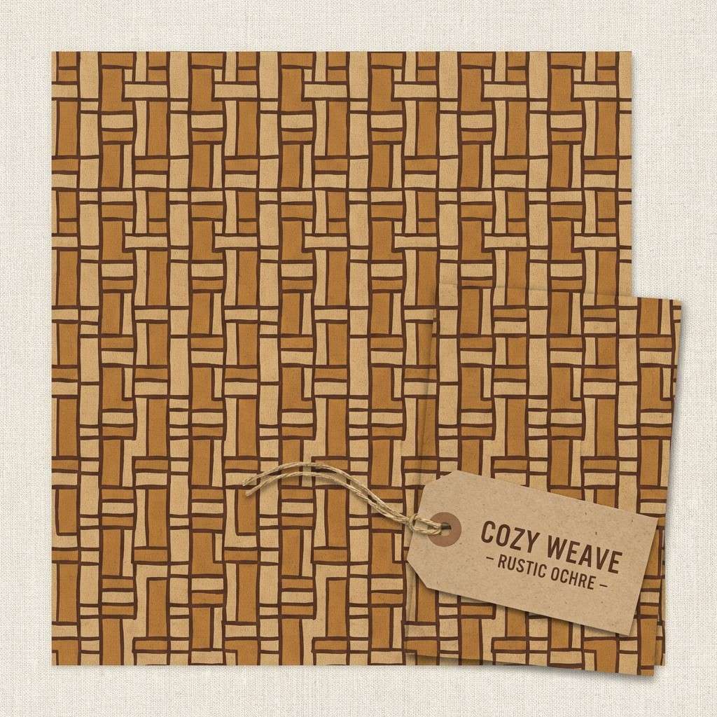
- cozy cabin textiles
- sculpted ceramics
- What Colors Go Well with Brown Ochre?
- How to Use a Brown Ochre Color Palette in Real Designs
- Create Brown Ochre Palette Visuals with AI
Why Brown Ochre Palettes Work So Well
Brown ochre sits in a sweet spot between rustic and refined: it’s warm enough to feel welcoming, but muted enough to look modern in digital layouts. That makes it easy to use as a brand “anchor” color that doesn’t overwhelm typography or imagery.
It also pairs naturally with a wide range of supporting tones—creams, taupes, charcoals, and greens—so you can build depth without jumping to high-saturation accents. This flexibility is why it works in everything from packaging to dashboards.
Most importantly, brown ochre photographs well and prints reliably, especially on matte paper or kraft textures. When you want an earthy tone that still feels clean and premium, it’s a dependable choice.
20+ Brown Ochre Color Palette Ideas (with HEX Codes)
1) Sunbaked Studio
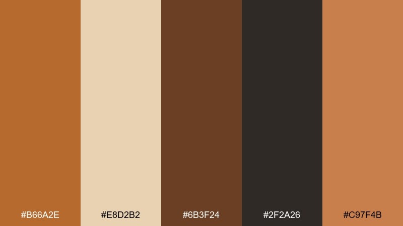
HEX: #B66A2E #E8D2B2 #6B3F24 #2F2A26 #C97F4B
Mood: warm, grounded, creative
Best for: branding for craft shops and handmade goods
Sun-warmed plaster, kiln-fired clay, and a hint of smoke give this set a studio-made feel. The brown ochre color palette shines in logos, labels, and brand boards where you want handmade warmth without looking dated. Pair the lighter sand tone with charcoal for clean type, then use the terracotta accent for seals or callouts. Tip: keep the dark walnut for small details so the design stays airy.
Image example of sunbaked studio generated using media.io
Media.io is an online AI studio for creating and editing video, image, and audio in your browser.

2) Desert Clay Neutral
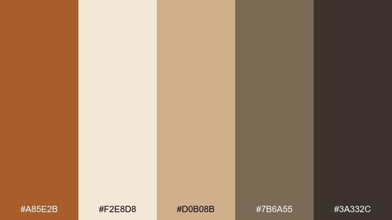
HEX: #A85E2B #F2E8D8 #D0B08B #7B6A55 #3A332C
Mood: calm, natural, minimal
Best for: interior paint planning and mood boards
Quiet desert clay and soft linen neutrals create an easy, lived-in calm. These tones work beautifully for walls, upholstery, and cabinetry when you want warmth but not heavy saturation. Balance the clay with creamy off-white, then add the deep brown only for hardware or trim. Tip: sample the mid taupe in larger areas to avoid an overly orange cast in warm lighting.
Image example of desert clay neutral generated using media.io
3) Rustic Market
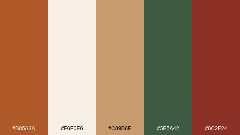
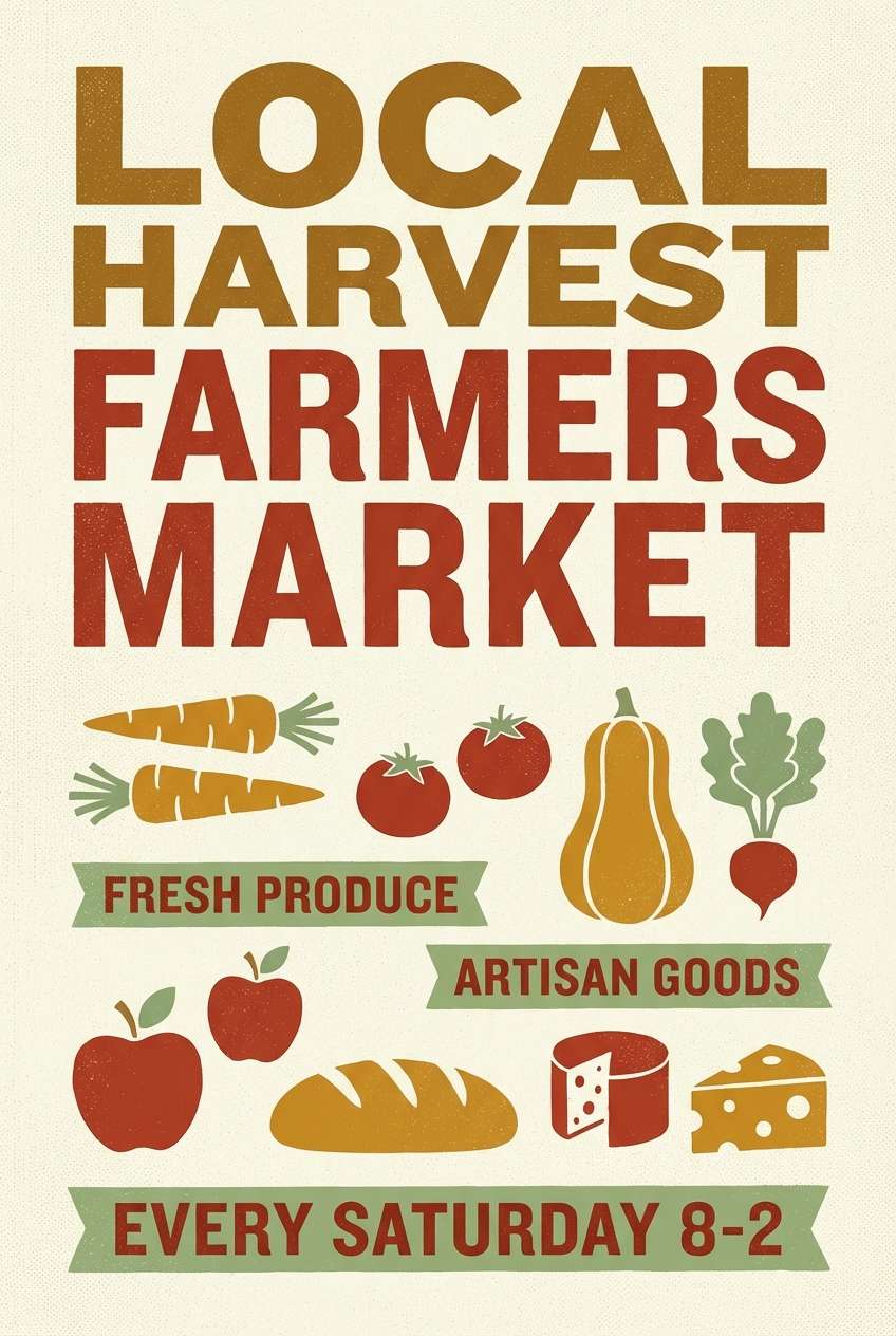
HEX: #B05A2A #F6F0E6 #C89B6E #3E5A42 #8C2F24
Mood: rustic, inviting, artisanal
Best for: farmers market posters and signage
Weathered wood, canvas sacks, and fresh herbs set a friendly market tone. These brown ochre color combinations feel especially good for seasonal posters and price signs, where warmth helps products look fresh and approachable. Let the cream background carry the layout, then use the brick red for highlights and the herb green for category tags. Tip: reserve the deepest tones for headlines so small text stays legible outdoors.
Image example of rustic market generated using media.io
4) Autumn Orchard
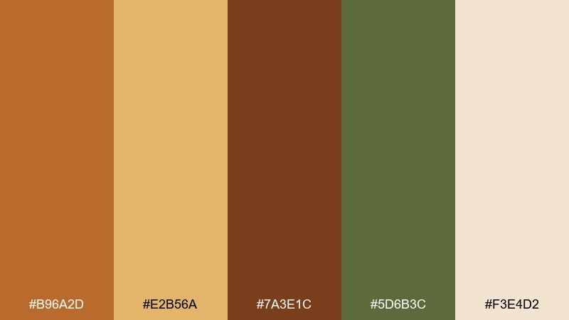
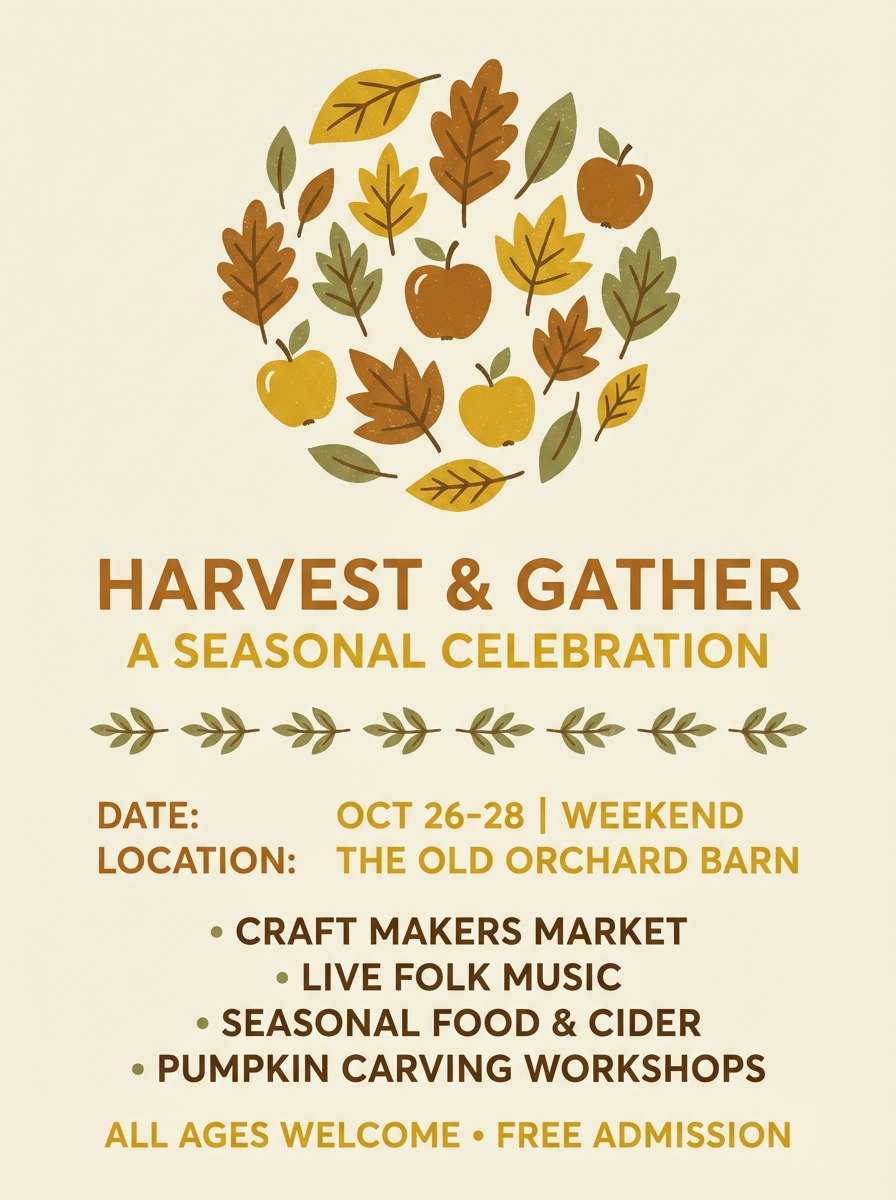
HEX: #B96A2D #E2B56A #7A3E1C #5D6B3C #F3E4D2
Mood: seasonal, cozy, nostalgic
Best for: fall event flyers and social graphics
Golden fruit skins and leaf-littered paths make this palette feel like late afternoon in an orchard. It fits fall promotions, harvest events, and seasonal menus where warmth should lead the eye. Use the cream as the base, then push the gold for buttons or key dates while the olive keeps it grounded. Tip: keep the darkest brown for a single anchor element to avoid muddy contrast.
Image example of autumn orchard generated using media.io
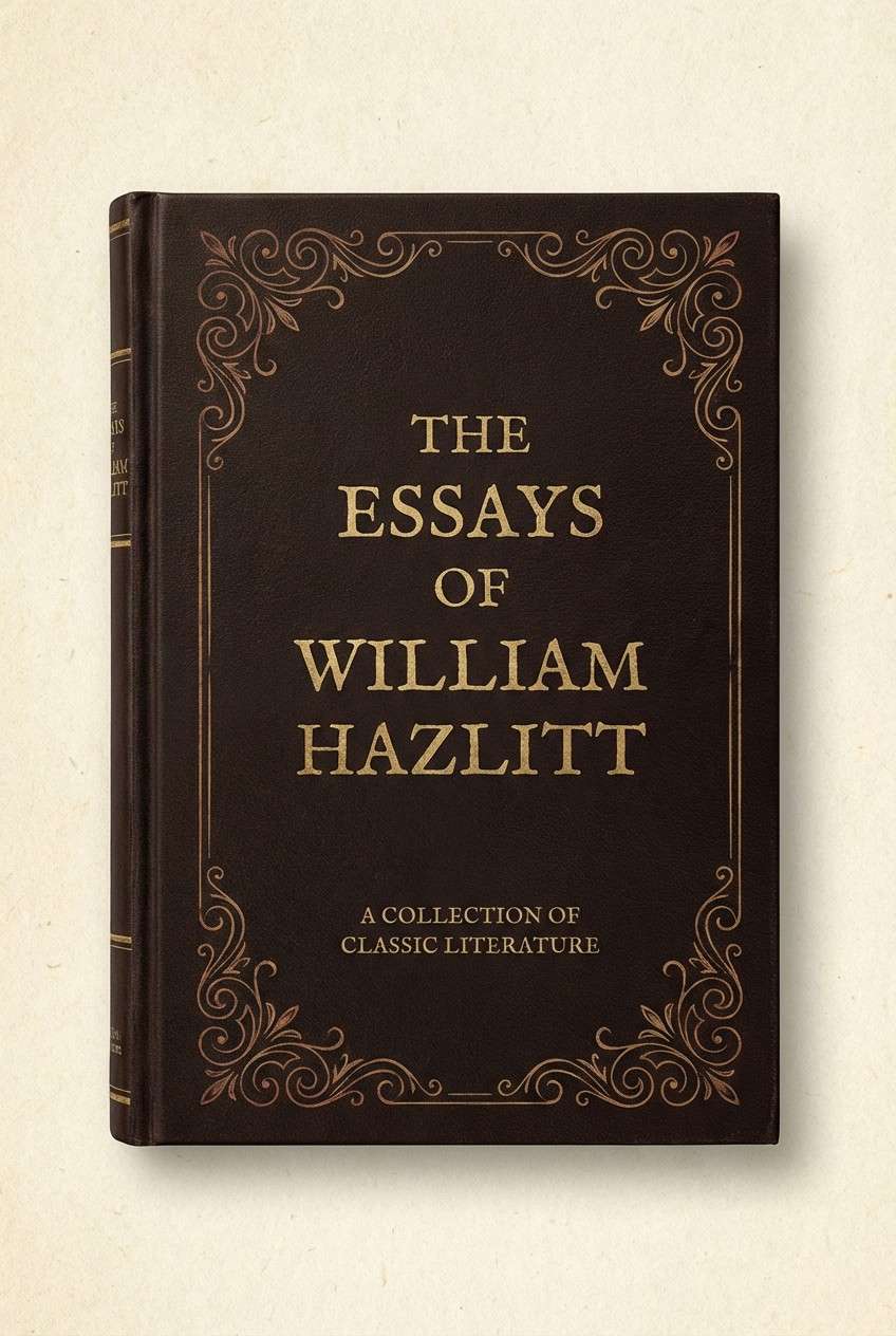
5) Vintage Leatherbound
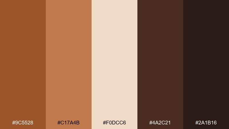
HEX: #9C5528 #C17A4B #F0DCC6 #4A2C21 #2A1B16
Mood: heritage, moody, refined
Best for: book covers and classic editorial headers
Old leather spines and dark-wood shelves give a scholarly, collected mood. These tones are strong for cover designs and section headers where you want gravitas without going fully black. Pair the warm tan with the cream for readable typography, then add the near-black for rules and small ornaments. Tip: use the mid leather shade in large blocks to keep the design rich, not flat.
Image example of vintage leatherbound generated using media.io
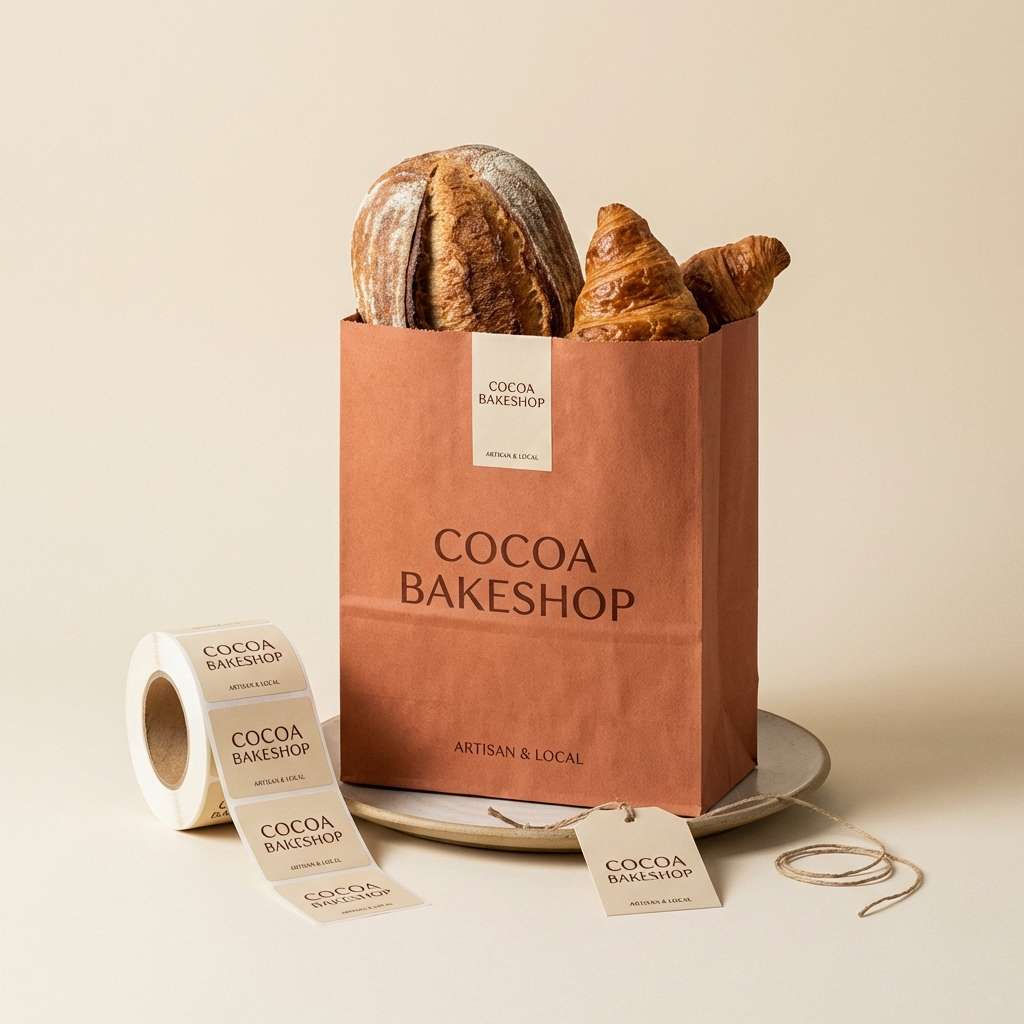
6) Terracotta and Cream
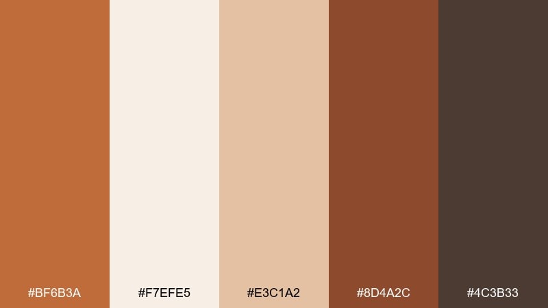
HEX: #BF6B3A #F7EFE5 #E3C1A2 #8D4A2C #4C3B33
Mood: soft, friendly, modern rustic
Best for: cafe menus and bakery packaging
Creamy paper and baked terracotta feel comforting, like warm pastries on a cool morning. The mix suits menus, takeout sleeves, and small packaging where you want appetizing warmth without shouting. Let cream and blushy beige dominate, then use the deeper cocoa for type and icons. Tip: keep the darkest color for text only to maintain that airy, handcrafted feel.
Image example of terracotta and cream generated using media.io
7) Ochre and Charcoal
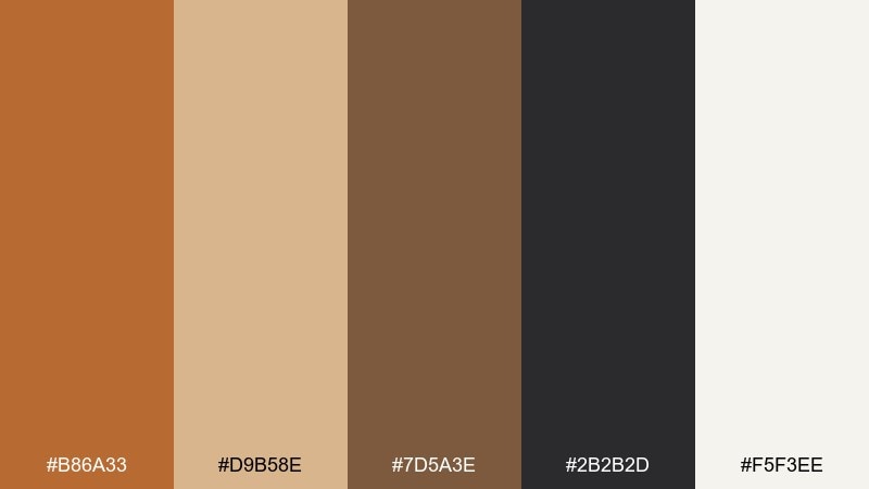
HEX: #B86A33 #D9B58E #7D5A3E #2B2B2D #F5F3EE
Mood: bold, balanced, contemporary
Best for: modern posters and typographic covers
Smoky charcoal and warm ochre create a crisp, gallery-ready contrast. This pairing works when you need warmth but also want sharp structure and modern punch. Use off-white for breathing room, then let charcoal handle headlines while ochre becomes the accent bar or shape. Tip: keep mid-browns subtle so the design does not lose its clean edge.
Image example of ochre and charcoal generated using media.io
8) Canyon Sunset
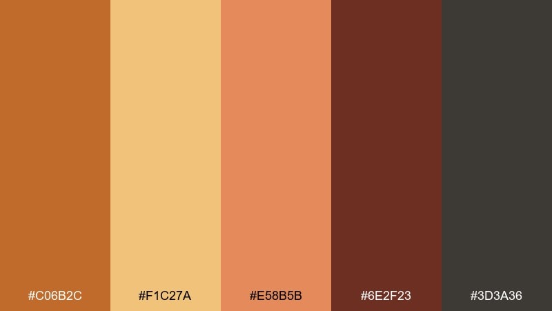
HEX: #C06B2C #F1C27A #E58B5B #6E2F23 #3D3A36
Mood: dramatic, warm, adventurous
Best for: travel ads and outdoor campaign banners
Sunset rock faces and dusty trails give this set an adventurous lift. It is ideal for travel banners, outdoor brands, and hero sections that need warmth and motion. Let the golden tone lead the highlights, then ground the layout with deep brown and graphite. Tip: use the coral-like accent sparingly for calls to action so it reads as energetic, not noisy.
Image example of canyon sunset generated using media.io

9) Spiced Honey
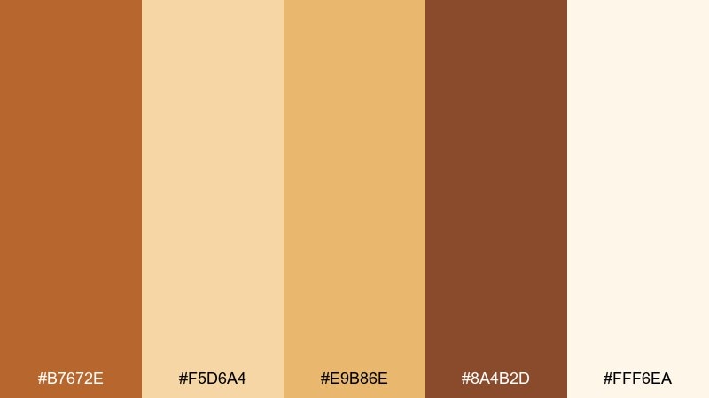
HEX: #B7672E #F5D6A4 #E9B86E #8A4B2D #FFF6EA
Mood: cheerful, sweet, sunny
Best for: food blogs and recipe card templates
Honeyed golds and warm spice browns feel bright, friendly, and a little indulgent. These tones work well for recipe cards, food blog headers, and thumbnails where you want a sunny appetite cue. Use the pale cream as the background, then layer gold panels behind headings for instant hierarchy. Tip: keep the darkest spice brown for ingredient lists to preserve readability.
Image example of spiced honey generated using media.io
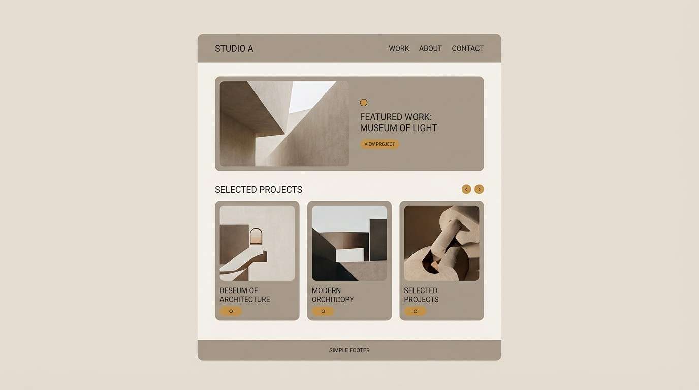
10) Museum Gallery Wall
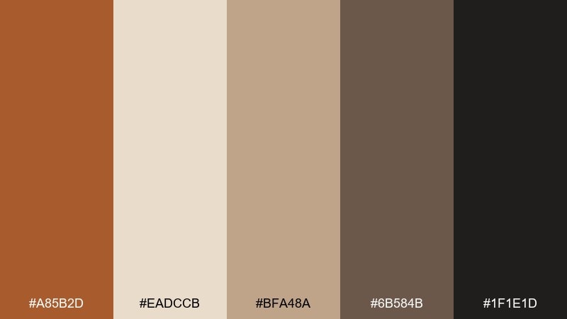
HEX: #A85B2D #EADCCB #BFA48A #6B584B #1F1E1D
Mood: elevated, quiet, curated
Best for: portfolio websites and case study pages
Muted wall plaster and dark frames create a calm, curated atmosphere. This set is perfect for portfolios and case studies where work should feel premium and easy to scan. Use the light plaster for page backgrounds, the mid taupe for cards, and near-black for type. Tip: add the ochre tone only to links or small badges to keep the layout gallery-clean.
Image example of museum gallery wall generated using media.io
11) Nordic Warm Minimal
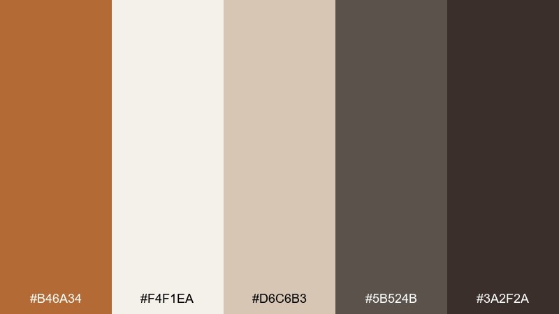
HEX: #B46A34 #F4F1EA #D6C6B3 #5B524B #3A2F2A
Mood: minimal, warm, balanced
Best for: scandinavian-inspired interiors and lookbooks
Soft oatmeal neutrals with a grounded brown core feel calm but never cold. The palette fits lookbooks, interior styling guides, and product pages that lean minimal yet welcoming. Pair the pale background with warm gray-brown text, then use the ochre tone on small highlights like section labels. Tip: keep contrast high for body text by using the darkest shade instead of midtones.
Image example of nordic warm minimal generated using media.io
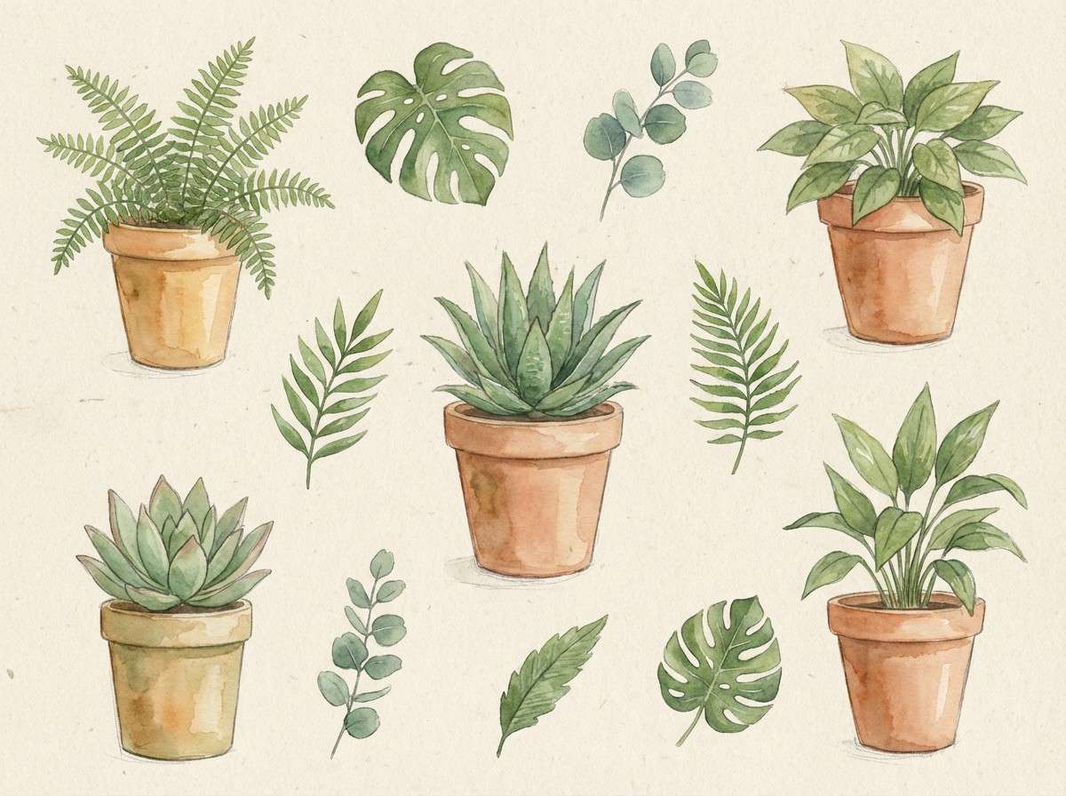
12) Botanical Potting Bench
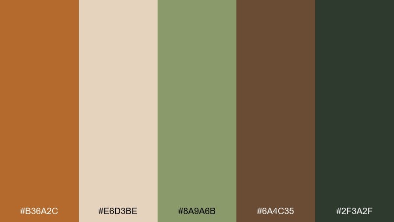
HEX: #B36A2C #E6D3BE #8A9A6B #6A4C35 #2F3A2F
Mood: earthy, fresh, outdoorsy
Best for: botanical illustrations and garden newsletters
Soil-stained terracotta and leafy greens evoke a potting bench after watering. It is a natural fit for garden newsletters, plant care guides, and botanical artwork with a grounded feel. Let the beige act as paper, then use moss green for headings and the dark forest tone for stamps or dividers. Tip: keep the ochre as a secondary accent so the greens stay fresh.
Image example of botanical potting bench generated using media.io
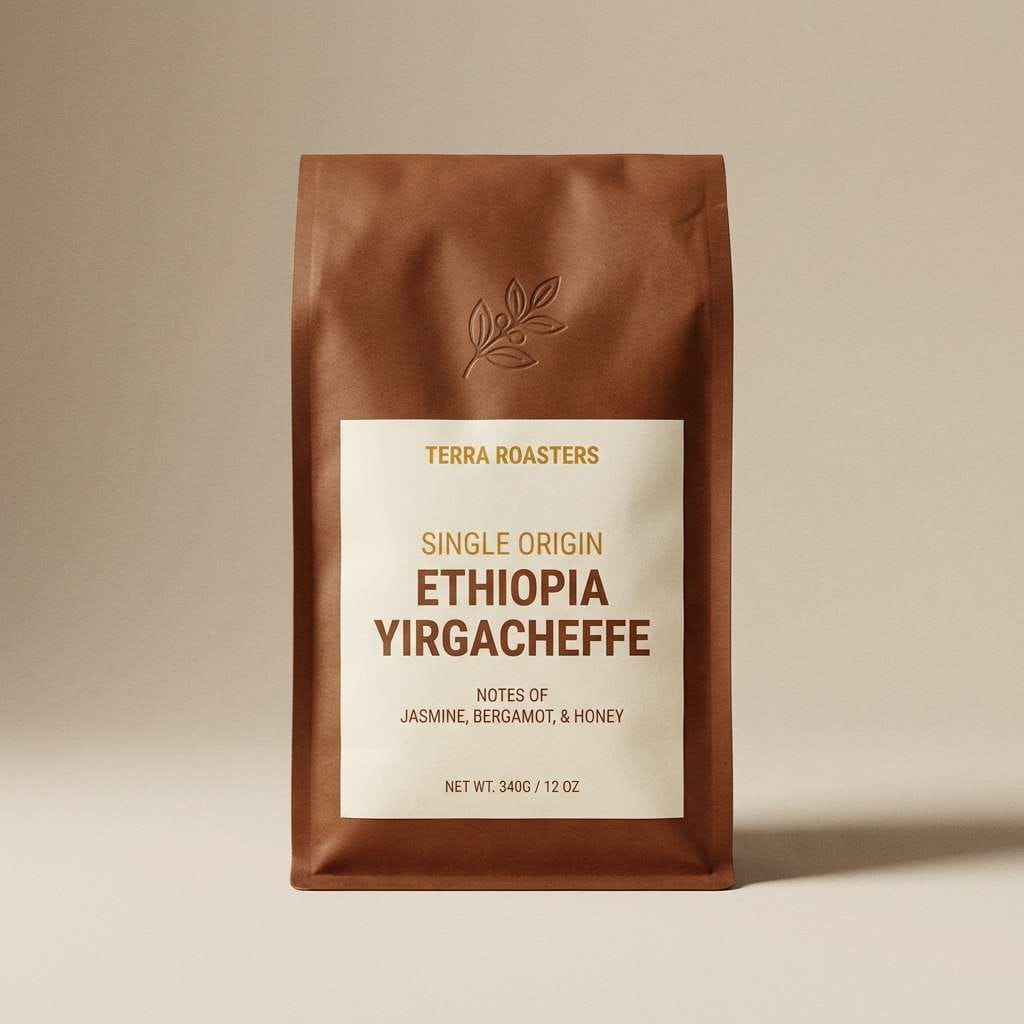
13) Artisan Coffee Label
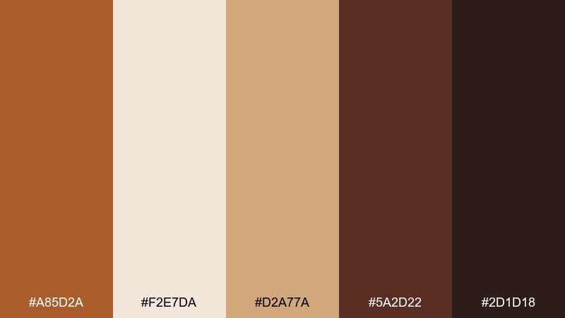
HEX: #A85D2A #F2E7DA #D2A77A #5A2D22 #2D1D18
Mood: rich, aromatic, premium
Best for: coffee bag labels and product ads
Roasted notes, crema foam, and dark cacao shadows make the palette feel premium and aromatic. These brown ochre color combinations work especially well on kraft paper textures and matte labels for small-batch products. Use the light cream for legible ingredient blocks, then lean on the deep roast tones for brand marks and borders. Tip: add the tan only as a highlight to keep the label feeling upscale.
Image example of artisan coffee label generated using media.io
14) Earthy Editorial Spread
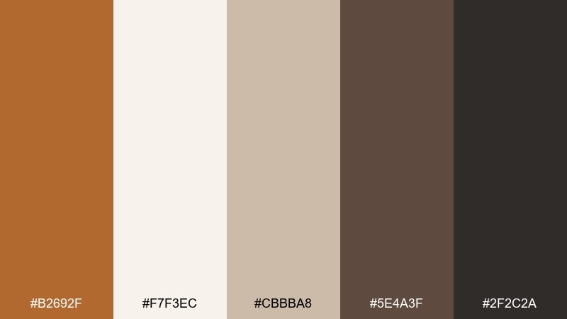
HEX: #B2692F #F7F3EC #CBBBA8 #5E4A3F #2F2C2A
Mood: editorial, thoughtful, grounded
Best for: magazine spreads and longform articles
Warm paper stock and muted ink tones create a thoughtful, reading-first vibe. It works for magazines, longform blog layouts, and reports where hierarchy and comfort matter. Use the off-white for margins, the taupe for sidebars, and the near-black for body text. Tip: keep the ochre for pull quotes or section numbers so it feels intentional.
Image example of earthy editorial spread generated using media.io
15) Modern Kitchen Accents
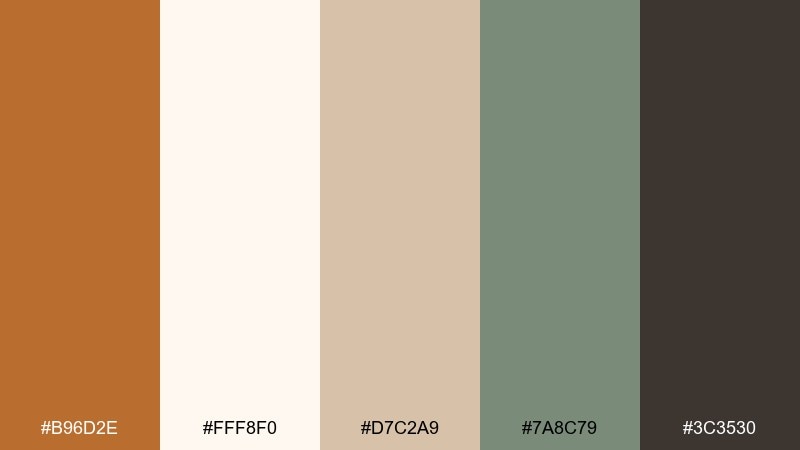
HEX: #B96D2E #FFF8F0 #D7C2A9 #7A8C79 #3C3530
Mood: clean, warm, homey
Best for: kitchen styling and home product catalogs
Fresh cream surfaces with a grounded ochre accent feel modern and lived-in. The muted green-gray adds a calming counterpoint, great for kitchen catalogs, appliance pages, or interior renders. Keep the background light, use the dark brown for copy, and bring ochre in through small accent blocks or tags. Tip: repeat the green-gray in two places to make the palette feel cohesive, not random.
Image example of modern kitchen accents generated using media.io
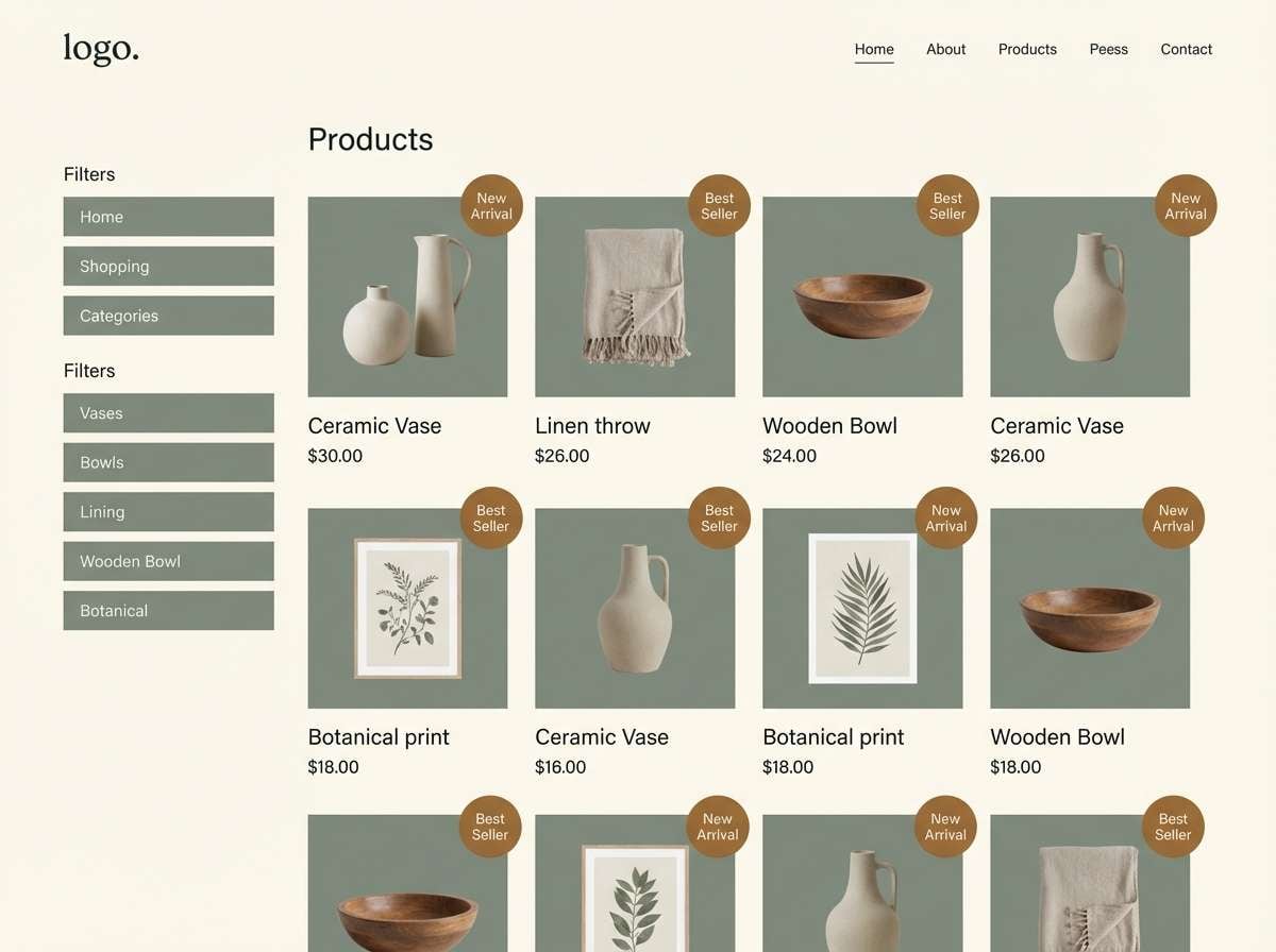
16) Warm UI Dashboard
HEX: #B86A2E #F3EFE8 #C9B8A4 #6D5649 #2A2624
Mood: professional, warm, readable
Best for: saas dashboards and analytics UI
Soft neutrals with a confident ochre accent make a dashboard feel human and approachable. The tones are strong for cards, charts, and data tables where contrast must stay consistent. Use the off-white as the main canvas, the dark brown for text, and the ochre for primary actions or selected states. Tip: keep chart fills in the mid beige range so alerts and highlights stay clear.
Image example of warm ui dashboard generated using media.io
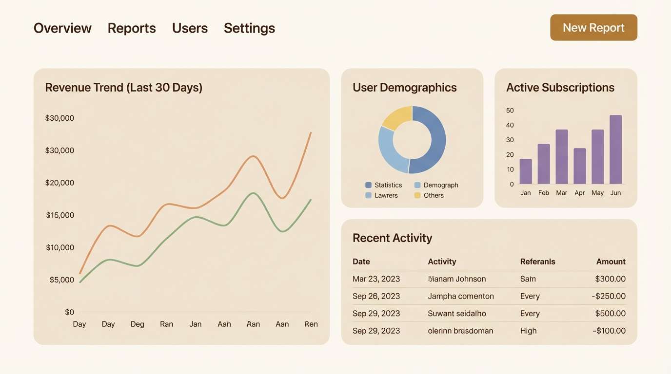
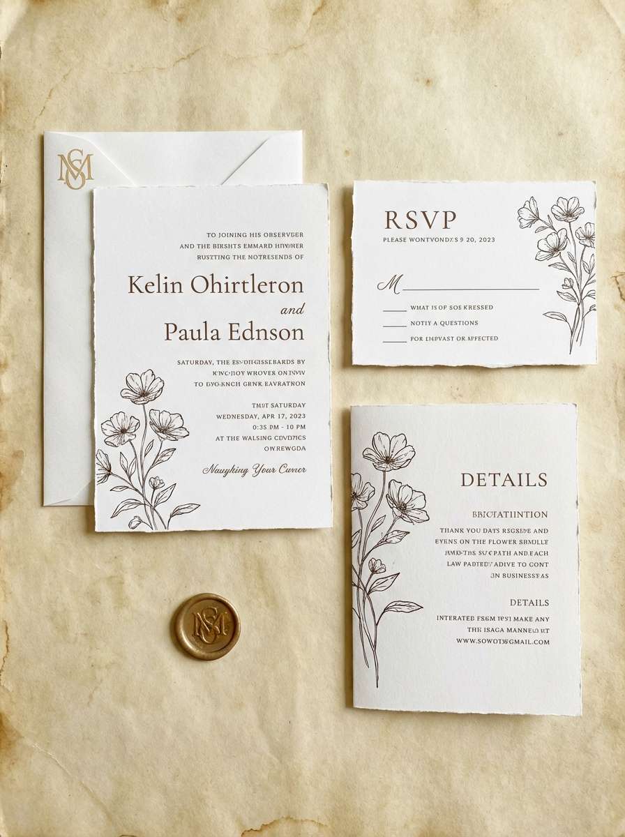
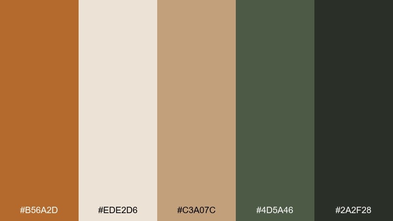
17) Heritage Wedding Suite
HEX: #B0622D #FAF2E8 #E7CBB0 #8C6A4F #3B2A25
Mood: romantic, timeless, elegant
Best for: wedding invitations and stationery
Aged parchment and warm ink tones evoke a timeless, heritage romance. This set fits invitations, RSVP cards, and envelope liners where elegance should feel approachable. Use the light parchment as the base, then set typography in deep brown for crisp readability. Tip: apply the ochre as a wax-seal accent or monogram highlight rather than large blocks.
Image example of heritage wedding suite generated using media.io
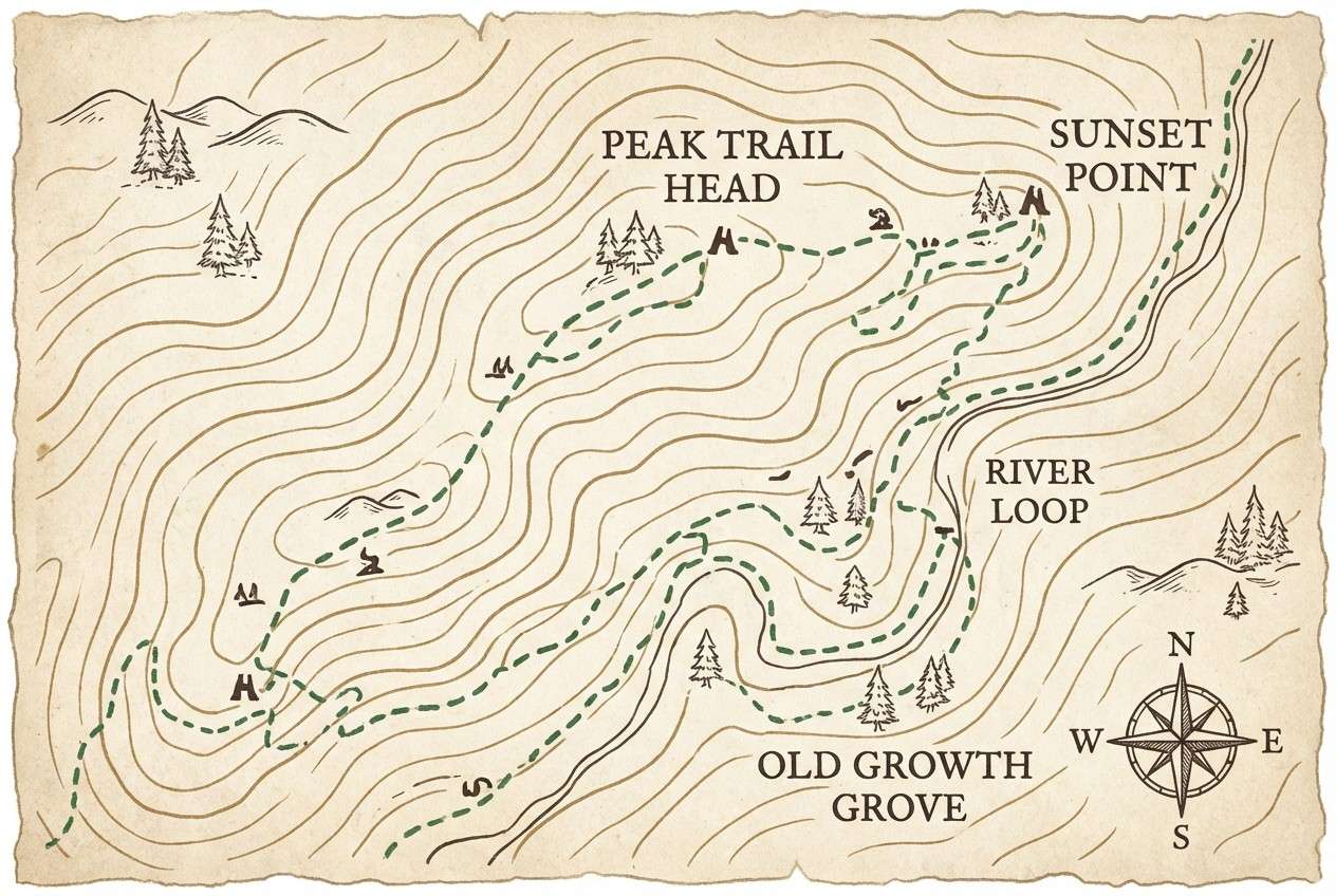
18) Hiker Trail Map
HEX: #B56A2D #EDE2D6 #C3A07C #4D5A46 #2A2F28
Mood: practical, outdoorsy, rugged
Best for: illustrated maps and guidebook pages
Dusty paths and evergreen shadows make this feel ready for the trail. It works well for illustrated maps, guidebook spreads, and park signage where clarity matters as much as mood. Use the light beige for the base, the green for routes or zones, and the dark tone for labels. Tip: keep the ochre for points of interest markers so users scan faster.
Image example of hiker trail map generated using media.io
19) Cozy Cabin Textiles
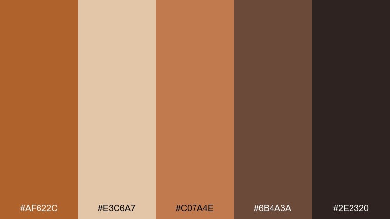
HEX: #AF622C #E3C6A7 #C07A4E #6B4A3A #2E2320
Mood: cozy, textured, rustic
Best for: textile patterns and home decor branding
Woven throws, cedar wood, and a firelit glow give these colors a cabin-cozy feel. The set is great for textile patterns, rug collections, and home decor brands that lean warm and tactile. Let the lighter tan be the base for repeating motifs, then use the deep brown for outlines and contrast. Tip: scale patterns up slightly so the mid browns do not blend together from a distance.
Image example of cozy cabin textiles generated using media.io
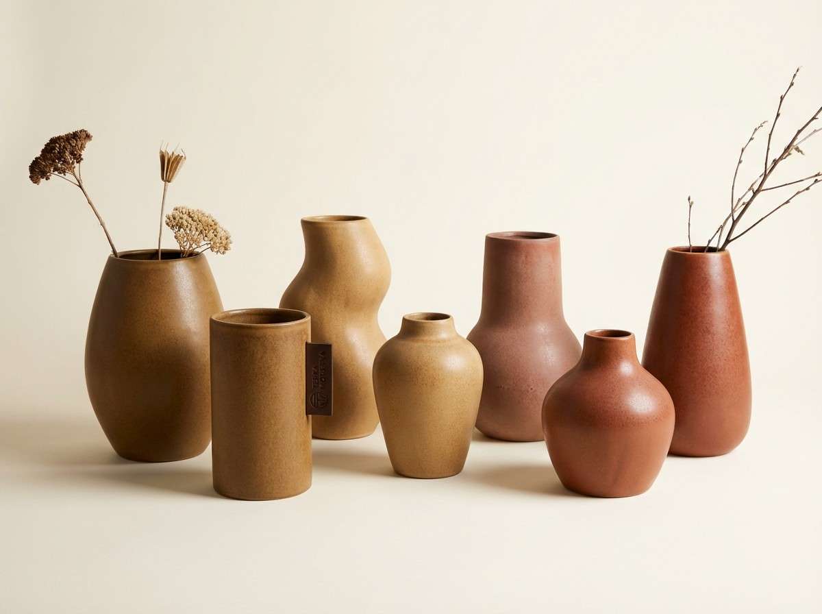
20) Sculpted Ceramics
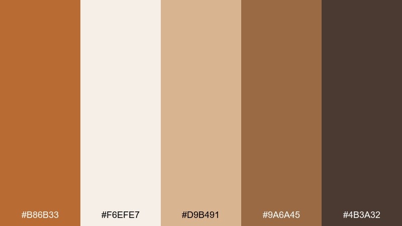
HEX: #B86B33 #F6EFE7 #D9B491 #9A6A45 #4B3A32
Mood: artful, warm, gallery modern
Best for: product photography for ceramics and decor
Sculpted clay and soft studio light make the tones feel artful and modern. Use this mix for product pages and ads where you want warmth, shape, and quiet luxury. Keep the background creamy, let ochre and sand be the dominant surfaces, and use the dark brown for minimal type or logos. Tip: add texture through lighting and shadows rather than extra colors.
Image example of sculpted ceramics generated using media.io
What Colors Go Well with Brown Ochre?
Brown ochre pairs best with light warm neutrals like cream, parchment, sand, and oatmeal because they preserve the cozy tone while keeping layouts bright. These combinations are especially reliable for editorial design and packaging where readability matters.
For contrast, charcoal and near-black give brown ochre a clean, contemporary edge—great for typography-heavy posters, brand systems, and UI. If you want a natural twist, muted greens (olive, moss, bottle tones) balance the warmth and make the palette feel outdoorsy and fresh.
For accents, consider terracotta, honey gold, or brick red in small doses. They keep the scheme cohesive while adding hierarchy for buttons, badges, and highlights.
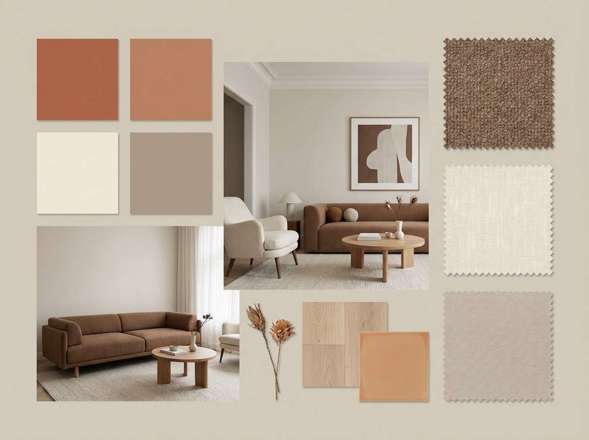
How to Use a Brown Ochre Color Palette in Real Designs
Start by choosing one light neutral as the main background, then assign brown ochre to brand accents (buttons, icons, labels, section titles). This keeps the overall look modern and uncluttered while still delivering warmth.
Use the darkest brown (or charcoal) for body text and key UI labels to maintain contrast, then place mid-tones on cards, borders, and secondary surfaces. In print, brown ochre shines on matte finishes and textured stocks, where it feels more tactile and less “orange.”
If the palette starts to look muddy, reduce the number of mid-browns visible in the same area and increase spacing/whitespace. A cleaner structure makes earthy colors feel intentional rather than heavy.
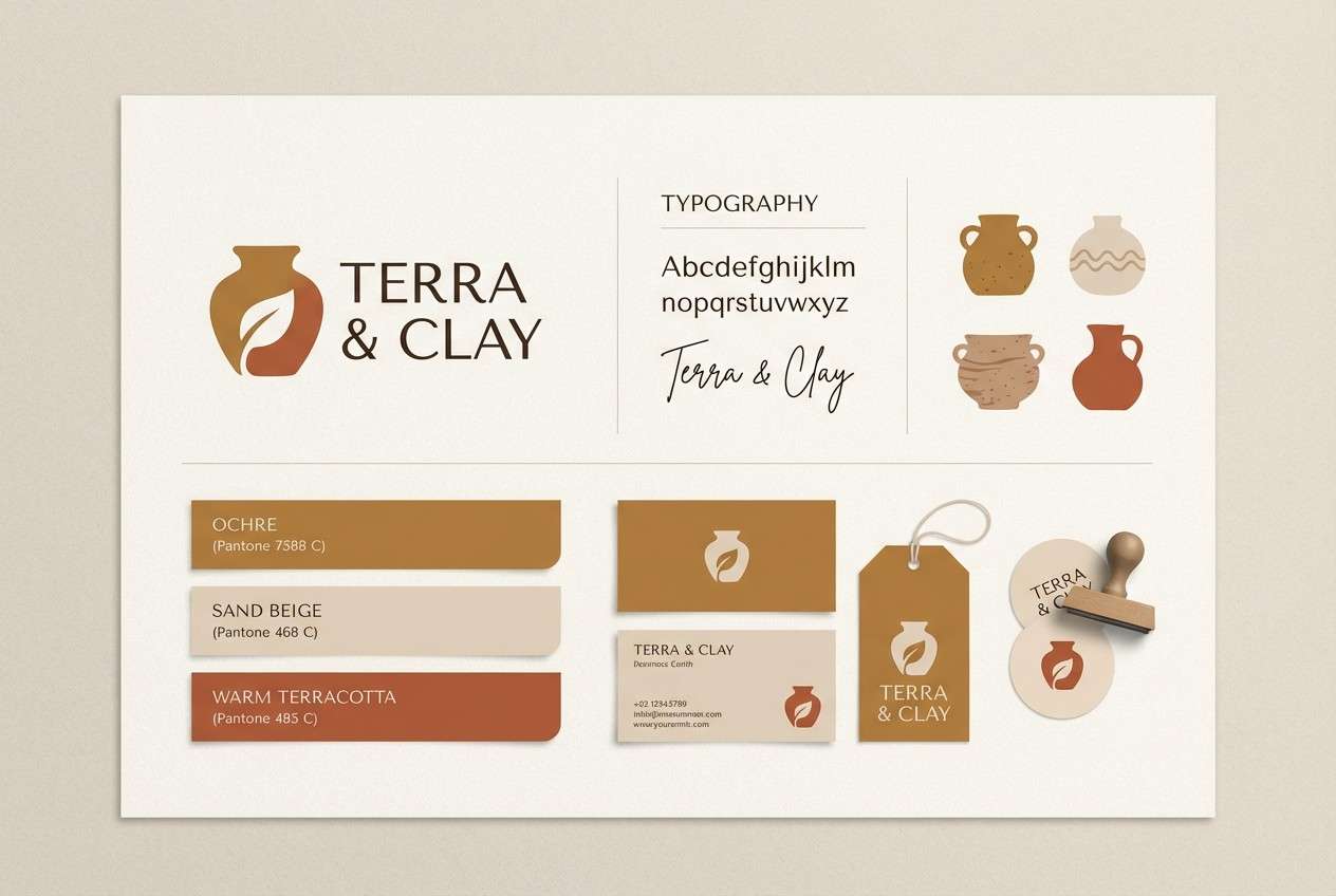
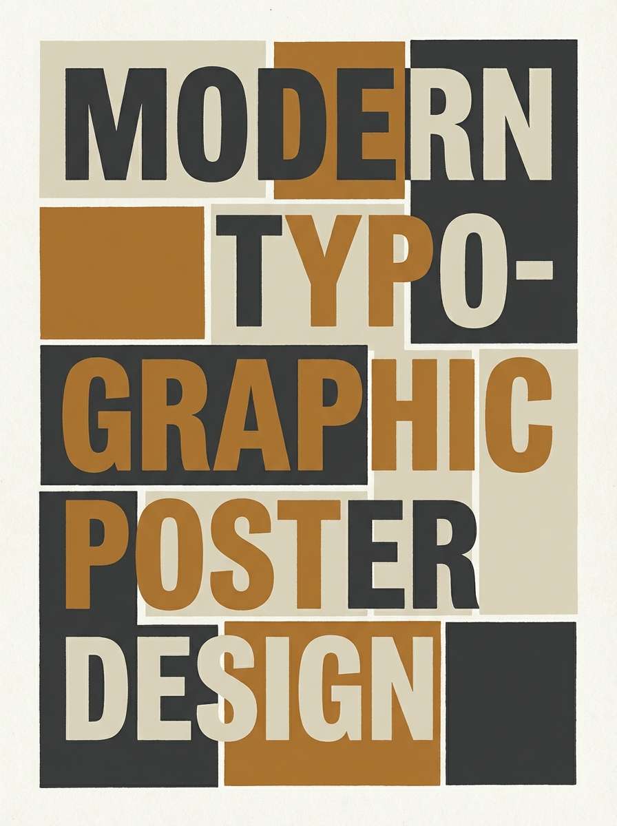
Create Brown Ochre Palette Visuals with AI
If you already have HEX codes, you can turn them into fast mockups for brand boards, posters, packaging, or UI screens. The key is describing the layout (grid, margins, typography) as clearly as the colors.
With Media.io’s text-to-image generator, you can test multiple styles—minimal editorial, rustic packaging, modern UI—without rebuilding comps from scratch. This is a simple way to validate contrast and mood before committing to production designs.
Try prompts that mention materials (kraft paper, plaster wall, ceramic glaze) and lighting (soft studio, warm diffused) to get more realistic results from a brown ochre color scheme.
Brown Ochre Color Palette FAQs
-
What is brown ochre (as a color)?
Brown ochre is an earthy brown with a yellow-gold clay undertone. It feels warm, natural, and grounded, often associated with terracotta, soil, and sunbaked materials. -
Is brown ochre more orange or more brown?
It usually reads as brown first, with a muted orange/yellow warmth underneath. The lighting and surrounding colors (especially creams vs. cool grays) can push it warmer or more neutral. -
What neutral colors work best with brown ochre?
Warm off-whites (cream, parchment), sand beige, and soft taupe are the easiest neutrals to pair. They keep the palette light while letting brown ochre provide character and depth. -
What accent colors complement a brown ochre palette?
Muted greens (olive, moss, bottle green) complement brown ochre naturally, while brick red, honey gold, and terracotta add warmth for highlights. Use accents sparingly for clearer hierarchy. -
Can brown ochre work in modern UI design?
Yes—use it as an accent for primary actions, selected states, and badges, and rely on off-white backgrounds with dark text for readability. Keeping mid-browns limited helps the UI stay crisp. -
How do I keep brown ochre palettes from looking muddy?
Increase contrast (use charcoal or very dark brown for text), reduce the number of mid-tone browns used together, and add whitespace. Let one light neutral dominate to keep the design clean. -
What finishes or materials make brown ochre look premium?
Matte paper, kraft textures, warm ceramics, and plaster-like surfaces all enhance its natural warmth. In digital design, subtle grain or soft shadows can recreate that tactile feel.


