

Bright turquoise is a high-energy blue-green that instantly reads fresh, modern, and “summer-ready.” It’s bold enough for hero sections and CTAs, yet clean enough for UI accents and data highlights.
Below are 20+ bright turquoise color combinations with HEX codes, plus practical pairing tips for branding, interiors, and digital design.
In this article
- Why Bright Turquoise Combinations Work So Well
-
- lagoon pop
- minted surf
- neon tide
- aqua minimal
- poolside citrus
- tropical linen
- glacier glow
- tech reef
- coral counterpoint
- skyline aqua
- ceramic seafoam
- urban splash
- mermaid pastels
- deep lagoon luxe
- arctic pool
- sandbar neutrals
- botanical aqua
- retro motel aqua
- clean clinic aqua
- night swim contrast
- sunlit marina
- crystal candy
- What Colors Go Well with Bright Turquoise?
- How to Use a Bright Turquoise Color Combination in Real Designs
- Create Bright Turquoise Palette Visuals with AI
Why Bright Turquoise Combinations Work So Well
Bright turquoise sits between blue (trust, clarity) and green (freshness, growth), so it feels both energizing and reliable. That balance makes it a strong “brand color” for modern products and lifestyle visuals.
It’s also highly versatile across backgrounds: crisp on white for minimal layouts, vibrant on dark navy for high-contrast posters, and natural-looking when paired with sand, terracotta, or olive tones.
Because it reads as “clean water” and “cool light,” bright turquoise quickly communicates refreshment—perfect for summer promos, wellness aesthetics, and UI states that need instant attention.
20+ Bright Turquoise Color Palette Ideas (with HEX Codes)
1) Lagoon Pop
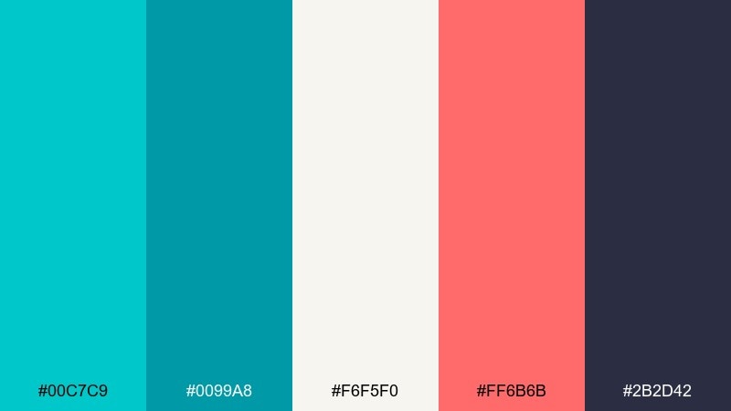
HEX: #00C7C9 #0099A8 #F6F5F0 #FF6B6B #2B2D42
Mood: playful, coastal, energetic
Best for: social media graphics for summer promos
Playful lagoon tones feel like sunlit water and a splash of fruity sherbet. Use the turquoise as your hero color, then let coral handle buttons, stickers, and calls to action. Off-white keeps layouts airy while deep navy anchors type for readability. Tip: keep coral to small accents so the feed still feels fresh, not loud.
Image example of lagoon pop generated using media.io

Media.io is an online AI studio for creating and editing video, image, and audio in your browser.

2) Minted Surf
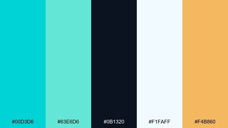
HEX: #00D3D6 #63E6D6 #0B1320 #F1FAFF #F4B860
Mood: clean, modern, breezy
Best for: mobile app UI and onboarding screens
Breezy surf tones read crisp and modern, like sea glass on a bright day. These bright turquoise color combinations work best when the dark ink shade handles navigation and body text. Use the pale blue-white as your main canvas, then reserve the warm amber for one primary action per screen. Tip: apply the turquoise to progress states and highlights to guide the eye.
Image example of minted surf generated using media.io

3) Neon Tide
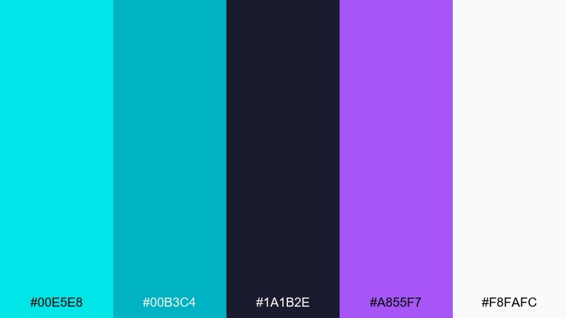
HEX: #00E5E8 #00B3C4 #1A1B2E #A855F7 #F8FAFC
Mood: nightlife, electric, bold
Best for: club flyers and event posters
Electric tide vibes feel like neon lights reflecting on dark water. Let the deep indigo set the stage, then punch in turquoise for headlines and key details. Purple adds a late-night edge without fighting the main hue, while white keeps information readable. Tip: use turquoise as a glow or outline effect to amplify contrast on the dark base.
Image example of neon tide generated using media.io
4) Aqua Minimal
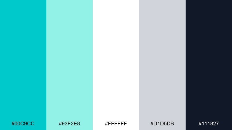
HEX: #00C9CC #93F2E8 #FFFFFF #D1D5DB #111827
Mood: minimal, airy, confident
Best for: SaaS landing pages and product sections
Airy aqua minimalism feels like clean glass and fresh water. This bright turquoise color palette shines on white backgrounds with plenty of spacing and calm gray dividers. Use the near-black for headings and UI labels, and keep the lighter mint for subtle cards and hover states. Tip: match icon strokes to the darker turquoise to keep the page cohesive.
Image example of aqua minimal generated using media.io

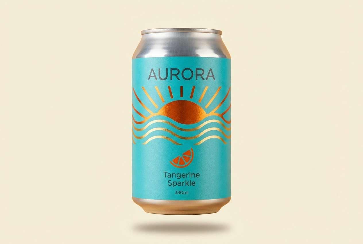
5) Poolside Citrus
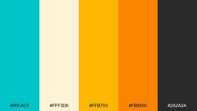
HEX: #00C4C7 #FFF3D6 #FFB703 #FB8500 #2A2A2A
Mood: sunny, appetizing, upbeat
Best for: beverage packaging and summer product ads
Poolside citrus feels like sparkling water, sliced oranges, and bright sunshine. Pair turquoise with creamy off-white for a clean label base, then layer in orange and gold for flavor cues and badges. Charcoal keeps ingredient lists sharp and premium. Tip: make turquoise the background field and let the citrus tones appear as small, punchy graphics.
Image example of poolside citrus generated using media.io
6) Tropical Linen
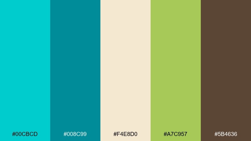
HEX: #00CBCD #008C99 #F4E8D0 #A7C957 #5B4636
Mood: relaxed, natural, resort-like
Best for: interior mood boards and lifestyle branding
Relaxed tropical tones evoke linen curtains, leafy greens, and a calm resort breeze. The sandy beige keeps the palette grounded, while turquoise adds a clean splash that feels airy rather than cold. Use olive green for botanical accents and warm brown for text or framing elements. Tip: keep turquoise on larger surfaces and let green appear in smaller decor details.
Image example of tropical linen generated using media.io
7) Glacier Glow
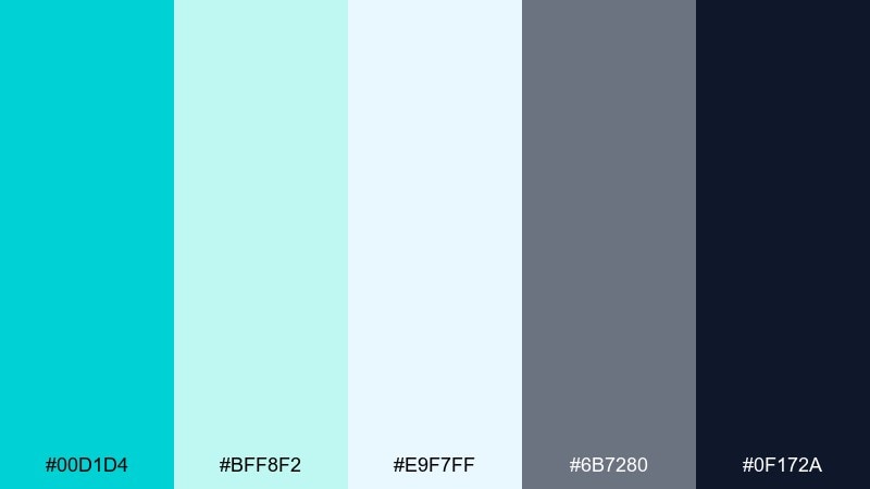
HEX: #00D1D4 #BFF8F2 #E9F7FF #6B7280 #0F172A
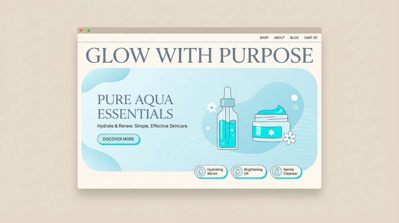
Mood: cool, soothing, spa-like
Best for: wellness brands and skincare websites
Glacier glow feels cool, clean, and quietly luxurious, like mist over icy water. Use the pale tints for backgrounds and panels, then reserve the saturated turquoise for key highlights and trust signals. The slate and midnight shades keep typography accessible and refined. Tip: lean into soft gradients between the light blues for a calm, spa-inspired finish.
Image example of glacier glow generated using media.io
8) Tech Reef
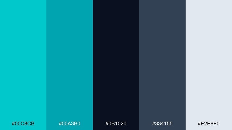
HEX: #00C8CB #00A3B0 #0B1020 #334155 #E2E8F0
Mood: sleek, technical, focused
Best for: fintech dashboards and data-heavy UI
Sleek reef tones feel like deep water lit by modern LEDs. Turquoise works as a strong status color for charts and active states, while the dark base keeps data readable and serious. Use slate for secondary panels and pale gray for grid lines and dividers. Tip: limit the brightest turquoise to the most important metric so the hierarchy stays clear.
Image example of tech reef generated using media.io

9) Coral Counterpoint
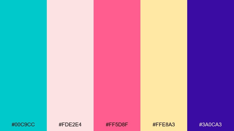
HEX: #00C9CC #FDE2E4 #FF5D8F #FFE8A3 #3A0CA3
Mood: romantic, lively, modern
Best for: wedding invitations and save-the-dates
Romantic coral notes with cool turquoise feel modern and celebratory, like confetti by the sea. Use blush as the main paper tone, then bring in turquoise for borders, monograms, or RSVP highlights. The berry pink gives florals and icons a lively punch, while deep violet adds elegant contrast for names. Tip: keep the typography mostly violet so the bright accents stay tasteful.
Image example of coral counterpoint generated using media.io

10) Skyline Aqua
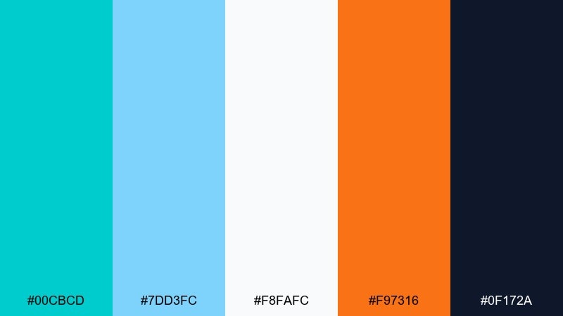
HEX: #00CBCD #7DD3FC #F8FAFC #F97316 #0F172A
Mood: fresh, optimistic, travel-ready
Best for: travel banners and destination ads
Fresh skyline aqua feels like clear mornings and ocean air. Pair the bright turquoise with airy sky blue for big gradients and hero imagery overlays, then add orange sparingly for limited-time deals. Off-white keeps the design light, while midnight navy gives headings crisp contrast. Tip: use orange only for one badge or price tag to avoid competing highlights.
Image example of skyline aqua generated using media.io

11) Ceramic Seafoam
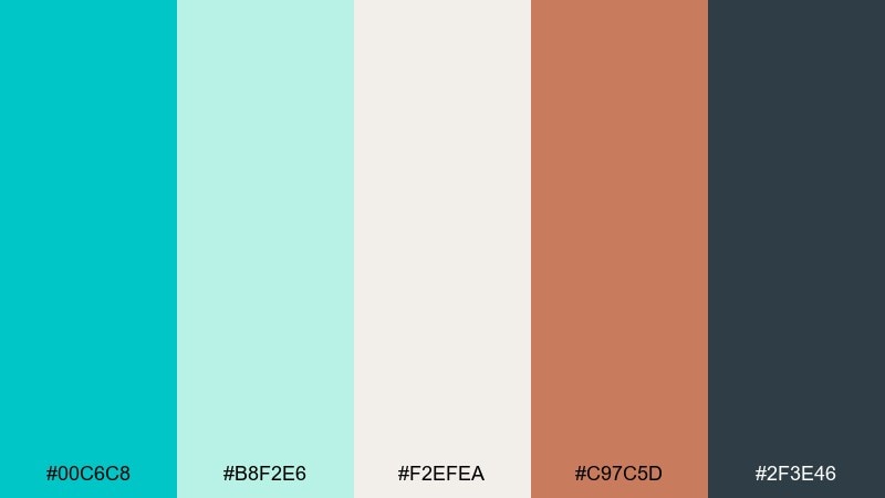
HEX: #00C6C8 #B8F2E6 #F2EFEA #C97C5D #2F3E46
Mood: handmade, calm, earthy
Best for: artisan ecommerce and craft product pages
Handmade seafoam tones evoke glazed ceramics, clay edges, and calm studio light. Use the warm cream as a product backdrop, then let turquoise and mint highlight buttons or section headers. Terracotta adds a natural, tactile accent that pairs beautifully with lifestyle photography. Tip: keep text in the deep gray-green so the page feels grounded and premium.
Image example of ceramic seafoam generated using media.io
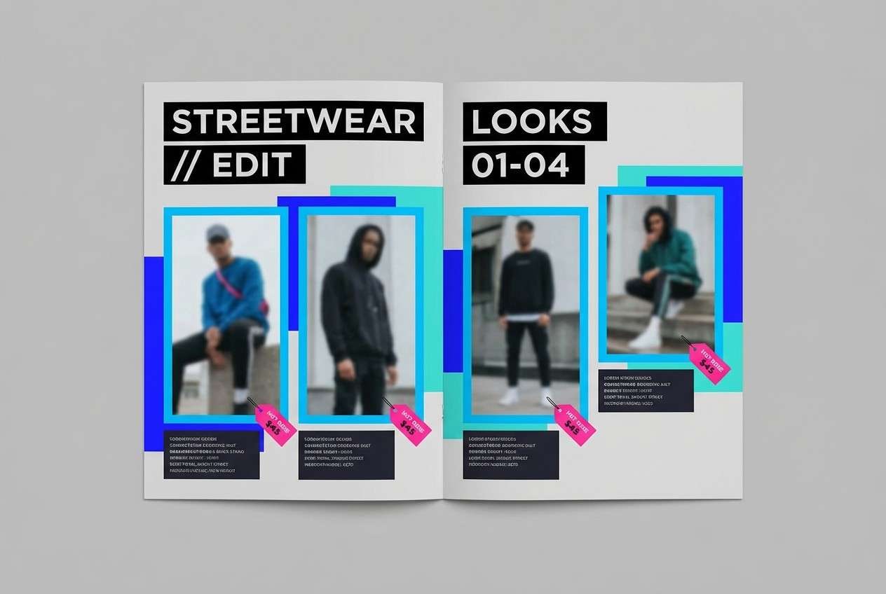
12) Urban Splash
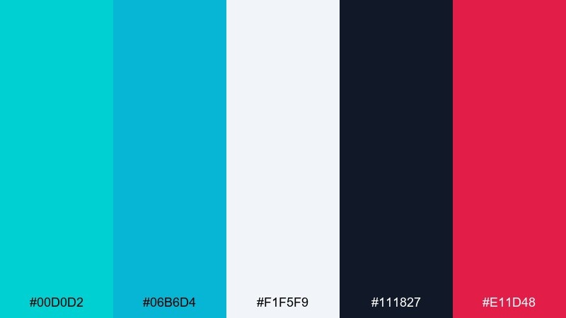
HEX: #00D0D2 #06B6D4 #F1F5F9 #111827 #E11D48
Mood: street, punchy, high-contrast
Best for: streetwear lookbooks and launch emails
Urban splash feels like fresh paint on concrete with a sharp, modern edge. The icy gray gives you space for imagery, while turquoise and cyan create a clean, sporty highlight system. Use near-black for bold headlines and a small dose of hot rose for drops, prices, or urgency. Tip: keep rose under 10 percent so it reads as a signal, not a second theme.
Image example of urban splash generated using media.io
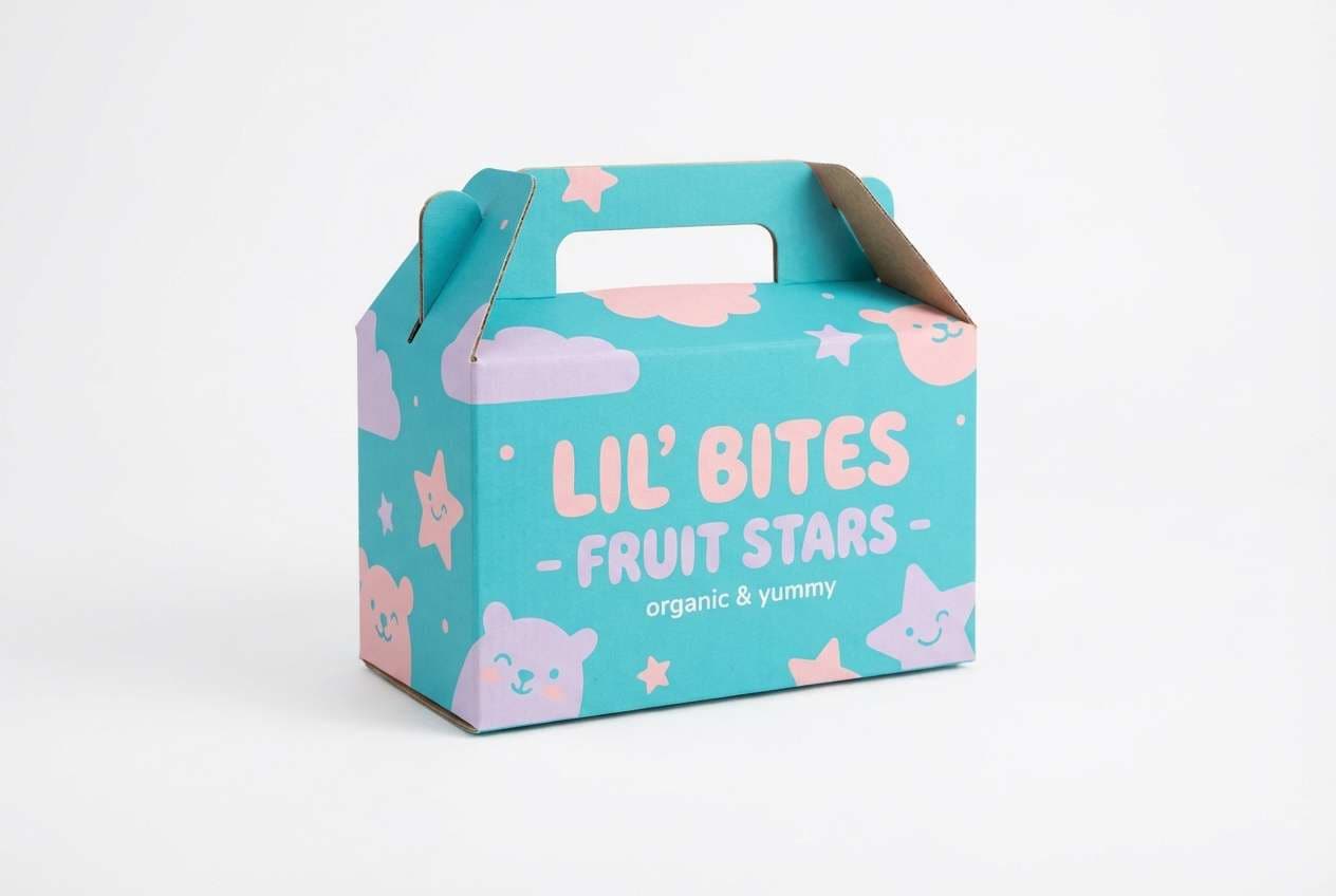
13) Mermaid Pastels
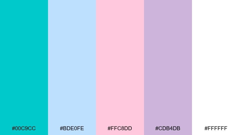
HEX: #00C9CC #BDE0FE #FFC8DD #CDB4DB #FFFFFF
Mood: sweet, dreamy, youthful
Best for: kids brands and playful packaging
Dreamy mermaid pastels feel soft and bubbly, like cotton candy by the shore. Let turquoise lead logos and key shapes, then blend in lavender and blush for friendly supporting tones. Use white generously to keep the palette bright and easy to read on small labels. Tip: choose one pastel as a repeating pattern color so the brand stays consistent across products.
Image example of mermaid pastels generated using media.io
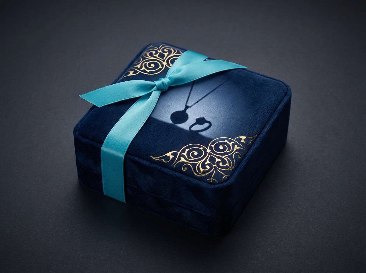
14) Deep Lagoon Luxe
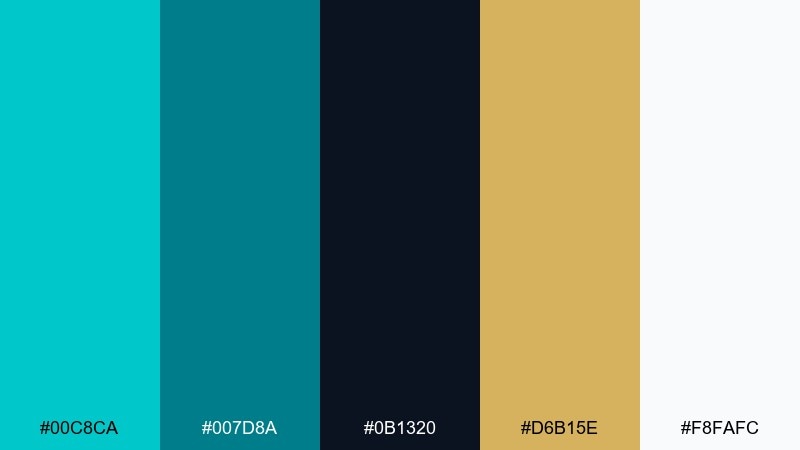
HEX: #00C8CA #007D8A #0B1320 #D6B15E #F8FAFC
Mood: luxurious, moody, polished
Best for: jewelry ads and premium brand identity
Moody lagoon luxe feels like deep water with a flash of gold. This bright turquoise color palette works best when the dark tones dominate and the turquoise appears as a refined highlight. Use gold for premium cues on badges, borders, and pricing, while off-white supports clean negative space. Tip: keep turquoise on thin lines and small details to make the whole look more expensive.
Image example of deep lagoon luxe generated using media.io
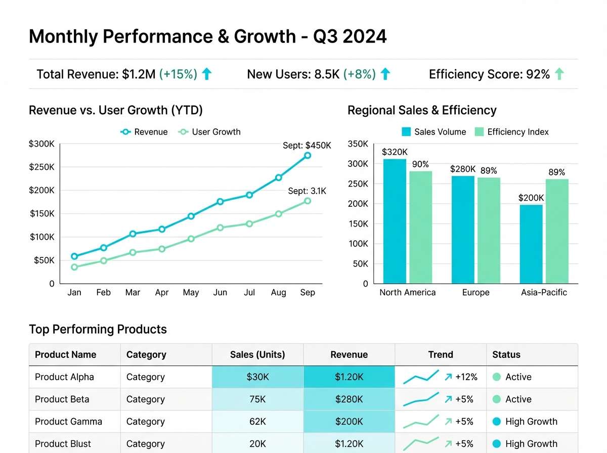
15) Arctic Pool
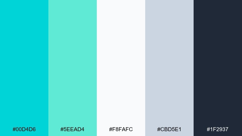
HEX: #00D4D6 #5EEAD4 #F8FAFC #CBD5E1 #1F2937
Mood: crisp, analytical, refreshing
Best for: data visualization and report templates
Crisp arctic tones feel refreshing and precise, like clean air over bright water. These bright turquoise color combinations are ideal for charts because they stay vivid against white without becoming harsh. Use the grays for axes, grid lines, and secondary series, and keep the near-black for labels and titles. Tip: assign turquoise only to the primary metric so comparisons remain easy at a glance.
Image example of arctic pool generated using media.io
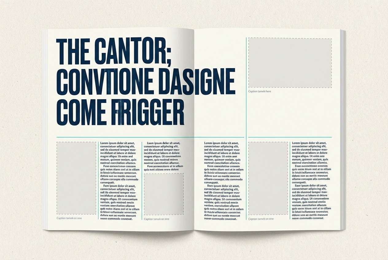
16) Sandbar Neutrals
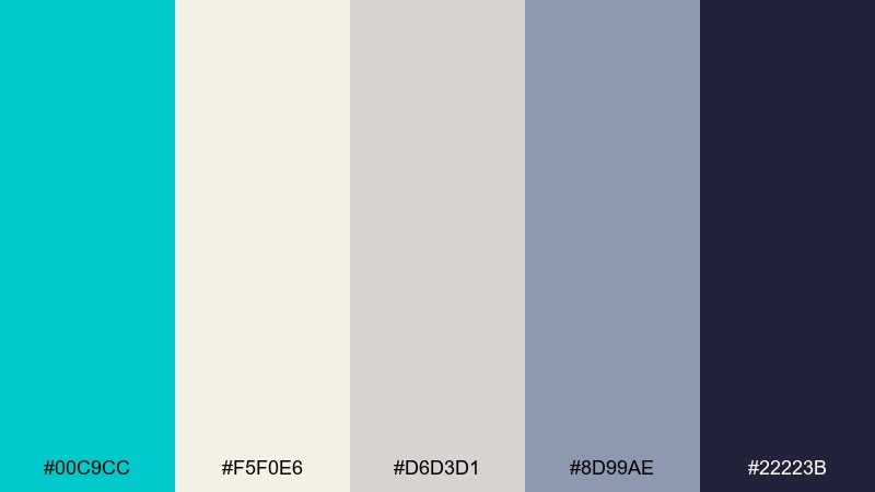
HEX: #00C9CC #F5F0E6 #D6D3D1 #8D99AE #22223B
Mood: calm, editorial, balanced
Best for: magazine layouts and portfolio sites
Calm sandbar neutrals feel like driftwood, pale stone, and a clean shoreline. Use the warm cream for wide margins and whitespace, then bring in turquoise for section markers and small links. The cool gray-blue supports captions and UI chrome, while the deep ink shade keeps titles strong. Tip: set turquoise only on recurring navigation elements for a subtle, signature accent.
Image example of sandbar neutrals generated using media.io
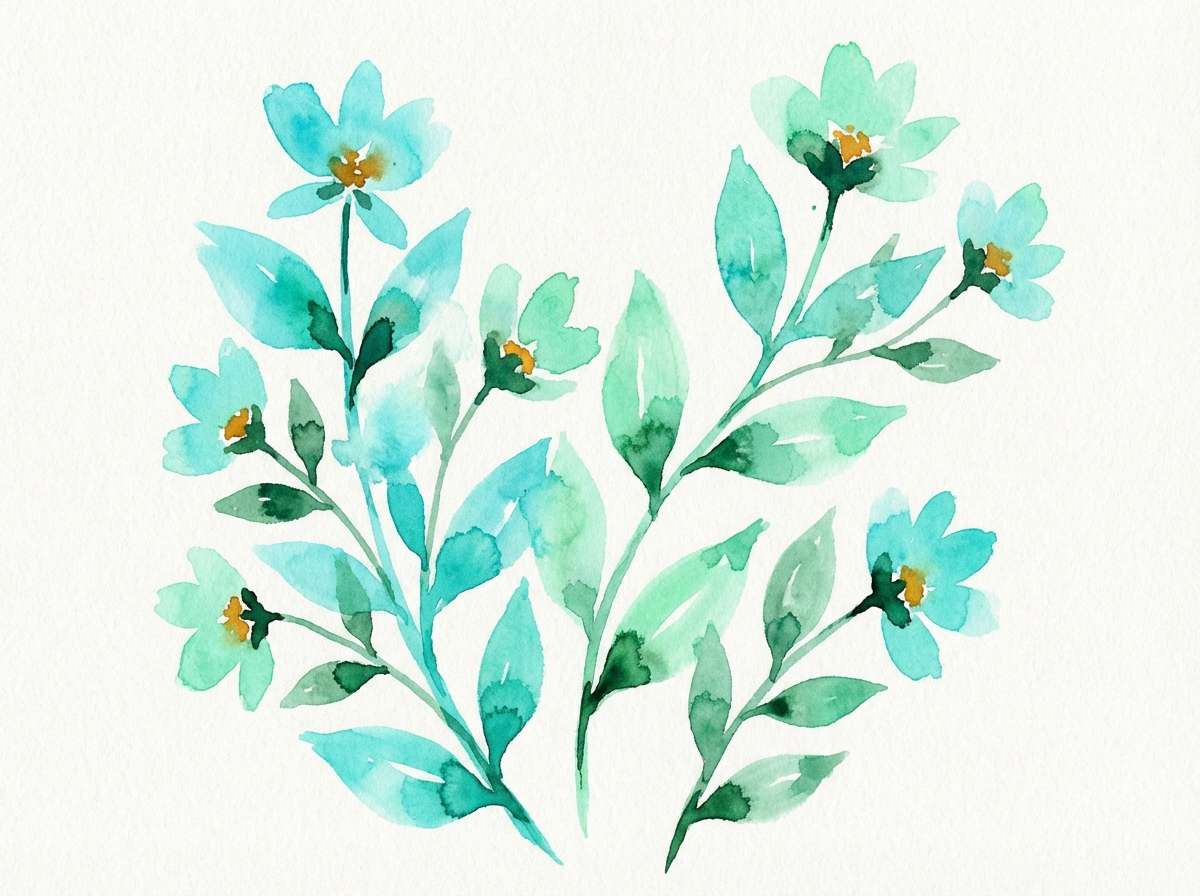
17) Botanical Aqua
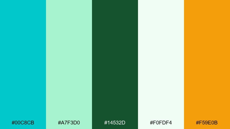
HEX: #00C8CB #A7F3D0 #14532D #F0FDF4 #F59E0B
Mood: fresh, garden-inspired, uplifting
Best for: spring illustrations and eco campaigns
Fresh botanical aqua evokes new leaves, clean water, and morning sunlight. Pair turquoise with deep green for a nature-forward contrast that still feels modern and bright. Use the soft mint and pale green as background washes, then add a small amber touch for flowers or highlights. Tip: keep the amber as tiny focal points so the greens stay dominant and soothing.
Image example of botanical aqua generated using media.io
18) Retro Motel Aqua
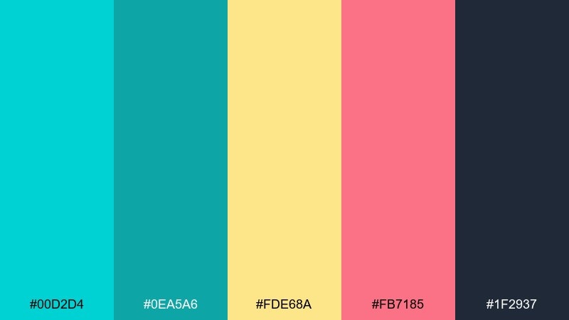
HEX: #00D2D4 #0EA5A6 #FDE68A #FB7185 #1F2937
Mood: retro, fun, nostalgic
Best for: vintage-style posters and merch graphics
Retro motel aqua feels like neon signage, warm evenings, and a hint of nostalgia. Use turquoise and teal for big blocks and outlines, then bring in buttery yellow for highlights and starbursts. The rosy pink adds playful pop for secondary text or badges, while charcoal keeps the design readable. Tip: try thick outlines and simple shapes to capture that classic roadside vibe.
Image example of retro motel aqua generated using media.io

19) Clean Clinic Aqua
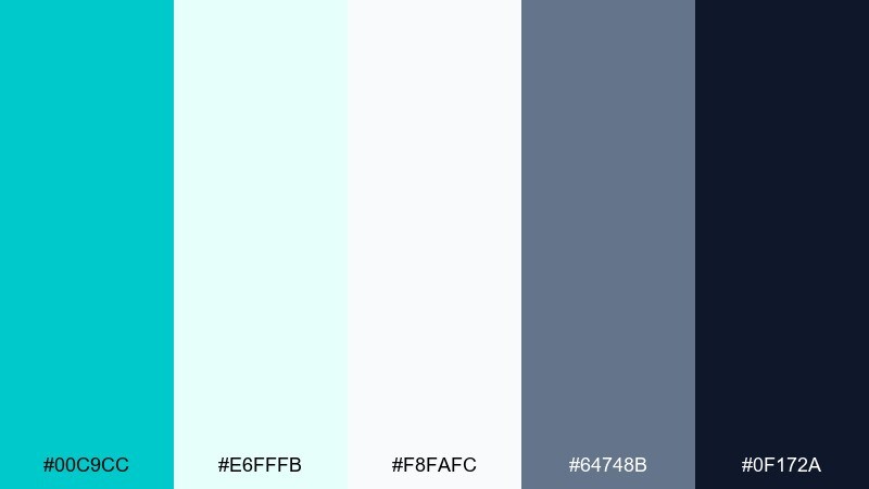
HEX: #00C9CC #E6FFFB #F8FAFC #64748B #0F172A
Mood: trustworthy, hygienic, calm
Best for: healthcare brochures and clinic websites
Clean clinic aqua feels reassuring and hygienic, like fresh linens and bright light. Use the pale aqua as a soft background tone, then apply turquoise for section headers and icons that need quick scanning. Slate and deep navy keep body copy professional and accessible. Tip: reserve the most saturated turquoise for key services or appointment calls to action.
Image example of clean clinic aqua generated using media.io

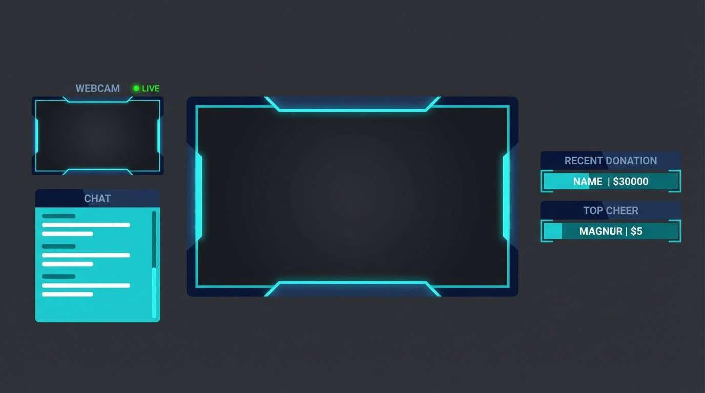
20) Night Swim Contrast
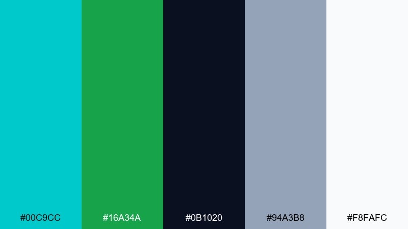
HEX: #00C9CC #16A34A #0B1020 #94A3B8 #F8FAFC
Mood: dramatic, sporty, high-contrast
Best for: gaming stream overlays and esports graphics
Night swim contrast feels fast and dramatic, like ripples under stadium lights. Let the deep navy dominate for a strong backdrop, then use turquoise for panels, frames, and active states. The vivid green adds an energetic secondary signal for wins, status, or live indicators. Tip: keep the overlay elements thin and consistent so the color pops without cluttering gameplay.
Image example of night swim contrast generated using media.io
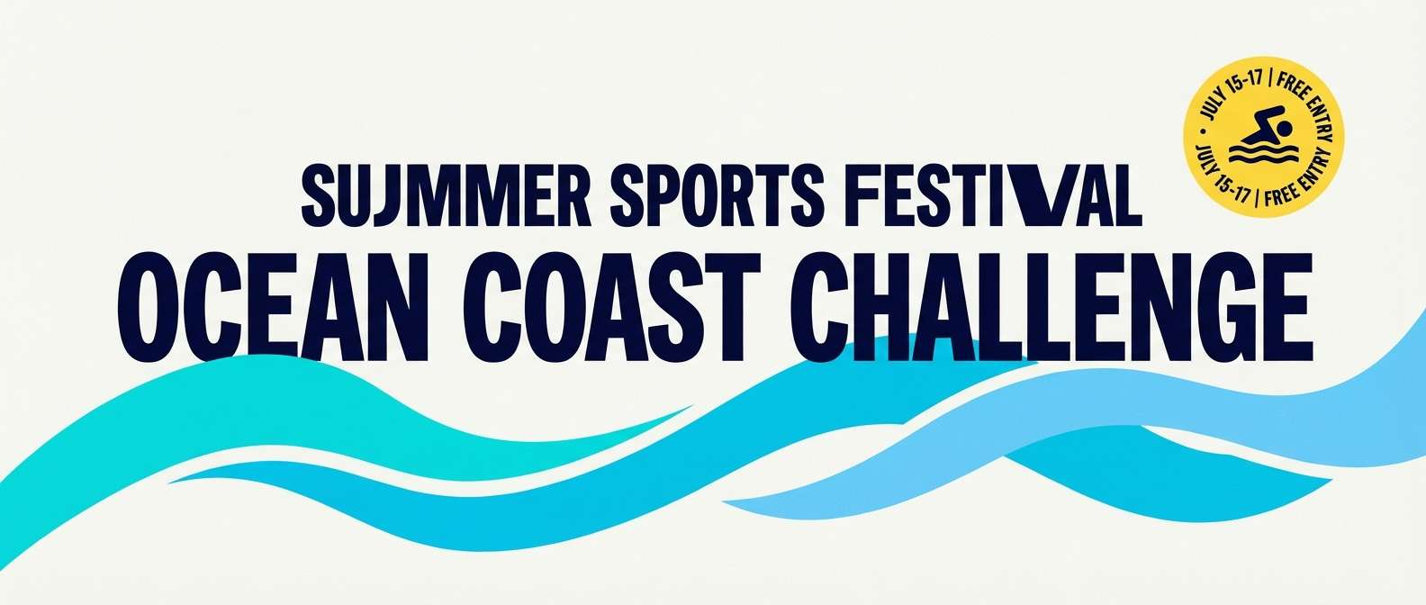
21) Sunlit Marina
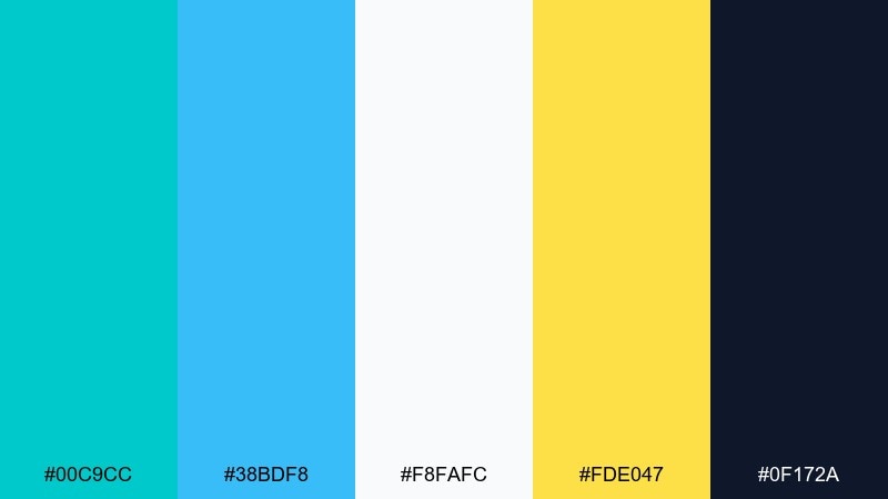
HEX: #00C9CC #38BDF8 #F8FAFC #FDE047 #0F172A
Mood: bright, friendly, outdoorsy
Best for: sports event banners and community campaigns
Sunlit marina tones feel open and optimistic, like blue sky over clear water. Use turquoise for the main banner field and pair it with sky blue for depth in shapes and gradients. The sunny yellow works best as a small highlight for dates, prices, or calls to action. Tip: keep the navy for text so the banner stays readable from a distance.
Image example of sunlit marina generated using media.io
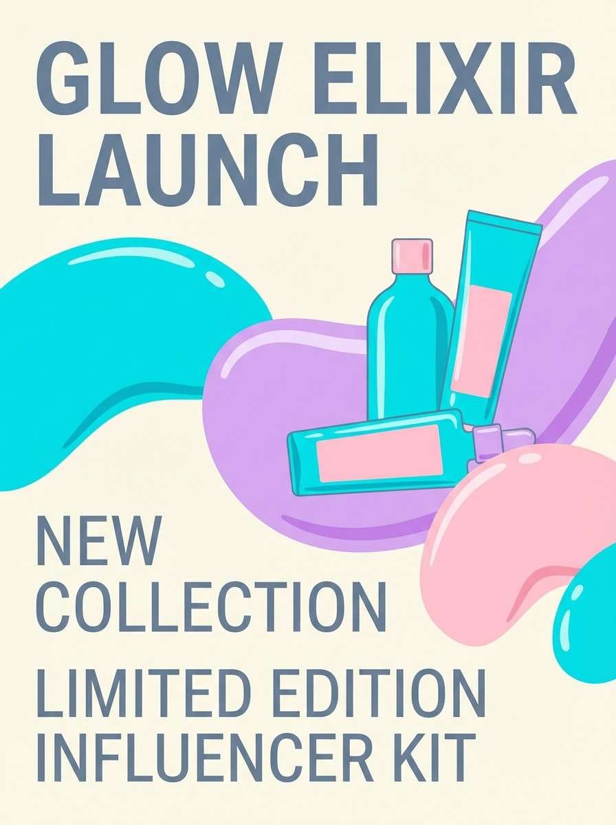
22) Crystal Candy
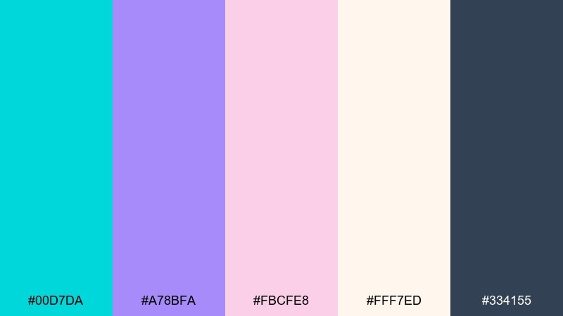
HEX: #00D7DA #A78BFA #FBCFE8 #FFF7ED #334155
Mood: playful, glossy, trendy
Best for: beauty launch posters and influencer kits
Crystal candy feels glossy and fun, like pastel candies under bright studio lights. Use turquoise as the punchy anchor color, then blend lavender and pink for a trendy, youthful vibe. Creamy off-white keeps it from turning too sugary, while slate adds structure for copy. Tip: use big color blocks with one bold headline to make the palette look intentional and premium.
Image example of crystal candy generated using media.io
What Colors Go Well with Bright Turquoise?
Bright turquoise pairs naturally with crisp neutrals like white, off-white, and cool light gray when you want a clean, modern look. For typography and UI structure, deep navy, charcoal, and near-black keep contrast high and readability strong.
For warmer, more expressive palettes, try coral, orange, amber, or sunny yellow as accents—these create a lively “vacation” energy and make CTAs stand out. If you want a nature-forward vibe, olive or deep green balances the coolness and feels grounded.
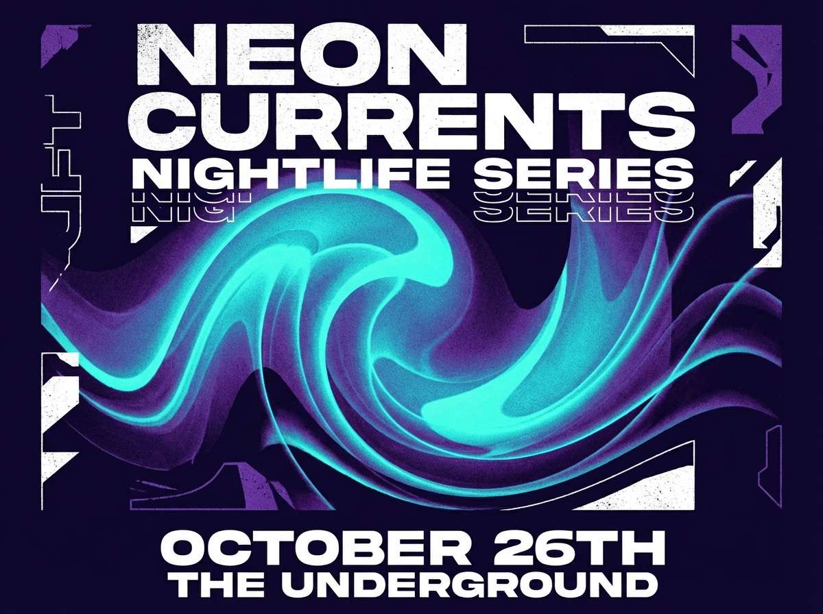
For a more futuristic or nightlife feel, bright turquoise looks great with indigo and purple, especially in dark mode designs where glow-like highlights help information pop.
How to Use a Bright Turquoise Color Combination in Real Designs
Start by choosing one role for turquoise: a hero background, an accent for buttons and links, or a data highlight color. Keeping it consistent prevents the palette from feeling noisy, especially when you add warm accents like coral or orange.
Use neutrals to control intensity. White and pale tints make turquoise feel airy and minimal, while dark navy makes it feel electric and premium. If you’re designing UI, reserve the most saturated turquoise for the most important states (primary CTA, active tab, key metric).
In print and branding, turquoise works best when paired with tactile colors (sand, terracotta, warm browns) or with a disciplined grid and plenty of whitespace—both approaches make the hue feel intentional rather than accidental.
Create Bright Turquoise Palette Visuals with AI
If you want to see these bright turquoise palettes in action, generate mockups quickly with AI—posters, UI screens, packaging shots, mood boards, and more. This helps you validate contrast, mood, and hierarchy before committing to a full design system.
Reuse the prompts above as a starting point, then tweak the subject (e.g., “skincare hero,” “fintech dashboard,” “wedding invitation”) while keeping the same HEX direction. You’ll get consistent visuals for presentations, clients, and A/B variations.
When you find a favorite look, create multiple aspect ratios (1:1, 16:9, 9:16) so your turquoise branding stays cohesive across social, web, and ads.
Bright Turquoise Color Combination FAQs
-
What HEX code is “bright turquoise” usually closest to?
A common bright turquoise anchor is around #00C9CC (a vivid cyan-teal). Depending on the palette, you’ll also see close variations like #00C7C9, #00D1D4, and #00D4D6. -
Is bright turquoise more blue or more green?
Bright turquoise sits between cyan and teal. Some versions lean bluer (more “cyan”), while others lean greener (more “teal”), which is why pairing choices can swing from techy (navy/gray) to tropical (sand/olive). -
What neutral colors work best with bright turquoise?
White and off-white keep it fresh; light cool grays add structure; deep navy or charcoal provide strong contrast for text and UI. These neutrals help the turquoise feel clean rather than overwhelming. -
What accent colors make bright turquoise pop?
Warm accents like coral, orange, amber, and sunny yellow create the strongest complementary punch. For a more modern nightlife style, purple or indigo accents also work well on dark backgrounds. -
Can I use bright turquoise for body text?
It’s usually better as an accent (links, highlights, icons) rather than body text, because saturated turquoise can reduce readability. Use navy/charcoal for text and reserve turquoise for emphasis. -
Does bright turquoise work for professional brands?
Yes—especially for SaaS, fintech, wellness, and healthcare—when balanced with disciplined neutrals and strong typography. Using turquoise as a controlled highlight color often feels more premium than using it everywhere. -
How do I keep a bright turquoise palette from feeling too loud?
Increase whitespace, add soft tints for backgrounds, and limit warm accents to small areas (like one CTA or badge). Also keep a single dark “ink” color for text to maintain a clear hierarchy.
Next: Tea Party Color Palette


