

Blue olive green palettes blend cool, trustworthy blues with grounded olive greens, creating color schemes that feel modern, outdoorsy, and easy to live with.
Below are 20 curated blue olive green color palette ideas with HEX codes, plus practical guidance for pairing accents and using these tones in branding, UI, interiors, and print.
In this article
- Why Blue Olive Green Palettes Work So Well
-
- harbor olive
- mossy denim
- sage nightfall
- rainy grove
- vintage field notes
- coastal eucalyptus
- library jacket
- juniper minimal ui
- olive ink poster
- stormy succulent
- canyon sky
- botanical blueprint
- modern cabin interior
- eco skincare packaging
- museum editorial spread
- ivy chalkboard menu
- summer dusk invitation
- retro sport badge
- quiet lakehouse
- urban garden website
- What Colors Go Well with Blue Olive Green?
- How to Use a Blue Olive Green Color Palette in Real Designs
- Create Blue Olive Green Palette Visuals with AI
Why Blue Olive Green Palettes Work So Well
Blue and olive green balance each other naturally: blue brings clarity, calm, and structure, while olive adds warmth, earthiness, and a subtle organic feel. Together, they create palettes that look stable rather than trendy.
Because both families can be muted without turning dull, blue olive green color schemes hold up across digital and print. They also make it easy to build hierarchy: deep navy for anchors, mid blues/teals for functional UI color, and olive for intentional emphasis.
Most importantly, these palettes pair beautifully with off-whites, parchment beiges, and soft grays—so your designs can feel premium and breathable while still having strong contrast where it matters.
20+ Blue Olive Green Color Palette Ideas (with HEX Codes)
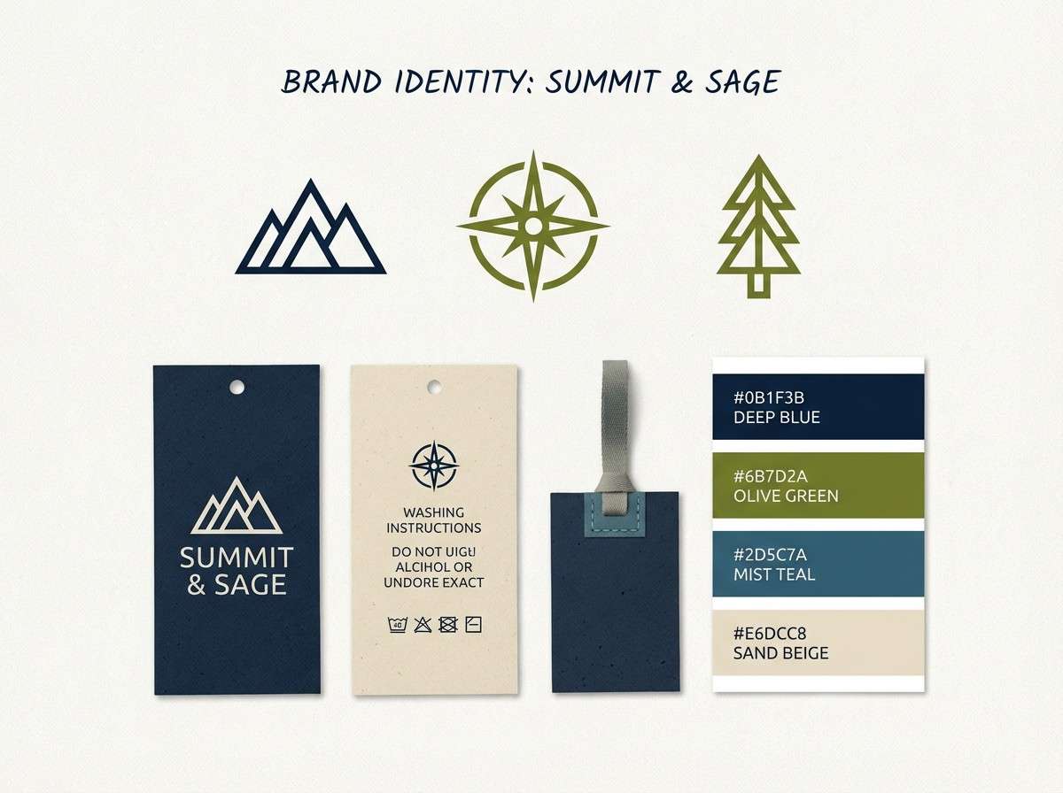
1) Harbor Olive
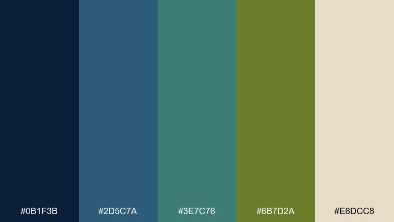
HEX: #0B1F3B #2D5C7A #3E7C76 #6B7D2A #E6DCC8
Mood: calm, nautical, grounded
Best for: outdoor apparel branding
Calm and seaworthy, these tones feel like weathered docks, deep water, and sun-faded canvas. Use the navy as your anchor, then let olive and teal carry secondary blocks and labels. Pair with warm sand for breathable negative space and add matte black only for tiny type. Tip: keep logos simple and bold so the olive reads cleanly at small sizes.
Image example of harbor olive generated using media.io
Media.io is an online AI studio for creating and editing video, image, and audio in your browser.

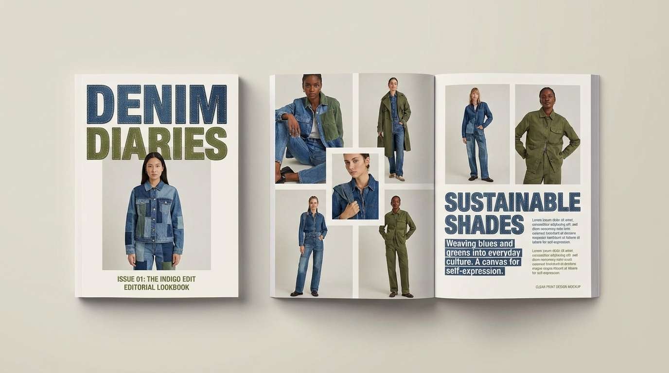
2) Mossy Denim
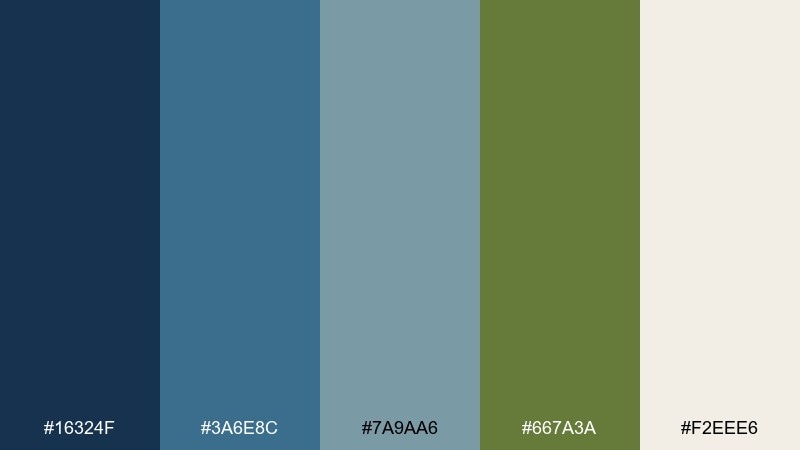
HEX: #16324F #3A6E8C #7A9AA6 #667A3A #F2EEE6
Mood: relaxed, casual, heritage
Best for: denim label and lookbook
Relaxed and worn-in, the blues read like softened denim while the olive feels like field jackets and canvas straps. Use the mid blue for big panels, then drop in moss for trims, badges, and stitching cues. Off-white keeps pages airy, especially for product photography margins. Tip: use the pale blue-gray for tables and size guides so the layout stays light.
Image example of mossy denim generated using media.io
3) Sage Nightfall
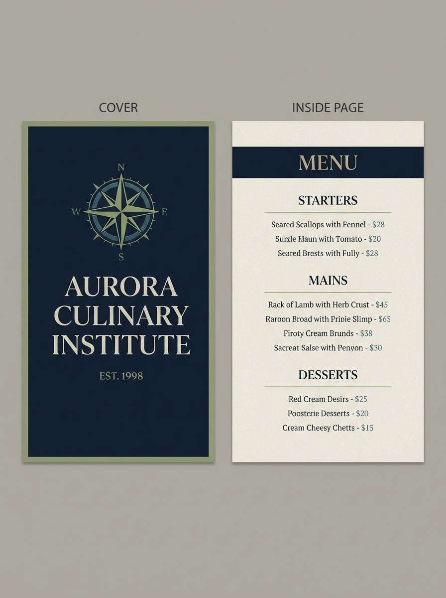
HEX: #101A2B #274B63 #4E7A6A #8A9B5A #D7D2C4
Mood: quiet, cinematic, refined
Best for: restaurant menu design
Quiet and cinematic, the dark base feels like evening light with sage drifting through. Put the near-black navy behind headings to create instant contrast, then use olive for section dividers and key dishes. The warm gray-beige keeps menus readable without looking stark. Tip: print on uncoated stock so the greens stay sophisticated rather than glossy.
Image example of sage nightfall generated using media.io
4) Rainy Grove
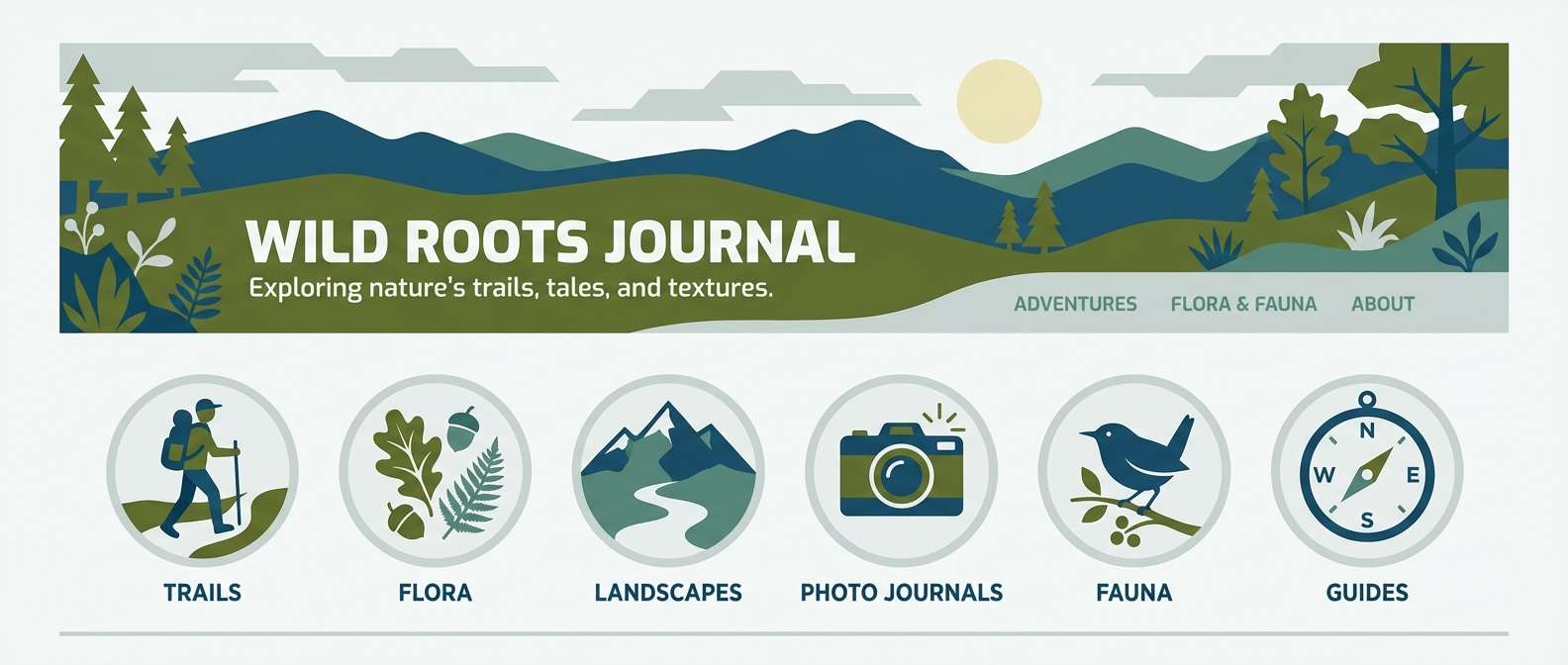
HEX: #1B2A41 #365F7D #5D8A7C #556B2F #C9D2D0
Mood: fresh, rainy-day, natural
Best for: eco blog header and icons
Fresh and misty, the mix evokes rain on leaves and a cool sky between trees. Use the slate-blue for hero headers, then bring in muted teal for icons and section highlights. Olive works best as a sparing accent for buttons or category tags. Tip: keep backgrounds in the soft gray-green so your content stays legible and calm.
Image example of rainy grove generated using media.io
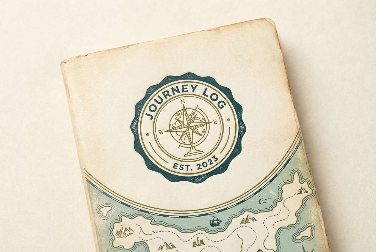
5) Vintage Field Notes
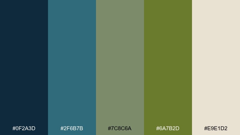
HEX: #0F2A3D #2F6B7B #7C8C6A #6A7B2D #E9E1D2
Mood: rugged, nostalgic, outdoorsy
Best for: travel journal cover
Rugged and nostalgic, these shades feel like ink sketches, canvas packs, and pressed leaves between pages. The blue-leaning teal makes a strong cover base, while olive reads perfectly for stamps, lines, and small emblems. For blue olive green color combinations that look timeless, add the cream as a paper substitute and avoid pure white. Tip: use the muted sage as a quiet midtone for maps and sidebar blocks.
Image example of vintage field notes generated using media.io
6) Coastal Eucalyptus
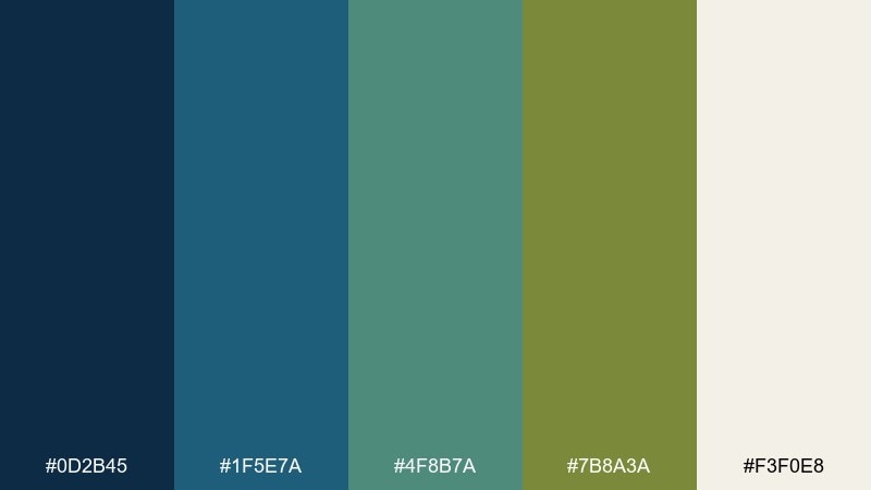
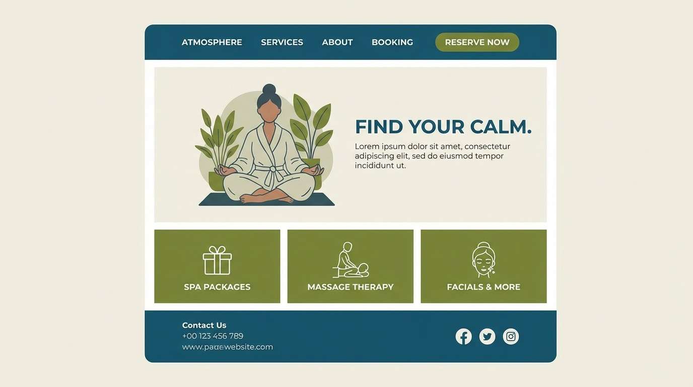
HEX: #0D2B45 #1F5E7A #4F8B7A #7B8A3A #F3F0E8
Mood: clean, breezy, modern-organic
Best for: spa landing page
Clean and breezy, the palette reads like cool ocean air mixed with eucalyptus leaves. Use the deep blue for navigation and footers, then lean on teal for large calming sections. Olive shines as a gentle call-to-action color when paired with plenty of off-white. Tip: keep button text dark and weights slightly heavier so the softer greens still pass contrast.
Image example of coastal eucalyptus generated using media.io
7) Library Jacket
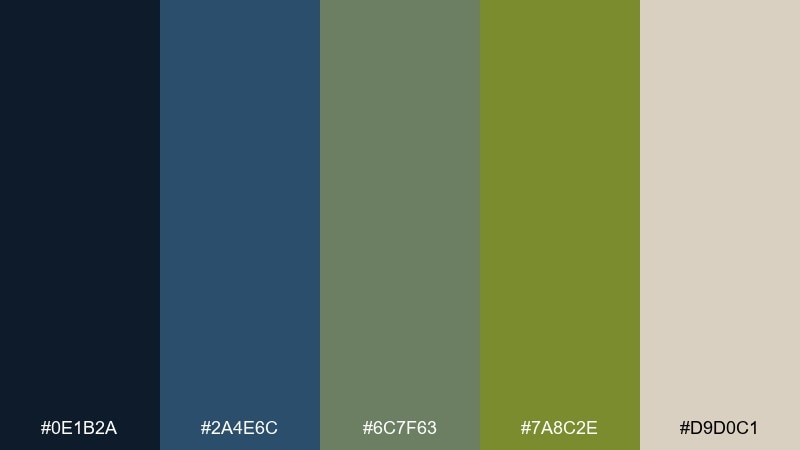
HEX: #0E1B2A #2A4E6C #6C7F63 #7A8C2E #D9D0C1
Mood: scholarly, warm, classic
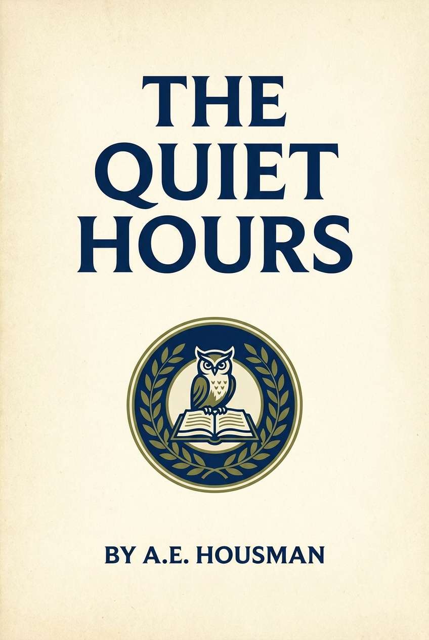
Best for: book cover design
Scholarly and warm, the blue olive green tones suggest old hardcovers, quiet stacks, and a hint of botanical ink. A dark navy title band feels confident, while olive brings a tasteful accent for rules, badges, or small illustrations. When you need a blue olive green color palette that feels literary, keep the background in the parchment beige and avoid glossy gradients. Tip: choose one accent only per cover so the hierarchy stays crisp.
Image example of library jacket generated using media.io
8) Juniper Minimal UI
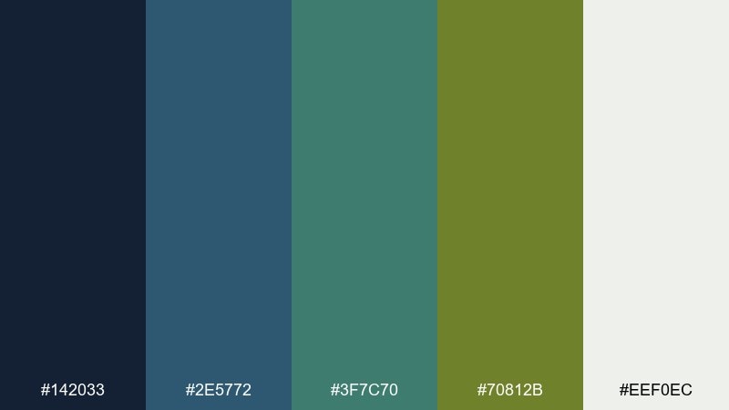
HEX: #142033 #2E5772 #3F7C70 #70812B #EEF0EC
Mood: focused, techy, understated
Best for: analytics dashboard UI
Focused and understated, these colors feel like a late-night dashboard with nature-inspired restraint. Use the near-black blue for the sidebar and top bar, then keep content areas light with a soft off-white. Teal is ideal for charts, while olive works for success states and active tabs. Tip: reserve the olive for the most important actions so it stays noticeable but not loud.
Image example of juniper minimal ui generated using media.io

9) Olive Ink Poster
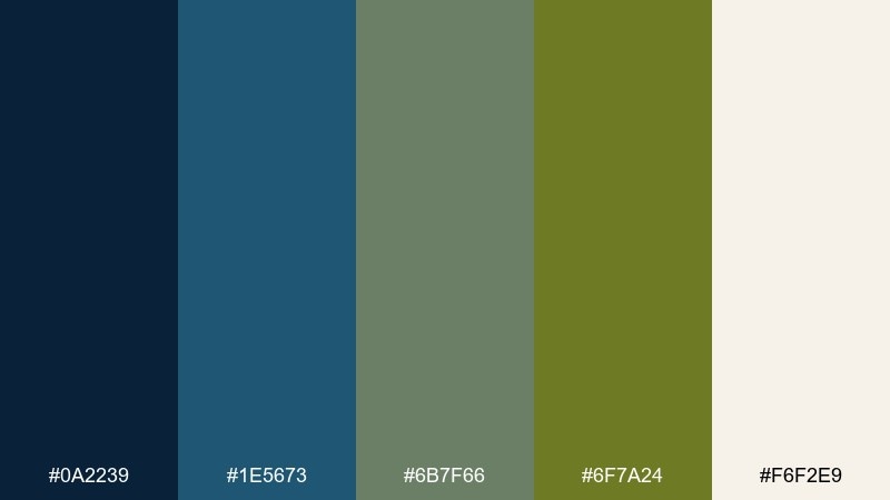
HEX: #0A2239 #1E5673 #6B7F66 #6F7A24 #F6F2E9
Mood: bold, graphic, artsy
Best for: gig poster
Bold and graphic, the inky blues feel like screen print layers with olive as the punchy overlay. Set large type in the deep blue, then drop olive behind key details for instant emphasis. Keep the background warm and light so the contrast stays sharp from a distance. Tip: limit yourself to two ink-like blocks and one accent outline for a true poster look.
Image example of olive ink poster generated using media.io
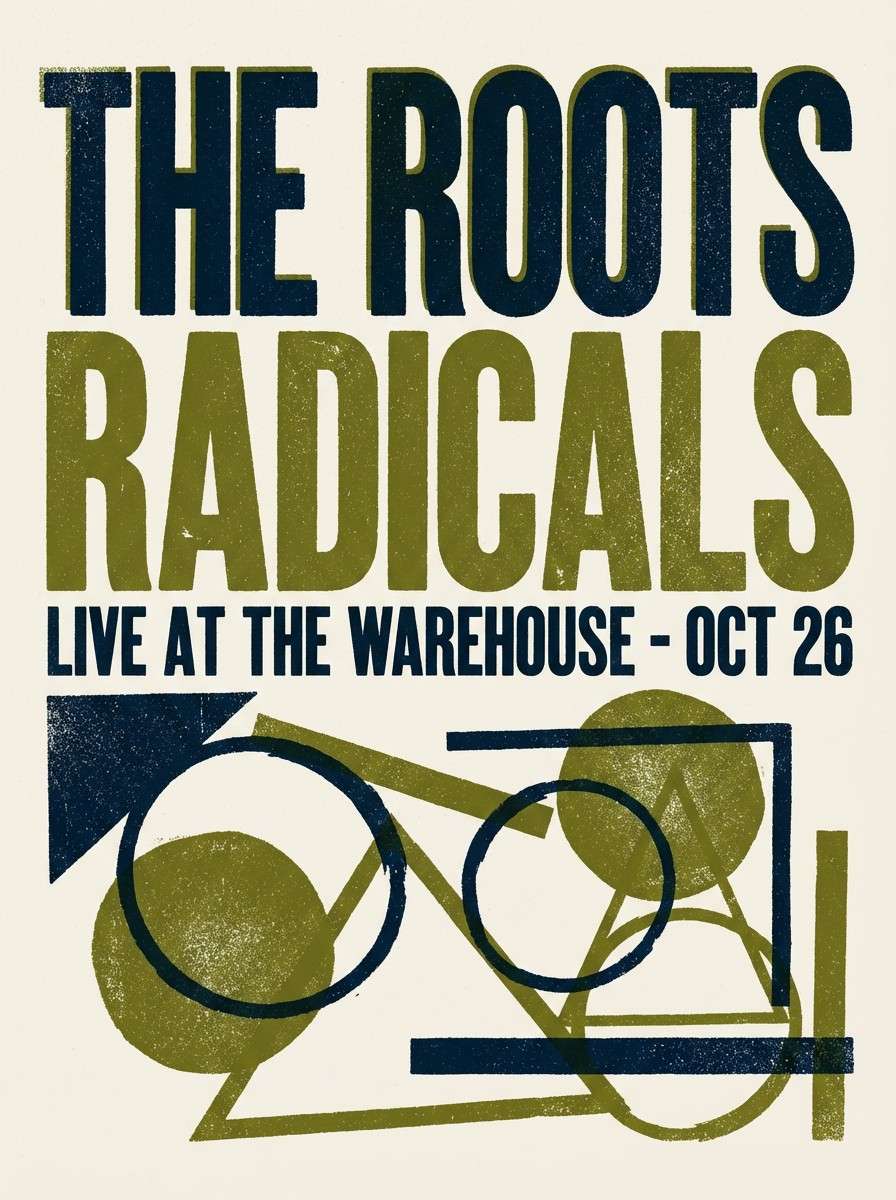
10) Stormy Succulent
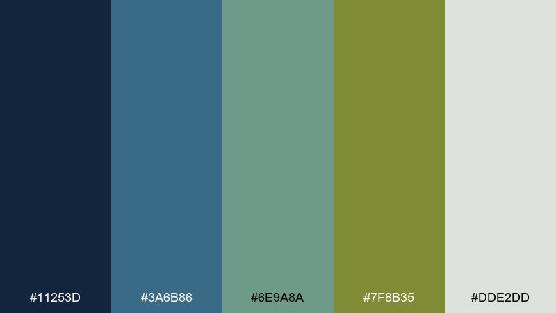
HEX: #11253D #3A6B86 #6E9A8A #7F8B35 #DDE2DD
Mood: cool, botanical, contemporary
Best for: plant shop signage
Cool and botanical, the colors evoke succulents after a storm with soft, damp shadows. Use the mid blue for sign headers and the sage-teal for supporting panels. Olive is perfect for price tags and callouts because it reads natural without looking pastel. Tip: keep typography simple and slightly condensed to match the modern, greenhouse vibe.
Image example of stormy succulent generated using media.io
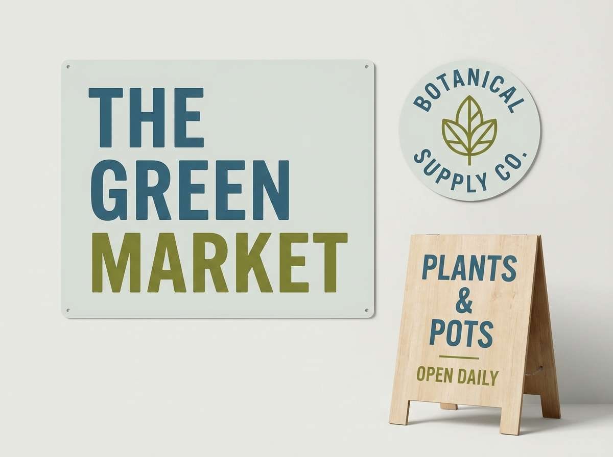
11) Canyon Sky
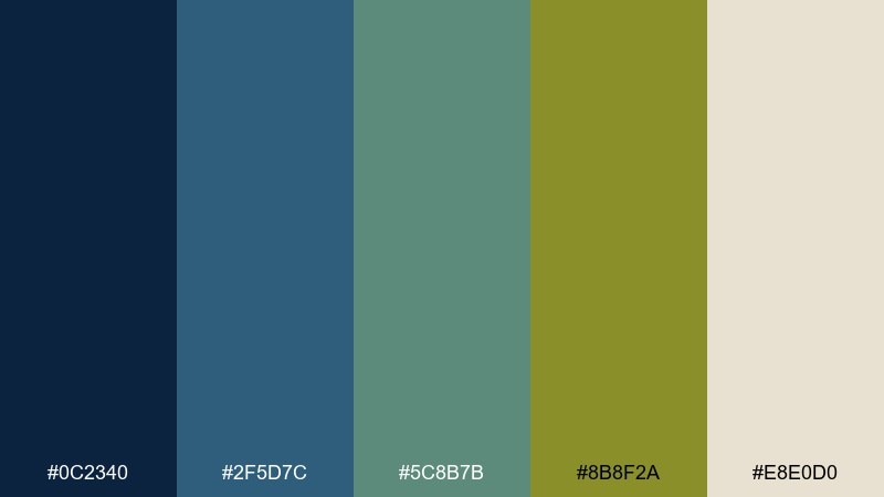
HEX: #0C2340 #2F5D7C #5C8B7B #8B8F2A #E8E0D0
Mood: adventurous, open-air, balanced
Best for: travel app onboarding screens
Adventurous and open-air, the palette feels like high cliffs under a cool sky with scrubby greens below. Keep onboarding backgrounds light and warm, then use the deeper blues for headings and progress indicators. Olive makes a strong highlight for primary buttons when the rest of the interface stays muted. Tip: repeat the teal on illustrations so the screens feel cohesive from step to step.
Image example of canyon sky generated using media.io
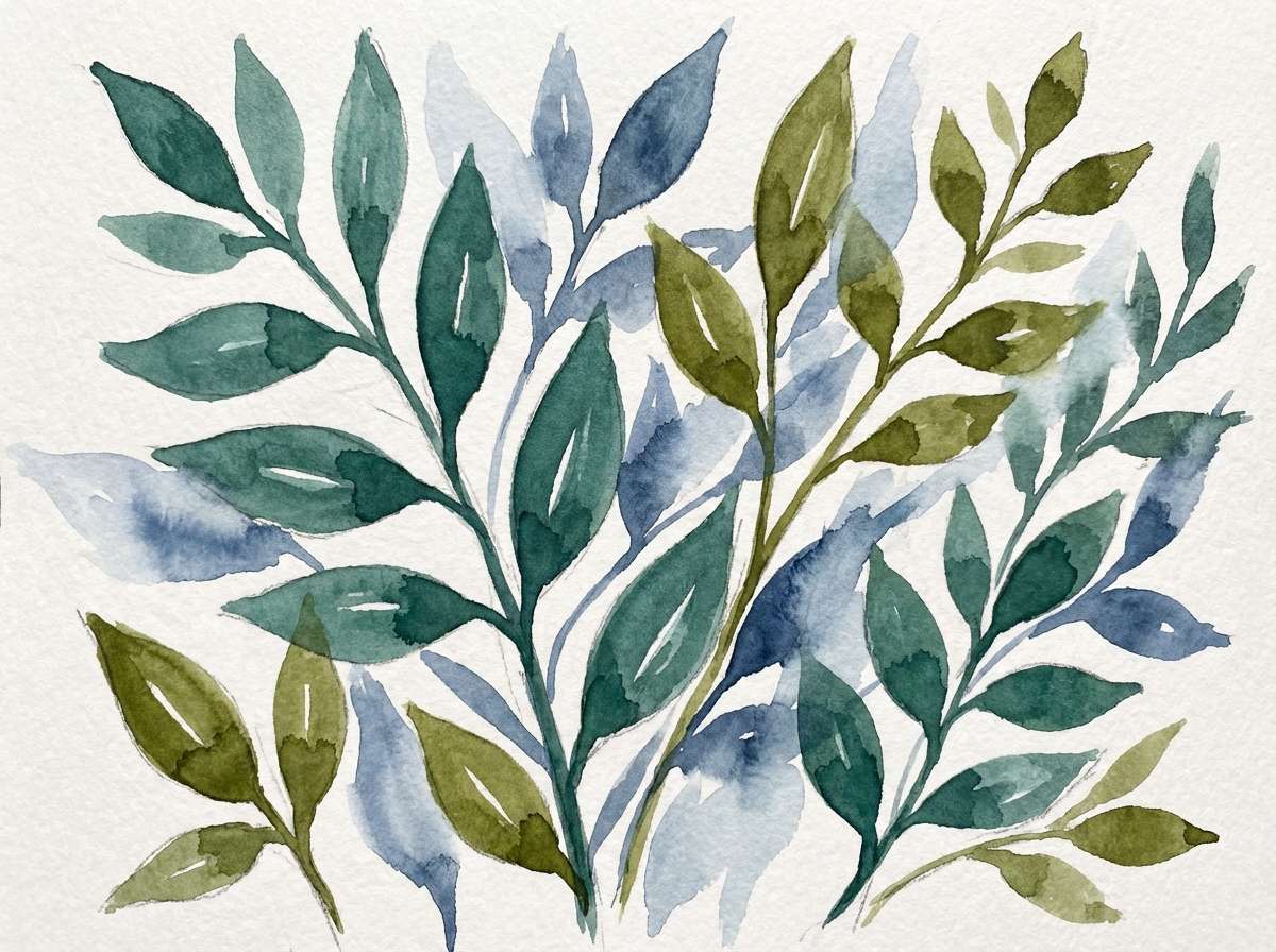
12) Botanical Blueprint
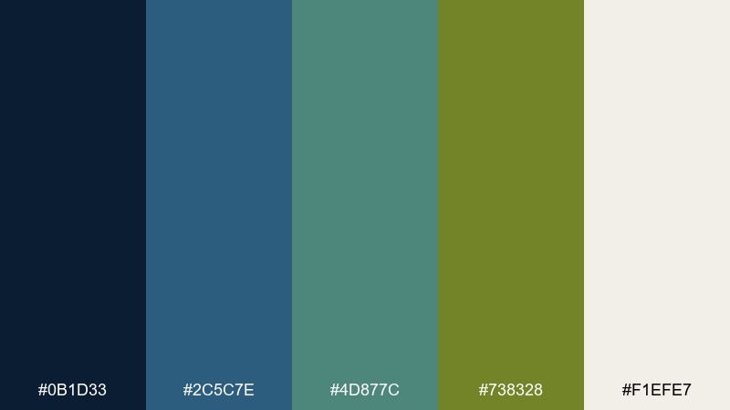
HEX: #0B1D33 #2C5C7E #4D877C #738328 #F1EFE7
Mood: artful, nature-study, serene
Best for: watercolor botanical illustration
Artful and serene, the mix suggests a botanical study painted over a blueprint-like wash. Let the soft off-white act as paper, then layer teal and steel-blue as gentle shadows and veins. Olive works beautifully for stems and small details without turning neon. Tip: keep edges slightly textured to maintain the hand-painted feel.
Image example of botanical blueprint generated using media.io
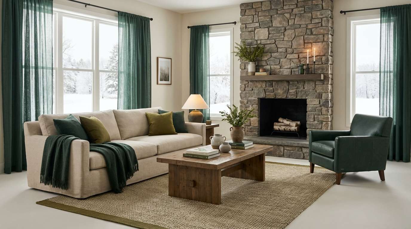
13) Modern Cabin Interior
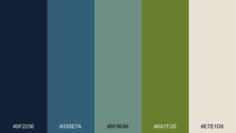
HEX: #0F2236 #335E7A #6F8E86 #6A7F2D #E7E1D6
Mood: cozy, modern-rustic, soothing
Best for: living room interior concept
Cozy and modern-rustic, these tones feel like a lake cabin with clean lines and soft textiles. Use the warm off-white on walls, then bring the blues into upholstery, rugs, or built-ins for depth. Olive is a great accent for plants, throw pillows, or painted cabinetry. Tip: repeat the deepest blue in small touches like frames to keep the room grounded.
Image example of modern cabin interior generated using media.io
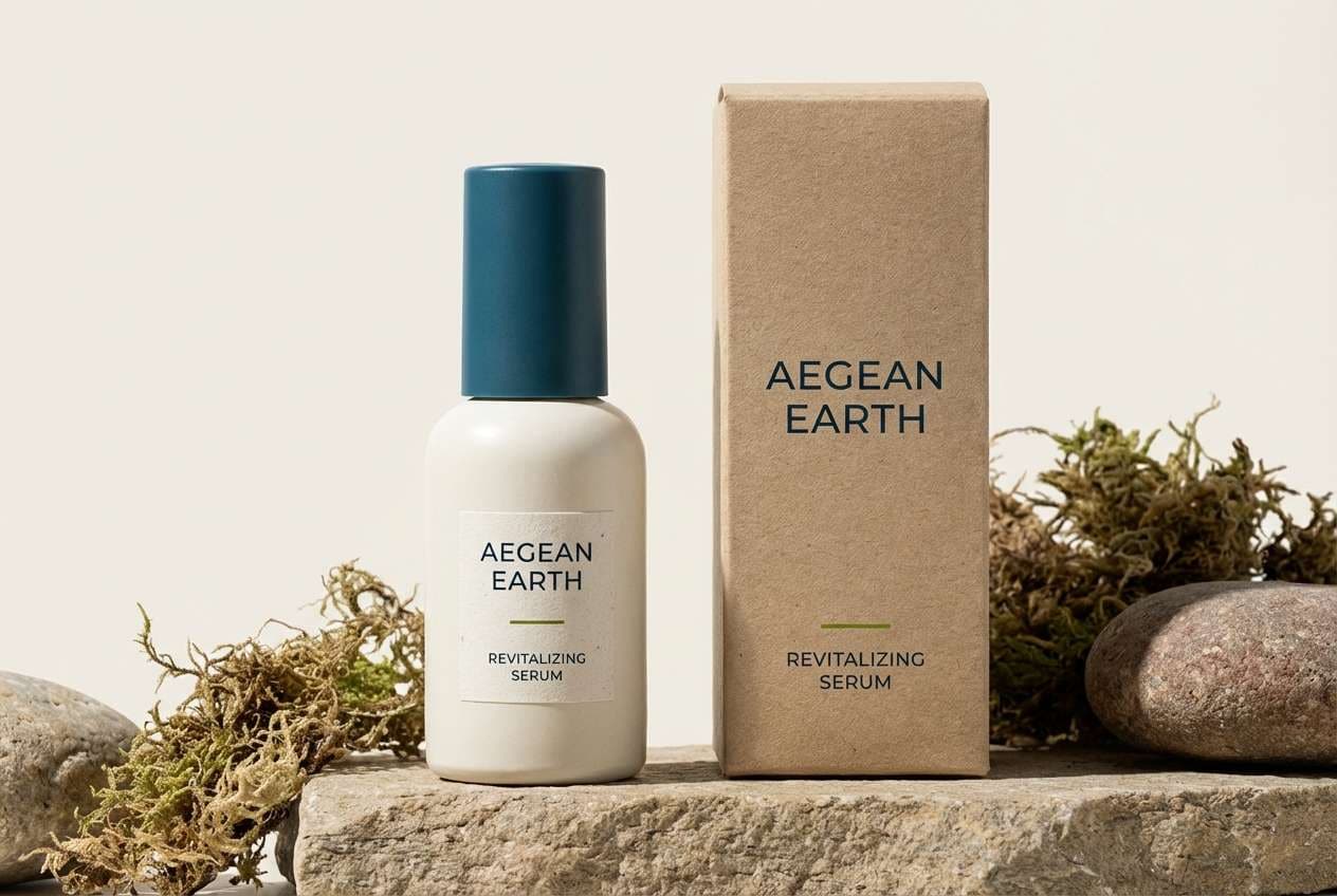
14) Eco Skincare Packaging
HEX: #0E2A47 #2C6B86 #5E8F82 #7A8B2B #F5F1E8
Mood: fresh, trustworthy, clean
Best for: skincare bottle and box packaging
Fresh and trustworthy, the colors suggest clean water, botanicals, and lab-level clarity. Use the off-white as the main label and box base, then apply teal for brand blocks and product ranges. For blue olive green color combinations that look premium, keep olive for small seals, icons, and key benefits instead of full backgrounds. Tip: choose a satin finish so the darker blue stays rich without glare.
Image example of eco skincare packaging generated using media.io
15) Museum Editorial Spread
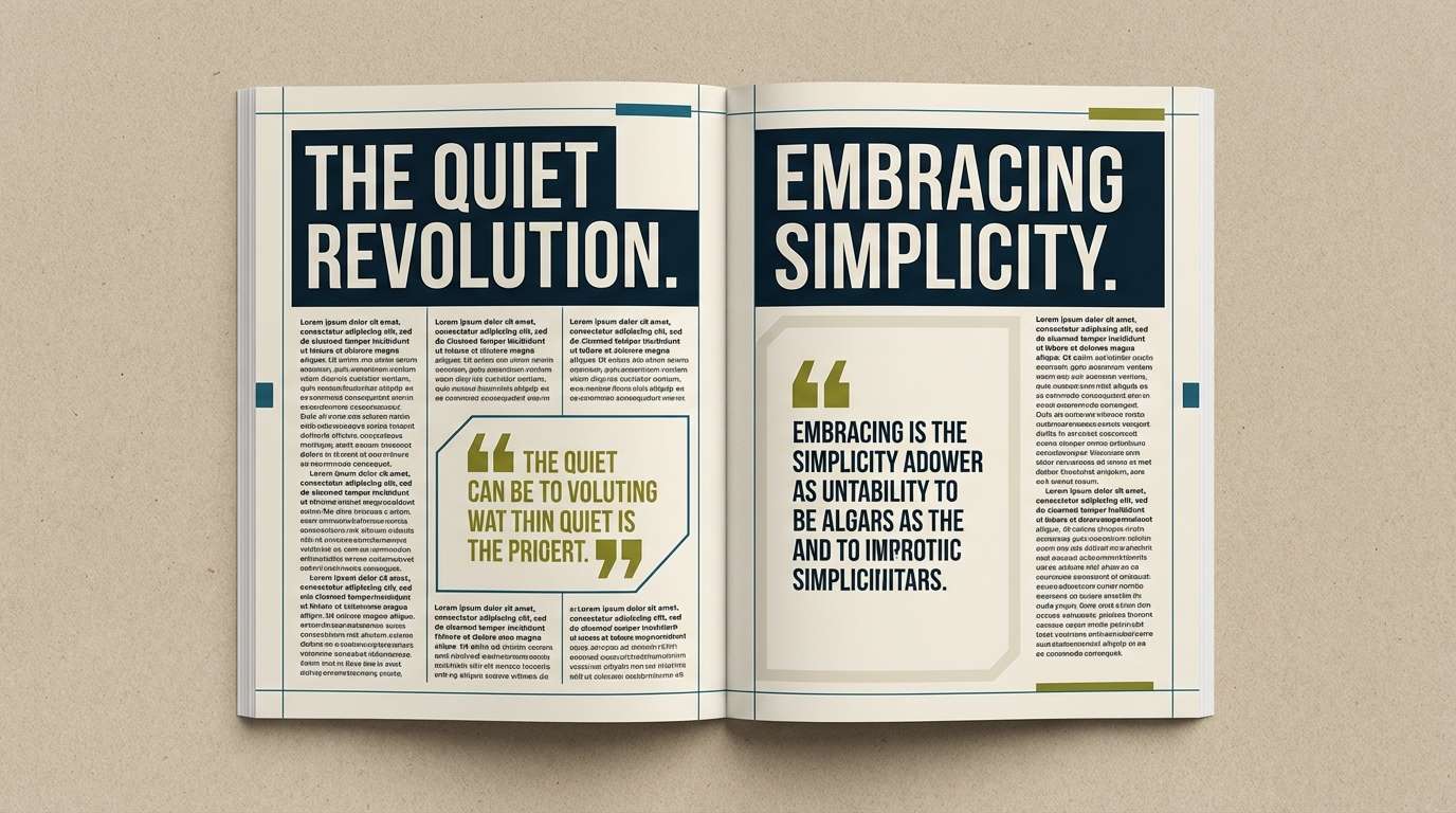
HEX: #0D1F2D #2C556E #6A8575 #7E8A2D #E4DED1
Mood: curated, intellectual, elegant
Best for: magazine feature layout
Curated and elegant, the palette feels like an exhibition catalog with quiet confidence. Use the deep ink tone for headings and captions, then set body copy on the warm beige for comfort. Sage and slate-blue can frame pull quotes and sidebars without distracting from photography. Tip: keep olive as a thin rule or tiny icon color to preserve the editorial sophistication.
Image example of museum editorial spread generated using media.io
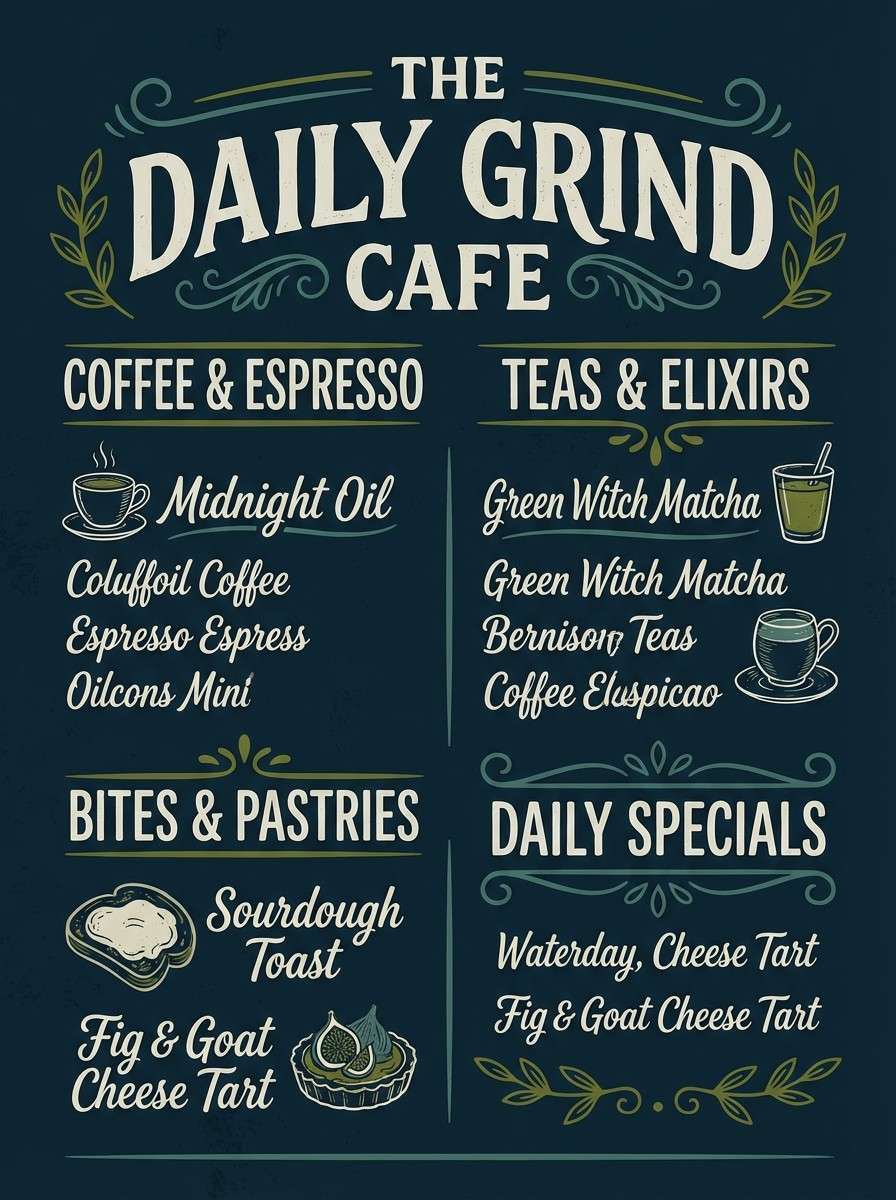
16) Ivy Chalkboard Menu
HEX: #0B1E2A #284D67 #4D766D #687A2A #D8D6CC
Mood: handcrafted, cozy, market-fresh
Best for: cafe chalkboard menu poster
Handcrafted and cozy, these tones evoke a chalkboard sign with ivy creeping around the edges. Use the darkest blue as your board color, then bring in the light gray for chalk-like typography. Olive and teal work as accent strokes for specials, icons, and little illustrations. Tip: keep accent colors to one or two highlights so it still feels hand-drawn and legible.
Image example of ivy chalkboard menu generated using media.io
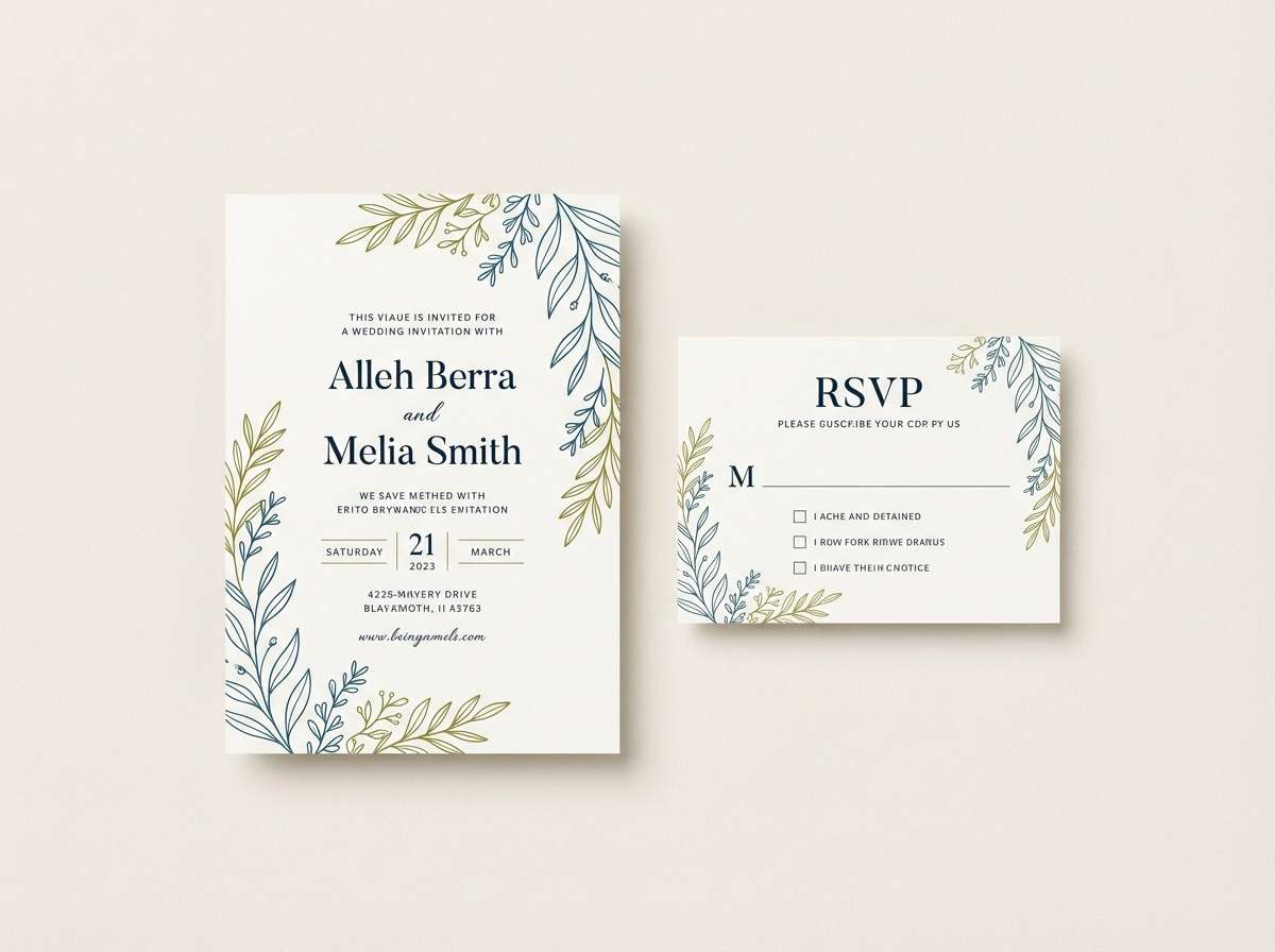
17) Summer Dusk Invitation
HEX: #10253F #3B6E86 #7AA091 #7A862C #F4EFE5
Mood: romantic, airy, botanical
Best for: wedding invitation suite
Romantic and airy, the colors feel like dusk light over garden greens. Use the warm off-white as the paper tone, then set typography in the deep blue for classic readability. Add teal for monograms or borders, and keep olive to small botanical line art for a refined finish. Tip: letterpress or subtle embossing pairs beautifully with the muted greens.
Image example of summer dusk invitation generated using media.io
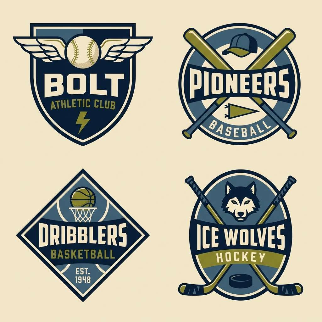
18) Retro Sport Badge
HEX: #0A1B33 #2E5F7F #3E7E73 #7F8C28 #EADFCB
Mood: energetic, vintage, bold
Best for: team badge and merch
Energetic and vintage, the hues look like an old enamel pin with rich shadows and a sunlit backing. Use the cream as your base for patches, then layer navy and mid blue for outlines and depth. Olive brings a punchy highlight that still feels earthy and classic. Tip: simplify shapes and increase stroke weight so embroidery and screen print hold up.
Image example of retro sport badge generated using media.io
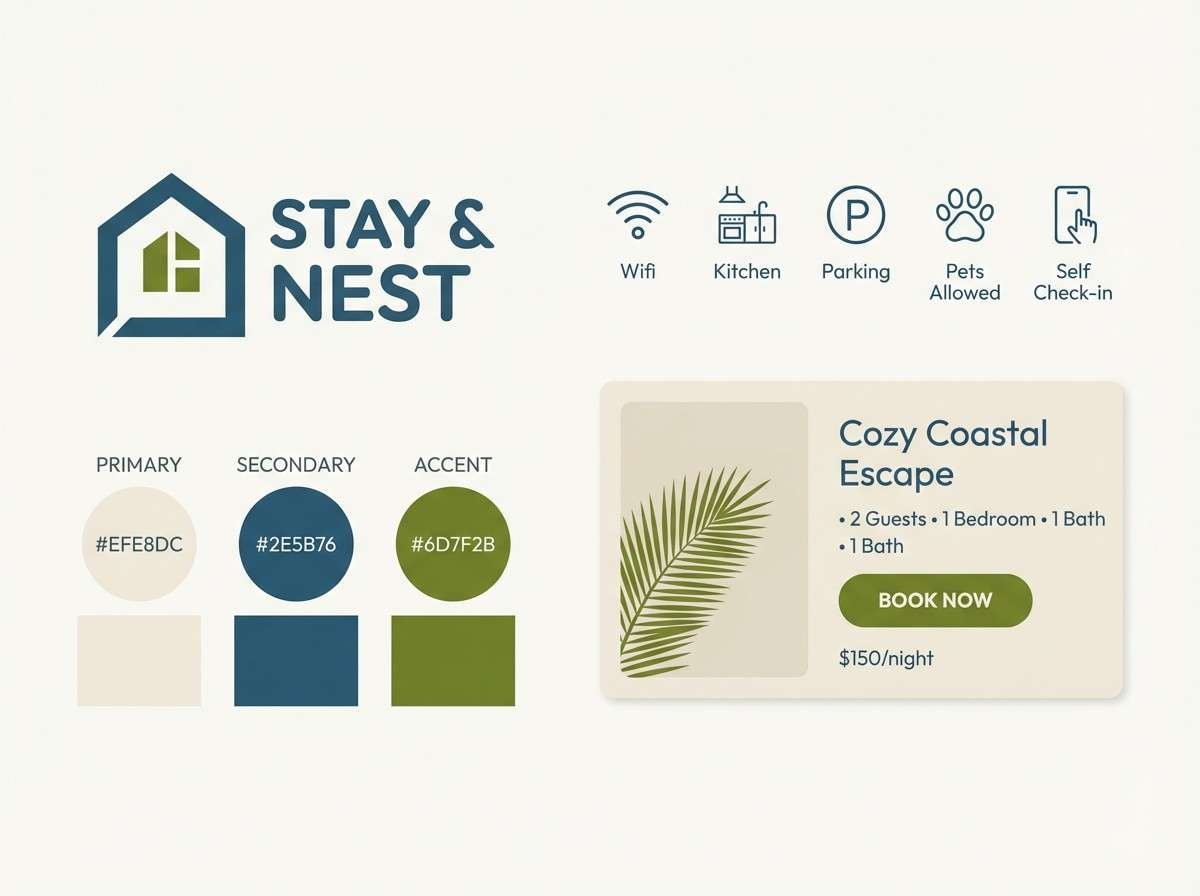
19) Quiet Lakehouse
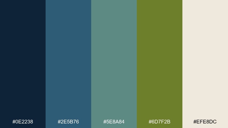
HEX: #0E2238 #2E5B76 #5E8A84 #6D7F2B #EFE8DC
Mood: peaceful, lived-in, natural
Best for: Airbnb listing brand kit
Peaceful and lived-in, the tones suggest still water, weathered wood, and soft morning light. Use the light neutral for templates and photography margins, then let the blues frame headings and section labels. Olive works well for small badges like pet-friendly or lake view without looking too loud. Tip: keep iconography simple and rounded to match the relaxed vibe.
Image example of quiet lakehouse generated using media.io
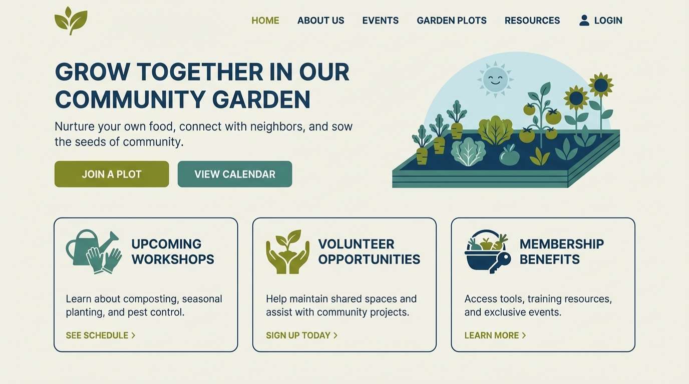
20) Urban Garden Website
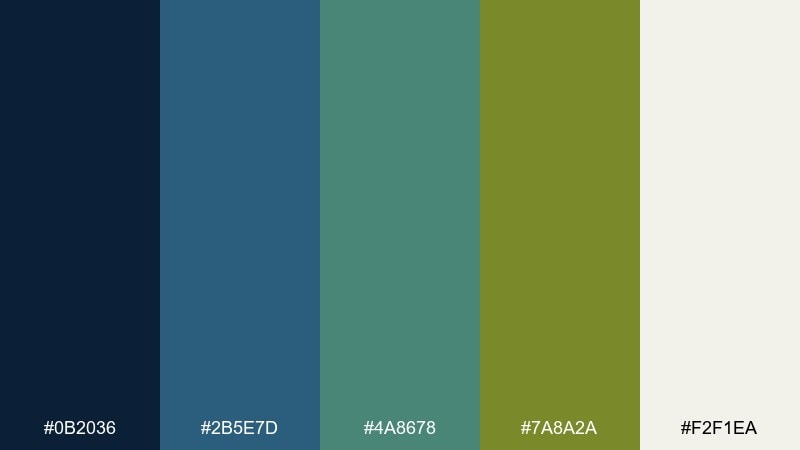
HEX: #0B2036 #2B5E7D #4A8678 #7A8A2A #F2F1EA
Mood: fresh, modern, city-nature
Best for: community garden website homepage
Fresh and modern, these tones feel like a city garden tucked between concrete and sky. Use the deep blue for headers and footer depth, then bring teal into cards and illustration accents. When a blue olive green color palette needs to feel current, keep the off-white dominant and use olive only for primary actions and active states. Tip: add generous spacing so the darker hues never make the page feel heavy.
Image example of urban garden website generated using media.io
What Colors Go Well with Blue Olive Green?
Soft neutrals are the easiest match: warm off-white, parchment, sand, and greige help blue olive green palettes feel spacious and premium. They also prevent the scheme from getting too cold or too heavy.
For accents, choose one direction: warm accents like terracotta, clay, or brass add autumn warmth, while cool accents like icy gray-blue or muted aqua keep things coastal and modern. If you need a sharper “pop,” use small doses of mustard or copper rather than high-saturation neon tones.
For type and outlines, deep navy or near-black blue usually looks more cohesive than pure black, especially in UI and editorial layouts.
How to Use a Blue Olive Green Color Palette in Real Designs
Start with a clear role system: use the darkest navy for headers/footers or headline blocks, the mid blues/teals for secondary surfaces and visuals (charts, icons, panels), and reserve olive for calls-to-action or key labels. This keeps the palette intentional instead of evenly “striped.”
In print and packaging, choose warmer paper-like backgrounds (cream, beige, off-white) so olive looks natural and sophisticated. In interiors, treat blue as the grounding element (built-ins, textiles) and bring olive in as smaller repeatable accents (plants, pillows, cabinet color).
When contrast matters (buttons, accessibility), test olive on off-white and navy on beige; many olives need slightly darker text weights or deeper shades to pass readability checks.
Create Blue Olive Green Palette Visuals with AI
If you have HEX codes but need real mockups—posters, menus, landing pages, packaging, or brand boards—AI image generation can help you visualize the palette fast before you commit to production.
Use prompts that specify where each color should appear (background, typography, buttons, accents) and include your preferred aspect ratio for the platform you’re designing for. You’ll get consistent, design-like outputs that are easy to iterate.
Generate a few variations (more navy, more off-white, or olive-only accents) to quickly discover the best hierarchy for your project.
Blue Olive Green Color Palette FAQs
-
What is a blue olive green color palette?
A blue olive green color palette is a coordinated set of colors that mixes blues (often navy, slate, or teal-leaning blue) with olive greens, usually supported by a soft neutral like cream, beige, or light gray for balance and readability. -
Are blue olive green color schemes good for branding?
Yes. Blue signals trust and stability, while olive adds a natural, grounded tone. Together, they’re popular for outdoor brands, wellness, eco products, and modern lifestyle identities that want to feel credible but not overly corporate. -
What neutrals work best with blue olive green?
Warm off-whites, parchment beiges, sand, and greige pair especially well because they soften the cool blues and keep olive from feeling harsh. Pure white can work, but it often makes the palette look more clinical. -
How do I pick an accent color for a blue olive green palette?
Choose either a warm accent (terracotta, clay, brass) for a cozy/seasonal feel or a cool accent (misty aqua, blue-gray) for a coastal/modern feel. Keep the accent small so olive can remain the primary highlight. -
Can I use olive as a button color in UI?
Yes, olive is a strong CTA color when the rest of the UI is muted. Just ensure contrast: use darker button text (often deep navy) and test the olive shade against your background to meet accessibility requirements. -
How do I keep blue olive green from looking too dark?
Increase the proportion of light neutral (off-white/cream), and use the deepest navy only for anchors (navigation, headings). Let mid blues/teals handle most surfaces, and apply olive in small, repeatable accents. -
Where can I generate blue olive green palette mockups quickly?
You can use Media.io’s AI text-to-image tool to generate brand boards, UI screens, posters, packaging, and interior concepts by describing your layout and including your HEX colors in the prompt.
Next: Autumn Color Palette


