Autumn color palettes are built around warm, grounded hues—think toasted browns, amber golds, olive greens, and clay reds. They’re ideal when you want visuals to feel welcoming, premium, and seasonally relevant without looking overly bright.
Below are 20 autumn palette ideas with HEX codes, plus real-use tips for UI, branding, print, and social creatives. Each palette also includes a ready-to-copy AI prompt you can use to generate matching visuals.
In this article
Why Autumn Color Schemes Work So Well
Autumn tones naturally feel comforting because they sit in the warm half of the spectrum: caramel, terracotta, rust, and deep browns. That warmth creates an instant sense of approachability, making the palette a strong choice for promotions, packaging, and lifestyle design.
They’re also highly practical. Many fall colors have strong mid-to-dark values, which means you can build clear contrast for text, buttons, and headers without relying on harsh blacks or ultra-saturated brights.
Finally, autumn palettes pair beautifully with neutrals. Creamy off-whites, oatmeal, and stone shades help the warm accents look premium—perfect for modern UI, branding systems, and editorial layouts.
20+ Autumn Color Palette Ideas (with HEX Codes)
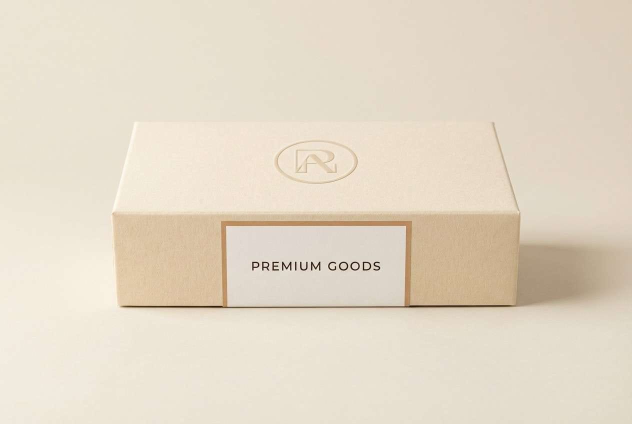
1) Harvest Latte
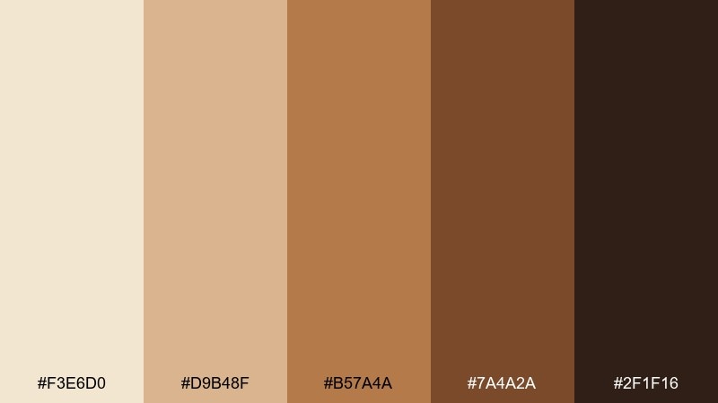
HEX: #f3e6d0 #d9b48f #b57a4a #7a4a2a #2f1f16
Mood: cozy, creamy, grounded
Best for: Cafe branding, menus, and packaging labels
Cozy café light and toasted foam come through in these creamy neutrals and roasted browns. This warm autumn color palette works beautifully on menus, stickers, and packaging where warmth should feel premium, not rustic. Pair it with lots of whitespace and a single deep espresso accent for hierarchy. Tip: use the darkest tone for typography and reserve the caramel midtone for buttons or price highlights.
Image example of harvest latte generated using media.io
Media.io is an online AI studio for creating and editing video, image, and audio in your browser.

2) Pumpkin Spice
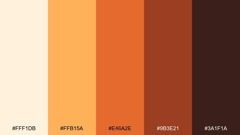
HEX: #fff1db #ffb15a #e46a2e #9b3e21 #3a1f1a
Mood: bold, inviting, spicy
Best for: Seasonal social ads and product promos
Bright gourd orange and toasted red-brown create a punchy, inviting look that feels like warm ovens and crisp air. These autumn color combinations are made for headlines, sale tags, and limited-time promos where contrast matters. Pair the vivid orange with creamy backgrounds to keep it readable and modern. Tip: use the deepest brown for fine print so the orange can stay the hero.
Image example of pumpkin spice generated using media.io

3) Maple Orchard
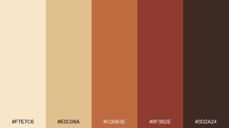
HEX: #f7e7c6 #e0c08a #c06b3e #8f3b2e #3d2a24
Mood: sunlit, nostalgic, rustic
Best for: Food photography presets, blog headers, and recipe cards
Sunlit maple syrup tones and orchard-bark browns give a nostalgic, kitchen-warm feeling. The midrange contrast makes it great for recipe cards and blog headers that need clarity without looking harsh. Pair it with simple serif type and plenty of cream space for an editorial touch. Tip: pull the maple midtone into icons or dividers to keep the page cohesive.
Image example of maple orchard generated using media.io
4) Cinnamon Cider
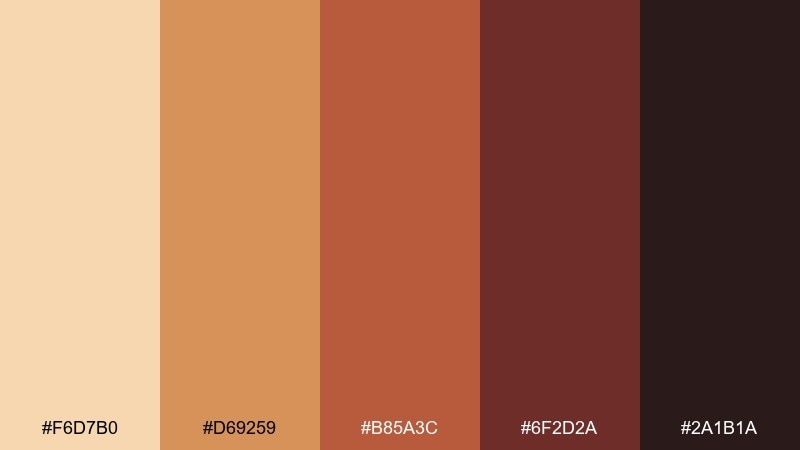
HEX: #f6d7b0 #d69259 #b85a3c #6f2d2a #2a1b1a
Mood: toasty, friendly, comforting
Best for: Event flyers and community posters
Toasty cinnamon and mulled cider reds feel friendly and approachable, like a neighborhood gathering. This autumn color scheme holds up well in large type, making it ideal for posters and flyers. Pair it with cream paper textures or simple line illustrations to avoid visual heaviness. Tip: keep the darkest shade for the event details so they stay legible from a distance.
Image example of cinnamon cider generated using media.io

5) Rustic Copper
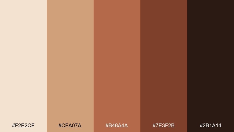
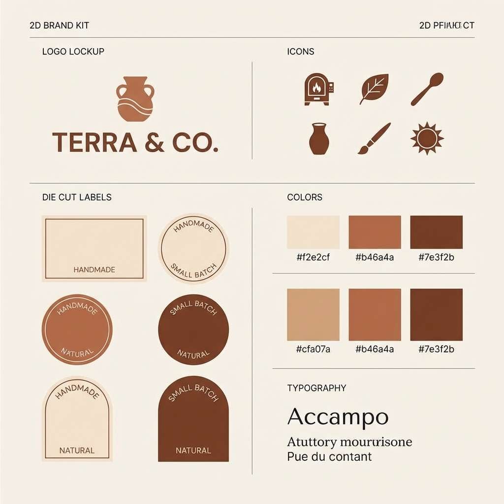
HEX: #f2e2cf #cfa07a #b46a4a #7e3f2b #2b1a14
Mood: crafted, warm, heritage
Best for: Handmade goods branding and Etsy storefronts
Hammered copper warmth and clay neutrals create a crafted, heritage vibe. This autumn color palette suits handmade brands that want to feel authentic while still polished. Pair it with ink-like line art and simple badges for a maker look. Tip: use the pale neutral as the storefront background and let copper tones lead in product tags and buttons.
Image example of rustic copper generated using media.io
6) Golden Wheat
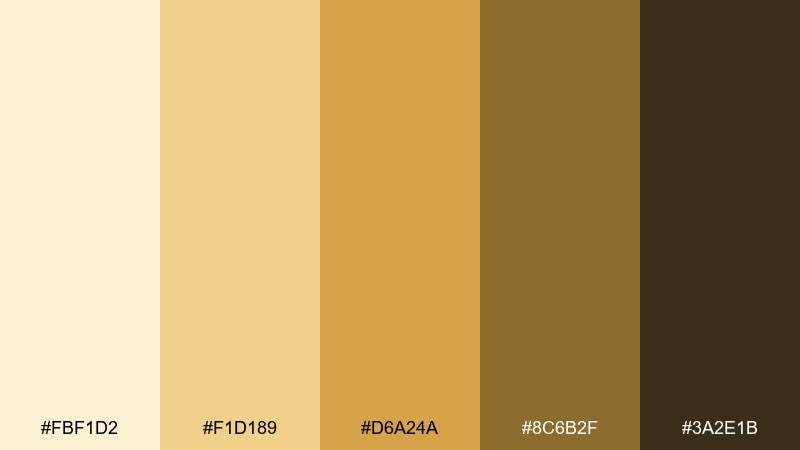
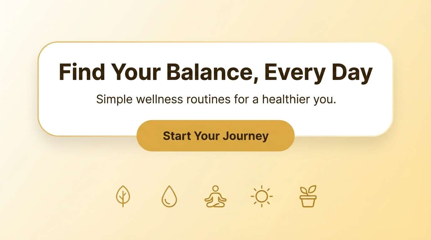
HEX: #fbf1d2 #f1d189 #d6a24a #8c6b2f #3a2e1b
Mood: bright, wholesome, sun-warmed
Best for: Wellness brands, newsletters, and landing pages
Sun-warmed wheat and honey golds feel wholesome, bright, and quietly optimistic. As a warm autumn color scheme, it keeps pages feeling light while still grounded. Pair it with charcoal text and gentle gradients to avoid looking flat. Tip: reserve the richest gold for calls to action so buttons pop without turning neon.
Image example of golden wheat generated using media.io
7) Forest Ember
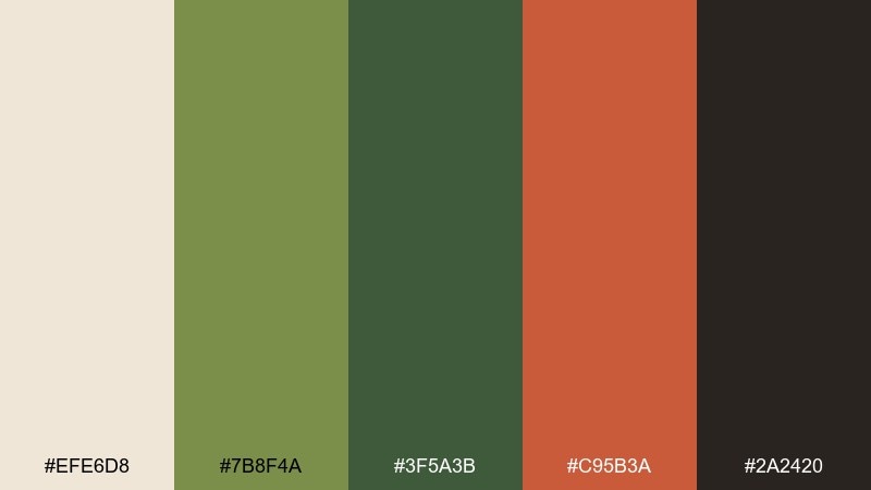
HEX: #efe6d8 #7b8f4a #3f5a3b #c95b3a #2a2420
Mood: outdoorsy, smoky, energetic
Best for: Outdoor brands and adventure blog graphics
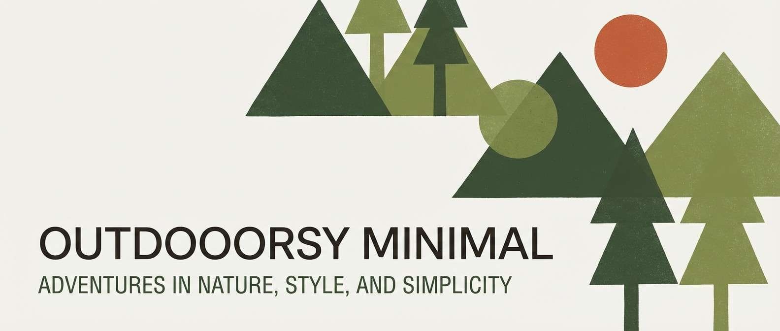
Pine green and ember orange evoke campfire smoke and late hikes under tall trees. The green base keeps it rugged while the ember accent adds energy for highlights. Pair it with off-white backgrounds and textured photography overlays for an outdoorsy feel. Tip: use the orange only for badges, icons, or key stats so it reads as a spark, not a block.
Image example of forest ember generated using media.io
8) Mossy Olive
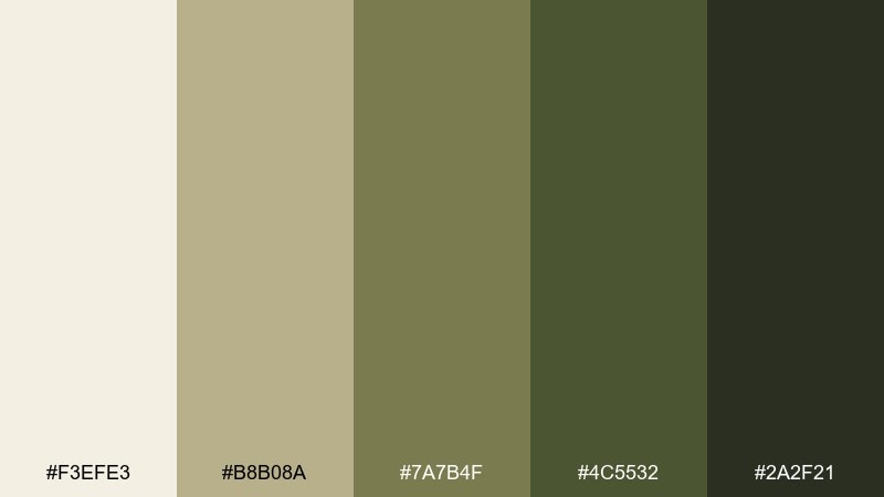
HEX: #f3efe3 #b8b08a #7a7b4f #4c5532 #2a2f21
Mood: calm, earthy, understated
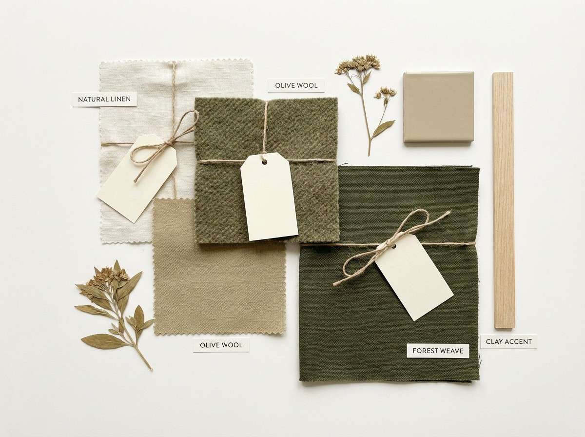
Best for: Interior design moodboards and homeware branding
Soft moss and olive tones feel calm and grounded, like linen, stone, and shaded gardens. The muted contrast is perfect for homeware brands and serene moodboards. Pair it with warm whites and natural materials like oak or rattan for cohesion. Tip: keep headings in the deepest green-black to maintain a premium, quiet look.
Image example of mossy olive generated using media.io
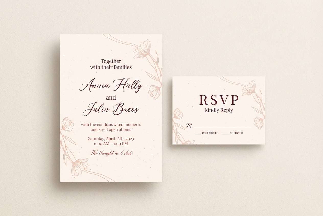
9) Cranberry Tart
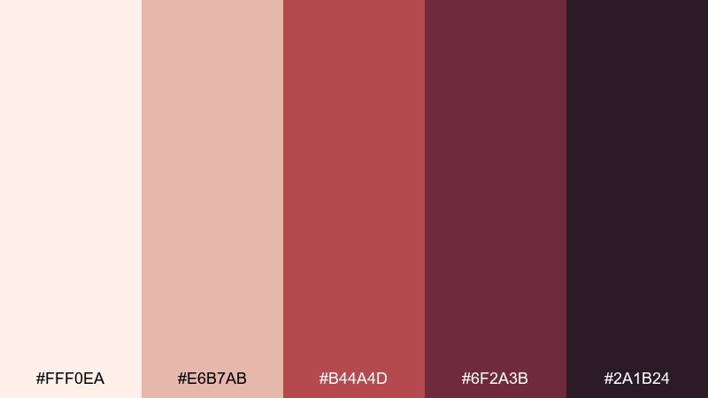
HEX: #fff0ea #e6b7ab #b44a4d #6f2a3b #2a1b24
Mood: romantic, rich, festive
Best for: Wedding stationery and boutique invitations
Tart cranberry reds and rosy neutrals bring a romantic, candlelit mood with a hint of drama. This deep autumn color palette shines on invitations, RSVP cards, and small-print stationery because the deep wine anchors the palette. Pair it with gold foil details or a warm cream stock for a luxe finish. Tip: keep backgrounds light and use the wine shade only for names, monograms, and borders.
Image example of cranberry tart generated using media.io
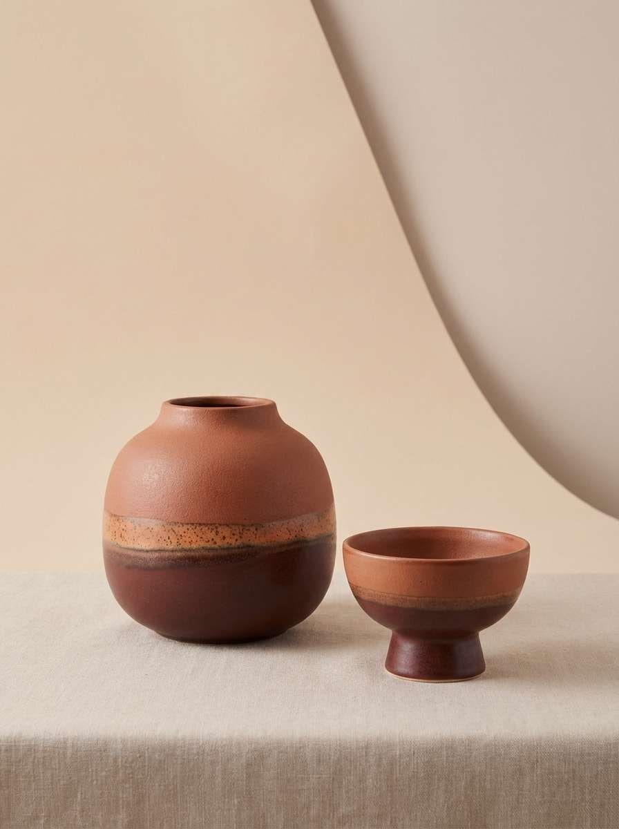
10) Smoked Clay
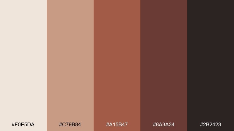
HEX: #f0e5da #c79b84 #a15b47 #6a3a34 #2b2423
Mood: moody, tactile, earthy
Best for: Ceramics branding and artisan product pages
Smoked clay and kiln-brown tones feel tactile, moody, and handmade. This autumn color scheme works well for ceramics, artisan goods, and product pages where texture is part of the story. Pair it with matte photography and simple sans-serif type for a modern craft vibe. Tip: use the dusty peach as a hover state or secondary button to keep interactions gentle.
Image example of smoked clay generated using media.io
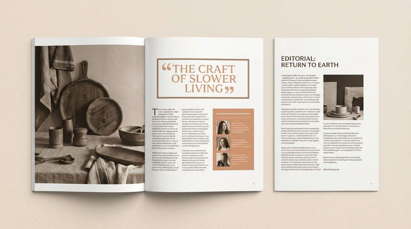
11) Chestnut Bark
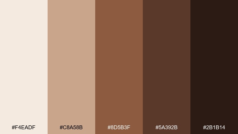
HEX: #f4eadf #c8a58b #8d5b3f #5a392b #2b1b14
Mood: classic, warm, dependable
Best for: Editorial layouts and long-form reading pages
Chestnut browns and paper-soft neutrals feel classic and dependable, like well-worn books. The low-glare contrast is comfortable for long reads and editorial layouts. Pair it with generous line height and subtle rules or dividers in the light tan. Tip: keep links in the mid-brown so they stand out without turning overly saturated.
Image example of chestnut bark generated using media.io
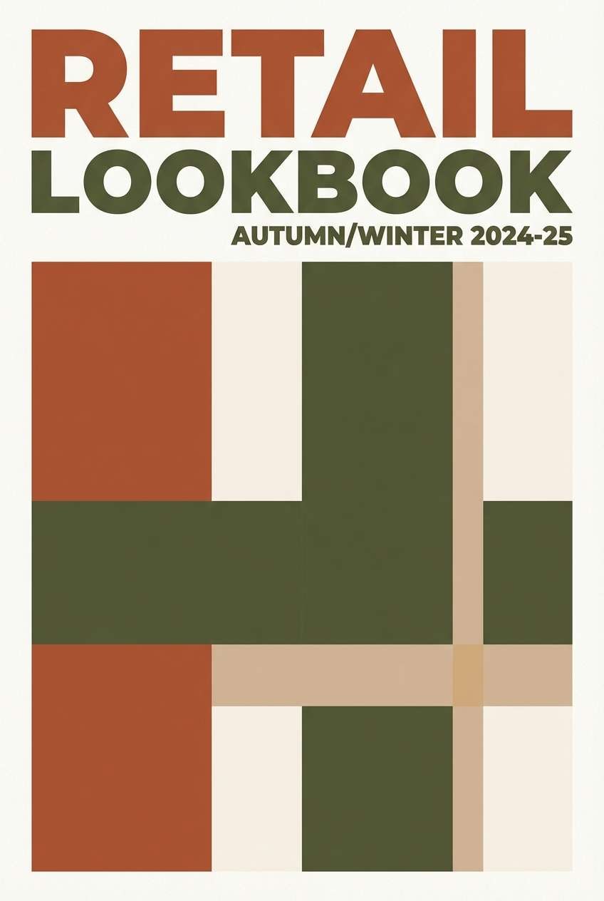
12) Vintage Plaid
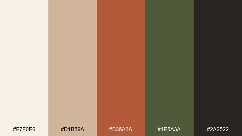
HEX: #f7f0e6 #d1b59a #b35a3a #4e5a3a #2a2522
Mood: heritage, cozy, outdoorsy
Best for: Retail lookbooks and apparel branding
Heritage plaid energy comes through in warm rust, moss green, and soft wool neutrals. This autumn color palette fits apparel lookbooks, hang tags, and retail banners where a timeless outdoors vibe sells the story. Pair it with textured backgrounds and simple grid layouts to keep it modern. Tip: let the green play support in small accents so the rust can lead the visual rhythm.
Image example of vintage plaid generated using media.io
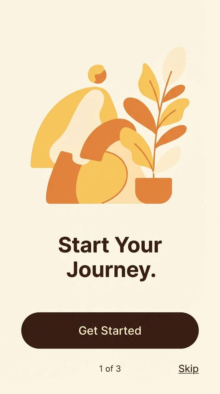
13) Saffron Sunset
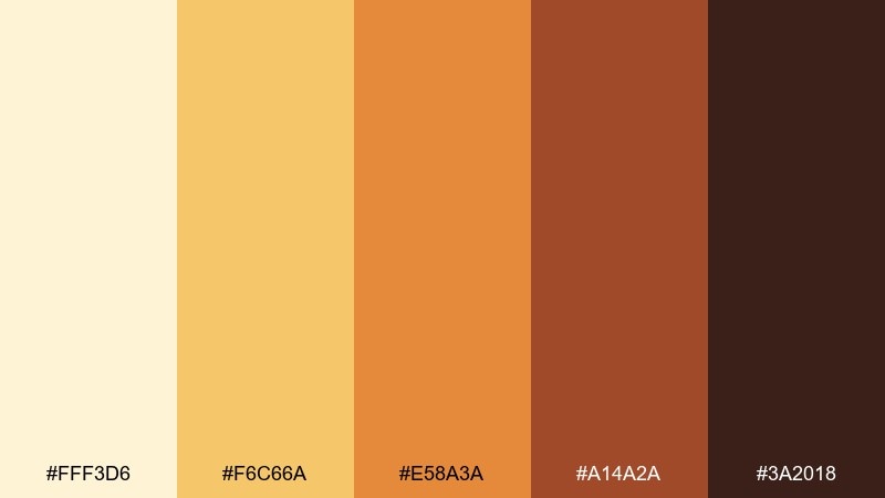
HEX: #fff3d6 #f6c66a #e58a3a #a14a2a #3a2018
Mood: radiant, optimistic, warm
Best for: App onboarding screens and hero banners
Saffron golds and sunset oranges feel radiant and optimistic without getting loud. The palette gives you clear steps for hierarchy, from light backgrounds to bold CTAs. Pair it with deep cocoa text and rounded shapes for a friendly digital feel. Tip: keep gradients subtle and centered around the golden midtones for a soft glow effect.
Image example of saffron sunset generated using media.io
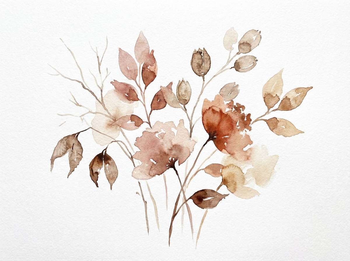
14) Terracotta Bloom
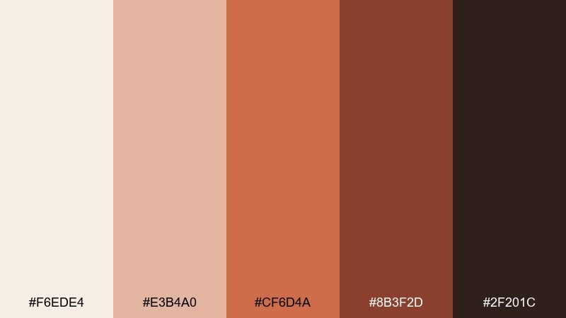
HEX: #f6ede4 #e3b4a0 #cf6d4a #8b3f2d #2f201c
Mood: soft, artistic, sunbaked
Best for: Botanical illustrations and lifestyle blogs
Sunbaked terracotta and dusty rose feel artistic, like clay pots and dried petals. It's ideal for lifestyle blogs and illustrated sections that need warmth without heavy saturation. Pair it with hand-drawn botanical elements and warm white margins. Tip: use the darker terracotta for section headings and the blush tone for highlights or callouts.
Image example of terracotta bloom generated using media.io
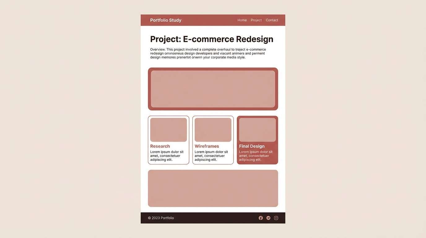
15) Dusty Brick
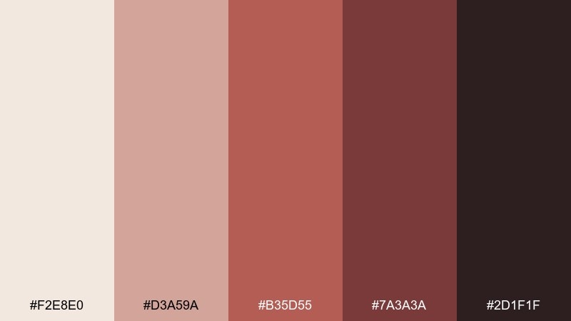
HEX: #f2e8e0 #d3a59a #b35d55 #7a3a3a #2d1f1f
Mood: urban, mature, understated
Best for: Architecture portfolios and case study pages
Dusty brick reds and concrete-like neutrals feel urban and mature, with a quiet confidence. The restrained saturation works well for portfolios and case studies where content should lead. Pair this autumn color scheme with large imagery blocks and minimal captions for a gallery vibe. Tip: use the brick midtone for hyperlinks and small UI chips to guide scanning.
Image example of dusty brick generated using media.io
16) Amber Lantern
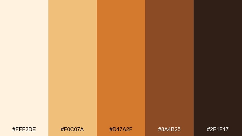
HEX: #fff2de #f0c07a #d47a2f #8a4b25 #2f1f17
Mood: glowing, festive, welcoming
Best for: Email headers, sale banners, and announcement graphics
Amber glow and lantern-lit browns create a welcoming, festive look that reads instantly. It's strong for announcements and banners where you want warmth with clear contrast. Pair it with simple geometric shapes and bold sans type for quick readability. Tip: keep backgrounds creamy and use the amber midtone for the main headline bar.
Image example of amber lantern generated using media.io

17) Twilight Mulberry
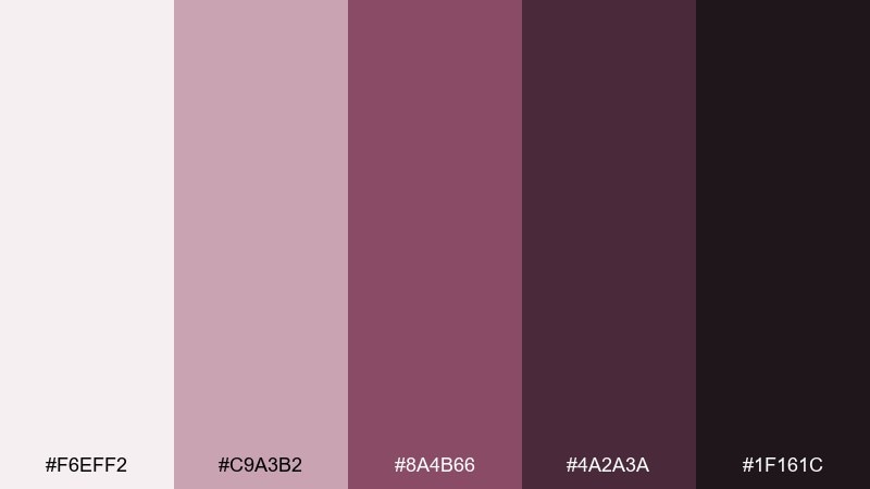
HEX: #f6eff2 #c9a3b2 #8a4b66 #4a2a3a #1f161c
Mood: moody, elegant, modern
Best for: Beauty branding and premium product ads
Mulberry and soft mauve feel moody and elegant, like twilight velvet and berry stain. The autumn color palette supports premium beauty visuals without relying on stark black. Pair it with glossy highlights and minimal typography to keep it modern. Tip: use the darkest plum sparingly on logos and borders so the mauves can stay airy.
Image example of twilight mulberry generated using media.io
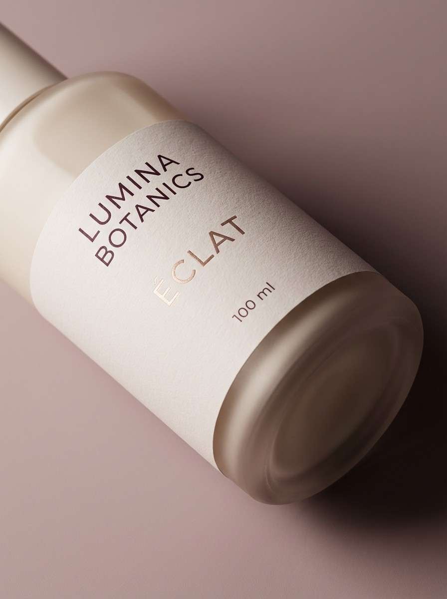
18) Oatmeal Stone
HEX: #faf3e8 #e0d1bf #b9a08a #6f5c4f #2a241f
Mood: neutral, calm, minimalist
Best for: Modern UI systems and design tokens
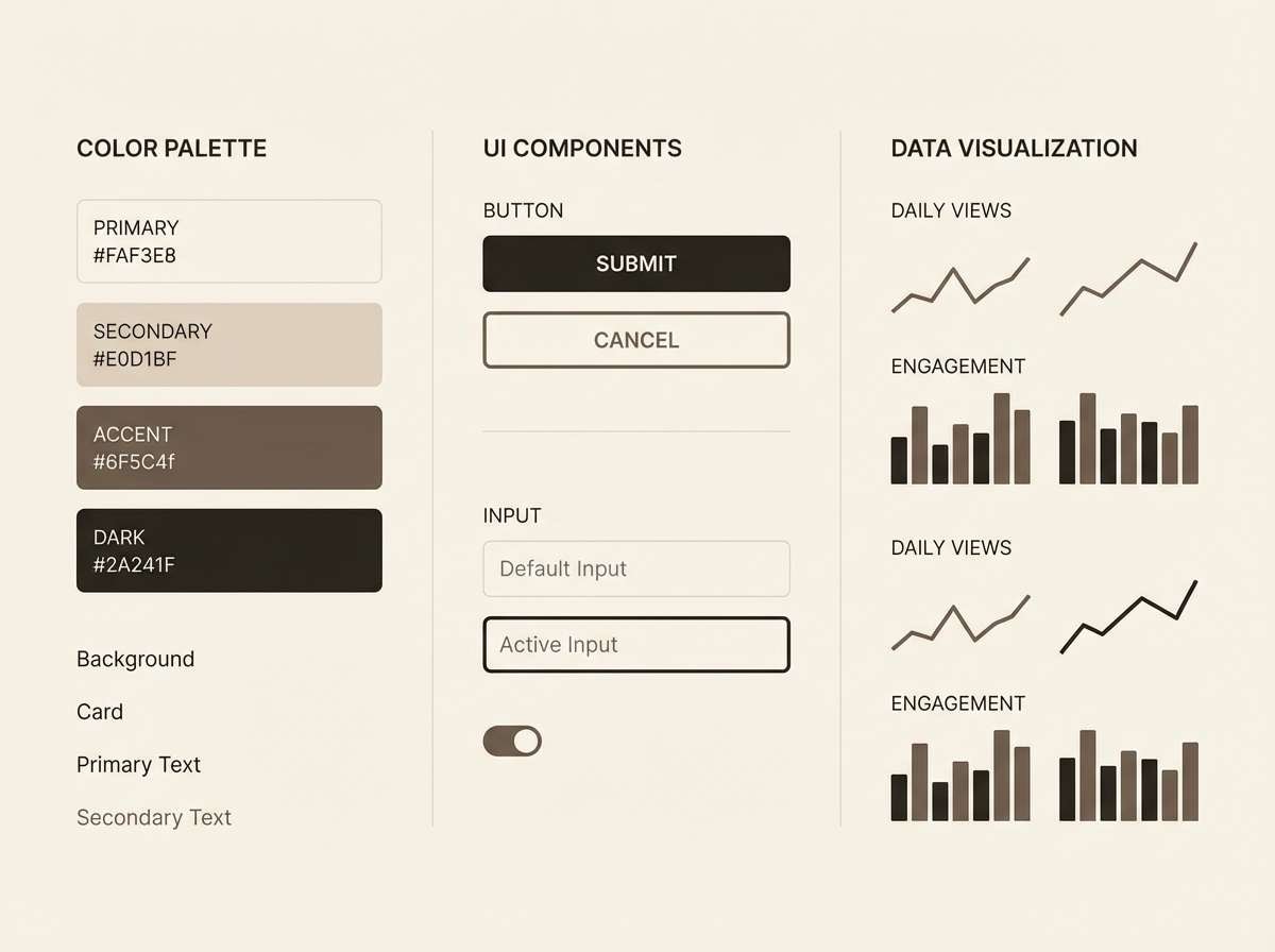
Oatmeal and stone neutrals feel calm, minimal, and quietly upscale. The wide value range makes it perfect for UI systems where you need dependable backgrounds, surfaces, and text colors. Pair it with one warm accent (like rust or olive) when you need attention states. Tip: map the midtones to borders and dividers so the interface stays soft, not boxy.
Image example of oatmeal stone generated using media.io
19) Pecan Leather
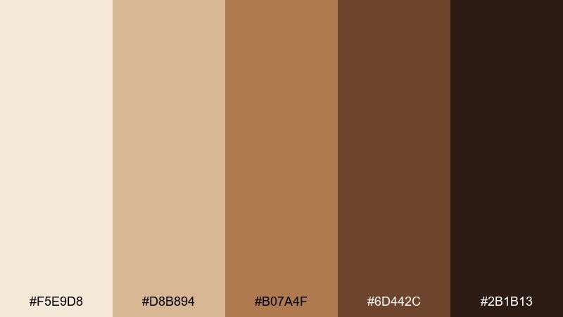
HEX: #f5e9d8 #d8b894 #b07a4f #6d442c #2b1b13
Mood: luxury, warm, refined
Best for: Menswear branding and premium packaging
Pecan tan and leather browns feel refined and quietly luxurious, like well-made accessories. It's a strong fit for premium packaging and menswear branding where warmth should stay controlled. Pair it with black-brown typography and a single debossed emblem for a timeless look. Tip: use the light cream as the main canvas and keep the mid-brown for trims, borders, and seals.
Image example of pecan leather generated using media.io
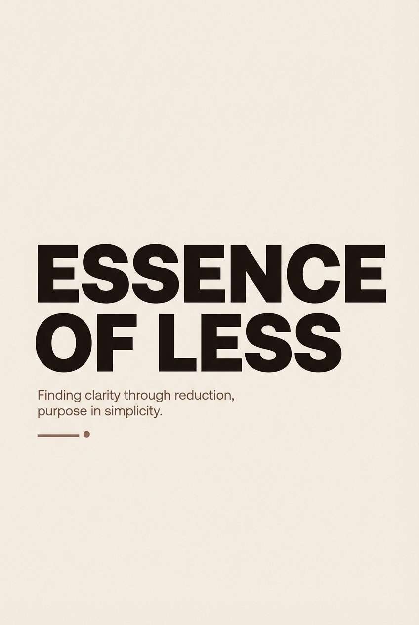
20) Cocoa Ash
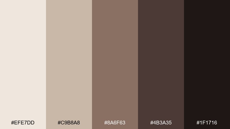
HEX: #efe7dd #c9b8a8 #8a6f63 #4b3a35 #1f1716
Mood: smoky, modern, sophisticated
Best for: Minimalist posters and typography studies
Cocoa and ash neutrals feel smoky and sophisticated, like roasted cacao and soft charcoal. The restrained palette is ideal for typographic posters where spacing and form do the heavy lifting. Pair it with bold letterforms and subtle grain for depth. Tip: keep the lightest tone as the background and use the darkest shade only for the main headline to maximize impact.
Image example of cocoa ash generated using media.io
What Colors Go Well with Autumn?
Autumn palettes pair best with warm neutrals (cream, oatmeal, tan) because they soften strong rusts and browns while keeping the overall look modern. If your palette already feels deep, increase the amount of light background to maintain readability.
For accents, choose one “spark” color: ember orange, saffron gold, or cranberry wine. Used sparingly on buttons, badges, and key highlights, it adds energy without overwhelming the grounded base.
Muted greens (olive, moss, forest) are also classic fall companions. They balance orange-heavy schemes and work especially well in outdoor, homeware, and heritage branding.
How to Use a Autumn Color Palette in Real Designs
Start with roles, not swatches: map the lightest tone to backgrounds, midtones to surfaces and borders, and the darkest tone to text. This creates consistent hierarchy across pages, posters, or packaging.
Keep saturation under control. Autumn colors can get heavy fast, so reserve the most vivid hue (like pumpkin orange) for CTAs, price highlights, or small UI chips, and let creams and tans do most of the layout work.
In branding, lean into texture: grain, paper, matte ceramics, and natural materials amplify the warmth of fall tones. In UI, use subtle gradients and generous spacing to prevent the palette from feeling dense.
Create Autumn Palette Visuals with AI
If you have HEX codes but need real assets—banners, mockups, headers, or product visuals—AI generation is a fast way to explore the “look” before committing to a full design system. You can keep outputs consistent by reusing the same prompt structure and swapping only the palette colors.
With Media.io, you can turn a simple prompt into on-brand autumn imagery for ads, landing pages, and social posts. Start with a clean background, specify the dominant HEX colors, and set the aspect ratio to match your platform.
Autumn Color Palette FAQs
-
What is an autumn color palette?
An autumn color palette is a set of warm, earthy tones inspired by fall—typically creams, tans, caramel browns, rust oranges, terracotta reds, and muted olive/forest greens. -
What are the best fall colors for branding?
For branding, start with warm neutrals (cream/oatmeal) plus a deep anchor (espresso or charcoal-brown). Add one accent—rust, amber, or cranberry—for CTAs and highlights to keep the identity memorable. -
How do I make an autumn palette look modern (not rustic)?
Use more whitespace, limit the number of saturated hues, and choose clean typography. Cream backgrounds with one confident accent (like amber or ember orange) usually feel contemporary and premium. -
What colors complement rust orange in an autumn scheme?
Rust orange pairs well with cream, tan, cocoa brown, and muted greens like olive or pine. For a richer contrast, add a deep wine/plum sparingly. -
Are autumn colors good for UI design?
Yes—especially when the palette includes a wide value range. Use light neutrals for backgrounds, midtones for surfaces/borders, and the darkest shade for text to maintain accessibility and contrast. -
How many colors should an autumn palette have?
Five is a practical sweet spot: 1 light background, 1 surface, 1 mid accent, 1 strong accent/CTA, and 1 dark text/anchor. You can expand later into tints and shades for a full design system. -
Can I generate autumn-themed visuals from HEX codes?
Yes. Add your HEX codes into a text-to-image prompt, specify which colors are dominant vs. accents, and keep composition and lighting consistent for a cohesive set of outputs.
