

Blue, mint, and green is a go-to color trio when you want designs to feel clean, calm, and modern without looking cold. It blends the trust of blue with the freshness of mint green, creating palettes that work across UI, branding, and decor.
Below are 20 ready-to-use mint green and blue color palette ideas with HEX codes, plus practical tips for keeping contrast, hierarchy, and accents under control.
In this article
Why Blue and Mint Green Palettes Work So Well
Blue mint green palettes feel instantly “fresh” because they sit in a cool, water-adjacent range—think sky, ocean, and seafoam. That association makes them ideal for products and interfaces where clarity and calm matter.
They also create natural visual hierarchy: deep navy or teal anchors typography and navigation, while mint works as a light-fill highlight that keeps layouts airy. You get contrast without relying on harsh black-and-white extremes.
Finally, blue and mint green are flexible across styles—minimal, coastal, clinical, playful, or futuristic—depending on how much saturation you use and whether you introduce a warm accent (cream, peach, or yellow) for balance.
20+ Blue Mint Green Color Palette Ideas (with HEX Codes)
1) Coastal Glass
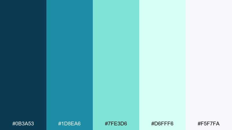
HEX: #0b3a53 #1d8ea6 #7fe3d6 #d6fff6 #f5f7fa
Mood: breezy, clean, seaside calm
Best for: travel blog hero banner
Breezy and sunlit, these tones feel like sea glass in shallow water and a clear sky after rain. Use the deep blue as your headline anchor and let mint carry the airy background blocks. Pair with warm white space and subtle grain textures to keep it editorial, not sterile. Tip: keep contrast strong by reserving the lightest mint for highlights and badges only.
Image example of coastal glass generated using media.io

Media.io is an online AI studio for creating and editing video, image, and audio in your browser.

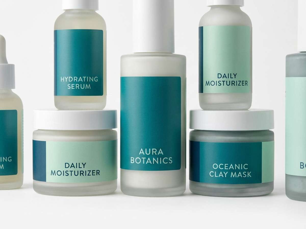
2) Arctic Spa
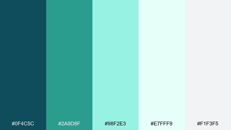
HEX: #0f4c5c #2a9d8f #98f2e3 #e7fff9 #f1f3f5
Mood: soothing, fresh, wellness-focused
Best for: skincare brand packaging
Soothing and crisp, it evokes chilled eucalyptus towels and a calm spa lobby. Put the teal and mint on labels for an instantly hygienic feel, then use the darker blue-green for ingredient hierarchy. Pair with matte white packaging and minimal sans-serif typography for modern trust. Tip: add a tiny foil stamp only in the darkest shade to keep the look premium without breaking the calm.
Image example of arctic spa generated using media.io
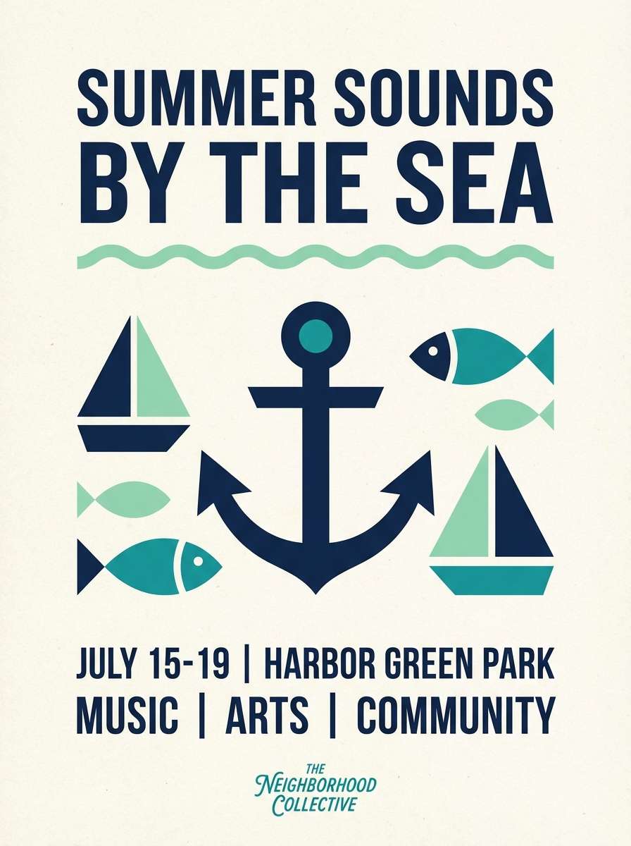
3) Harbor Breeze
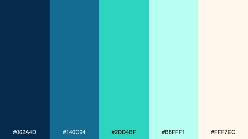
HEX: #062a4d #146c94 #2dd4bf #b8fff1 #fff7ec
Mood: optimistic, nautical, bright
Best for: summer event poster
Optimistic and nautical, it reads like a harbor morning with flags snapping in the wind. This blue mint green color palette shines on bold type posters where the navy holds the layout and the bright mint pops for calls to action. Pair with a warm off-white background to prevent the cool tones from feeling icy. Tip: keep mint to one or two hero elements so the composition stays readable from afar.
Image example of harbor breeze generated using media.io
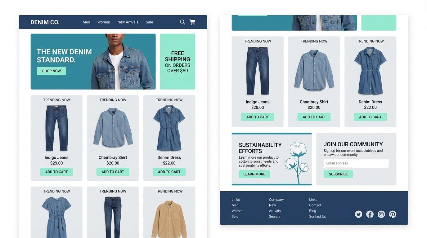
4) Seafoam Denim
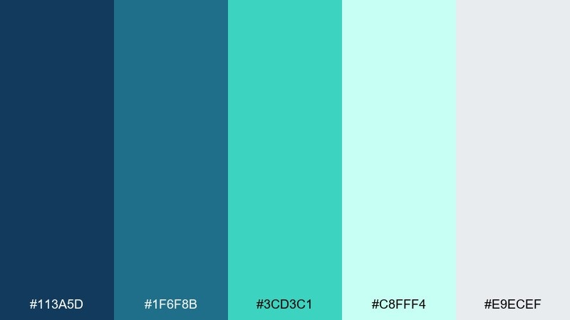
HEX: #113a5d #1f6f8b #3cd3c1 #c8fff4 #e9ecef
Mood: casual, dependable, modern
Best for: ecommerce apparel landing page
Casual and dependable, these shades feel like worn denim next to seafoam surf. Use the deeper blues for nav bars and product category chips, while mint adds a fresh edge to pricing and promotions. Pair with light gray for panels and keep photography neutral so the colors do not compete. Tip: test button states by darkening teal, not mint, to maintain accessibility.
Image example of seafoam denim generated using media.io
5) Iceberg Minimal
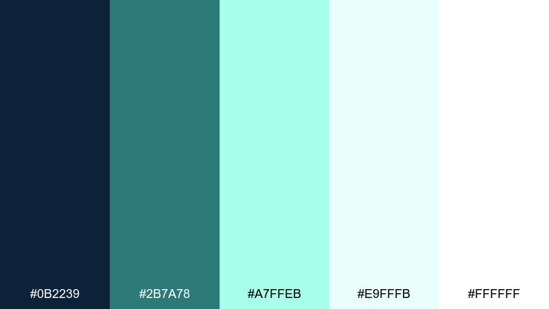
HEX: #0b2239 #2b7a78 #a7ffeb #e9fffb #ffffff
Mood: minimal, airy, high-clarity
Best for: saas dashboard UI
Minimal and icy-clear, it suggests glass panels, crisp data, and tidy workflows. Let the near-black navy carry charts and key metrics, then use teal sparingly for interactive states. Pair with pure white and generous spacing to keep the interface feeling fast and modern. Tip: reserve the light mint for subtle table row highlights rather than large fills.
Image example of iceberg minimal generated using media.io
6) Citrus Tide
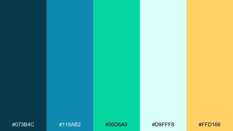
HEX: #073b4c #118ab2 #06d6a0 #d9fff8 #ffd166
Mood: playful, energetic, sun-kissed
Best for: startup social ad creative
Playful and sun-kissed, it feels like turquoise water with a squeeze of citrus. These blue mint green color combinations work best when the yellow is treated as a tiny spark for badges, icons, or a single underline. Pair with bold geometric shapes and keep backgrounds light to avoid visual noise. Tip: set the call-to-action in the darkest blue for contrast, then ring it with mint.
Image example of citrus tide generated using media.io

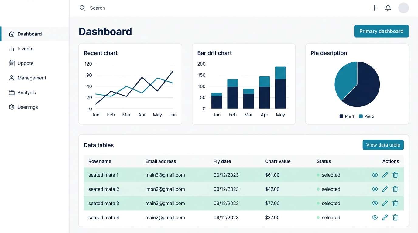
7) Lagoon Workspace
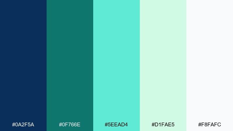
HEX: #0a2f5a #0f766e #5eead4 #d1fae5 #f8fafc
Mood: focused, friendly, productivity
Best for: project management app UI
Focused yet friendly, these tones bring to mind a calm lagoon beside a modern workspace. Use navy for structure and readability, and let teal guide navigation states and progress indicators. Pair with soft off-white cards and minimal shadows to keep the UI light. Tip: apply mint to status tags in small doses to avoid a washed-out interface.
Image example of lagoon workspace generated using media.io
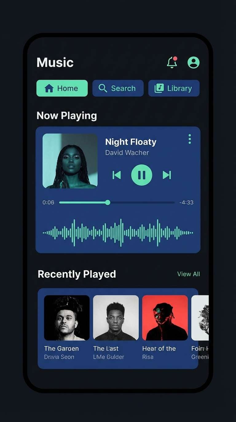
8) Minty Midnight
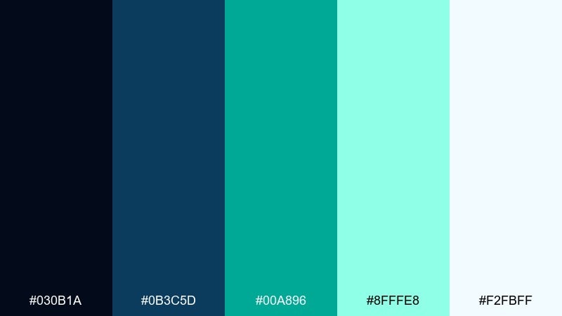
HEX: #030b1a #0b3c5d #00a896 #8fffe8 #f2fbff
Mood: sleek, nocturnal, techy
Best for: music app dark mode
Sleek and nocturnal, it resembles city lights reflecting on water at midnight. Let the near-black base own the background, then bring in teal for active states and mint for glow-like highlights. Pair with subtle gradients and thin dividers to avoid harsh contrast. Tip: keep long text in the pale icy tone and use mint only for icons and toggles.
Image example of minty midnight generated using media.io
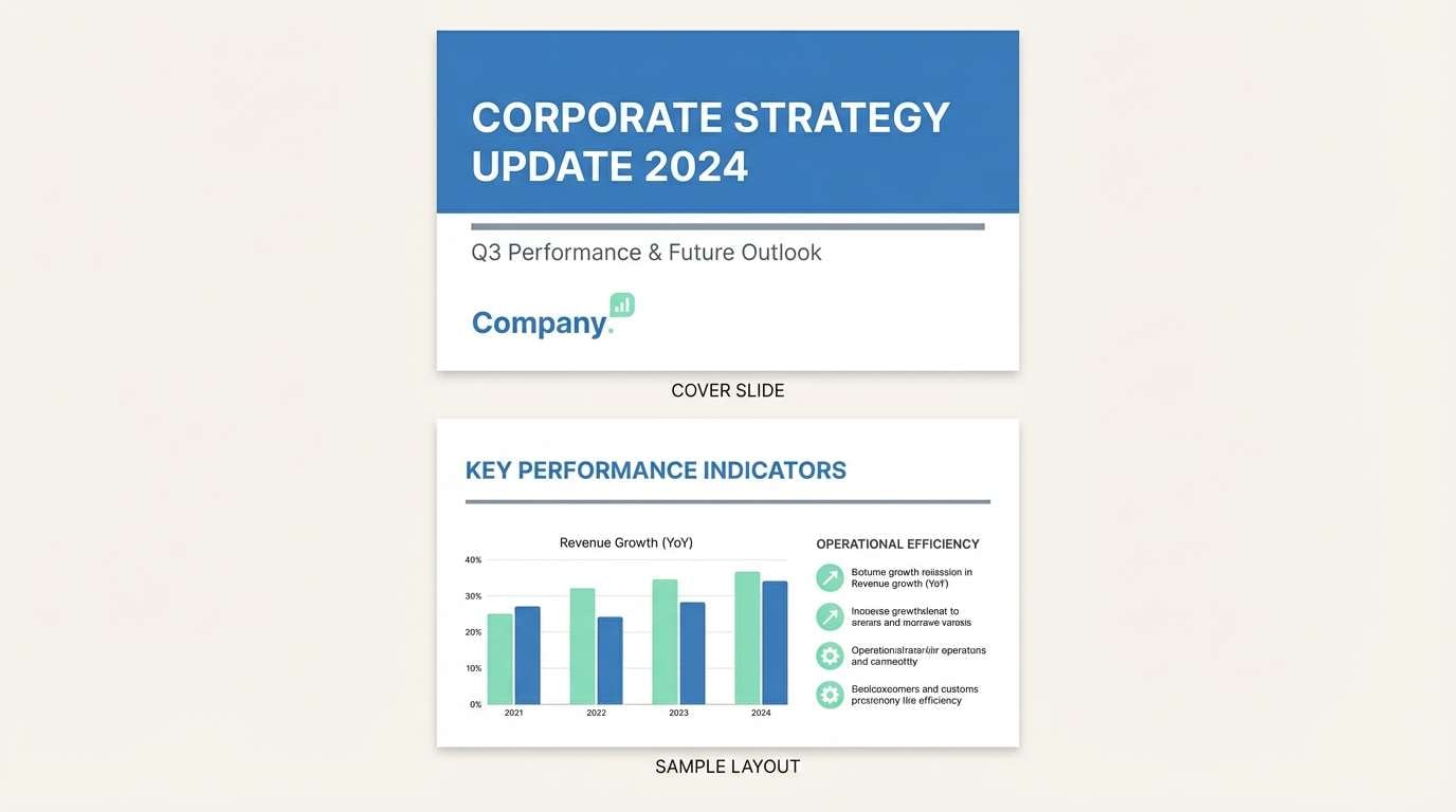
9) Cloudy Marina
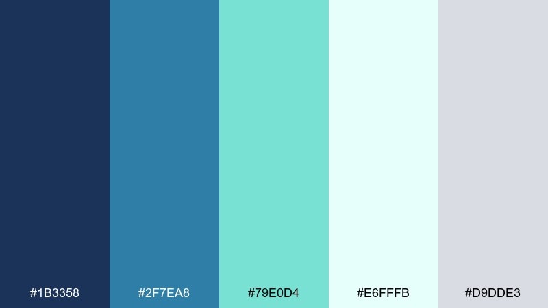
HEX: #1b3358 #2f7ea8 #79e0d4 #e6fffb #d9dde3
Mood: calm, airy, understated
Best for: corporate slide deck
Calm and understated, these colors look like a marina under soft cloud cover. Use the mid blue for section headers and the mint for charts, callouts, and friendly data points. Pair with cool gray for dividers and tables to keep the deck professional. Tip: keep backgrounds near-white and avoid filling entire slides with teal blocks.
Image example of cloudy marina generated using media.io
10) Retro Pool Tile
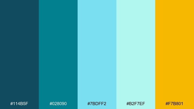
HEX: #114b5f #028090 #7bdff2 #b2f7ef #f7b801
Mood: retro, sunny, playful
Best for: ice cream shop branding
Retro and sunny, it brings back pool tiles, paper umbrellas, and weekend treats. Use teal and aqua as the brand base, then drop in a small hit of golden yellow for a nostalgic logo mark. Pair with rounded type and simple patterns like stripes or tiles for extra personality. Tip: keep the yellow to under 10 percent so the cool tones stay dominant.
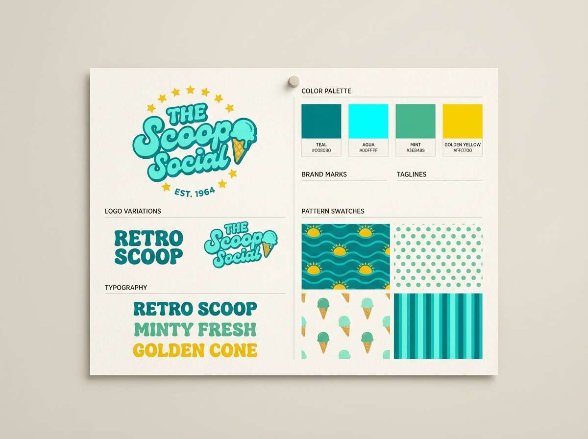
Image example of retro pool tile generated using media.io
11) Fresh Clinic
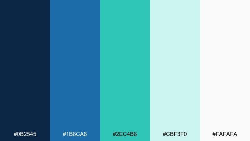
HEX: #0b2545 #1b6ca8 #2ec4b6 #cbf3f0 #fafafa
Mood: clinical, trustworthy, modern
Best for: healthcare website redesign
Trustworthy and clean, it feels like polished counters, fresh air, and calm guidance. Use the deeper blue for navigation and headings, and apply teal to links, icons, and form focus states. Pair with near-white backgrounds and subtle line icons to keep the experience approachable. Tip: set error and warning colors outside this palette, but keep them muted so they do not clash.
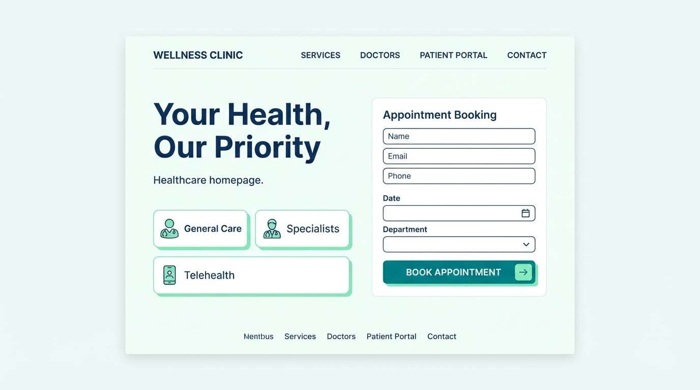
Image example of fresh clinic generated using media.io
12) Ocean Notebook
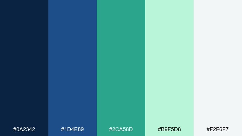
HEX: #0a2342 #1d4e89 #2ca58d #b9f5d8 #f2f6f7
Mood: studious, calm, organized
Best for: online course brand kit
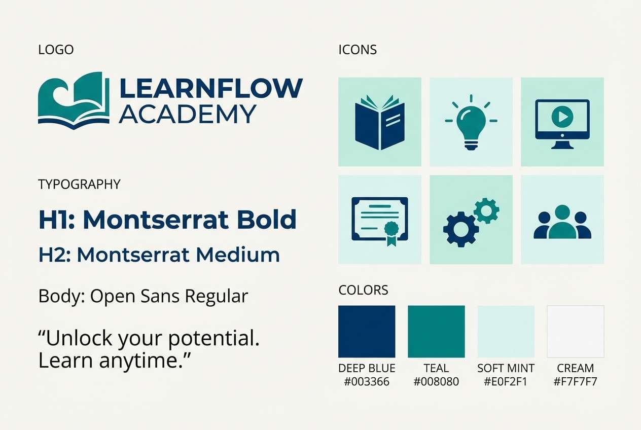
Studious and calm, it evokes tidy notebooks, sea air, and steady progress. This blue mint green color palette works beautifully for course platforms where clarity matters more than flash. Pair with clean serif headlines for credibility and a simple grid for lesson cards. Tip: use the soft mint as a background for quote blocks and learning tips, not for body text.
Image example of ocean notebook generated using media.io
13) Alpine Lakehouse
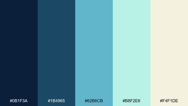
HEX: #0b1f3a #1b4965 #62b6cb #b8f2e6 #f4f1de
Mood: cozy, scenic, refreshing
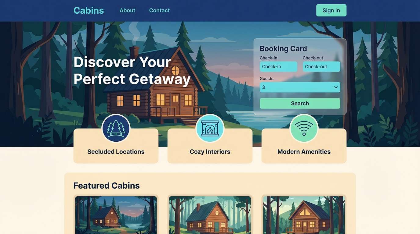
Best for: cabin rental website
Cozy yet refreshing, it feels like an alpine lake beside warm wood and wool blankets. Use the darker blues for structure and trust, while aqua and mint brighten photo overlays and booking highlights. Pair with a creamy neutral to soften the cool palette and make it feel more hospitable. Tip: add texture through subtle paper grain or wood-toned photography rather than extra colors.
Image example of alpine lakehouse generated using media.io
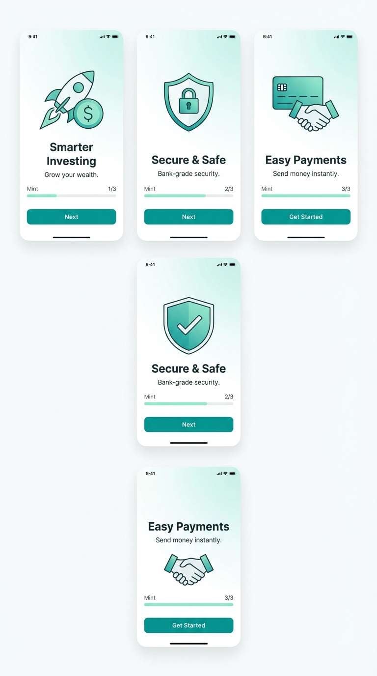
14) Soft Gradient UI
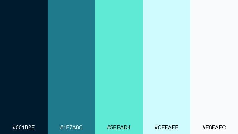
HEX: #001b2e #1f7a8c #5eead4 #cffafe #f8fafc
Mood: soft, modern, lightweight
Best for: fintech app onboarding screens
Soft and lightweight, it suggests gentle gradients and a reassuring sense of control. Use teal as the primary action color and keep mint for progress steps and friendly success states. Pair with lots of white, simple icons, and short copy for a frictionless onboarding flow. Tip: apply a subtle teal-to-mint gradient only on one hero illustration per screen to avoid banding.
Image example of soft gradient ui generated using media.io
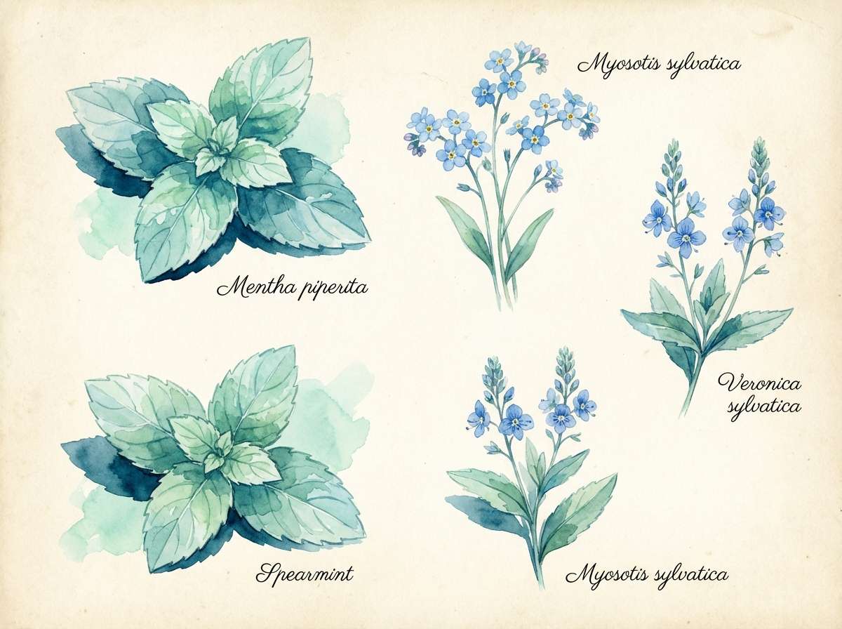
15) Botanical Breeze
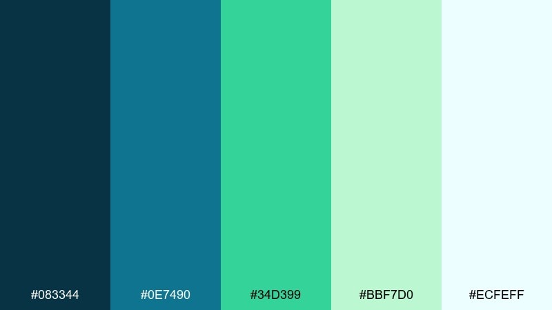
HEX: #083344 #0e7490 #34d399 #bbf7d0 #ecfeff
Mood: fresh, botanical, springlike
Best for: watercolor botanical illustration set
Fresh and springlike, it reads like mint leaves, morning dew, and cool shade. Use deep teal for line detail and let the softer greens wash across petals and foliage. Pair with a pale icy background to keep the illustration airy and clean. Tip: keep the darkest shade for only the focal points so the set stays delicate.
Image example of botanical breeze generated using media.io
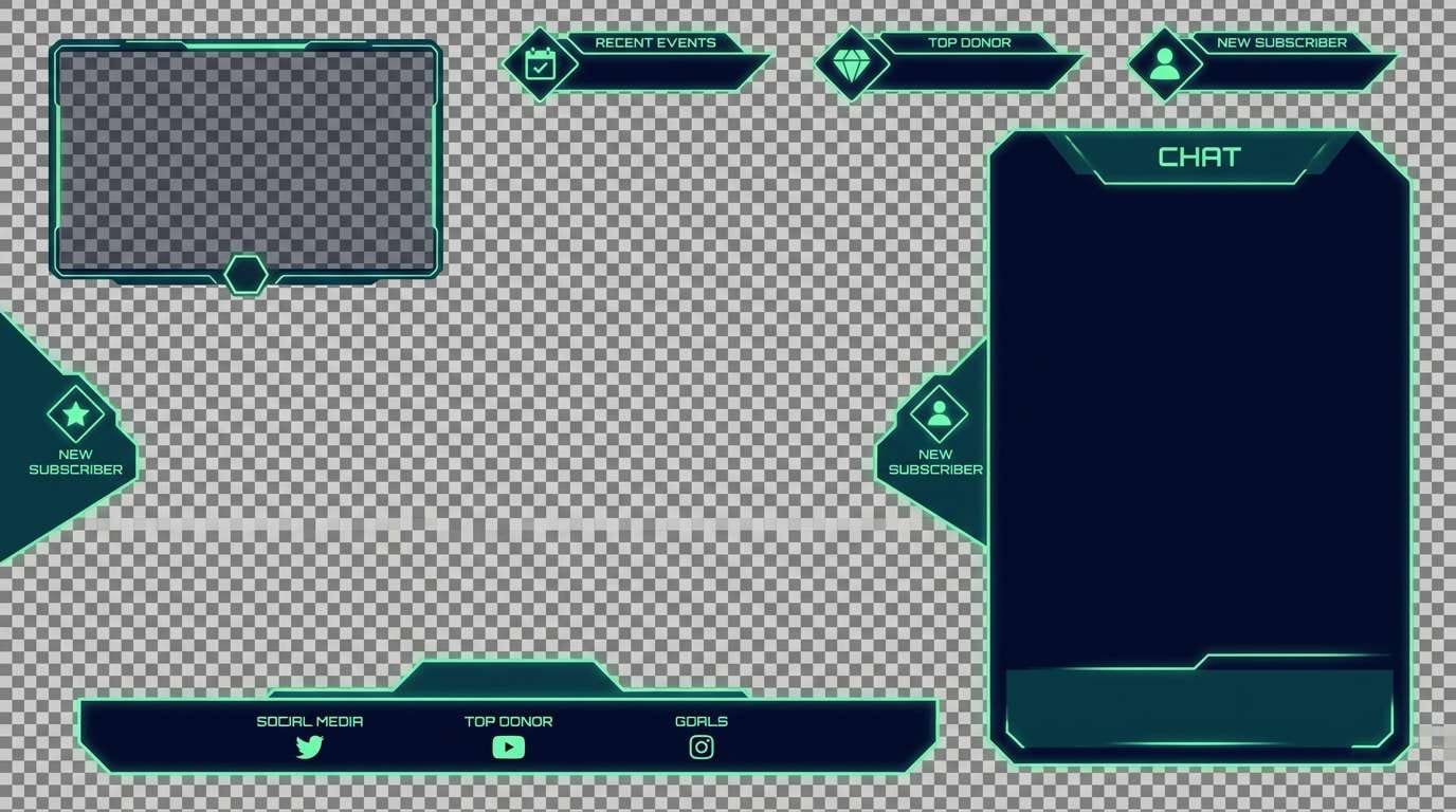
16) Neon Mint Accent
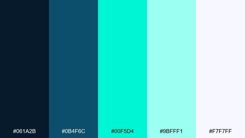
HEX: #061a2b #0b4f6c #00f5d4 #9bfff1 #f7f7ff
Mood: bold, futuristic, high-contrast
Best for: gaming stream overlay UI
Bold and futuristic, it feels like LED glow cutting through deep ocean night. Use the neon mint as a sharp accent for alerts, borders, and key badges, while the darker blues keep everything grounded. Pair with simple shapes and a restrained type scale so the overlay stays readable during motion. Tip: limit neon mint to small elements and use the softer mint for larger panels to reduce eye fatigue.
Image example of neon mint accent generated using media.io
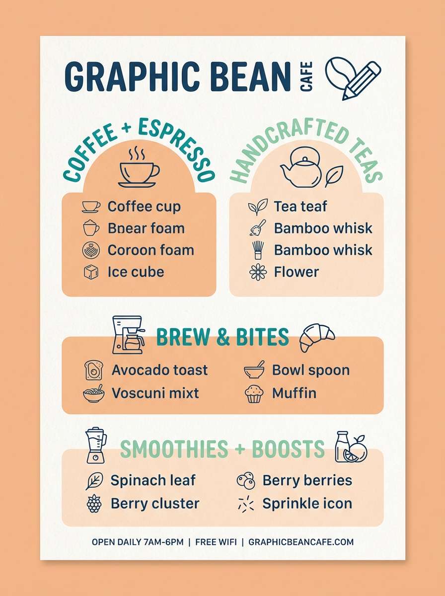
17) Sandbar Pop
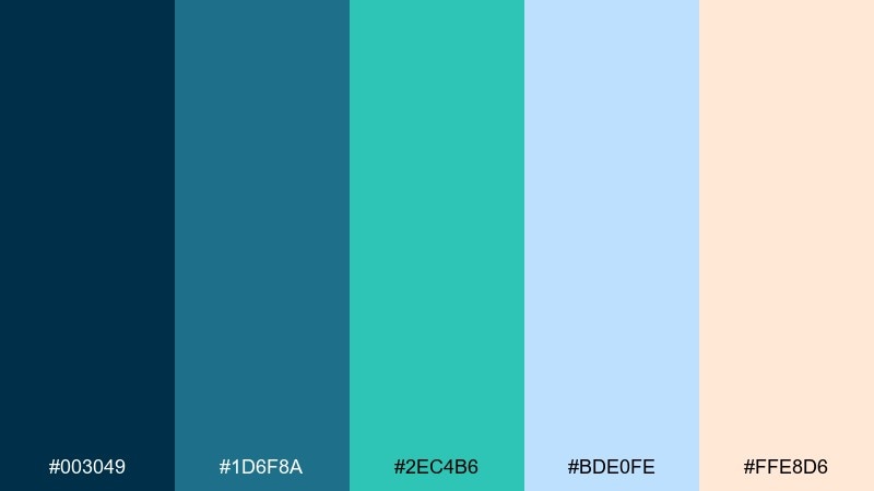
HEX: #003049 #1d6f8a #2ec4b6 #bde0fe #ffe8d6
Mood: light, friendly, beachy-modern
Best for: cafe menu flyer
Light and beachy-modern, it recalls a sandbar with clear water and sun-bleached shells. These blue mint green color combinations are easy on the eyes for menus, especially when you use the warm peach as a background block. Pair with simple line icons and generous spacing for quick scanning at the counter. Tip: keep body copy in the darkest blue and use mint only for section headings and price highlights.
Image example of sandbar pop generated using media.io
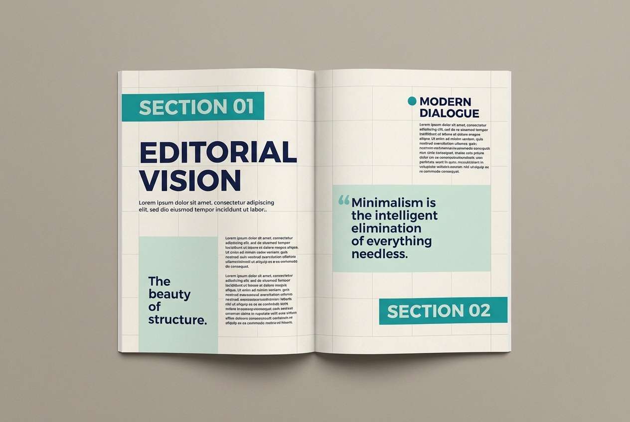
18) Museum Catalog
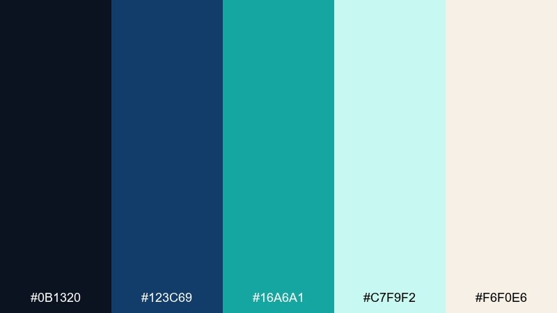
HEX: #0b1320 #123c69 #16a6a1 #c7f9f2 #f6f0e6
Mood: refined, academic, gallery-cool
Best for: editorial magazine spread
Refined and gallery-cool, it feels like a quiet museum wing with polished signage. Use deep navy for headlines and captions, then bring in teal for pull quotes and section markers. Pair with a warm paper tone to make the layout feel printed and collectible. Tip: use mint as a soft highlight behind quotes rather than as a primary text color.
Image example of museum catalog generated using media.io
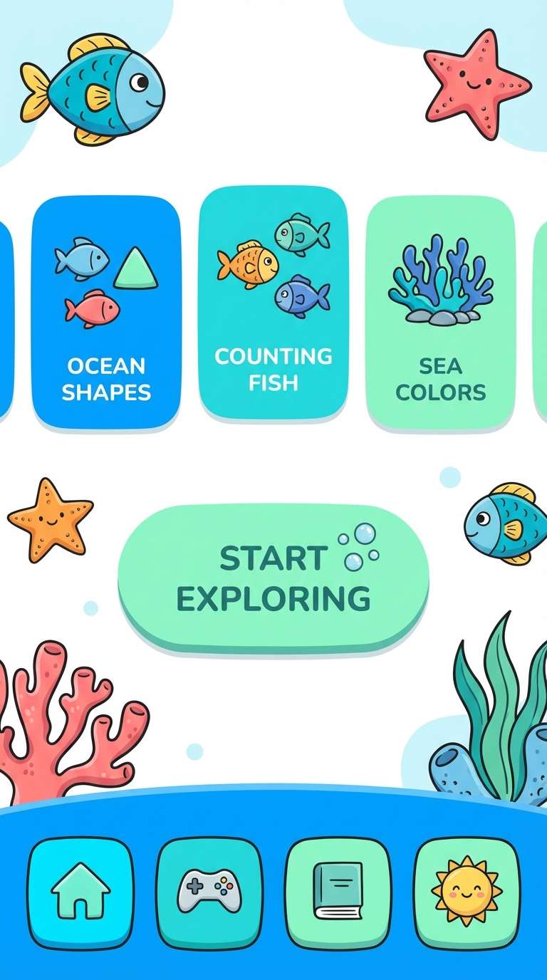
19) Kidcore Aquarium
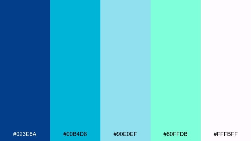
HEX: #023e8a #00b4d8 #90e0ef #80ffdb #fffbff
Mood: cheerful, bubbly, kid-friendly
Best for: kids learning app UI
Cheerful and bubbly, it looks like cartoon waves and bright aquarium tanks. Use the strong blue for navigation and keep aqua and mint for interactive learning elements like buttons and progress stars. Pair with plenty of white and rounded UI components for a friendly feel. Tip: choose one dominant button color and reserve the others for rewards and micro-interactions.
Image example of kidcore aquarium generated using media.io
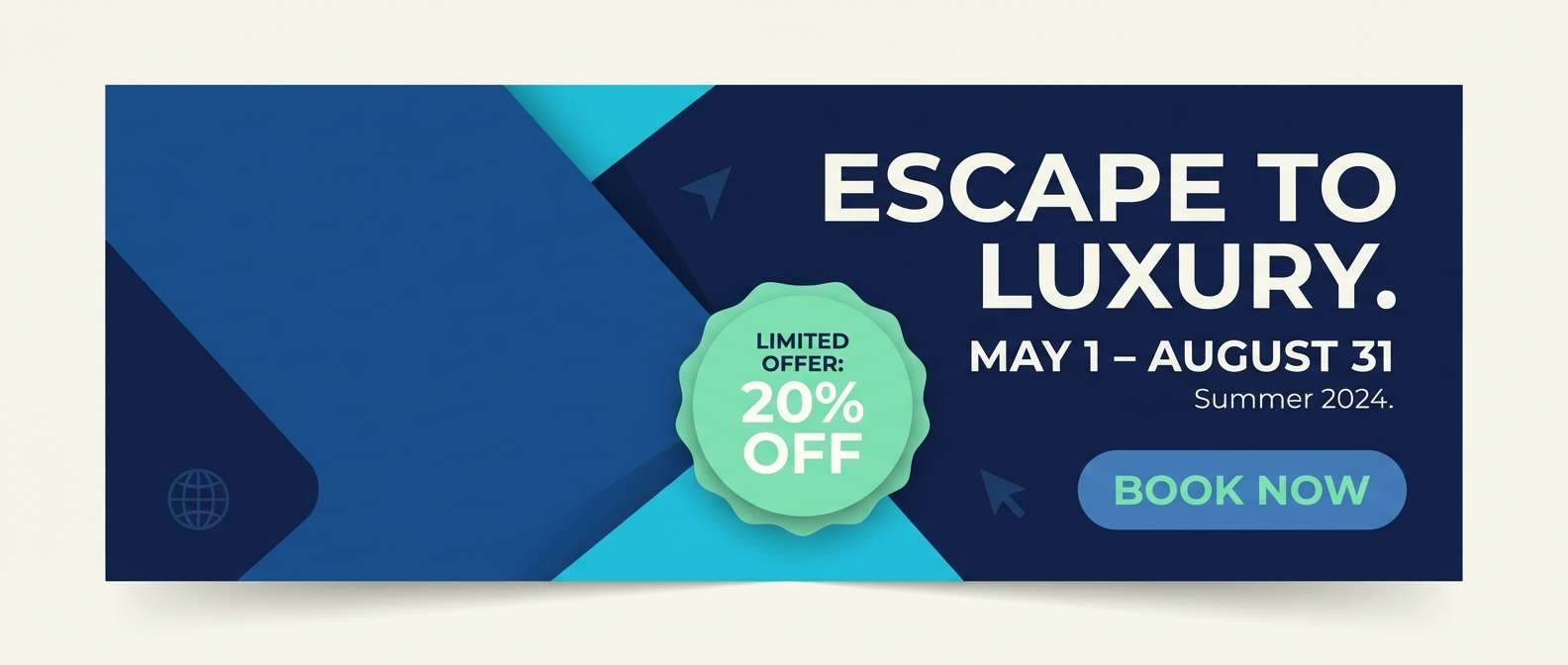
20) Winter Tropics
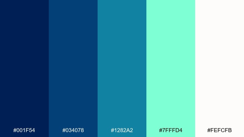
HEX: #001f54 #034078 #1282a2 #7fffd4 #fefcfb
Mood: fresh, modern, slightly adventurous
Best for: hotel booking promo banner
Fresh with a hint of adventure, it feels like tropical water viewed through a winter-clear sky. Use the layered blues to build depth in the layout, then apply mint as the pop for limited-time offers. Pair with crisp white and clean photography for a premium travel look. Tip: add a subtle gradient from navy to teal behind the headline to boost legibility without extra colors.
Image example of winter tropics generated using media.io
What Colors Go Well with Blue Mint Green?
Warm neutrals are the easiest match: soft ivory, cream, beige, and sand tones keep the palette welcoming and prevent the cool blues/greens from feeling too clinical. These are especially useful for backgrounds, cards, and large surfaces.
For modern contrast, add grounded darks like charcoal, ink navy, or near-black for type and UI structure. If you want a “spark,” use warm accents such as citrus yellow, apricot, or coral in tiny doses (badges, icons, underlines).
Metallics and textures also pair well—think silver, brushed steel, or subtle paper grain—because they complement the clean, watery vibe without introducing extra competing hues.
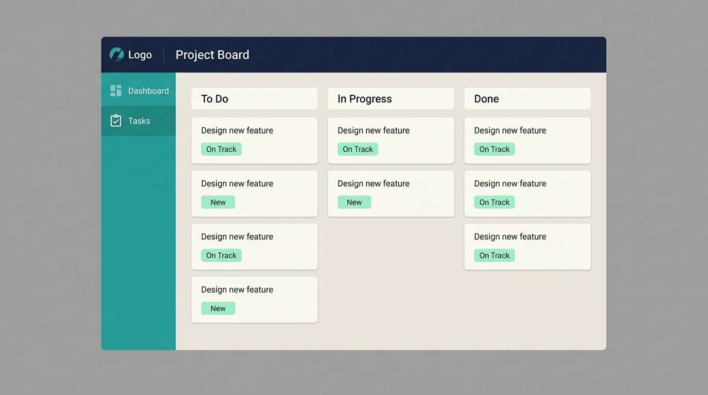
How to Use a Blue Mint Green Color Palette in Real Designs
Start with a role-based setup: assign the darkest blue to text and navigation, mid teal to interactive elements, and pale mint to backgrounds or soft highlights. This keeps hierarchy predictable and improves readability across screens.
For branding, keep mint as the “fresh signature” rather than the main logo fill—many brands look more premium when the logo stays dark and mint appears in supporting assets like patterns, packaging bands, or social templates.
In interiors and decor, use blue for anchor pieces (rugs, feature walls, cabinetry) and mint green for lighter layers (tiles, linens, art). Add a warm neutral (wood, cream) to avoid a chilly, over-cooled room.
Create Blue Mint Green Palette Visuals with AI
If you already have HEX codes, the fastest way to test a blue mint green color scheme is to generate a few concept visuals—posters, UI mockups, packaging, or wallpapers—so you can judge contrast, mood, and balance in context.
With Media.io, you can turn a short prompt into multiple styled images, then iterate quickly by swapping one accent color (like yellow or peach) to see how the overall vibe changes.
Blue Mint Green Color Palette FAQs
-
What vibe does a blue mint green color palette create?
Most blue mint green palettes feel fresh, clean, and calming—often associated with water, air, wellness, and clarity. Dark navy/teal adds trust and structure, while mint adds an airy, modern lift. -
Is blue and mint green a good combination for UI design?
Yes—use deep blue for text and navigation, teal for interactive states, and pale mint for subtle highlights. This role-based approach helps maintain hierarchy and accessibility while keeping the interface light. -
How do I keep mint from looking washed out?
Avoid using mint for body text and large, full-bleed sections. Instead, keep it for small accents (chips, badges, focus rings) or light background panels paired with a darker blue for contrast. -
What accent colors pair best with blue mint green?
Warm accents like citrus yellow, peach, coral, and warm off-white pair especially well because they balance cool tones. Use them sparingly to avoid overpowering the mint/teal base. -
Can I use a blue mint green palette for branding?
Definitely—these colors work well for healthcare, SaaS, skincare, education, travel, and sustainability brands. Keep the darkest shade as the primary brand anchor and let mint act as the “fresh” supporting color. -
What’s the best way to choose a primary color in this palette?
Pick the darkest blue/teal as your primary for readability and consistency, then assign teal to actions and mint to highlights. If you also add a warm accent, keep it under 10% of the design for a controlled look. -
How can I preview these palettes on real mockups quickly?
Generate a few themed visuals (UI screens, posters, packaging, or social ads) with an AI image tool, then compare versions by changing only one color at a time. This makes it easy to see what improves contrast and brand tone.


