

Green yellow brown palettes blend nature’s most familiar cues: leaves, sun, soil, and wood. The result is a warm, earthy scheme that feels approachable, grounded, and instantly “real.”
Whether you’re building a brand, packaging, interior moodboard, or web UI, these tones can look premium without feeling cold—especially when you balance green depth with small yellow highlights and reliable brown text.
In this article
- Why Green Yellow Brown Palettes Work So Well
-
- mossy citrus trail
- honey olive grove
- sunlit terracotta field
- woodland mustard
- sage cornbread kitchen
- autumn orchard marks
- desert herb letterpress
- vintage camp map
- farmstand dashboard
- clay and lime invitation
- botanical study wash
- roastery label roast
- eco soap studio
- hiking lookbook earth
- cozy library nook
- minimal data grove
- skincare herbarium ad
- sunroom plant pots
- farmers market flyer
- earthy classroom board
- retro picnic pattern
- What Colors Go Well with Green Yellow Brown?
- How to Use a Green Yellow Brown Color Palette in Real Designs
- Create Green Yellow Brown Palette Visuals with AI
Why Green Yellow Brown Palettes Work So Well
Green, yellow, and brown naturally sit in the “earth + sunlight” family, so they feel cohesive even when you mix shades like olive, mustard, and leather. That built-in harmony makes these palettes easy to apply across backgrounds, accents, and typography.
They also communicate trust and craft. Green suggests freshness and stability, yellow adds optimism and visibility, and brown provides weight—useful when you want a design to feel established without looking corporate.
Most importantly, this trio is flexible: you can push it rustic with darker browns and muted olives, or modern with airy off-whites and restrained yellow highlights. The palette can be both friendly and professional depending on contrast and saturation.
20+ Green Yellow Brown Color Palette Ideas (with HEX Codes)
1) Mossy Citrus Trail
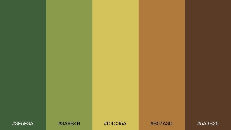
HEX: #3F5F3A #8A9B4B #D4C35A #B07A3D #5A3B25
Mood: fresh, grounded, outdoorsy
Best for: outdoor brand landing page
Fresh forest air meets bright citrus peel, anchored by worn leather browns. It works beautifully for outdoor brands, adventure blogs, and nature-driven campaigns where you want energy without neon. Pair it with warm off-white and simple line icons to keep it crisp. Tip: use the yellow as a small accent for buttons and highlights so the greens stay dominant.
Image example of mossy citrus trail generated using media.io

Media.io is an online AI studio for creating and editing video, image, and audio in your browser.

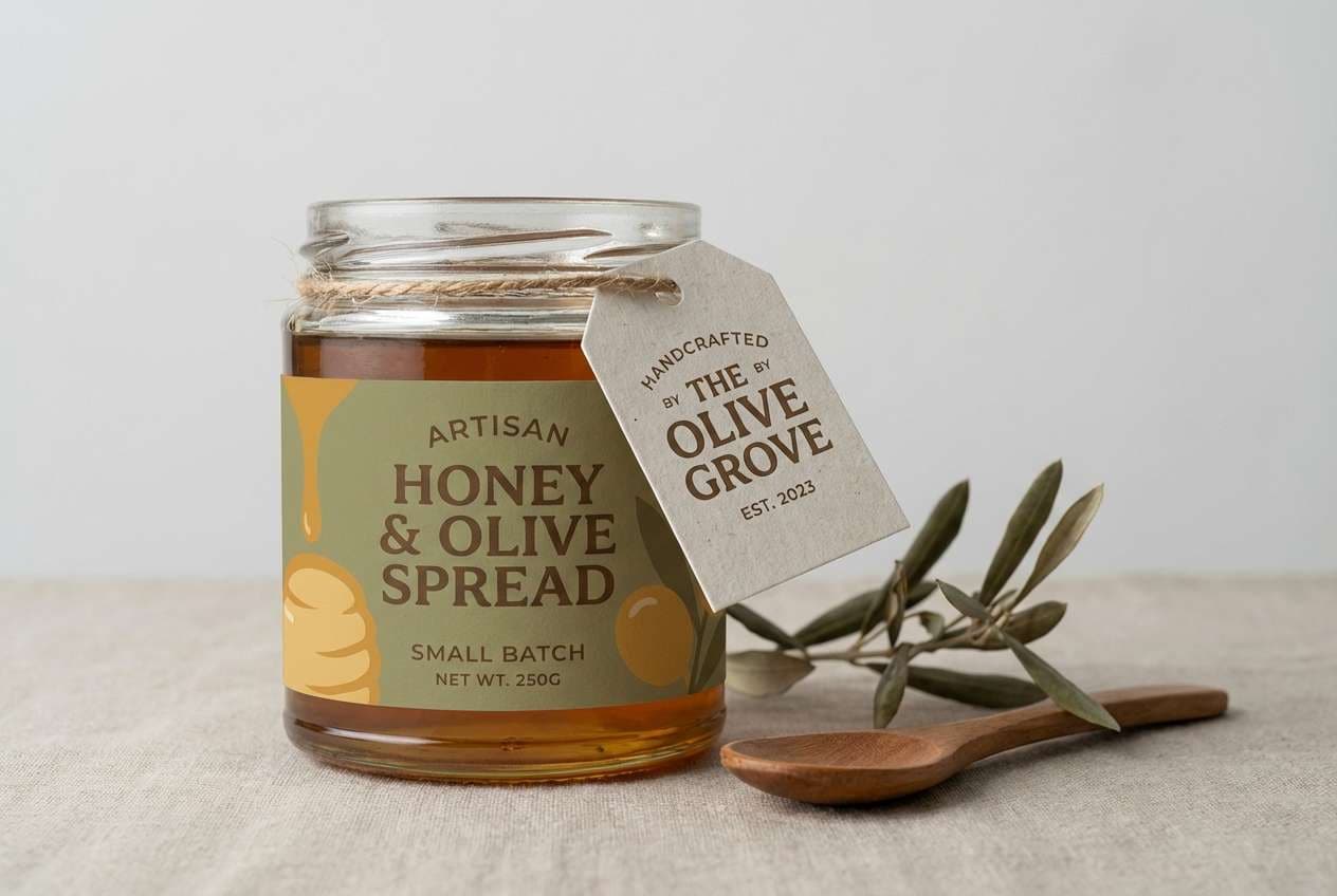
2) Honey Olive Grove
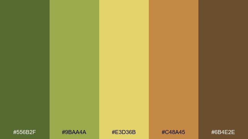
HEX: #556B2F #9BAA4A #E3D36B #C48A45 #6B4E2E
Mood: sun-warmed, natural, welcoming
Best for: artisan food packaging
Sun-warmed olives and honey tones create a friendly, farm-to-table feeling. This mix shines on jars, labels, and tag designs where you want rustic credibility with modern polish. Add a creamy background and a subtle paper texture to make the browns feel premium. Tip: keep typography in the darkest brown for reliable readability on the yellow.
Image example of honey olive grove generated using media.io
3) Sunlit Terracotta Field
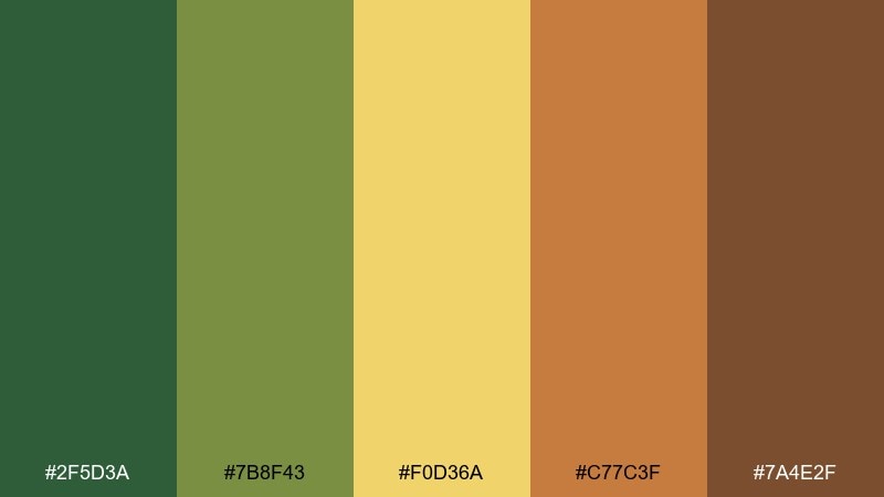
HEX: #2F5D3A #7B8F43 #F0D36A #C77C3F #7A4E2F
Mood: bright, earthy, optimistic
Best for: seasonal campaign poster
Bright midday sun over a terracotta field gives this set an upbeat, handmade vibe. These green yellow brown color combinations are ideal for seasonal posters, farmers market promos, or community events that need warmth and clarity. Pair with plenty of negative space and bold sans serif type so the palette stays modern. Tip: use the terracotta as a headline block color to balance the greens.
Image example of sunlit terracotta field generated using media.io
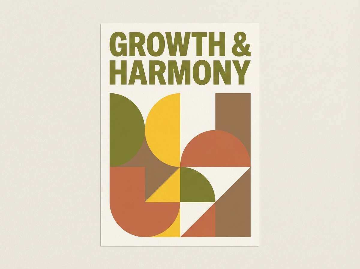
4) Woodland Mustard
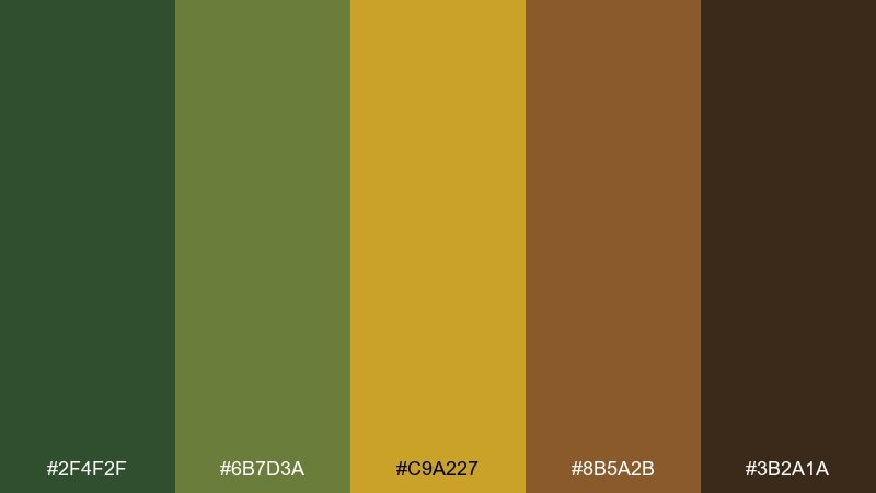
HEX: #2F4F2F #6B7D3A #C9A227 #8B5A2B #3B2A1A
Mood: bold, rustic, dramatic
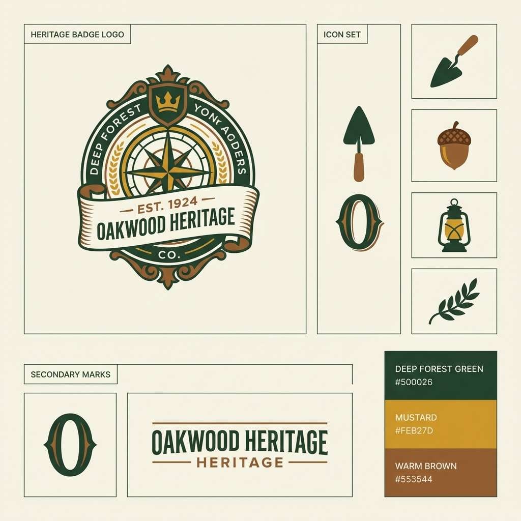
Best for: heritage logo system
Deep woodland greens and punchy mustard bring a confident, vintage-camp attitude. It fits heritage logos, badge marks, and apparel graphics that want grit without feeling messy. Pair with cream stock, stamp textures, and a single strong typeface. Tip: reserve the mustard for emblems and small highlights to keep the dark tones in control.
Image example of woodland mustard generated using media.io
5) Sage Cornbread Kitchen
HEX: #6E7F5B #B7C26A #F2D16B #C08A54 #7B5A3A
Mood: cozy, homey, comfort-food
Best for: restaurant menu design
Soft sage and cornbread yellow feel like a warm kitchen at golden hour. Use it for menus, cafe signage, and food photography overlays where you want comfort and approachability. Pair with a light cream background and warm brown rules for structure. Tip: keep body text in the darkest brown to avoid low contrast on the mid greens.
Image example of sage cornbread kitchen generated using media.io
6) Autumn Orchard Marks

HEX: #3A6B4A #94A94E #E6C85E #B67A3A #5E3D22
Mood: harvest, friendly, handcrafted
Best for: local brand identity kit
Harvest greens and mellow golds evoke orchard walks and handmade signage. This green yellow brown color palette is great for local brands, craft makers, and small-batch products that want an authentic feel. Pair it with natural paper tones and simple illustrations for a cohesive identity. Tip: use the mid green for backgrounds and keep the gold for icons and callouts.
Image example of autumn orchard marks generated using media.io
7) Desert Herb Letterpress
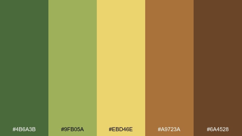
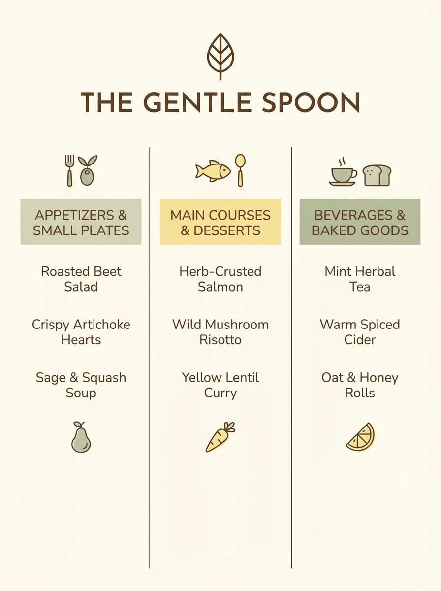
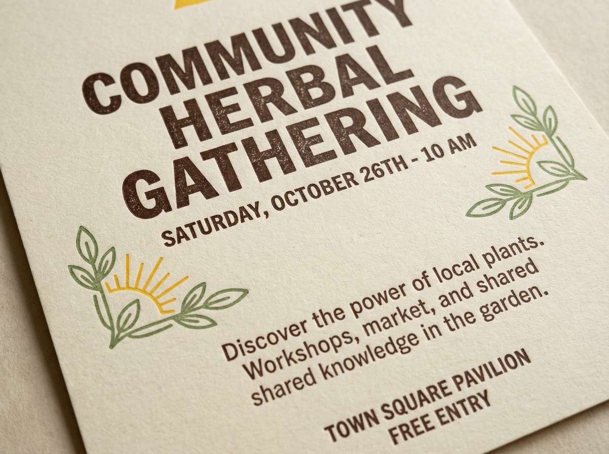
HEX: #4B6A3B #9FB05A #EBD46E #A9723A #6A4528
Mood: dry, sunny, artisanal
Best for: letterpress-style flyer
Dry herb greens and sun-bleached yellow suggest desert trails and handmade ink. It suits letterpress-inspired flyers, workshop promos, and community boards where texture matters. Pair with grainy patterns and a thick slab serif to reinforce the crafted mood. Tip: keep the darkest brown for headlines to mimic real ink density.
Image example of desert herb letterpress generated using media.io
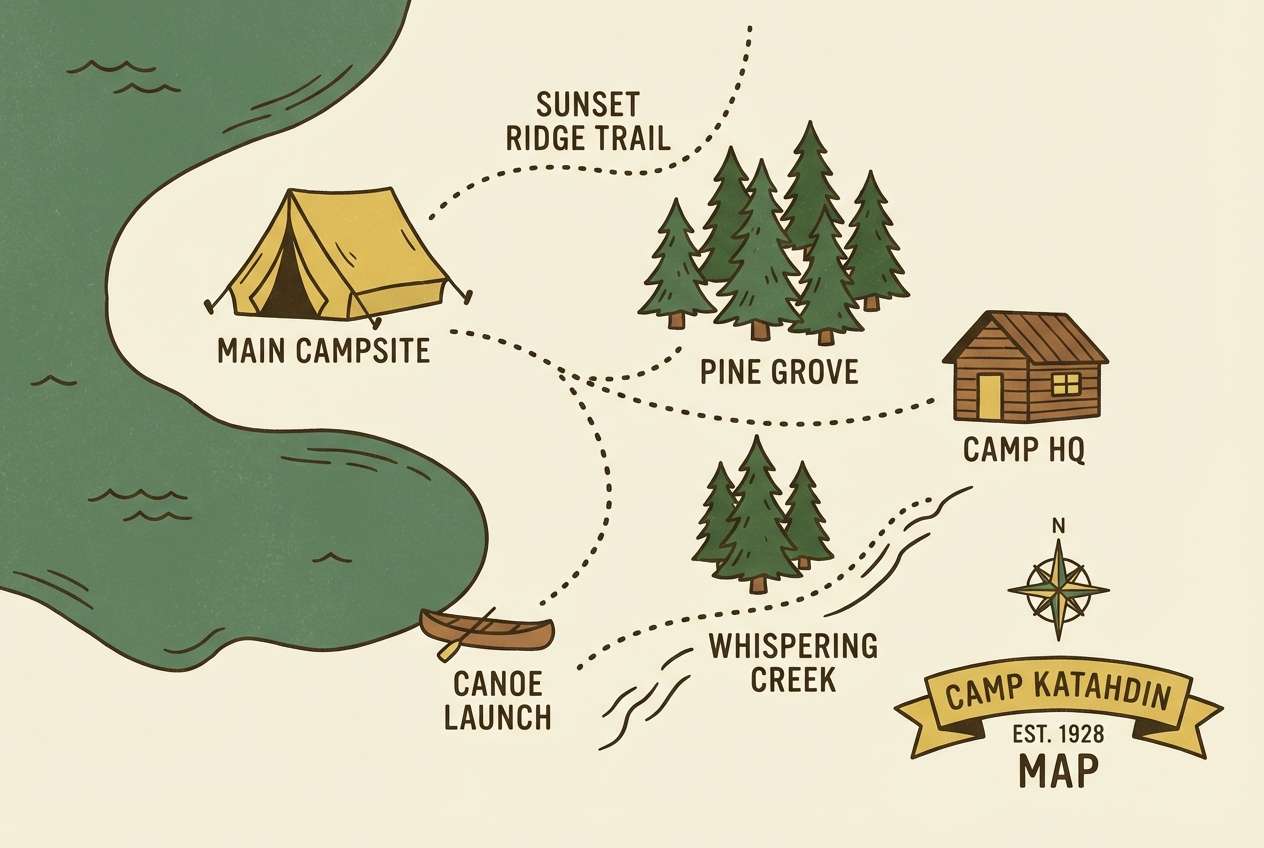
8) Vintage Camp Map
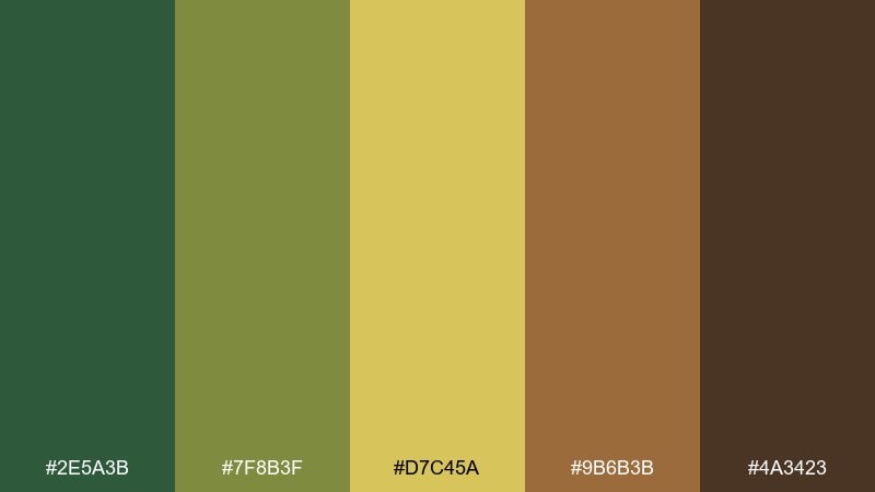
HEX: #2E5A3B #7F8B3F #D7C45A #9B6B3B #4A3423
Mood: nostalgic, exploratory, rugged
Best for: illustrated map graphic
Nostalgic greens and sun-faded yellows feel like an old camp map tucked in a backpack. It works well for illustrated maps, trail guides, and infographic-style prints. Pair with thin contour lines and a cream base so the palette reads clearly. Tip: use the mid brown for labels and the dark brown for borders to frame the artwork.
Image example of vintage camp map generated using media.io
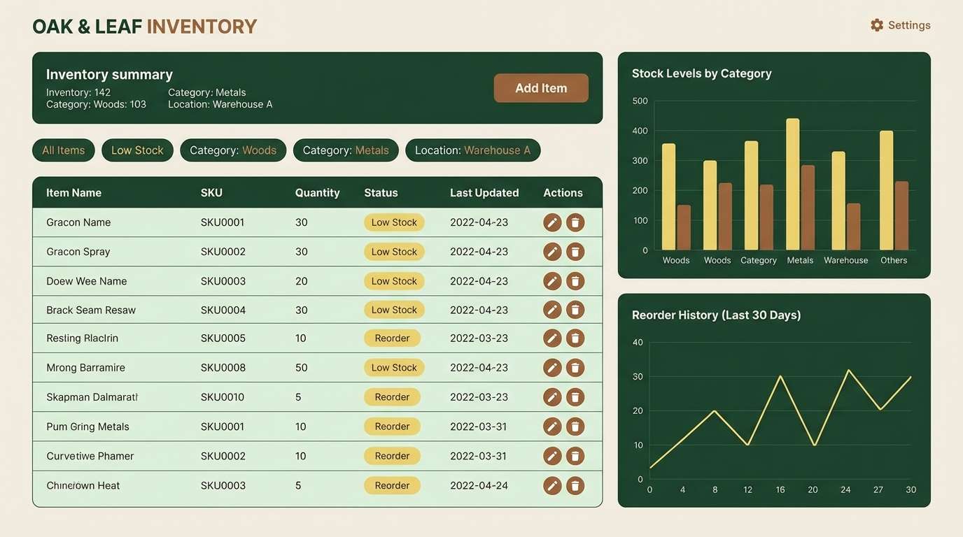
9) Farmstand Dashboard
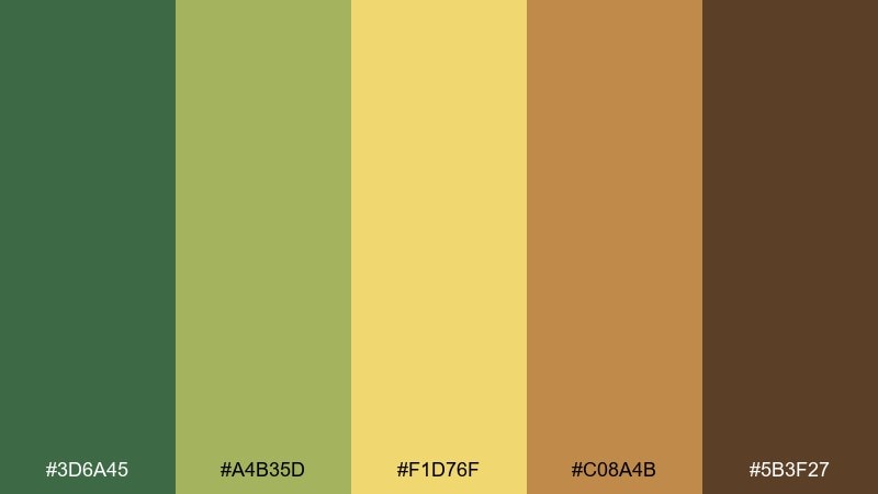
HEX: #3D6A45 #A4B35D #F1D76F #C08A4B #5B3F27
Mood: clear, friendly, practical
Best for: inventory dashboard UI
Clean greens with a bright yellow accent give a practical, upbeat feel. It is a strong fit for dashboards, admin panels, and analytics screens that need warmth without losing structure. Pair with neutral grays and consistent spacing so the yellow reads as a true status highlight. Tip: use the lightest yellow only for badges, not large panels, to avoid glare.
Image example of farmstand dashboard generated using media.io
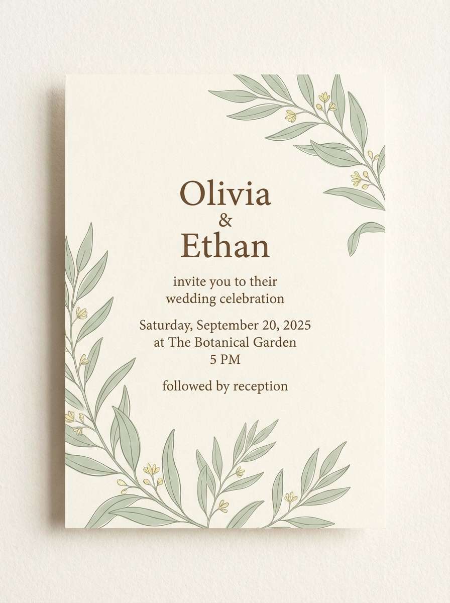
10) Clay and Lime Invitation
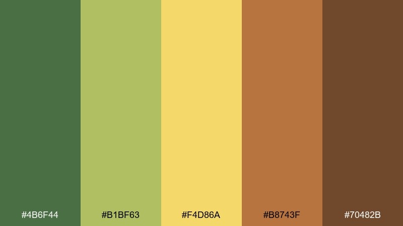
HEX: #4B6F44 #B1BF63 #F4D86A #B8743F #70482B
Mood: romantic, earthy, sunlit
Best for: rustic wedding invitation
Sunlit lime and clay browns create a relaxed, romantic countryside vibe. It is perfect for rustic invitations, save-the-dates, and wedding signage that leans natural rather than boho-busy. Pair with deckled paper textures and a clean serif to keep it elegant. Tip: set the main text in dark brown and use the yellow only for small decorative flourishes.
Image example of clay and lime invitation generated using media.io
11) Botanical Study Wash
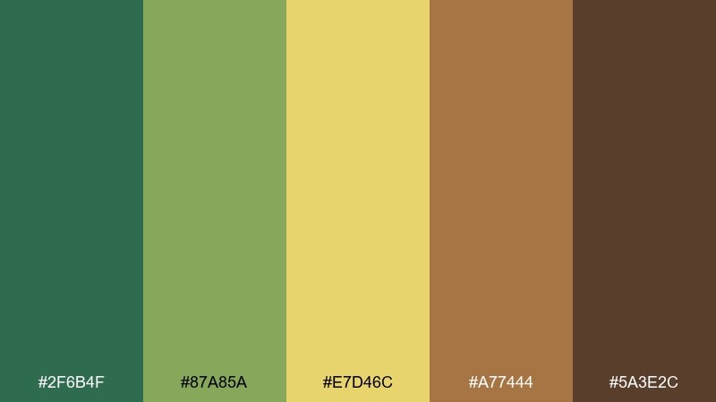
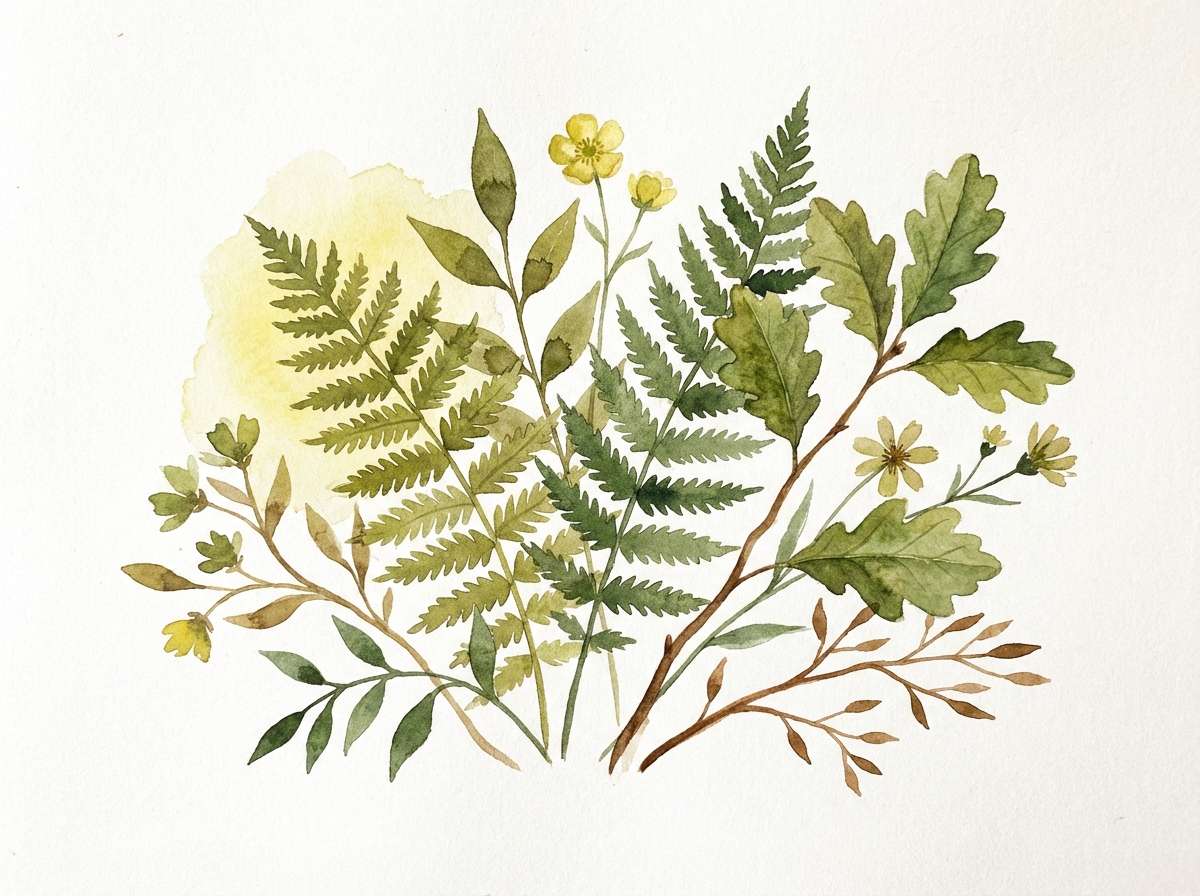
HEX: #2F6B4F #87A85A #E7D46C #A77444 #5A3E2C
Mood: calm, botanical, artistic
Best for: watercolor botanical illustration
Calm leaf greens and soft golden wash feel like a botanical notebook page. Use it for watercolor illustrations, plant icons, and gentle social graphics. Pair with plenty of white space and delicate outlines so the tones stay airy. Tip: let the yellow sit behind the greenery as a subtle glow instead of a solid block.
Image example of botanical study wash generated using media.io
12) Roastery Label Roast
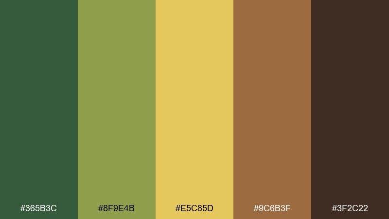
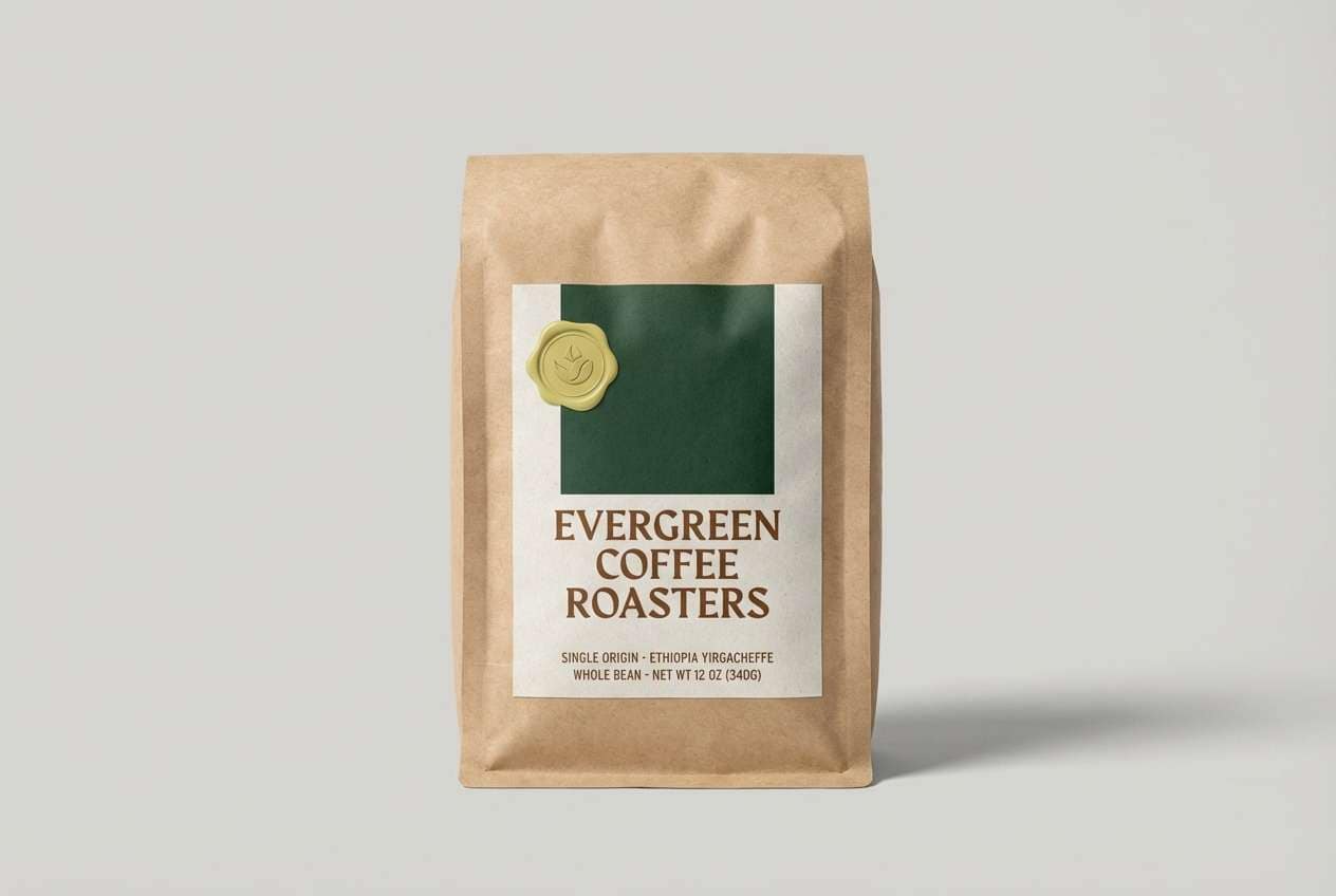
HEX: #365B3C #8F9E4B #E5C85D #9C6B3F #3F2C22
Mood: rich, aromatic, premium
Best for: coffee bag label design
Rich roast browns with olive greens feel like a warm café with sunlight cutting through steam. These green yellow brown color combinations work especially well for coffee labels, craft beverages, and specialty food packaging. Pair with matte black or deep brown type and minimal icons for a premium read. Tip: use the yellow as a thin border or seal mark rather than a full background.
Image example of roastery label roast generated using media.io
13) Eco Soap Studio
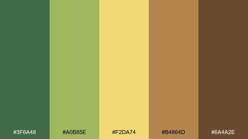
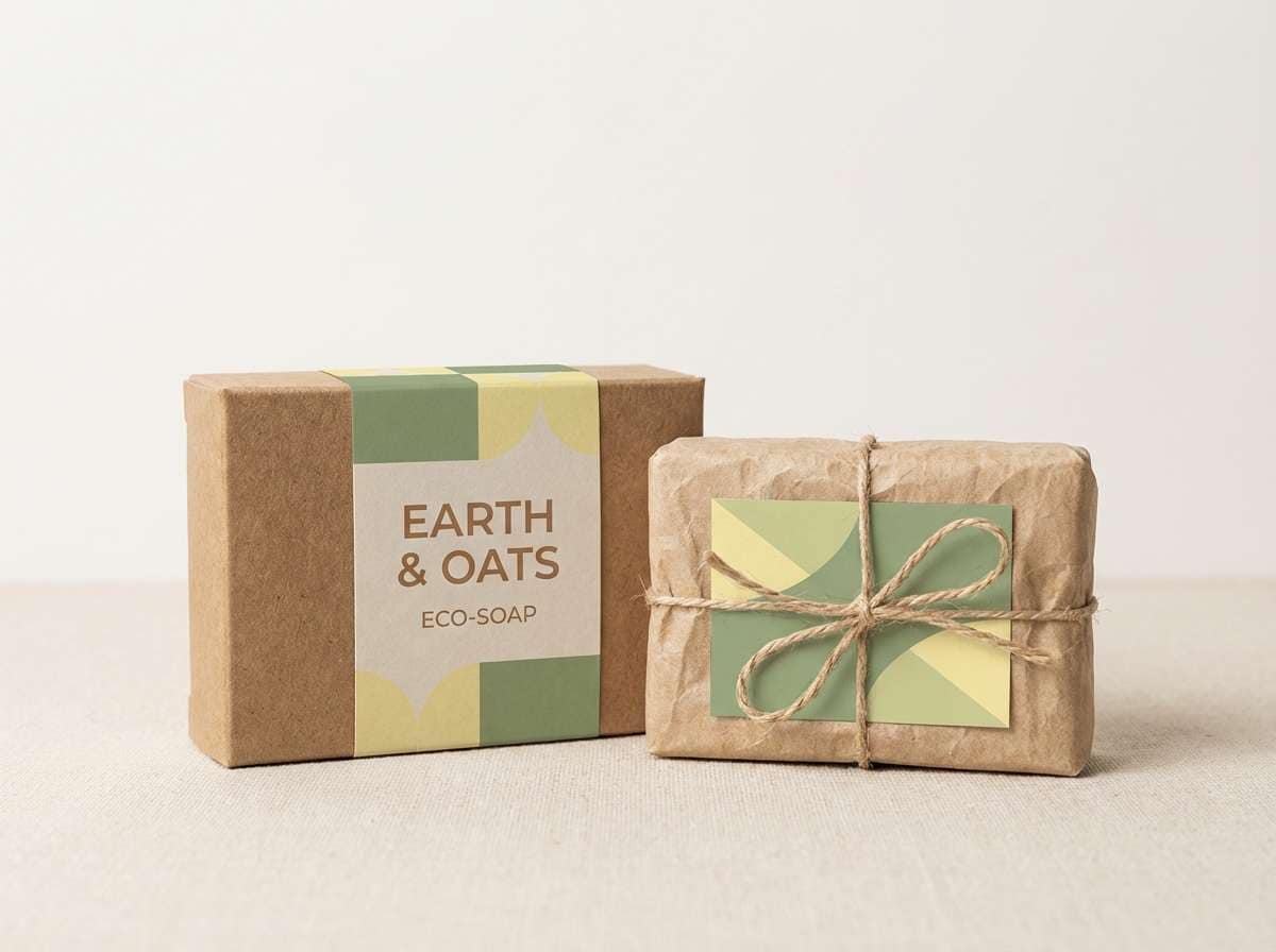
HEX: #3F6A48 #A0B85E #F2DA74 #B4864D #6A4A2E
Mood: clean, earthy, modern
Best for: eco soap packaging
Clean greens with a soft golden note feel fresh, botanical, and trustworthy. It is a strong fit for eco soap, refill products, and sustainable packaging where you want natural cues without leaning too rustic. Pair with kraft paper textures and simple sans serif labels to keep it contemporary. Tip: keep the brown for small details like ingredient lists and batch numbers.
Image example of eco soap studio generated using media.io
14) Hiking Lookbook Earth
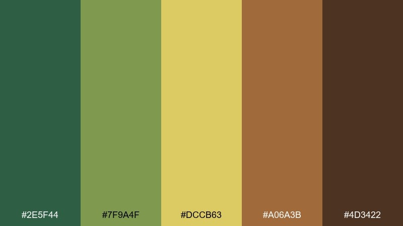
HEX: #2E5F44 #7F9A4F #DCCB63 #A06A3B #4D3422
Mood: adventurous, grounded, sporty
Best for: outdoor apparel lookbook
Grounded greens and warm browns bring a rugged, trail-ready energy. Use it for lookbooks, gear catalogs, and campaign layouts that need to feel durable and authentic. Pair with strong photography and keep the yellow as a thin accent line for sections and prices. Tip: if you add black, use it sparingly to avoid flattening the earthy depth.
Image example of hiking lookbook earth generated using media.io
15) Cozy Library Nook
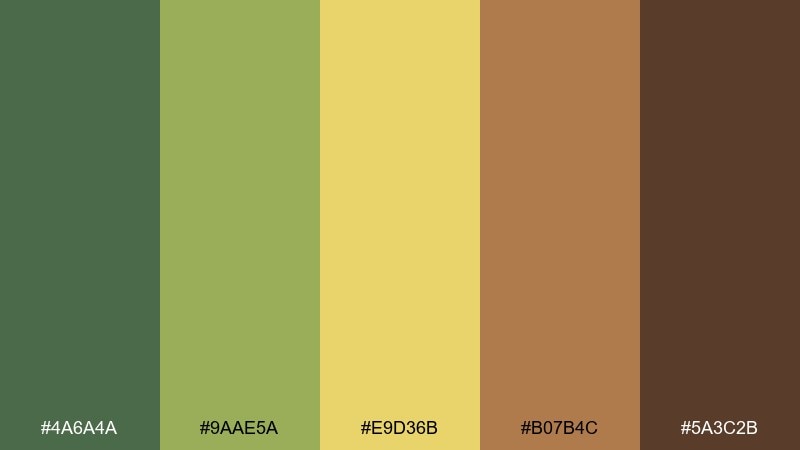
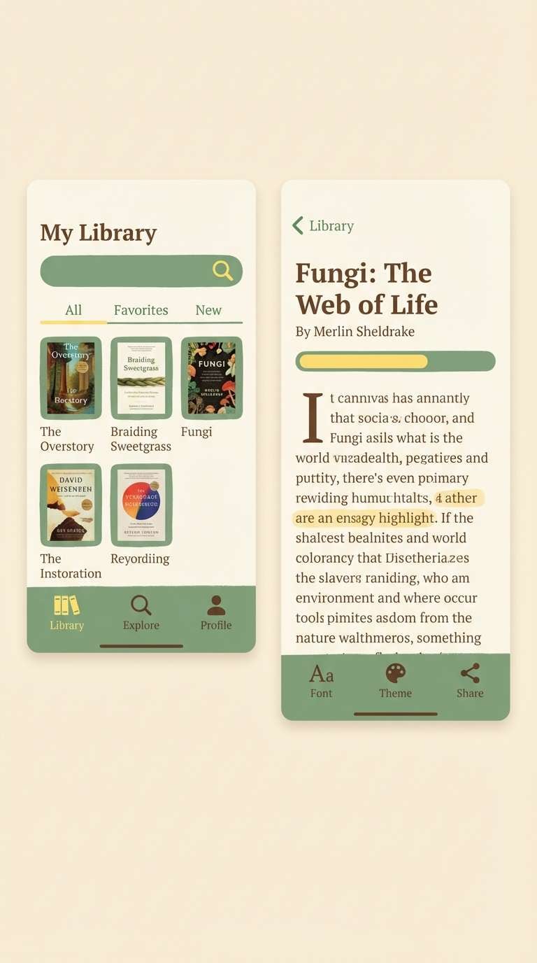
HEX: #4A6A4A #9AAE5A #E9D36B #B07B4C #5A3C2B
Mood: quiet, cozy, nostalgic
Best for: reading app theme
Quiet greens and mellow golds feel like a cozy library corner at dusk. It is ideal for reading apps, note-taking tools, or long-form content sites where comfort matters. Pair with warm cream backgrounds and reduce saturation on large areas to avoid fatigue. Tip: use the golden tone for progress indicators so they stay visible without shouting.
Image example of cozy library nook generated using media.io
16) Minimal Data Grove
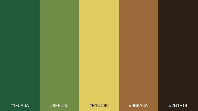
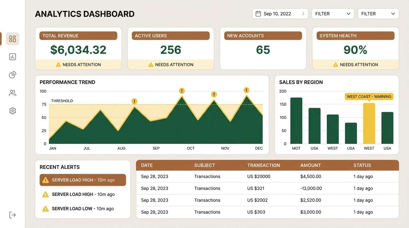
HEX: #1F5A3A #6F8D45 #E1CC62 #9B6A3A #2B1F16
Mood: focused, modern, confident
Best for: analytics dashboard UI
Focused greens with a restrained yellow accent feel modern and confident, like data viewed through a natural lens. This green yellow brown color palette suits analytics dashboards, fintech tools, and reports where clarity is non-negotiable. Pair with light neutrals and consistent chart styles to keep the interface calm. Tip: use the yellow only for one meaning, such as warnings, so users learn it instantly.
Image example of minimal data grove generated using media.io
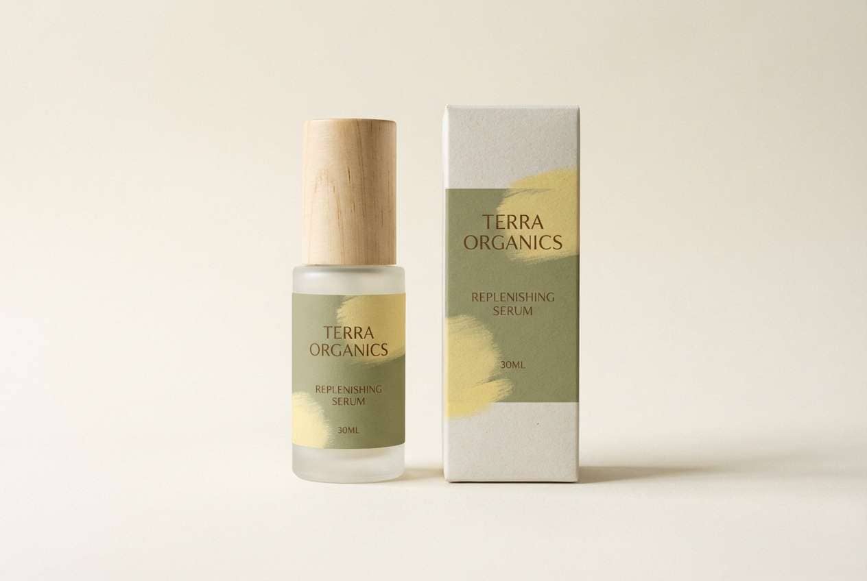
17) Skincare Herbarium Ad

HEX: #3A6F4D #A7BC62 #F3DD7B #C08C56 #6A4B33
Mood: fresh, gentle, premium
Best for: organic skincare product ad
Fresh greens and soft gold read as gentle, botanical, and high-quality. It fits organic skincare ads, serum labels, and ingredient-focused campaigns that need calm credibility. Pair with a bright white or warm ivory background and minimal copy for a premium finish. Tip: let the green carry the brand and keep brown limited to fine print and caps.
Image example of skincare herbarium ad generated using media.io
18) Sunroom Plant Pots
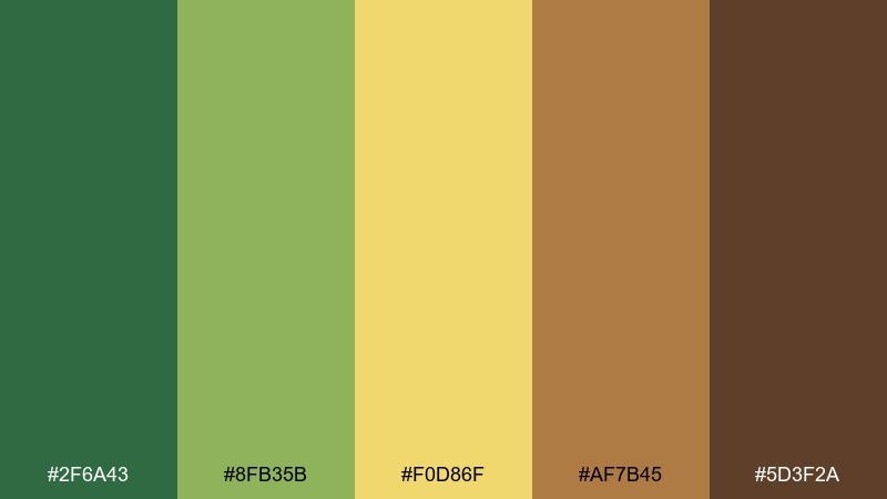
HEX: #2F6A43 #8FB35B #F0D86F #AF7B45 #5D3F2A
Mood: bright, airy, plant-loving
Best for: home decor moodboard
Bright greens and warm clay browns feel like plant pots in a sunny room. Use it for home decor moodboards, interior styling guides, and Pinterest graphics that aim for relaxed natural warmth. Pair with linen textures and light wood tones to keep everything breathable. Tip: keep the yellow as a small sunlit accent so it does not overpower the calmer greens.
Image example of sunroom plant pots generated using media.io
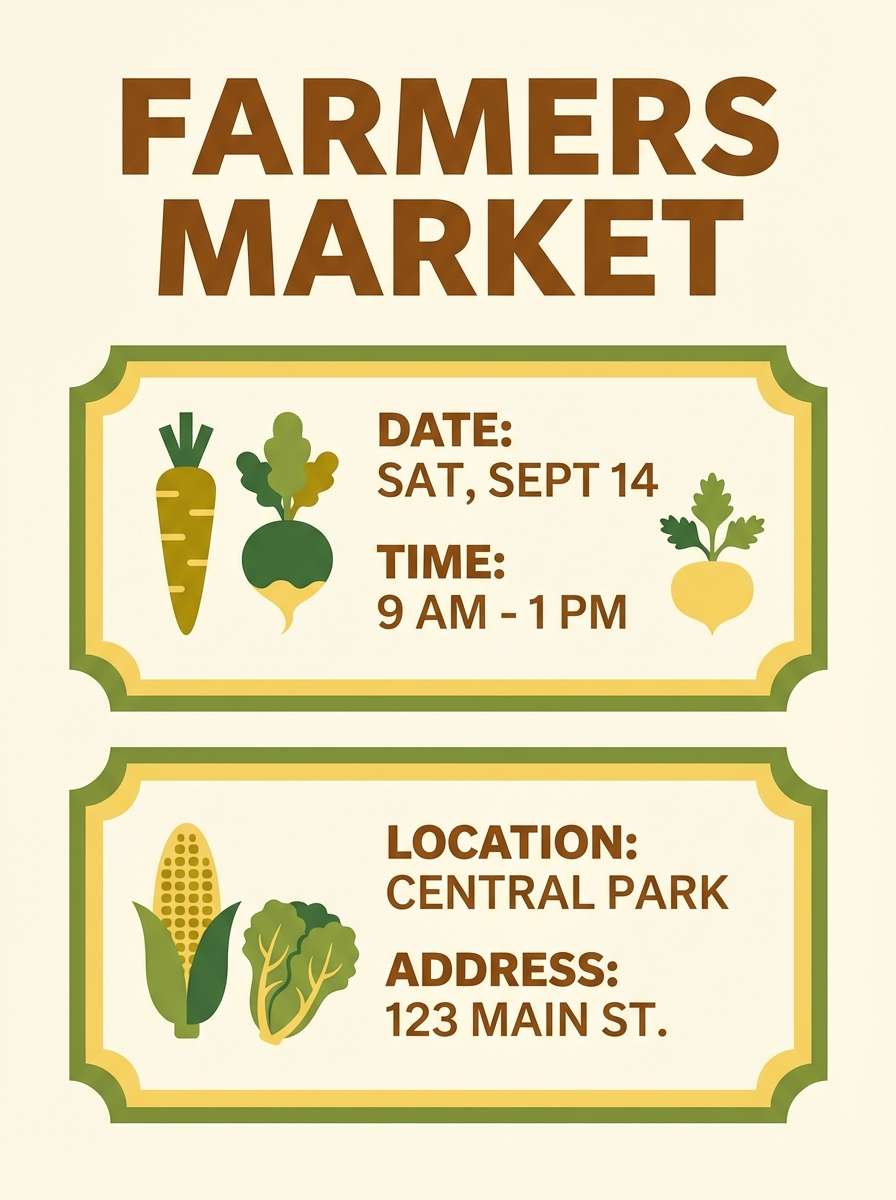
19) Farmers Market Flyer
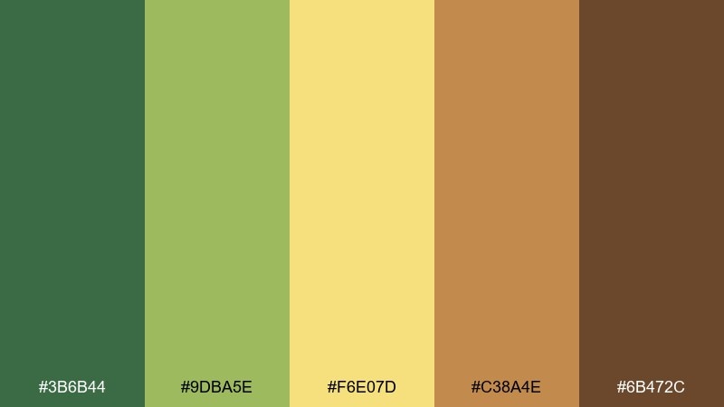
HEX: #3B6B44 #9DBA5E #F6E07D #C38A4E #6B472C
Mood: cheerful, local, community-first
Best for: event flyer design
Cheerful greens with buttery yellow feel like hand-painted signs at a local stall. A green yellow brown color combination like this works well for event flyers, seasonal specials, and community announcements. Pair with bold headers, simple produce icons, and an off-white background for easy scanning. Tip: keep the yellow behind key details like dates to boost visibility without clutter.
Image example of farmers market flyer generated using media.io
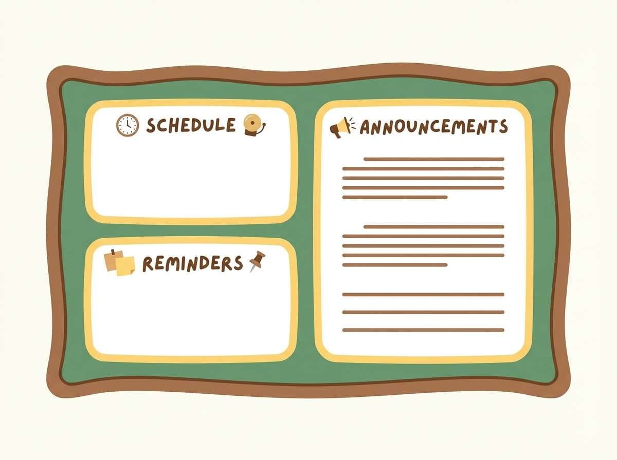
20) Earthy Classroom Board
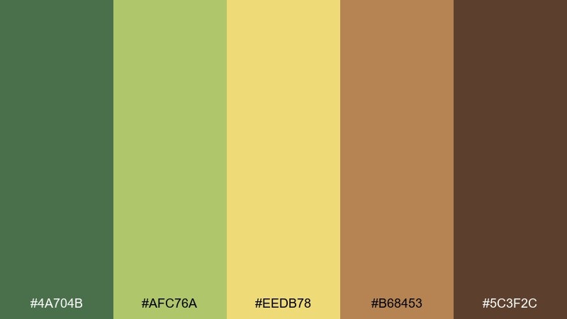
HEX: #4A704B #AFC76A #EEDB78 #B68453 #5C3F2C
Mood: calm, friendly, organized
Best for: classroom bulletin template
Calm greens and friendly yellow bring a grounded, welcoming vibe without turning childish. It is ideal for classroom bulletin templates, printable schedules, and learning resources that need gentle structure. Pair with lots of white space and rounded shapes to keep it approachable. Tip: use the mid green for section headers so the layout stays clear from a distance.
Image example of earthy classroom board generated using media.io
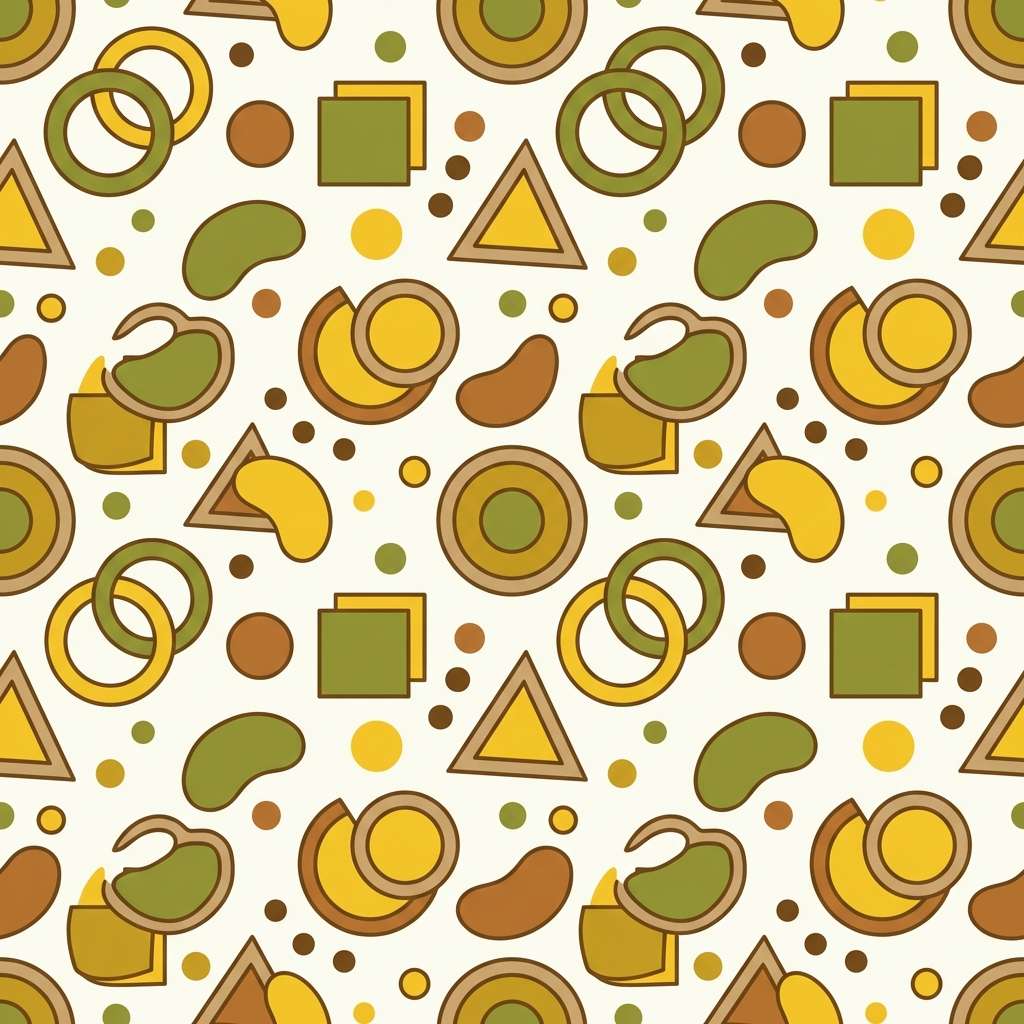
21) Retro Picnic Pattern
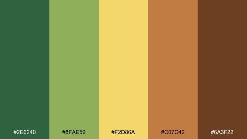
HEX: #2E6240 #8FAE59 #F2D86A #C07C42 #6A3F22
Mood: playful, retro, sun-kissed
Best for: packaging pattern design
Playful retro greens with sunny yellow feel like a picnic blanket in late summer. These green yellow brown color combinations are great for repeat patterns, snack packaging, and limited-edition wrappers. Pair with simple geometric motifs and keep the darkest brown for outlines to sharpen the pattern. Tip: test the pattern at small sizes so the yellow does not blur into the tan.
Image example of retro picnic pattern generated using media.io
What Colors Go Well with Green Yellow Brown?
Warm neutrals are the easiest match: cream, ivory, oatmeal, and soft greige keep the palette breathable and help yellow accents pop without turning harsh. For a more premium look, add charcoal or deep espresso as a “type + outline” color.
Muted reds and oranges (terracotta, rust, clay) pair naturally with brown and make greens feel richer. If you want a fresher, cleaner direction, try cool balancing neutrals like fog gray or a desaturated slate.
For contrast, treat yellow as an accent rather than a base layer, then use the deepest green or darkest brown for text and key UI elements. This keeps the scheme readable while preserving that earthy warmth.
How to Use a Green Yellow Brown Color Palette in Real Designs
Start with role assignment: pick one dominant green for large areas (background panels, hero blocks), one supporting mid-tone (secondary surfaces), and reserve yellow for calls-to-action, badges, or small highlights. Let brown handle typography, borders, and grounding elements like footers.
Watch saturation and contrast. Earthy yellows can look dull if overused; instead, use them as small “sunlight” moments against calmer greens. In print, browns can feel premium with subtle texture; in UI, keep brown mostly for text and icons to avoid a heavy interface.
To modernize the look, add plenty of negative space and clean typography. Even rustic palettes feel contemporary when layouts are grid-based and color usage is disciplined.
Create Green Yellow Brown Palette Visuals with AI
If you’re pitching concepts or building a moodboard, generating quick palette-based visuals can save hours. With Media.io, you can turn a short prompt into on-brand examples—landing pages, packaging mockups, posters, and UI screens—using the exact green yellow brown tones you want.
Use your palette colors as guidance in the prompt (e.g., “dominant olive green, muted yellow accents, warm brown typography”), then iterate on layout style and lighting. This is especially helpful when you need multiple directions for stakeholders fast.
Green Yellow Brown Color Palette FAQs
-
What does a green yellow brown color palette communicate?
It usually signals nature, warmth, and authenticity—think plants (green), sunlight/energy (yellow), and earth/craft (brown). That combination often feels friendly, grounded, and trustworthy for brands and interfaces. -
How do I keep yellow from overpowering the design?
Use yellow as an accent (buttons, icons, labels, small shapes) rather than a full background. Let green carry the large areas, and use dark brown or deep green to anchor contrast and readability. -
Which color should I use for text: green or brown?
Most of the time, use the darkest brown for body text because it reads more naturally on warm off-whites and yellows. Deep green can work for headings, but test contrast carefully on mid-greens. -
What background colors work best with these earthy tones?
Warm off-white, cream, ivory, and light beige are the safest backgrounds because they keep the palette airy. For a moodier look, try very deep green or espresso brown with restrained yellow highlights. -
Is this palette good for UI and dashboards?
Yes, as long as you control contrast and limit yellow to a single meaning (e.g., warnings or highlights). Pair the palette with neutral grays for tables and cards so the interface stays clean. -
How can I make a green yellow brown palette feel more modern?
Reduce saturation, increase whitespace, and use a clean type system. Keep browns for text and fine details, and use yellow sparingly—modern designs typically avoid large, flat yellow panels. -
Can I generate matching palette visuals quickly for presentations?
Yes. Use Media.io’s text-to-image tool and describe the layout plus the color dominance (e.g., “olive green base, muted yellow accents, warm brown typography”). Then iterate prompts to explore multiple styles consistently.
Next: Kids Color Palette


