

Antique white (#FAEBD7) is a warm, creamy neutral that instantly softens a layout without feeling bland. It’s a favorite for interiors, branding, and UI because it reads clean while still feeling human and tactile.
Below are modern antique white palette ideas you can copy fast, plus practical tips for pairing contrast, accents, and textures so your designs stay calm, readable, and intentional.
In this article
- Why Antique White Palettes Work So Well
-
- heritage linen
- porcelain rose
- candlelit brass
- dusty sage pantry
- coastal oyster
- museum walnut
- quiet minimal
- vintage tea room
- french country bluegray
- old book paper
- warm sandstone
- soft terracotta glow
- ivory and ink
- garden pergola
- autumn mantel
- clouded lavender
- stone and moss
- champagne evening
- sepia studio
- winter eucalyptus
- What Colors Go Well with Antique White?
- How to Use a Antique White Color Palette in Real Designs
- Create Antique White Palette Visuals with AI
Why Antique White Palettes Work So Well
Antique white is warm enough to feel inviting, but light enough to act like a “soft background” that lets typography, photography, and product colors lead. Compared with pure white, it reduces glare and makes pages feel more premium and relaxed.
It also pairs effortlessly with both warm and cool families: walnuts, tans, and terracottas look natural, while blue-grays and sage greens add structure without harsh contrast. That versatility makes it a reliable base for cohesive visual systems.
Most importantly, antique white supports texture-driven design. Grain, linen, paper, plaster, and matte finishes all read more believable on a creamy neutral, which is why it works so well for interiors, packaging, and heritage-inspired branding.
20+ Antique White Color Palette Ideas (with HEX Codes)
1) Heritage Linen
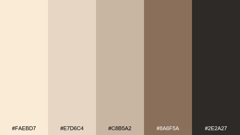
HEX: #FAEBD7 #E7D6C4 #C8B5A2 #8A6F5A #2E2A27
Mood: classic, cozy, grounded
Best for: traditional living room styling
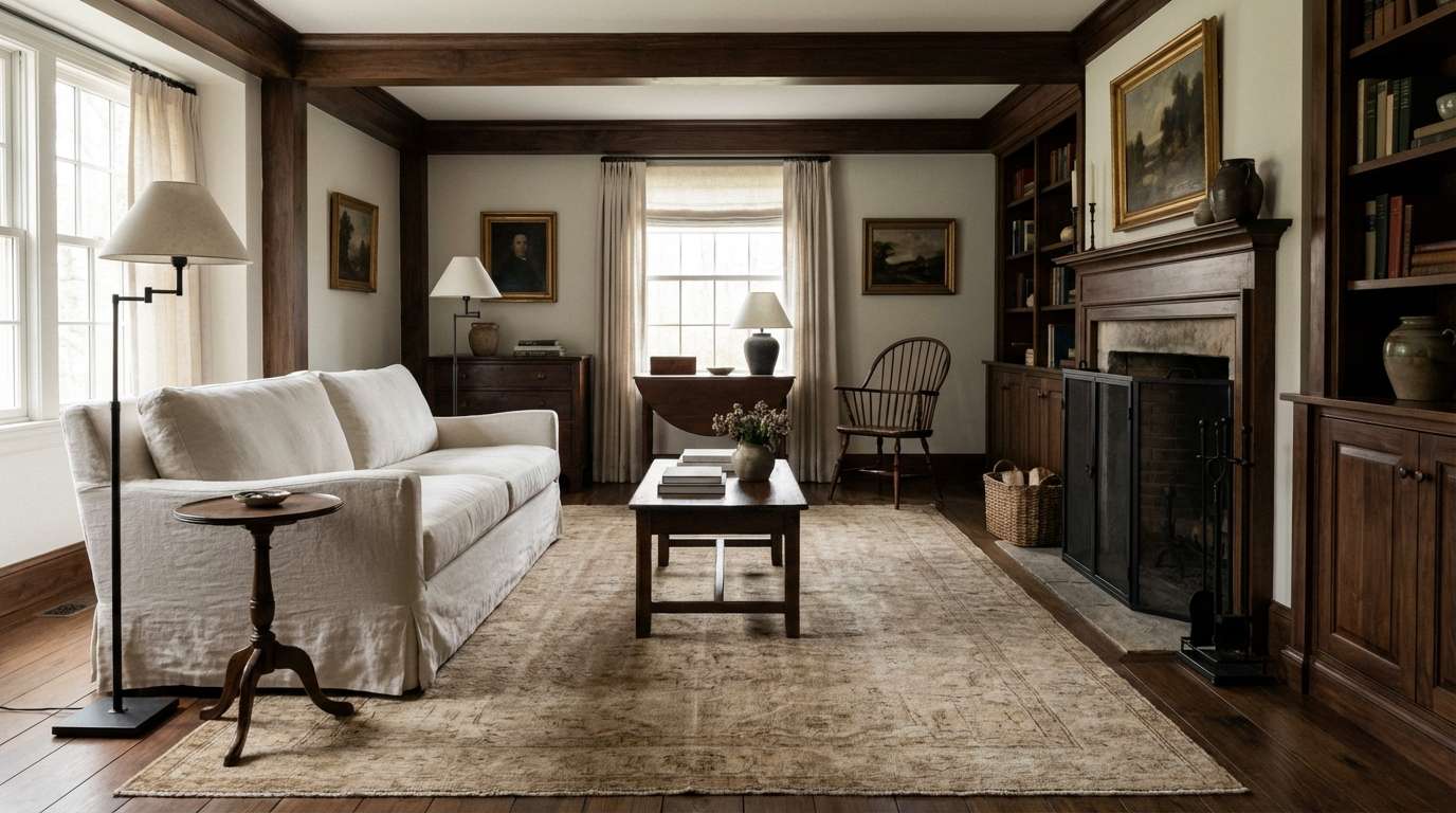
Classic and cozy like sunlit linen and aged wood, this mix feels instantly lived-in. It works beautifully for warm interiors, boutique hotels, and heritage branding where you want softness without looking plain. For a reliable antique white color palette, keep the darkest tone to small anchors like frames, hardware, or a single statement chair. Pair it with natural textures such as oak, jute, and matte ceramics for an authentic finish.
Image example of heritage linen generated using media.io
Media.io is an online AI studio for creating and editing video, image, and audio in your browser.

2) Porcelain Rose
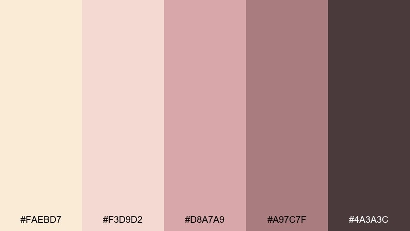
HEX: #FAEBD7 #F3D9D2 #D8A7A9 #A97C7F #4A3A3C
Mood: romantic, delicate, nostalgic
Best for: wedding invitation design
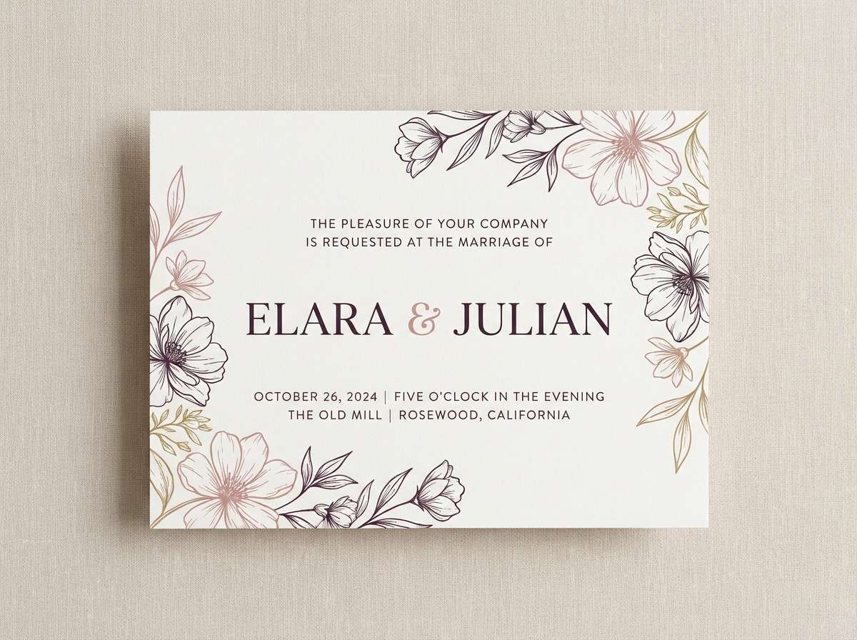
Romantic and delicate like vintage porcelain and pressed petals, these tones read soft but intentional. They shine on invitations, beauty packaging, and editorial layouts that need a gentle blush without turning sugary. Balance the pinks with plenty of pale space and let the deep plum act as your typography color. A subtle paper grain or letterpress effect makes the palette feel premium.
Image example of porcelain rose generated using media.io
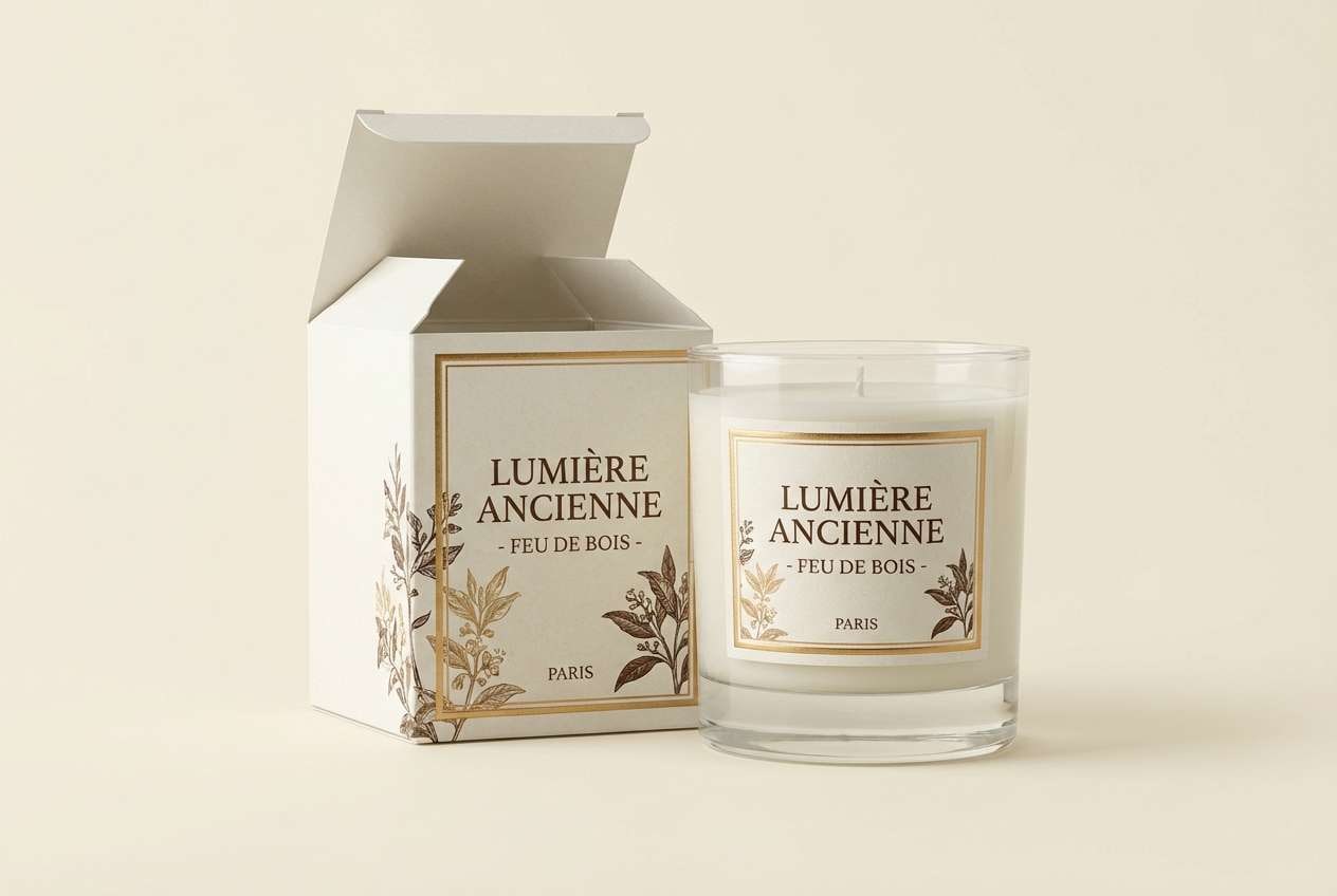
3) Candlelit Brass
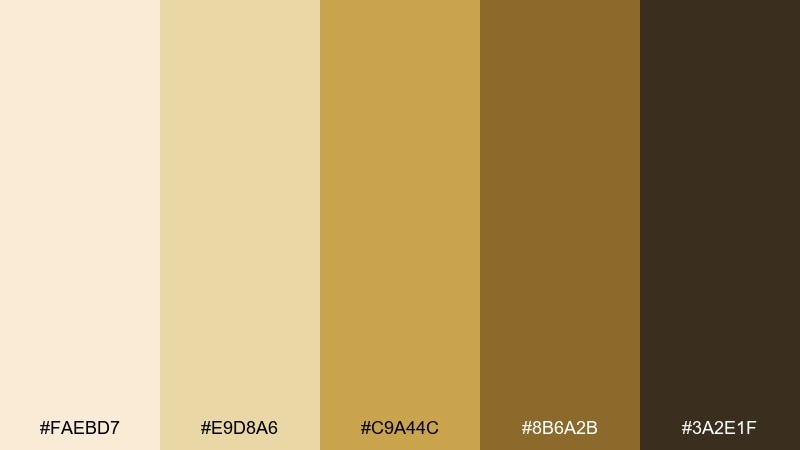
HEX: #FAEBD7 #E9D8A6 #C9A44C #8B6A2B #3A2E1F
Mood: warm, glowing, upscale
Best for: luxury candle packaging
Warm and glowing like brass beside candlelight, this set feels elegant and inviting. It is a strong fit for premium packaging, hospitality menus, and seasonal product photography with a golden mood. Use the antique white base for breathing room and apply the brass tones to labels, seals, and small graphic borders. Keep finishes matte or lightly textured so the gold reads sophisticated, not flashy.
Image example of candlelit brass generated using media.io
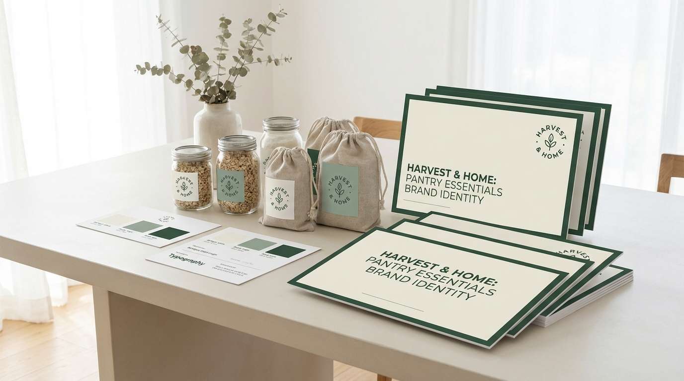
4) Dusty Sage Pantry
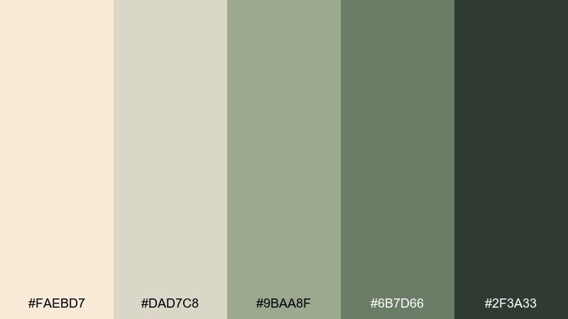
HEX: #FAEBD7 #DAD7C8 #9BAA8F #6B7D66 #2F3A33
Mood: fresh, earthy, calm
Best for: kitchen brand identity
Fresh and earthy like a herb pantry and sun-bleached labels, the greens feel calm against creamy neutrals. It fits food startups, natural skincare, and kitchen branding where you want clean with a hint of rustic. These antique white color combinations work best when sage is your hero and the darkest green is reserved for small type and icons. Add kraft paper or recycled textures to reinforce the organic vibe.
Image example of dusty sage pantry generated using media.io
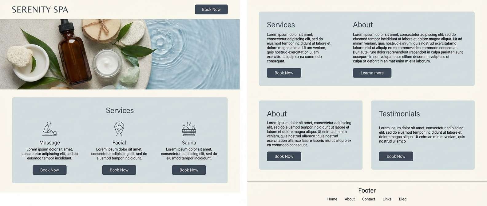
5) Coastal Oyster
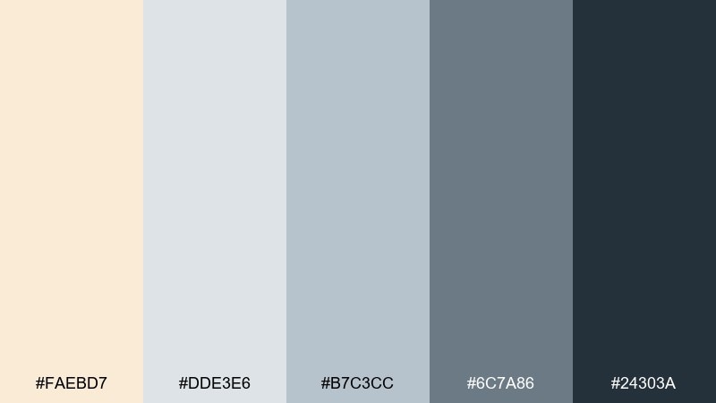
HEX: #FAEBD7 #DDE3E6 #B7C3CC #6C7A86 #24303A
Mood: breezy, clean, coastal
Best for: spa website homepage
Breezy and clean like oyster shells and cool sea air, these grays keep the cream from feeling too warm. Use it for spa sites, wellness apps, and airy editorial designs that need calm contrast. Let antique white carry the background, then layer blue-gray sections to create structure without harsh lines. A single dark slate for buttons will keep CTAs crisp and readable.
Image example of coastal oyster generated using media.io
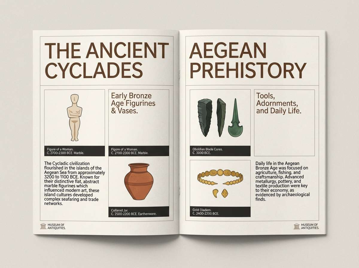
6) Museum Walnut
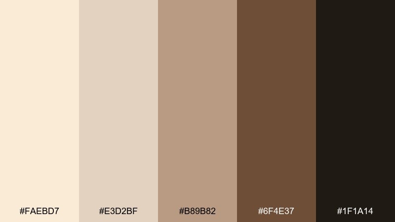
HEX: #FAEBD7 #E3D2BF #B89B82 #6F4E37 #1F1A14
Mood: refined, historic, rich
Best for: museum brochure layout
Refined and historic like gallery walls and walnut frames, this palette brings quiet drama. It is ideal for cultural institutions, artisan brands, and long-form brochures where readability matters. Use the near-black for headlines and captions, while keeping mid-browns to dividers and callouts. If photos are warm-toned, this set will make them feel cohesive without heavy filters.
Image example of museum walnut generated using media.io
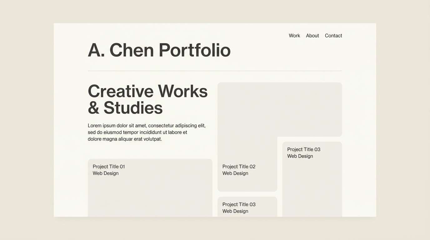
7) Quiet Minimal
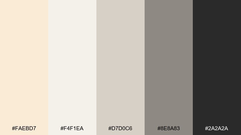
HEX: #FAEBD7 #F4F1EA #D7D0C6 #8E8A83 #2A2A2A
Mood: minimal, airy, modern
Best for: portfolio website UI
Minimal and airy like a bright studio with soft shadows, these neutrals feel modern and calm. They are perfect for portfolios, architecture sites, and product pages where the work needs to lead. Keep contrast high by using the charcoal only for key text and navigation. A gentle gradient between the off-whites can add depth without visible color noise.
Image example of quiet minimal generated using media.io
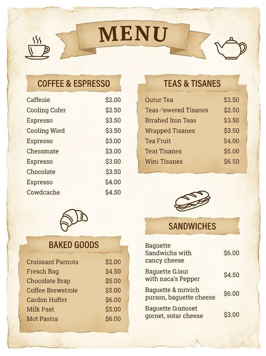
8) Vintage Tea Room
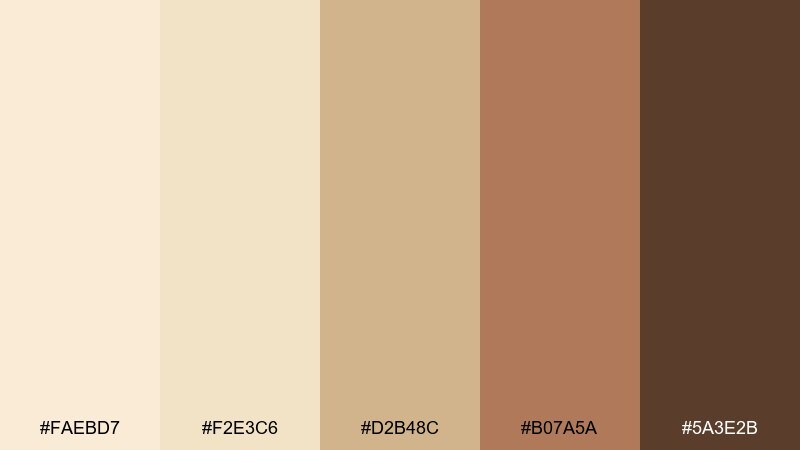
HEX: #FAEBD7 #F2E3C6 #D2B48C #B07A5A #5A3E2B
Mood: welcoming, vintage, sweet
Best for: cafe menu design
Welcoming and vintage like a tea room menu beside warm pastries, these browns feel friendly and familiar. Great for cafes, bakeries, and food packaging that leans handmade rather than slick. As an antique white color scheme, it reads best when you use the deeper cocoa for headings and let tan act as section blocks. Add small illustrated motifs to keep the design charming, not cluttered.
Image example of vintage tea room generated using media.io
9) French Country Bluegray
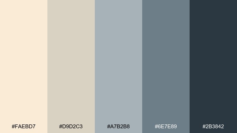
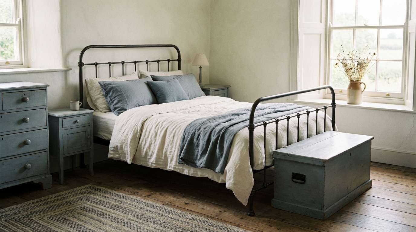
HEX: #FAEBD7 #D9D2C3 #A7B2B8 #6E7E89 #2B3842
Mood: soft, rustic, composed
Best for: farmhouse bedroom interior
Soft and composed like faded shutters against creamy plaster, the blue-grays feel quietly rustic. Use it in farmhouse interiors, home goods branding, or calm lifestyle photography. Keep the darkest blue-gray to metal accents and small decor so the room stays light. Linen bedding and brushed wood textures will make the tones look naturally layered.
Image example of french country bluegray generated using media.io
10) Old Book Paper
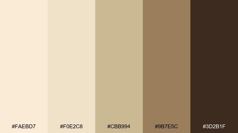
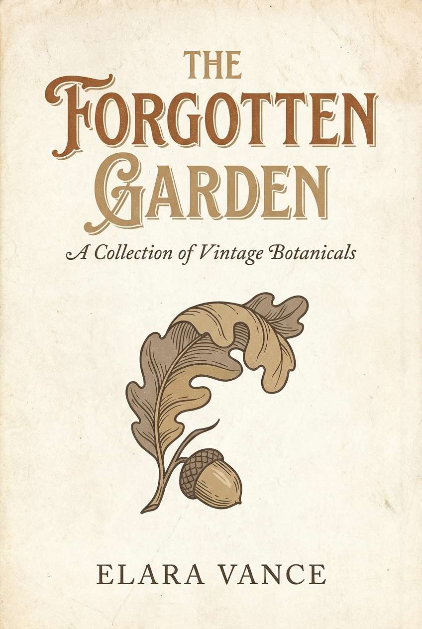
HEX: #FAEBD7 #F0E2C8 #CBB994 #9B7E5C #3D2B1F
Mood: literary, warm, nostalgic
Best for: book cover design
Literary and warm like dog-eared pages and worn leather, this set feels timeless. It works for book covers, podcasts, and author brands that want a classic, readable look. Use the deepest brown for title type and reserve mid-tones for ornamental rules or subtitle blocks. A subtle grain overlay can sell the vintage print feel without making it look distressed.
Image example of old book paper generated using media.io
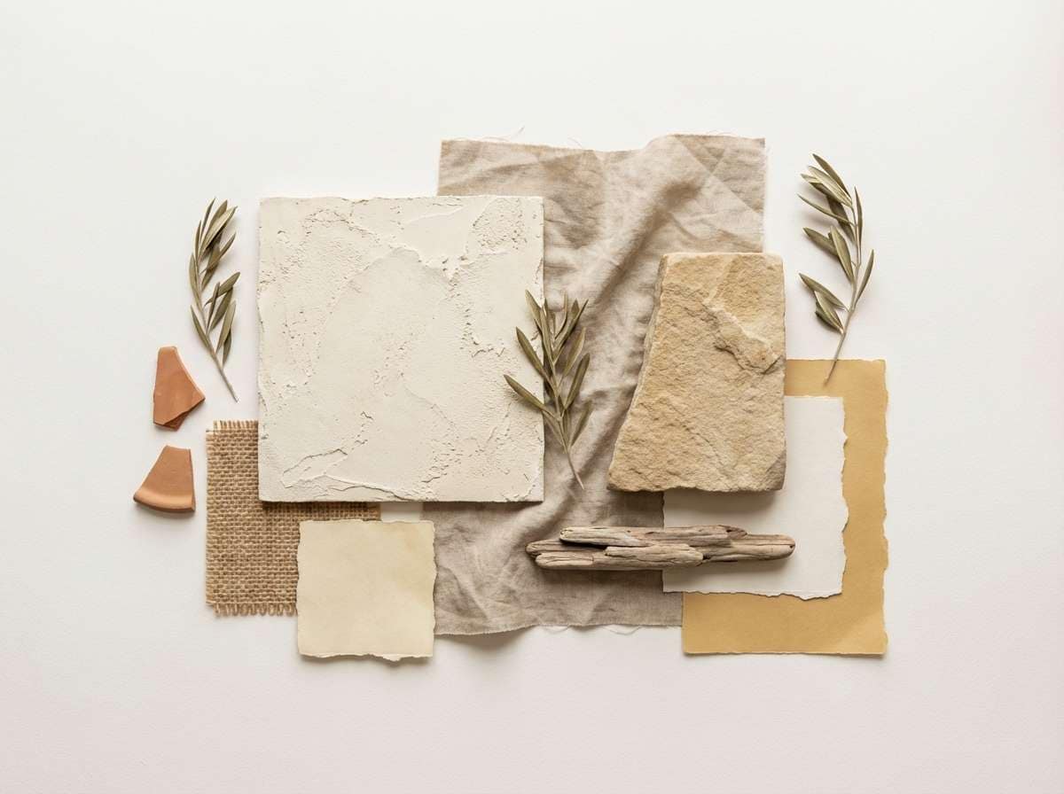
11) Warm Sandstone
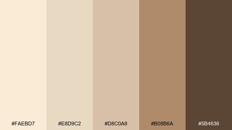
HEX: #FAEBD7 #E8D9C2 #D8C0A8 #B08B6A #5B4636
Mood: sun-baked, natural, relaxed
Best for: Mediterranean interior moodboard
Sun-baked and relaxed like sandstone steps at golden hour, these tans feel effortless. Ideal for Mediterranean interiors, travel branding, and lifestyle lookbooks. Make the palette feel modern by using large blocks of pale cream and only small hits of the deeper clay-brown. Pair with terracotta pottery and rough plaster textures for a cohesive, tactile vibe.
Image example of warm sandstone generated using media.io
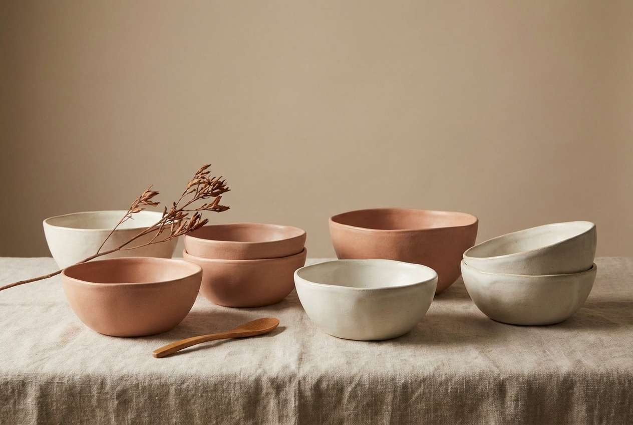
12) Soft Terracotta Glow
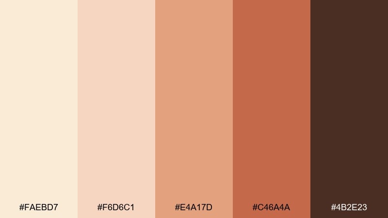
HEX: #FAEBD7 #F6D6C1 #E4A17D #C46A4A #4B2E23
Mood: warm, creative, inviting
Best for: handmade ceramics product ad
Warm and creative like terracotta fired in a small studio kiln, these oranges feel inviting rather than loud. They are strong for handmade ceramics, artisan markets, and cozy seasonal campaigns. Keep the antique-white base as your negative space and let terracotta carry the hero product color. A deep cocoa shadow color will add depth without turning the ad too heavy.
Image example of soft terracotta glow generated using media.io
13) Ivory and Ink
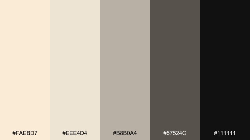
HEX: #FAEBD7 #EEE4D4 #B8B0A4 #57524C #111111
Mood: sharp, editorial, premium
Best for: fashion lookbook layout
Sharp and editorial like ink on ivory paper, this palette is made for contrast and clarity. Use it for fashion lookbooks, galleries, and premium portfolios where typography is the star. For a dependable antique white color palette, keep black for headlines and key UI elements, then lean on warm grays for captions and spacing. Avoid extra colors and let photography provide the visual energy.
Image example of ivory and ink generated using media.io
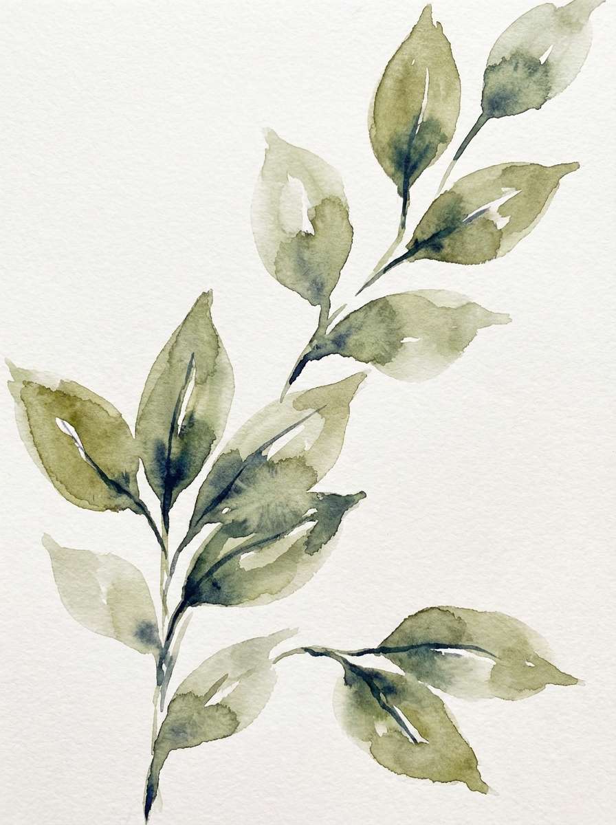
14) Garden Pergola
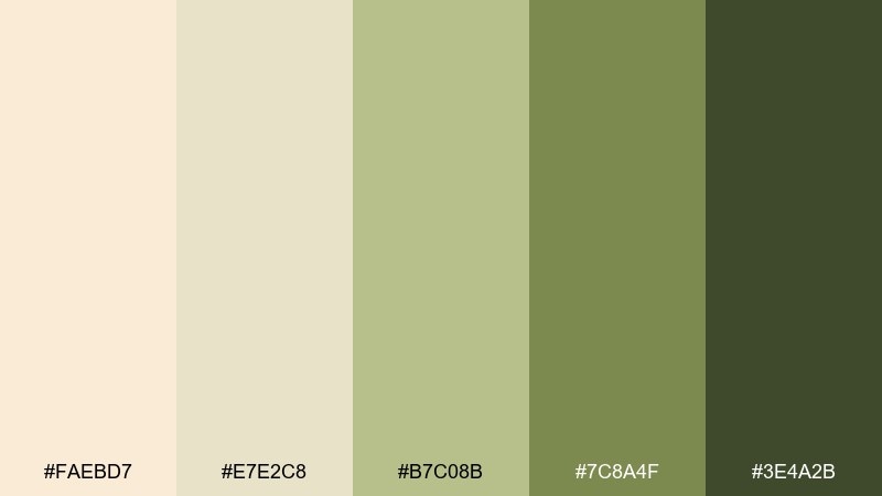
HEX: #FAEBD7 #E7E2C8 #B7C08B #7C8A4F #3E4A2B
Mood: leafy, soft, sunlit
Best for: botanical watercolor print
Leafy and sunlit like climbing vines over a garden pergola, the greens feel gentle against cream. Perfect for botanical prints, natural wedding suites, and spring packaging. Use the pale olive as your main wash and reserve the darkest green for stems and small detail lines. A deckled edge or paper texture will make the artwork feel handcrafted.
Image example of garden pergola generated using media.io
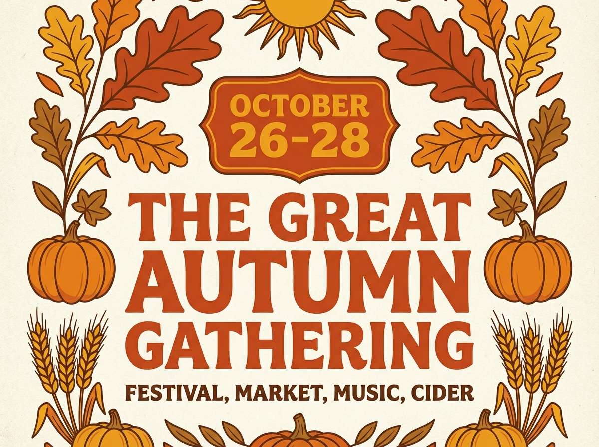
15) Autumn Mantel
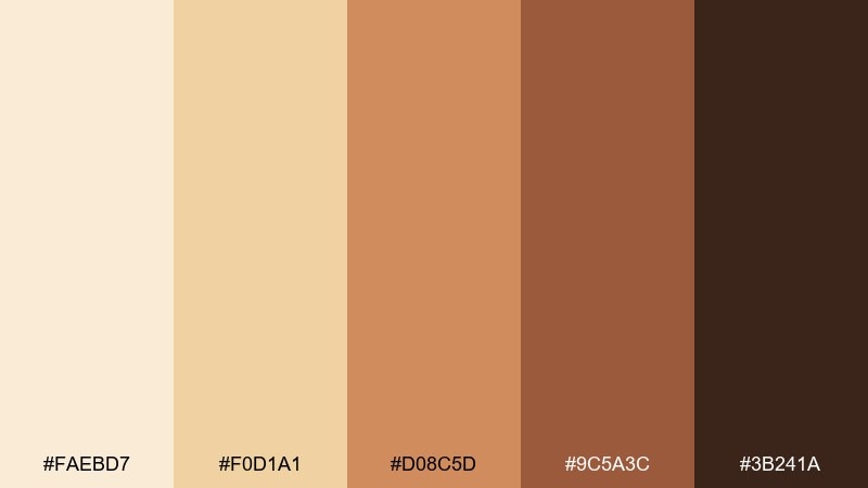
HEX: #FAEBD7 #F0D1A1 #D08C5D #9C5A3C #3B241A
Mood: seasonal, cozy, nostalgic
Best for: fall event flyer
Seasonal and cozy like an autumn mantel with dried florals, these warm oranges feel nostalgic. Use it for fall event flyers, harvest markets, and seasonal social graphics. Keep text in the deep brown for readability and use the mid-orange as your highlight color for dates or badges. A light grain background will help the cream and amber blend naturally.
Image example of autumn mantel generated using media.io
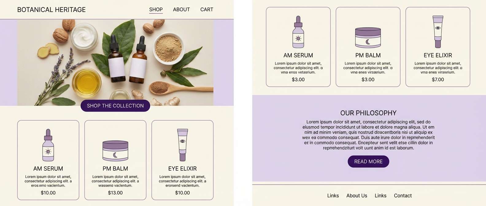
16) Clouded Lavender
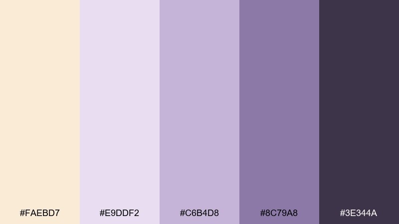
HEX: #FAEBD7 #E9DDF2 #C6B4D8 #8C79A8 #3E344A
Mood: dreamy, gentle, modern
Best for: skincare landing page
Dreamy and gentle like lavender haze over cream, these purples feel soothing and modern. Great for skincare, wellness, and calming app experiences that need a soft accent family. Keep the lavender light as a section background and use the deep violet for key buttons or price highlights. Pair with simple sans-serif type and rounded shapes to maintain the serene feel.
Image example of clouded lavender generated using media.io
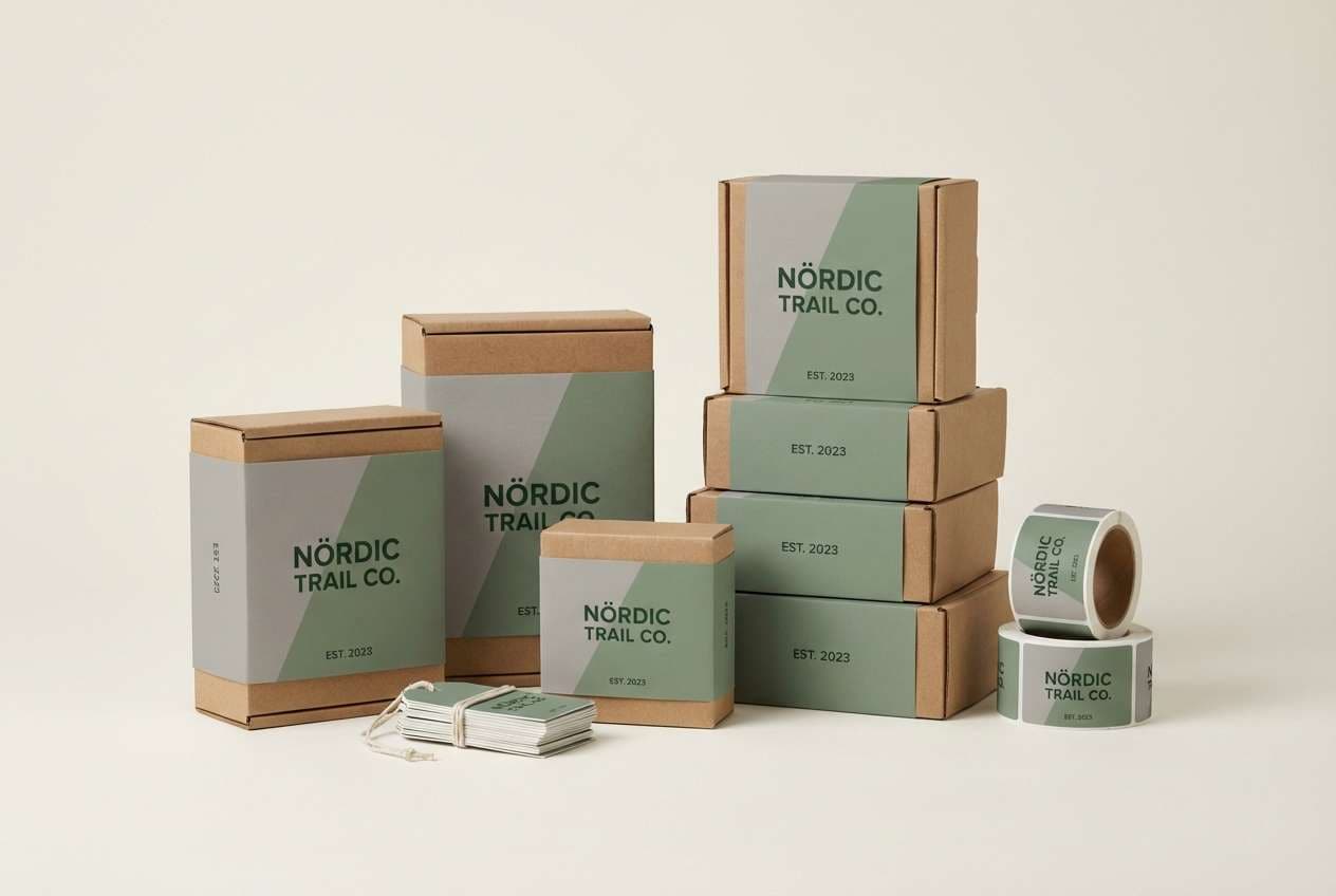
17) Stone and Moss
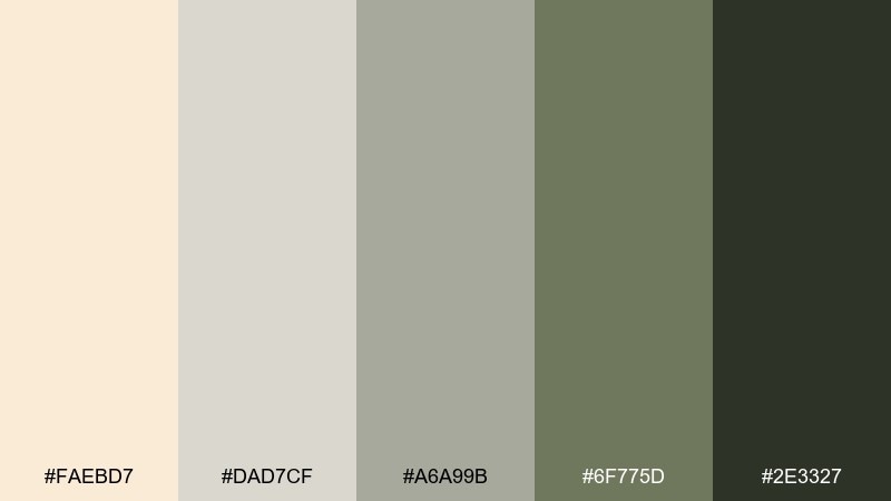
HEX: #FAEBD7 #DAD7CF #A6A99B #6F775D #2E3327
Mood: organic, muted, outdoorsy
Best for: outdoor brand packaging
Organic and muted like stone paths with patches of moss, this mix feels rugged but refined. It suits outdoor brands, eco packaging, and minimalist labels that want an earthy backbone. Use the mossy mid-tone for large label panels and keep the deep green for small copy and icons. A matte finish and recycled paper stock will make the colors look richer and more tactile.
Image example of stone and moss generated using media.io
18) Champagne Evening
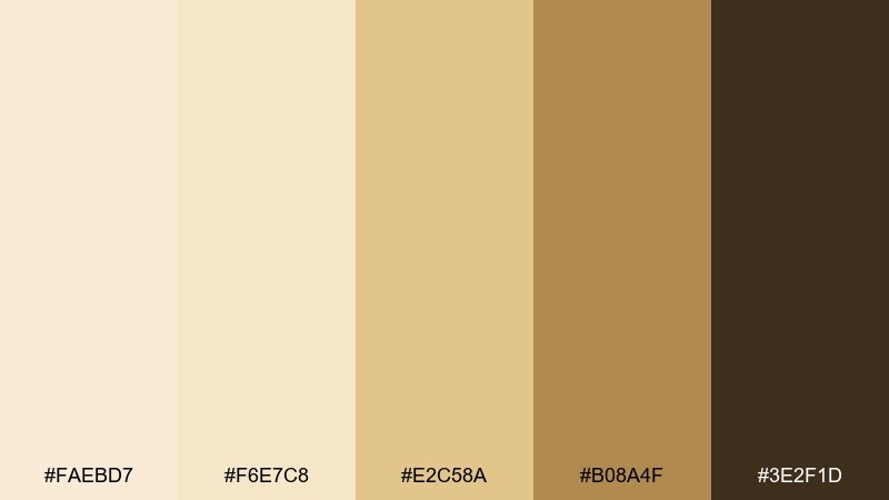
HEX: #FAEBD7 #F6E7C8 #E2C58A #B08A4F #3E2F1D
Mood: festive, elegant, warm
Best for: new year party invitation
Festive and elegant like champagne bubbles in warm light, these golds feel celebratory without screaming. Ideal for New Year invitations, gala flyers, and premium restaurant promos. These antique white color combinations look best with restrained metallic touches and lots of calm space for type. Use the deep brown for formal headings and keep gold to borders, icons, or a single monogram.
Image example of champagne evening generated using media.io

19) Sepia Studio
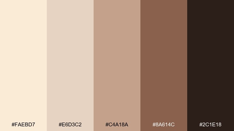
HEX: #FAEBD7 #E6D3C2 #C4A18A #8A614C #2C1E18
Mood: artistic, warm, cinematic
Best for: photography portfolio branding
Artistic and cinematic like a sepia contact sheet, these browns feel confident and crafted. Perfect for photography branding, creative studios, and maker portfolios that want warmth without pastel sweetness. Use the mid-brown for logo marks and highlight elements, then keep the darkest shade for navigation and watermarks. A consistent paper-like background will tie galleries together across pages.
Image example of sepia studio generated using media.io
20) Winter Eucalyptus
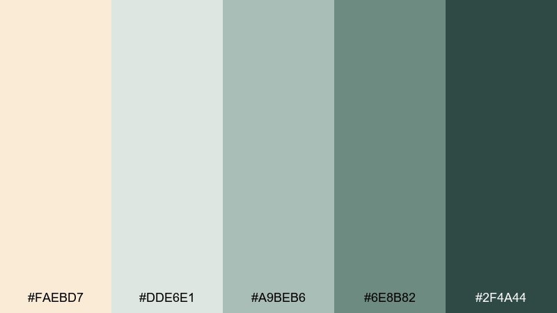
HEX: #FAEBD7 #DDE6E1 #A9BEB6 #6E8B82 #2F4A44
Mood: cool, clean, restorative
Best for: holiday greeting card
Cool and restorative like eucalyptus sprigs in winter air, these blue-greens feel fresh against cream. Great for holiday cards, minimalist wrapping, and calm seasonal branding that avoids loud reds. For a modern antique white color combination, use the pale mint as the main field and the deep teal for a single focal message. Keep decorative elements simple so the color temperature stays crisp.
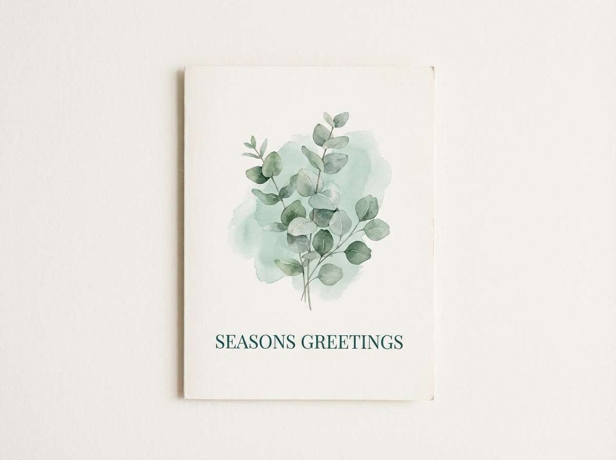
Image example of winter eucalyptus generated using media.io
What Colors Go Well with Antique White?
Antique white pairs best with warm neutrals (sand, taupe, tan, cocoa) when you want a cozy, heritage feel. These combinations look especially good with natural materials like wood, linen, leather, and matte ceramics.
For a cleaner, more modern look, combine it with cool blue-grays or soft slate tones to add structure and contrast without starkness. This is a reliable direction for UI sections, editorial layouts, and minimal brand systems.
If you need an accent, go muted rather than neon: dusty rose, sage, olive, lavender, and terracotta all complement #FAEBD7 while keeping the palette calm and cohesive.
How to Use a Antique White Color Palette in Real Designs
Start with antique white as your main background and pick one darker “anchor” color for readability (charcoal, deep brown, slate, or deep green). This keeps text crisp while preserving the soft, airy mood.
Use mid-tones as structure: section blocks, dividers, cards, and subtle borders. Save the strongest accent for small highlights—buttons, icons, badges, or a single headline—so the design feels intentional rather than busy.
Finally, add texture thoughtfully. Paper grain, linen overlays, plaster gradients, and matte shadows make antique white feel richer, but keep them subtle so the palette stays modern and clean.
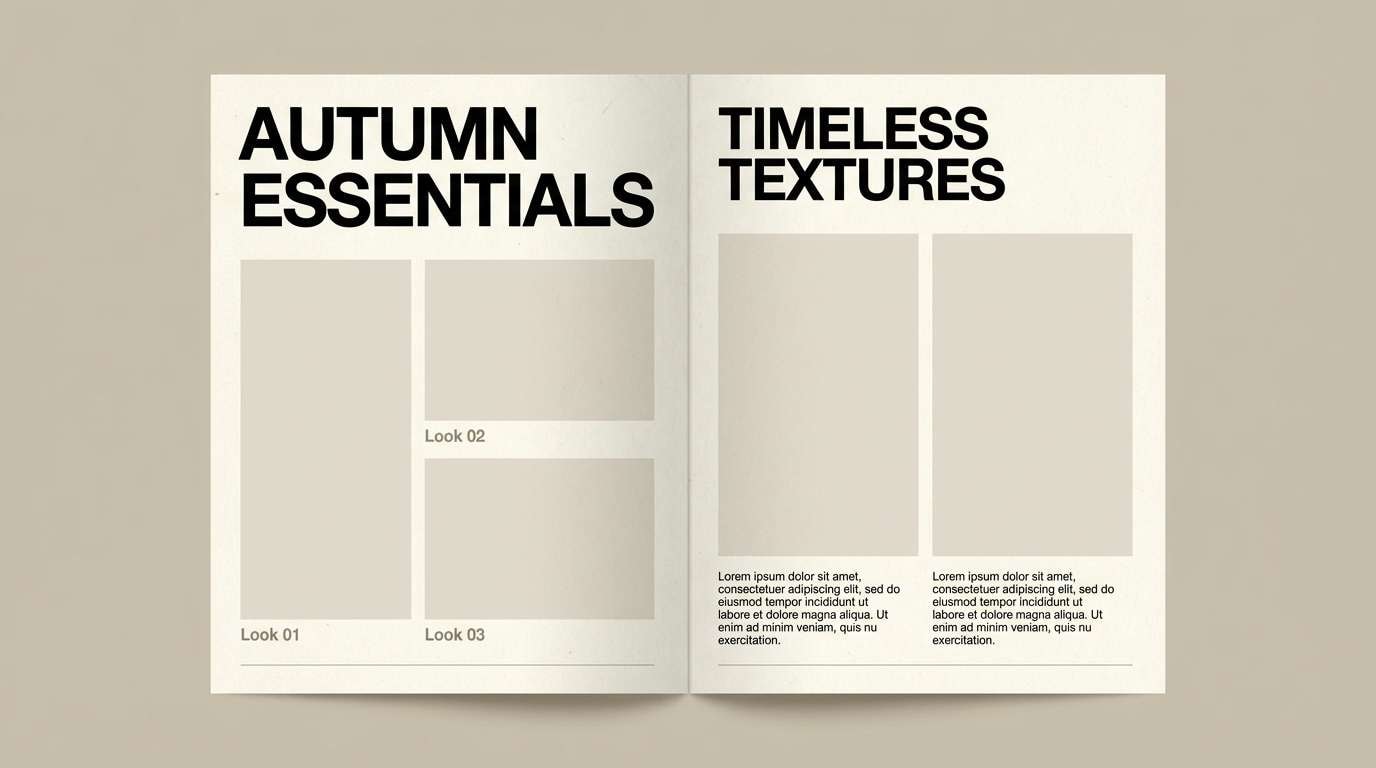
Create Antique White Palette Visuals with AI
If you want to see these palettes in context, generate quick mockups with AI—invites, landing pages, packaging, interiors, and moodboards. It’s a fast way to test how #FAEBD7 behaves under different lighting, materials, and contrast levels.
Reuse the prompts above and swap subjects (e.g., “skincare landing page” to “coffee brand label”) while keeping the same color direction. You’ll get consistent results and a clearer sense of which palette fits your project.
When you find a look you love, export it as a reference for your brand kit, client presentation, or design system.
Antique White Color Palette FAQs
-
What is the HEX code for antique white?
The standard web HEX code for AntiqueWhite is #FAEBD7. -
Is antique white warm or cool?
Antique white is a warm off-white with a gentle yellow-beige undertone, so it feels softer than pure white. -
What’s the best text color on an antique white background?
Use deep neutrals like charcoal, near-black, deep brown, or dark slate for strong readability; avoid light gray body text because contrast can drop quickly. -
What accent colors look good with antique white?
Muted accents work best: sage/olive greens, dusty rose, terracotta, lavender, and blue-grays add interest without overpowering the cream base. -
Does antique white work for modern UI design?
Yes—pair it with clean grays and a single dark anchor for navigation/buttons. It keeps interfaces calm while still looking premium and approachable. -
How do I keep an antique white palette from looking “dated”?
Increase contrast with one modern dark tone, limit decorative colors, and use contemporary typography and spacing. Matte textures beat heavy vintage effects. -
Can I generate antique white palette mockups with AI?
Yes—use a text-to-image tool to create fast references for packaging, interiors, and web layouts, then iterate by adjusting materials, lighting, and the accent color.


