

Blue copper is a standout pairing: cool blue tones (from navy to patina teal) create clarity and trust, while copper adds warmth, depth, and a premium “metallic” edge.
Below are 20+ blue copper color palette ideas with HEX codes, plus practical tips for branding, UI, and interior styling—and AI prompts you can reuse to generate matching visuals.
In this article
- Why Blue Copper Palettes Work So Well
-
- harbor patina
- midnight alloy
- verdigris workshop
- coastal copper
- antique circuit
- riverstone metal
- museum patina
- copper reef
- blueprint bronze
- stormy kettle
- sea glass and penny
- oxidized minimal
- industrial lagoon
- copper ink
- gallery blue and brass
- soft patina neutrals
- urban harbor
- winter copperlight
- botanical verdigris
- retro maritime
- copper current
- What Colors Go Well with Blue Copper?
- How to Use a Blue Copper Color Palette in Real Designs
- Create Blue Copper Palette Visuals with AI
Why Blue Copper Palettes Work So Well
Blue copper palettes balance temperature in a way that feels instantly intentional: blues bring calm structure and credibility, while copper injects warmth and human character.
They also create natural hierarchy. Dark blues anchor backgrounds, navigation, and typography, and copper excels as a controlled accent for CTAs, highlights, and premium details.
Because copper sits in the orange-brown family, it contrasts beautifully against teals and navies without feeling as aggressive as pure orange—making it easier to keep designs refined.
20+ Blue Copper Color Palette Ideas (with HEX Codes)
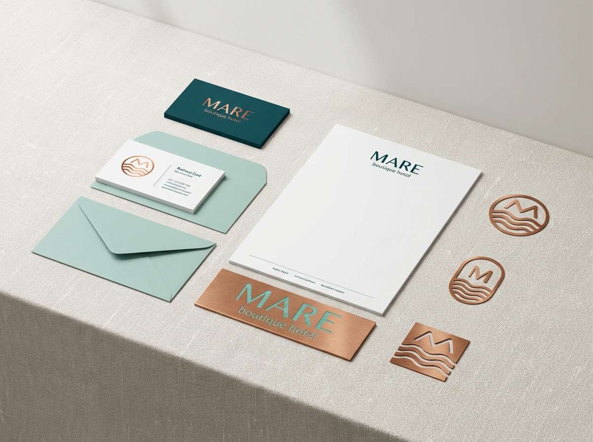
1) Harbor Patina
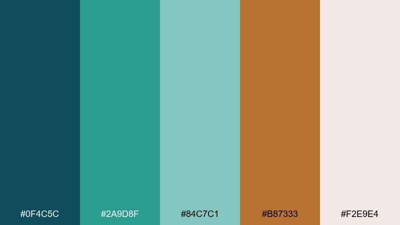
HEX: #0F4C5C #2A9D8F #84C7C1 #B87333 #F2E9E4
Mood: calm, coastal, refined
Best for: Boutique hotel branding and lobby accents
Calm seaside air and sun-warmed metal come through in these patina blues with a copper spark. Use the deep teal as your anchor, then let the softer aqua carry backgrounds and secondary panels. Copper works best as a controlled accent for signage, key icons, or trim details. Pair with warm off-white and natural textures like linen or light oak for a welcoming finish.
Image example of harbor patina generated using media.io
Media.io is an online AI studio for creating and editing video, image, and audio in your browser.

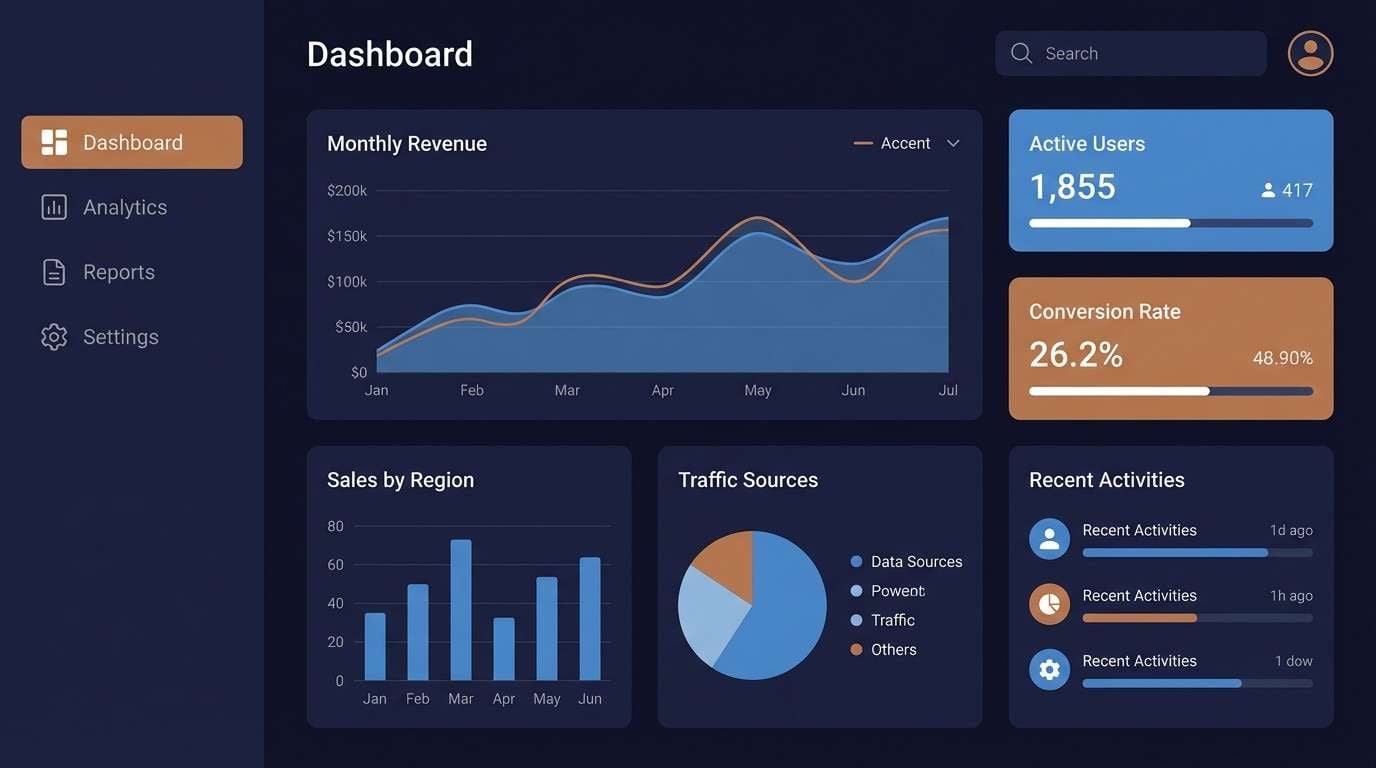
2) Midnight Alloy
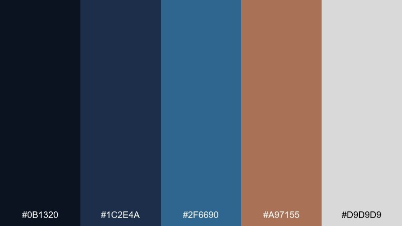
HEX: #0B1320 #1C2E4A #2F6690 #A97155 #D9D9D9
Mood: moody, cinematic, premium
Best for: Tech keynote slides and dark mode dashboards
Moody midnight blues feel like a theater screen, with copper reading as a precise highlight rather than a loud accent. Keep the darkest shade for backgrounds and navigation, then step up to the steel-blue for charts and cards. Copper is perfect for primary buttons, active states, or KPI callouts where you need focus. Add a light gray for legibility and generous spacing to keep the look premium.
Image example of midnight alloy generated using media.io
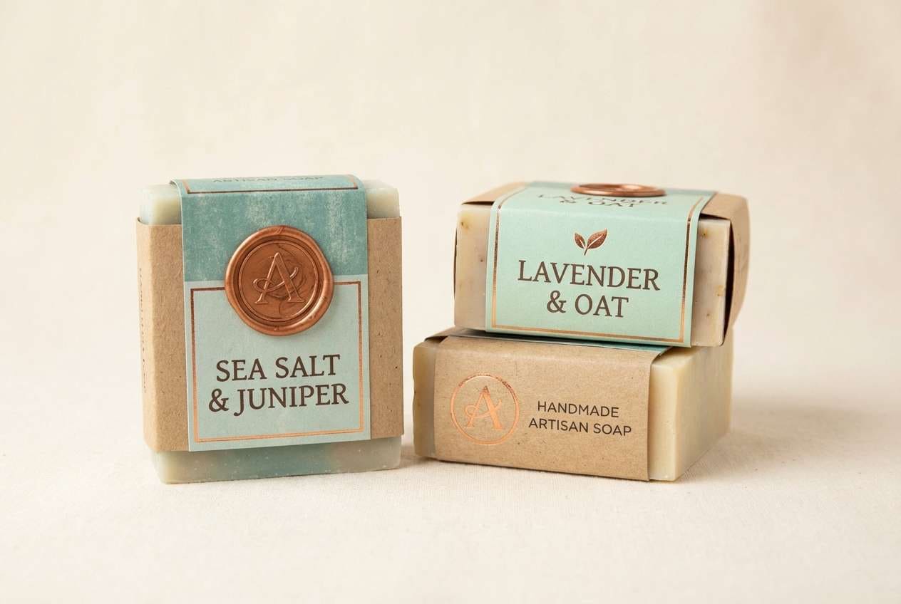
3) Verdigris Workshop
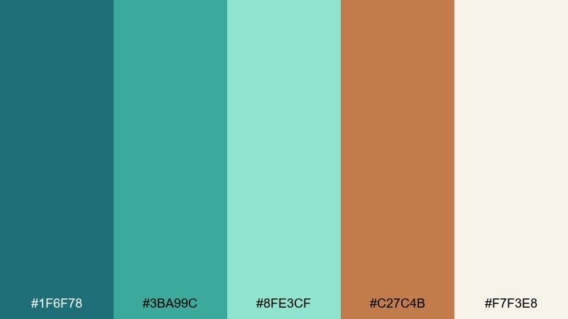
HEX: #1F6F78 #3BA99C #8FE3CF #C27C4B #F7F3E8
Mood: artisanal, fresh, hands-on
Best for: Craft packaging for soaps or candles
Artisanal and airy, these tones evoke a studio table beside open windows and oxidized metal tools. Use the verdigris teal as the hero color for labels, then lighten with mint for secondary panels and ingredient sections. The copper note adds a handcrafted touch on seals, foil stamps, or cap details. Tip: keep typography dark and simple to let the materials feel authentic.
Image example of verdigris workshop generated using media.io
4) Coastal Copper

HEX: #0E6BA8 #3AA7D9 #BFD7EA #C46D3B #F4EDE5
Mood: bright, breezy, optimistic
Best for: Travel landing pages and booking CTAs
Bright ocean blues and warm metal highlights feel like sunshine reflecting off a marina railing. For a blue copper color scheme that stays readable, set the darkest blue for headings and links, then use the sky tones for section backgrounds. Copper is ideal for one primary CTA color and small badges so it does not overpower the airy base. Pair with soft cream whitespace and rounded shapes for a friendly travel vibe.
Image example of coastal copper generated using media.io
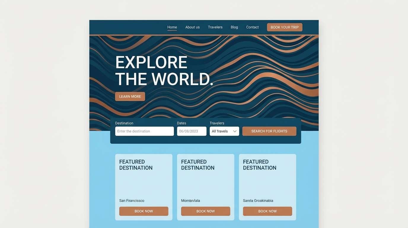
5) Antique Circuit
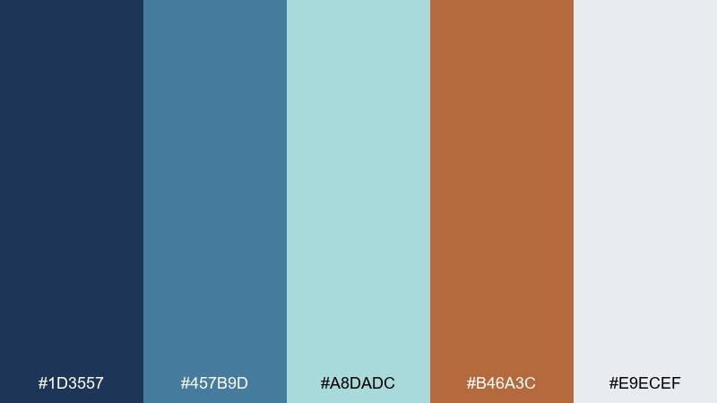
HEX: #1D3557 #457B9D #A8DADC #B46A3C #E9ECEF
Mood: retro-tech, thoughtful, tidy
Best for: SaaS onboarding screens and icon sets
Retro-tech energy shows up as crisp blues with a warm copper trace, like circuitry on a vintage board. Use the navy for structure and the mid-blue for components such as tabs, toggles, and focus rings. Copper works best for progress highlights and micro-interactions where you want subtle delight. Keep the light gray as your default canvas so the UI stays calm and legible.
Image example of antique circuit generated using media.io

6) Riverstone Metal
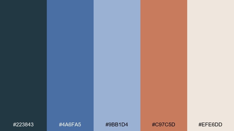
HEX: #223843 #4A6FA5 #9BB1D4 #C97C5D #EFE6DD
Mood: grounded, modern rustic, calming
Best for: Living room paint planning and textiles
Grounded blues feel like smooth river stones, while copper adds a gentle glow like evening lamplight. Use the charcoal blue for a feature wall or built-ins, then layer the softer blues in rugs, throws, and artwork. Copper suits hardware, frames, and lighting to warm up the cool palette. Tip: repeat the cream tone across ceilings and large upholstery to keep the room airy.
Image example of riverstone metal generated using media.io
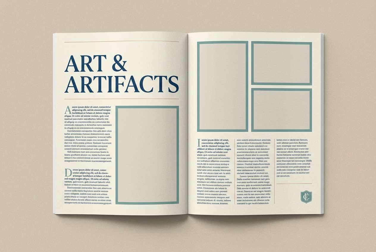
7) Museum Patina
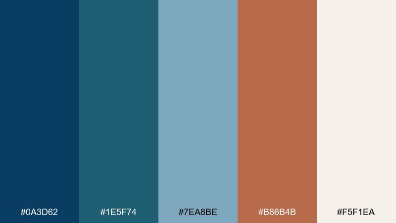
HEX: #0A3D62 #1E5F74 #7EA8BE #B86B4B #F5F1EA
Mood: heritage, quiet luxury, curated
Best for: Editorial layouts for design magazines
Heritage blues and patina tones evoke gallery halls, framed prints, and aged copper plaques. Use the darkest blue for headlines and section dividers, then let the softer blue-gray handle captions and pull quotes. Copper shines as a small rule line, drop cap, or icon detail that feels collectible. Keep margins generous and paper-like cream backgrounds for an editorial finish.
Image example of museum patina generated using media.io
8) Copper Reef
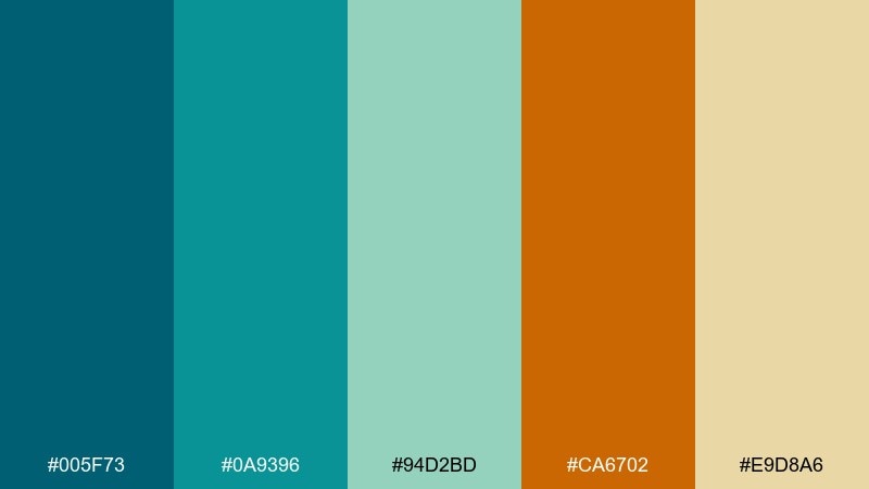
HEX: #005F73 #0A9396 #94D2BD #CA6702 #E9D8A6
Mood: tropical, energetic, playful
Best for: Summer event posters and social ads
Tropical reef colors bring a lively splash, with warm copper-orange making the whole set feel sunlit. Use the deep teal for bold type and outlines, then build gradients or blocks with aqua and seafoam. The orange works best as a single punch for dates, tickets, or featured performers. Tip: keep backgrounds light and let contrast do the heavy lifting for readability.
Image example of copper reef generated using media.io

9) Blueprint Bronze
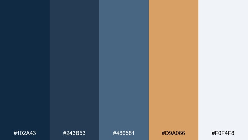
HEX: #102A43 #243B53 #486581 #D9A066 #F0F4F8
Mood: structured, confident, professional
Best for: Architecture firm branding and proposals
Structured navy layers feel like blueprint paper, and bronze brings a subtle, executive edge. These blue copper color combinations work well when you reserve bronze for seals, section markers, and proposal covers. Use the mid-slate for charts and tables so data reads cleanly without harsh contrast. Tip: stick to one or two bronze accents per page to keep the look disciplined.
Image example of blueprint bronze generated using media.io

10) Stormy Kettle

HEX: #334E68 #627D98 #9FB3C8 #B76E4C #F8F9FA
Mood: cozy, rainy-day, comforting
Best for: Coffee shop menus and loyalty cards
Cozy stormy blues feel like rain on a window, while copper reads as the warmth of a kettle on the stove. Use the darker blue for menu hierarchy and item titles, then soften sections with the misty blue-gray. Copper is perfect for prices, stamps, and loyalty highlights that should feel inviting. Tip: add plenty of white space so the cozy mood stays clean, not crowded.
Image example of stormy kettle generated using media.io

11) Sea Glass and Penny
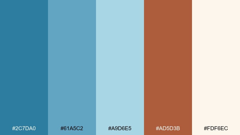
HEX: #2C7DA0 #61A5C2 #A9D6E5 #AD5D3B #FDF6EC
Mood: airy, friendly, approachable
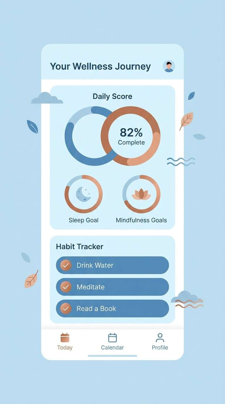
Best for: Wellness app UI and gentle illustrations
Airy sea-glass blues feel restorative, with a penny-copper accent adding warmth and humanity. Keep the lightest blue for backgrounds and cards, then use the medium blue for active elements and links. Copper works best for progress rings, streak badges, or small celebration moments. Tip: pair with rounded corners and soft shadows to match the calm mood.
Image example of sea glass and penny generated using media.io
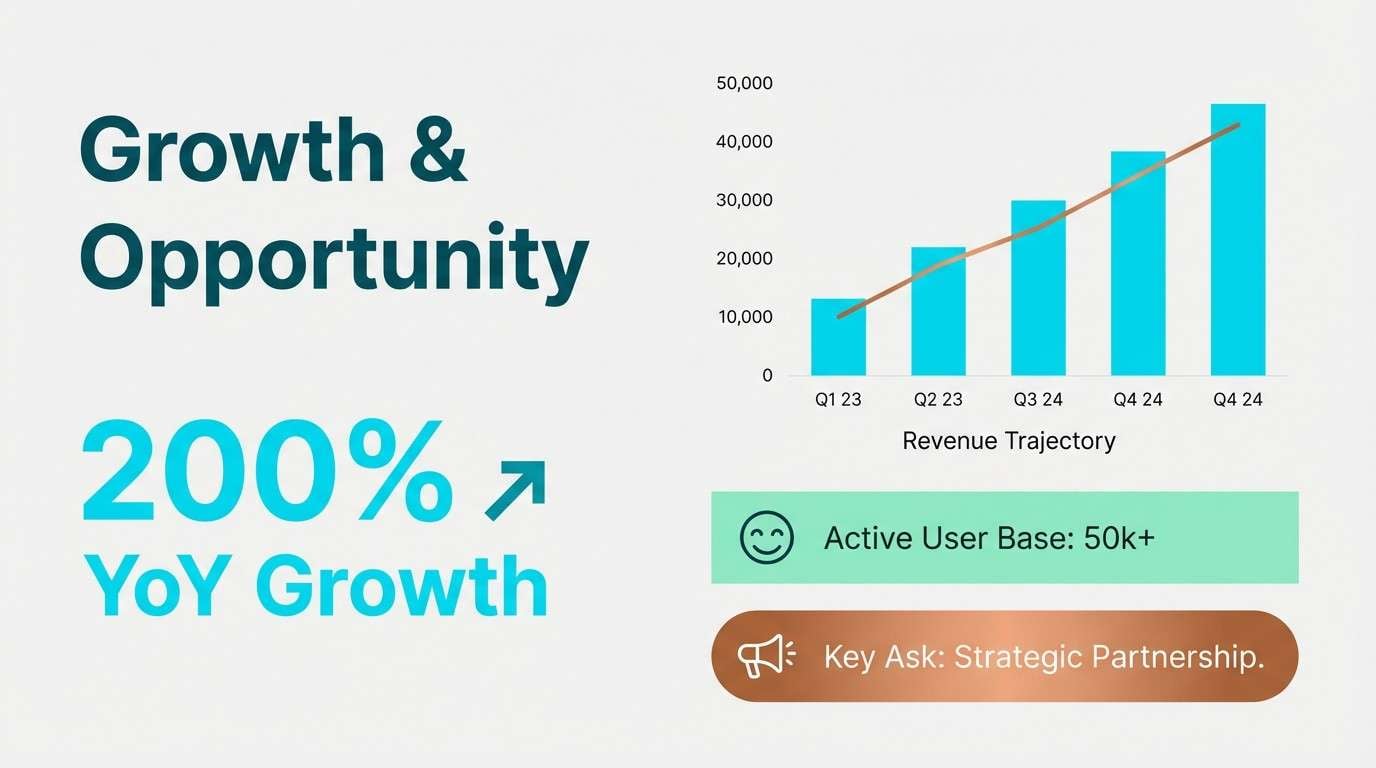
12) Oxidized Minimal
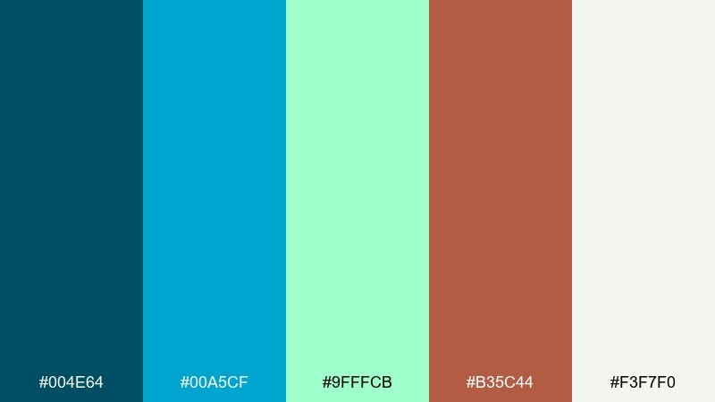
HEX: #004E64 #00A5CF #9FFFCB #B35C44 #F3F7F0
Mood: clean, modern, fresh
Best for: Startup pitch decks and product one-pagers
Clean, oxidized blues feel crisp like new paint on metal, balanced by a warm copper note. Use the deep teal as your headline color and keep the bright cyan for graphs and key metrics. Copper should be a sparing accent for callouts, icons, or a single button style. Tip: keep your backgrounds soft and light so the cyan stays bright without vibrating.
Image example of oxidized minimal generated using media.io
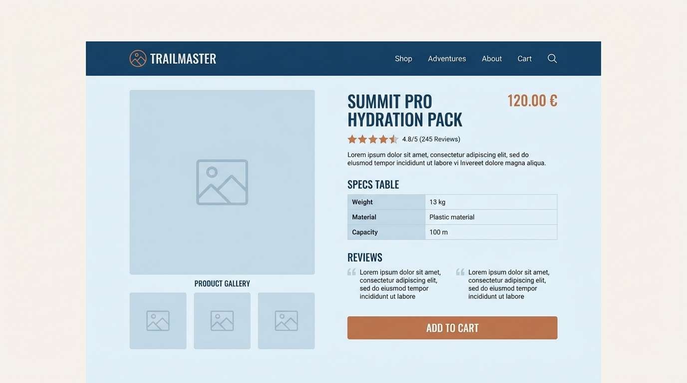
13) Industrial Lagoon
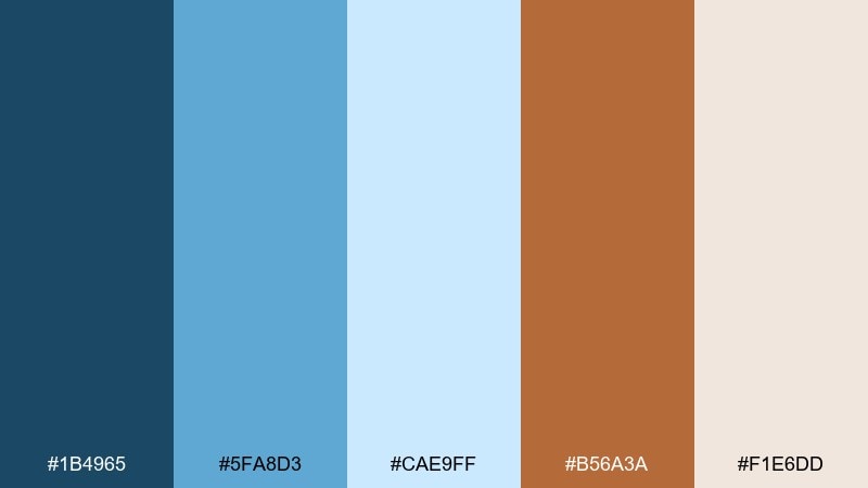
HEX: #1B4965 #5FA8D3 #CAE9FF #B56A3A #F1E6DD
Mood: fresh, industrial, optimistic
Best for: Ecommerce product pages for outdoor gear
Fresh lagoon blues meet workshop warmth, like painted steel beside sandy trails. Use the darkest blue for navigation and product titles, then rely on the light blues for sectioning and feature callouts. Copper suits add-to-cart buttons, sale tags, and star ratings without feeling overly loud. Tip: keep product imagery consistent and let the palette carry the brand personality.
Image example of industrial lagoon generated using media.io
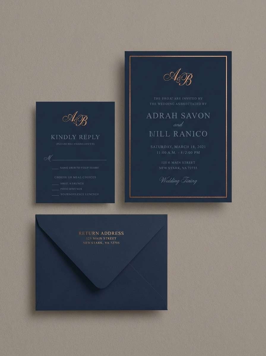
14) Copper Ink
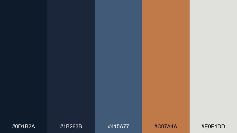
HEX: #0D1B2A #1B263B #415A77 #C07A4A #E0E1DD
Mood: dramatic, elegant, high-contrast
Best for: Luxury stationery and wedding invitations
Dramatic ink-like blues create a formal atmosphere, and copper adds a celebratory glow like foil on thick paper. Choose the darkest shade for background or envelopes, then print text in the lighter slate for softer contrast. Copper works beautifully for monograms, borders, and small motifs, especially with a matte texture. Tip: keep one focal area in copper so the design feels intentional, not busy.
Image example of copper ink generated using media.io
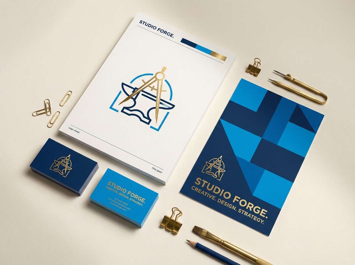
15) Gallery Blue and Brass
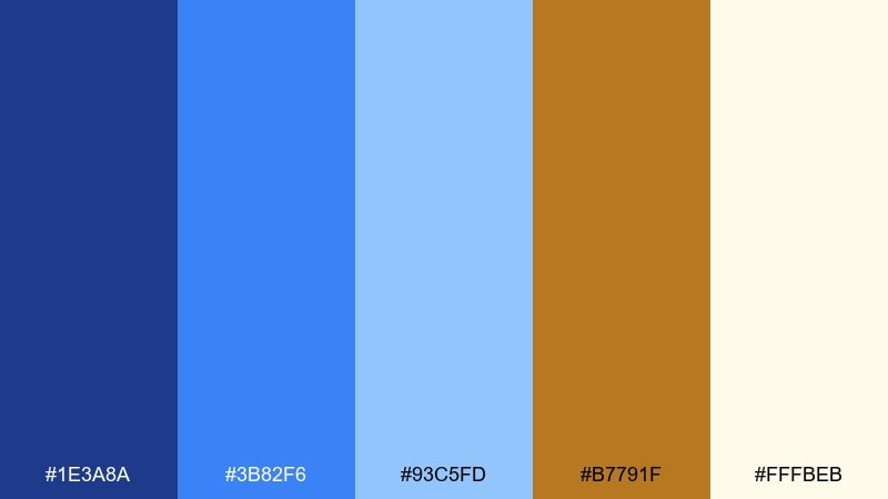
HEX: #1E3A8A #3B82F6 #93C5FD #B7791F #FFFBEB
Mood: bold, upbeat, contemporary
Best for: Brand identity for creative studios
Bold gallery blues feel energetic and modern, while brass-gold adds a confident signature. Try this blue copper color combination when you want a creative brand that still reads polished and grown-up. Use the bright blue for hero moments and the lighter blue for backgrounds or gradients, keeping brass for marks and premium details. Tip: test the brass on both light and dark blue to ensure it stays rich, not muddy.
Image example of gallery blue and brass generated using media.io
16) Soft Patina Neutrals
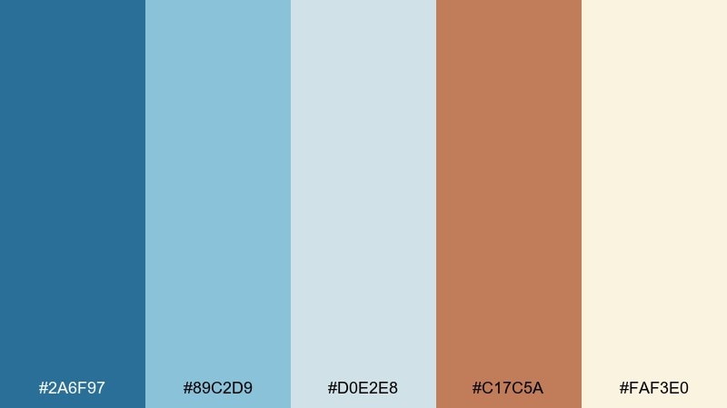
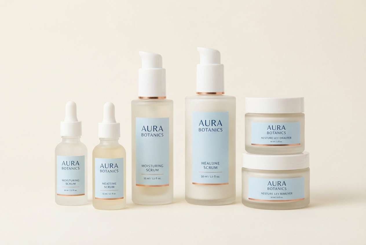
HEX: #2A6F97 #89C2D9 #D0E2E8 #C17C5A #FAF3E0
Mood: soft, airy, comforting
Best for: Skincare packaging and label systems
Soft patina tones feel spa-like and clean, with a copper warmth that keeps it from turning icy. Use the pale blue and cream as your label base colors, then rely on the deeper blue for product names and categories. Copper is ideal for small brand marks, batch numbers, or a thin border that suggests quality. Tip: keep finishes matte and let copper appear as a subtle spot color.
Image example of soft patina neutrals generated using media.io
17) Urban Harbor
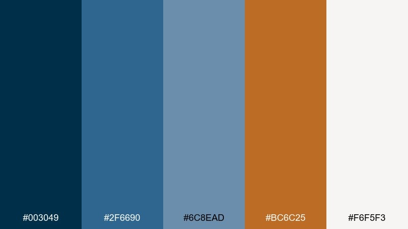
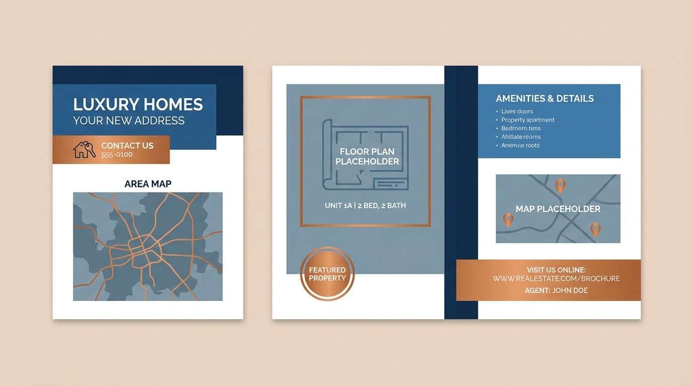
HEX: #003049 #2F6690 #6C8EAD #BC6C25 #F6F5F3
Mood: urban, steady, confident
Best for: Real estate brochures and signage
Urban harbor blues feel solid and trustworthy, like painted brick and steel by the waterfront. The cooler blues handle maps, floor plans, and section headers without stealing attention from property photos. Use the copper-orange as a directional accent for contact info, key amenities, or sale highlights. Tip: keep body copy dark and avoid overusing the accent so it stays premium.
Image example of urban harbor generated using media.io
18) Winter Copperlight
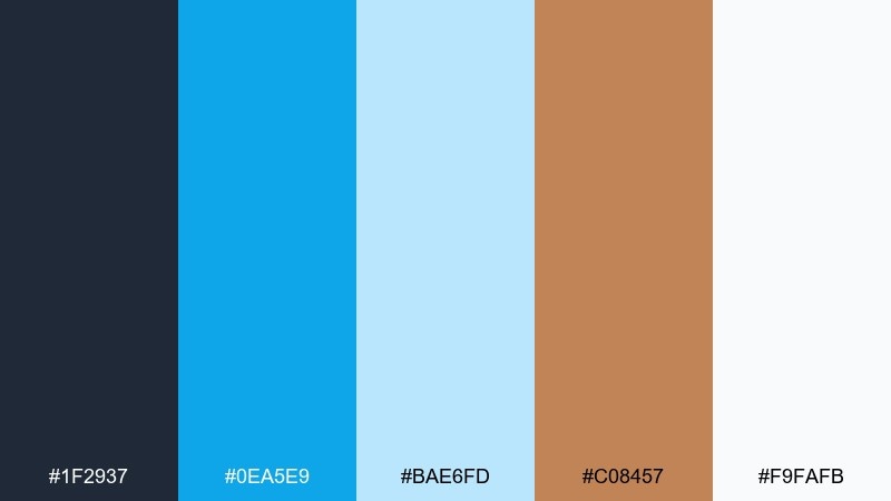
HEX: #1F2937 #0EA5E9 #BAE6FD #C08457 #F9FAFB
Mood: crisp, modern, bright
Best for: Fintech app marketing banners
Crisp winter blues feel clear and high-tech, while copper reads like warm light cutting through a cold morning. Use the charcoal as your base for strong type, then let the bright blue handle buttons and links. Copper works best for trust signals like badges, stars, and small emphasis text. Tip: keep gradients subtle so the palette stays sharp and contemporary.
Image example of winter copperlight generated using media.io

19) Botanical Verdigris

HEX: #0B525B #144552 #2A9D8F #D17A4B #E5F4EA
Mood: botanical, earthy, refreshing
Best for: Watercolor botanical illustrations and prints
Botanical verdigris tones feel like greenhouse leaves and oxidized planters after a misty morning. Use the deep teal shades for stems, shadows, and ink outlines, then bring in the greener teal for fresh leaf highlights. Copper adds warmth as floral centers or small label details. Tip: keep the background pale and textured so the illustration stays light and natural.
Image example of botanical verdigris generated using media.io

20) Retro Maritime

HEX: #274C77 #6096BA #A3CEF1 #D4A373 #F8EDEB
Mood: retro, sun-faded, nostalgic
Best for: Cafe merch and illustrated tote bags
Retro maritime blues feel sun-faded and nostalgic, with sandy copper bringing a laid-back weekend mood. These blue copper color combinations shine in simple illustrations, badge logos, and merch prints that need to feel friendly. Use the deepest blue for outlines and typography, then fill shapes with the lighter blues and sandy accent. Tip: limit gradients and lean on flat shapes for a classic screen-print look.
Image example of retro maritime generated using media.io

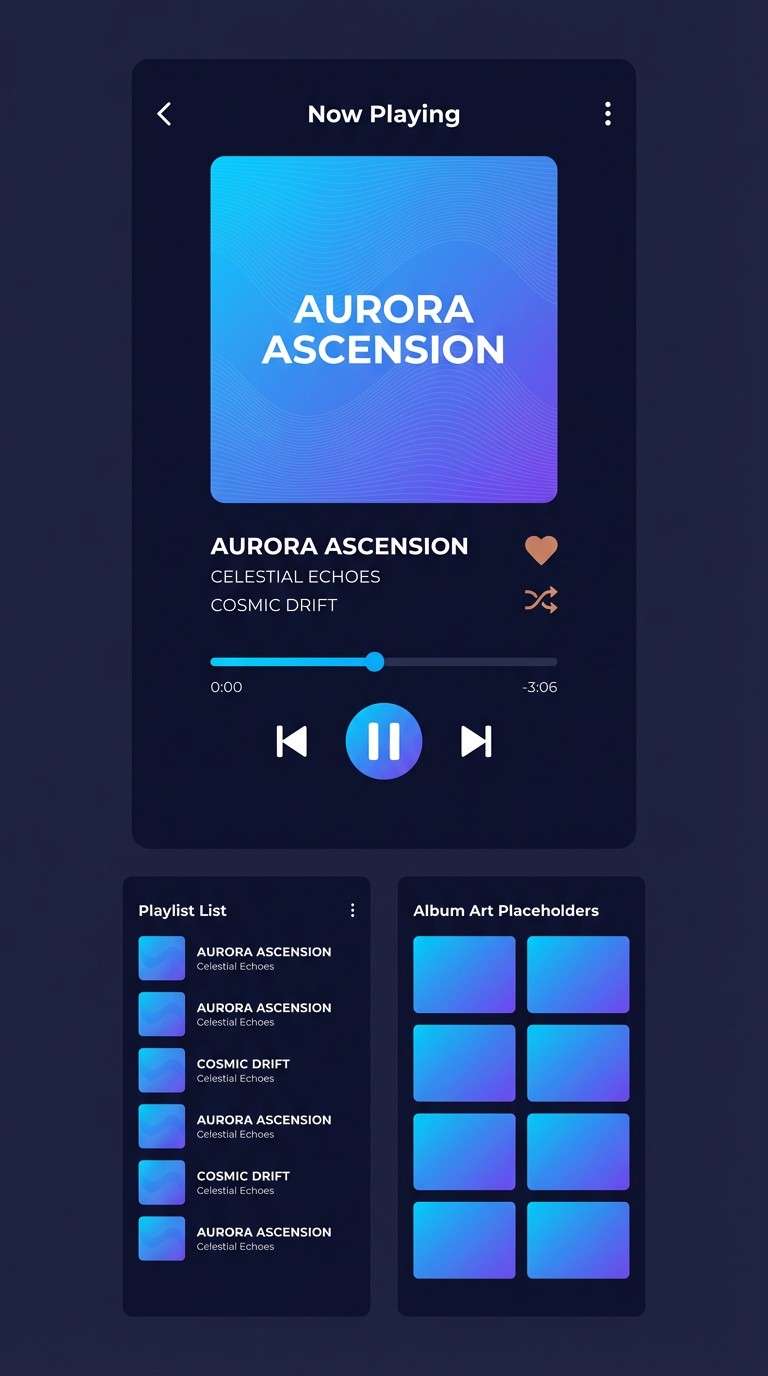
21) Copper Current
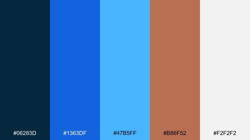
HEX: #06283D #1363DF #47B5FF #B86F52 #F2F2F2
Mood: dynamic, modern, high-contrast
Best for: Music app UI and playlist covers
Dynamic electric blues suggest motion and rhythm, while copper softens the edges with a warm counterbeat. Use the darkest navy for the app shell and player controls, then let the vivid blues own artwork frames and active states. Copper is a great pick for like buttons, small toggles, or featured playlist tags. Tip: keep backgrounds light or very dark to preserve contrast and avoid a muddy mid-tone mix.
Image example of copper current generated using media.io
What Colors Go Well with Blue Copper?
Blue copper pairs naturally with warm neutrals like cream, sand, greige, and soft taupe—these keep the palette breathable while letting copper accents feel intentional.
For extra freshness, add seafoam, mint, or pale aqua as supporting tints. For a more premium direction, introduce charcoal, slate, or cool light gray to sharpen contrast and improve readability.
If you want a bolder look, use a controlled pop such as bright sky blue or a muted brass-gold—just keep copper as the “special” highlight so the scheme doesn’t get noisy.
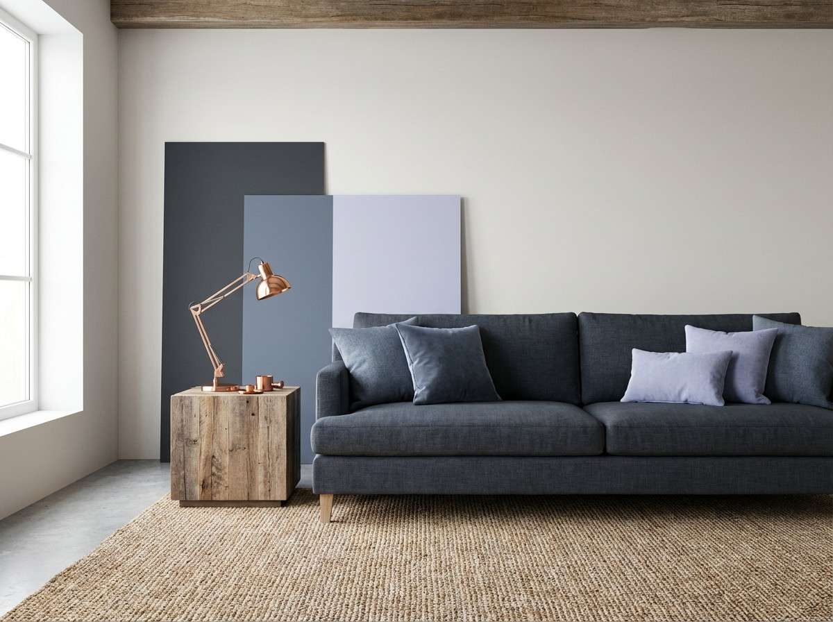
How to Use a Blue Copper Color Palette in Real Designs
In branding, let deep blue handle logos, wordmarks, and key typography, then use copper as an accent for seals, icon details, packaging stamps, or signature lines. This keeps the identity consistent across print and digital.
In UI, start with a dark or mid-blue foundation for navigation and headings, and reserve copper for primary actions (one button style), active states, or KPI callouts. Balance with light neutrals so copper remains readable and doesn’t over-saturate the interface.
In interiors, treat blue as the “quiet large surface” (walls, cabinets, rugs) and copper as the “small reflective layer” (hardware, lighting, frames). Repeat a warm off-white to unify the room and prevent the blues from feeling cold.
Create Blue Copper Palette Visuals with AI
If you’re pitching a concept or building a mood board, generating images that match your blue copper color scheme can help stakeholders approve direction faster.
With Media.io’s text-to-image tools, you can create brand boards, UI mockups, packaging scenes, and poster layouts using the prompts above—then iterate quickly by swapping subjects, ratios, and materials.
Blue Copper Color Palette FAQs
-
What is a blue copper color palette?
A blue copper palette combines cool blues (navy, teal, patina, sky) with warm copper/bronze accents and typically a light neutral. The contrast creates designs that feel both calming and premium. -
Is copper more like orange or brown in design?
Copper sits between orange and brown, with a metallic warmth. In most designs it behaves like a warm orange-brown accent—best used sparingly for emphasis, highlights, and “luxury” details. -
How do I keep blue and copper from looking too harsh?
Add a soft neutral (cream, off-white, light gray) and use copper only for small elements like buttons, icons, or trim. Avoid placing large copper blocks next to highly saturated blues without a neutral buffer. -
Which blue works best with copper: navy or teal?
Both work: navy + copper feels formal and premium, while teal/patina + copper feels coastal and fresh. Choose based on mood—then keep copper consistent as the accent color. -
What’s a good background color for a blue copper scheme?
For light layouts, use warm off-white or cream to make copper glow and keep blues readable. For dark layouts, use near-black navy so copper highlights feel crisp and high-end. -
Can I use blue copper palettes in dark mode UI?
Yes. Use deep navy as the base, mid-blue for cards and charts, and copper for primary CTAs or active states. Add a light gray for text to maintain accessibility and contrast. -
How many accent colors should I use with blue copper?
Usually one accent is enough: copper. If you add another, keep it subtle (mint/seafoam or brass) and limit it to small supporting elements so the visual hierarchy stays clear.
Next: Tangerine Color Palette


