

A great beach color palette is more than “sand + ocean.” The best combinations balance warm sunlit neutrals with cool aquatic tones, so your design feels relaxed but still readable and modern.
Below are 20 beach color palette ideas with HEX codes, plus AI prompt examples you can reuse for UI, branding, print, and social designs.
In this article
- Why Beach Palettes Work So Well
-
- dune sunrise
- sea glass calm
- coral reef pop
- driftwood neutral
- tidepool teal
- sandbar pastels
- boardwalk retro
- sunset lifeguard
- lagoon luxe
- shell pink minimal
- stormy coast
- tropical breeze
- pebble and foam
- palm shade
- marina night
- sun bleached denim
- citrus coast
- oceanfront spa
- vintage postcard
- saltwater slate
- What Colors Go Well with Beach?
- How to Use a Beach Color Palette in Real Designs
- Create Beach Palette Visuals with AI
Why Beach Palettes Work So Well
Beach color schemes naturally mix high-light neutrals (sand, shell, foam) with calm mid-tones (sea glass, teal, slate). That contrast makes layouts feel airy while still offering structure for navigation, hierarchy, and calls to action.
They also map cleanly to real-world materials: linen, paper, driftwood, and water. This makes beach color combinations especially effective for brands that want “fresh” and “premium” at the same time.
Most importantly, coastal colors are flexible. You can push them brighter for summer campaigns or mute them toward slate and navy for modern, professional UI.
20+ Beach Color Palette Ideas (with HEX Codes)
1) Dune Sunrise
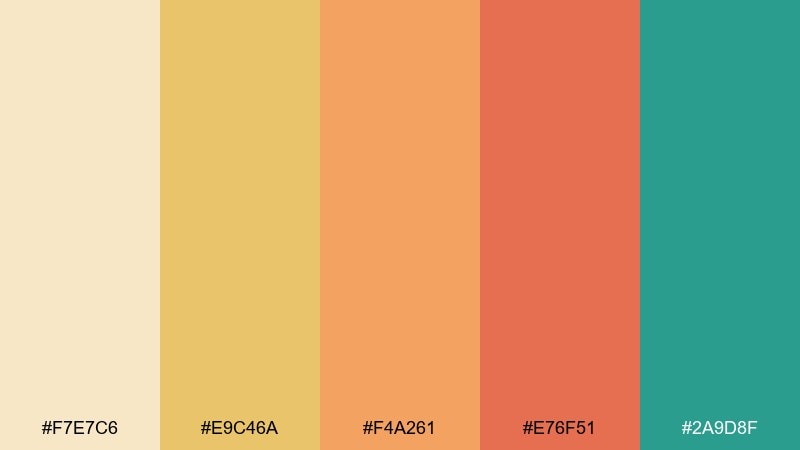
HEX: #F7E7C6 #E9C46A #F4A261 #E76F51 #2A9D8F
Mood: warm, optimistic, sunlit
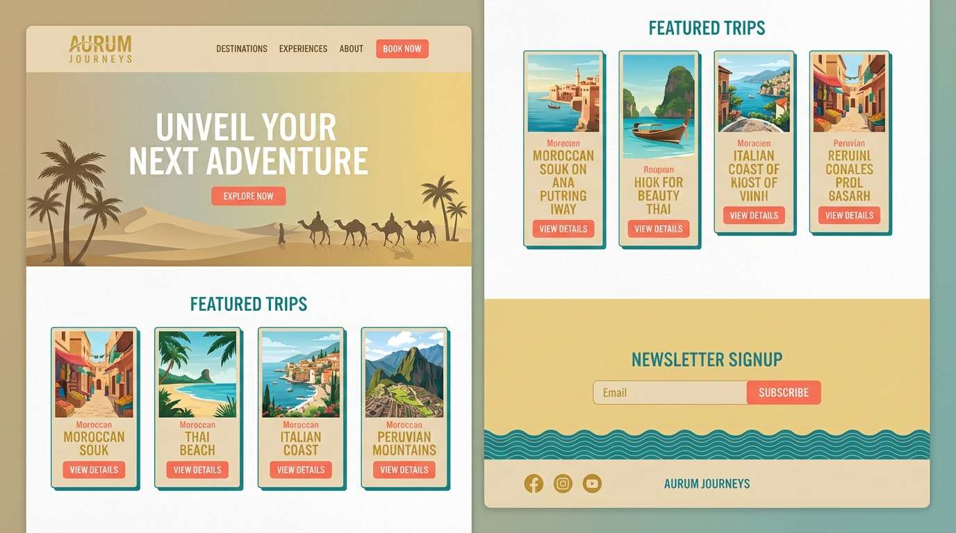
Best for: travel brand landing page UI
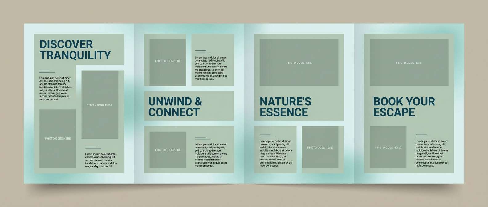
Warm and optimistic, it feels like first light over pale dunes with a hint of turquoise water. Use the sand and gold tones for backgrounds, then bring in coral for buttons and highlights. The teal works best as a steady anchor for headers and navigation. For a clean beach color palette, keep body text dark and let the accent colors do the talking.
Image example of dune sunrise generated using media.io
Media.io is an online AI studio for creating and editing video, image, and audio in your browser.

2) Sea Glass Calm
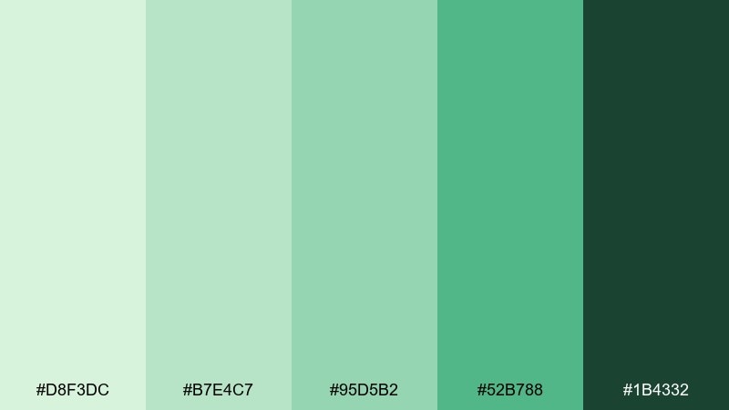
HEX: #D8F3DC #B7E4C7 #95D5B2 #52B788 #1B4332
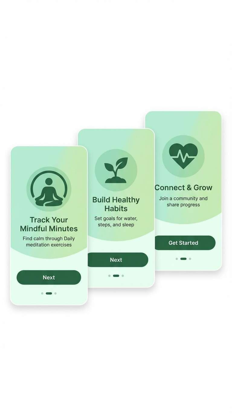
Mood: fresh, quiet, restorative
Best for: wellness app onboarding screens
Fresh and restorative, these greens read like sea glass scattered along the shoreline. Layer the palest mint as the base, then step up to deeper greens for progress states and icons. Pair it with plenty of white space to keep the flow airy. Tip: reserve the darkest green for primary actions so the interface stays calm but still clear.
Image example of sea glass calm generated using media.io
3) Coral Reef Pop
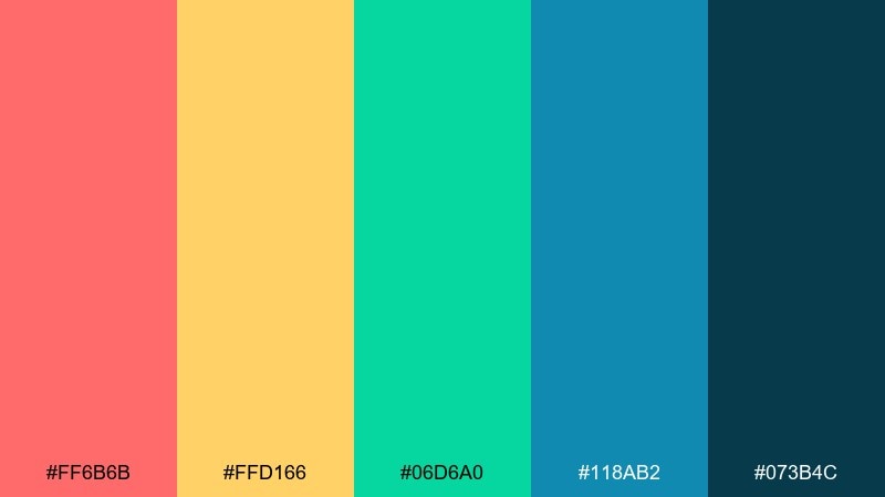
HEX: #FF6B6B #FFD166 #06D6A0 #118AB2 #073B4C
Mood: playful, energetic, tropical
Best for: summer campaign social ads
Playful and energetic, it evokes bright reef life and sun-splashed water. Use the navy as a grounding backdrop, then let coral and mango carry headlines and key stickers. Teal and blue make great secondary shapes for depth without muddying the look. Tip: keep gradients subtle so the design stays punchy rather than candy-like.
Image example of coral reef pop generated using media.io

4) Driftwood Neutral
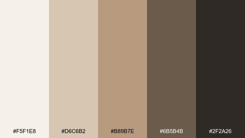
HEX: #F5F1E8 #D6C6B2 #B89B7E #6B5B4B #2F2A26
Mood: grounded, natural, understated
Best for: boutique hotel brand identity
Grounded and understated, these tones feel like sun-dried driftwood and linen towels. Build your system with the lightest cream for backgrounds and the mid browns for dividers and secondary elements. The darkest brown gives logos and type a premium weight without looking harsh. Tip: add texture through paper grain or subtle noise to keep neutrals from feeling flat.
Image example of driftwood neutral generated using media.io
5) Tidepool Teal
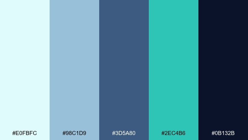
HEX: #E0FBFC #98C1D9 #3D5A80 #2EC4B6 #0B132B
Mood: crisp, nautical, modern
Best for: SaaS dashboard UI
Crisp and nautical, it mirrors clear tidepools with deep-water shadows. Use the pale aqua for panels, then rely on slate blue for structure like sidebars and tables. Teal works beautifully for active states and data highlights. Tip: keep charts limited to two accent colors so the dashboard stays readable.
Image example of tidepool teal generated using media.io
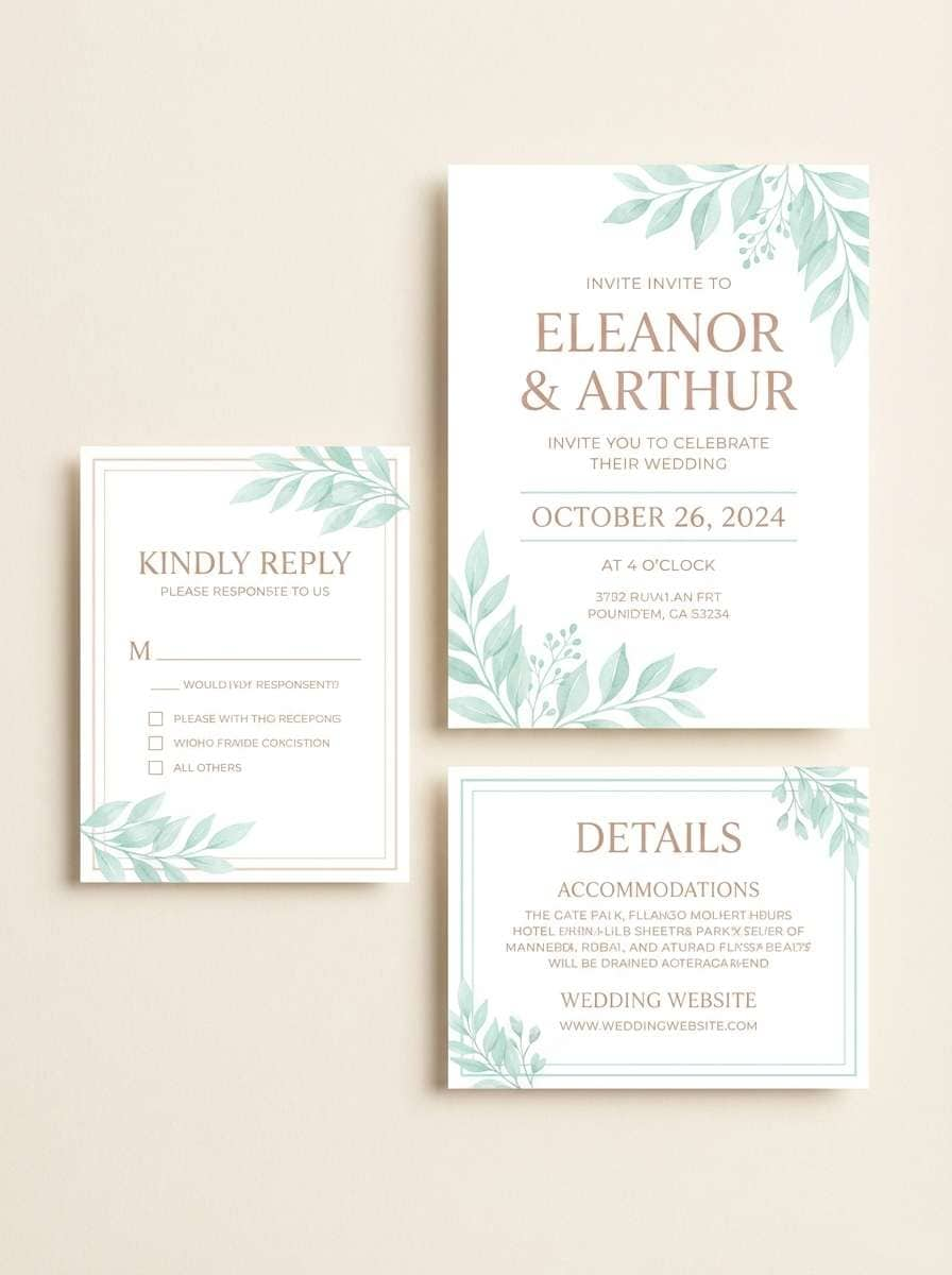
6) Sandbar Pastels
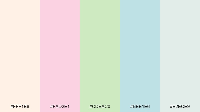
HEX: #FFF1E6 #FAD2E1 #CDEAC0 #BEE1E6 #E2ECE9
Mood: soft, airy, gentle
Best for: wedding invitation suite
Soft and airy, these pastels feel like shells, sea foam, and hazy sun. Use the blush and cream for the main card, then bring in mint as a subtle botanical accent. The cool aqua is perfect for borders, monograms, or RSVP details. Tip: print on textured stock to amplify the delicate tone without needing heavy ornament.
Image example of sandbar pastels generated using media.io
7) Boardwalk Retro
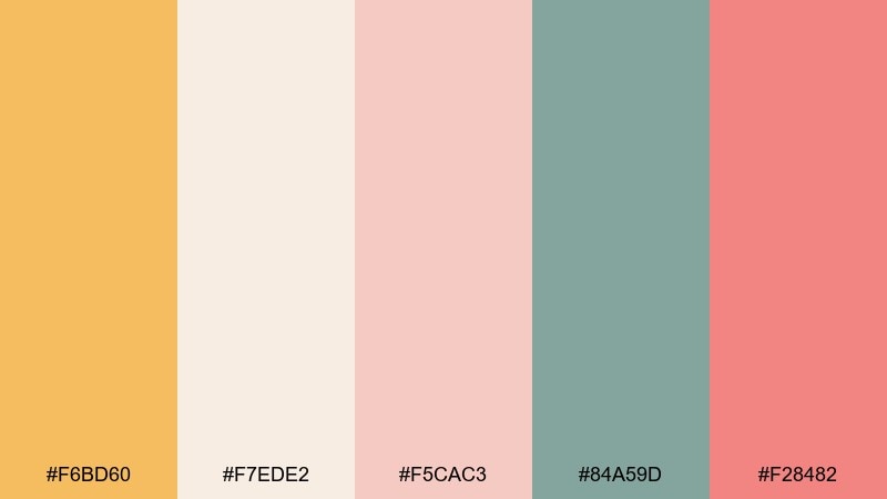
HEX: #F6BD60 #F7EDE2 #F5CAC3 #84A59D #F28482
Mood: nostalgic, cheerful, sun-faded
Best for: ice cream shop poster
Nostalgic and cheerful, it recalls sun-faded umbrellas and a stroll down the boardwalk. Use the warm cream as your base, then layer peach and coral for playful type and shapes. The muted teal keeps the whole mix from looking overly sweet. Tip: add a single bold outline color in teal to unify retro illustrations and text.
Image example of boardwalk retro generated using media.io
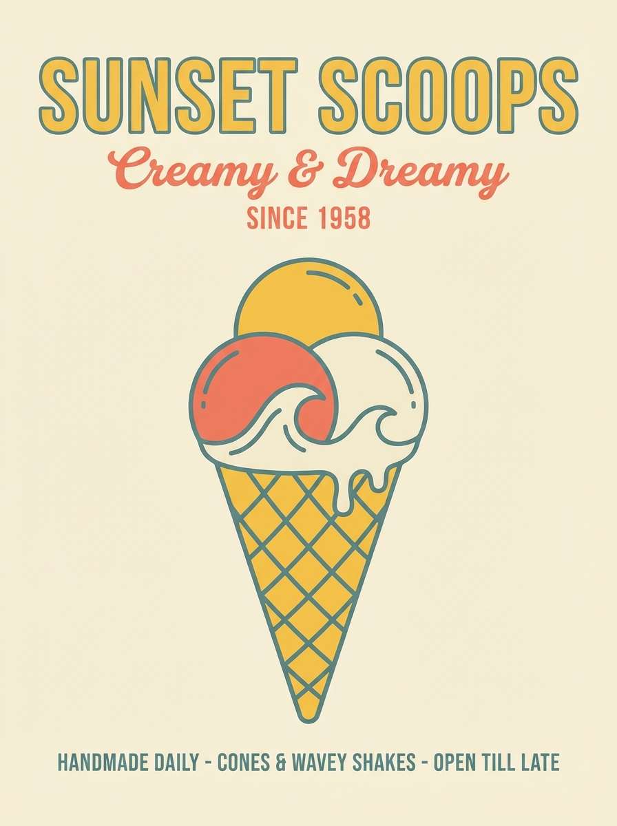
8) Sunset Lifeguard
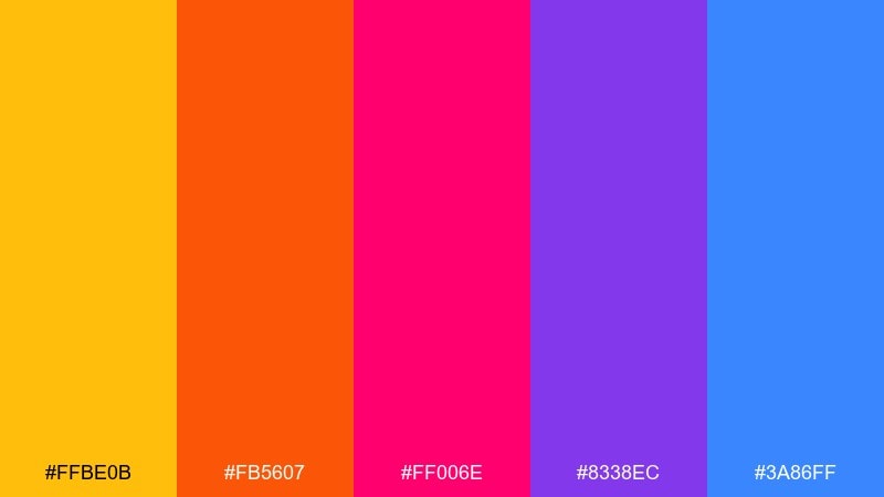
HEX: #FFBE0B #FB5607 #FF006E #8338EC #3A86FF
Mood: bold, electric, festival-ready
Best for: music event flyer
Bold and electric, it feels like neon signs against a late-summer sunset. Use yellow and orange for the headline hierarchy, then punch in magenta for date and venue details. Blue balances the heat and keeps the layout legible at a distance. For standout beach color combinations, limit gradients and let flat blocks do the work for maximum impact.
Image example of sunset lifeguard generated using media.io
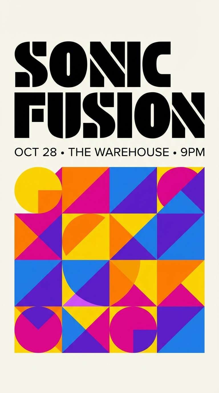
9) Lagoon Luxe
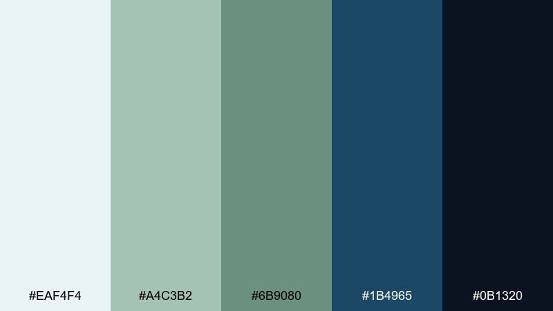
HEX: #EAF4F4 #A4C3B2 #6B9080 #1B4965 #0B1320
Mood: refined, cool, coastal-elegant
Best for: resort brochure layout
Refined and cool, these hues suggest a quiet lagoon with deep blue depth. Use the misty aqua for generous margins and the sage for section panels. The dark blue works well for editorial headlines and premium-feeling callouts. Tip: pair with thin line icons and a single serif font to keep the look upscale.
Image example of lagoon luxe generated using media.io
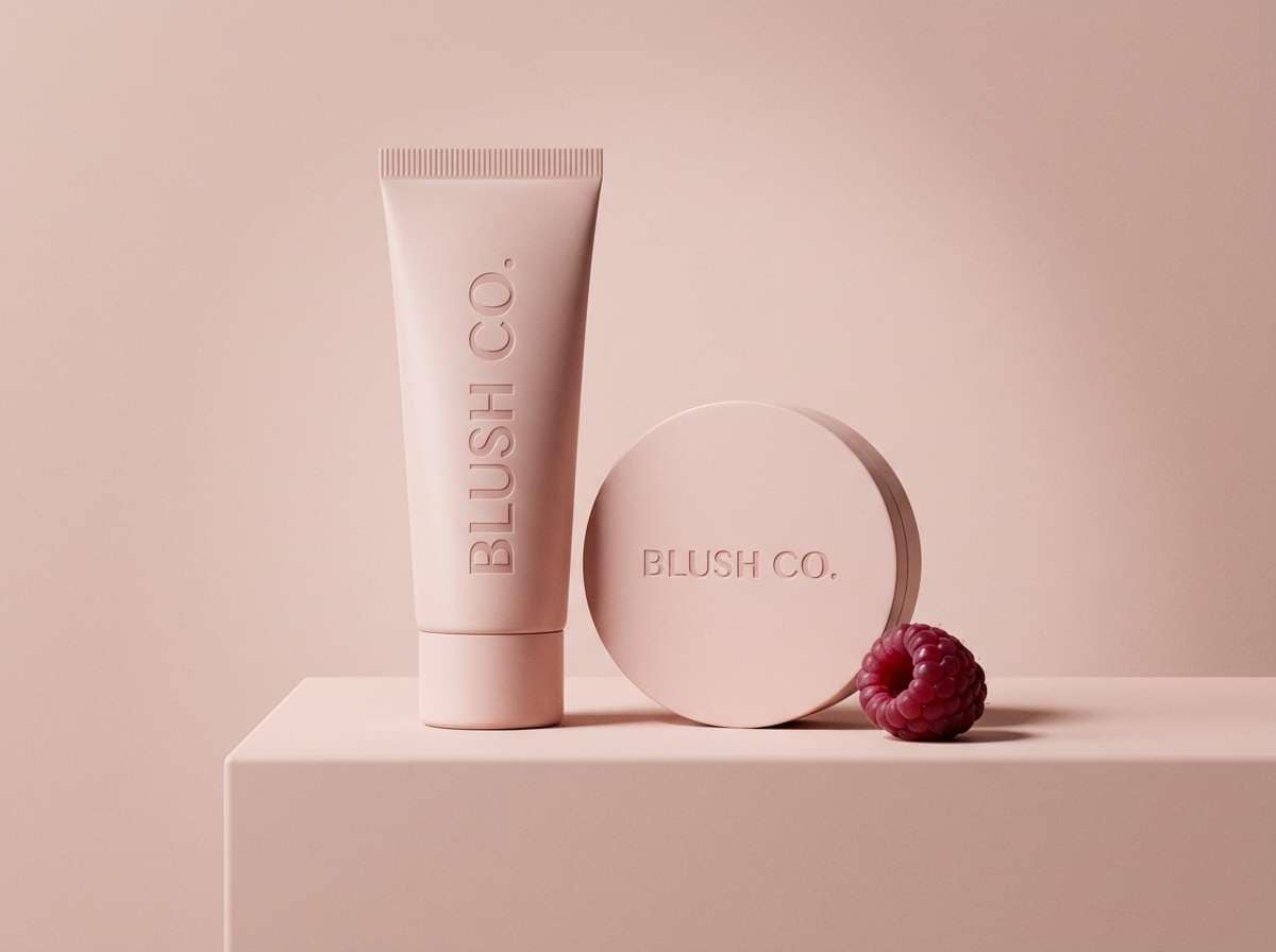
10) Shell Pink Minimal
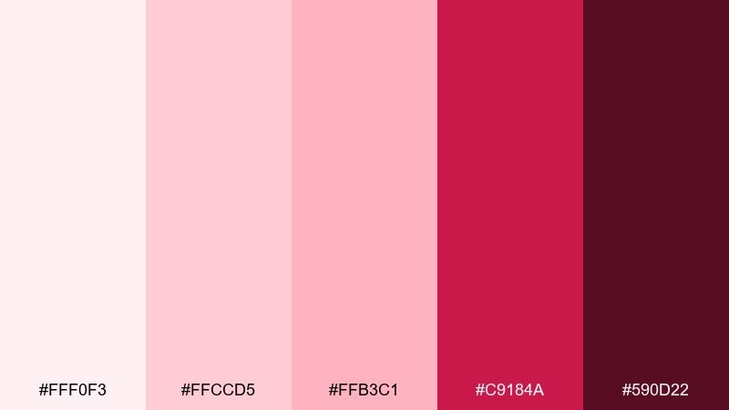
HEX: #FFF0F3 #FFCCD5 #FFB3C1 #C9184A #590D22
Mood: romantic, clean, modern
Best for: cosmetics product ad
Romantic yet modern, it reads like soft shell pink with a confident berry edge. Use the pale blush for a clean background and keep typography in the deep wine for contrast. The saturated berry is ideal for small details like price tags or a single focal element. Tip: keep shadows minimal so the palette stays light and premium.
Image example of shell pink minimal generated using media.io
11) Stormy Coast
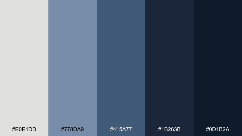
HEX: #E0E1DD #778DA9 #415A77 #1B263B #0D1B2A
Mood: moody, cinematic, sophisticated
Best for: tech brand presentation deck
Moody and cinematic, it evokes overcast skies meeting steel-blue water. Use the light gray as slide canvas, then lean on slate for charts and dividers. The deep navy creates strong title contrast and makes small color accents feel intentional. Tip: add one warm neutral in photography only, so the deck stays sleek and cohesive.
Image example of stormy coast generated using media.io
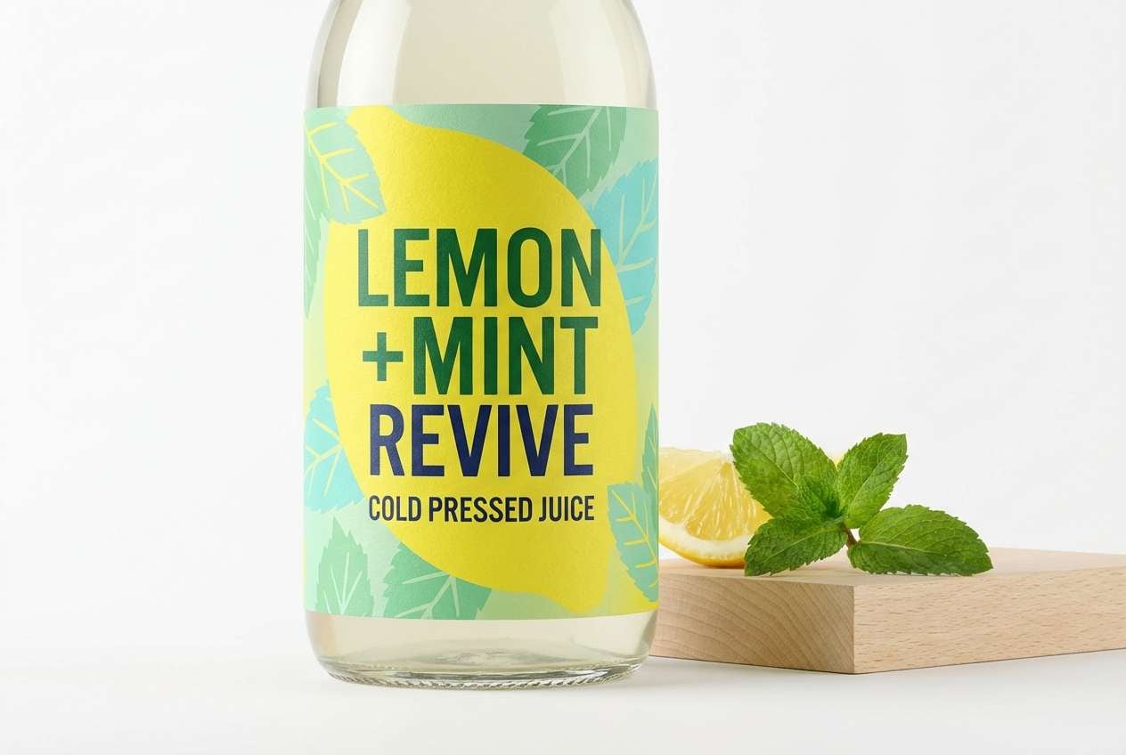
12) Tropical Breeze
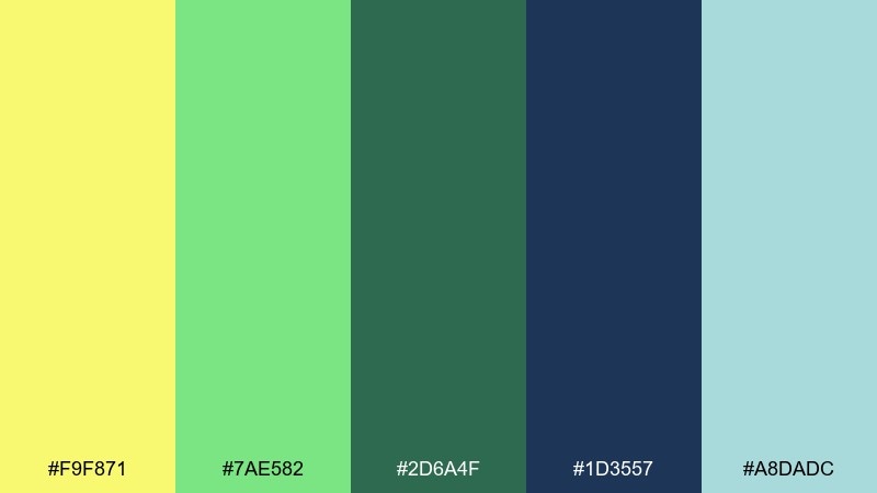
HEX: #F9F871 #7AE582 #2D6A4F #1D3557 #A8DADC
Mood: bright, breezy, upbeat
Best for: juice label packaging
Bright and breezy, it suggests citrus sun with cool sea air. Use the lemon yellow for the label focal area, then add mint and aqua for freshness cues. The deep green and navy help anchor the typography so it reads well on shelves. Tip: choose matte stock so the high-energy colors do not glare under lights.
Image example of tropical breeze generated using media.io
13) Pebble and Foam
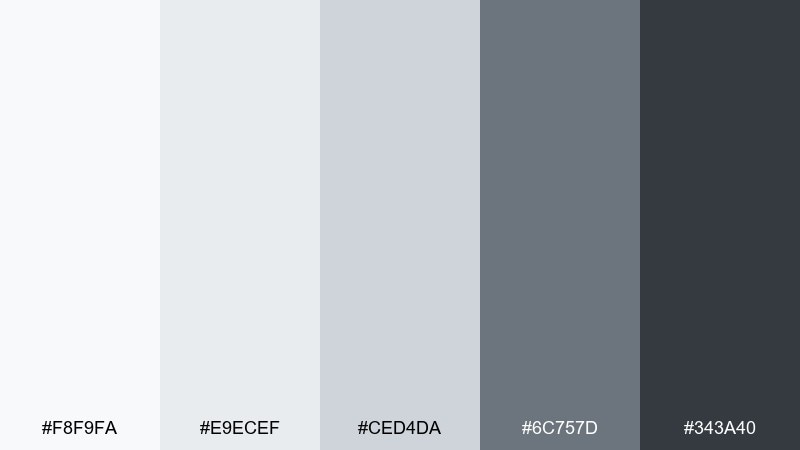
HEX: #F8F9FA #E9ECEF #CED4DA #6C757D #343A40
Mood: clean, balanced, minimalist
Best for: portfolio website UI
Clean and balanced, it feels like smooth pebbles under a thin layer of foam. Use the light grays for section backgrounds and spacing rhythm, then step up to charcoal for headings and CTAs. The mid gray is perfect for subtle borders, tags, and disabled states. Tip: introduce color only through imagery so the layout stays timeless.
Image example of pebble and foam generated using media.io
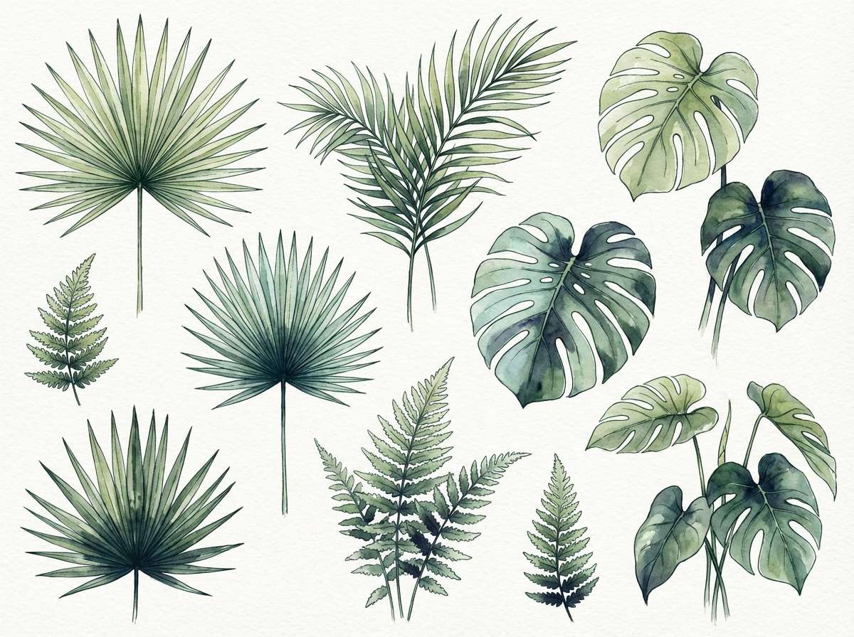
14) Palm Shade
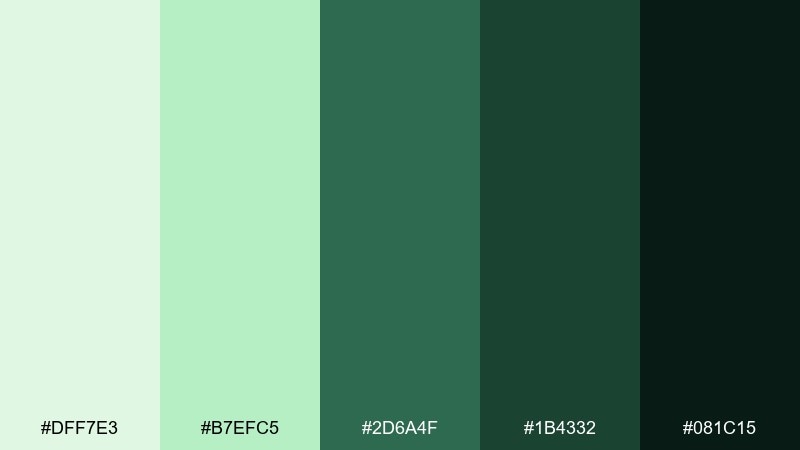
HEX: #DFF7E3 #B7EFC5 #2D6A4F #1B4332 #081C15
Mood: lush, shaded, earthy
Best for: botanical illustration set
Lush and shaded, it brings to mind palm fronds casting cool shadows on warm sand. Use the pale greens for washes and highlights, then deepen with forest tones for stems and outlines. The near-black green is great for fine detail and contrast without going stark. Tip: keep gradients watercolor-soft so the greens feel natural rather than digital.
Image example of palm shade generated using media.io
15) Marina Night
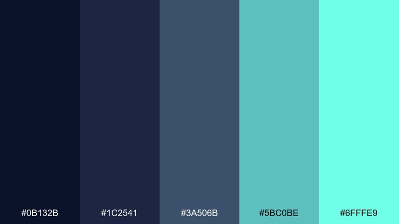
HEX: #0B132B #1C2541 #3A506B #5BC0BE #6FFFE9
Mood: sleek, nocturnal, high-contrast
Best for: finance app dark mode UI
Sleek and nocturnal, it resembles dock lights reflecting on calm water. Use the deep blues for surfaces and cards, then bring in teal for active tabs and key numbers. The bright aqua should be a small, high-impact accent for primary actions. Tip: increase line height and spacing so dark mode feels premium, not cramped.
Image example of marina night generated using media.io
16) Sun Bleached Denim
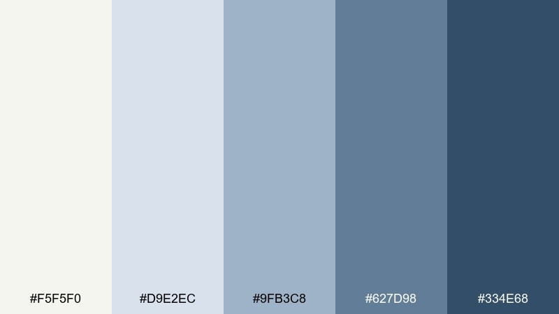
HEX: #F5F5F0 #D9E2EC #9FB3C8 #627D98 #334E68
Mood: casual, breezy, lived-in
Best for: lifestyle blog header and tiles
Casual and lived-in, it feels like worn denim with a salty breeze. Use the off-white as the base and the light blue-gray for content tiles and captions. The deeper blues are strong for navigation and link states without getting too corporate. Tip: pair with warm photography to keep the overall tone friendly.
Image example of sun bleached denim generated using media.io
17) Citrus Coast
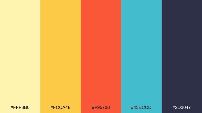
HEX: #FFF3B0 #FCCA46 #F95738 #43BCCD #2D3047
Mood: zesty, youthful, sunny
Best for: food delivery app promo banner
Zesty and youthful, it brings the vibe of citrus slices against cool water. Use pale yellow for the background glow, then let orange-red carry the offer and discount badge. Teal adds freshness for icons and small illustrations, while the deep indigo keeps text sharp. Tip: keep promo type bold and short so the bright accents stay readable.
Image example of citrus coast generated using media.io
18) Oceanfront Spa
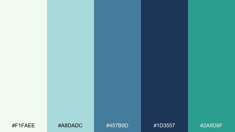
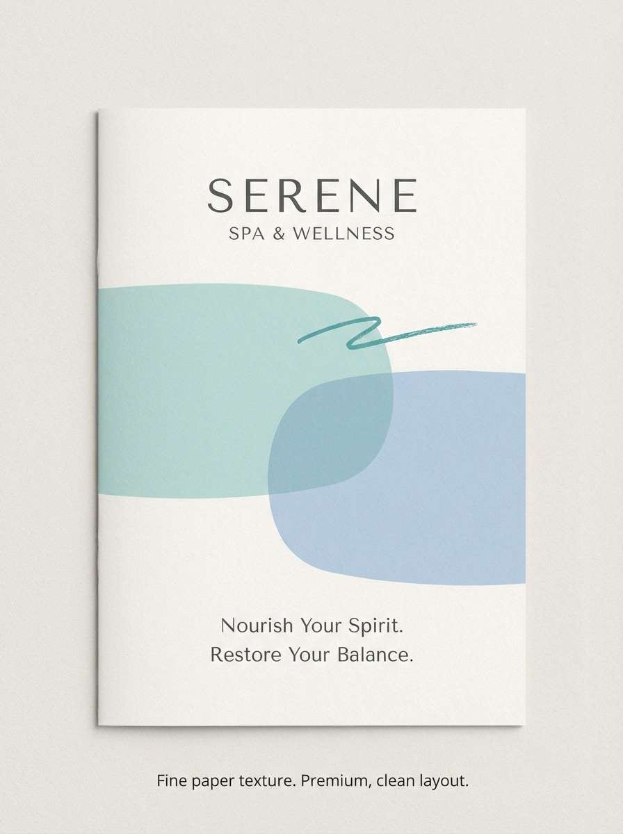
HEX: #F1FAEE #A8DADC #457B9D #1D3557 #2A9D8F
Mood: serene, clean, refreshing
Best for: spa brochure cover
Serene and clean, it suggests cool towels, eucalyptus mist, and a quiet ocean view. Use the soft off-white as breathing room, then apply aqua for large calming blocks. The blues bring structure for headings and service lists, while teal works well for subtle callouts. Tip: choose matte finishes and thin dividers to keep the design spa-quiet.
Image example of oceanfront spa generated using media.io
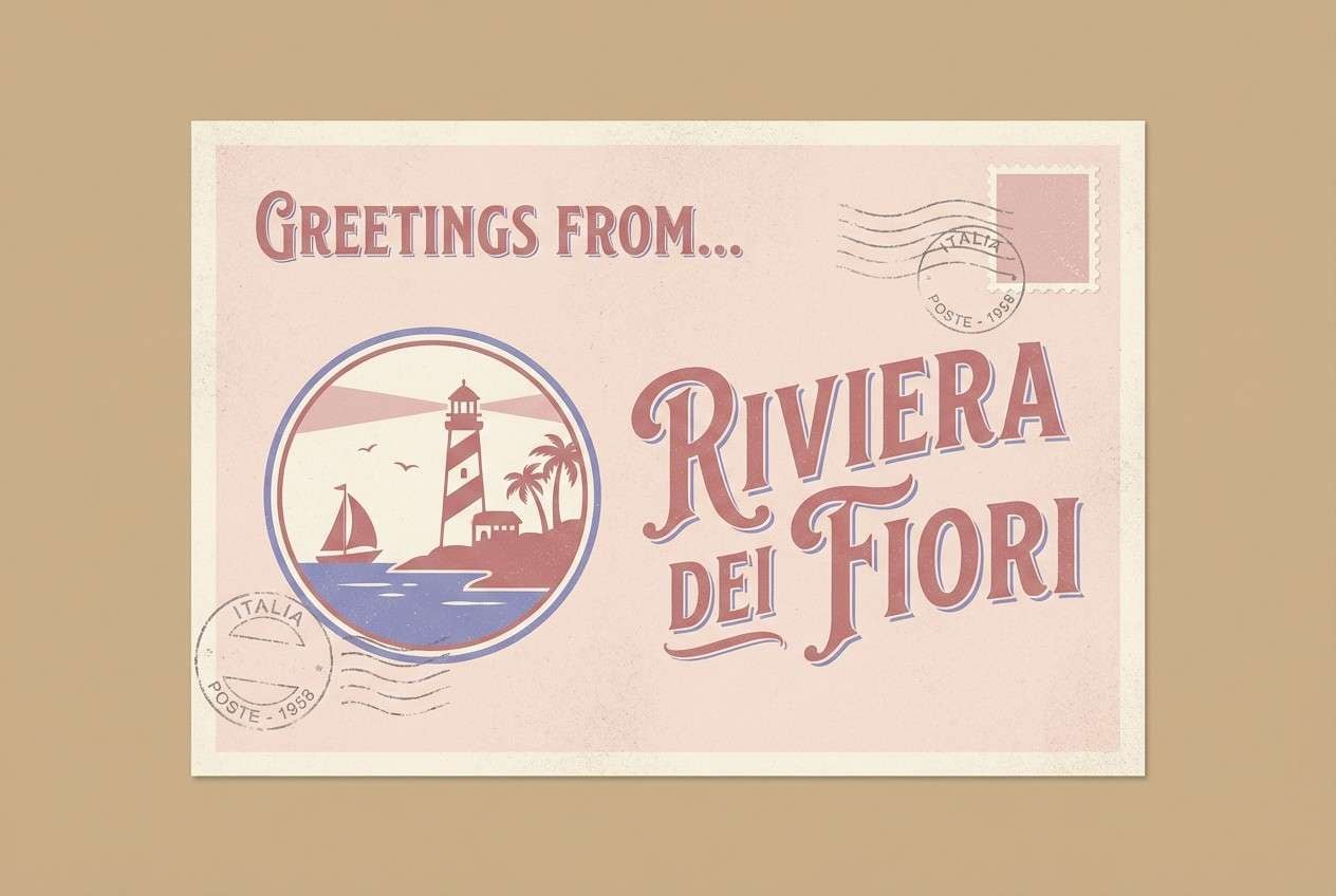
19) Vintage Postcard
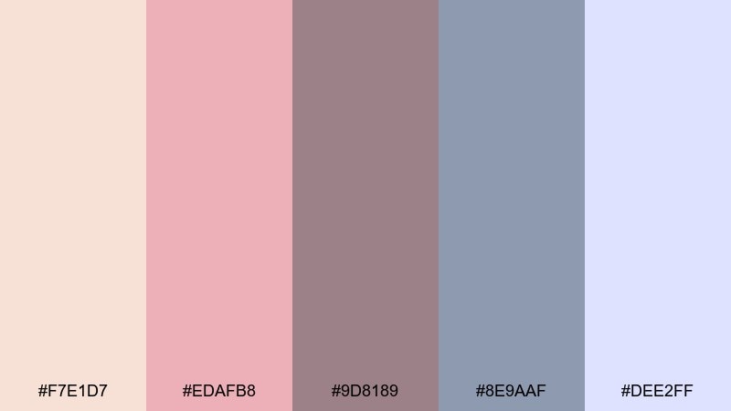
HEX: #F7E1D7 #EDAFB8 #9D8189 #8E9AAF #DEE2FF
Mood: romantic, nostalgic, dusty
Best for: travel postcard print design
Romantic and dusty, it looks like a faded postcard pulled from a suitcase pocket. Use the creamy pink as paper tone, then set headlines in muted mauve for that vintage feel. The periwinkle and soft lavender make great borders and stamp-like details. Tip: add light grain and halftone textures to enhance the aged print effect.
Image example of vintage postcard generated using media.io
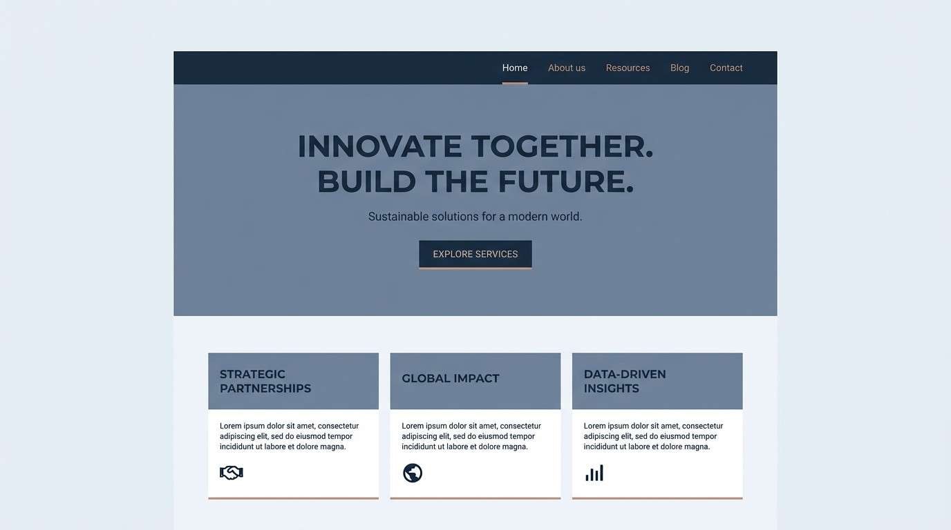
20) Saltwater Slate
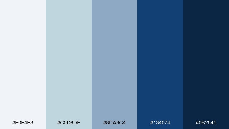
HEX: #F0F4F8 #C0D6DF #8DA9C4 #134074 #0B2545
Mood: cool, professional, dependable
Best for: corporate website rebrand
Cool and dependable, it feels like salt air over slate rocks and deep water. Use the palest blue-gray for page backgrounds, then build sections with the mid slate tones. The two navies create confident hierarchy for headers, footers, and key CTAs. For modern beach color combinations, keep accent use focused on links and buttons so the brand stays sharp.
Image example of saltwater slate generated using media.io
What Colors Go Well with Beach?
Beach colors pair best when you mix a warm neutral (sand, cream, driftwood) with a cool aquatic (aqua, teal, ocean blue). This creates that classic “sun + water” contrast without needing loud saturation.
For accents, coral and mango add energy, while navy and charcoal keep typography sharp. If you want a softer coastal look, lean into sea-glass greens, blush shell pink, and light foam grays.
How to Use a Beach Color Palette in Real Designs
Start with a light neutral as your main canvas so your UI or print layout feels breathable. Then assign one darker anchor color (navy, deep green, espresso) for text, headers, and key structure.
Use one bright accent (coral, citrus, aqua) for CTAs and highlights, and keep it consistent across states. For extra polish, introduce “beach texture” through photography, subtle grain, or thin linework instead of adding more colors.
Create Beach Palette Visuals with AI
If you want to preview a beach color scheme before designing, generate quick concept images with AI. You can test how sand tones behave as backgrounds, whether teal reads clearly on dark surfaces, and how coral accents pop in different layouts.
Reuse the prompts above, swap in your palette keywords (like “sea glass,” “driftwood,” or “tidepool teal”), and keep the layout notes (grid, negative space, typography) for more controllable results.
Beach Color Palette FAQs
-
What is a beach color palette?
A beach color palette is a set of coastal-inspired colors—often sand/cream neutrals plus ocean blues, teals, and optional coral accents—used to create a relaxed, airy visual mood. -
What are the best beach color combinations for modern UI?
Try pale sand or foam as the background, navy or slate for text, and teal as the active/CTA color. This keeps contrast high while still feeling coastal. -
Do beach color schemes work for professional brands?
Yes. Muted options like Saltwater Slate or Stormy Coast feel dependable and corporate-friendly while still referencing the coast through blue-gray undertones. -
How do I keep a beach palette from looking too “tropical”?
Lower saturation, prioritize neutrals (cream, driftwood, pebble gray), and use coral/yellow only as small accents. Avoid heavy gradients and use clean typography. -
What’s a good accent color for sand and ocean blue?
Coral is the classic choice for warmth and contrast. If you want a calmer accent, use sea-glass green; for a sharper look, use deep navy. -
How many colors should a beach palette use in a design system?
Use 1–2 neutrals for surfaces, 1 dark anchor for text, and 1–2 accents for actions and highlights. Too many brights can make the design feel noisy. -
Can I generate beach-themed palette mockups with AI?
Yes. Use Media.io Text-to-Image with prompts that specify layout type (UI, poster, brochure) and explicitly mention your key hues (sand, teal, coral, navy) for more consistent outputs.


