

Blue bronze is a timeless pairing: cool oceanic blues bring clarity and trust, while bronze adds warmth, heritage, and a premium “metallic” cue—even when used as a flat color.
Below are 20 blue bronze color palette ideas with HEX codes, plus practical notes on contrast, mood, and where each mix performs best in branding, UI, and print.
In this article
- Why Blue Bronze Palettes Work So Well
-
- harbor patina
- antique compass
- midnight alloy
- coastal bronze mist
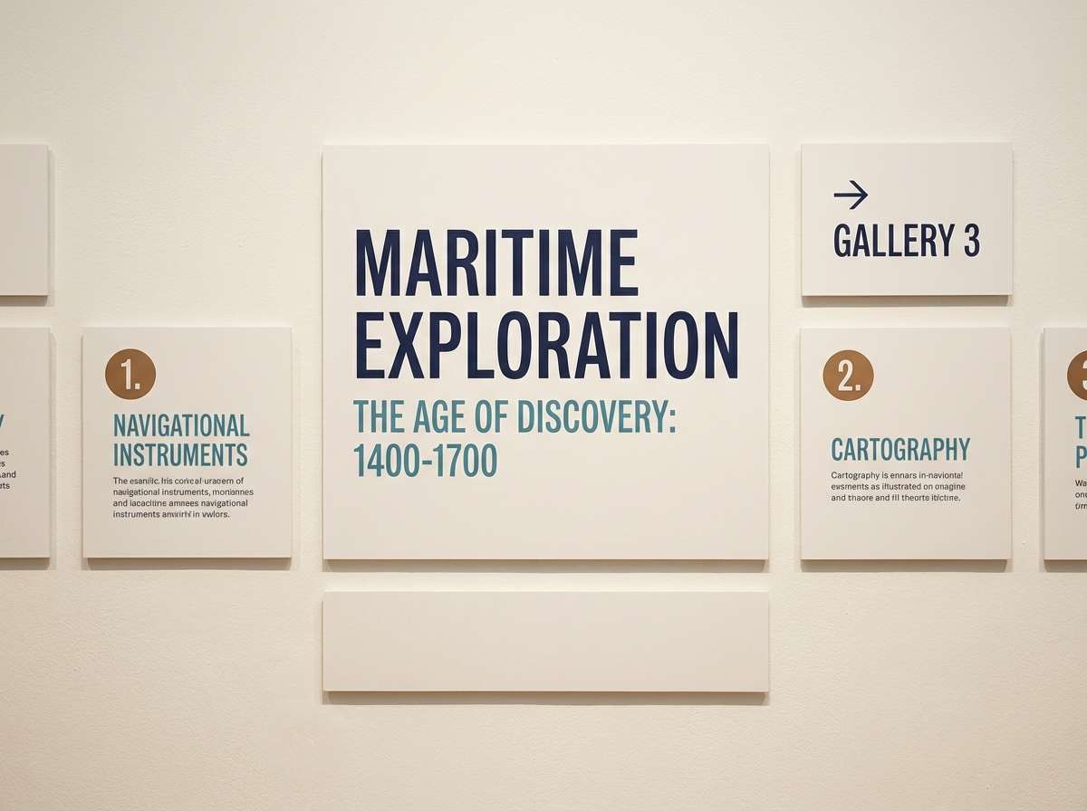
- museum label
- blueprint and brass
- autumn harbor
- quiet verdigis
- bronze ink editorial
- copper sky poster
- urban foundry ui
- night market packaging
- desert navy wedding
- observatory glass
- bronze tide app
- aged medal interiors
- steamship logo
- gallery spotlight
- rainy boulevard
- celestial bronze
- What Colors Go Well with Blue Bronze?
- How to Use a Blue Bronze Color Palette in Real Designs
- Create Blue Bronze Palette Visuals with AI
Why Blue Bronze Palettes Work So Well
Blue and bronze create a natural temperature contrast: blue feels calm, stable, and modern, while bronze adds a sun-warmed highlight that reads crafted and intentional. Together, they deliver “premium” without needing heavy ornament.
Functionally, blues cover most UI and layout needs—backgrounds, surfaces, charts, and readable typography—while bronze excels as an accent for calls-to-action, badges, dividers, and key numbers. This keeps hierarchy clear and prevents visual noise.
In print, bronze also plays well with off-whites and warm papers, giving a subtle metallic vibe even in matte inks. That makes blue bronze palettes versatile for everything from tech to hospitality to editorial.
20+ Blue Bronze Color Palette Ideas (with HEX Codes)
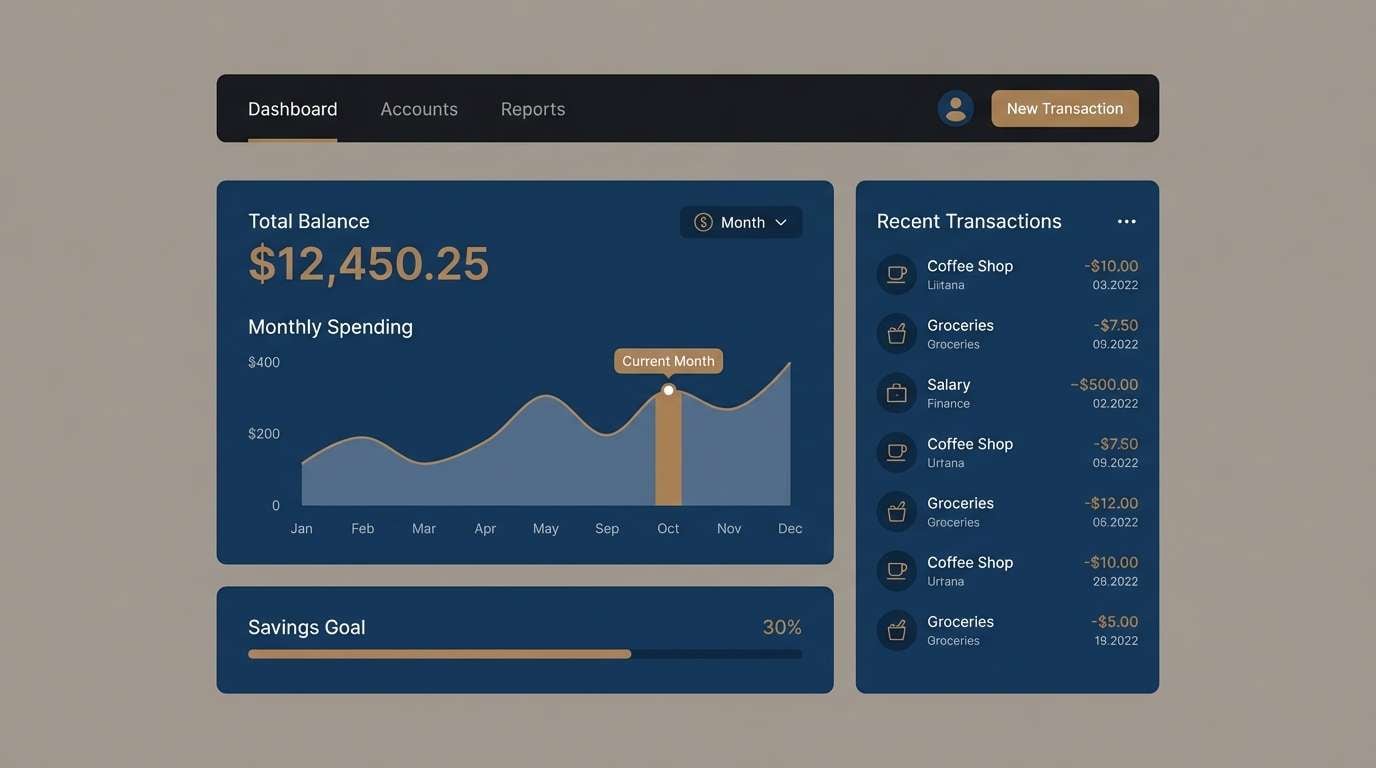
1) Harbor Patina
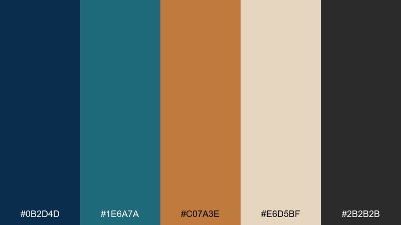
HEX: #0B2D4D #1E6A7A #C07A3E #E6D5BF #2B2B2B
Mood: nautical, refined, grounded
Best for: brand identity for coastal or heritage businesses
Nautical and timeworn, it feels like ship paint, salt air, and aged metal hardware. Deep navy sets a premium base while patina teal keeps it approachable and modern. Use bronze as a small but deliberate highlight on rules, icons, or seals, and let the warm sand tone handle backgrounds. Tip: keep charcoal for typography so the bronze stays the hero.
Image example of harbor patina generated using media.io
Media.io is an online AI studio for creating and editing video, image, and audio in your browser.

2) Antique Compass
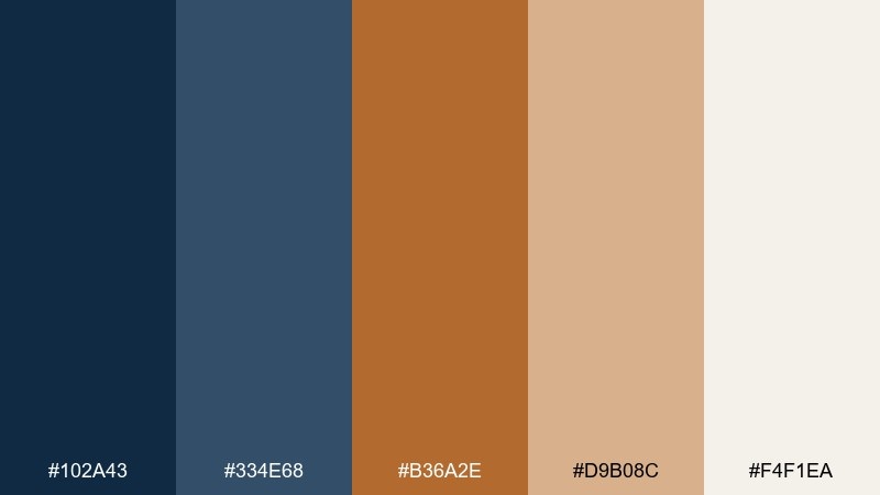
HEX: #102A43 #334E68 #B36A2E #D9B08C #F4F1EA
Mood: classic, adventurous, warm
Best for: travel blog header and editorial graphics
Classic and exploratory, it brings to mind map ink, leather journals, and a brass compass. The layered blues create depth for headers and photo overlays, while bronze reads like a timeless marker color. Pair the warm tan with plenty of off-white space to keep layouts airy. Tip: use bronze only for callouts and section labels to avoid overpowering body text.
Image example of antique compass generated using media.io
3) Midnight Alloy
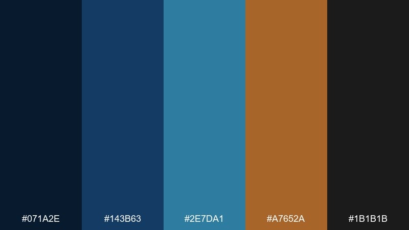
HEX: #071A2E #143B63 #2E7DA1 #A7652A #1B1B1B
Mood: moody, industrial, high-contrast
Best for: tech conference poster design
Moody and industrial, it suggests midnight skies over metalwork and glass. The inky blues support bold typography, while the sharp teal adds clarity for secondary details. Bronze works best as a spotlight color for dates, badges, or key numbers. Tip: keep most shapes in dark tones and reserve bronze for one focal element per section.
Image example of midnight alloy generated using media.io

4) Coastal Bronze Mist
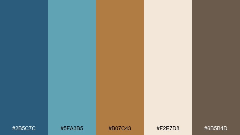
HEX: #2B5C7C #5FA3B5 #B07C43 #F2E7D8 #6B5B4D
Mood: soft, breezy, elegant
Best for: boutique hotel website hero section
Soft and breezy, it feels like misty mornings on the water with sunlit bronze details. The lighter blue is ideal for large sections and gradients, while the deeper blue anchors navigation and buttons. Bronze adds a boutique touch without looking flashy when paired with creamy neutrals. Tip: try bronze for thin dividers and icon strokes to keep it polished.
Image example of coastal bronze mist generated using media.io
5) Museum Label
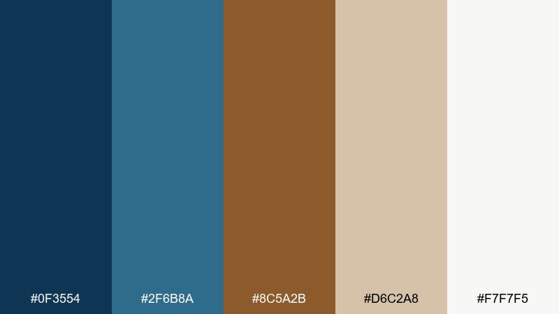
HEX: #0F3554 #2F6B8A #8C5A2B #D6C2A8 #F7F7F5
Mood: curated, scholarly, calm
Best for: exhibition signage and wall labels
Curated and scholarly, it evokes gallery walls, archival paper, and carefully lit artifacts. Navy and blue-green deliver strong readability for titles and directional cues. Bronze leans more antique here, so it suits numbering, section markers, and subtle borders. Tip: print on warm stock so the tan and bronze feel intentional, not accidental.
Image example of museum label generated using media.io
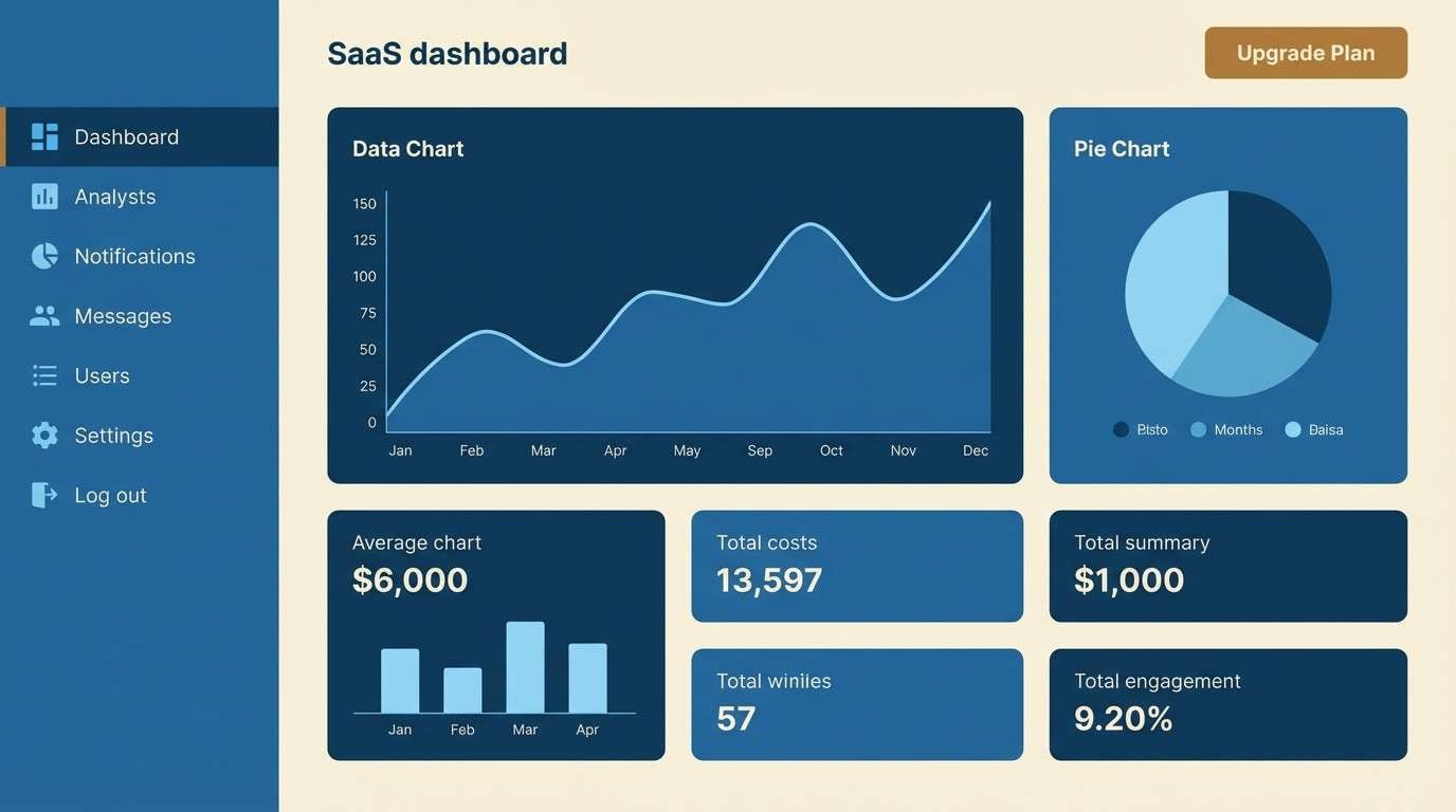
6) Blueprint and Brass
HEX: #123B66 #2A74A5 #4DA3C7 #B8792B #F0E5D6
Mood: confident, modern, clean
Best for: saas dashboard UI and data cards
Confident and modern, it reads like a crisp blueprint with brass fasteners. The three blues give you a ready-made hierarchy for surfaces, states, and charts. This blue bronze color palette looks best when bronze is limited to primary actions and key metrics. Tip: use the cream tone as the main canvas so dense screens never feel heavy.
Image example of blueprint and brass generated using media.io
7) Autumn Harbor
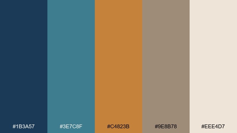
HEX: #1B3A57 #3E7C8F #C4823B #9E8B78 #EEE4D7
Mood: cozy, mature, inviting
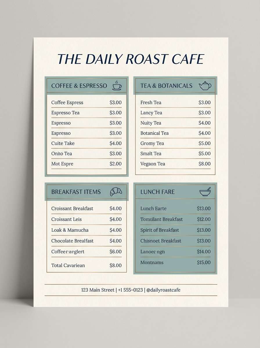
Best for: cafe menu and tabletop print pieces
Cozy and mature, it feels like a harbor town in early fall with warm storefront lights. The muted teal softens the navy, making long menus easier to scan. Bronze shines as a highlight for section headers and price emphasis without turning loud. Tip: keep backgrounds light and use the taupe for secondary rules and icons.
Image example of autumn harbor generated using media.io
8) Quiet Verdigis
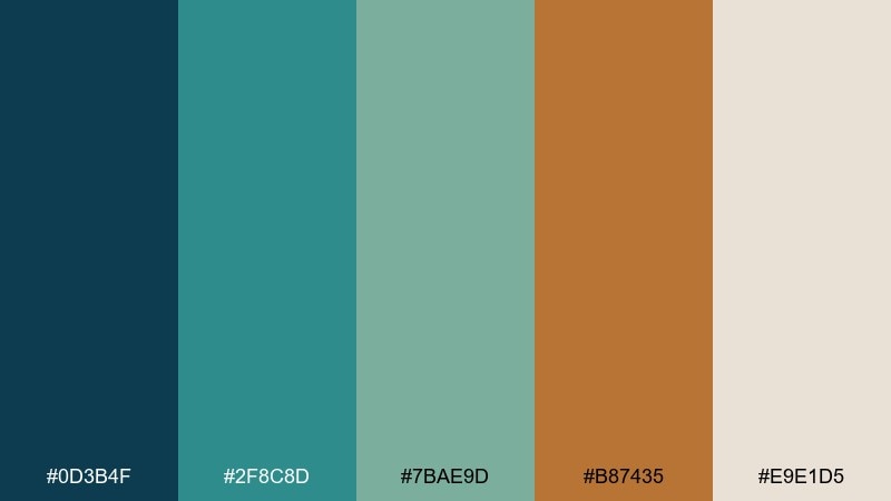
HEX: #0D3B4F #2F8C8D #7BAE9D #B87435 #E9E1D5
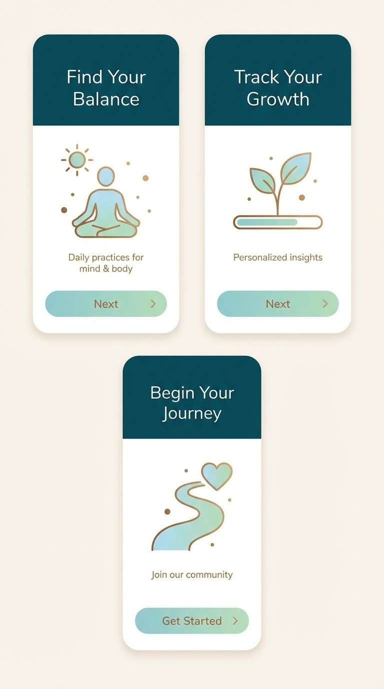
Mood: soothing, natural, understated
Best for: wellness app onboarding screens
Soothing and natural, it suggests mineral water, sea glass, and softly oxidized metal. The green-leaning blues create a gentle gradient for onboarding flows and calming banners. Bronze works best as a tiny warmth injection on progress dots, toggles, or links. Tip: avoid heavy shadows and let the palette do the depth work through tone shifts.
Image example of quiet verdigis generated using media.io
9) Bronze Ink Editorial
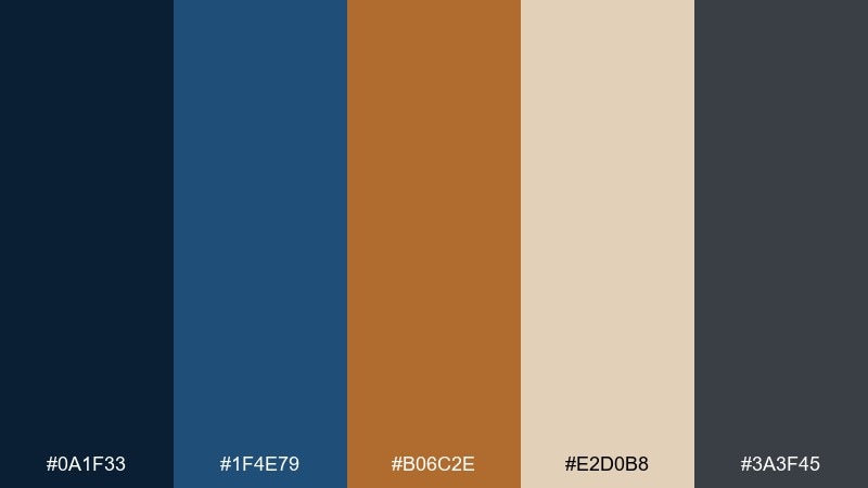
HEX: #0A1F33 #1F4E79 #B06C2E #E2D0B8 #3A3F45
Mood: serious, premium, literary
Best for: magazine feature layout
Serious and literary, it evokes ink-heavy pages with a bronze glint in the margins. Dark navy and graphite give you strong editorial contrast for headlines and pull quotes. The warm beige keeps long reads comfortable while bronze adds a premium accent for bylines or drop caps. Tip: use bronze sparingly around one typographic detail per spread.
Image example of bronze ink editorial generated using media.io
10) Copper Sky Poster
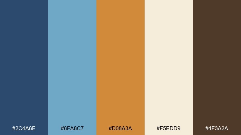
HEX: #2C4A6E #6FA8C7 #D08A3A #F5EDD9 #4F3A2A
Mood: optimistic, airy, artistic
Best for: event poster for a daytime festival
Optimistic and airy, it feels like a bright blue sky with warm copper sunlight. Light blue is perfect for large shapes and negative space, while navy gives type a clean anchor. For blue bronze color combinations that pop, put copper against the cream background and keep the brown for tiny grounding details. Tip: use copper for one big graphic element and let everything else stay calm.
Image example of copper sky poster generated using media.io
11) Urban Foundry UI
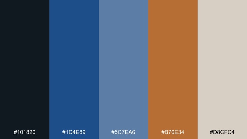
HEX: #101820 #1D4E89 #5C7EA6 #B76E34 #D8CFC4
Mood: bold, urban, professional
Best for: finance app dashboard UI
Bold and urban, it brings to mind steel beams with a warm bronze glow. Nearly-black gives the interface a premium edge, while the two blues keep charts legible and modern. Bronze is ideal for primary CTAs and important totals, especially on the warm gray background. Tip: maintain consistent spacing so the palette reads sharp, not busy.
Image example of urban foundry ui generated using media.io
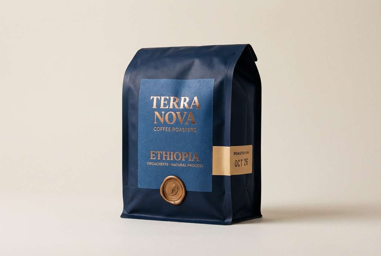
12) Night Market Packaging
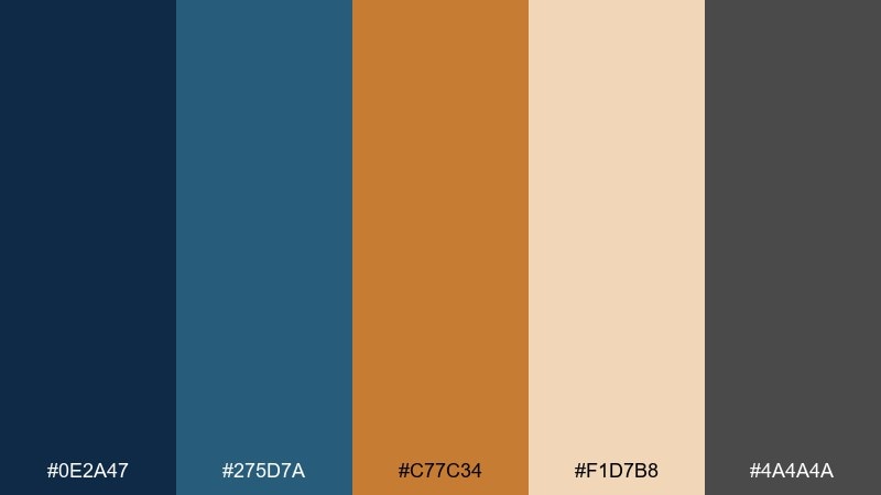
HEX: #0E2A47 #275D7A #C77C34 #F1D7B8 #4A4A4A
Mood: rich, appetizing, craft
Best for: coffee bag and label packaging
Rich and craft-focused, it feels like lantern light over deep blue stalls and copper kettles. The darker blues set a strong premium base for packaging, while bronze reads delicious and roasted. Use the warm beige for label panels so important text stays clear at a glance. Tip: choose a matte finish for blues and a spot gloss for the bronze accent.
Image example of night market packaging generated using media.io
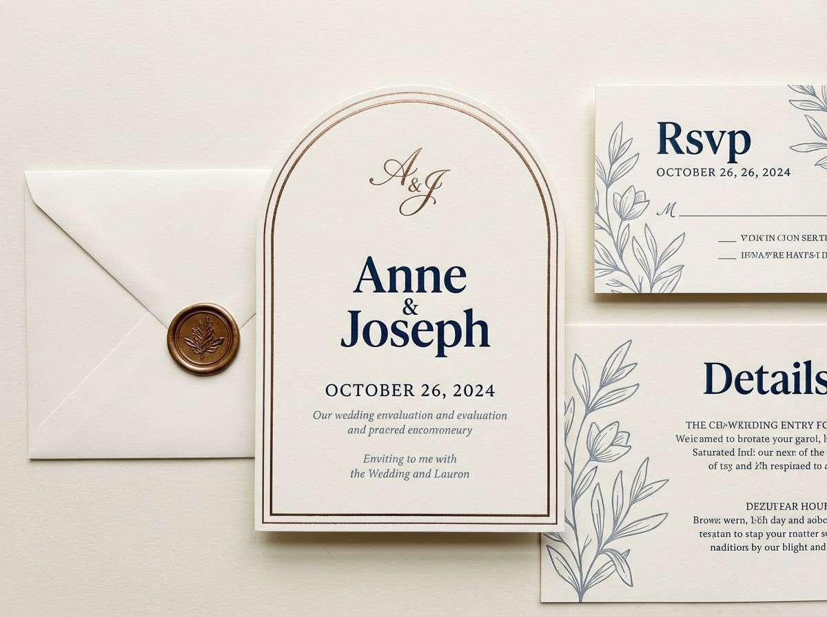
13) Desert Navy Wedding
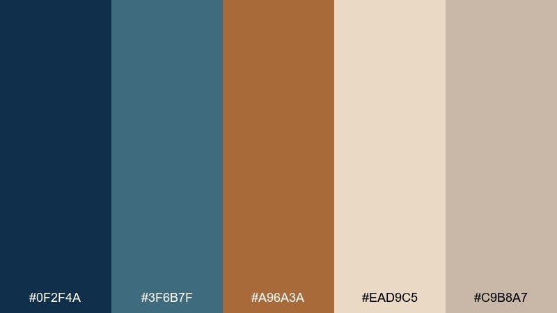
HEX: #0F2F4A #3F6B7F #A96A3A #EAD9C5 #C9B8A7
Mood: romantic, earthy, timeless
Best for: wedding invitation suite
Romantic and earthy, it recalls desert dusk with a navy sky and sun-warmed bronze accents. The soft blue-gray keeps typography gentle while still feeling formal. Pair bronze with the creamy neutrals for foil touches, monograms, or line art. Tip: keep the invitation background light and use navy for names so everything stays readable.
Image example of desert navy wedding generated using media.io
14) Observatory Glass
HEX: #0C2340 #2D5F88 #7FB6C8 #C08A4D #F6F0E6
Mood: crisp, luminous, modern-classic
Best for: presentation slides and keynote themes
Crisp and luminous, it feels like looking through clean glass at a bronze instrument. The three blues naturally map to title, subtitle, and data layers, keeping slides consistent. If you want a blue bronze color combination that reads premium on projectors, use bronze only for key numbers and icons. Tip: keep the background near-white and avoid heavy gradients to preserve clarity.
Image example of observatory glass generated using media.io
15) Bronze Tide App
HEX: #142E4A #245A7A #3C8DA3 #B86F2D #E8DCCB
Mood: active, coastal, fresh
Best for: fitness app home screen UI
Active and coastal, it brings up images of deep water, training gear, and warm metal hardware. The progression of blues supports clear UI states for cards, charts, and progress rings. Bronze makes an excellent highlight for streaks, trophies, and primary buttons when the background stays light. Tip: use the teal for success states so bronze remains reserved for achievements.
Image example of bronze tide app generated using media.io
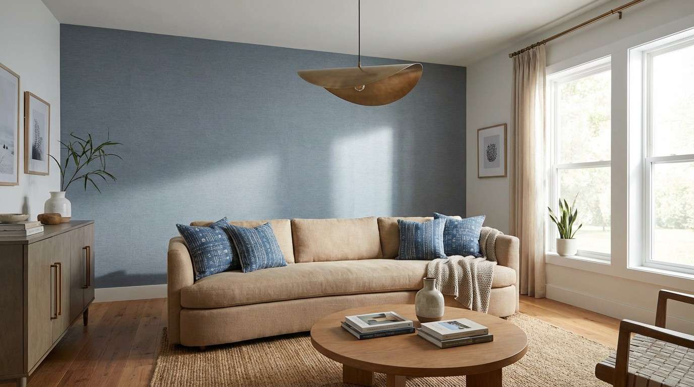
16) Aged Medal Interiors
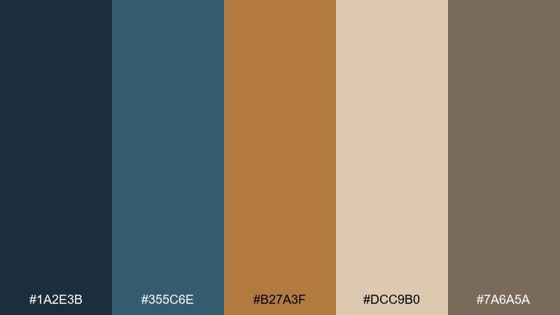
HEX: #1A2E3B #355C6E #B27A3F #DCC9B0 #7A6A5A
Mood: cozy, heritage, tactile
Best for: living room interior styling
Cozy and heritage-leaning, it feels like an old medal on a navy wool coat. Deep blue-gray works beautifully on walls or large textiles, while the lighter blue-gray softens the room. Bronze warms up lighting fixtures and hardware, especially with the sandy neutral and taupe nearby. Tip: balance bronze metals with matte finishes so the palette stays relaxed, not flashy.
Image example of aged medal interiors generated using media.io
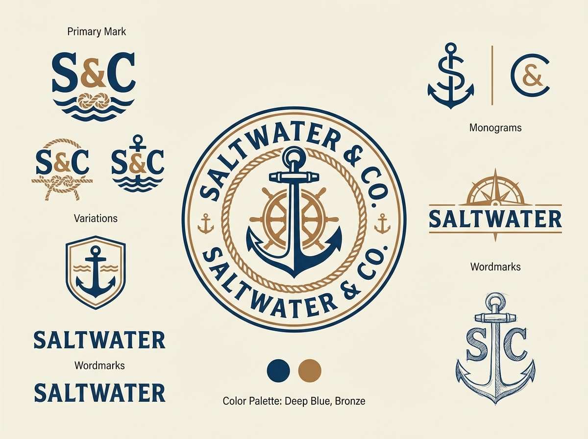
17) Steamship Logo
HEX: #0B2B3C #1C5771 #B5722D #F3E9DA #2E3E46
Mood: bold, maritime, confident
Best for: logo and monogram concepts
Bold and maritime, it suggests painted hulls, deep water, and warm bronze rivets. The blues are strong enough for solid marks and typography, while bronze adds character without stealing legibility. Use the cream as negative space to keep the mark crisp at small sizes. Tip: test the logo in one color first, then introduce bronze as an accent version.
Image example of steamship logo generated using media.io
18) Gallery Spotlight
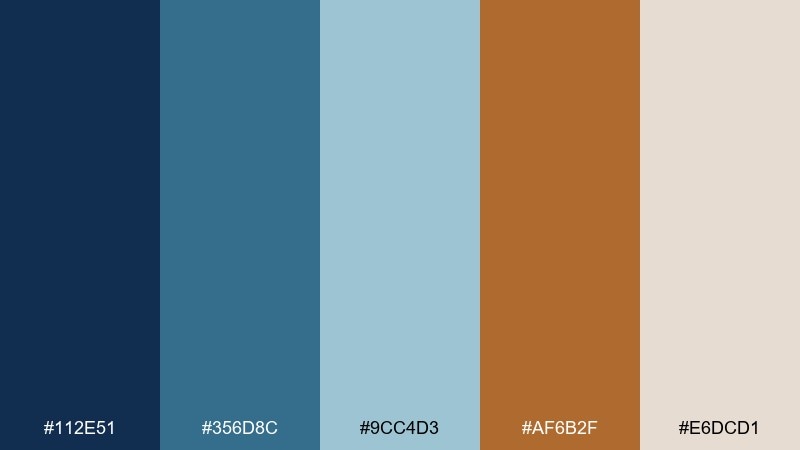
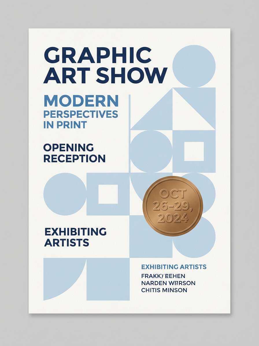
HEX: #112E51 #356D8C #9CC4D3 #AF6B2F #E6DCD1
Mood: bright, curated, contemporary
Best for: art show flyer and social post
Bright and curated, it feels like cool gallery lighting with a warm bronze spotlight. The pale blue lifts the composition for posters and social graphics, while the darker blue keeps the text structured. Bronze works best for date blocks, venue pins, or a single standout shape. Tip: keep backgrounds neutral so the blues stay clean and modern.
Image example of gallery spotlight generated using media.io
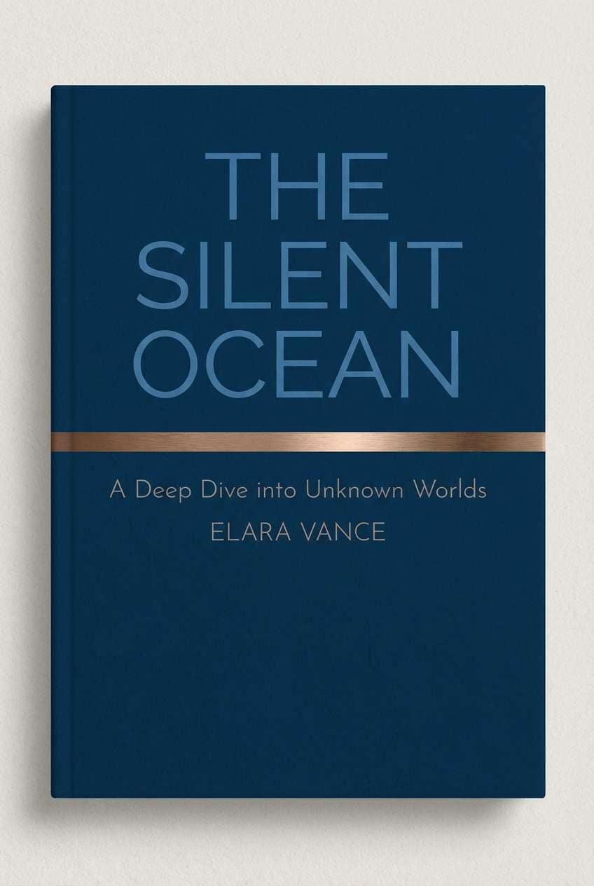
19) Rainy Boulevard
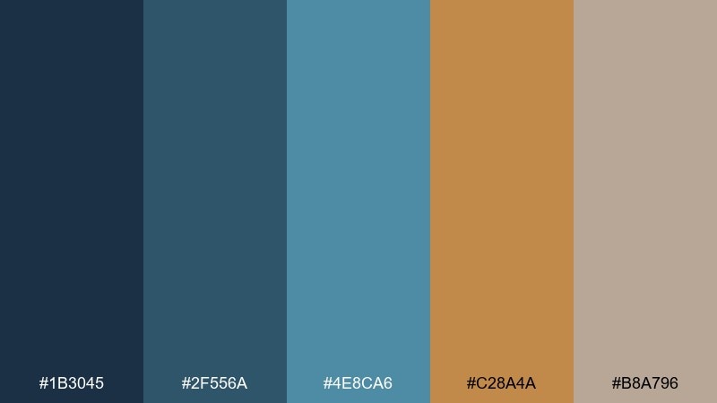
HEX: #1B3045 #2F556A #4E8CA6 #C28A4A #B8A796
Mood: cinematic, urban, balanced
Best for: book cover design
Cinematic and urban, it recalls wet pavement reflecting blue streetlight and bronze storefront glow. The blues give a strong backdrop for title type, and the warm bronze adds a human touch. Pair the taupe neutral with understated textures like paper grain for a literary finish. Tip: place bronze behind a short subtitle or author name for instant hierarchy.
Image example of rainy boulevard generated using media.io
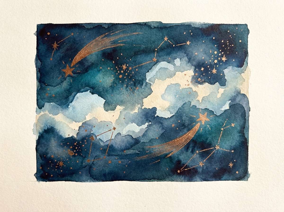
20) Celestial Bronze
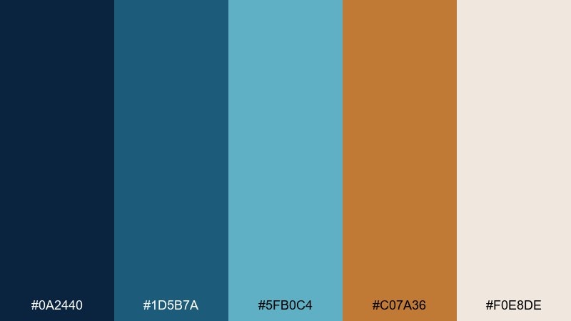
HEX: #0A2440 #1D5B7A #5FB0C4 #C07A36 #F0E8DE
Mood: dreamy, expansive, uplifting
Best for: watercolor celestial illustration
Dreamy and expansive, it feels like a night sky fading into dawn with a bronze comet trail. The blues layer beautifully for washes and soft gradients, while bronze adds a glowing focal point. Use the warm neutral as paper tone to keep the illustration airy. Tip: let teal handle the midtones and keep navy only in the deepest shadows.
Image example of celestial bronze generated using media.io
What Colors Go Well with Blue Bronze?
Warm neutrals (cream, sand, parchment, warm gray) are the easiest companions because they bridge the temperature gap between cool blues and warm bronze. They also create breathing room so bronze can stay an accent instead of becoming overpowering.
For deeper contrast, add charcoal or near-black for typography and UI chrome—this keeps the palette readable and lets bronze feel like a deliberate highlight. If you want a fresher direction, a sea-glass teal or pale blue can widen the range without breaking the “coastal metal” vibe.
In print or packaging, subtle browns and taupes pair especially well with bronze because they reinforce an aged-metal feel. In digital products, stick to clean whites and cool light blues when you want the look to feel more modern than vintage.
How to Use a Blue Bronze Color Palette in Real Designs
Start with blues as your system colors: one dark blue for primary text/navigation, one mid blue for surfaces/cards, and one lighter blue for highlights, charts, or secondary sections. This creates structure before you add any “special” color.
Use bronze like a signal, not a fill: primary buttons, key metrics, badges, icons, and thin dividers work best. If bronze appears too often, it stops reading as premium and starts competing with content.
To keep accessibility strong, place bronze on light neutrals or use it for outlines/icons rather than long text. When bronze must appear on dark blue, increase size/weight and test contrast—especially for small UI labels.
Create Blue Bronze Palette Visuals with AI
If you’re pitching a concept or building a moodboard, generating quick palette-driven visuals can help stakeholders “see” the direction immediately. Blue bronze palettes are especially effective for posters, UI mockups, packaging, and brand boards.
With Media.io’s text-to-image tool, you can describe the layout (poster, dashboard, logo sheet), specify your blue/bronze mood (nautical, editorial, industrial), and iterate until the accents and contrast feel right.
Try starting with one of the prompts above and swapping the use case (e.g., “website hero,” “invitation suite,” “product label”) while keeping the same color story.
Blue Bronze Color Palette FAQs
-
What does a blue bronze color palette communicate in branding?
It usually signals trust and competence (blue) paired with craft, heritage, and premium value (bronze). The combination is popular for brands that want to feel modern but not sterile. -
Is bronze a good choice for buttons and CTAs in UI?
Yes—bronze works well as a CTA color when it’s used sparingly and supported by neutral backgrounds. Keep most UI elements in blues/greys, and reserve bronze for primary actions and key highlights. -
What neutrals work best with blue and bronze?
Warm off-whites, cream, sand, and parchment tones are the safest choices because they harmonize with bronze and soften blue-heavy layouts. Charcoal is also excellent for readable typography. -
How do I keep a blue bronze palette from looking too “vintage”?
Use cleaner, brighter blues (or a pale blue) and a near-white background, and limit bronze to small accents. Avoid overly brown neutrals and heavy textures if you want a more modern feel. -
Does bronze need to be metallic to work?
No. A flat bronze HEX color can still read “metal-inspired” when paired with deep blues and warm neutrals. If you do use metallic effects, apply them selectively (badges, seals, foil-like details). -
What are common use cases for blue bronze color combinations?
They’re frequently used in coastal or heritage branding, packaging (coffee/spirits), finance or SaaS dashboards, editorial layouts, posters, and invitation suites where a premium accent is needed. -
How can I generate blue bronze visuals quickly for a presentation?
Use Media.io’s AI text-to-image generator with prompts that specify your format (brand board, UI mockup, poster) and call out bronze as an accent color. Iterate by adjusting the balance of bronze vs. blue until hierarchy looks clear.
Next: Snow White Color Palette


