

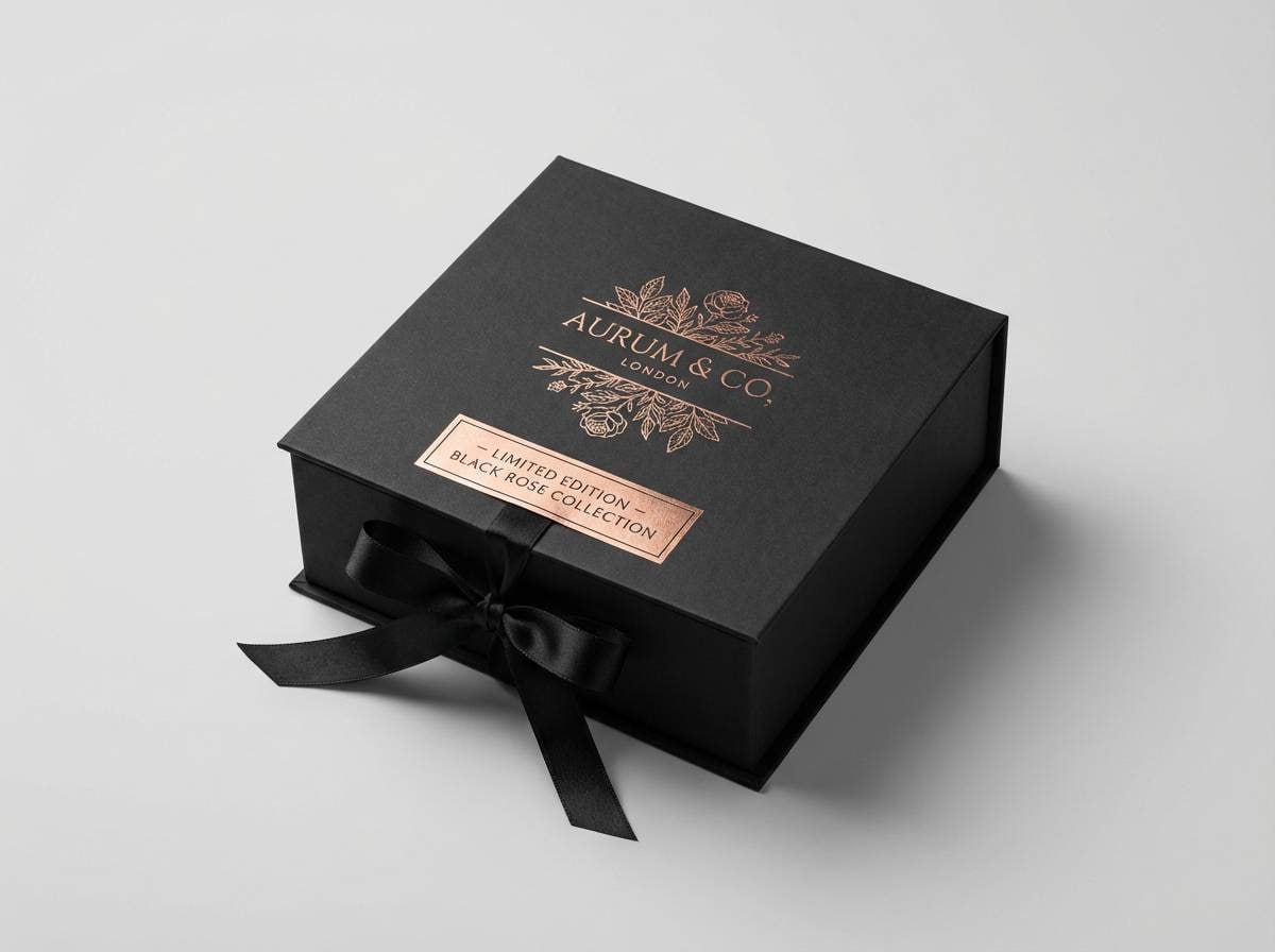
Black rose gold is where deep, modern black meets the warm, metallic romance of rose gold—an instantly premium pairing for branding, UI, and events.
Below are 20 black rose gold color palette ideas with HEX codes, plus practical tips for keeping contrast crisp while letting the metallic warmth do the highlighting.
In this article
Why Black Rose Gold Palettes Work So Well
Black creates instant structure and authority, acting as a strong anchor for typography, photography, and layout grids. Rose gold adds a soft, human warmth that keeps the overall look from feeling cold or overly corporate.
This pairing also naturally supports hierarchy: dark tones handle backgrounds and readability, while rose-gold accents guide attention to buttons, prices, dates, or brand marks. When used sparingly, the metallic note feels intentional and “expensive.”
Because black and rose gold sit at opposite ends of perceived weight (heavy vs. luminous), they’re especially effective for modern glam aesthetics—premium, romantic, and high-contrast without being harsh.
20+ Black Rose Gold Color Palette Ideas (with HEX Codes)
1) Midnight Alloy
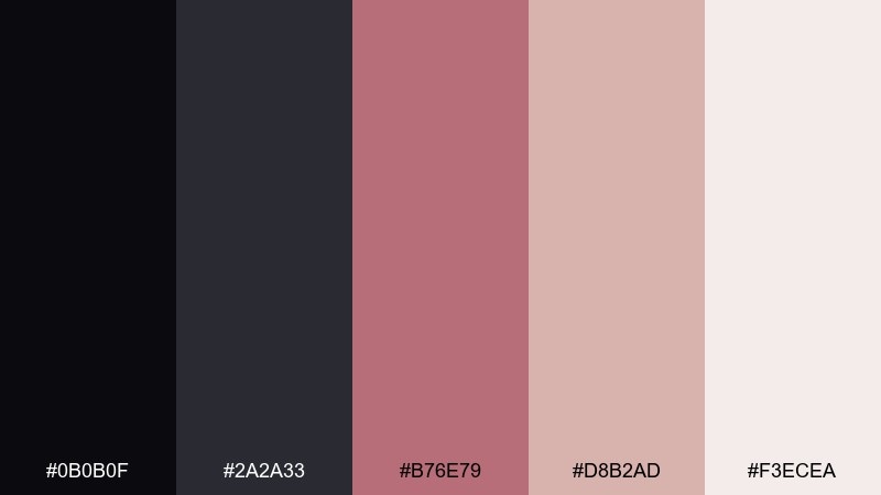
HEX: #0b0b0f #2a2a33 #b76e79 #d8b2ad #f3ecea
Mood: sleek, nocturnal, premium
Best for: tech branding and hero sections
Sleek midnight tones with a rose-metal shimmer feel like a city skyline lit by warm neon. Use the near-black and graphite as your base, then reserve the rose gold for buttons, icons, or key stats. Pair it with clean typography and plenty of whitespace so the metallic note feels intentional. Tip: keep the highlight color to under 10% of the layout for a more expensive look.
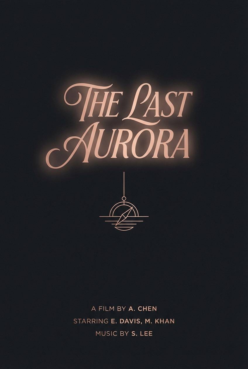
Image example of midnight alloy generated using media.io

Media.io is an online AI studio for creating and editing video, image, and audio in your browser.

2) Velvet Champagne
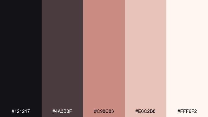
HEX: #121217 #4a3b3f #c98c83 #e6c2b8 #fff6f2
Mood: soft glam, warm, celebratory
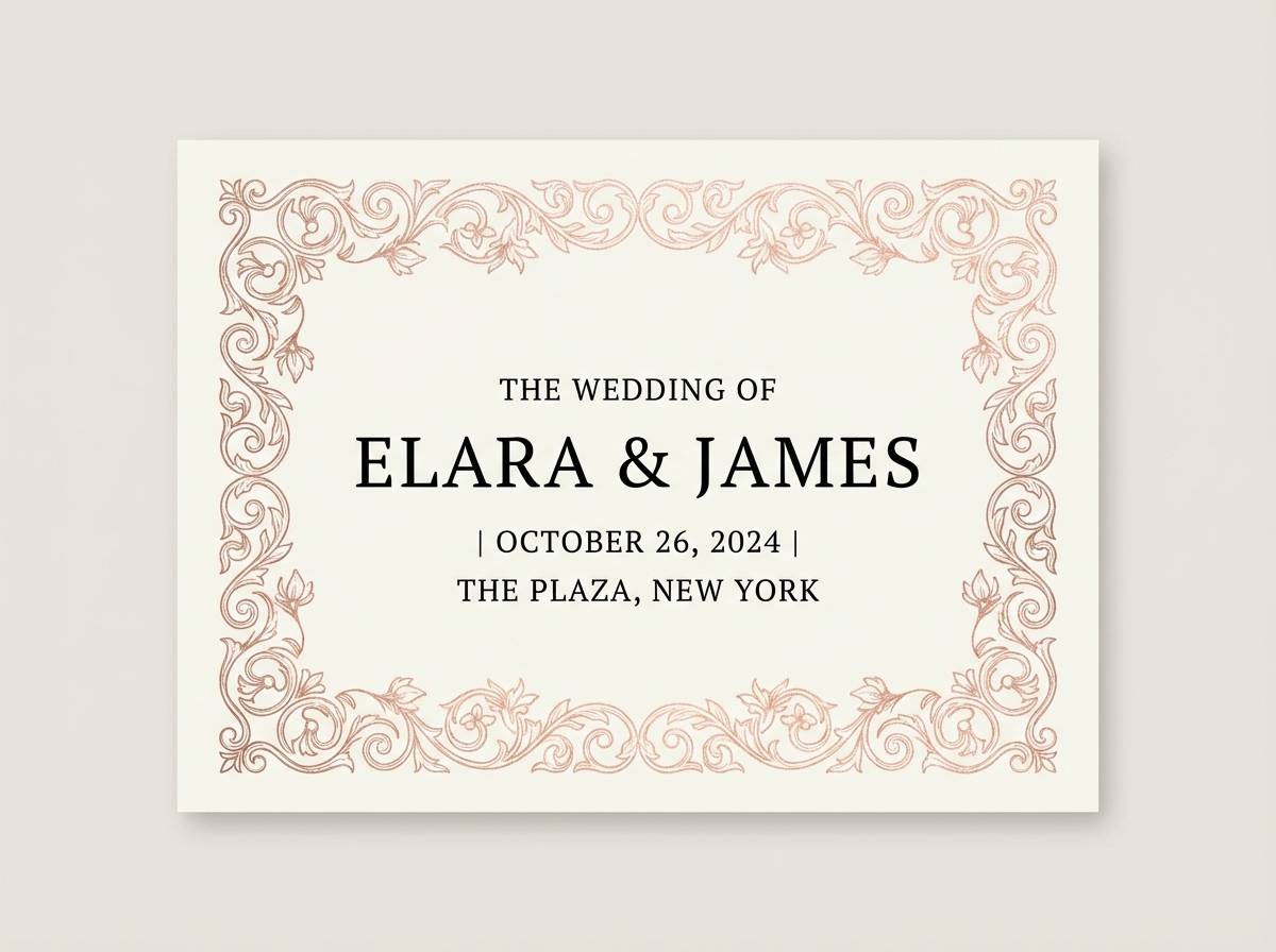
Best for: wedding invitations and RSVP cards
Soft glam warmth comes through like velvet drapery and a champagne toast at dusk. Let the creamy off-white carry the text, and use the deep charcoal for elegant contrast and legibility. The rose gold tone works beautifully for monograms, borders, and small ornaments. Tip: print the accent in foil and keep body copy in solid ink for clarity.
Image example of velvet champagne generated using media.io
3) Noir Blush Glow
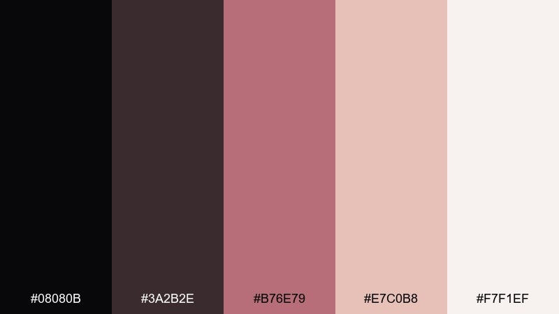
HEX: #08080b #3a2b2e #b76e79 #e7c0b8 #f7f1ef
Mood: romantic, dramatic, luminous
Best for: beauty ads and makeup packaging
Romantic drama meets a luminous blush glow, like candlelight on satin. This black rose gold color palette excels in beauty work where contrast needs to feel soft rather than harsh. Use the near-black for brand marks and the warm metallic rose for caps, labels, and callouts. Tip: add a subtle matte texture to the dark areas so the metallic accent pops more.
Image example of noir blush glow generated using media.io
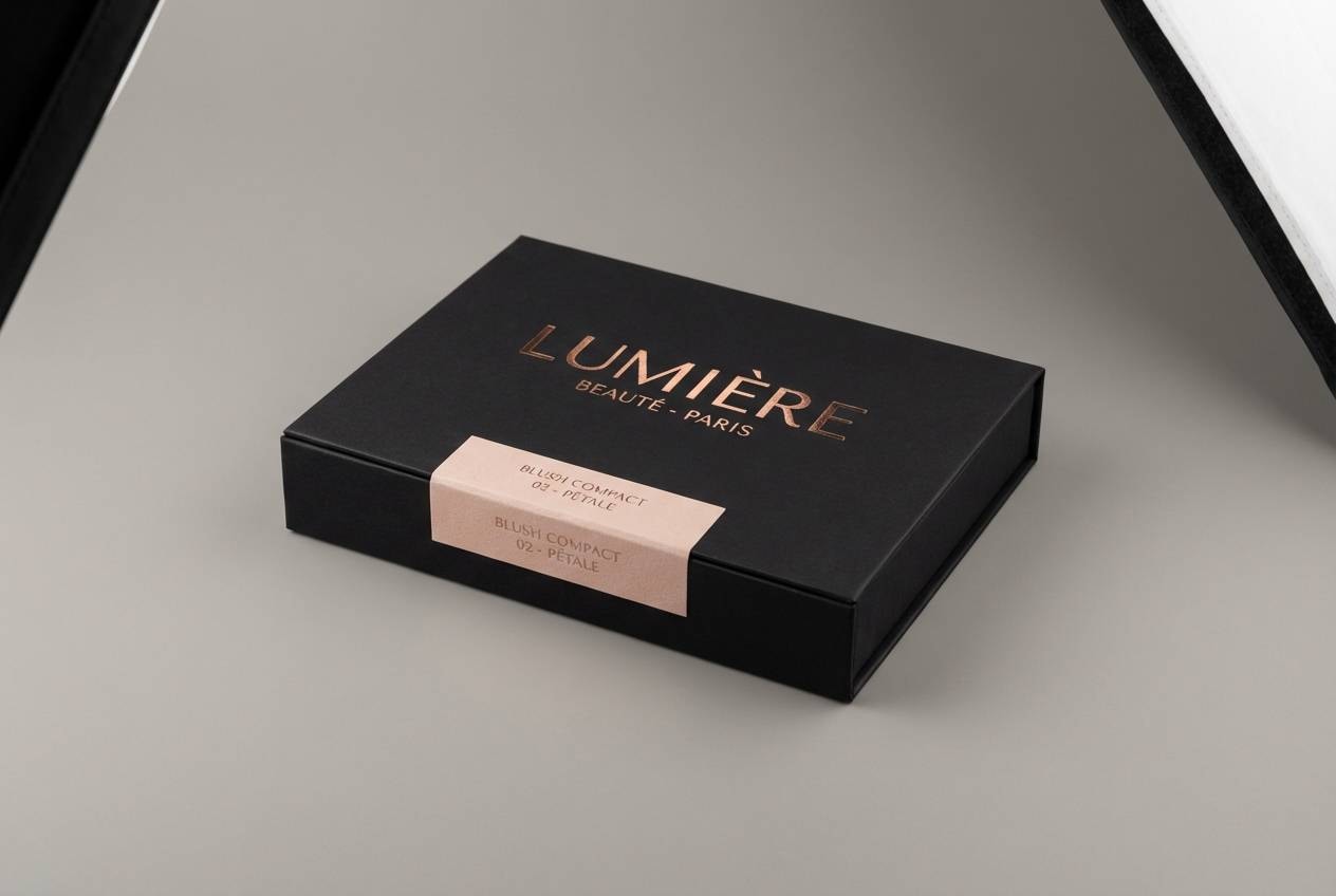
4) Smoky Quartz
HEX: #141419 #4b4347 #8c6d73 #cda7a0 #efe5e2
Mood: muted, grounded, elegant
Best for: interior mood boards and decor planning
Muted smoky neutrals feel like quartz stone warmed by a rosy highlight. Build the room around the charcoal and taupe notes, then add rose metallic through hardware, lighting, or frames. This mix works especially well with walnut wood and brushed brass. Tip: repeat the rosy accent in at least three small places to make it look deliberate.
Image example of smoky quartz generated using media.io
5) Rose Gold Foil
HEX: #0f0f12 #2f2a2e #d19a93 #f0d2cb #fff9f6
Mood: polished, editorial, upscale
Best for: product labels and gift boxes
Polished and upscale, it evokes rose gold foil pressed into a deep inked paper. Use the darkest shades for the box and typography, while the warm metallic tone becomes your hero accent on logos and seals. Pair with simple geometry so the finish feels premium, not busy. Tip: keep the lightest shade for negative space and avoid full-bleed blush panels.
Image example of rose gold foil generated using media.io
6) Candlelit Noir
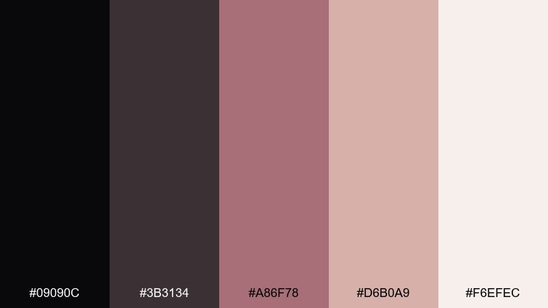
HEX: #09090c #3b3134 #a86f78 #d6b0a9 #f6efec
Mood: intimate, vintage, warm
Best for: restaurant menus and lounge branding
Intimate and warm, it feels like candlelight reflecting off dark lacquer. Use the near-black for menu backgrounds and the dusty rose gold for section headers and dividers. Pair it with serif typography and subtle line art for a classic lounge vibe. Tip: choose one accent weight and reuse it consistently so the menu stays readable.
Image example of candlelit noir generated using media.io
7) Dusty Rose Satin

HEX: #15151a #5b4a4f #b48b8b #e2c6c2 #faf3f1
Mood: soft, modern romantic, airy
Best for: social media templates and quote cards
Soft satin-like tones create an airy romantic look without turning overly sweet. Let the pale blush carry the background, and use the charcoal shade for text so posts stay high-contrast. The dusty rose works well for highlight bars, stickers, and subtle gradients. Tip: keep text blocks aligned and minimal to avoid competing with the gentle color shifts.
Image example of dusty rose satin generated using media.io
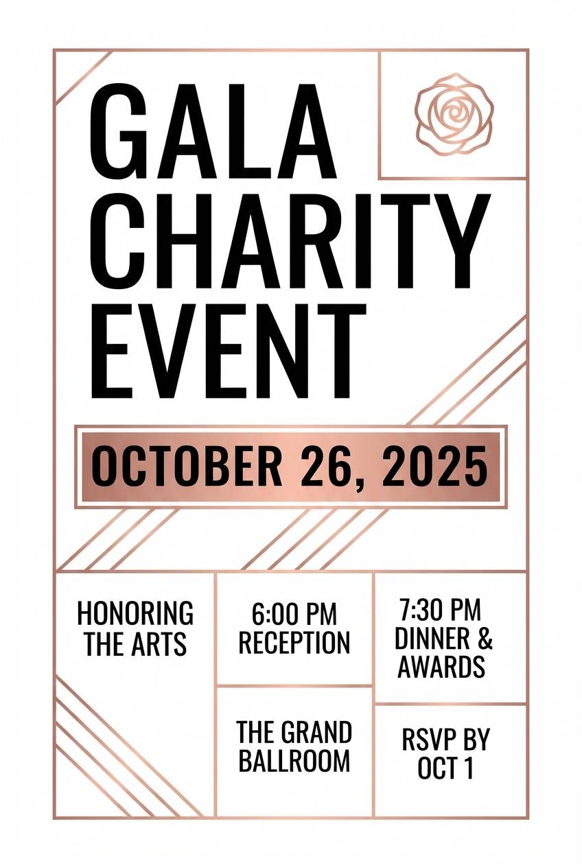
8) Modern Gala
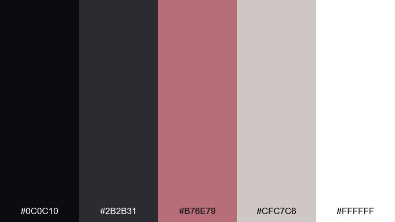
HEX: #0c0c10 #2b2b31 #b76e79 #cfc7c6 #ffffff
Mood: high-contrast, crisp, glamorous
Best for: event posters and gala flyers
High-contrast and crisp, it reads like a modern gala dress code with a rose-metal glint. The black rose gold color scheme is ideal when you need instant luxury without heavy ornament. Use black and white for structure, then reserve the metallic rose for dates, ticket tiers, or sponsor marks. Tip: limit decorative elements to thin lines so the typography remains the star.
Image example of modern gala generated using media.io
9) Onyx and Petal
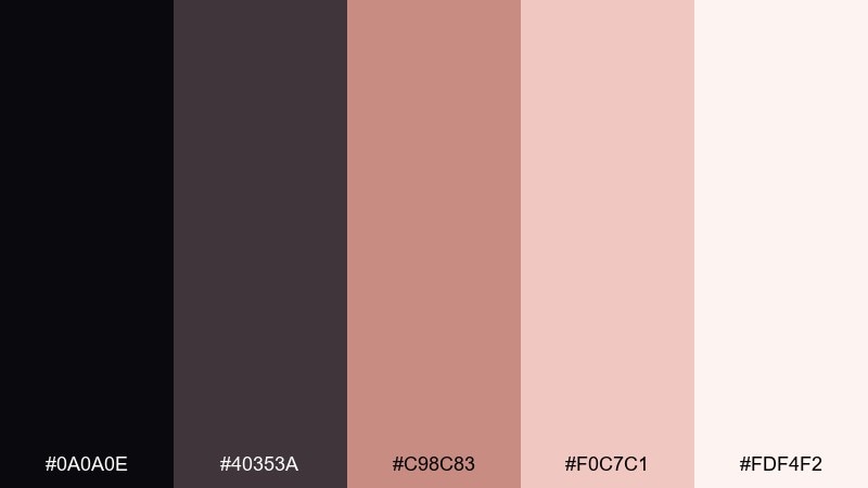
HEX: #0a0a0e #40353a #c98c83 #f0c7c1 #fdf4f2
Mood: delicate, chic, balanced
Best for: jewelry brand identity
Delicate petals against onyx darkness feel chic and intentionally balanced. Use the deep tones for wordmarks and photography frames, then bring in the rose gold and blush for jewelry callouts or price tags. This pairing looks especially refined with thin sans-serif type and lots of spacing. Tip: keep the blush as a background wash, not a saturated block, for a lighter feel.
Image example of onyx and petal generated using media.io

10) Copper Rosette
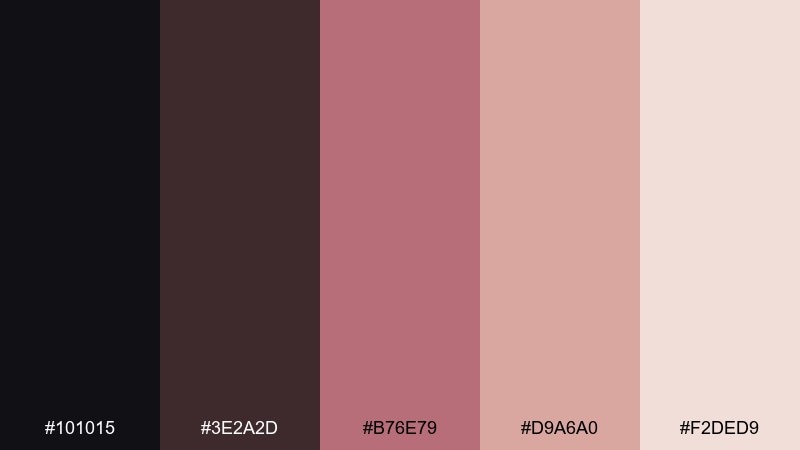
HEX: #101015 #3e2a2d #b76e79 #d9a6a0 #f2ded9
Mood: artisan, warm, handcrafted
Best for: cafe packaging and loyalty cards
Warm and handcrafted, it suggests copper rosettes stamped onto dark paper. A black rose gold color combination like this pairs nicely with kraft textures, letterpress type, and minimal icons. Use the darkest shade for stamps and QR codes, then add the warm metallic for loyalty rewards and seals. Tip: keep the accent consistent across touchpoints so the brand feels cohesive.
Image example of copper rosette generated using media.io
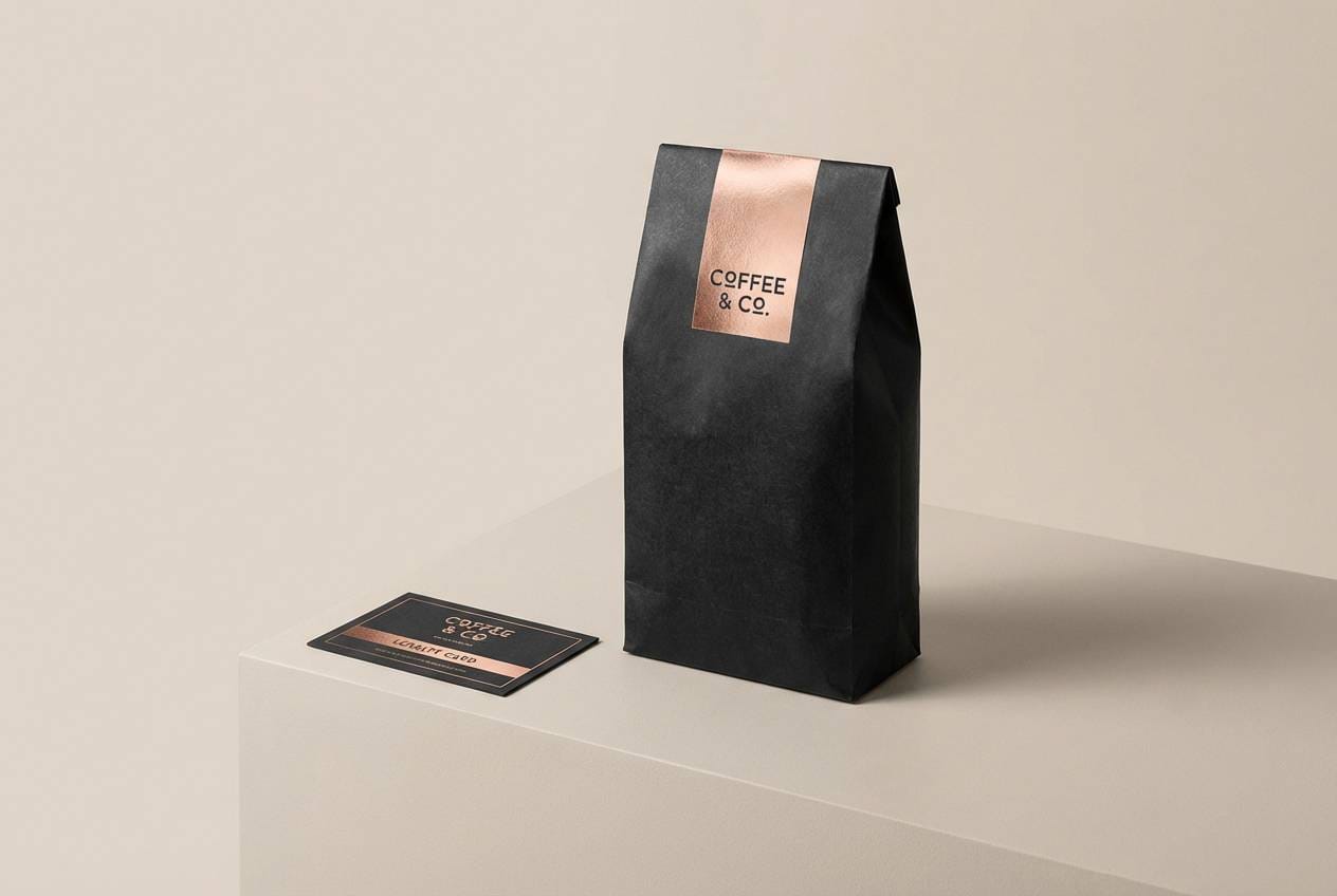
11) Black Tie Bloom
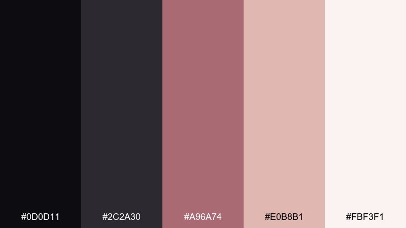
HEX: #0d0d11 #2c2a30 #a96a74 #e0b8b1 #fbf3f1
Mood: formal, floral, refined
Best for: wedding signage and table numbers
Formal black-tie energy blooms with a soft floral undertone. Let the pale blush act as your signage base, with crisp black type for names, menus, and table numbers. The rose metallic shade is best used for small flourishes like separators, initials, or a venue crest. Tip: choose one floral motif and repeat it lightly rather than filling the whole card.
Image example of black tie bloom generated using media.io

12) Warm Graphite
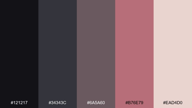
HEX: #121217 #34343c #6a5a60 #b76e79 #ead4d0
Mood: professional, subtle, mature
Best for: B2B slide decks and reports
Professional graphite with a warm rose-metal note feels mature and trustworthy. Use the grays for charts and sectioning, then add the rose shade for key metrics, highlights, or callout boxes. It pairs well with neutral photography and clean grid systems. Tip: apply the accent only to insights and takeaways so the narrative stays clear.
Image example of warm graphite generated using media.io
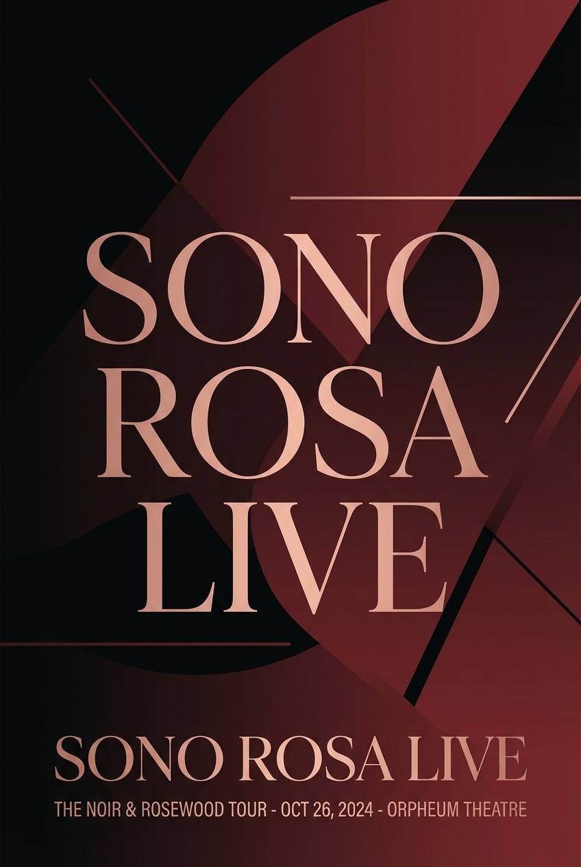
13) Rosewood Night
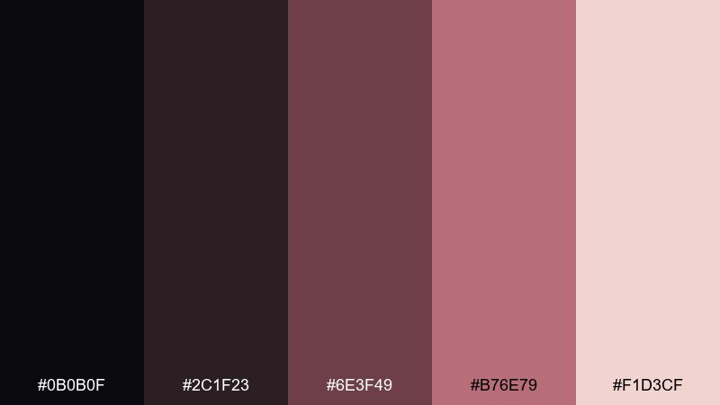
HEX: #0b0b0f #2c1f23 #6e3f49 #b76e79 #f1d3cf
Mood: moody, romantic, rich
Best for: album covers and music posters
Moody rosewood reds against near-black feel like late-night jazz and velvet curtains. Use the deep wine tone for a background gradient and the rose metallic as a spotlight on the title. Pair with high-contrast photography and minimal text blocks for impact. Tip: keep secondary text in the pale blush so it stays readable without looking stark.
Image example of rosewood night generated using media.io
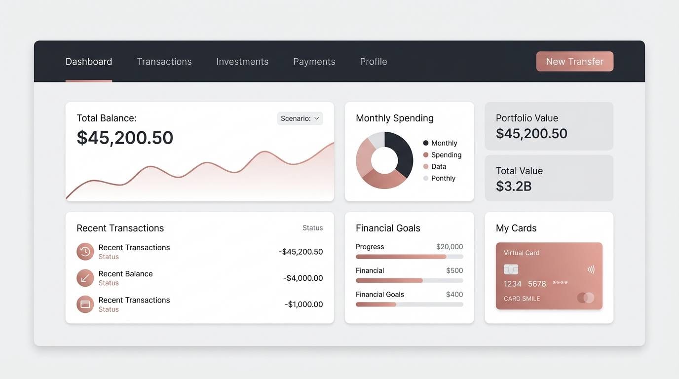
14) Luxe Minimal
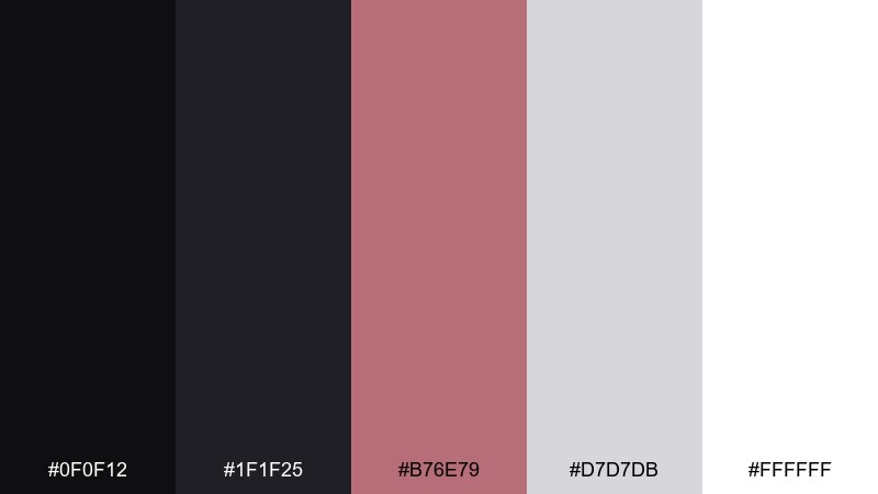
HEX: #0f0f12 #1f1f25 #b76e79 #d7d7db #ffffff
Mood: minimal, luxe, sharp
Best for: app UI and fintech dashboards
Minimal and sharp, it evokes glossy black glass with a rose-gold edge. This black rose gold color palette works best when you keep surfaces simple and let the accent guide attention. Use light gray and white for cards, then apply the metallic rose to active states, toggles, and tiny badges. Tip: avoid using the accent for body text, and reserve it for interaction cues only.
Image example of luxe minimal generated using media.io
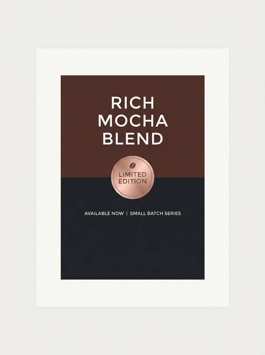
15) Mocha Spark
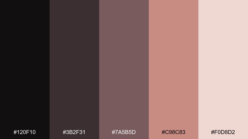
HEX: #120f10 #3b2f31 #7a5b5d #c98c83 #f0d8d2
Mood: cozy, modern, grounded
Best for: coffee brand ads and posters
Cozy mocha tones with a subtle spark feel like espresso crema under warm light. Use the deep brown-black for headers and product names, while the rose gold note becomes a modern highlight for pricing or limited-edition tags. Pair with creamy neutrals and soft shadows for a comforting look. Tip: keep the accent as a small badge so the palette stays grounded.
Image example of mocha spark generated using media.io
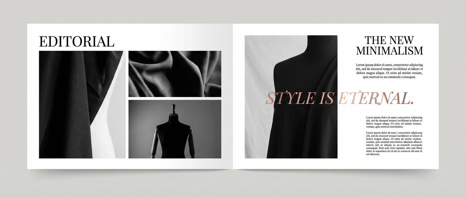
16) Urban Rose
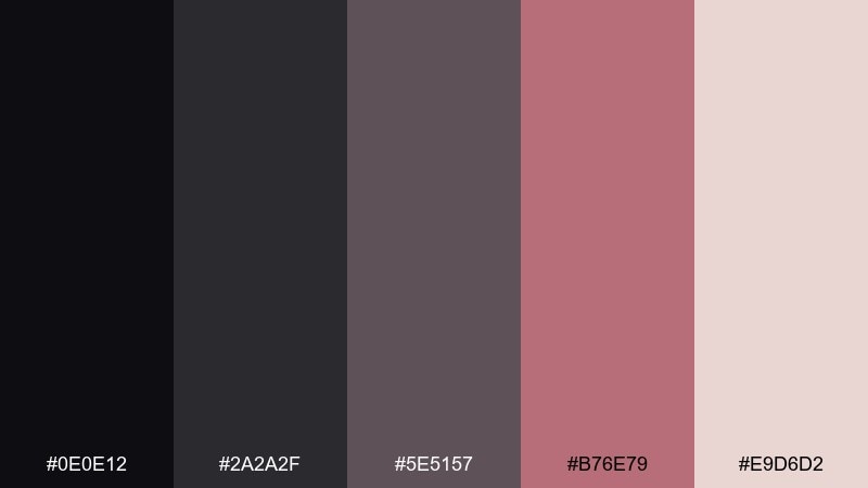
HEX: #0e0e12 #2a2a2f #5e5157 #b76e79 #e9d6d2
Mood: street-chic, modern, cool
Best for: fashion lookbooks and editorial layouts
Street-chic and cool, it feels like night asphalt with a rosy sheen. Use the grays for columns and captions, then add rose gold accents to pull quotes and section markers. It pairs well with high-contrast monochrome photography and bold headlines. Tip: keep margins generous so the dark tones do not overwhelm the page.
Image example of urban rose generated using media.io
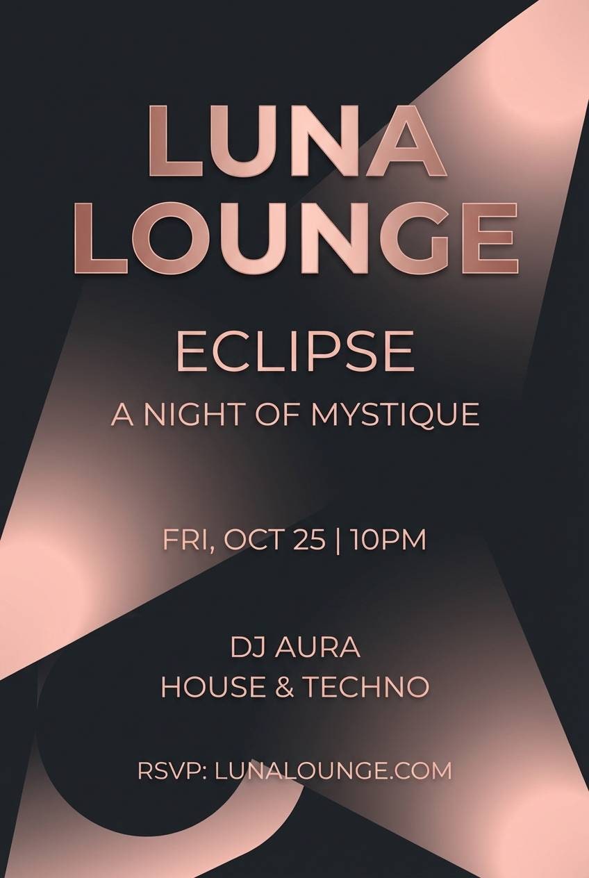
17) Eclipse Metallic
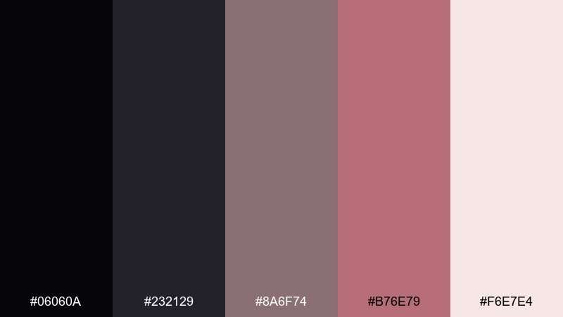
HEX: #06060a #232129 #8a6f74 #b76e79 #f6e7e4
Mood: mysterious, luxe, cinematic
Best for: movie posters and trailer thumbnails
Mysterious and cinematic, it reads like an eclipse rimmed with metallic rose. Use the near-black as a dramatic canvas, then place the rose gold at focal points such as titles or laurels. Pair with subtle grain and soft glows for a filmic feel. Tip: keep supporting text in the pale blush to preserve hierarchy without bright white.
Image example of eclipse metallic generated using media.io
18) Soft Drama
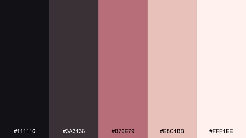
HEX: #111116 #3a3136 #b76e79 #e8c1bb #fff1ee
Mood: dramatic, soft, romantic
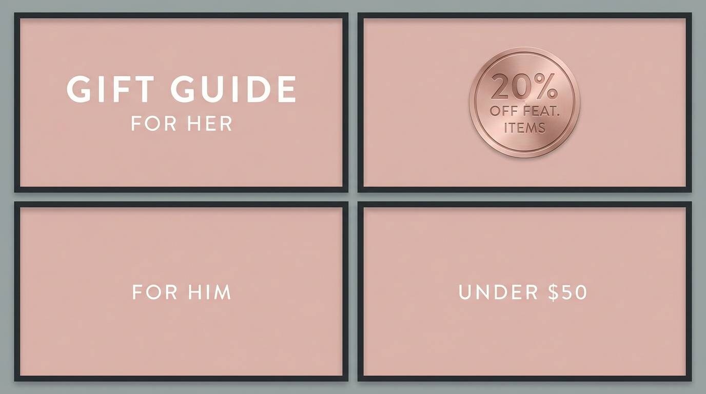
Best for: valentine promos and gift guides
Soft drama shows up like a dark stage with blush spotlights. Use the deep tones for bold headers and product frames, then bring in the rosy metallic for discount tags or gift-guide labels. A little cream background keeps it feeling light and shoppable. Tip: place the accent on one corner element per card to avoid visual clutter.
Image example of soft drama generated using media.io
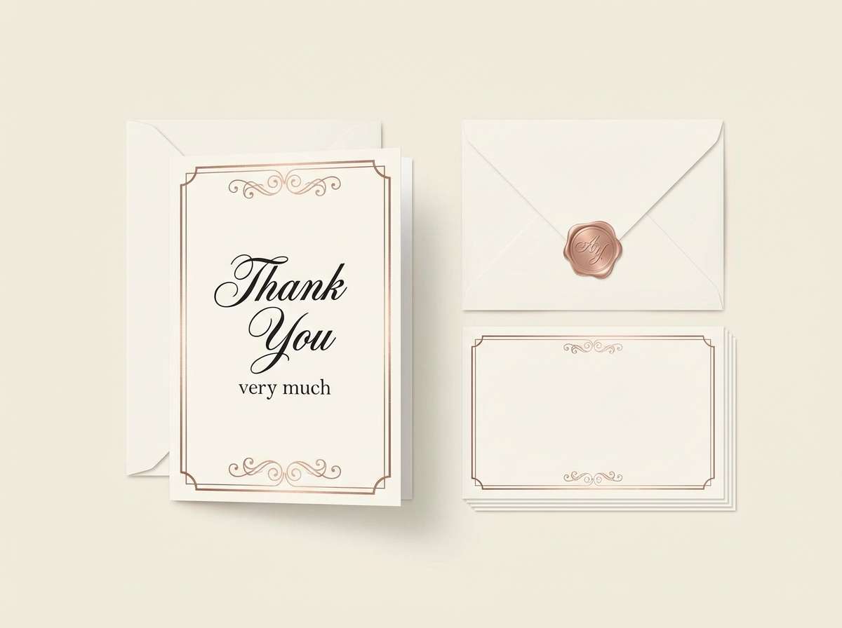
19) Antique Rose Gold
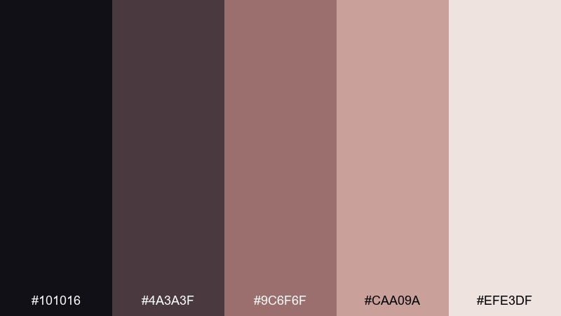
HEX: #101016 #4a3a3f #9c6f6f #caa09a #efe3df
Mood: nostalgic, refined, timeless
Best for: stationery sets and thank-you cards
Nostalgic and refined, it feels like antique metal against aged parchment. The muted rose gold plays well with handwritten scripts and subtle paper textures. Use the darker tones for envelopes or borders, and keep the lightest shade for ample breathing room. Tip: add a tiny metallic seal or corner detail to make the set feel collectible.
Image example of antique rose gold generated using media.io
20) Blush After Dark

HEX: #07070b #2a2429 #b76e79 #dba8a6 #f9e8e6
Mood: nightlife, flirtatious, bold
Best for: club flyers and DJ promo graphics
Flirtatious nightlife energy comes through like blush lights in a dark room. These black rose gold color combinations are perfect for bold type, simple shapes, and high-impact announcements. Use the near-black for the backdrop, then layer the rose and blush as spotlight blocks behind the lineup. Tip: keep the palette tight and let scale and spacing create the drama.
Image example of blush after dark generated using media.io
What Colors Go Well with Black Rose Gold?
Neutrals are the safest way to expand a black rose gold palette: warm whites, creams, and soft greiges keep layouts breathable while preserving the luxe mood. They also prevent rose gold from looking overly pink.
For richer depth, add wine, plum, or rosewood tones; they sit naturally between black and metallic blush and feel romantic rather than loud. For cleaner, modern contrast, pair with crisp white and cool graphite grays.
If you want a pop color, choose one controlled accent (like emerald, deep teal, or midnight blue) and keep it minimal so the rose gold remains the signature highlight.
How to Use a Black Rose Gold Color Palette in Real Designs
Start by assigning roles: let black/near-black handle backgrounds, headers, and framing; use off-white/blush for readable surfaces; then treat rose gold as an accent for interaction states, badges, and small ornaments.
For UI, keep rose gold off body text and instead apply it to buttons, icons, active tabs, and key metrics. For print, consider using foil or metallic ink for the rose gold so the “metal” feeling is real, while your main copy stays in flat black for clarity.
To avoid muddy visuals, keep contrast deliberate: pair your darkest shade with your lightest for typography, and use mid-tones only for secondary panels, subtle gradients, or supporting dividers.
Create Black Rose Gold Palette Visuals with AI
If you’re pitching a brand direction or building a mood board, generating quick mockups helps stakeholders “see” the palette in action. The prompts above are designed to produce clean, on-theme visuals without extra clutter.
With Media.io’s text-to-image tool, you can iterate fast: swap ratios, adjust keywords like “matte black,” “rose gold foil,” or “soft blush lighting,” and produce consistent variations for posters, packaging, or UI screens.
Once you find a look you like, keep the palette consistent across assets by reusing the same five HEX codes and only changing layout and typography to explore options.
Black Rose Gold Color Palette FAQs
-
What hex code is “rose gold” in these palettes?
A commonly used rose gold anchor here is #B76E79, which reads like warm metallic blush when paired with near-black and soft creams. -
How do I keep black and rose gold from looking too harsh?
Use an off-white or pale blush as a buffer (background or card color), keep black for structure and text, and apply rose gold in small accents rather than large blocks. -
Is black rose gold good for UI design?
Yes—use black/graphite for headers and framing, light neutrals for surfaces, and reserve rose gold for interactive states (buttons, toggles, active tabs) instead of body text. -
What font colors work best on black rose gold designs?
For readability, use near-white/cream text on black backgrounds and deep charcoal/black text on blush or off-white surfaces; keep rose gold mainly for highlights and labels. -
What’s the best ratio of rose gold to black?
A strong starting point is 70–85% dark neutrals, 10–25% light neutrals, and 5–10% rose gold accents, so the metallic tone feels premium and not overpowering. -
Can I print rose gold, or should I fake it with color?
For the most authentic look, use rose-gold foil or metallic ink for accents. If printing standard CMYK, keep rose gold as a flat blush-metal tone and add “metal” via texture and contrast. -
What colors pair well if I want to add a third accent?
Deep emerald/teal, midnight blue, or wine tones work well—use only one extra accent and keep it minimal so rose gold remains the signature highlight.
Next: Blush Pink Color Palette


