

Blush pink is one of those rare colors that can feel romantic, modern, or even high-contrast—depending on what you pair it with. It sits in the “soft-but-not-boring” zone, which makes it a favorite for weddings, branding, and UI accents.
Below are 20 blush pink color palette ideas with HEX codes, plus quick guidance on what each set is best for and how to turn the palette into real visuals.
In this article
- Why Blush Pink Palettes Work So Well
-
- rose silk neutrals
- peony latte
- ballet slipper gray
- dusty blush terracotta
- blush sage garden
- strawberry milkshake
- blush midnight navy
- vintage powder blue
- mauve cocoa luxe
- cherry blossom minimal
- blush gold glam
- soft coral sunrise
- blush plum velvet
- warm sandstone
- blush teal pop
- modern monochrome pink
- floral watercolor pastels
- editorial blush black
- wedding ivory lace
- cozy knit mauve
- What Colors Go Well with Blush Pink?
- How to Use a Blush Pink Color Palette in Real Designs
- Create Blush Pink Palette Visuals with AI
Why Blush Pink Palettes Work So Well
Blush pink is naturally flattering: it brings warmth without the intensity of hot pink, so it feels approachable across many industries. It also reads “premium” when paired with soft neutrals like ivory, greige, and taupe.
Design-wise, blush is flexible because it can swing warm or cool. Add sandy browns or terracotta to lean cozy and artisanal, or introduce cool grays, navy, or teal to make it feel modern and structured.
It’s also easy to build hierarchy with blush: keep light tints for backgrounds, then use deeper berries or charcoal tones for headings, buttons, and iconography. That balance helps you stay soft while still meeting contrast and readability needs.
20+ Blush Pink Color Palette Ideas (with HEX Codes)
1) Rose Silk Neutrals
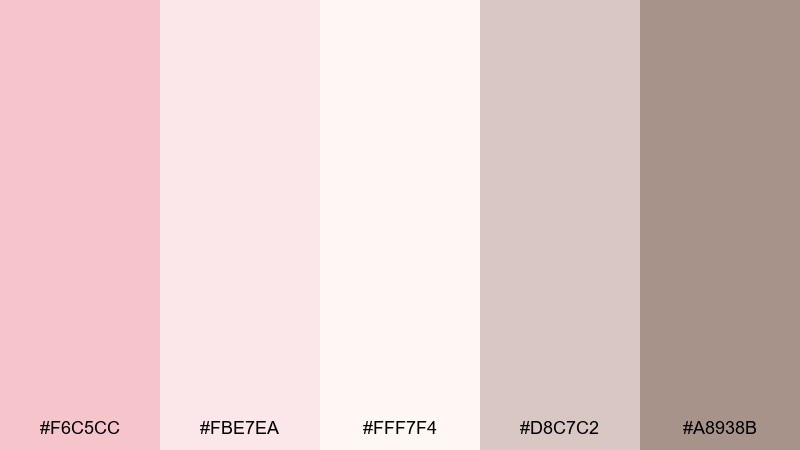
HEX: #F6C5CC #FBE7EA #FFF7F4 #D8C7C2 #A8938B
Mood: airy, romantic, polished
Best for: wedding stationery, lifestyle branding, soft product labels
Airy and romantic like silk ribbons and a sunlit veil, these tones feel instantly refined. Use them for invitations, beauty packaging, or a calm homepage hero where warmth matters more than contrast. Pair the blush with creamy whites and warm taupes to keep everything cohesive and premium. Tip: reserve the deepest taupe for typography so the pinks stay light and breathable.
Image example of rose silk neutrals generated using media.io
Media.io is an online AI studio for creating and editing video, image, and audio in your browser.

2) Peony Latte
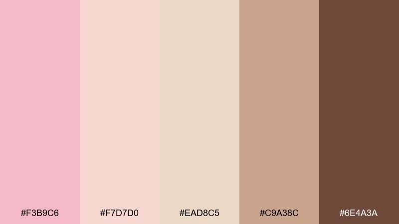
HEX: #F3B9C6 #F7D7D0 #EAD8C5 #C9A38C #6E4A3A
Mood: cozy, sweet, boutique
Best for: cafe branding, bakery packaging, menu design
Cozy and sweet like peonies beside a warm latte, this mix feels welcoming without being childish. It works beautifully for cafe menus, dessert boxes, and small-batch skincare that leans friendly and handmade. Pair with kraft textures or creamy paper stock, and use the espresso brown for headings and stamps. Tip: keep the mid beige as your main background to prevent the pink from feeling too dominant.
Image example of peony latte generated using media.io
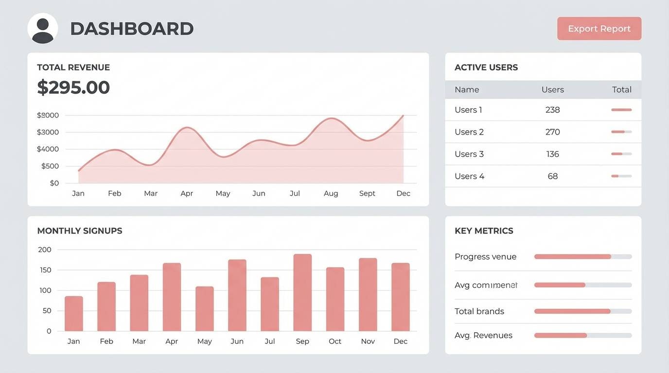
3) Ballet Slipper Gray
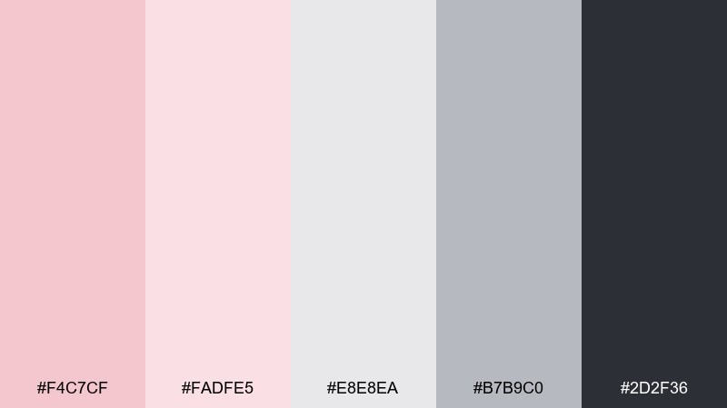
HEX: #F4C7CF #FADFE5 #E8E8EA #B7B9C0 #2D2F36
Mood: minimal, modern, calm
Best for: UI design, pitch decks, SaaS landing pages
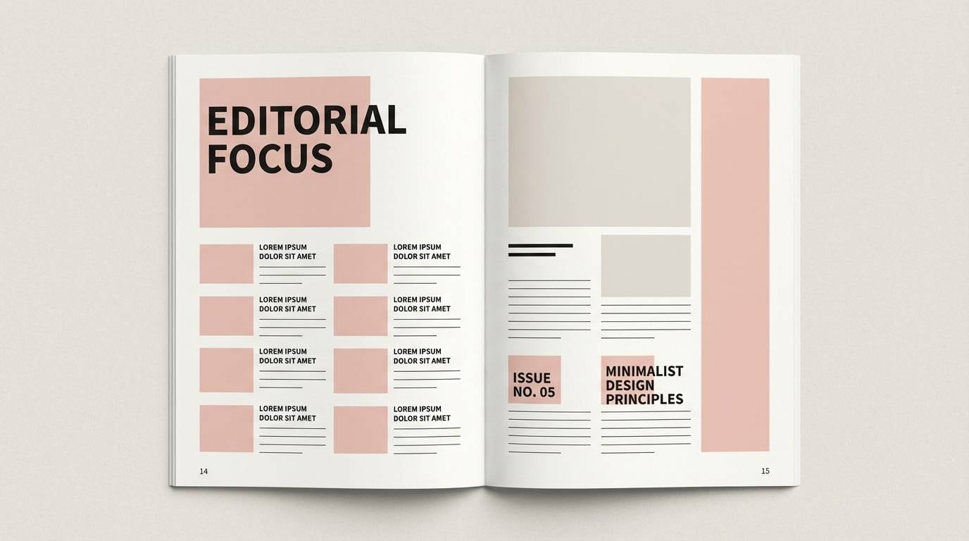
Minimal and modern like a ballet studio in soft daylight, these pinks read clean against cool grays. They are ideal for dashboards, onboarding screens, and presentations that need warmth without losing clarity. Pair with charcoal text and plenty of white space so components stay sharp and accessible. Tip: use the darkest gray only for key actions and titles to maintain a gentle hierarchy.
Image example of ballet slipper gray generated using media.io
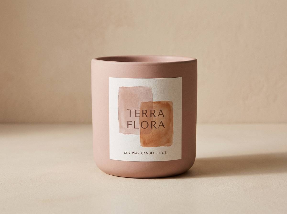
4) Dusty Blush Terracotta
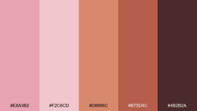
HEX: #E8A3B2 #F2C6CD #D8896C #B75D4C #4B2B2A
Mood: earthy, warm, artisanal
Best for: home decor brands, ceramics shops, autumn campaigns
Earthy and warm like sun-baked clay and dried roses, this palette feels grounded and handcrafted. It suits artisan product lines, home decor lookbooks, and seasonal promos with a cozy edge. Pair the terracotta with the deeper brown for headings, then let the blush tones soften the overall feel. Tip: keep terracotta for accents and calls to action so the layout stays elegant rather than heavy.
Image example of dusty blush terracotta generated using media.io
5) Blush Sage Garden
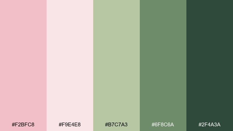
HEX: #F2BFC8 #F9E4E8 #B7C7A3 #6F8C6A #2F4A3A
Mood: fresh, botanical, restorative
Best for: spring promotions, wellness brands, botanical illustrations
Fresh and restorative like a morning garden walk, blush meets sage for a naturally calming look. These blush pink color combinations are perfect for wellness packaging, yoga studios, and spring campaign graphics. Pair the greens with the soft blush tints for backgrounds, then use the deep forest tone for logos and fine details. Tip: add generous margins so the palette feels airy and plant-like rather than busy.
Image example of blush sage garden generated using media.io
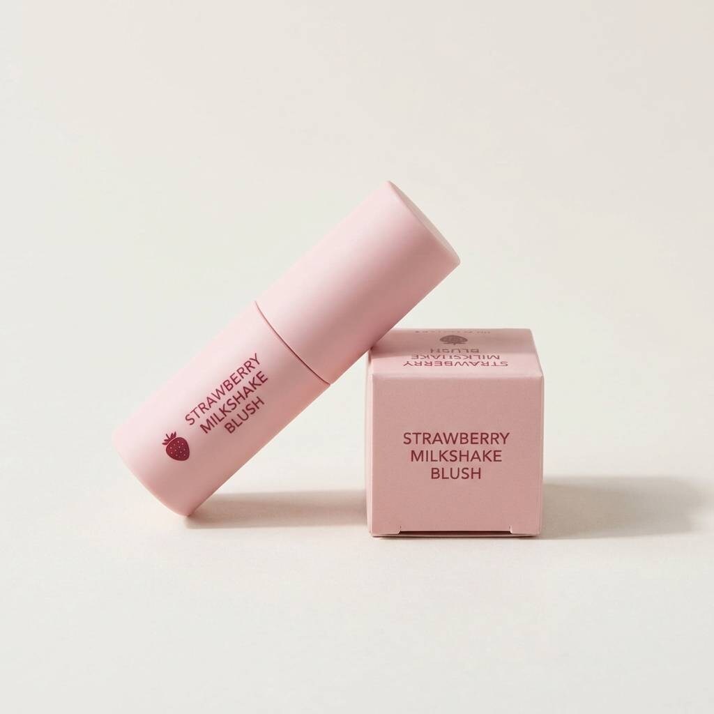
6) Strawberry Milkshake
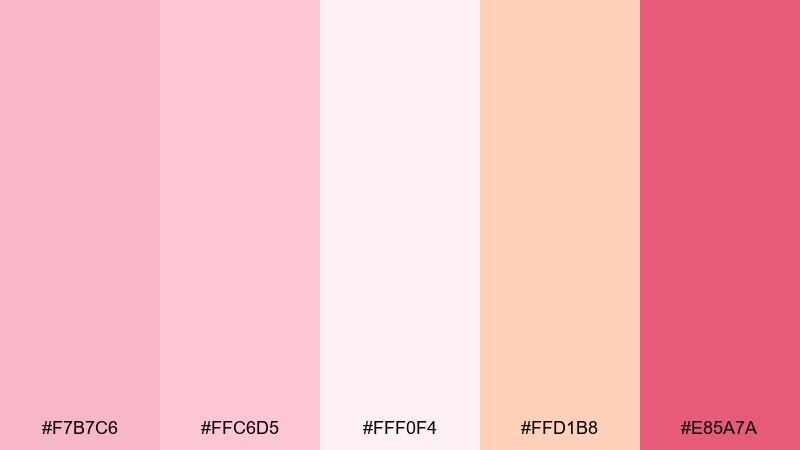
HEX: #F7B7C6 #FFC6D5 #FFF0F4 #FFD1B8 #E85A7A
Mood: playful, bright, youthful
Best for: beauty ads, social posts, fun retail promos
Playful and bright like a frosty milkshake, these pinks pop without turning neon. Use them for beauty promos, Instagram carousels, or packaging that needs a cheerful first impression. Pair with soft creams to keep the design readable, and save the vibrant berry for badges and limited-edition tags. Tip: keep body text in a dark neutral so the energetic accents do not reduce legibility.
Image example of strawberry milkshake generated using media.io
7) Blush Midnight Navy
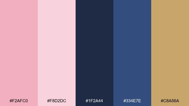
HEX: #F2AFC0 #F8D2DC #1F2A44 #334E7E #C8A56A
Mood: dramatic, elegant, high-contrast
Best for: evening event posters, luxury branding, jewelry ads
Dramatic and elegant like a midnight gala, blush softens the depth of navy for a refined contrast. These blush pink color combinations work especially well for luxury brands, event posters, and editorial hero sections. Pair the navy as a background with blush headlines, then add gold as a small highlight for buttons or separators. Tip: keep gold usage under ten percent so it reads as jewelry, not glitter.
Image example of blush midnight navy generated using media.io

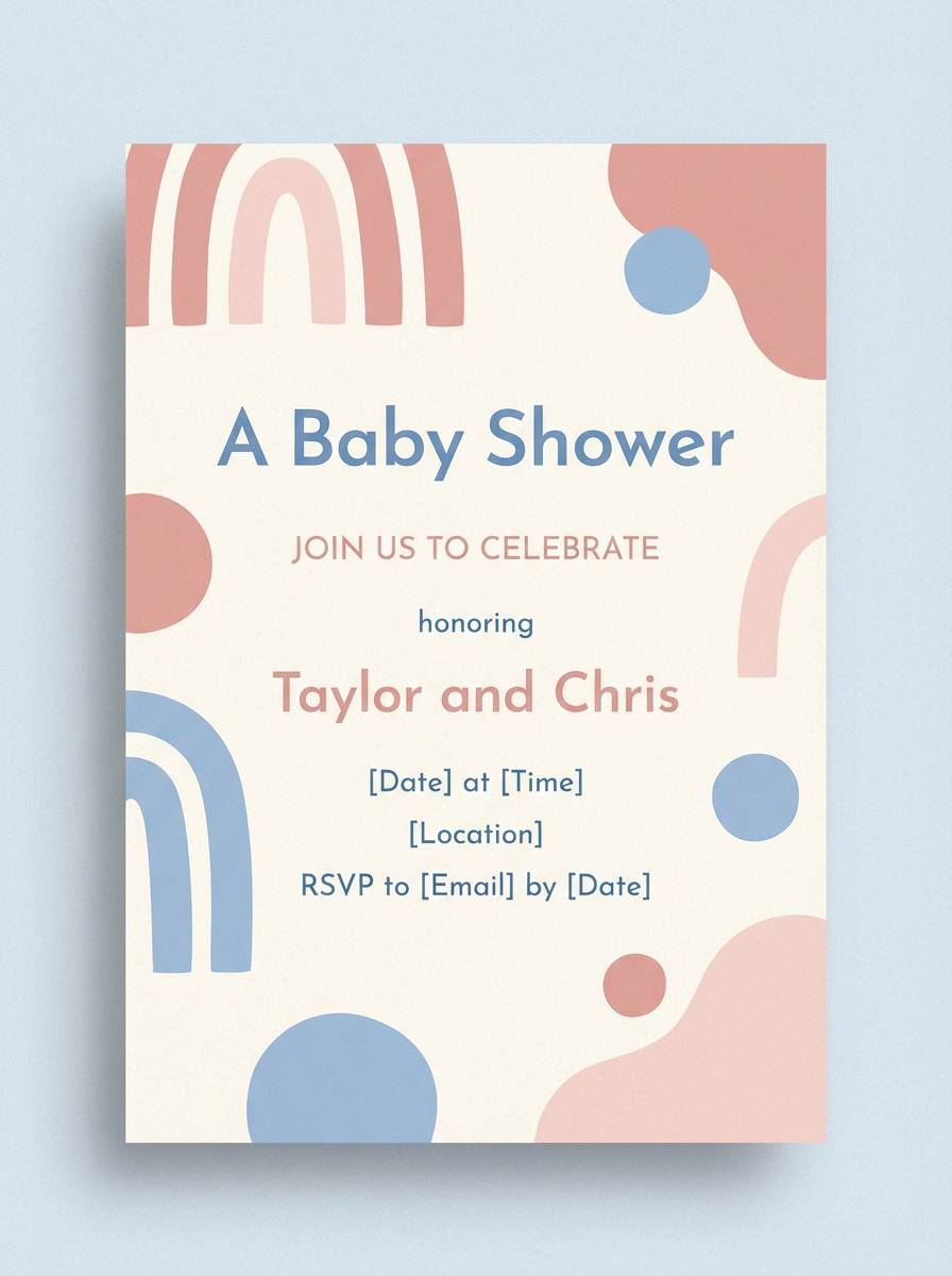
8) Vintage Powder Blue
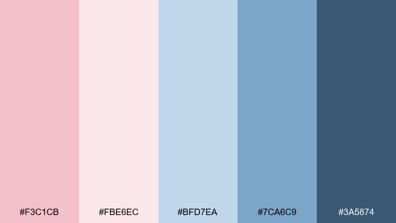
HEX: #F3C1CB #FBE6EC #BFD7EA #7CA6C9 #3A5874
Mood: nostalgic, soft, airy
Best for: baby shower invites, retro branding, gentle web themes
Nostalgic and airy like a vintage postcard, powder blue gives blush a breezy, classic twist. It fits baby shower stationery, soft lifestyle blogs, and retro-inspired boutiques. Pair the lighter tones for backgrounds and use the steel blue for navigation and captions. Tip: add a thin dark-blue rule line to structure layouts without making them feel heavy.
Image example of vintage powder blue generated using media.io
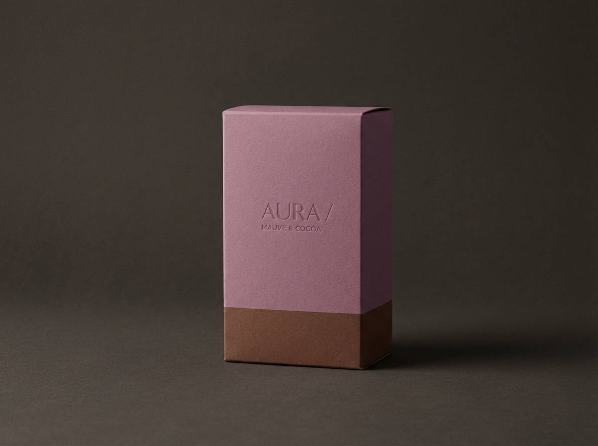
9) Mauve Cocoa Luxe
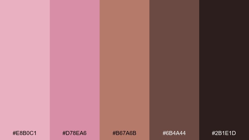
HEX: #E8B0C1 #D78EA6 #B67A6B #6B4A44 #2B1E1D
Mood: moody, luxe, intimate
Best for: fragrance branding, premium packaging, boutique interiors
Moody and luxe like velvet seating in candlelight, mauve and cocoa create a sensual, intimate mood. It shines on fragrance boxes, premium labels, and brand identities that want warmth with depth. Pair the mid mauve with cocoa for typography, and keep the light blush as negative space for breathing room. Tip: use a soft matte finish in mockups so the palette feels expensive, not glossy.
Image example of mauve cocoa luxe generated using media.io
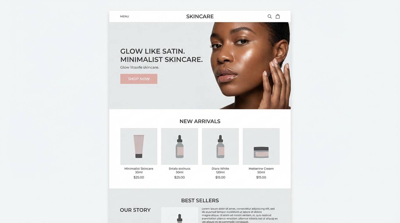
10) Cherry Blossom Minimal
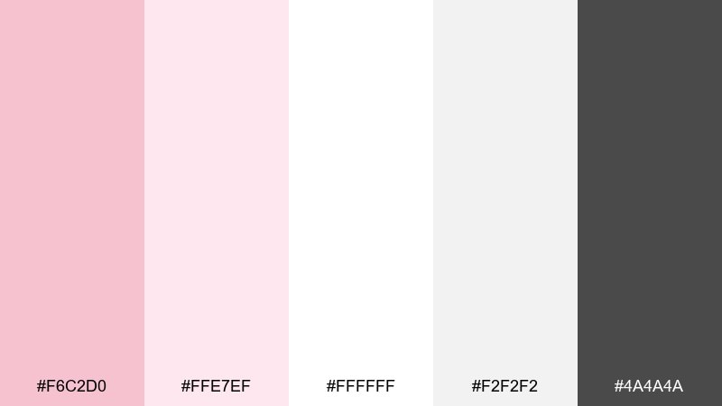
HEX: #F6C2D0 #FFE7EF #FFFFFF #F2F2F2 #4A4A4A
Mood: clean, light, contemporary
Best for: minimal UI kits, modern blogs, skincare websites
Clean and contemporary like cherry blossoms against white architecture, these tones feel crisp and intentional. A blush pink color palette like this works well for minimal UI kits, skincare sites, and modern blog templates. Pair the blush accents with soft grays for dividers, and keep charcoal for text and icons to stay accessible. Tip: limit pink to primary buttons and key illustrations so the design stays airy.
Image example of cherry blossom minimal generated using media.io
11) Blush Gold Glam
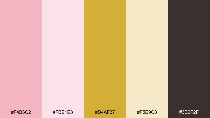
HEX: #F4B6C2 #FBE1E8 #D4AF37 #F5E9C8 #3B2F2F
Mood: glamorous, celebratory, polished
Best for: beauty launches, holiday promos, upscale invitations
Glamorous and celebratory like champagne bubbles, blush and gold create instant polish. This set suits beauty launches, holiday promos, and upscale invitations that need sparkle without loud colors. Pair gold for thin borders and icons, then anchor the layout with a deep cocoa for text. Tip: use gold as a foil-style accent in small doses so the blush remains the hero.
Image example of blush gold glam generated using media.io
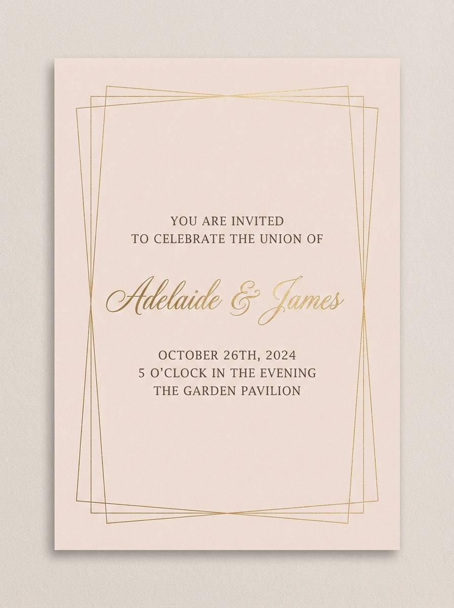
12) Soft Coral Sunrise
HEX: #F6B8C6 #FFD1D1 #FFB38A #FFE3B3 #2D2A26
Mood: optimistic, warm, sunlit
Best for: summer campaigns, food photography overlays, travel promos
Optimistic and sunlit like early morning skies, coral and blush feel warm and energetic together. Use it for travel promos, seasonal landing pages, or food brand graphics where warmth sells the story. Pair the pale blush and butter tones as backgrounds, then use the dark espresso for type and navigation. Tip: keep coral for highlights and banners so it reads like sunshine, not clutter.
Image example of soft coral sunrise generated using media.io

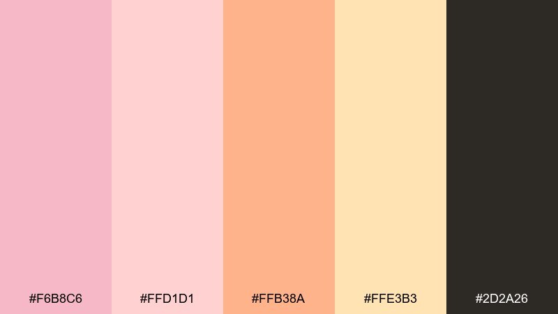
13) Blush Plum Velvet
HEX: #F0B3C4 #F7D2DE #6C2E5C #3D1A33 #C9B2C2
Mood: romantic, dramatic, artistic
Best for: album covers, boutique fashion, night event branding
Romantic and dramatic like velvet drapes, plum brings depth to soft blush tones. It is a strong choice for fashion lookbooks, album artwork, and evening event branding that needs mood. Pair the lighter blush as negative space and let plum handle headlines and key shapes. Tip: add a gentle grain texture to backgrounds to make the dark tones feel rich rather than flat.
Image example of blush plum velvet generated using media.io
14) Warm Sandstone
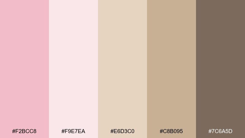
HEX: #F2BCC8 #F9E7EA #E6D3C0 #C8B095 #7C6A5D
Mood: natural, serene, understated
Best for: interior design portfolios, spa branding, modern stationery
Natural and serene like sun-warmed stone, these blush and sand tones feel quietly sophisticated. They are great for interior design portfolios, spa menus, and modern stationery that avoids stark white. Pair sandstone as the base and use blush for highlights, while the deeper taupe supports readable headings. Tip: choose one dominant neutral and keep the rest as accents for a calm, gallery-like layout.
Image example of warm sandstone generated using media.io
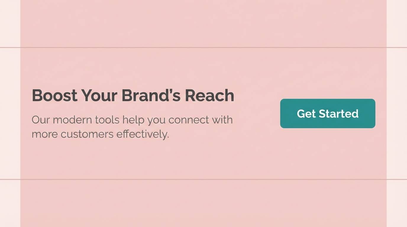
15) Blush Teal Pop
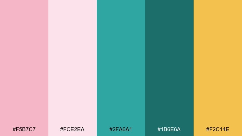
HEX: #F5B7C7 #FCE2EA #2FA6A1 #1B6E6A #F2C14E
Mood: fresh, bold, playful
Best for: app marketing, modern posters, sporty lifestyle brands
Fresh and bold like a pop-art print, teal gives blush a crisp, modern edge. It works for app marketing graphics, energetic posters, and lifestyle brands that want friendly color with punch. Pair teal for buttons and icons, blush for backgrounds, and use the warm yellow as a tiny highlight for badges. Tip: keep teal to one primary shade so the contrast feels intentional, not chaotic.
Image example of blush teal pop generated using media.io
16) Modern Monochrome Pink
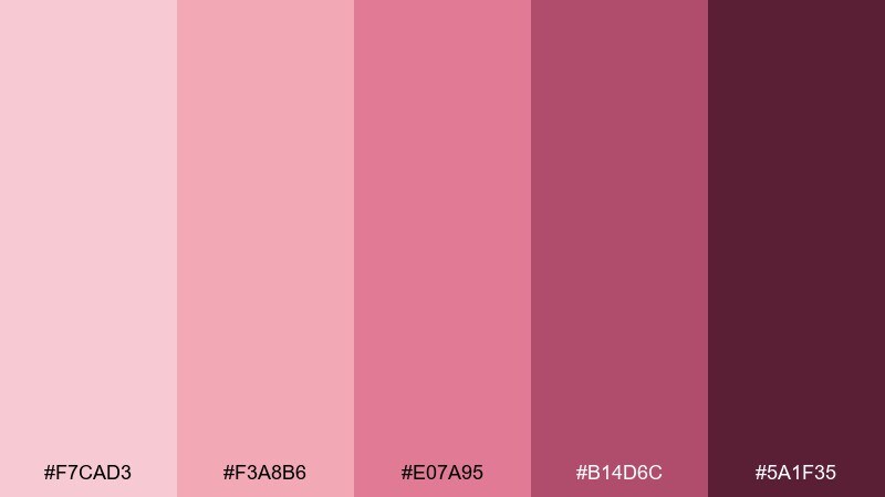
HEX: #F7CAD3 #F3A8B6 #E07A95 #B14D6C #5A1F35
Mood: confident, cohesive, trend-forward
Best for: brand identities, social templates, product drops
Confident and trend-forward like a tonal fashion edit, this all-pink range feels cohesive and strong. It is ideal for brand systems, social templates, and product drops where you want one signature hue across assets. Pair the lightest tint for backgrounds and reserve the deep berry for text, icons, and emphasis. Tip: introduce contrast through type scale and spacing so everything does not blur into a single block of color.
Image example of modern monochrome pink generated using media.io

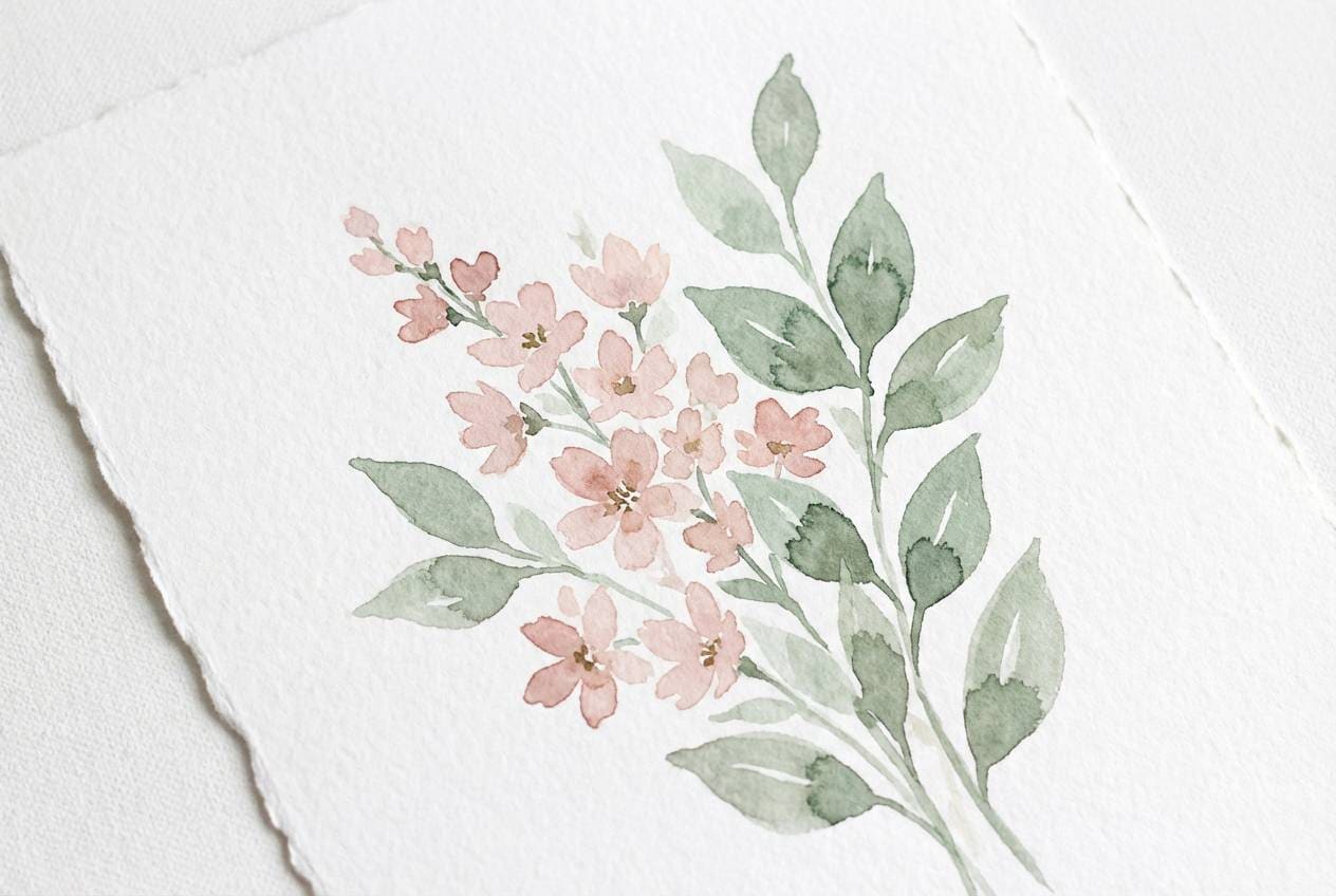
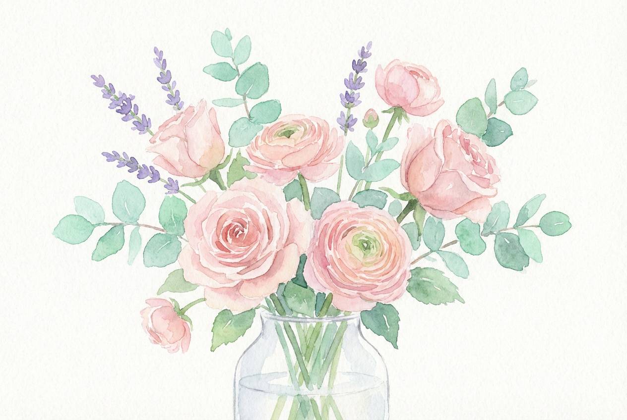
17) Floral Watercolor Pastels
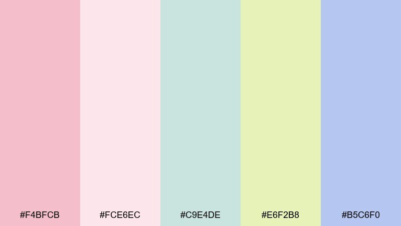
HEX: #F4BFCB #FCE6EC #C9E4DE #E6F2B8 #B5C6F0
Mood: light, dreamy, springlike
Best for: greeting cards, nursery art, spring illustrations
Light and dreamy like a watercolor bouquet, these pastels feel gentle and optimistic. They are perfect for greeting cards, nursery prints, and seasonal campaign illustrations that need softness. Pair the blush with mint and lavender for variety, and keep the palest pink as a paper-like base. Tip: use loose brush edges and plenty of white space to preserve the airy watercolor mood.
Image example of floral watercolor pastels generated using media.io
18) Editorial Blush Black
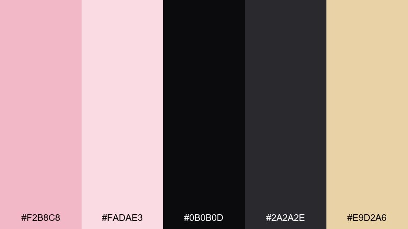
HEX: #F2B8C8 #FADAE3 #0B0B0D #2A2A2E #E9D2A6
Mood: editorial, sharp, high-fashion
Best for: magazine layouts, lookbooks, premium landing pages
Editorial and sharp like a high-fashion spread, blush becomes striking when framed by near-black. Use it for magazine layouts, lookbooks, and premium landing pages that need drama and clean structure. Pair black for typography and grids, and keep the pale blush as spacious backgrounds or highlight panels. Tip: add a small warm accent like champagne for section markers to avoid a harsh, cold finish.
Image example of editorial blush black generated using media.io
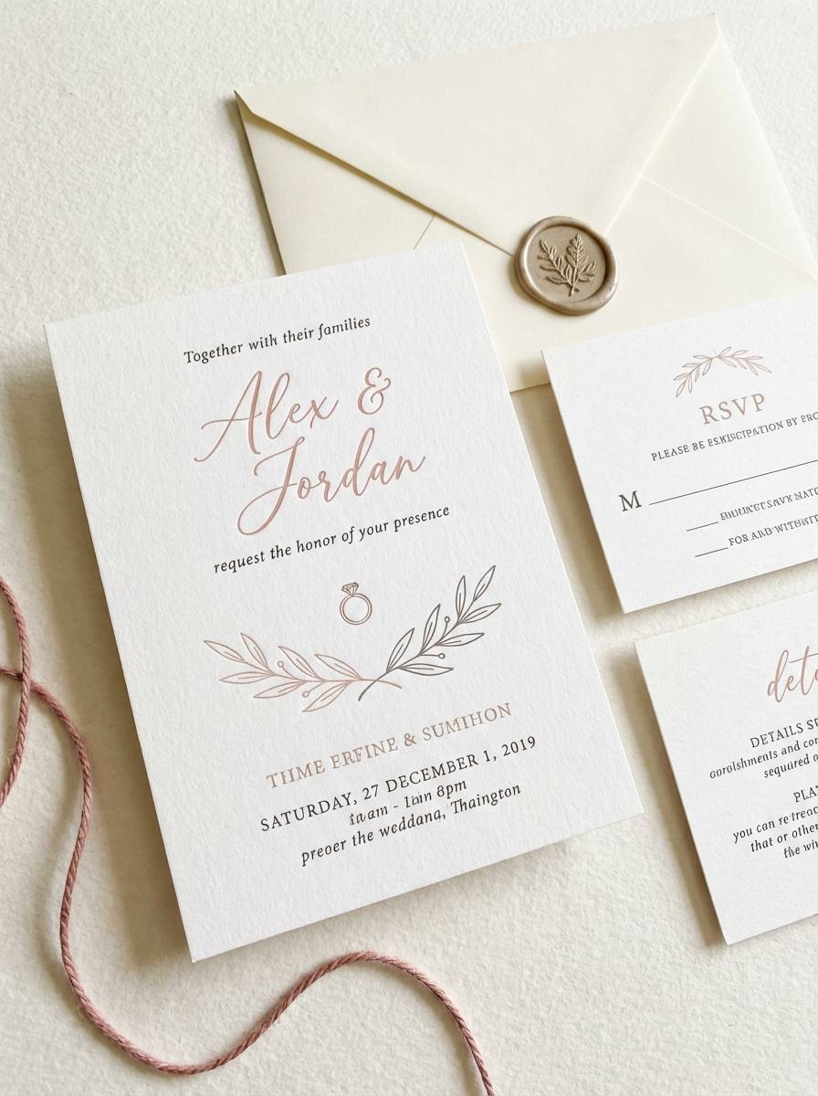
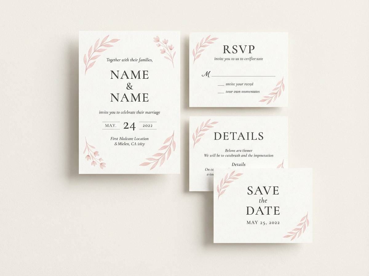
19) Wedding Ivory Lace
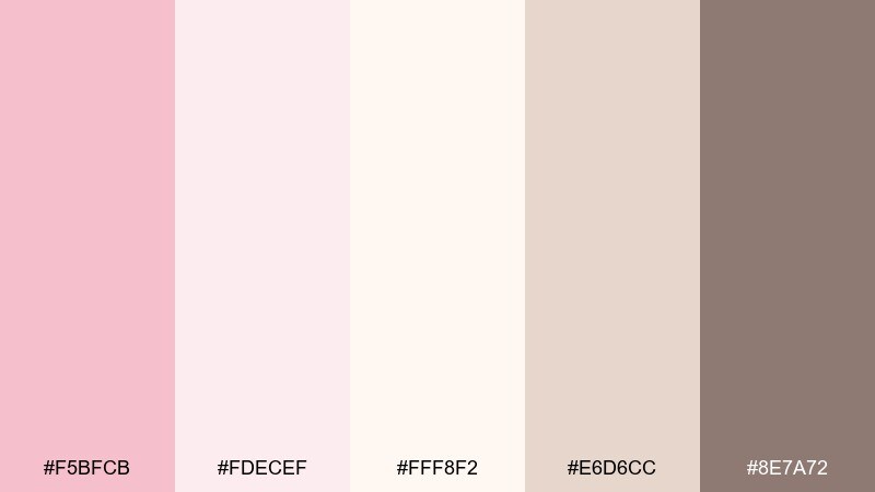
HEX: #F5BFCB #FDECEF #FFF8F2 #E6D6CC #8E7A72
Mood: romantic, timeless, soft
Best for: wedding suites, bridal branding, elegant invitations
Romantic and timeless like ivory lace, these tones feel classic and tender. A blush pink color palette like this is made for full wedding suites, from save-the-dates to menus and place cards. Pair ivory and cream as the main base, then use the muted taupe for monograms and small details. Tip: print the blush on textured stock to keep it soft and sophisticated rather than glossy.
Image example of wedding ivory lace generated using media.io
20) Cozy Knit Mauve
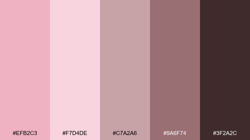
HEX: #EFB2C3 #F7D4DE #C7A2A6 #9A6F74 #3F2A2C
Mood: cozy, muted, comforting
Best for: autumn lifestyle content, handmade products, cozy blog themes
Cozy and comforting like a soft knit sweater, mauve makes blush feel muted and lived-in. It is a great fit for handmade product listings, autumn lifestyle content, and warm blog themes. Pair the dusty midtones for backgrounds and use the deep cocoa for headers, buttons, and icons. Tip: add subtle rounded corners in UI or labels to reinforce the soft, cozy vibe.
Image example of cozy knit mauve generated using media.io
What Colors Go Well with Blush Pink?
Blush pink pairs effortlessly with warm neutrals like ivory, cream, beige, and taupe—these keep the palette soft, cohesive, and “quiet luxury.” If you want something slightly more grounded, add cocoa brown or sandstone for depth.
For cooler, more modern contrast, blush works well with light gray, charcoal, and deep navy. These combinations make blush feel less “sweet” and more editorial or UI-friendly.
If you want a fresh twist, try botanical greens (sage, olive, forest) or bold complementary accents like teal. Use saturated accents in small doses so the overall look stays balanced and the blush remains the hero.
How to Use a Blush Pink Color Palette in Real Designs
Start with a role-based plan: choose one light blush or off-white as your background, one medium blush as your supporting color, and one deep neutral (charcoal, cocoa, or navy) for text. This keeps readability strong while maintaining a soft aesthetic.
Use blush strategically for focus: primary buttons, highlights, tags, and key illustrations. If blush becomes the dominant background everywhere, add structure with dividers in light gray or warm taupe to avoid a “washed” layout.
For print and packaging, test finish and texture. Blush often looks more premium on matte or textured stock; pair it with thin metallic lines (gold/champagne) or crisp dark typography for an elevated, polished result.
Create Blush Pink Palette Visuals with AI
If you already have HEX codes, you can turn them into on-brand mockups fast by generating images that match the palette mood—minimal UI, wedding stationery, cosmetics packaging, posters, and more.
In Media.io, describe the design, mention the key colors (or the vibe), and iterate until the composition fits your layout needs. Keep prompts specific about style (flat lay, studio shot, vector UI) and aspect ratio so outputs are easier to reuse.
Once you like a direction, generate a few variations for ads, product pages, and social templates to keep your visuals consistent across channels.
Blush Pink Color Palette FAQs
-
What HEX code is blush pink?
Blush pink doesn’t have one single HEX value, but common blush pink tones sit around soft warm pinks like #F6C5CC or #F4B6C2. Use lighter tints for backgrounds and deeper berries/charcoal for readable text. -
Is blush pink warm or cool?
Most blush pink shades lean warm (a soft red/peach undertone), but they can read cooler when paired with grays, navy, or powder blue. Your surrounding colors largely determine the final temperature. -
What colors complement blush pink the most?
Great complements include sage green, teal, navy, charcoal, and warm browns. For softer matches, use ivory, cream, beige, and warm taupe to keep the palette airy and romantic. -
How do I keep blush pink designs from feeling too “sweet”?
Add contrast and structure: use charcoal or near-black for typography, introduce cool grays or navy, and keep pink limited to accents like buttons, tags, and highlights rather than full-page backgrounds. -
Does blush pink work for UI and app design?
Yes—blush works well as an accent color for buttons, charts, and highlights, especially when supported by neutral backgrounds and dark text. Aim for accessible contrast by keeping key text in charcoal or deep navy. -
What’s a good blush pink palette for weddings?
Blush with ivory/cream and warm taupe is a classic wedding direction (soft, timeless, and print-friendly). If you want more drama, pair blush with midnight navy and use a small gold accent. -
How can I generate blush pink palette images quickly?
Use Media.io’s text-to-image tool: describe the design type (invitation, packaging, UI, poster), specify a blush pink mood (romantic, minimal, editorial), and keep the prompt clear about lighting/style and aspect ratio.
Next: Cobalt Color Palette


