

A 90s grunge color palette is all about contrast that feels lived-in: washed denim blues, dusty neutrals, soot charcoals, and small hits of rust or brick.
If you want designs that feel raw but still readable for modern posters, UI, or branding, these muted grunge colors are a reliable place to start.
In this article
- Why 90s Grunge Palettes Work So Well
-
- basement denim
- flannel & ash
- rusted amplifier
- mossy alley
- cassette smoke
- faded zine
- garage concrete
- sepia stage lights
- thrift store teal
- muddy plum
- mustard worn tee
- riverbank grime
- charcoal sketchbook
- dusk over seattle
- vinyl sleeve blues
- oxide & olive
- puddle reflection
- band poster ink
- brick and sludge
- soft static
- What Colors Go Well with 90s Grunge?
- How to Use a 90s Grunge Color Palette in Real Designs
- Create 90s Grunge Palette Visuals with AI
Why 90s Grunge Palettes Work So Well
Grunge palettes are built on imperfect color: tones that look sun-faded, smoke-tinted, or printed on cheap paper. That “worn-in” quality instantly adds mood without relying on loud saturation.
They also solve a practical design problem: you get strong hierarchy from dark ink-like neutrals, while denim blues, olives, and rusts create emphasis that feels intentional rather than glossy.
Because the colors are muted, they pair naturally with grain, photocopy texture, halftones, and distressed type—making the whole design feel cohesive even when you mix photos, collage, and bold headlines.
20+ 90s Grunge Color Palette Ideas (with HEX Codes)
1) Basement Denim
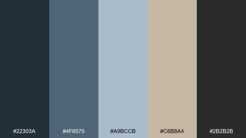
HEX: #22303a #4f6575 #a9bccb #c6b8a4 #2b2b2b
Mood: moody, worn-in, cool
Best for: editorial layouts and lookbooks
Moody and worn-in like faded jeans under a single rehearsal-room bulb, these tones lean cool and lived-through. Use the denim blues as your base, then add the ash black for type and the paper-tan for breathing room. It shines in editorial grids, zines, and photo spreads where contrast should feel soft, not glossy. Tip: keep the light blue for highlights and pull headings in charcoal to keep the vibe grounded.
Image example of basement denim generated using media.io
Media.io is an online AI studio for creating and editing video, image, and audio in your browser.

2) Flannel & Ash
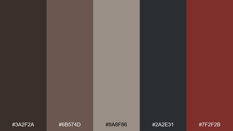
HEX: #3a2f2a #6b574d #9a8f86 #2a2e31 #7f2f2b
Mood: earthy, smoky, gritty
Best for: brand identity for coffee shops and barbers
Earthy browns and smoky charcoal evoke thrifted flannel, campfire ash, and a hint of brick-red attitude. Build logos and wordmarks with the deep espresso and ash, then use the warm taupes to soften edges. It works especially well for tactile brands like cafes, barbers, and small-batch goods. Tip: reserve the red-brown as a single accent for seals, icons, or a call-to-action.
Image example of flannel & ash generated using media.io
3) Rusted Amplifier
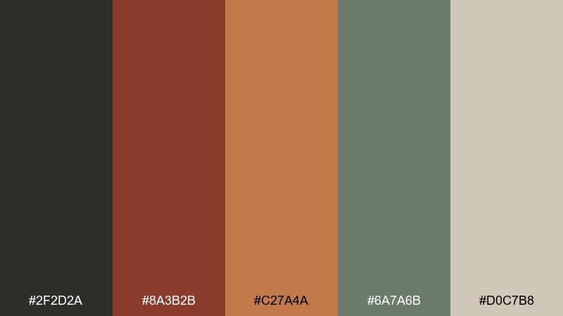
HEX: #2f2d2a #8a3b2b #c27a4a #6a7a6b #d0c7b8
Mood: raw, warm, loud
Best for: concert posters and album promo graphics
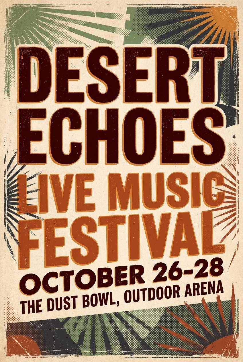
Raw and loud like a scratched amp faceplate, the rust and burnt orange bring heat against grounded neutrals. These 90s grunge color combination ideas work best when you treat the dark neutral as ink and let the warm tones carry the energy. Use it for gig posters, album promos, and merch graphics where texture matters. Tip: add subtle halftone or photocopy grain so the orange looks weathered, not shiny.
Image example of rusted amplifier generated using media.io
4) Mossy Alley
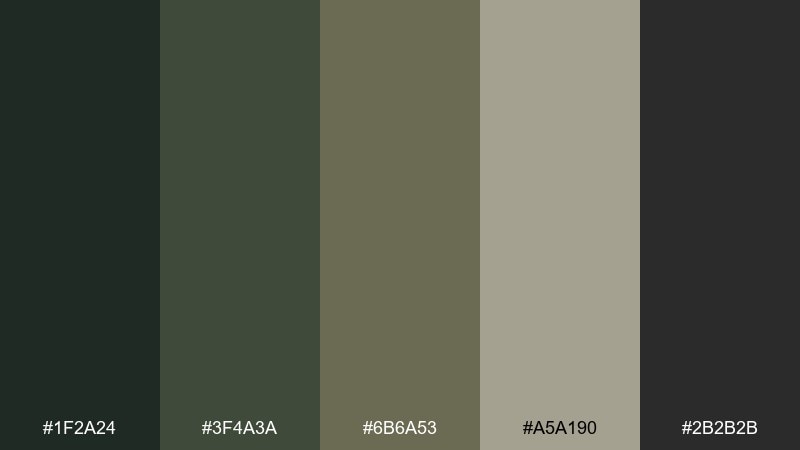
HEX: #1f2a24 #3f4a3a #6b6a53 #a5a190 #2b2b2b
Mood: damp, muted, urban
Best for: outdoor apparel ads and eco branding
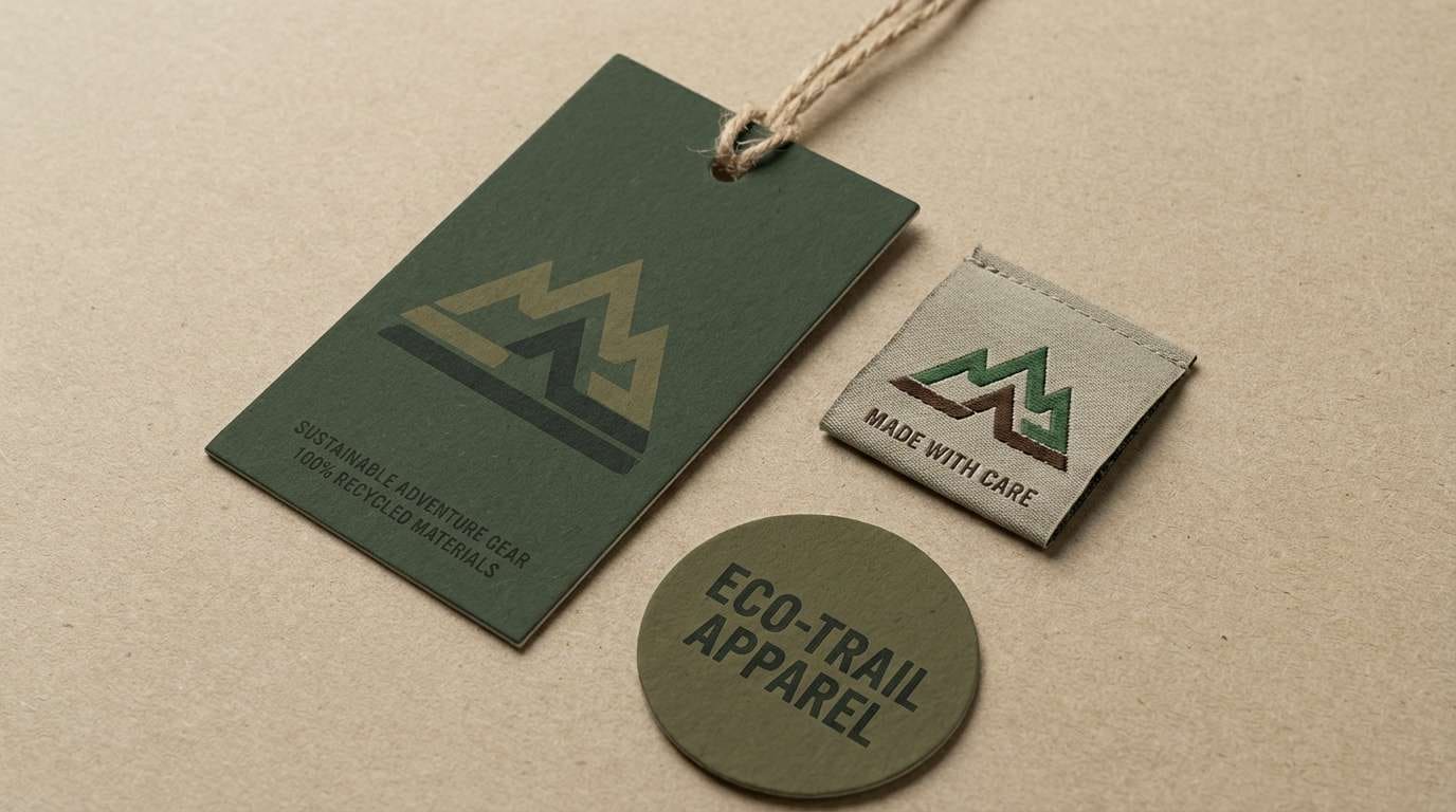
Damp and muted like moss creeping over cracked concrete, these greens stay subtle and urban. Lean on the deep forest as your anchor, then layer olive and stone for secondary panels and typography blocks. It fits outdoor apparel, eco brands, and packaging that wants to feel rugged rather than pristine. Tip: keep contrast readable by placing text on the light stone and using the darkest green for headlines.
Image example of mossy alley generated using media.io
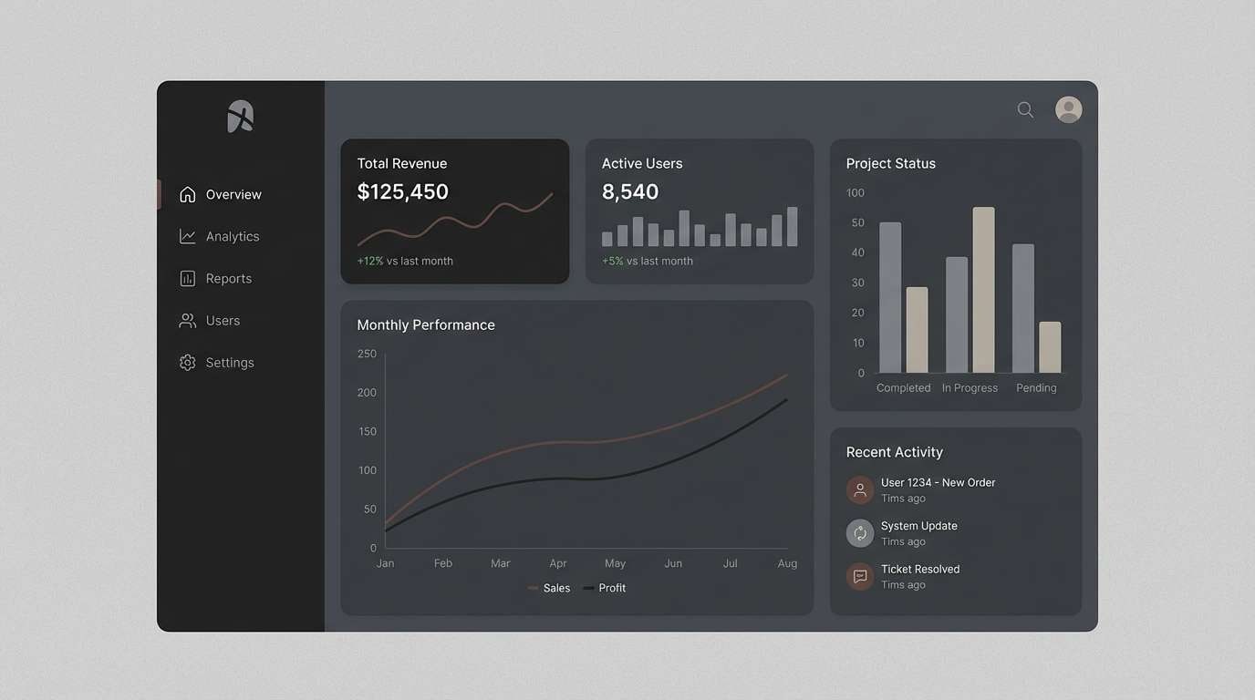
5) Cassette Smoke
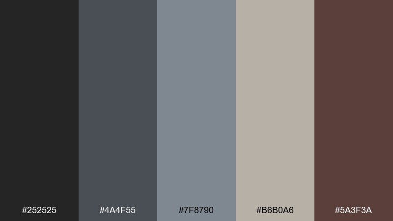
HEX: #252525 #4a4f55 #7f8790 #b6b0a6 #5a3f3a
Mood: hazy, nostalgic, low-contrast
Best for: UI dashboards with a retro edge
Hazy and nostalgic like tape hiss and smoke in a dim venue, the grays keep everything calm and cohesive. Use the charcoal for navigation, mid-grays for cards, and the warm greige to prevent the UI from feeling sterile. It suits dashboards, music apps, and tools that want a retro edge without going full dark mode. Tip: add the dusty brown only for active states so interactions feel intentional.
Image example of cassette smoke generated using media.io
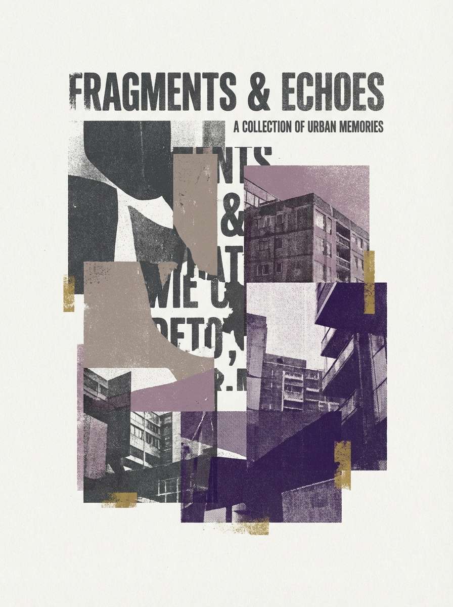
6) Faded Zine
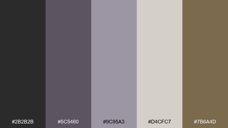
HEX: #2b2b2b #5c5460 #9c95a3 #d4cfc7 #7b6a4d
Mood: photocopied, soft, indie
Best for: zines, resumes, and minimal posters
Photocopied and soft like a stapled zine left in the sun, the lavender-gray adds a gentle twist to classic grunge neutrals. Pair the charcoal with the pale paper tone for readable type, then sprinkle in the muted purple for sections and pull quotes. It works for zines, creative resumes, and minimal posters where texture does the heavy lifting. Tip: keep gradients out and use flat blocks plus grain for a more authentic print feel.
Image example of faded zine generated using media.io
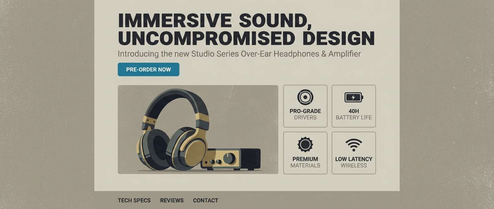
7) Garage Concrete
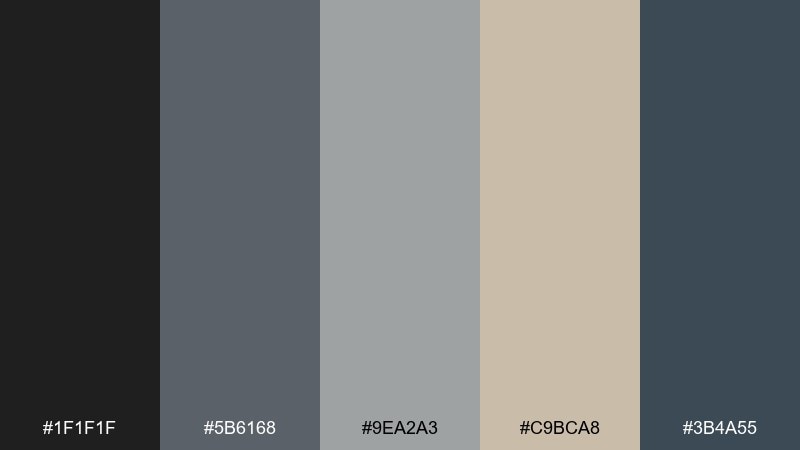
HEX: #1f1f1f #5b6168 #9ea2a3 #c9bca8 #3b4a55
Mood: industrial, cool, grounded
Best for: product landing pages for audio gear
Industrial and cool like concrete dust on a garage floor, these grays feel tough without turning flat. The mix is a reliable 90s grunge color palette for modern landing pages where you need clarity and character. Use the near-black for hero text, concrete gray for sections, and the warm sand as a subtle background lift. Tip: make the blue-gray your primary button color to keep calls-to-action visible but not glossy.
Image example of garage concrete generated using media.io
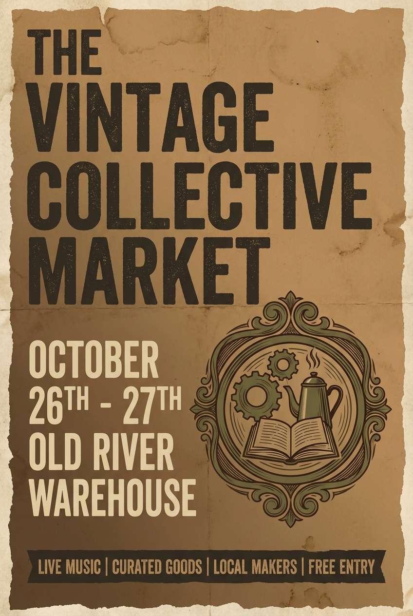
8) Sepia Stage Lights
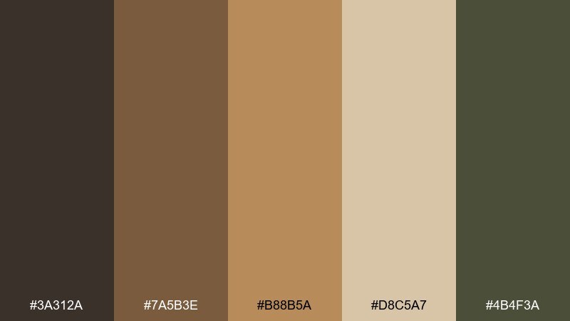
HEX: #3a312a #7a5b3e #b88b5a #d8c5a7 #4b4f3a
Mood: warm, smoky, cinematic
Best for: event flyers and venue promos
Warm and smoky like stage lights cutting through haze, the sepia range feels cinematic and intimate. Use the dark brown for type and borders, then let tan and parchment carry the background and imagery overlays. It is ideal for venue promos, event flyers, and acoustic session announcements. Tip: add the muted olive as a secondary accent to keep the palette from going too monochrome.
Image example of sepia stage lights generated using media.io
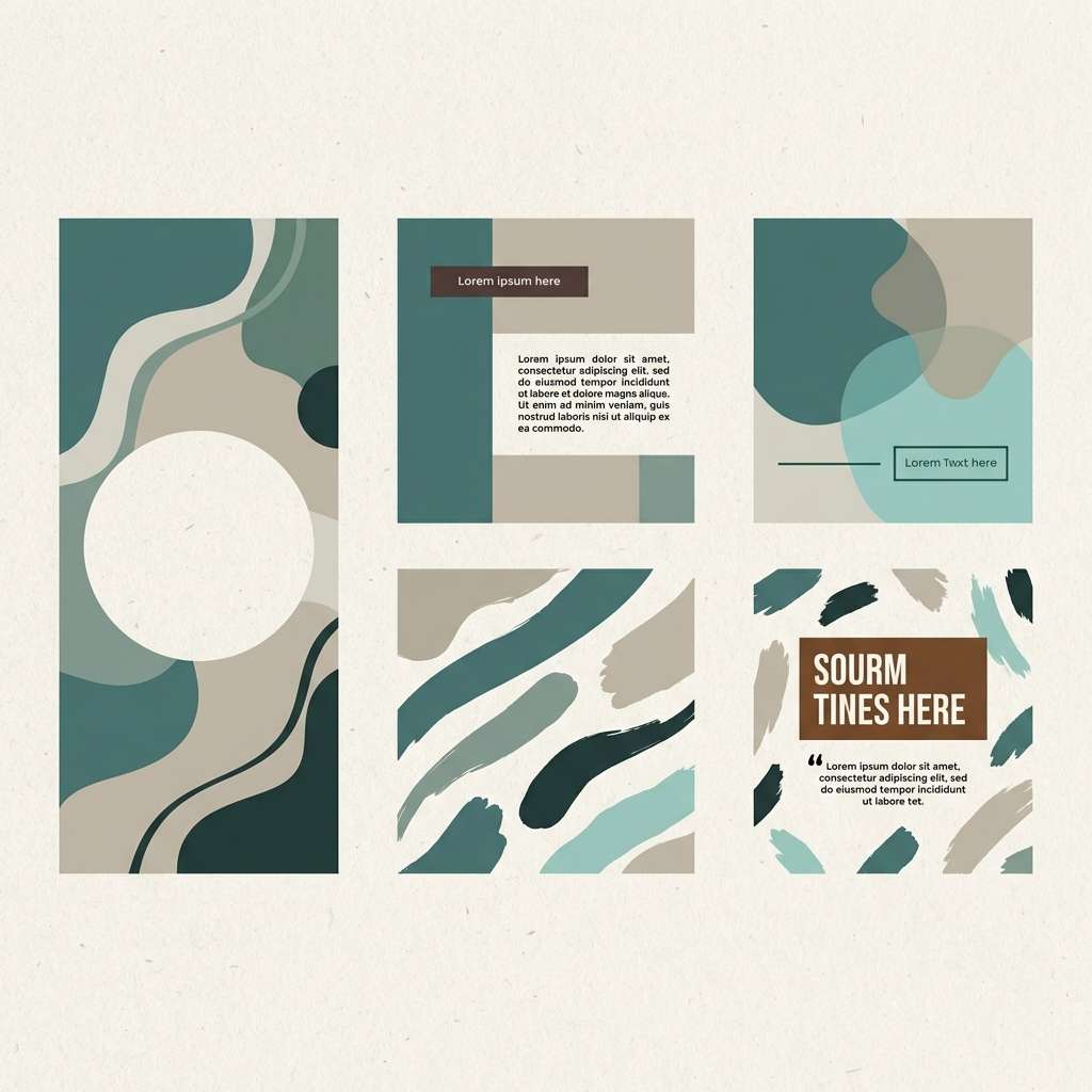
9) Thrift Store Teal
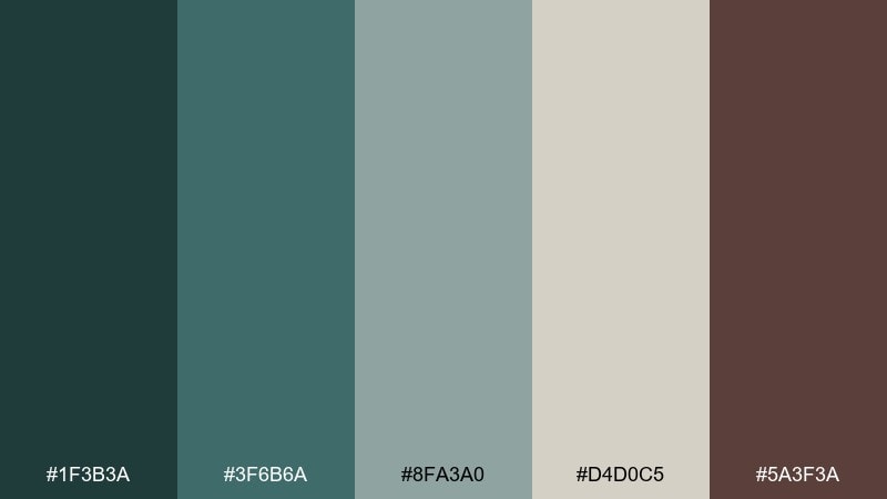
HEX: #1f3b3a #3f6b6a #8fa3a0 #d4d0c5 #5a3f3a
Mood: dusty, quirky, mellow
Best for: social posts and creator branding
Dusty teal and warm neutrals feel like mismatched thrift finds that somehow work together. The cool greens calm the layout, while the cocoa brown keeps it human and tactile. It is great for creator branding, social templates, and highlight covers that need a mellow but memorable color story. Tip: keep backgrounds light and use teal for shapes so text stays crisp and shareable.
Image example of thrift store teal generated using media.io
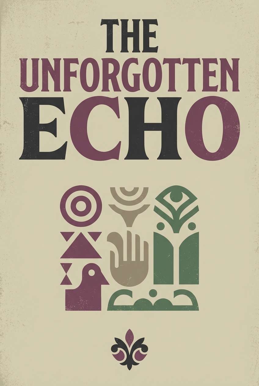
10) Muddy Plum
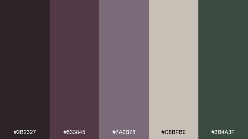
HEX: #2b2327 #533845 #7a6b78 #c8bfb6 #3b4a3f
Mood: brooding, artsy, muted
Best for: book covers and album artwork
Brooding plum and smoky mauves evoke bruised twilight and ink-stained sketches. Use the deepest shade for titles, the mid plum for blocks and frames, and the dusty beige as negative space. It fits book covers, album artwork, and editorial features where you want drama without neon. Tip: pair with matte textures and keep imagery high-contrast so the purple stays sophisticated, not sweet.
Image example of muddy plum generated using media.io
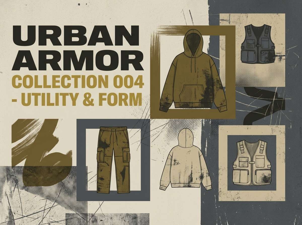
11) Mustard Worn Tee
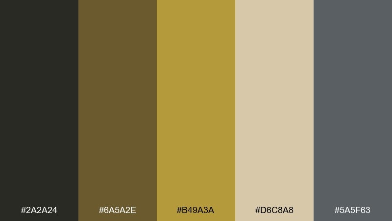
HEX: #2a2a24 #6a5a2e #b49a3a #d6c8a8 #5a5f63
Mood: gritty, sun-faded, vintage
Best for: streetwear lookbooks and merch
Gritty mustard and faded neutrals feel like a favorite tee that has survived too many tours. Let the mustard sit in small bursts for logos, tags, or hero shapes, while the dark neutral handles legibility. It works for streetwear lookbooks, merch drops, and promo banners that need attitude without screaming. Tip: use the pale sand as the main background to keep yellow from overpowering the layout.
Image example of mustard worn tee generated using media.io
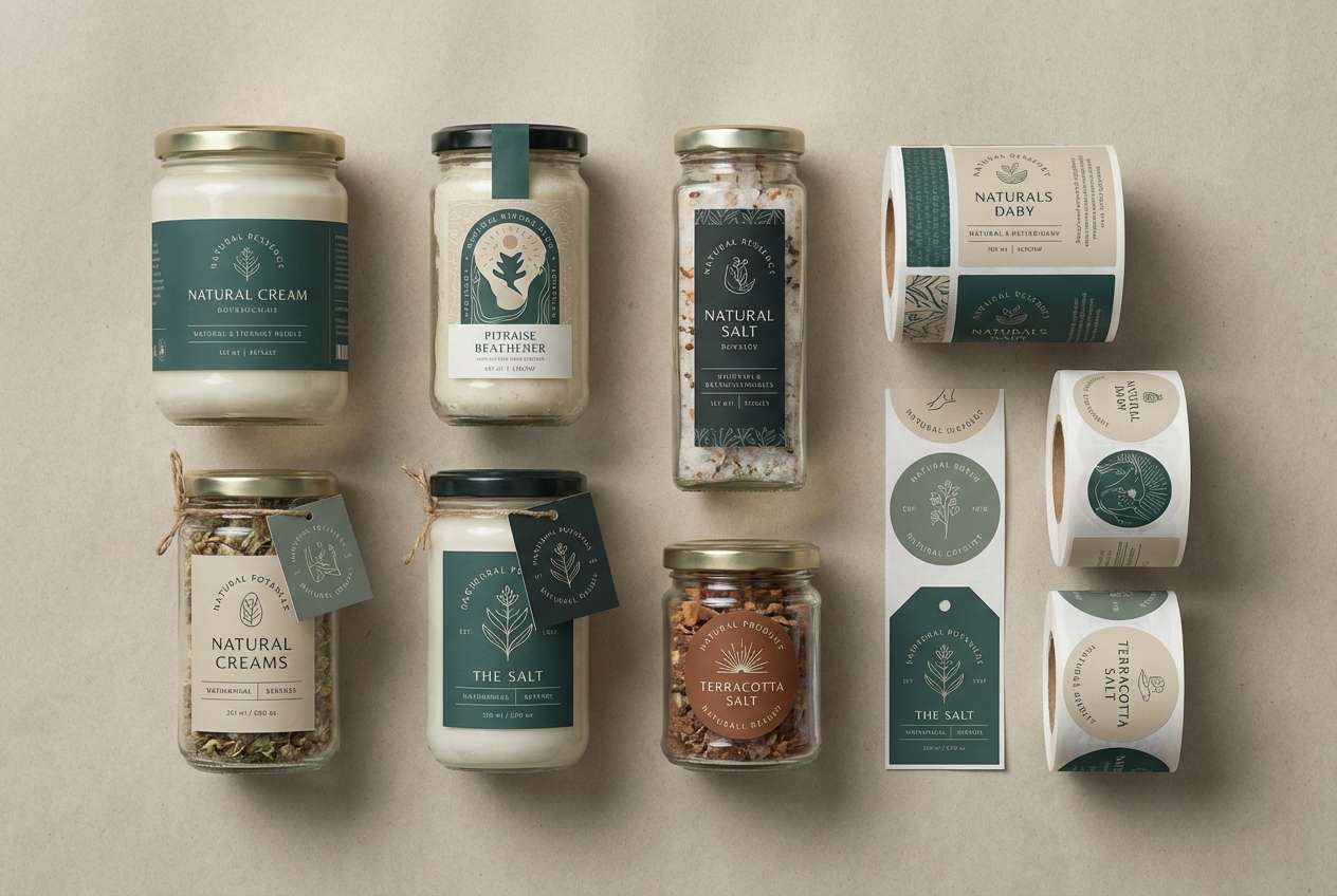
12) Riverbank Grime
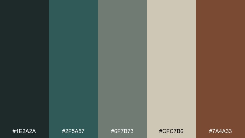
HEX: #1e2a2a #2f5a57 #6f7b73 #cfc7b6 #7a4a33
Mood: muddy, cool, outdoorsy
Best for: craft packaging and label systems
Muddy teal and river-stone gray evoke wet pebbles, driftwood, and the calm after rain. Try these 90s grunge color combinations on craft packaging where you want a handmade, grounded tone without going full rustic. Use the parchment neutral for the label base and the deep teal for brand marks and ingredient lists. Tip: keep the rust-brown for stamps or batch numbers to add instant authenticity.
Image example of riverbank grime generated using media.io
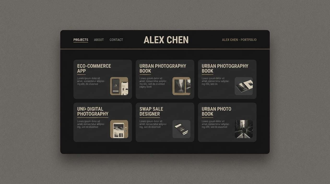
13) Charcoal Sketchbook
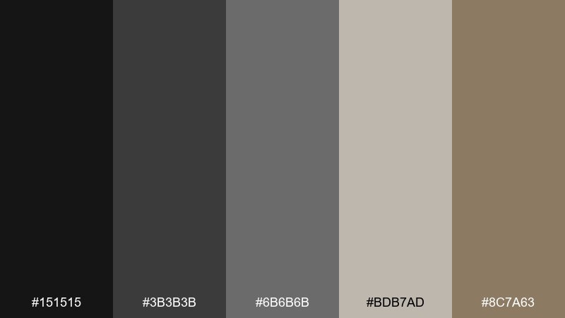
HEX: #151515 #3b3b3b #6b6b6b #bdb7ad #8c7a63
Mood: minimal, gritty, focused
Best for: portfolio websites and case studies
Minimal and gritty like charcoal lines on rough paper, these neutrals keep the focus on content. Use near-black for headings, mid gray for UI dividers, and warm beige for background sections. It is a strong fit for portfolios, case studies, and typography-first sites that need a serious tone. Tip: introduce the soft brown only in small UI details to keep the page feeling intentional, not muddy.
Image example of charcoal sketchbook generated using media.io
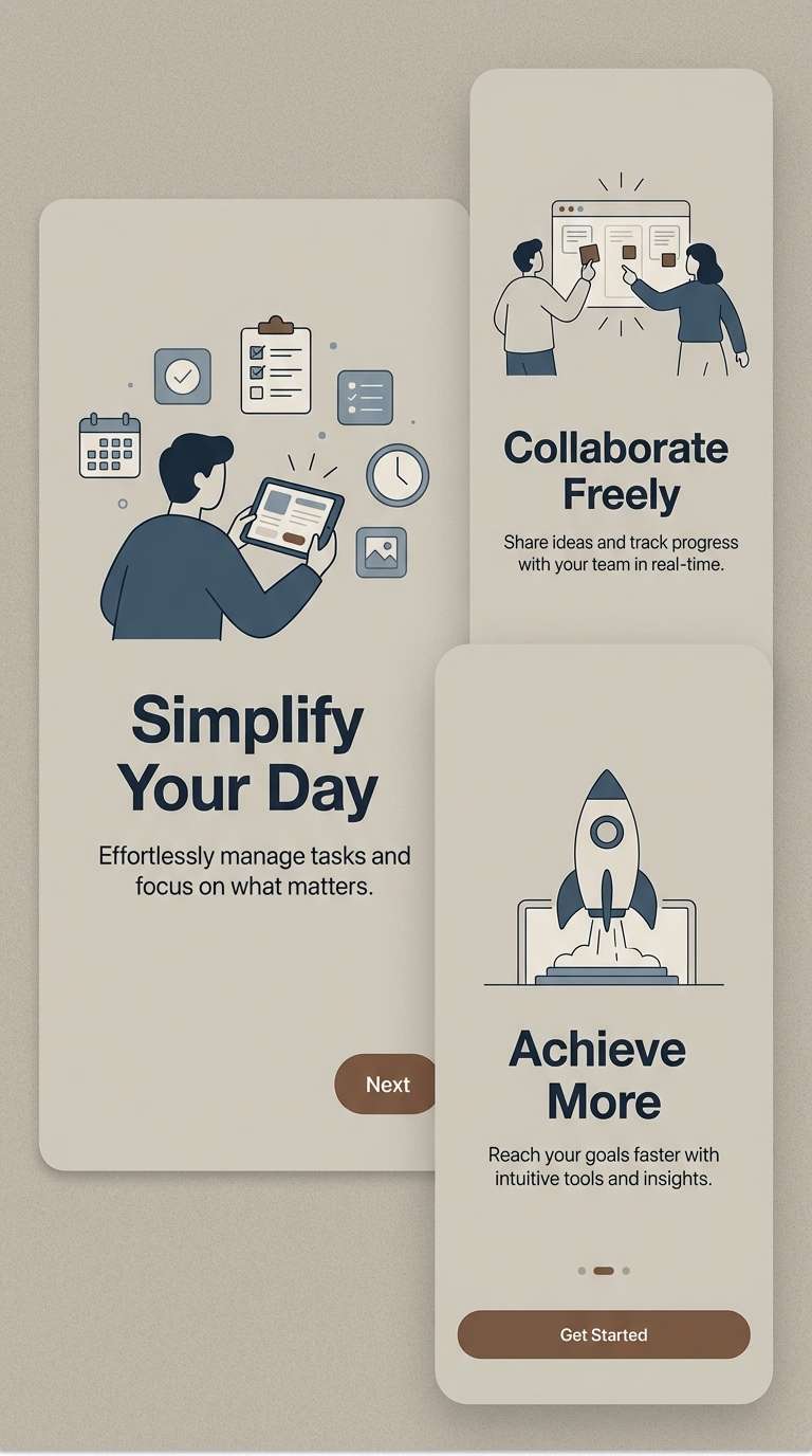
14) Dusk Over Seattle
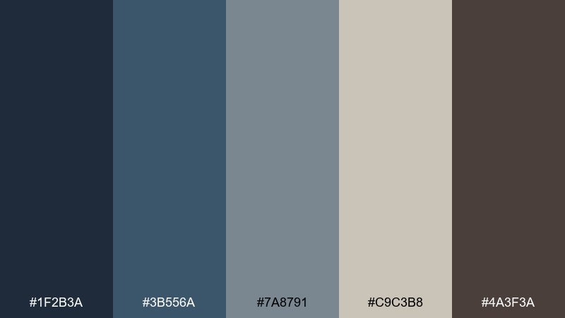
HEX: #1f2b3a #3b556a #7a8791 #c9c3b8 #4a3f3a
Mood: rainy, calm, cinematic
Best for: music app onboarding screens
Rainy dusk blues and softened grays bring to mind city lights reflecting on wet streets. Use the deep navy for headers and the pale stone for background panels to keep onboarding readable. It works well for music apps and streaming features that want a cinematic mood without heavy blacks. Tip: keep illustrations monochrome and let the blue-gray do most of the emotional lifting.
Image example of dusk over seattle generated using media.io
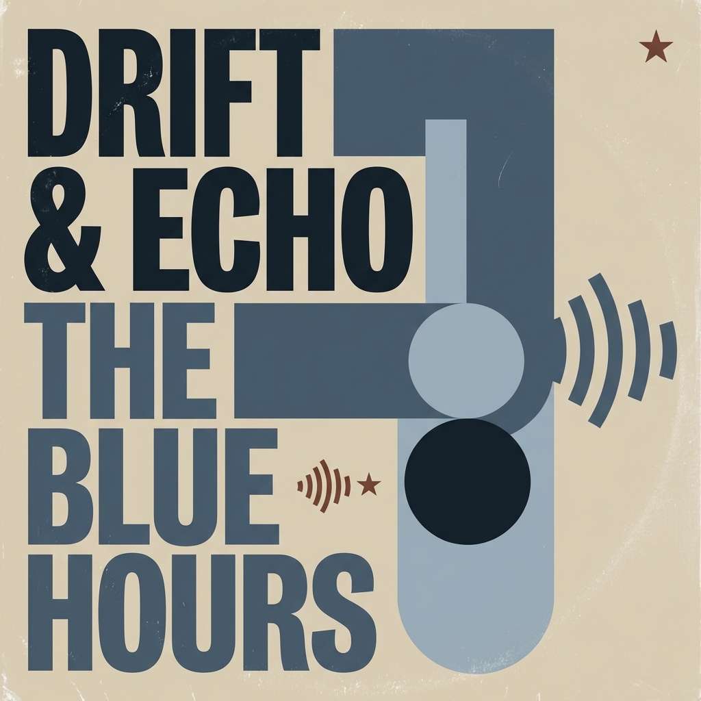
15) Vinyl Sleeve Blues
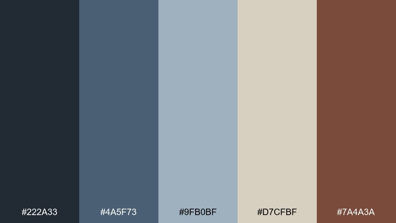
HEX: #222a33 #4a5f73 #9fb0bf #d7cfbf #7a4a3a
Mood: cool, nostalgic, polished-grunge
Best for: album cover concepts and streaming banners
Cool blues and paper-warm neutrals feel like a well-loved vinyl sleeve with slightly worn edges. As a 90s grunge color palette, it balances clarity and grit for modern music visuals. Use the mid blue for main shapes, keep type in deep navy, and let the warm brown appear as a small highlight or sticker detail. Tip: add a subtle crease or scuff texture so the pale blue reads authentic rather than corporate.
Image example of vinyl sleeve blues generated using media.io
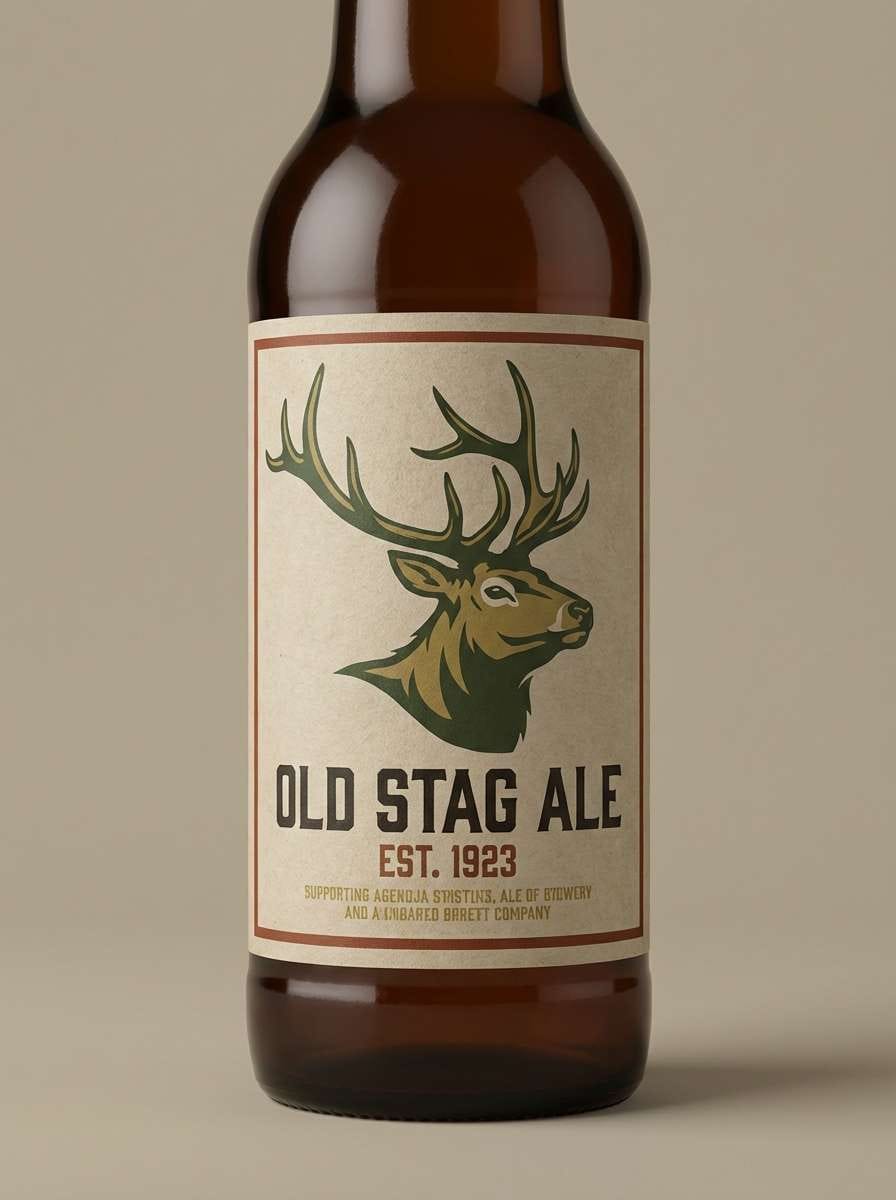
16) Oxide & Olive
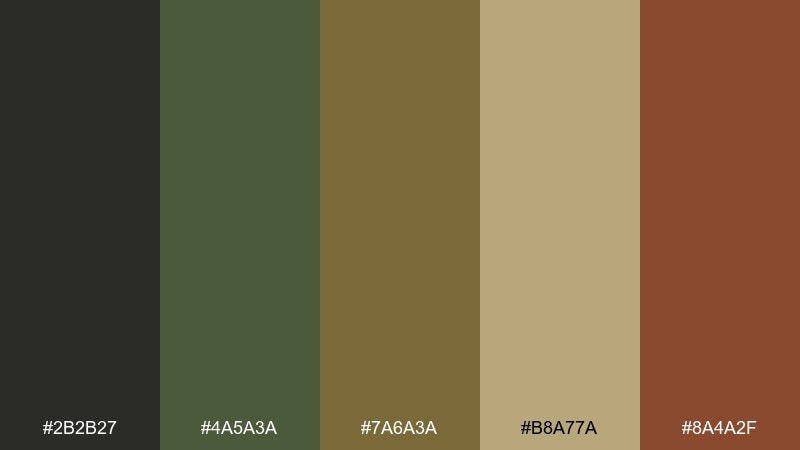
HEX: #2b2b27 #4a5a3a #7a6a3a #b8a77a #8a4a2f
Mood: dusty, rugged, earthy
Best for: beer labels and vintage-style packaging
Dusty olive and oxide orange evoke rusted tools, dry grass, and old workshop signs. Use the deep neutral for brand marks, then layer olive and mustard for pattern and hierarchy. It is a great fit for beer labels, vintage-style packaging, and badges where you want a rugged handmade feel. Tip: print with a slightly muted finish so the orange looks oxidized, not bright.
Image example of oxide & olive generated using media.io
17) Puddle Reflection
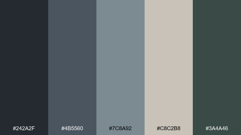
HEX: #242a2f #4b5560 #7c8a92 #c8c2b8 #3a4a46
Mood: quiet, wet, understated
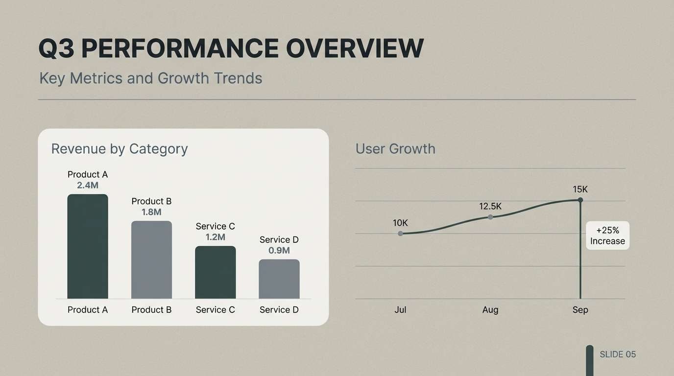
Best for: presentation decks and reports
Quiet blue-grays and softened neutrals feel like a cloudy reflection in a street puddle. Use the mid slate for charts and section dividers, then anchor titles with the deep charcoal. It works nicely for presentation decks and reports that should look modern but not glossy. Tip: keep the background near the pale neutral and use only one saturated block at a time to avoid visual noise.
Image example of puddle reflection generated using media.io
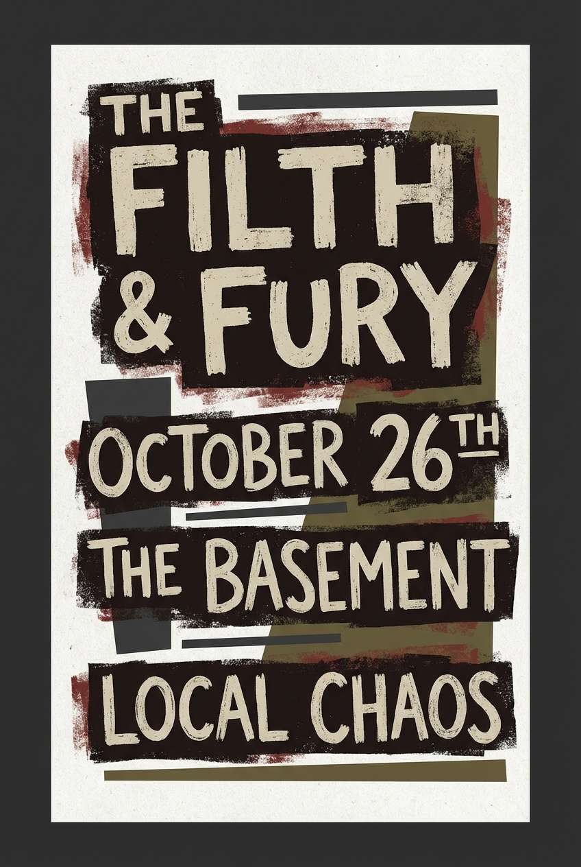
18) Band Poster Ink
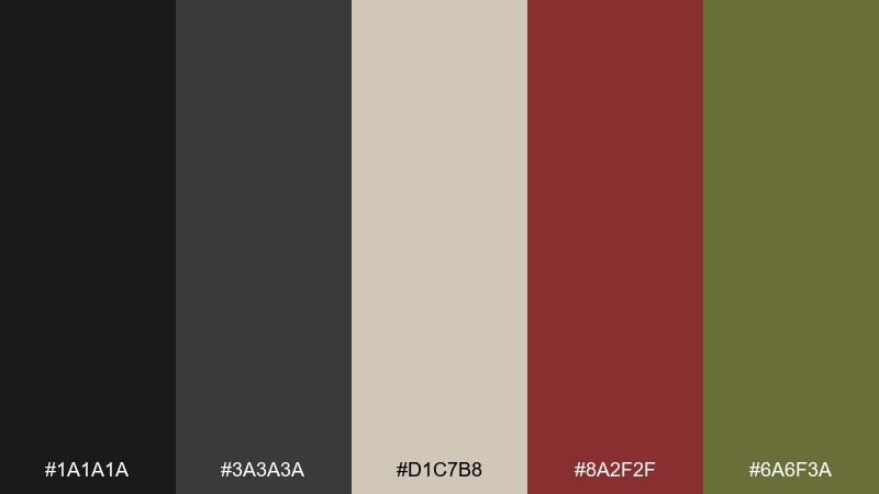
HEX: #1a1a1a #3a3a3a #d1c7b8 #8a2f2f #6a6f3a
Mood: bold, gritty, high-contrast
Best for: punk and grunge gig posters
Bold and gritty like thick ink on cheap paper, this set pushes contrast without needing bright colors. Lean on black and parchment for the main layout, then use the deep red for the headline or venue name. It is perfect for gig posters, tour announcements, and print ads where type must hit fast. Tip: keep the olive as a small supporting accent so the red stays the star.
Image example of band poster ink generated using media.io
19) Brick and Sludge
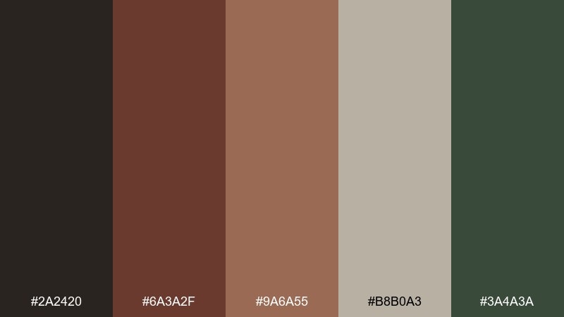
HEX: #2a2420 #6a3a2f #9a6a55 #b8b0a3 #3a4a3a
Mood: warm, dirty, urban
Best for: restaurant menus and chalkboard-style ads
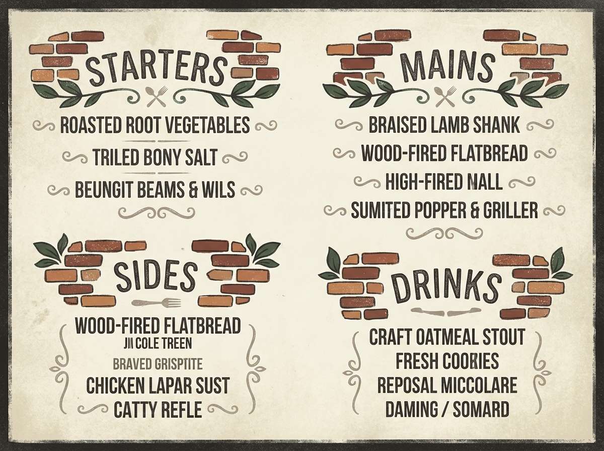
Warm brick reds and dirty neutrals evoke alleyway walls, worn leather, and late-night diner booths. Use the deep brown for text and outlines, with brick as your primary accent for section headers or stamps. It suits menus, chalkboard-style ads, and signage that should feel handmade and inviting. Tip: limit large red areas and instead let the beige carry the page to keep the design readable.
Image example of brick and sludge generated using media.io
20) Soft Static
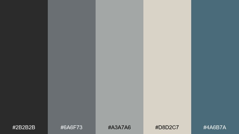
HEX: #2b2b2b #6a6f73 #a3a7a6 #d8d2c7 #4a6b7a
Mood: calm, airy, analog
Best for: minimal UI kits and design systems
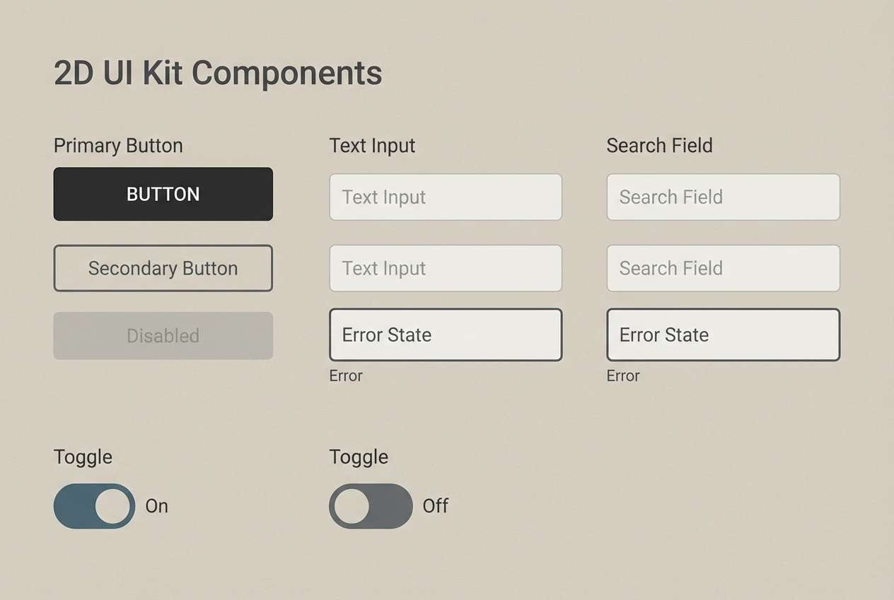
Calm and airy like TV static fading into silence, these tones keep grunge subtle and usable. The gray ladder gives you instant hierarchy for components, while the muted blue adds just enough personality for links and focus states. It is ideal for UI kits and design systems that need to feel human, not sterile. Tip: apply the blue sparingly to interactive elements so the system stays cohesive at scale.
Image example of soft static generated using media.io
What Colors Go Well with 90s Grunge?
90s grunge colors pair best with other “quiet” tones: charcoal, soot black, paper beige, greige, and concrete gray. These neutrals act like ink and paper, so your layout stays readable even with heavy texture.
For accents, lean into weathered color—rust, brick red, oxidized orange, muddy plum, or muted olive. Use accents sparingly (buttons, stamps, headers, icons) so they feel like found objects rather than modern neon.
If you want a fresher direction, add a light blue highlight (washed denim or pale steel blue). It keeps the grunge vibe but adds air and modern UI clarity.
How to Use a 90s Grunge Color Palette in Real Designs
Start with a two-layer foundation: a dark “ink” (near-black/charcoal) and a light “paper” (parchment/greige). Then choose one mid-tone (denim blue, slate, olive) to carry panels, cards, and secondary blocks.
Save your warm accent (rust/brick/mustard) for one job only—CTAs, badges, venue names, price tags, or small icon fills. That restriction makes the design feel intentional, not muddy.
Finally, add texture thoughtfully: a light grain overlay, halftone dots, scuffed edges, or photocopy noise. Keep the color flat underneath so the texture reads authentic instead of glossy.
Create 90s Grunge Palette Visuals with AI
Want to see these HEX codes in action before you commit to a poster, brand board, or UI kit? Generate quick mockups using a text prompt and your palette’s dominant and accent colors.
With Media.io’s text-to-image tool, you can iterate fast—swap the “paper” tone, adjust how strong the denim blue feels, or test rust accents on different compositions.
90s Grunge Color Palette FAQs
-
What defines a 90s grunge color palette?
Muted, worn-looking colors (denim blues, charcoals, greige, olive, rust) with “paper + ink” contrast. The goal is raw, analog mood—not bright saturation. -
Are grunge palettes always dark?
No. Many grunge schemes are low-contrast and light (parchment, concrete gray, washed blue) and rely on texture and typography for attitude. -
What’s the best accent color for grunge designs?
Rust, brick red, oxidized orange, mustard, or dusty brown work well. Use one accent at a time so it feels like a printed stamp or sticker detail. -
How do I keep grunge UI readable?
Use a clear neutral background, set body text on light “paper” tones, and reserve the darkest charcoal for headings and navigation. Keep accents for active/focus states only. -
Do 90s grunge palettes work for branding?
Yes—especially for coffee shops, barbers, music projects, streetwear, and craft packaging. They communicate tactile authenticity and a retro edge without looking trendy. -
What textures pair best with grunge colors?
Photocopy grain, halftones, distressed ink, crumpled paper, and subtle scuffs. Avoid glossy gradients; flat color plus texture reads more authentic. -
Can I generate grunge palette mockups with AI?
Yes. Use a prompt that specifies layout type (poster, UI kit, label, album cover), add “distressed” or “photocopy grain,” and include your dominant and accent HEX colors for consistency.
Next: Light Blue Color Palette


