

Yellow cream is the kind of warm neutral that instantly makes designs feel brighter, softer, and more inviting. It sits between sunny pastel yellow and cozy beige, so it works in both modern minimal and rustic, textured styles.
Below you’ll find 20 ready-to-use yellow cream color palettes with HEX codes, plus quick guidance on pairings for branding, interiors, and UI.
In this article
- Why Yellow Cream Palettes Work So Well
-
- buttercream sunrise
- lemon meringue linen
- honey oat minimal
- warm vanilla studio
- marigold latte
- citrus cream pop
- sandstone butter
- pale gold editorial
- soft saffron spa
- custard clay kitchen
- sunlit wheat branding
- creamy mustard retro
- daffodil drift nursery
- golden parchment ui
- buttered sage garden
- almond cream wedding
- apricot custard packaging
- caramel cream cozy
- light ochre workspace
- champagne butter nightfall
- What Colors Go Well with Yellow Cream?
- How to Use a Yellow Cream Color Palette in Real Designs
- Create Yellow Cream Palette Visuals with AI
Why Yellow Cream Palettes Work So Well
Yellow cream palettes feel optimistic without being loud. Because the hue is softened with white and beige, it adds warmth while still reading as a neutral base in layouts.
They’re also highly flexible across mediums: in print they look friendly and premium on natural paper stocks, while on screens they reduce the harshness of pure white backgrounds and make interfaces feel more human.
Most importantly, yellow cream plays nicely with both warm and cool accents—think terracotta and cocoa for coziness, or slate and sage for a calm, modern balance.
20+ Yellow Cream Color Palette Ideas (with HEX Codes)
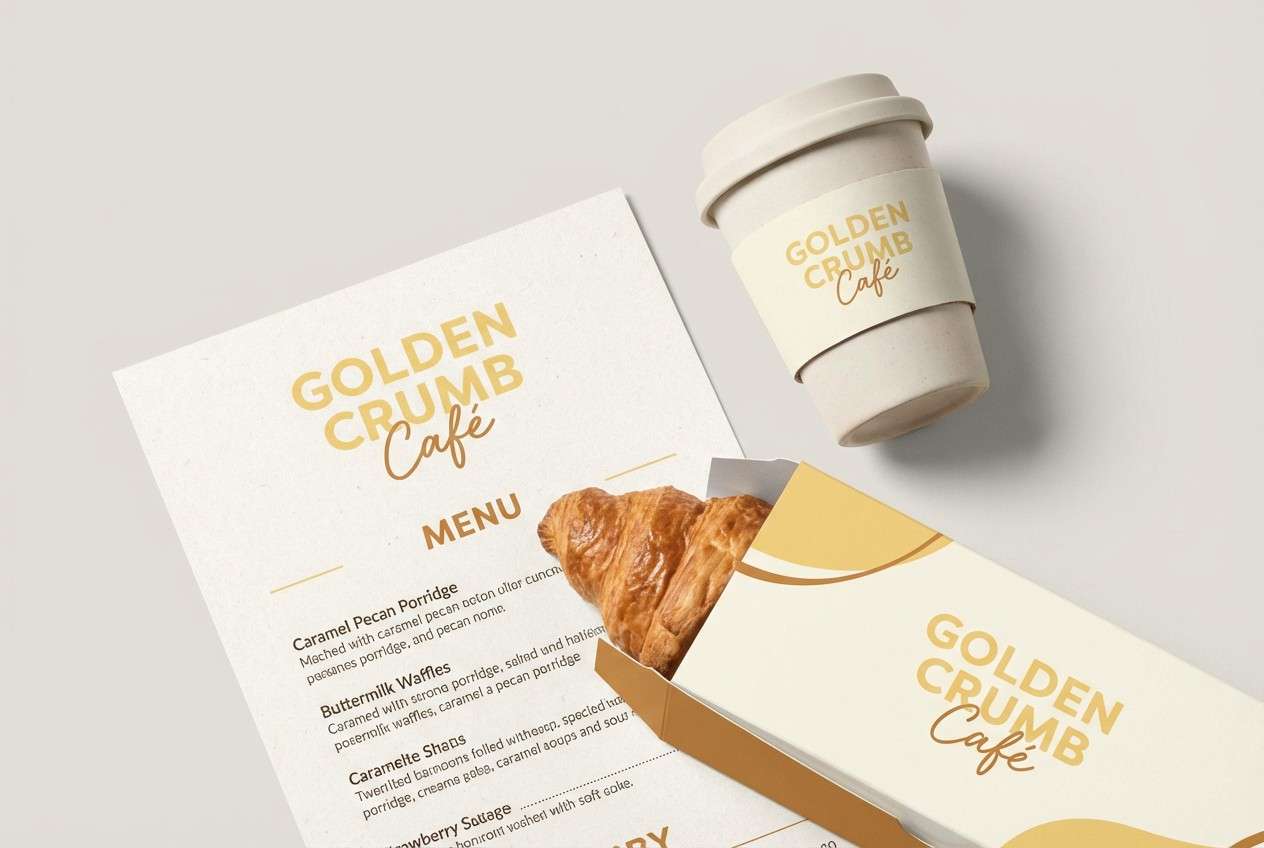
1) Buttercream Sunrise
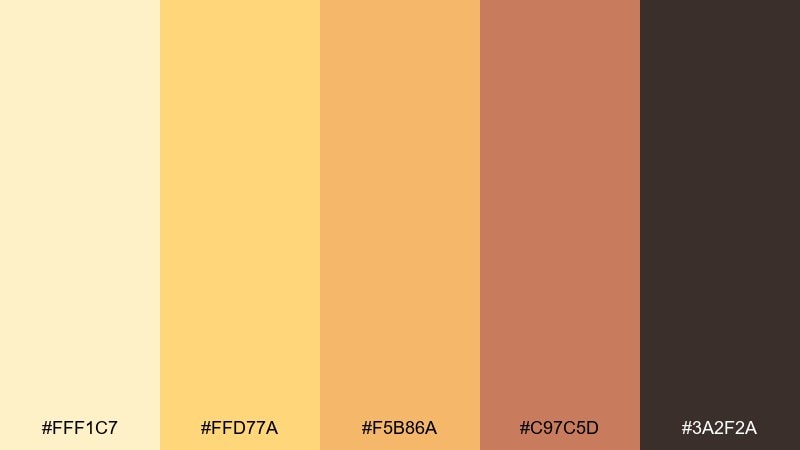
HEX: #fff1c7 #ffd77a #f5b86a #c97c5d #3a2f2a
Mood: cheerful and warm
Best for: breakfast cafe branding
Cheerful morning light and warm pastries come to mind, with a soft glow that feels welcoming. This mix works beautifully for food brands, cafe menus, and friendly packaging where warmth matters. Pair it with natural paper textures and a deep espresso brown for legible type. Usage tip: keep the dark brown for headlines only so the creams stay airy in the layout.
Image example of buttercream sunrise generated using media.io
Media.io is an online AI studio for creating and editing video, image, and audio in your browser.

2) Lemon Meringue Linen
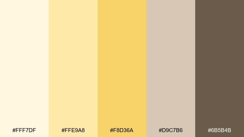
HEX: #fff7df #ffe9a8 #f8d36a #d9c7b6 #6b5b4b
Mood: light and breezy
Best for: spring home decor styling
Light and breezy like sun on linen curtains, this set feels clean without turning sterile. It shines in airy rooms, tablescapes, and lifestyle content where you want warmth with restraint. Pair the pale yellows with textured neutrals like flax, oak, and matte ceramics. Usage tip: repeat the linen beige in large surfaces and keep the darker brown for small contrast moments.
Image example of lemon meringue linen generated using media.io

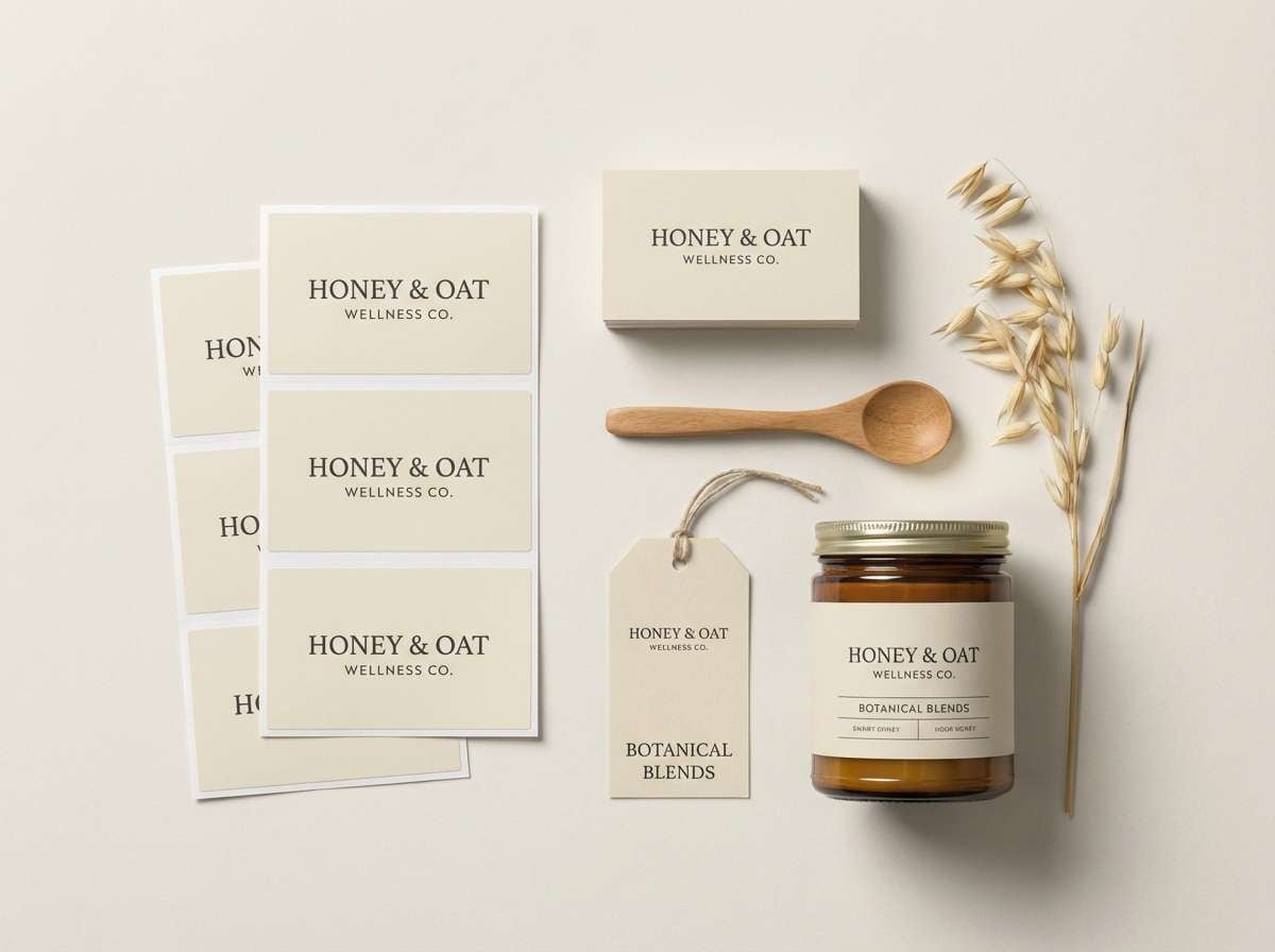
3) Honey Oat Minimal
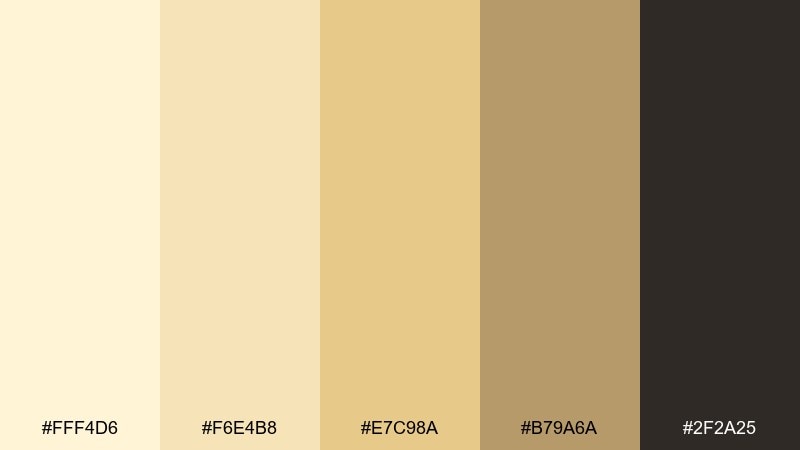
HEX: #fff4d6 #f6e4b8 #e7c98a #b79a6a #2f2a25
Mood: calm and minimal
Best for: wellness brand identity
Calm and grounded like oats, honey, and warm paper, this palette reads as quiet confidence. It suits wellness brands, nutrition labels, and soft editorial layouts that need trust and clarity. Pair it with simple sans-serif type and plenty of white space to keep the look modern. Usage tip: use the oat midtone for icons and dividers so the light creams remain the hero.
Image example of honey oat minimal generated using media.io
4) Warm Vanilla Studio
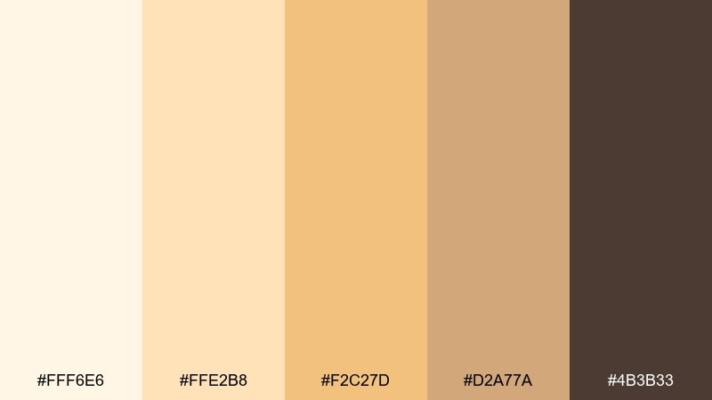
HEX: #fff6e6 #ffe2b8 #f2c27d #d2a77a #4b3b33
Mood: soft and welcoming
Best for: portrait photography presets
Soft and welcoming like a sunlit studio wall, these tones flatter skin and keep shadows gentle. They work well for portrait preset branding, gallery websites, and creator portfolios that lean warm. Pair with chocolate brown text and subtle grain for a film-inspired finish. Usage tip: keep saturation modest so the vanilla highlight stays creamy instead of neon.
Image example of warm vanilla studio generated using media.io

5) Marigold Latte
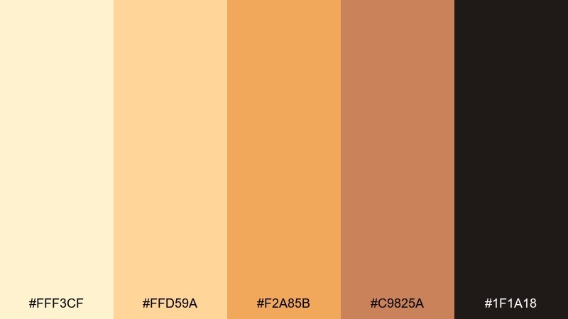
HEX: #fff3cf #ffd59a #f2a85b #c9825a #1f1a18
Mood: cozy and bold
Best for: coffee packaging design
Cozy and bold like marigold foam art, it brings energy without losing comfort. Use it for coffee bags, cafe ads, and product pages that need appetite appeal. Pair the marigold with deep near-black for premium contrast and add the latte beige as breathing room. Usage tip: reserve the brightest orange-yellow for seals, badges, and key calls to action.
Image example of marigold latte generated using media.io
6) Citrus Cream Pop
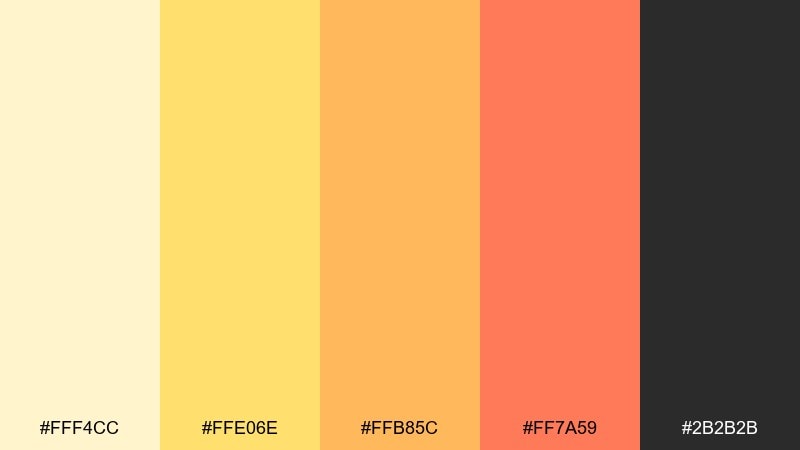
HEX: #fff4cc #ffe06e #ffb85c #ff7a59 #2b2b2b
Mood: playful and energetic
Best for: summer event poster
Playful and energetic like citrus soda, this set feels loud in the best way. It is ideal for posters, social promos, and summer campaigns that need quick attention at a distance. These yellow cream color combinations look best with chunky type and simple shapes, letting the warm coral do the shouting. Usage tip: keep backgrounds mostly cream so the coral accent stays crisp and readable.
Image example of citrus cream pop generated using media.io

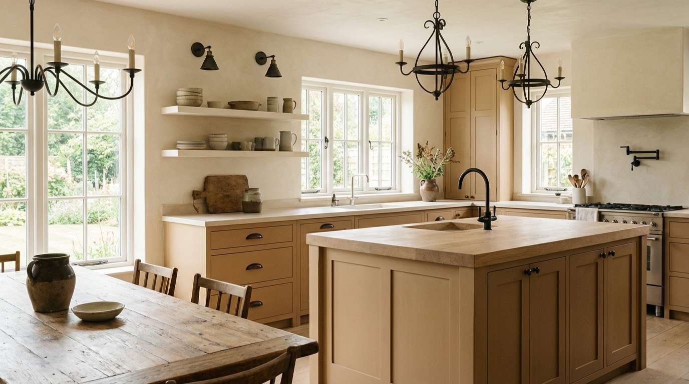
7) Sandstone Butter
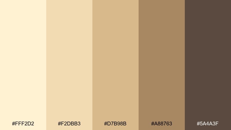
HEX: #fff2d2 #f2dbb3 #d7b98b #a88763 #5a4a3f
Mood: earthy and serene
Best for: modern farmhouse kitchen
Earthy and serene like sandstone warmed by late sun, it feels stable and lived-in. It fits farmhouse kitchens, rustic websites, and product photography backdrops where texture matters. Pair it with matte black hardware and oak wood tones to keep the look contemporary. Usage tip: use the mid sandstone as the main wall or background color and let cream show up in trim and textiles.
Image example of sandstone butter generated using media.io
8) Pale Gold Editorial
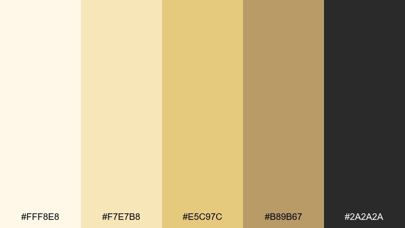
HEX: #fff8e8 #f7e7b8 #e5c97c #b89b67 #2a2a2a
Mood: refined and airy
Best for: magazine layout design
Refined and airy like gilded paper, these tones feel polished without looking flashy. They are great for magazine spreads, lookbooks, and long-form reading experiences where comfort matters. Pair the pale gold with charcoal text and generous margins for a premium, readable rhythm. Usage tip: use gold only in headings and pull quotes to avoid visual fatigue.
Image example of pale gold editorial generated using media.io
9) Soft Saffron Spa
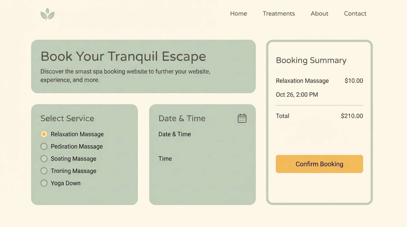
HEX: #fff6da #ffe6a6 #f6c86b #9bb08a #3b3f3a
Mood: fresh and restorative
Best for: spa website UI
Fresh and restorative like saffron tea with herbs, it balances warmth with a hint of green calm. It works well for spa websites, booking flows, and wellness dashboards that need a soothing tone. Pair the sage green with cream backgrounds and keep the darkest gray for text and form borders. Usage tip: use the soft yellow as a highlight state rather than a full button fill to maintain tranquility.
Image example of soft saffron spa generated using media.io
10) Custard Clay Kitchen
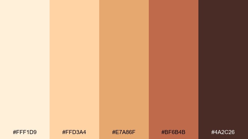
HEX: #fff1d9 #ffd3a4 #e7a86f #bf6b4b #4a2c26
Mood: homey and rustic
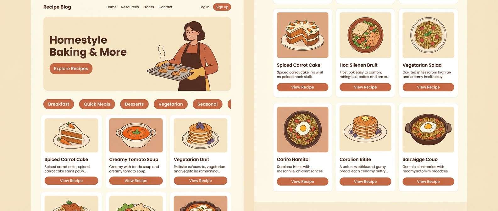
Best for: recipe blog theme
Homey and rustic like custard baked in a clay dish, this set feels handmade and comforting. It is a strong fit for recipe blogs, cooking newsletters, and food photography overlays. Pair with warm terracotta accents and dark cocoa text for readability on light backgrounds. Usage tip: keep the terracotta for buttons and category tags so navigation is easy to scan.
Image example of custard clay kitchen generated using media.io
11) Sunlit Wheat Branding
HEX: #fff7e1 #ffe3a1 #f2c96f #c9b08a #2e2c28
Mood: optimistic and grounded
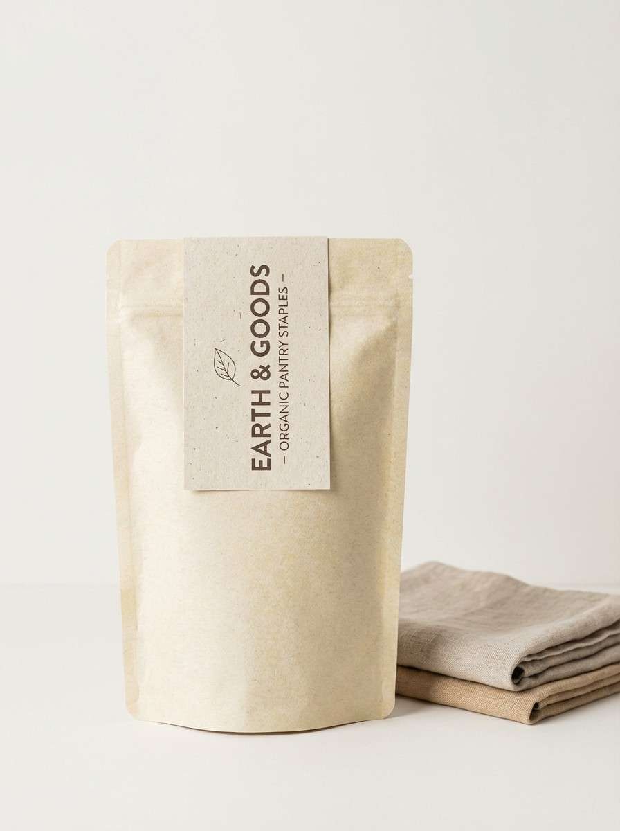
Best for: eco brand packaging
Optimistic and grounded like a wheat field at noon, it reads natural and trustworthy. For eco packaging, it creates a soft premium feel while staying approachable on shelves. This yellow cream color scheme pairs nicely with recycled paper, muted greens, and minimal line icons. Usage tip: print the wheat midtone as a subtle pattern and keep the darkest color for compliance text and barcodes.
Image example of sunlit wheat branding generated using media.io
12) Creamy Mustard Retro
HEX: #fff0c5 #f5d57b #d8a13b #7a5b3a #2a1f18
Mood: retro and punchy
Best for: mid-century poster art
Retro and punchy like mid-century prints, these shades feel nostalgic yet graphic. They are perfect for posters, album covers, and bold social templates with chunky shapes. Pair mustard with warm browns and a touch of cream for breathing room around typography. Usage tip: lean on flat fills and simple textures to keep the vintage vibe consistent.
Image example of creamy mustard retro generated using media.io
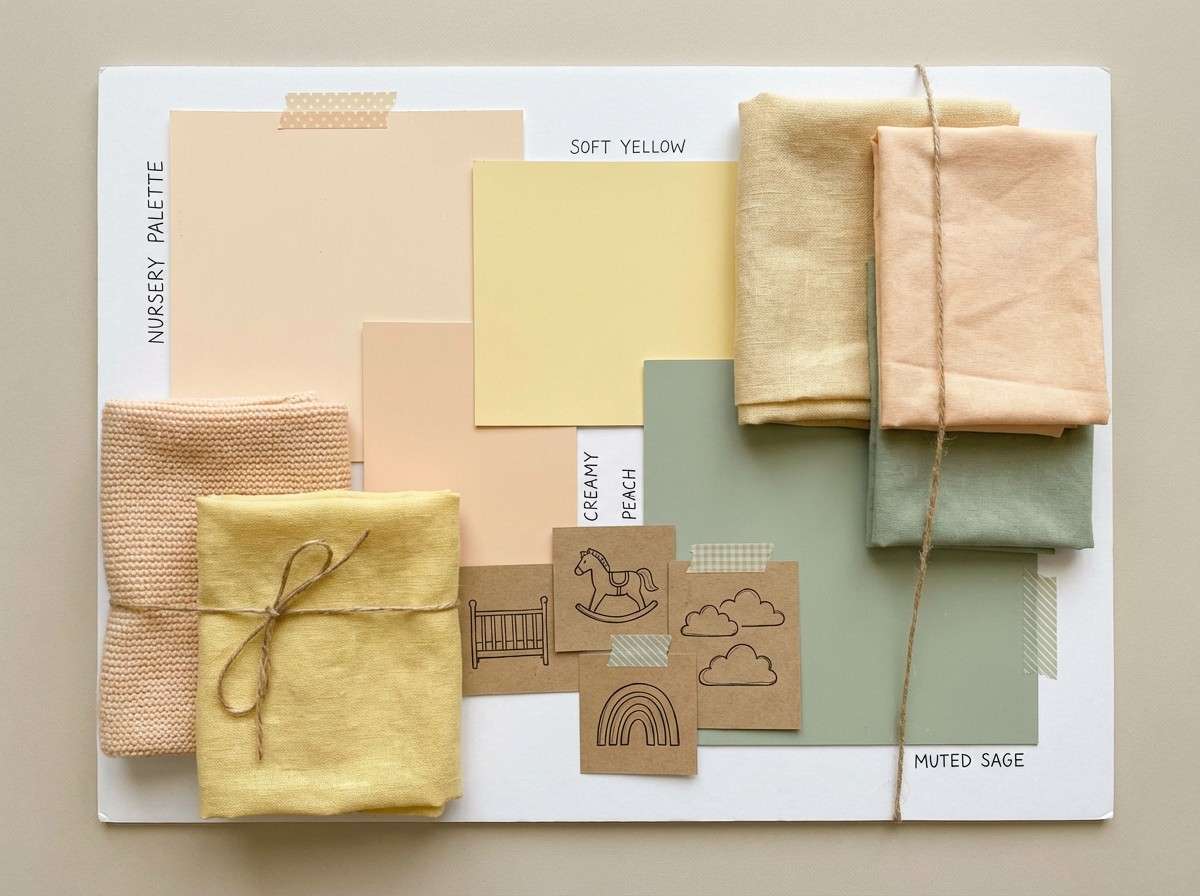
13) Daffodil Drift Nursery
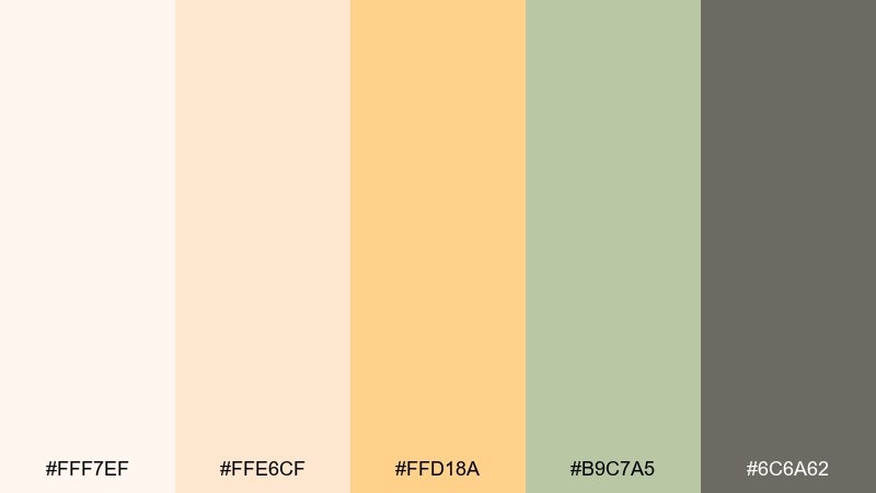
HEX: #fff7ef #ffe6cf #ffd18a #b9c7a5 #6c6a62
Mood: gentle and sweet
Best for: nursery room moodboard
Gentle and sweet like daffodils and soft blankets, this mix feels tender and safe. It suits nursery moodboards, baby shower graphics, and calm family photo albums. Pair the warm peachy cream with muted sage accents and keep gray for outlines and small text. Usage tip: use the sage as a repeating accent in patterns to avoid an overly yellow room.
Image example of daffodil drift nursery generated using media.io
14) Golden Parchment UI
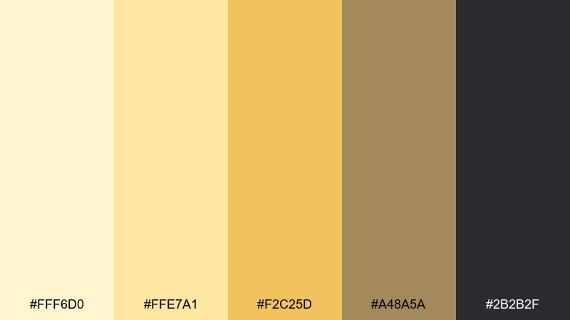
HEX: #fff6d0 #ffe7a1 #f2c25d #a48a5a #2b2b2f
Mood: classic and clear
Best for: dashboard UI design
Classic and clear like golden parchment, it keeps interfaces warm while staying professional. Use it for dashboards, admin panels, and analytics views where long sessions need visual comfort. A yellow cream color palette like this benefits from strong typographic hierarchy and restrained highlights. Usage tip: apply the gold as status chips and progress bars, not as large panels, to prevent glare.
Image example of golden parchment ui generated using media.io

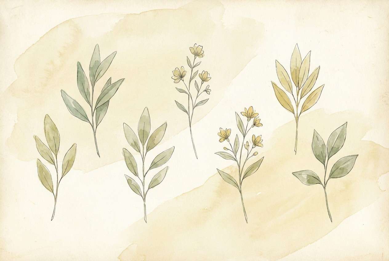
15) Buttered Sage Garden
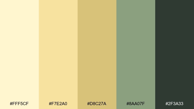
HEX: #fff5cf #f7e2a0 #d8c27a #8aa07f #2f3a33
Mood: natural and balanced
Best for: botanical illustration set
Natural and balanced like a garden path in soft sun, it blends warm cream with quiet greens. It fits botanical illustration packs, eco stationery, and calming blog headers. Pair the sage with textured off-white paper and keep the darkest green for outlines and labels. Usage tip: paint large washes in cream first, then layer green details for depth without harsh contrast.
Image example of buttered sage garden generated using media.io
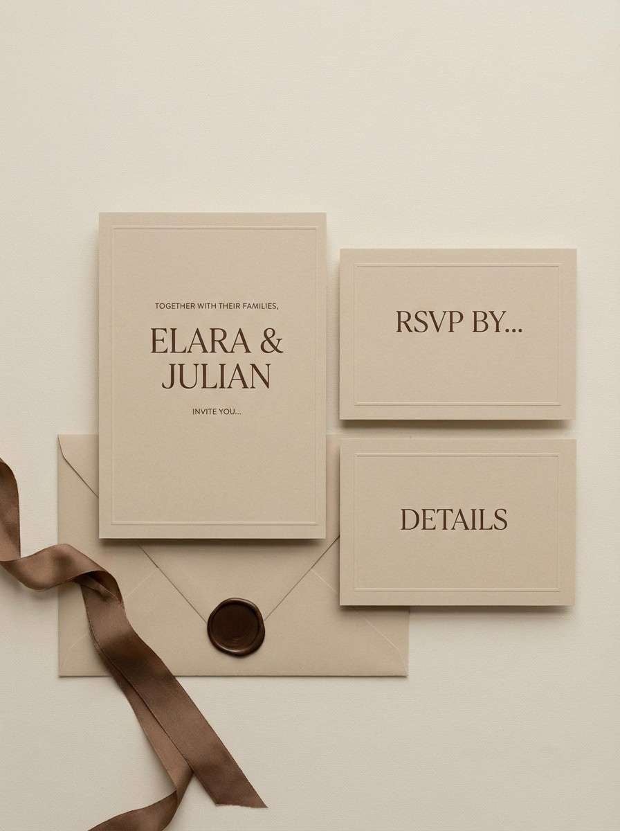
16) Almond Cream Wedding
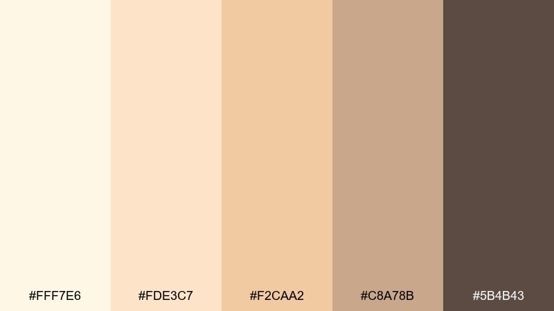
HEX: #fff7e6 #fde3c7 #f2caa2 #c8a78b #5b4b43
Mood: romantic and timeless
Best for: wedding invitation suite
Romantic and timeless like almond cream and champagne silk, it feels soft but elevated. It is a great choice for invitations, place cards, and ceremony signage with a warm neutral lean. Pair it with fine serif type and a thin brown rule line to frame the layout. Usage tip: use the deepest brown only for names and key details to keep the suite delicate.
Image example of almond cream wedding generated using media.io
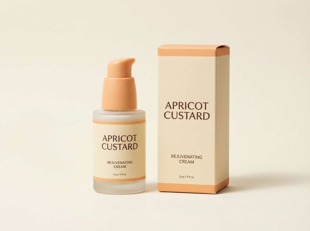
17) Apricot Custard Packaging
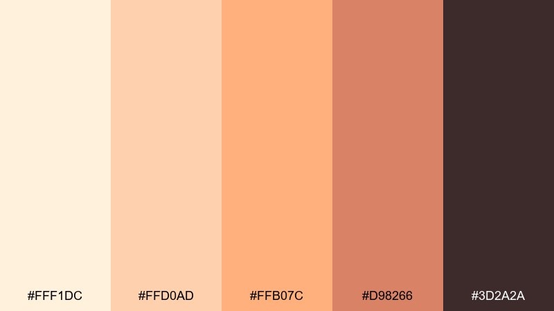
HEX: #fff1dc #ffd0ad #ffb07c #d98266 #3d2a2a
Mood: sweet and modern
Best for: skincare product packaging
Sweet and modern like apricot custard, it brings warmth that feels youthful and clean. It suits skincare packaging, beauty landing pages, and product ads that need a friendly glow. Pair the apricot with cream for large areas and use the dark cocoa for ingredient lists and contrast. Usage tip: add a matte finish and keep gradients subtle so the colors look premium, not sugary.
Image example of apricot custard packaging generated using media.io
18) Caramel Cream Cozy
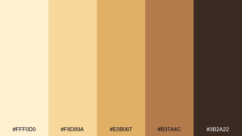
HEX: #fff0d0 #f8d89a #e0b067 #b37a4c #3b2a22
Mood: cozy and indulgent
Best for: fall social media templates
Cozy and indulgent like caramel drizzle, this set feels snug and seasonal. It works for fall promos, cafe Instagram templates, and warm lifestyle reels. These yellow cream color combinations pair especially well with kraft textures and soft shadowed shapes. Usage tip: keep the caramel midtone as your main accent and let cream dominate the background for an easy-to-read feed.
Image example of caramel cream cozy generated using media.io
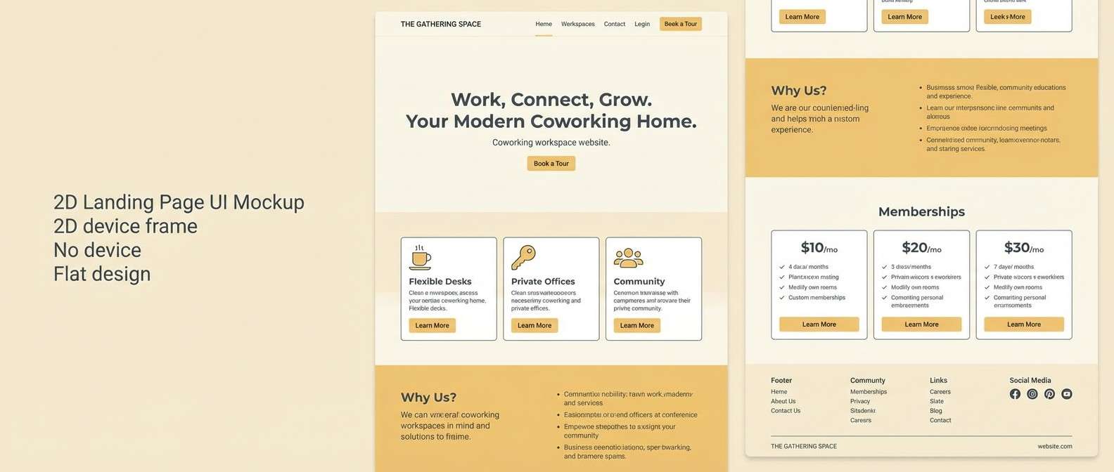
19) Light Ochre Workspace
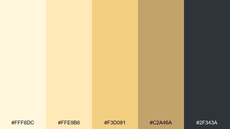
HEX: #fff6dc #ffe9b6 #f3d081 #c2a46a #2f343a
Mood: focused and upbeat
Best for: workspace landing page
Focused and upbeat like a tidy desk in morning light, it keeps energy high without distraction. It is ideal for productivity tools, coworking spaces, and landing pages that need friendly professionalism. Pair the ochre with cool slate text for crisp legibility and add plenty of spacing to stay modern. Usage tip: use the brightest yellow only for primary buttons so conversion points stand out.
Image example of light ochre workspace generated using media.io
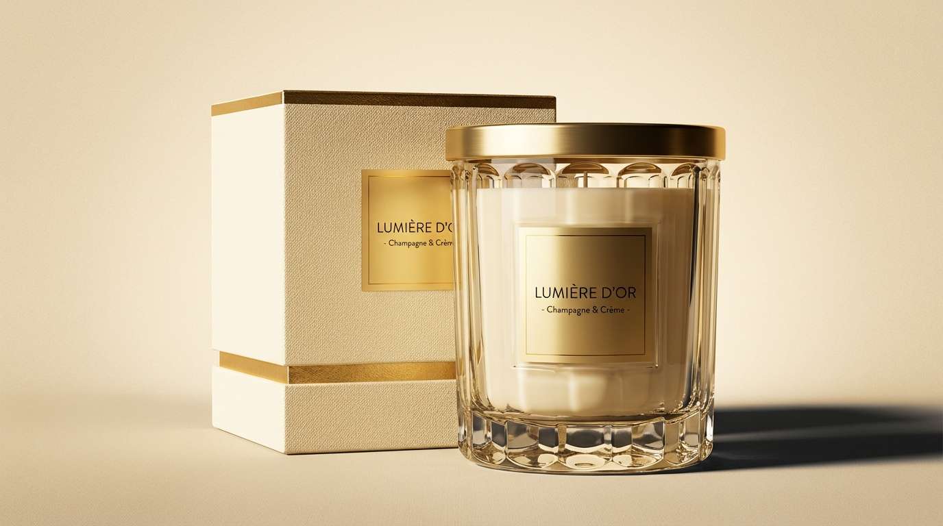
20) Champagne Butter Nightfall
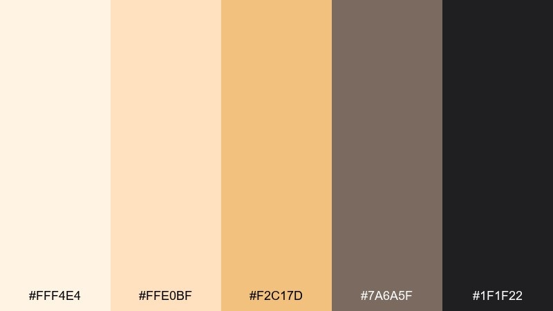
HEX: #fff4e4 #ffe0bf #f2c17d #7a6a5f #1f1f22
Mood: elegant and moody
Best for: luxury candle brand ad
Elegant and moody like champagne glow at night, it balances softness with cinematic contrast. It works beautifully for luxury candles, fragrance ads, and premium gift sets. For a refined yellow cream color palette, pair the warm highlight with deep charcoal and keep layouts minimal. Usage tip: spotlight products with a cream-to-champagne gradient and let the darkest tone frame the edges for drama.
Image example of champagne butter nightfall generated using media.io
What Colors Go Well with Yellow Cream?
Yellow cream pairs naturally with grounded neutrals like cocoa brown, charcoal, warm gray, and taupe—these give you contrast for typography and structure without cooling the palette too much.
For a fresher, calmer feel, add muted greens such as sage, olive, or eucalyptus. This creates a balanced “warm sun + soft nature” harmony that works especially well in wellness, home decor, and lifestyle branding.
If you want energy, introduce warm accents like coral, terracotta, or apricot. Keep those brighter tones as small, intentional highlights so the creamy base stays light and premium.
How to Use a Yellow Cream Color Palette in Real Designs
Start by assigning roles: use the lightest cream as your background, a mid honey/ochre as your secondary surface color, and the darkest brown/charcoal for text. This keeps readability high while preserving the soft mood.
In branding and packaging, yellow cream looks best with tactile cues—paper textures, subtle grain, and matte finishes. In digital UI, use it to reduce glare: cream backgrounds with restrained yellow highlights can feel more comfortable than stark white.
To avoid a “washed out” look, add one anchor color (deep brown, slate, or dark green) and repeat it in small elements like headings, icons, and dividers for consistency.
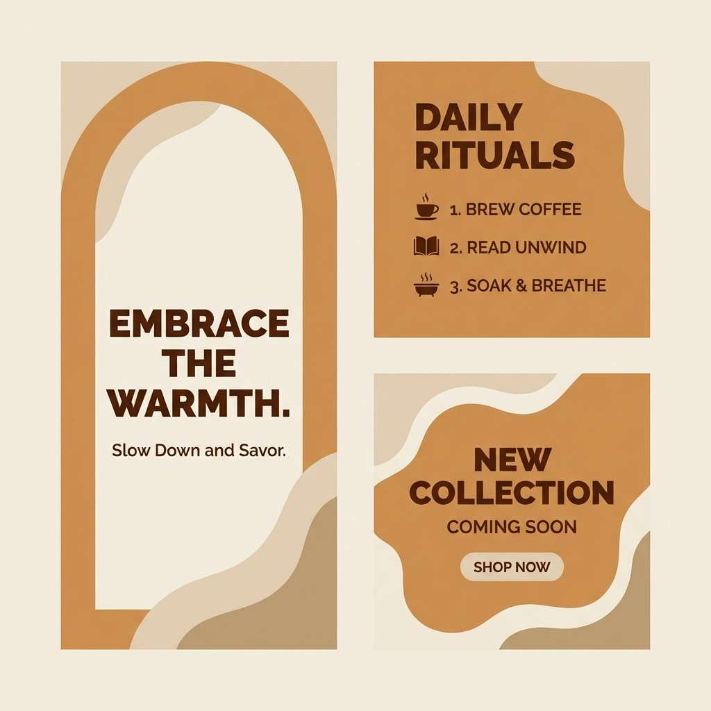
Create Yellow Cream Palette Visuals with AI
If you’re building a moodboard, poster, UI mockup, or product scene, generating visuals from a color direction is a fast way to validate the vibe before you design everything.
Use the prompts included under each palette as a starting point, then tweak subjects (e.g., “skincare,” “kitchen,” “editorial layout”) while keeping the same yellow cream tone language.
When you get a result you like, iterate by adjusting lighting (“soft natural light,” “studio seamless”), materials (“linen,” “kraft paper,” “matte ceramic”), and contrast (“deep charcoal typography”) to match your use case.
Yellow Cream Color Palette FAQs
-
What is a yellow cream color?
Yellow cream is a soft, pale yellow tinted with white and often a touch of beige, giving it a warm, buttery neutral look that feels sunny but not saturated. -
Is yellow cream a good background color for websites?
Yes—used lightly, yellow cream can be a comfortable alternative to pure white, reducing glare while keeping layouts bright. Pair it with dark charcoal or deep brown text for accessibility. -
What accent colors work best with yellow cream?
Sage/olive greens for calm balance, terracotta/coral for warmth and energy, and charcoal/slate for modern contrast are among the easiest accents to pair with yellow cream. -
How do I keep a yellow cream palette from looking “too yellow”?
Let cream dominate large areas, add neutral beiges/taupes for structure, and reserve the stronger yellow or orange tones for small highlights like buttons, tags, or icons. -
What’s the best text color on yellow cream?
Deep brown, espresso, charcoal, or near-black typically provide the cleanest contrast and keep the palette feeling premium and readable. -
Does yellow cream work for branding and packaging?
It’s a strong choice for friendly, trustworthy brands (food, wellness, home, eco). It also prints beautifully on natural or recycled paper, especially with matte finishes. -
How can I generate yellow cream palette visuals quickly?
You can use an AI text-to-image tool and describe your scene plus the color mood (buttery cream, soft lemon, honey accents, deep brown type). Start with the prompts above and iterate.


