

A great living room color palette makes decorating easier because every choice (paint, sofa, rug, art) has a built-in “yes/no” filter. Instead of guessing, you’re coordinating.
Below are 20 curated living room color schemes with HEX codes, plus practical tips and AI prompts you can use to generate visuals before you commit to paint or textiles.
In this article
- Why Living Room Palettes Work So Well
-
- sunlit linen
- charcoal and cashmere
- coastal mist
- sage hearth
- terracotta night
- midnight teal luxe
- blush gallery
- denim and driftwood
- olive library
- modern greige
- citrus clay
- soft monochrome
- lavender dusk
- rust and indigo
- desert palm
- chocolate marble
- pearl and peacock
- misty blue calm
- warm walnut
- playful pastel pop
- What Colors Go Well with Living Room?
- How to Use a Living Room Color Palette in Real Designs
- Create Living Room Palette Visuals with AI
Why Living Room Palettes Work So Well
A living room is usually the most visually “mixed” room in the home: upholstery, wood tones, rugs, metal finishes, wall art, and lighting all share the same sightline. A defined palette keeps those elements from competing.
Palettes also help you control mood. Warm neutrals read cozy, blue-grays feel restful, and deep greens or charcoals can make a space feel intentional and elevated—especially when you repeat key tones across textiles and decor.
Finally, color palettes reduce decision fatigue. When you know your base, mid-tones, and accents, shopping gets simpler and your final design looks cohesive rather than accidental.
20+ Living Room Color Palette Ideas (with HEX Codes)
1) Sunlit Linen
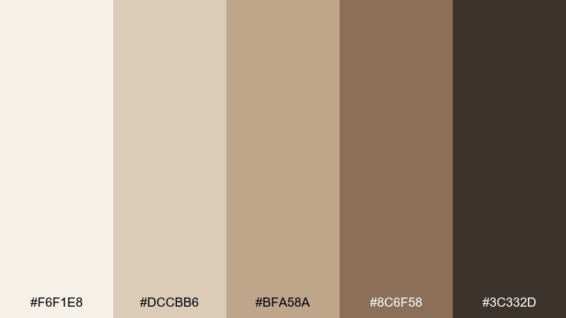
HEX: #F6F1E8 #DCCBB6 #BFA58A #8C6F58 #3C332D
Mood: airy and warm
Best for: scandinavian-style small apartment living room with lots of daylight
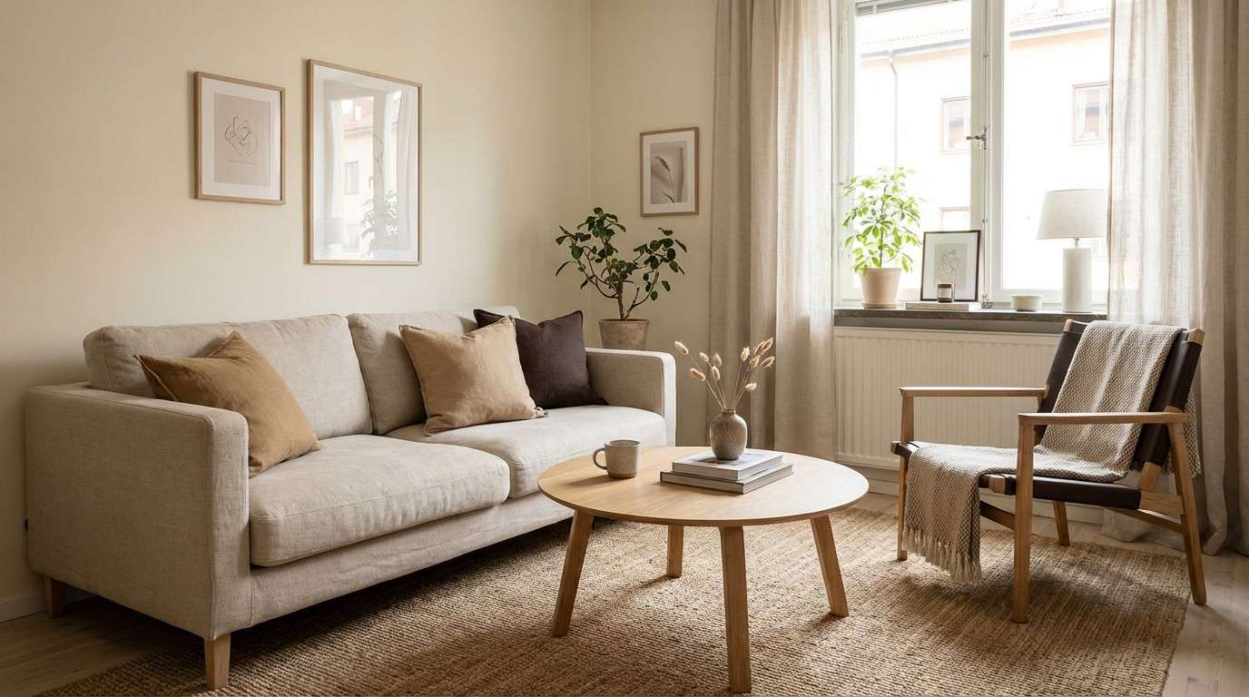
Airy warmth like morning light on linen curtains and pale oak floors. Use the cream and sand tones for walls and large upholstery, then ground the space with espresso details in frames or a media console. It works beautifully in compact rooms where you want brightness without feeling sterile. Tip: repeat the mid tan in two textures, like a woven rug and leather pouf, to keep it cohesive.
Image example of sunlit linen generated using media.io
Media.io is an online AI studio for creating and editing video, image, and audio in your browser.

2) Charcoal and Cashmere
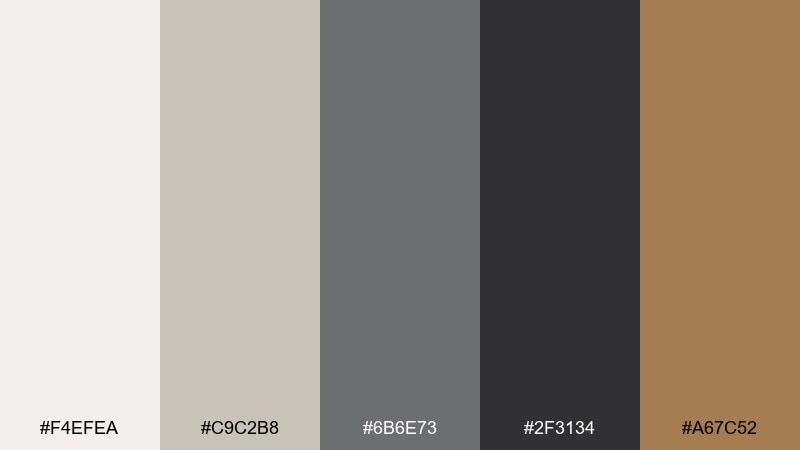
HEX: #F4EFEA #C9C2B8 #6B6E73 #2F3134 #A67C52
Mood: sleek and elevated
Best for: modern loft living room with black metal, leather, and clean lines
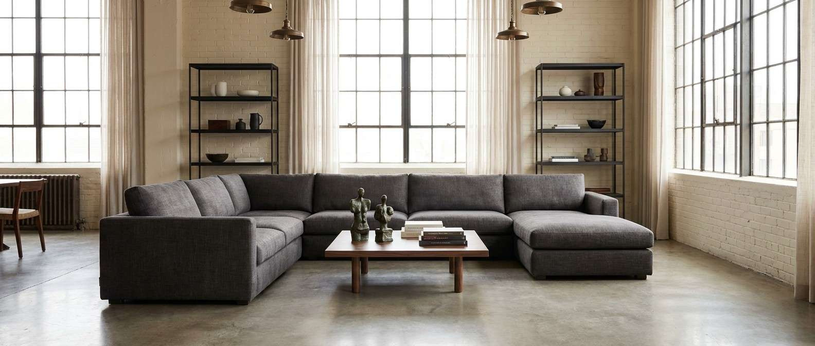
Sleek contrast that feels like cashmere against matte charcoal. Keep the light neutral on walls and ceiling, then layer charcoal through cabinetry, shelving, or a statement sofa. The warm bronze note prevents the grays from turning cold, especially with wood and brushed brass. Tip: add one oversized art piece with a warm undertone to bridge the dark and light zones.
Image example of charcoal and cashmere generated using media.io
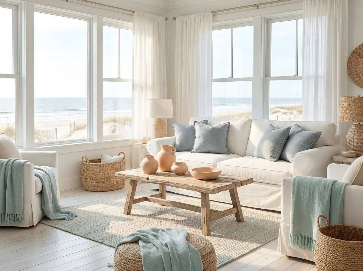
3) Coastal Mist
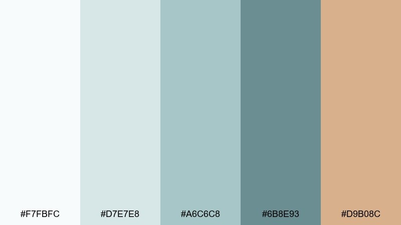
HEX: #F7FBFC #D7E7E8 #A6C6C8 #6B8E93 #D9B08C
Mood: fresh and breezy
Best for: beach-inspired living room with white slipcovers and light woods
Breezy like sea fog rolling over pale dunes. Use the airy whites and soft aquas for the main surfaces, then bring in the deeper blue-gray for contrast in throw pillows or built-ins. The sandy peach is perfect for subtle warmth in ceramics, art, or a vintage rug. Tip: keep metals light, like brushed nickel or weathered silver, to stay true to the coastal feel.
Image example of coastal mist generated using media.io
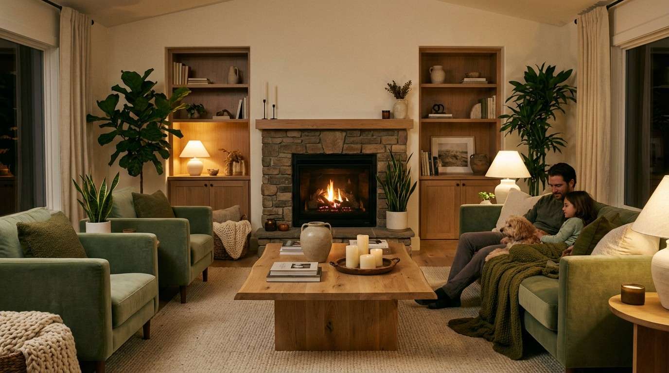
4) Sage Hearth
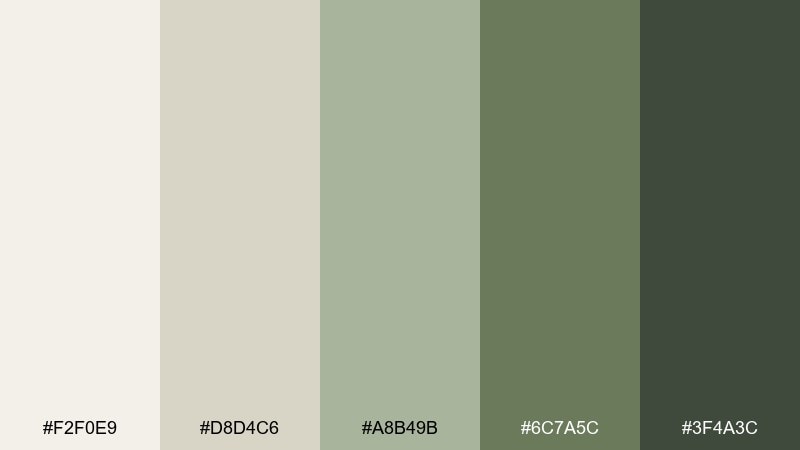
HEX: #F2F0E9 #D8D4C6 #A8B49B #6C7A5C #3F4A3C
Mood: grounded and calming
Best for: family living room with a fireplace, natural textures, and plants
Grounded calm that recalls fresh herbs, stoneware, and a softly lit hearth. This living room color scheme shines with warm whites on walls, sage textiles, and darker olive for millwork or a built-in bookcase. Pair it with oak, rattan, and matte black hardware for an updated, nature-forward look. Tip: echo the deepest green in two small places, like lamp shades and frames, to make the palette feel intentional.
Image example of sage hearth generated using media.io
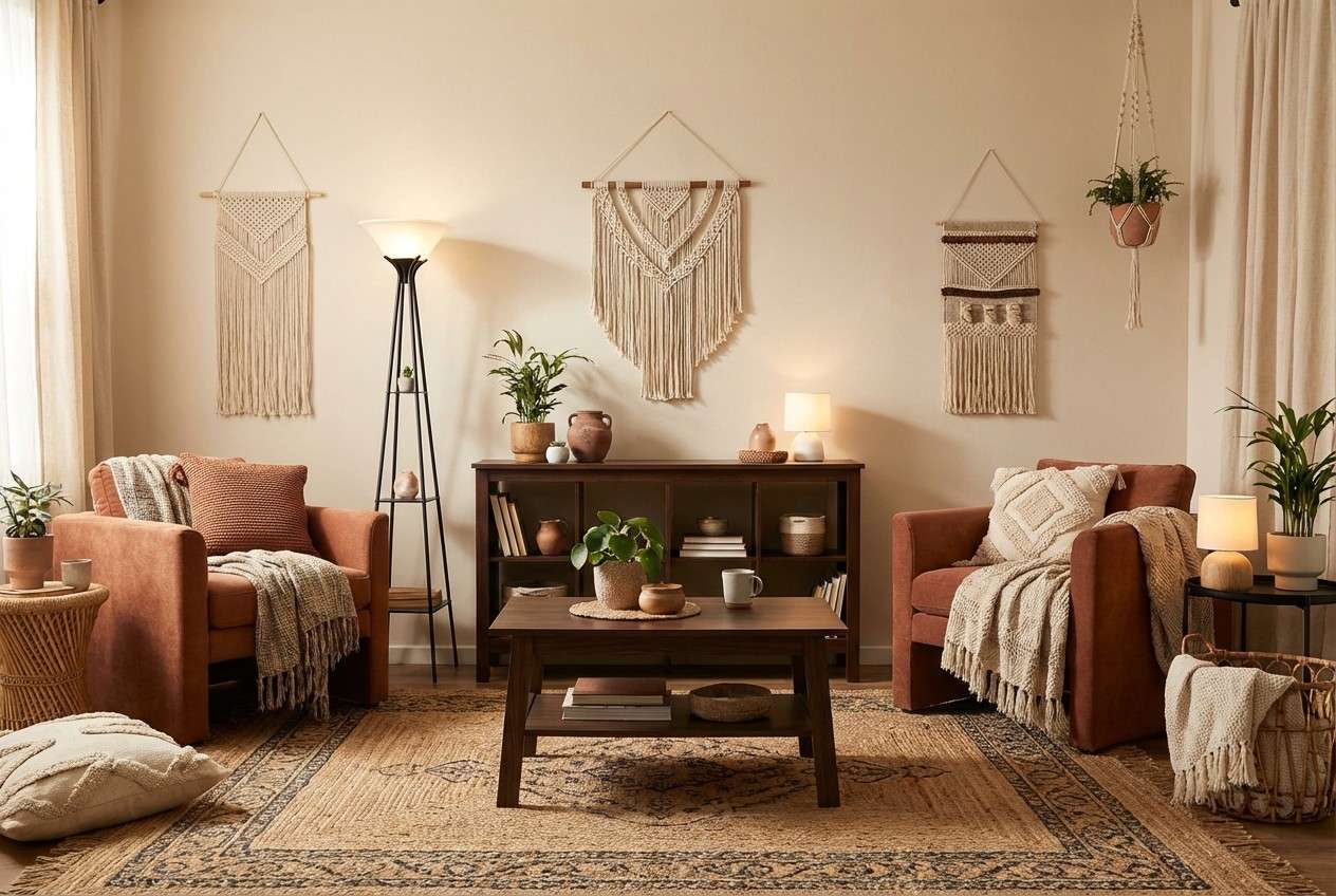
5) Terracotta Night
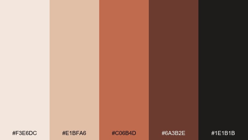
HEX: #F3E6DC #E1BFA6 #C06B4D #6A3B2E #1E1B1B
Mood: moody and earthy
Best for: boho living room with textured textiles and warm ambient lighting
Moody earth tones like clay pots, ember glow, and worn leather. For living room color combinations that feel cozy, keep the pale clay on larger surfaces and let terracotta pop in pillows, art, or an accent chair. Deep cocoa and near-black make the warm notes look richer, especially with woven textures and aged brass. Tip: use the darkest shade on one anchoring piece, like a media cabinet, to avoid overpowering the room.
Image example of terracotta night generated using media.io
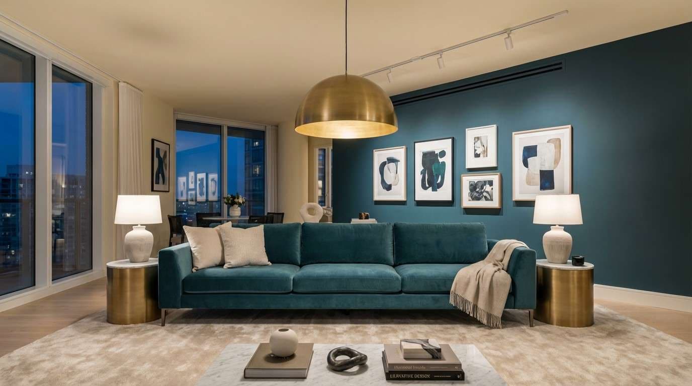
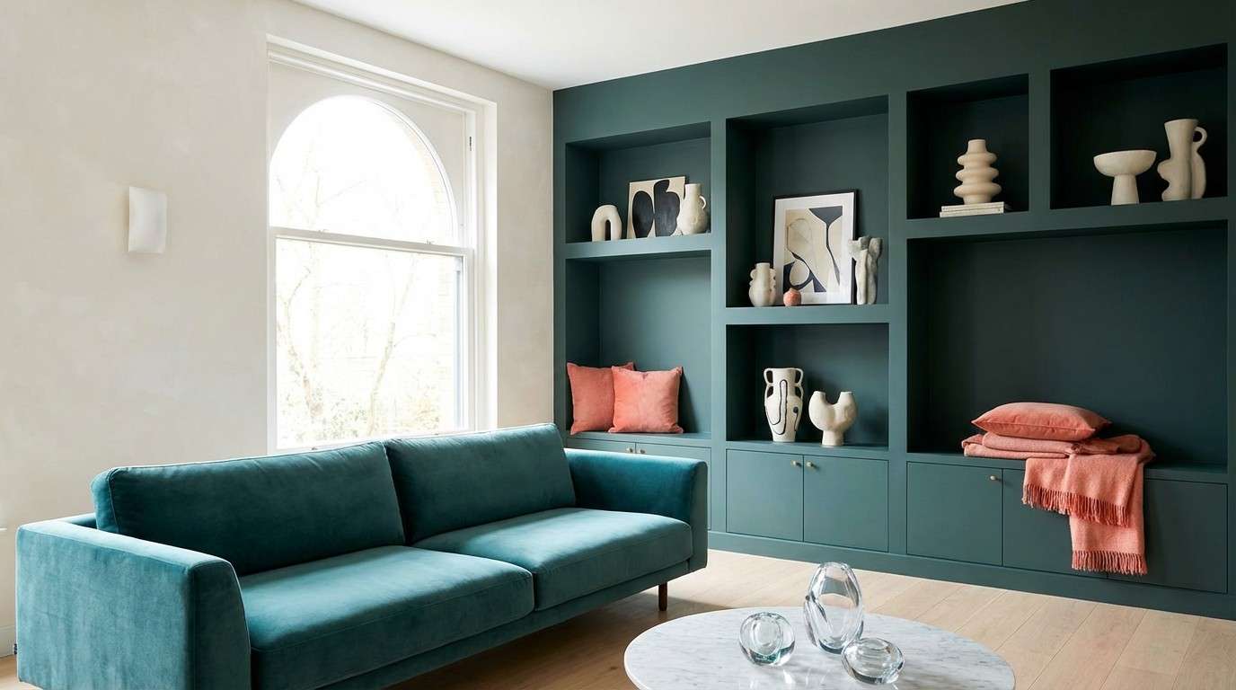
6) Midnight Teal Luxe
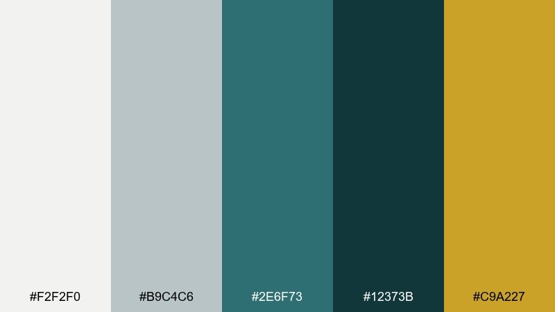
HEX: #F2F2F0 #B9C4C6 #2E6F73 #12373B #C9A227
Mood: dramatic and luxurious
Best for: statement living room with velvet seating and gallery lighting
Dramatic jewel tones that feel like a dim lounge with velvet and brass. Use the soft off-white and cool gray for balance, then let teal take the lead on a sofa or feature wall. The inky blue-green adds depth for trim or shelving, while the gold accent sings in lighting and hardware. Tip: keep patterns minimal and rely on texture, like velvet, bouclé, and lacquer, for a polished finish.
Image example of midnight teal luxe generated using media.io
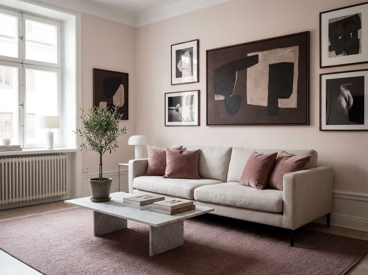
7) Blush Gallery
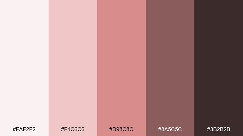
HEX: #FAF2F2 #F1C6C6 #D98C8C #8A5C5C #3B2B2B
Mood: soft and artistic
Best for: apartment living room styled like a mini art gallery
Soft blush tones that evoke watercolor washes and rose-tinted light. Keep the palest pink for walls or large upholstery, then build contrast with muted mauve in pillows, rugs, and drapery. The deeper cocoa shades help artwork and black-and-white photography feel crisp, not sweet. Tip: choose one warm wood, like walnut, to harmonize with the rosy undertones.
Image example of blush gallery generated using media.io
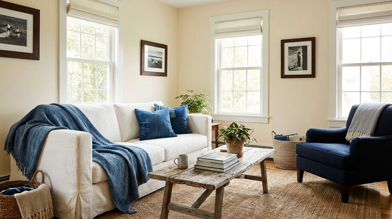
8) Denim and Driftwood
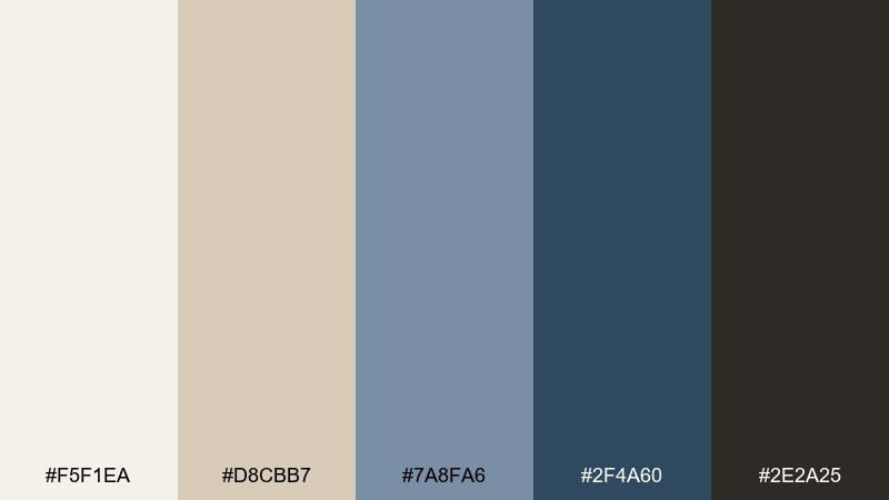
HEX: #F5F1EA #D8CBB7 #7A8FA6 #2F4A60 #2E2A25
Mood: relaxed and lived-in
Best for: casual living room with a slipcovered sofa and vintage wood pieces
Relaxed blues and weathered neutrals that feel like favorite denim and sun-faded timber. Use the warm creams for walls and big seating, then layer the mid denim in textiles to keep the room easygoing. The deep navy brings structure in cabinetry or a feature chair, and the dark brown works well in leather and antique frames. Tip: add a jute rug to connect the sandy tones to the blues without looking themed.
Image example of denim and driftwood generated using media.io
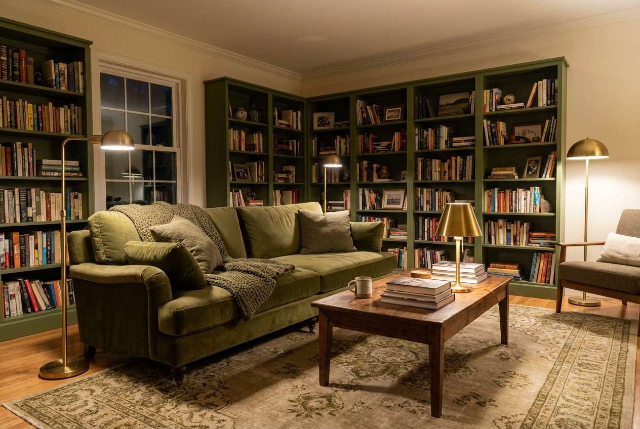
9) Olive Library
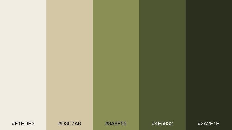
HEX: #F1EDE3 #D3C7A6 #8A8F55 #4E5632 #2A2F1E
Mood: academic and cozy
Best for: book-lined living room with warm lamps and vintage accents
Cozy and intellectual, like worn paperbacks, brass lamps, and a quiet reading corner. This living room color palette works best with creamy walls, olive upholstery, and deeper moss on built-ins or trim. Add warmth through aged leather, walnut, and antique gold so the greens feel inviting rather than flat. Tip: use picture lights or warm bulbs to make the olive tones glow at night.
Image example of olive library generated using media.io
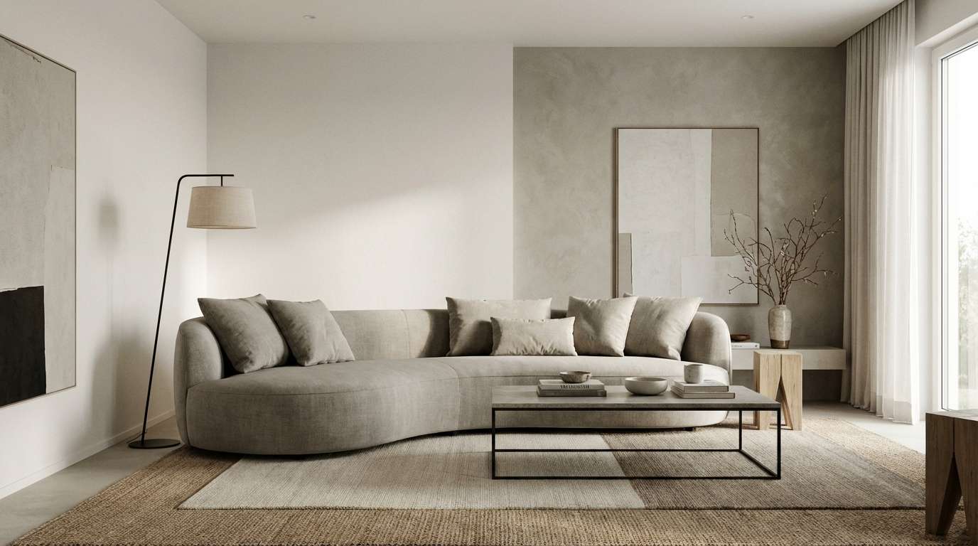
10) Modern Greige
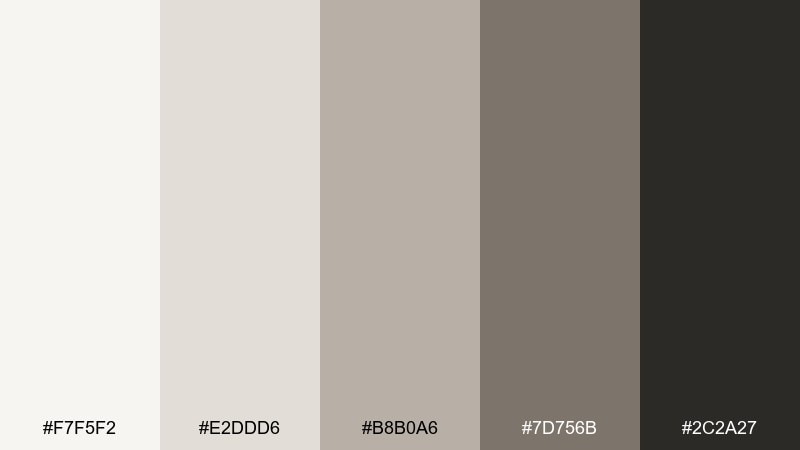
HEX: #F7F5F2 #E2DDD6 #B8B0A6 #7D756B #2C2A27
Mood: clean and timeless
Best for: minimal modern living room with layered neutrals and sharp silhouettes
Clean neutrals that feel like polished plaster, soft wool, and quiet luxury. Let the lightest tones cover walls and ceiling, then build depth with greige upholstery and stone-colored rugs. The charcoal-black shade is perfect for thin-framed furniture and lighting to sharpen the look. Tip: mix matte and subtle sheen finishes, like boucle next to satin ceramics, to keep neutrals from feeling flat.
Image example of modern greige generated using media.io
11) Citrus Clay
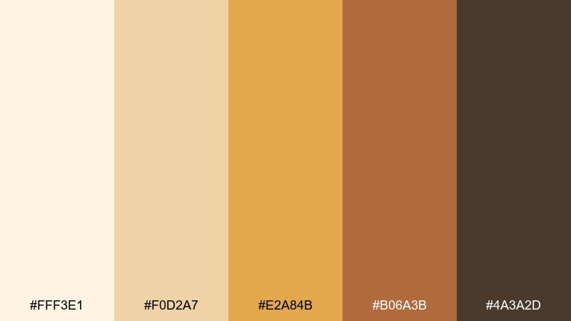
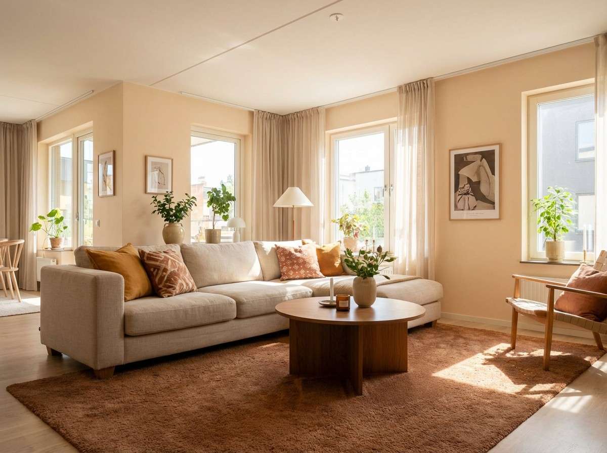
HEX: #FFF3E1 #F0D2A7 #E2A84B #B06A3B #4A3A2D
Mood: sunny and welcoming
Best for: open-plan living room that needs warmth without heavy dark colors
Sunny warmth like late-afternoon light on clay walls and golden textiles. Use the creamy peach as your base, then bring in honey and amber through pillows, art, and a statement rug. The earthy brown shades keep the brightness grounded, especially alongside mid-tone woods. Tip: balance the warm palette with crisp off-white trim so it still feels fresh.
Image example of citrus clay generated using media.io
12) Soft Monochrome
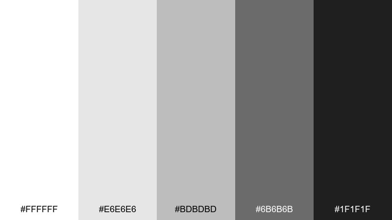
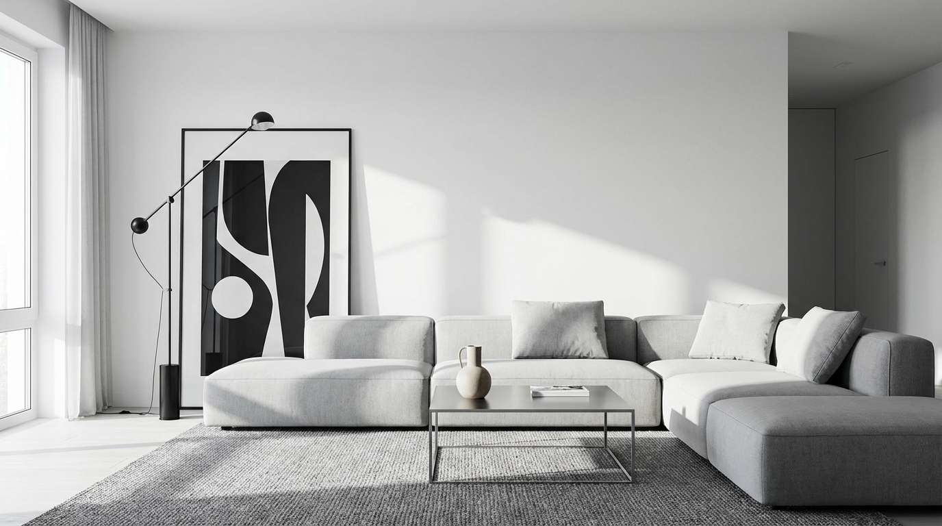
HEX: #FFFFFF #E6E6E6 #BDBDBD #6B6B6B #1F1F1F
Mood: crisp and modern
Best for: high-contrast living room with graphic art and streamlined furniture
Crisp monochrome like a design magazine spread with sharp shadows and clean edges. Keep white dominant on walls to maximize light, then build layers with soft grays in rugs and upholstery. The deeper gray and near-black are best saved for accents like lighting, frames, and a statement chair. Tip: introduce tactile materials, such as wool and ribbed ceramics, so the grayscale feels warm rather than clinical.
Image example of soft monochrome generated using media.io
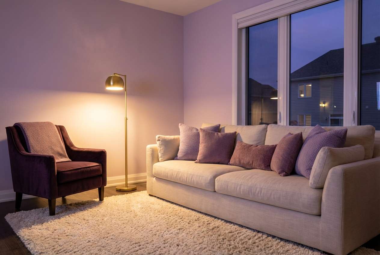
13) Lavender Dusk
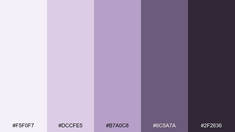
HEX: #F5F0F7 #DCCFE5 #B7A0C8 #6C5A7A #2F2636
Mood: dreamy and intimate
Best for: cozy living room with layered lighting and plush textiles
Dreamy dusk tones that feel like twilight through sheer curtains. Use the pale lavender as a soft neutral for walls, then add the mid purple in cushions and throws for gentle color. The deeper plum shades are ideal for a velvet chair or painted bookcase when you want intimacy. Tip: choose warm bulbs and brass accents so the purples read inviting, not icy.
Image example of lavender dusk generated using media.io
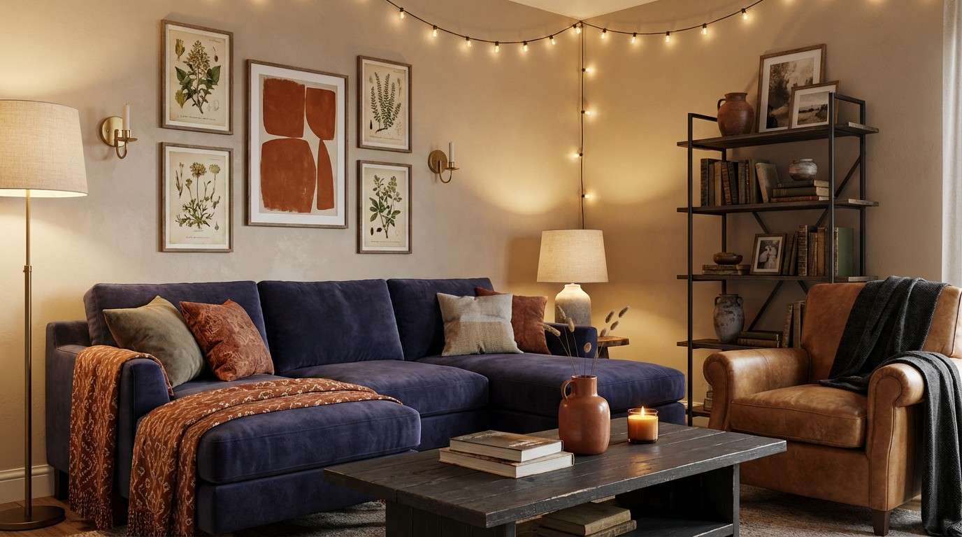
14) Rust and Indigo
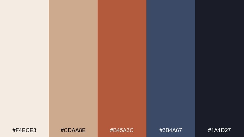
HEX: #F4ECE3 #CDAA8E #B45A3C #3B4A67 #1A1D27
Mood: bold and balanced
Best for: eclectic living room mixing vintage finds with modern pieces
Bold contrast like rusted metal against a deep evening sky. These living room color combinations work best when indigo leads in one big element, such as a sofa or painted wall, and rust is used as an accent in art and textiles. Keep the warm neutrals in the background so the room feels collected, not loud. Tip: add one repeating shape, like round pillows or arched mirrors, to unify the mix of eras.
Image example of rust and indigo generated using media.io
15) Desert Palm
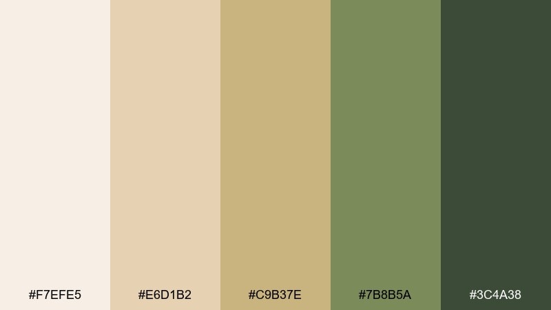
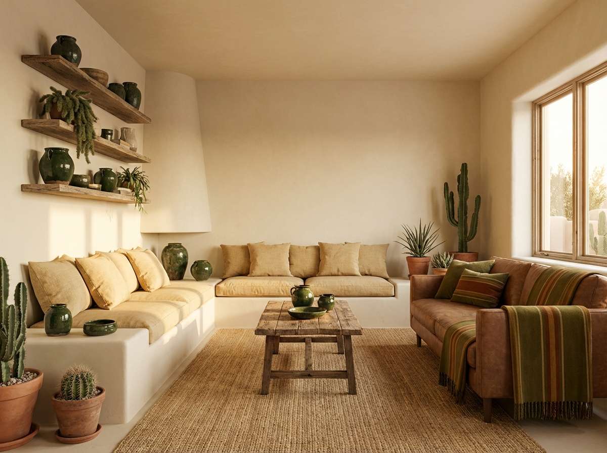
HEX: #F7EFE5 #E6D1B2 #C9B37E #7B8B5A #3C4A38
Mood: sun-baked and natural
Best for: southwest-inspired living room with plants and woven textures
Sun-baked warmth that suggests sand, palm fronds, and handmade pottery. Use the creamy beige as a base, then layer tan and straw tones through rugs, baskets, and wood furniture. The greens are perfect for a painted accent piece or abundant plants to keep the palette alive. Tip: a textured plaster wall or limewash finish makes these earthy hues feel authentic.
Image example of desert palm generated using media.io
16) Chocolate Marble
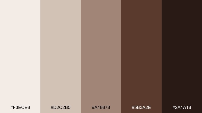
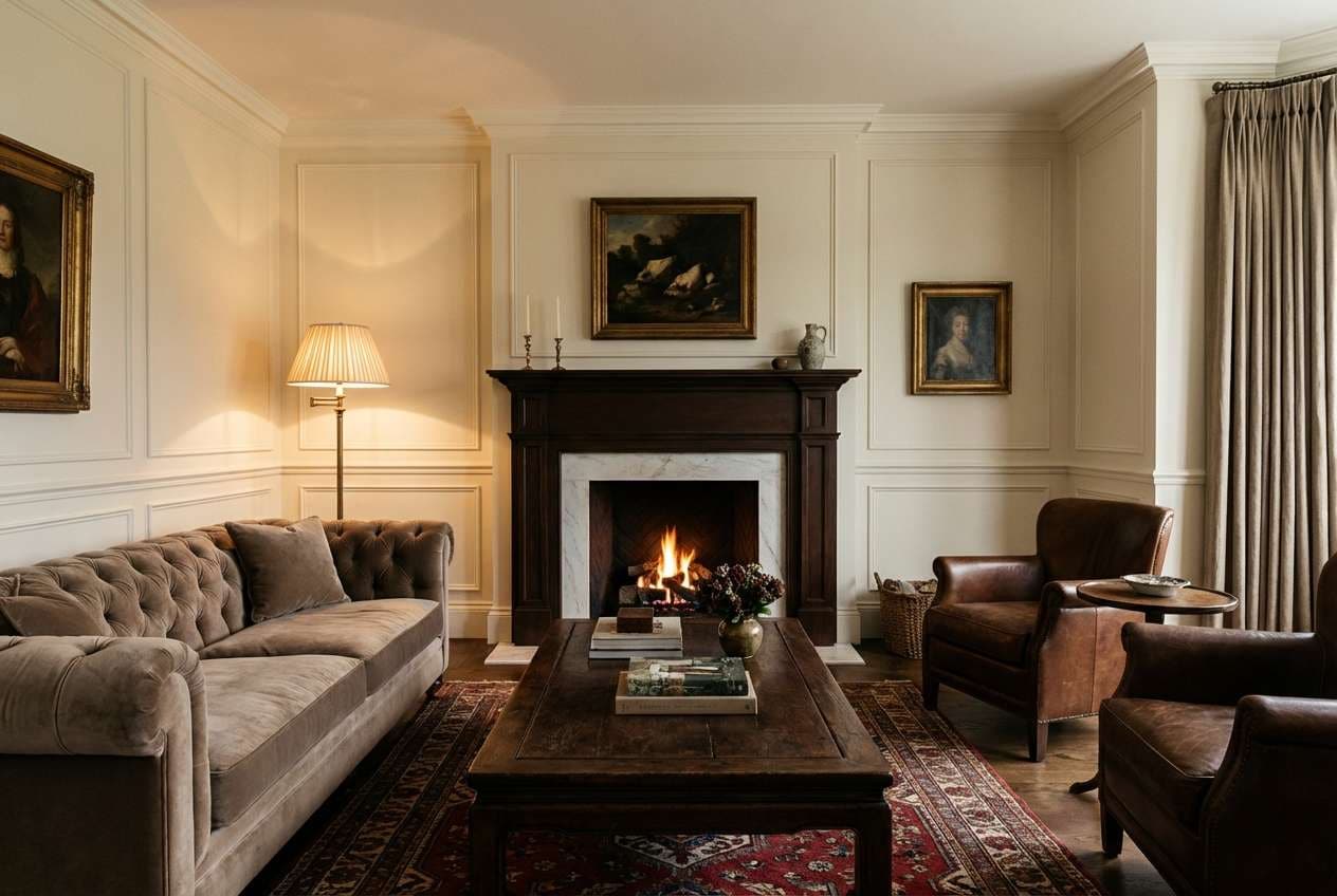
HEX: #F3ECE6 #D2C2B5 #A18678 #5B3A2E #2A1A16
Mood: rich and refined
Best for: traditional living room with elegant trim and classic furniture shapes
Rich browns and soft creams that feel like marble veining and dark chocolate. Use the light cream for walls and drapery to keep the room bright, then bring in warm taupe for upholstery. The deeper cocoa tones are ideal for wood furniture, built-ins, or a statement fireplace surround. Tip: add a single warm metallic, like antique brass, to lift the darker shades without turning flashy.
Image example of chocolate marble generated using media.io
17) Pearl and Peacock
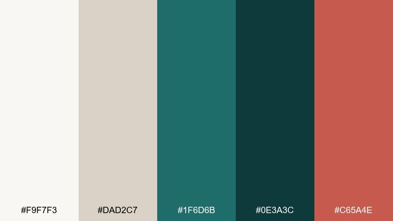
HEX: #F9F7F3 #DAD2C7 #1F6D6B #0E3A3C #C65A4E
Mood: sophisticated and vibrant
Best for: contemporary living room with statement art and sculptural decor
Sophisticated contrast that feels like pearl lacquer beside peacock feathers. Keep the soft neutrals dominant, then use teal and deep green-blue for a feature wall or upholstered seating. The coral accent adds a lively spark in small doses, such as a vase, art print, or a single cushion. Tip: choose a cream rug with subtle texture to keep the bold tones from visually overpowering the floor.
Image example of pearl and peacock generated using media.io
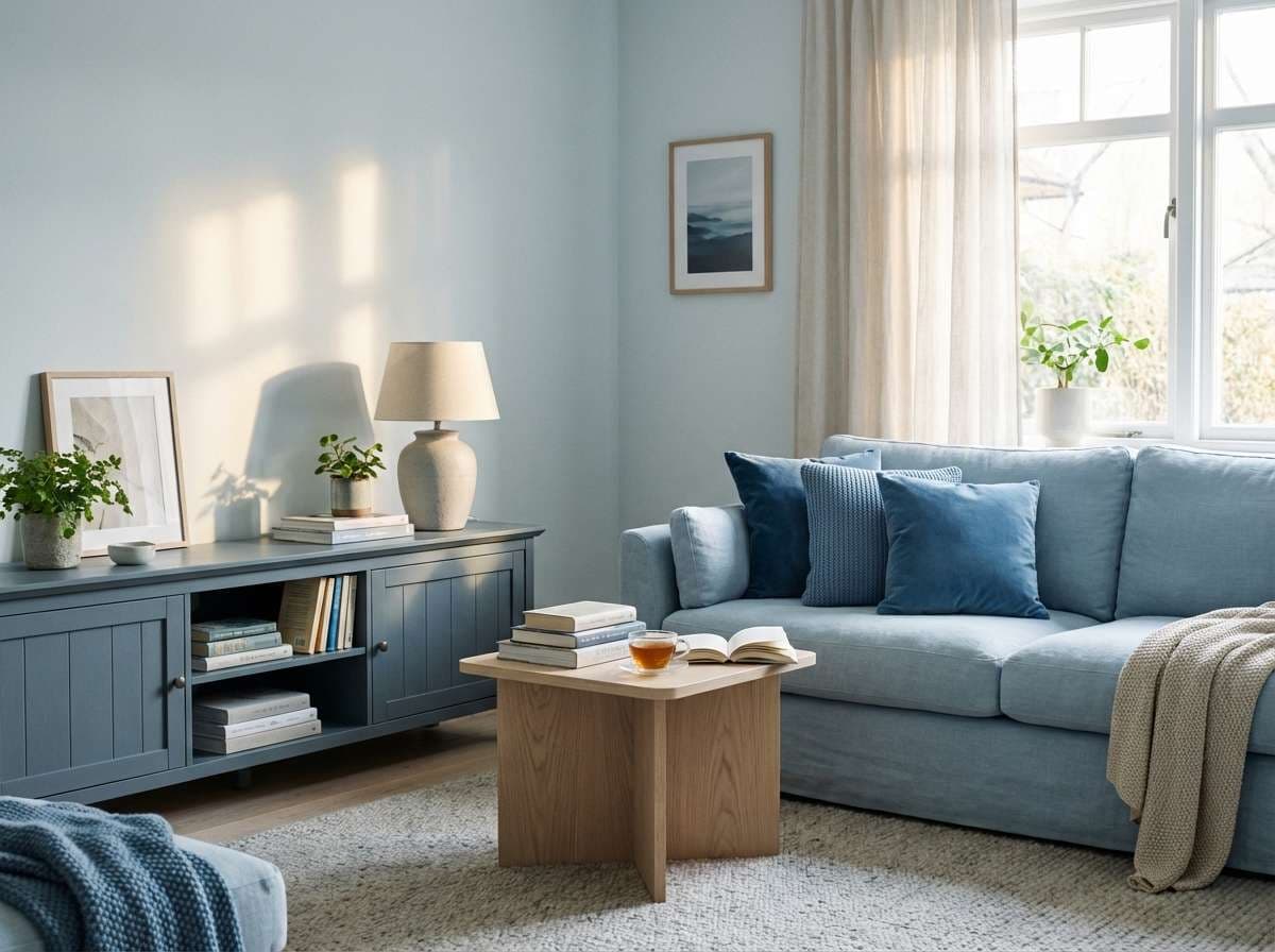
18) Misty Blue Calm
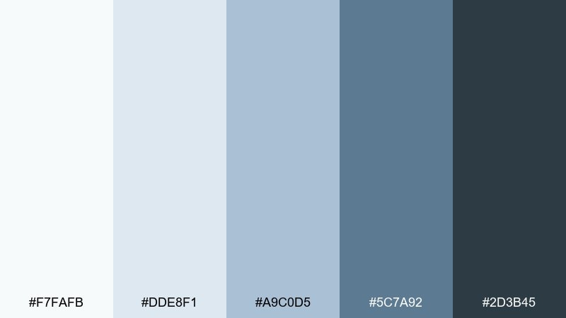
HEX: #F7FAFB #DDE8F1 #A9C0D5 #5C7A92 #2D3B45
Mood: cool and restful
Best for: quiet living room designed for reading and unwinding
Cool calm like mist over a lake and soft morning skies. Use the lightest blue-white on walls to open the space, then layer the mid blues in textiles for gentle depth. The slate shades work well in a media unit or shelving to add structure without going heavy. Tip: pair with pale oak and simple white ceramics for a clean, soothing finish.
Image example of misty blue calm generated using media.io
19) Warm Walnut
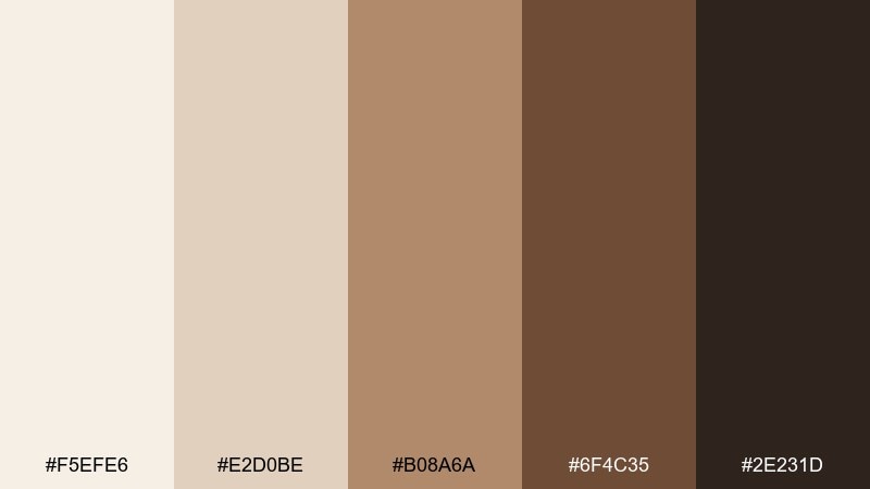
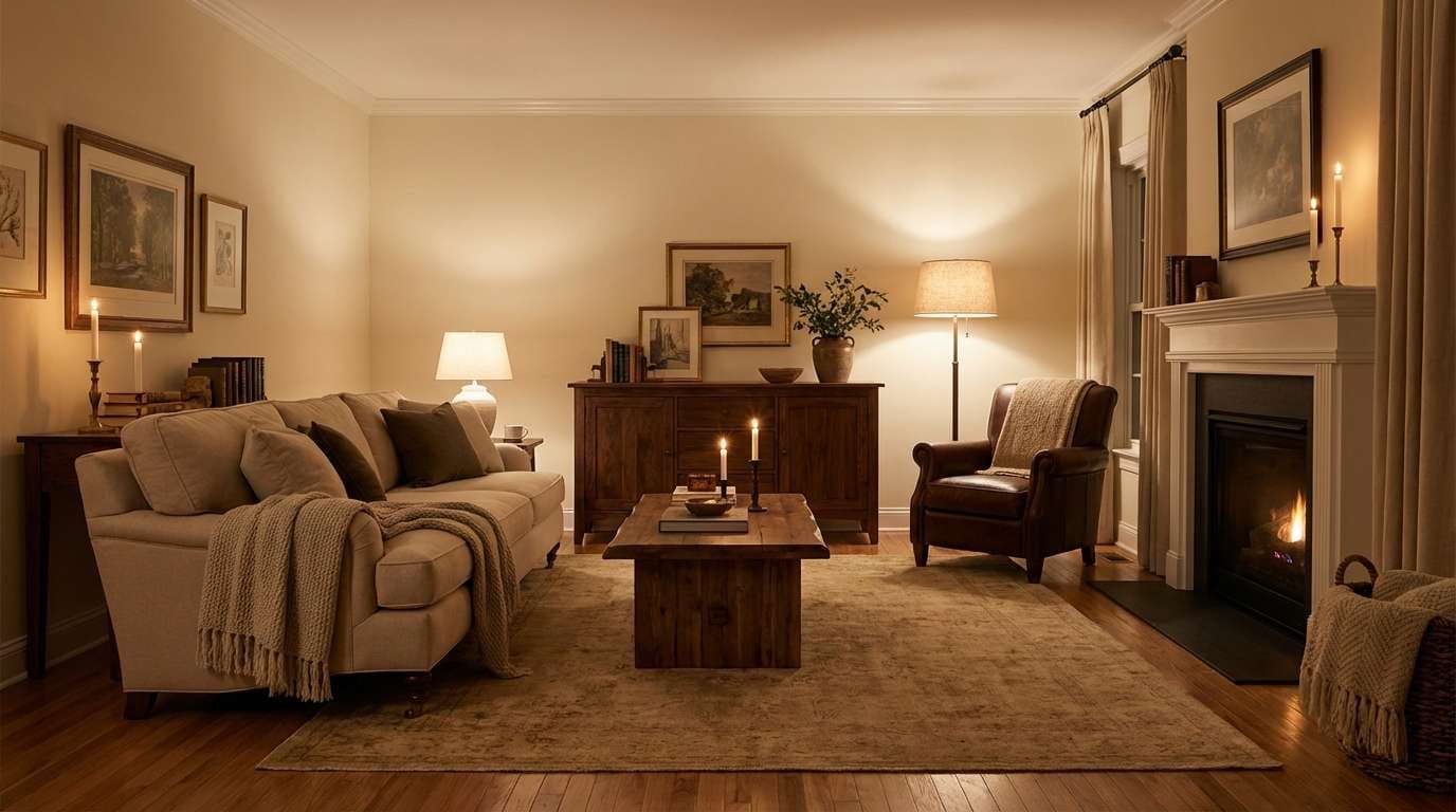
HEX: #F5EFE6 #E2D0BE #B08A6A #6F4C35 #2E231D
Mood: cozy and classic
Best for: living room with walnut furniture, warm lighting, and timeless styling
Cozy warmth like toasted caramel, walnut grain, and soft candlelight. Keep the light creams for walls and larger seating to maintain openness, then bring in the mid tans through rugs and curtains. The deeper browns are perfect for wood tones, leather, and picture frames that add instant character. Tip: use a warm white lamp shade to keep the whole room glowing rather than yellow.
Image example of warm walnut generated using media.io
20) Playful Pastel Pop
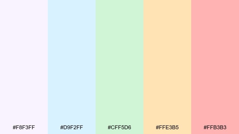
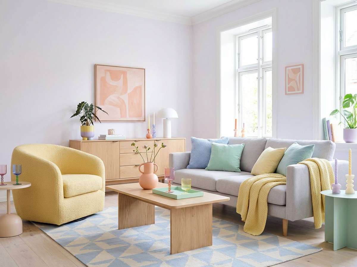
HEX: #F8F3FF #D9F2FF #CFF5D6 #FFE3B5 #FFB3B3
Mood: cheerful and light
Best for: creative living room with modern furniture and colorful accents
Cheerful pastels that feel like gelato, spring paper, and soft studio light. Use the lilac-leaning white as the base, then pick two pastels as your dominant accents so it stays grown-up. The peachy pink is great in artwork and small decor, while the buttery yellow can brighten a chair or throw. Tip: anchor the sweetness with light wood and a simple, low-profile sofa silhouette.
Image example of playful pastel pop generated using media.io
What Colors Go Well with Living Room?
Living rooms typically look best with a balanced mix of light, medium, and dark values. If your walls are light, you can safely add depth with darker furniture, a media unit, or bold artwork without shrinking the space.
Warm neutrals (cream, sand, tan) pair well with earthy tones like terracotta, olive, and walnut, while cooler bases (white, gray, blue-white) match beautifully with slate, teal, and charcoal accents.
For easy cohesion, repeat one accent color at least twice—like teal in both cushions and a vase, or rust in both art and a throw—so it reads like a deliberate living room color scheme.
How to Use a Living Room Color Palette in Real Designs
Start with your largest surfaces first: walls, big seating, and rugs. Choose the lightest or most neutral HEX in your palette for paint, then pick a mid-tone for upholstery to avoid a room that feels too stark.
Use the darkest color as an anchor rather than spreading it everywhere. A single dark built-in, coffee table, or set of frames often creates enough contrast to make lighter tones feel brighter and more intentional.
Finish with accents and texture: curtains, pillows, ceramics, and lighting. Even in neutral living room colors, layered materials (linen, velvet, wood grain, metal) keep the palette feeling rich instead of flat.
Create Living Room Palette Visuals with AI
If you’re unsure how a palette will look in your space, generate a few realistic mockups first. Seeing the same living room color combinations in different lighting (daytime vs evening) makes decisions faster and more confident.
With Media.io’s text-to-image tool, you can paste a ready-made prompt (like the ones above), tweak style keywords (modern, boho, traditional), and iterate until the mood matches your home.
Once you like the direction, use the HEX codes to shop paint, textiles, and decor that stay consistent with your chosen living room color palette.
Living Room Color Palette FAQs
-
What’s the easiest living room color palette to decorate with?
Warm neutrals (cream, sand, tan) with one dark anchor (espresso or charcoal) are the easiest because they match most wood tones, metals, and fabrics while still giving the room contrast. -
How many colors should a living room color scheme include?
Most living rooms work best with 3–5 colors: a main wall color, one or two supporting mid-tones (sofa/rug), and one or two accents (pillows, art, decor). -
Should the living room walls be lighter or darker than the sofa?
Either works, but a common safe choice is lighter walls with a mid-tone or darker sofa. It keeps the room open while the seating feels grounded and intentional. -
What are good accent colors for a neutral living room?
Teal, olive, rust/terracotta, dusty rose, and muted gold are reliable accent colors. They add personality without overpowering neutral living room colors. -
How do I match a rug to my living room palette?
Pick a rug that contains at least two colors from your palette (often a base neutral plus one accent). This makes the rug act like a “bridge” between walls, sofa, and decor. -
What lighting makes living room paint colors look accurate?
Test swatches in both daytime and nighttime lighting. Warm bulbs enhance creams, tans, and terracotta, while cooler bulbs can emphasize blue/gray undertones in whites and greiges. -
Can I mix warm and cool tones in the same living room?
Yes—mixing warm and cool can look high-end when balanced. Keep one temperature dominant (for example, warm neutrals) and use the other as an accent (like slate blue or teal).
Next: Interior Color Palette


