

A woodland color palette is built around deep greens, bark browns, and warm, paper-like neutrals. It’s a reliable way to make designs feel grounded, organic, and quietly premium.
Below are 20 woodland color palette ideas with HEX codes—plus practical tips and AI prompts you can reuse for branding, UI, packaging, and print.
In this article
Why Woodland Palettes Work So Well
Woodland palettes feel instantly familiar because they mirror the most stable colors in nature—evergreens, soil, stone, and wood. That familiarity translates into trust, which is why these schemes work for wellness, eco, and craft brands.
They also solve a practical design problem: you get strong contrast options without relying on harsh primaries. Deep greens and near-blacks anchor layouts, while creamy neutrals keep pages breathable and readable.
Finally, woodland colors are flexible across mediums. They print beautifully on uncoated stocks and kraft labels, and they’re equally effective in modern UI when you need calm, low-glare surfaces.
20+ Woodland Color Palette Ideas (with HEX Codes)
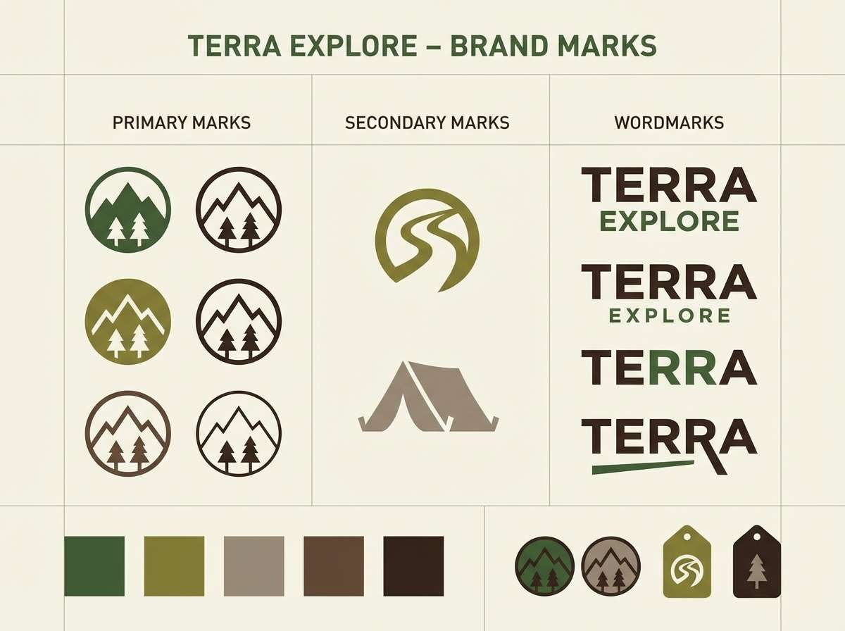
1) Mossy Trail
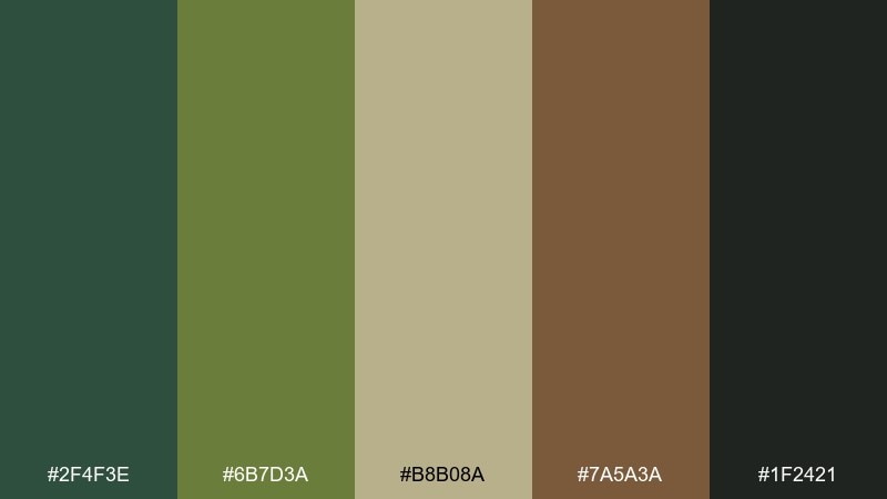
HEX: #2F4F3E #6B7D3A #B8B08A #7A5A3A #1F2421
Mood: grounded, lush, and calm
Best for: outdoor brand identity and logo marks
Grounded greens and bark browns evoke a shaded path after rain, with soft lichen neutrals keeping it approachable. This woodland color palette works well for outdoor, gardening, and eco brands that want to feel credible, not trendy. Pair it with uncoated paper textures, simple line icons, and plenty of breathing room. Usage tip: reserve the near-black for wordmarks and let moss green carry the accents.
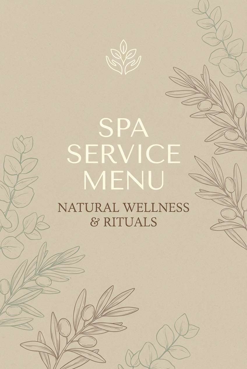
Image example of mossy trail generated using media.io
Media.io is an online AI studio for creating and editing video, image, and audio in your browser.

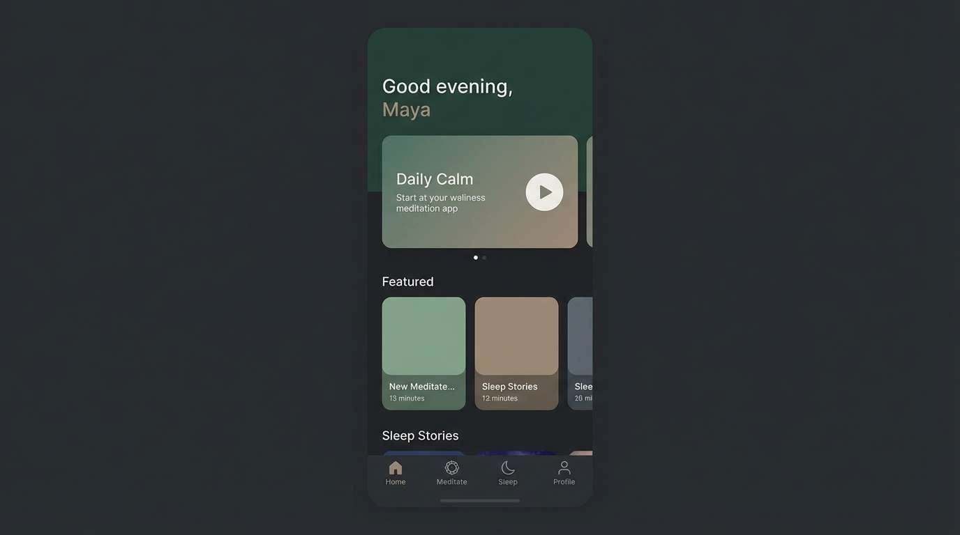
2) Pine Needle Dusk
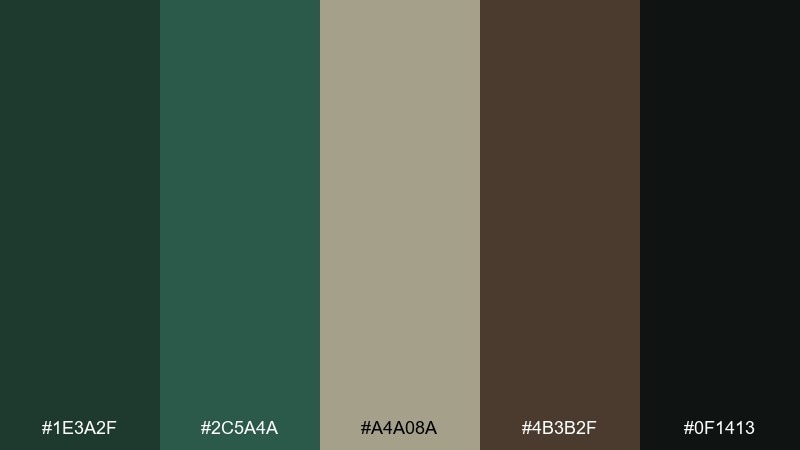
HEX: #1E3A2F #2C5A4A #A4A08A #4B3B2F #0F1413
Mood: moody, quiet, and refined
Best for: dark mode UI for wellness and meditation apps
Moody pine tones and deep charcoal feel like a forest at dusk, calm and private without turning cold. These tones suit dark mode interfaces where contrast and readability matter. Pair with warm gray typography and subtle texture instead of heavy gradients. Usage tip: use the mid green for primary buttons and keep the darkest shade for backgrounds to avoid eye fatigue.
Image example of pine needle dusk generated using media.io
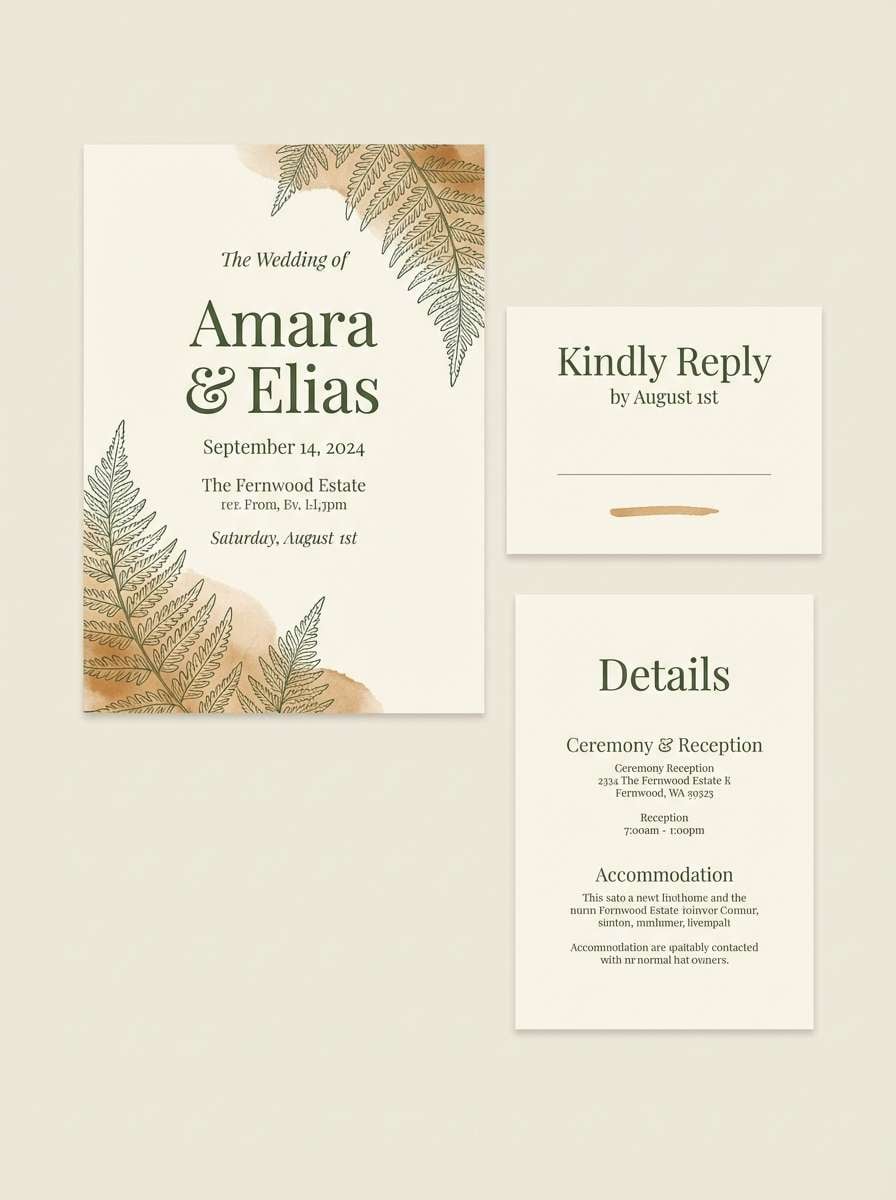
3) Fern and Fawn
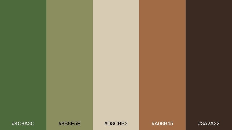
HEX: #4C6A3C #8B8E5E #D8CBB3 #A06B45 #3A2A22
Mood: soft, rustic, and welcoming
Best for: wedding invitations and stationery
Soft fern greens and creamy fawn neutrals evoke sunlit clearings and handmade paper. It fits invitations that want a natural, intimate vibe without leaning boho-bright. Pair with serif type, deckled edges, and a copper-ink detail for warmth. Usage tip: keep the brown as a thin border or monogram so the neutrals stay airy.
Image example of fern and fawn generated using media.io
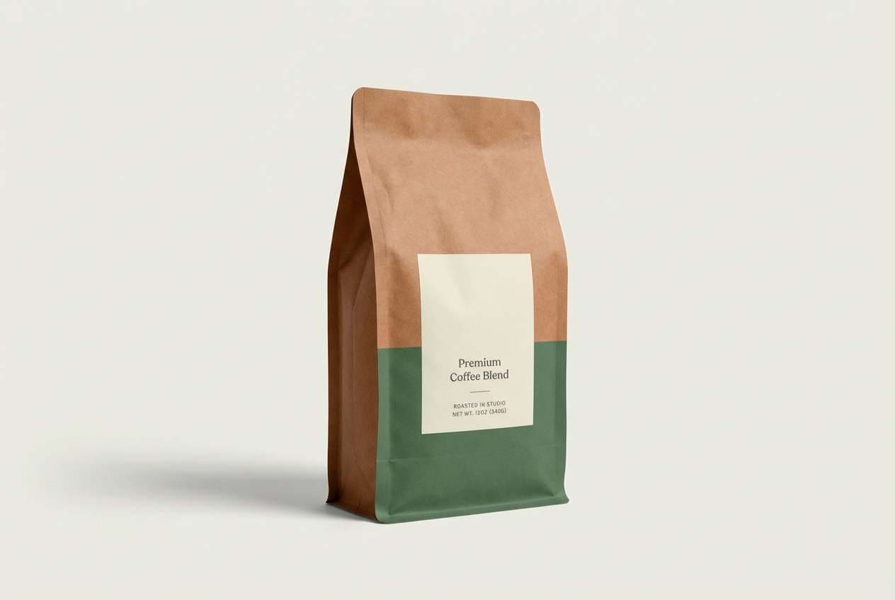
4) Cedar Cabin
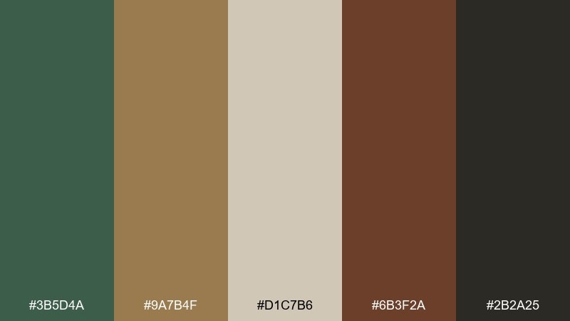
HEX: #3B5D4A #9A7B4F #D1C7B6 #6B3F2A #2B2A25
Mood: cozy, heritage, and earthy
Best for: coffee packaging and bag labels
Cozy cedar browns and muted greens bring to mind a warm cabin and a fresh grind in the morning. These woodland color combinations are ideal for packaging that needs to feel craft, dependable, and premium at the same time. Pair with kraft paper, stamped typography, and a single icon or crest. Usage tip: let the light neutral dominate the label so the darker browns can stay crisp and legible.
Image example of cedar cabin generated using media.io
5) Lichen Stone
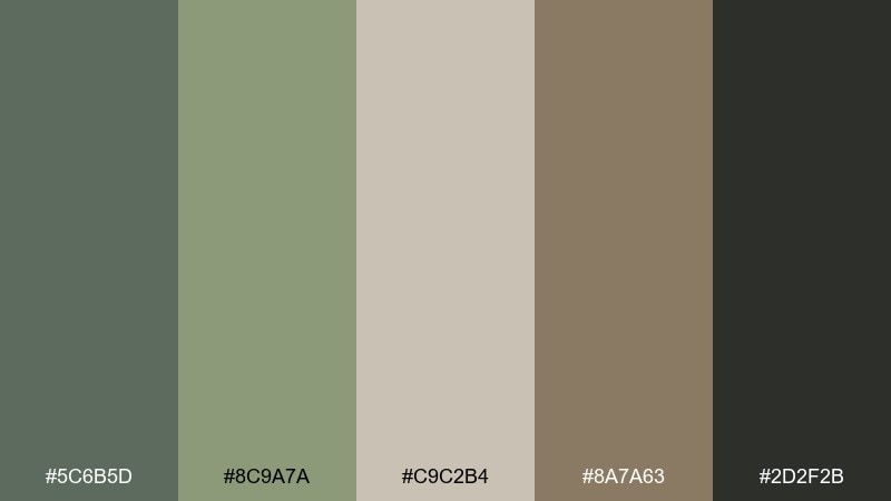
HEX: #5C6B5D #8C9A7A #C9C2B4 #8A7A63 #2D2F2B
Mood: minimal, balanced, and modern
Best for: interior design mood boards and presentations
Cool lichen greens and stone neutrals feel like moss on river rocks, understated and modern. It works beautifully for interior decks, material boards, and architectural presentations. Pair with warm woods, brushed metal, and lots of negative space. Usage tip: keep typography in the deep charcoal so the lighter stone tone can act as a calm background.
Image example of lichen stone generated using media.io
6) Riverbank Bark
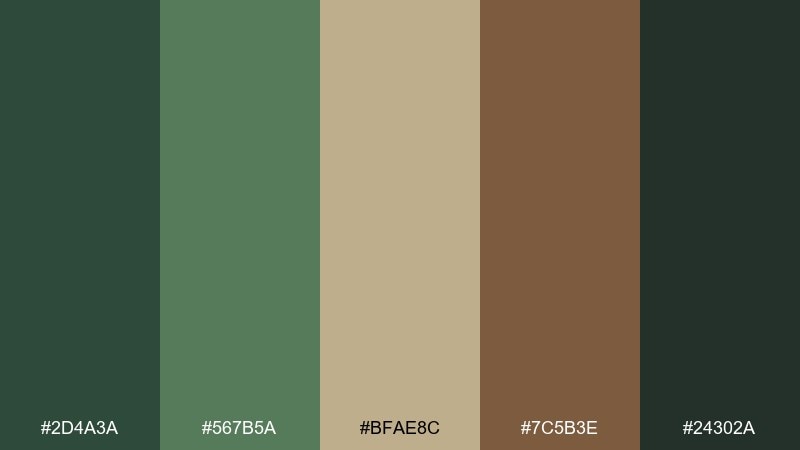
HEX: #2D4A3A #567B5A #BFAE8C #7C5B3E #24302A
Mood: natural, sturdy, and outdoorsy
Best for: hiking event posters and signage
Sturdy greens and riverbank browns suggest wet bark, trail maps, and well-worn boots. The contrast supports bold headlines and clear wayfinding, especially for outdoor events. Pair with topo-line patterns and a simple two-weight sans serif. Usage tip: use the tan as the main poster background to keep the darker tones readable from a distance.
Image example of riverbank bark generated using media.io

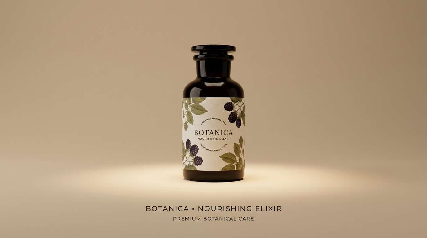
7) Blackberry Thicket
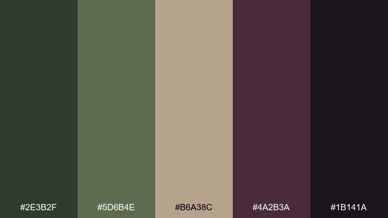
HEX: #2E3B2F #5D6B4E #B6A38C #4A2B3A #1B141A
Mood: mysterious, rich, and botanical
Best for: skincare product ads and hero banners
Deep berry shadow paired with muted greens feels like brambles at twilight, rich and a little mysterious. It suits skincare and botanical brands that want a luxe edge without neon color. Pair with macro ingredient photography and thin gold-leaning typography in the warm neutral. Usage tip: keep berry as a small accent for buttons or badges so it reads intentional, not heavy.
Image example of blackberry thicket generated using media.io
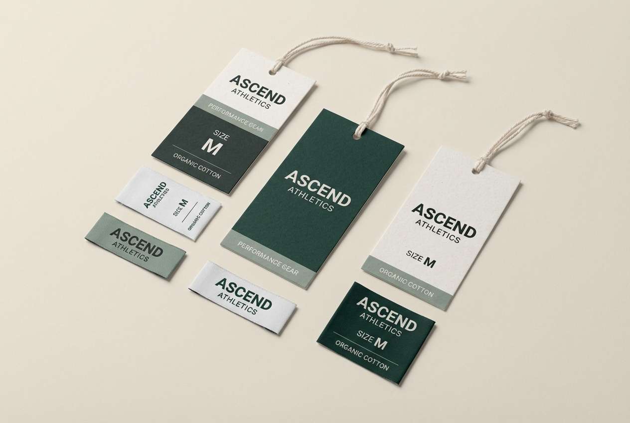
8) Spruce Shadow
HEX: #17362C #2E6A57 #93A58E #6D5A45 #0E1211
Mood: bold, confident, and cool
Best for: sportswear branding and hang tags
Bold spruce green and near-black feel athletic and sharp, like evergreen needles against winter shade. These tones are strong for sportswear labels, hang tags, and stitched patches. Pair with condensed typography and a high-contrast layout for quick readability. Usage tip: use the gray-green as a buffer tone so the darkest shades do not crush detail in print.
Image example of spruce shadow generated using media.io
9) Amber Acorn
HEX: #4A5D3A #8C7A3E #D8C7A6 #B16B3A #2D241C
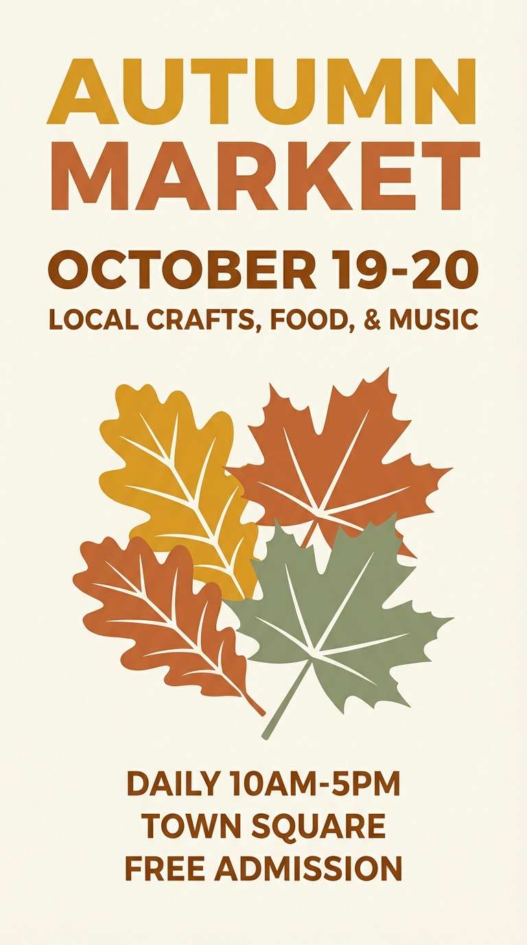
Mood: warm, nostalgic, and sunny
Best for: autumn market flyers and social posts
Warm amber and acorn browns feel like fallen leaves and late afternoon light. It is great for seasonal promotions where you want warmth without loud orange. Pair with hand-drawn icons, simple borders, and a cream base to keep it inviting. Usage tip: use the copper tone for calls to action and keep green as the grounding frame.
Image example of amber acorn generated using media.io
10) Misty Canopy
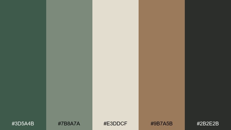
HEX: #3D5A4B #7B8A7A #E3DDCF #9B7A5B #2B2E2B
Mood: airy, calm, and sophisticated
Best for: editorial layouts and lifestyle blogs
Misty greens and creamy paper tones evoke fog drifting through tall trees, soft but still structured. It works for editorial design where you want a natural feel without sacrificing clarity. Pair with generous margins, muted photography, and warm gray body text. Usage tip: keep the darkest shade for captions and rules so the layout stays crisp.
Image example of misty canopy generated using media.io
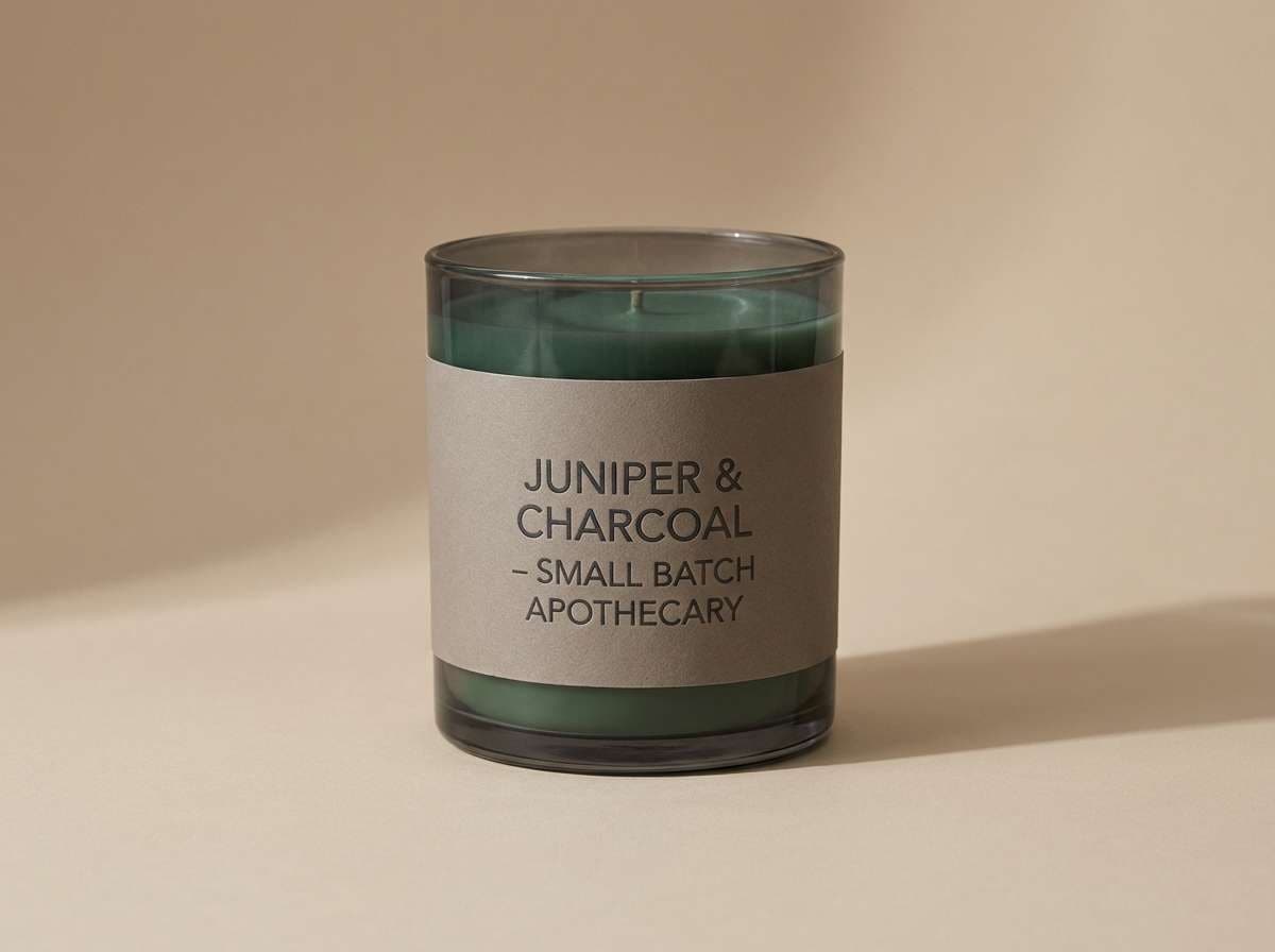
11) Juniper Smoke
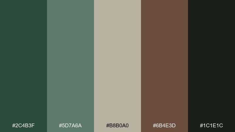
HEX: #2C4B3F #5D7A6A #B8B0A0 #6B4E3D #1C1E1C
Mood: smoky, relaxed, and premium
Best for: candle labels and scent packaging
Smoky juniper greens with warm neutrals suggest a crackling fire and a crisp herbal scent. It fits premium candle packaging and apothecary-style labels. Pair with minimal serif type, thin rules, and a single botanical illustration. Usage tip: print the darkest tone sparingly to avoid over-inking on textured stocks.
Image example of juniper smoke generated using media.io
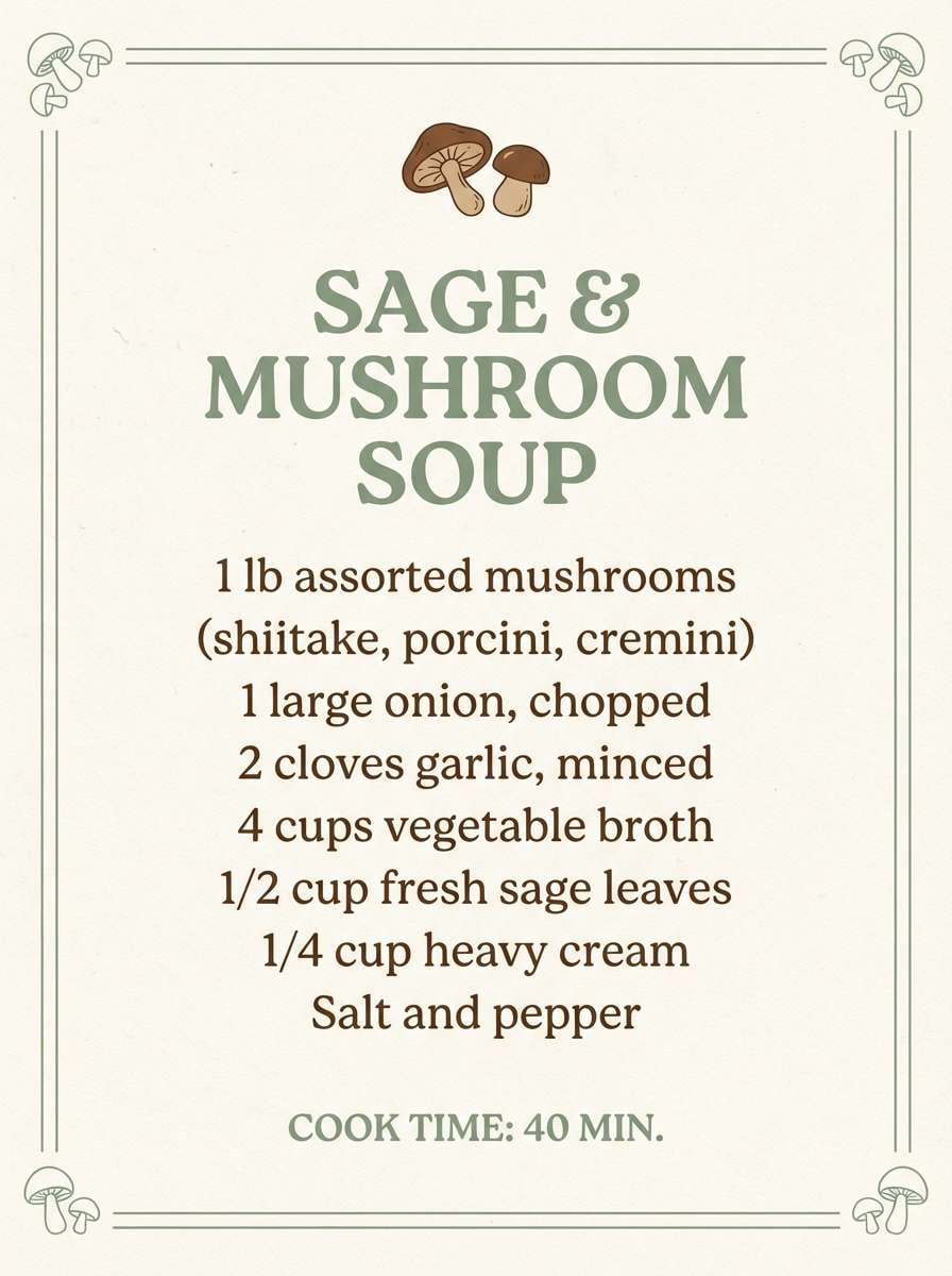
12) Wild Mushroom
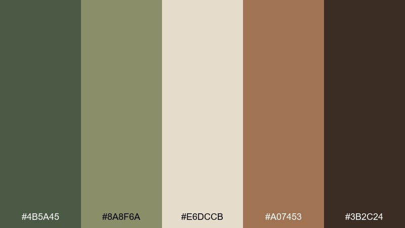
HEX: #4B5A45 #8A8F6A #E6DCCB #A07453 #3B2C24
Mood: earthy, gentle, and organic
Best for: food blog branding and recipe cards
Gentle greens and mushroom browns feel like a forest harvest, wholesome and grounded. These tones shine on recipe cards, blog headers, and food packaging where you want an organic look. Pair with natural-light photography and a cream background for readability. Usage tip: use the warm brown for section headers to keep the palette appetizing, not dull.
Image example of wild mushroom generated using media.io
13) Birch Grove
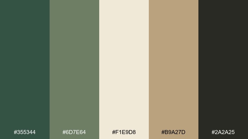
HEX: #355344 #6D7E64 #F1E9D8 #B9A27D #2A2A25
Mood: clean, fresh, and natural
Best for: minimal UI for eco shopping and marketplaces
Fresh birch-like creams with steady greens feel clean and breathable, like sunlight through pale trunks. It is a strong choice for marketplaces and eco shopping experiences that need clarity first. Pair with rounded UI elements, light dividers, and simple iconography. Usage tip: keep the cream as the main canvas and use the tan for subtle cards to avoid visual noise.
Image example of birch grove generated using media.io
14) Sage Understory
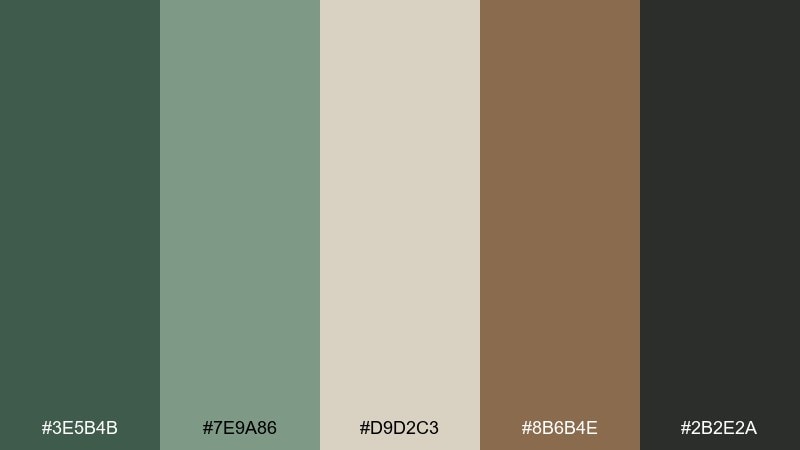
HEX: #3E5B4B #7E9A86 #D9D2C3 #8B6B4E #2B2E2A
Mood: soothing, airy, and botanical
Best for: spa menus and service brochures
Soothing sage and warm neutrals evoke a quiet understory, relaxed and restorative. It suits spa menus, brochures, and calm service brands that rely on trust and softness. Pair with thin sans serif type, light line art, and plenty of whitespace. Usage tip: keep the darker green for headings and use the pale neutral for the main background to maintain a serene flow.
Image example of sage understory generated using media.io
15) Copperleaf Autumn
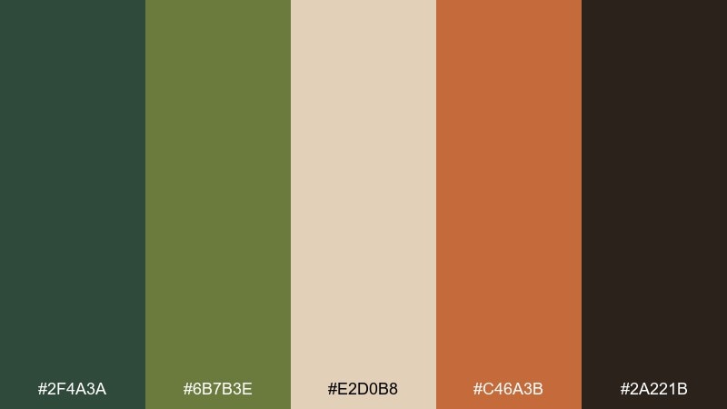
HEX: #2F4A3A #6B7B3E #E2D0B8 #C46A3B #2A221B
Mood: vibrant, warm, and seasonal
Best for: brand campaigns and launch graphics
Copperleaf orange against steady greens feels like a bright canopy in peak fall, energetic but still grounded. These woodland color combinations work well for campaign graphics where you need a strong focal accent. Pair with bold headlines and simple shapes, letting the cream tone soften the overall contrast. Usage tip: use copper for highlights only, and repeat it consistently across CTAs and key icons.
Image example of copperleaf autumn generated using media.io
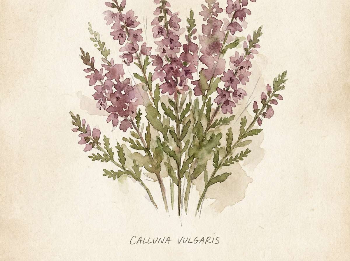
16) Highland Heather
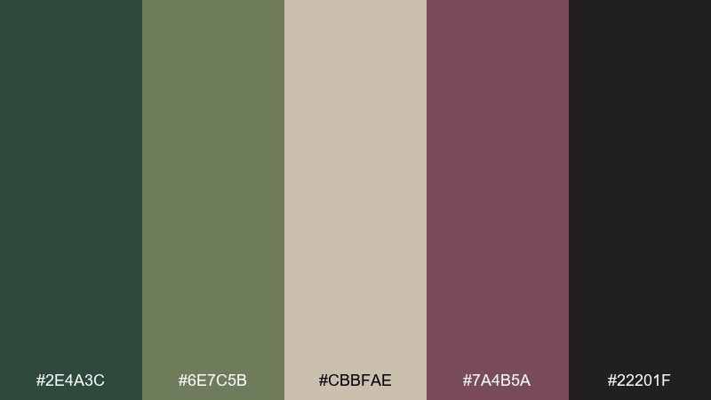
HEX: #2E4A3C #6E7C5B #CBBFAE #7A4B5A #22201F
Mood: romantic, muted, and artsy
Best for: botanical illustration prints
Muted heather mauve with mossy greens feels like wildflowers tucked into evergreen hills. It is ideal for art prints and stationery that want a subtle twist beyond plain earth tones. Pair with watercolor textures, fine outlines, and a warm paper background. Usage tip: keep the mauve for petals and small details so the greens remain the main structure.
Image example of highland heather generated using media.io
17) Forest Floor Neutral
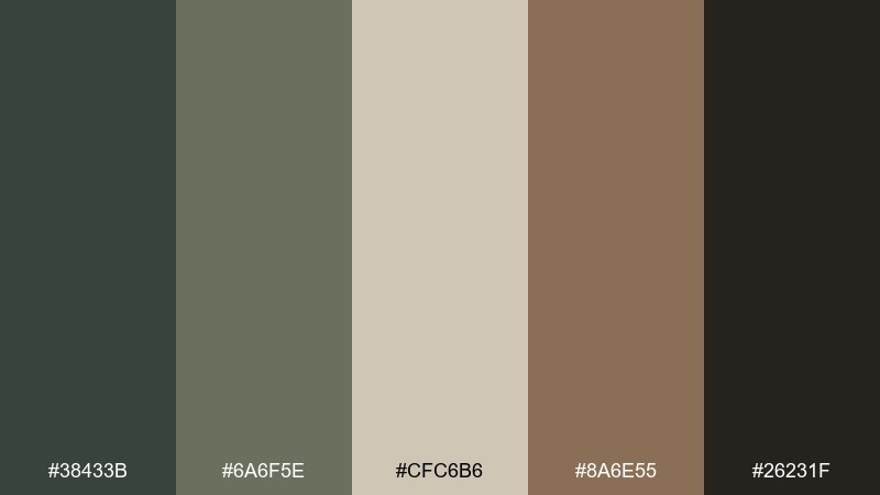
HEX: #38433B #6A6F5E #CFC6B6 #8A6E55 #26231F
Mood: neutral, pragmatic, and timeless
Best for: presentation templates and dashboards
Neutral greens and warm grays evoke leaf litter and soft soil, understated and dependable. It works for decks and dashboards where content needs to lead, not color. Pair with simple charts, thin dividers, and a restrained hierarchy. Usage tip: reserve the darkest tone for data labels and use the mid gray-green for secondary UI elements.
Image example of forest floor neutral generated using media.io
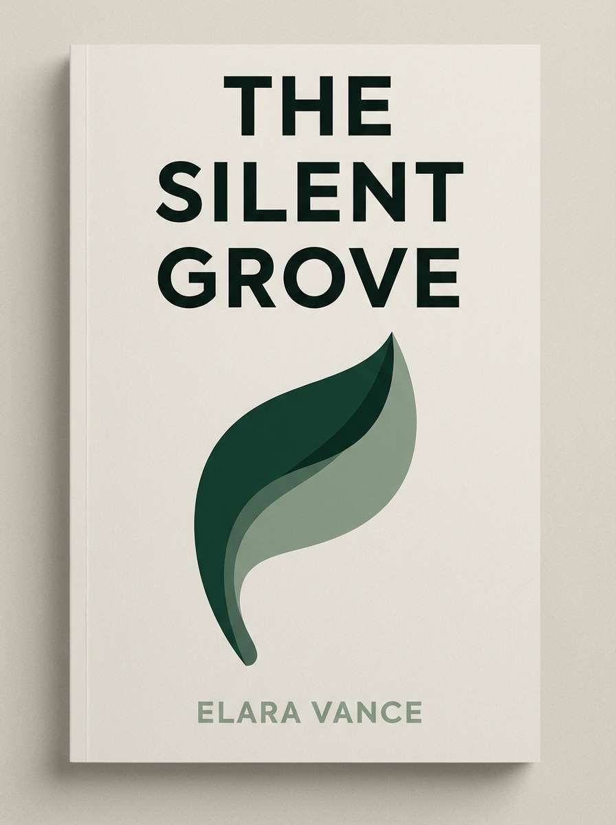
18) Evergreen Ink
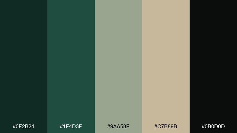
HEX: #0F2B24 #1F4D3F #9AA58F #C7B89B #0B0D0D
Mood: elegant, editorial, and high contrast
Best for: book covers and album art
Evergreen ink and near-black create a bold, literary mood like a dense canopy at night. It is great for covers that need drama, clarity, and a premium feel. Pair with large type, simple shapes, and a restrained two-color approach. Usage tip: let the pale green-gray handle secondary text so the black can stay clean and impactful.
Image example of evergreen ink generated using media.io
19) Owl Feather
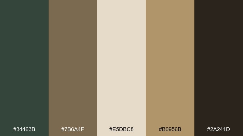
HEX: #34463B #7B6A4F #E5DBC8 #B0956B #2A241D
Mood: warm, natural, and slightly vintage
Best for: handmade goods shop banners
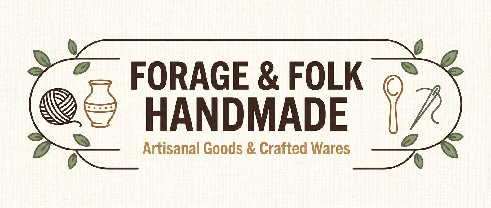
Warm feather browns with grounded greens feel like vintage field notes and natural fibers. It fits handmade shops, artisan marketplaces, and craft fair signage. Pair with textured paper backdrops, stamped icons, and a soft cream base. Usage tip: keep the tan and cream prominent, using dark brown only for key text and outlines.
Image example of owl feather generated using media.io
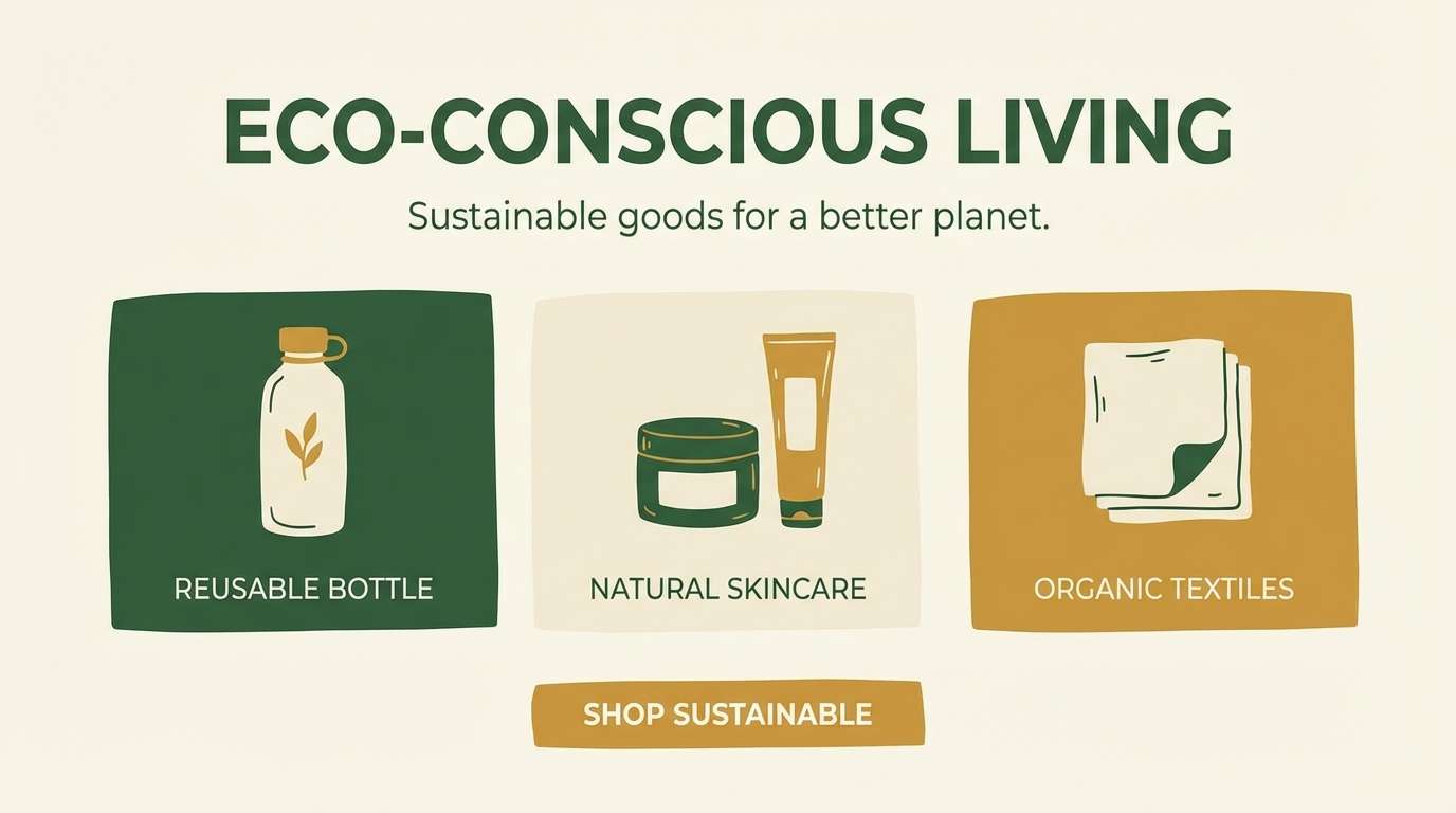
20) Sunlit Glade
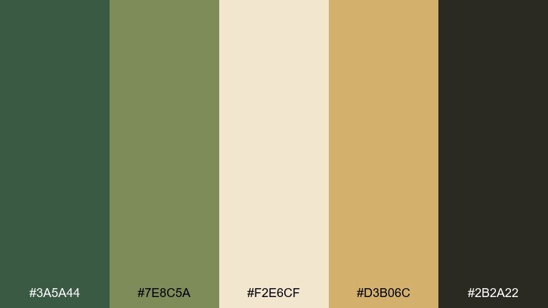
HEX: #3A5A44 #7E8C5A #F2E6CF #D3B06C #2B2A22
Mood: bright, optimistic, and natural
Best for: eco product landing pages and hero sections
Sunlit cream and warm golden accents feel like a clearing at midday, fresh and optimistic. It is strong for landing pages where you want natural warmth without overpowering the content. Pair with clean photography, soft shadows, and simple iconography. Usage tip: use the gold as a highlight for badges and links, keeping green for primary navigation and headings.
Image example of sunlit glade generated using media.io
What Colors Go Well with Woodland?
Woodland colors pair naturally with warm neutrals: cream, oatmeal, taupe, and kraft-paper beige. These shades keep layouts open and prevent deep greens from feeling too heavy.
For accents, choose muted warm tones like copper, amber, clay, or berry—just enough to add a focal point while keeping the palette grounded. This is especially effective for CTAs, badges, and small highlights.
If you need a modern edge, add a cool stone gray or a green-gray buffer tone between dark backgrounds and text. It improves readability and helps the palette feel contemporary rather than “rustic-only.”
How to Use a Woodland Color Palette in Real Designs
Start with a clear hierarchy: use the light neutral as your main canvas, a deep green or charcoal for text, and one mid green as your primary UI/brand color. Then reserve brown/copper/berry for controlled accents.
In print and packaging, woodland palettes look best on uncoated or textured stocks because they reinforce the natural story. Keep your darkest ink to typography and key marks to avoid muddy results.
For digital design, watch contrast in dark mode. A near-black green background with a softened sage/stone foreground often reads better than pure black and pure white, while still feeling forest-inspired.
Create Woodland Palette Visuals with AI
If you already have HEX codes, you can turn them into mood boards, UI mockups, posters, or packaging concepts in minutes using AI. The key is to describe the layout and material (paper, label, cards) and then name your dominant and accent colors.
Use the prompts above as templates: swap the subject (brochure, hero banner, hang tag) while keeping the “dominant colors” line consistent. This keeps your outputs cohesive across a full brand system.
When you like a direction, generate a few variations and tighten the contrast: make one color the background, one the typography, and one the CTA. That simple structure makes woodland palettes look intentional, not random.
Woodland Color Palette FAQs
-
What is a woodland color palette?
A woodland color palette is a set of nature-inspired tones—typically forest greens, mossy olives, bark browns, and warm neutrals (cream, taupe, stone)—used to create a grounded, organic look. -
Which HEX codes are common for woodland colors?
Common woodland HEX directions include deep greens (like #17362C or #2F4F3E), olive/sage supports (like #6B7D3A or #7E9A86), warm creams (like #F2E6CF), and bark browns (like #7A5A3A). -
How do I keep a woodland palette from looking too dark?
Let a light neutral (cream or stone) dominate the background and reserve near-black/charcoal for text only. Use mid greens for large surfaces and keep browns as secondary accents. -
Do woodland palettes work for modern UI design?
Yes—woodland palettes are great for calm, modern UI when you build a clear contrast system (neutral canvas, dark text, one primary green, one accent). For dark mode, use deep green-charcoal backgrounds with softened sage/stone text. -
What accent colors go best with woodland greens?
Muted warm accents like copper, amber, clay, and berry pair especially well. They add energy and focus without breaking the natural, earthy feel. -
What’s the best use case for woodland palettes in branding?
They’re ideal for outdoor brands, eco products, wellness, artisanal goods, and premium “natural” positioning. The tones signal trust, craft, and longevity rather than fast trends. -
Can I generate woodland palette mockups with AI?
Yes. Use a text-to-image tool and describe the design format (logo sheet, label, UI mockup) plus your dominant and accent woodland colors. Reusing a consistent prompt structure helps keep results cohesive.


