

A great gatsby color palette is all about Art Deco contrast: inky shadows, champagne gold shine, and jewel tones that feel instantly glamorous.
Below are 20 picks with HEX codes plus practical pairing tips for wedding invites, branding, posters, and modern UI that still nods to the Jazz Age.
In this article
- Why Great Gatsby Palettes Work So Well
-
- champagne noir
- emerald speakeasy
- gatsby blue hour
- pearl and brass
- rouge velvet lounge
- ivory deco lines
- midnight tuxedo
- garden party mint
- copper cigarette case
- sunset on the pier
- sapphire martini
- blush ballroom
- smoke and mirrors
- gold foil invitation
- olive silk suit
- crystal chandelier
- jazz club plum
- seaside linen
- art deco poster
- dawn at west egg
- What Colors Go Well with Great Gatsby?
- How to Use a Great Gatsby Color Palette in Real Designs
- Create Great Gatsby Palette Visuals with AI
Why Great Gatsby Palettes Work So Well
Great Gatsby palettes feel iconic because they lean on strong value contrast: deep blacks and navies against creamy ivories, with metallic gold as a highlight. That contrast makes typography crisp, shapes bold, and layouts instantly “Art Deco” even with minimal ornament.
They also borrow from luxury materials—velvet, brass, marble, crystal—so the colors carry a built-in sense of texture. You can make a design feel premium just by pairing a near-black base with a warm gold accent and a soft neutral background.
Finally, Jazz Age color schemes balance drama and restraint. The best looks use one dominant dark, one light neutral, and a single “spark” color (often gold), which keeps the vibe glamorous without turning the design noisy.
20+ Great Gatsby Color Palette Ideas (with HEX Codes)
1) Champagne Noir
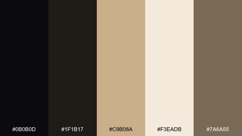
HEX: #0b0b0d #1f1b17 #c9b08a #f3eadb #7a6a55
Mood: glamorous, high-contrast, luxe
Best for: luxury brand logo and packaging
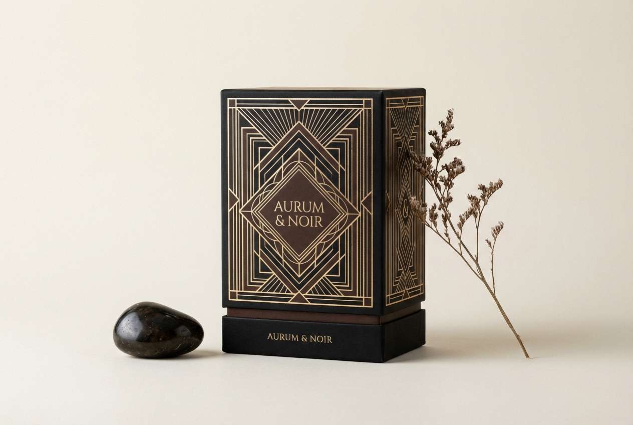
Glamorous and cinematic, it feels like candlelight catching a champagne coupe in a dark lounge. The black and espresso tones create instant drama, while champagne gold adds a crisp, upscale glow. Use it for premium packaging, monograms, and boutique branding where contrast matters. For a polished finish, keep text in noir and reserve the gold for thin lines or foil accents in a great gatsby color palette.
Image example of champagne noir generated using media.io
Media.io is an online AI studio for creating and editing video, image, and audio in your browser.

2) Emerald Speakeasy
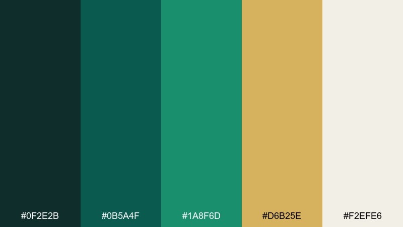
HEX: #0f2e2b #0b5a4f #1a8f6d #d6b25e #f2efe6
Mood: opulent, lively, jewel-toned
Best for: cocktail bar menu design
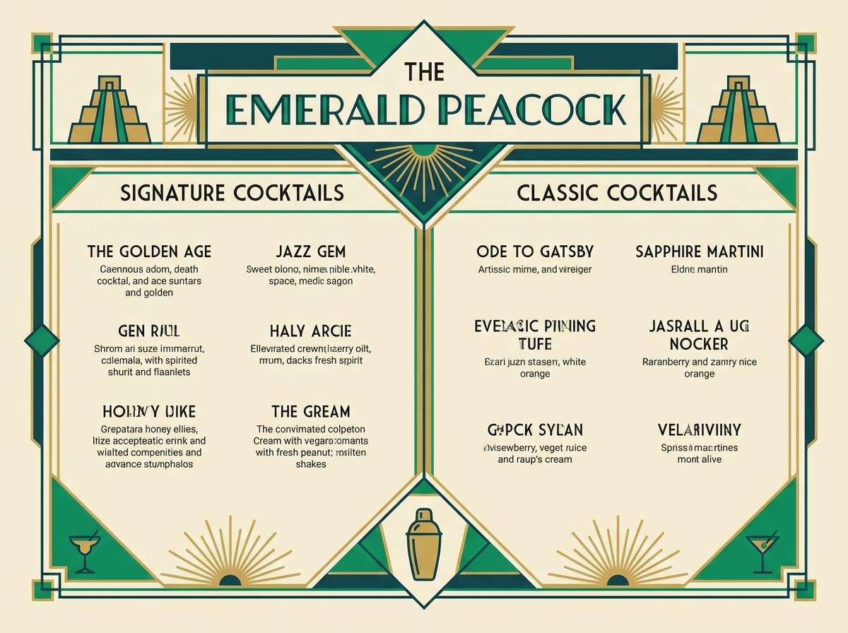
Opulent and lively, it evokes emerald velvet booths, brass rails, and the hush of a hidden door. Deep teal-green anchors the look, with warm gold bringing that unmistakable Jazz Age sparkle. These great gatsby color combinations work best with bold geometry and plenty of negative space for readability. Tip: set headings in emerald, body copy on warm ivory, and use gold only for dividers and icons.
Image example of emerald speakeasy generated using media.io
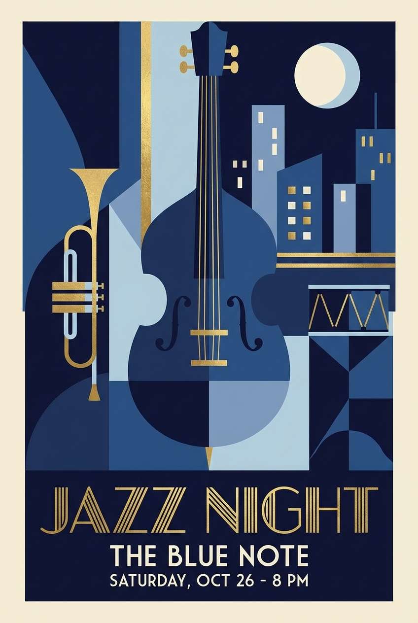
3) Gatsby Blue Hour
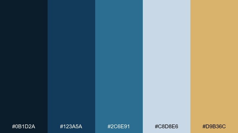
HEX: #0b1d2a #123a5a #2c6e91 #c8d8e6 #d9b36c
Mood: cool, elegant, twilight
Best for: event poster for a jazz night
Cool and elegant, it captures twilight over the bay with city lights starting to shimmer. Navy and deep blue set a refined base, while misty pale blue keeps it airy and modern. Add a small hit of warm gold to mimic marquee glow and guide the eye to key details. Keep the poster mostly blues, then use gold for dates, stars, or a single deco frame line.
Image example of gatsby blue hour generated using media.io
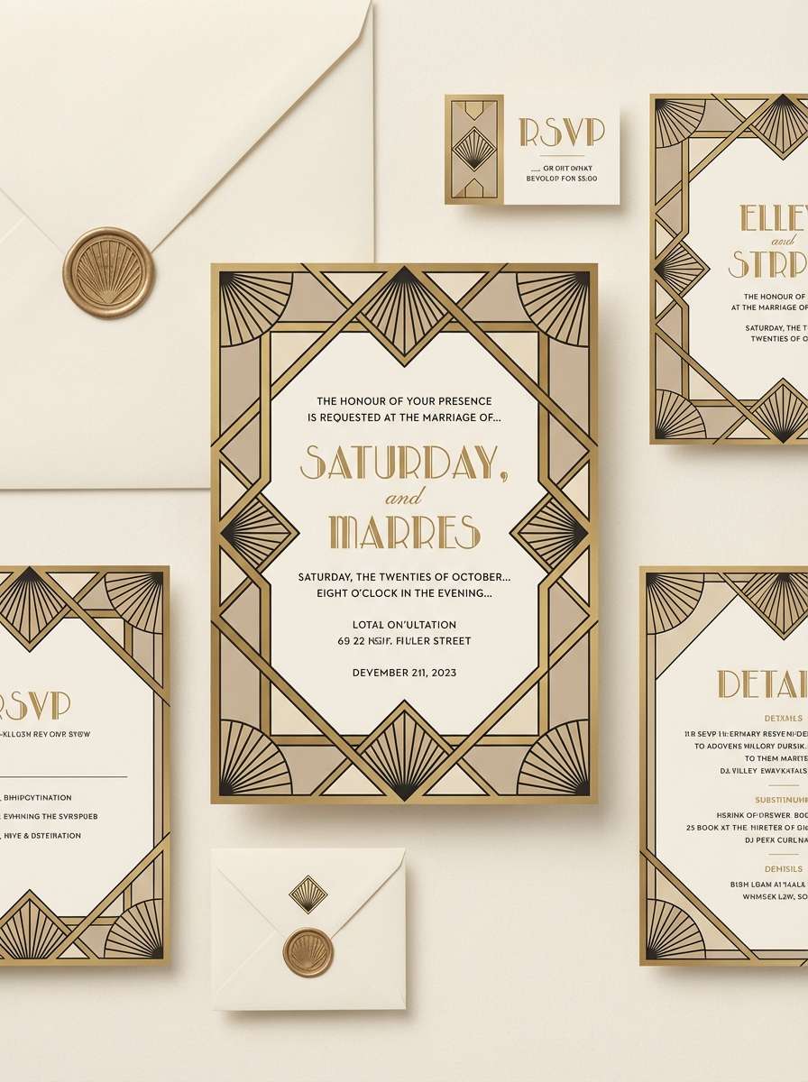
4) Pearl and Brass
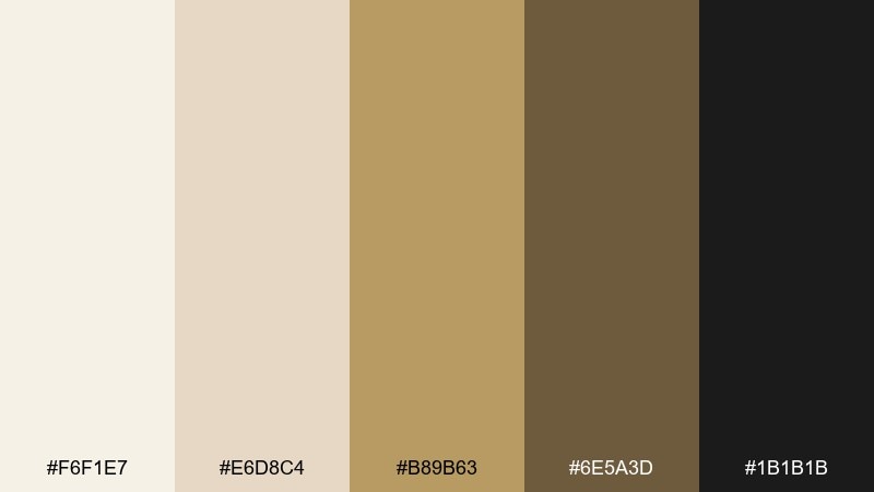
HEX: #f6f1e7 #e6d8c4 #b89b63 #6e5a3d #1b1b1b
Mood: soft, refined, heritage
Best for: wedding invitation suite
Soft and refined, it feels like pearls against silk with a hint of polished brass. Creamy neutrals keep everything romantic, while warm metallic tones add structure and formality. It suits invitation suites, RSVP cards, and place settings where legibility needs to stay high. Tip: print on textured stock and use the darkest tone for text, saving brass for borders or monograms.
Image example of pearl and brass generated using media.io
5) Rouge Velvet Lounge
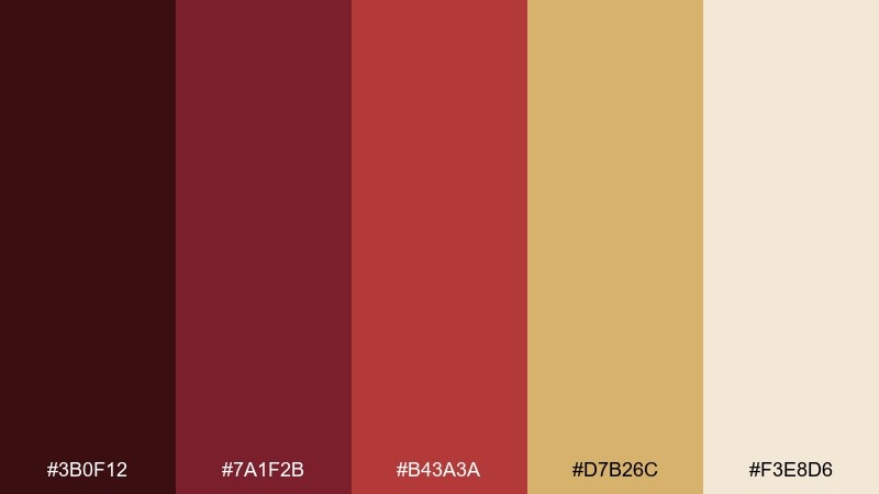
HEX: #3b0f12 #7a1f2b #b43a3a #d7b26c #f3e8d6
Mood: sensual, warm, theatrical
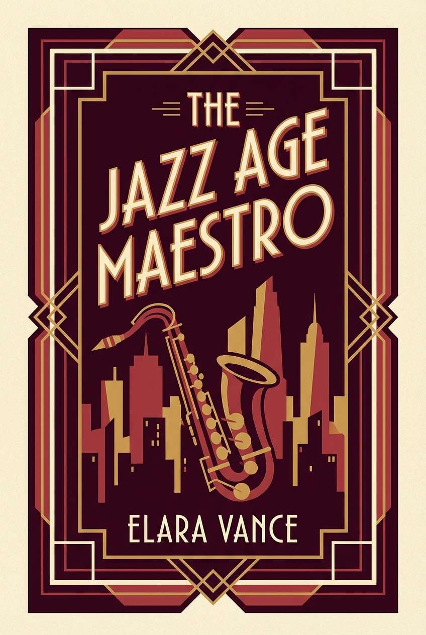
Best for: book cover design
Sensual and theatrical, it suggests velvet curtains, lipstick, and low jazz notes in a crowded room. Deep burgundy creates intensity, while muted red brings energy without turning neon. Gold and warm cream keep the palette from feeling too heavy and help type pop. For a great gatsby color scheme, pair the reds with thin deco linework and use cream as the main reading field.
Image example of rouge velvet lounge generated using media.io
6) Ivory Deco Lines
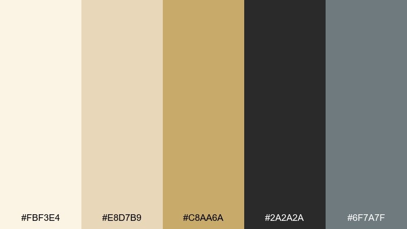
HEX: #fbf3e4 #e8d7b9 #c8aa6a #2a2a2a #6f7a7f
Mood: clean, classic, architectural
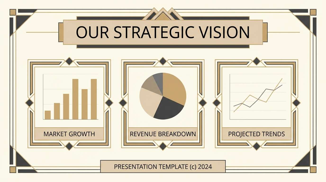
Best for: presentation template slides
Clean and architectural, it feels like carved ivory with crisp linework and tidy grids. Warm neutrals create an elegant canvas, and charcoal adds the strong contrast you need for charts and headlines. The slight slate-gray keeps it contemporary without losing the vintage cue. Tip: use gold only for section dividers and keep body text in charcoal for maximum clarity.
Image example of ivory deco lines generated using media.io
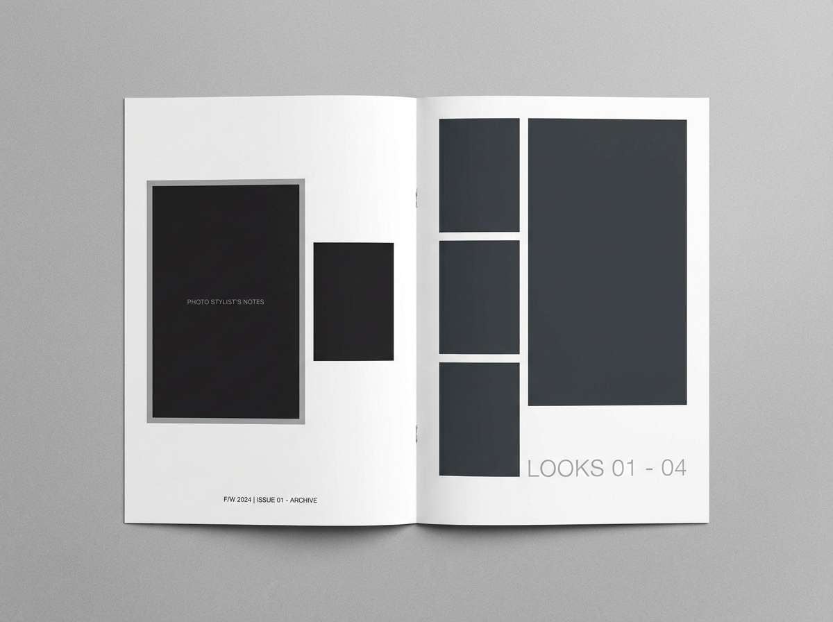
7) Midnight Tuxedo
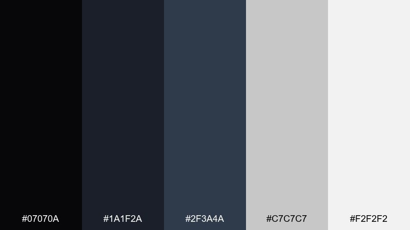
HEX: #07070a #1a1f2a #2f3a4a #c7c7c7 #f2f2f2
Mood: sleek, modern, monochrome
Best for: fashion lookbook layout
Sleek and modern, it reads like a tuxedo under spotlight with crisp folds and sharp edges. The layered dark tones give depth without needing bright color, and the silvers keep it clean and editorial. It works beautifully for lookbooks, typography-heavy layouts, and minimalist brand systems. Tip: use the lightest gray as a soft background so pure white stays reserved for key highlights.
Image example of midnight tuxedo generated using media.io
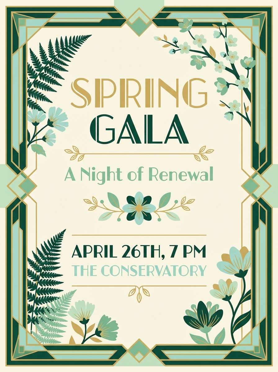
8) Garden Party Mint
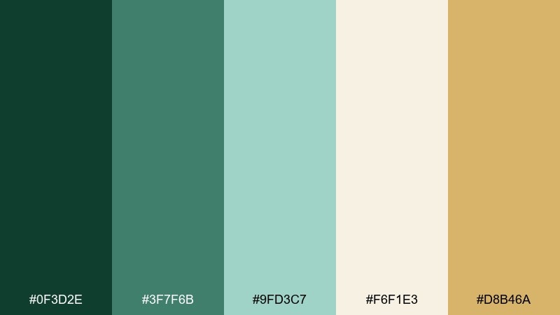
HEX: #0f3d2e #3f7f6b #9fd3c7 #f6f1e3 #d8b46a
Mood: fresh, sunny, celebratory
Best for: spring gala flyer
Fresh and celebratory, it brings to mind mint juleps, clipped hedges, and sunlight bouncing off glassware. Deep green keeps it grounded, while airy mint and cream make the layout feel open and welcoming. Add small gold accents for a dressed-up touch that still feels daytime-friendly. Tip: let mint be the dominant field color and use the darkest green only for type and key separators.
Image example of garden party mint generated using media.io
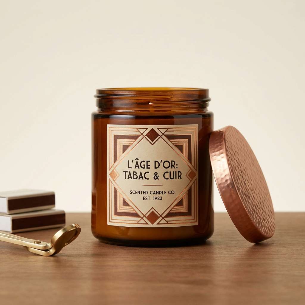
9) Copper Cigarette Case
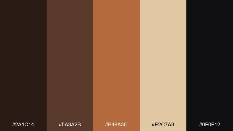
HEX: #2a1c14 #5a3a2b #b46a3c #e2c7a3 #0f0f12
Mood: warm, smoky, nostalgic
Best for: product label for candles
Warm and smoky, it recalls a polished copper case and the soft haze of a late-night room. Rich browns and copper make the palette feel tactile and vintage, especially with a near-black anchor. It fits candle labels, grooming products, and anything that wants a heritage vibe without looking old-fashioned. Tip: use copper for small typography or seals, and keep the main label background in parchment beige.
Image example of copper cigarette case generated using media.io
10) Sunset on the Pier
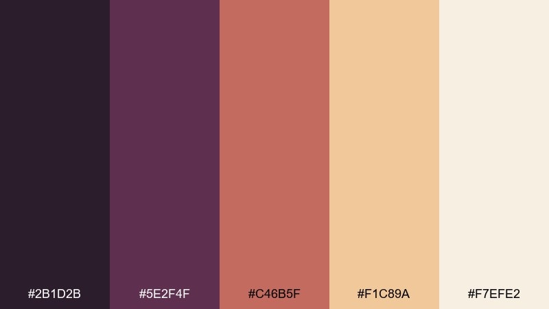
HEX: #2b1d2b #5e2f4f #c46b5f #f1c89a #f7efe2
Mood: romantic, warm, dreamy
Best for: social media promo set
Romantic and dreamy, it feels like sunset reflections on water with music floating from the shore. Plum and mauve add sophistication, while peach and apricot keep the mood approachable for modern audiences. It works well for promo posts, carousel templates, and lifestyle branding that wants a vintage hint. Tip: keep gradients subtle and use plum for the call-to-action to maintain contrast.
Image example of sunset on the pier generated using media.io
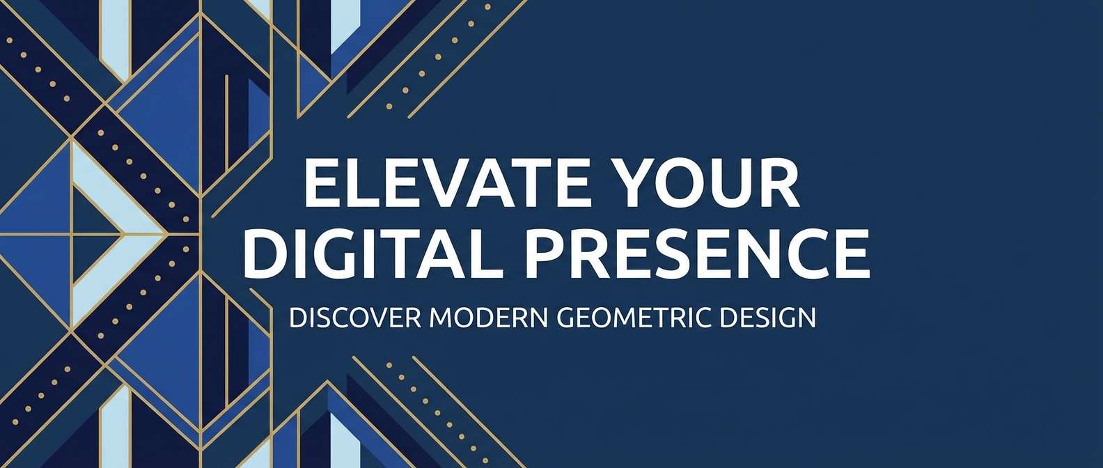
11) Sapphire Martini
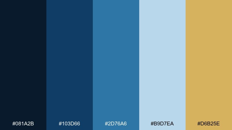
HEX: #081a2b #103d66 #2d76a6 #b9d7ea #d6b25e
Mood: crisp, upscale, cool
Best for: website hero banner
Crisp and upscale, it suggests a sapphire-blue martini glass with a gold rim catching the light. The blues offer a clean, modern foundation, while pale blue keeps the mood airy instead of heavy. Use the gold sparingly to create focal points like buttons, badges, or a thin border around a headline. Tip: choose one dominant blue for the hero block and keep the rest as supporting tints for depth.
Image example of sapphire martini generated using media.io
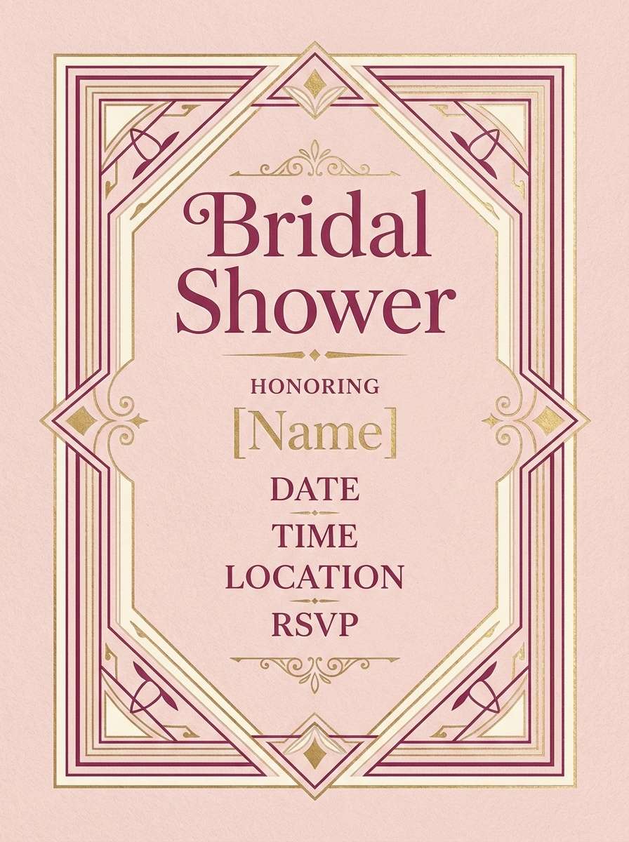
12) Blush Ballroom
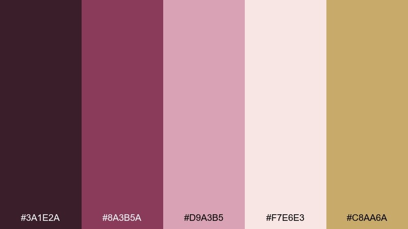
HEX: #3a1e2a #8a3b5a #d9a3b5 #f7e6e3 #c8aa6a
Mood: romantic, elegant, soft
Best for: bridal shower invitation
Romantic and elegant, it feels like blush satin, soft florals, and a slow waltz under warm lights. Deep berry keeps the sweetness in check, and the pale blushes give plenty of breathing room for type. The gold tone adds a celebratory edge without overpowering the delicate base. Tip: use berry for names and dates, then frame the layout with thin gold deco lines.
Image example of blush ballroom generated using media.io
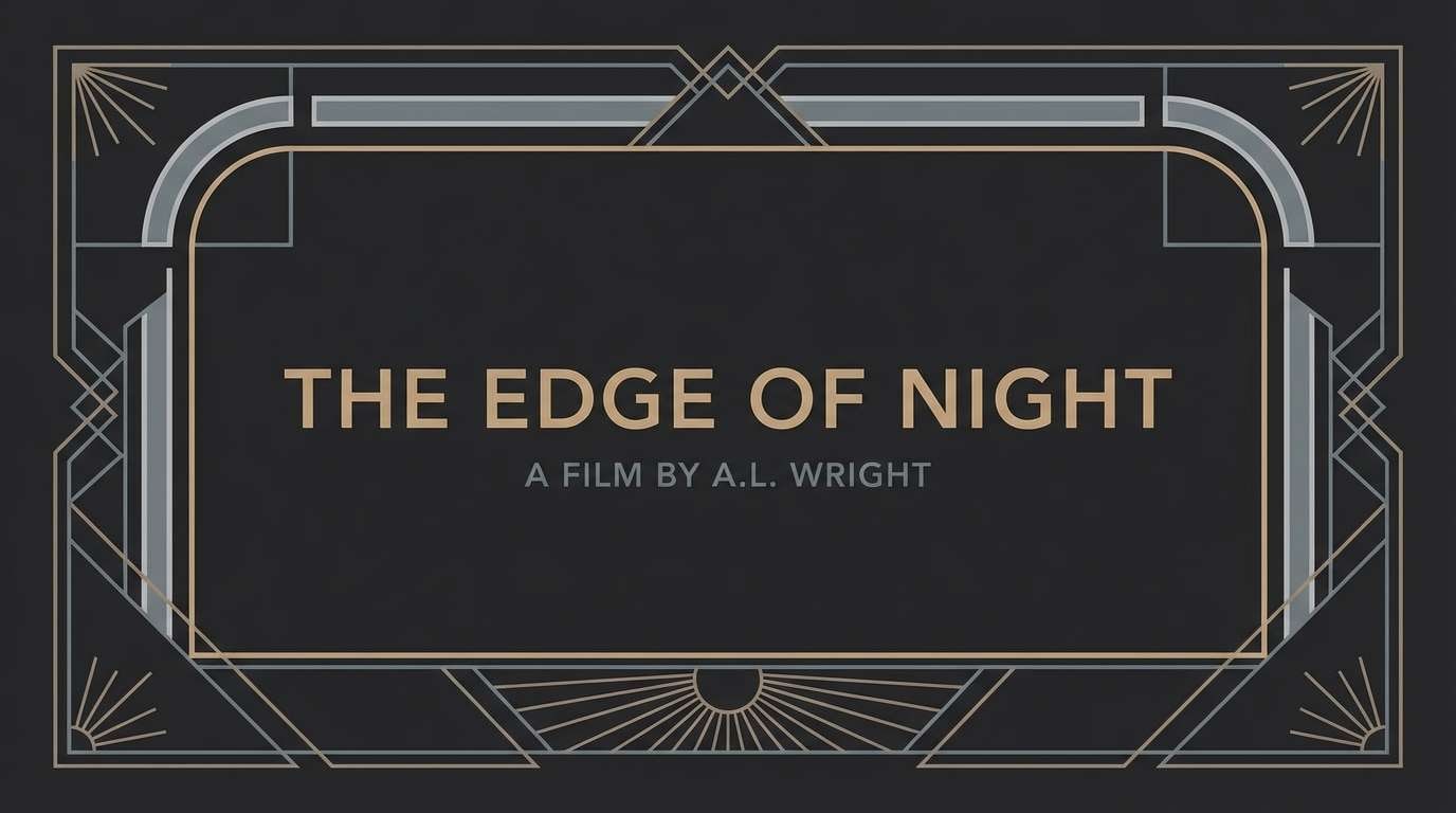
13) Smoke and Mirrors
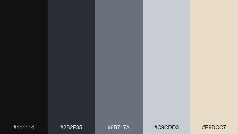
HEX: #111114 #2b2f35 #6b717a #c9cdd3 #e9dcc7
Mood: moody, understated, cinematic
Best for: film title card design
Moody and understated, it evokes cigarette smoke, mirrored walls, and whispered conversations after midnight. Charcoal and steel-gray create a cinematic base that feels modern, while warm beige softens the edge. It is ideal for title cards, credits, and typography-first compositions where tone matters more than color. Tip: use the light gray for the title and keep the background nearly black for a dramatic reveal.
Image example of smoke and mirrors generated using media.io
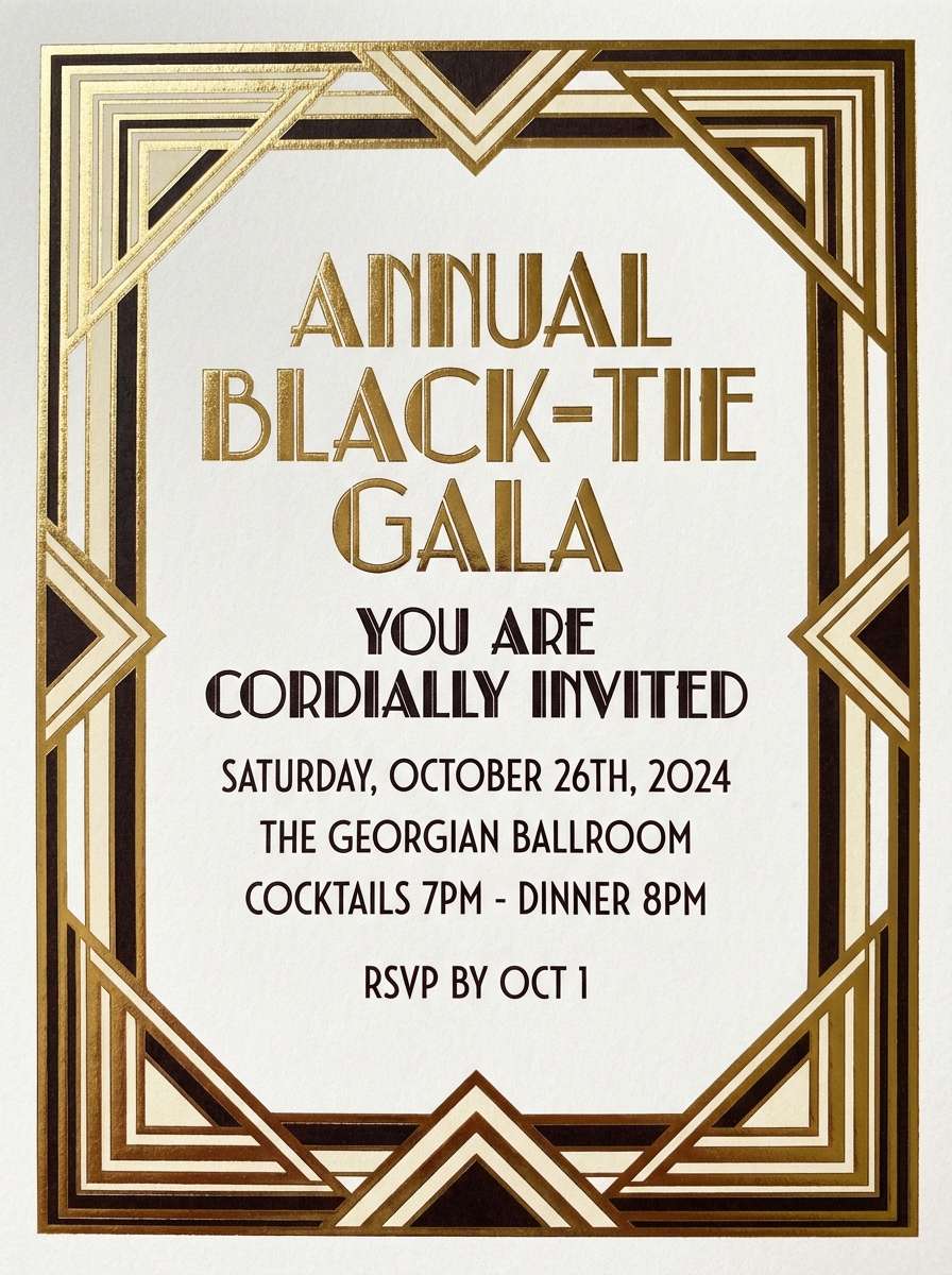
14) Gold Foil Invitation
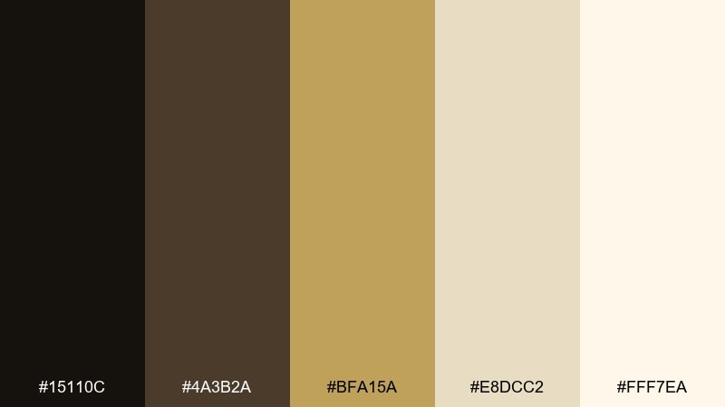
HEX: #15110c #4a3b2a #bfa15a #e8dcc2 #fff7ea
Mood: formal, luminous, celebratory
Best for: black-tie gala invitation
Formal and luminous, it looks like gold foil pressed into thick paper under soft lamplight. Deep brown-black adds gravity, while layered creams keep the overall feel bright and premium. These great gatsby color combinations shine on invitations, programs, and table signage with geometric deco frames. Tip: keep the background warm white, then add gold in thin strokes so it reads elegant instead of loud.
Image example of gold foil invitation generated using media.io
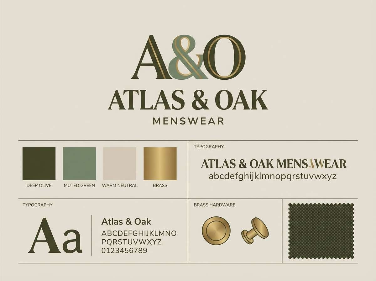
15) Olive Silk Suit
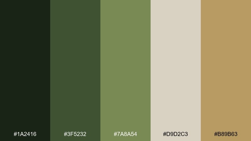
HEX: #1a2416 #3f5232 #7a8a54 #d9d2c3 #b89b63
Mood: earthy, refined, uncommon
Best for: menswear brand identity
Earthy yet refined, it brings to mind olive silk, tailored details, and vintage tailoring shops. The greens feel distinctive without turning rustic, and the warm neutral keeps it sophisticated for typography. It is a strong fit for menswear branding, labels, and editorial styling guides. Tip: use olive as a solid block color, then highlight product names with a small brass-gold accent.
Image example of olive silk suit generated using media.io
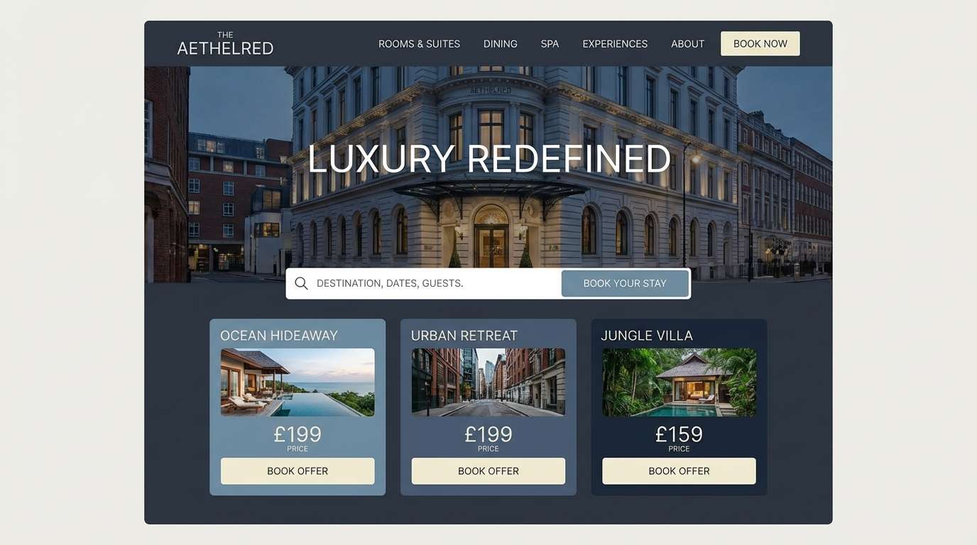
16) Crystal Chandelier
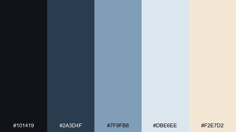
HEX: #101419 #2a3d4f #7f9fb8 #dbe6ee #f2e7d2
Mood: airy, polished, sparkling
Best for: luxury hotel website UI
Airy and polished, it feels like crystal facets reflecting cool light over a marble lobby. The blue-grays keep the UI calm and premium, and the creamy highlight adds warmth so it does not feel sterile. Use it for hotel websites, booking flows, and membership pages that need a quiet sense of luxury. Tip: reserve the darkest tone for navigation and use the softest blue for large background panels.
Image example of crystal chandelier generated using media.io
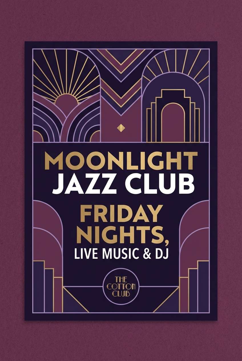
17) Jazz Club Plum
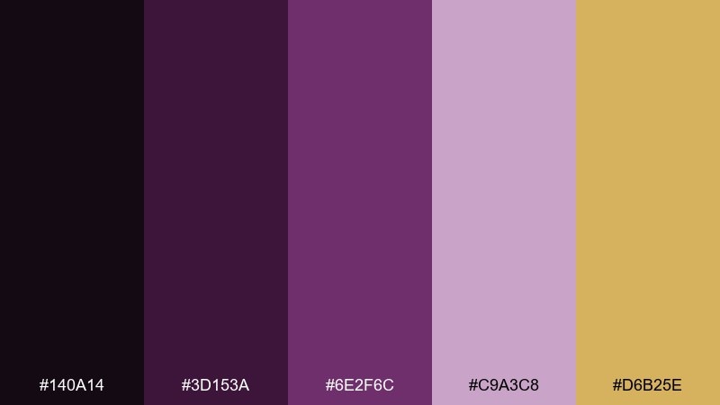
HEX: #140a14 #3d153a #6e2f6c #c9a3c8 #d6b25e
Mood: bold, moody, electric
Best for: nightlife club poster
Bold and electric, it recalls plum stage lights, velvet shadows, and a brass section hitting the chorus. Dark violet keeps it dramatic, while soft lavender adds depth for layered shapes and typography. Gold works like a spotlight, perfect for dates, ticket info, or a single emblem. Tip: keep the background nearly black-purple and let lavender shapes guide the viewer toward the headline.
Image example of jazz club plum generated using media.io
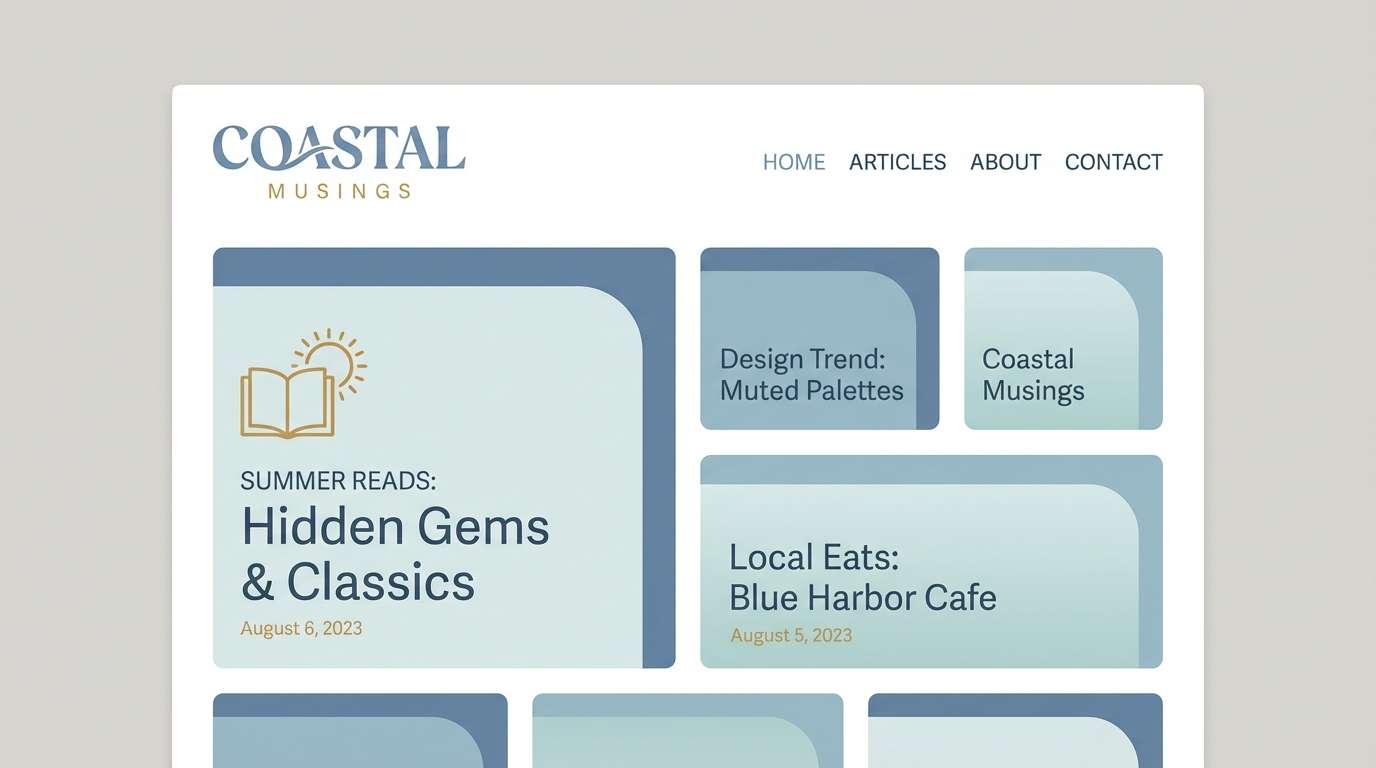
18) Seaside Linen
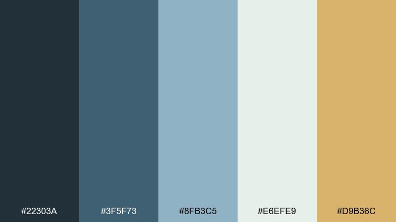
HEX: #22303a #3f5f73 #8fb3c5 #e6efe9 #d9b36c
Mood: breezy, relaxed, coastal
Best for: lifestyle blog theme
Breezy and relaxed, it feels like linen suits by the water with a soft wind off the coast. Dusty blues keep the look calm and readable, and the seafoam-leaning light tone adds freshness for content-heavy pages. A touch of warm gold adds personality without breaking the coastal mood. Tip: use the lightest shade for page backgrounds and keep buttons in the deeper blue for clear hierarchy.
Image example of seaside linen generated using media.io
19) Art Deco Poster
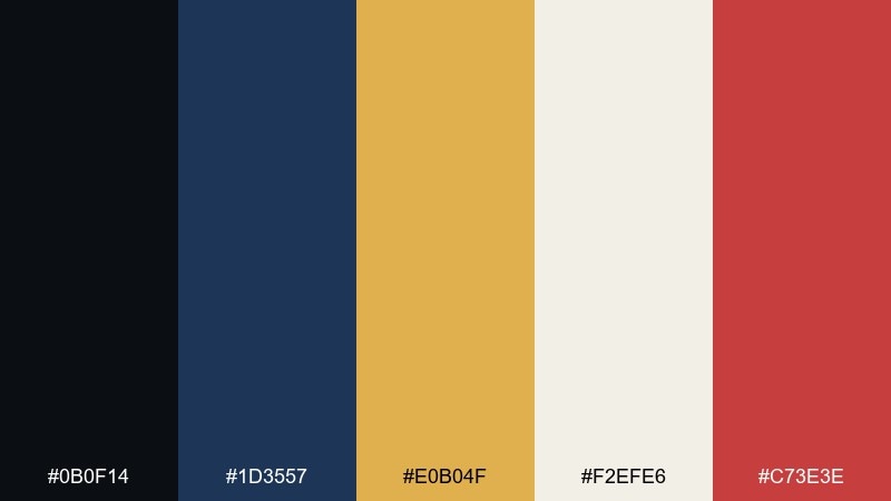
HEX: #0b0f14 #1d3557 #e0b04f #f2efe6 #c73e3e
Mood: graphic, confident, iconic
Best for: retro-inspired wall print
Graphic and iconic, it evokes bold poster art with sharp angles and a confident headline. Navy and near-black provide a strong foundation, while warm gold delivers instant Art Deco energy. Cream keeps the layout breathable, and the red is best used as a small punch for stamps or corner motifs. Tip: limit red to under 10 percent of the design so the gold remains the star.
Image example of art deco poster generated using media.io
20) Dawn at West Egg
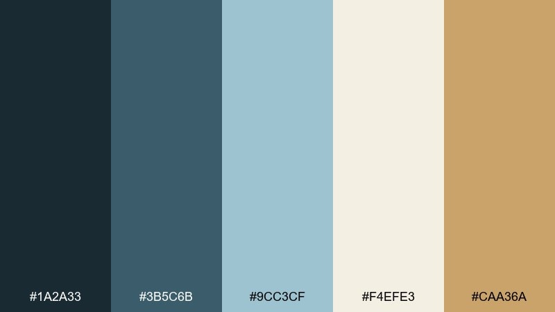
HEX: #1a2a33 #3b5c6b #9cc3cf #f4efe3 #caa36a
Mood: hopeful, calm, refined
Best for: editorial article header
Hopeful and calm, it suggests early morning haze with a soft blue sky and quiet gold light on the horizon. The cool tones feel modern for digital publishing, while the warm accent adds a hint of glamour without shouting. It is a balanced great gatsby color combination for editorial headers, pull quotes, and feature pages. Tip: keep the background creamy, then use the mid blue for rules and the gold only for small ornaments.
Image example of dawn at west egg generated using media.io
What Colors Go Well with Great Gatsby?
The classic Great Gatsby pairing is black + gold + ivory, because it mirrors the era’s interiors and jewelry and keeps the design legible. Add deep emerald, sapphire, or burgundy for a jewel-toned twist that still feels period-correct.
For a softer, more romantic 1920s color scheme, swap pure black for charcoal or deep brown-black, then layer creams, blush, or pearl tones. This keeps the Art Deco vibe while working beautifully for invitations and editorial layouts.
If you want a modern Gatsby look, stick to cool blue-grays and pale blues, then use warm gold as a micro-accent. The result feels clean for UI and branding while still reading “vintage glamour.”
How to Use a Great Gatsby Color Palette in Real Designs
Start with a simple hierarchy: one dominant background (often noir, navy, or warm ivory), one text color with strong contrast, and one accent (gold) for emphasis. Art Deco works best when accents are thin—frames, dividers, corner motifs, and small icons.
For print pieces like menus and wedding suites, choose an off-white base so gold and dark inks feel richer, not harsh. If you’re using metallics, reserve them for borders, monograms, or section headers to keep the layout refined.
For digital UI, keep large surfaces in soft tints (pale blue or cream) and save dark tones for navigation and headings. Use gold only on key interactive elements (primary button, badge, or active state) to maintain a premium feel.
Create Great Gatsby Palette Visuals with AI
If you already have HEX codes, you can generate matching Art Deco visuals fast by describing the scene (menu, invitation, poster, packaging) and specifying which color should dominate. This helps you test how a palette reads in real layouts instead of just swatches.
Use prompts that mention Art Deco geometry, foil lines, and clean negative space, then keep the accent color (gold) “small” so the output doesn’t become overly saturated. Iterate by changing only one variable at a time: background tone, accent amount, or typography style.
With Media.io, you can create consistent image examples for mood boards, client presentations, and brand explorations—without rebuilding each concept from scratch.
Great Gatsby Color Palette FAQs
-
What is a Great Gatsby color palette?
A Great Gatsby color palette is inspired by 1920s Art Deco style—typically featuring high-contrast dark tones (black, navy, charcoal), warm neutrals (ivory, cream), and metallic accents like gold or brass, often paired with jewel tones such as emerald or burgundy. -
What are the most iconic Gatsby colors?
Black, champagne gold, and ivory are the most iconic. Emerald green, deep sapphire blue, and rich burgundy are also common Jazz Age additions for a more opulent, speakeasy-inspired look. -
How do I keep a Gatsby palette from looking too dark?
Let a warm light neutral (ivory/cream) be the main background, use dark tones only for text and framing, and apply gold as a thin accent. This keeps the “noir” mood without sacrificing readability. -
Can I use Great Gatsby colors for a modern website UI?
Yes. Use muted blue-grays or pale blues for large panels, keep navigation and headings in deep navy/charcoal, and reserve gold for primary buttons or small highlights. The key is restraint and clear contrast. -
What colors work best for Gatsby-style wedding invitations?
Cream/pearl backgrounds with black or deep brown text are a safe base, with brass or gold for borders and monograms. Blush, berry, or emerald can be added as a secondary color for a softer or more opulent theme. -
How much gold should I use in an Art Deco palette?
Treat gold as an accent, not a fill—thin lines, corner ornaments, icons, and small title details work best. Keeping gold limited helps it read like “foil” and preserves a luxe feel. -
How can I generate Gatsby-style visuals that match my HEX codes?
Use a text-to-image prompt that specifies “Art Deco linework,” “geometric border,” and your dominant tones (e.g., noir, ivory, champagne gold). Generate a few variations and adjust only one element at a time (background, accent amount, or layout) for consistency.
Next: Pale Blue Color Palette


