

Wine is a rich, mood-setting color family that sits between deep red and purple, making it perfect for designs that need depth without feeling flat. From bordeaux to berry and rose, wine tones can look modern, romantic, or heritage depending on the neutrals you pair them with.
Below are 20 wine color palette ideas with HEX codes, plus practical pairing tips for branding, UI, print, and AI-generated visuals.
In this article
Why Wine Palettes Work So Well
Wine tones feel instantly premium because they’re naturally associated with craft, aging, and ritual—think labels, menus, velvet textiles, and candlelit spaces. That built-in “story” helps brands and layouts feel intentional with minimal extra styling.
They’re also flexible across industries: deepen the reds for luxury, soften them into dusty rose for romance, or cool them with slate and charcoal for modern UI. Wine colors can carry hierarchy well because they offer clear dark-to-light steps.
Most importantly, wine shades pair beautifully with readable neutrals (cream, beige, fog gray) and controlled accents (gold, pine, sunset orange). That makes them reliable for both digital contrast and print reproduction.
20+ Wine Color Palette Ideas (with HEX Codes)
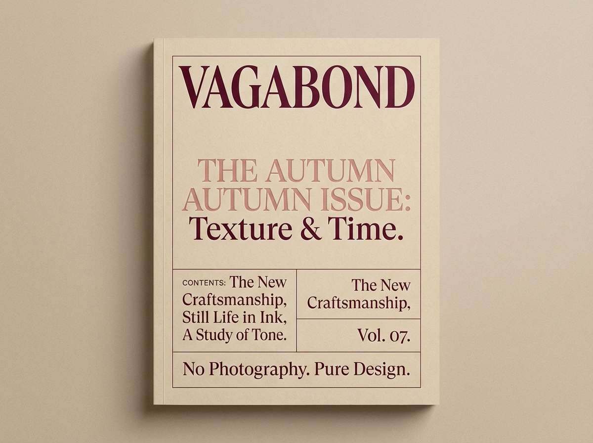
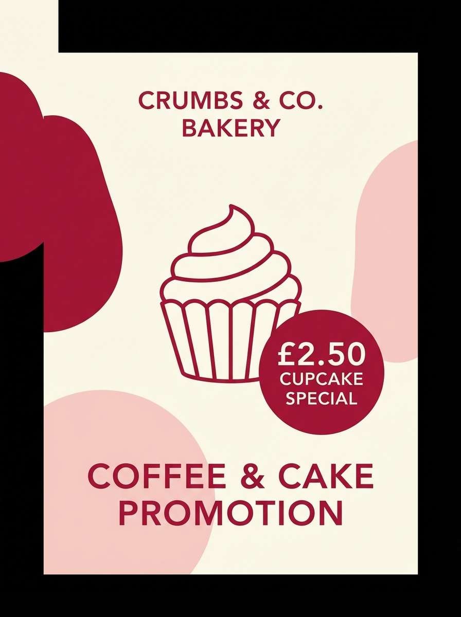
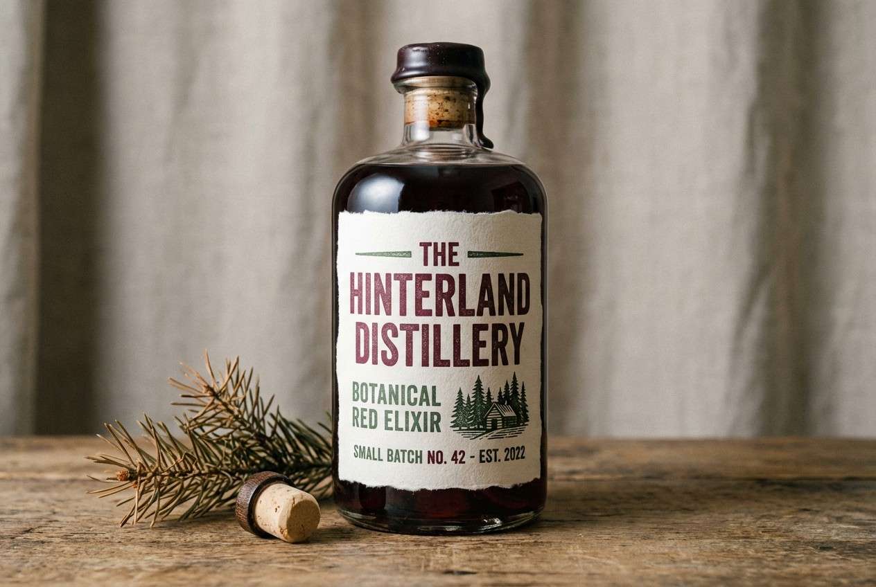
1) Cellar Velvet
HEX: #4b1020 #7a1f3d #b15b73 #e7d7cf #1c1a1c
Mood: moody, luxurious, intimate
Best for: premium branding and editorial covers
Moody velvet reds and soft blush highlights evoke candlelit cellars and polished leather. This wine color palette works beautifully on premium labels, book covers, and fashion editorials where contrast matters. Pair the deep base with warm neutrals to keep it readable, then use the blush as a spotlight color for calls to action. Tip: reserve the near-black for type and thin rules to avoid heavy blocks.
Image example of cellar velvet generated using media.io
Media.io is an online AI studio for creating and editing video, image, and audio in your browser.

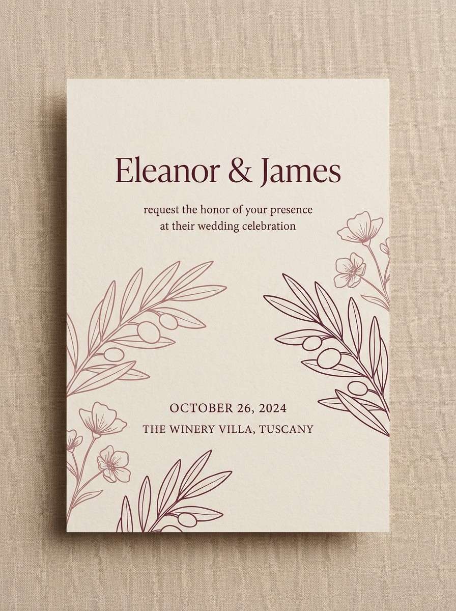
2) Merlot Linen
HEX: #5a0f24 #8c2c45 #c68a8f #f3efe6 #c9b8a6
Mood: soft, refined, welcoming
Best for: wedding invitations and stationery
Soft merlot tones over linen-like neutrals feel romantic without turning sugary. The creamy base makes details like monograms, line florals, and wax-seal motifs pop. Pair it with warm metallic foil or textured paper stocks to elevate the finish. Tip: keep the darkest shade for names and headings, and let the mid tones handle borders and icons.
Image example of merlot linen generated using media.io
3) Rosewood Blush
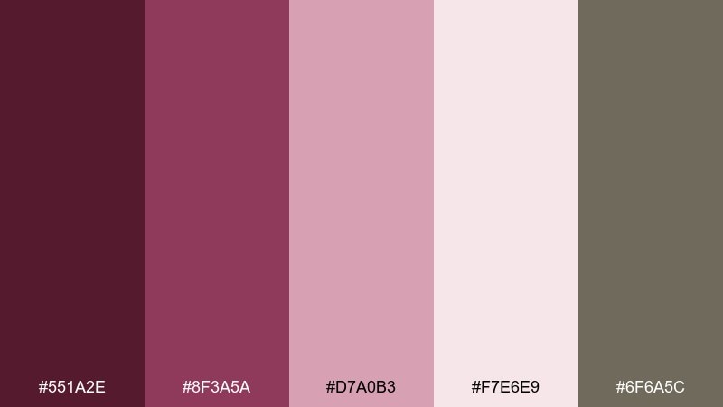
HEX: #551a2e #8f3a5a #d7a0b3 #f7e6e9 #6f6a5c
Mood: romantic, gentle, modern
Best for: beauty packaging and social ads
Rosewood and blush create a soft-focus glow, like makeup swatches on clean studio paper. The warm light tones keep the look fresh while the muted gray-brown adds sophistication. Pair with minimal typography and plenty of breathing room for a premium feel. Tip: use the blush as the main surface color and save the deep rosewood for logos and key claims.
Image example of rosewood blush generated using media.io
4) Vintage Bordeaux

HEX: #3f0b19 #6e1b2c #a33c4f #d9b3a7 #4a3b3b
Mood: classic, heritage, confident
Best for: restaurant menus and boutique hotel collateral
Deep bordeaux with aged-rose undertones feels timeless, like well-worn leather and old paper. It suits menus, tasting notes, and hotel print pieces that need a classic mood without looking dated. Pair with cream stock, serif typography, and subtle texture for a refined finish. Tip: keep body text in the cocoa shade for comfort reading under dim lighting.
Image example of vintage bordeaux generated using media.io
5) Mulberry Smoke
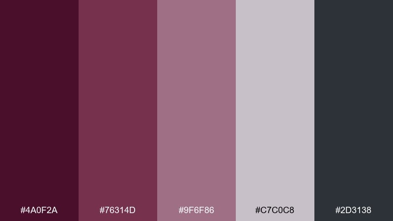
HEX: #4a0f2a #76314d #9f6f86 #c7c0c8 #2d3138
Mood: cool, atmospheric, sleek
Best for: music posters and moody photography edits
Mulberry purples and smoky grays bring a late-night, city-rain vibe with a modern edge. The cooler neutrals help the darker tones feel crisp rather than heavy. Pair with condensed typefaces, grain overlays, and simple geometric shapes. Tip: add the pale gray-lilac as a halo behind text to boost legibility on dark layouts.
Image example of mulberry smoke generated using media.io
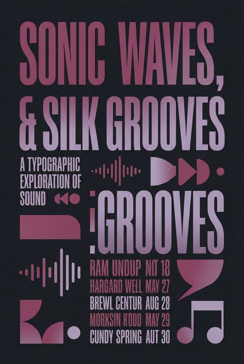
6) Garnet Gold
HEX: #5b0d1b #8a2637 #b94a5a #d7b25e #fbf3da
Mood: opulent, celebratory, warm
Best for: holiday campaigns and premium product ads
Garnet reds with a honeyed gold accent feel festive, like candlelight on satin ribbons. These wine color combinations shine in seasonal campaigns, limited-edition packaging, and upscale event graphics. Pair with minimal black type or warm cream backgrounds so the gold reads as a true highlight. Tip: use gold sparingly for badges and borders to avoid a brassy look.
Image example of garnet gold generated using media.io
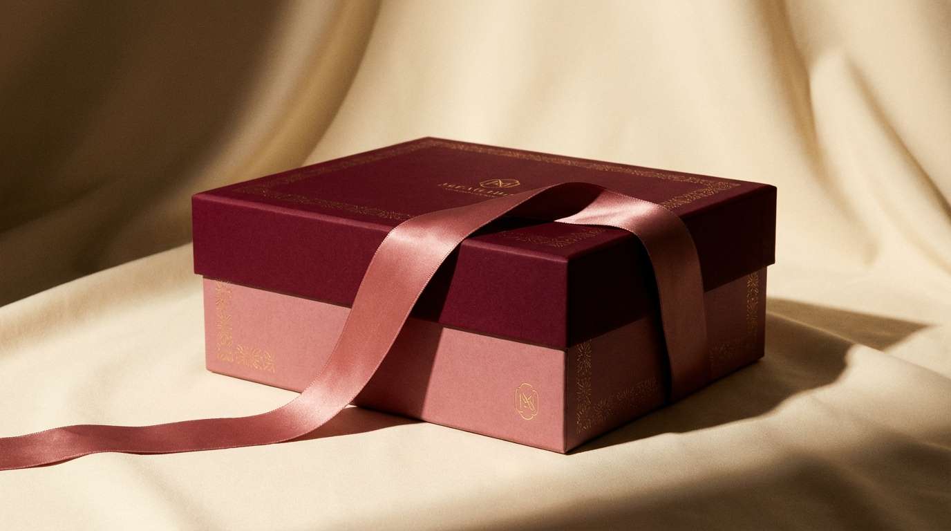
7) Cranberry Cream
HEX: #6b1025 #a12a43 #d45a6b #f5d7d1 #fff7f0
Mood: sweet, airy, approachable
Best for: bakery branding and Valentine promos
Cranberry reds blended with whipped-cream neutrals feel playful and inviting. The lighter tints keep layouts bright, while the mid red adds punch for buttons and price tags. Pair with rounded typefaces and simple illustrations for a friendly look. Tip: keep the deepest shade for outlines and small text so the palette stays soft overall.
Image example of cranberry cream generated using media.io
8) Plum Slate
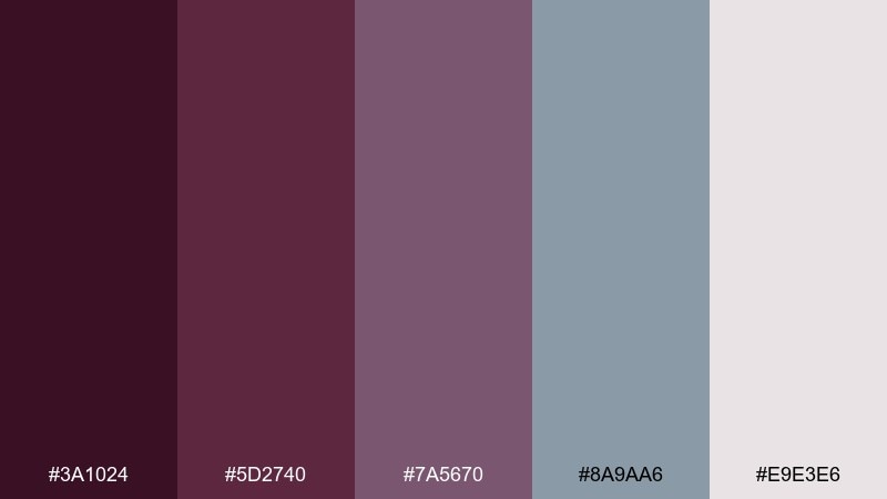
HEX: #3a1024 #5d2740 #7a5670 #8a9aa6 #e9e3e6
Mood: calm, contemporary, balanced
Best for: dashboard UI and data apps
Plum tones against slate blue-gray read calm and intelligent, like dusk light on stone. It is ideal for UI where you need depth without harsh contrast. Pair with thin icon strokes and generous spacing, letting the pale background carry the layout. Tip: use the slate shade for secondary panels and the plum for active states and charts.
Image example of plum slate generated using media.io
9) Port and Pine
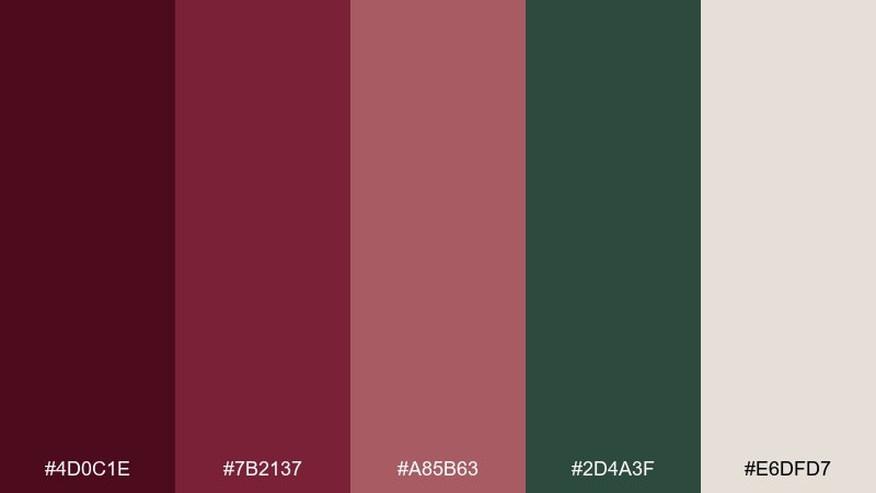
HEX: #4d0c1e #7b2137 #a85b63 #2d4a3f #e6dfd7
Mood: earthy, rustic, grounded
Best for: outdoor lifestyle branding and labels
Port reds with pine green feel like autumn hikes and woodsmoke in the air. The green adds a natural counterbalance that keeps the reds from reading too formal. Pair with kraft textures, serif headlines, and simple stamp-style marks. Tip: let pine green handle backgrounds while the reds stay on badges, logos, and small highlights.
Image example of port and pine generated using media.io
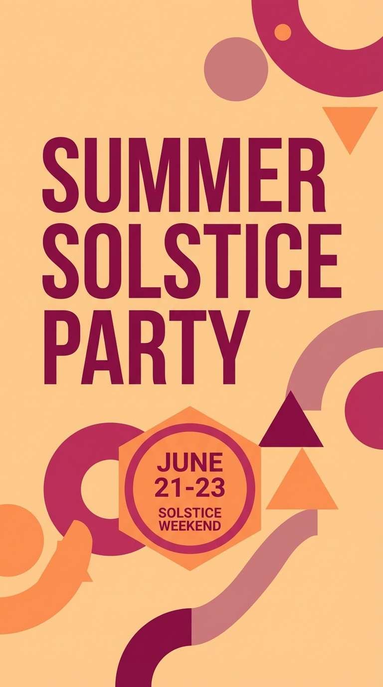
10) Sangria Sunset
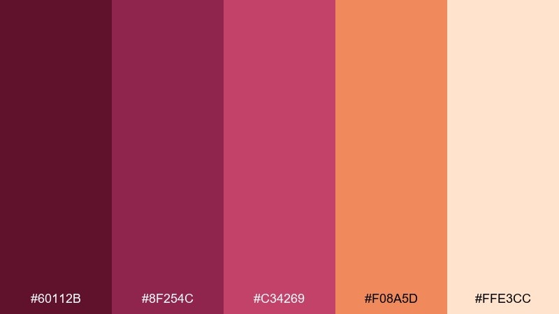
HEX: #60112b #8f254c #c34269 #f08a5d #ffe3cc
Mood: vibrant, flirty, energetic
Best for: event flyers and social media promos
Bold berry tones with a sunset orange accent feel like rooftop evenings and music spilling into the street. These wine color combinations are made for high-impact flyers, story templates, and punchy CTA buttons. Pair with big typography and simple shapes so the warmth stays modern, not chaotic. Tip: use orange only as a spark for dates, prices, or key announcements.
Image example of sangria sunset generated using media.io
11) Berry Cocoa
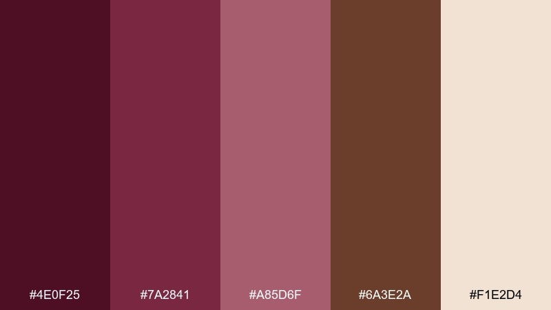
HEX: #4e0f25 #7a2841 #a85d6f #6a3e2a #f1e2d4
Mood: cozy, artisanal, comforting
Best for: coffee shop menus and craft packaging
Berry reds and cocoa browns evoke warm pastries, roasted beans, and handwritten notes. The creamy neutral keeps the set approachable for menu boards and small labels. Pair with script accents or hand-drawn icons for an artisanal feel. Tip: use the cocoa tone for backgrounds on packaging to make the berry shades feel richer.
Image example of berry cocoa generated using media.io
12) Aubergine Aura
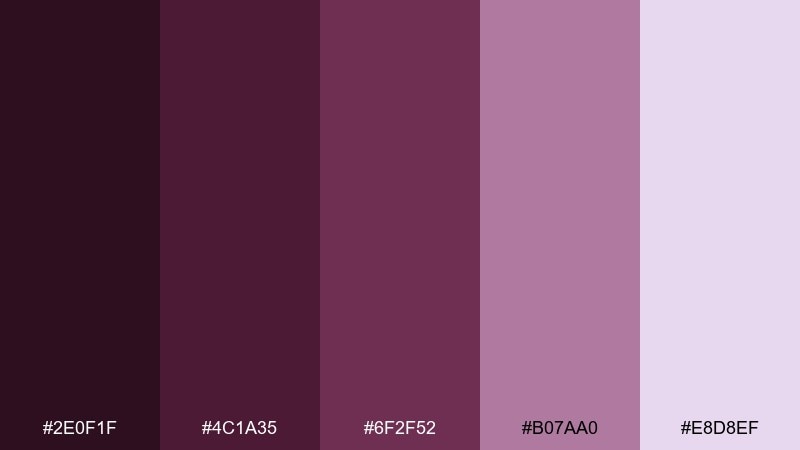
HEX: #2e0f1f #4c1a35 #6f2f52 #b07aa0 #e8d8ef
Mood: mysterious, dreamy, artistic
Best for: album art and creative portfolios
Aubergine shadows and lavender haze create a dreamy, late-night studio mood. The lighter violet tint softens the depth and gives you room for overlays and gradients. Pair with minimalist sans typography and abstract shapes for a contemporary finish. Tip: keep backgrounds dark and let the pale lilac carry highlights and small UI indicators.
Image example of aubergine aura generated using media.io
13) Brick Rose
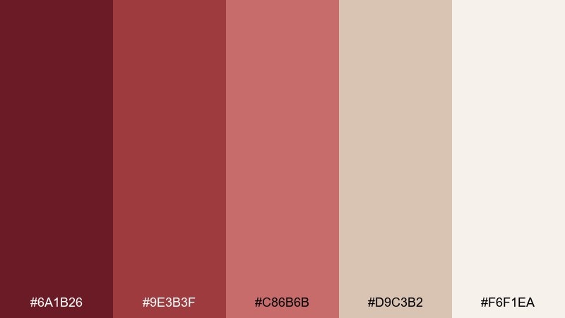
HEX: #6a1b26 #9e3b3f #c86b6b #d9c3b2 #f6f1ea
Mood: warm, mature, friendly
Best for: home decor lookbooks and lifestyle blogs
Brick red and dusty rose feel like sunlit terracotta, soft textiles, and warm plaster walls. The beige neutrals keep it relaxed for blog headers, lookbooks, and interior moodboards. Pair with natural textures like linen and light wood in your imagery. Tip: use the mid rose for section dividers and the light cream for generous margins.
Image example of brick rose generated using media.io
14) Dusty Wine Minimal
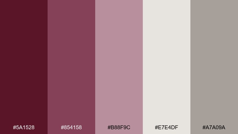
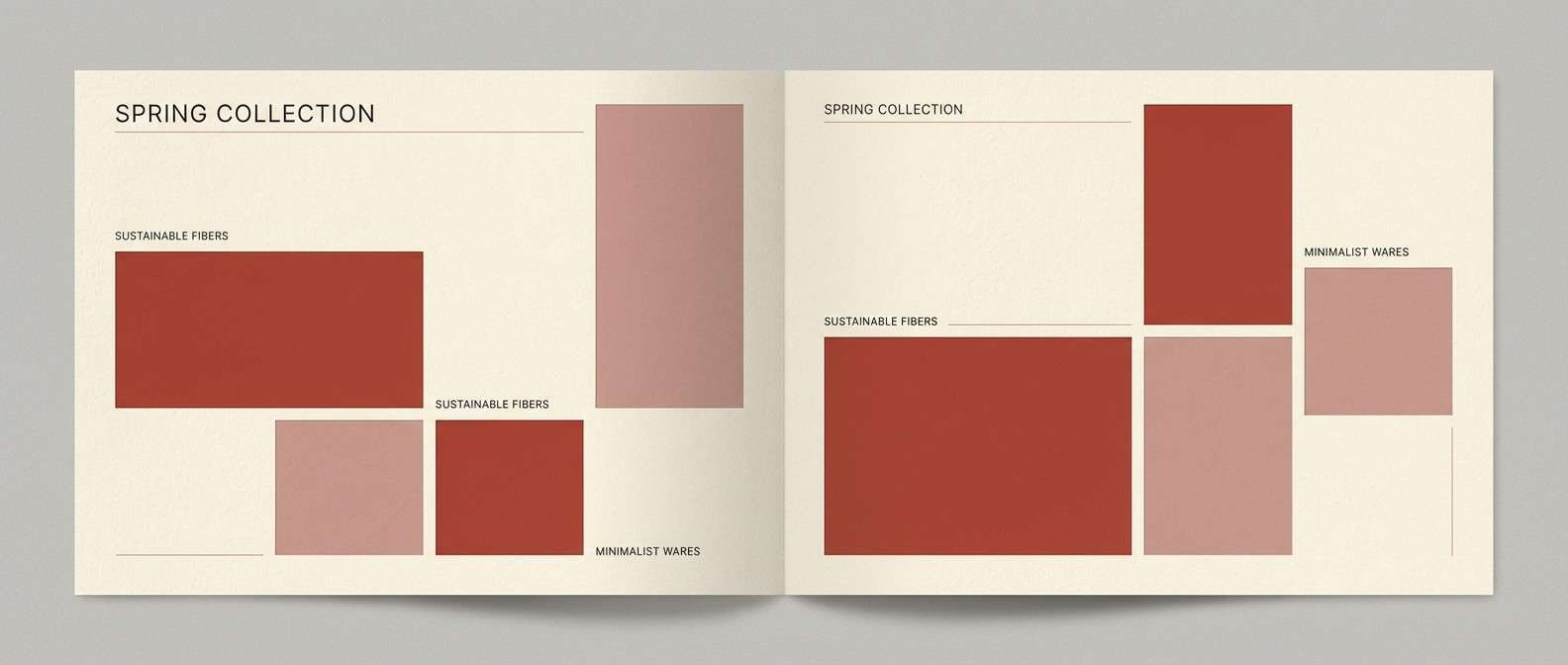
HEX: #5a1528 #854158 #b88f9c #e7e4df #a7a09a
Mood: minimal, soft, understated
Best for: clean UI kits and modern branding
Dusty reds softened with warm grays evoke quiet confidence and minimalist interiors. This wine color palette is ideal for UI kits, skincare branding, and calm landing pages where the tone should feel mature. Pair with off-white backgrounds and muted grayscale icons to keep everything airy. Tip: set primary buttons in the deep shade and use the dusty pink for hover and focus states.
Image example of dusty wine minimal generated using media.io
15) Rustic Vineyard
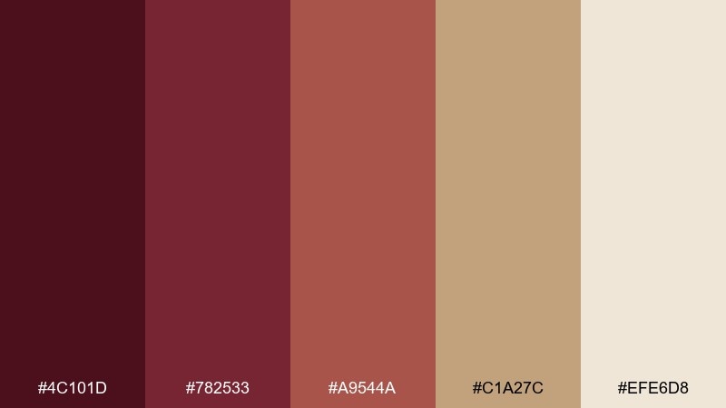
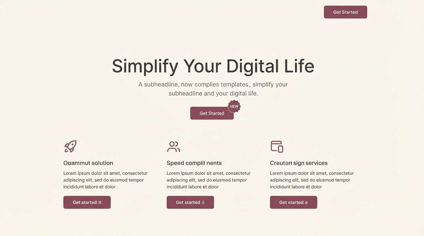
HEX: #4c101d #782533 #a9544a #c1a27c #efe6d8
Mood: rustic, sunbaked, authentic
Best for: farm-to-table packaging and market signage
Sunbaked reds and earthy tan tones feel like vineyard soil, wood crates, and handwritten tags. The warm neutrals make it easy to print on uncoated stocks and kraft labels. Pair with stamp marks, illustration-style icons, and slightly rough textures for authenticity. Tip: keep the tan as your main background so the darker reds read cleanly in small sizes.
Image example of rustic vineyard generated using media.io
16) Noir Orchid
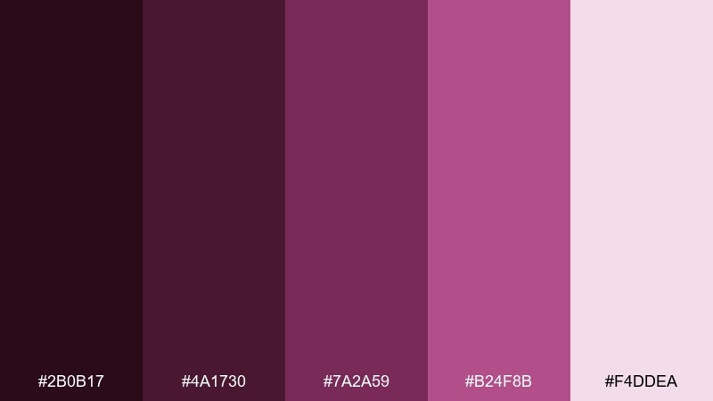
HEX: #2b0b17 #4a1730 #7a2a59 #b24f8b #f4ddea
Mood: dramatic, glamorous, bold
Best for: nightlife posters and beauty campaigns
Noir plum and orchid pink bring runway drama with a glossy, nighttime edge. The bright magenta-leaning accent is perfect for headlines, stickers, and spotlight elements. Pair with high-contrast type and simple shapes to keep the look sharp. Tip: use the pale pink as negative space to prevent the dark tones from overwhelming the design.
Image example of noir orchid generated using media.io
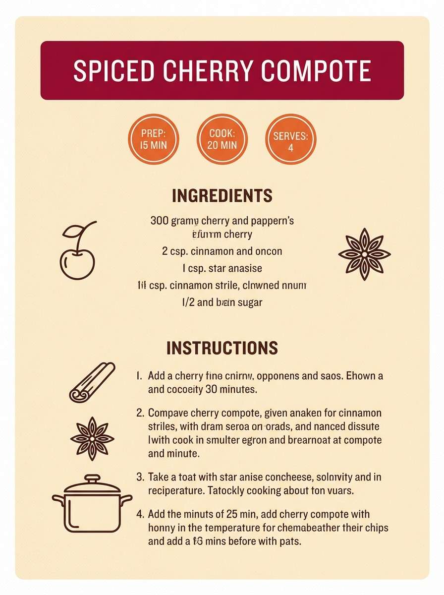
17) Spiced Cherry
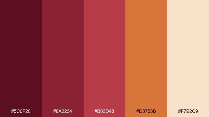
HEX: #5c0f20 #8a2234 #b63d48 #d8753b #f7e2c9
Mood: warm, appetizing, lively
Best for: food photography presets and recipe cards
Spiced cherry reds with toasted orange feel like simmering jam and cinnamon steam. The warm cream background keeps recipe cards readable and print-friendly. Pair with serif headings and simple ingredient icons for a cozy editorial look. Tip: use the orange shade for highlights like cook time, ratings, or callouts.
Image example of spiced cherry generated using media.io
18) Fig and Fog
HEX: #3c0f1d #62263d #8a5a6c #b7b8bd #ece8e3
Mood: muted, elegant, quiet
Best for: corporate reports and calm presentations
Muted fig tones washed with foggy gray feel professional and composed. The palette stays soft on-screen and prints cleanly for charts, tables, and long-form pages. Pair with plenty of whitespace and restrained iconography for a modern business look. Tip: assign the darker fig to headings and the gray to gridlines and secondary text.
Image example of fig and fog generated using media.io
19) Cabernet Pop
HEX: #4a0c1a #7b1a33 #b12b4d #ff5c8a #f7f0f2
Mood: playful, punchy, modern
Best for: app onboarding and youth-focused branding
Cabernet depth with a bright pop-pink accent feels bold, upbeat, and slightly rebellious. These wine color combinations are great for onboarding screens, promo banners, and energetic brand moments. Pair with crisp white space and simple illustrations so the pink reads as intentional emphasis. Tip: limit the pop color to one UI role, like primary CTA, to keep hierarchy clear.
Image example of cabernet pop generated using media.io
20) Rosy Tannin
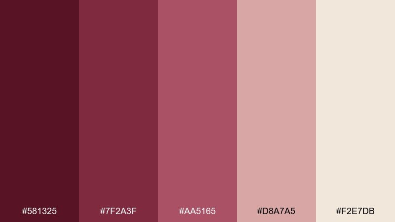
HEX: #581325 #7f2a3f #aa5165 #d8a7a5 #f2e7db
Mood: balanced, romantic, sophisticated
Best for: brand style guides and portfolio websites
Rosy reds with tannin-like depth feel polished, like a well-tailored suit softened by warm light. The pale beige keeps layouts breathable while the mid rose makes a confident accent. Pair with clean typography and subtle gradients for modern brand systems. Tip: define a clear scale, using the darkest tone for logos and the lightest as your main canvas.
Image example of rosy tannin generated using media.io
What Colors Go Well with Wine?
Wine pairs best with warm, soft neutrals like cream, beige, blush, and linen—these keep layouts readable and prevent the deep reds from feeling too heavy. For more modern systems, try fog gray, slate, or charcoal to cool the palette and sharpen contrast.
Metallics (gold, brass, rose gold) make wine tones feel celebratory and premium, especially for packaging and campaign graphics. If you want an earthy counterbalance, greens like pine and olive can make wine feel rustic and grounded.
For bold accents, use a single “spark” color—sunset orange or pop pink—and assign it to one job (CTA, date badge, or highlight) so the hierarchy stays clear.
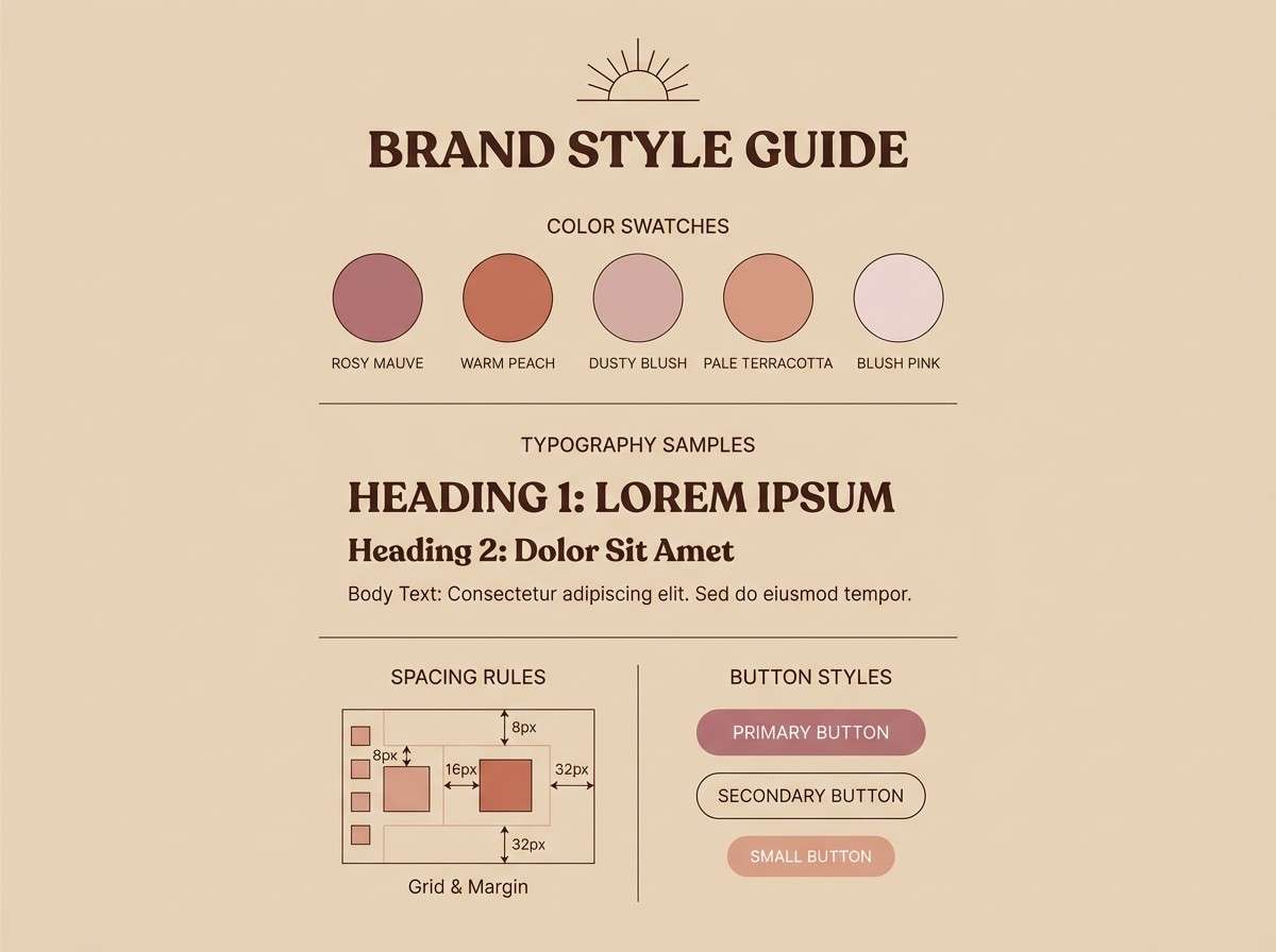
How to Use a Wine Color Palette in Real Designs
Start by choosing one darkest wine shade as your anchor (logos, headlines, primary UI states), then build a light neutral canvas for breathing room. This setup keeps wine looking intentional instead of overpowering.
In print, wine tones look especially good on uncoated or textured stocks; pair them with cream backgrounds and serif typography for a classic feel. In UI, add contrast by using slate/gray panels and reserve the richest reds for active states, charts, and primary buttons.
To avoid muddiness, limit the number of deep shades used simultaneously and lean on tints (blush/rose/cream) for spacing, cards, and negative space.
Create Wine Palette Visuals with AI
If you want to see how a wine color palette will look on a menu, label, landing page, or poster, generate quick concept visuals with AI before you commit to a full design. It’s a fast way to test typography, spacing, and where your accent color should live.
Use prompts that describe the layout and materials (linen paper, matte packaging, foil details, grain texture) and add your desired aspect ratio for the final output. Then iterate by changing just one variable—like “more cream background” or “less gold accent”—to keep results consistent.
When you find a direction you like, you can match your generated visuals to the HEX codes above to build a reusable brand or UI system.
Wine Color Palette FAQs
-
What is a “wine” color in design?
Wine usually refers to deep red-purple shades inspired by bordeaux, merlot, burgundy, and plum. It can lean warmer (more red) or cooler (more purple), which changes how modern or classic it feels. -
Is wine closer to burgundy or maroon?
Wine is often closer to burgundy because it typically carries a noticeable purple/berry undertone. Maroon tends to read browner and more muted, especially in low-saturation palettes. -
What background color works best with wine tones?
Cream, warm off-white, beige, and soft blush are the safest choices for readability and a premium feel. For a sleek look, use charcoal or slate but add a pale “halo” behind text to maintain contrast. -
What accent colors make wine feel more modern?
Try slate blue-gray, fog gray, or a controlled bright accent like pop pink or sunset orange. The key is to assign the accent to one role (CTA, badge, highlight) so it doesn’t compete with the deep base. -
Do wine palettes print well?
Yes—wine shades are popular in labels and editorial print, but very dark reds can fill in on absorbent stock. Use warm neutrals as the main background and avoid large, solid blocks of the darkest shade. -
How do I keep wine palettes from looking too heavy?
Increase whitespace with creams and pale tints, use the near-black/charcoal only for type, and reserve the deepest wine shade for small high-impact areas (logos, headings, button fills). -
Can I generate wine palette mockups with AI?
Yes—describe the design type (menu, packaging, UI, poster), materials (linen, kraft, matte, foil), and your preferred style (minimal, vintage, luxe). Then iterate while keeping the palette consistent with your chosen HEX codes.
Next: Honeydew Color Palette


