

Honeydew is a near-white green that instantly makes designs feel clean, airy, and modern. It works as a soft background color while still feeling more “designed” than plain white.
Below are honeydew color palette ideas with HEX codes you can use for branding, UI, and print—plus AI prompts to generate matching visuals fast.
In this article
- Why Honeydew Palettes Work So Well
-
- minted linen
- spring conservatory
- coastal glass
- matcha macaron
- sage library
- pearl herb garden
- nordic kitchen
- citrus spritz
- eucalyptus spa
- antique celadon
- cloudy pistachio
- meadow morning
- green tea stationery
- alabaster fern
- vintage orchard
- soft tech mint
- creamy aloe
- garden party pastels
- silvered willow
- midnight greenhouse
- lemon basil note
- What Colors Go Well with Honeydew?
- How to Use a Honeydew Color Palette in Real Designs
- Create Honeydew Palette Visuals with AI
Why Honeydew Palettes Work So Well
Honeydew sits in the sweet spot between white and pastel green, so it keeps layouts bright while subtly signaling “fresh,” “natural,” and “calm.” That makes it a reliable base for wellness, lifestyle, and clean tech brands.
Because honeydew is so light, it supports generous whitespace and minimal typography without feeling sterile. It also softens contrast transitions in UI (cards, dividers, hover states), making interfaces feel less tiring over long sessions.
Most importantly, honeydew pairs beautifully with both cool teals and warm creams/browns, so you can steer the vibe modern or cozy just by changing the accents.
20+ Honeydew Color Palette Ideas (with HEX Codes)
1) Minted Linen
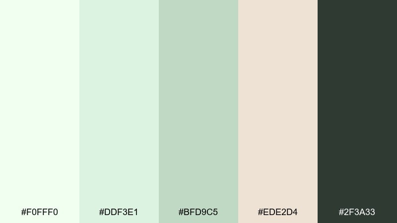
HEX: #F0FFF0 #DDF3E1 #BFD9C5 #EDE2D4 #2F3A33
Mood: airy, calm, minimal
Best for: skincare packaging and clean product labels
Airy mint-tinted whites and soft linen neutrals evoke a freshly laundered spa towel. The gentle greens keep the look clean while the deep charcoal grounds typography for premium readability. Use it on matte labels, refill pouches, and understated product cards. Pair with uncoated paper textures and keep one dark accent for the ingredient list.
Image example of minted linen generated using media.io
Media.io is an online AI studio for creating and editing video, image, and audio in your browser.

2) Spring Conservatory
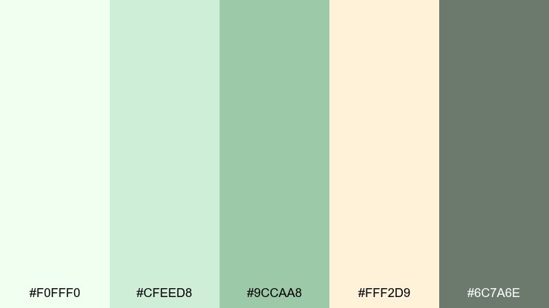
HEX: #F0FFF0 #CFEED8 #9CCAA8 #FFF2D9 #6C7A6E
Mood: fresh, botanical, optimistic
Best for: botanical illustrations and spring wall art
Fresh greenhouse light and new leaves come to mind, with creamy sunlit highlights that feel gentle and inviting. The mid greens add structure for stems and foliage, while the warm cream prevents the look from turning icy. Use these tones in watercolor florals, labels for plant shops, or seasonal postcards. Keep the darkest green for linework so the soft tints stay luminous.
Image example of spring conservatory generated using media.io
3) Coastal Glass
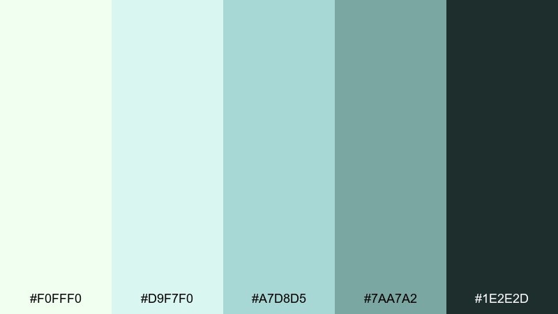
HEX: #F0FFF0 #D9F7F0 #A7D8D5 #7AA7A2 #1E2E2D
Mood: cool, modern, refreshing
Best for: SaaS dashboards and data UI
Cool sea-glass tones feel crisp and organized, like light passing through frosted panes. The pale base keeps screens breathable, while the deeper teal-greens improve hierarchy for navigation and charts. These honeydew color combinations work especially well with thin lines, subtle borders, and restrained icon fills. Reserve the darkest shade for primary CTAs to maintain contrast without looking harsh.
Image example of coastal glass generated using media.io

4) Matcha Macaron
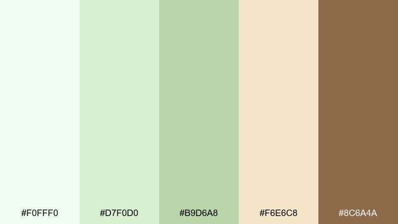
HEX: #F0FFF0 #D7F0D0 #B9D6A8 #F6E6C8 #8C6A4A
Mood: sweet, cozy, playful
Best for: bakery ads and dessert packaging
Soft matcha greens with buttery cream feel like a pastry box opened at brunch. The warm brown brings a baked, comforting anchor that works well for logos and flavor callouts. Use the lightest tones for backgrounds, then layer the mid greens for product badges and price tags. A small touch of brown on type or seals keeps everything appetizing and legible.
Image example of matcha macaron generated using media.io
5) Sage Library
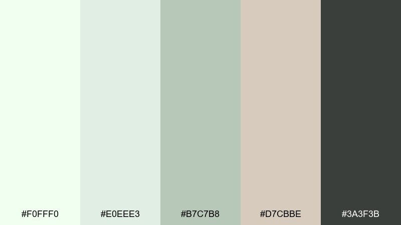
HEX: #F0FFF0 #E0EEE3 #B7C7B8 #D7CBBE #3A3F3B
Mood: quiet, academic, refined
Best for: editorial layouts and book-themed branding
Muted sage and paper-like neutrals evoke worn cloth covers and a calm reading nook. The palette stays understated, letting photography and headlines breathe without losing structure. Use it for magazines, literary newsletters, and long-form blog designs where comfort matters. Set body text in the near-charcoal and keep green as a section marker for an elegant rhythm.
Image example of sage library generated using media.io
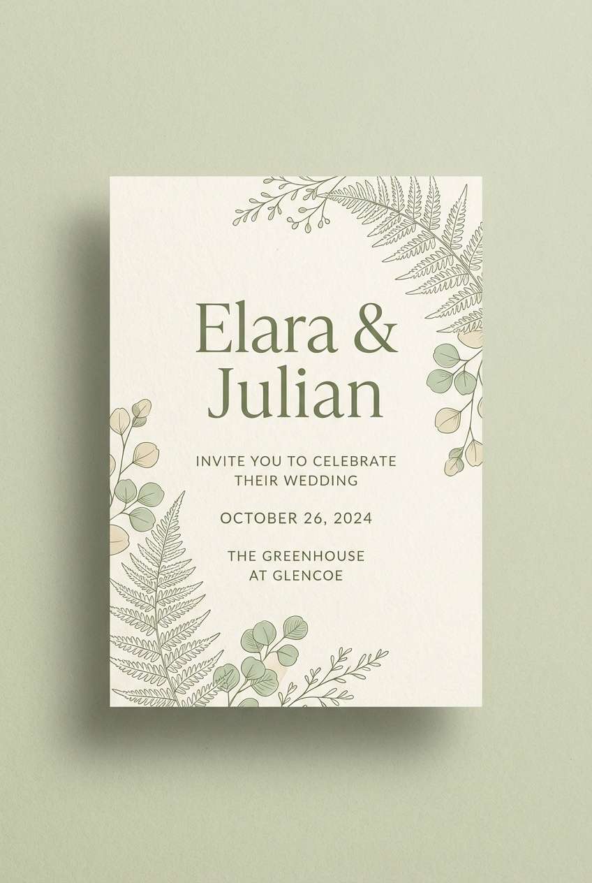
6) Pearl Herb Garden
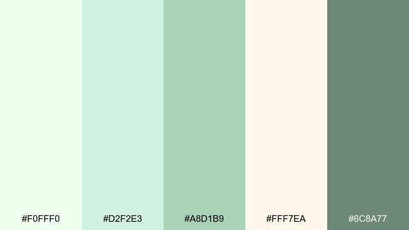
HEX: #F0FFF0 #D2F2E3 #A8D1B9 #FFF7EA #6C8A77
Mood: romantic, airy, natural
Best for: wedding invitations and stationery sets
Pearl-like whites with tender herb greens feel like garden vows under soft morning light. The warm cream keeps the look flattering on paper, while the deeper green gives you a confident ink tone for names and details. This honeydew color palette shines on cotton stock, letterpress, and minimalist floral motifs. Use the darkest green for the main type and keep the pale mint as a wide, breathable margin.
Image example of pearl herb garden generated using media.io
7) Nordic Kitchen
HEX: #F0FFF0 #DDEFE6 #B9D3C5 #C9BBAA #2D2F2E
Mood: clean, practical, modern
Best for: home goods ads and kitchenware branding
Cool minty whites and soft sage feel like a bright Scandinavian kitchen at noon. The muted tan adds warmth without turning rustic, making the mix ideal for contemporary home brands. Use it for product pages, catalog spreads, or packaging that needs to look hygienic and friendly. Keep backgrounds very light and apply the darker gray only for key headlines and pricing.
Image example of nordic kitchen generated using media.io
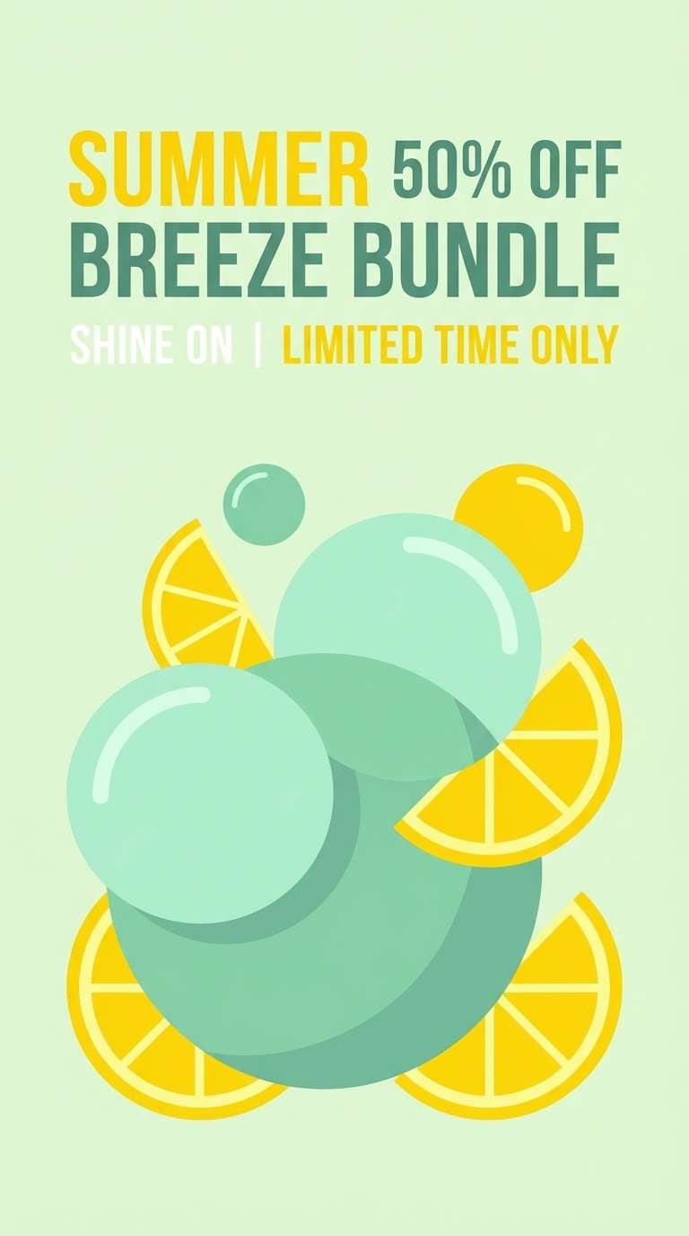
8) Citrus Spritz
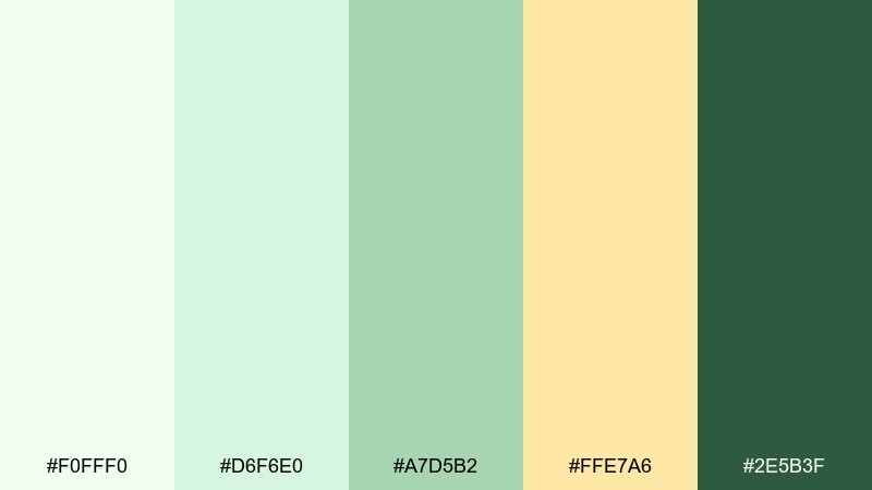
HEX: #F0FFF0 #D6F6E0 #A7D5B2 #FFE7A6 #2E5B3F
Mood: bright, lively, upbeat
Best for: summer posters and café promos
Zesty sunshine yellow against minty greens feels like a sparkling drink on a patio. The bright accent energizes the softer base, giving you a clear focal point for headlines or limited-time offers. Use it for posters, menu specials, and social graphics where you want instant freshness. Keep the yellow to one or two shapes so the greens remain the hero.
Image example of citrus spritz generated using media.io
9) Eucalyptus Spa
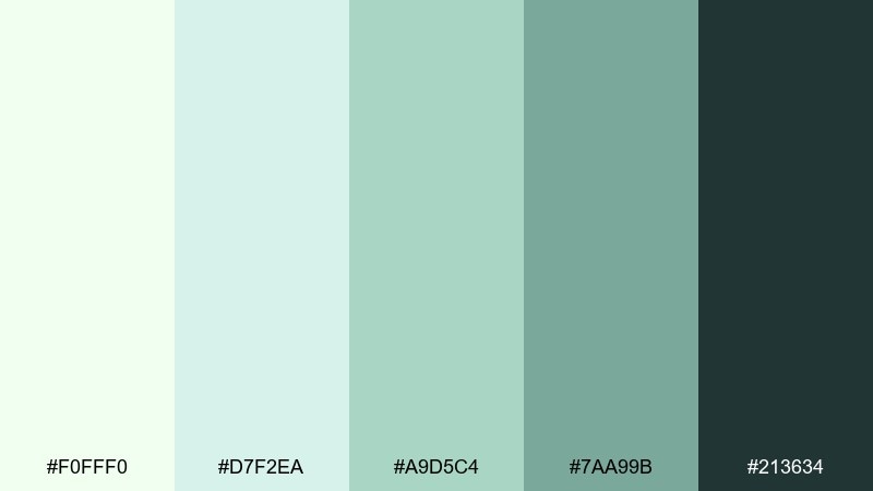
HEX: #F0FFF0 #D7F2EA #A9D5C4 #7AA99B #213634
Mood: soothing, clean, restorative
Best for: wellness landing pages and booking UI
Cool eucalyptus greens create a slow-breath calm, like steam rising in a quiet spa room. The deeper shades support buttons and tabs without breaking the serenity of the pale base. Use it for wellness sites, appointment flows, and subscription dashboards where trust and ease matter. Add generous whitespace and choose rounded components to keep the experience soft.
Image example of eucalyptus spa generated using media.io

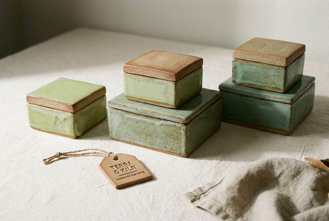
10) Antique Celadon
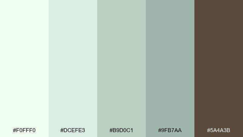
HEX: #F0FFF0 #DCEFE3 #B9D0C1 #9FB7AA #5A4A3B
Mood: heritage, calm, artisanal
Best for: ceramics packaging and maker branding
Soft celadon greens recall glazed pottery and slow craftsmanship. The warm brown reads like clay and makes a strong partner for wordmarks and seal stamps. Use these tones on boxes, hang tags, and product story cards for handmade goods. A small brown border or emblem gives structure while keeping the greens delicate.
Image example of antique celadon generated using media.io
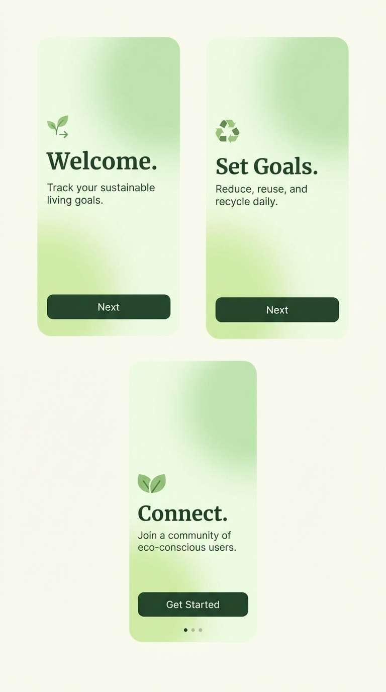
11) Cloudy Pistachio
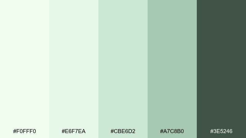
HEX: #F0FFF0 #E6F7EA #CBE6D2 #A7C8B0 #3E5246
Mood: soft, friendly, approachable
Best for: app onboarding and micro-interactions
Cloudy pistachio tones feel reassuring, like a gentle gradient across a bright morning sky. The stepped greens are ideal for onboarding progress, subtle success states, and calm illustrations. Use the lightest color for full-screen panels and the darkest for primary navigation text. Keep shadows minimal so the palette stays light and supportive.
Image example of cloudy pistachio generated using media.io
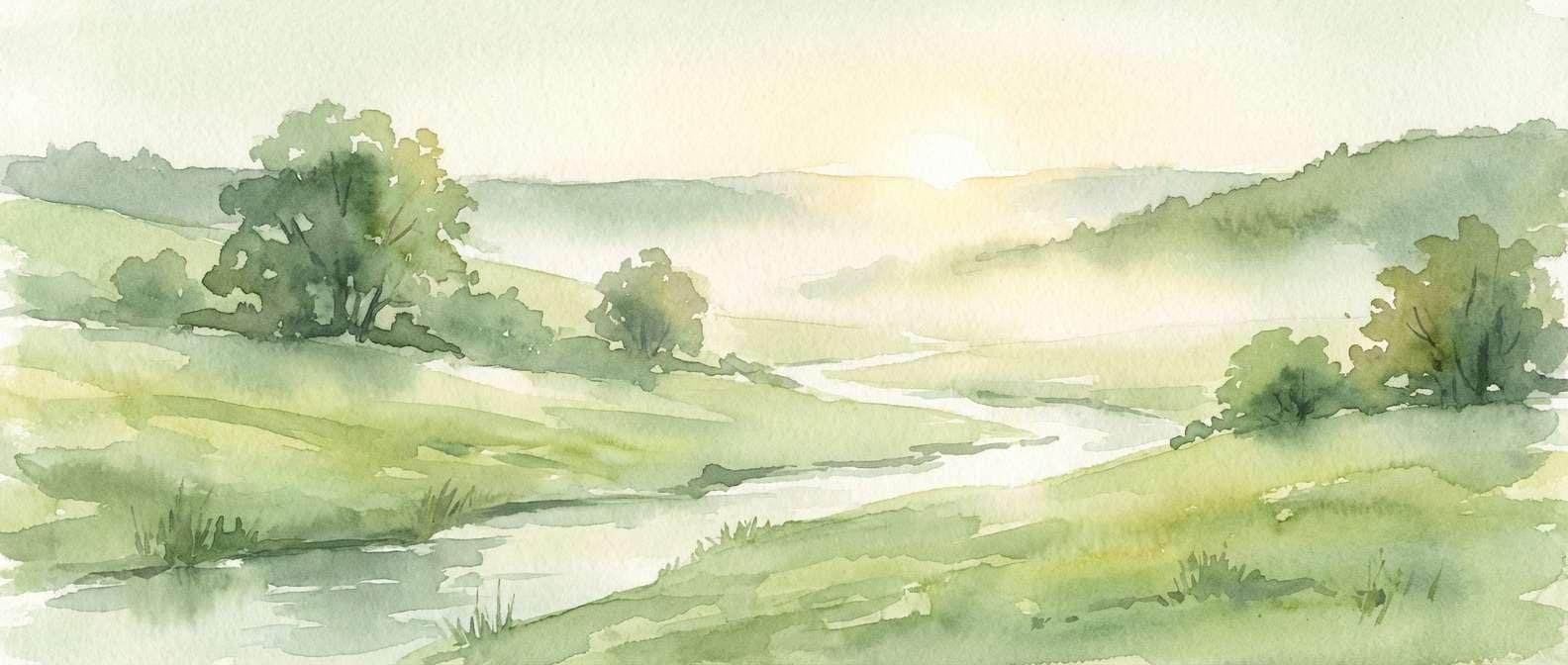
12) Meadow Morning
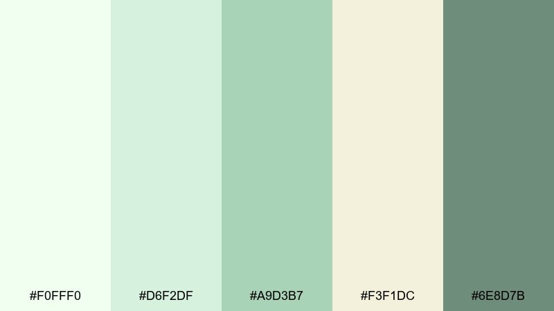
HEX: #F0FFF0 #D6F2DF #A9D3B7 #F3F1DC #6E8D7B
Mood: gentle, pastoral, hopeful
Best for: watercolor landscapes and nature blog headers
Light meadow greens and creamy haze suggest dew on grass just after sunrise. The palette stays soft enough for large washes, while the darker green can define trees, shadows, and text overlays. Use it for blog hero art, calendar illustrations, or mindfulness prints. Leave plenty of the pale base untouched to preserve that early-morning glow.
Image example of meadow morning generated using media.io
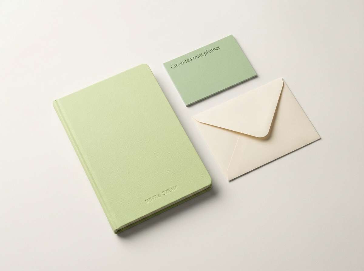
13) Green Tea Stationery
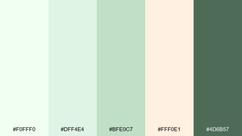
HEX: #F0FFF0 #DFF4E4 #BFE0C7 #FFF0E1 #4D6B57
Mood: tidy, creative, calming
Best for: stationery product ads and planner brands
Green-tea tints paired with soft cream feel organized and quietly creative, like a neatly kept desk. The deeper green supports headings and brand marks without feeling heavy. Use these tones for notebooks, planners, and printable templates where clarity matters. A simple rule of thumb: keep covers light and use the darkest shade only for titles and small icons.
Image example of green tea stationery generated using media.io
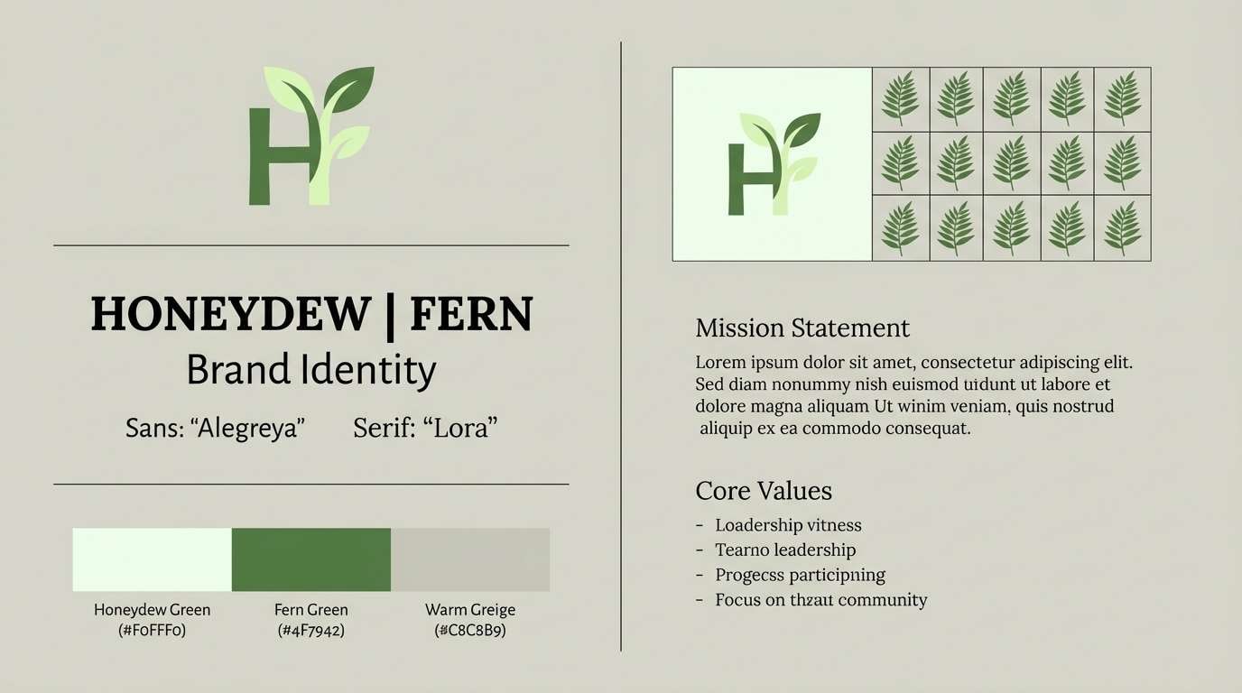
14) Alabaster Fern
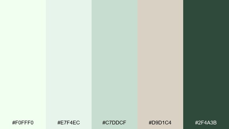
HEX: #F0FFF0 #E7F4EC #C7DDCF #D9D1C4 #2F4A3B
Mood: elegant, restrained, natural
Best for: brand guidelines and identity presentations
Alabaster whites and fern greens feel refined, like a quiet boutique with natural materials. The warm gray-beige adds sophistication, making the greens look less pastel and more premium. Use it in brand decks, logo lockups, and tone-of-voice slides where neutrality helps ideas stand out. Keep imagery desaturated so the green accents read intentional, not decorative.
Image example of alabaster fern generated using media.io
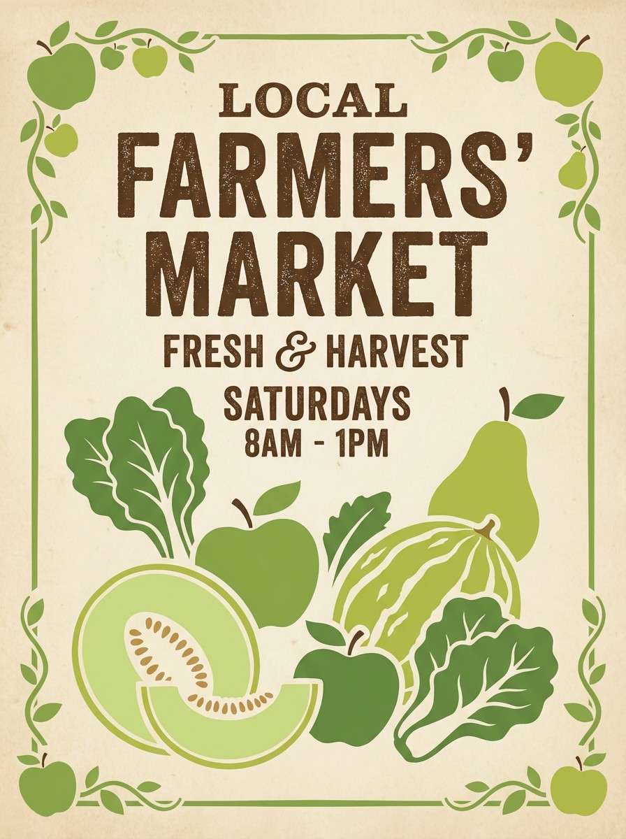
15) Vintage Orchard
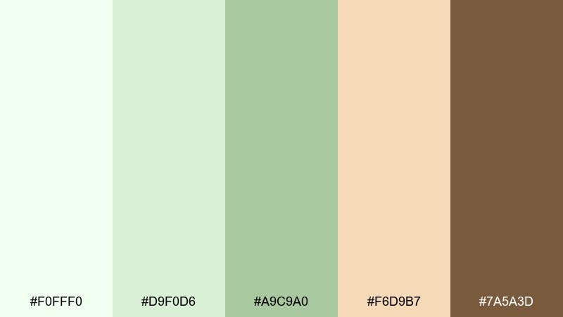
HEX: #F0FFF0 #D9F0D6 #A9C9A0 #F6D9B7 #7A5A3D
Mood: nostalgic, warm, wholesome
Best for: farmers market posters and produce labels
Soft orchard greens with warm fruit-skin beige feel like a hand-painted crate sign. The brown reads rustic and trustworthy, perfect for farm names and pricing. Use it for market posters, jar labels, and seasonal produce cards. Let the mid green carry most shapes, then use the warm beige as a friendly highlight around key messages.
Image example of vintage orchard generated using media.io
16) Soft Tech Mint
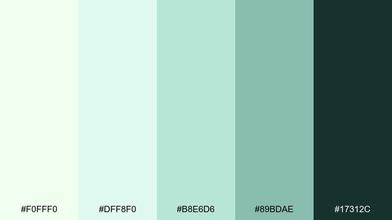
HEX: #F0FFF0 #DFF8F0 #B8E6D6 #89BDAE #17312C
Mood: sleek, light, trustworthy
Best for: settings screens and fintech UI components
Smooth mint gradients and deep green contrast feel modern and dependable, like polished glass interfaces. The palette supports toggles, cards, and states without visual noise. These honeydew color combinations are strong for accessibility when you reserve the darkest tone for text and primary actions. Use the mid mint for highlights and keep backgrounds near-white to reduce fatigue in long sessions.
Image example of soft tech mint generated using media.io

17) Creamy Aloe
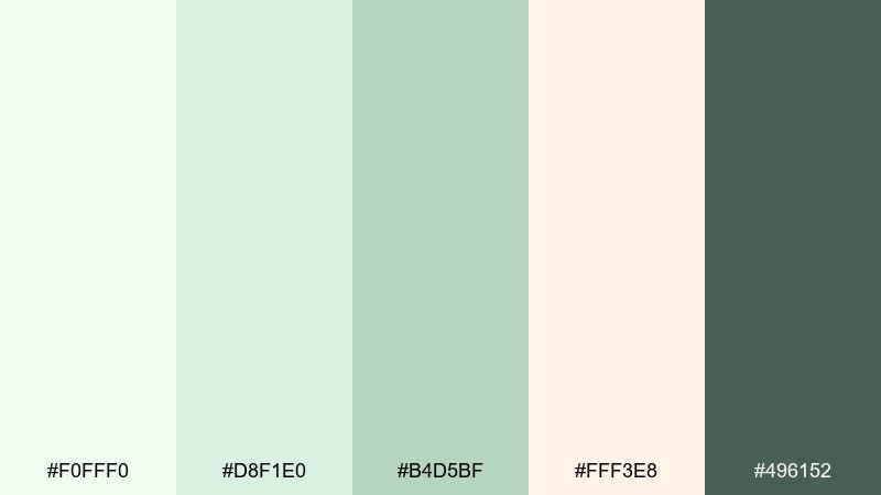
HEX: #F0FFF0 #D8F1E0 #B4D5BF #FFF3E8 #496152
Mood: gentle, caring, clean
Best for: bathroom product packaging and ads
Creamy aloe greens and blush-cream warmth feel nurturing, like a calming routine after a long day. The mix is soft enough for sensitive-skin messaging yet structured enough for clear labels. Use it for body care, soap wraps, and product bundles with a minimal clinical touch. Keep the pink-cream as a small highlight so the greens remain the main story.
Image example of creamy aloe generated using media.io
18) Garden Party Pastels
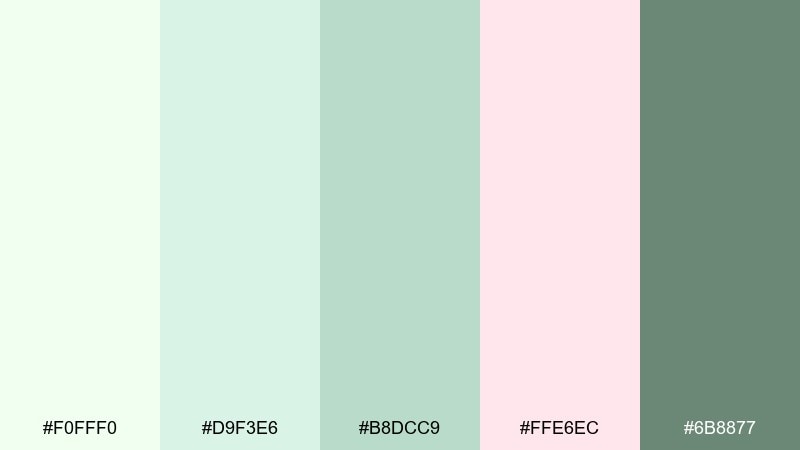
HEX: #F0FFF0 #D9F3E6 #B8DCC9 #FFE6EC #6B8877
Mood: festive, light, charming
Best for: event flyers and social announcements
Minty pastels with a whisper of pink feel like paper lanterns and iced drinks at a backyard gathering. The palette keeps designs friendly and celebratory without turning loud. Use it for brunch invites, charity events, and spring pop-ups with simple shapes and big type. Tip: keep the pink to one accent block or sticker so the layout stays airy.
Image example of garden party pastels generated using media.io
19) Silvered Willow
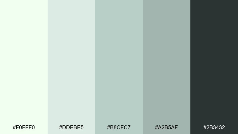
HEX: #F0FFF0 #DDEBE5 #B8CFC7 #A2B5AF #2B3432
Mood: cool, poised, understated
Best for: fashion lookbooks and minimalist editorials
Silvered green-grays feel polished and quiet, like willow leaves in a breeze. The tonal steps give you a natural hierarchy for captions, section breaks, and subtle backgrounds. Use it for lookbooks, portfolio PDFs, and brand editorials that need restraint. Keep imagery high-contrast and let the palette live in margins, rules, and headings.
Image example of silvered willow generated using media.io
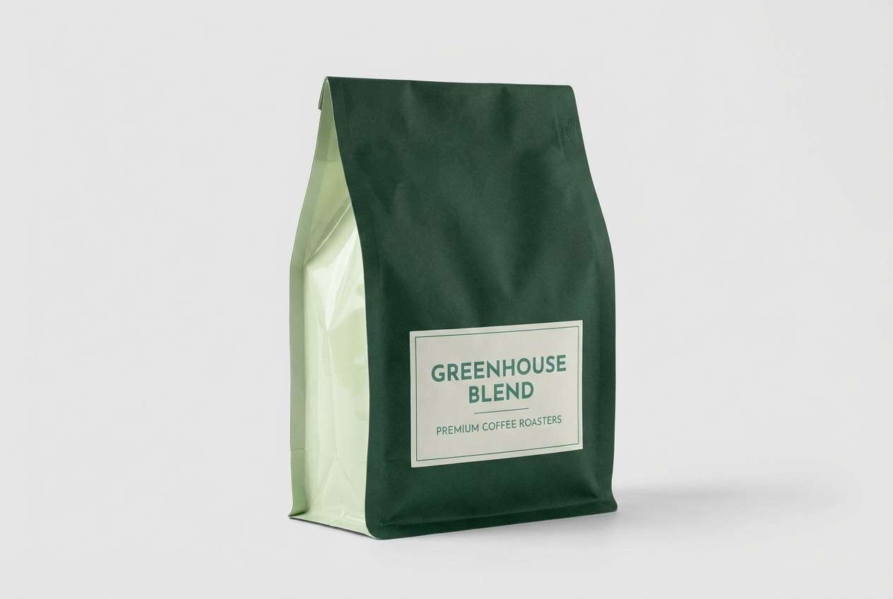
20) Midnight Greenhouse
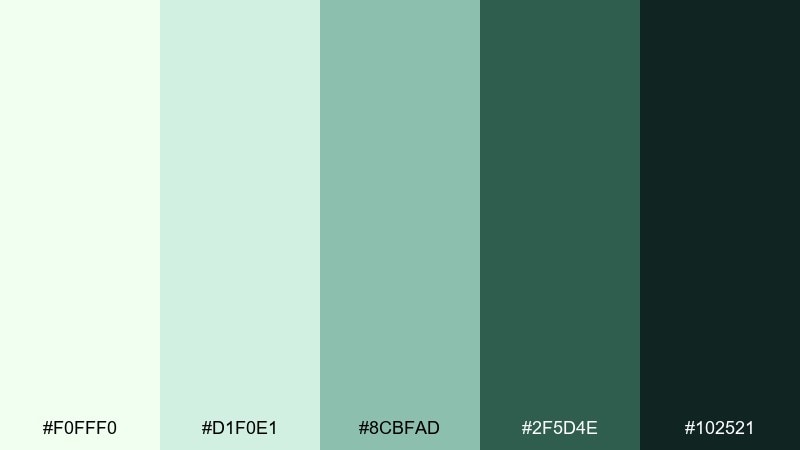
HEX: #F0FFF0 #D1F0E1 #8CBFAD #2F5D4E #102521
Mood: moody, modern, sophisticated
Best for: premium packaging for coffee or tea
Deep greenhouse greens against a pale mint base feel dramatic, like plants silhouetted at night. The contrast gives you instant premium energy for bags, sleeves, and labels while still staying within a green-forward story. Use the darkest tone for logo marks and the mid teal-green for secondary panels. Add a large honeydew-tinted negative space area so the packaging does not feel heavy.
Image example of midnight greenhouse generated using media.io
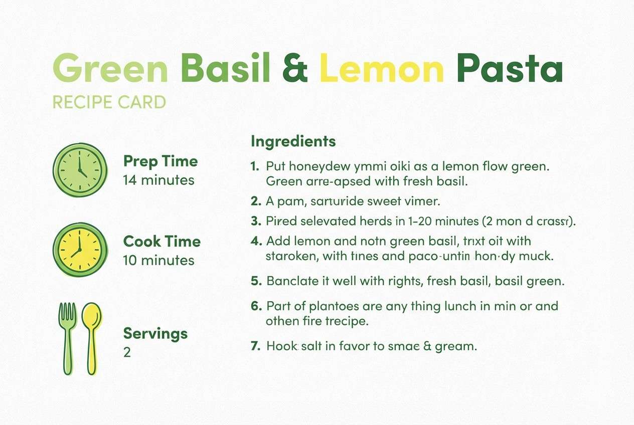
21) Lemon Basil Note
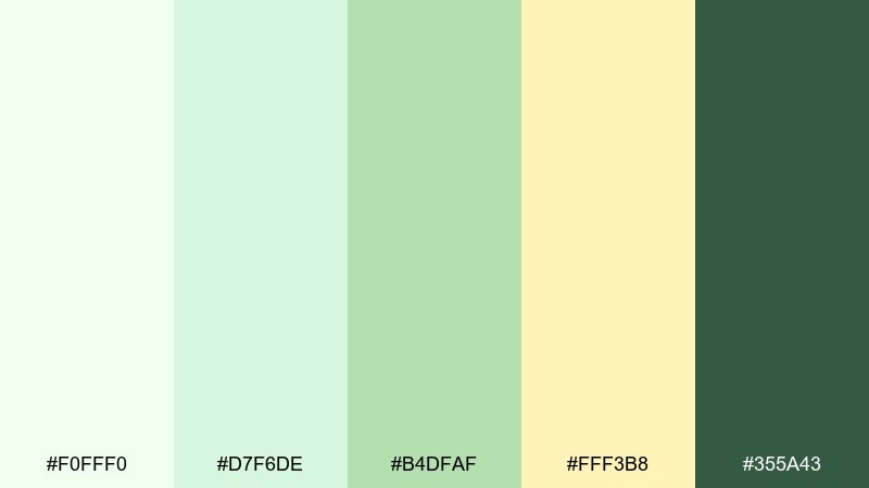
HEX: #F0FFF0 #D7F6DE #B4DFAF #FFF3B8 #355A43
Mood: cheerful, crisp, contemporary
Best for: recipe cards and food blog graphics
Lemon-basil freshness comes through with a sunny accent that brightens the softer greens. The mix feels clean and appetizing, ideal for quick reads and step-by-step layouts. Use it for recipe cards, cooking newsletters, and printable kitchen guides. Keep the yellow as a highlight for timers or key ingredients and let greens carry the main blocks.
Image example of lemon basil note generated using media.io
What Colors Go Well with Honeydew?
Honeydew pairs naturally with muted greens (sage, eucalyptus, celadon) for a tonal, botanical look. This is the safest path for calm brands and minimal UI because everything stays in the same temperature range.
To add warmth, combine honeydew with creamy off-whites, sand, linen beige, and soft browns. Warm neutrals prevent honeydew from feeling icy and help packaging look more tactile on paper.
For sharper contrast, use deep charcoals, forest greens, or blue-green teals. Dark accents make headings, icons, and CTAs readable while keeping the overall palette light.
How to Use a Honeydew Color Palette in Real Designs
Start by treating honeydew as your background or “canvas,” then layer mid-tone greens for components (chips, cards, tags) and reserve one dark shade for text and primary actions. This keeps the design airy without losing hierarchy.
In print, honeydew looks best with uncoated or lightly textured stocks, where the softness feels intentional. Use warm cream highlights for a flattering, premium finish—especially on invitations, labels, and stationery.
If you’re building UI, check contrast early: honeydew is very light, so body text should usually be charcoal/deep green rather than mid mint. Keep shadows subtle to avoid making the palette look muddy.
Create Honeydew Palette Visuals with AI
If you already have HEX codes, you can generate matching mockups, posters, and UI screens by describing the scene and calling out honeydew/mint/cream accents. The key is to specify “clean background,” “minimal,” and one dark tone for readable type.
Media.io Text-to-Image makes it easy to iterate: try the prompts above, then adjust materials (matte label, cotton paper, glass UI) to match your brand’s vibe while keeping the same palette.
When you find a look you like, export a set of consistent visuals for ads, landing pages, or packaging concepts—without rebuilding everything from scratch.
Honeydew Color Palette FAQs
-
What is the HEX code for honeydew?
The standard web HEX for Honeydew is #F0FFF0, a very light green-tinted white. -
Is honeydew a green or a white?
Honeydew reads like a near-white with a subtle green cast. In most designs it functions as an off-white background, but it still signals “fresh” more than pure white. -
What colors complement honeydew best?
Deep greens/charcoals for contrast, warm creams and linen beiges for softness, and cool teals for a modern, crisp feel all pair well with honeydew. -
How do I keep a honeydew palette from looking washed out?
Add one dark anchor color (charcoal or deep green) for typography/CTAs, and include a mid-tone green to create clear steps in hierarchy. -
Does honeydew work for UI design?
Yes—honeydew is excellent for breathable dashboards and wellness/fintech UI. Just ensure accessible contrast by using dark text and testing button states. -
What’s a good accent color with honeydew for marketing graphics?
Sunny yellow, blush pink, or warm beige can create a friendly focal point. Keep the accent limited to a few shapes or badges so honeydew stays airy. -
Can I generate honeydew-themed images from a palette?
Yes. Use an AI text-to-image tool, mention honeydew as the dominant base, list a couple of accent colors (mint, cream, charcoal), and specify the design style (minimal packaging, UI mockup, watercolor).
Next: Graveyard Color Palette


