

Wine burgundy is a deep, berry-leaning red that feels premium, romantic, and grounded all at once. It’s a go-to for brands and spaces that want warmth without looking loud.
Below are modern wine burgundy color palette ideas with HEX codes—built for everything from wedding suites and packaging to UI, interiors, and editorial layouts.
In this article
- Why Wine Burgundy Palettes Work So Well
-
- cellar velvet
- rosewood and cream
- gilded merlot
- autumn vineyard
- noir cabernet
- dusty blush pairing
- sage barrel
- teal tasting room
- terracotta cork
- lavender nightcap
- espresso truffle
- pearl champagne
- denim and merlot
- copper still
- winter cranberry
- olive tapenade
- peachy rose pop
- minimal mocha
- botanical plum
- luxe black tie
- stone and sangria
- berry ink contrast
- What Colors Go Well with Wine Burgundy?
- How to Use a Wine Burgundy Color Palette in Real Designs
- Create Wine Burgundy Palette Visuals with AI
Why Wine Burgundy Palettes Work So Well
Wine burgundy sits in that sweet spot between classic red and modern moody tones. It communicates richness and confidence, but it’s softer than pure crimson—so it feels more refined in both print and digital work.
It also pairs beautifully with neutrals. Cream, oat, stone, and warm whites keep burgundy from feeling heavy, while near-black and charcoal add contrast for typography and clean UI structure.
Because burgundy has both warm and cool undertones depending on the mix, it adapts easily across styles—rustic and earthy with terracotta, glamorous with gold/champagne, or crisp and digital with navy and white.
20+ Wine Burgundy Color Palette Ideas (with HEX Codes)
1) Cellar Velvet
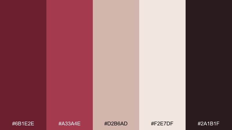
HEX: #6b1e2e #a33a4e #d2b6ad #f2e7df #2a1b1f
Mood: moody, plush, romantic
Best for: luxury branding and hero sections
Moody and plush like a candlelit wine cellar, these tones feel intimate and premium. Use the deep burgundy as your anchor, then soften the look with the warm blush and cream. The near-black adds contrast for typography and logos without turning harsh. Tip: keep backgrounds creamy and use burgundy for headlines to avoid a heavy page.
Image example of cellar velvet generated using media.io
Media.io is an online AI studio for creating and editing video, image, and audio in your browser.

2) Rosewood and Cream
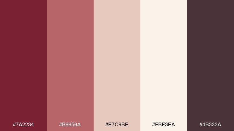
HEX: #7a2234 #b8656a #e7c9be #fbf3ea #4b333a
Mood: soft, timeless, airy
Best for: wedding invitations and stationery
Soft and timeless like dried roses on linen, this mix reads romantic without feeling sugary. Pair rosewood with cream for the main card, then bring in the muted pink for borders, monograms, or wax-seal graphics. The smoky mauve-brown is ideal for body copy and small details. Tip: print the darkest tone in a matte finish to keep it elegant.
Image example of rosewood and cream generated using media.io
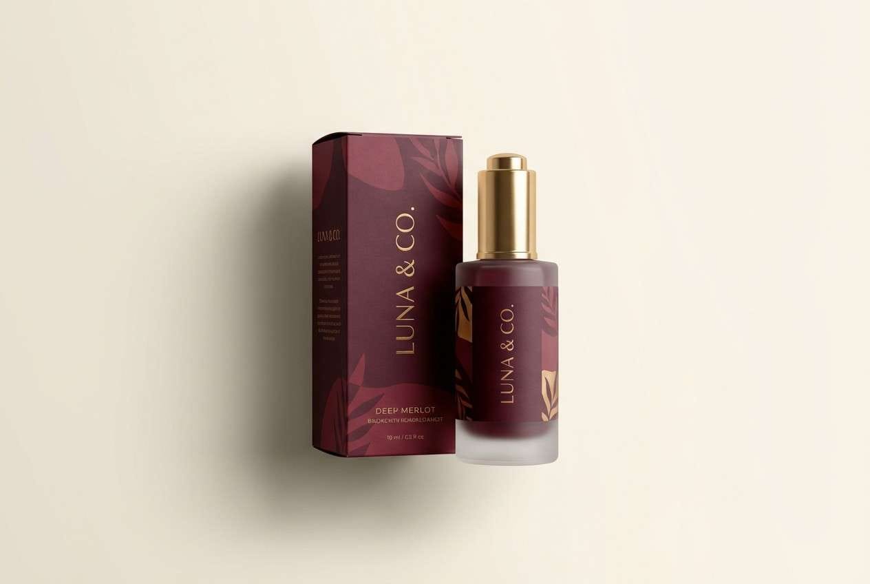
3) Gilded Merlot
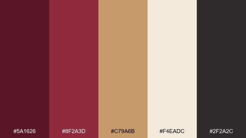
HEX: #5a1626 #8f2a3d #c79a6b #f4eadc #2f2a2c
Mood: opulent, dramatic, warm
Best for: premium packaging and product ads
Opulent and dramatic, it feels like merlot velvet lit by warm brass. This wine burgundy color palette shines when you treat gold as the accent, not the base. Use the cream for negative space and the charcoal for small legal copy or barcodes. Tip: add subtle foil or metallic gradients only on the gold tone to keep the look premium.
Image example of gilded merlot generated using media.io
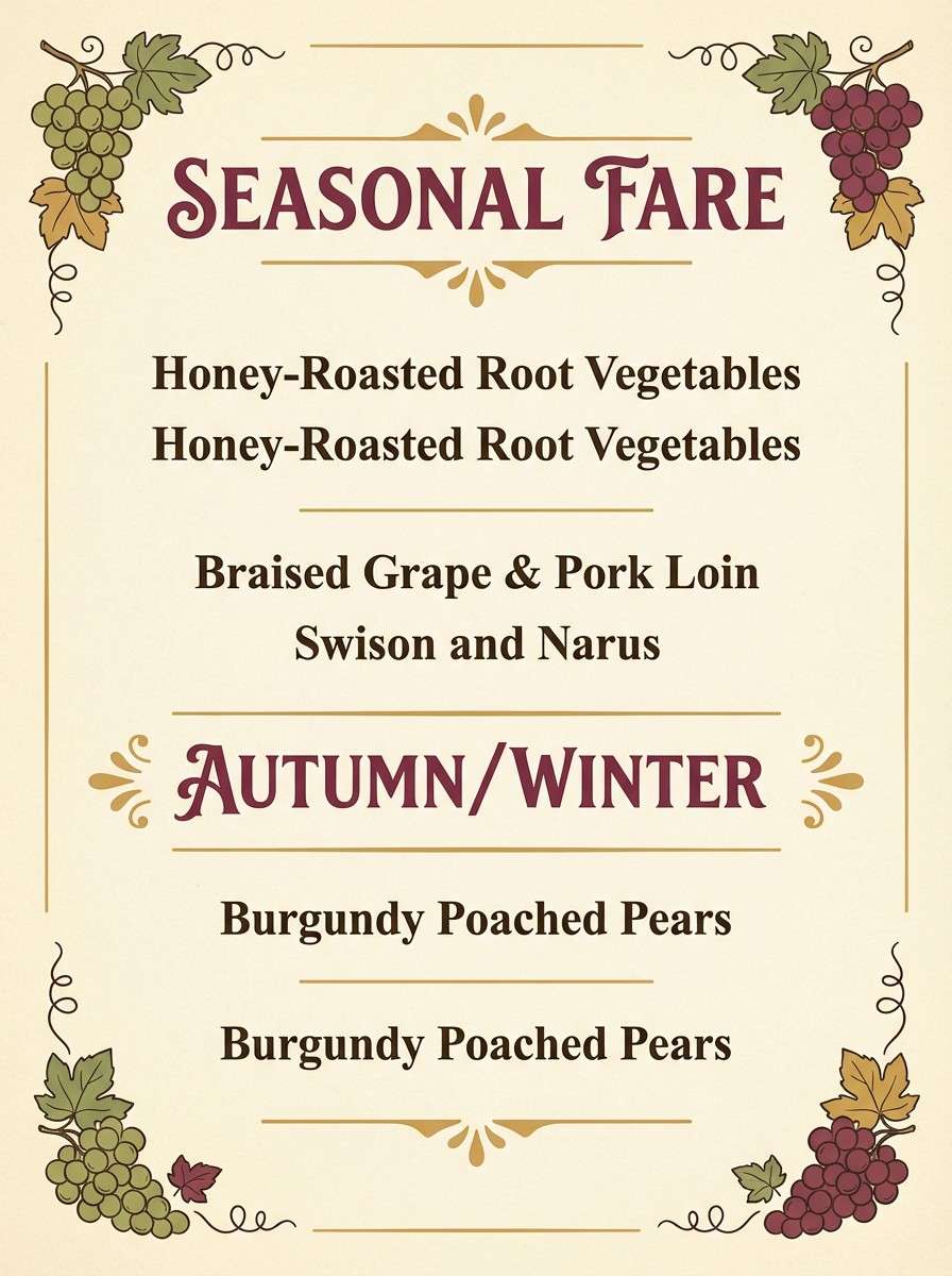
4) Autumn Vineyard
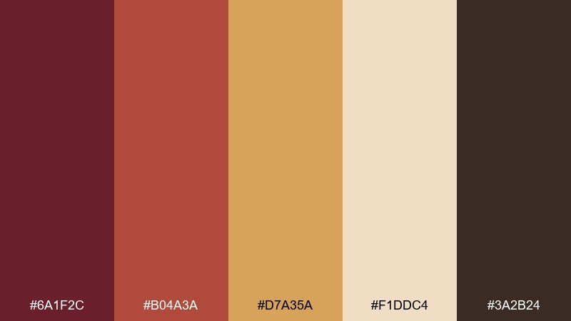
HEX: #6a1f2c #b04a3a #d7a35a #f1ddc4 #3a2b24
Mood: earthy, rustic, inviting
Best for: restaurant menus and seasonal promos
Earthy and inviting like vineyard rows in late fall, this set balances fruit and spice. The burgundy and brick tones work well for headings, while the honey and cream keep layouts approachable. Add the deep cocoa for borders, dividers, and icons to ground the design. Tip: use the honey tone for callouts so the warm message pops without shouting.
Image example of autumn vineyard generated using media.io
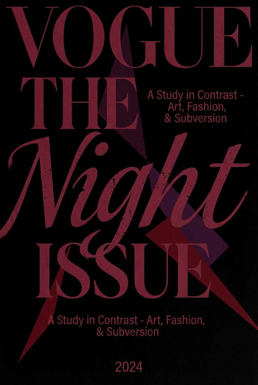
5) Noir Cabernet
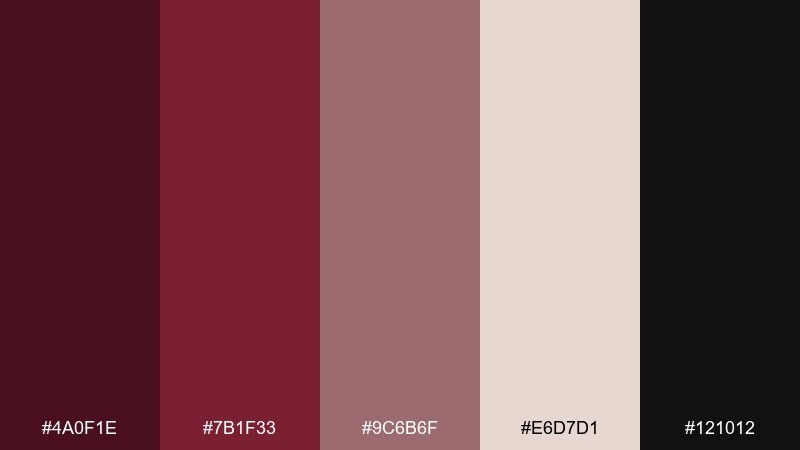
HEX: #4a0f1e #7b1f33 #9c6b6f #e6d7d1 #121012
Mood: bold, cinematic, high-contrast
Best for: editorial covers and posters
Bold and cinematic, it evokes a midnight tasting room with velvet shadows. Use near-black as the backdrop and let the cabernet tones carry the typography and key graphics. The dusty mauve works as a bridge for gradients and subheads, while the pale neutral keeps text readable. Tip: reserve the brightest neutral for only the most important copy to maintain drama.
Image example of noir cabernet generated using media.io
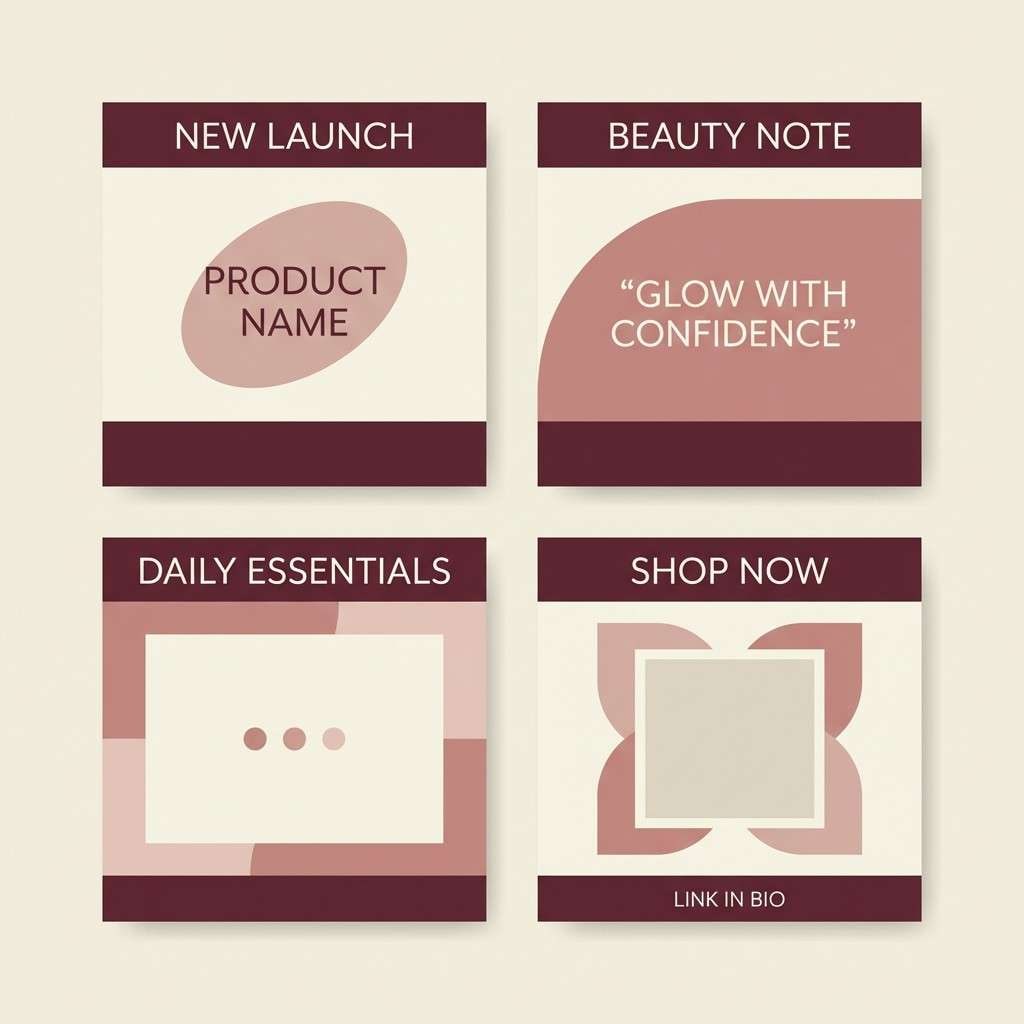
6) Dusty Blush Pairing
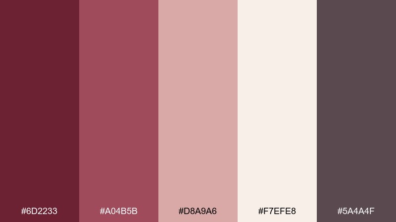
HEX: #6d2233 #a04b5b #d8a9a6 #f7efe8 #5a4a4f
Mood: gentle, romantic, modern
Best for: beauty branding and social posts
Gentle and romantic, it feels like powdered blush over a deep berry base. Let burgundy set the mood, then use dusty pink for buttons, badges, or product highlights. The soft cream keeps posts looking bright and clean, while the muted taupe supports captions. Tip: try a two-tone background split between cream and blush for quick, on-brand layouts.
Image example of dusty blush pairing generated using media.io
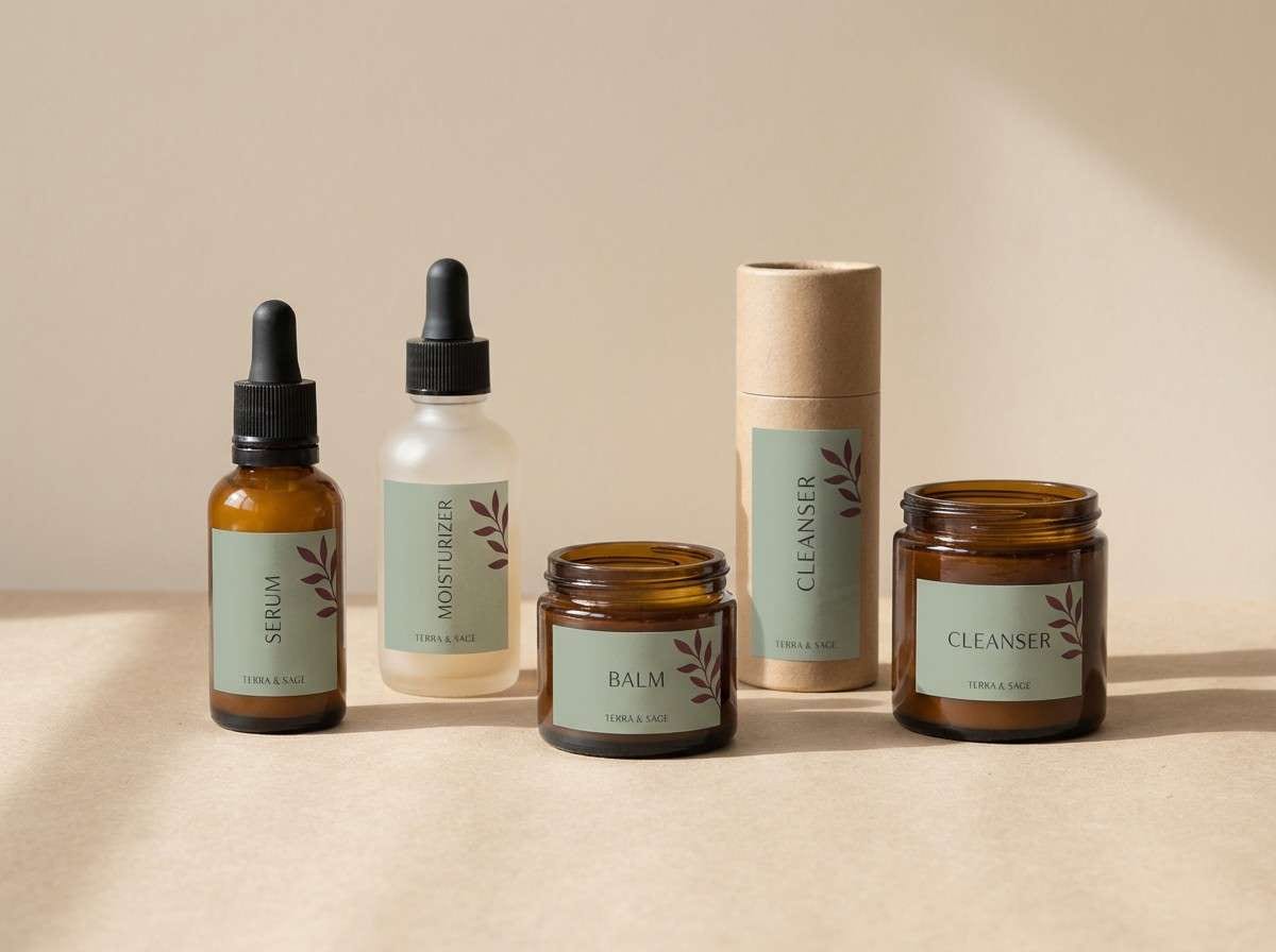
7) Sage Barrel
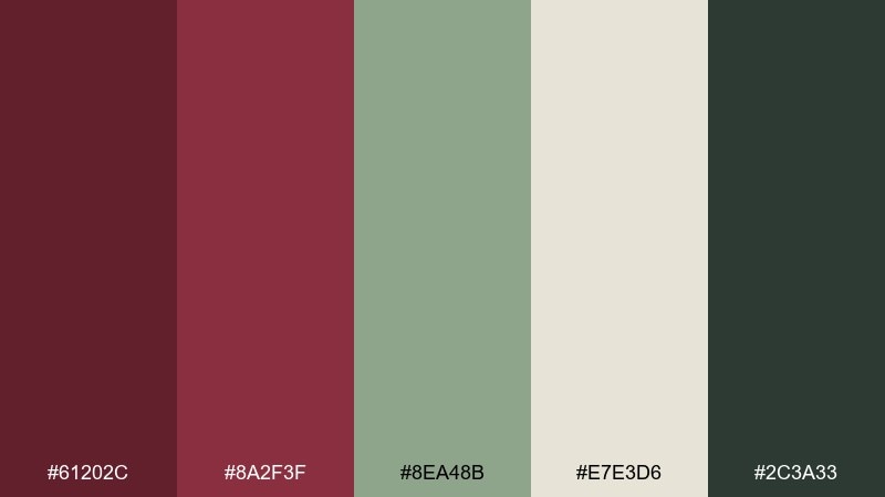
HEX: #61202c #8a2f3f #8ea48b #e7e3d6 #2c3a33
Mood: grounded, botanical, calm
Best for: wellness brands and eco packaging
Grounded and botanical, it suggests crushed herbs beside a glass of red. Sage is the perfect counterpoint to burgundy, creating a fresh balance for labels and web sections. Use the pale sand as your main background to keep the palette breathable. Tip: keep the dark green for icons and outlines so the burgundy stays the star.
Image example of sage barrel generated using media.io
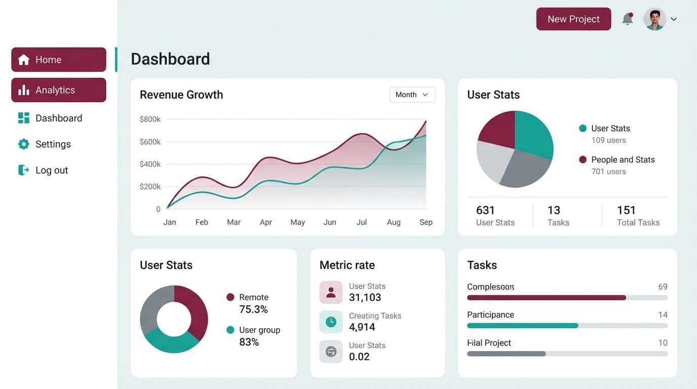
8) Teal Tasting Room
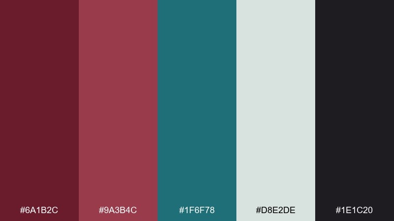
HEX: #6a1b2c #9a3b4c #1f6f78 #d8e2de #1e1c20
Mood: fresh, confident, contemporary
Best for: app UI and dashboards
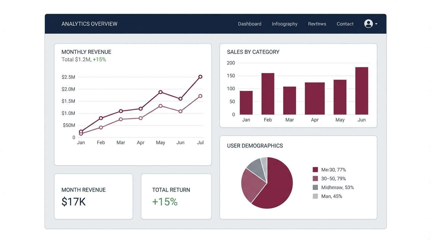
Fresh and confident, it feels like cool teal glassware against rich red wine. These wine burgundy color combinations work especially well for UI states: burgundy for primary actions, teal for secondary actions, and pale mist for surfaces. The near-black keeps data tables crisp without pure black glare. Tip: avoid using burgundy and teal at equal weight; pick one primary and let the other support.
Image example of teal tasting room generated using media.io
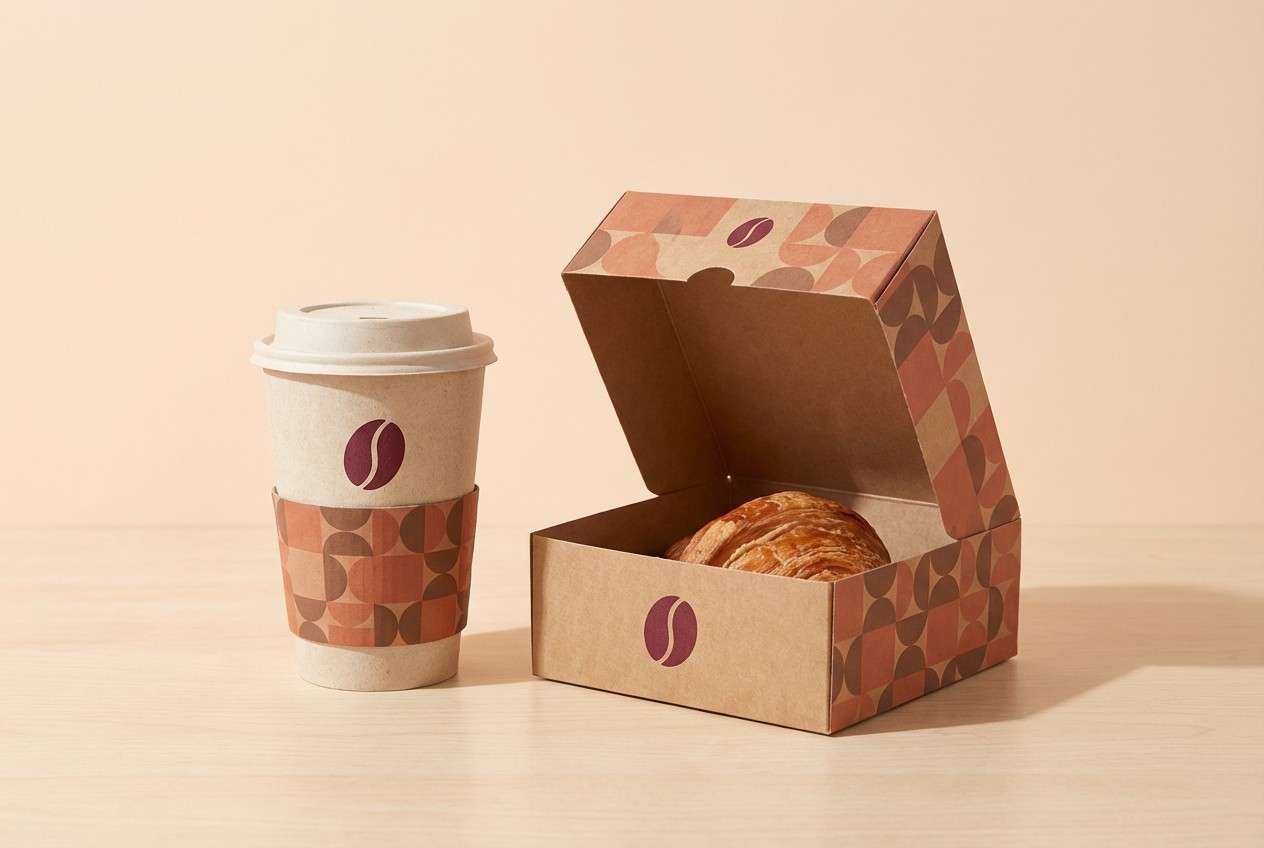
9) Terracotta Cork
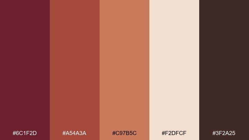
HEX: #6c1f2d #a54a3a #c97b5c #f2dfcf #3f2a25
Mood: warm, handmade, cozy
Best for: cafe branding and food packaging
Warm and handmade, it brings to mind clay pottery, cork, and slow dinners. Use burgundy for the logo and key labels, then layer terracotta and clay for patterns or icon fills. The pale peachy neutral makes a friendly background for menus and wrappers. Tip: add a simple repeating motif in the two mid-tones to get texture without extra colors.
Image example of terracotta cork generated using media.io
10) Lavender Nightcap
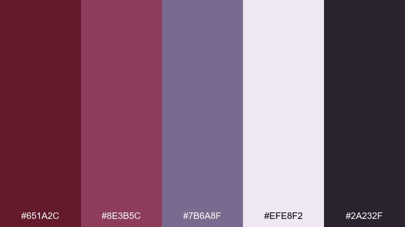
HEX: #651a2c #8e3b5c #7b6a8f #efe8f2 #2a232f
Mood: dreamy, artistic, night-time
Best for: event flyers and album art
Dreamy and artistic, it feels like twilight fading into a late-night lounge. Burgundy and plum set the base, while lavender adds a surprising, modern twist for titles and gradients. Keep the soft lilac-white for open space so the design stays light. Tip: use subtle grain over the background to make the night tones feel richer.
Image example of lavender nightcap generated using media.io

11) Espresso Truffle
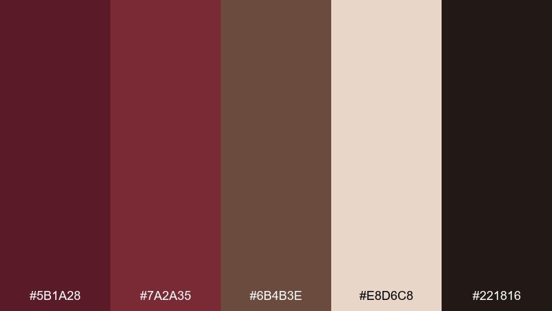
HEX: #5b1a28 #7a2a35 #6b4b3e #e8d6c8 #221816
Mood: rich, cozy, gourmand
Best for: coffee brands and artisan labels
Rich and cozy, it evokes espresso crema and dark chocolate truffles. The burgundy reads refined next to warm brown, making it ideal for labels, loyalty cards, and rustic-luxe packaging. Use the creamy beige to keep text legible and to prevent the design from feeling too heavy. Tip: lean on simple serif typography to match the gourmet mood.
Image example of espresso truffle generated using media.io
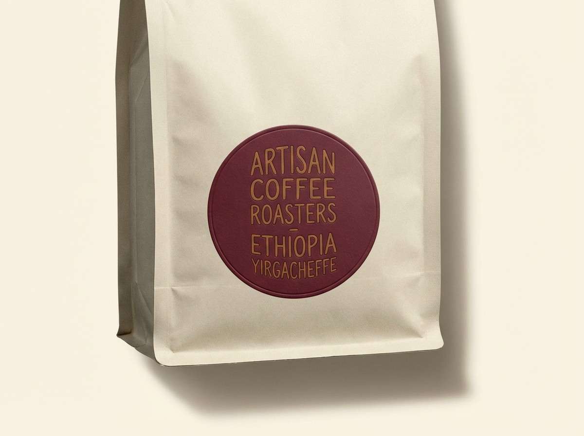
12) Pearl Champagne
HEX: #6a1e2f #9b3d4b #d9c7b6 #fff7ee #b48b6a
Mood: glamorous, light, celebratory
Best for: bridal branding and luxury invites
Glamorous and light, it suggests champagne bubbles beside a dark berry lip. Use the pearl and ivory tones as the main canvas, then add burgundy sparingly for monograms and headings. The warm champagne gold can highlight borders and icons without overpowering the page. Tip: keep gradients subtle so the palette stays crisp in print.
Image example of pearl champagne generated using media.io
13) Denim and Merlot
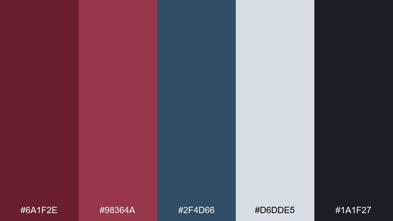
HEX: #6a1f2e #98364a #2f4d66 #d6dde5 #1a1f27
Mood: casual, confident, modern
Best for: streetwear branding and ecommerce
Casual and confident, it feels like dark denim paired with a merlot statement piece. Use burgundy for badges, sale tags, and key CTAs, while the denim blue supports navigation and secondary UI. The cool pale gray-blue keeps product grids clean and readable. Tip: keep the darkest navy for headers and footers to frame the layout.
Image example of denim and merlot generated using media.io
14) Copper Still
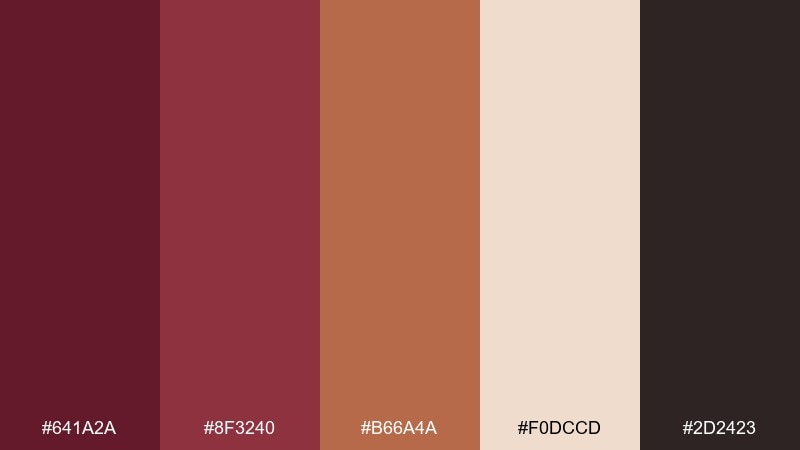
HEX: #641a2a #8f3240 #b66a4a #f0dccd #2d2423
Mood: craft, warm, industrial
Best for: spirits labels and bar menus
Crafty and warm, it recalls copper stills and dim bar lighting. Copper and burgundy together feel premium yet approachable, perfect for labels and menu headers. Use the pale peach for background space and the deep brown for fine print and dividers. Tip: try copper for thin linework and burgundy for bold stamps to create hierarchy.
Image example of copper still generated using media.io
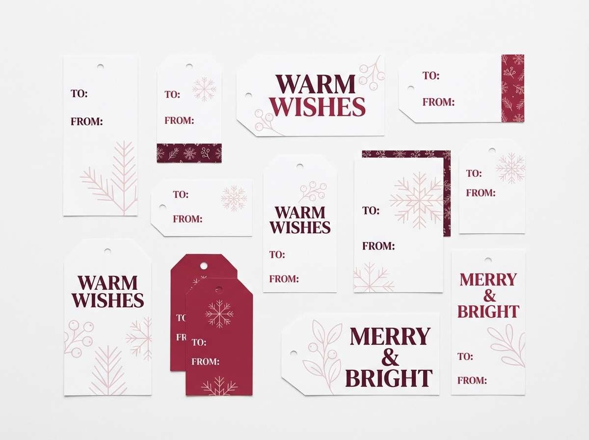
15) Winter Cranberry
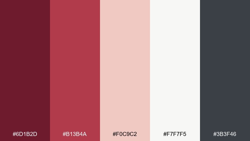
HEX: #6d1b2d #b13b4a #f0c9c2 #f7f7f5 #3b3f46
Mood: bright, festive, crisp
Best for: holiday campaigns and gift tags
Bright and festive, it feels like cranberries on fresh snow with a modern edge. Let the burgundy and cranberry lead the message, then use icy white for plenty of breathing room. The cool gray is perfect for secondary text and subtle patterns. Tip: keep accent shapes small so the palette stays crisp instead of candy-like.
Image example of winter cranberry generated using media.io
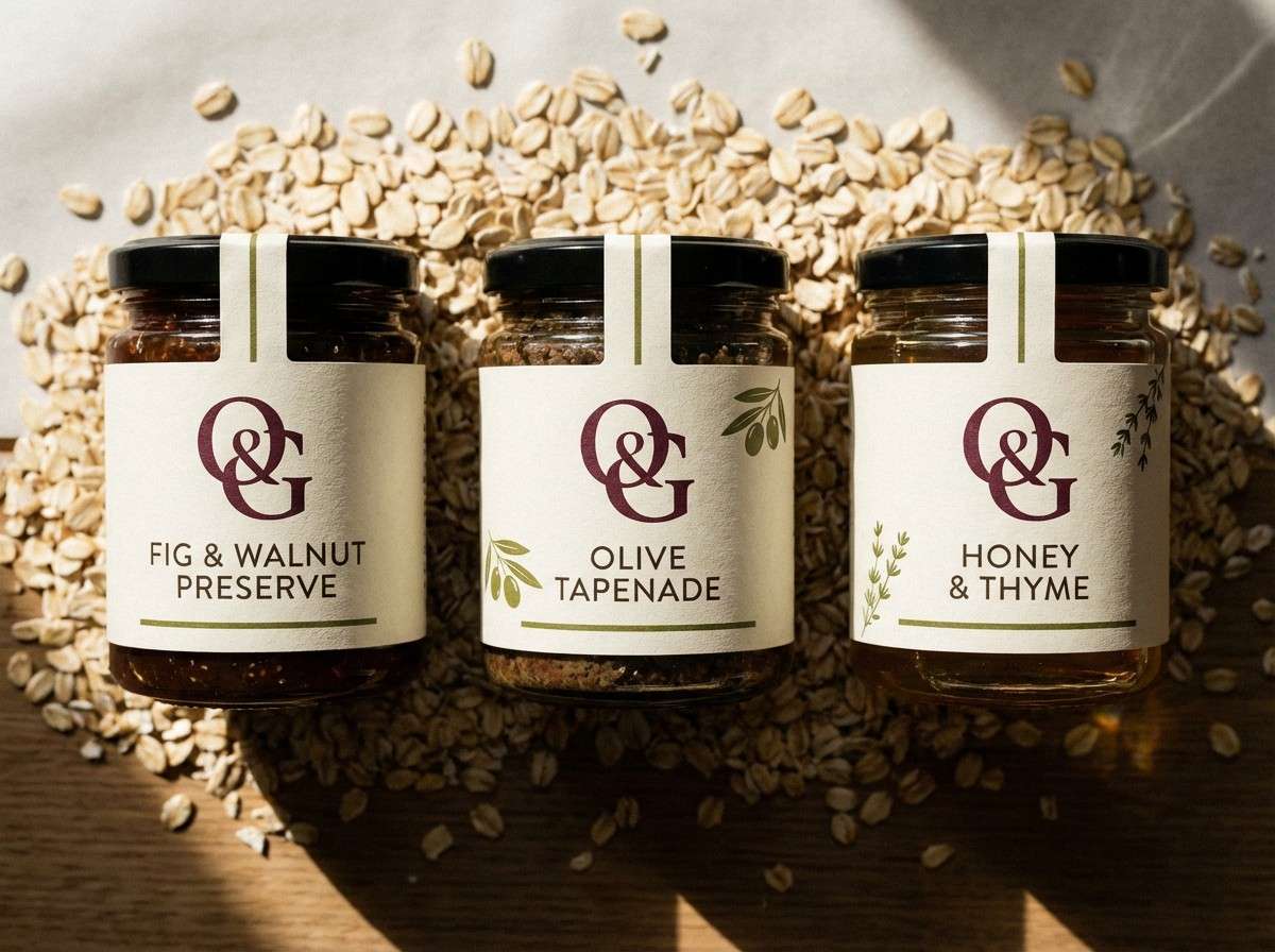
16) Olive Tapenade
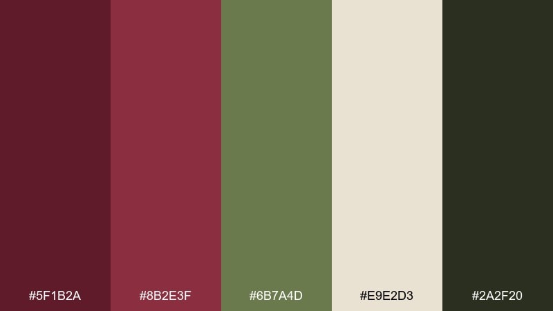
HEX: #5f1b2a #8b2e3f #6b7a4d #e9e2d3 #2a2f20
Mood: savory, organic, grounded
Best for: gourmet food brands and labels
Savory and organic, it brings to mind olives, herbs, and a rich red pour. The olive green cools down the burgundy so packaging feels culinary rather than floral. Use the pale oat tone as a clean label base and the deep green-black for barcodes and nutrition text. Tip: pair with textured paper to enhance the artisanal feel.
Image example of olive tapenade generated using media.io
17) Peachy Rose Pop
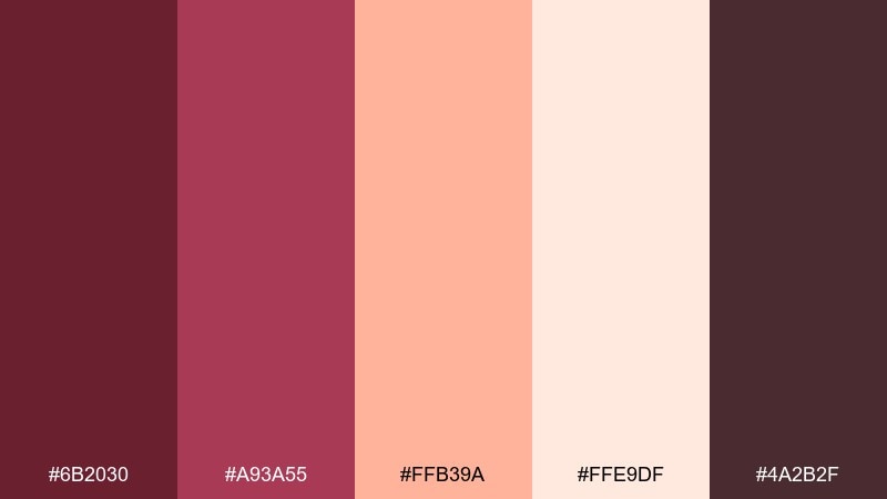
HEX: #6b2030 #a93a55 #ffb39a #ffe9df #4a2b2f
Mood: playful, bold, modern
Best for: beauty launches and promo posters
Playful and bold, it looks like bright peach gloss against deep berry lipstick. Use peach as the attention-grabber for stickers, price bursts, or key promo lines, while burgundy holds the brand identity. The soft blush background keeps it youthful and readable. Tip: stick to large, simple shapes so the contrast feels intentional, not busy.
Image example of peachy rose pop generated using media.io

18) Minimal Mocha
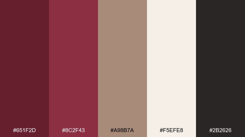
HEX: #651f2d #8c2f43 #a98b7a #f5efe8 #2b2626
Mood: minimal, warm, polished
Best for: portfolio sites and editorial layouts
Minimal and warm, it feels like mocha foam with a deep berry undertone. Use the off-white for wide margins and clean grids, then bring burgundy in for links and section titles. The soft tan works well for card backgrounds and subtle dividers. Tip: keep your imagery desaturated so the palette stays the focus.
Image example of minimal mocha generated using media.io
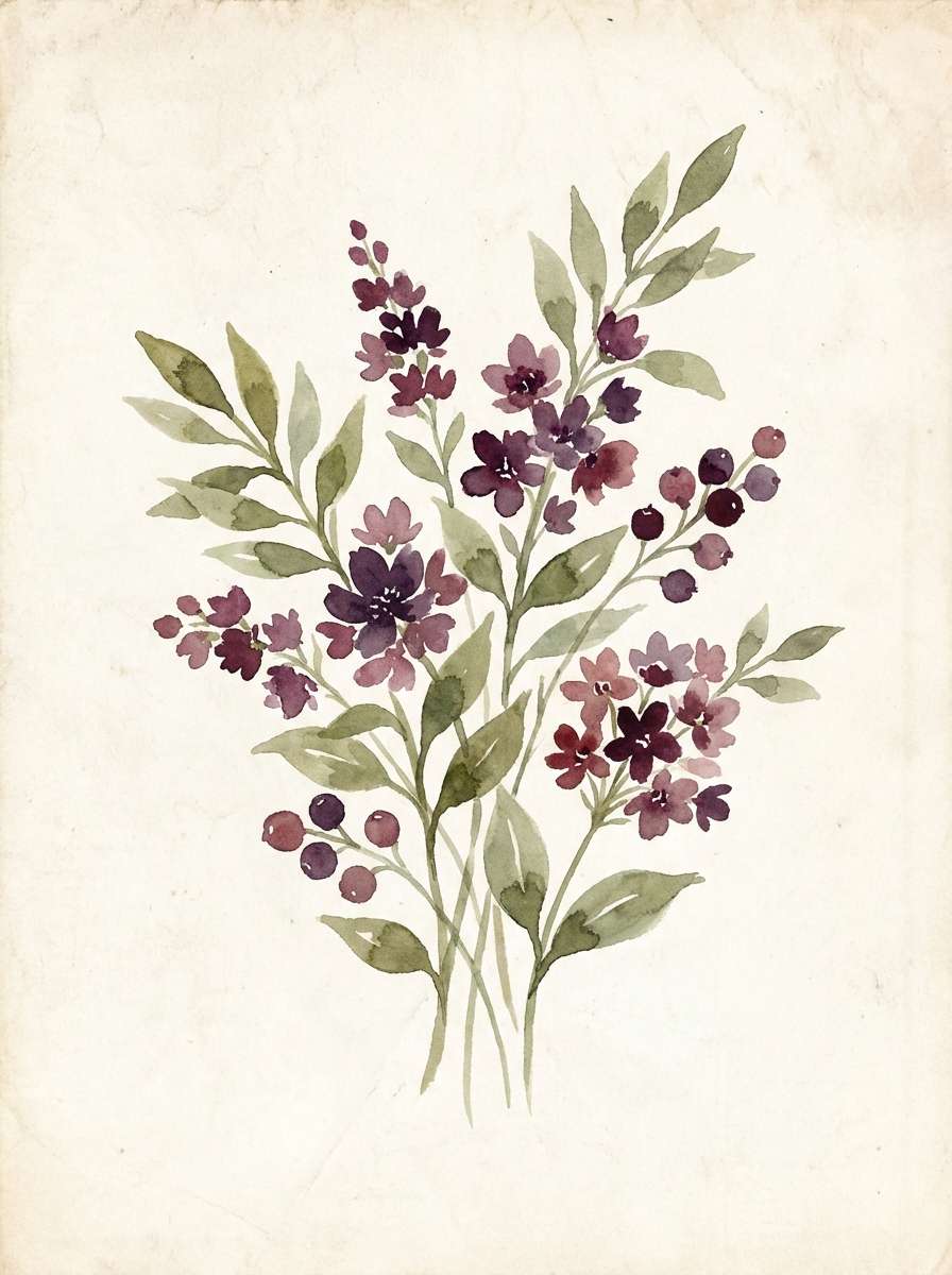
19) Botanical Plum
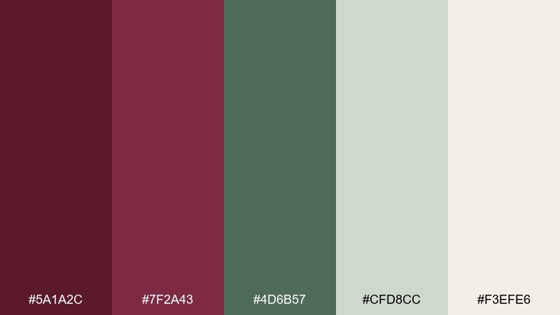
HEX: #5a1a2c #7f2a43 #4d6b57 #cfd8cc #f3efe6
Mood: garden, calm, refined
Best for: botanical illustrations and labels
Calm and refined, it suggests plum skins and soft green leaves in a shaded garden. The muted greens keep burgundy from feeling too heavy, making it great for botanical branding and illustration work. Use the pale neutrals as paper tones, with plum for outlines and titles. Tip: keep florals minimal and let negative space do the work.
Image example of botanical plum generated using media.io
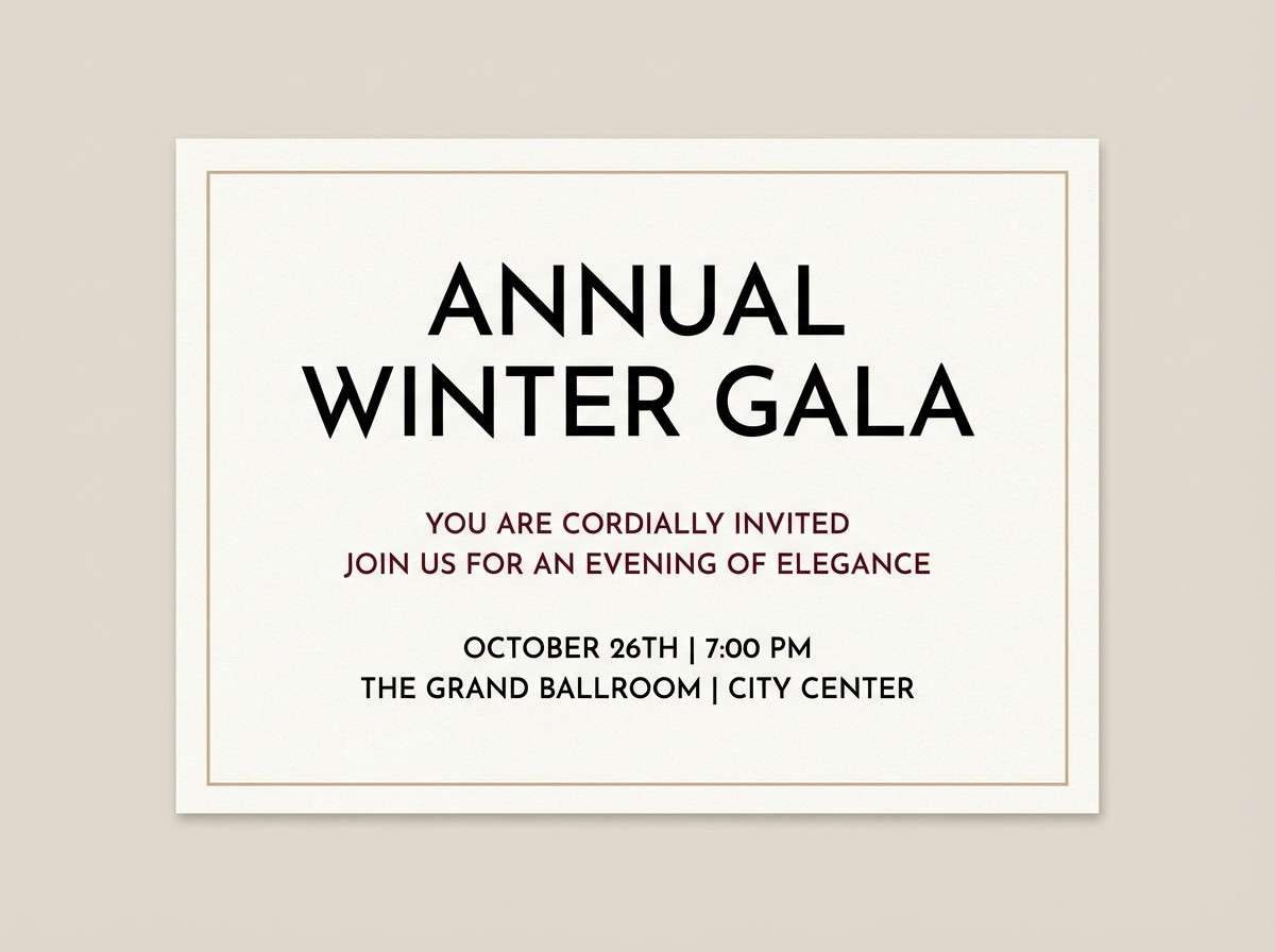
20) Luxe Black Tie
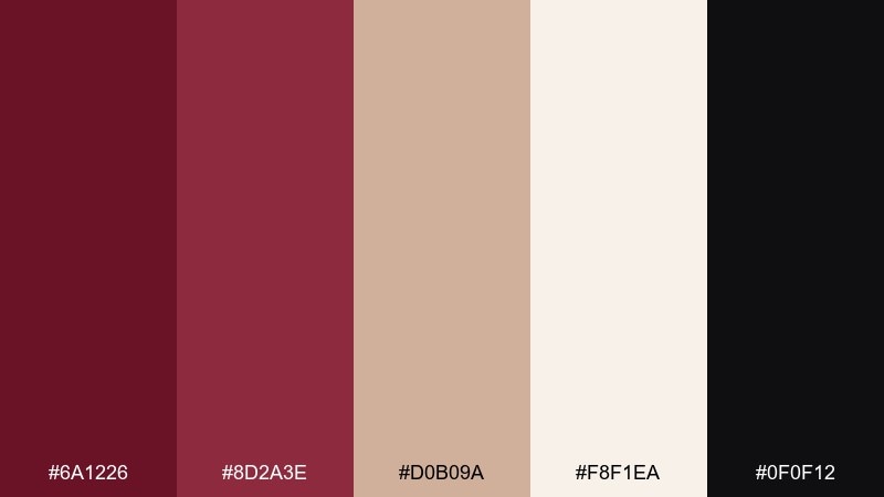
HEX: #6a1226 #8d2a3e #d0b09a #f8f1ea #0f0f12
Mood: formal, luxe, high-end
Best for: event branding and gala invites
Formal and high-end, it reads like a black-tie evening with burgundy silk accents. Use black as the background for maximum contrast, then bring in burgundy for typography and seals. The warm nude and ivory keep it from feeling cold and help with readability. Tip: limit gold-adjacent beige to thin borders and small icons for a refined finish.
Image example of luxe black tie generated using media.io
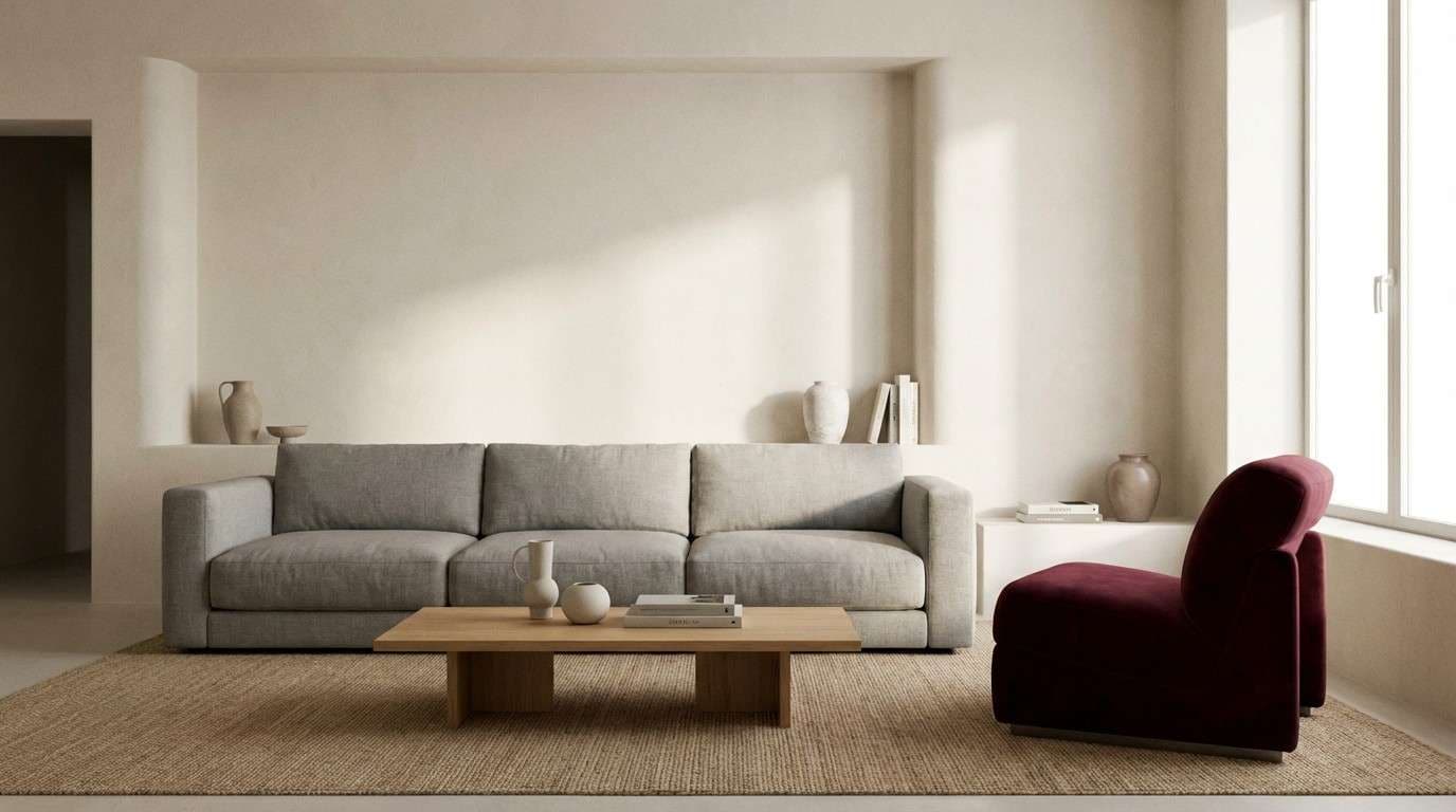
21) Stone and Sangria
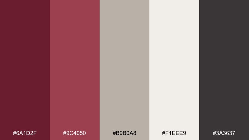
HEX: #6a1d2f #9c4050 #b9b0a8 #f1eee9 #3a3637
Mood: muted, architectural, calm
Best for: interior palettes and paint planning
Muted and architectural, it feels like sangria beside cool stone and plaster. The grays and off-whites keep the burgundy sophisticated for accent walls, cabinetry, or textiles. Use the mid gray as a bridge so transitions look intentional across rooms. Tip: sample burgundy in low light first, since it deepens dramatically at night.
Image example of stone and sangria generated using media.io
22) Berry Ink Contrast
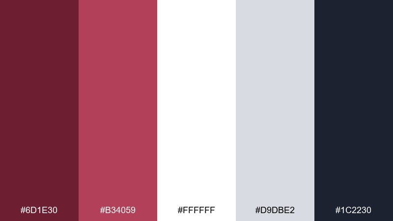
HEX: #6d1e30 #b34059 #ffffff #d9dbe2 #1c2230
Mood: clean, sharp, digital
Best for: SaaS UI, charts, and data apps
Clean and sharp, it looks like berry ink on crisp paper with deep navy structure. Use burgundy for primary highlights in charts and active states, while navy handles headers and navigation. The light grays help separate cards without adding extra colors. Tip: keep data viz accents consistent so burgundy always signals the same meaning.
Image example of berry ink contrast generated using media.io
What Colors Go Well with Wine Burgundy?
Wine burgundy pairs effortlessly with warm neutrals like cream, ivory, oat, sand, and soft blush—these lighten the overall look and keep layouts readable for web and print.
For contrast and structure, use charcoal, near-black, espresso brown, or deep navy. These darker anchors help burgundy feel more modern and make typography, icons, and borders look intentional.
If you want a fresher twist, try cool counterpoints like sage/olive greens, teal, or muted lavender. They balance the richness of burgundy and keep the palette from leaning too traditional.
How to Use a Wine Burgundy Color Palette in Real Designs
Start with role-based usage: make burgundy your primary brand tone for headlines, logos, or primary buttons, then assign a neutral (cream/off-white) as the main background to avoid visual heaviness.
Use one accent color for emphasis—gold/copper for luxury, teal for modern UI, or peach for playful promos. Keep accents small (badges, borders, icons, highlights) so burgundy remains the identity.
For accessibility, test contrast early: burgundy on cream is usually comfortable for headings, while body text often reads best in charcoal or deep brown rather than pure burgundy.
Create Wine Burgundy Palette Visuals with AI
If you already have HEX codes, you can turn them into real mockups fast—hero banners, invitations, packaging scenes, posters, and UI screens—by describing the layout and materials you want.
To stay on-brand, mention the exact wine burgundy shade (like #6b1e2e) and call out where each color should appear (background, typography, buttons, accents) so the AI keeps clear hierarchy.
Generate multiple variations (minimal, editorial, and high-contrast) and compare them side-by-side before you lock your final wine burgundy color scheme.
Wine Burgundy Color Palette FAQs
-
What is the HEX code for a classic wine burgundy?
A popular modern wine burgundy HEX is #6b1e2e. It’s deep, slightly berry-toned, and works well as an anchor color for branding, UI, and print. -
Is burgundy the same as maroon or wine red?
They’re related but not identical. Maroon often leans browner, while wine red/burgundy typically leans more purple/berry. The easiest way to confirm is to compare the HEX values side-by-side. -
What neutral colors look best with wine burgundy?
Cream, ivory, warm off-white, oat, and soft greige are the safest pairings. They brighten the palette and keep burgundy from feeling too dark or heavy. -
What accent colors modernize a wine burgundy color scheme?
Try teal, sage green, muted lavender, or champagne gold. These accents add contrast and freshness while still feeling refined. -
How do I use wine burgundy in a website or app UI?
Use burgundy for primary actions (active states, key buttons, highlights), and rely on white/soft gray surfaces for readability. Keep body text in charcoal/navy so the interface stays crisp. -
Does wine burgundy work for weddings?
Yes—especially with cream, blush, and champagne tones. For print, consider matte finishes for the darkest inks and keep backgrounds light to maintain an elegant look. -
How can I generate wine burgundy palette mockups quickly?
Use an AI text-to-image tool and specify your HEX colors, the design format (invitation, packaging, hero banner, UI), and where each color should appear (background, type, accents) for consistent results.
Next: Mardi Gras Color Palette


