

Mardi Gras colors are famous for bold purple, lively green, and radiant gold—an instantly recognizable trio that reads festive in print, digital, and event branding.
Below are 20+ Mardi Gras color palette ideas with HEX codes, plus practical ways to apply them to invitations, posters, packaging, and modern UI.
In this article
- Why Mardi Gras Palettes Work So Well
-
- royal parade
- brass & beads
- velvet mask
- king cake crumb
- french quarter neon
- bayou twilight
- confetti streamers
- jester suit
- parade float florals
- gilded trumpet
- streetcar charm
- purple raincoat
- emerald sash
- crown & ivy
- creole night market
- spotlight royale
- carnival minimal
- beadwork heritage
- sparkler finale
- harbor morning
- balcony nightfall
- canal street classic
- What Colors Go Well with Mardi Gras?
- How to Use a Mardi Gras Color Palette in Real Designs
- Create Mardi Gras Palette Visuals with AI
Why Mardi Gras Palettes Work So Well
Mardi Gras palettes succeed because they’re built on high-contrast, high-saturation anchors—purple and green—balanced by gold for instant “celebration” cues. Even a tiny gold accent can make a layout feel premium and event-ready.
They’re also flexible across mediums: deep purples and near-blacks create dramatic nighttime energy for posters and flyers, while creams and soft lavenders keep invitations and UI layouts readable and clean.
Most importantly, the color story is culturally recognizable without being complicated—so your audience understands the mood at a glance, whether it’s for Fat Tuesday promos, parade posters, or themed app screens.
20+ Mardi Gras Color Palette Ideas (with HEX Codes)
1) Royal Parade
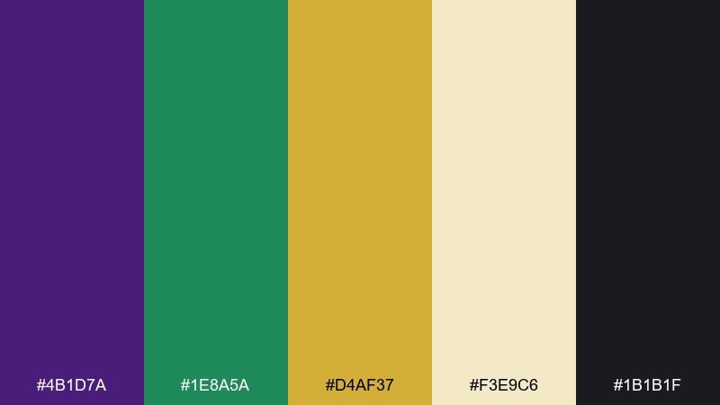
HEX: #4B1D7A #1E8A5A #D4AF37 #F3E9C6 #1B1B1F
Mood: regal, festive, high-contrast
Best for: festival poster design
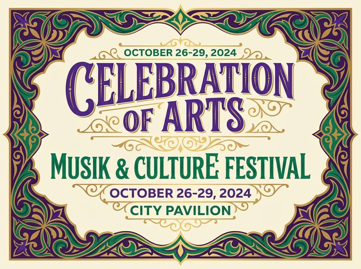
Regal and celebratory, it feels like velvet capes, brass bands, and gold coins catching the light. Use the deep purple for headlines, the emerald for supporting blocks, and the gold as a spotlight accent. It works best on creamy backgrounds where the dark ink tone can anchor the layout. Tip: keep gold to small shapes and dividers so it reads premium instead of noisy.
Image example of royal parade generated using media.io
Media.io is an online AI studio for creating and editing video, image, and audio in your browser.

2) Brass & Beads
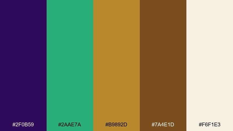
HEX: #2F0B59 #2AAE7A #B9892D #7A4E1D #F6F1E3
Mood: warm, crafted, street-festival
Best for: product packaging for bead kits
Warm and handmade, it evokes brass instruments, wooden storefronts, and strands of beads piled high. The bronze and brown tones give you a grounded base, while green keeps the pack feeling lively. Use the cream as negative space so small text stays readable on shelves. Tip: print the bronze as a foil or spot varnish to mimic real metal shine.
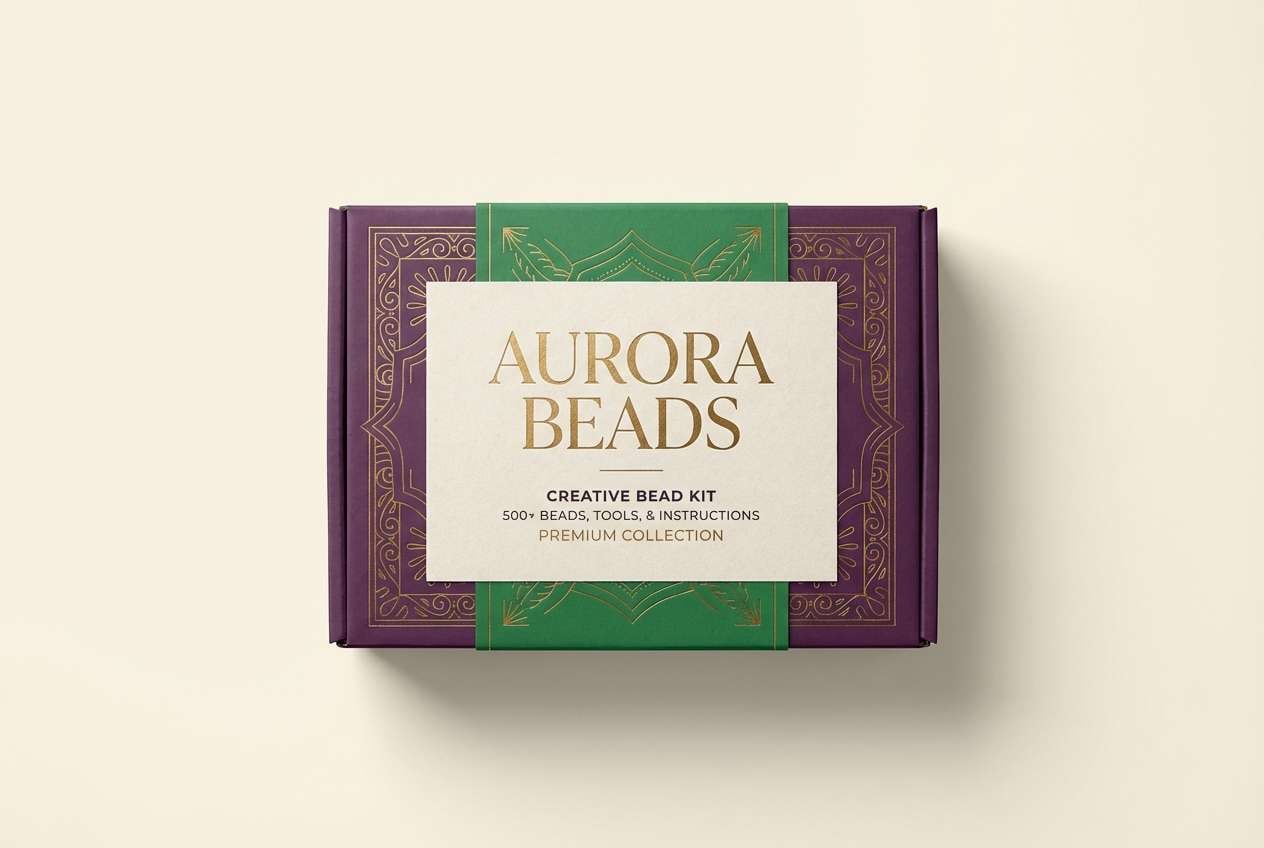
Image example of brass & beads generated using media.io
3) Velvet Mask
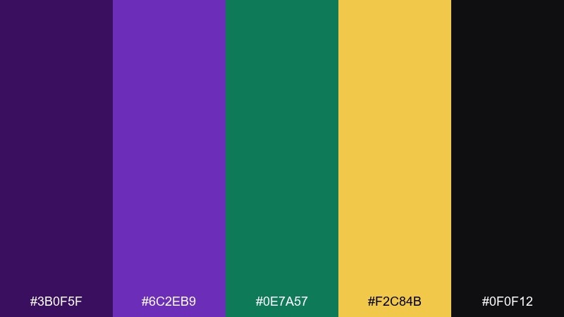
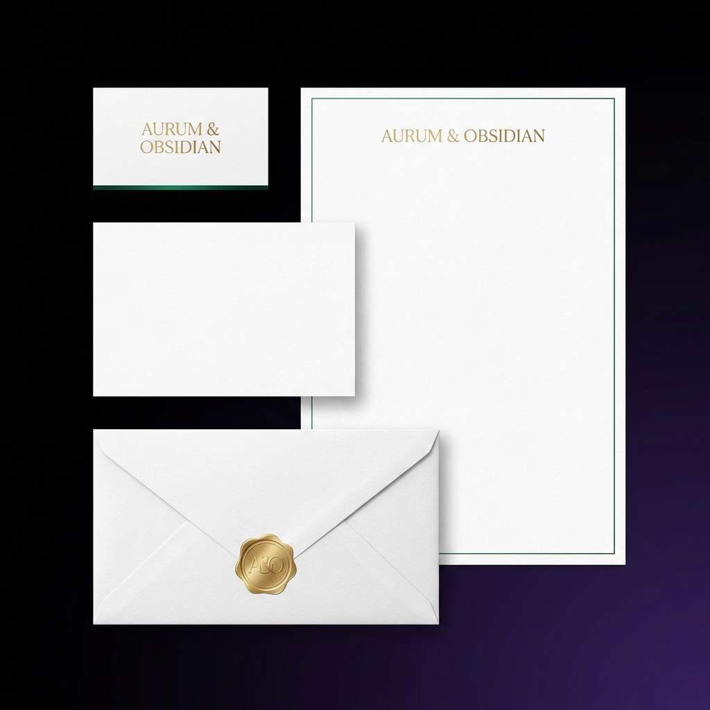
HEX: #3B0F5F #6C2EB9 #0E7A57 #F2C84B #0F0F12
Mood: luxurious, dramatic, night-ready
Best for: luxury brand logo and stationery
Luxurious and mysterious, it brings to mind masked balls, candlelit rooms, and jewel-toned velvet. For a refined look, let purple carry the brand mark while black handles typography and structure. The green can appear as a thin line or seal, with gold reserved for one premium detail. Tip: in a mardi gras color palette like this, choose one metallic moment and keep everything else matte.
Image example of velvet mask generated using media.io
4) King Cake Crumb
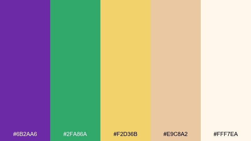
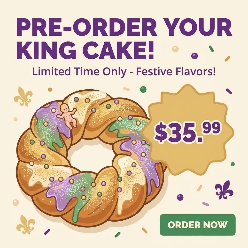
HEX: #6B2AA6 #2FA86A #F2D36B #E9C8A2 #FFF7EA
Mood: sweet, cozy, sunlit
Best for: bakery social media ad
Sweet and cozy, it feels like powdered sugar, warm pastry, and sprinkles in the afternoon sun. The soft golds and creams make food photography pop, while purple and green can frame prices and calls to action. Use the tan as a gentle border color to avoid harsh contrast on mobile. Tip: keep text in purple for readability and reserve green for buttons only.
Image example of king cake crumb generated using media.io
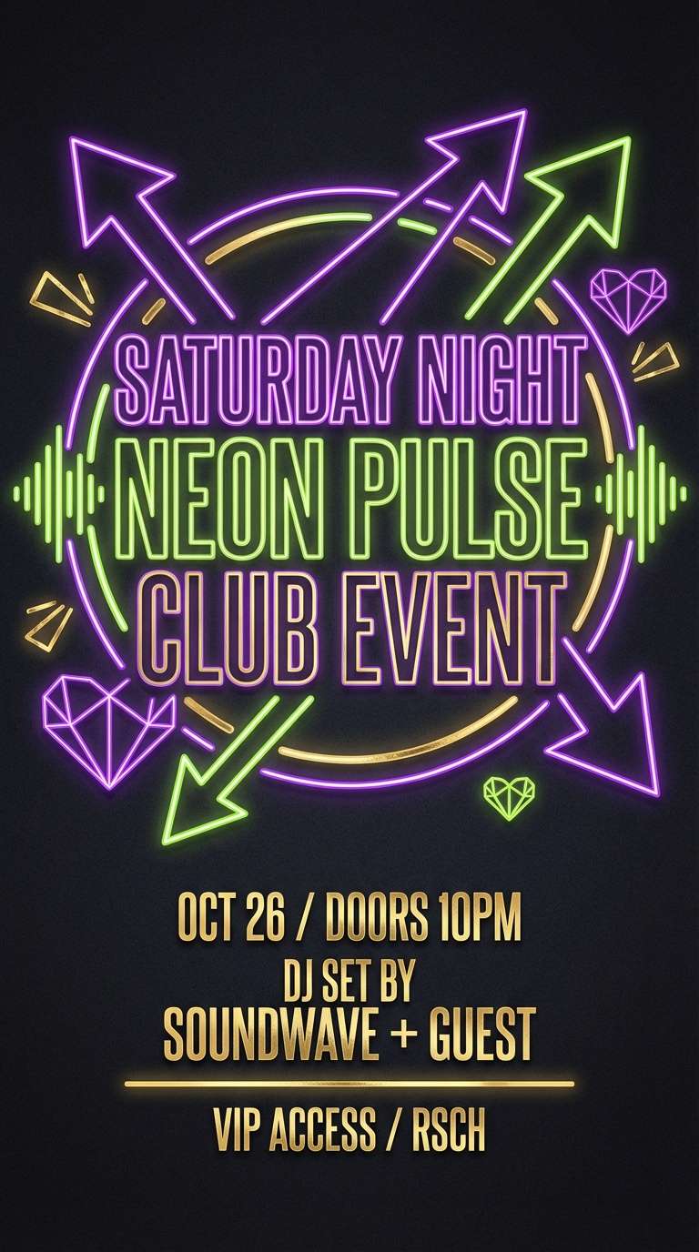
5) French Quarter Neon
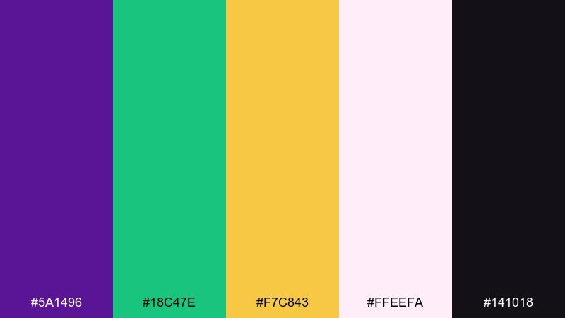
HEX: #5A1496 #18C47E #F7C843 #FFEEFA #141018
Mood: electric, nightlife, bold
Best for: nightlife event flyer
Electric and late-night, it evokes glowing signs, crowded sidewalks, and music spilling out of doorways. Pair the neon-leaning green with deep purple for maximum punch, then use gold as a highlight for dates and VIP tags. A soft pink-white can act as a halo behind text to keep it legible on dark layouts. Tip: apply the bright green as a gradient edge rather than a full block to reduce eye strain.
Image example of french quarter neon generated using media.io
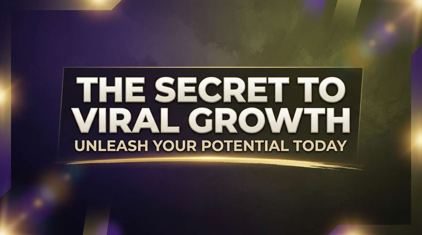
6) Bayou Twilight
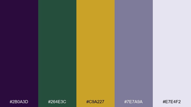
HEX: #2B0A3D #264E3C #C9A227 #7E7A9A #E7E4F2
Mood: moody, cinematic, atmospheric
Best for: cinematic video thumbnail
Moody and cinematic, it suggests twilight water, distant lanterns, and a hush before the parade turns the corner. Let the dark purple set the drama while muted green builds depth without competing for attention. Gold works best as a single focal glint, like a headline underline or icon. Tip: add plenty of light lavender space around the title so the thumbnail stays readable at small sizes.
Image example of bayou twilight generated using media.io
7) Confetti Streamers
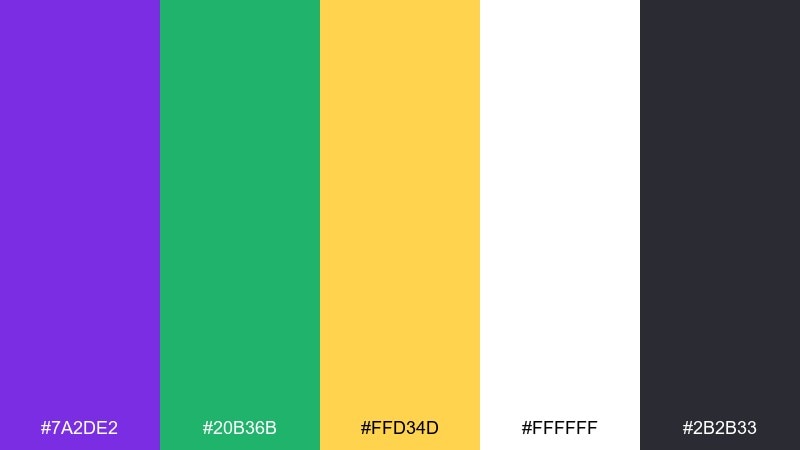
HEX: #7A2DE2 #20B36B #FFD34D #FFFFFF #2B2B33
Mood: playful, bright, family-friendly
Best for: kids party invitation
Playful and bright, it feels like confetti pops, paper streamers, and laughter. Use the vivid purple for the event name, then balance it with lots of white so the layout stays airy. Green and gold make cheerful icons and borders without overwhelming the text. Tip: keep body copy in the dark charcoal to improve readability for parents scanning quickly.
Image example of confetti streamers generated using media.io
8) Jester Suit
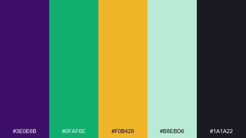
HEX: #3E0E6B #0FAF6E #F0B429 #B8EBD6 #1A1A22
Mood: bold, graphic, high-energy
Best for: ecommerce banner
Bold and graphic, it recalls diamond patterns, playful mischief, and sharp contrast on stage. The minty aqua gives your layout breathing room while still staying in the festive family. For punchy mardi gras color combinations, set gold price tags against the deep purple and use green for buttons. Tip: limit patterns to one section so the banner stays scannable in a fast scroll.
Image example of jester suit generated using media.io

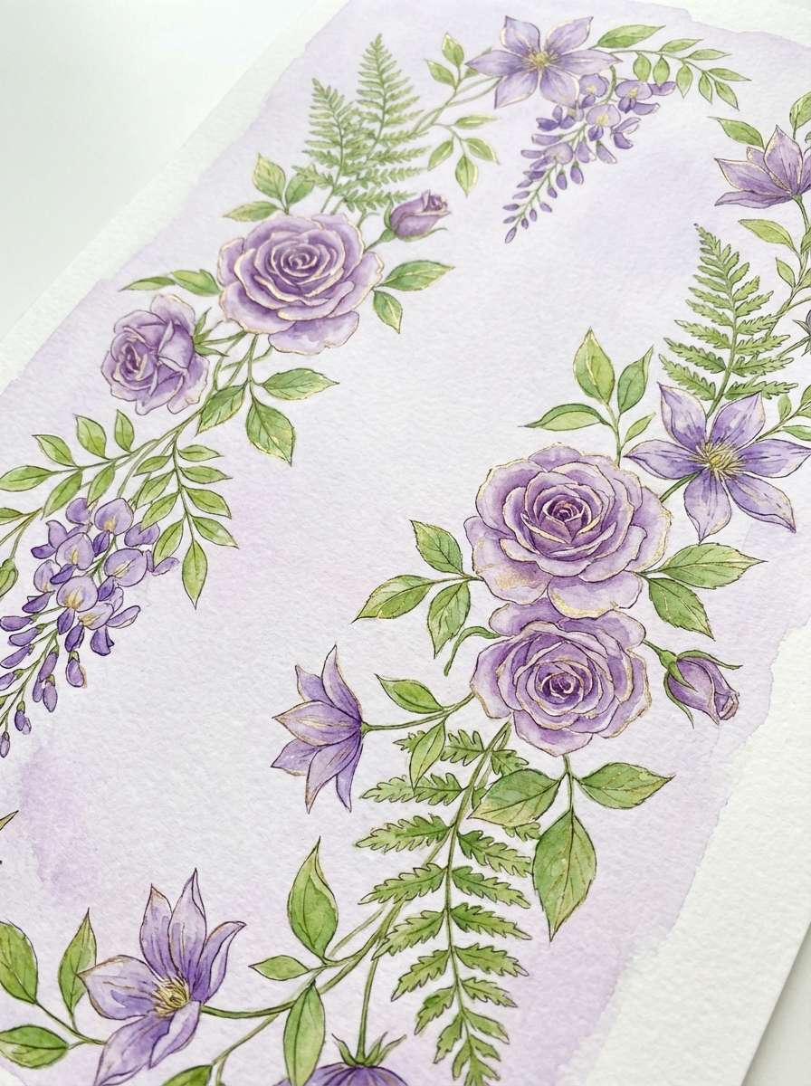
9) Parade Float Florals
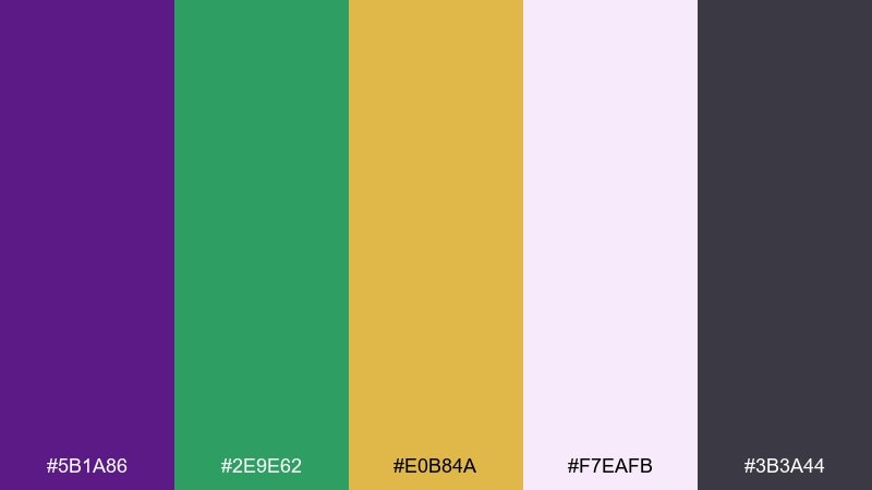
HEX: #5B1A86 #2E9E62 #E0B84A #F7EAFB #3B3A44
Mood: springlike, decorative, charming
Best for: watercolor botanical illustration
Springlike and decorative, it brings up petaled garlands and float florals layered over rich fabric. Soft lilac gives you a gentle base while the green keeps the foliage believable and fresh. Gold reads beautifully as pollen-like highlights and tiny accents. Tip: keep the darkest tone for outlines only so the illustration stays light and airy.
Image example of parade float florals generated using media.io
10) Gilded Trumpet
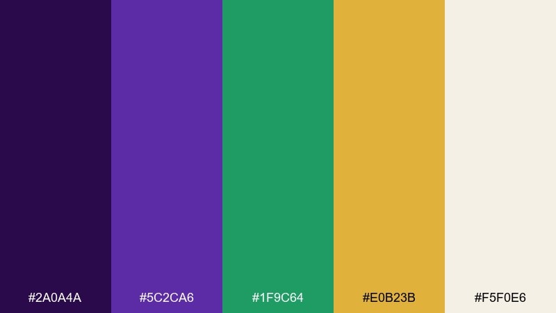
HEX: #2A0A4A #5C2CA6 #1F9C64 #E0B23B #F5F0E6
Mood: jazzy, polished, celebratory
Best for: album cover design
Jazzy and polished, it feels like a trumpet solo under warm spotlights and a velvet curtain. Use the darkest purple as the stage backdrop, then layer brighter violet for type to keep it readable. Green can support secondary text, while gold becomes the hero detail on the title or emblem. Tip: add subtle grain to the cream so the cover looks tactile instead of flat.
Image example of gilded trumpet generated using media.io
11) Streetcar Charm
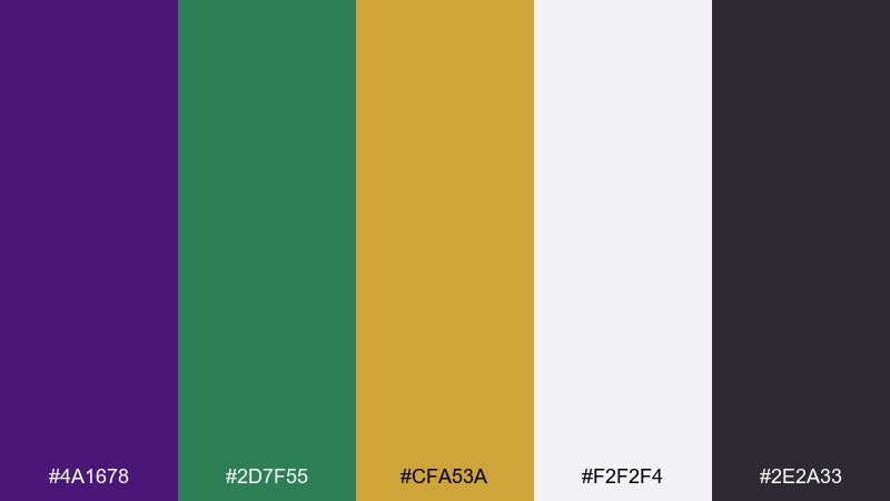
HEX: #4A1678 #2D7F55 #CFA53A #F2F2F4 #2E2A33
Mood: classic, urban, editorial
Best for: editorial magazine layout
Classic and urban, it suggests streetcar lines, iron balconies, and old-world signage. Use the cool gray-white as the page base, then drop in purple for section headers and pull quotes. Green works well for data callouts, while gold adds a refined accent for rules and icons. Tip: keep gold thin and consistent so the layout feels editorial, not party-store.
Image example of streetcar charm generated using media.io
12) Purple Raincoat
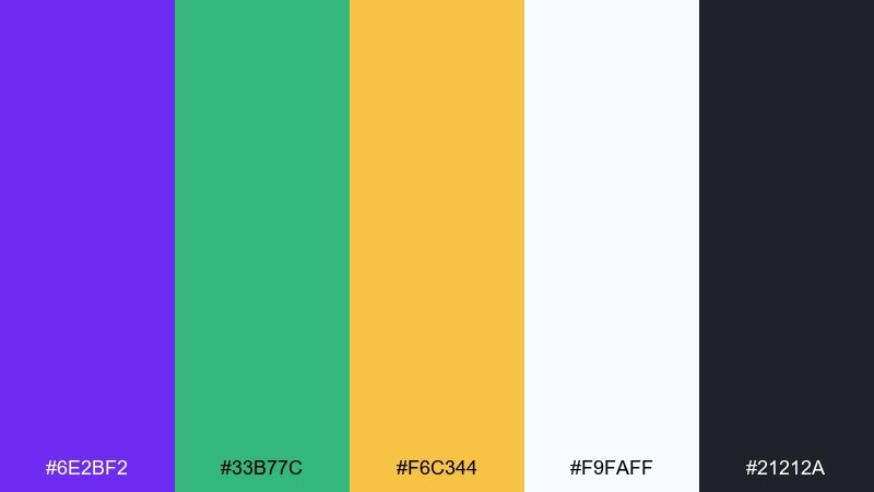
HEX: #6E2BF2 #33B77C #F6C344 #F9FAFF #21212A
Mood: fresh, modern, app-friendly
Best for: app onboarding screens
Fresh and modern, it feels like a bright raincoat in a lively crowd and crisp signage that guides you forward. Use purple as the primary brand color, then let near-white do most of the heavy lifting for space and clarity. Green is great for success states, and gold can highlight key perks or badges. Tip: keep button text dark and increase contrast for accessibility on mobile.
Image example of purple raincoat generated using media.io

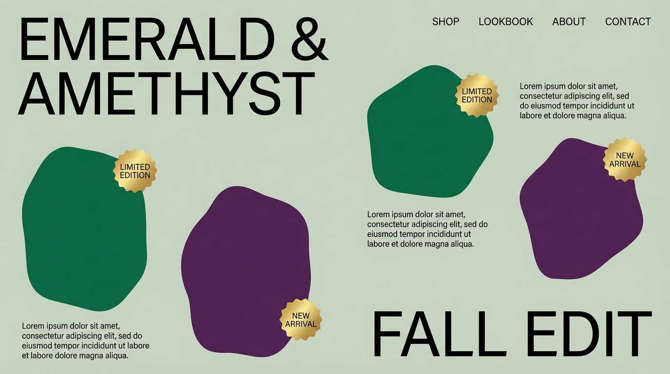
13) Emerald Sash
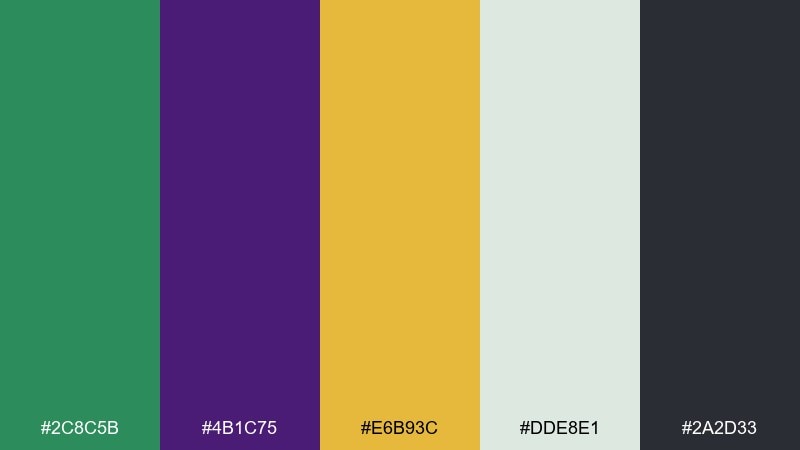
HEX: #2C8C5B #4B1C75 #E6B93C #DDE8E1 #2A2D33
Mood: tailored, confident, upscale
Best for: clothing lookbook page
Tailored and confident, it evokes a crisp sash, polished buttons, and upscale details. The soft sage-gray background keeps layouts calm while emerald and purple add unmistakable character. Gold can be used for small UI chips like new or limited to keep the page premium. Tip: avoid equal-sized color blocks and instead use one dominant color with two supporting accents.
Image example of emerald sash generated using media.io
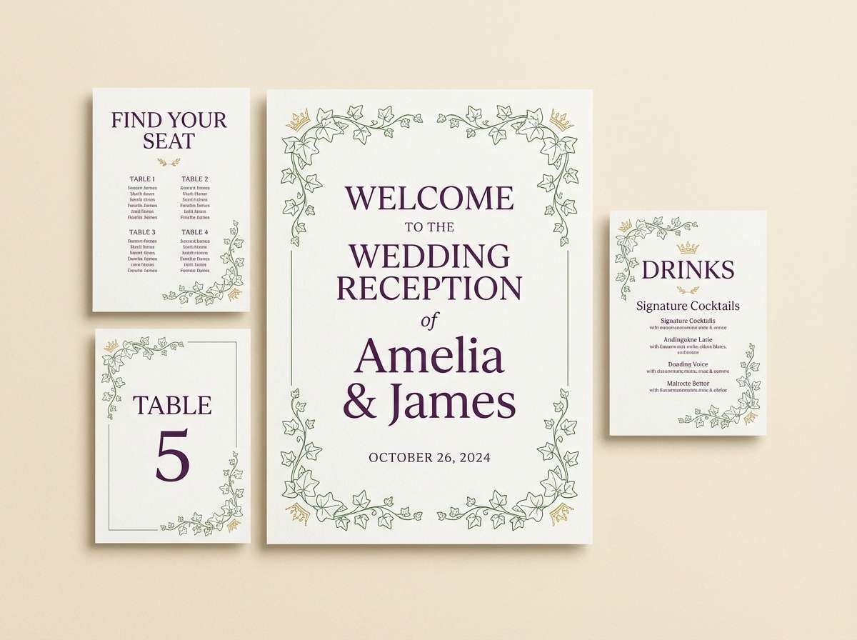
14) Crown & Ivy
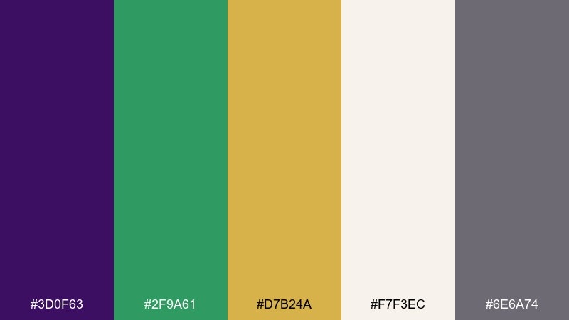
HEX: #3D0F63 #2F9A61 #D7B24A #F7F3EC #6E6A74
Mood: romantic, refined, celebratory
Best for: wedding reception signage
Romantic and refined, it suggests a gilded crown tucked into ivy and soft candlelight on linen. Creamy whites keep signage readable, while purple and green add elegant contrast from a distance. Use gold sparingly for monograms, arrows, or table numbers. Tip: choose a single serif font for the purple text and keep all icons in green for cohesion.
Image example of crown & ivy generated using media.io
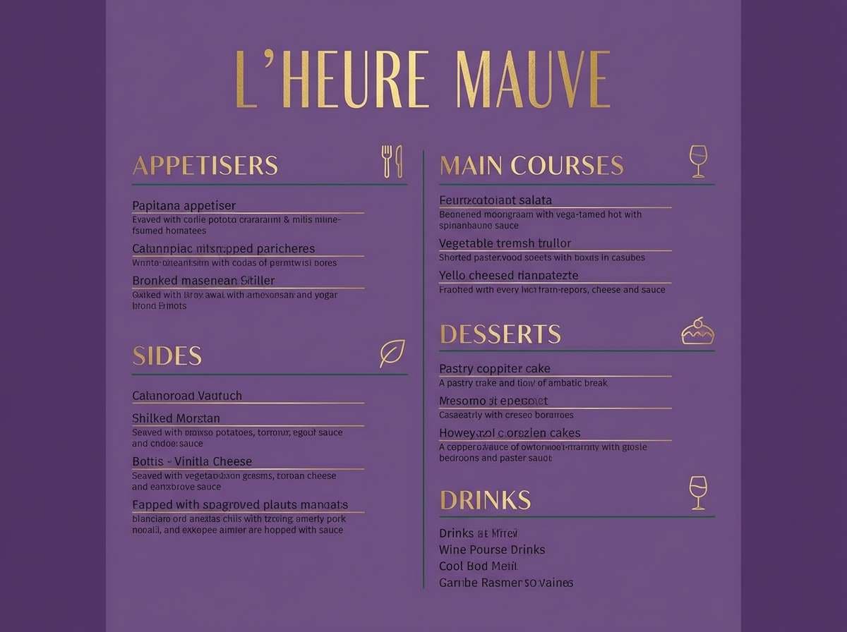
15) Creole Night Market
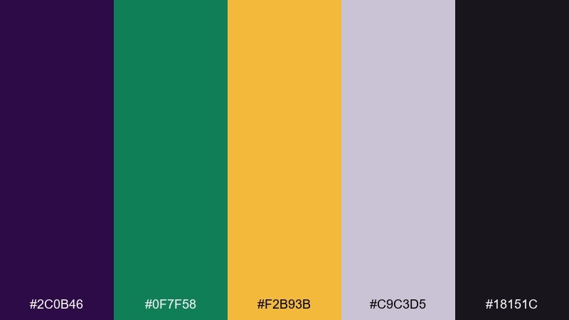
HEX: #2C0B46 #0F7F58 #F2B93B #C9C3D5 #18151C
Mood: savory, moody, inviting
Best for: restaurant menu design
Savory and moody, it feels like a night market menu under string lights with a hint of spice in the air. Use the pale lavender-gray for sections so the deep background does not swallow your text. Green is perfect for vegetarian markers, while gold can frame signature dishes. Tip: keep prices in gold but use the same font weight as the item names to avoid a cluttered look.
Image example of creole night market generated using media.io
16) Spotlight Royale
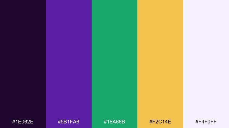
HEX: #1E062E #5B1FA6 #18A66B #F2C14E #F4F0FF
Mood: theatrical, energetic, high-impact
Best for: stage lighting poster
Theatrical and high-impact, it evokes a spotlight cutting through haze and a crowd ready to cheer. For strong mardi gras color combinations, push purple and black as the base, then use gold for the focal glow and green for supporting badges. The pale lavender-white keeps small details from disappearing on dark backgrounds. Tip: add one oversized gold circle behind the headline to simulate lighting without using gradients everywhere.
Image example of spotlight royale generated using media.io
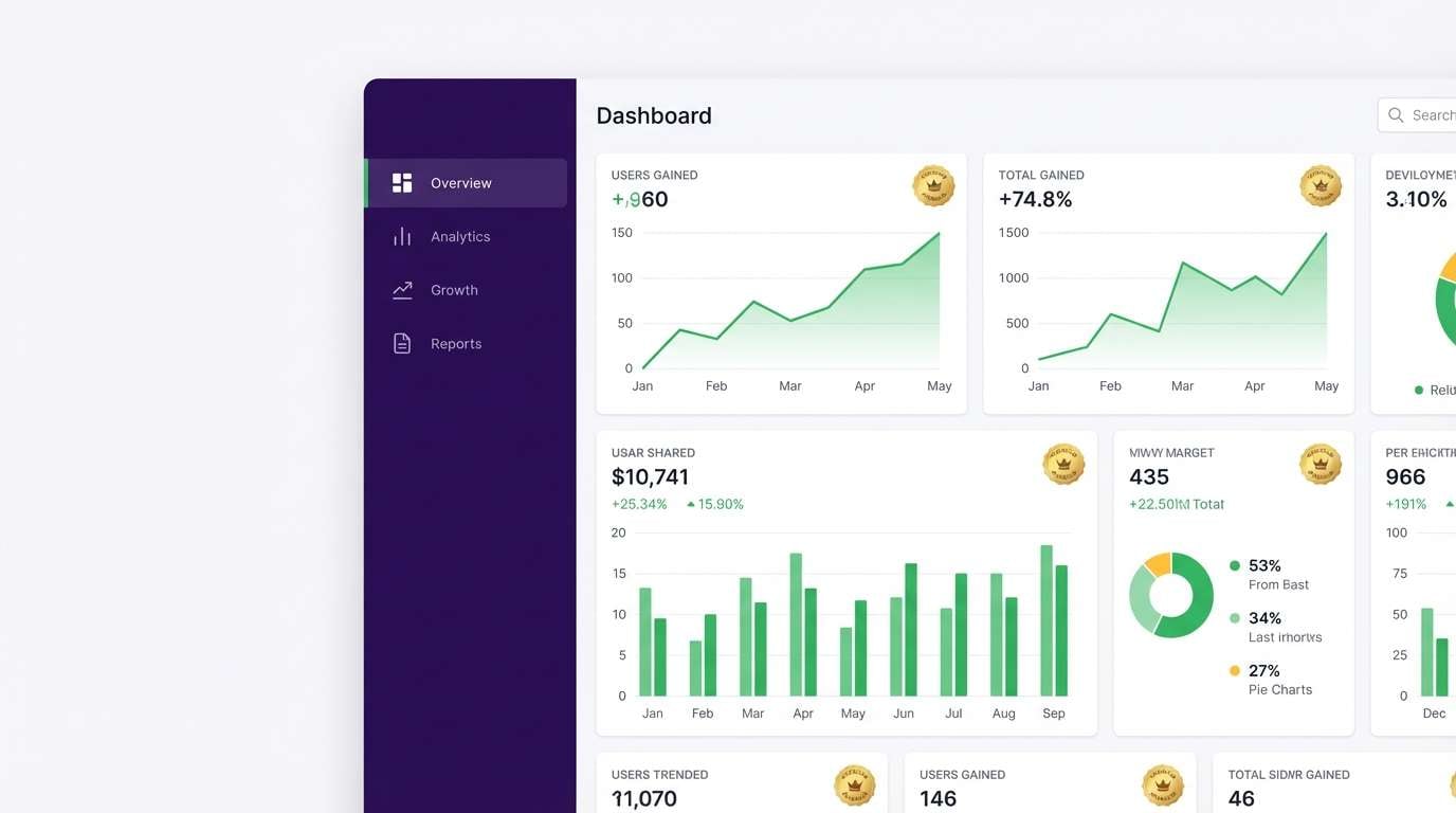
17) Carnival Minimal
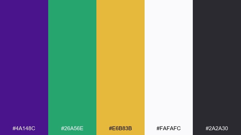
HEX: #4A148C #26A56E #E6B83B #FAFAFC #2A2A30
Mood: clean, modern, confident
Best for: modern ui dashboard
Clean and modern, it feels like a crisp interface with a festive twist rather than a loud party scene. Use near-white for most surfaces, then apply purple to navigation and key metrics. Green works naturally for positive trends, while gold is best reserved for premium status or featured cards. Tip: keep gold at low saturation in UI so it reads as highlight, not warning.
Image example of carnival minimal generated using media.io
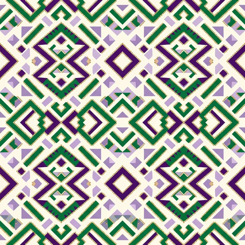
18) Beadwork Heritage
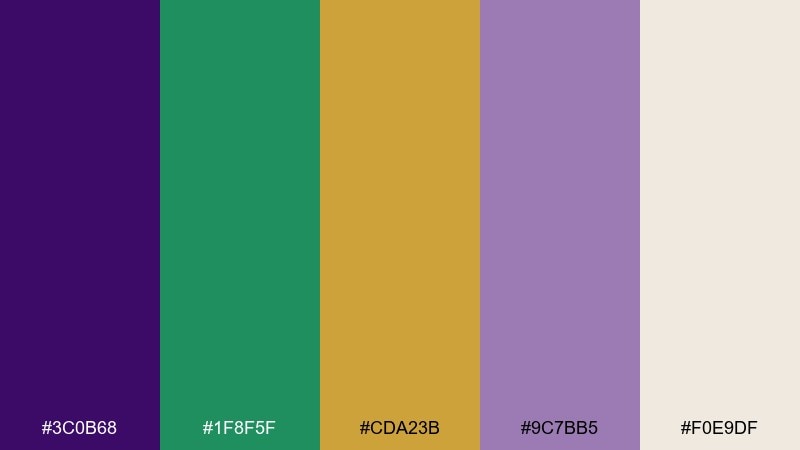
HEX: #3C0B68 #1F8F5F #CDA23B #9C7BB5 #F0E9DF
Mood: heritage, textured, artisanal
Best for: textile pattern design
Heritage-rich and textured, it brings up hand-beaded motifs, stitched borders, and keepsake craftsmanship. Lavender adds softness so the darker purple does not overpower repeating patterns. Use green for the motif shapes and gold for tiny dot details that mimic bead shine. Tip: test the pattern at small scale and reduce gold density so it does not flicker visually.
Image example of beadwork heritage generated using media.io
19) Sparkler Finale
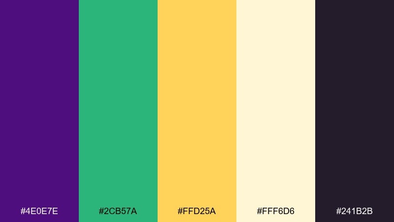
HEX: #4E0E7E #2CB57A #FFD25A #FFF6D6 #241B2B
Mood: bright, triumphant, celebratory
Best for: email header graphic
Bright and triumphant, it feels like the finale when everything glitters at once. Use dark plum as the base bar so gold typography and icons stay sharp. Green can signal the main call to action, while the pale butter tone keeps highlights soft instead of harsh. Tip: keep the header simple and let the body content carry extra decoration.
Image example of sparkler finale generated using media.io

20) Harbor Morning
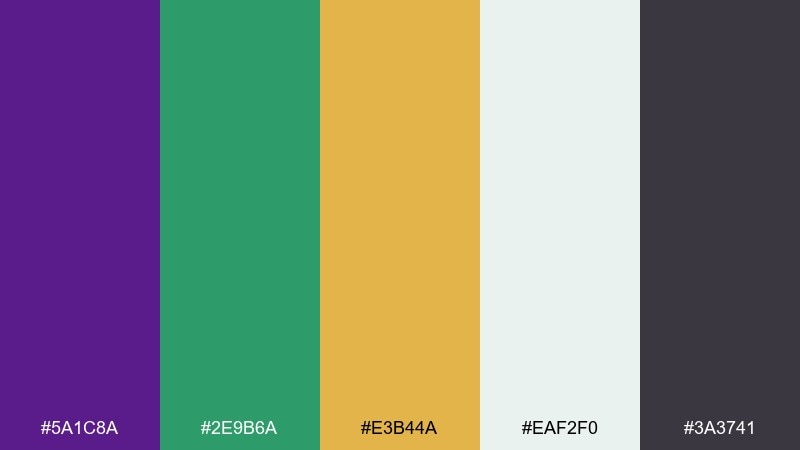
HEX: #5A1C8A #2E9B6A #E3B44A #EAF2F0 #3A3741
Mood: fresh, airy, optimistic
Best for: spring branding moodboard
Fresh and airy, it evokes a bright morning breeze with just enough sparkle to feel festive. The pale seafoam-gray keeps the palette light, letting purple and green feel modern instead of heavy. Gold becomes a warm sun note for icons, pins, and tiny highlights. Tip: on a moodboard, show gold as a texture swatch so it reads like a material, not a flat paint chip.
Image example of harbor morning generated using media.io
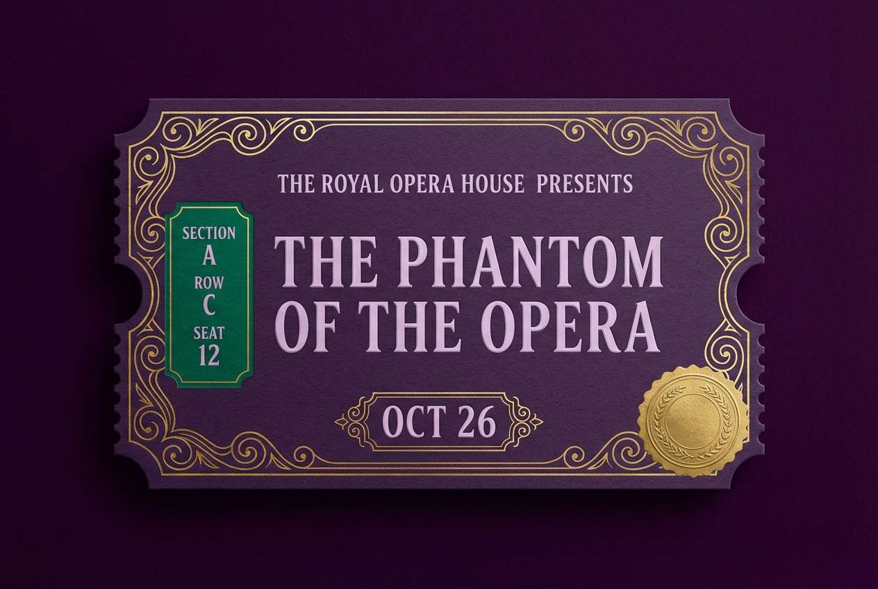
21) Balcony Nightfall
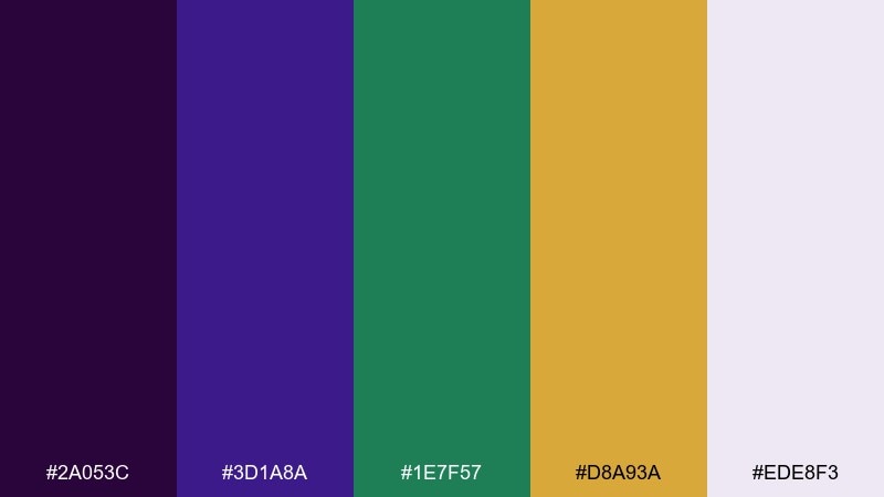
HEX: #2A053C #3D1A8A #1E7F57 #D8A93A #EDE8F3
Mood: elegant, nocturnal, romantic
Best for: theater ticket design
Elegant and nocturnal, it suggests wrought-iron balconies and soft lamplight in the distance. Use the darkest purple for the ticket base, then set type in the pale lavender for crisp contrast. Green can tag seating sections, and gold works well for a seal or barcode frame. Tip: leave generous margins so the design stays readable when printed small.
Image example of balcony nightfall generated using media.io
22) Canal Street Classic
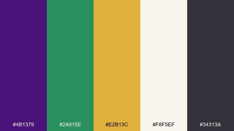
HEX: #4B1379 #2A915E #E2B13C #F8F5EF #34313A
Mood: timeless, balanced, versatile
Best for: business presentation template
Timeless and balanced, it feels polished enough for professional decks while still nodding to celebration. Use the off-white as the slide base and keep most text in charcoal for clarity. Add purple for section dividers and charts, then bring in green as the secondary data series. Tip: reserve gold for key takeaways so it directs attention without overpowering the content.
Image example of canal street classic generated using media.io
What Colors Go Well with Mardi Gras?
Beyond the classic purple-green-gold core, Mardi Gras palettes pair beautifully with warm creams, off-whites, and soft lavenders to keep layouts readable—especially for invitations, signage, and UI.
For darker, nightlife designs, add charcoal or near-black to anchor typography and let gold act like a “light source.” For a springlike feel, bring in pale seafoam or mint to soften contrast while staying festive.
If you need a modern twist, reduce saturation slightly and use gold only as a micro-accent (badges, dividers, icons). That keeps the theme recognizable while avoiding an overly loud look.
How to Use a Mardi Gras Color Palette in Real Designs
Start with one dominant base (usually purple or a light cream), then assign green to secondary components like buttons, tags, or sidebars. Keep gold as the “attention” color for dates, prices, VIP markers, or key takeaways.
For print pieces (posters, tickets, menus), prioritize contrast: place small text on creams or light lavenders, and use deep purple/charcoal for body copy. Save metallic-looking gold for lines, seals, and frames so it reads premium.
For digital UI, use near-white surfaces and apply purple as navigation or brand highlights. Green works well for success states and positive metrics, while gold is ideal for premium tiers or featured cards.
Create Mardi Gras Palette Visuals with AI
If you want to preview a Mardi Gras color scheme before committing to a full design, generate quick mockups (flyers, menus, invites, UI screens) and test readability at multiple sizes.
With Media.io’s text-to-image tool, you can paste a prompt, describe the style (vector, editorial, watercolor, UI), and iterate until the palette balance feels right—especially for how much gold you should use.
Once you have a strong visual direction, apply the same HEX set across your assets for consistent party branding, social graphics, and event templates.
Mardi Gras Color Palette FAQs
-
What are the traditional Mardi Gras colors?
The traditional Mardi Gras colors are purple, green, and gold. In design, they’re often supported by cream/off-white for readability and a dark neutral (charcoal/black) for text and structure. -
What HEX codes work for a classic Mardi Gras palette?
A strong starting set is #4B1D7A (purple), #1E8A5A (green), and #D4AF37 (gold), plus a light background like #F3E9C6 and a dark neutral like #1B1B1F. -
How do I keep purple-green-gold from looking too noisy?
Pick one dominant color (often purple or a light cream), use green as a secondary accent, and limit gold to small highlights such as dividers, icons, badges, or a single focal element. -
What background colors pair best with Mardi Gras colors?
Creams and off-whites make bright accents feel more premium and keep text readable. For nightlife looks, deep plum or near-black backgrounds make gold and neon greens pop. -
Is gold okay for body text in Mardi Gras designs?
Usually no—gold is best for short highlights (dates, prices, VIP tags). For longer text, use dark charcoal or deep purple on a light background to maintain legibility. -
Can I use Mardi Gras colors in modern UI?
Yes. Keep most surfaces near-white, use purple for navigation and key states, green for success/positive metrics, and gold only for premium badges or featured elements. -
How can I generate Mardi Gras palette mockups quickly?
Use Media.io text-to-image: describe the design type (poster, invite, menu, UI), specify the mood, and iterate until the purple/green/gold balance looks right for your brand.
Next: Byzantine Color Palette


