

White wine tones sit in that sweet spot between airy neutrals and soft golds—clean enough for modern UI, warm enough for cozy branding.
Below are 20 white wine color palette combinations with HEX codes, plus AI image prompts you can use to generate on-brand visuals fast.
In this article
Why White Wine Palettes Work So Well
White wine palettes are naturally versatile: they read as clean neutrals first, then reveal gentle warmth through straw, honey, and oak-like browns. That makes them easy to use across digital and print without feeling cold or sterile.
They also support strong typography. Creamy backgrounds keep layouts breathable, while deep olive and espresso accents create high-contrast text and UI states without needing harsh pure black.
Finally, these tones pair beautifully with texture—paper grain, linen, cork, wood, and soft shadows—so designs feel premium and tactile even when the color range stays subtle.
20+ White Wine Color Palette Ideas (with HEX Codes)
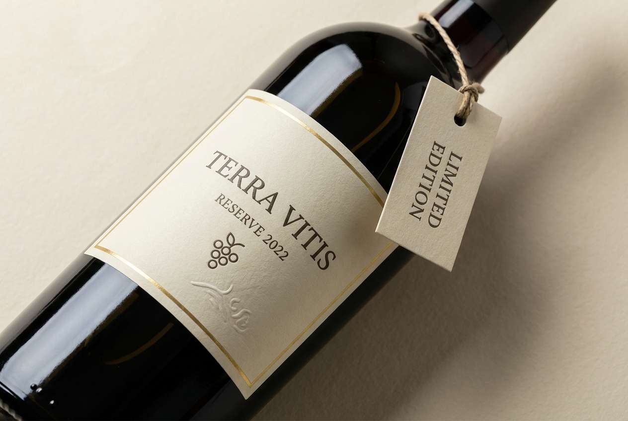
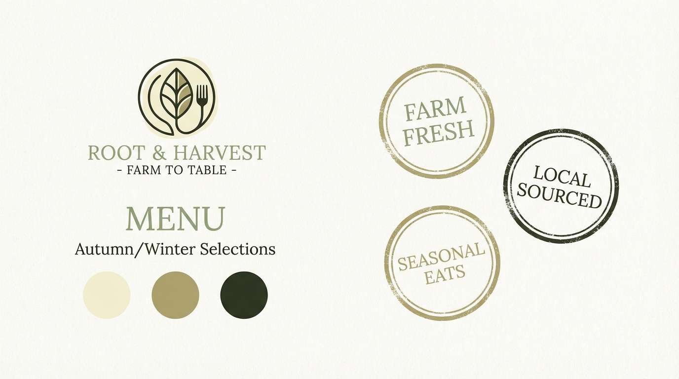
1) Cellar Glow
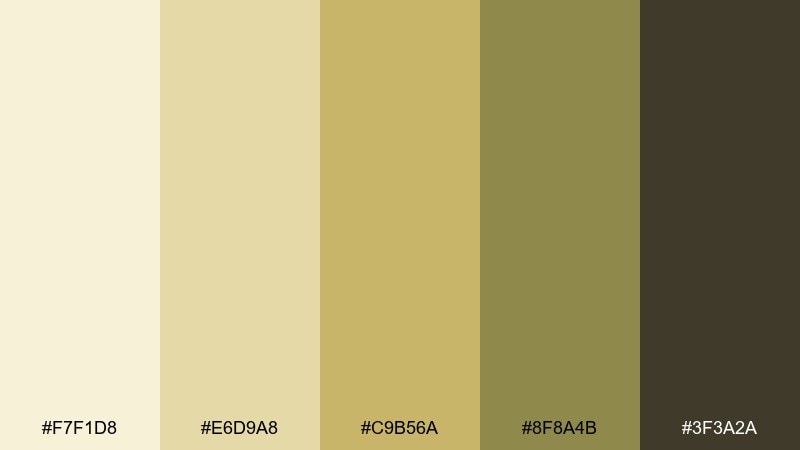
HEX: #F7F1D8 #E6D9A8 #C9B56A #8F8A4B #3F3A2A
Mood: warm, aged, inviting
Best for: wine label and bottle packaging
Warm and aged like candlelight in a barrel room, these tones feel premium without being flashy. It is a white wine color palette that shines on labels, neck tags, and tasting-room signage. Pair the pale straw and soft gold with charcoal typography for high contrast, then reserve the olive-brown for borders and seals. Usage tip: keep metallic foils subtle so the creamy base still reads clean and modern.
Image example of cellar glow generated using media.io
Media.io is an online AI studio for creating and editing video, image, and audio in your browser.

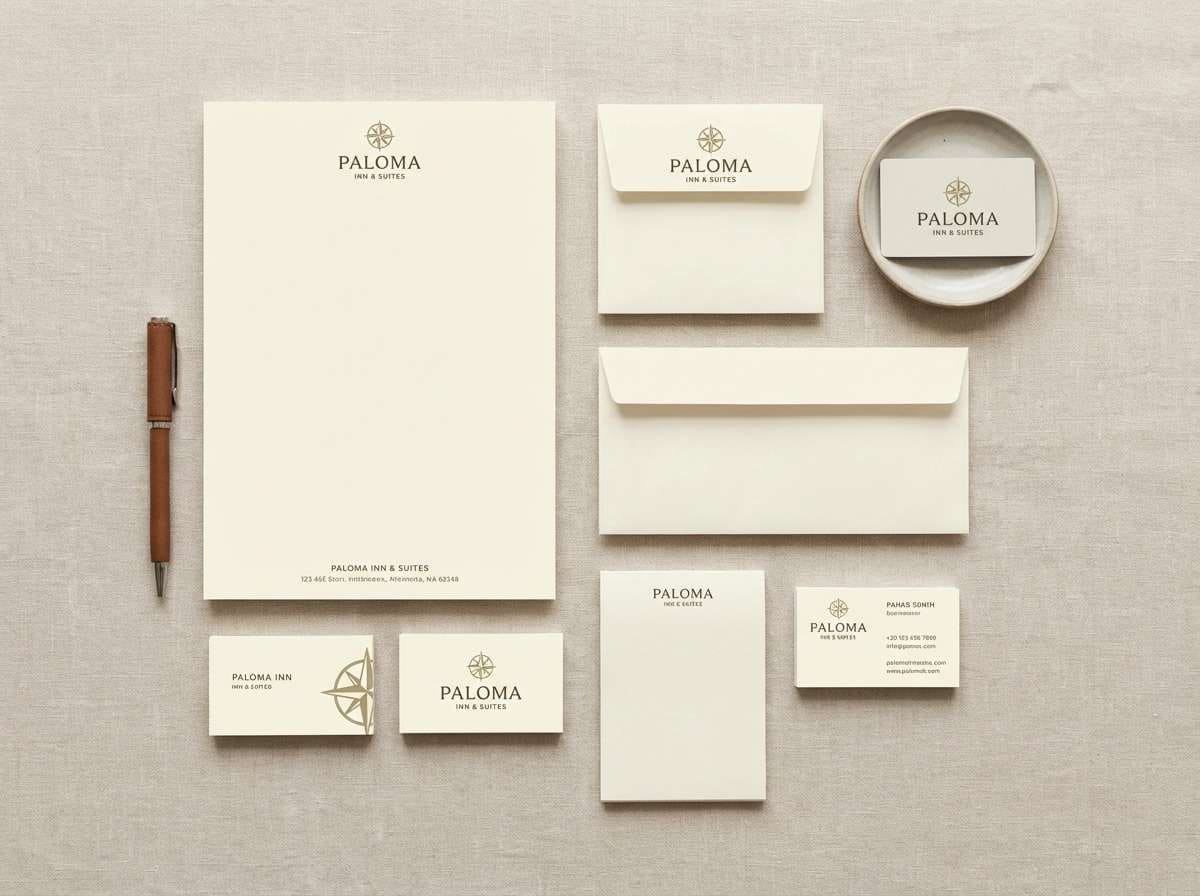
2) Vineyard Linen
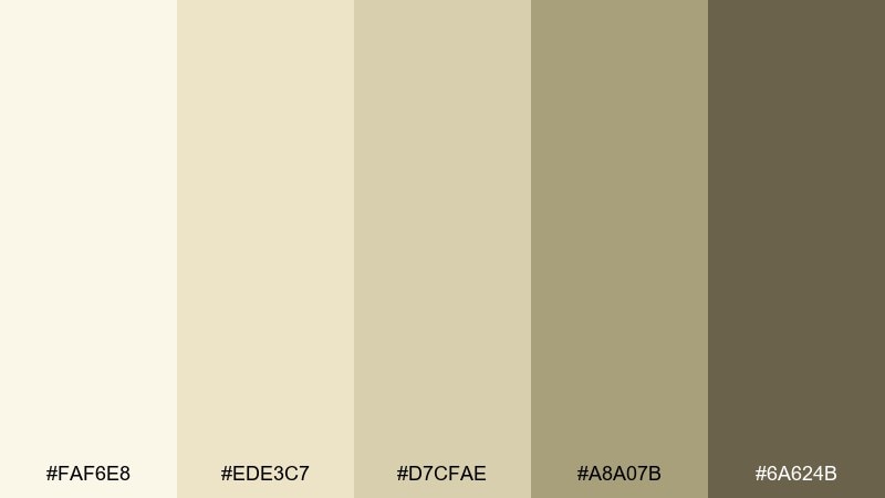
HEX: #FAF6E8 #EDE3C7 #D7CFAE #A8A07B #6A624B
Mood: soft, natural, understated
Best for: boutique hotel branding and stationery
Soft and natural like sun-bleached linen, this mix reads calm and trustworthy. It works beautifully on letterheads, envelopes, and brand guidelines where you want warmth without heavy color. Pair it with tactile paper stocks and a clean serif, using the taupe for headings and the cream for generous whitespace. Usage tip: add a spot varnish on the darker text color for a quiet premium finish.
Image example of vineyard linen generated using media.io
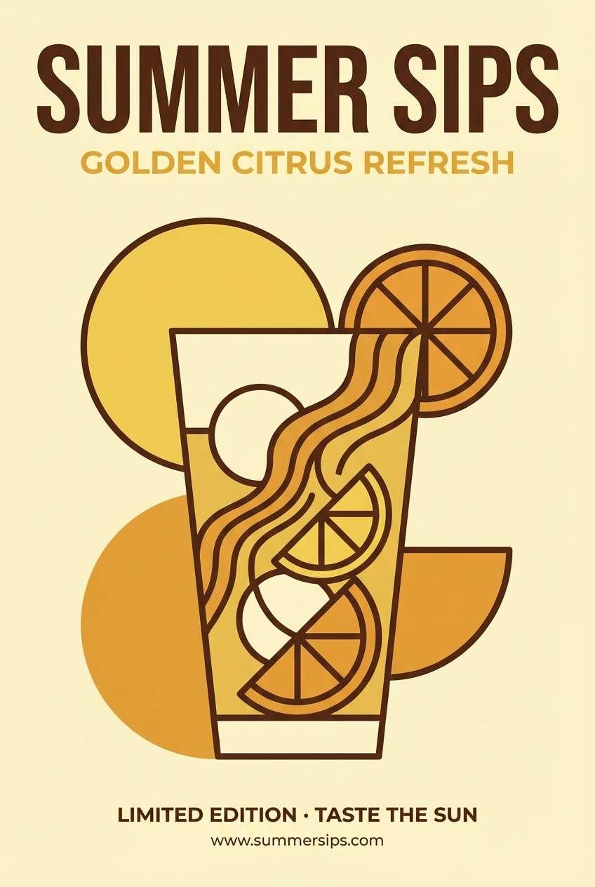
3) Citrus Must
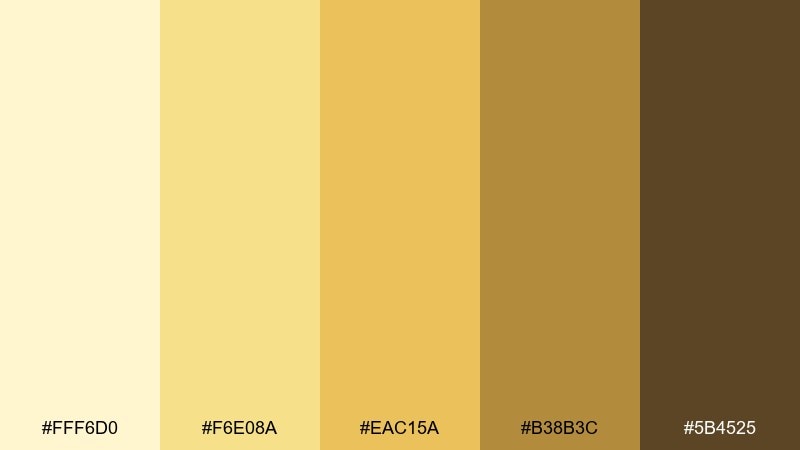
HEX: #FFF6D0 #F6E08A #EAC15A #B38B3C #5B4525
Mood: zesty, sunny, energetic
Best for: summer drink poster design
Zesty and sunny like fresh citrus over ice, these yellows feel instantly uplifting. Use it for seasonal posters, bar menus, and social tiles where you want a bright hook without neon intensity. Pair the lightest tint as the background, then let the deeper honey tone drive headlines and icons. Usage tip: keep body text on the darker brown for readability and a grounded finish.
Image example of citrus must generated using media.io
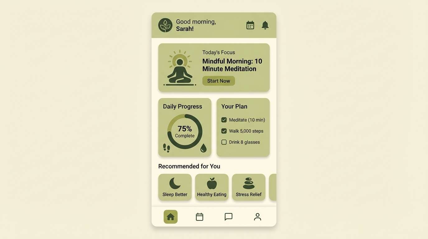
4) Sage Spritz
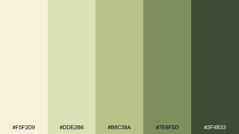
HEX: #F5F2D9 #DDE2B6 #B8C38A #7E8F5D #3F4B33
Mood: fresh, botanical, balanced
Best for: wellness app UI screens
Fresh and botanical like a herb garden after rain, these greens stay gentle and composed. They are ideal for wellness UI, habit trackers, and dashboards that need calm hierarchy. Pair the creamy off-white with sage as your primary surfaces, then use the deep green for navigation and key states. Usage tip: keep success and highlight elements in the mid green to avoid harsh contrast.
Image example of sage spritz generated using media.io
5) Pear Fizz
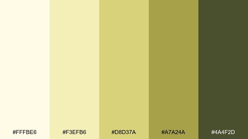
HEX: #FFFBE6 #F3EFB6 #D8D37A #A7A24A #4A4F2D
Mood: light, playful, crisp
Best for: sparkling beverage can design
Light and playful like pear soda in a chilled glass, this set feels crisp but still cozy. These white wine color combinations suit beverage cans, multipack boxes, and launch ads that need a bright shelf pop. Pair the buttery tint with bold dark-olive type, and use the yellow-green as a lively band or flavor cue. Usage tip: limit gradients and lean on flat blocks to keep the design readable at a distance.
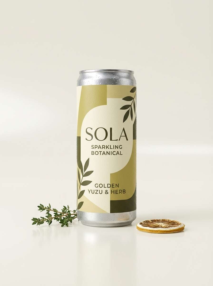
Image example of pear fizz generated using media.io
6) Oak Barrel
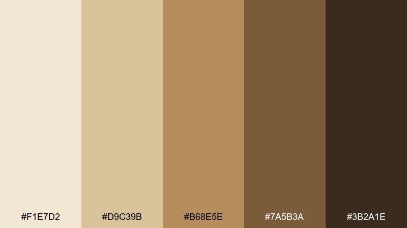
HEX: #F1E7D2 #D9C39B #B68E5E #7A5B3A #3B2A1E
Mood: earthy, toasted, traditional
Best for: restaurant menu and wine list layout
Earthy and toasted like oak and spice, this range feels classic and grounded. It is a strong fit for restaurant menus, wine lists, and tasting notes where warmth supports appetite. Pair the creamy base with medium brown section headers, then use the darkest tone for body text and prices. Usage tip: add subtle divider lines in the tan shade to organize long lists without visual noise.
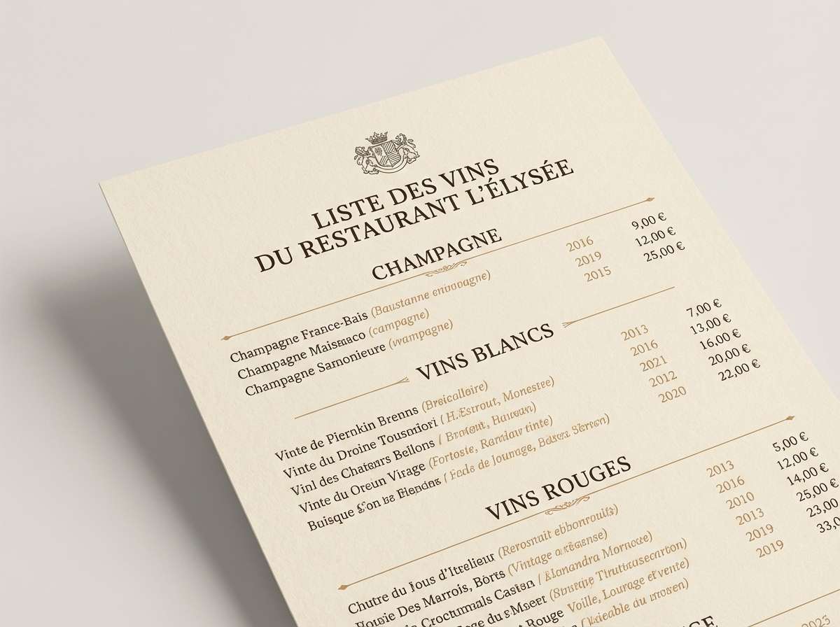
Image example of oak barrel generated using media.io
7) Chardonnay Mist
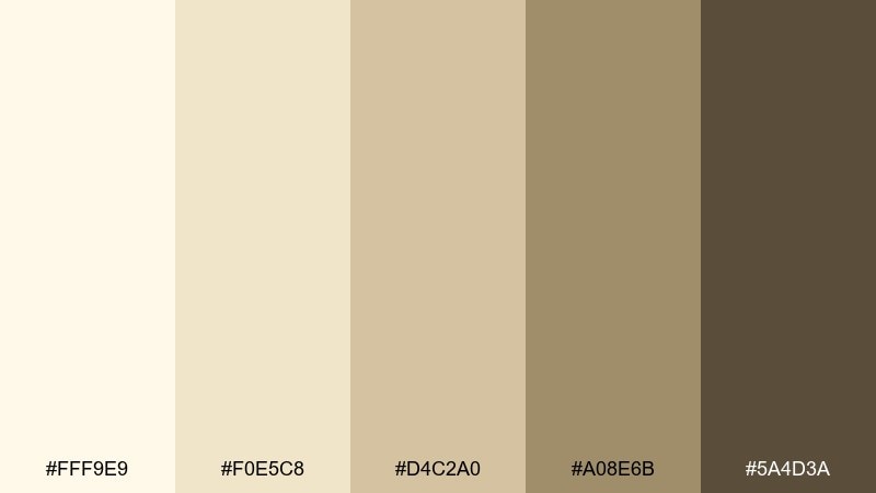
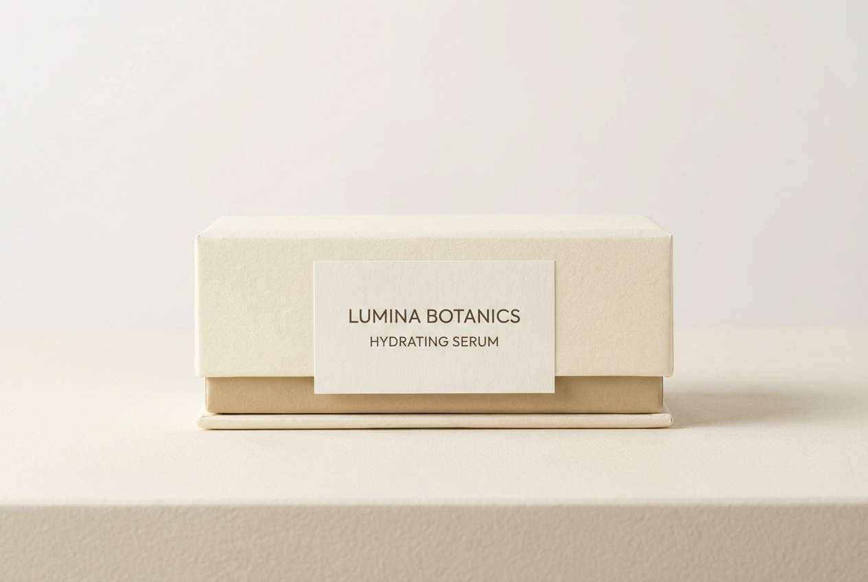
HEX: #FFF9E9 #F0E5C8 #D4C2A0 #A08E6B #5A4D3A
Mood: airy, elegant, minimal
Best for: skincare label and box packaging
Airy and elegant like morning mist over vineyards, these neutrals feel clean and refined. They work well for skincare packaging, where subtle warmth reads more human than stark white. Pair the palest tone with soft taupe type, using the mid beige for panels and ingredient callouts. Usage tip: keep the darkest brown for small regulatory text so it stays legible on curved surfaces.
Image example of chardonnay mist generated using media.io
8) Golden Hour Toast
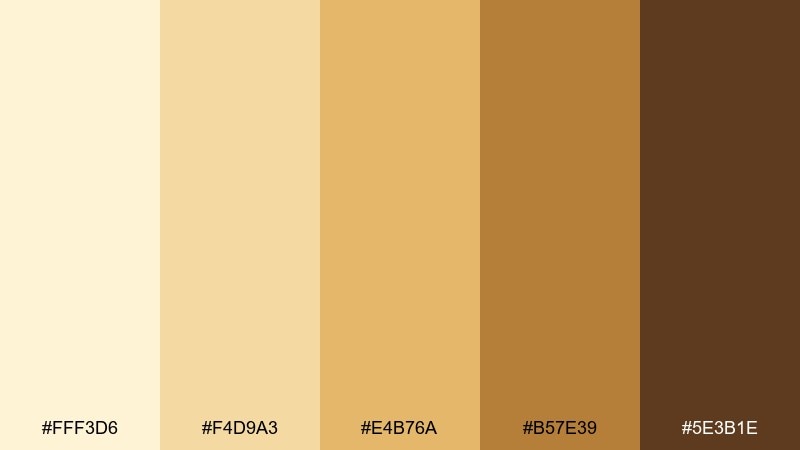
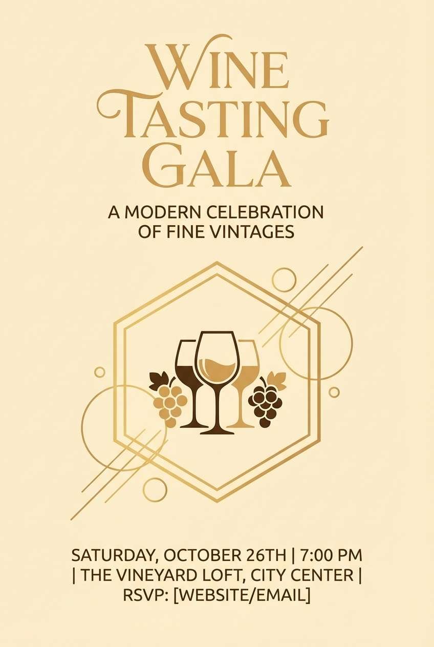
HEX: #FFF3D6 #F4D9A3 #E4B76A #B57E39 #5E3B1E
Mood: glowing, celebratory, warm
Best for: event flyer for a wine tasting
Glowing and celebratory like a sunset toast, these golds feel festive without going gaudy. Use them for event flyers, tasting invitations, and sponsor banners where warmth helps set the mood. Pair the pale base with bold headline blocks in amber, and anchor the layout with espresso-brown text. Usage tip: keep decorative flourishes minimal so the color does the storytelling.
Image example of golden hour toast generated using media.io
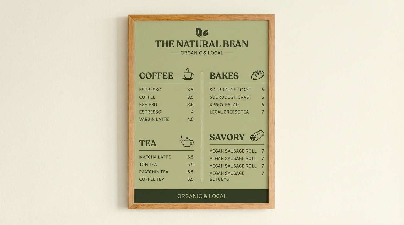
9) Herbal Aperitif
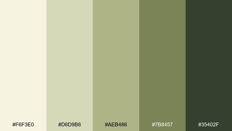
HEX: #F6F3E0 #D6D9B8 #AEB486 #7B8457 #35402F
Mood: quiet, herbal, sophisticated
Best for: cafe brand identity and menu boards
Quiet and herbal like an aperitif with a rosemary twist, this set feels smart and calming. It suits cafe branding, chalkboard-style menus, and loyalty cards where you want a natural cue without looking rustic. Pair the creamy tone with muted sage blocks, then use the deep green for type and icons. Usage tip: choose one accent color for highlights and keep the rest as supportive neutrals.
Image example of herbal aperitif generated using media.io
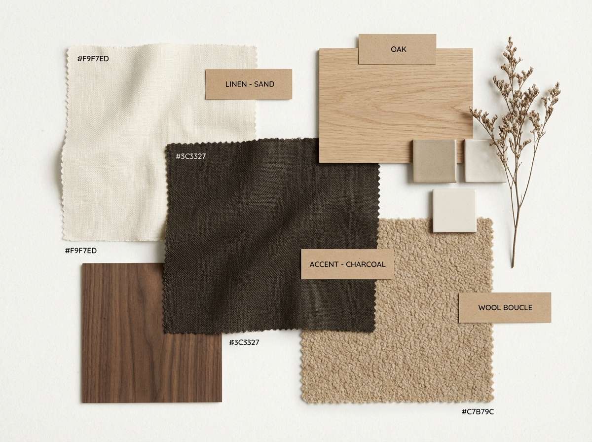
10) Coastal Cork
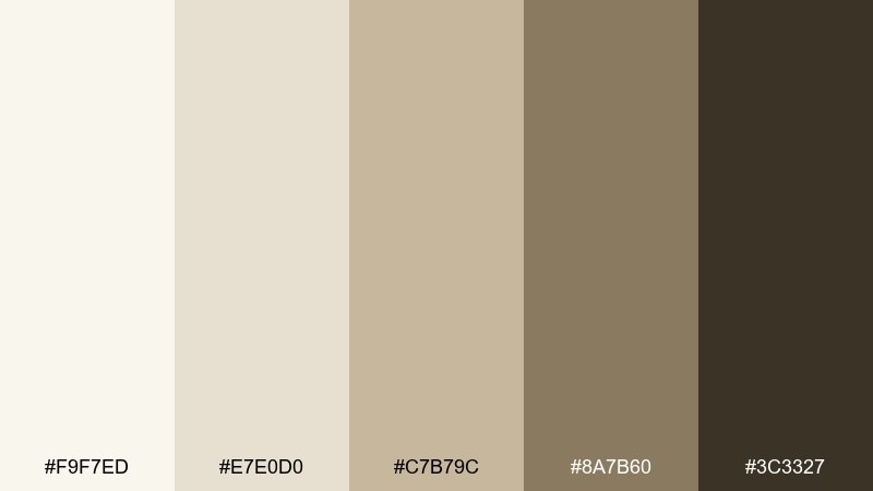
HEX: #F9F7ED #E7E0D0 #C7B79C #8A7B60 #3C3327
Mood: relaxed, coastal, grounded
Best for: interior mood board for living spaces
Relaxed and grounded like driftwood and cork, these neutrals bring calm structure. They are great for interior mood boards, renovation decks, and client presentations where you need a warm baseline. Pair the off-white with sand-beige surfaces, then use the deeper taupe for furniture callouts and headings. Usage tip: add texture swatches alongside the colors to make the palette feel tactile and real.
Image example of coastal cork generated using media.io
11) Champagne Flute
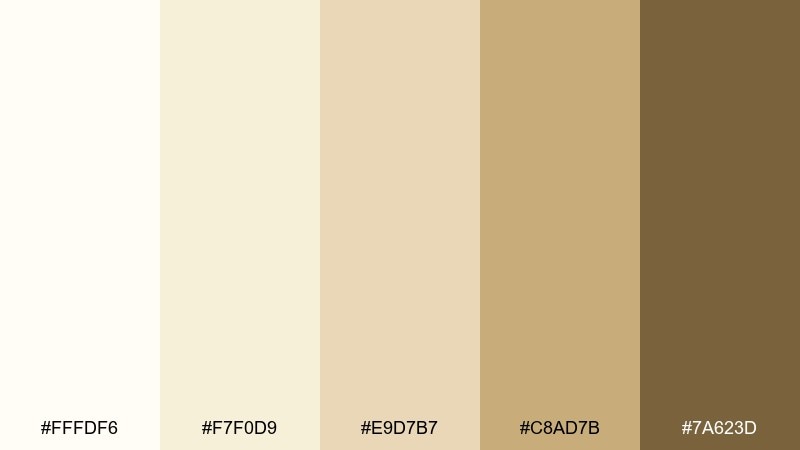
HEX: #FFFDF6 #F7F0D9 #E9D7B7 #C8AD7B #7A623D
Mood: polished, airy, celebratory
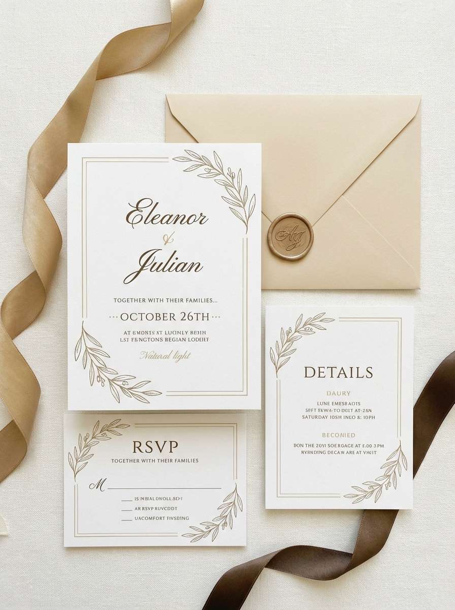
Best for: wedding invitation suite
Polished and airy like a clink of glasses, these creams and soft golds feel timeless. They work beautifully for wedding invitations, RSVP cards, and day-of signage with a refined look. Pair the lightest tone as the paper base, then use the gold-tan for monograms and borders while keeping type in warm brown. Usage tip: print the pale tones on textured stock so the design does not feel flat.
Image example of champagne flute generated using media.io
12) Honeyed Stone
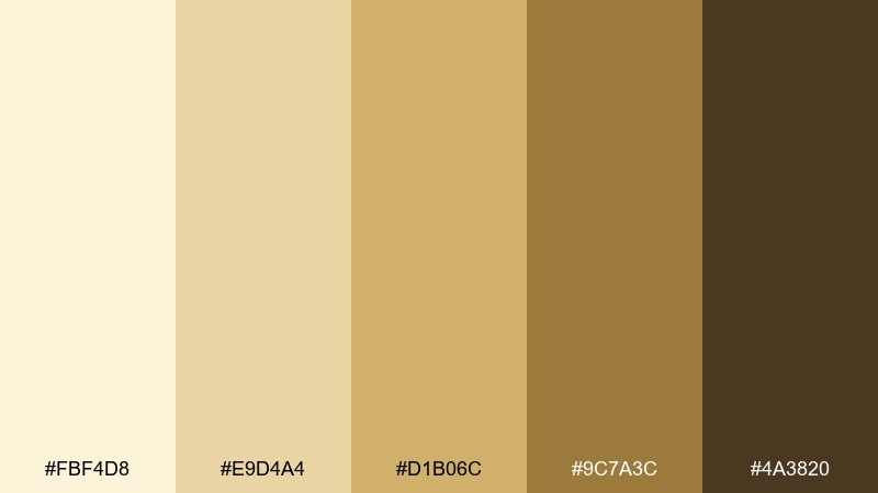
HEX: #FBF4D8 #E9D4A4 #D1B06C #9C7A3C #4A3820
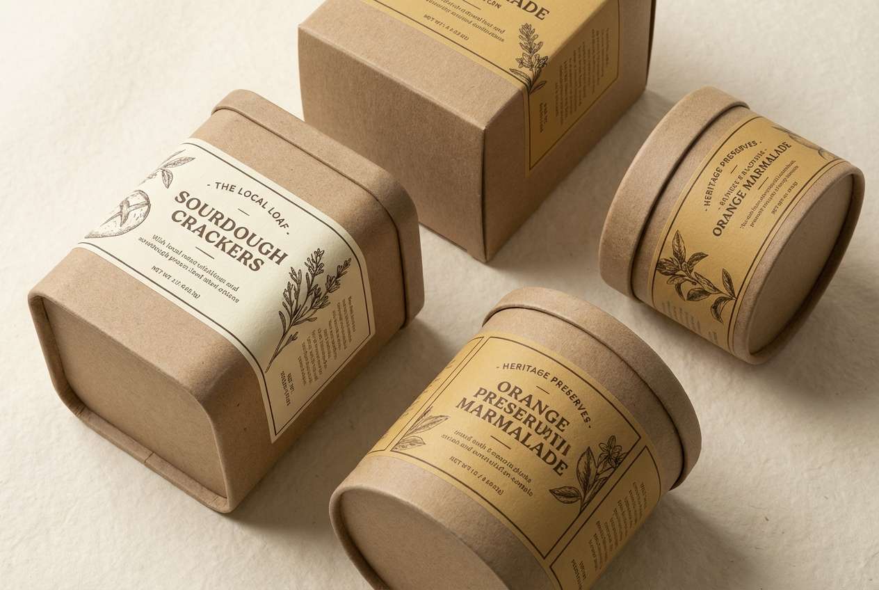
Mood: rich, artisanal, refined
Best for: artisan food packaging and labels
Rich and artisanal like honey over warm stone, these tones feel handcrafted and premium. This white wine color palette is ideal for olive oil, crackers, or gourmet gift sets where subtle warmth signals quality. Pair the creamy straw base with deep brown type, then use the honey tone for seals, badges, or flavor variants. Usage tip: maintain generous margins so the darker accents do not overpower the light foundation.
Image example of honeyed stone generated using media.io
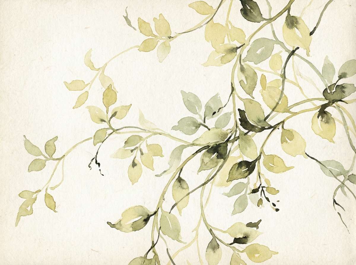
13) Garden Trellis
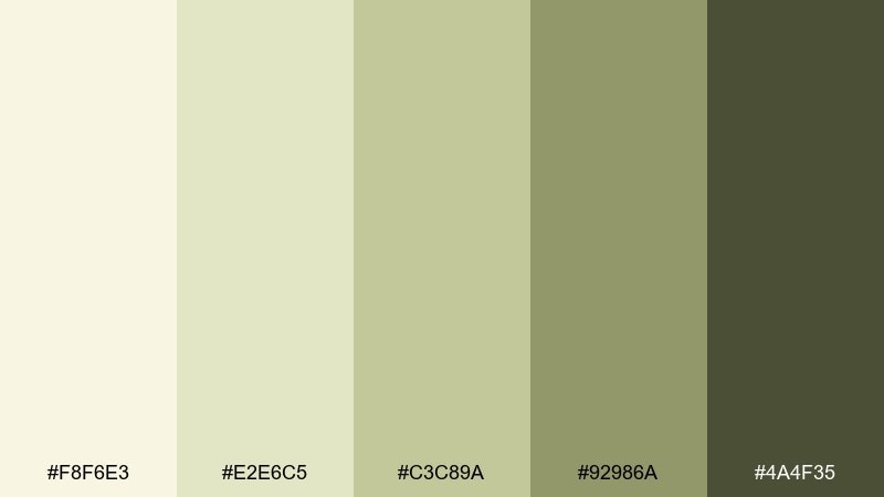
HEX: #F8F6E3 #E2E6C5 #C3C89A #92986A #4A4F35
Mood: fresh, airy, garden-inspired
Best for: spring botanical illustration set
Fresh and airy like new vines climbing a trellis, these greens feel optimistic and light. They are a natural fit for spring botanical illustrations, pattern packs, and seasonal editorial graphics. Pair the soft cream as the paper tone and let the mid greens define leaves and stems, saving the darkest shade for fine linework. Usage tip: keep shadows subtle so the artwork stays delicate rather than heavy.
Image example of garden trellis generated using media.io
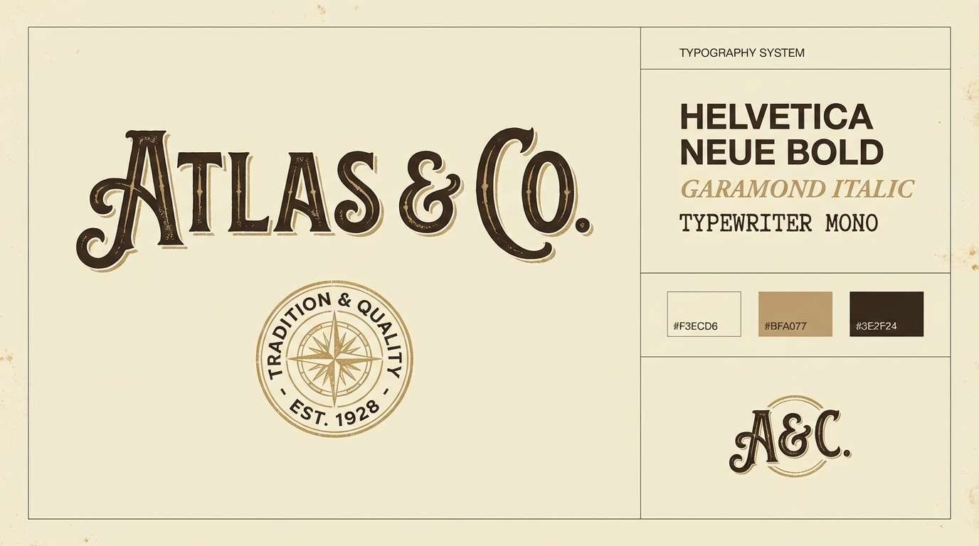
14) Antique Label
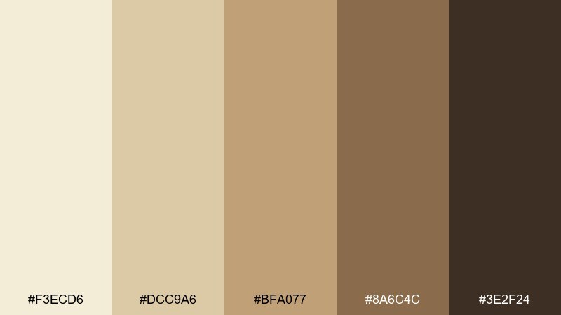
HEX: #F3ECD6 #DCC9A6 #BFA077 #8A6C4C #3E2F24
Mood: vintage, storied, classic
Best for: heritage brand logo and typography system
Vintage and storied like a well-kept cellar notebook, these browns and creams feel authentic. They suit heritage logos, typographic lockups, and brand systems that lean classic rather than trendy. Pair the cream with the mid tan for backgrounds, then use the dark brown for logotype and stamps. Usage tip: test the palette on uncoated paper so the warm tones stay true.
Image example of antique label generated using media.io
15) Pearwood Minimal
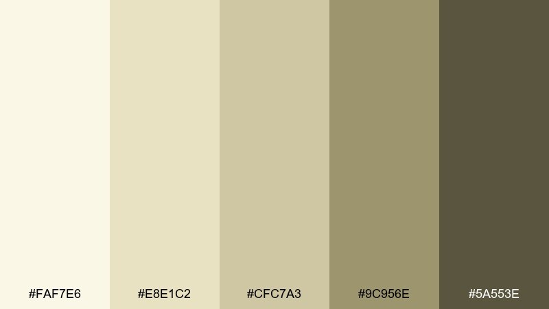
HEX: #FAF7E6 #E8E1C2 #CFC7A3 #9C956E #5A553E
Mood: minimal, calm, contemporary
Best for: SaaS landing page UI
Minimal and calm like light wood in a bright studio, this palette feels modern and approachable. It is well suited for SaaS landing pages where you want gentle warmth and clear hierarchy. Pair the light cream with muted olive-gray sections, and use the darkest tone for headlines and primary buttons. Usage tip: introduce contrast through typography weight and spacing instead of adding extra colors.
Image example of pearwood minimal generated using media.io

16) Sparkling Press
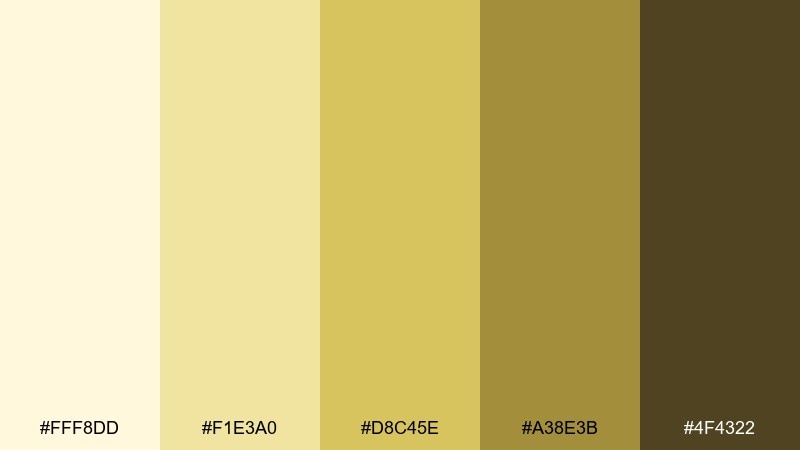
HEX: #FFF8DD #F1E3A0 #D8C45E #A38E3B #4F4322
Mood: bright, lively, confident
Best for: product ad for a sparkling white wine
Bright and lively like bubbles catching the light, these golds feel confident and upbeat. Use this white wine color combination for a product ad where you want energy but still need a premium edge. Pair the pale background with bold gold shapes and keep copy in the deep olive-brown for clarity. Usage tip: let one golden tone dominate and use the others as supporting highlights to avoid a muddy look.
Image example of sparkling press generated using media.io
17) Olive Brine
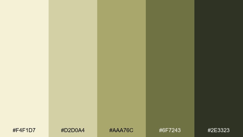
HEX: #F4F1D7 #D2D0A4 #AAA76C #6F7243 #2E3323
Mood: savory, moody, organic
Best for: farm-to-table restaurant branding
Savory and moody like olives and herbs, this set feels organic and grown-up. It works well for farm-to-table branding, signage, and merch where you want an earthy stamp of authenticity. Pair the pale straw with the muted olive as the primary duo, then use the deep green-black for logos and small print. Usage tip: keep photography warm so the greens do not shift too cool.
Image example of olive brine generated using media.io
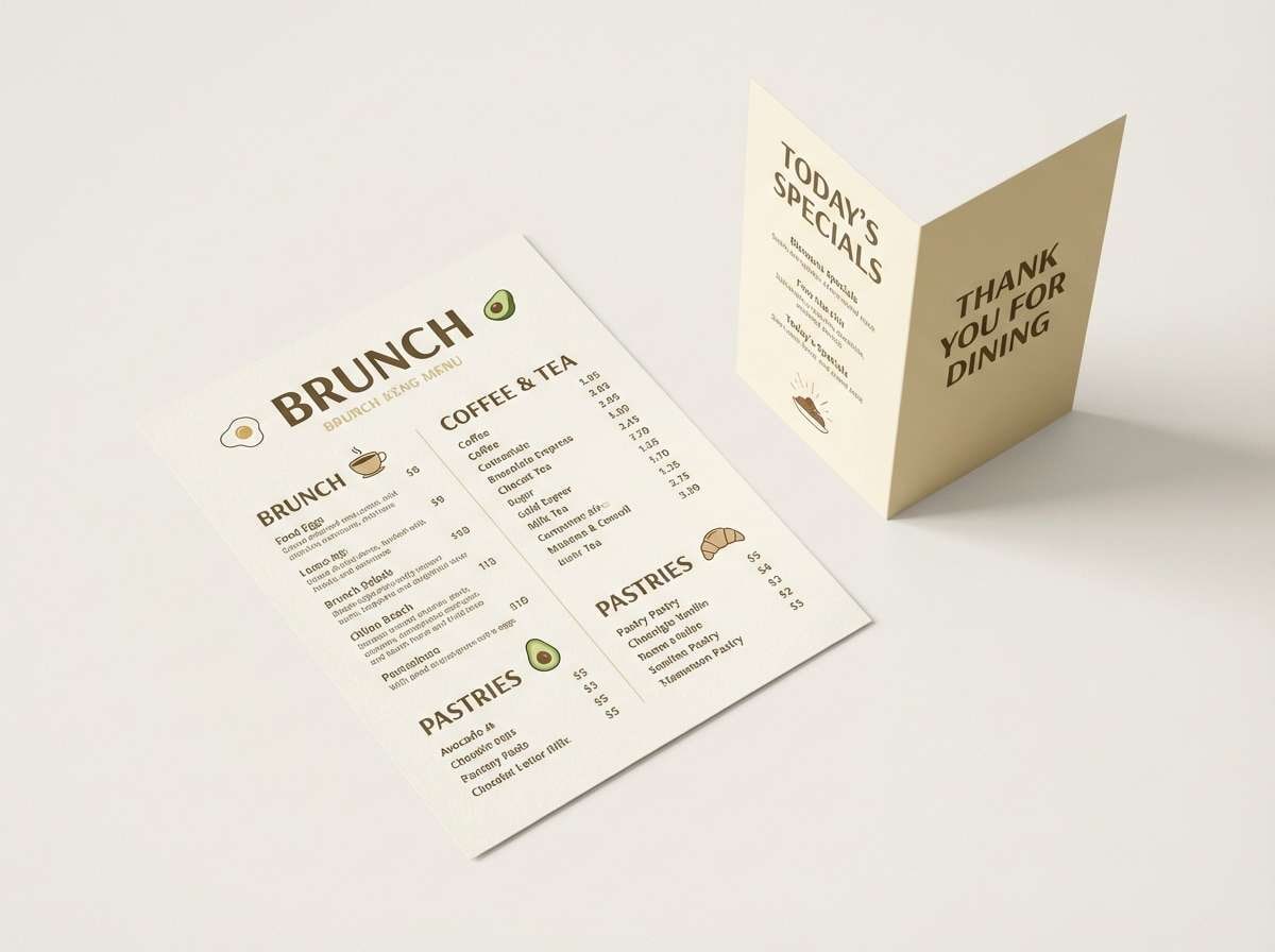
18) Sunlit Patio
HEX: #FFF7E2 #F2E0BF #D7C08F #B08E5B #6B5133
Mood: sunny, relaxed, social
Best for: brunch menu and table tent design
Sunny and relaxed like a late brunch on a patio, these tones feel friendly and welcoming. They are great for menus, table tents, and small-format print where warmth boosts appetite. Pair the creamy top tone with caramel highlights for section headers, then keep body text in the darker brown for contrast. Usage tip: use the mid tan for icons so they remain visible without shouting.
Image example of sunlit patio generated using media.io
19) Quiet Somm
HEX: #F6F0DE #E2D7BF #C4B69A #8B7D62 #423828
Mood: calm, mature, editorial
Best for: magazine editorial layout
Calm and mature like a quiet tasting note, this palette feels editorial and considered. It fits long-form layouts, lookbooks, and print spreads where readability matters as much as mood. Pair the lightest shade as the page background, then use the taupe for pull quotes and the darkest brown for text and page numbers. Usage tip: keep large image captions in the mid tone to soften the overall contrast.
Image example of quiet somm generated using media.io
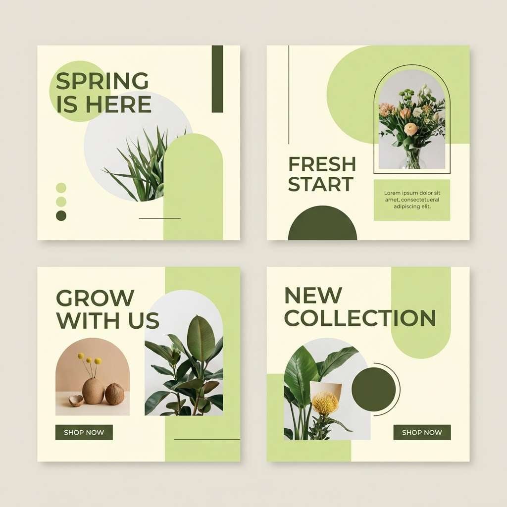
20) Meadow Bubbles
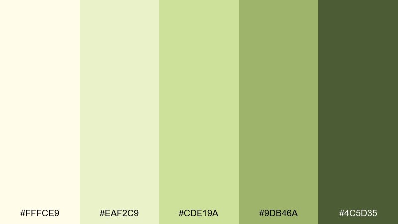
HEX: #FFFCE9 #EAF2C9 #CDE19A #9DB46A #4C5D35
Mood: fresh, cheerful, springlike
Best for: seasonal social media graphics
Fresh and cheerful like spring fields with a hint of sparkle, these greens and creams feel lighthearted. They work well for seasonal social graphics, story templates, and promo banners that need a soft pop. Pair the pale cream with the leaf green for big shapes, then use the darker green for type and small UI elements. Usage tip: maintain consistent color blocks across posts to build instant recognition in a feed.
Image example of meadow bubbles generated using media.io
What Colors Go Well with White Wine?
White wine tones pair naturally with deep, earthy anchors like espresso brown, olive-black, and charcoal—these keep layouts readable while maintaining a warm, elevated feel.
For a fresher look, add soft botanical greens (sage, moss, olive) or pale citrus accents (lemon, honey, amber). They echo the palette’s straw-and-herb vibe without turning loud.
If you want a more modern contrast, bring in a cool counterbalance in tiny doses—stone gray, muted teal, or a restrained emerald accent—so the creamy base stays the hero.
How to Use a White Wine Color Palette in Real Designs
Start with the lightest cream as your main background, then choose one mid-tone (beige, straw, or sage) for sections, cards, or packaging panels. This keeps the design calm while still creating structure.
Use the darkest shade for typography, icons, and key UI states (navigation, primary buttons, price text). You’ll get strong contrast without the harshness of pure black on warm paper-like surfaces.
In print, lean into texture: uncoated paper, subtle grain, embossing, or quiet foil details. These palettes look especially premium when the color is restrained and the material does the heavy lifting.
Create White Wine Palette Visuals with AI
If you already have HEX codes, the fastest next step is turning them into visuals—mockups, posters, labels, UI screens, and social templates—so you can validate the mood before production.
Reuse the prompts above (or swap in your product type, typography style, and aspect ratio) to generate consistent on-brand imagery in minutes.
Once you have a winning direction, create variations by adjusting one accent color (olive to emerald, honey to amber) while keeping the creamy base stable for brand continuity.
White Wine Color Palette FAQs
-
What is a “white wine” color in design?
“White wine” usually refers to warm, creamy off-whites and pale straw-gold tones—softer than pure white, with a subtle yellow or beige undertone. -
Are white wine palettes good for UI and apps?
Yes. They’re excellent for calm, readable interfaces because light cream backgrounds reduce glare, while deep olive/espresso accents deliver clear hierarchy and contrast for text and navigation. -
Which text color works best on white wine backgrounds?
Deep olive-brown, espresso, or warm charcoal typically read best. They keep the palette cohesive and often feel more premium than pure black. -
How do I keep a white wine palette from looking “yellow”?
Use the palest cream as the dominant background, keep saturated golds as accents, and introduce a balancing neutral (taupe, stone, or muted olive) for structure. -
What accent colors pair well with white wine tones?
Sage and olive greens are the most natural pairings, while honey/amber adds warmth for headings or badges. For a sharper modern pop, add a restrained emerald accent sparingly. -
Is a white wine palette suitable for luxury branding?
Absolutely. These tones look especially premium when combined with generous whitespace, high-contrast typography, and tactile finishes like textured stock, embossing, or subtle foil. -
How can I generate images that match my white wine palette?
Use an AI text-to-image tool and include your HEX codes in the prompt along with the product type (label, UI, poster) and lighting/style notes (minimal, premium paper texture, soft shadows).
Next: Emerald Color Palette


