

Emerald is the kind of green that instantly feels premium: deep enough to ground a layout, yet bright enough to look fresh on screens and in print.
Below are 20 emerald color palette ideas with HEX codes, plus practical pairing tips for branding, interiors, and UI.
In this article
Why Emerald Palettes Work So Well
Emerald sits in a sweet spot of the green spectrum: it reads natural and calming, but still has enough saturation to feel intentional and designed. That balance makes it versatile across brand identities, packaging, and modern interfaces.
It also pairs cleanly with both cool and warm companions. Cool grays and navies sharpen emerald for UI and editorial layouts, while warm metals (gold, brass, copper) make it instantly luxurious for premium packaging and invitations.
Finally, emerald offers strong contrast opportunities. Deep emeralds can replace black for softer typography, while mint and sea-glass tints provide spacious backgrounds that keep designs breathable.
20+ Emerald Color Palette Ideas (with HEX Codes)
1) Forest Velvet
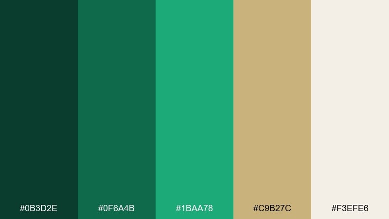
HEX: #0B3D2E #0F6A4B #1BAA78 #C9B27C #F3EFE6
Mood: lush, grounded, refined
Best for: luxury branding and packaging
Lush and grounded like a shaded forest floor, these tones feel rich without looking heavy. The deep green anchors layouts, while the bright green adds a clean, modern lift. Pair the warm gold-beige with off-white for premium labels, hang tags, or hero banners. Usage tip: keep the darkest shade for typography and use the light cream as breathing room.
Image example of forest velvet generated using media.io
Media.io is an online AI studio for creating and editing video, image, and audio in your browser.

2) Jade Brass
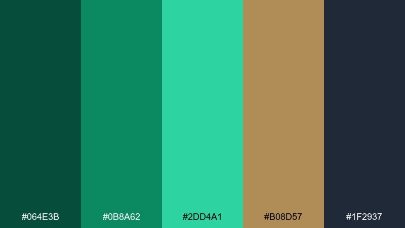
HEX: #064E3B #0B8A62 #2DD4A1 #B08D57 #1F2937
Mood: polished, confident, modern
Best for: tech brand identity
Polished and confident, this mix reads like jade glass set against brushed metal. The charcoal and deep green create instant authority, while the minty highlight keeps it crisp for digital. Bring in the brass tone for icons, badges, or call-to-action buttons. Usage tip: reserve the brightest green for one focal element per screen to avoid visual noise.
Image example of jade brass generated using media.io
3) Sea Glass Mint
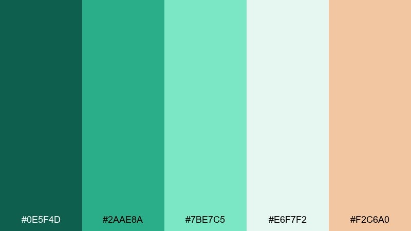
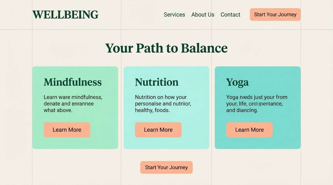
HEX: #0E5F4D #2AAE8A #7BE7C5 #E6F7F2 #F2C6A0
Mood: fresh, airy, coastal
Best for: wellness landing page UI
Fresh and airy like sea glass in morning light, these tones feel calming and clean. The soft mint and pale aqua make an inviting canvas for content-heavy sections. Add the peach as a friendly accent for buttons, tags, or progress states. Usage tip: keep contrast high by using the darkest green for headings and navigation.
Image example of sea glass mint generated using media.io
4) Emerald Noir
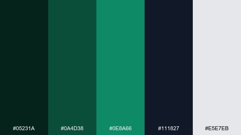
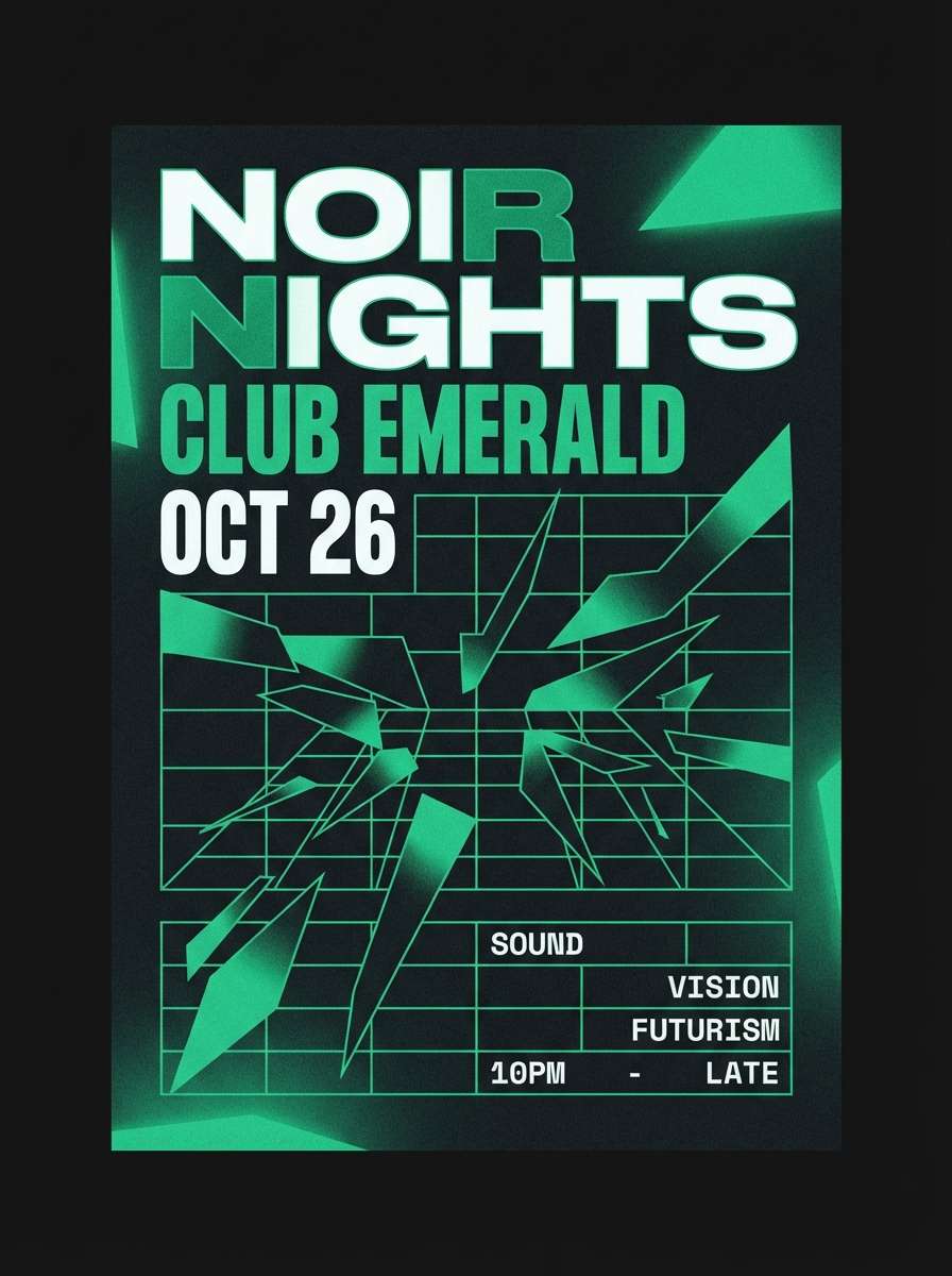
HEX: #05231A #0A4D38 #0E8A66 #111827 #E5E7EB
Mood: moody, sleek, editorial
Best for: nightlife poster design
Moody and sleek like a neon sign reflected on dark glass, this set is built for drama. The inky background and deep green create instant atmosphere, while the bright green pops like a highlight stroke. Use this emerald color combination with light gray for readable type and tight, modern grids. Usage tip: apply the vivid green sparingly to headlines and key dates so it feels intentional, not loud.
Image example of emerald noir generated using media.io
5) Botanical Linen
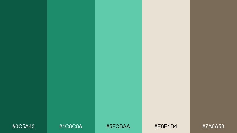
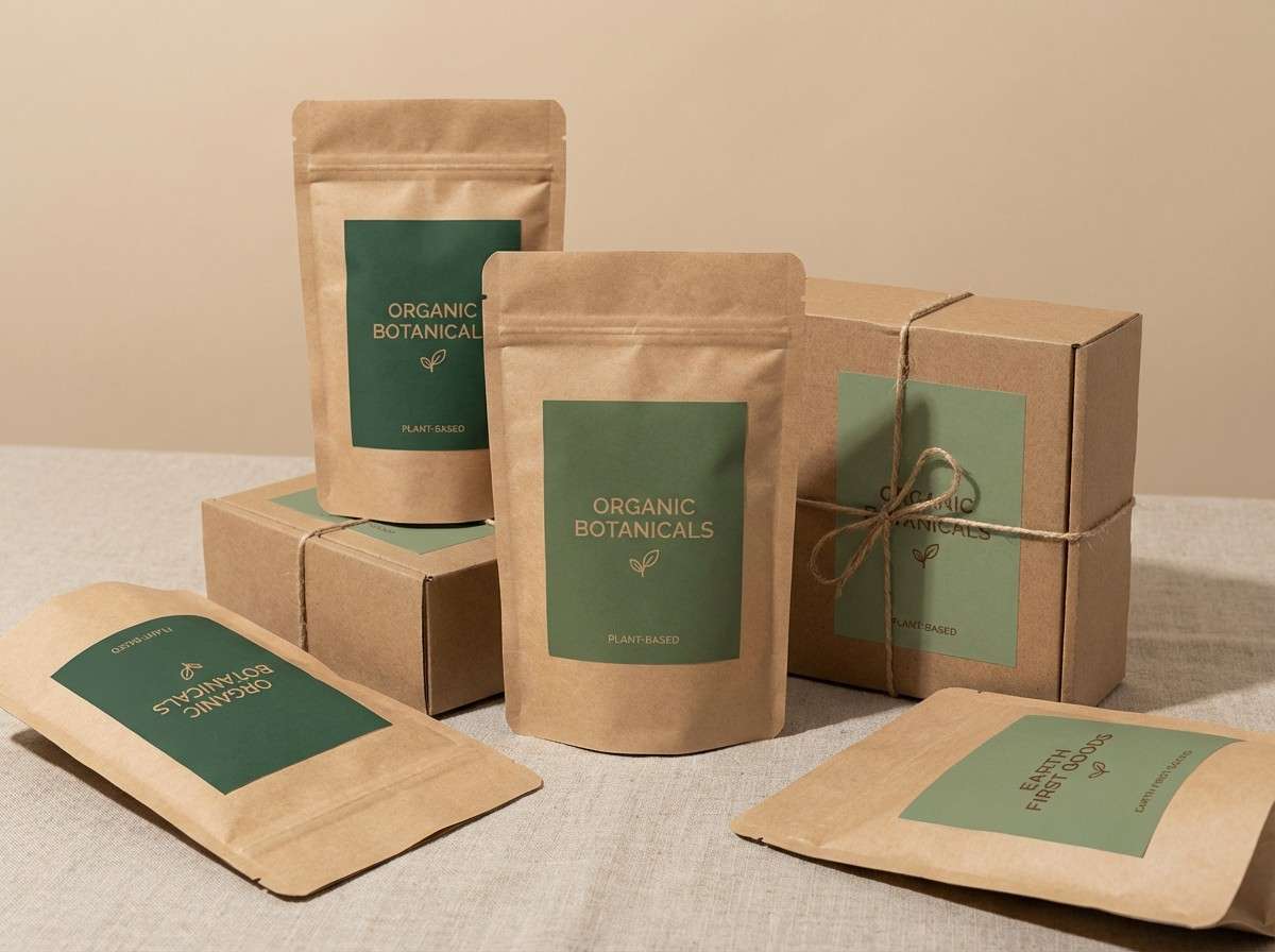
HEX: #0C5A43 #1C8C6A #5FCBAA #E8E1D4 #7A6A58
Mood: natural, warm, calming
Best for: eco product labels
Natural and warm like fresh leaves on linen, this palette feels honest and handcrafted. The muted neutrals soften the greens, making it ideal for organic goods and sustainable stories. Pair the tan-brown with the deepest green for ingredient lists and certification marks. Usage tip: print tests matter here, so choose uncoated stock and slightly increase text weight for legibility.
Image example of botanical linen generated using media.io
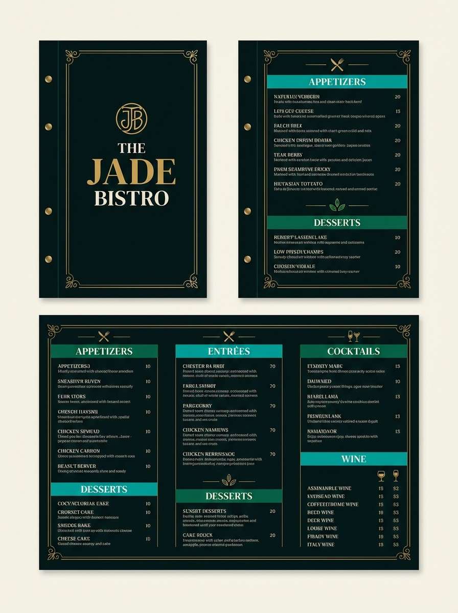
6) Peacock Lounge
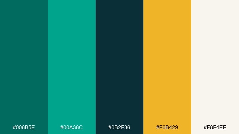
HEX: #006B5E #00A38C #0B2F36 #F0B429 #F8F4EE
Mood: bold, glamorous, playful
Best for: restaurant menu design
Bold and glamorous, these tones evoke peacock feathers, velvet booths, and warm spotlighting. The deep teal-black makes a luxe base, while the brighter greens bring energy to headings and dividers. One of the easiest emerald color combinations for hospitality is adding a golden accent for price points or specials. Usage tip: keep body text on the soft off-white to maintain readability under low light.
Image example of peacock lounge generated using media.io
7) Alpine Mist
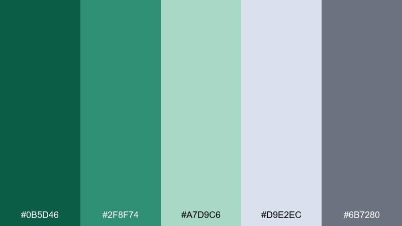
HEX: #0B5D46 #2F8F74 #A7D9C6 #D9E2EC #6B7280
Mood: cool, clean, outdoorsy
Best for: travel blog header visuals
Cool and clean like mountain air after rain, these greens feel refreshing and spacious. The pale mist tones work beautifully for backgrounds, while the deeper green keeps typography grounded. Pair with slate gray for captions and subtle UI chrome. Usage tip: add generous whitespace so the softer shades stay crisp and not washed out.
Image example of alpine mist generated using media.io

8) Gilded Evergreen
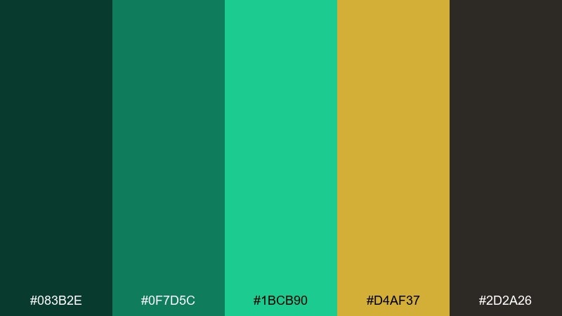
HEX: #083B2E #0F7D5C #1BCB90 #D4AF37 #2D2A26
Mood: opulent, festive, high-contrast
Best for: holiday campaign creatives
Opulent and festive, this mix feels like evergreen branches with gold ribbon. The near-black brown adds depth for premium headlines, while the bright green brings a celebratory spark. Use the gold for thin rules, stars, or key offer callouts. Usage tip: limit gold to small areas and let the greens carry the mood for a cleaner, modern finish.
Image example of gilded evergreen generated using media.io

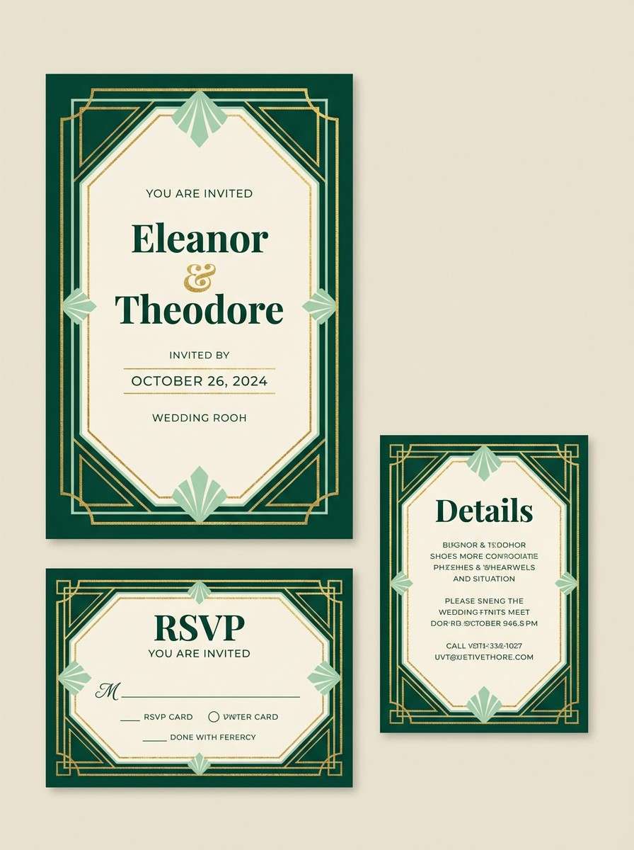
9) Art Deco Emerald
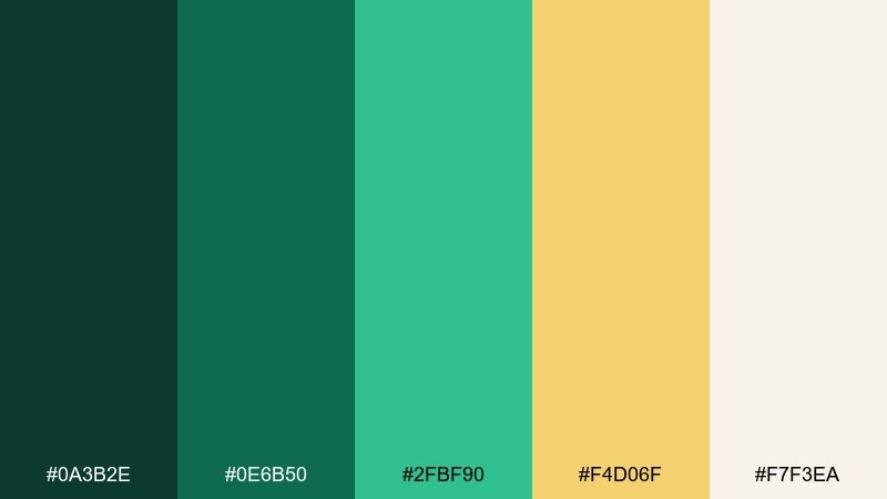
HEX: #0A3B2E #0E6B50 #2FBF90 #F4D06F #F7F3EA
Mood: vintage, elegant, geometric
Best for: wedding invitation suite
Vintage and elegant, these tones call up art deco arches, champagne bubbles, and gilded lines. The contrast between deep green and creamy white keeps the layout formal but approachable. This emerald color palette shines with gold foil accents and symmetrical borders. Usage tip: print the cream background warm, and use the mid green for secondary text to soften the hierarchy.
Image example of art deco emerald generated using media.io
10) Rainy Garden
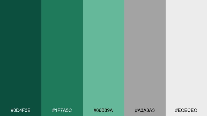
HEX: #0D4F3E #1F7A5C #66B89A #A3A3A3 #ECECEC
Mood: soft, grounded, understated
Best for: presentation slide deck
Soft and understated like a garden after drizzle, these colors feel steady and calm. The grays keep the greens from skewing too saturated, which helps in business content and long reads. Use the mid green for charts and the pale gray for section backgrounds. Usage tip: keep one strong green as your only highlight color to maintain consistency across slides.
Image example of rainy garden generated using media.io
11) Tropical Canopy
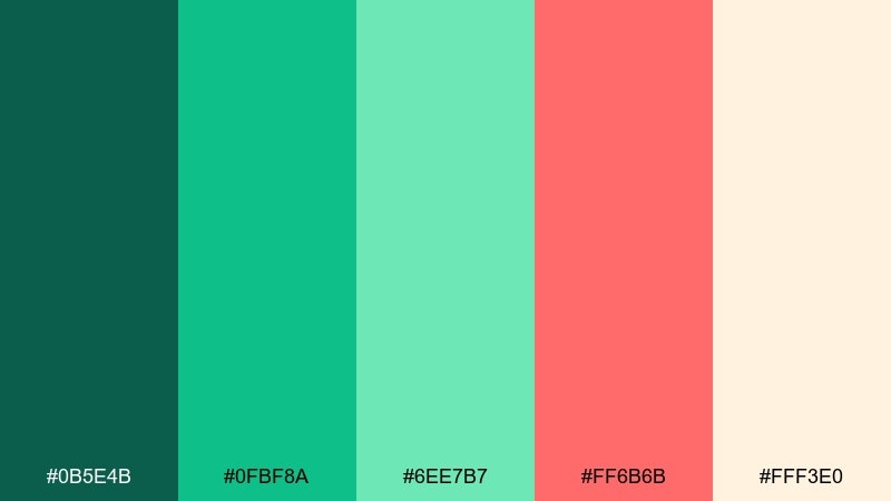
HEX: #0B5E4B #0FBF8A #6EE7B7 #FF6B6B #FFF3E0
Mood: bright, upbeat, summery
Best for: social media promo graphics
Bright and upbeat like a tropical canopy at noon, this set feels energetic and youthful. The coral adds a fun counterpoint to the greens, perfect for promos and limited-time offers. Try an emerald color combination where mint is the background, deep green is the type, and coral is the button. Usage tip: keep coral to small blocks or stickers so it reads as an accent, not a takeover.
Image example of tropical canopy generated using media.io
12) Vintage Apothecary
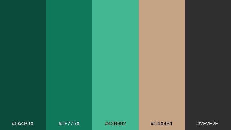
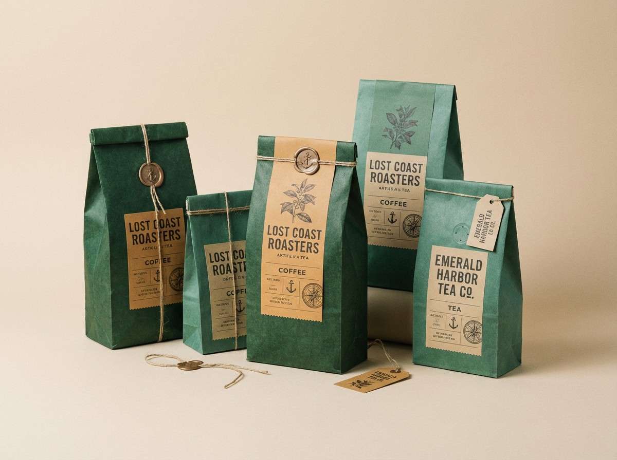
HEX: #0A4B3A #0F775A #43B692 #C4A484 #2F2F2F
Mood: heritage, cozy, artisanal
Best for: coffee or tea packaging
Heritage and cozy, these tones feel like old apothecary labels and polished wood shelves. The warm tan pairs beautifully with deep green for a handcrafted, small-batch look. Use charcoal for barcodes and legal text so the greens stay the hero. Usage tip: add subtle texture in the background to reinforce the vintage story without cluttering the front panel.
Image example of vintage apothecary generated using media.io
13) Sage and Stone
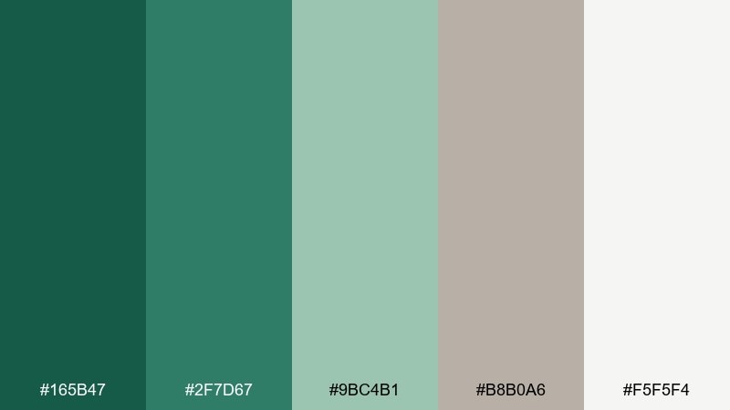
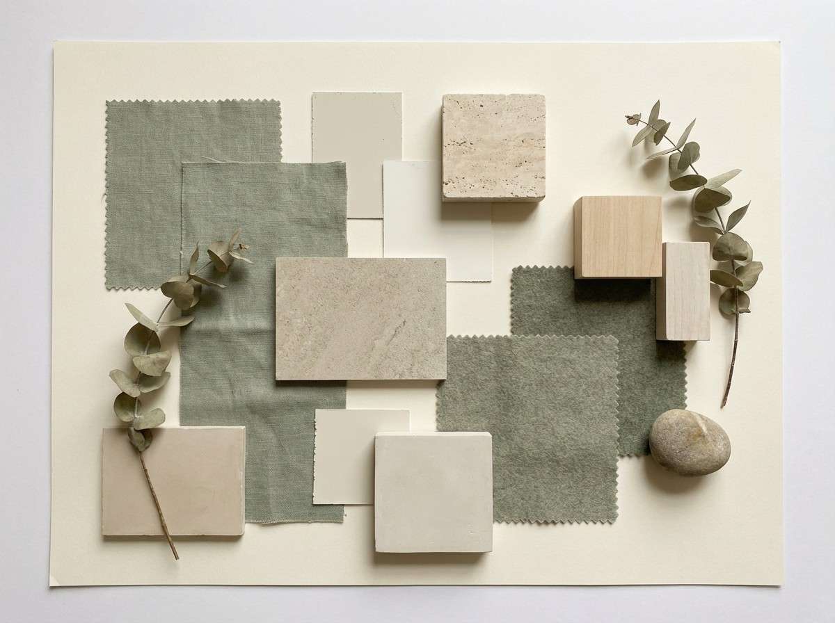
HEX: #165B47 #2F7D67 #9BC4B1 #B8B0A6 #F5F5F4
Mood: quiet, modern, minimal
Best for: spa interior mood board
Quiet and modern, this mix feels like smooth stone, eucalyptus, and soft daylight. The desaturated greens keep the atmosphere serene for interiors and lifestyle brands. Pair the stone beige with off-white for walls, linens, or background blocks, and use the darkest green for signage. Usage tip: repeat one green at three different scales (large wall, medium tile, small accessory) to make it cohesive.
Image example of sage and stone generated using media.io
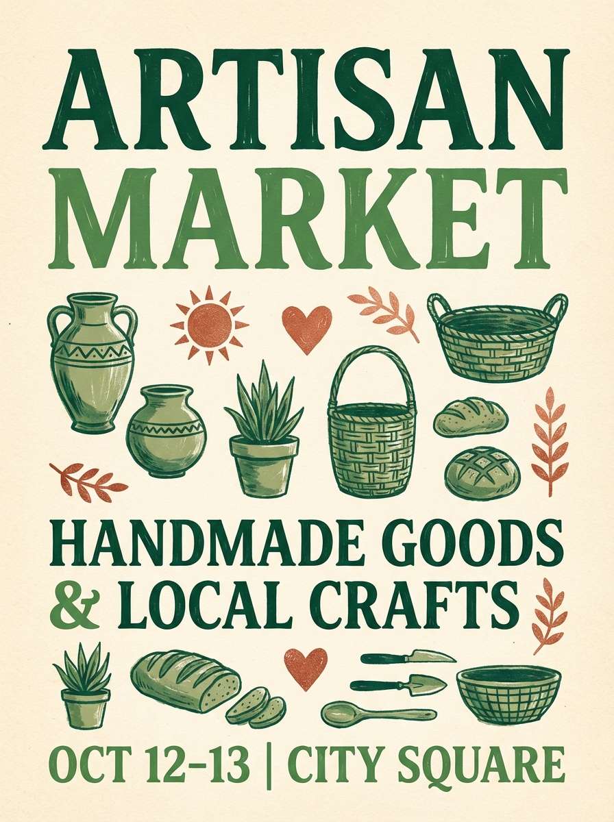
14) Cedar Copper
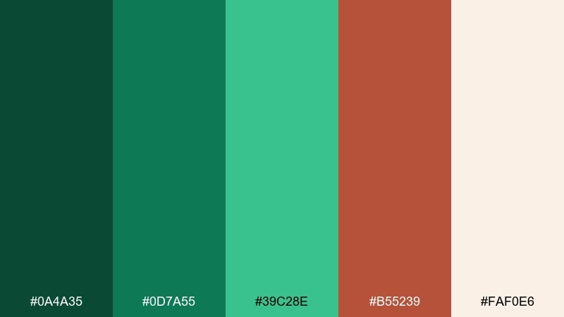
HEX: #0A4A35 #0D7A55 #39C28E #B55239 #FAF0E6
Mood: warm, rustic, inviting
Best for: artisan market poster
Warm and inviting like cedarwood and hammered copper, this palette adds earthiness to modern greens. The copper-red brings a handcrafted edge that works well for markets, workshops, and local events. Use the cream for generous margins and let the mid green carry supporting graphics. Usage tip: keep the copper to stamps or small illustrations so it stays charming, not muddy.
Image example of cedar copper generated using media.io
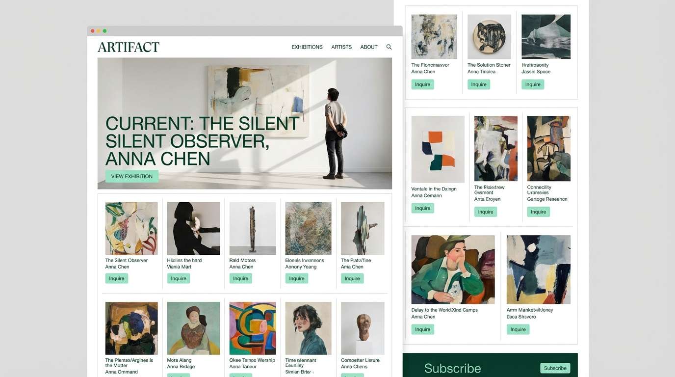
15) Modern Museum
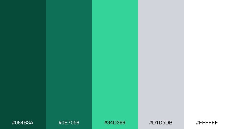
HEX: #064B3A #0E7056 #34D399 #D1D5DB #FFFFFF
Mood: clean, curated, contemporary
Best for: gallery website UI
Clean and curated like a modern museum wall, these greens look sharp against bright white space. The light gray supports long pages without feeling sterile, while the minty green acts as a clear interaction cue. For a restrained emerald color scheme, keep buttons in the bright green and rely on the darker shades for text and navigation. Usage tip: maintain consistent hover states by shifting only one step in the green range, not switching hues.
Image example of modern museum generated using media.io
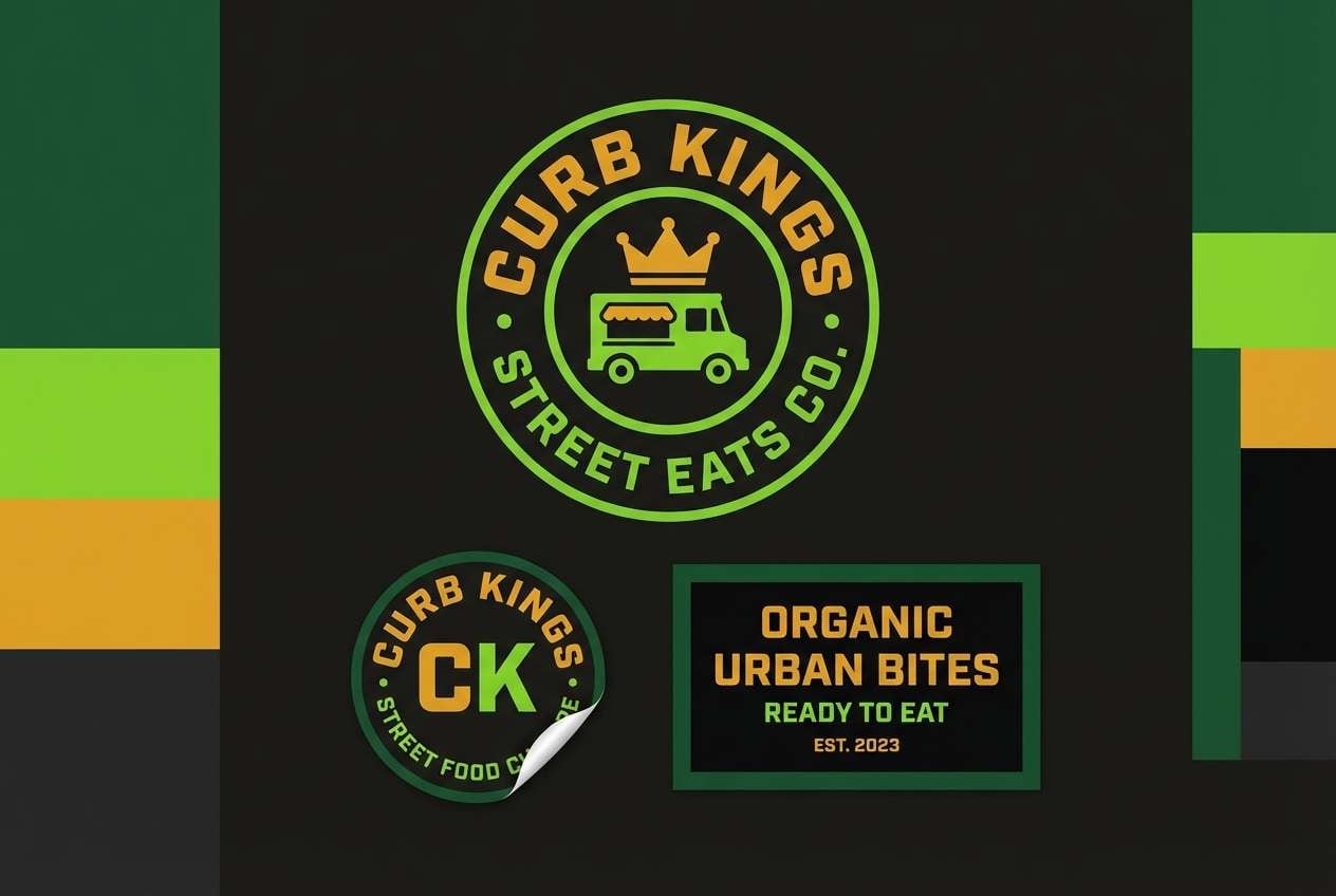
16) Night Market
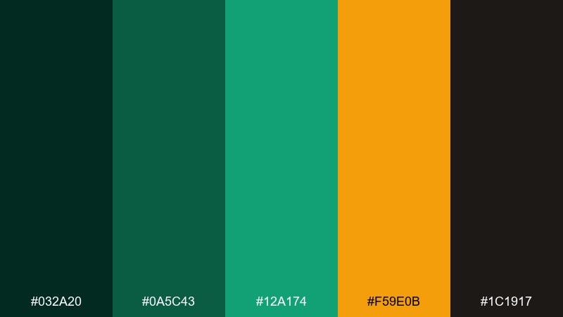
HEX: #032A20 #0A5C43 #12A174 #F59E0B #1C1917
Mood: urban, spicy, high-energy
Best for: street food brand kit
Urban and high-energy, these tones feel like night stalls, warm lanterns, and glossy signage. The amber accent adds appetite appeal and pairs naturally with the punchy green. Use the near-black for backgrounds or aprons, then pop the bright green on logos and labels. Usage tip: keep the amber as a secondary accent so the greens remain the signature look.
Image example of night market generated using media.io
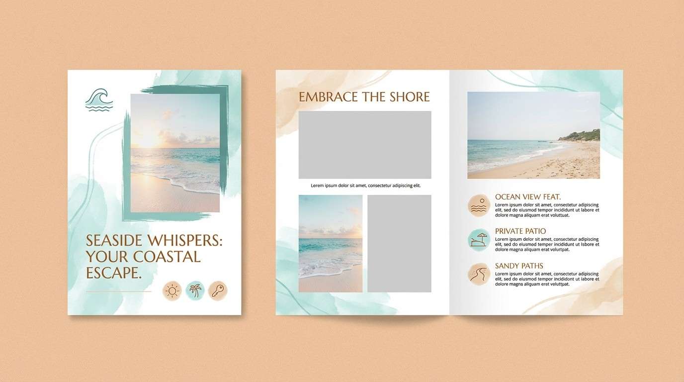
17) Coastal Ivy
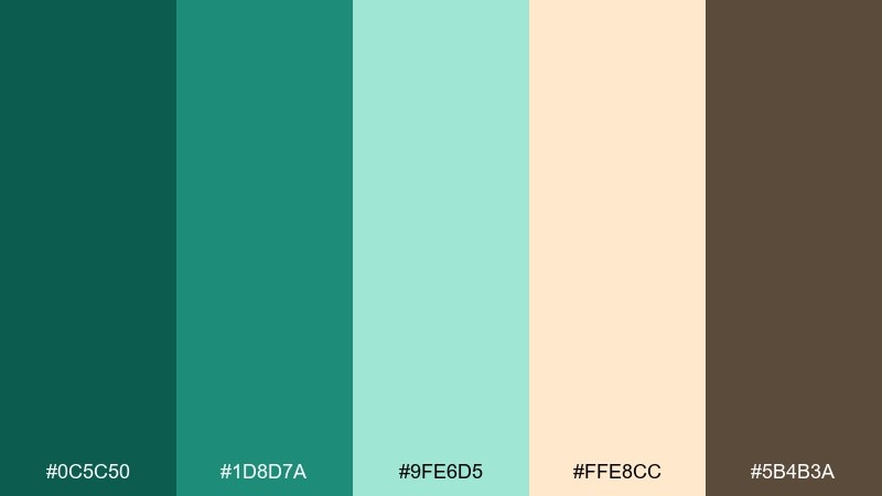
HEX: #0C5C50 #1D8D7A #9FE6D5 #FFE8CC #5B4B3A
Mood: relaxed, breezy, friendly
Best for: beach rental brochure
Relaxed and breezy, these tones evoke ivy on a sunlit fence by the coast. The soft aqua and peachy sand feel welcoming for travel materials and lifestyle print. Add the brown for small text and icons so the page stays warm rather than clinical. Usage tip: use the sand tone as a unifying background across pages to keep photos and type consistent.
Image example of coastal ivy generated using media.io
18) Ceramic Verde
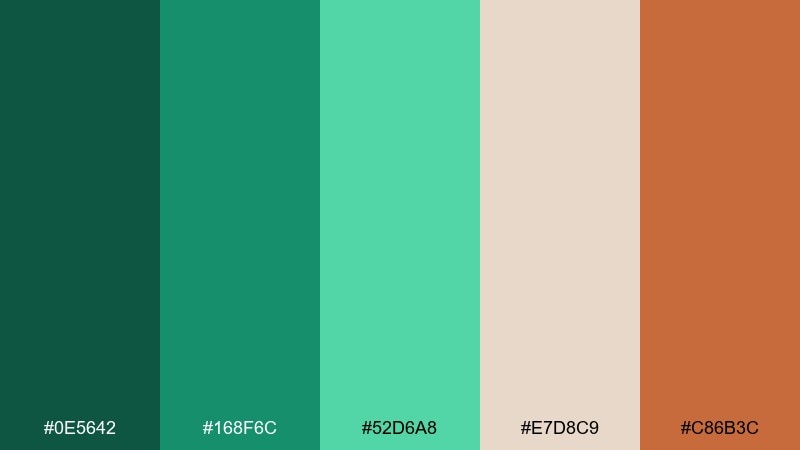
HEX: #0E5642 #168F6C #52D6A8 #E7D8C9 #C86B3C
Mood: earthy, artistic, handcrafted
Best for: pottery studio flyer
Earthy and artistic, these colors suggest glazed ceramic, clay, and studio warmth. The terracotta accent gives the greens a handmade edge that feels approachable and creative. Use the beige as your paper tone and place the darkest green in headers for strong contrast. Usage tip: lean on simple shapes and plenty of negative space so the palette reads modern, not rustic clutter.
Image example of ceramic verde generated using media.io

19) Minimal Emerald UI
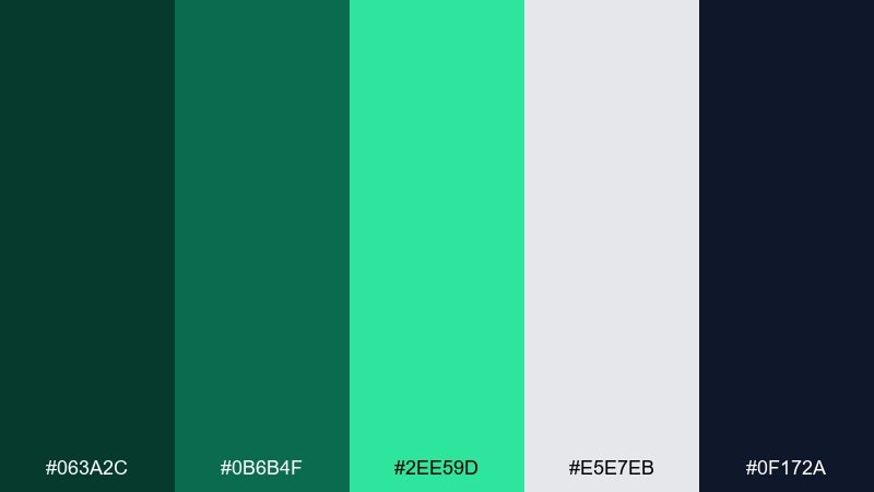
HEX: #063A2C #0B6B4F #2EE59D #E5E7EB #0F172A
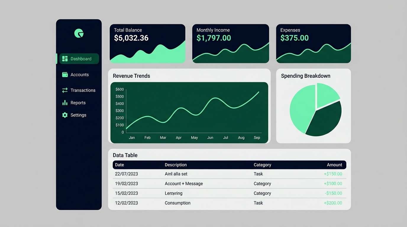
Mood: crisp, efficient, modern
Best for: finance dashboard UI
Crisp and efficient, this set feels like a high-contrast dashboard with clear hierarchy. The navy-black and deep green make data tables easy to scan, while the bright mint works as a status highlight. An emerald color palette like this pairs well with light gray surfaces and strict spacing. Usage tip: map the bright green to one meaning only, such as positive change, to keep signals consistent.
Image example of minimal emerald ui generated using media.io
20) Garden Party
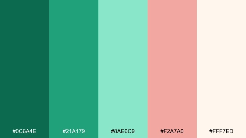
HEX: #0C6A4E #21A179 #8AE6C9 #F2A7A0 #FFF7ED
Mood: cheerful, romantic, springlike
Best for: spring botanical illustration
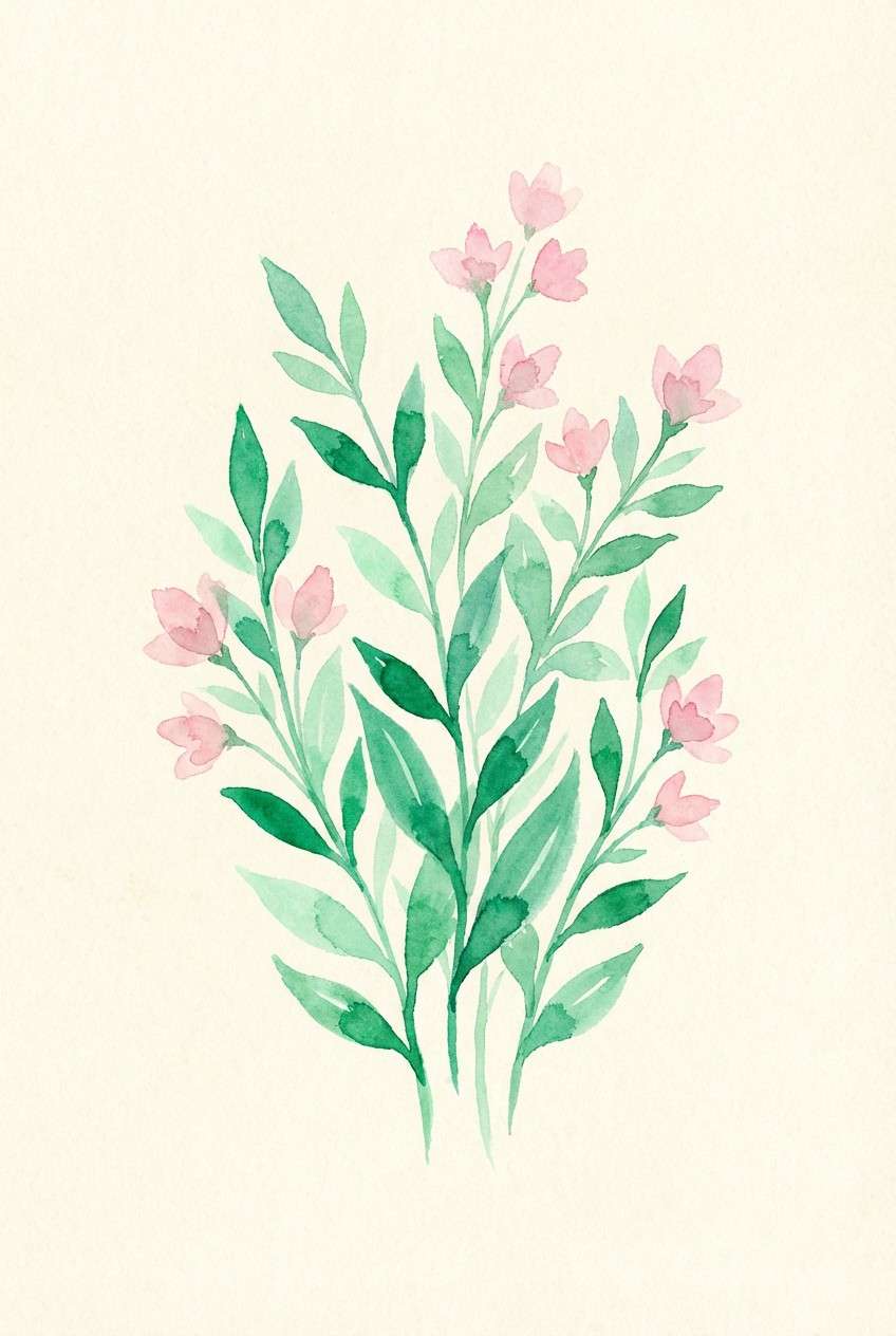
Cheerful and springlike, these tones look like fresh stems, pastel blossoms, and warm morning light. The pink brings romance without overpowering the greens, making it great for seasonal campaigns. If you want emerald color combinations that feel softer, lean on the pale mint and cream as the base and let the deeper green define edges. Usage tip: keep the pink in small floral details so the overall look stays green-forward.
Image example of garden party generated using media.io
What Colors Go Well with Emerald?
Neutrals are the easiest match: warm creams and beiges make emerald feel softer and more organic, while cool whites and grays make it look modern and crisp. If you want emerald to replace black, try pairing it with light gray instead of pure white for a less harsh contrast.
Metal tones add instant “premium” energy. Gold and brass look elegant and celebratory, while copper brings warmth and a handcrafted vibe that works for food, craft, and local events.
For accents, choose one temperature and commit. Coral, peach, and amber create friendly contrast, while mint and aqua keep the whole scheme cool and airy for wellness, travel, and UI.
How to Use a Emerald Color Palette in Real Designs
Start by assigning roles: pick one deep emerald for text/navigation, one mid emerald for secondary elements, and one bright mint for highlights. This prevents “too many greens” from competing and keeps hierarchy clear.
In print, emerald can look darker than expected, especially on uncoated paper. Increase type weight slightly, avoid super-thin lines, and test how metallic accents (gold/brass) reproduce if you’re not foiling.
In UI, emerald works best when interaction states are consistent. Keep hover/focus changes within the same green family (one step lighter or darker) and reserve your brightest accent for one meaning (like success or primary CTA).
Create Emerald Palette Visuals with AI
If you have HEX codes but need real-looking mockups (packaging, posters, UI screens, or mood boards), AI can help you visualize the palette before you commit to production. The key is to describe the scene, materials, and lighting, then specify where each emerald shade appears.
Use a consistent prompt template across variations so you can compare palettes fairly. Swap only the colors and a few styling details (like “brass accent icons” or “cream paper texture”) to keep results cohesive.
Emerald Color Palette FAQs
-
What is the HEX code for emerald green?
“Emerald” can vary by brand and medium, but common emerald-like HEX values include deep greens such as #0A4D38 or #064E3B. For accuracy, choose the emerald shade that matches your project’s lighting, paper, or screen context. -
Does emerald go better with gold or silver?
Both work, but they communicate different moods: gold/brass makes emerald feel warmer and more luxurious, while silver/chrome pushes it toward a cooler, more modern look—often better for tech UI and sleek editorial designs. -
What neutral colors pair best with emerald?
Creams and warm off-whites create an organic, premium feel; cool whites and light grays feel modern and minimal. Charcoal and near-black are great for typography when you want depth without using pure black. -
How do I keep an emerald palette from looking too dark?
Add a high-key background (off-white, light gray, or pale mint) and use the darkest emerald mainly for text and anchors. Limit near-black shades to small areas and rely on mid greens for larger surfaces. -
What accent colors look good with emerald for CTAs?
Warm accents like peach, coral, amber, and terracotta create clear contrast for buttons and badges. For a calmer approach, use mint or sea-glass tones and increase contrast with darker emerald text. -
Is emerald a good brand color?
Yes—emerald often signals quality, trust, and nature. It’s especially strong for wellness, finance, lifestyle, and premium retail, as long as you plan accessible contrast for text and interactive elements. -
How can I generate emerald palette mockups quickly?
Use Media.io’s text-to-image tool to create packaging, UI, posters, or mood board visuals from a prompt. Describe the design style, materials, and where your emerald shades and accents should appear.
Next: Wine Color Palette


