

A white blue green color palette is a go-to for designs that need to feel clean, coastal, and modern without looking sterile. White creates space, blues bring clarity and trust, and greens add a natural “fresh” accent.
Below are 20+ curated picks (with HEX codes) plus practical ideas for using these tones across UI, branding, packaging, and print.
In this article
- Why White Blue Green Palettes Work So Well
-
- sea glass calm
- arctic mint
- lagoon postcard
- clinic fresh
- sprout and sky
- poolside minimal
- oceanic editorial
- nordic fjord
- breeze and basil
- aqua classroom
- harbor neon
- botanical wash
- resort towel
- teal laboratory
- sage surf
- cyan evergreen
- gentle glacier
- marina nightlight
- ceramic coast
- rainy boardroom
- minted invitation
- What Colors Go Well with White Blue Green?
- How to Use a White Blue Green Color Palette in Real Designs
- Create White Blue Green Palette Visuals with AI
Why White Blue Green Palettes Work So Well
White blue green palettes balance “air” and “structure.” White handles whitespace and readability, blue provides hierarchy and a trustworthy feel, and green adds a subtle organic cue that keeps the look approachable.
This trio is especially effective for modern interfaces because you can clearly separate surfaces (white), information density (blue), and status/feedback (green). The result is clean, scan-friendly layouts that still feel lively.
They also translate well across screens and print: blues reproduce consistently, greens make excellent accents for confirmations or sustainability messaging, and white maintains a premium, minimalist base.
20+ White Blue Green Color Palette Ideas (with HEX Codes)
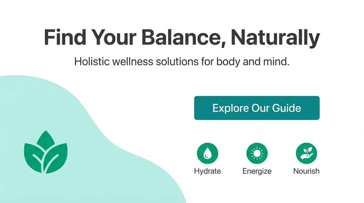
1) Sea Glass Calm
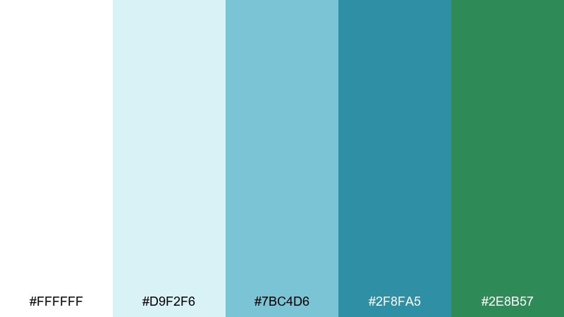
HEX: #FFFFFF #D9F2F6 #7BC4D6 #2F8FA5 #2E8B57
Mood: breezy, coastal, refreshing
Best for: wellness brand landing page
Breezy and coastal, these tones feel like sea glass on bright sand with a cool ocean horizon. Use the pale aqua as open space, then anchor sections with the deeper teal for headings and buttons. The green works best as a sparing accent for calls to action or trust badges. Pair with light gray dividers and simple sans type to keep it airy.
Image example of sea glass calm generated using media.io
Media.io is an online AI studio for creating and editing video, image, and audio in your browser.

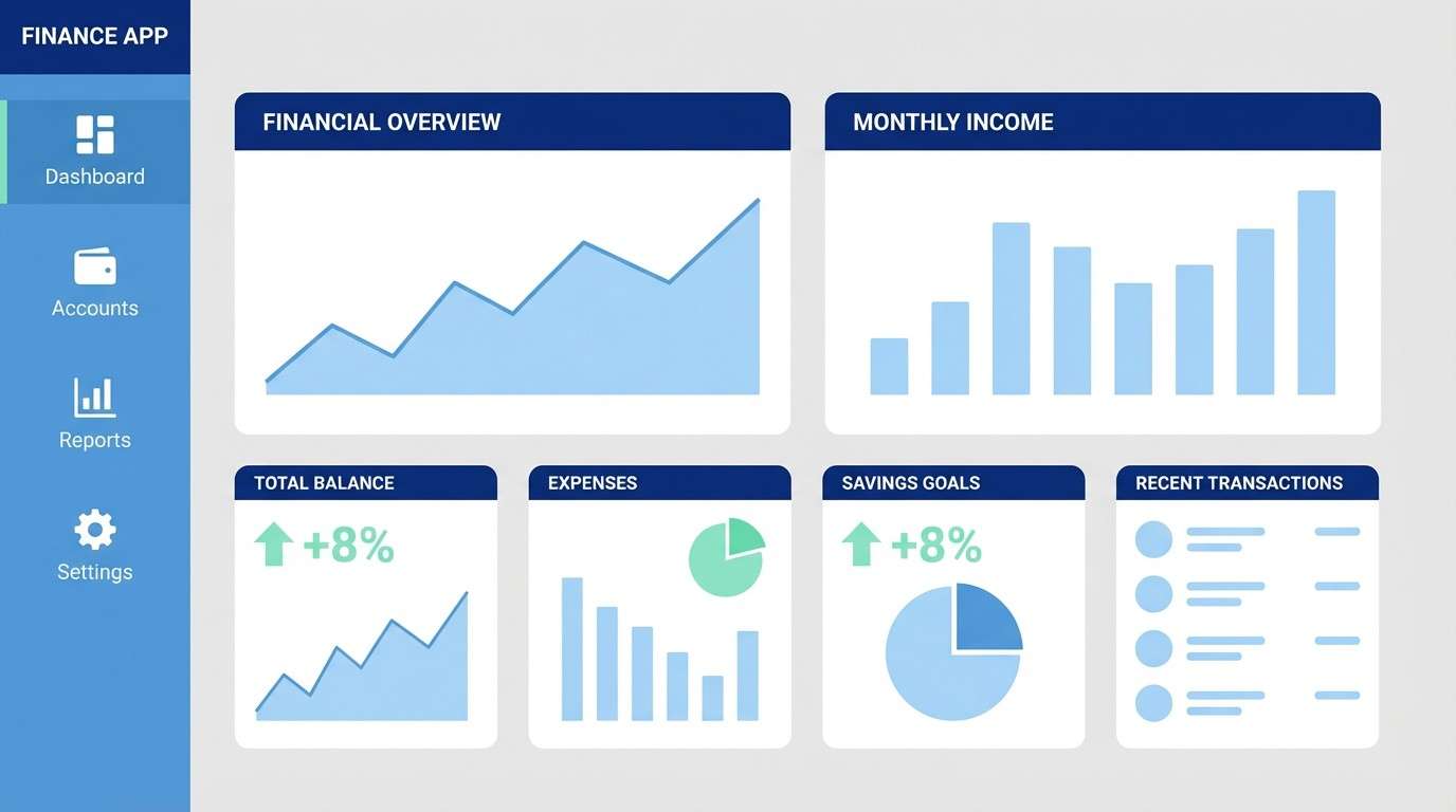
2) Arctic Mint
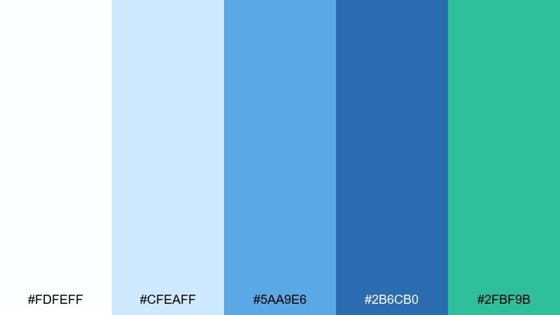
HEX: #FDFEFF #CFEAFF #5AA9E6 #2B6CB0 #2FBF9B
Mood: crisp, modern, energetic
Best for: finance app dashboard ui
Crisp and modern, the mix reads like icy air, clean glass, and a minty burst of optimism. Build the dashboard on near-white panels, then use the mid blue for charts and navigation states. Reserve the mint for positive metrics, toggles, and confirmations so it feels meaningful. Keep contrast strong with the deep blue for text and key controls.
Image example of arctic mint generated using media.io
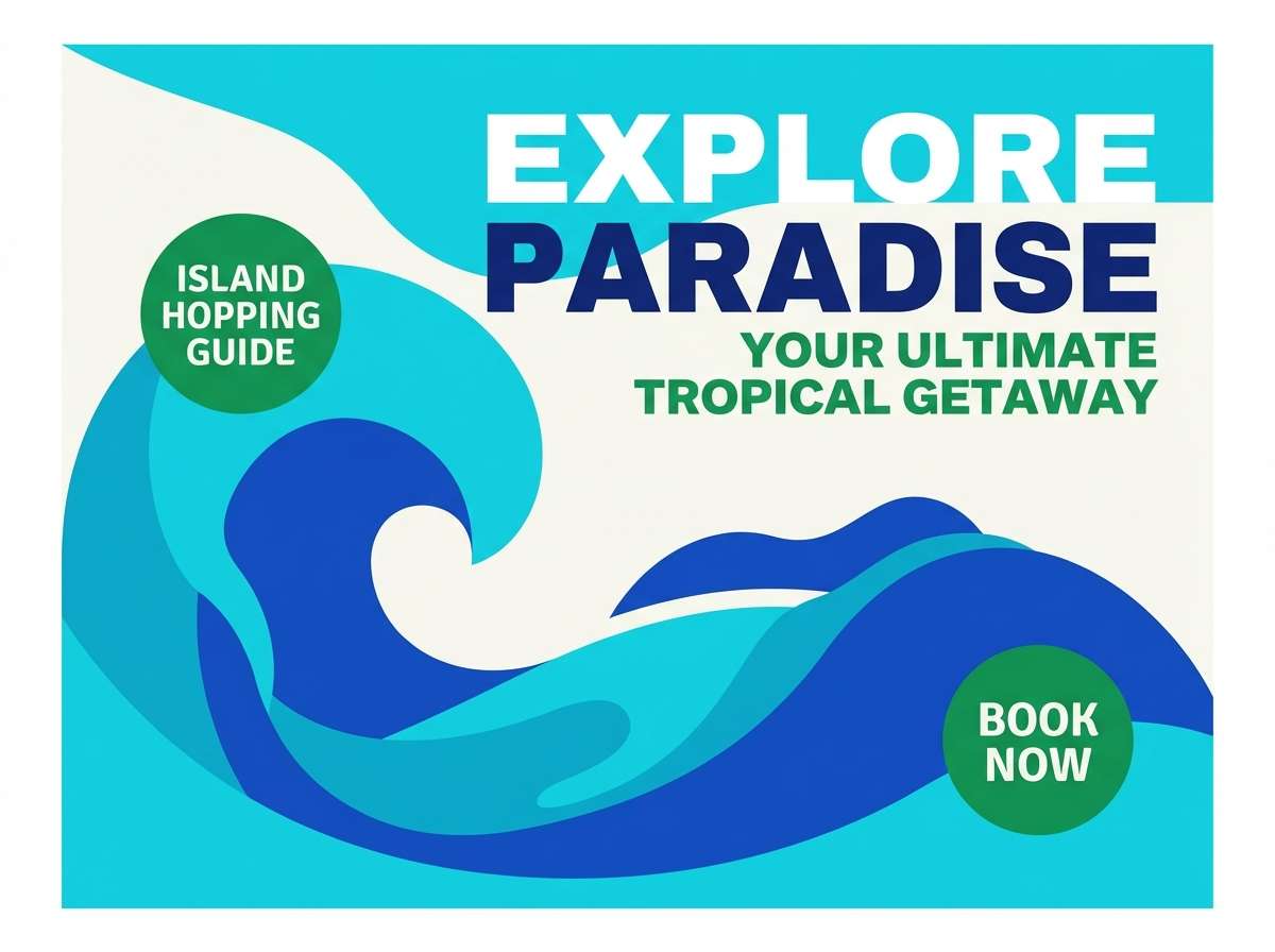
3) Lagoon Postcard
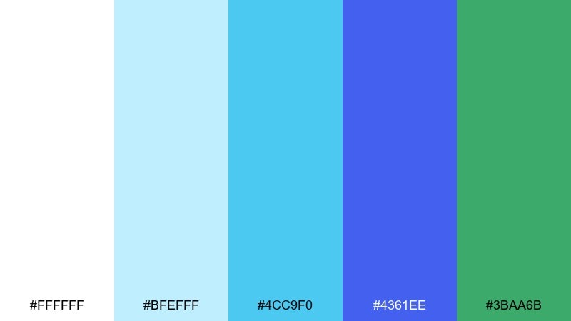
HEX: #FFFFFF #BFEFFF #4CC9F0 #4361EE #3BAA6B
Mood: sunny, travel-ready, vibrant
Best for: travel brochure cover
Sunny and travel-ready, the blues feel like a lagoon shifting from shallow sparkle to deep water. Put the brightest cyan on highlights and imagery overlays, then lean on the royal blue for titles that need to pop. The green is a fresh accent for location pins or price badges. Use matte white margins to keep the cover premium instead of loud.
Image example of lagoon postcard generated using media.io
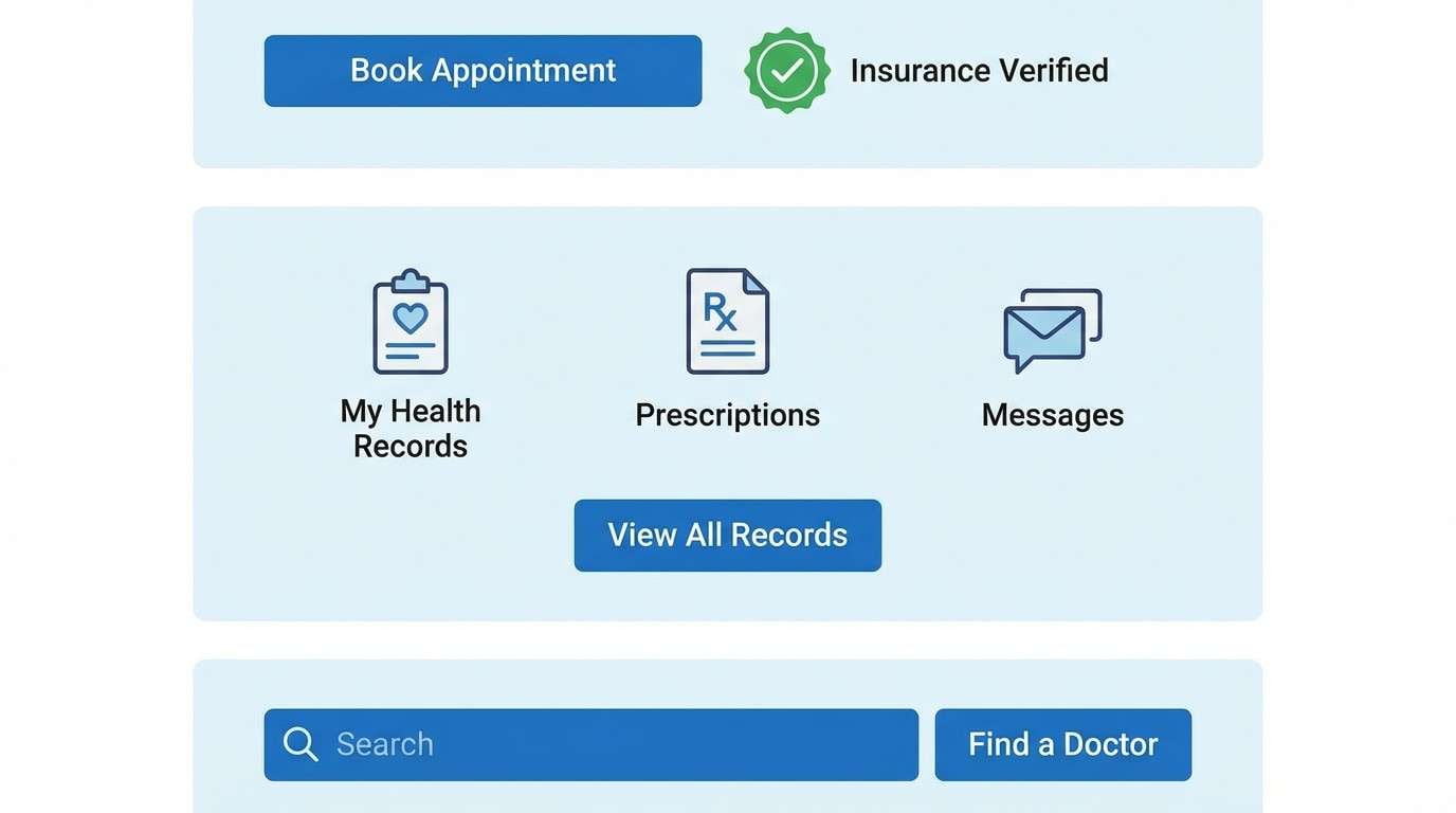
4) Clinic Fresh
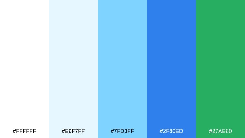
HEX: #FFFFFF #E6F7FF #7FD3FF #2F80ED #27AE60
Mood: clean, reassuring, professional
Best for: healthcare website ui
Clean and reassuring, these hues suggest bright rooms, fresh linens, and calm competence. Use the light blue as section background to separate content without heavy lines. Keep primary actions in the medium blue, then use the green for success states and appointment confirmations. For readability, set body text in deep navy or charcoal rather than pure blue.
Image example of clinic fresh generated using media.io
5) Sprout and Sky
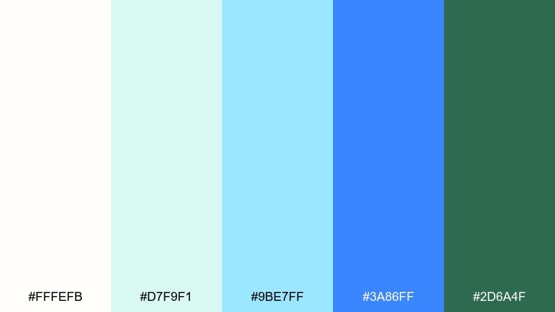
HEX: #FFFEFB #D7F9F1 #9BE7FF #3A86FF #2D6A4F
Mood: hopeful, springlike, optimistic
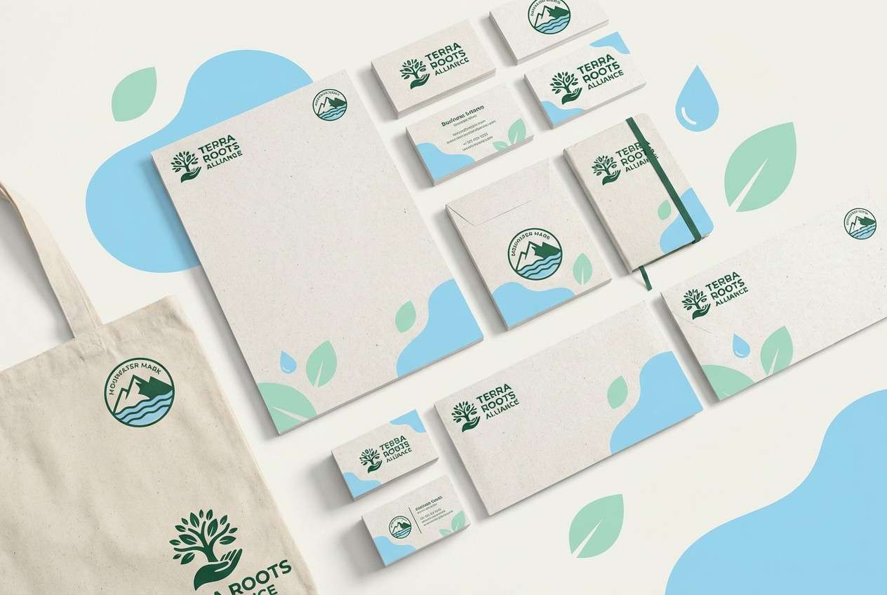
Best for: eco non-profit branding kit
Hopeful and springlike, the tones look like new leaves under a clear morning sky. Use the creamy off-white as the base so the greens feel natural rather than neon. The bright blue works best for links and social accents, while the forest green anchors logos and headlines. For print, choose uncoated stock to keep the softness intact.
Image example of sprout and sky generated using media.io
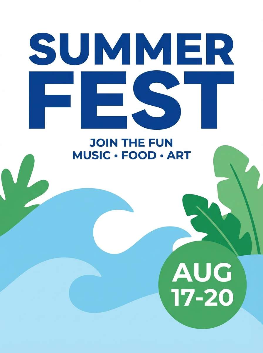
6) Poolside Minimal
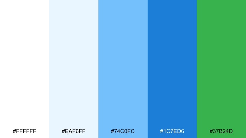
HEX: #FFFFFF #EAF6FF #74C0FC #1C7ED6 #37B24D
Mood: playful, sporty, bright
Best for: summer event poster
Playful and sporty, the palette feels like sun on water with a sharp, leafy kick. Set a high-contrast headline in the deep blue, then layer lighter blues behind it as simple waves. Use the green for date blocks and ticket info so details stay easy to scan. Keep shapes geometric and avoid extra colors to preserve the punch.
Image example of poolside minimal generated using media.io
7) Oceanic Editorial
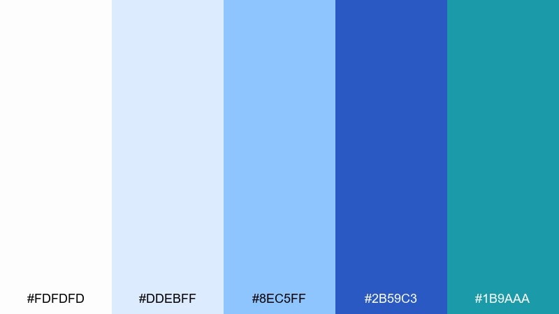
HEX: #FDFDFD #DDEBFF #8EC5FF #2B59C3 #1B9AAA
Mood: polished, editorial, cool
Best for: magazine feature layout
Polished and editorial, the cool blues read like glossy ink over bright paper. Use the palest tint for column backgrounds and pull-quote blocks so the layout feels layered. The darker blue is ideal for section headers, while the teal adds a modern accent for charts or sidebars. Stick to one serif and one sans to keep the spread sophisticated.
Image example of oceanic editorial generated using media.io
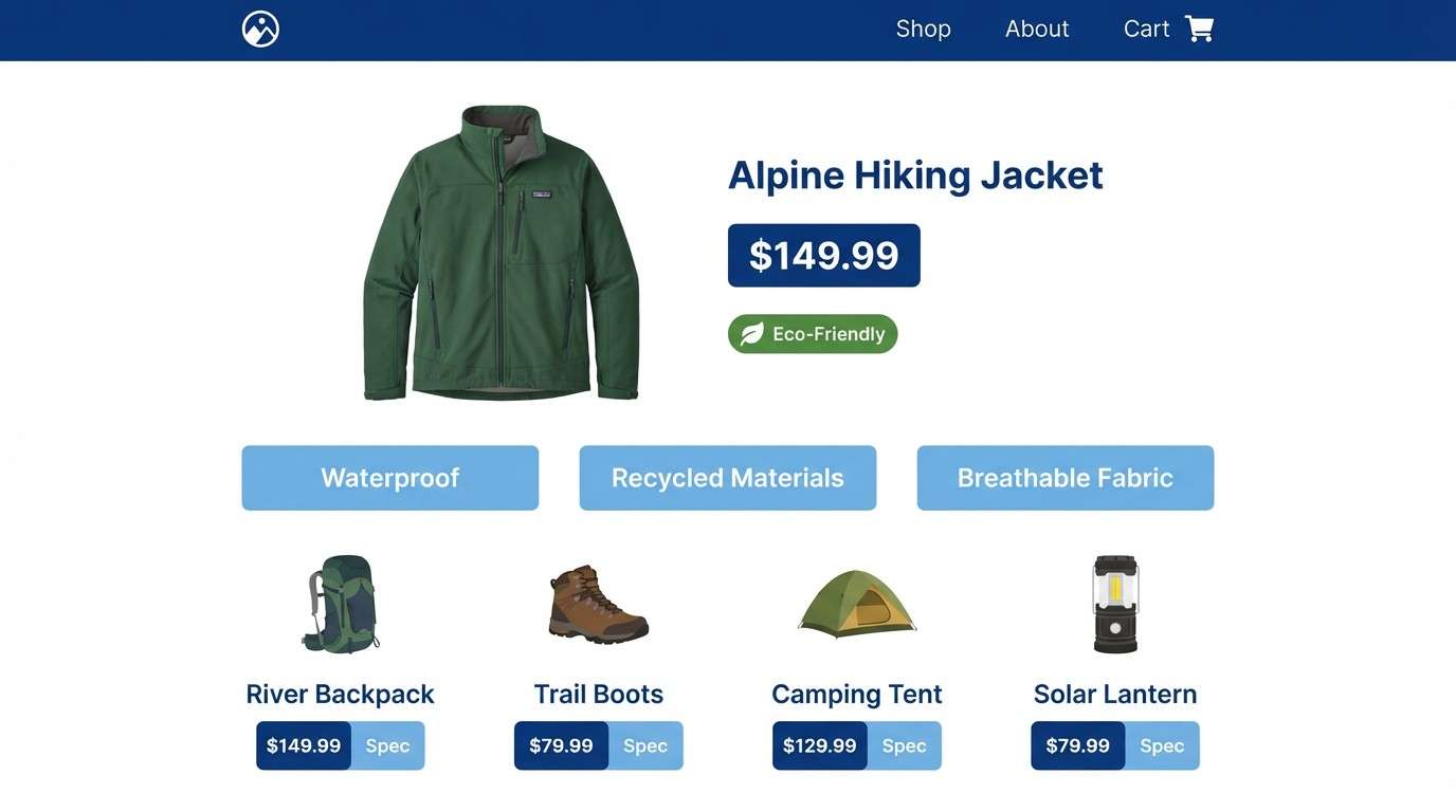
8) Nordic Fjord
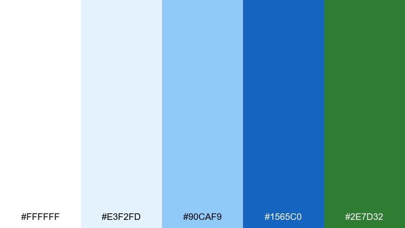
HEX: #FFFFFF #E3F2FD #90CAF9 #1565C0 #2E7D32
Mood: quiet, reliable, outdoorsy
Best for: outdoor gear product page
Quiet and reliable, these tones evoke cold water, clean air, and evergreen trails. Use the soft blue for product spec panels and the deeper blue for navigation and price emphasis. The green works best for sustainability labels or availability status. Keep product photography neutral so the interface colors do the storytelling.
Image example of nordic fjord generated using media.io
9) Breeze and Basil
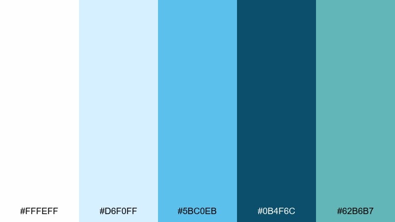
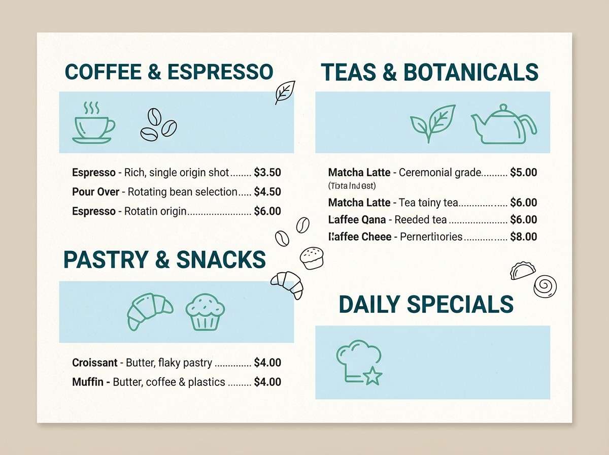
HEX: #FFFEFF #D6F0FF #5BC0EB #0B4F6C #62B6B7
Mood: relaxed, coastal, artisan
Best for: cafe menu design
Relaxed and artisan, the mix feels like a shaded patio near the water with herbs on the table. Use the deep teal for menu section titles and the mid blue for item dividers. The softer green-blue is great for icons, dietary labels, and small illustrations. Print on warm white paper to keep it welcoming rather than clinical.
Image example of breeze and basil generated using media.io
10) Aqua Classroom
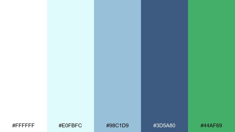
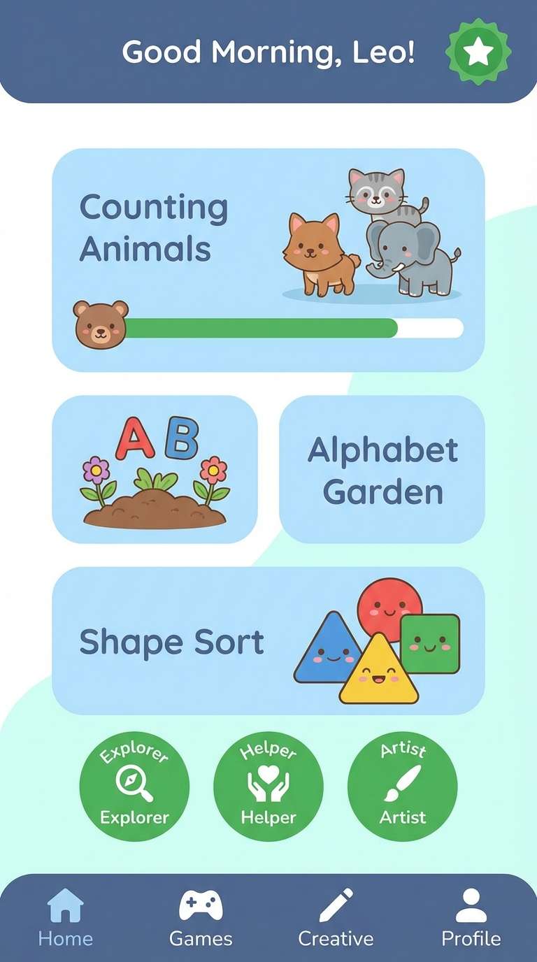
HEX: #FFFFFF #E0FBFC #98C1D9 #3D5A80 #44AF69
Mood: friendly, educational, structured
Best for: kids learning app ui
Friendly and structured, these shades feel like tidy notebooks with a splash of fun. Use the pale aqua for screens and onboarding cards so the UI stays gentle on the eyes. The slate blue is strong for navigation, while the green makes progress and rewards feel positive. Keep illustrations simple and avoid heavy gradients for clarity.
Image example of aqua classroom generated using media.io
11) Harbor Neon
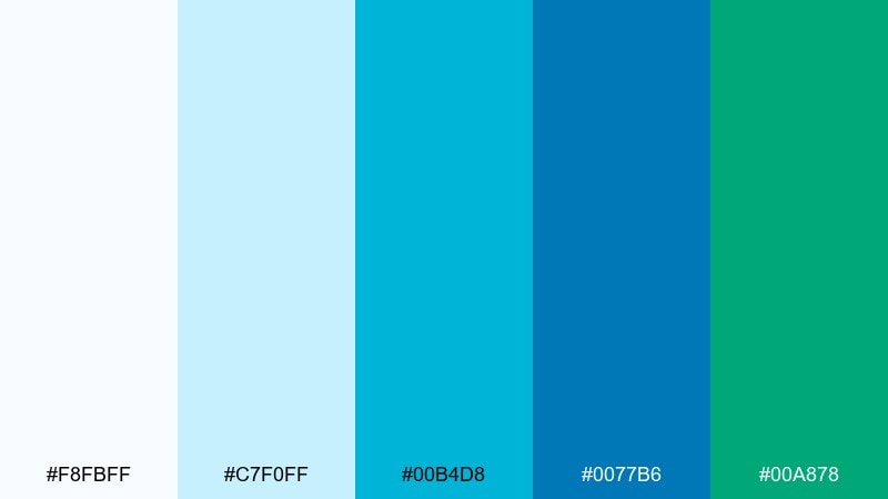
HEX: #F8FBFF #C7F0FF #00B4D8 #0077B6 #00A878
Mood: bold, techy, high-contrast
Best for: saas hero section
Bold and techy, the colors echo harbor lights over dark water with a crisp, modern glow. Build the hero on near-white with strong blocks of blue for product shots and feature highlights. Use the green-teal as the accent for primary CTAs, but keep it limited so it feels premium. This is one white blue green color combination that benefits from generous spacing and sharp iconography.
Image example of harbor neon generated using media.io

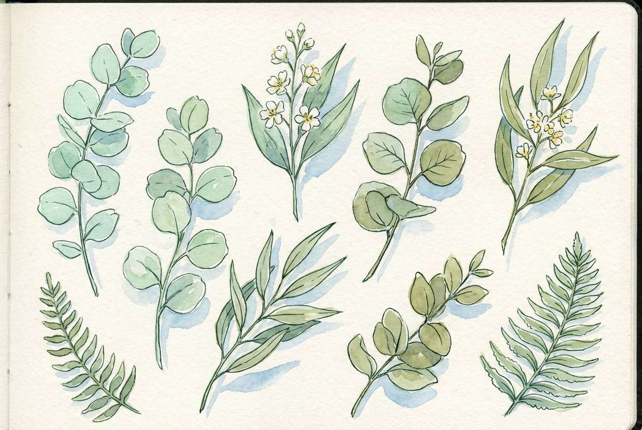
12) Botanical Wash
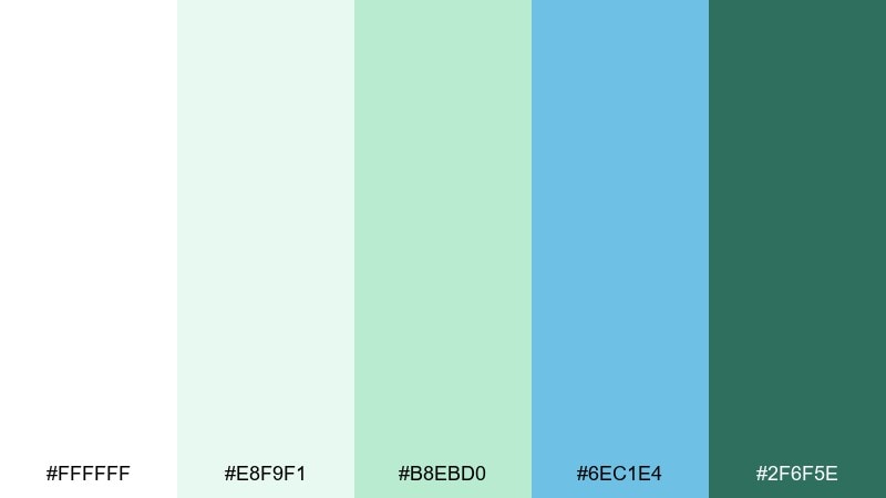
HEX: #FFFFFF #E8F9F1 #B8EBD0 #6EC1E4 #2F6F5E
Mood: soft, botanical, calming
Best for: watercolor plant illustration set
Soft and botanical, the hues look like diluted watercolor on thick paper. Let the mint and pale green do most of the work in leaves, then add the airy blue as a cool shadow tone. Use the deep green as a thin outline or stem detail to keep the art delicate. A textured off-white background helps the washes feel handmade.
Image example of botanical wash generated using media.io
13) Resort Towel
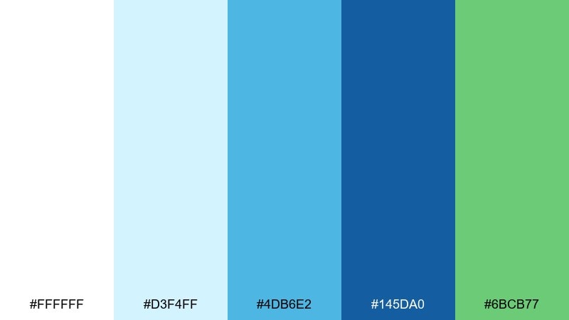
HEX: #FFFFFF #D3F4FF #4DB6E2 #145DA0 #6BCB77
Mood: vacation, cheerful, clean
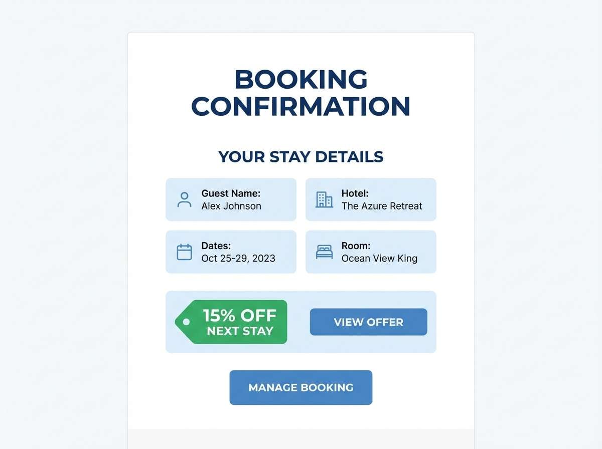
Best for: hotel booking email template
Vacation-bright and clean, it brings to mind striped resort towels and a clear pool edge. Use white for breathing room, then apply the mid blue for buttons and fare cards. The green works well for limited-time tags or loyalty perks without looking spammy. Keep imagery cool-toned so the blues stay coherent across the template.
Image example of resort towel generated using media.io
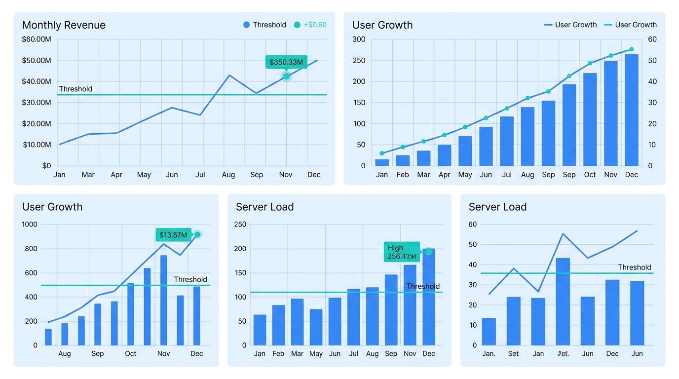
14) Teal Laboratory
HEX: #FAFDFF #E1F5FE #81D4FA #1976D2 #26C6DA
Mood: precise, scientific, sleek
Best for: data visualization dashboard
Precise and sleek, these blues feel like clean glassware and bright lab lighting. Use the lightest tints for grid backgrounds so charts remain the focal point. The deeper blue should carry axes, labels, and key series, while teal highlights important thresholds. Limit the number of series colors to avoid visual noise.
Image example of teal laboratory generated using media.io
15) Sage Surf
HEX: #FFFEFC #E9F5DB #B7E4C7 #76C893 #34A0A4
Mood: natural, soothing, spa-like
Best for: skincare packaging
Natural and spa-like, the greens and blue-green tones feel like herbal steam and ocean mist. Keep the label mostly off-white, then use sage blocks for variants and the deeper teal for the brand mark. Matte finishes and minimal line icons fit this direction best. As a usage tip, print the smallest text in a dark neutral for legibility on light greens.
Image example of sage surf generated using media.io
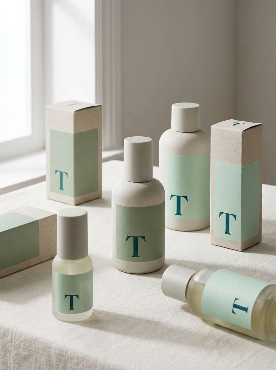
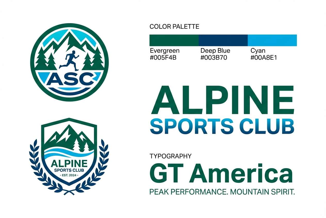
16) Cyan Evergreen
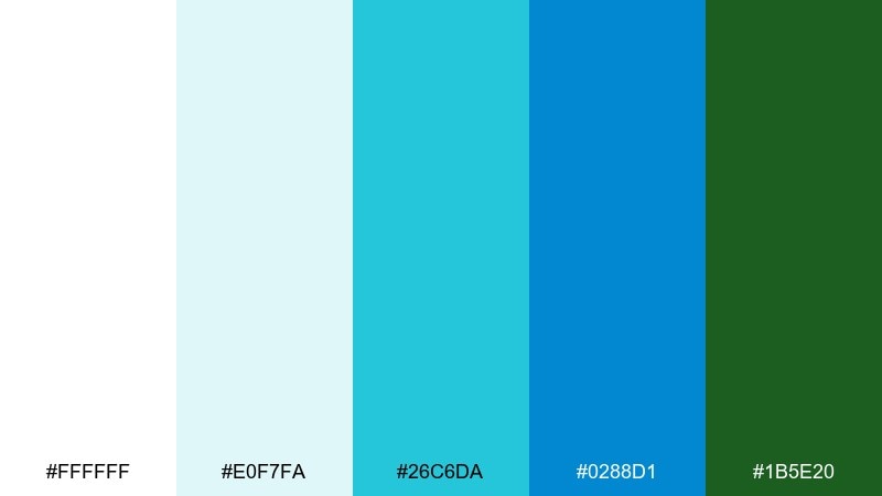
HEX: #FFFFFF #E0F7FA #26C6DA #0288D1 #1B5E20
Mood: fresh, confident, outdoors
Best for: sports club branding
Fresh and confident, the cyan and deep green feel like cold water and dense forest trails. Use cyan for social graphics and motion accents, while evergreen anchors the logo and typography. The darker blue is ideal for uniforms and signage where contrast matters. For consistency, keep backgrounds white or very pale aqua instead of gray.
Image example of cyan evergreen generated using media.io
17) Gentle Glacier
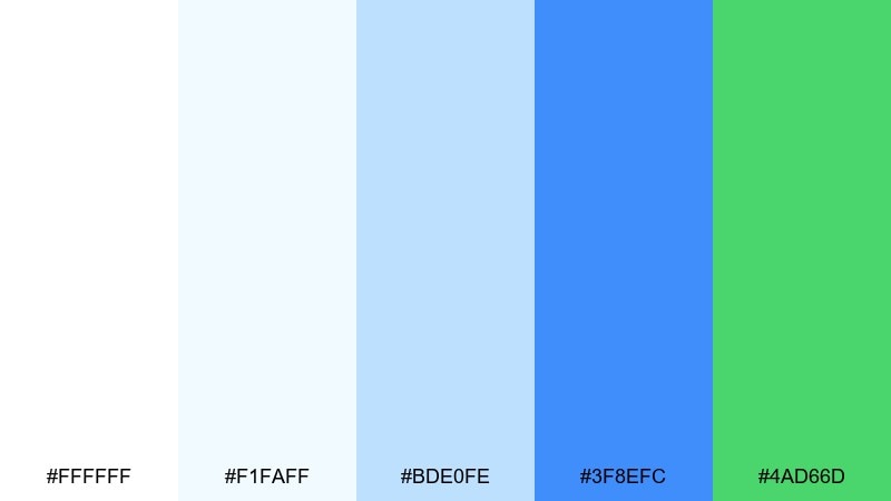
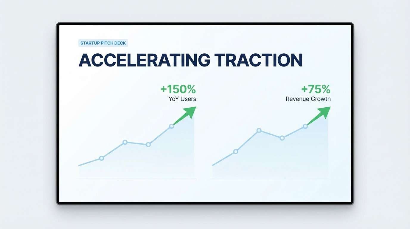
HEX: #FFFFFF #F1FAFF #BDE0FE #3F8EFC #4AD66D
Mood: light, friendly, optimistic
Best for: startup pitch deck
Light and optimistic, it reads like sunlight hitting glacier ice with a friendly green spark. Use the palest tones for slide backgrounds and charts so content stays easy to digest. The bright blue gives structure to titles and section breaks, while green highlights traction and growth. Among white blue green color combinations, this one is especially good for clean infographics and sparse layouts.
Image example of gentle glacier generated using media.io
18) Marina Nightlight
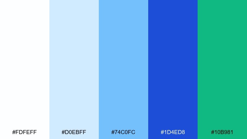
HEX: #FDFEFF #D0EBFF #74C0FC #1D4ED8 #10B981
Mood: sleek, contemporary, confident
Best for: app store screenshots
Sleek and contemporary, the tones feel like a marina at dusk with bright signage and clean reflections. Use the deep blue as the main frame color for screenshot title bars and feature callouts. The green is perfect for highlighting one key benefit per slide without stealing attention. Keep captions short and use white space to avoid clutter.
Image example of marina nightlight generated using media.io
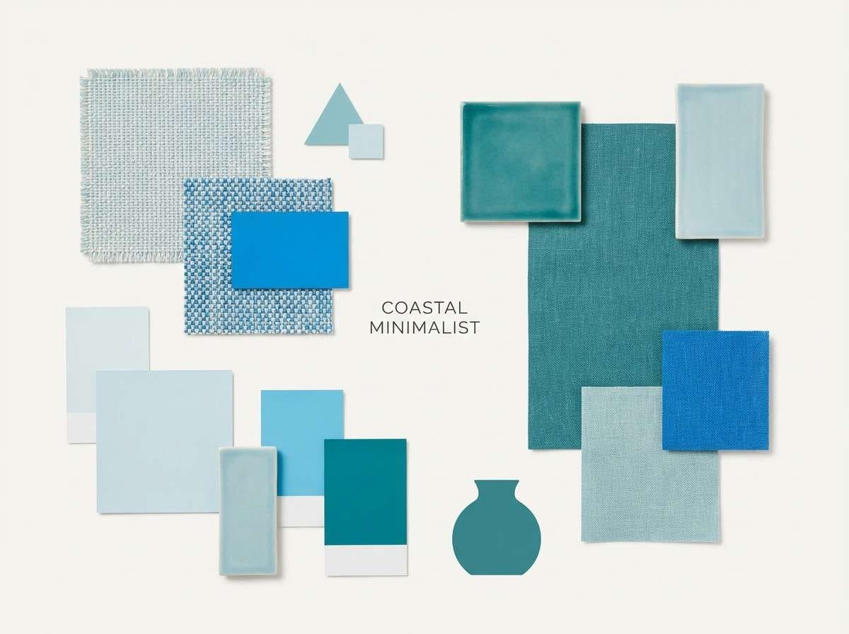
19) Ceramic Coast

HEX: #FFFEFD #E7F5FF #A5D8FF #3B82F6 #2DD4BF
Mood: handmade, airy, modern
Best for: home decor mood board
Handmade and airy, it suggests glazed ceramic, sunlit walls, and a cool coastal breeze. Use the soft blues for textiles and wall paint references, and save the brighter blue for accent furniture or art. The teal is a clean pop for small decor pieces like vases or throw pillows. Add warm wood photography to keep the overall look balanced.
Image example of ceramic coast generated using media.io
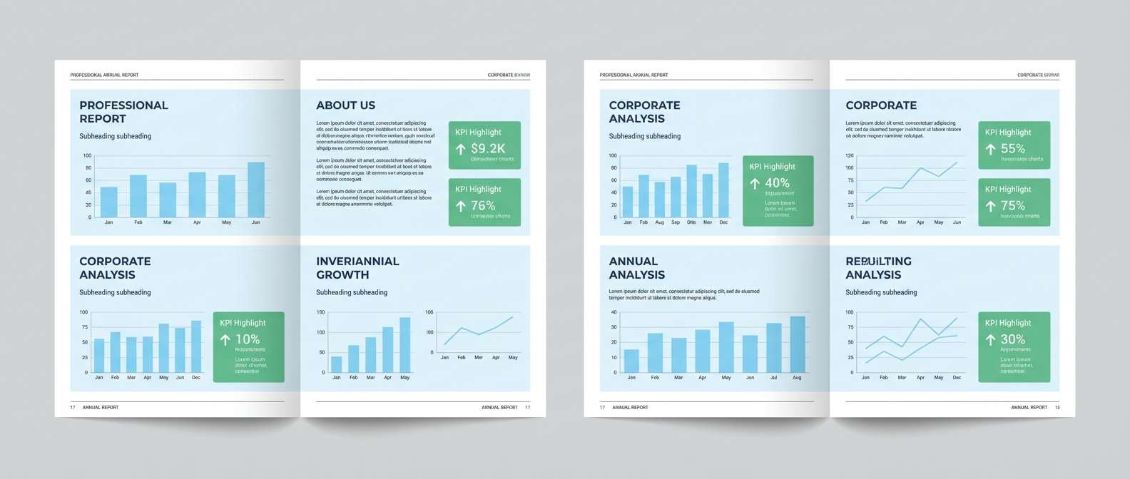
20) Rainy Boardroom
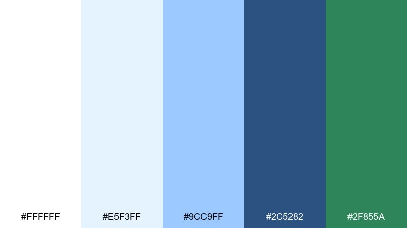
HEX: #FFFFFF #E5F3FF #9CC9FF #2C5282 #2F855A
Mood: corporate, steady, trustworthy
Best for: annual report layout
Corporate and steady, the colors feel like a bright office day with rain-softened light outside. Use pale blue page panels for chapter openers and side notes, then rely on the navy-blue for headings and chart labels. The green reads as responsible progress when used for KPI highlights. This white blue green color palette works best with strict grids and generous margins.
Image example of rainy boardroom generated using media.io
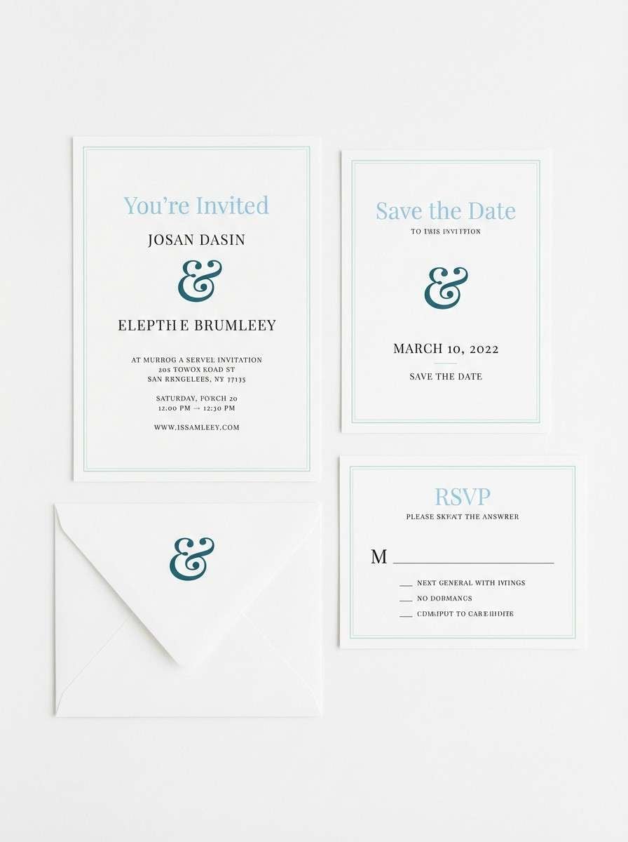
21) Minted Invitation
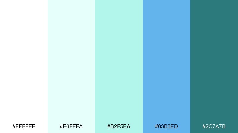
HEX: #FFFFFF #E6FFFA #B2F5EA #63B3ED #2C7A7B
Mood: elegant, airy, celebratory
Best for: wedding invitation suite
Elegant and airy, it feels like crisp stationery with a hint of seafoam and sky. Use white as the main paper tone, then add the soft mint for borders or watercolor-like washes. The light blue supports names and headings, while the deep teal is perfect for monograms and fine line details. Choose cotton paper and letterpress accents for a refined finish.
Image example of minted invitation generated using media.io
What Colors Go Well with White Blue Green?
Neutrals are the easiest win: charcoal, slate, and soft grays keep the palette grounded while preserving the clean, coastal vibe. Warm off-whites also pair beautifully with minty greens to avoid a clinical feel.
For contrast, add a deep navy or near-black for typography and data labels, especially in UI. If you want a premium accent, try a muted sand, warm beige, or brushed gold—just keep it limited so the blues stay dominant.
For playful projects, coral or peach can work as a small highlight color (icons, badges, or small headings). Use it sparingly to avoid competing with the blue-green harmony.
How to Use a White Blue Green Color Palette in Real Designs
Start by assigning roles: white/off-white for backgrounds and spacing, mid blues for interactive elements (links, tabs, chart series), deep blues for headings and high-contrast controls, and green for success states or one primary CTA.
In branding and packaging, treat green as a signal color (freshness, eco, health) rather than a fill color everywhere. A mostly white label with blue structure and a single green badge often looks more premium than full-coverage color.
For print, test on the intended paper stock—uncoated paper softens light blues and mints. If small text sits on pale tints, use a dark neutral ink (charcoal/navy) to maintain legibility.
Create White Blue Green Palette Visuals with AI
If you want to see these palettes in context, generate quick mockups (landing pages, posters, packaging, dashboards) using text prompts. It’s a fast way to validate contrast, mood, and color balance before committing to a full design system.
With Media.io’s text-to-image tools, you can iterate on layout styles (minimal, editorial, playful) while keeping your white-blue-green direction consistent. Try swapping one accent (teal vs. evergreen) to match your brand personality.
White Blue Green Color Palette FAQs
-
What does a white blue green color palette communicate?
It typically signals cleanliness and clarity (white), trust and calm (blue), and freshness or growth (green). Together, it’s a popular choice for modern, reassuring, and “healthy” design aesthetics. -
Is white blue green a good palette for UI design?
Yes—white supports readability and spacing, blue provides strong hierarchy for navigation and links, and green works naturally for success states, confirmations, and positive metrics. -
How do I keep a white blue green scheme from looking too clinical?
Use a warmer off-white, reduce the amount of very pale cyan, and add a soft neutral (warm gray or beige). Pair with friendly typography and avoid overusing bright “hospital” blues. -
Which color should be my primary CTA: blue or green?
Use blue for most interactive UI patterns (tabs, links, standard buttons) and reserve green for one primary “yes” action (subscribe, book, confirm) so it stays meaningful and stands out. -
What text color works best on light blue or mint backgrounds?
Choose deep navy or charcoal for body text instead of saturated blue. It improves contrast and reduces visual vibration, especially on pale aqua or mint surfaces. -
Do white blue green palettes print well?
They usually do, but light tints can shift depending on paper and finishing. Proof critical pieces, keep small text off very light tints, and consider uncoated stock for a softer, natural look. -
How can I quickly preview these palettes on real layouts?
Generate a few targeted mockups (web hero, dashboard, packaging label, poster) with consistent prompts and swap only one color at a time. This helps you spot contrast issues and pick the best accent strategy.


