

A wedding color palette does more than “match” your decor—it sets the emotional tone for every touchpoint, from save-the-dates to signage. The right mix helps your day feel intentional, cohesive, and easy to style.
Below are modern wedding tones you can use instantly, each with five HEX codes and a ready prompt to generate matching visuals.
In this article
- Why Wedding Palettes Work So Well
-
- sage champagne blush
- dusty rose mauve taupe
- eucalyptus ivory gold
- coastal navy sand
- terracotta olive cream
- lavender lilac silver
- black tie pearl
- garden mint peony
- sunset coral peach
- winter pine cranberry
- ocean mist slate
- modern greige blush
- citrus marigold teal
- vintage lace sepia
- boho clay denim
- tropical orchid palm
- minimal white sage charcoal
- rustic burlap sage
- art deco emerald gold
- celestial midnight lavender
- What Colors Go Well with Wedding?
- How to Use a Wedding Color Palette in Real Designs
- Create Wedding Palette Visuals with AI
Why Wedding Palettes Work So Well
A strong wedding palette creates visual consistency across stationery, florals, attire, and digital pieces—so everything feels like it belongs to the same story. Even simple choices (like using one dark shade only for headings) can make the whole set feel more premium.
Palettes also solve practical problems: readability for invitations, contrast for signage, and photography-friendly tones that won’t wash out in bright venues. When you repeat the same neutrals and accents, your details photograph cleaner and look more intentional.
Most importantly, color is mood. Airy neutrals read romantic and modern, deep greens and navies feel dramatic and formal, and warm terracottas make a space feel instantly welcoming.
20+ Wedding Color Palette Ideas (with HEX Codes)
1) Sage Champagne Blush
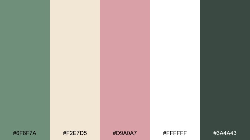
HEX: #6f8f7a #f2e7d5 #d9a0a7 #ffffff #3a4a43
Mood: soft, romantic, airy
Best for: invitation suite design
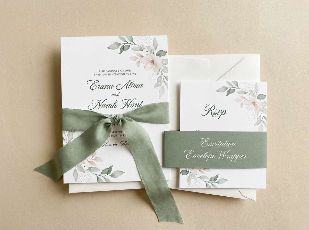
Soft and romantic with a fresh garden feel, these tones look like sage leaves against warm champagne silk and a blush bloom. The mix stays light on the eyes while still feeling special for formal stationery. Pair it with subtle gold foil details and off-white paper textures for depth. Tip: use the deep green only for headings or monograms to keep the overall look delicate.
Image example of sage champagne blush generated using media.io
Media.io is an online AI studio for creating and editing video, image, and audio in your browser.

2) Dusty Rose Mauve Taupe
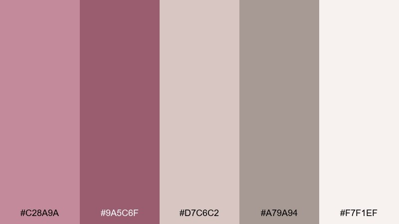
HEX: #c28a9a #9a5c6f #d7c6c2 #a79a94 #f7f1ef
Mood: vintage, tender, understated
Best for: bridesmaid dress and accessory styling
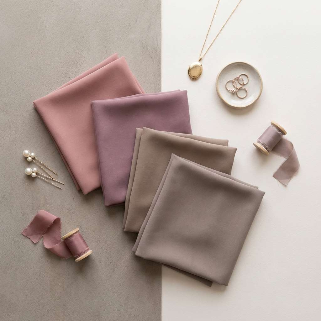
Vintage and tender, these hues feel like faded petals, rosy lipstick, and soft linen. The mauve adds grown-up depth while taupe keeps everything grounded and wearable. It works especially well with matte fabrics, pearl jewelry, and dried florals. Tip: keep bouquets muted and let one deeper mauve accessory become the focal accent.
Image example of dusty rose mauve taupe generated using media.io
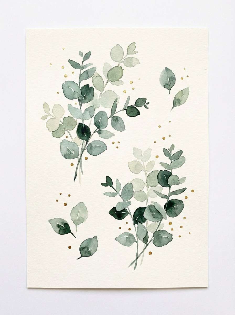
3) Eucalyptus Ivory Gold
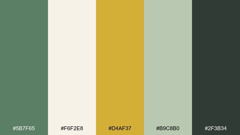
HEX: #5b7f65 #f6f2e8 #d4af37 #b9c8b0 #2f3b34
Mood: classic, botanical, refined
Best for: botanical watercolor illustration set
Classic and botanical, this set evokes eucalyptus branches on ivory paper with a clean hint of antique gold. The greens read natural without turning too rustic, making them versatile for both modern and traditional aesthetics. Pair it with thin line art, embossing, or wax seals for a timeless finish. Tip: reserve gold for tiny rules and icons so it feels intentional, not loud.
Image example of eucalyptus ivory gold generated using media.io
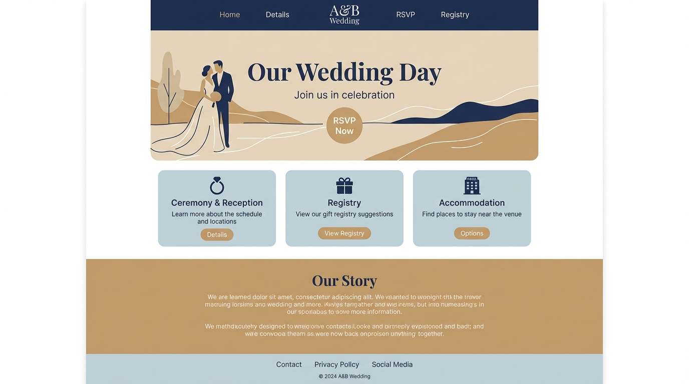
4) Coastal Navy Sand
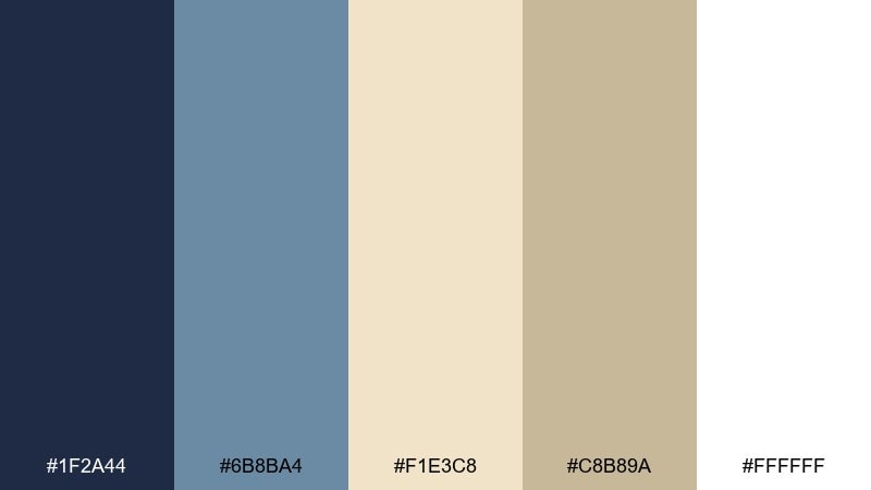
HEX: #1f2a44 #6b8ba4 #f1e3c8 #c8b89a #ffffff
Mood: breezy, modern, seaside
Best for: wedding website UI landing page
Breezy and modern, these tones feel like deep ocean water, misty sky, and sun-warmed sand. As a wedding color palette, it reads crisp and elevated without leaning overly nautical. Combine it with clean sans-serif type, plenty of white space, and a sand-toned background for calm contrast. Tip: use navy for primary buttons and keep the lighter blue for subtle hover states or dividers.
Image example of coastal navy sand generated using media.io
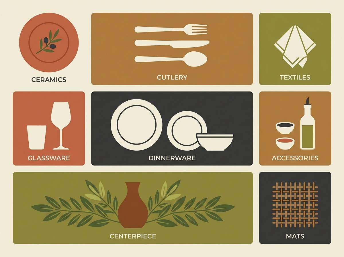
5) Terracotta Olive Cream
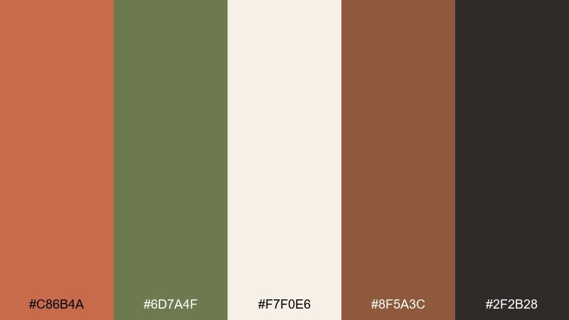
HEX: #c86b4a #6d7a4f #f7f0e6 #8f5a3c #2f2b28
Mood: earthy, warm, rustic-chic
Best for: reception table setting moodboard
Earthy and warm, this mix brings to mind clay pottery, olive branches, and creamy candles at dusk. The terracotta tones add instant coziness while olive keeps it natural and grounded. It pairs beautifully with wood tables, linen runners, and vintage brass. Tip: repeat the cream shade across menus and place cards to keep the setting looking bright, not heavy.
Image example of terracotta olive cream generated using media.io
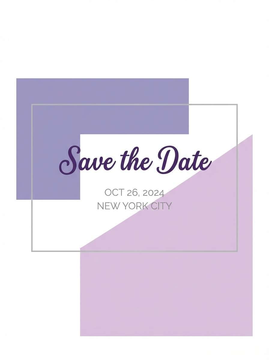
6) Lavender Lilac Silver
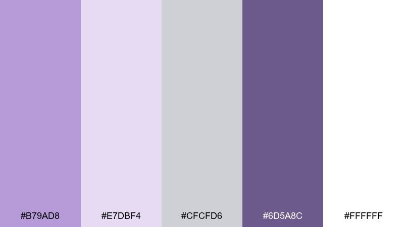
HEX: #b79ad8 #e7dbf4 #cfcfd6 #6d5a8c #ffffff
Mood: dreamy, light, elegant
Best for: save-the-date card design
Dreamy and light, these purples feel like twilight flowers with a soft silver shimmer. The pale lilac keeps the look airy, while the deeper violet gives you legible contrast for type. Pair it with delicate script fonts and fine-line frames for a graceful finish. Tip: avoid heavy gradients and let the silver tone act as your subtle shadow color.
Image example of lavender lilac silver generated using media.io
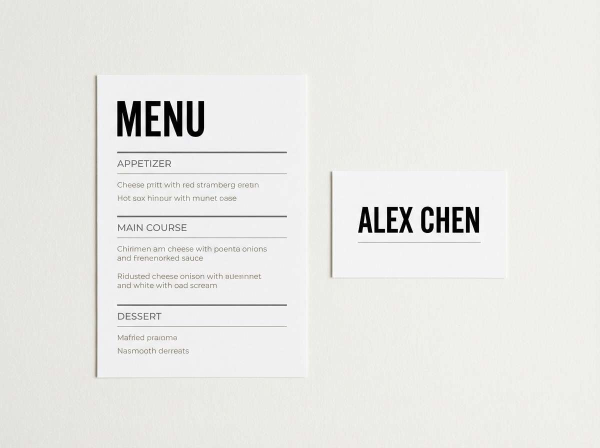
7) Black Tie Pearl
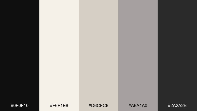
HEX: #0f0f10 #f6f1e8 #d6cfc6 #a6a1a0 #2a2a2b
Mood: formal, timeless, high-contrast
Best for: menu and place card typography system
Formal and timeless, this palette looks like black tuxedo fabric against pearl paper and soft stone shadows. The neutrals keep it luxurious without relying on bright accents. It shines with letterpress, thick stock, and crisp spacing in the layout. Tip: use warm pearl instead of pure white to make the black feel richer and less harsh.
Image example of black tie pearl generated using media.io
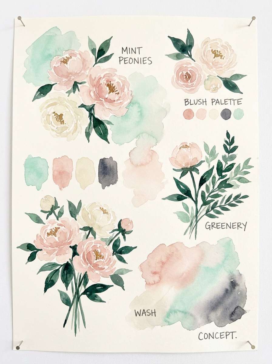
8) Garden Mint Peony
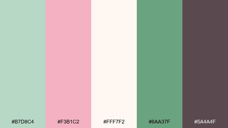
HEX: #b7d8c4 #f3b1c2 #fff7f2 #6aa37f #5a4a4f
Mood: fresh, playful, springlike
Best for: floral arrangement concept board
Fresh and springlike, these tones feel like mint leaves, peonies, and airy cream petals in morning light. The deeper green keeps the pink from becoming too sweet, while the soft charcoal adds sophistication. Pair it with natural greenery, ribbon in blush, and creamy ceramics for centerpieces. Tip: echo mint in small touchpoints like napkins or signage borders to unify the look.
Image example of garden mint peony generated using media.io
9) Sunset Coral Peach
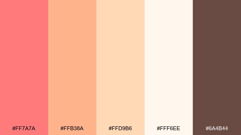
HEX: #ff7a7a #ffb38a #ffd9b6 #fff6ee #6a4b44
Mood: joyful, glowing, summery
Best for: social media announcement post
Joyful and glowing, this mix reads like a sunset gradient over soft peach skin tones and warm sand. It makes wedding color combinations feel bright and friendly without turning neon. Pair it with rounded typography, plenty of breathing room, and a cocoa-brown headline for contrast. Tip: keep coral as the hero and use peach and cream as background layers to avoid visual noise.
Image example of sunset coral peach generated using media.io

10) Winter Pine Cranberry
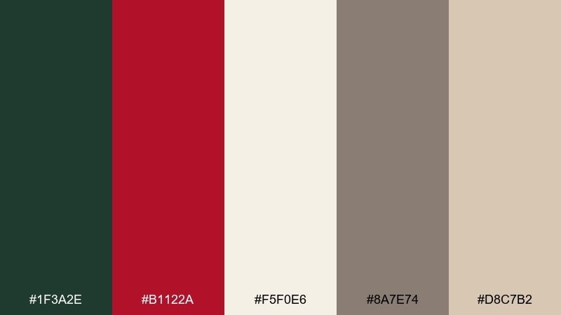
HEX: #1f3a2e #b1122a #f5f0e6 #8a7e74 #d8c7b2
Mood: cozy, festive, dramatic
Best for: holiday-season ceremony signage
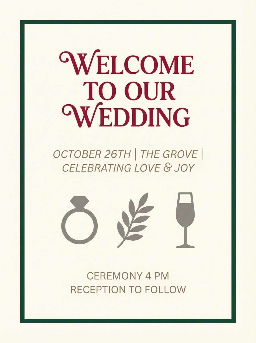
Cozy and dramatic, these colors evoke pine needles, cranberry velvet, and warm candlelit neutrals. The deep green gives structure, while cranberry brings a celebratory punch that photographs beautifully. Pair it with kraft textures, matte cardstock, and warm lighting for a winter-ready feel. Tip: use cranberry sparingly on key words and icons so it reads luxe rather than loud.
Image example of winter pine cranberry generated using media.io
11) Ocean Mist Slate
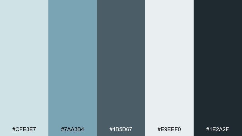
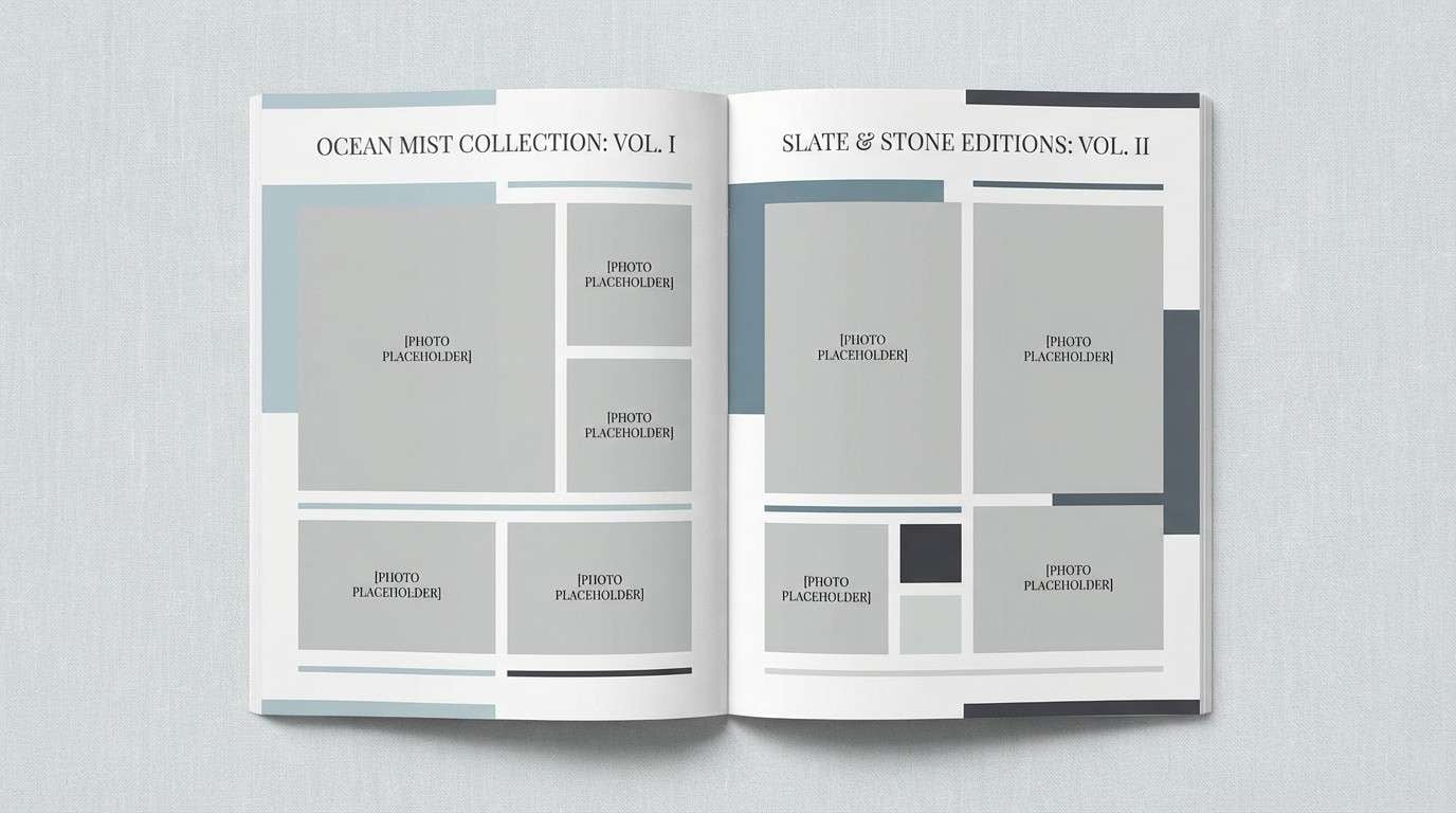
HEX: #cfe3e7 #7aa3b4 #4b5d67 #e9eef0 #1e2a2f
Mood: calm, clean, contemporary
Best for: editorial lookbook layout
Calm and contemporary, these blues and slates feel like sea fog rolling over cool stone. The palette reads clean and editorial, perfect for layouts that need quiet sophistication. Pair it with lots of negative space, thin rules, and grayscale photography for a modern lookbook feel. Tip: use the darkest slate for captions and small type to keep body text crisp.
Image example of ocean mist slate generated using media.io
12) Modern Greige Blush
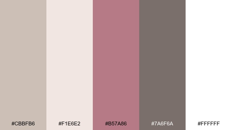
HEX: #cbbfb6 #f1e6e2 #b57a86 #7a6f6a #ffffff
Mood: minimal, warm, modern-romantic
Best for: brand identity kit for planners
Minimal and warm, these tones resemble soft stone, blush suede, and clean studio light. As a wedding color palette, it fits modern branding that wants romance without frills. Pair it with sleek logo marks, muted photography, and a single blush accent for calls to action. Tip: keep greige as the main background and use blush only on highlights to maintain that premium calm.
Image example of modern greige blush generated using media.io
13) Citrus Marigold Teal
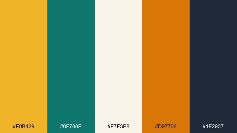
HEX: #f0b429 #0f766e #f7f3e8 #d97706 #1f2937
Mood: bold, upbeat, modern
Best for: reception bar menu poster
Bold and upbeat, this pairing feels like marigold blooms with a cool teal counterpoint and creamy paper. The contrast is punchy but still polished, especially with dark charcoal typography. It works great for statement signage, bar menus, and playful illustrated icons. Tip: keep teal as a supporting block color and let marigold own the spotlight for instant readability.
Image example of citrus marigold teal generated using media.io
14) Vintage Lace Sepia
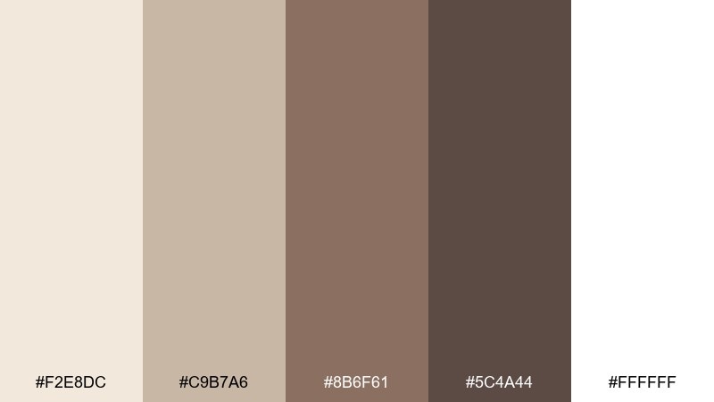
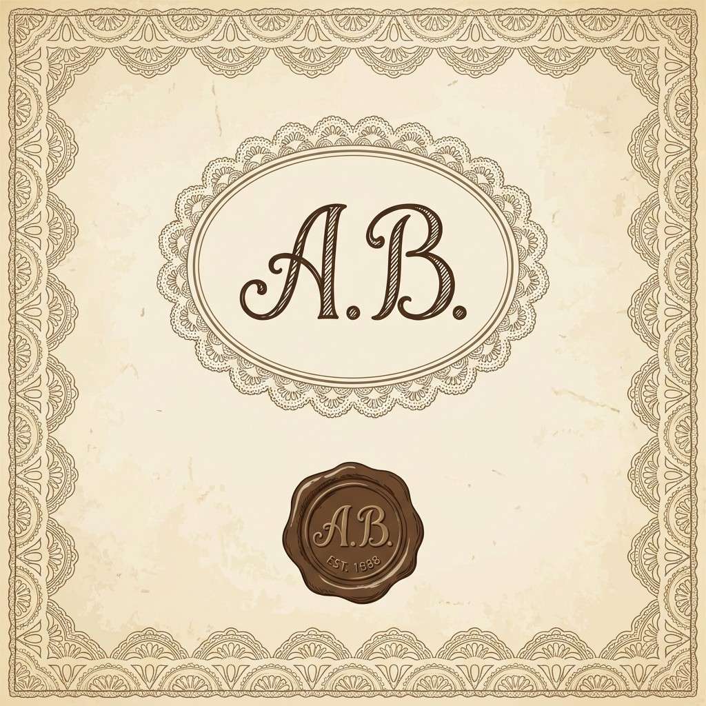
HEX: #f2e8dc #c9b7a6 #8b6f61 #5c4a44 #ffffff
Mood: nostalgic, warm, heritage
Best for: monogram and wax seal design
Nostalgic and warm, these shades look like antique lace, sepia ink, and sunlit parchment. The mid browns add heritage charm while the creamy white keeps it breathable. Pair it with ornate monograms, serif typography, and textured paper stocks for a classic look. Tip: use the darkest brown for seal outlines and keep the rest of the artwork in softer sepia to avoid heaviness.
Image example of vintage lace sepia generated using media.io
15) Boho Clay Denim
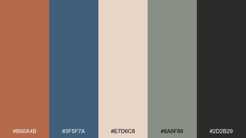
HEX: #b66a4b #3f5f7a #e7d6c8 #8a8f86 #2d2b29
Mood: bohemian, relaxed, outdoorsy
Best for: engagement party flyer
Bohemian and relaxed, this mix feels like sunbaked clay, worn denim, and soft canvas. The denim blue brings a cool balance that keeps the clay from looking too autumn-only. Pair it with hand-drawn illustrations, kraft textures, and casual typography for an easygoing vibe. Tip: use canvas beige as the main background so the denim and clay pops stay clean and readable.
Image example of boho clay denim generated using media.io
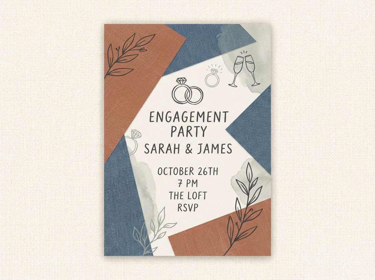
16) Tropical Orchid Palm
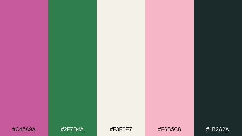
HEX: #c45a9a #2f7d4a #f3f0e7 #f6b5c8 #1b2a2a
Mood: tropical, vibrant, confident
Best for: destination weekend itinerary card
Tropical and confident, these colors suggest orchids, palm fronds, and creamy resort walls. The pinks feel lively but still romantic when balanced with deep green and inky charcoal. Pair it with bold sans-serif headings and simple palm illustrations to keep it modern. Tip: let cream handle most of the background so the orchid pink reads like a fresh accent instead of a flood of color.
Image example of tropical orchid palm generated using media.io
17) Minimal White Sage Charcoal
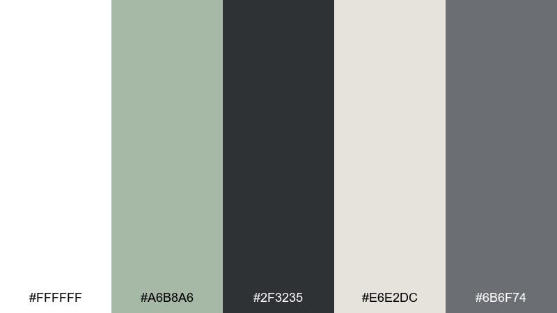
HEX: #ffffff #a6b8a6 #2f3235 #e6e2dc #6b6f74
Mood: clean, minimalist, calming
Best for: registry landing page UI
Clean and calming, these neutrals look like bright white space softened by sage and modern charcoal type. The result feels organized, breathable, and easy to navigate. Pair it with simple icons, thin dividers, and warm off-white panels for gentle hierarchy. Tip: use sage as a success state or subtle highlight color so the interface stays primarily neutral.
Image example of minimal white sage charcoal generated using media.io
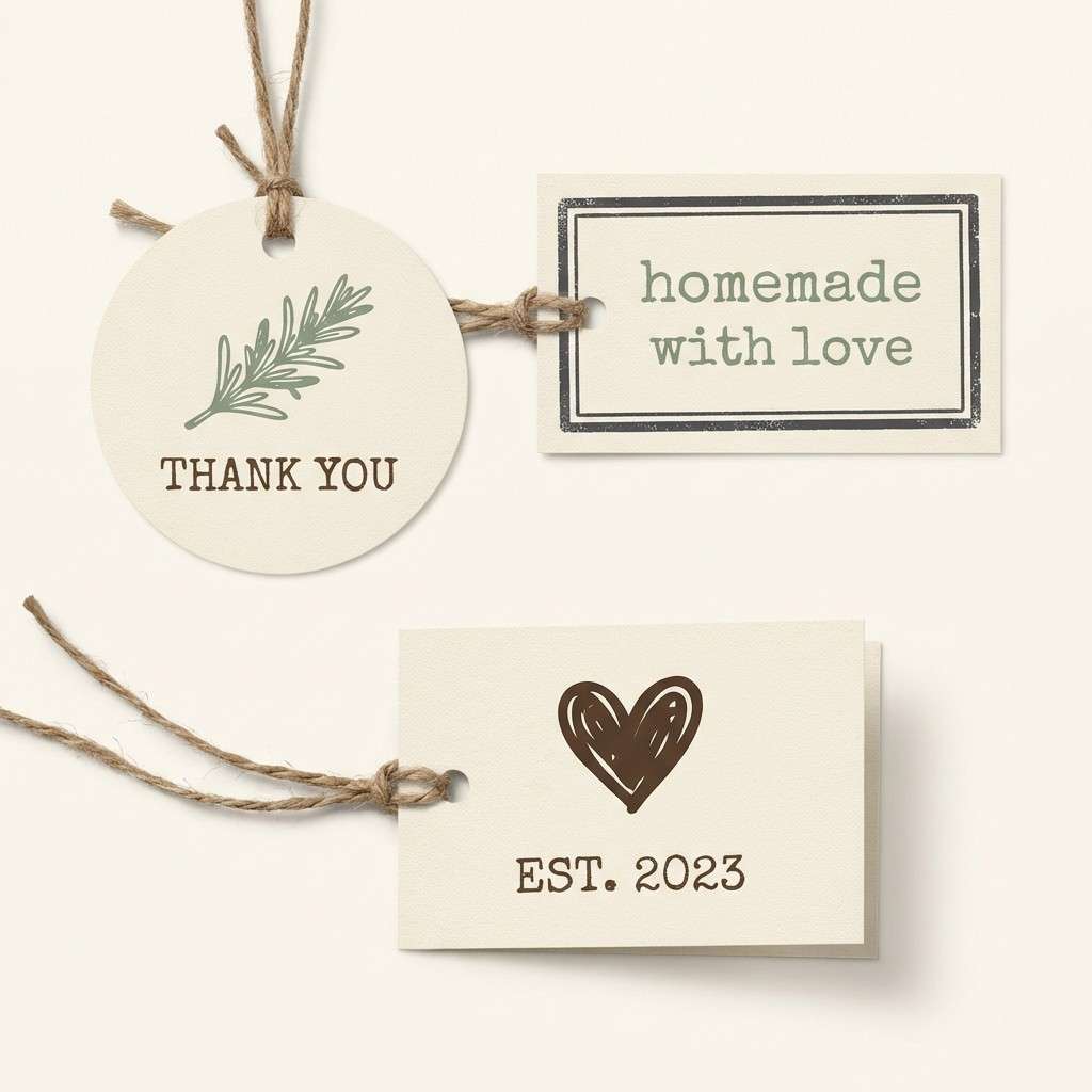
18) Rustic Burlap Sage
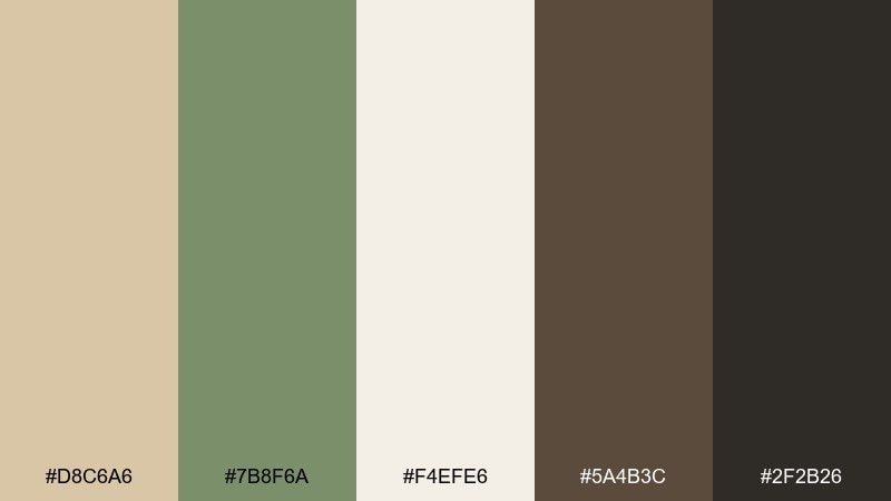
HEX: #d8c6a6 #7b8f6a #f4efe6 #5a4b3c #2f2b26
Mood: rustic, natural, cozy
Best for: favor tag and label set
Rustic and cozy, these tones feel like burlap, sage sprigs, and warm cream cardstock. The browns provide an earthy backbone, while the sage keeps the look fresh and organic. It pairs well with twine, kraft paper, and simple stamp-style illustrations. Tip: print tags on cream stock and use the darkest brown for text to stay readable under warm lighting.
Image example of rustic burlap sage generated using media.io
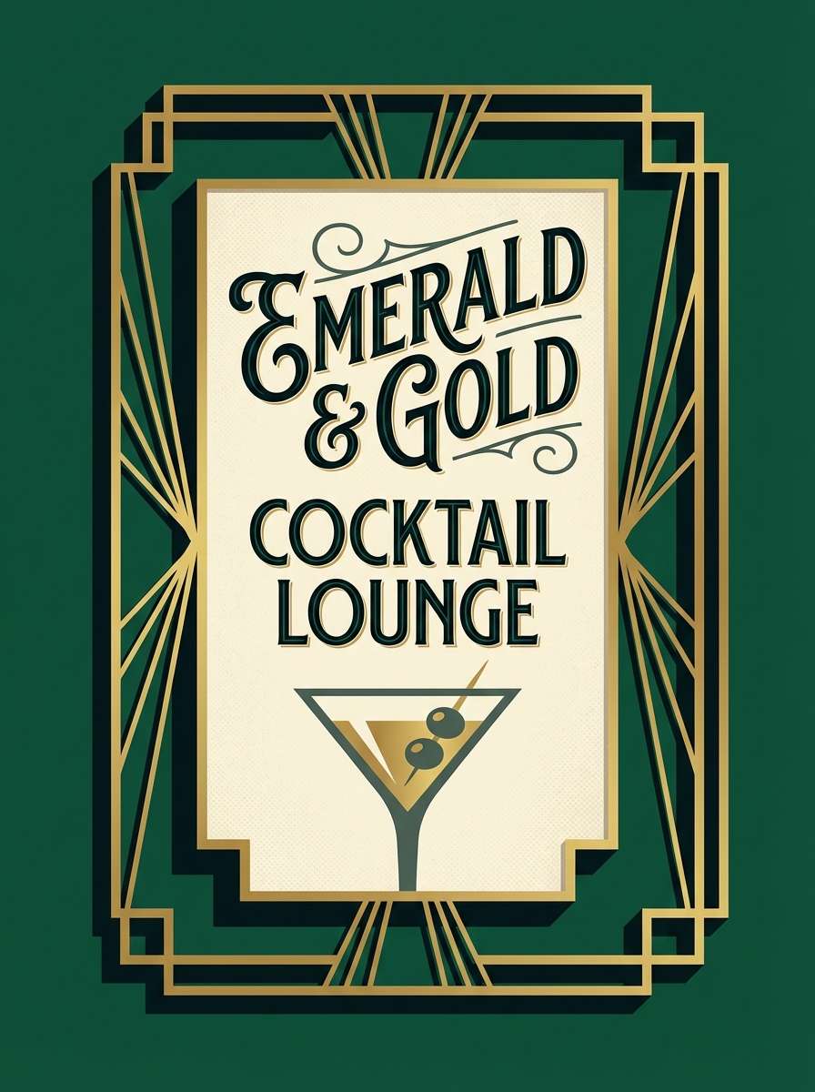
19) Art Deco Emerald Gold
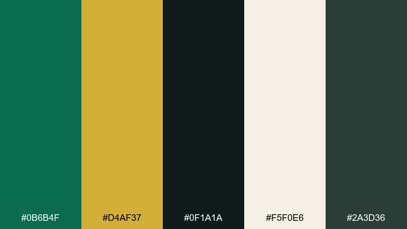
HEX: #0b6b4f #d4af37 #0f1a1a #f5f0e6 #2a3d36
Mood: glamorous, bold, vintage-luxe
Best for: cocktail bar sign and monogram
Glamorous and bold, these shades echo emerald velvet, brushed gold, and dark cocktail lounges. The contrast makes wedding color combinations feel instantly luxe, especially with geometric Art Deco lines. Pair it with blackened green backgrounds, gold accent rules, and cream text blocks for balance. Tip: keep gold as thin strokes and small icons so it looks like foil, not flat yellow.
Image example of art deco emerald gold generated using media.io
20) Celestial Midnight Lavender
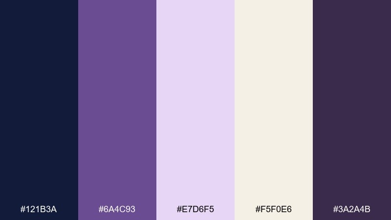
HEX: #121b3a #6a4c93 #e7d6f5 #f5f0e6 #3a2a4b
Mood: mystical, romantic, night-sky
Best for: night ceremony program cover
Mystical and romantic, this palette feels like a midnight sky with soft lavender haze and candlelit paper. The deep blues and purples create drama while the pale lavender keeps it dreamy, not heavy. Pair it with star motifs, thin gold-free line art, and creamy stock for a modern celestial look. Tip: use the darkest blue for large areas and keep lavender to highlights so the design stays legible.
Image example of celestial midnight lavender generated using media.io

What Colors Go Well with Wedding?
Wedding colors pair best when you balance a calm base (white, ivory, greige, warm gray) with one to two statement accents (blush, cranberry, marigold, orchid) and a grounding dark (navy, charcoal, deep green). This keeps your designs readable and your decor cohesive.
Greens and blues are especially versatile for modern wedding tones because they complement florals, greenery, and most venue materials. Warm neutrals (champagne, cream, taupe) soften everything and look flattering in photography.
For a more elevated feel, keep brights minimal and use metallic-like tones (gold, silver, pearl) sparingly—think rules, icons, or small highlights rather than large blocks.
How to Use a Wedding Color Palette in Real Designs
Start by assigning roles to each color: background, body text, headings, accent, and “hero” color. This prevents overuse of the bold shades and makes invitations, menus, and signage feel consistent.
Repeat your neutrals across multiple items (paper stock, table linens, website sections) and use one accent color for key moments like monograms, RSVP buttons, or bouquet ribbon. Small repetition is what makes a wedding palette feel intentional.
Before printing, test contrast: dark text on light paper is safest, and muted mid-tones work best as backgrounds rather than small type. If you’re unsure, keep the darkest shade for typography only.
Create Wedding Palette Visuals with AI
If you want your palette to look consistent across invites, social posts, moodboards, and signage, generating a few concept visuals is a fast way to validate the vibe. You can iterate on typography style, layout, and floral motifs without committing to print.
Use the prompts under each palette as a starting point, then swap the format (save-the-date, menu, website hero, bar sign) while keeping the same five colors. This helps you build a cohesive set that still feels varied.
With Media.io’s text-to-image tool, you can quickly create matching wedding design mockups and share them with your planner, florist, or stationer for alignment.
Wedding Color Palette FAQs
-
How do I choose a wedding color palette that won’t clash in photos?
Pick one light neutral (ivory/cream/soft white), one dark anchor (navy/charcoal/deep green), and one accent. This creates reliable contrast and keeps skin tones and florals looking natural in different lighting. -
How many colors should a wedding palette have?
Five is a sweet spot: 1–2 neutrals, 1 main color, 1 accent, and 1 dark for text/contrast. It’s enough variety for stationery and decor without feeling busy. -
What are the most timeless wedding colors?
Ivory, pearl, champagne, deep green, navy, and warm grays tend to stay timeless. Add a small seasonal accent (blush, cranberry, marigold) for personality. -
Can I mix warm and cool tones in a wedding scheme?
Yes—just keep one temperature dominant. For example, pair warm champagne and blush with a cool sage, then use a deep neutral to tie everything together. -
How do I apply the palette to invitations and signage?
Use the lightest shade as paper/background, the darkest shade for all body text, and reserve the accent for highlights like names, monograms, borders, or icons. This keeps everything readable and consistent. -
What wedding colors work best for modern minimalist styles?
Greige, warm white, sage, and charcoal are ideal for minimalist weddings. Keep accents subtle and use clean typography with generous spacing. -
How can I preview my wedding palette before printing?
Create quick mockups (save-the-date, menu, place card, website header) using the same HEX codes. Generating a few AI visuals helps confirm contrast, mood, and consistency before you order anything.


