

A green blue gray color palette is a modern classic: it’s calm like coastal air, structured like stone, and clean enough for digital interfaces. It also plays nicely with warm accents, so your designs don’t feel cold or flat.
Below are 20 curated green blue gray palettes with HEX codes, plus practical tips for interiors, branding, UI, and print. Each set includes an AI image prompt you can reuse in Media.io to generate matching visuals.
In this article
Why Green Blue Gray Palettes Work So Well
Green, blue, and gray sit in a naturally calming zone of the spectrum, which is why they’re a go-to for spaces and screens that should feel composed. You get the freshness of green, the trust of blue, and the restraint of gray—without needing loud saturation.
These palettes are also flexible because they create built-in hierarchy: deeper teals and navies anchor layouts, mid grays handle structure, and pale grays or off-whites keep everything breathable. That makes them ideal for UI, brand systems, and interiors alike.
Finally, green blue gray combinations pair beautifully with warmth—wood, brass, sand, terracotta—so you can tune the mood from coastal airy to premium moody while staying cohesive.
20+ Green Blue Gray Color Palette Ideas (with HEX Codes)
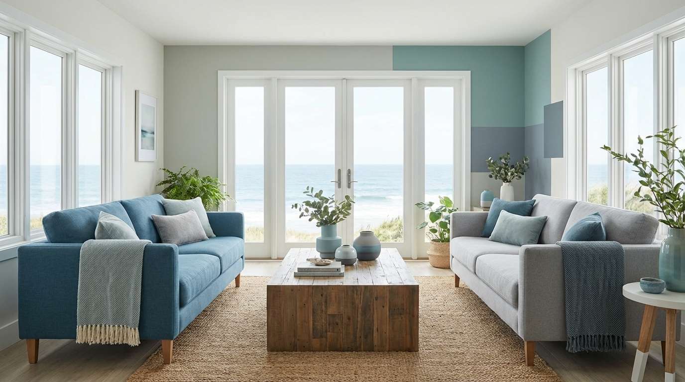
1) Harbor Mist
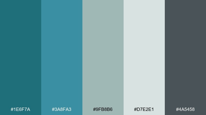
HEX: #1E6F7A #3A8FA3 #9FB8B6 #D7E2E1 #4A5458
Mood: calm, coastal, airy
Best for: coastal living room and paint styling
Calm and coastal, these tones feel like sea air rolling over a quiet marina. Use the deeper teal and slate as anchors on feature walls, sofas, or cabinetry, then lift the space with the pale misty neutral. Brass, light oak, and woven textures pair naturally with the softened blue-greens. Tip: keep the darkest shade to small accents so the room stays bright.
Image example of harbor mist generated using media.io
Media.io is an online AI studio for creating and editing video, image, and audio in your browser.

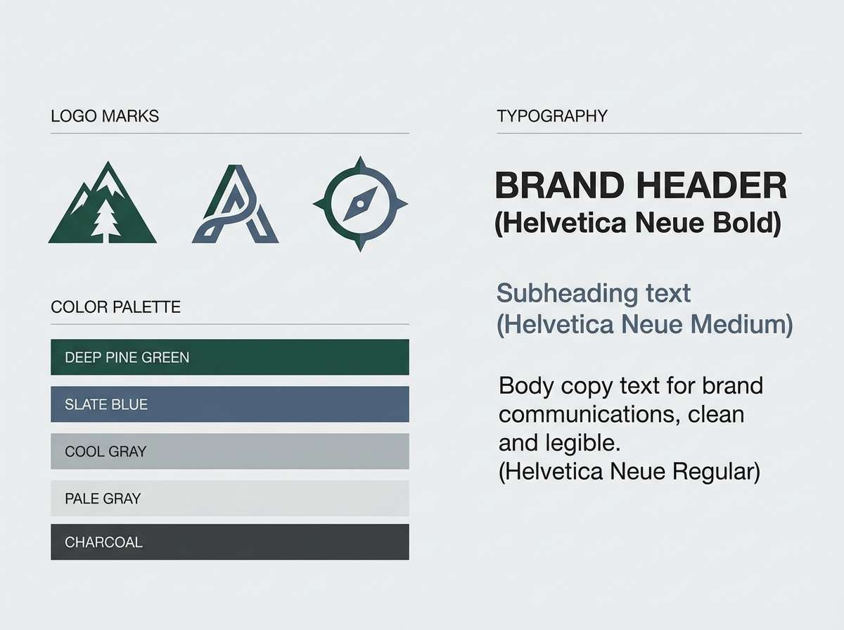
2) Alpine Slate
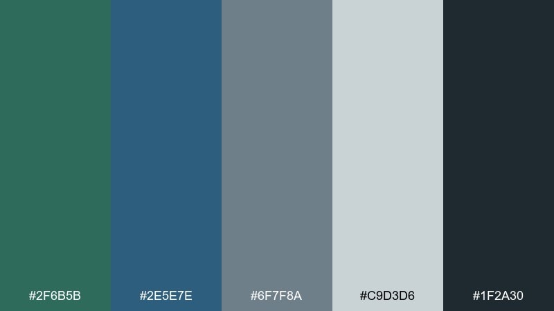
HEX: #2F6B5B #2E5E7E #6F7F8A #C9D3D6 #1F2A30
Mood: crisp, modern, grounded
Best for: outdoor brand identity and logo design
Crisp and grounded, it brings to mind alpine lakes against dark rock. The blue and green work best as primary brand colors, while the pale gray keeps layouts breathable. Pair with monochrome photography and a clean sans serif to maintain the modern feel. Tip: reserve the near-black for type and icons to sharpen contrast.
Image example of alpine slate generated using media.io
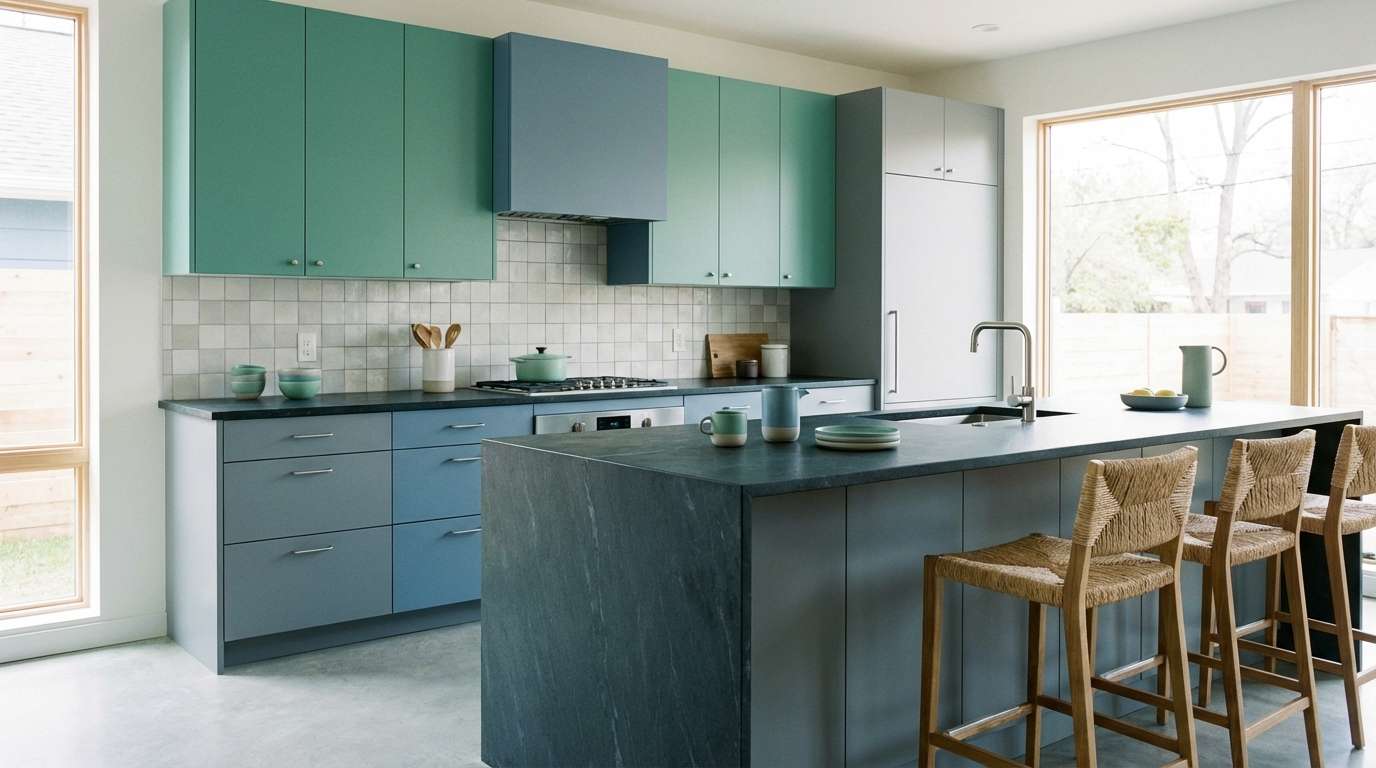
3) Seaglass Concrete
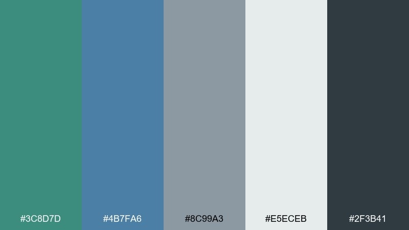
HEX: #3C8D7D #4B7FA6 #8C99A3 #E5ECEB #2F3B41
Mood: fresh, urban, balanced
Best for: modern kitchen cabinets and backsplash
Fresh yet urban, it feels like seaglass resting on wet concrete after rain. This green blue gray color palette works beautifully on lower cabinets or an island, with the pale tone on walls to keep the kitchen open. Add matte nickel hardware and white quartz to keep everything crisp. Tip: echo the slate tone in grout or bar stools for a pulled-together finish.
Image example of seaglass concrete generated using media.io
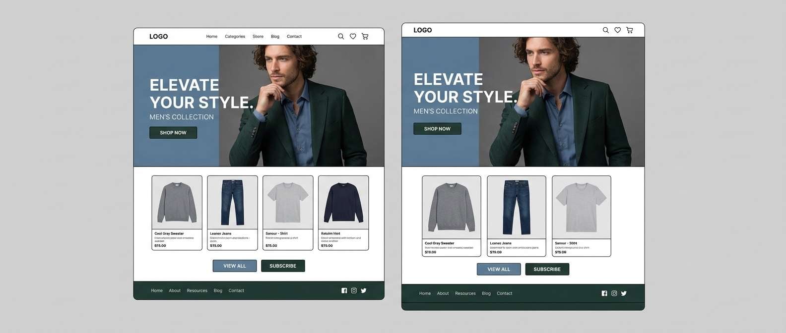
4) Urban Spruce
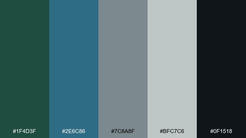
HEX: #1F4D3F #2E6C86 #7C8A8F #BFC7C6 #0F1518
Mood: moody, architectural, confident
Best for: menswear ecommerce landing page UI
Moody and architectural, these tones feel like evergreen shadows between city buildings. Use the deep spruce and inky near-black to frame hero sections, then bring in the steel blue for buttons and highlights. Keep product photos neutral and let typography do the heavy lifting. Tip: add generous spacing so the dark base still reads premium, not heavy.
Image example of urban spruce generated using media.io
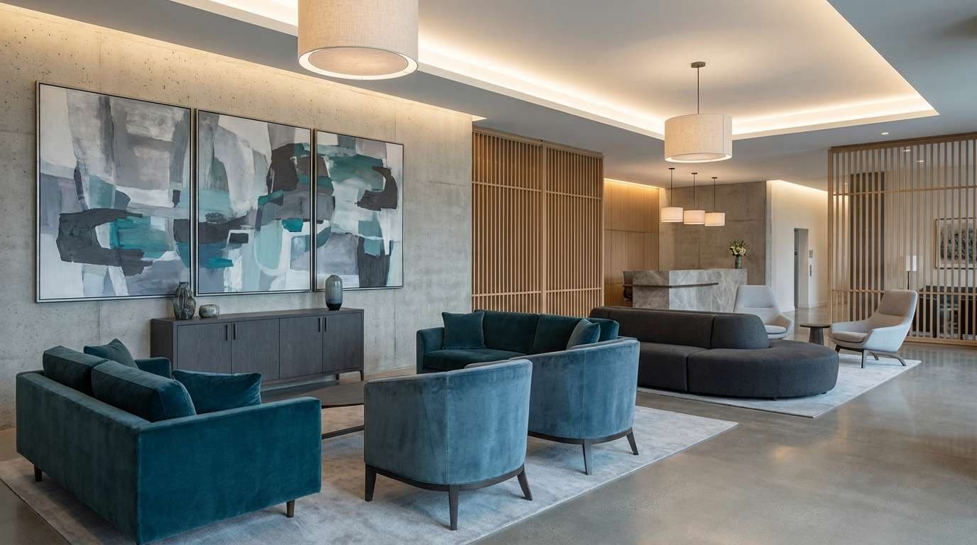
5) Stormy Lagoon
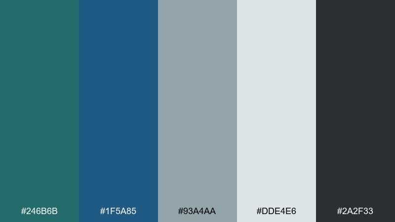
HEX: #246B6B #1F5A85 #93A4AA #DDE4E6 #2A2F33
Mood: stormy, sophisticated, calm
Best for: hotel lobby interior accents
Stormy and sophisticated, it evokes a lagoon under overcast skies. The richer teal and blue shine on velvet seating or art pieces, while the light gray-blue keeps the lobby feeling airy. Pair with warm walnut and soft, diffused lighting to avoid a chilly look. Tip: repeat the dark charcoal in signage and trim for a polished hotel vibe.
Image example of stormy lagoon generated using media.io
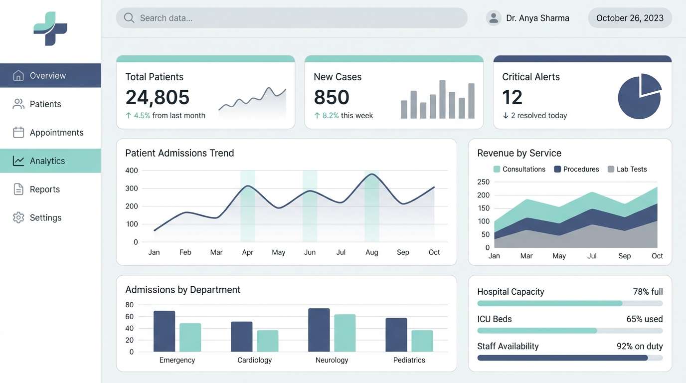
6) Quiet Lab
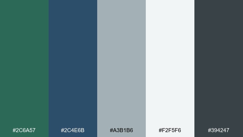
HEX: #2C6A57 #2C4E6B #A3B1B6 #F2F5F6 #394247
Mood: clean, clinical, reassuring
Best for: healthcare dashboard UI and data cards
Clean and reassuring, it feels like a quiet lab with frosted glass and tidy instruments. For a green blue gray color scheme in UI, keep the near-white as the main canvas and use the teal for success states or key metrics. The muted blue works well for navigation and secondary actions without shouting. Tip: use the mid gray for borders and dividers so charts stay readable.
Image example of quiet lab generated using media.io
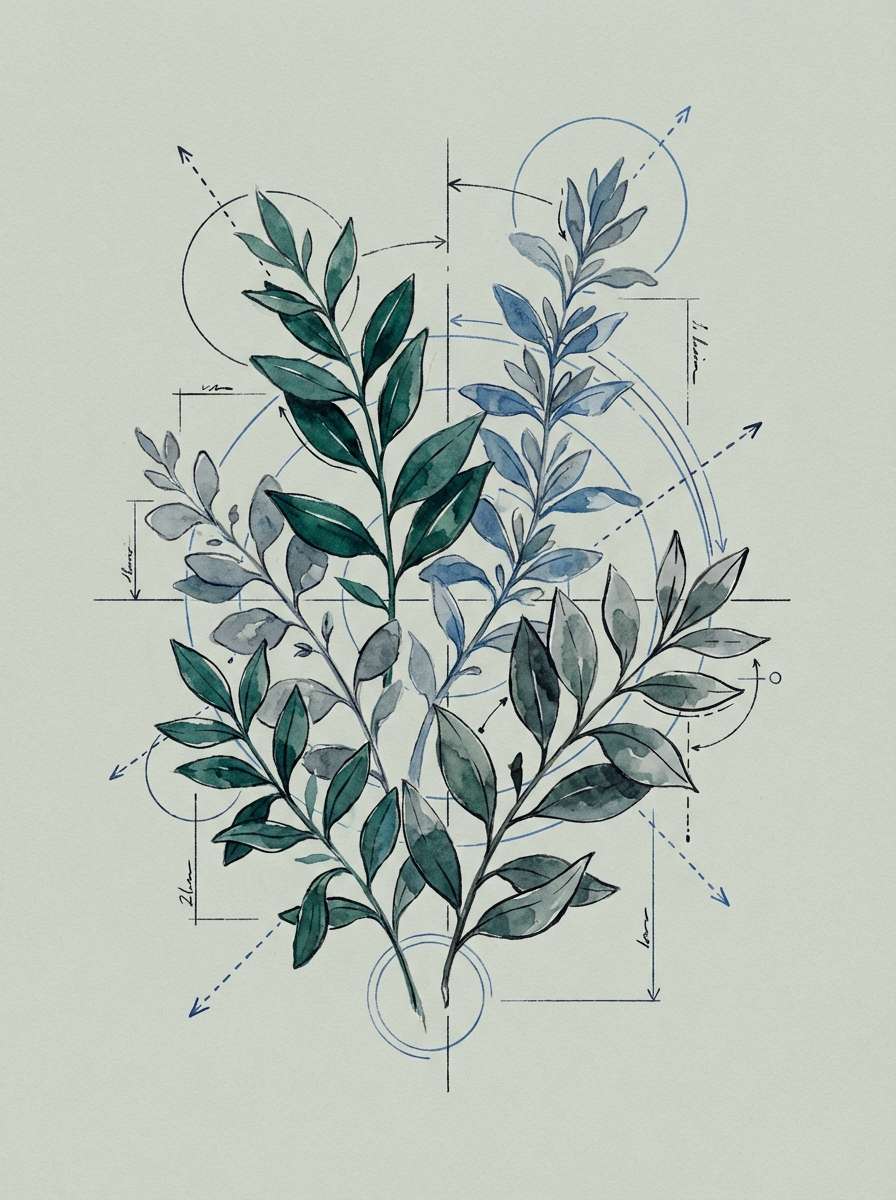
7) Botanical Blueprint
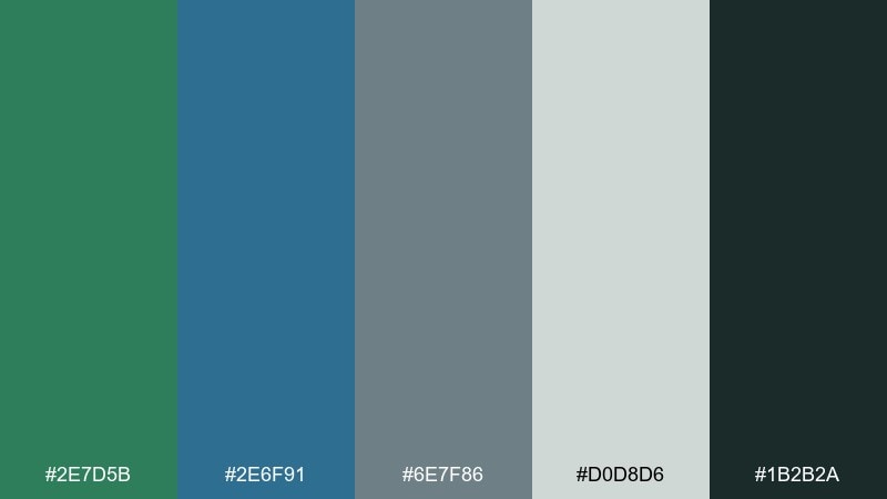
HEX: #2E7D5B #2E6F91 #6E7F86 #D0D8D6 #1B2B2A
Mood: botanical, thoughtful, creative
Best for: watercolor botanical poster illustration
Botanical and thoughtful, it suggests pressed leaves laid over a clean blueprint grid. Let the teal-green lead in foliage, then use the blue for subtle shadows and line details. A cool gray-blue background keeps the illustration modern rather than vintage. Tip: limit the darkest shade to fine outlines so the watercolor stays soft.
Image example of botanical blueprint generated using media.io
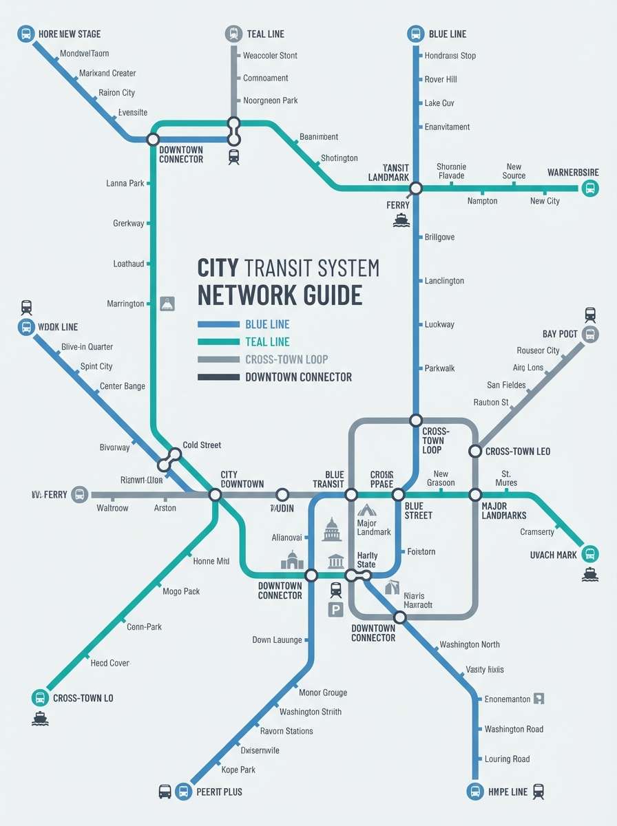
8) Coastal Transit

HEX: #357A74 #3B6F9B #7E8C93 #E9EEEF #283238
Mood: fresh, organized, dependable
Best for: public transit wayfinding poster design
Fresh and dependable, it feels like coastal commuter lines mapped with precision. Use the blue for route highlights and the teal for category labels, keeping the light gray as the main poster background. The darker slate keeps text crisp from a distance. Tip: stick to two accent colors per poster to avoid visual clutter in complex maps.
Image example of coastal transit generated using media.io
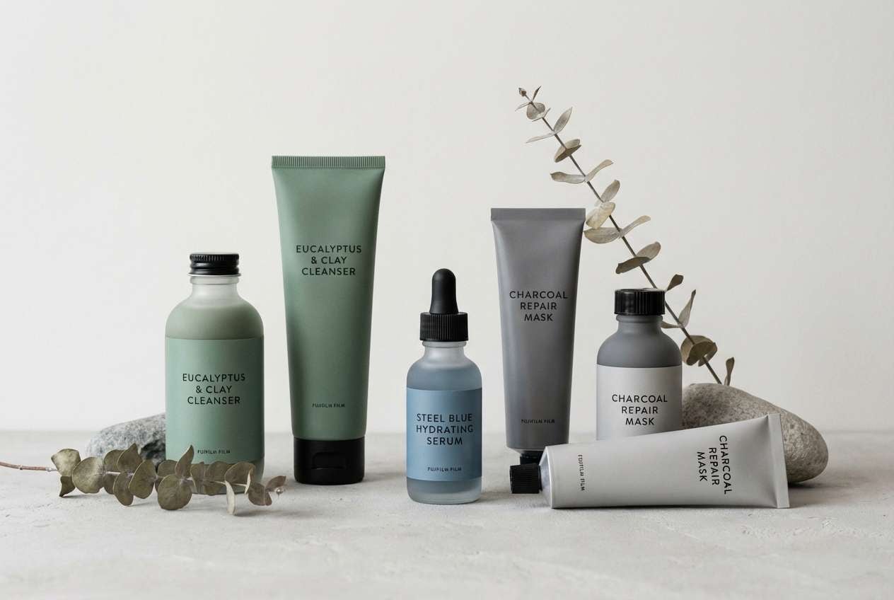
9) Eucalyptus Steel
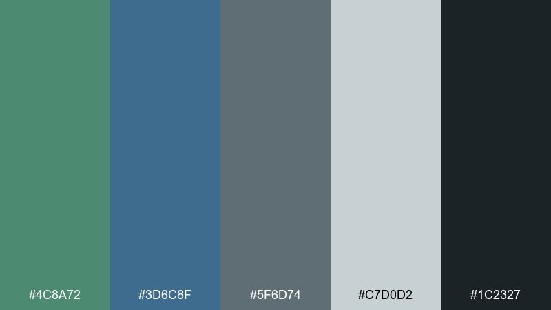
HEX: #4C8A72 #3D6C8F #5F6D74 #C7D0D2 #1C2327
Mood: earthy, modern, composed
Best for: skincare product packaging and label set
Earthy and composed, these shades feel like eucalyptus leaves against brushed metal. Green blue gray color combinations like this work well for premium skincare when you keep layouts minimal and let the materials shine. Pair with uncoated paper, subtle embossing, and a warm-white background for a softer luxury. Tip: use the steel gray for ingredient blocks to keep labels readable.
Image example of eucalyptus steel generated using media.io
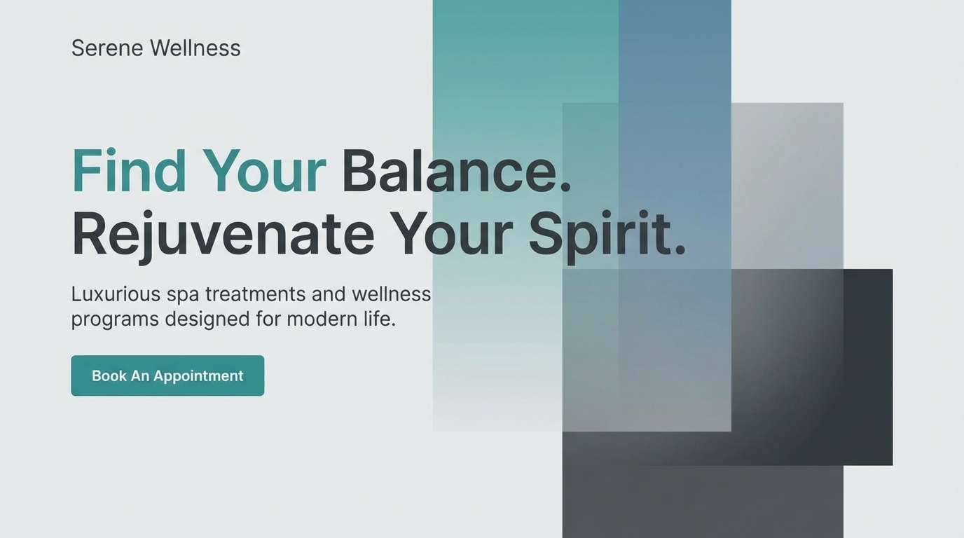
10) Rainy Atrium
HEX: #2B6D63 #3A5F78 #88959C #DCE2E3 #2B3136
Mood: tranquil, reflective, elegant
Best for: spa website hero section
Tranquil and reflective, it brings to mind an atrium window streaked with rain. Use the pale gray as your hero background, then layer the teal and blue in gradients for calm depth. Pair with soft serif headings and plenty of whitespace to keep it serene. Tip: keep contrast accessible by using the darkest shade for text and buttons.
Image example of rainy atrium generated using media.io
11) Glacier Office
HEX: #2E6E6A #2C6288 #B5C2C7 #F7FAFA #4B5660
Mood: cool, focused, professional
Best for: corporate slide deck theme
Cool and focused, it feels like glacier light in a quiet office. Use the blue for section headers and the teal for data highlights, while the near-white keeps slides clean. The mid gray-blue is great for charts, grid lines, and footers. Tip: keep one bold accent per slide so numbers stay the main story.
Image example of glacier office generated using media.io
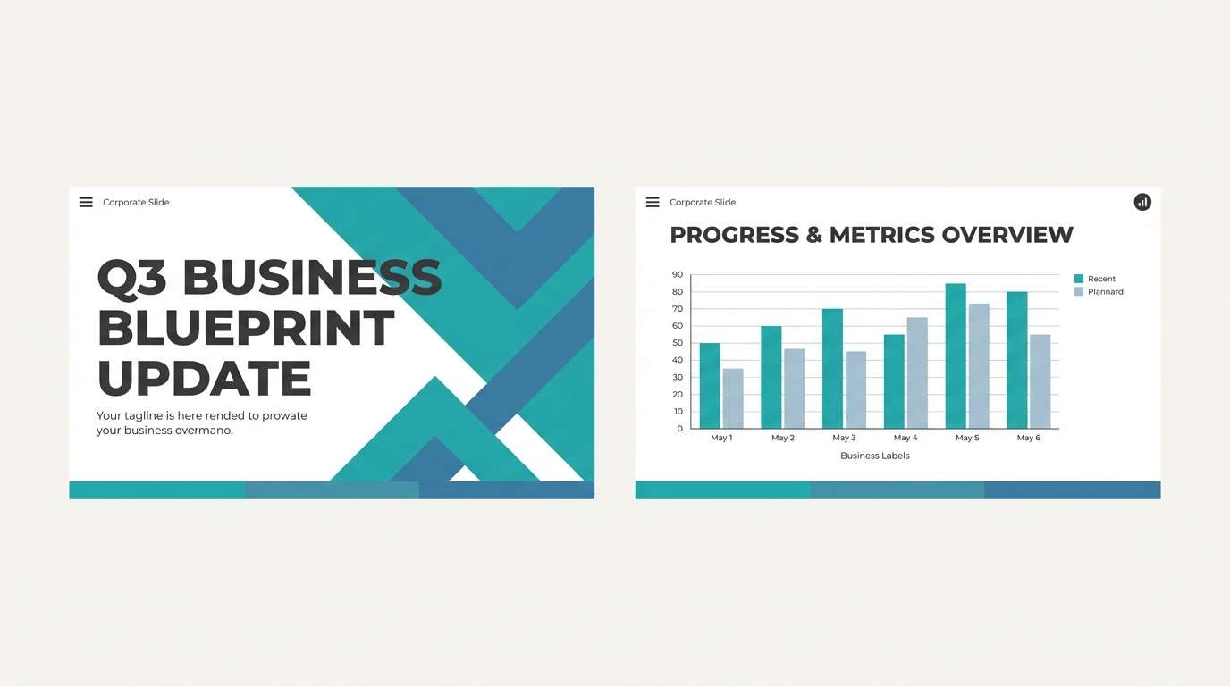
12) Modern Nautilus
HEX: #2D7A6C #2C5F93 #7B8C94 #E2E8EA #20303A
Mood: clean, nautical, modern
Best for: creative agency website and case studies
Clean and nautical, it suggests a nautilus shell sketched in ink with a hint of sea tone. As a green blue gray color palette, it gives agency sites a confident look without feeling loud. Pair it with bold grid layouts, plenty of negative space, and a single warm accent like sand or copper for CTAs. Tip: keep case-study images consistent and let the palette handle the polish.
Image example of modern nautilus generated using media.io
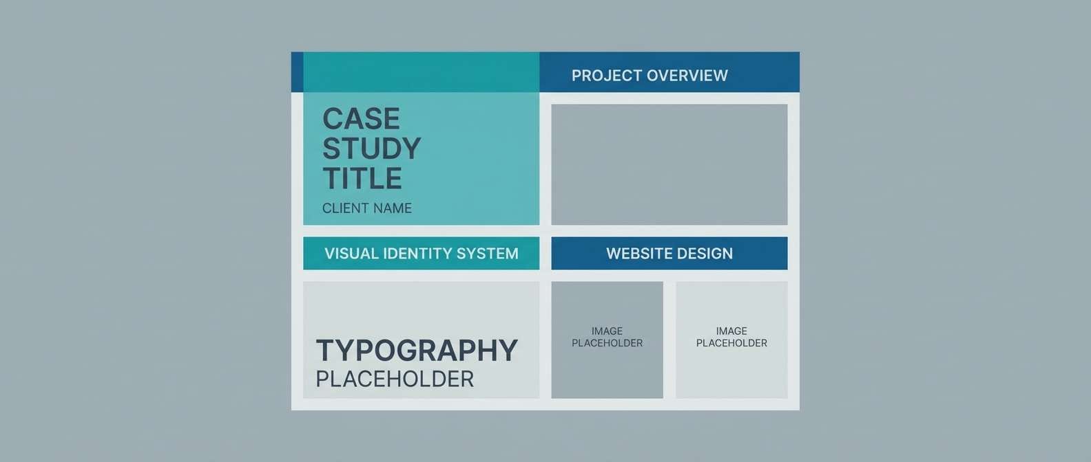
13) Sage Circuit
HEX: #5C8B7D #2F6B87 #A7B0B4 #EDEFF0 #354047
Mood: techy, soft, approachable
Best for: app onboarding screens and icons
Techy but soft, it feels like a calm circuit board drawn in watercolor. Use the sage tone for friendly icon fills and the blue for primary buttons, keeping the light neutral as the screen base. The grays help you build hierarchy without adding more colors. Tip: keep icon strokes consistent and use the darkest gray only for key labels.
Image example of sage circuit generated using media.io
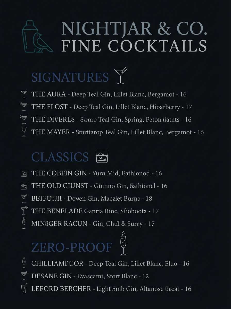
14) Deep Harborline
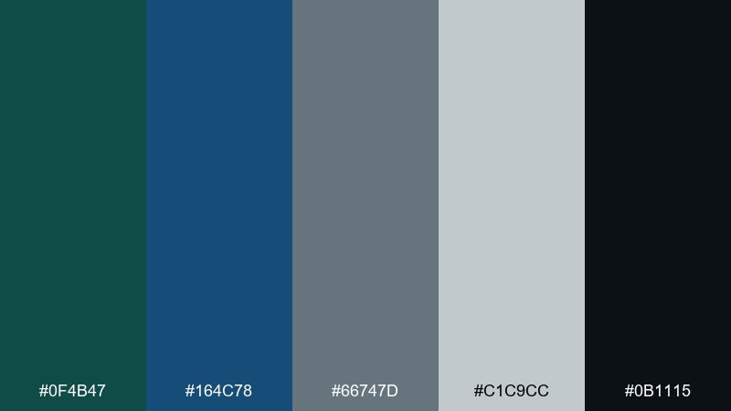
HEX: #0F4B47 #164C78 #66747D #C1C9CC #0B1115
Mood: dramatic, maritime, premium
Best for: cocktail bar menu design
Dramatic and maritime, it evokes a deep harbor at night with polished metal rails. Use the near-black and dark teal as the menu base, then bring in the blue for headings and dividers. Pair with textured paper and minimal line art for a premium feel. Tip: keep body text in the light gray for readability under low lighting.
Image example of deep harborline generated using media.io
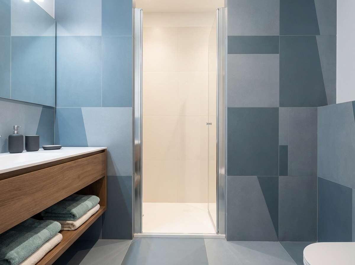
15) Mineral Spa
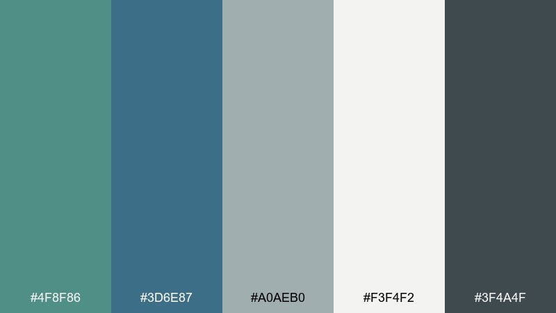
HEX: #4F8F86 #3D6E87 #A0AEB0 #F3F4F2 #3F4A4F
Mood: soothing, clean, restorative
Best for: bathroom tile and towel styling
Soothing and restorative, it feels like mineral water over smooth stone. Let the pale neutral lead on walls, then use the teal and blue in tile patterns or towels for a subtle pop. Matte black fixtures and pale wood keep it contemporary. Tip: repeat the medium gray in grout or accessories to tie the whole bathroom together.
Image example of mineral spa generated using media.io
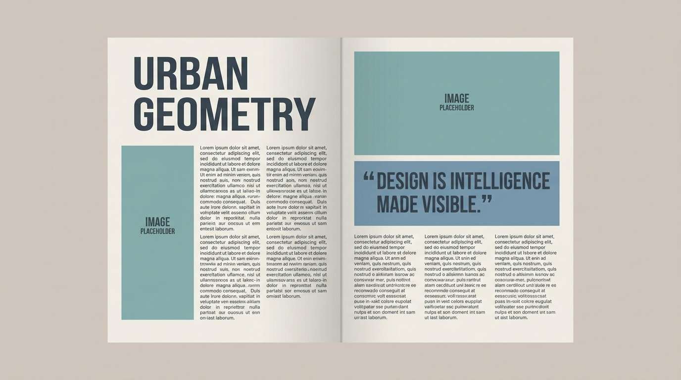
16) Museum Wall
HEX: #3E7C6C #365D7D #97A3A9 #E7E3DB #2A3338
Mood: quiet, curated, timeless
Best for: editorial magazine spread layout
Quiet and curated, it brings to mind a gallery wall with linen paper and cool-toned spotlights. Use the warm light neutral as the page base, then set headlines in slate and accent pull quotes in blue. The teal reads beautifully in small graphic ornaments or section tabs. Tip: keep photo tones cool and desaturated so the palette stays cohesive.
Image example of museum wall generated using media.io
17) Soft Tarmac
HEX: #2E645F #3E5E73 #727E85 #CED5D7 #1A1F22
Mood: industrial, smooth, understated
Best for: automotive service brand brochure
Industrial but smooth, it feels like fresh tarmac after a light drizzle. Use the darker shades for strong headings and section panels, then keep content blocks airy with the pale gray. The blue-gray is a solid choice for diagrams and technical icons. Tip: pair with clean line illustrations to keep the brochure modern and readable.
Image example of soft tarmac generated using media.io

18) Pine Overcast
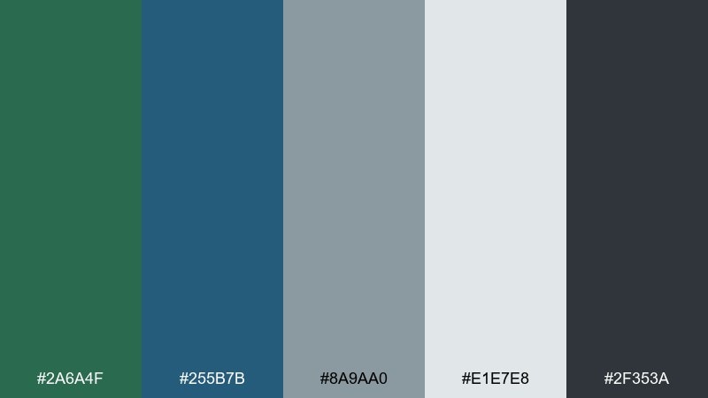
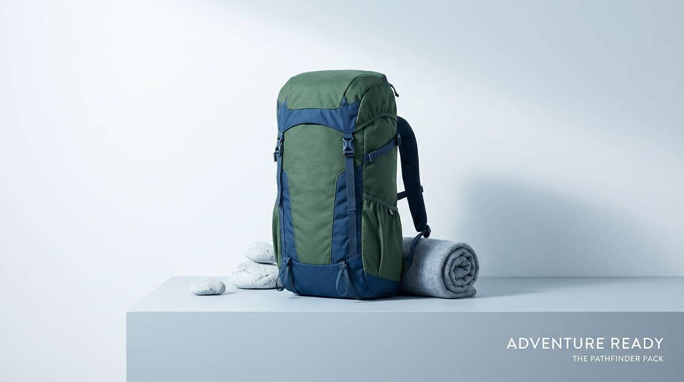
HEX: #2A6A4F #255B7B #8A9AA0 #E1E7E8 #2F353A
Mood: cool, outdoorsy, steady
Best for: hiking gear product ad banner
Cool and outdoorsy, it evokes pine needles under an overcast sky. Green blue gray color combinations like these are ideal for gear ads because they feel rugged without going full camouflage. Use the deep blue for headlines, the pine green for product callouts, and the light gray as negative space. Tip: keep backgrounds simple so the product silhouette stays sharp.
Image example of pine overcast generated using media.io
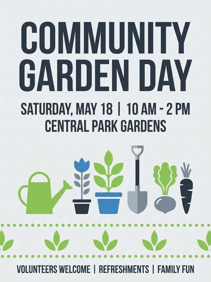
19) Blueprint Garden
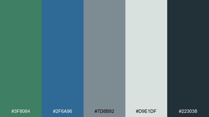
HEX: #3F8064 #2F6A96 #7D8B92 #D9E1DF #223038
Mood: fresh, structured, optimistic
Best for: community garden event flyer
Fresh and structured, it feels like garden planning notes drawn on clean drafting paper. Use the green for headers and icons, the blue for section dividers, and the light neutral for the flyer background. Pair with simple illustrations and friendly rounded type to keep it welcoming. Tip: add one bold color only in small doses if you need extra emphasis.
Image example of blueprint garden generated using media.io
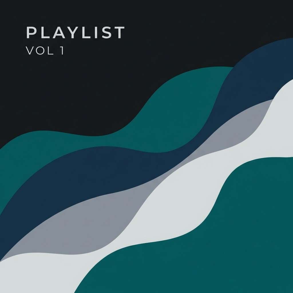
20) Night Ferry
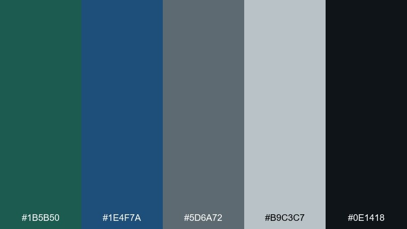
HEX: #1B5B50 #1E4F7A #5D6A72 #B9C3C7 #0E1418
Mood: cinematic, calm, confident
Best for: music playlist cover artwork
Cinematic and calm, it suggests a night ferry cutting through quiet water. Use the deep blue and teal as the main shapes, then add the lighter gray for type and subtle highlights. Grain textures and simple geometry pair well with the muted mood. Tip: keep contrast high on small screens by using the darkest shade behind the title.
Image example of night ferry generated using media.io
What Colors Go Well with Green Blue Gray?
Warm neutrals are the easiest match: cream, linen, sand, and warm white keep green blue gray palettes from feeling chilly. For interiors, add natural wood tones (oak, walnut) to bring instant comfort and depth.
Metals also pair cleanly. Brushed nickel and chrome reinforce the modern, cool direction, while brass and copper add warmth and a more premium finish—especially against slate and teal.
If you want contrast, try a small dose of warm accent colors like terracotta, clay, coral, or mustard. Keep them limited to CTAs, pillows, artwork, or labels so the palette stays calm and sophisticated.
How to Use a Green Blue Gray Color Palette in Real Designs
Start with role assignment: use the lightest shade as the main background, mid grays for structure (cards, borders, grids), and deeper teal/blue for primary actions or focal surfaces. This keeps hierarchy clear without adding extra colors.
In UI, check accessibility early—deep teal/navy on near-white often passes easily, but mid grays may need darkening for body text. In print and branding, consider using one saturated anchor (teal or blue) and let the grays do the heavy lifting for balance.
For interiors, use the darkest shade sparingly (trim, hardware, small decor) and repeat one mid-tone 2–3 times across the room (rug + art + cushions) to make the scheme feel intentional rather than accidental.
Create Green Blue Gray Palette Visuals with AI
If you already have HEX codes, the fastest way to validate the mood is to generate a few on-style visuals: a hero banner, a room scene, packaging mockups, or a UI screen. Seeing the colors on materials and lighting helps you choose the right balance of warmth and contrast.
In Media.io, you can paste a prompt (like the ones above), specify the aspect ratio, and quickly iterate on styles—coastal, modern, premium, editorial—while keeping your green blue gray direction consistent.
Generate a few options, then pick the version that best matches your brand voice or space: airy and light for wellness, or deeper and moodier for hospitality and nightlife.
Green Blue Gray Color Palette FAQs
-
What mood does a green blue gray color palette create?
Most green blue gray palettes feel calm, clean, and modern. Depending on how dark your anchor shade is, they can lean airy and coastal (more light gray) or dramatic and premium (more charcoal and deep teal/blue). -
Is green blue gray good for branding?
Yes—blue signals trust, green suggests balance and sustainability, and gray adds professionalism. It’s especially effective for outdoor brands, wellness, skincare, SaaS, and hospitality where you want a steady, composed look. -
How do I keep green blue gray from looking too cold?
Add warmth through materials or accents: linen/cream backgrounds, wood textures, brass/copper metals, or a small terracotta/sand CTA color. Even warm lighting in photography can shift the whole palette to feel more inviting. -
What’s a safe background color for this palette in UI?
Use a near-white or very pale gray (like #F7FAFA or #EDEFF0) as your main canvas, then reserve mid grays for dividers and deep teal/blue for primary actions. This keeps layouts readable and reduces visual heaviness. -
Which green blue gray palette is best for a dark, premium design?
Try darker sets like Deep Harborline, Urban Spruce, or Night Ferry. They include near-black anchors that look polished in menus, hero sections, and entertainment artwork while still keeping a cool, refined mood. -
Can I use these palettes for interior paint?
Yes—use the lightest shade on most walls, pick one teal/blue-green for a feature wall or cabinetry, and keep charcoal for small accents (hardware, frames, trim). Repeat one mid gray-blue in textiles to connect the room. -
How can I generate on-brand images that match my palette?
Use Media.io’s text-to-image tool with a prompt that describes your scene (kitchen, packaging, UI) and include color words like muted teal, slate blue, cool gray, and warm off-white. Generate several variations, then refine the prompt for lighting and materials.
Next: Linen Color Palette


