

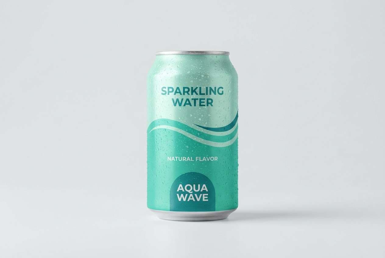
A waterfall color palette blends airy aquas, teals, and slates to capture that fresh, clean “moving water” feeling. It’s a go-to choice for modern branding, UI, and print because it reads as calm, trustworthy, and contemporary.
Below are 20 waterfall color palette ideas with HEX codes—each with a real-world use case and an AI prompt you can copy to generate matching visuals.
In this article
Why Waterfall Palettes Work So Well
Waterfall palettes sit in that sweet spot between blue (trust, clarity) and green (growth, wellness). That mix feels naturally balanced, which is why it performs well across brand identities, apps, and editorial layouts.
They’re also “background-friendly” colors: pale aquas and misty grays keep pages open and breathable, while deeper teals and slates add structure for typography, icons, and charts.
Finally, waterfall color combinations adapt easily to light and dark UI. With a strong deep anchor shade and a clean light base, you can maintain contrast without losing the soft, refreshing vibe.
20+ Waterfall Color Palette Ideas (with HEX Codes)
1) Misty Cascade

HEX: #E9F7F6 #BFE6E0 #6EC9C3 #2D8F94 #1F3E46
Mood: airy, calm, clean
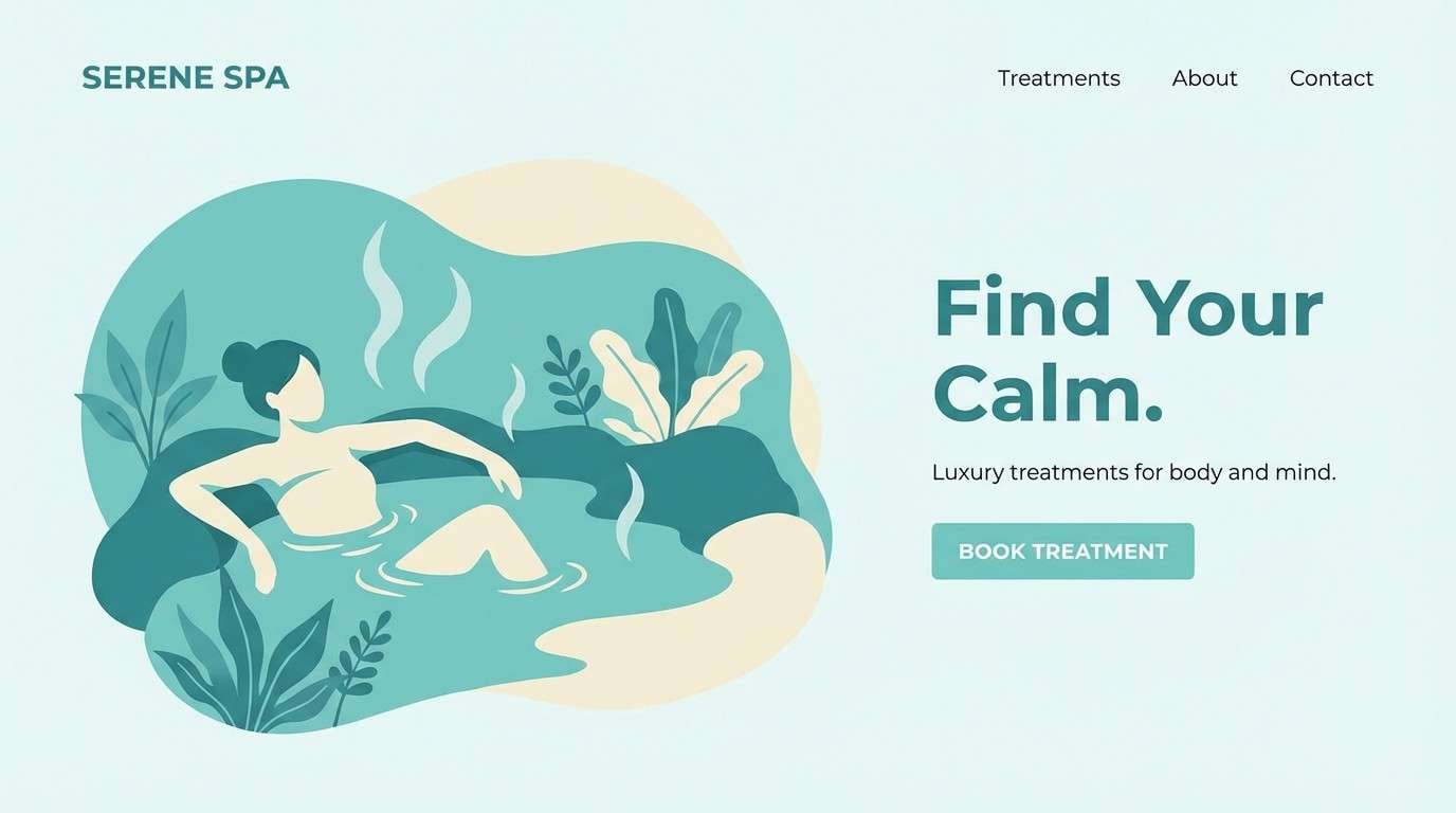
Best for: wellness branding and spa landing pages
Airy and calm like cool spray drifting over smooth stone, these tones feel instantly restorative. Use the pale aqua as a background, then let the mid teal carry buttons and highlights. Pair with warm white, soft sand, or brushed silver to keep it premium instead of clinical. Tip: reserve the deep slate for text and icons so contrast stays crisp.
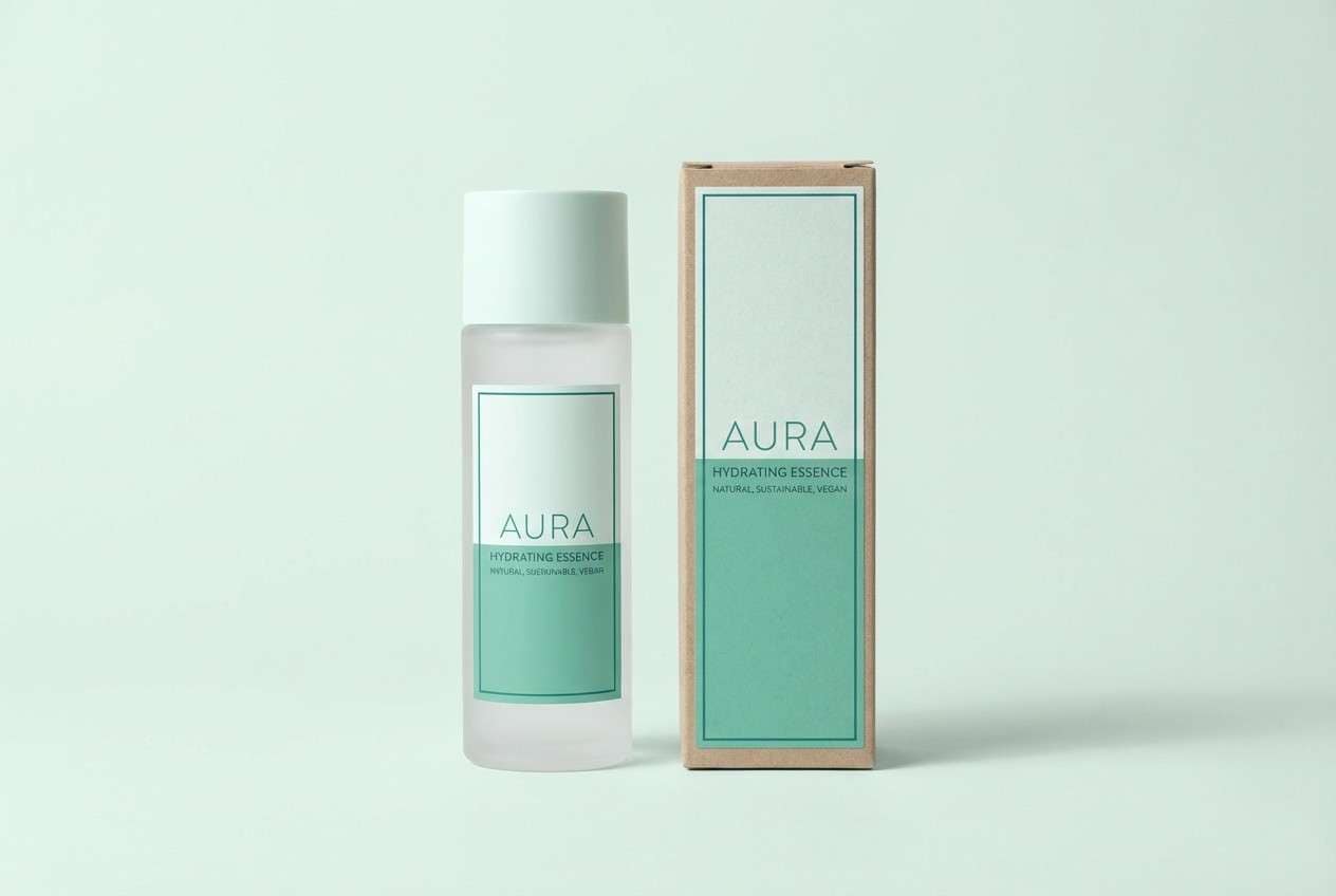
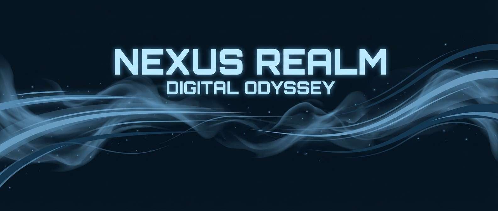
Image example of misty cascade generated using media.io
Media.io is an online AI studio for creating and editing video, image, and audio in your browser.

2) Riverstone Teal
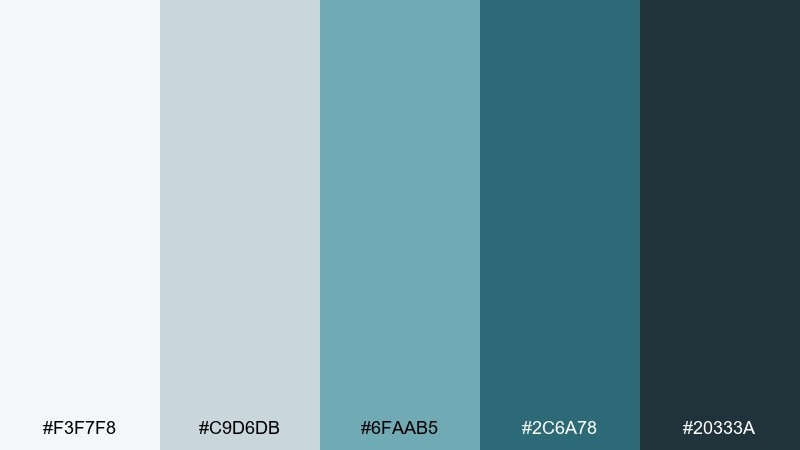
HEX: #F3F7F8 #C9D6DB #6FAAB5 #2C6A78 #20333A
Mood: grounded, modern, dependable
Best for: fintech dashboards and data-heavy UI
Grounded and modern, it reads like wet riverstone with a cool teal sheen. The light gray-blue keeps large surfaces quiet, while the steel teal brings structure to navigation and charts. Balance it with a single bright aqua highlight if you need clearer hierarchy. Tip: use the charcoal tone for table text and borders to avoid washed-out contrast.
Image example of riverstone teal generated using media.io
3) Foam and Fern
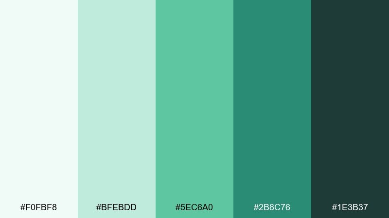
HEX: #F0FBF8 #BFEBDD #5EC6A0 #2B8C76 #1E3B37
Mood: fresh, botanical, lively
Best for: eco product packaging and labels
Fresh and botanical, these greens feel like fern shadows behind bright foam. Use the minty light tone to keep packaging clean, then push the mid green for logos and seals. It pairs beautifully with kraft paper, matte white, and minimal line illustrations. Tip: keep the darkest green for small type only so the label stays light and friendly.
Image example of foam and fern generated using media.io
4) Glacier Spray
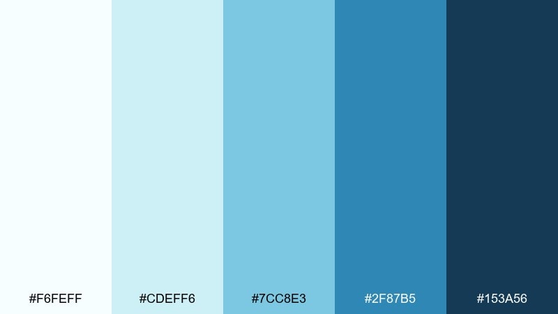
HEX: #F6FEFF #CDEFF6 #7CC8E3 #2F87B5 #153A56
Mood: crisp, bright, energetic
Best for: travel ads and outdoor campaign posters
Crisp and bright, it feels like sunlight catching icy mist in midair. These waterfall color combinations work best with bold, simple shapes and plenty of negative space. Add a small warm accent like coral or amber to keep the blues from feeling too cold. Tip: set headlines in the deep navy for punch without turning the design heavy.
Image example of glacier spray generated using media.io
5) Deep Pool
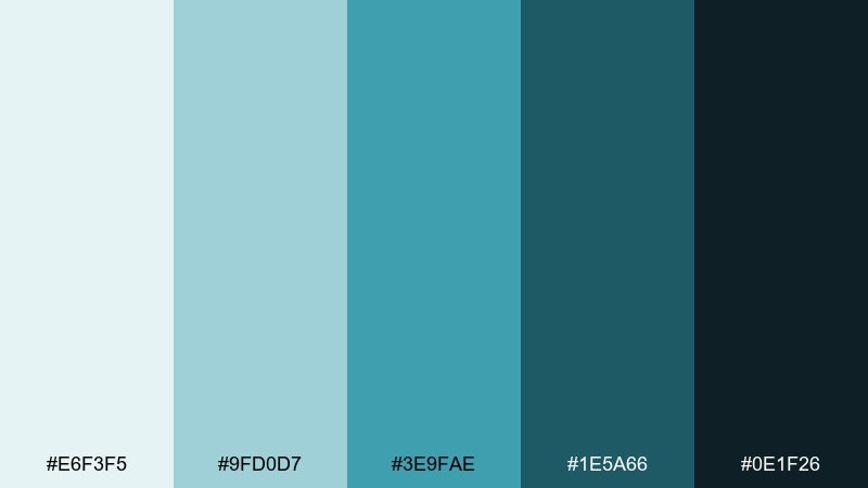
HEX: #E6F3F5 #9FD0D7 #3E9FAE #1E5A66 #0E1F26
Mood: quiet, moody, sophisticated
Best for: editorial layouts and photo essays
Quiet and moody, it evokes a still pool where the water turns darker as it deepens. Use the pale blue-green to frame photography, then layer mid teals for pull quotes and section markers. It pairs well with black-and-white images and warm gray paper textures. Tip: keep body text on the lightest tone for long-form readability.
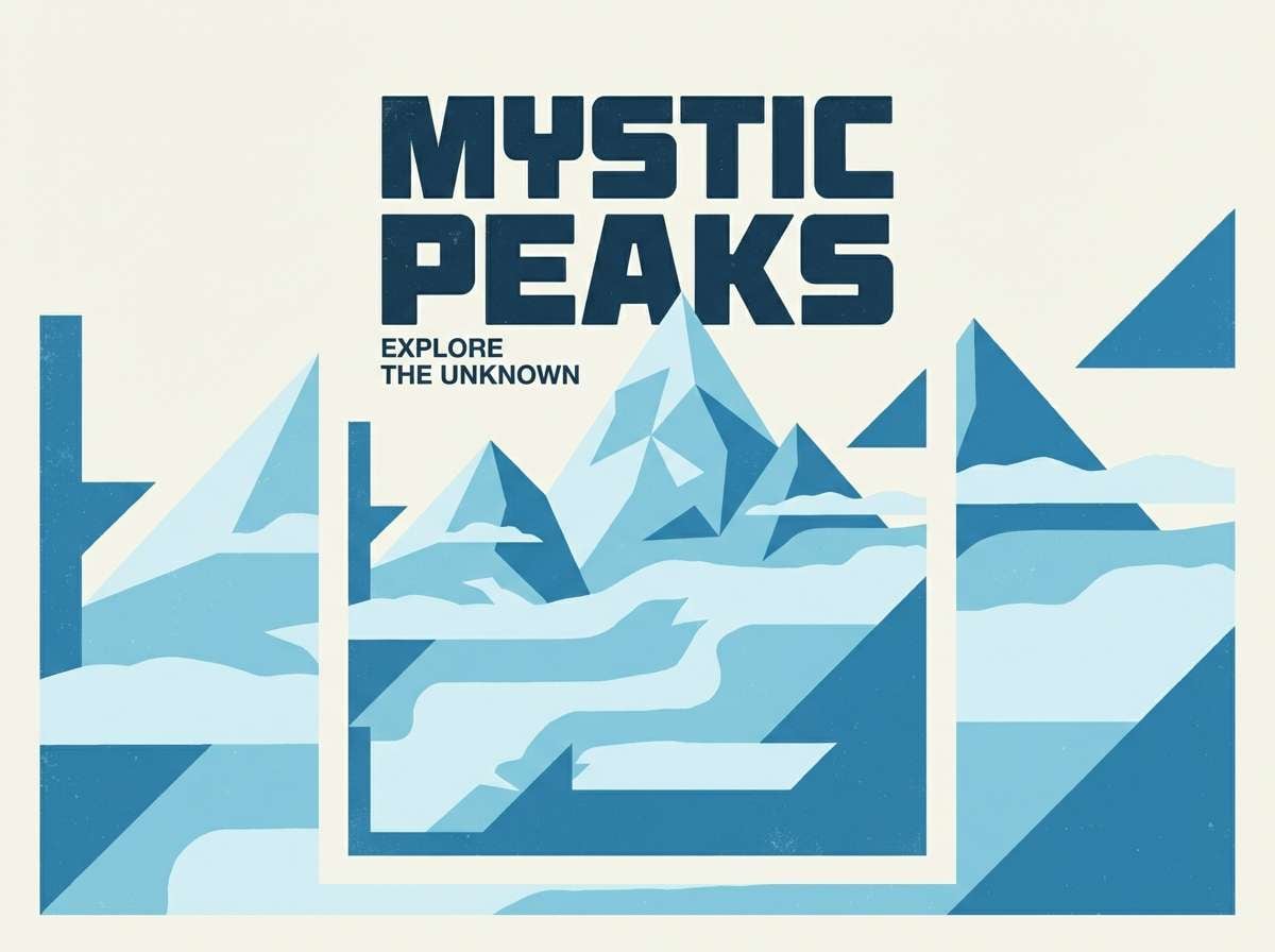
Image example of deep pool generated using media.io
6) Mossy Cliff
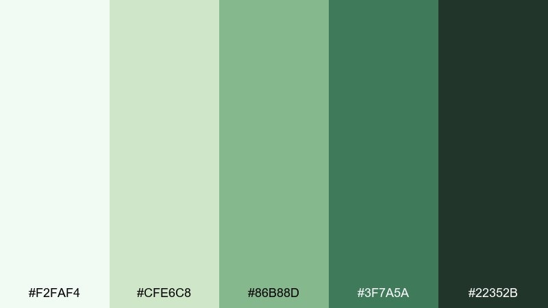
HEX: #F2FAF4 #CFE6C8 #86B88D #3F7A5A #22352B
Mood: natural, earthy, reassuring
Best for: outdoor brand identity and signage
Natural and earthy, it suggests moss clinging to rock beside a rushing fall. As a waterfall color scheme, it shines in logos where the mid green can carry the mark and the dark forest adds authority. Combine it with stone neutrals, uncoated paper, and simple pictogram icons. Tip: keep the soft mint as a wide background field to make the greens feel more contemporary.
Image example of mossy cliff generated using media.io
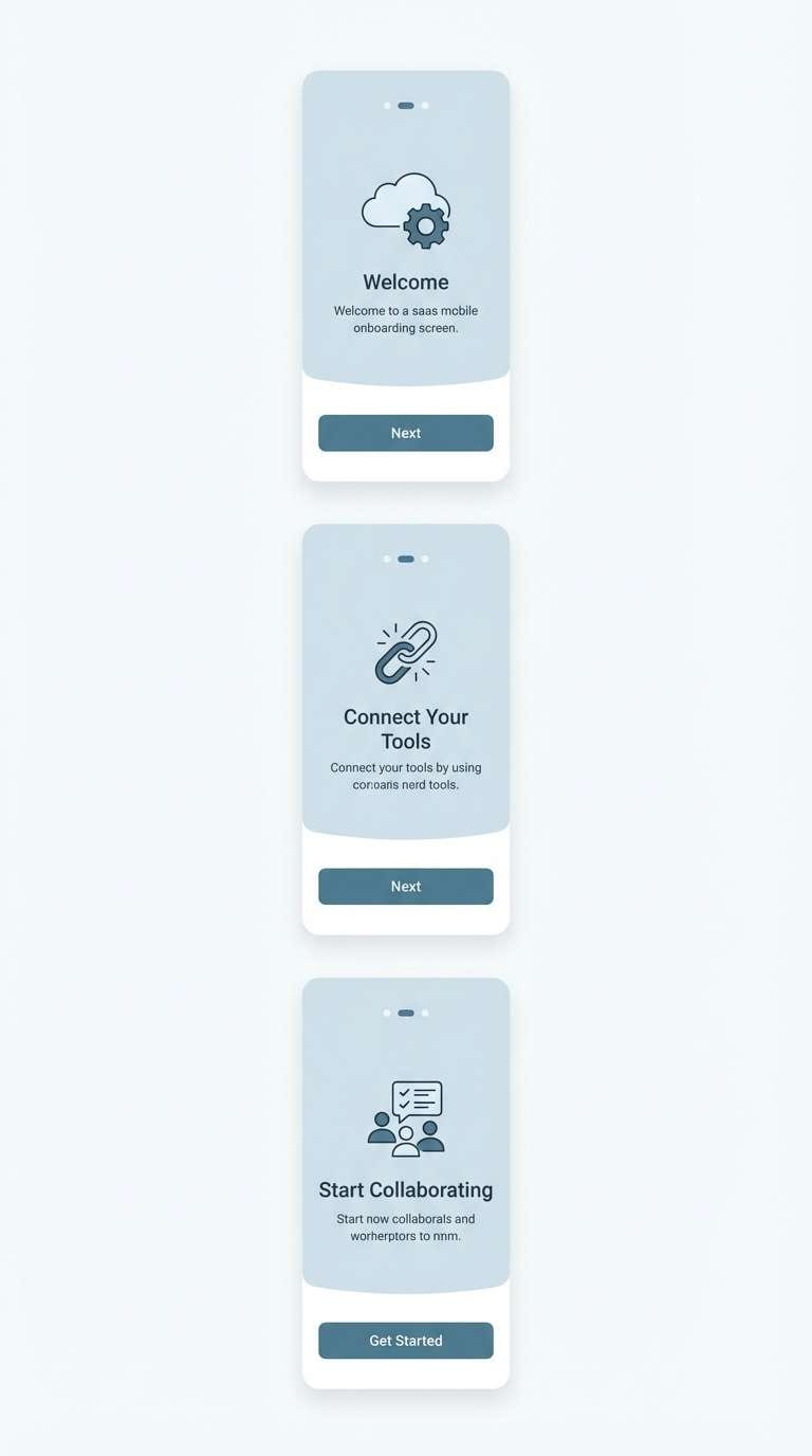
7) Silver Mist
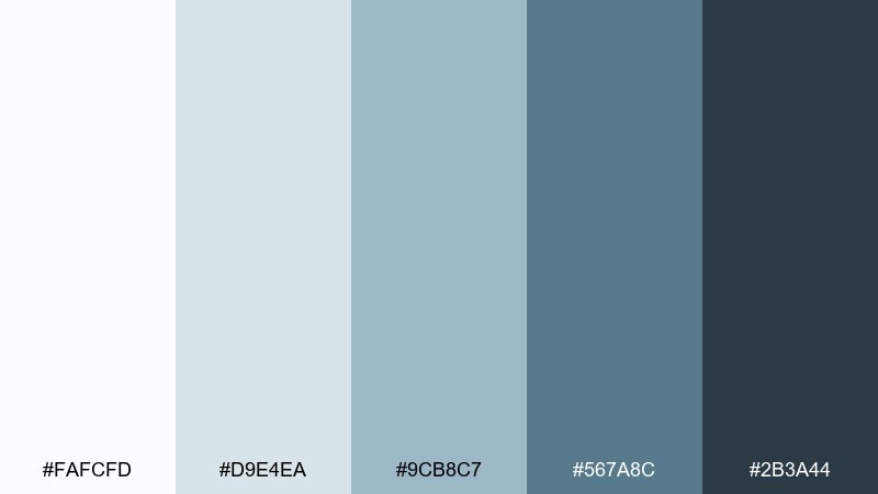
HEX: #FAFCFD #D9E4EA #9CB8C7 #567A8C #2B3A44
Mood: cool, minimal, professional
Best for: SaaS websites and onboarding screens
Cool and minimal, it feels like fog rolling over water at dawn. The soft silver-blue keeps interfaces polished, while the medium slate gives you reliable contrast for components. Pair it with a single saturated teal or lime micro-accent for progress states and badges. Tip: use the darkest tone sparingly for primary CTAs so they stand out without turning harsh.
Image example of silver mist generated using media.io
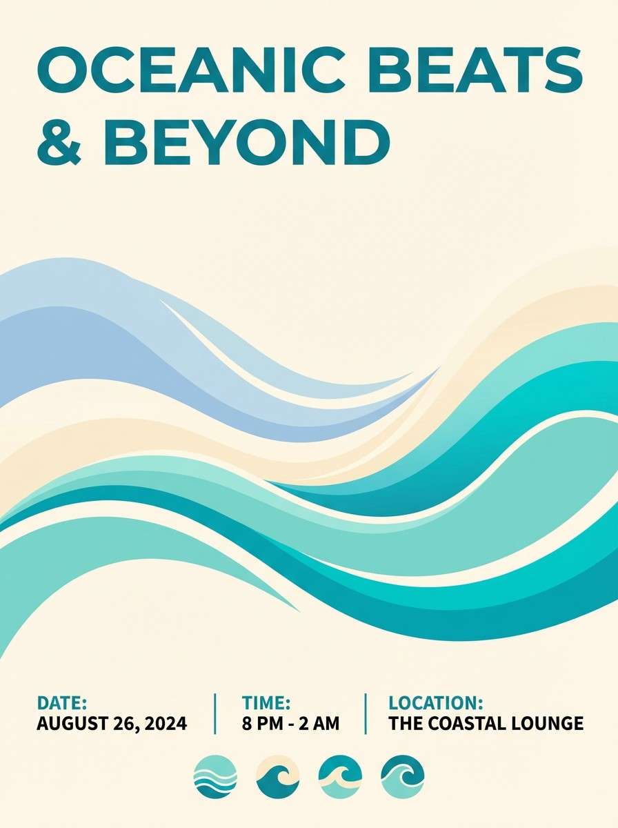
8) Sunlit Falls
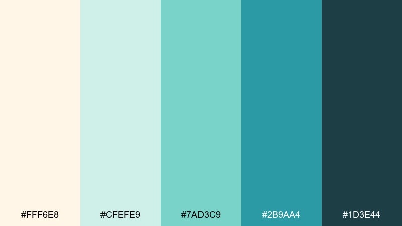
HEX: #FFF6E8 #CFEFE9 #7AD3C9 #2B9AA4 #1D3E44
Mood: bright, optimistic, breezy
Best for: summer event flyers and social posts
Bright and optimistic, it looks like sunbeams warming a cool stream. The creamy highlight keeps the teal family friendly for posters, while the darker blue-green anchors type. Pair with rounded sans fonts and plenty of breathing room for a modern, upbeat look. Tip: use the cream as the main background so the aquas stay luminous instead of flat.
Image example of sunlit falls generated using media.io
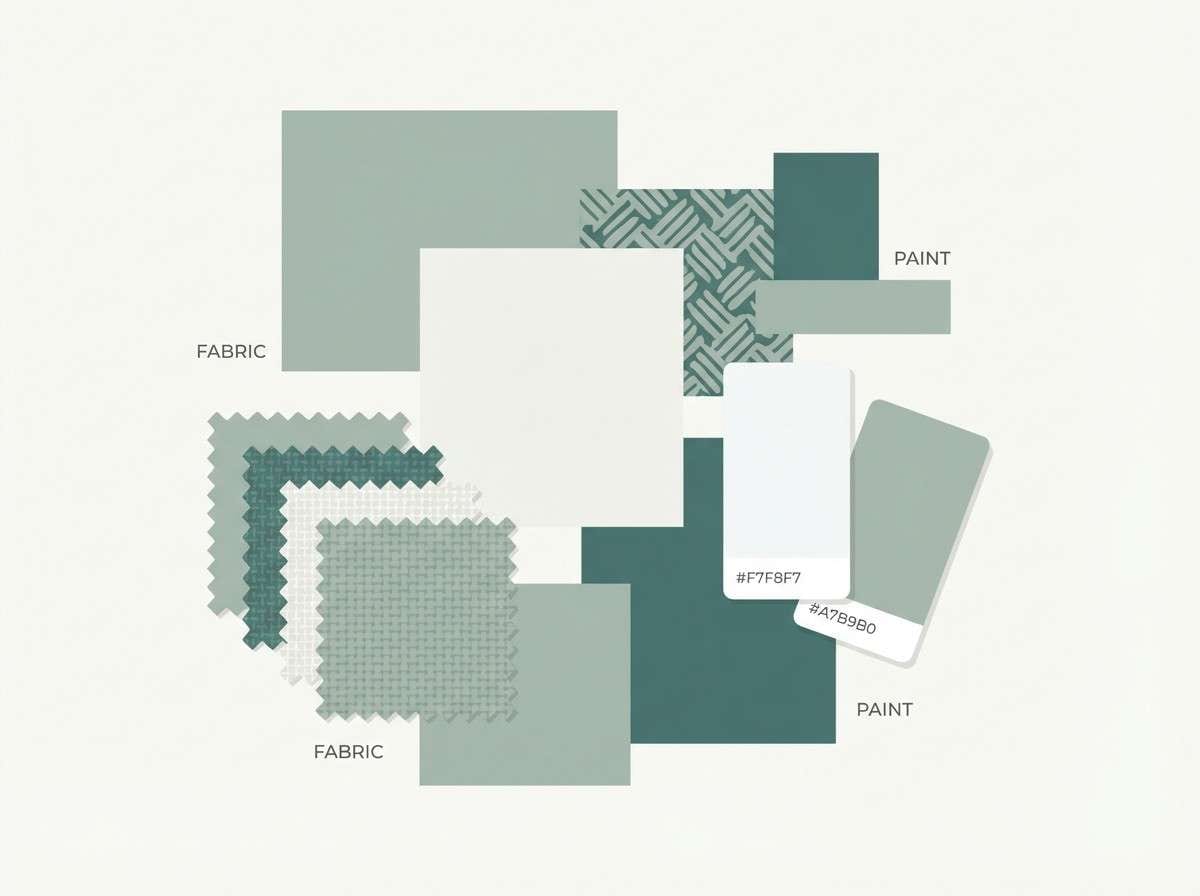
9) Pebble Path
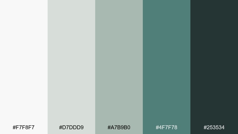
HEX: #F7F8F7 #D7DDD9 #A7B9B0 #4F7F78 #253534
Mood: subtle, balanced, calm
Best for: interior design mood boards
Subtle and balanced, it recalls pebbles under shallow water with a gentle green cast. Use the pale neutrals for large swatches, then layer the mossy midtone for textiles and accents. It pairs naturally with light oak, linen, and black metal fixtures. Tip: keep the deepest shade for small callouts so the board stays soft.
Image example of pebble path generated using media.io
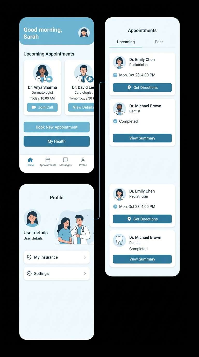
10) Aquatic Haze
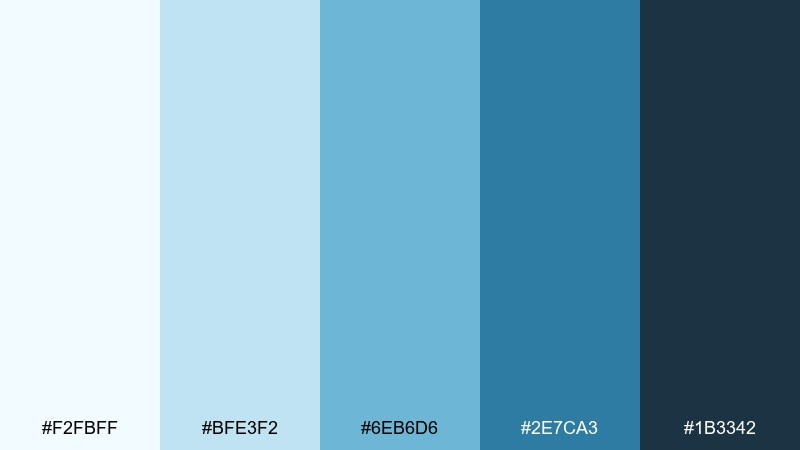
HEX: #F2FBFF #BFE3F2 #6EB6D6 #2E7CA3 #1B3342
Mood: clean, coastal, refreshing
Best for: healthcare apps and patient portals
Clean and refreshing, it feels like coastal air and soft water haze. Keep the light blue as the base to reduce visual fatigue, then use the medium aqua for buttons and active states. Pair with plenty of white and clear iconography for a reassuring, clinical-friendly feel. Tip: reserve the darkest tone for error text and key navigation to protect accessibility.
Image example of aquatic haze generated using media.io
11) Blue-Green Drift
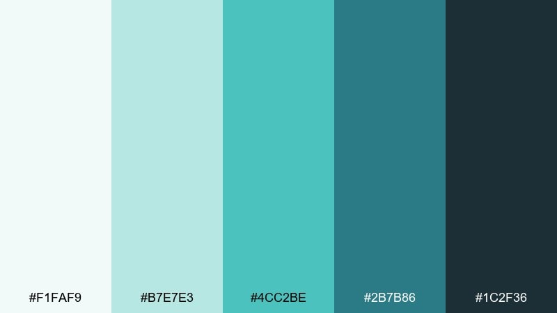
HEX: #F1FAF9 #B7E7E3 #4CC2BE #2B7B86 #1C2F36
Mood: modern, playful, breezy
Best for: startup branding and pitch decks
Modern and breezy, it reads like shifting currents where blue and green trade places. These waterfall color combinations give slides a confident rhythm when you alternate mint backgrounds with teal headers. Pair with sharp geometric shapes and one neutral gray to keep charts easy to read. Tip: keep the bright teal for key numbers and highlights, not body text.
Image example of blue-green drift generated using media.io
12) Rainy Overlook
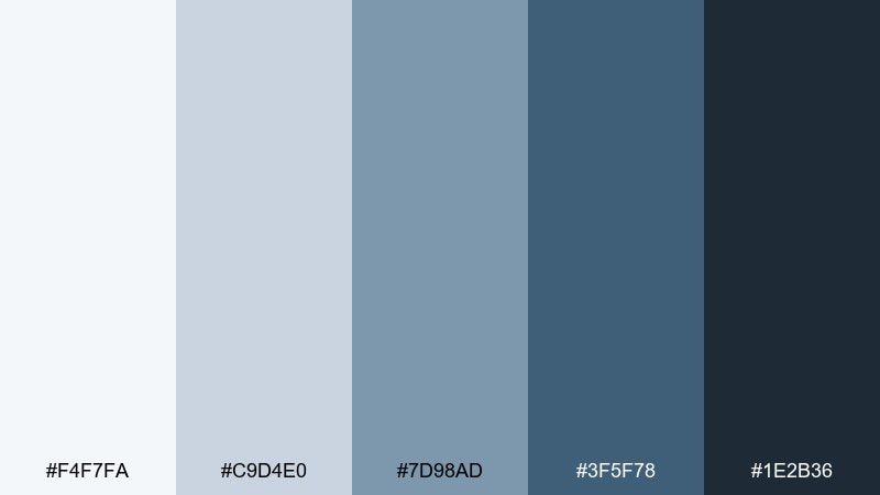
HEX: #F4F7FA #C9D4E0 #7D98AD #3F5F78 #1E2B36
Mood: stormy, elegant, thoughtful
Best for: book covers and moody album art
Stormy and elegant, it feels like looking over a waterfall in light rain. Use the misty gray as breathing room, then stack the desaturated blues for depth and type hierarchy. It pairs well with serif titles, grain texture, and subtle gradients. Tip: add a small metallic foil effect on the darkest shade for a premium finish.
Image example of rainy overlook generated using media.io
13) Emerald Veil
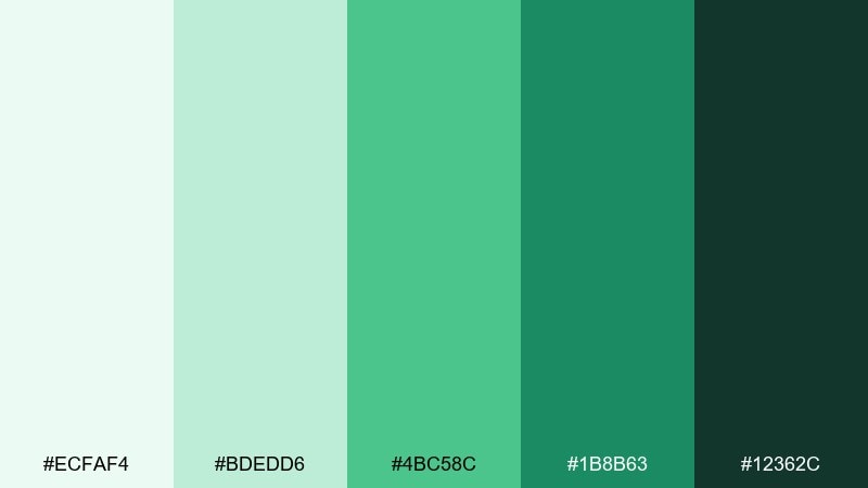
HEX: #ECFAF4 #BDEDD6 #4BC58C #1B8B63 #12362C
Mood: lush, vibrant, confident
Best for: restaurant branding and menu design
Lush and vibrant, it brings to mind a green veil of water over dark rock. The bright emerald makes menus feel fresh, while the deep green adds appetite-friendly richness. Pair with cream paper, black ink, and botanical line art for a refined look. Tip: use the emerald as a spot color for section headers and price highlights.
Image example of emerald veil generated using media.io
14) Stormwater Slate
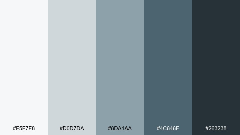
HEX: #F5F7F8 #D0D7DA #8DA1AA #4C646F #263238
Mood: industrial, serious, refined
Best for: B2B branding and corporate reports
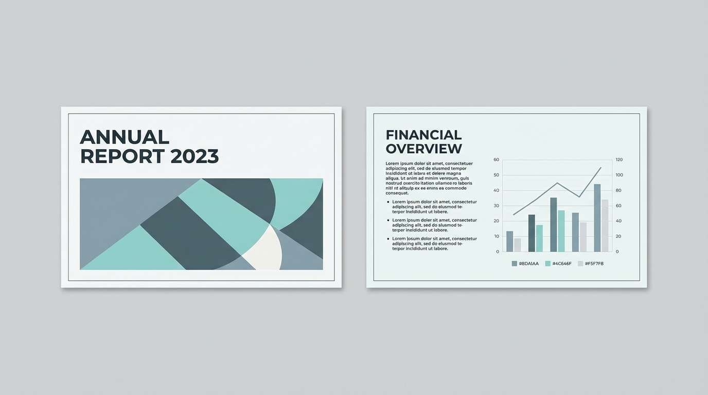
Industrial and refined, it resembles stormwater running over slate steps. Use the pale gray for page backgrounds, then rely on the steel midtone for charts and infographics. Pair it with a single bright cyan or green accent if you need more energy. Tip: keep the charcoal for headings so long reports stay structured and readable.
Image example of stormwater slate generated using media.io
15) Tropical Plunge
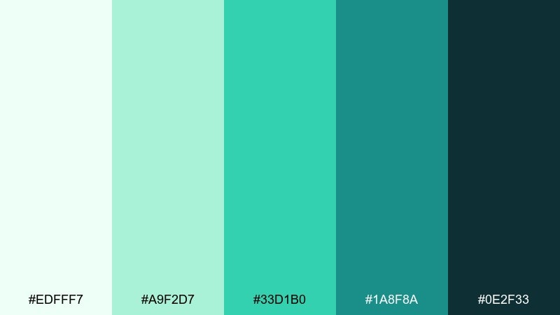
HEX: #EDFFF7 #A9F2D7 #33D1B0 #1A8F8A #0E2F33
Mood: tropical, punchy, adventurous
Best for: beverage can design and product ads
Tropical and punchy, it feels like a plunge into bright lagoon water. Make the neon-leaning mint the hero on cans, then ground it with the deeper teal so it still looks premium. Pair with bold typography and simple patterns like waves or dots. Tip: keep backgrounds clean so the saturated tones do the talking.
Image example of tropical plunge generated using media.io
16) Seaglass Shine
HEX: #F7FFFE #D2F6F0 #8EE2D5 #3FB7AA #214B4A
Mood: soft, glossy, uplifting
Best for: beauty brand socials and product cards
Soft and glossy, it looks like seaglass catching light near a shoreline fall. Use the pale mint as negative space for skincare photography, then bring in the seafoam and teal for stickers, badges, and icons. Pair with warm beige and gentle shadowing for a clean, editorial feel. Tip: keep gradients subtle so the palette stays airy, not candy-like.
Image example of seaglass shine generated using media.io
17) Canyon Stream
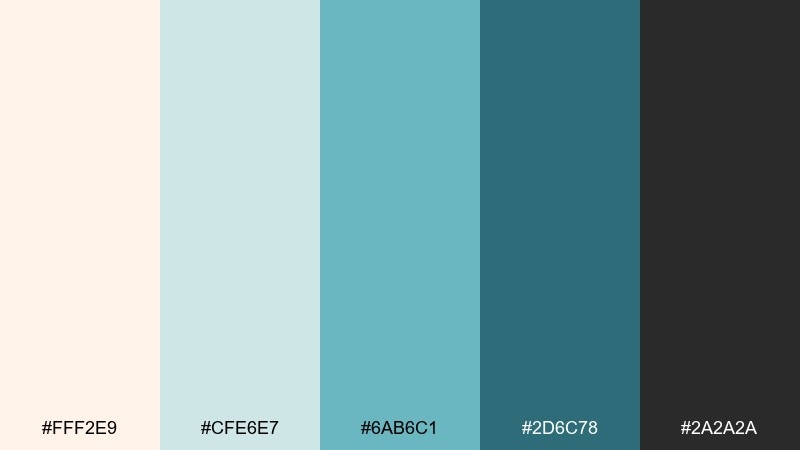
HEX: #FFF2E9 #CFE6E7 #6AB6C1 #2D6C78 #2A2A2A
Mood: warm-cool contrast, rustic-modern
Best for: wedding invitations and stationery
Warm-cool contrast makes it feel like a stream cutting through sunlit canyon stone. The peachy cream softens the teals, giving stationery a romantic but modern edge. Pair with delicate serif type, line florals, and plenty of margin for an upscale look. Tip: print the darkest tone for names and dates to keep everything legible.
Image example of canyon stream generated using media.io
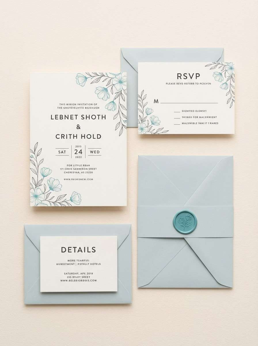
18) Opal Current
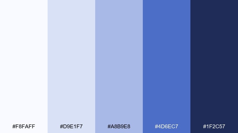
HEX: #F8FAFF #D9E1F7 #A8B9E8 #4D6EC7 #1F2C57
Mood: dreamy, polished, tech-forward
Best for: app icons and gradient backgrounds
Dreamy and polished, it resembles opal light moving through fast water. The periwinkle-to-ink range works well for gradients, especially in login screens and hero banners. Pair with crisp white and thin-line icons to keep it sleek. Tip: limit gradients to large sections and keep buttons solid for clarity.
Image example of opal current generated using media.io
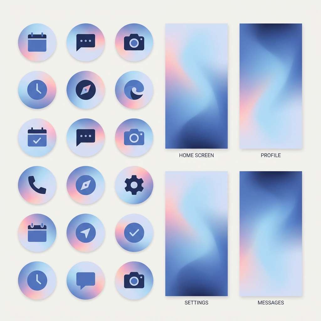
19) Nightfall Rapids
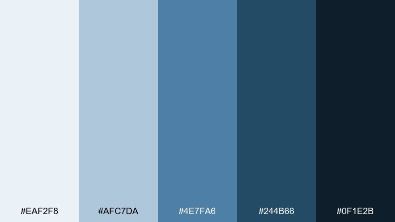
HEX: #EAF2F8 #AFC7DA #4E7FA6 #244B66 #0F1E2B
Mood: dramatic, cinematic, cool
Best for: gaming banners and cinematic thumbnails
Dramatic and cinematic, it suggests rapids after sunset when the water turns ink-blue. A waterfall color palette like this is ideal for bold overlays, strong shadows, and high-contrast titles. Pair it with a single electric accent for callouts, and keep backgrounds simple so the type stays dominant. Tip: place text on the mid blue instead of the darkest shade to avoid crushing detail.
Image example of nightfall rapids generated using media.io
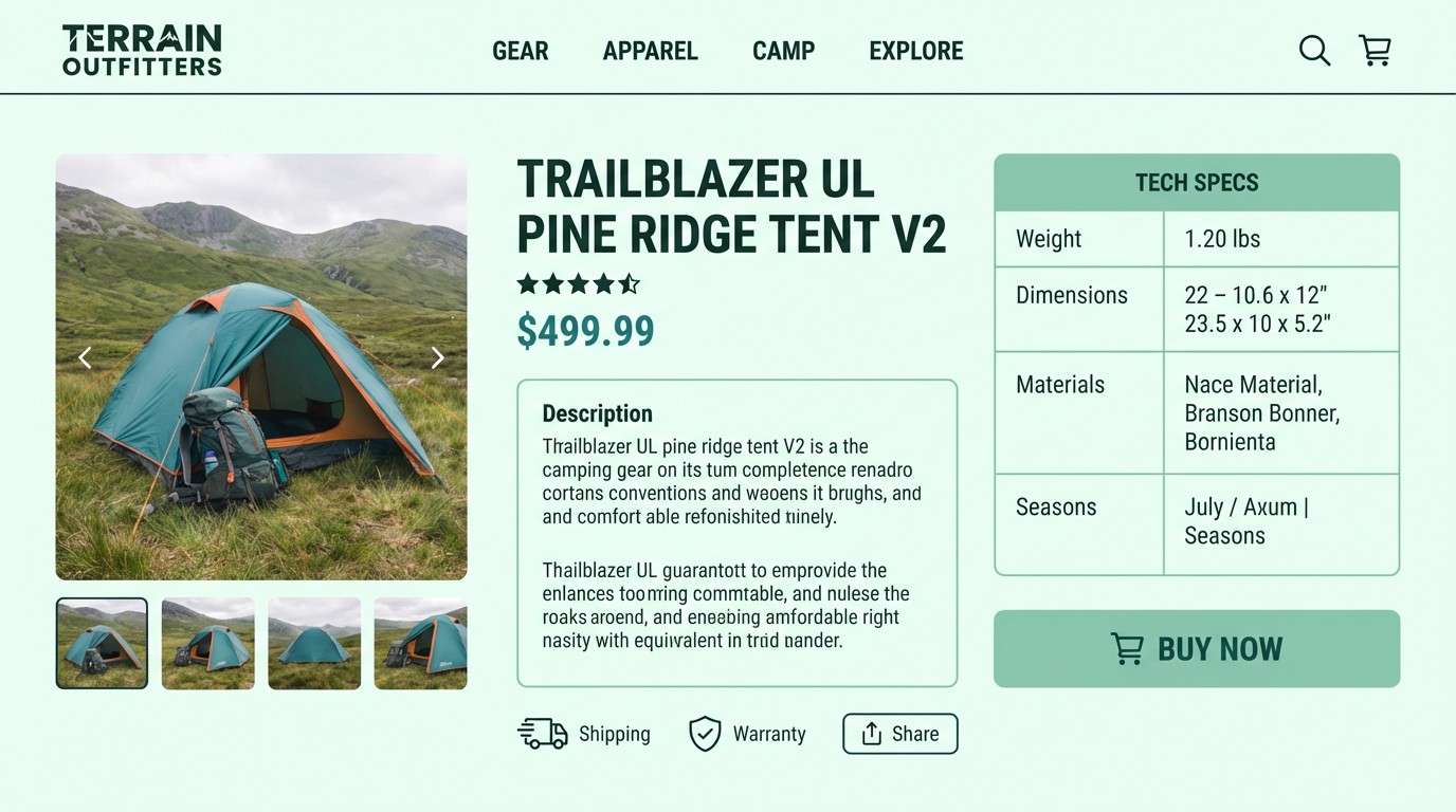
20) Alpine Runoff
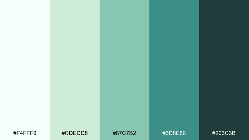
HEX: #F4FFF9 #CDEDD8 #87C7B2 #3D8E86 #203C3B
Mood: fresh, alpine, balanced
Best for: outdoor gear product pages
Fresh and alpine, it feels like snowmelt feeding a clear green-blue stream. The light mint keeps product pages spacious, while the deeper teal adds a rugged edge for headings and badges. Pair with slate gray, clean photography, and simple spec tables. Tip: use the midtone for secondary buttons so primary actions stay obvious.
Image example of alpine runoff generated using media.io
What Colors Go Well with Waterfall?
Waterfall tones (aqua, teal, slate, and deep blue-green) pair effortlessly with clean neutrals like warm white, soft gray, and stone. These neutrals keep the palette feeling modern and prevent cool hues from turning clinical.
For contrast, add a small warm accent—coral, amber, peach, or sand. Warm highlights create instant hierarchy for CTAs, price tags, or badges while letting the waterfall base stay calm.
If you want a more premium look, combine waterfall colors with metallics (silver, brushed steel) or inky navy. The darker anchor shades help typography and UI elements stay crisp on light and dark backgrounds.
How to Use a Waterfall Color Palette in Real Designs
Start by choosing one light “mist” tone for backgrounds, one mid teal for interactive elements, and one deep slate for text. This three-step structure makes layouts feel intentional while keeping accessibility easier to manage.
In branding, waterfall color combinations work best when you keep saturation controlled: reserve the brightest aqua/teal for emphasis (logo detail, icon fill, key numbers), and let softer tints do the heavy lifting across large areas.
For print, test your palette on uncoated and coated stocks—cool colors can shift. Using the darkest shade for body text (instead of mid teal) usually improves legibility and prevents a washed-out finish.
Create Waterfall Palette Visuals with AI
If you already have HEX codes, you can turn them into consistent mockups (landing pages, posters, packaging, or UI screens) by prompting an AI generator with your palette and a clear layout description.
To keep results cohesive, reuse the same prompt structure across assets: specify dominant colors, accent colors, typography style, and background type. Small constraints (like “no device frame” or “plain background”) help outputs stay clean and usable.
Generate a few variations, then pick one composition and iterate—this is the fastest way to build a matching set of waterfall-themed visuals for branding and content.
Waterfall Color Palette FAQs
-
What is a waterfall color palette?
A waterfall color palette typically blends cool, water-inspired hues—light aqua, teal, blue-gray, slate, and deep blue-green—to mimic the layered depth you see in mist, moving water, and wet stone. -
Is a waterfall color scheme good for websites and UI?
Yes. Light mist tones make comfortable backgrounds, mid teals create clear interactive states, and deep slates provide strong contrast for text and navigation—great for modern, readable interfaces. -
What accent colors pair best with waterfall tones?
Warm accents like coral, peach, amber, or sand work especially well. Use them sparingly for CTAs, badges, or highlights so the overall design stays calm and fresh. -
How do I keep waterfall palettes from looking too cold?
Mix in a warm neutral (cream or warm white), add gentle texture (paper grain, subtle shadow), or introduce a small warm spot color. This balances the cool base without losing the “water” vibe. -
Which waterfall palette is best for professional branding?
Try cooler, restrained sets like Silver Mist or Stormwater Slate. They read clean and minimal, and they hold up well in corporate decks, SaaS pages, and reports. -
Which waterfall palette works best for moody visuals?
Nightfall Rapids and Deep Pool are great for cinematic thumbnails, editorial layouts, and dramatic hero sections because they include darker anchors that support high-contrast type. -
Can I generate waterfall palette mockups with AI?
Yes. Use an AI text-to-image tool and include your HEX colors (dominant + accents) plus a specific format request (e.g., “dashboard UI,” “packaging,” “poster”). Iterating on one strong prompt helps you build a consistent visual set.
Next: Carmine Color Palette


