

Carmine is a deep, saturated red that instantly signals confidence, romance, and premium craftsmanship. It’s bold enough to carry a brand, but versatile enough to feel modern when paired with soft neutrals or sleek dark tones.
Below are 20+ carmine color palette ideas with HEX codes, practical use cases, and AI-ready prompts you can reuse for posters, UI themes, invitations, packaging, and product shots.
In this article
- Why Carmine Palettes Work So Well
-
- velvet theater
- crimson atelier
- rosewood neutrals
- garnet glow
- carmine and cream letterpress
- velvet noir
- dusty carmine minimal
- spiced berry kitchen
- ruby copper luxe
- botanical carmine bloom
- retro diner red
- modern editorial rouge
- soft blush and carmine
- winter wine night
- clay terracotta harmony
- neon sign carmine
- heritage burgundy library
- sunset carmine gradient
- monochrome carmine ui
- festival poster punch
- stone and carmine contrast
- cherry mocha comfort
- What Colors Go Well with Carmine?
- How to Use a Carmine Color Palette in Real Designs
- Create Carmine Palette Visuals with AI
Why Carmine Palettes Work So Well
Carmine sits in that sweet spot between classic red and deep wine—so it can feel timeless in print, yet still crisp and contemporary in digital layouts. It draws attention fast, which makes it excellent for headlines, CTAs, and focal elements.
Because carmine is naturally intense, it pairs beautifully with restraint: warm creams, soft blushes, stone grays, and near-black give it space to breathe. This contrast creates strong hierarchy without needing lots of extra colors.
It also adapts across styles. Add metallics and you get luxury; add teal or mustard and you get retro pop; stay monochrome and it becomes a focused UI theme with clear states and depth.
20+ Carmine Color Palette Ideas (with HEX Codes)
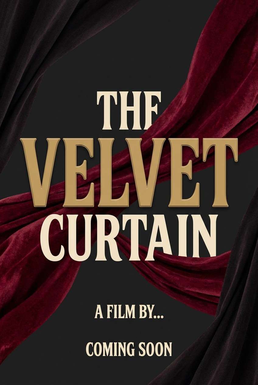
1) Velvet Theater
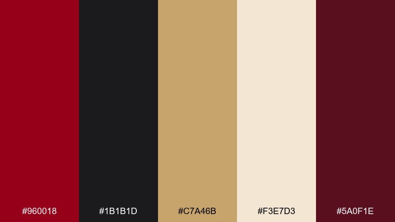
HEX: #960018 #1B1B1D #C7A46B #F3E7D3 #5A0F1E
Mood: dramatic, luxe, cinematic
Best for: film poster design
Dramatic and plush like stage curtains under warm spotlights, these tones feel instantly premium. Use the deep red as the headline anchor, then let near-black carry typography and negative space. Brass-gold details add a classic prestige touch without feeling flashy. Tip: keep gradients subtle and use gold only for small accents like credits or laurels.
Image example of velvet theater generated using media.io
Media.io is an online AI studio for creating and editing video, image, and audio in your browser.

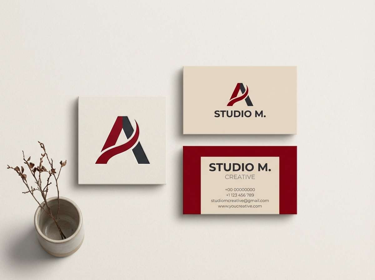
2) Crimson Atelier
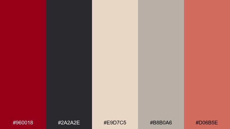
HEX: #960018 #2A2A2E #E9D7C5 #B8B0A6 #D06B5E
Mood: artful, modern, gallery-like
Best for: creative studio branding
Artful and modern, it reads like a quiet gallery wall with one bold painting stealing the room. Let the saturated red lead your logo mark, while warm beige keeps the system approachable. The dusty neutrals are perfect for stationery and social templates that need consistency. Tip: pair with a geometric sans serif and reserve the coral tone for calls to action.
Image example of crimson atelier generated using media.io
3) Rosewood Neutrals
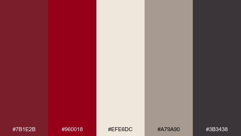
HEX: #7B1E2B #960018 #EFE6DC #A79A90 #3B3438
Mood: warm, grounded, refined
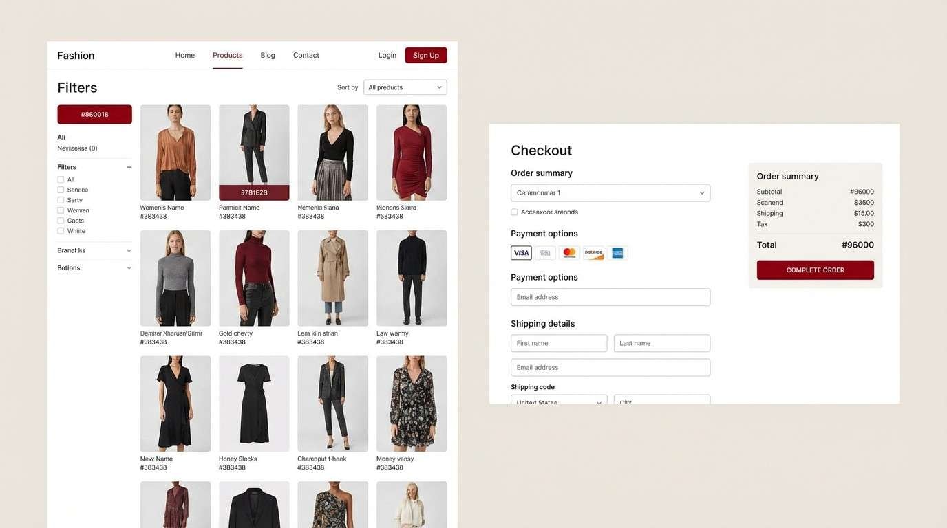
Best for: fashion e-commerce UI
Warm and grounded, these tones evoke rosewood furniture, soft knits, and calm studio light. This carmine color scheme works best when the deepest shade is used for buttons and price highlights, not full backgrounds. Keep the cream and taupe dominant to maintain a premium, breathable layout. Tip: use the charcoal as your primary text color for readability on warm neutrals.
Image example of rosewood neutrals generated using media.io
4) Garnet Glow
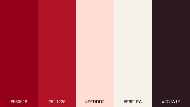
HEX: #960018 #B11226 #FFDDD2 #F6F1EA #2C1A1F
Mood: romantic, warm, inviting
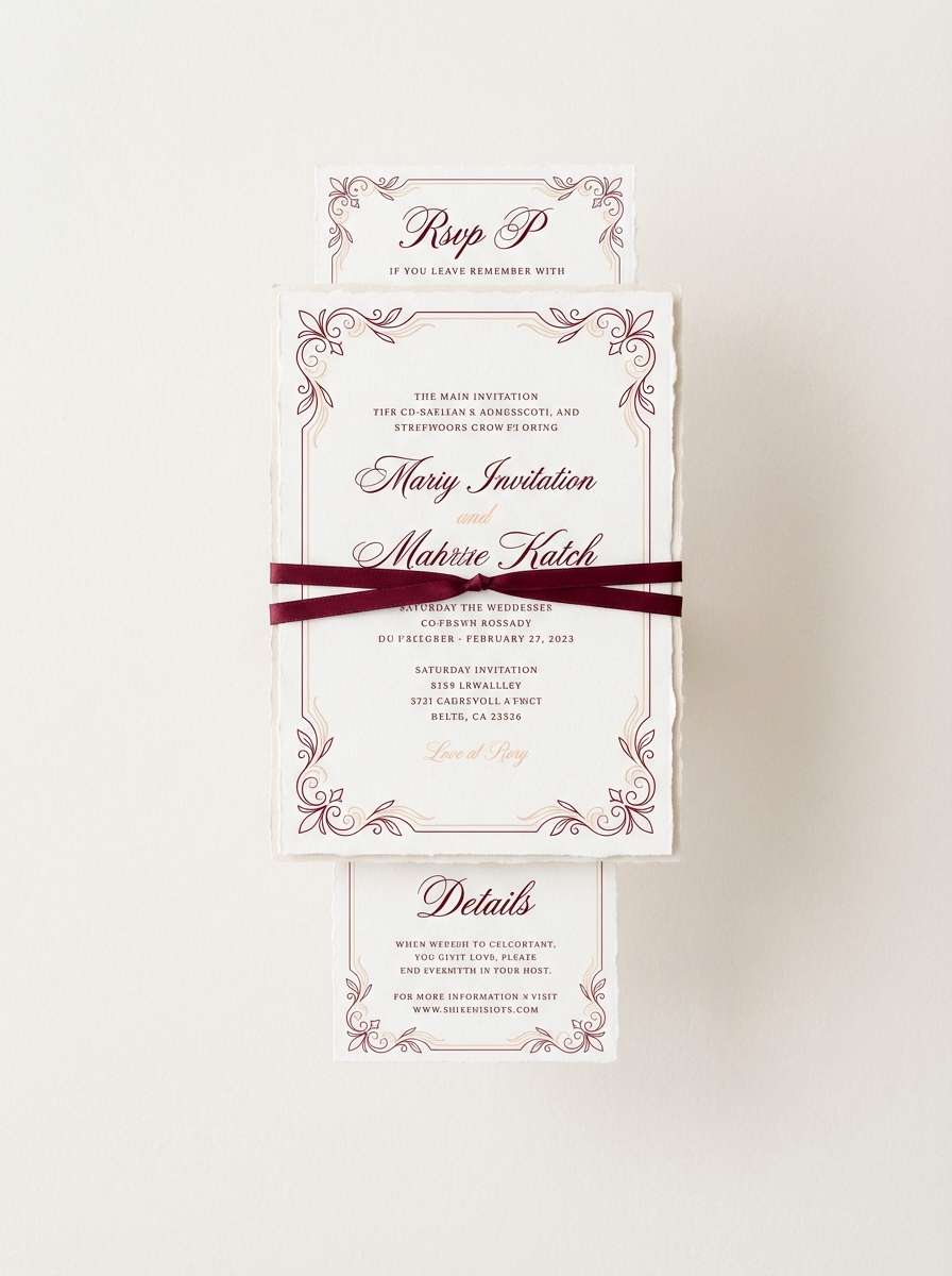
Best for: wedding invitation set
Romantic and softly lit, it feels like candle glow reflecting off garnet glass. Use the blush and warm white as the main paper tone, and bring in the deeper reds for names, borders, and wax-seal motifs. A touch of near-black keeps scripts crisp and legible. Tip: emboss or foil the darker red for an elegant, tactile finish.
Image example of garnet glow generated using media.io
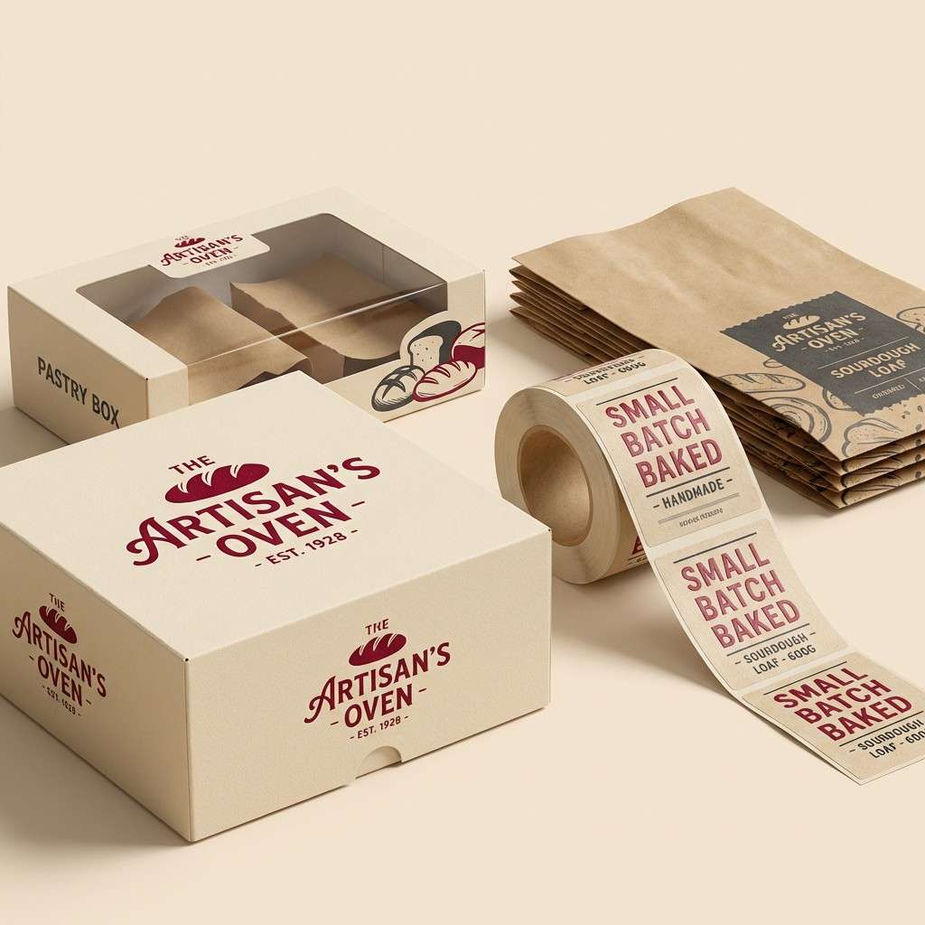
5) Carmine and Cream Letterpress
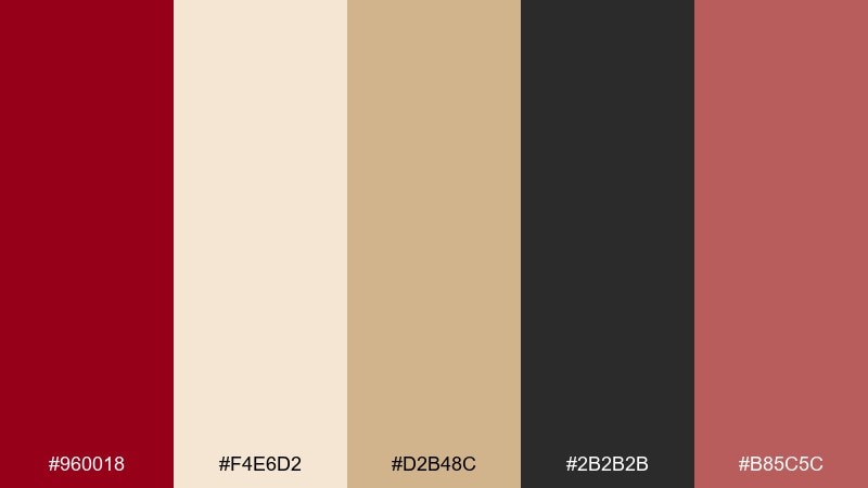
HEX: #960018 #F4E6D2 #D2B48C #2B2B2B #B85C5C
Mood: classic, tactile, handcrafted
Best for: bakery packaging design
Classic and tactile, it evokes letterpress ink on thick cream stock with a warm, handmade charm. This carmine color palette shines on labels and boxes when the cream stays dominant and the red is used for stamps and emblems. Tan and cocoa notes help it feel artisanal rather than formal. Tip: choose uncoated paper textures and keep the red to one or two print passes for authenticity.
Image example of carmine and cream letterpress generated using media.io
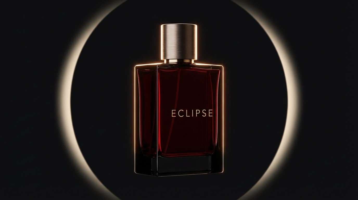
6) Velvet Noir
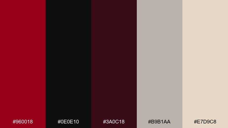
HEX: #960018 #0E0E10 #3A0C18 #B9B1AA #E7D9C8
Mood: moody, sleek, high-contrast
Best for: luxury fragrance ad
Moody and sleek, it feels like velvet in a dark room with a single red glow. Use black as the canvas, then pull the red forward for the bottle label, headline, or a thin frame. The warm light neutrals soften the contrast so the layout stays refined. Tip: keep copy minimal and let one red focal element do the heavy lifting.
Image example of velvet noir generated using media.io
7) Dusty Carmine Minimal
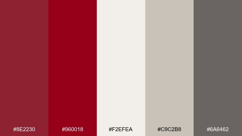
HEX: #8E2230 #960018 #F2EFEA #C9C2B8 #6A6462
Mood: minimal, calm, contemporary
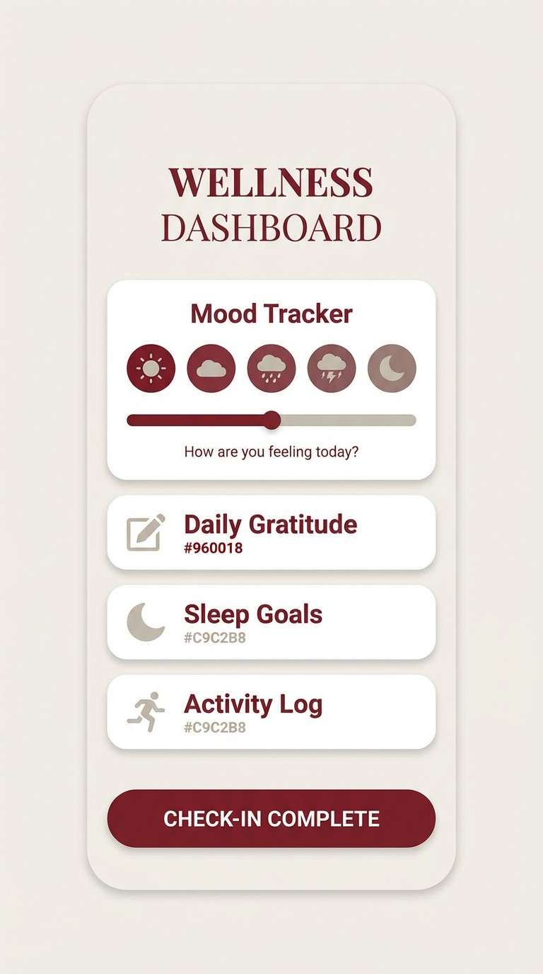
Best for: wellness app UI
Minimal and calm, it suggests soft fabric, quiet mornings, and gentle structure. Use the off-white as the main screen background and the dusty reds for key actions and progress states. Muted grays keep charts and dividers subtle without looking cold. Tip: reserve the deepest red for primary buttons only to keep the experience restful.
Image example of dusty carmine minimal generated using media.io
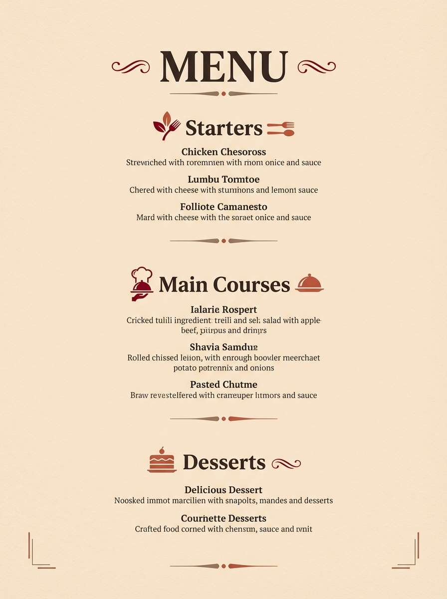
8) Spiced Berry Kitchen
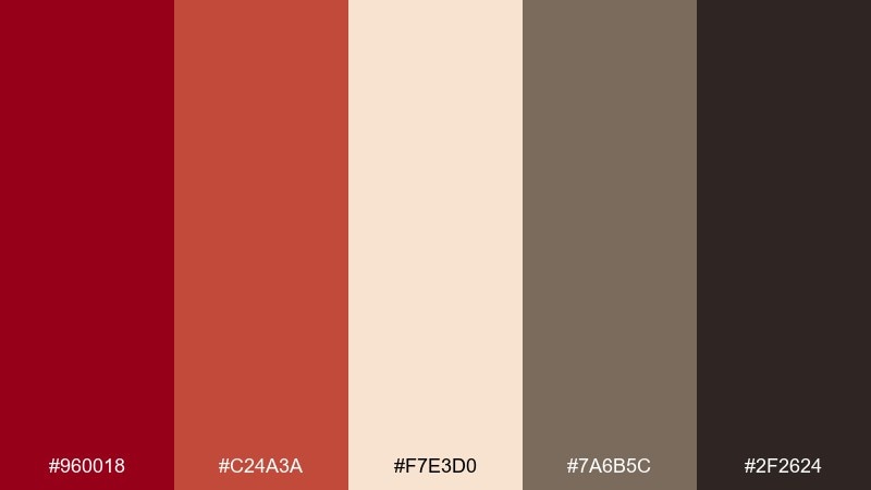
HEX: #960018 #C24A3A #F7E3D0 #7A6B5C #2F2624
Mood: cozy, appetizing, rustic
Best for: restaurant menu design
Cozy and appetizing, it brings to mind berry compote, spice jars, and warm wood counters. Use the cream as the main menu paper tone, then pull in red for section headers and special items. The brown and charcoal shades make body text and pricing feel grounded. Tip: pair with a serif for headings and a clean sans for descriptions to keep it readable.
Image example of spiced berry kitchen generated using media.io
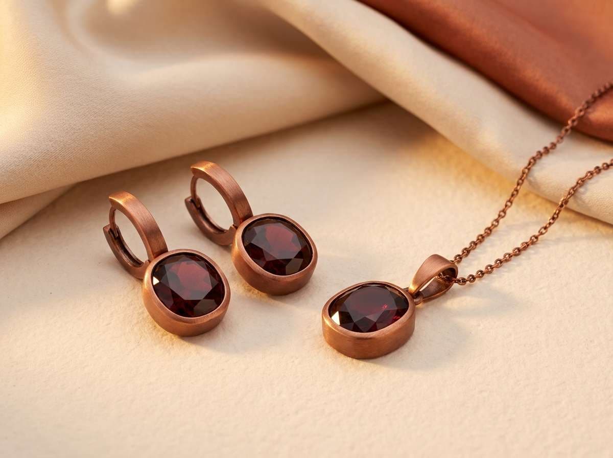
9) Ruby Copper Luxe
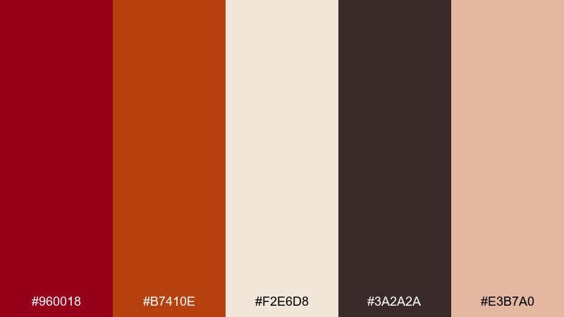
HEX: #960018 #B7410E #F2E6D8 #3A2A2A #E3B7A0
Mood: glam, warm, upscale
Best for: jewelry product ad
Glam and warm, it feels like ruby facets catching copper light at golden hour. A strong carmine color combination with copper works best when the metals are highlights and the red stays as the brand anchor. Keep the cream backdrop for a clean, high-end studio look. Tip: use the soft peach as a gradient glow behind the product to add depth without clutter.
Image example of ruby copper luxe generated using media.io
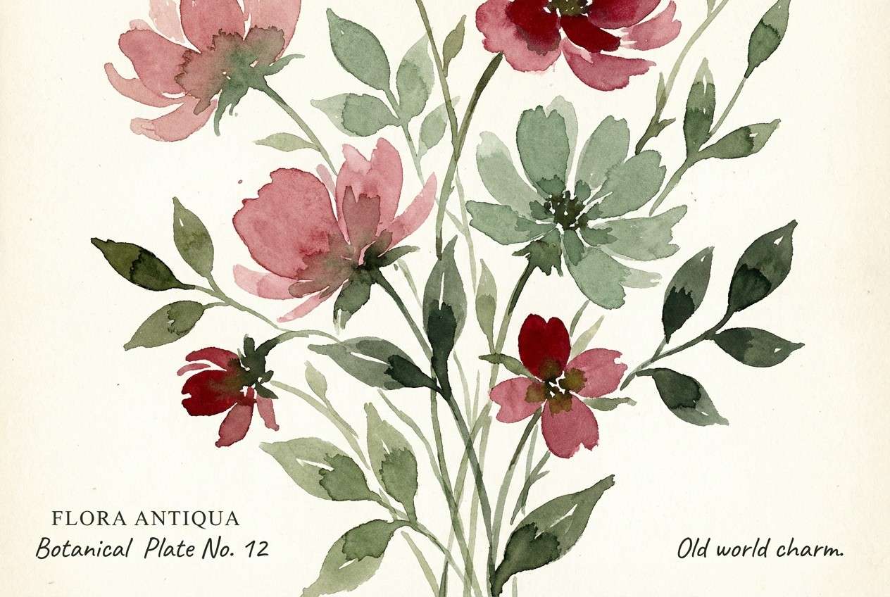
10) Botanical Carmine Bloom
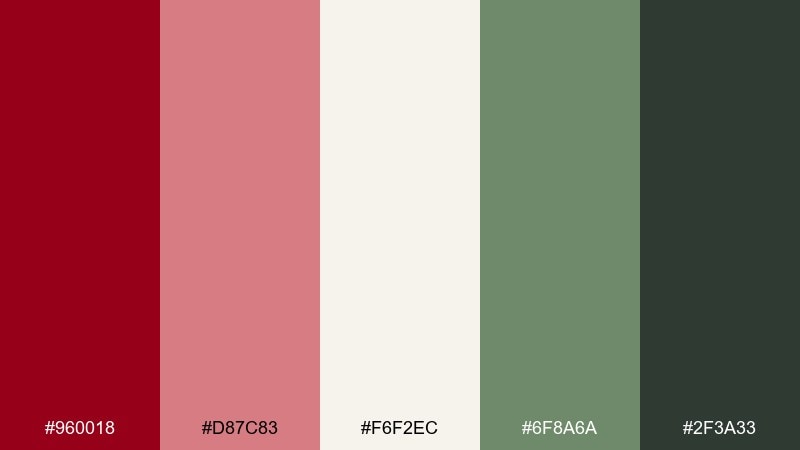
HEX: #960018 #D87C83 #F6F2EC #6F8A6A #2F3A33
Mood: fresh, floral, balanced
Best for: spring botanical illustration
Fresh and floral, it evokes garden petals against leafy greens after a light rain. Use the soft pink-red for petals and the deeper red for flower centers or small accents. Sage and deep green give the composition structure without overpowering the blooms. Tip: keep the background warm-white to make the reds feel natural rather than neon.
Image example of botanical carmine bloom generated using media.io
11) Retro Diner Red
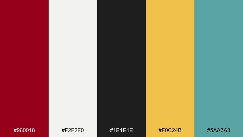
HEX: #960018 #F2F2F0 #1E1E1E #F0C24B #5AA3A3
Mood: retro, playful, punchy
Best for: vintage style flyer
Retro and punchy, it channels diner signage, chrome edges, and classic jukebox energy. Use the red and off-white for the main headline blocks, then bring in mustard for badges and price callouts. The teal is a fun secondary accent for icons or divider lines. Tip: lean into bold condensed type and simple shapes to keep it authentically vintage.
Image example of retro diner red generated using media.io
12) Modern Editorial Rouge
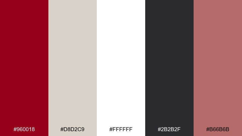
HEX: #960018 #D8D2C9 #FFFFFF #2B2B2F #B66B6B
Mood: editorial, clean, confident
Best for: magazine spread layout
Clean and confident, it reads like a modern fashion spread with sharp type and controlled color. Keep white as the dominant field, then use the red for pull quotes, section tabs, or a single hero headline. Warm gray and charcoal handle body copy with a premium feel. Tip: limit the accent pink to small highlights so the page stays crisp and editorial.
Image example of modern editorial rouge generated using media.io
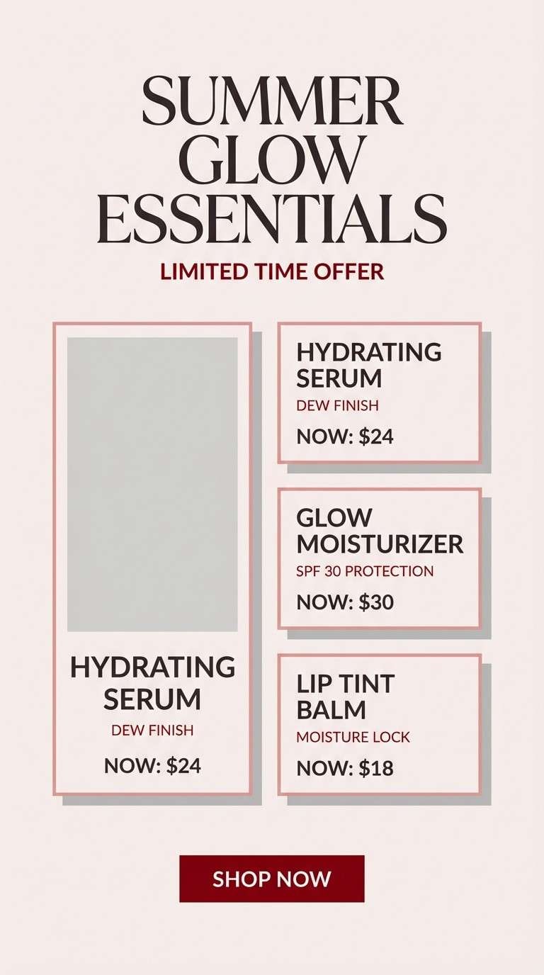
13) Soft Blush and Carmine
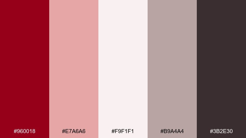
HEX: #960018 #E7A6A6 #F9F1F1 #B9A4A4 #3B2E30
Mood: soft, romantic, gentle
Best for: beauty social media template
Soft and romantic, it feels like blush makeup, satin ribbons, and warm studio light. Use the pale pink and near-white as the base for stories and posts, with the deeper red reserved for brand marks or key offers. The muted mauve-gray keeps text readable without turning harsh. Tip: apply the dark tone only to captions and small UI elements so the feed stays airy.
Image example of soft blush and carmine generated using media.io
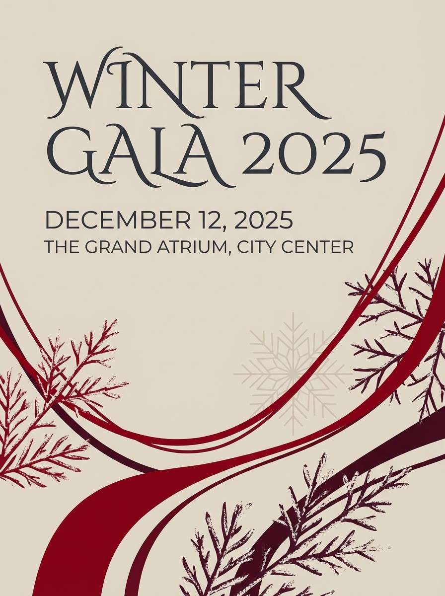
14) Winter Wine Night
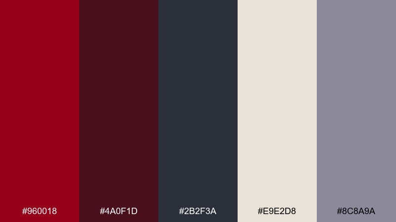
HEX: #960018 #4A0F1D #2B2F3A #E9E2D8 #8C8A9A
Mood: cool, moody, wintery
Best for: event invitation poster
Cool and moody, it suggests red wine by a window on a snowy night. Let the cream shade keep the layout readable, then add depth with plum and slate blocks behind key details. The muted lavender-gray works well for secondary text and separators. Tip: use plenty of spacing so the darker tones feel sophisticated, not heavy.
Image example of winter wine night generated using media.io
15) Clay Terracotta Harmony
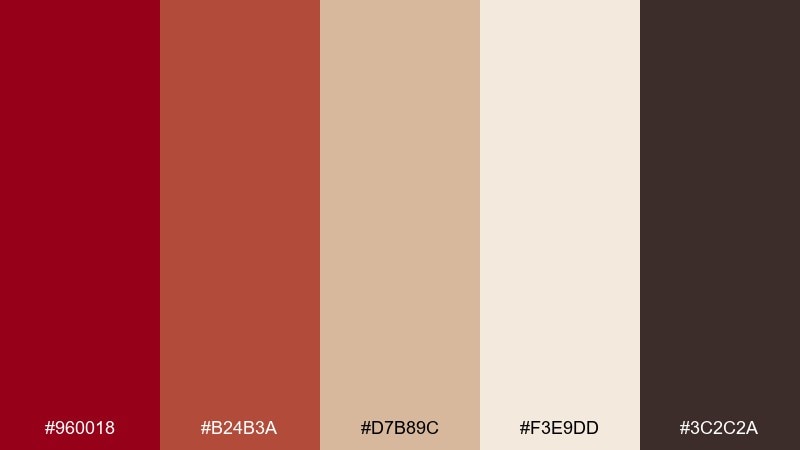
HEX: #960018 #B24B3A #D7B89C #F3E9DD #3C2C2A
Mood: earthy, warm, artisanal
Best for: home decor brand kit
Earthy and warm, it feels like kiln-fired clay, linen textiles, and a sunlit studio. Use terracotta and red as complementary accents, with warm cream doing most of the heavy lifting in backgrounds. The dark brown grounds your logo and typography for a handcrafted, premium vibe. Tip: add subtle grain textures to backgrounds to amplify the natural feel.
Image example of clay terracotta harmony generated using media.io
16) Neon Sign Carmine
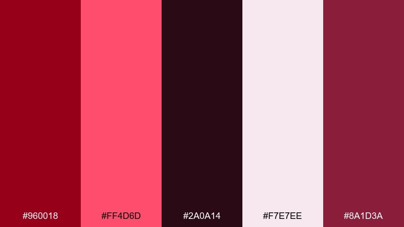
HEX: #960018 #FF4D6D #2A0A14 #F7E7EE #8A1D3A
Mood: bold, nightlife, electric
Best for: music event poster
Bold and electric, it evokes neon tubing glowing against a dark club wall. These carmine color combinations work best with a near-black background and a hot pink-red highlight for the main act name. Use the pale blush as a soft halo or small text panel so details stay readable. Tip: add a subtle glow effect only to the headline to keep the rest of the design sharp.
Image example of neon sign carmine generated using media.io

17) Heritage Burgundy Library
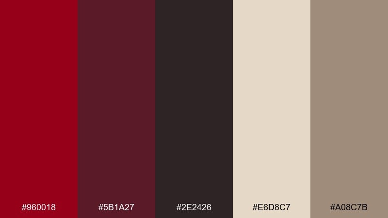
HEX: #960018 #5B1A27 #2E2426 #E6D8C7 #A08C7B
Mood: heritage, scholarly, timeless
Best for: book cover design
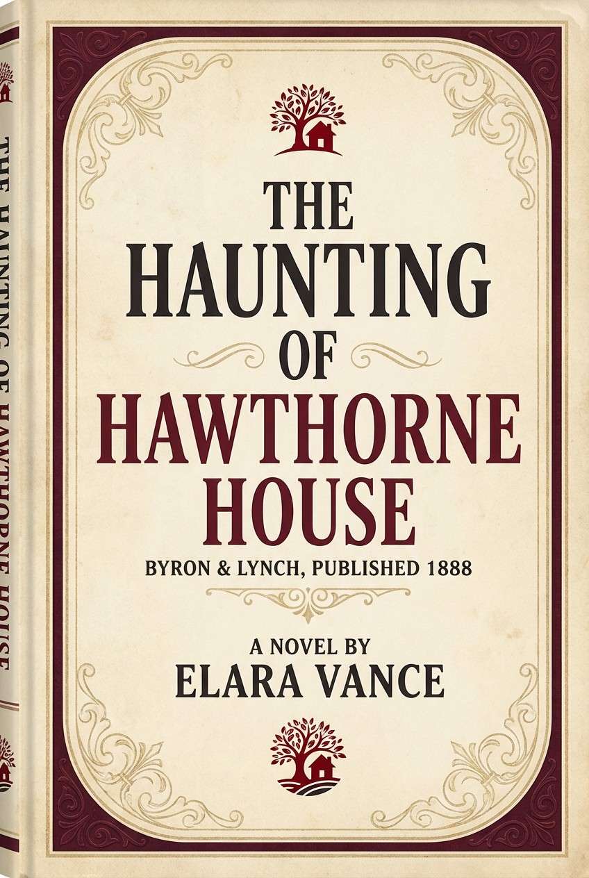
Heritage and timeless, it recalls leather-bound books, worn paper, and quiet library corners. Use the cream and tan for title blocks, then frame the composition with burgundy and deep brown. The strongest red works beautifully for a small emblem or series badge. Tip: keep ornamentation minimal and let texture and typography carry the mood.
Image example of heritage burgundy library generated using media.io
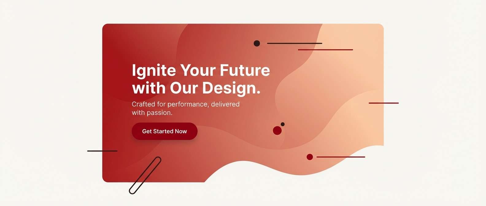
18) Sunset Carmine Gradient
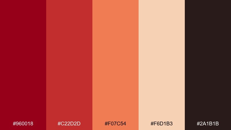
HEX: #960018 #C22D2D #F07C54 #F6D1B3 #2A1B1B
Mood: warm, radiant, energetic
Best for: landing page hero banner
Warm and radiant, it feels like a late sunset fading from deep red to peach. Use a controlled gradient for the hero area, then ground the page with dark text and simple components. Peach and sand tones are ideal for background sections and cards that need softness. Tip: keep the gradient to one focal block and use flat fills elsewhere for speed and clarity.
Image example of sunset carmine gradient generated using media.io
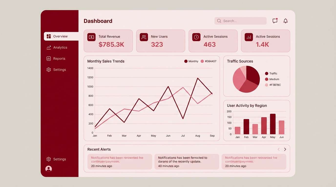
19) Monochrome Carmine UI
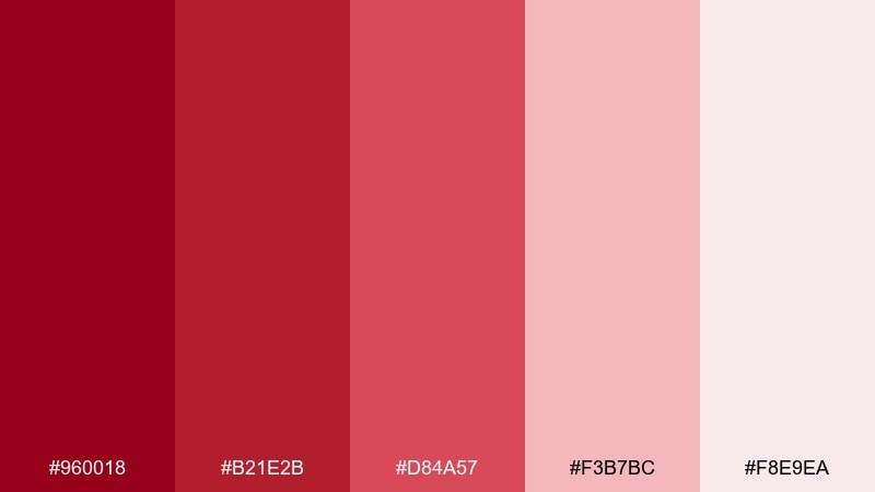
HEX: #960018 #B21E2B #D84A57 #F3B7BC #F8E9EA
Mood: focused, bold, cohesive
Best for: dashboard UI theme
Focused and cohesive, it looks like a clean interface built from one strong hue and its tints. This carmine color palette is ideal for dashboards where status states need clear hierarchy without switching hues. Use the pale tint for surfaces, mid tones for cards and charts, and the deepest red for primary actions. Tip: add neutral grays only for text if contrast fails, otherwise stay monochrome for impact.
Image example of monochrome carmine ui generated using media.io
20) Festival Poster Punch
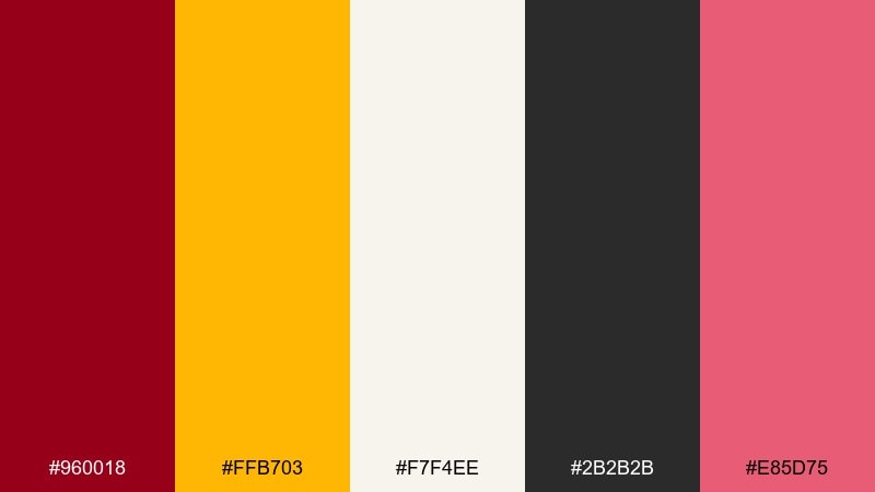
HEX: #960018 #FFB703 #F7F4EE #2B2B2B #E85D75
Mood: fun, loud, celebratory
Best for: street festival poster
Fun and celebratory, it brings the energy of street banners, music stages, and sunny crowds. Use the red for the main headline, mustard for highlights like dates and ticket info, and keep the background light for readability. The pink-red accent adds extra pop for icons or sponsor tags. Tip: stick to bold shapes and a tight color ratio so the layout feels punchy, not messy.
Image example of festival poster punch generated using media.io

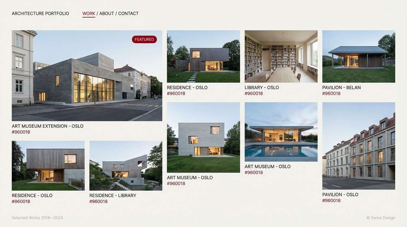
21) Stone and Carmine Contrast
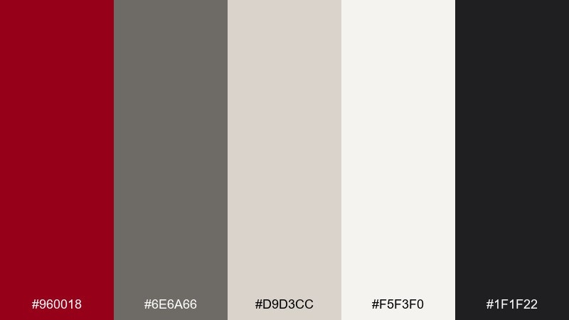
HEX: #960018 #6E6A66 #D9D3CC #F5F3F0 #1F1F22
Mood: modern, architectural, balanced
Best for: architecture portfolio website
Modern and architectural, it feels like polished concrete with a bold red wayfinding stripe. Use light stone neutrals for the page background and grids, then introduce the red as a navigation highlight or hover state. Charcoal and dark gray keep captions and project details crisp. Tip: keep photos black-and-white or muted so the accent red stays intentional.
Image example of stone and carmine contrast generated using media.io
22) Cherry Mocha Comfort
HEX: #960018 #7A2E2A #4B2C2A #E9D5C3 #F6EFE7
Mood: comforting, warm, cozy
Best for: coffee shop loyalty card
Comforting and warm, it suggests cherry syrup, espresso crema, and soft cafe lighting. Use the light cream for the card base, then bring in rich browns for text and stamps. The deep red works best as a small badge or punch mark that repeats across the set. Tip: add subtle line illustrations in brown to keep it friendly and legible at small sizes.
Image example of cherry mocha comfort generated using media.io
What Colors Go Well with Carmine?
Warm neutrals like cream, sand, and beige soften carmine’s intensity and make it feel premium rather than aggressive. This is a reliable direction for packaging, invitations, and editorial layouts where readability and elegance matter.
Deep darks—near-black, charcoal, espresso—make carmine look richer and more cinematic. Use these pairings for luxury ads, film posters, and any design that benefits from dramatic contrast.
For more energy, add a single bright accent (mustard, coral, or teal) while keeping the rest of the palette restrained. This creates playful, modern color combinations without losing carmine’s role as the anchor.
How to Use a Carmine Color Palette in Real Designs
Start by choosing your “dominant surface” color (often cream, warm white, or stone) and treat carmine as the attention color. This keeps layouts breathable while still giving you a strong visual signature for buttons, titles, and badges.
Maintain a clear color ratio: use carmine sparingly for key actions and high-value info, then support it with text-friendly darks and mid-tone neutrals. In UI, test contrast early so the palette remains accessible across states.
In print, carmine works best when you embrace texture—uncoated paper, embossing, or subtle grain—while keeping the composition clean. A little restraint makes the red look more intentional and expensive.
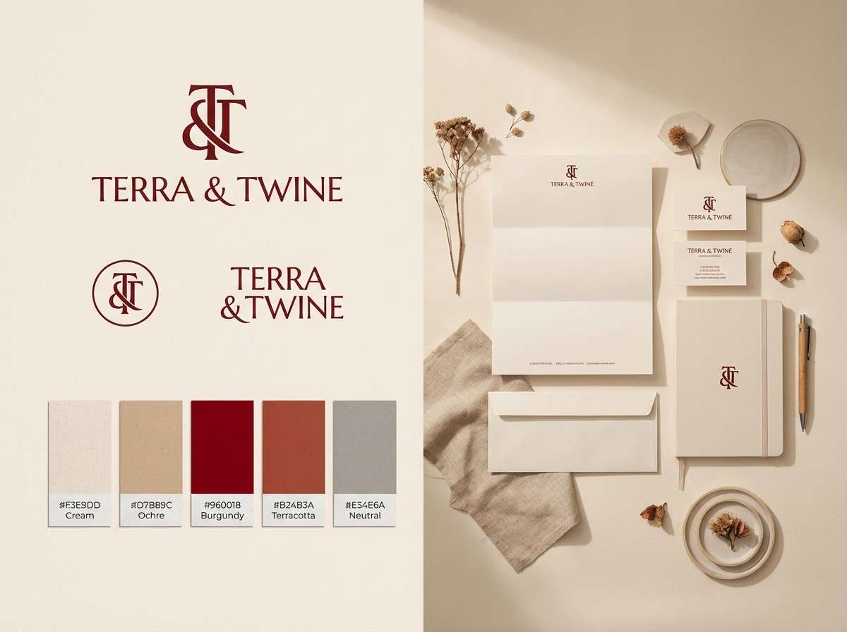
Create Carmine Palette Visuals with AI
If you want to see these palettes in action fast, generate realistic mockups or stylized posters using an AI text-to-image tool. Reuse the prompts above as templates, then swap in your product type, layout, and aspect ratio.
To keep results consistent, lock your HEX colors in the prompt, describe the background as “plain” or “clean,” and specify the design format (UI mockup, invitation set, product ad, poster). This helps the model focus on composition rather than clutter.
Once you get a strong first image, iterate by changing only one variable at a time—type style, lighting, or texture—so you can quickly converge on a brand-ready look.
Carmine Color Palette FAQs
-
What is the HEX code for carmine?
A common digital carmine is #960018. You’ll often see it used as the anchor red in palettes that lean toward burgundy or wine tones. -
Is carmine closer to crimson or burgundy?
Carmine usually sits between crimson and burgundy: it has the bold presence of crimson but with a deeper, slightly darker character that can read more refined like burgundy. -
What colors pair best with carmine for a luxury look?
Near-black/charcoal, warm cream, and metallic accents (gold or copper) are classic choices. They increase contrast and make carmine feel richer and more premium. -
How do I use carmine in UI without overpowering the design?
Use carmine for primary buttons, active states, and key highlights, while keeping backgrounds light (warm white/cream) and text in charcoal. Limit large carmine blocks to avoid visual fatigue. -
Does carmine work for wedding invitations?
Yes. Pair carmine with blush and warm white for a romantic tone, and add a dark ink color for legibility. Foil, embossing, or letterpress textures can elevate it further. -
What’s a good contrasting accent color for carmine?
Teal and mustard are strong, lively contrasts when used sparingly. For a softer contrast, try sage green or dusty rose. -
How can I generate carmine palette visuals with consistent results?
Include the exact HEX codes in your prompt, specify the design type (poster, UI, packaging), and keep backgrounds “plain/clean.” Then iterate with small changes (lighting, typography style, texture) to refine the look.
Next: Cinematic Color Palette


