

Violet blue sits between the confidence of blue and the imagination of violet, making it a go-to choice for modern UI, branding, and editorial design.
Below are 20+ refined violet blue color palette ideas with HEX codes, plus practical guidance for pairing, contrast, and real-world use.
In this article
- Why Violet Blue Palettes Work So Well
-
- midnight iris
- periwinkle mist
- electric violet pop
- royal ink and silver
- lapis lavender cream
- cosmic berry drift
- stormy denim slate
- amethyst neon night
- sapphire orchid clay
- glacier violet minimal
- indigo plum velvet
- sky violet citrus
- twilight hydrangea
- blueberry milkshake
- aubergine seafoam
- velvet dusk gold
- ultraviolet coral spark
- nebula gradient fade
- classic violet blue studio
- violet blue and sage calm
- crystal lilac night
- frosted violet grid
- What Colors Go Well with Violet Blue?
- How to Use a Violet Blue Color Palette in Real Designs
- Create Violet Blue Palette Visuals with AI
Why Violet Blue Palettes Work So Well
Violet blue is a “bridge color” that feels both trustworthy and expressive. It carries the stability people associate with blue, while adding a subtle creative edge from purple.
In digital design, violet blue reads clean and high-contrast against soft tints, and it pairs well with both cool neutrals (silver, slate, off-white) and warm accents (gold, clay, coral).
Across branding and print, violet blue can shift mood easily: deeper indigo-based mixes look premium and cinematic, while periwinkle-leaning tints feel airy, friendly, and modern.
20+ Violet Blue Color Palette Ideas (with HEX Codes)
1) Midnight Iris
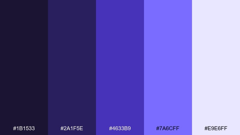
HEX: #1b1533 #2a1f5e #4633b9 #7a6cff #e9e6ff
Mood: cinematic, bold, mysterious
Best for: SaaS landing page hero and navigation
Cinematic and nocturnal, these tones feel like city lights reflecting off deep velvet. Use the darkest shade for headers and nav, then let the violet-blue core carry primary buttons and links. Pair with soft lilac-tinted whites to keep readability crisp without looking sterile. Usage tip: reserve the lightest tint for large background blocks so the mid tones pop.
Image example of midnight iris generated using media.io

Media.io is an online AI studio for creating and editing video, image, and audio in your browser.

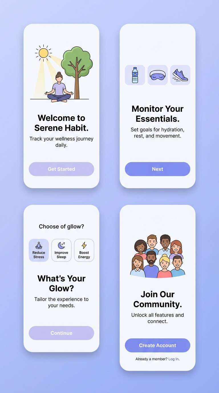
2) Periwinkle Mist
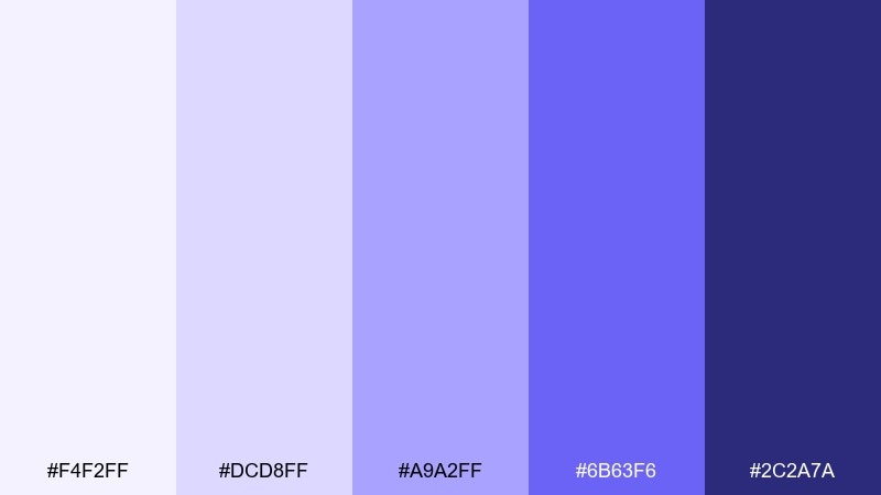
HEX: #f4f2ff #dcd8ff #a9a2ff #6b63f6 #2c2a7a
Mood: airy, calm, optimistic
Best for: wellness app onboarding screens
Airy and soothing, this set reads like morning fog tinted with soft periwinkle. Keep layouts spacious with the pale tints, then use the saturated violet-blue for progress states and primary actions. A deep indigo anchor helps icons and key labels stay legible on light backgrounds. Usage tip: apply the mid lavender as a gentle gradient to reduce flatness without adding noise.
Image example of periwinkle mist generated using media.io
3) Electric Violet Pop
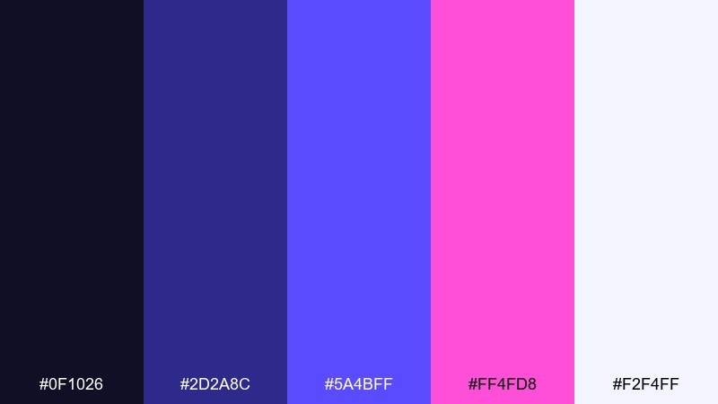
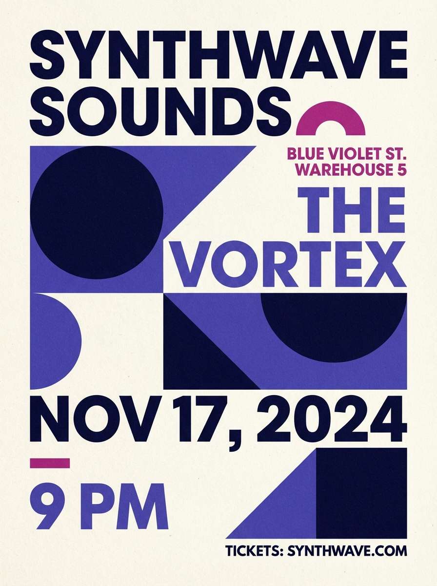
HEX: #0f1026 #2d2a8c #5a4bff #ff4fd8 #f2f4ff
Mood: energetic, playful, high-contrast
Best for: music event poster design
Punchy and electric, it feels like a late-night set with neon highlights. Let the violet-blue carry the headline and key shapes, while magenta becomes a controlled accent for dates or callouts. The near-black base keeps everything grounded and gives bright colors room to glow. Usage tip: keep magenta under 15 percent of the layout so it stays a spark, not a takeover.
Image example of electric violet pop generated using media.io
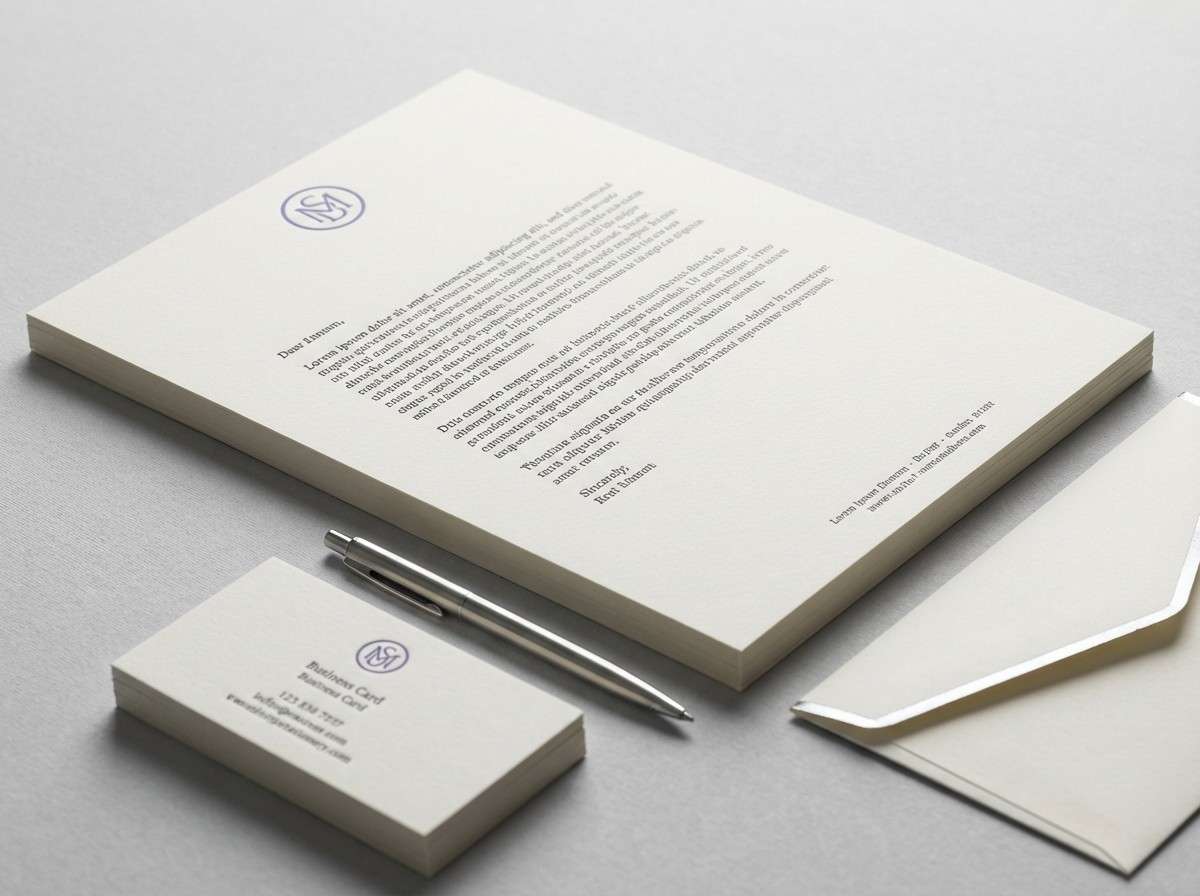
4) Royal Ink and Silver
HEX: #14112a #2b235a #4b3fbf #bfc5d8 #f6f7fb
Mood: premium, editorial, refined
Best for: luxury brand identity and stationery
Polished and regal, these colors feel like ink on thick paper with a cool metallic sheen. Use the deep ink tone for logos and typography, then bring in the violet-blue for monograms or signature marks. Silver-gray makes a sophisticated support neutral for lines, seals, and subtle patterns. Usage tip: print the darkest shade as rich black replacement for a softer, more upscale finish.
Image example of royal ink and silver generated using media.io
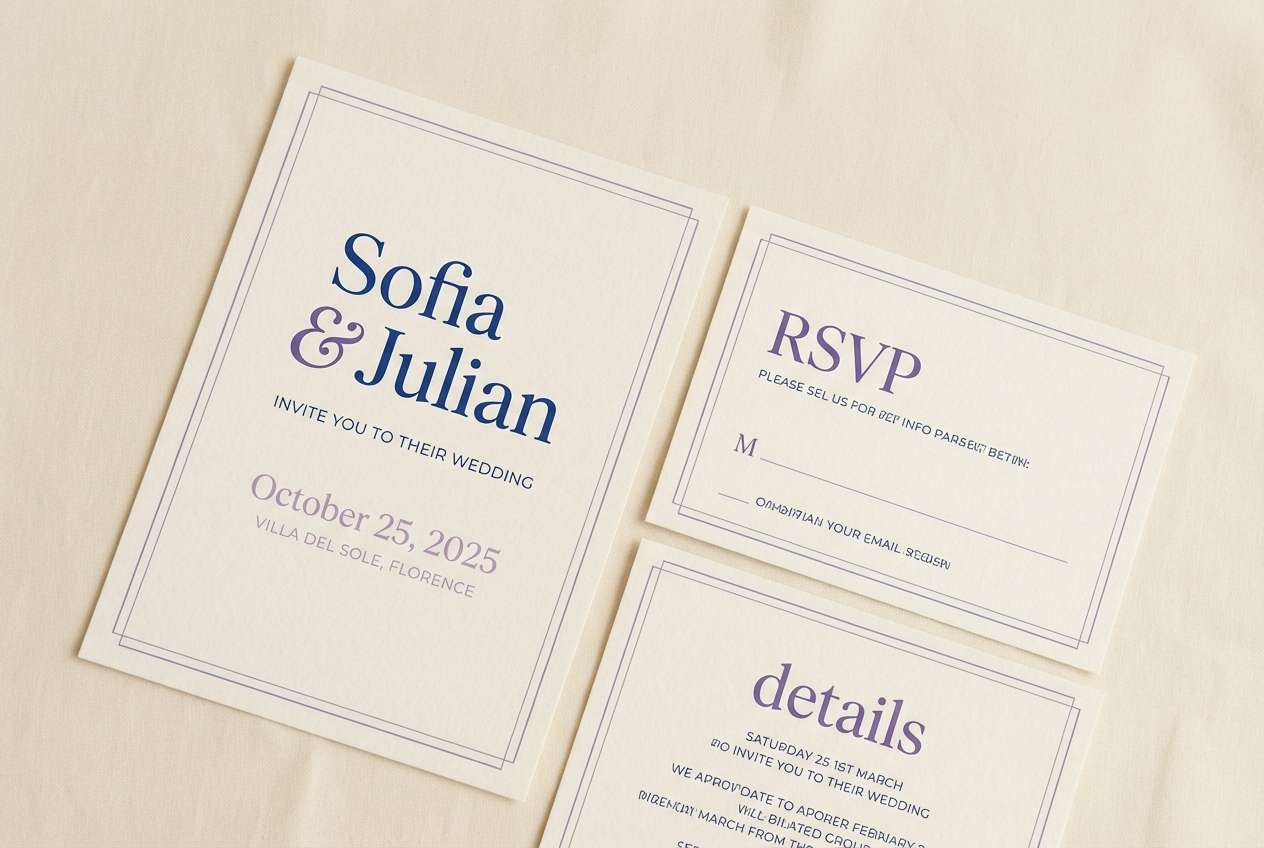
5) Lapis Lavender Cream
HEX: #2a2c8a #5247d6 #9b8cff #f3e7ff #fff6e8
Mood: soft, romantic, inviting
Best for: wedding invitation suite
Romantic and luminous, it brings to mind lavender petals against warm candlelight. Use the cream as the paper base, then layer violet-blue for names and headings. The blushy lilac tint works beautifully for borders, icons, and delicate flourishes. Usage tip: keep body copy in the deeper lapis tone for contrast that still feels gentle.
Image example of lapis lavender cream generated using media.io
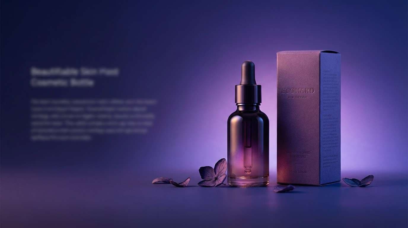
6) Cosmic Berry Drift
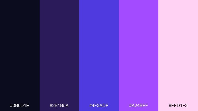
HEX: #0b0d1e #2b1b5a #4f3adf #a24bff #ffd1f3
Mood: dreamy, cosmic, expressive
Best for: beauty product ad creative
Dreamy and cosmic, it looks like stardust dissolving into berry-tinted haze. These violet blue color combinations shine in gradient-heavy ads, where deep indigo fades into bright purple accents. Keep the pale pink as a highlight for glow effects, not a full background. Usage tip: add soft grain on gradients to prevent banding in social exports.
Image example of cosmic berry drift generated using media.io
7) Stormy Denim Slate
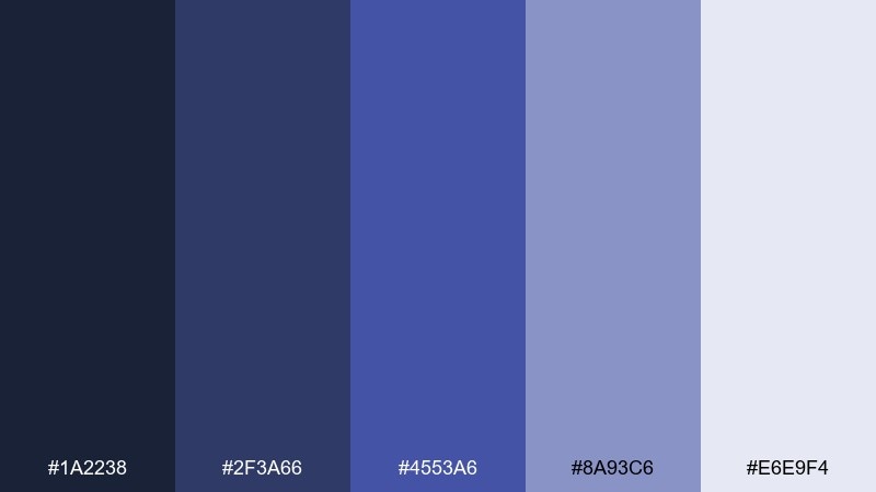
HEX: #1a2238 #2f3a66 #4553a6 #8a93c6 #e6e9f4
Mood: cool, dependable, professional
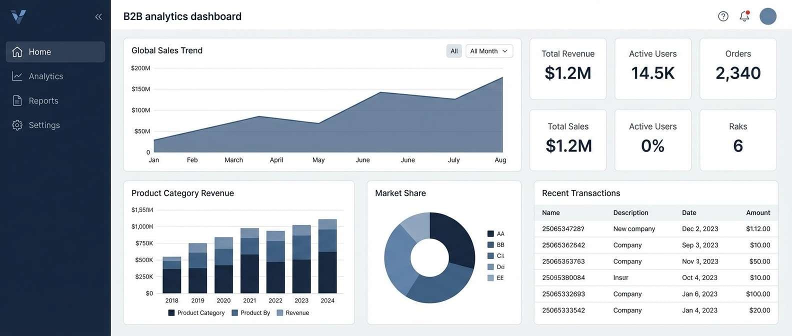
Best for: B2B dashboard and data visualization
Cool and dependable, it evokes storm clouds over worn denim. Use the slate blues for chart series and hover states, with the pale gray-blue as a background panel color. The darkest navy keeps tables, toolbars, and sidebar items structured. Usage tip: limit the mid violet-blue to key metrics so analytics screens do not feel noisy.
Image example of stormy denim slate generated using media.io
8) Amethyst Neon Night
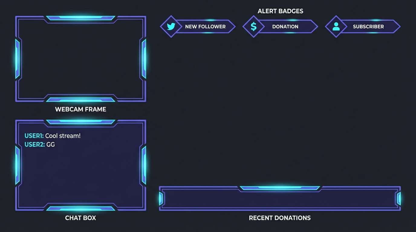
HEX: #070716 #22104f #4a2cff #00d4ff #f7f2ff
Mood: futuristic, crisp, high-energy
Best for: gaming stream overlay graphics
Futuristic and sharp, it feels like neon signage cutting through a dark arcade. Use violet-blue as your dominant frame and panel color, then bring in cyan for alerts and live badges. The off-white tint keeps small type readable without turning the overlay gray. Usage tip: apply cyan only to motion elements so attention stays where it matters.
Image example of amethyst neon night generated using media.io
9) Sapphire Orchid Clay
HEX: #1e1b4b #3f3aa8 #7a6cff #d7c4ff #c6a18a
Mood: artful, modern, slightly warm
Best for: boutique interior mood board
Artful and modern, it mixes cool sapphire with orchid softness and a touch of clay warmth. Use the violet-blue and soft lilac in textiles and wall accents, then let the clay tone show up in wood, leather, or ceramics. The deep indigo works as a grounding paint or metal finish. Usage tip: repeat the clay accent at least twice to keep the palette from feeling too icy.
Image example of sapphire orchid clay generated using media.io
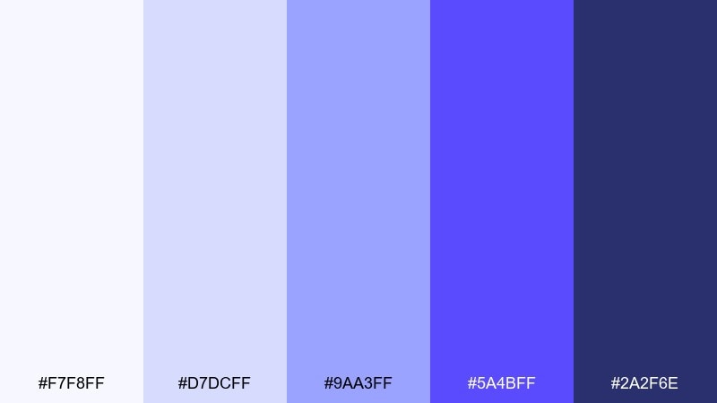
10) Glacier Violet Minimal
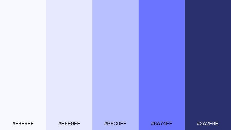
HEX: #f8f9ff #e6e9ff #b8c0ff #6a74ff #2a2f6e
Mood: clean, minimal, tech-forward
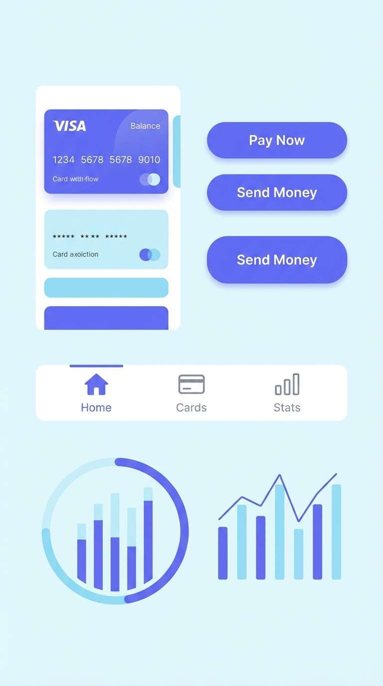
Best for: fintech mobile UI components
Clean and glacial, it suggests frosted glass with a violet tint. This violet blue color scheme works well for fintech UI because it feels precise without becoming cold. Use the light tints for cards and surfaces, then assign the saturated blue-violet to primary actions and active tabs. Usage tip: keep error and success colors muted so the core tone remains the brand anchor.
Image example of glacier violet minimal generated using media.io
11) Indigo Plum Velvet
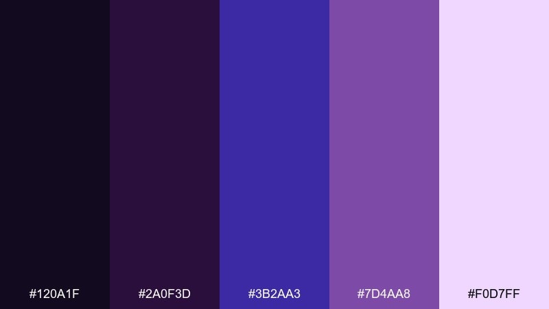
HEX: #120a1f #2a0f3d #3b2aa3 #7d4aa8 #f0d7ff
Mood: dramatic, luxe, intimate
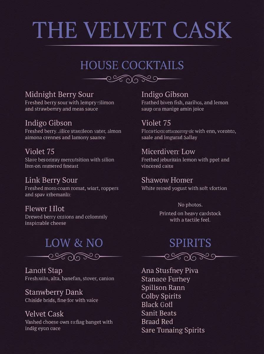
Best for: cocktail bar menu design
Dramatic and velvety, it feels like candlelit booths and plush drapery. Use the near-black plum for the menu base, then set section titles in violet-blue for a refined glow. The soft pink-lilac tint can highlight specials without turning the piece cute. Usage tip: add plenty of negative space so dark backgrounds still feel premium, not heavy.
Image example of indigo plum velvet generated using media.io
12) Sky Violet Citrus
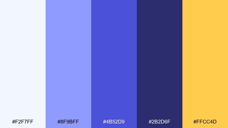
HEX: #f2f7ff #8f9bff #4b52d9 #2b2d6f #ffcc4d
Mood: bright, modern, attention-grabbing
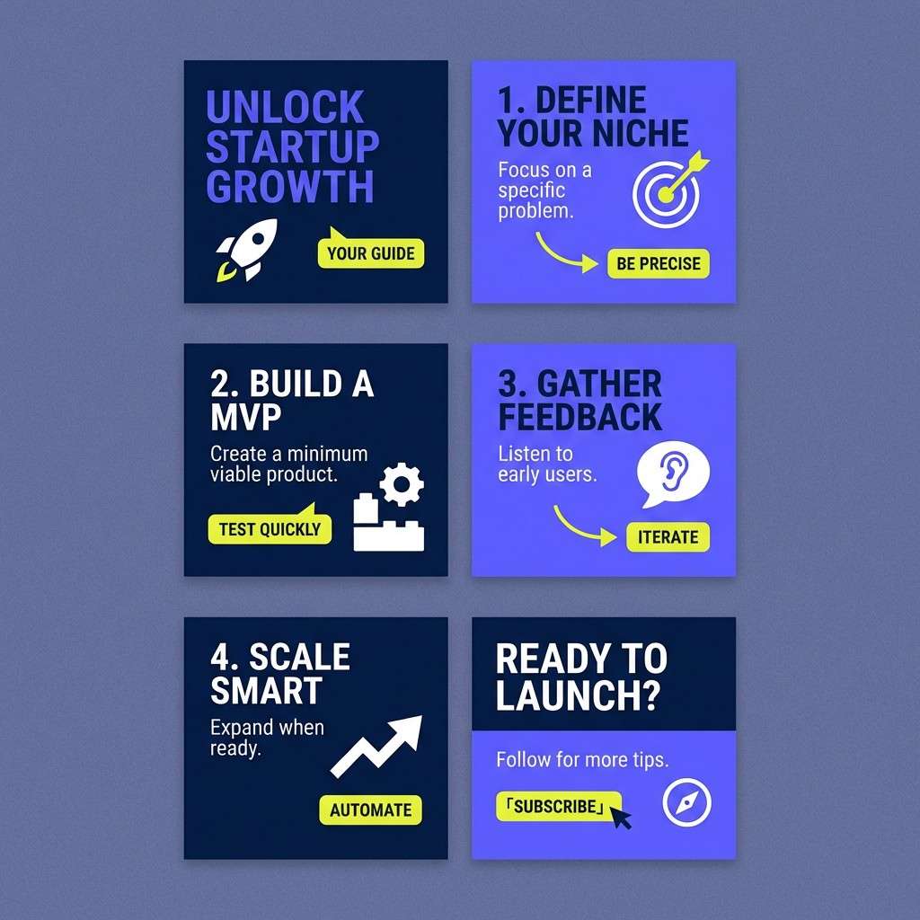
Best for: startup social media carousel
Bright and modern, it feels like a clear sky interrupted by a confident citrus flash. Use the violet-blue range for headings and shapes, then reserve the yellow for key numbers, CTAs, or stickers. The navy keeps small text readable and prevents the carousel from looking washed out. Usage tip: place yellow on solid blocks rather than thin lines to avoid vibration on screens.
Image example of sky violet citrus generated using media.io
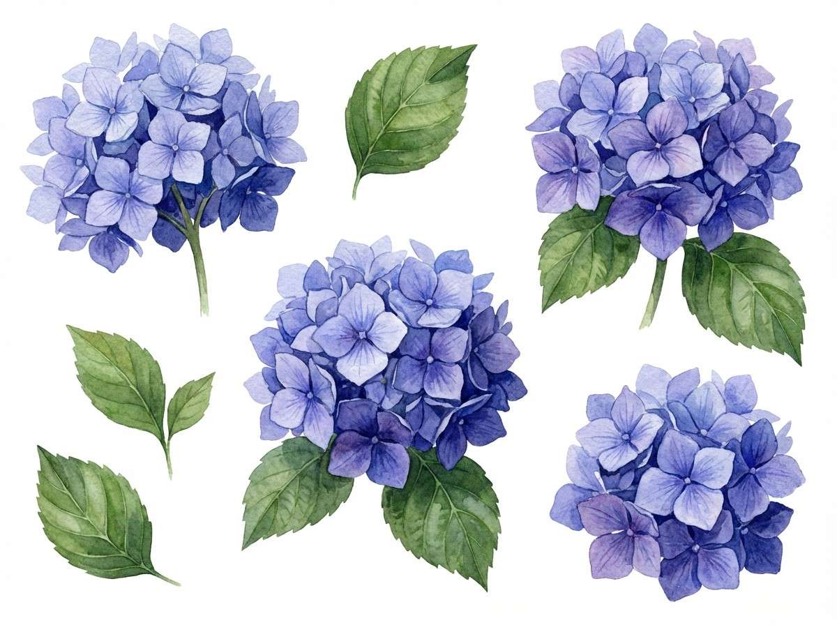
13) Twilight Hydrangea
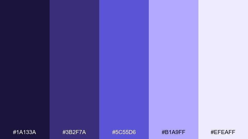
HEX: #1a133a #3b2f7a #5c55d6 #b1a9ff #efeaff
Mood: gentle, floral, nostalgic
Best for: spring botanical illustration set
Gentle and floral, it recalls hydrangea blooms fading into twilight. Paint petals with the soft lilac and periwinkle tones, then use the darker indigo for stems, shadows, and ink outlines. The bright violet-blue is ideal for focal blossoms or small decorative motifs. Usage tip: keep washes translucent so the palette stays airy instead of heavy.
Image example of twilight hydrangea generated using media.io
14) Blueberry Milkshake
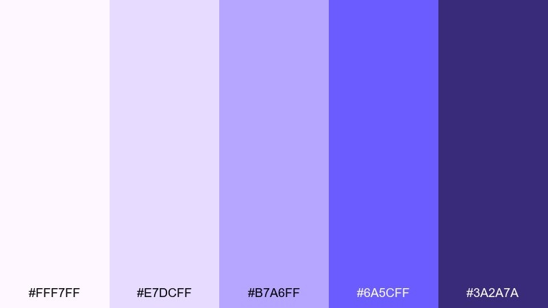
HEX: #fff7ff #e7dcff #b7a6ff #6a5cff #3a2a7a
Mood: sweet, soft, friendly
Best for: kids education app branding
Sweet and friendly, it feels like a blueberry milkshake with a creamy finish. Use the soft tints for backgrounds and rounded cards, then bring in the saturated violet-blue for characters, badges, and interactive states. The deeper purple-blue helps icons stand out without looking harsh. Usage tip: keep typography in the darkest shade and save the brightest color for rewards.
Image example of blueberry milkshake generated using media.io
15) Aubergine Seafoam
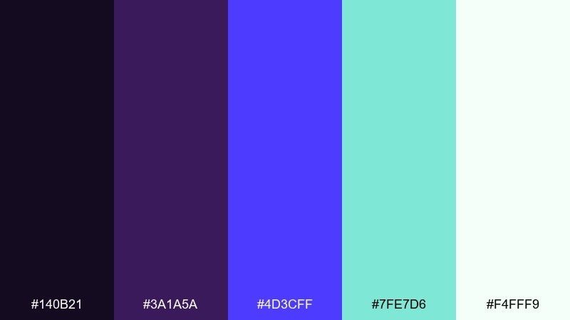
HEX: #140b21 #3a1a5a #4d3cff #7fe7d6 #f4fff9
Mood: unexpected, fresh, contemporary
Best for: creative agency website refresh
Unexpected and fresh, it pairs aubergine depth with a seafoam lift. These violet blue color combinations work best when seafoam is kept as a highlight for hover states, links, or small illustrations. Use the deep purple-black for big typographic moments and to frame the layout. Usage tip: test seafoam text on light backgrounds and switch to outlines if contrast dips.
Image example of aubergine seafoam generated using media.io
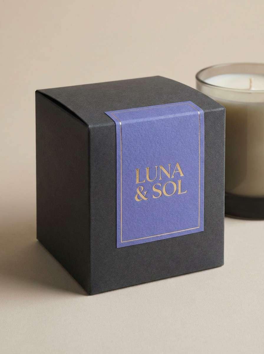
16) Velvet Dusk Gold
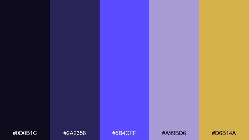
HEX: #0d0b1c #2a2358 #5b4cff #a99bd6 #d6b14a
Mood: opulent, moody, celebratory
Best for: premium packaging for candles
Opulent and moody, it feels like velvet at dusk with a warm gold glint. Use violet-blue as the main brand color on labels, then let gold appear in foil details or thin rules. The soft mauve keeps secondary information calm and elegant. Usage tip: keep gold to small, high-impact elements so it reads premium rather than flashy.
Image example of velvet dusk gold generated using media.io
17) Ultraviolet Coral Spark
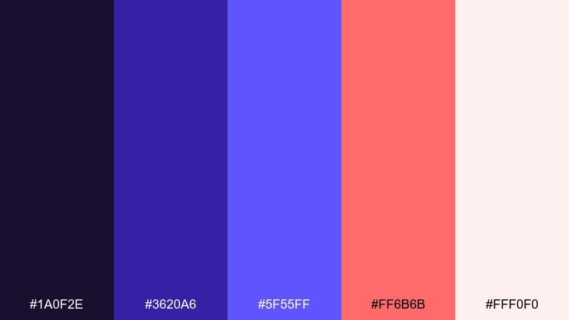
HEX: #1a0f2e #3620a6 #5f55ff #ff6b6b #fff0f0
Mood: bold, youthful, upbeat
Best for: product launch email header
Bold and upbeat, it looks like ultraviolet light with a coral burst. Use violet-blue for the main header block and navigation accents, then let coral highlight the offer and countdown details. The soft blush background keeps the message friendly, not aggressive. Usage tip: make coral the only warm accent in the layout to keep focus tight.
Image example of ultraviolet coral spark generated using media.io
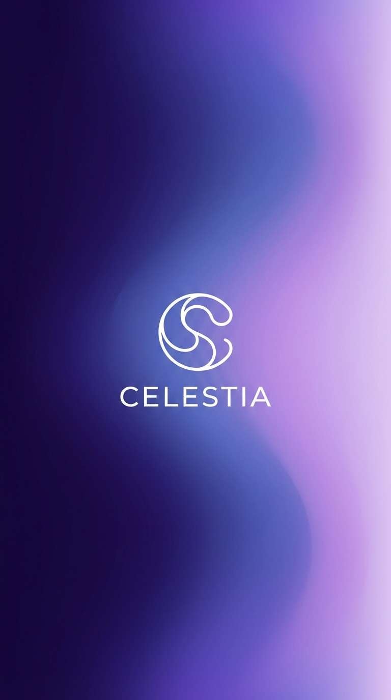
18) Nebula Gradient Fade
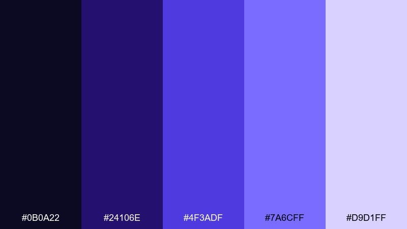
HEX: #0b0a22 #24106e #4f3adf #7a6cff #d9d1ff
Mood: atmospheric, modern, immersive
Best for: app splash screen and gradients
Atmospheric and immersive, it resembles a nebula drifting from deep space into soft light. Build gradients from indigo to violet-blue, then fade into the pale lilac for a premium glow. Keep icons simple and use the darkest shade for the status bar area. Usage tip: add a subtle vignette to frame the center logo and avoid a flat gradient band.
Image example of nebula gradient fade generated using media.io
19) Classic Violet Blue Studio
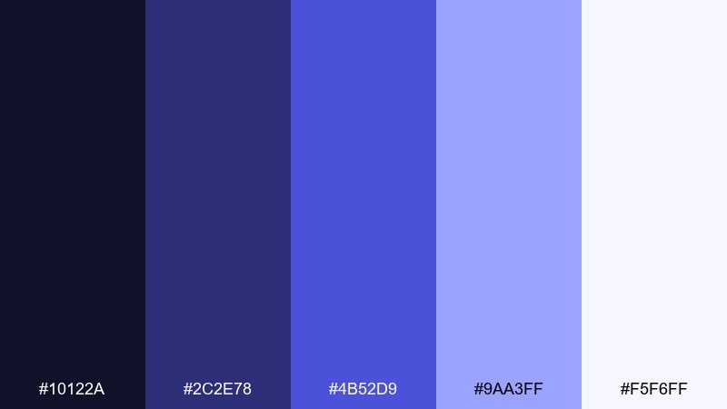
HEX: #10122a #2c2e78 #4b52d9 #9aa3ff #f5f6ff
Mood: confident, balanced, versatile
Best for: brand guideline cover and slides
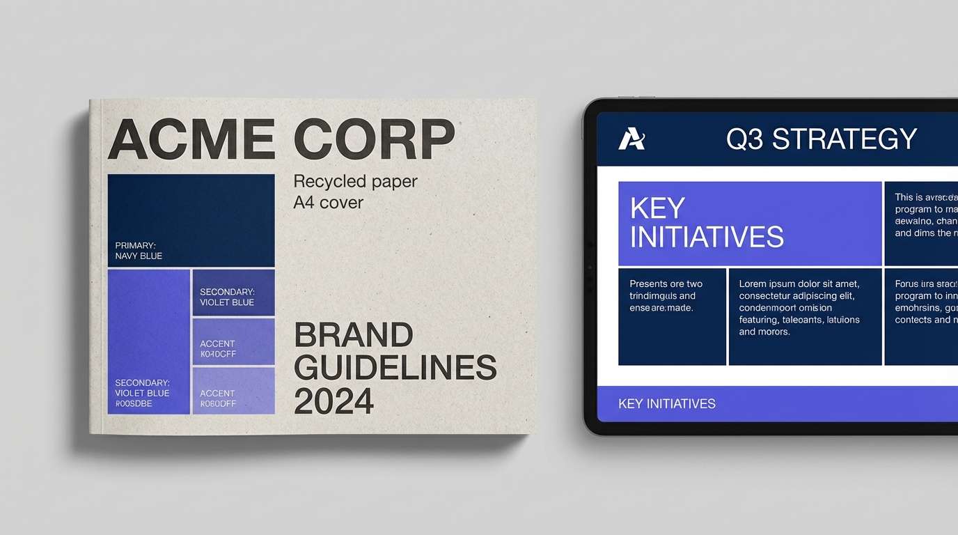
Confident and balanced, it feels like a well-lit studio where every detail is intentional. A violet blue color palette like this is versatile for decks: deep navy for titles, mid violet-blue for charts, and pale tints for section dividers. The lighter periwinkle keeps long pages from feeling dense. Usage tip: assign each tone a role in your slide system and stick to it for consistency.
Image example of classic violet blue studio generated using media.io
20) Violet Blue and Sage Calm
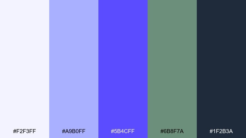
HEX: #f2f3ff #a9b0ff #5b4cff #6b8f7a #1f2b3a
Mood: calm, natural, grounded
Best for: eco product label design
Calm and grounded, it blends cool violet-blue with a quiet, botanical sage. Use the sage for secondary panels, ingredient callouts, or icons, while violet-blue holds the brand mark and key claims. The dark blue-gray replaces harsh black and keeps the label feeling natural. Usage tip: print test on uncoated stock so the pale tint does not wash out.
Image example of violet blue and sage calm generated using media.io
21) Crystal Lilac Night
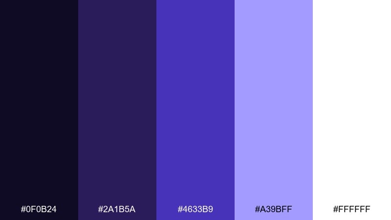
HEX: #0f0b24 #2a1b5a #4633b9 #a39bff #ffffff
Mood: sleek, luminous, modern
Best for: tech keynote slide theme
Sleek and luminous, it looks like crystal light cutting through a dark room. Use the deep base for full-bleed slide backgrounds, then set big numbers and charts in the brighter violet-blue. White keeps messaging clear, while the soft lilac helps secondary charts or footnotes read without distraction. Usage tip: increase line weights on dark backgrounds so details do not disappear in projectors.
Image example of crystal lilac night generated using media.io

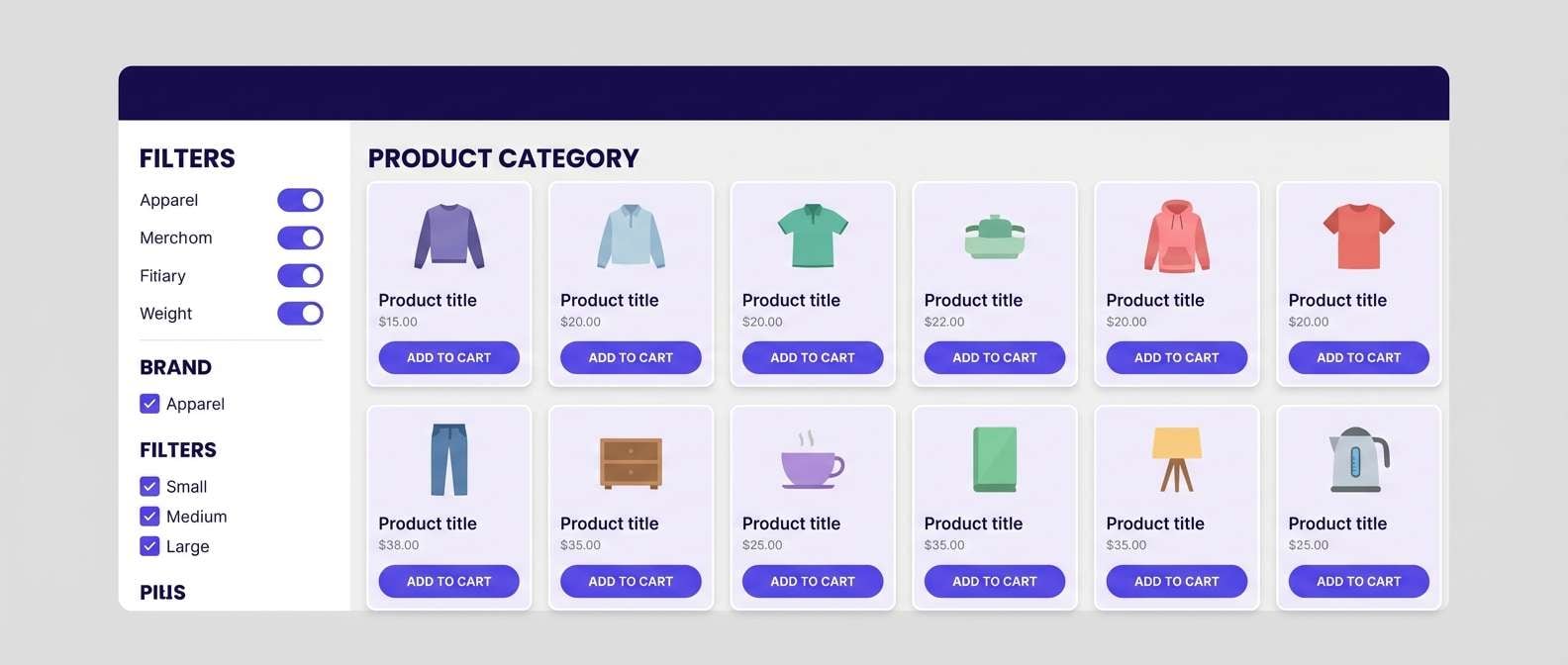
22) Frosted Violet Grid
HEX: #f7f8ff #d7dcff #9aa3ff #5a4bff #2a2f6e
Mood: organized, crisp, contemporary
Best for: ecommerce product grid UI
Organized and crisp, it feels like frosted glass over a tidy grid. Use the lightest tones for page background and cards, then apply violet-blue to price highlights and primary actions. The deeper indigo is perfect for filters, sticky headers, and focused states. Usage tip: keep borders subtle and rely on spacing plus tint shifts to separate product tiles.
Image example of frosted violet grid generated using media.io
What Colors Go Well with Violet Blue?
Cool neutrals like silver, slate, and off-white make violet blue look sharper and more “tech-forward,” especially in UI where contrast and hierarchy matter.
Warm accents such as gold, clay, cream, and soft blush help balance violet blue’s coolness and add a premium, human feel for packaging, decor, and editorial layouts.
For bold contrast, try high-chroma pops like cyan, coral, or magenta—but keep them controlled so violet blue stays the main brand anchor.
How to Use a Violet Blue Color Palette in Real Designs
Assign roles to each tone: a deep base for headers/nav, a mid violet blue for primary actions, and pale tints for surfaces and spacing. This keeps screens readable and consistent across components.
In print and branding, swap harsh black for a deep indigo and use violet blue for signatures (monograms, rules, icons). The result feels refined while staying legible.
If you rely on gradients, add subtle grain and test exports on multiple displays to avoid banding and ensure your violet blue stays smooth.
Create Violet Blue Palette Visuals with AI
Want to see these violet blue color combinations in real layouts—posters, UI screens, packaging, or mood boards? Generate quick mockups from a simple prompt and iterate in minutes.
Use consistent keywords (e.g., “clean vector UI,” “studio shot,” “print-ready poster”) and include your chosen HEX-inspired vibe so the visuals match your intended style.
When you find a direction you like, keep the same prompt structure and only change the palette accents to create a cohesive series.
Violet Blue Color Palette FAQs
-
What is the HEX code for a classic violet blue?
A widely used modern violet blue is #5a4bff, which sits between indigo and electric periwinkle and works well for buttons, links, and brand accents. -
Is violet blue closer to indigo or periwinkle?
It depends on the tint: darker violet blues lean indigo (more navy/purple depth), while lighter tints drift toward periwinkle (more airy and pastel). -
What colors pair best with violet blue in UI design?
Off-white surfaces, cool grays, and deep indigo/navy are the easiest matches. For accents, use cyan or coral sparingly for alerts and key highlights. -
How do I keep violet blue designs from feeling too cold?
Add one warm counterbalance like cream, gold, clay, or blush. Even small warm details (icons, dividers, foil accents) can make the palette feel more inviting. -
Can I use violet blue for professional B2B branding?
Yes—choose slate/denim companions and a deep ink base, then reserve the brighter violet blue for key metrics, CTAs, or logo elements to keep it credible and clean. -
What’s a good accent ratio when pairing violet blue with a bright pop color?
Keep the pop color (magenta, cyan, coral) to a small percentage of the layout—often under 10–15%—so violet blue remains the dominant visual identity. -
How do I generate violet blue palette mockups with AI?
Pick a target format (poster, app screen, packaging), describe the style (minimal, editorial, futuristic), and specify where violet blue should appear (headline, buttons, frames). Then iterate by swapping only accent colors.


