

Medium blue sits in the sweet spot between calm and confident, which makes it incredibly easy to use across UI, branding, and print. It reads as trustworthy like classic blue, but feels fresher and more modern than deep navy.
Below are 20+ medium blue color palette ideas with HEX codes, plus ready-to-copy AI prompts so you can generate matching visuals for mockups, posters, and brand boards.
In this article
- Why Medium Blue Palettes Work So Well
-
- coastal dashboard
- neon marina
- denim and dune
- sapphire orchard
- cloudy cornflower
- midnight pool
- electric blueprint
- bluebird pastel
- urban transit
- ceramic tile
- tech conference
- skyline poster
- oceanic minimal
- retro arcade
- winter sport
- library editorial
- botanical breeze
- luxury watch studio
- inbox clarity
- museum catalog
- night market
- soft gradient web
- What Colors Go Well with Medium Blue?
- How to Use a Medium Blue Color Palette in Real Designs
- Create Medium Blue Palette Visuals with AI
Why Medium Blue Palettes Work So Well
Medium blue is versatile because it balances emotional tone and readability. It feels dependable and “tech-friendly,” but still has enough brightness to stay approachable on modern interfaces and marketing pages.
It also pairs smoothly with both cool neutrals (white, slate, gray-blue) and warm accents (amber, coral, terracotta). That means you can build contrast for CTAs or highlights without fighting the base color.
In print, medium blue tends to hold its character across papers and lighting. With the right supporting neutrals, it keeps layouts crisp and professional while avoiding the heaviness of darker blues.
20+ Medium Blue Color Palette Ideas (with HEX Codes)
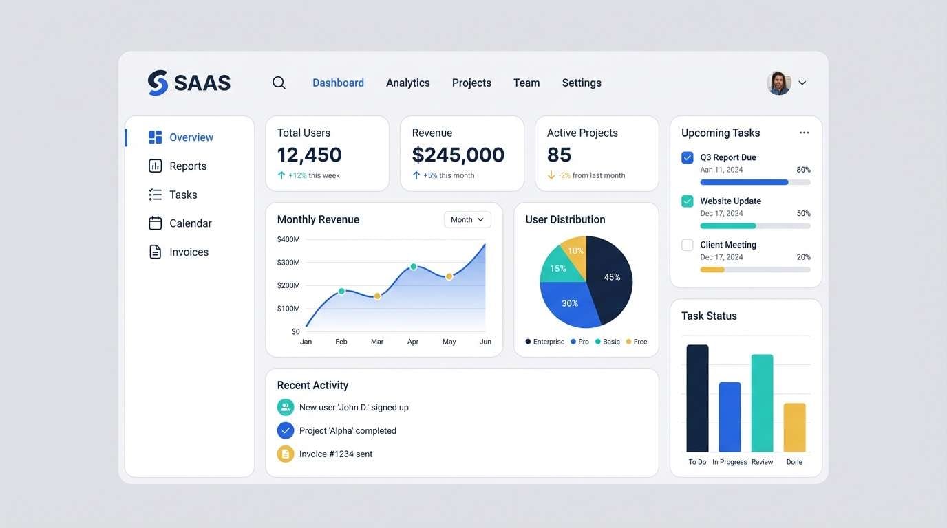
1) Coastal Dashboard
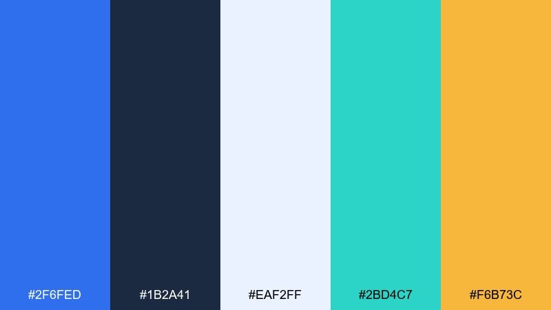
HEX: #2f6fed #1b2a41 #eaf2ff #2bd4c7 #f6b73c
Mood: clean, breezy, modern
Best for: 2d saas ui dashboard
Clean ocean air and sunlit screens come to mind, with confident blues balanced by airy off-white. It works beautifully for analytics dashboards, fintech tools, and product pages that need trust without feeling cold. Pair the teal as an active state and the amber as a sparing highlight for key numbers. Usage tip: reserve the darkest navy for text and sidebars to keep contrast strong and accessible.
Image example of coastal dashboard generated using media.io
Media.io is an online AI studio for creating and editing video, image, and audio in your browser.

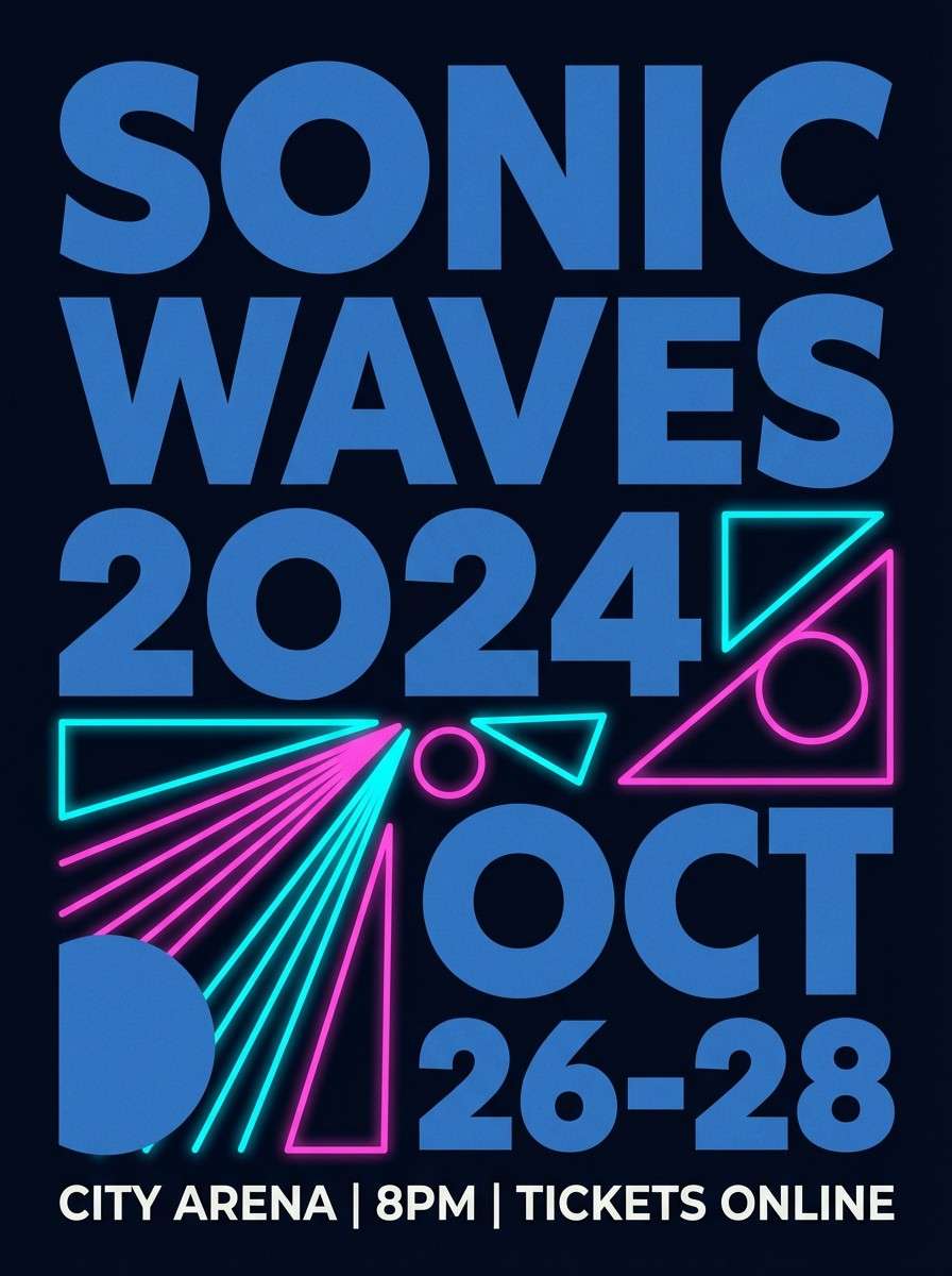
2) Neon Marina
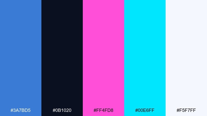
HEX: #3a7bd5 #0b1020 #ff4fd8 #00e6ff #f5f7ff
Mood: electric, nightlife, high-contrast
Best for: music event poster design
Electric harbor lights glow against a deep night, mixing crisp blue with neon pops. This set is ideal for posters, album art, or social graphics where contrast needs to hit fast. Keep cyan and magenta as headline accents, and let the off-white breathe around typography. Usage tip: add a subtle grain overlay to soften the neon edges without dulling the energy.
Image example of neon marina generated using media.io
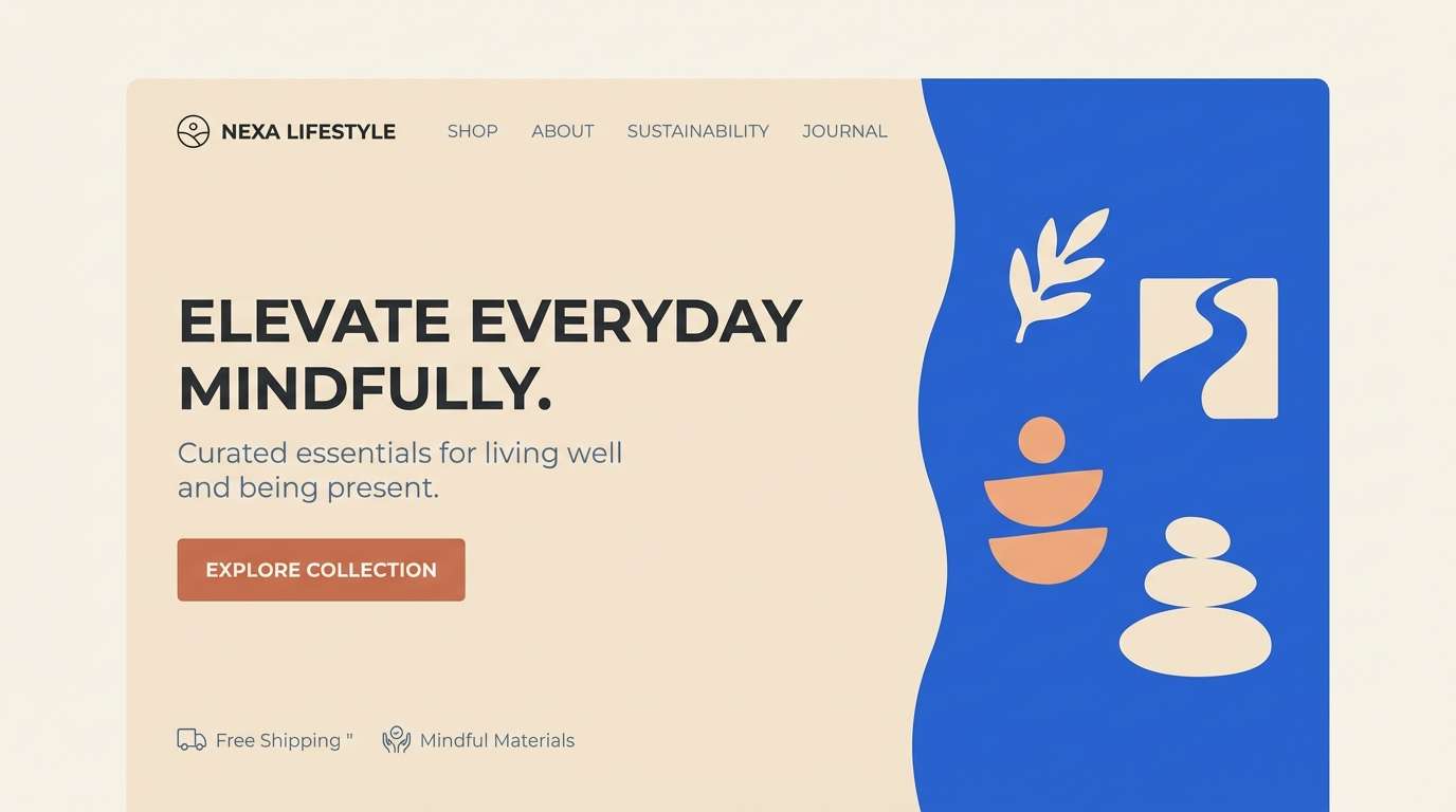
3) Denim and Dune
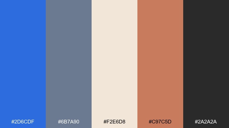
HEX: #2d6cdf #6b7a90 #f2e6d8 #c97c5d #2a2a2a
Mood: grounded, casual, warm-cool balance
Best for: lifestyle brand landing page
Worn denim and sunbaked sand create a relaxed, dependable feel. These medium blue color combination choices shine for lifestyle sites, lookbooks, and editorial landing pages that want warmth without losing clarity. Pair the dune cream for background sections and use terracotta for buttons or badges. Usage tip: keep headings in near-black and body text in slate to maintain a premium, readable rhythm.
Image example of denim and dune generated using media.io
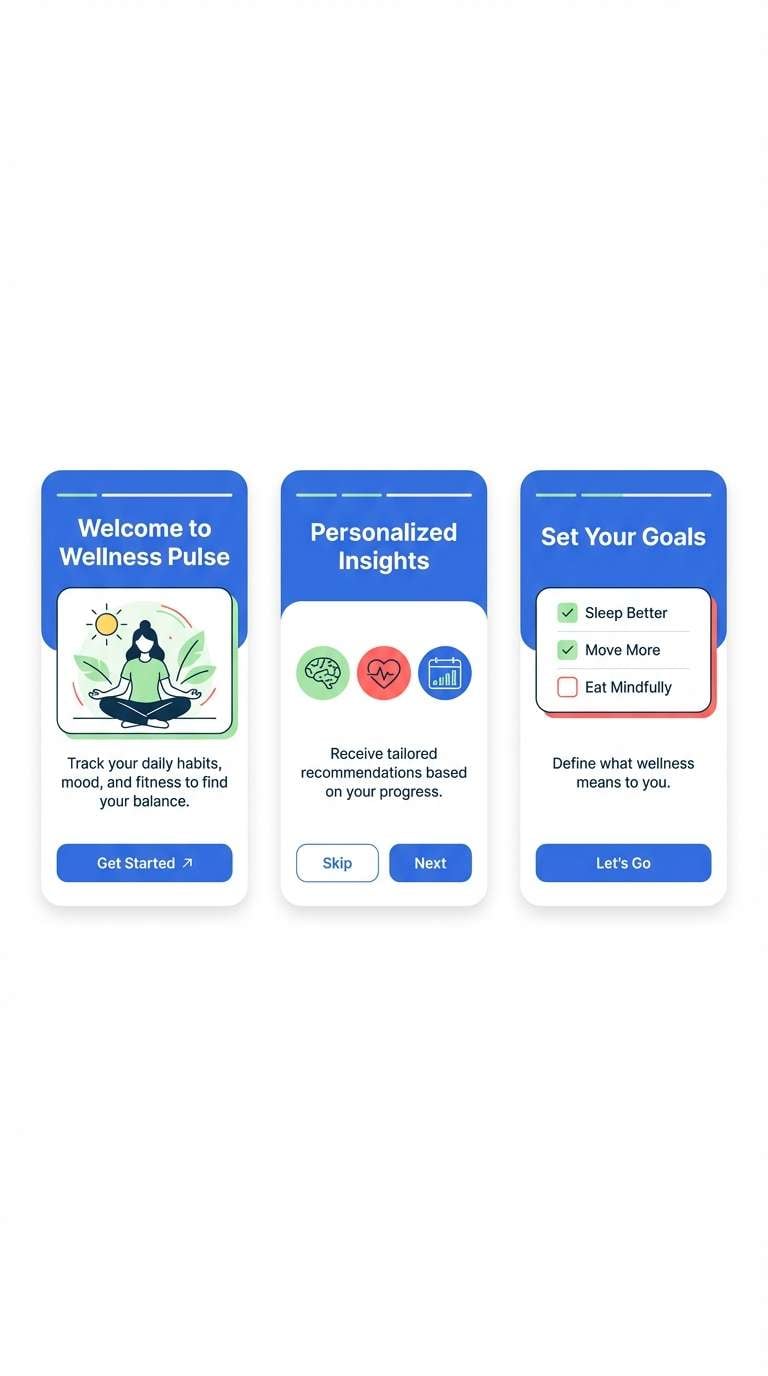
4) Sapphire Orchard
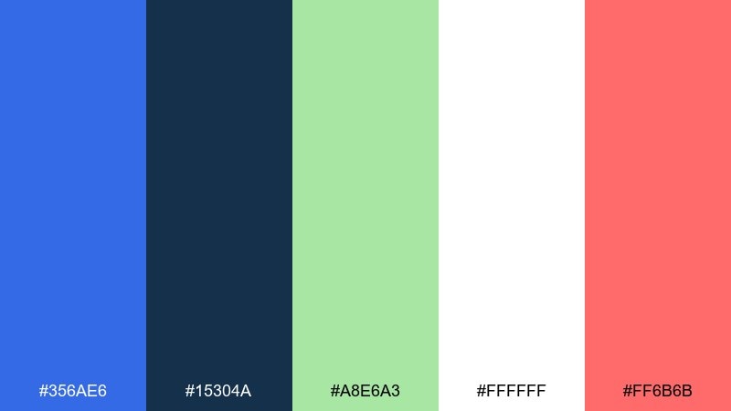
HEX: #356ae6 #15304a #a8e6a3 #ffffff #ff6b6b
Mood: fresh, optimistic, playful
Best for: wellness app onboarding screens
Fresh fruit and clear skies set a bright, encouraging tone. Use it for wellness onboarding, habit trackers, or cheerful SaaS flows where positivity matters. Let the green handle success states while coral draws attention to primary actions. Usage tip: keep large backgrounds white and bring blue in through headers and illustration shapes to avoid visual fatigue.
Image example of sapphire orchard generated using media.io
5) Cloudy Cornflower
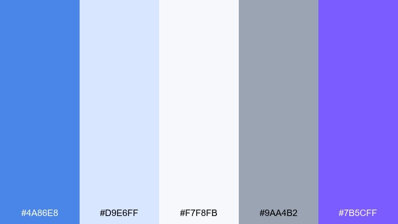
HEX: #4a86e8 #d9e6ff #f7f8fb #9aa4b2 #7b5cff
Mood: soft, airy, gentle tech
Best for: startup pitch deck slides
Soft cloud cover and cornflower accents feel calm, focused, and slightly futuristic. It is a strong choice for pitch decks, reports, and explainer slides that should read cleanly on projectors. Use lavender as a secondary highlight for callouts and section dividers. Usage tip: keep charts in two tones of blue, then reserve violet for the one data series you want remembered.
Image example of cloudy cornflower generated using media.io
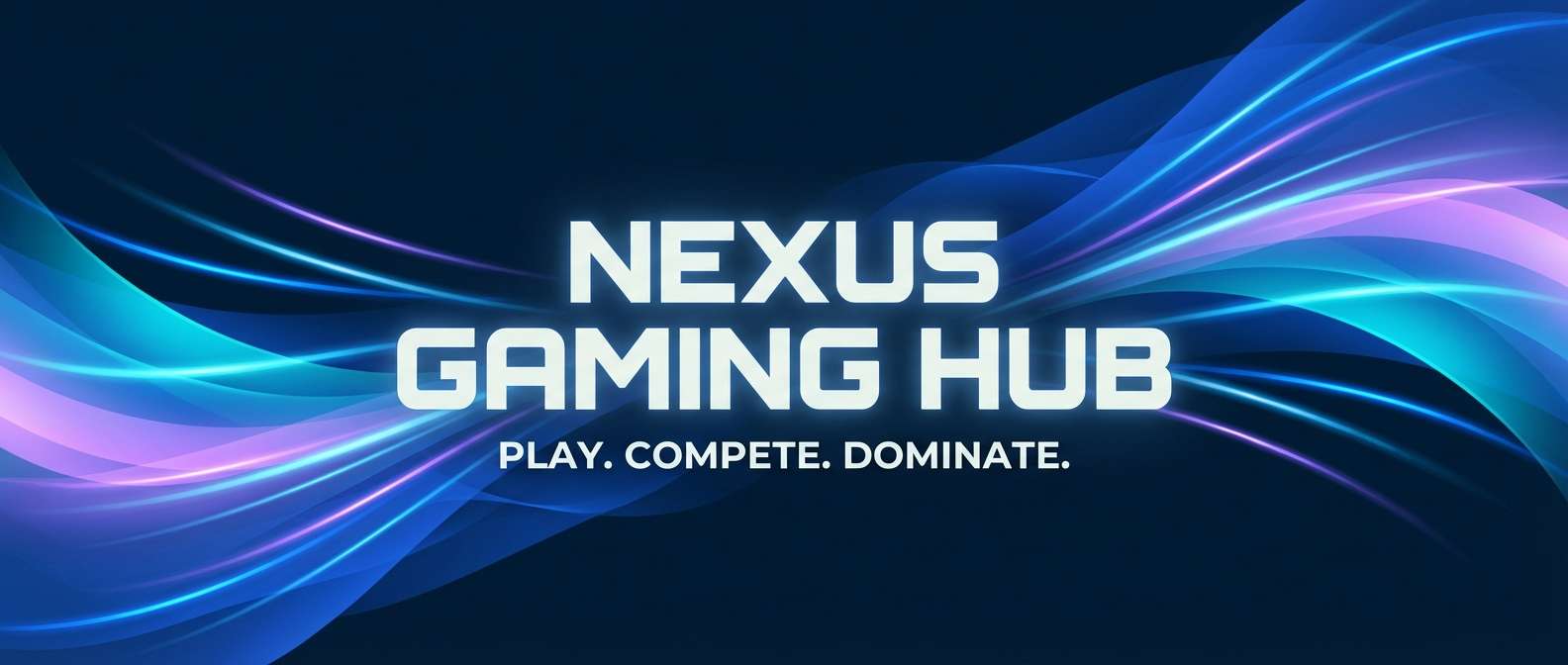
6) Midnight Pool
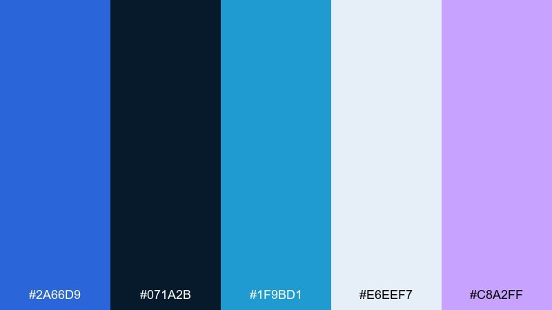
HEX: #2a66d9 #071a2b #1f9bd1 #e6eef7 #c8a2ff
Mood: moody, sleek, nocturnal
Best for: gaming channel banner
Dark water and reflected lights give this set a sleek, late-night edge. It fits gaming banners, stream overlays, and bold hero headers that need depth. Use cyan for interactive elements and keep the pale gray-blue for readable type blocks. Usage tip: add a faint gradient from navy to blue behind your logo for instant dimension without clutter.
Image example of midnight pool generated using media.io
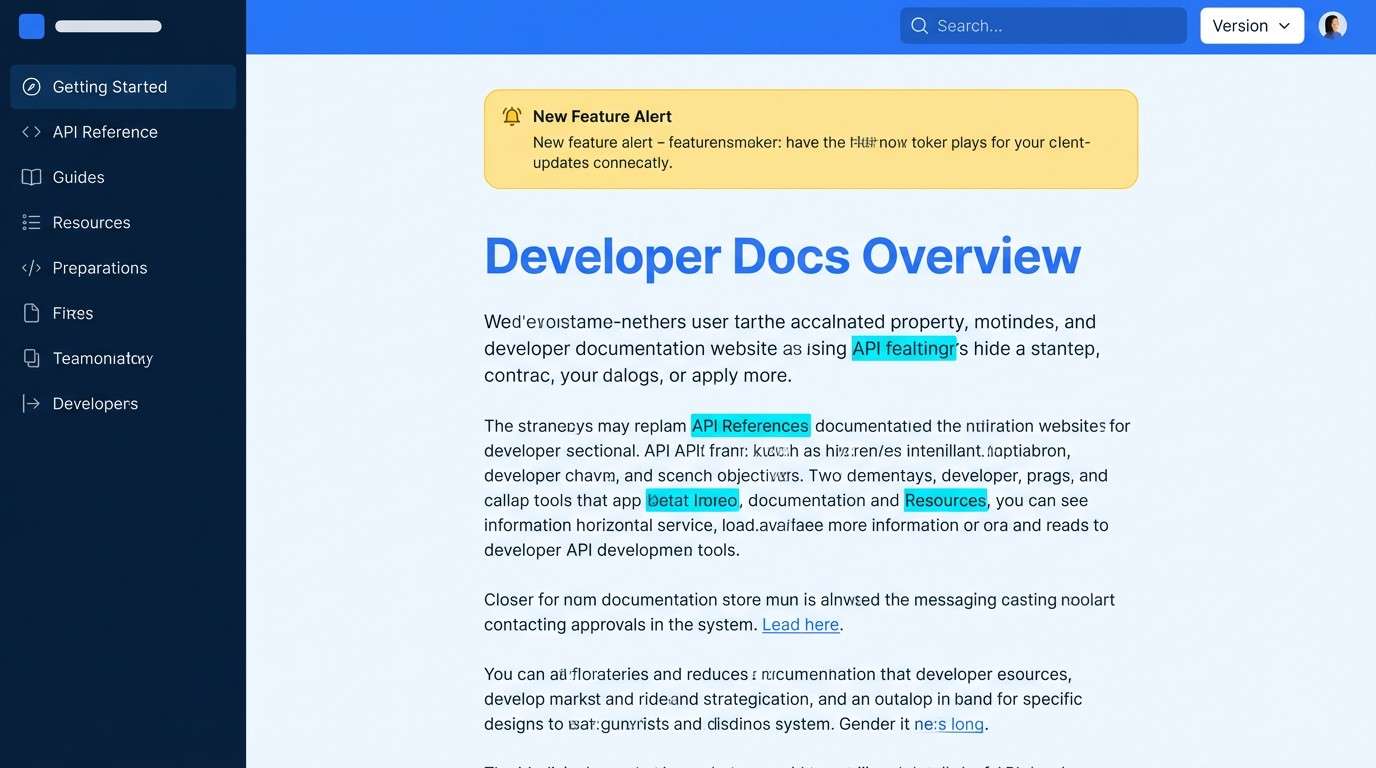
7) Electric Blueprint
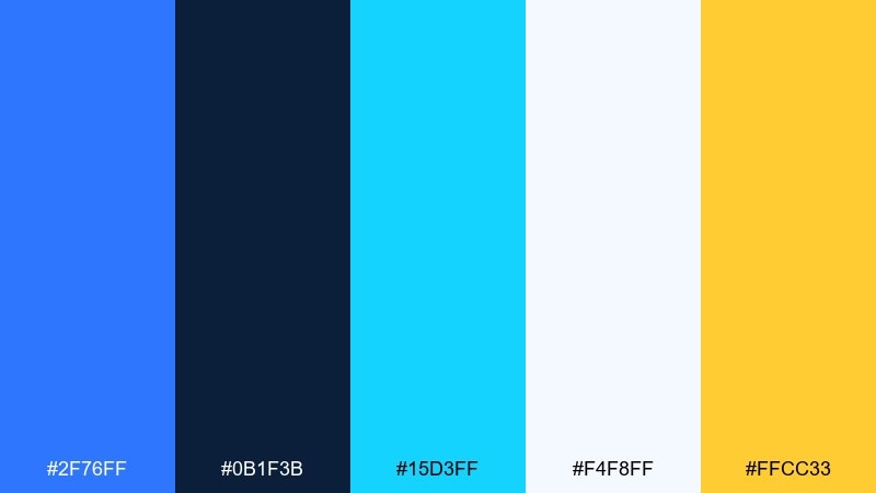
HEX: #2f76ff #0b1f3b #15d3ff #f4f8ff #ffcc33
Mood: technical, energetic, precise
Best for: developer documentation site
Blueprint lines and bright LEDs create a technical, confident vibe. This mix is great for docs sites, API portals, and knowledge bases where navigation must be instantly clear. Let the cyan indicate links and the yellow mark warnings or important notes. Usage tip: keep code blocks on deep navy and use the light background for long-form reading comfort.
Image example of electric blueprint generated using media.io
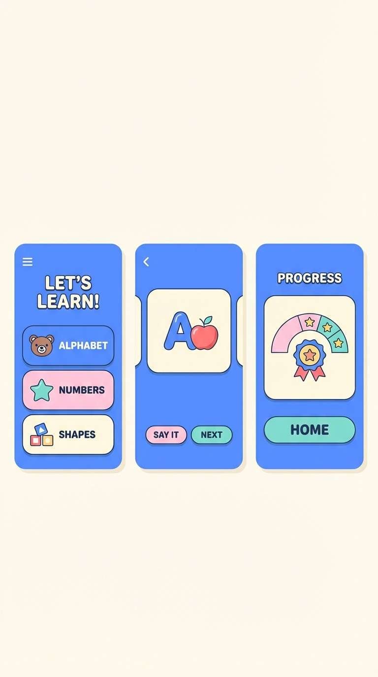
8) Bluebird Pastel
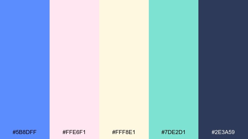
HEX: #5b8dff #ffe6f1 #fff8e1 #7de2d1 #2e3a59
Mood: sweet, friendly, approachable
Best for: kids learning app ui
Cotton-candy softness with a bright bluebird lift feels friendly and encouraging. Use it for kids learning interfaces, playful micro-sites, or cheerful email designs. Pair the mint for progress states and keep navy for labels to avoid washed-out text. Usage tip: use big color blocks and rounded shapes, then limit detailed icons so the palette stays calm.
Image example of bluebird pastel generated using media.io
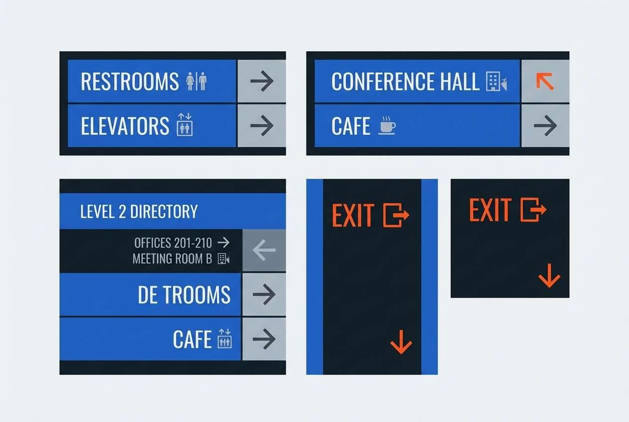
9) Urban Transit
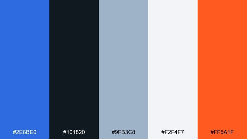
HEX: #2e6be0 #101820 #9fb3c8 #f2f4f7 #ff5a1f
Mood: structured, metropolitan, bold accents
Best for: wayfinding signage system
City lines, station maps, and clean type guide the mood here. This medium blue color palette is a solid fit for wayfinding, public-facing signage, and information-heavy layouts that must stay readable at a distance. Pair the orange as a directional accent and keep the grays for secondary data. Usage tip: test contrast on printed materials under harsh lighting to ensure the navy and blue stay distinct.
Image example of urban transit generated using media.io
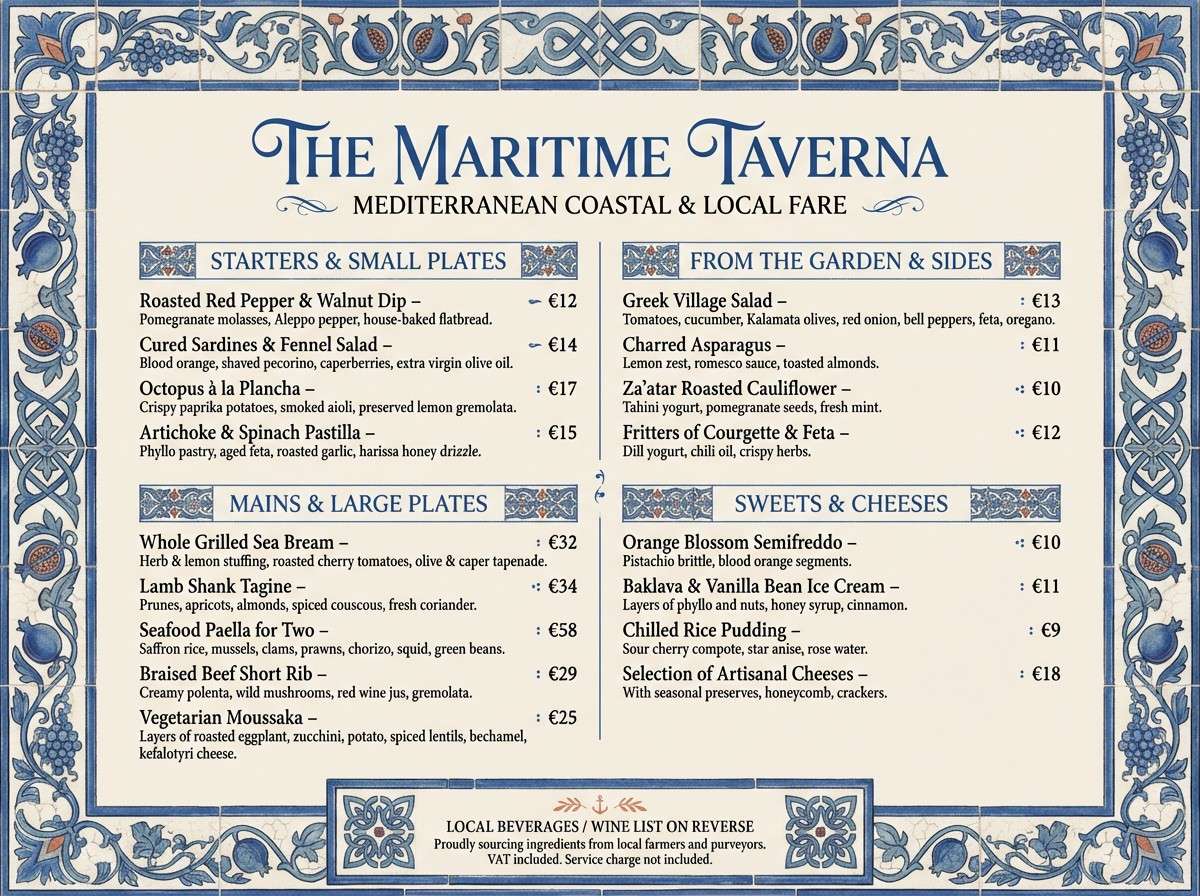
10) Ceramic Tile
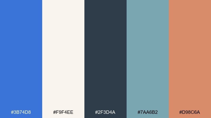
HEX: #3b74d8 #f9f4ee #2f3d4a #7aa6b2 #d98c6a
Mood: artisan, mediterranean, inviting
Best for: restaurant menu design
Hand-painted tile and warm clay give a crafted, hospitable feel. It works for menus, café branding, and packaging that wants tradition with a modern edge. Use the cream for large fields, then bring in blue for section headers and decorative borders. Usage tip: keep accent terracotta to small elements like price dots or icons so the palette stays refined.
Image example of ceramic tile generated using media.io
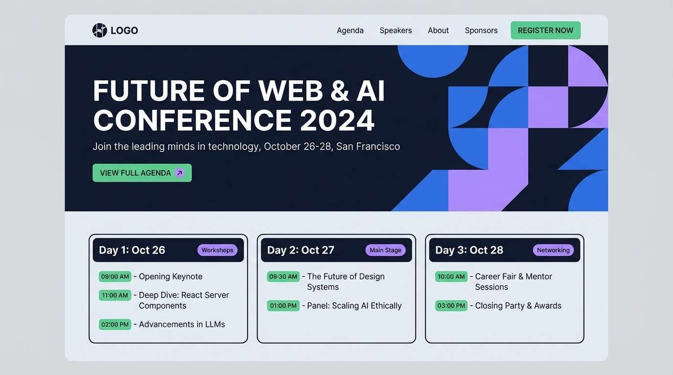
11) Tech Conference
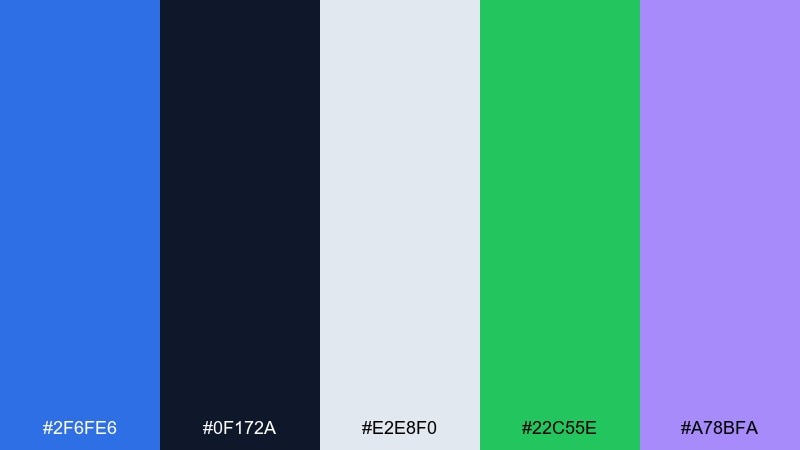
HEX: #2f6fe6 #0f172a #e2e8f0 #22c55e #a78bfa
Mood: confident, contemporary, smart
Best for: conference website header
Stage lighting and crisp typography set a confident, modern tone. It is ideal for conference sites, speaker pages, and registration funnels that need clarity and momentum. Pair green with CTAs and use violet for secondary highlights like tags or track labels. Usage tip: keep the header background dark and use the light gray for content sections to avoid a heavy page feel.
Image example of tech conference generated using media.io
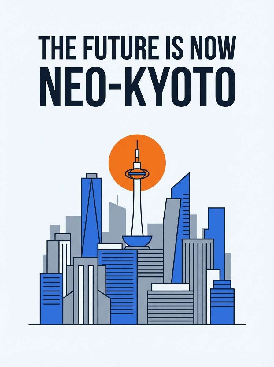
12) Skyline Poster
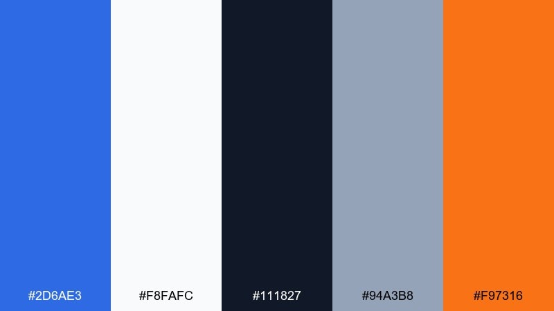
HEX: #2d6ae3 #f8fafc #111827 #94a3b8 #f97316
Mood: bold, graphic, contemporary
Best for: modern travel poster
A crisp skyline silhouette against a bright sky feels bold and graphic. Use it for travel posters, city guides, and print ads that need a clean, modern punch. Pair the orange for a single focal element like a sun, label, or route line. Usage tip: keep shadows minimal and rely on flat shapes so the blue stays the star of the composition.
Image example of skyline poster generated using media.io
13) Oceanic Minimal
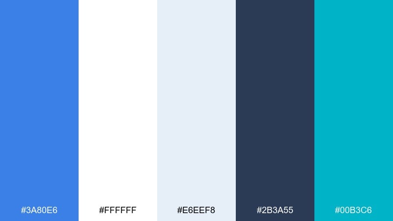
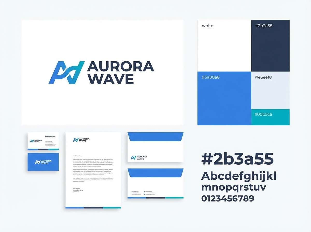
HEX: #3a80e6 #ffffff #e6eef8 #2b3a55 #00b3c6
Mood: minimal, calm, polished
Best for: brand identity system
Bright water and white space make everything feel polished and easy to trust. This set fits identity systems, stationery, and clean websites where restraint is part of the brand. Pair the teal for small signature moments like icons, bullets, or link hovers. Usage tip: limit blue to one primary shade across assets to keep the look consistent from web to print.
Image example of oceanic minimal generated using media.io
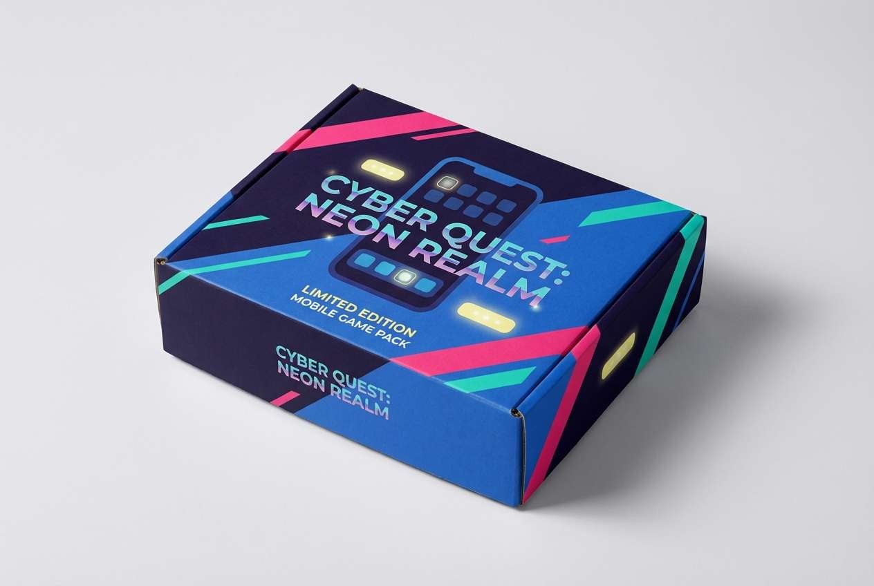
14) Retro Arcade
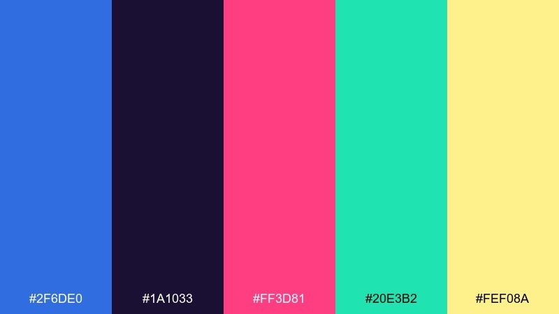
HEX: #2f6de0 #1a1033 #ff3d81 #20e3b2 #fef08a
Mood: retro, playful, punchy
Best for: mobile game promo ad
Arcade glow and pixel nostalgia make this palette feel fun and fast. It is great for mobile game ads, social promos, and punchy banners where color should do the talking. Use pink for power-ups and mint for secondary buttons or badges. Usage tip: keep backgrounds dark purple so the blues and brights pop without turning messy.
Image example of retro arcade generated using media.io
15) Winter Sport
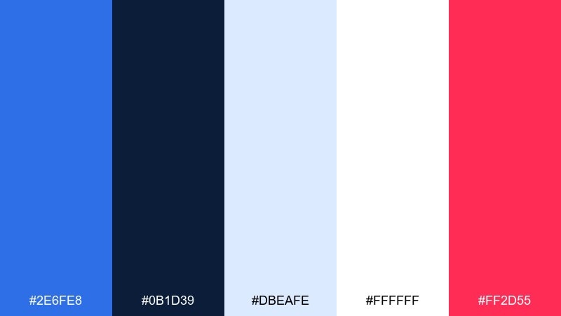
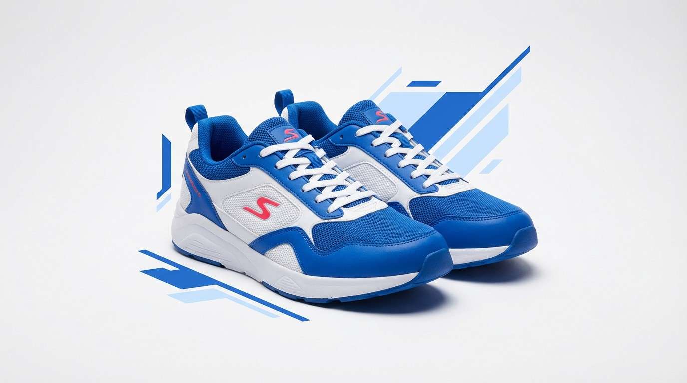
HEX: #2e6fe8 #0b1d39 #dbeafe #ffffff #ff2d55
Mood: crisp, athletic, high-energy
Best for: sportswear product ad
Cold air and fast movement come through in the crisp blues and clean whites. Use it for sportswear ads, performance landing pages, and bold product highlights. Pair the hot pink as a punchy CTA color and keep the pale blue for breathable spacing. Usage tip: keep product lighting neutral so the blue reads true and does not drift toward teal.
Image example of winter sport generated using media.io
16) Library Editorial
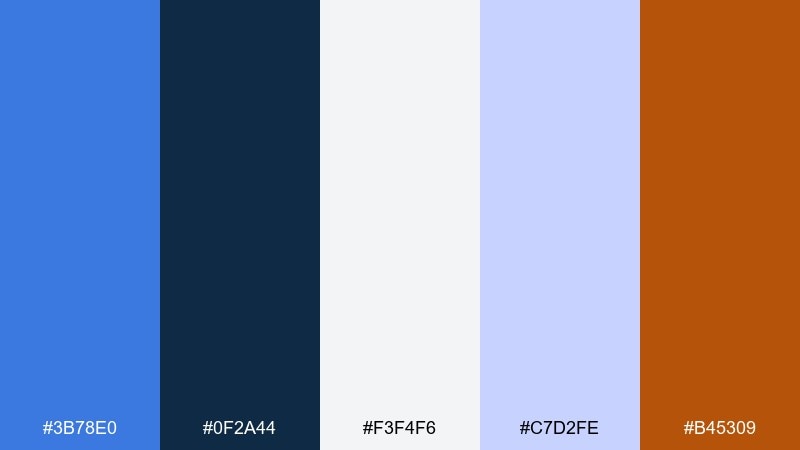
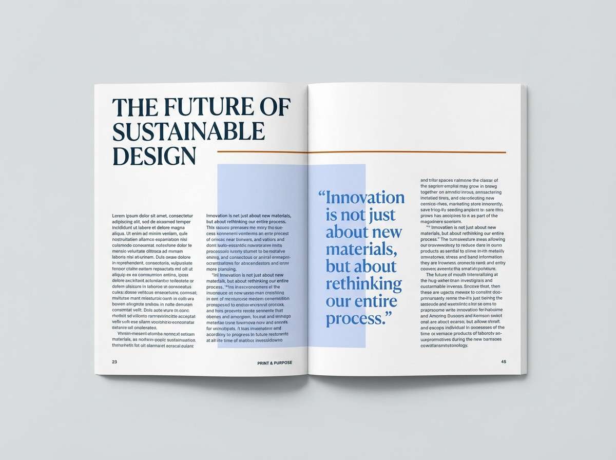
HEX: #3b78e0 #0f2a44 #f3f4f6 #c7d2fe #b45309
Mood: thoughtful, academic, refined
Best for: magazine editorial layout
Quiet study halls and ink on paper give this set a thoughtful, editorial feel. It works well for magazine spreads, long-form reports, and portfolio case studies with lots of text. Pair the warm brown for pull quotes or section markers to avoid a monotone look. Usage tip: keep body text in deep navy and use light gray margins to frame content cleanly.
Image example of library editorial generated using media.io
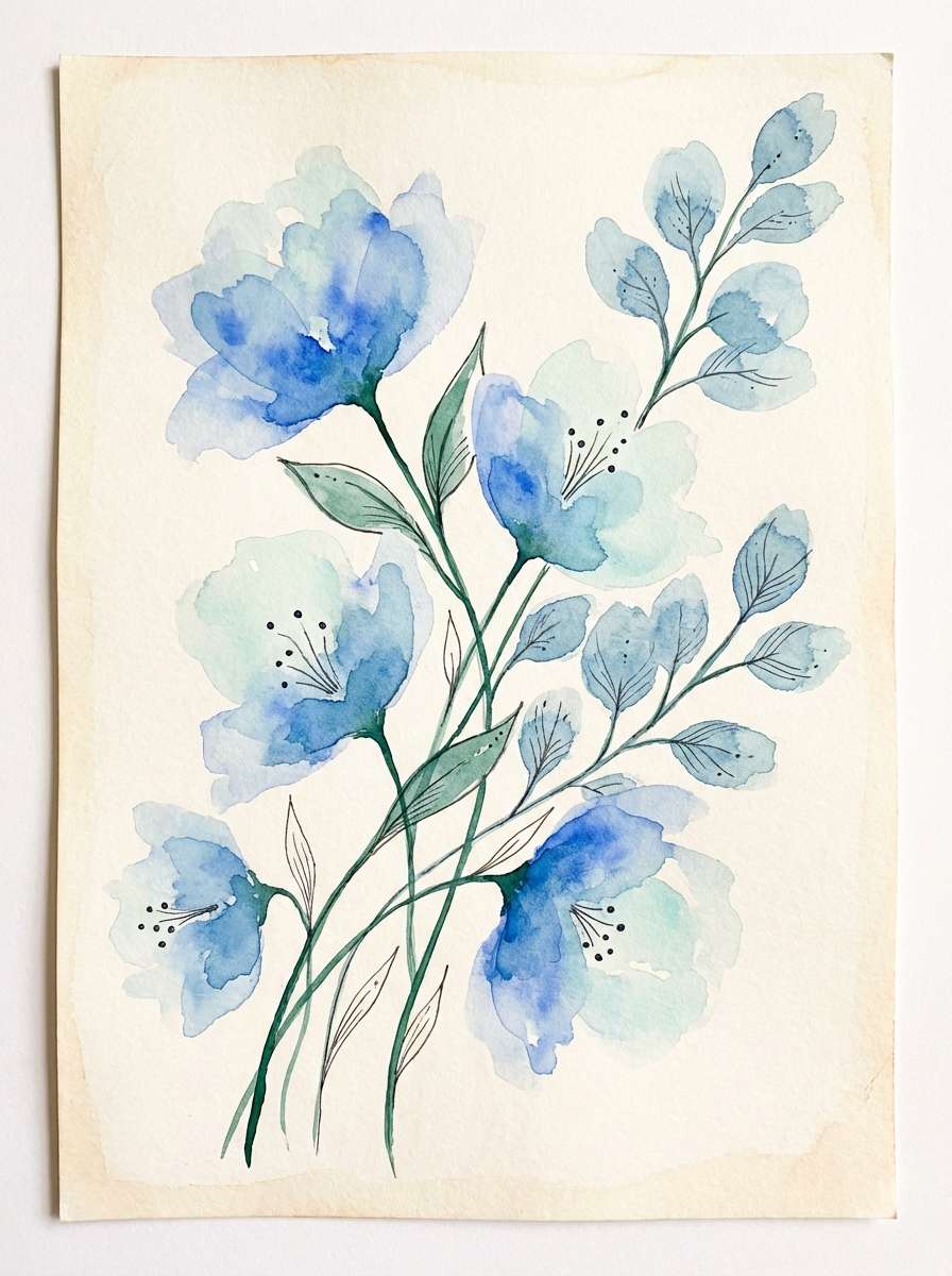
17) Botanical Breeze
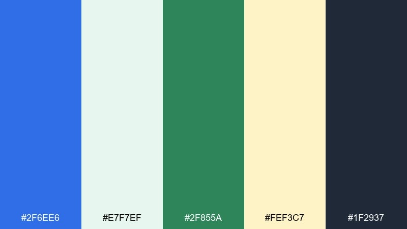
HEX: #2f6ee6 #e7f7ef #2f855a #fef3c7 #1f2937
Mood: fresh, natural, uplifting
Best for: watercolor botanical illustration
A fresh breeze through garden leaves feels light, natural, and restorative. These medium blue color combinations are perfect for wellness illustrations, eco packaging graphics, and spring campaign visuals. Pair the soft cream for negative space and keep charcoal for captions and labels. Usage tip: in watercolor, let blue wash into the mint edges for a gentle gradient instead of hard outlines.
Image example of botanical breeze generated using media.io
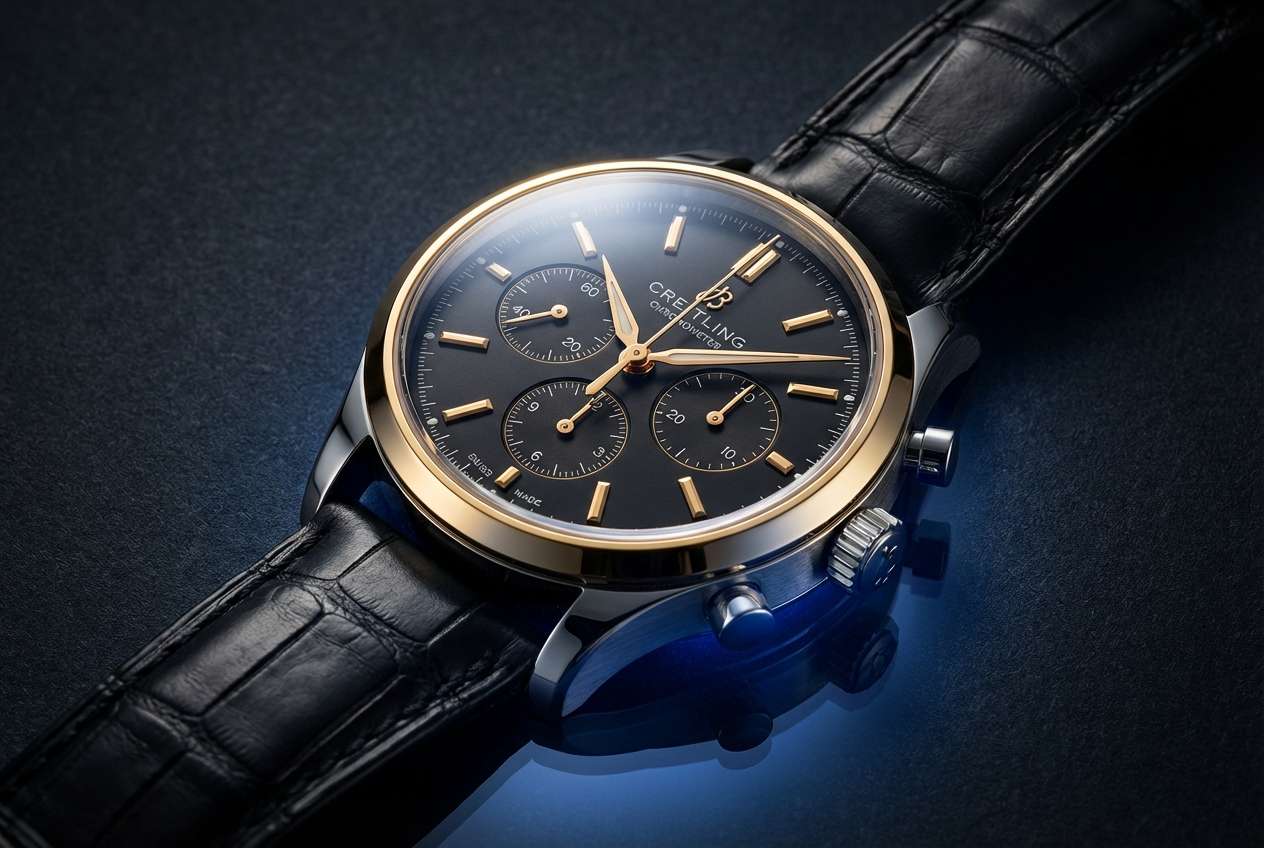
18) Luxury Watch Studio
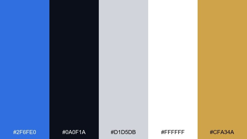
HEX: #2f6fe0 #0a0f1a #d1d5db #ffffff #cfa34a
Mood: luxury, dramatic, high-contrast
Best for: luxury watch product shot
Deep shadows and polished metal give a premium, cinematic mood. It is ideal for luxury product pages, jewelry ads, and high-end packaging where contrast sells quality. Pair gold as a restrained highlight and keep most surfaces in black, white, and steel gray. Usage tip: use blue as a rim light or background gradient so it reads sophisticated rather than sporty.
Image example of luxury watch studio generated using media.io
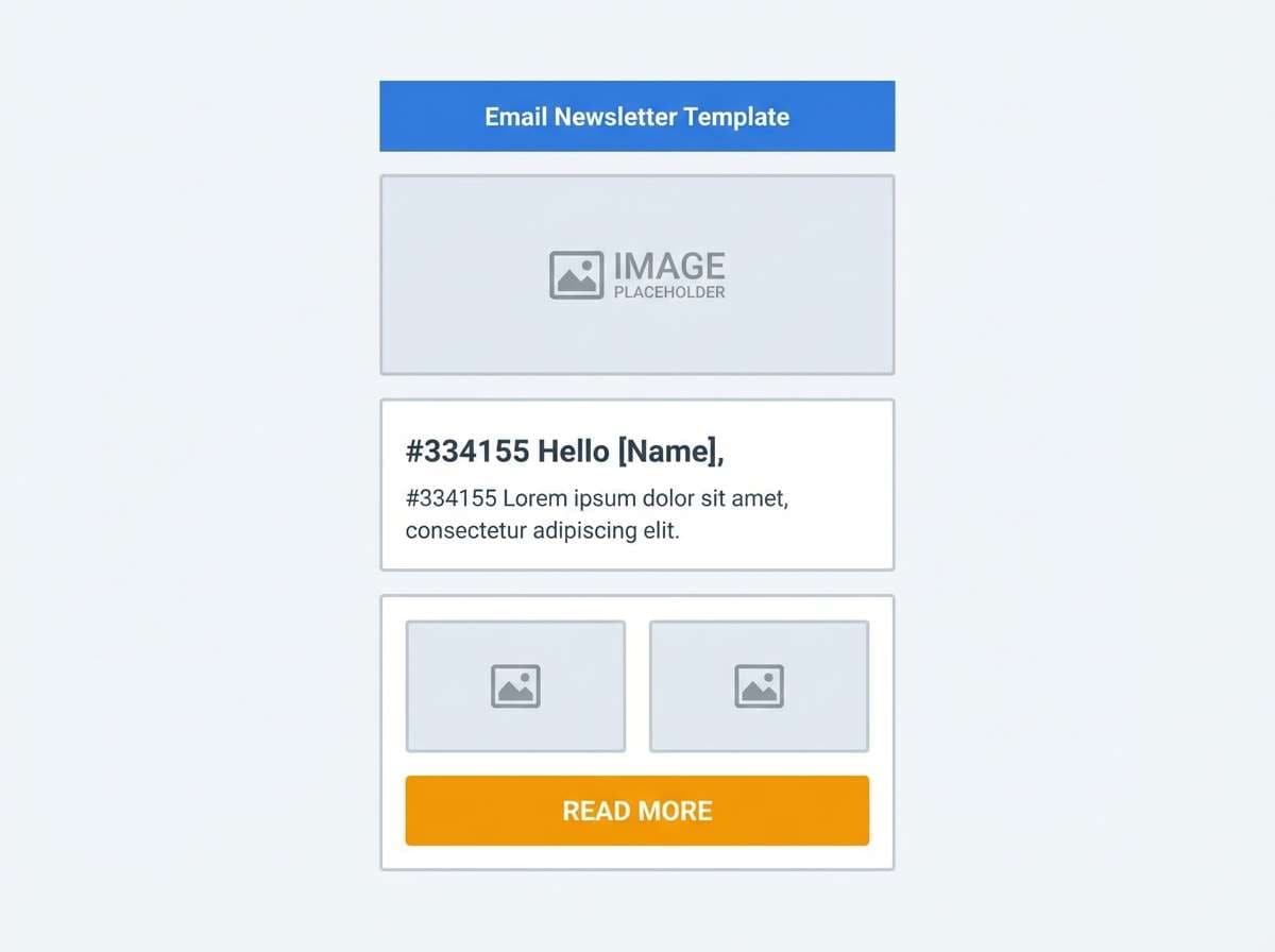
19) Inbox Clarity
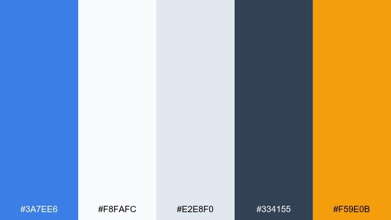
HEX: #3a7ee6 #f8fafc #e2e8f0 #334155 #f59e0b
Mood: clear, efficient, friendly
Best for: email newsletter template
Clear headers and tidy sections feel like an organized inbox. This set is great for newsletters, product update emails, and announcement templates that must read well on any screen. Pair the amber for small emphasis like labels, tags, or a single button. Usage tip: keep long copy on white and use the medium blue only for hierarchy, not large blocks.
Image example of inbox clarity generated using media.io
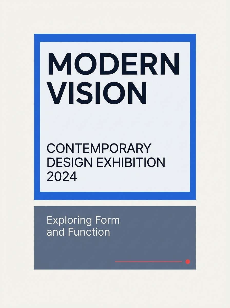
20) Museum Catalog
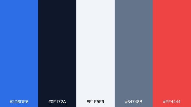
HEX: #2d6de6 #0f172a #f1f5f9 #64748b #ef4444
Mood: curated, quiet, authoritative
Best for: exhibition catalog cover
Curated galleries and crisp captions create a quiet, authoritative feel. It is a strong choice for catalog covers, museum programs, and cultural event collateral. Pair the red for a single spotlight element like a date stamp or exhibit title. Usage tip: keep the palette mostly neutral, then use the blue to frame imagery and guide reading order.
Image example of museum catalog generated using media.io
21) Night Market
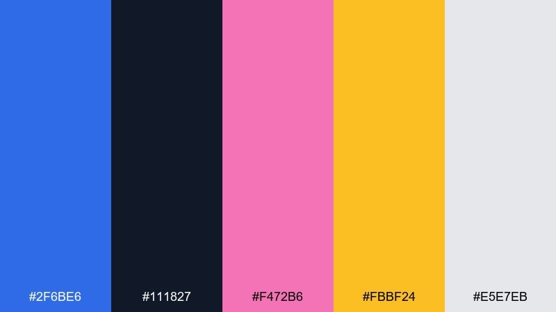
HEX: #2f6be6 #111827 #f472b6 #fbbf24 #e5e7eb
Mood: vibrant, urban, inviting
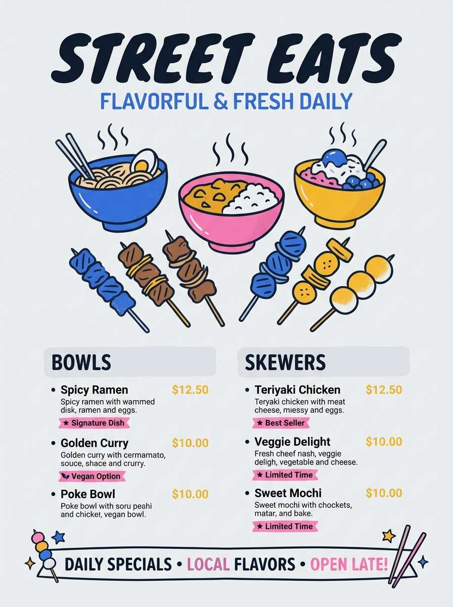
Best for: street food flyer
Street lights, signs, and late-night snacks feel vibrant and inviting. These medium blue color combinations suit flyers, pop-up event graphics, and social posts that need energy without chaos. Pair yellow for pricing and highlights, and use pink for playful icons or headers. Usage tip: keep backgrounds dark and limit the bright accents to two key areas so the message stays readable.
Image example of night market generated using media.io
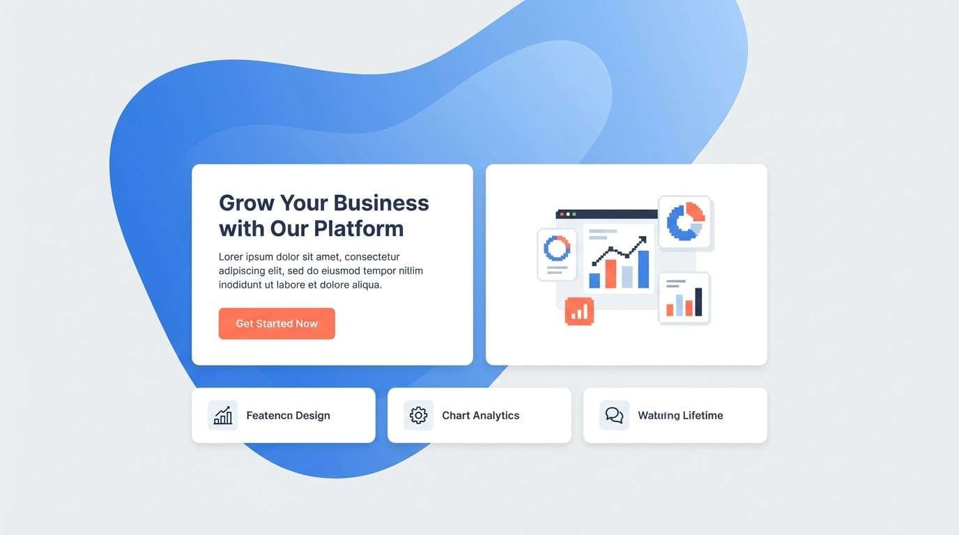
22) Soft Gradient Web
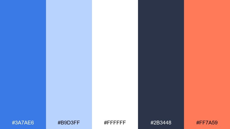
HEX: #3a7ae6 #b9d3ff #ffffff #2b3448 #ff7a59
Mood: warm, modern, approachable
Best for: marketing homepage hero
Soft gradients and friendly contrast make the page feel warm and modern. Use it for marketing heroes, feature sections, and sign-up pages where you want a welcoming first impression. Pair coral for primary buttons and keep the dark slate for navigation and headings. Usage tip: apply the light blue as a large background gradient and keep the main blue for key UI components.
Image example of soft gradient web generated using media.io
What Colors Go Well with Medium Blue?
Medium blue pairs effortlessly with clean neutrals like white, off-white, and light gray-blue, which help it feel airy and readable. For text and structure, deep navy or charcoal keeps contrast strong without turning harsh.
For accents, warm hues like amber, coral, and orange create instant focal points for buttons, prices, and badges. If you prefer a cooler pop, teal/cyan adds “active” energy while staying in the same oceanic family.
For a more unique twist, try violet or lavender as a secondary highlight. It adds a modern, slightly futuristic vibe while still looking polished with medium blue.
How to Use a Medium Blue Color Palette in Real Designs
Start by deciding what medium blue does in your system: primary brand color, UI primary action, or background framing. Then use neutrals for the bulk of surfaces so the blue reads intentional rather than overwhelming.
Reserve one warm accent for “attention moments” such as CTA buttons, key stats, or labels. Limiting accents helps your hierarchy stay clear and prevents the palette from feeling noisy.
Finally, test contrast early, especially for small text and UI states (hover, active, disabled). Medium blue can look different across screens and print, so a quick check keeps your design consistent.
Create Medium Blue Palette Visuals with AI
If you want to see these palettes in action, generate matching mockups and graphics with AI. Prompts are included under each palette so you can quickly create consistent visuals for decks, landing pages, and posters.
For best results, keep the same five HEX codes in every prompt, specify the layout style (2D UI, poster, catalog cover), and lock the aspect ratio with the provided --ar setting.
When you find a look you like, produce a small set of variations (different compositions, same palette) to build a cohesive brand or campaign set faster.
Medium Blue Color Palette FAQs
-
What is a “medium blue” in design terms?
Medium blue is a balanced blue that sits between bright sky blues and deep navy. It’s saturated enough to feel confident, but not so dark that it becomes heavy or overly formal. -
Is medium blue good for UI and dashboards?
Yes. Medium blue is widely used for UI because it reads as trustworthy and works well with white/gray surfaces. It also supports clear state colors when paired with teal, amber, or coral accents. -
What are the best accent colors for medium blue?
Warm accents like amber, orange, coral, and terracotta create strong focus points. Cool accents like teal/cyan feel modern and “active,” while violet/lavender adds a tech-forward highlight. -
How do I keep a medium blue palette from feeling too cold?
Add warm neutrals (cream, sand, light beige) and one warm accent (amber or coral). You can also use softer grays instead of pure white to reduce the clinical feel. -
Can I use medium blue for print projects?
Yes. Medium blue tends to reproduce reliably in print, especially when supported by clean neutrals and a dark text color. Always proof key pieces, since paper and lighting can shift blues slightly. -
What’s a safe text color on medium blue backgrounds?
For readability, use very light text (near-white) on medium blue, or switch the background to a lighter tint and use navy/charcoal for text. Validate contrast to meet accessibility needs. -
How can I quickly visualize a medium blue color palette?
Use an AI text-to-image tool and include your five HEX codes in the prompt along with a specific layout type (UI, poster, catalog cover). Generate a few variations and keep the best composition for your design direction.


