

Vermilion is a warm, orange-leaning red that reads energetic, appetizing, and confident across branding, UI, posters, and packaging.
Below are vermilion color palette ideas with ready-to-use HEX codes, plus practical pairing and usage tips for real design work.
In this article
Why Vermilion Palettes Work So Well
Vermilion sits between red and orange, so it carries red’s urgency while adding orange’s friendliness. That makes it a reliable “hero accent” when you need attention without turning the whole layout aggressive.
It also performs well across mediums: in print it feels rich and tactile, while on screens it reads crisp and modern when paired with calm neutrals. With the right contrast, vermilion boosts hierarchy for headlines, buttons, badges, and key data points.
Most importantly, vermilion is easy to control: keep it as a 10–20% highlight color and it instantly elevates clarity. Pair it with deep charcoals, warm creams, or muted greens/blues to prevent visual heat from taking over.
20+ Vermilion Color Palette Ideas (with HEX Codes)
1) Ember Market
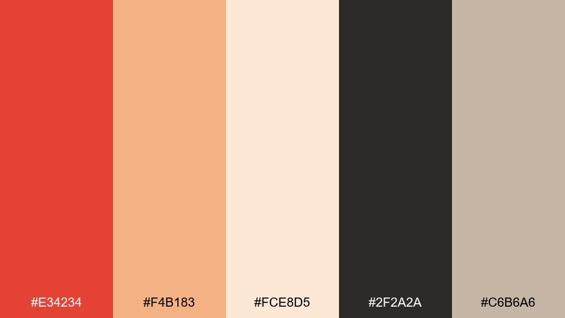
HEX: #E34234 #F4B183 #FCE8D5 #2F2A2A #C6B6A6
Mood: lively, artisanal, warm
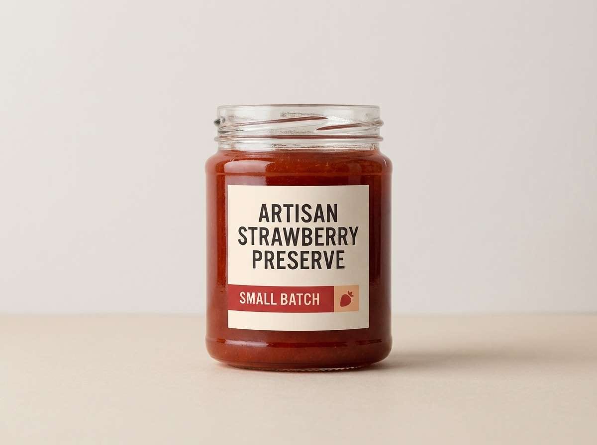
Best for: food packaging label design
Lively and handcrafted, these tones feel like a weekend market stall with baked goods and spice jars. Use the vermilion as the hero color for a badge or flavor callout, then let cream and linen neutrals keep the label readable. Charcoal works best for nutrition panels and small type. Tip: print the vermilion as a matte ink and reserve the gold-beige for subtle foil accents.
Image example of ember market generated using media.io
Media.io is an online AI studio for creating and editing video, image, and audio in your browser.

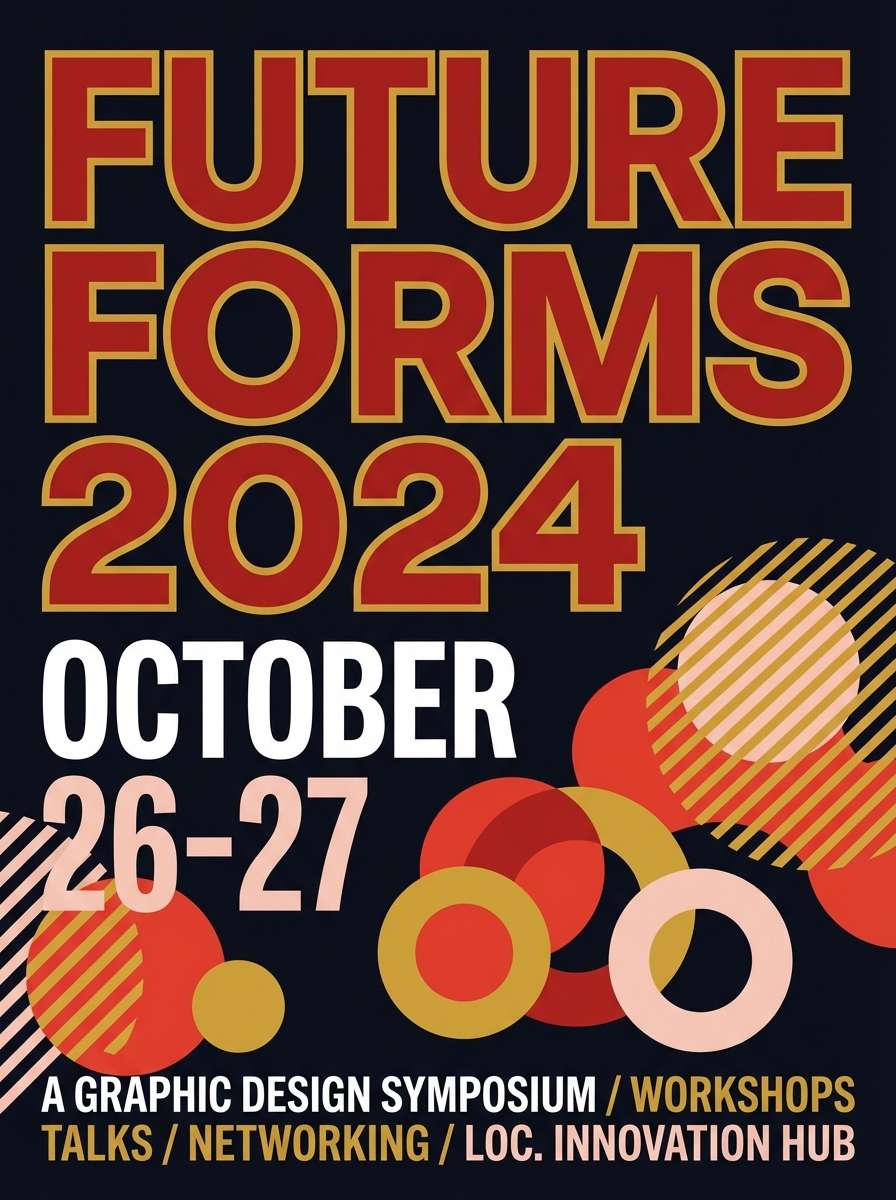
2) Crimson Lantern
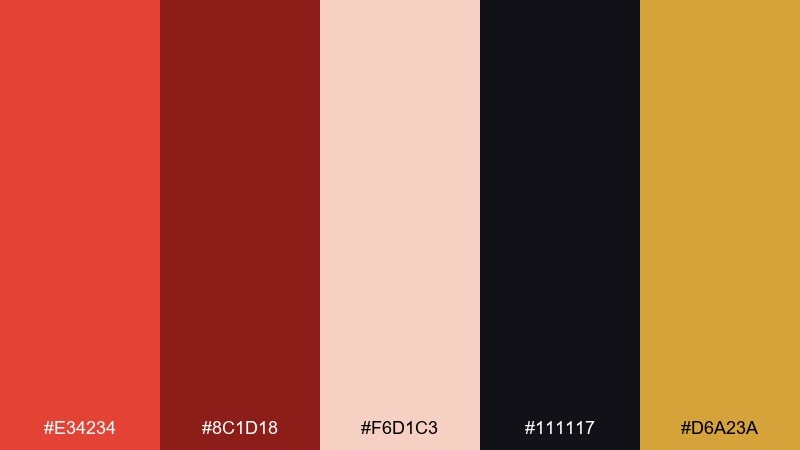
HEX: #E34234 #8C1D18 #F6D1C3 #111117 #D6A23A
Mood: dramatic, night-lit, festive
Best for: night market event poster
Dramatic and night-lit, this mix recalls glowing lanterns against dark streets. Put vermilion and gold on the headline and key details, then use near-black for depth and contrast. The soft blush keeps secondary blocks from feeling heavy. Tip: try a subtle grain texture in the dark background to make the warm colors feel brighter without increasing saturation.
Image example of crimson lantern generated using media.io
3) Coastal Terracotta
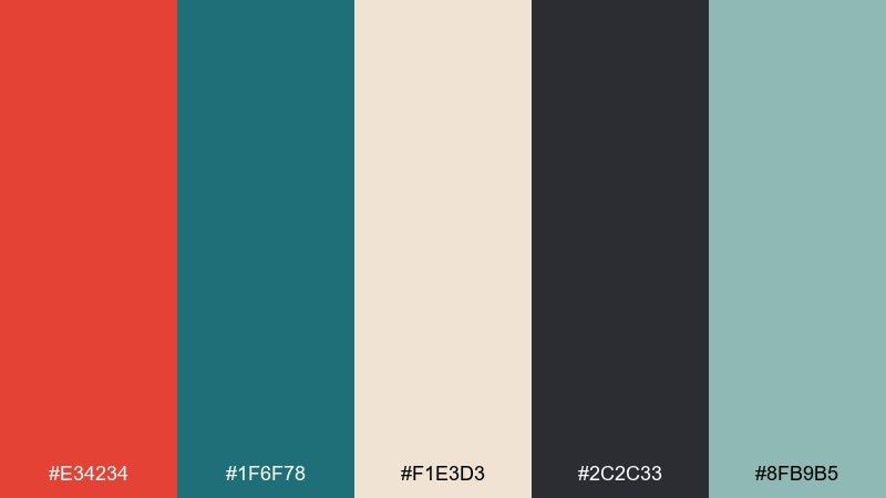
HEX: #E34234 #1F6F78 #F1E3D3 #2C2C33 #8FB9B5
Mood: sun-warmed, breezy, travel-ready
Best for: travel brochure cover
Sun-warmed and breezy, the contrast between terracotta heat and sea-glass teal feels instantly vacation-ready. Use the teal for blocks and navigation elements, keeping vermilion for stamps, icons, and small highlights. Creamy sand makes an easy background for photos and maps. Tip: avoid equal dominance of the two strong hues, and let one lead while the other supports.
Image example of coastal terracotta generated using media.io

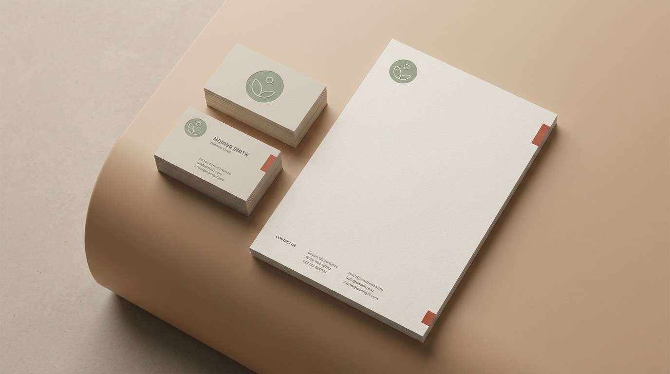
4) Sage Workshop
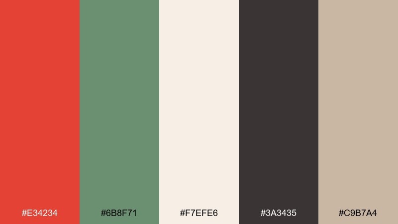
HEX: #E34234 #6B8F71 #F7EFE6 #3A3435 #C9B7A4
Mood: grounded, natural, studio-calm
Best for: handmade brand identity kit
Grounded and natural, this blend feels like clay, dried herbs, and craft paper in a calm studio. One of the most practical vermilion color combinations is pairing it with sage, because the green softens the heat without dulling it. Use off-white for stationery and the deep cocoa for wordmarks and fine lines. Tip: keep vermilion to 10 to 20 percent of the layout so the identity stays premium, not loud.
Image example of sage workshop generated using media.io
5) Retro Diner Pop
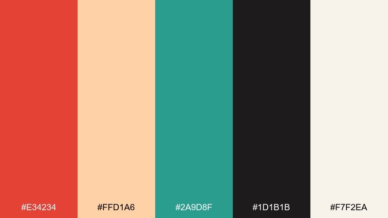
HEX: #E34234 #FFD1A6 #2A9D8F #1D1B1B #F7F2EA
Mood: playful, nostalgic, high-contrast
Best for: social media promo graphic
Playful and nostalgic, these colors echo menu boards, neon signs, and checker-tile energy without the glare. Use vermilion for the discount burst, then balance it with teal for buttons and call-to-action shapes. Cream keeps the design friendly and readable on small screens. Tip: outline key elements in near-black to prevent the warm tones from blending on mobile.
Image example of retro diner pop generated using media.io

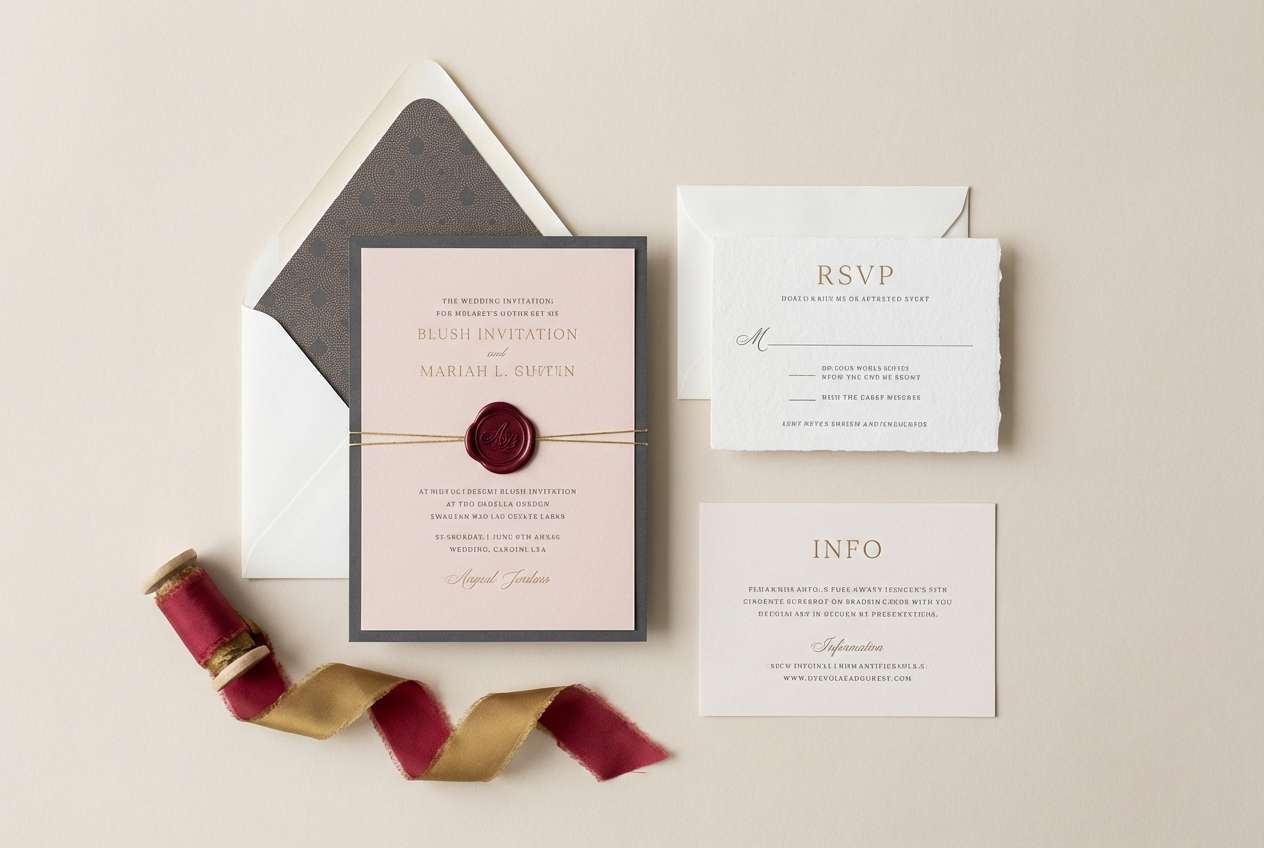
6) Silk Evening
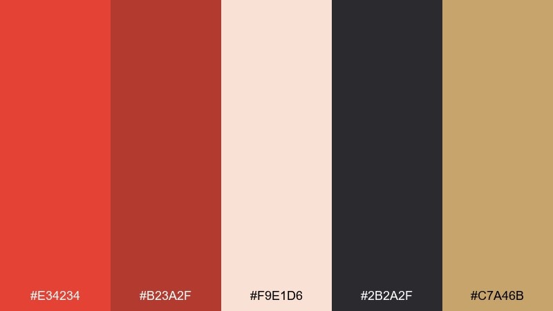
HEX: #E34234 #B23A2F #F9E1D6 #2B2A2F #C7A46B
Mood: romantic, elegant, candlelit
Best for: wedding invitation suite
Romantic and candlelit, the warm reds and soft blush feel like silk fabric and evening light. This vermilion color palette shines when the deep red is reserved for names and key lines, while blush handles the large paper areas. Add a touch of muted gold for monograms or border rules. Tip: choose a slightly textured stock so the warm tones look rich without needing heavy ink coverage.
Image example of silk evening generated using media.io
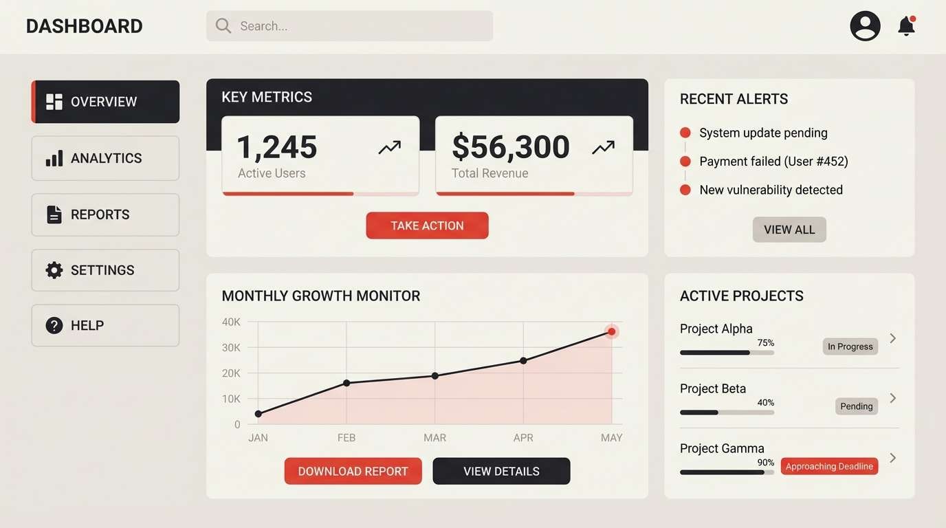
7) Minimal Heat UI
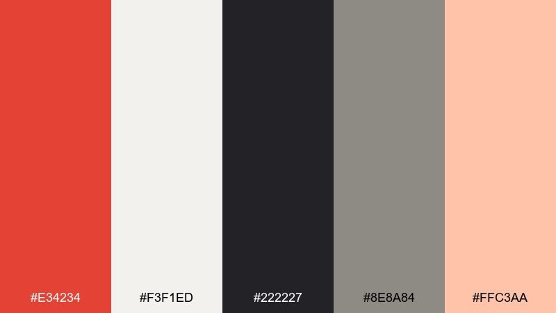
HEX: #E34234 #F3F1ED #222227 #8E8A84 #FFC3AA
Mood: clean, modern, confident
Best for: 2d app UI mockup
Clean and confident, this set feels like a sharp interface with one warm spark. Use the off-white as the main canvas, then deploy vermilion for primary buttons, badges, and selected states. The gray ladder keeps text hierarchy clear without competing. Tip: reserve the blush tint for subtle hover states so the UI stays calm while still feeling responsive.
Image example of minimal heat ui generated using media.io
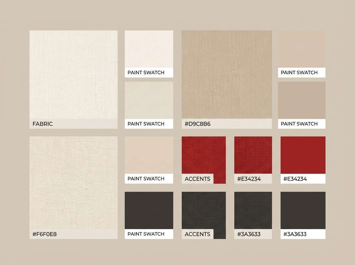
8) Brick and Linen
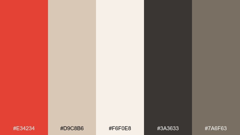
HEX: #E34234 #D9C8B6 #F6F0E8 #3A3633 #7A6F63
Mood: cozy, earthy, homey
Best for: interior design moodboard
Cozy and earthy, these shades evoke brick walls, linen throws, and sunlit plaster. Use vermilion sparingly as an accent swatch alongside textured neutrals to keep the room feeling relaxed. Deep brown-charcoal is ideal for captions and measurements. Tip: pair warm lighting photography with this mix so the cream stays creamy, not cold.
Image example of brick and linen generated using media.io
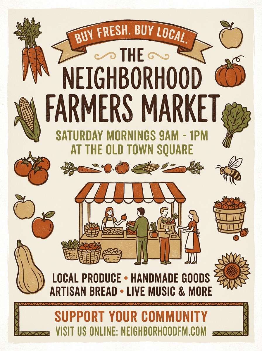
9) Harvest Spice
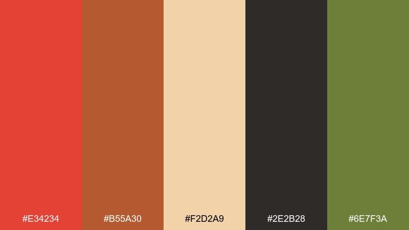
HEX: #E34234 #B55A30 #F2D2A9 #2E2B28 #6E7F3A
Mood: rustic, seasonal, appetizing
Best for: autumn farmers market flyer
Rustic and seasonal, the warm reds and baked-orange tones feel like cider steam and roasted squash. Use vermilion for the headline and the olive green for section headers to add variety without cooling the palette. Creamy tan keeps the layout approachable for community events. Tip: try hand-drawn iconography in dark brown to emphasize the local, handmade vibe.
Image example of harvest spice generated using media.io
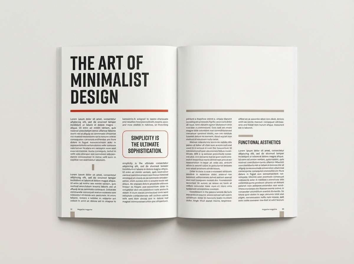
10) Gallery Accent
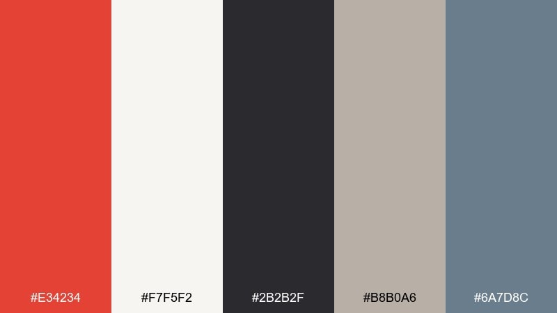
HEX: #E34234 #F7F5F2 #2B2B2F #B8B0A6 #6A7D8C
Mood: editorial, curated, understated
Best for: magazine editorial layout
Curated and editorial, the neutral base makes the warm accent feel intentional and modern. Use vermilion for pull quotes, small rules, and section markers while charcoal handles body text. The dusty slate adds a quiet secondary tone that works well in charts or sidebars. Tip: keep generous white space so the accent reads as premium rather than promotional.
Image example of gallery accent generated using media.io
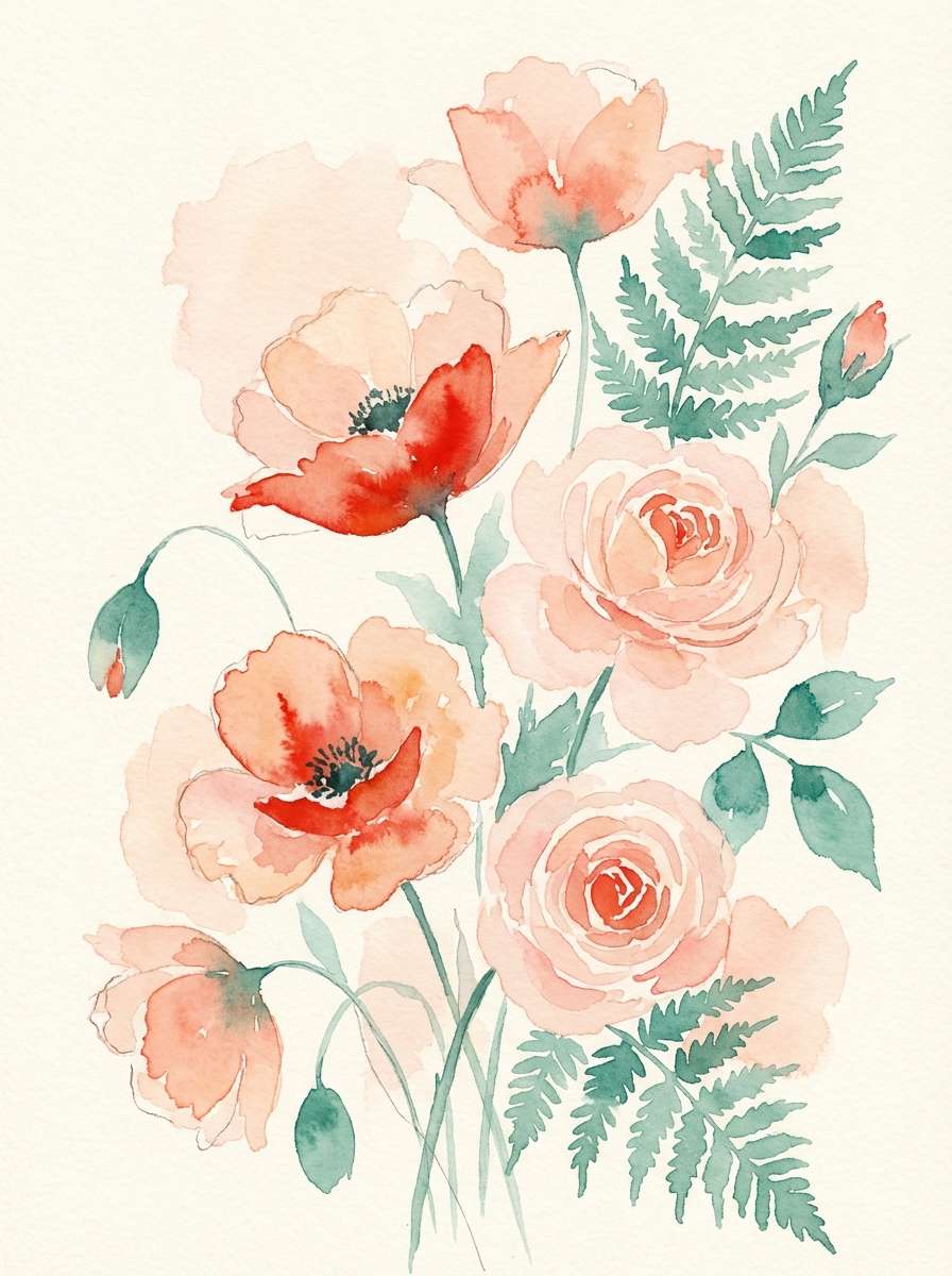
11) Peach Bloom
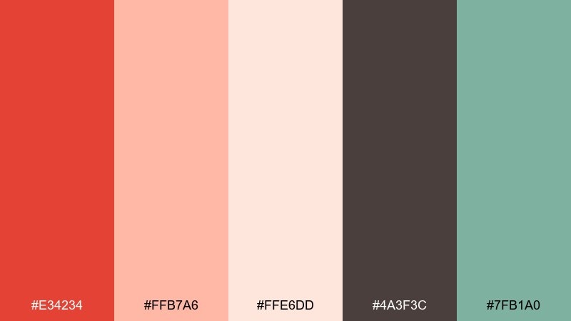
HEX: #E34234 #FFB7A6 #FFE6DD #4A3F3C #7FB1A0
Mood: soft, floral, optimistic
Best for: botanical watercolor illustration
Soft and optimistic, these hues suggest peach petals with a warm, sunlit glow. Let the blush and cream carry most of the paper area, then use vermilion for flower centers and tiny highlights. A hint of muted mint keeps the illustration airy instead of overly sweet. Tip: glaze the vermilion lightly so the details stay delicate rather than bold.
Image example of peach bloom generated using media.io
12) Carbon Coral
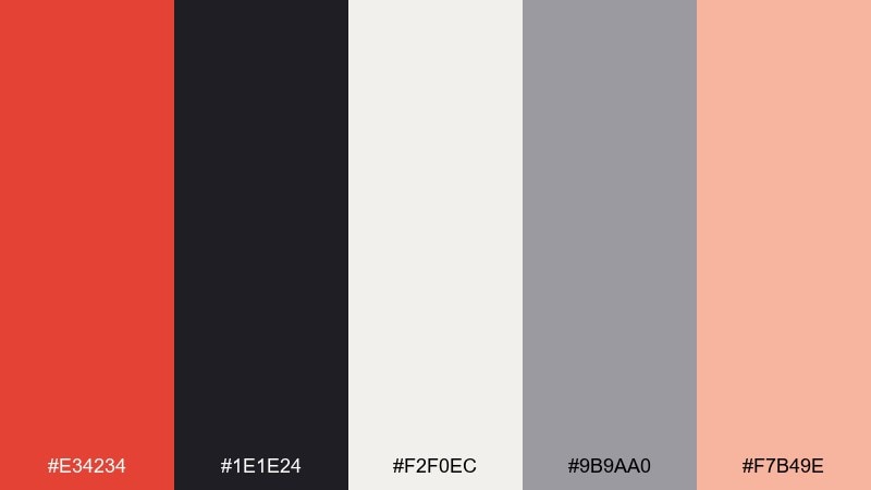
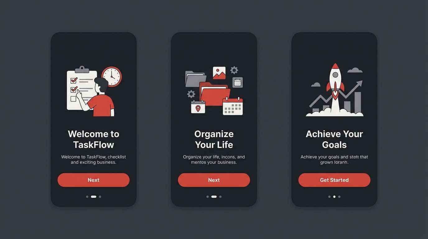
HEX: #E34234 #1E1E24 #F2F0EC #9B9AA0 #F7B49E
Mood: bold, techy, high-contrast
Best for: app onboarding screens
Bold and techy, this mix feels like a dark mode interface with a warm ignition point. Use carbon for the main background and keep vermilion for primary actions and progress indicators. Off-white and soft gray preserve readability for long copy. Tip: add the coral tint only to illustrations or micro-interactions so the CTA color stays unmistakable.
Image example of carbon coral generated using media.io
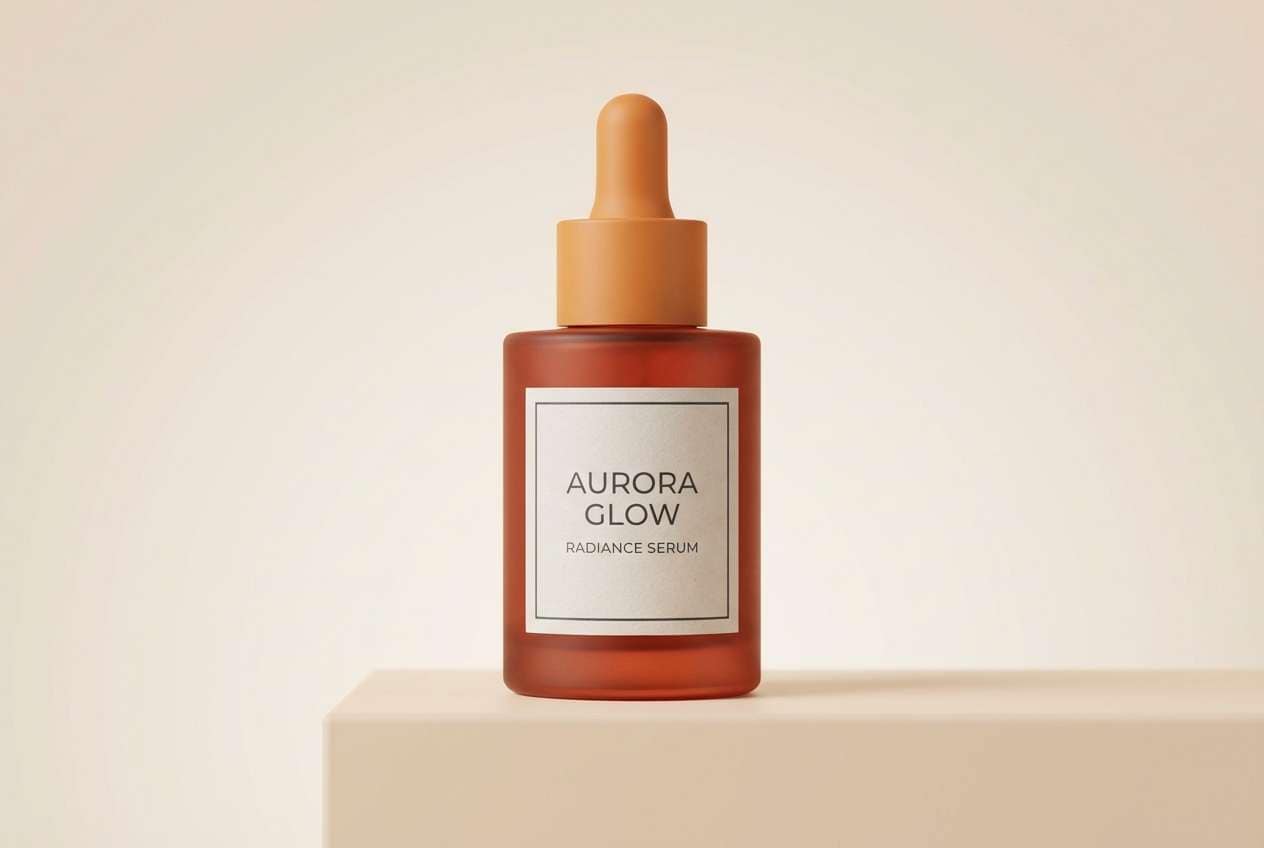
13) Copper Sunrise
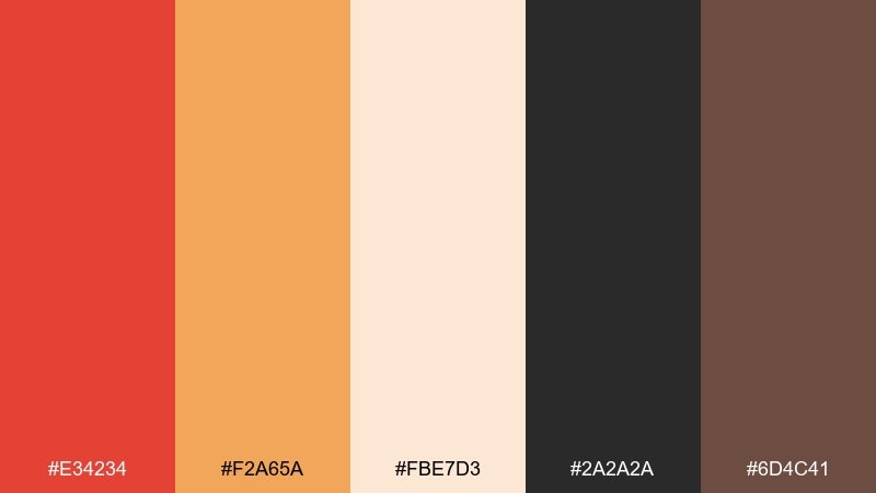
HEX: #E34234 #F2A65A #FBE7D3 #2A2A2A #6D4C41
Mood: energizing, glossy, commercial
Best for: skincare product ad
Energizing and glossy, these tones read like sunrise light on copper and warm skin. Use vermilion and amber as gradient partners for the hero background, then ground the copy in deep charcoal. Creamy peach is perfect for soft highlights on packaging. Tip: keep shadows warm rather than cool so the ad stays cohesive and premium.
Image example of copper sunrise generated using media.io
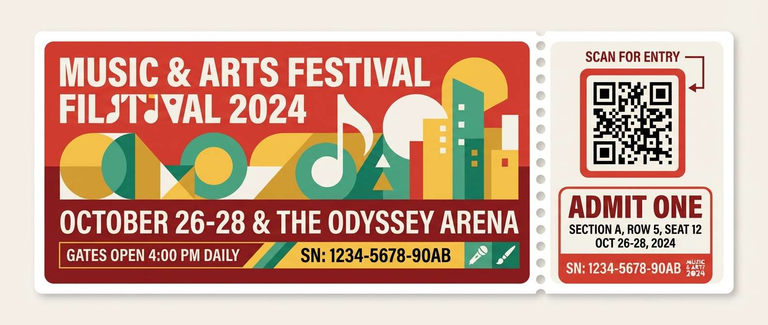
14) Festival Confetti
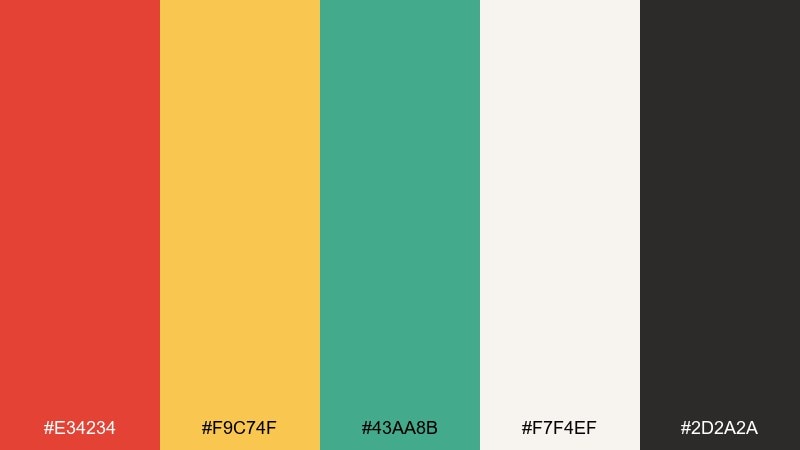
HEX: #E34234 #F9C74F #43AA8B #F7F4EF #2D2A2A
Mood: bright, cheerful, celebratory
Best for: event ticket design
Bright and celebratory, the warm red pops like confetti against a clean backdrop. Use vermilion for the ticket stub and important details, while yellow and green can mark sections like seating or entry type. The off-white keeps busy shapes from feeling chaotic. Tip: limit patterns to one area of the ticket so scanning and QR codes stay crisp.
Image example of festival confetti generated using media.io
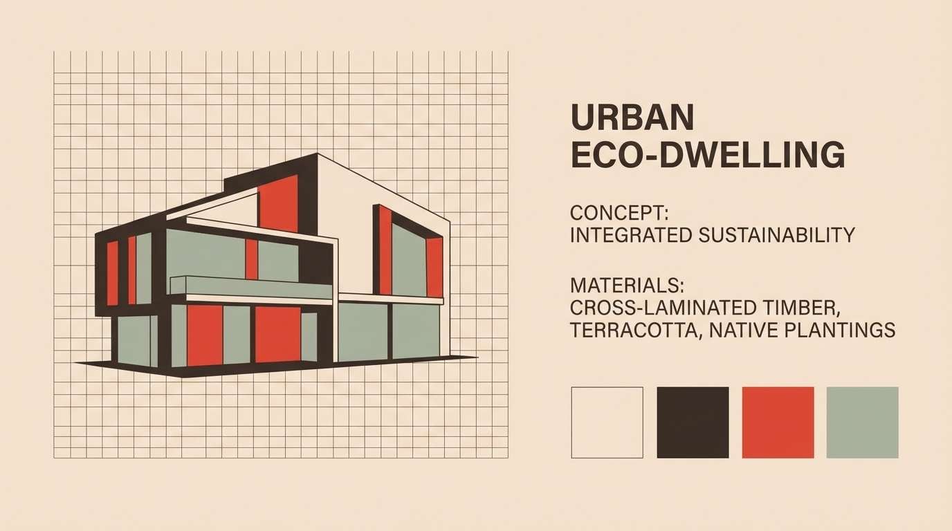
15) Desert Adobe
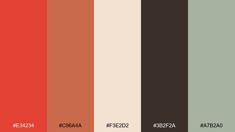
HEX: #E34234 #C96A4A #F3E2D2 #3B2F2A #A7B2A0
Mood: sunbaked, architectural, calm
Best for: architecture presentation slides
Sunbaked and architectural, these colors feel like adobe walls, dust, and desert shrubs. Use the sandy neutral as the main slide background, then apply vermilion to highlight key metrics and section dividers. The muted green is a great accent for diagrams and site plans. Tip: stick to thin lines and large margins so the warm tones look refined, not heavy.
Image example of desert adobe generated using media.io
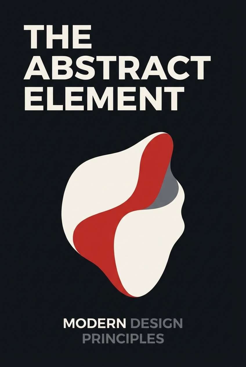
16) Ink and Persimmon
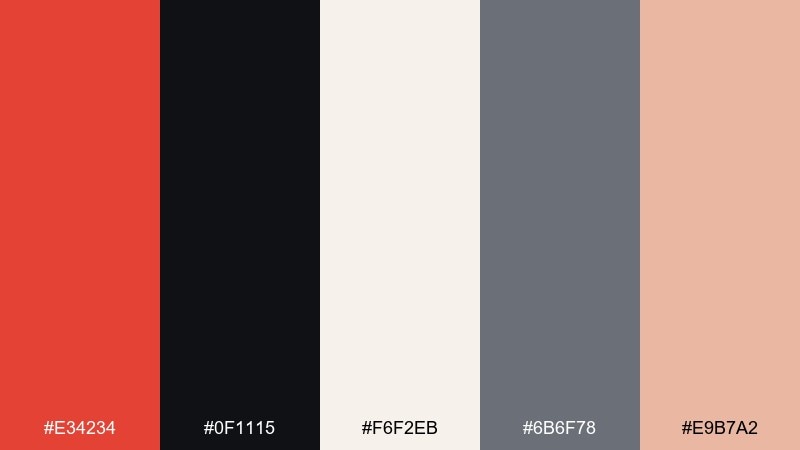
HEX: #E34234 #0F1115 #F6F2EB #6B6F78 #E9B7A2
Mood: sharp, modern, editorial
Best for: book cover design
Sharp and modern, the inky dark base makes the warm accent look decisive and literary. This vermilion color palette works best when the title sits in off-white and vermilion is used for a single striking shape or underline. Soft gray supports subtitles and author names without stealing focus. Tip: test the cover at thumbnail size to ensure the accent remains visible but not overpowering.
Image example of ink and persimmon generated using media.io
17) Winter Hearth
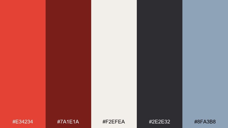
HEX: #E34234 #7A1E1A #F2EFEA #2E2E32 #8FA3B8
Mood: cozy, wintry, storybook
Best for: holiday greeting card
Cozy and wintry, the deep red and soft cream feel like a hearth glow against cold air. Use vermilion for the focal illustration or a bold greeting, then lean on cream for the card base. The slate blue is a subtle seasonal counterpoint that keeps the reds from feeling too heavy. Tip: add a small amount of blue only in background shapes or envelopes to maintain the warm center.
Image example of winter hearth generated using media.io

18) Modern Folk
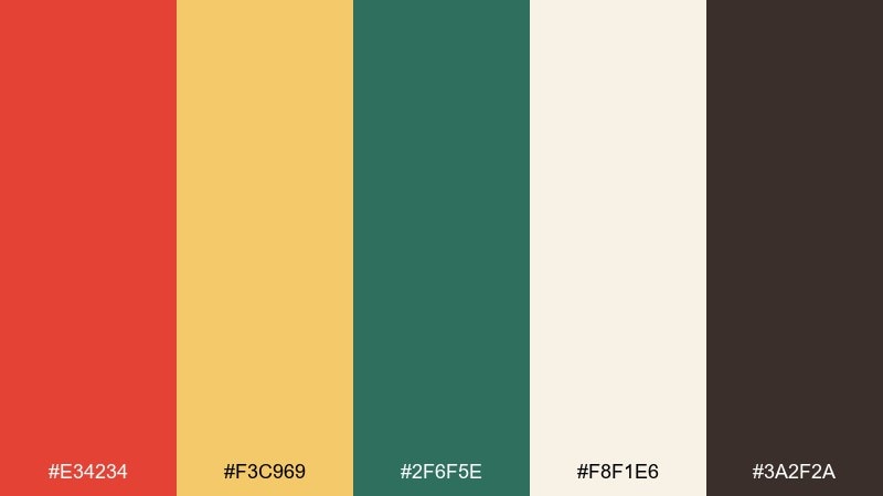
HEX: #E34234 #F3C969 #2F6F5E #F8F1E6 #3A2F2A
Mood: folk, friendly, handcrafted
Best for: craft fair poster
Friendly and handcrafted, this set feels like folk patterns printed on natural paper. Vermilion pairs beautifully with deep green for motif outlines and headings, while buttery yellow can highlight dates and locations. The cream background keeps the look inviting rather than busy. Tip: repeat one small pattern element in only two colors to avoid turning the poster into a patchwork.
Image example of modern folk generated using media.io

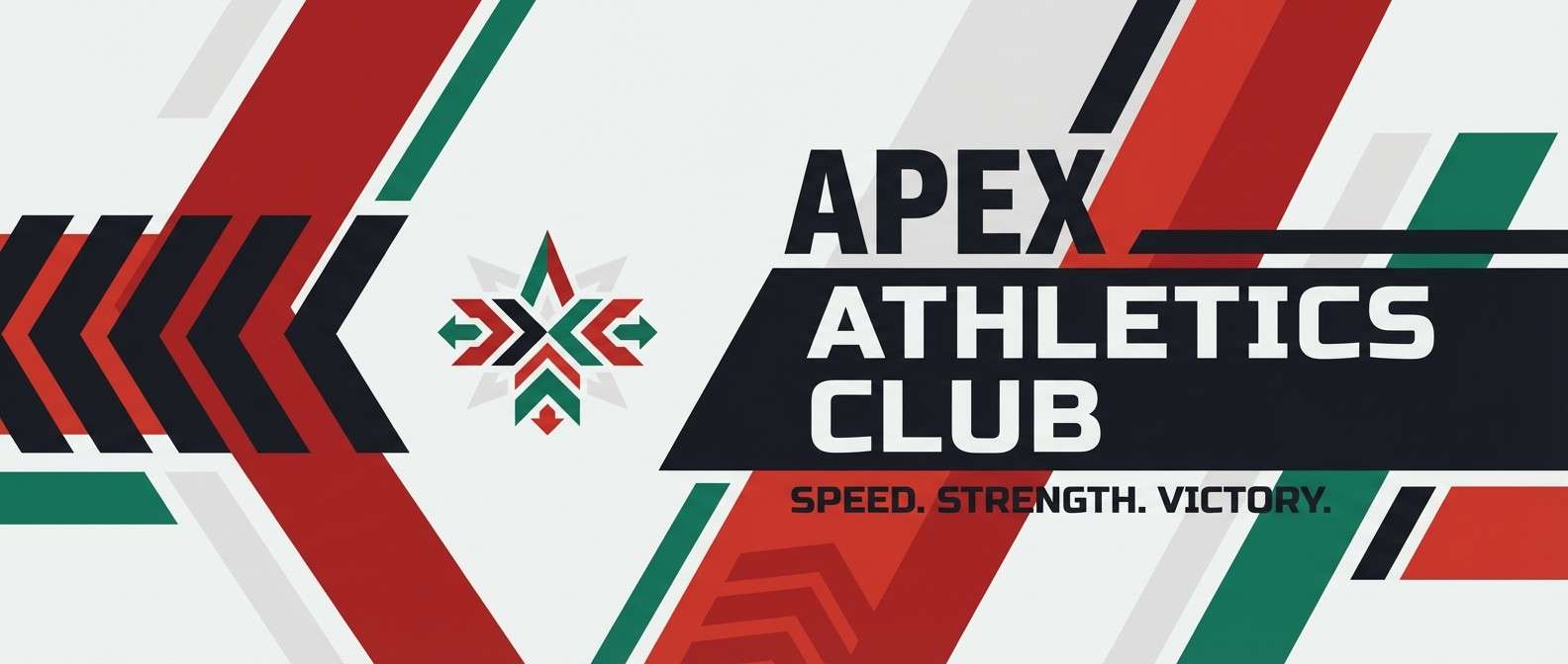
19) Courtline Energy
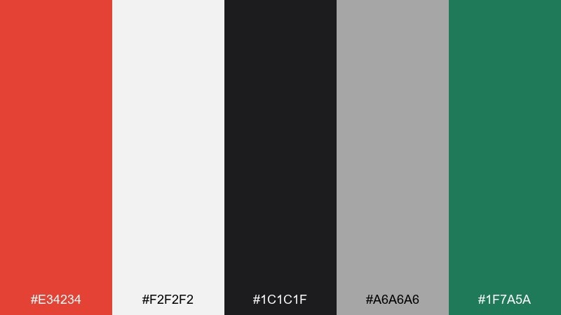
HEX: #E34234 #F2F2F2 #1C1C1F #A6A6A6 #1F7A5A
Mood: sporty, punchy, modern
Best for: sports club banner
Sporty and punchy, the hot accent feels like a whistle blast against clean neutrals. Use vermilion for the main call-to-action and score highlights, keeping black for typography and structure. A controlled green adds a fresh edge without competing with the hero color. Tip: increase letter spacing on white areas so the banner stays legible from a distance.
Image example of courtline energy generated using media.io
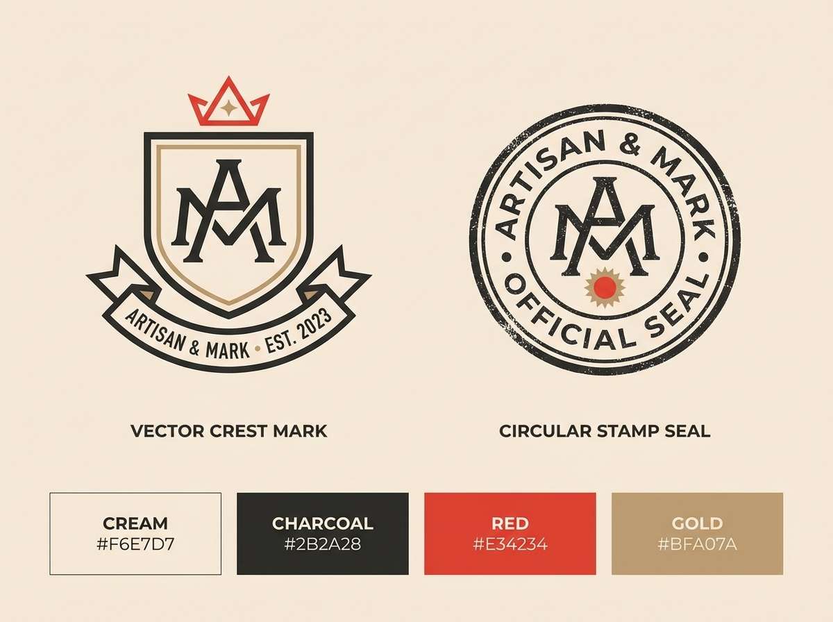
20) Classic Seal
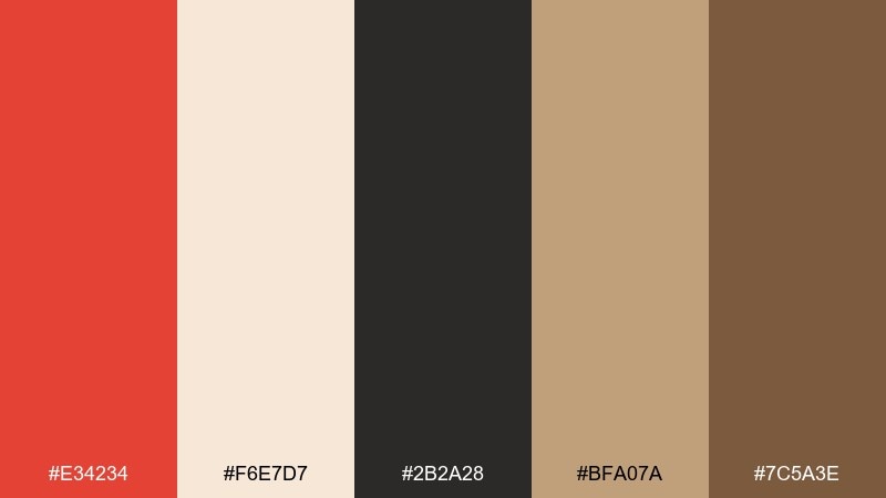
HEX: #E34234 #F6E7D7 #2B2A28 #BFA07A #7C5A3E
Mood: heritage, trustworthy, tactile
Best for: logo and stamp mark system
Heritage and tactile, these shades recall wax seals, parchment, and old-world craft. For refined vermilion color combinations, pair the accent with warm tan and deep brown so the look stays classic rather than flashy. Use cream as negative space to keep the mark crisp on packaging and certificates. Tip: create one-color stamp versions in brown first, then introduce vermilion only for premium applications.
Image example of classic seal generated using media.io
What Colors Go Well with Vermilion?
Vermilion pairs best with warm neutrals (cream, parchment, sand) that keep layouts breathable and let the accent feel intentional. Charcoal and near-black are also reliable partners, especially for typography and UI contrast.
For a modern twist, add muted greens (sage, olive) or sea-glass teals to cool the palette slightly without killing the warmth. Dusty blues and slate tones work well as secondary accents for charts, sidebars, or seasonal balance.
Metallic-adjacent hues like muted gold, tan, and bronze can make vermilion feel more premium in print. The key is to avoid competing warm reds; instead, use one deep red for depth and let vermilion stay the standout.
How to Use a Vermilion Color Palette in Real Designs
In branding, treat vermilion as a “signature” highlight: seals, badges, icon fills, and micro-elements on packaging tend to look more refined than large vermilion blocks. Pair with warm paper-like backgrounds and dark type for a handcrafted, trustworthy feel.
In UI, use vermilion for primary actions (buttons, selected states, progress) and rely on grayscale for structure and text hierarchy. Keep hover and disabled states softer (peach/blush tints) so the main CTA remains unmistakable.
For posters and social graphics, vermilion excels in headlines and callouts—but protect readability with strong contrast and generous spacing. If you introduce a second bold hue (teal/green/yellow), choose one leader and one supporter to avoid a “shouting” layout.
Create Vermilion Palette Visuals with AI
If you want to see these vermilion palettes in action, generate quick mockups for packaging, posters, UI screens, and invitations using AI. This helps you test contrast, dominance, and mood before committing to a full design.
Start with a clear subject (e.g., “event ticket,” “skincare bottle,” “dashboard UI”), then paste the HEX colors into your prompt so the output stays on-brand. Iterate with small changes like “matte ink,” “grain texture,” or “minimal typography” to refine the look.
Vermilion Color Palette FAQs
-
What is vermilion in HEX?
In this article, the core vermilion used across palettes is #E34234, a warm red with a noticeable orange undertone. -
Is vermilion more red or orange?
Vermilion sits between red and orange. It keeps the intensity of red but leans orange enough to feel warmer and more inviting. -
What neutral colors pair well with vermilion?
Warm neutrals like cream, parchment, sand, and linen pair especially well. For typography and structure, charcoal or near-black provides strong, clean contrast. -
What is a good complementary accent for a vermilion palette?
Muted teals/sea-glass tones and subdued greens (sage, olive) complement vermilion nicely because they cool the palette slightly while keeping it sophisticated. -
How do I use vermilion in UI without overwhelming the screen?
Use vermilion primarily for CTAs and key states (selected, active, progress). Keep most surfaces neutral and reserve lighter coral/blush tints for hovers or subtle emphasis. -
Does vermilion print well on packaging?
Yes—vermilion is strong and readable in print, especially on warm off-whites. For a premium feel, consider matte ink for the vermilion and use tan/gold-beige accents for subtle finishing touches. -
How can I generate vermilion palette mockups quickly?
Use Media.io text-to-image: describe the design (label, poster, UI, invitation) and include the palette HEX codes in the prompt to keep the visuals consistent.
Next: Dim Gray Color Palette


