

Dim gray is a modern neutral that brings structure without the harshness of pure black. In UI, branding, and interiors, it supports clean typography, stable layouts, and a calm visual hierarchy.
Below are 20+ dim gray color palette ideas with HEX codes, plus practical guidance for pairing accents, keeping contrast readable, and turning palettes into real design systems.
In this article
- Why Dim Gray Palettes Work So Well
-
- urban fog
- stone and sage
- museum minimal
- cocoa smoke
- coastal overcast
- neon sign dusk
- linen studio
- arctic steel
- blush concrete
- forest slate
- golden hour asphalt
- navy tailored
- terracotta loft
- iris and ink
- monochrome workshop
- mint metro
- rosewood evening
- clay and graphite
- citrus concrete
- winter botanical
- copper circuit
- What Colors Go Well with Dim Gray?
- How to Use a Dim Gray Color Palette in Real Designs
- Create Dim Gray Palette Visuals with AI
Why Dim Gray Palettes Work So Well
Dim gray sits in the sweet spot between stark black and soft light gray, so it can carry navigation, headings, and UI chrome without overpowering content. That balance makes designs feel composed and intentional.
Because it’s neutral, dim gray pairs easily with warm accents (sand, terracotta, gold) or cool accents (teal, slate blue, mint). You can shift the mood dramatically while keeping the same dependable foundation.
It also helps with consistency across screens and print: dim gray reduces the “pure black” contrast shock, and it tends to look more refined on large blocks, backgrounds, and typography-heavy layouts.
20+ Dim Gray Color Palette Ideas (with HEX Codes)
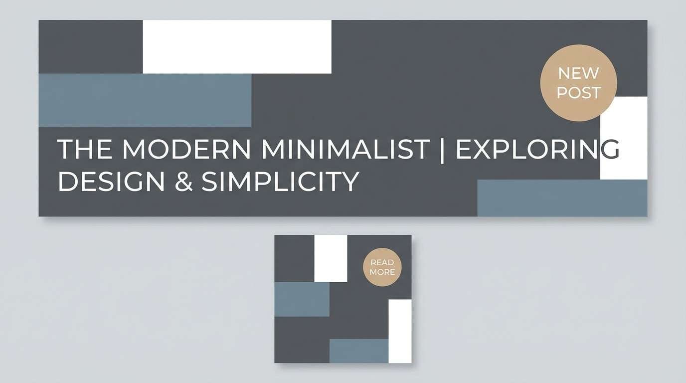
1) Urban Fog
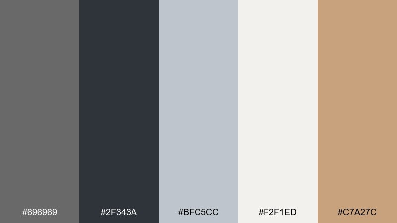
HEX: #696969 #2F343A #BFC5CC #F2F1ED #C7A27C
Mood: quiet, metropolitan, polished
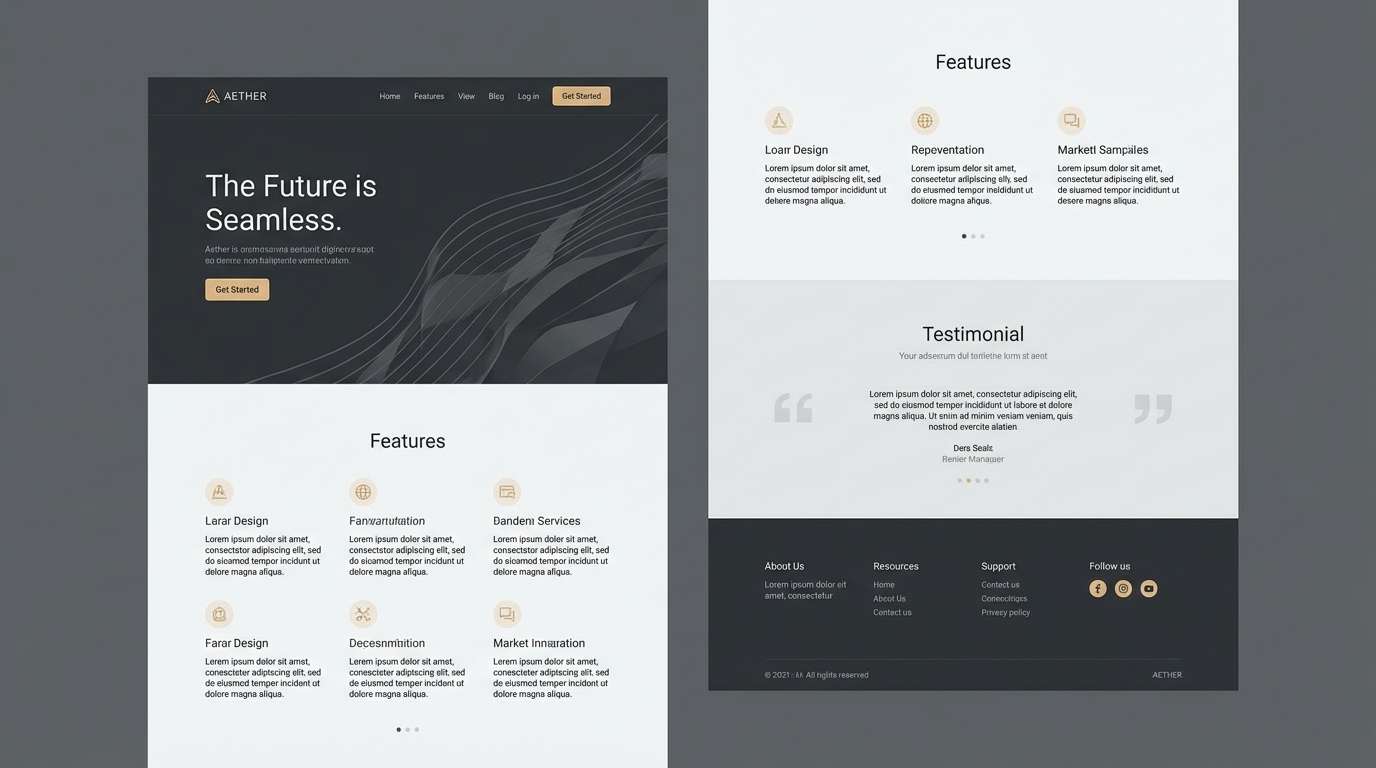
Best for: landing page UI for a tech product
Quiet city fog and brushed concrete come to mind, softened by a warm sand accent. It fits dashboards and SaaS landing pages where clarity matters more than hype. Pair the taupe highlight with buttons or key metrics while keeping headings in the deep charcoal. Usage tip: reserve the tan for one primary action to avoid muddy contrast.
Image example of urban fog generated using media.io
Media.io is an online AI studio for creating and editing video, image, and audio in your browser.

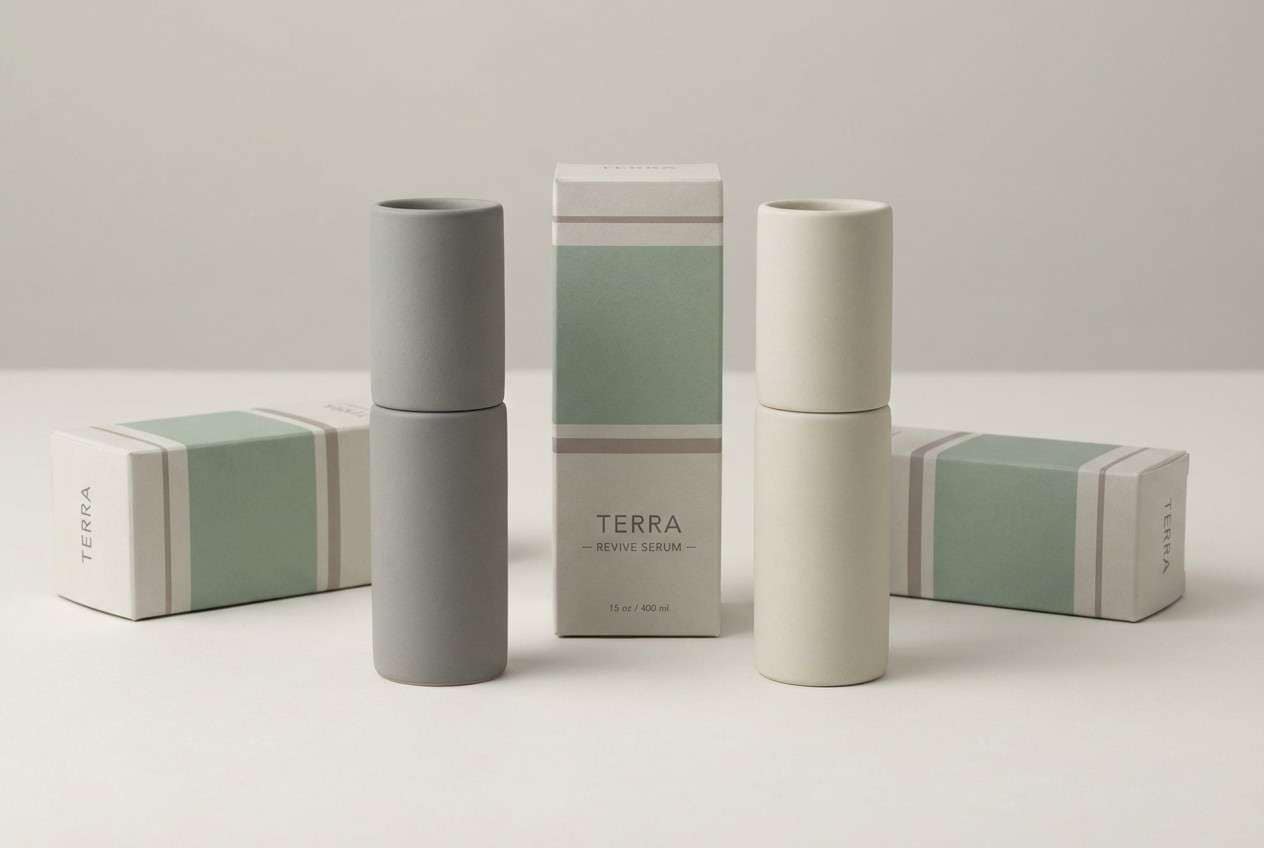
2) Stone and Sage
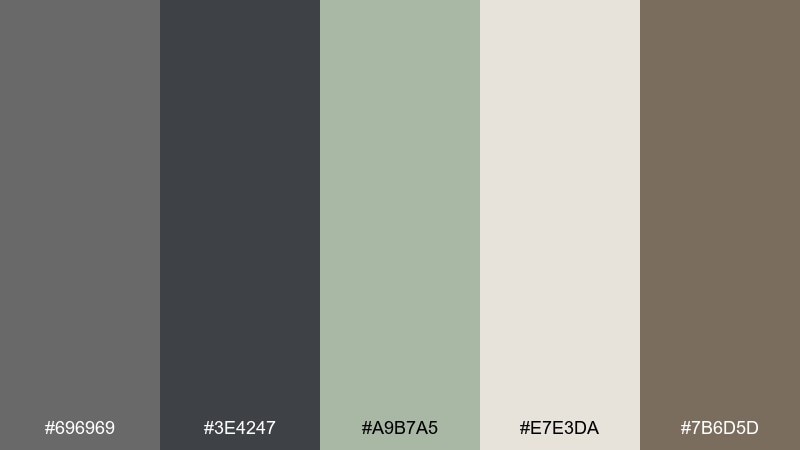
HEX: #696969 #3E4247 #A9B7A5 #E7E3DA #7B6D5D
Mood: grounded, natural, restorative
Best for: spa brand identity and packaging
Grounded stone tones meet a soft sage note, like a calm bathhouse interior. It works beautifully for wellness branding, labels, and minimal packaging where you want trust and calm. Keep sage as the hero accent on seals or callouts and let the grays handle typography. Usage tip: print the light cream as uncoated stock to enhance the organic feel.
Image example of stone and sage generated using media.io
3) Museum Minimal
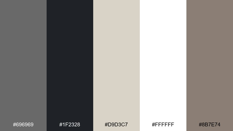
HEX: #696969 #1F2328 #D9D3C7 #FFFFFF #8B7E74
Mood: gallery-clean, refined, quiet luxury
Best for: editorial magazine layout
Gallery walls, quiet type, and curated stillness define the mood. This dim gray color palette suits editorial spreads and lookbooks that rely on whitespace and elegant hierarchy. Pair the near-black for headlines with warm greige for pull quotes to keep pages from feeling cold. Usage tip: stick to one accent rule for captions so the layout stays museum-like.
Image example of museum minimal generated using media.io
4) Cocoa Smoke
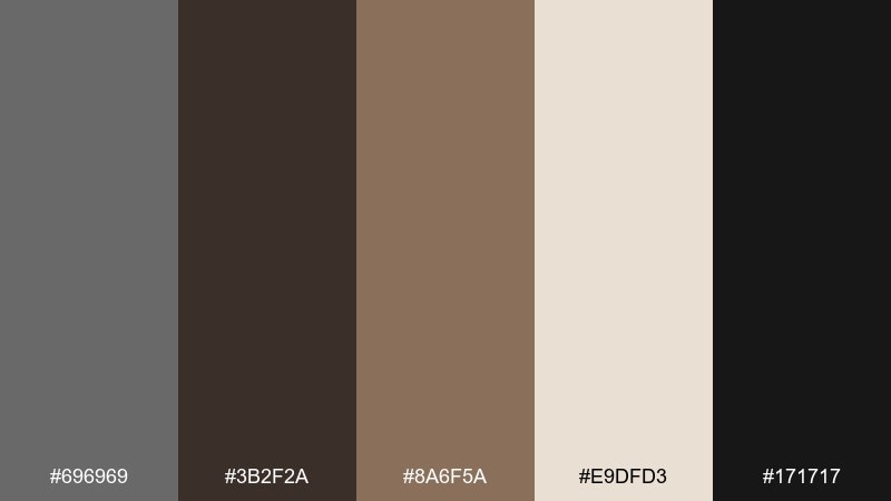
HEX: #696969 #3B2F2A #8A6F5A #E9DFD3 #171717
Mood: moody, cozy, intimate
Best for: coffee shop menu design
Smoky espresso tones and warm cocoa create a cozy, late-night cafe atmosphere. It is ideal for menus and small-format print where readability must stay strong. Use the cream background for body text and reserve the deep brown for section headers and prices. Usage tip: add subtle paper texture to keep the darks from feeling flat.
Image example of cocoa smoke generated using media.io
5) Coastal Overcast
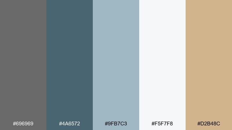
HEX: #696969 #4A6572 #9FB7C3 #F5F7F8 #D2B48C
Mood: fresh, airy, calm
Best for: travel blog header and thumbnails
Overcast skies by the sea feel airy rather than gloomy, thanks to a clean ice-white base. This mix works for travel headers, thumbnail systems, and content cards that need a quiet color story. Pair the blue-gray for links and small UI highlights, and keep tan as a soft badge color. Usage tip: limit saturated blues so the palette stays misty and relaxed.
Image example of coastal overcast generated using media.io
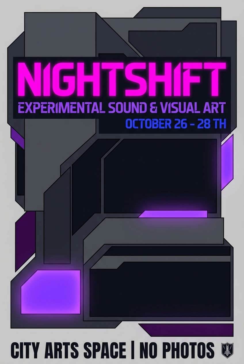
6) Neon Sign Dusk
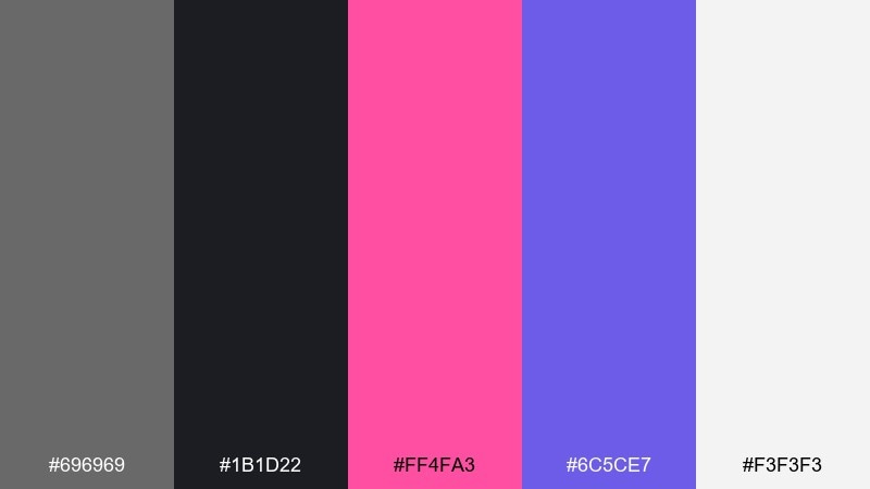
HEX: #696969 #1B1D22 #FF4FA3 #6C5CE7 #F3F3F3
Mood: energetic, nightlife, modern edge
Best for: event poster for an electronic music night
Nightlife dusk energy shows up in the punchy pink and violet against deep, smoky neutrals. These dim gray color combinations shine on event posters and social graphics where contrast needs to grab attention fast. Keep the grays as the stage and use the pink for the headline while violet supports secondary details. Usage tip: avoid gradients unless you can control banding in print.
Image example of neon sign dusk generated using media.io
7) Linen Studio
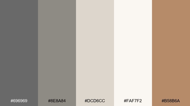
HEX: #696969 #8E8A84 #DCD6CC #FAF7F2 #B58B6A
Mood: soft, tactile, handmade
Best for: minimal product photography background styling
Soft linen and studio daylight give this set a calm, handcrafted tone. It is great for product shoots where you want neutral surfaces with a warm, natural undertone. Use the warm tan as a prop accent (ribbon, label, small card) while the off-whites carry most of the frame. Usage tip: keep shadows gentle so the grays read as fabric, not metal.
Image example of linen studio generated using media.io
8) Arctic Steel
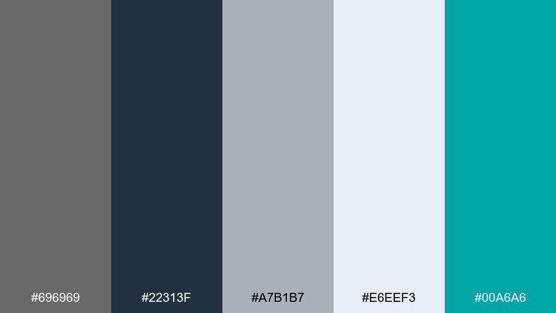
HEX: #696969 #22313F #A7B1B7 #E6EEF3 #00A6A6
Mood: crisp, technical, confident
Best for: data dashboard UI
Crisp steel and icy light grays feel technical and dependable, with a clean teal signal color. It fits analytics dashboards and fintech tools where states and metrics need clear emphasis. Pair teal with charts and toggles, and keep the darkest navy for navigation. Usage tip: test contrast on small type so the mid-gray never becomes low-visibility.
Image example of arctic steel generated using media.io

9) Blush Concrete
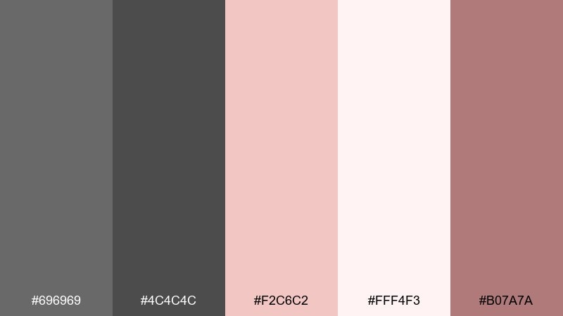
HEX: #696969 #4C4C4C #F2C6C2 #FFF4F3 #B07A7A
Mood: soft, modern, approachable
Best for: beauty brand social templates
Soft blush on concrete feels modern but friendly, like a minimalist studio with a rosy glow. It is a strong fit for beauty social templates, product callouts, and simple promos. Use blush for large blocks and the deeper rose for small tags so the grays keep everything grounded. Usage tip: keep backgrounds near-white to avoid making the pinks look dusty.
Image example of blush concrete generated using media.io
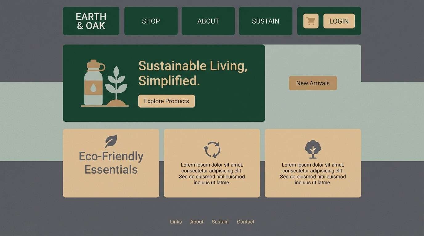
10) Forest Slate
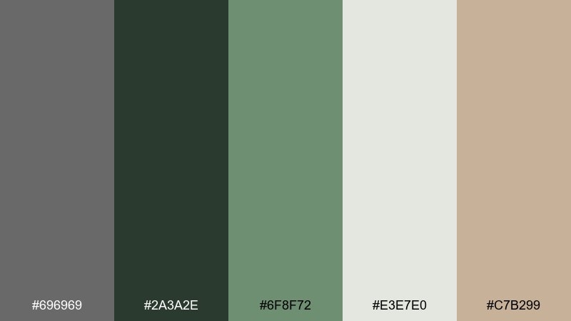
HEX: #696969 #2A3A2E #6F8F72 #E3E7E0 #C7B299
Mood: outdoorsy, steady, wholesome
Best for: eco-friendly brand website
Forest greens layered over slate gray evoke hiking trails and recycled paper labels. It works well for sustainable brands that want to feel practical, not preachy. Pair the evergreen for headers and icons, and use the pale gray-green as your primary page background. Usage tip: add warm beige sparingly to keep the greens from turning too cold.
Image example of forest slate generated using media.io
11) Golden Hour Asphalt
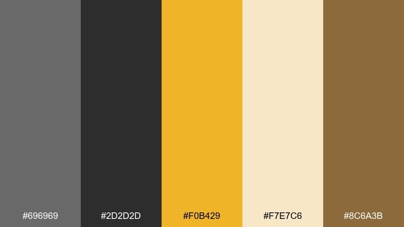
HEX: #696969 #2D2D2D #F0B429 #F7E7C6 #8C6A3B
Mood: bold, warm, urban
Best for: startup pitch deck slides
Warm golden hour light cutting across asphalt gives this set a confident, urban punch. It is ideal for pitch decks and keynote slides where you want authority with a bit of optimism. Keep the yellow for highlights and key numbers while the darker neutrals structure the grid. Usage tip: use the cream as the main canvas to prevent yellow from overpowering.
Image example of golden hour asphalt generated using media.io
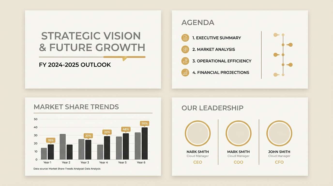
12) Navy Tailored
HEX: #696969 #0F1B2D #2B3A55 #E9EDF2 #C6A15B
Mood: professional, tailored, premium
Best for: law firm branding
Tailored navy and quiet gray feel like a well-cut suit with a brushed brass pin. It suits legal and consulting brands that need credibility without looking dated. Pair the brass-gold with seals or dividers, and keep navy for navigation and headlines. Usage tip: avoid using gold for body text; treat it as a finishing detail.
Image example of navy tailored generated using media.io
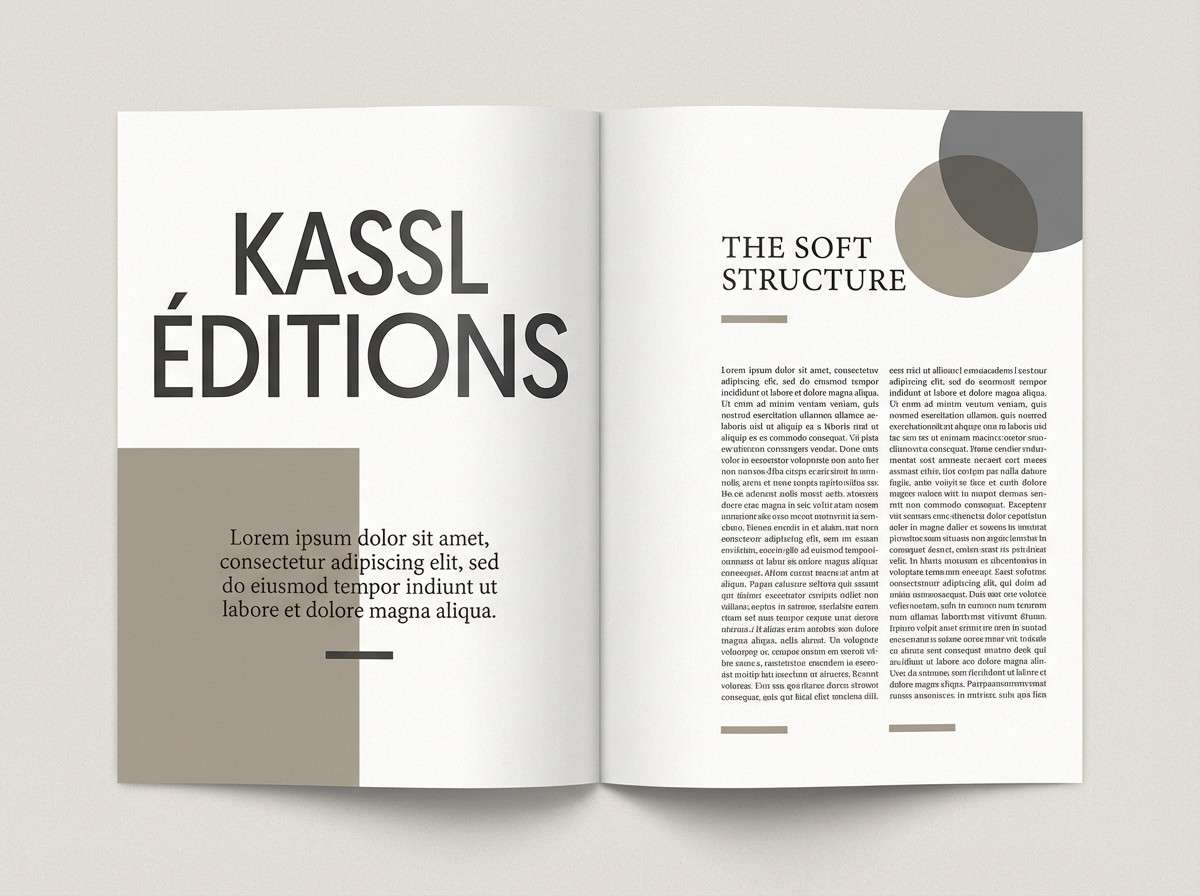
13) Terracotta Loft
HEX: #696969 #3C3532 #C76B4B #F3E6DC #8C8A84
Mood: warm, creative, lived-in
Best for: interior design mood board
Warm terracotta in a loft setting feels creative and inviting, like clay planters by a big window. It is a strong choice for interiors, mood boards, and home decor posts. Pair terracotta with the soft cream for walls or backgrounds, and keep dim tones for furniture silhouettes. Usage tip: repeat the terracotta in small doses across the design for cohesion.
Image example of terracotta loft generated using media.io
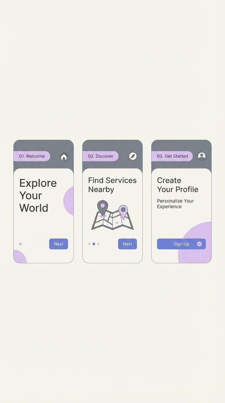
14) Iris and Ink
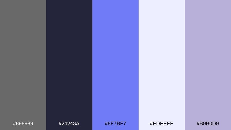
HEX: #696969 #24243A #6F7BF7 #EDEEFF #B9B0D9
Mood: dreamy, modern, slightly futuristic
Best for: mobile app onboarding screens
Inky shadows with iris light feel dreamy, like twilight glowing through frosted glass. This dim gray color palette works well for onboarding flows where you want calm motion and clear steps. Pair the periwinkle with progress indicators and micro-interactions, and keep the near-white for content cards. Usage tip: use the mid lavender as a soft shadow substitute instead of pure black.
Image example of iris and ink generated using media.io
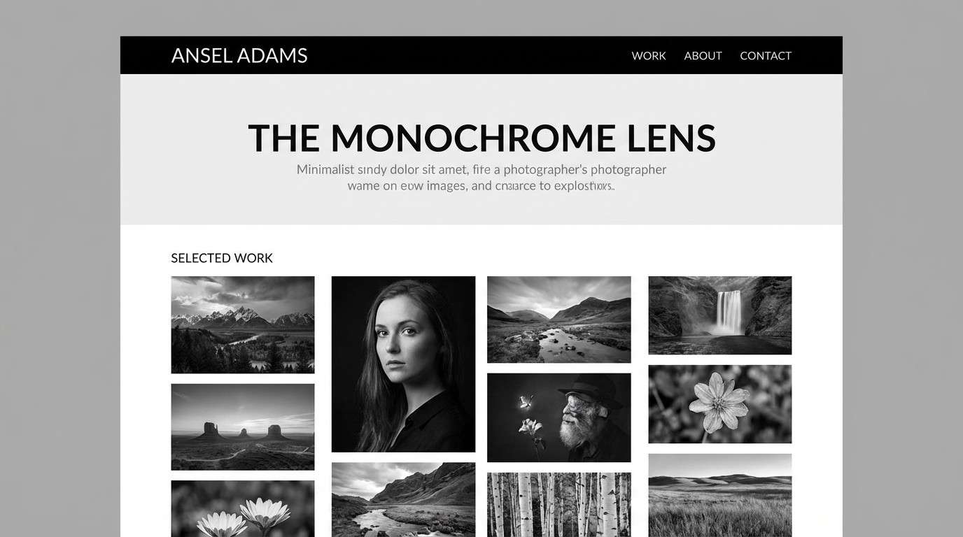
15) Monochrome Workshop
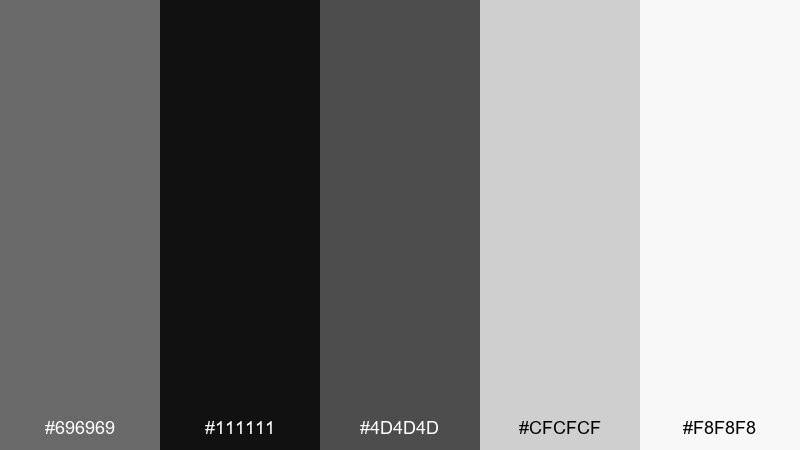
HEX: #696969 #111111 #4D4D4D #CFCFCF #F8F8F8
Mood: industrial, focused, no-nonsense
Best for: portfolio website for a photographer
Industrial monochrome feels like a workshop wall covered in prints and contact sheets. It is perfect for portfolios that need images to lead while the UI stays invisible. Pair the darkest black for navigation and use the light grays for spacing and separators. Usage tip: keep hover states subtle so the work remains the star.
Image example of monochrome workshop generated using media.io
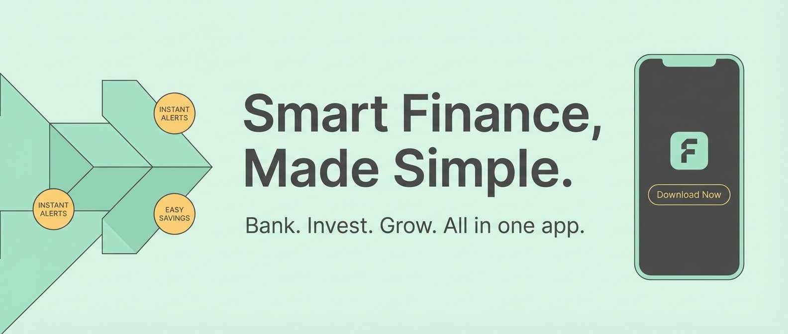
16) Mint Metro
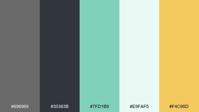
HEX: #696969 #30363B #7FD1B9 #E9FAF5 #F4C95D
Mood: fresh, upbeat, contemporary
Best for: fintech app marketing banner
Fresh mint against metro gray feels modern and optimistic, like a clean commute with sunlight hitting glass. These pairings are great for fintech banners and feature callouts where you want trust plus energy. Use mint for primary shapes and keep yellow as a tiny spark for badges or rates. Usage tip: give mint plenty of white space so it stays crisp, not loud.
Image example of mint metro generated using media.io
17) Rosewood Evening
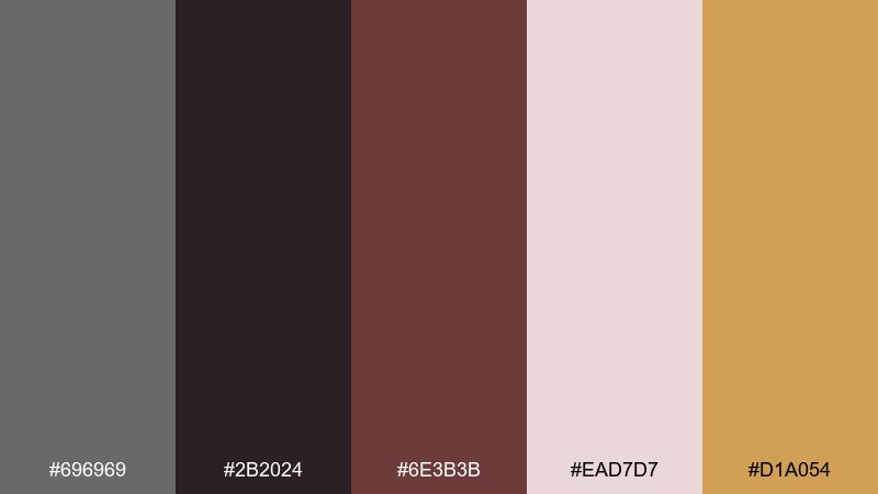
HEX: #696969 #2B2024 #6E3B3B #EAD7D7 #D1A054
Mood: romantic, dramatic, elegant
Best for: wedding invitation set
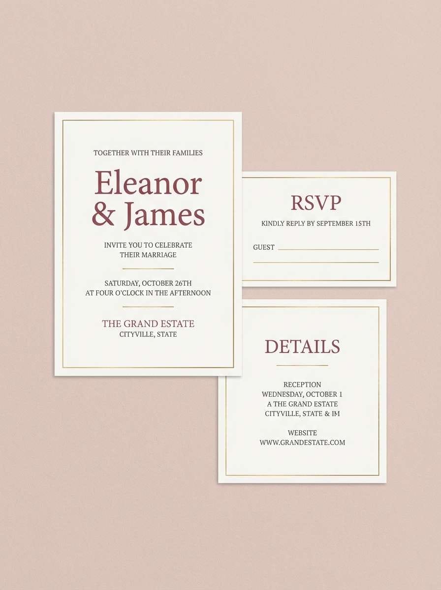
Rosewood and dim light feel romantic and dramatic, like candlelit velvet. It suits invitation suites and formal stationery with a slightly modern edge. Pair the dusty blush background with deep wine text, and use the gold as a foil-style highlight for names or borders. Usage tip: keep gold accents thin so the design stays refined.
Image example of rosewood evening generated using media.io
18) Clay and Graphite
HEX: #696969 #2E2A28 #B38B6D #EFE7DD #6F5E53
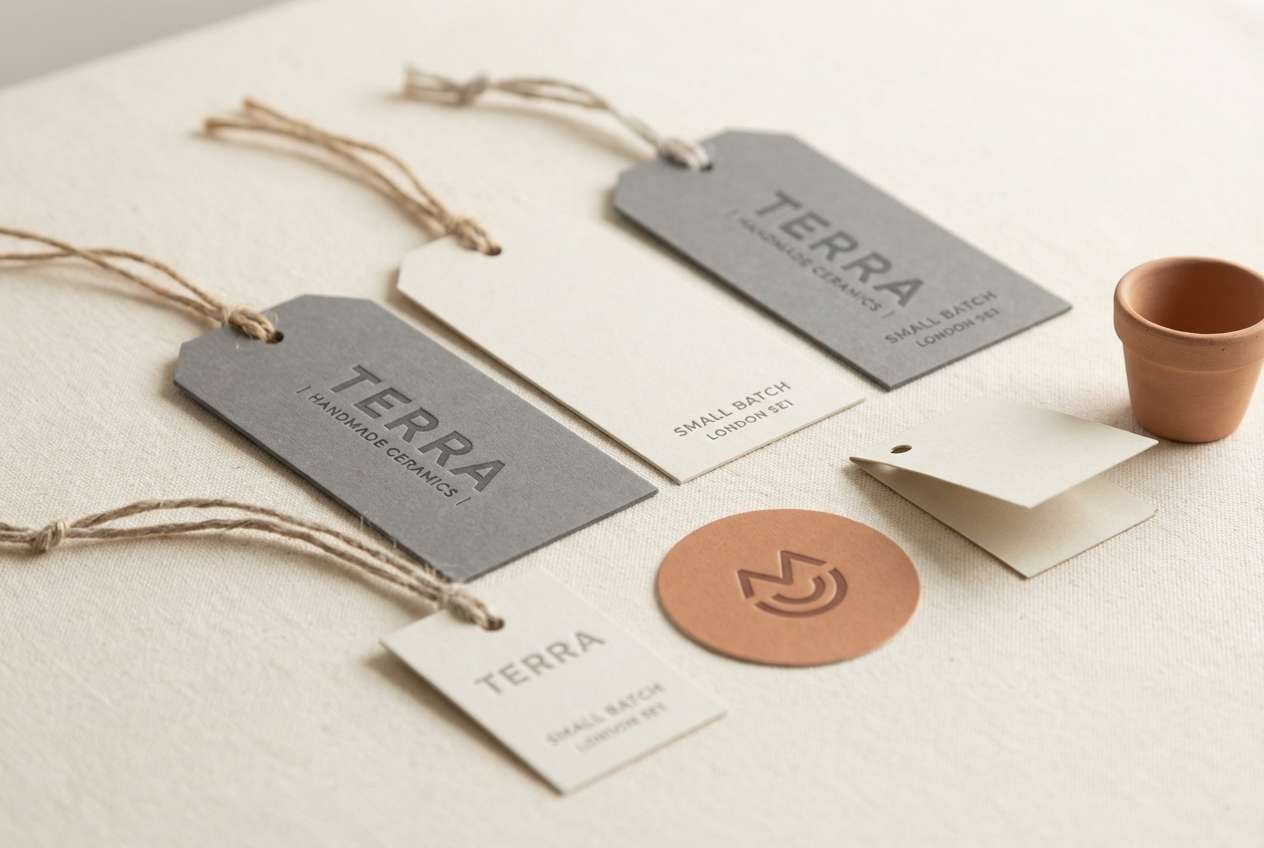
Mood: earthy, artisanal, grounded
Best for: ceramics shop packaging labels
Earthy clay and graphite feel handmade, like a potter trimming a bowl on a quiet morning. It works well for labels, tags, and small packaging where texture is part of the story. Pair the warm clay with cream for the label base and use graphite for crisp type. Usage tip: add a simple stamp mark in the mid-brown to reinforce the artisanal vibe.
Image example of clay and graphite generated using media.io
19) Citrus Concrete
HEX: #696969 #333333 #D7E04B #F5F6E8 #A3A7AA
Mood: bright, playful, modern
Best for: sportswear product ad
Concrete neutrals with a citrus pop feel sporty and modern, like a fresh trainer drop in a clean studio. This dim gray color combination is excellent for product ads where you need punch without turning neon-chaotic. Pair the pear-lime accent with key benefits and keep the pale off-white for negative space. Usage tip: use the lime on one focal element per layout for maximum impact.
Image example of citrus concrete generated using media.io
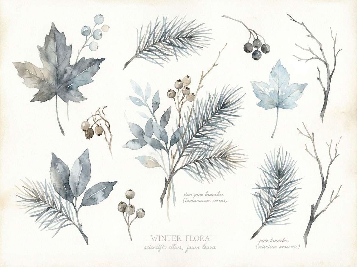
20) Winter Botanical
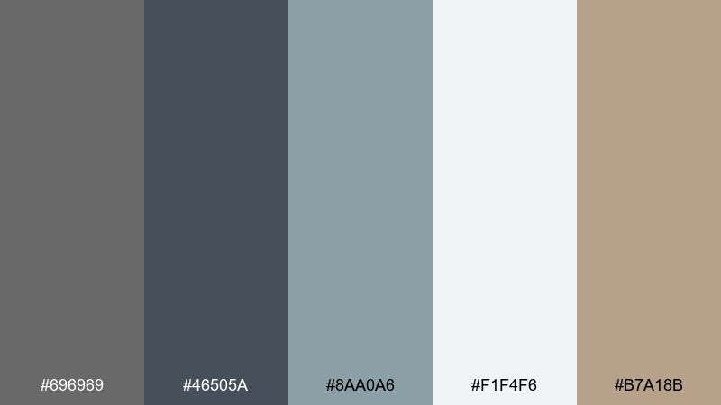
HEX: #696969 #46505A #8AA0A6 #F1F4F6 #B7A18B
Mood: cool, delicate, airy
Best for: watercolor botanical illustration set
Cool winter botanicals feel delicate, like pale leaves pressed in a journal. These dim gray color combinations suit illustration sets and stationery where you want softness without losing structure. Pair the blue-gray for stems and shadows, and keep the lightest tones as paper wash. Usage tip: let beige show up as subtle seed pods to warm the composition.
Image example of winter botanical generated using media.io
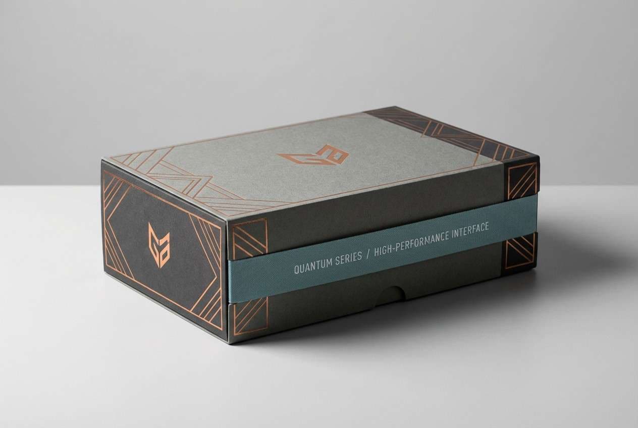
21) Copper Circuit
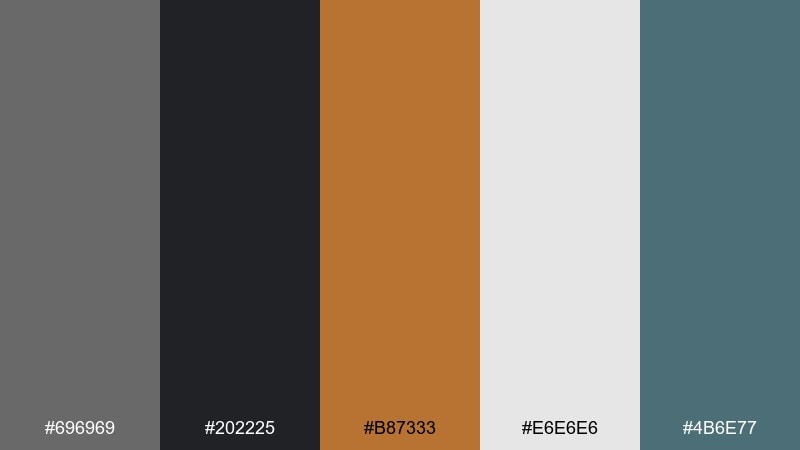
HEX: #696969 #202225 #B87333 #E6E6E6 #4B6E77
Mood: industrial, high-tech, premium
Best for: hardware product packaging
Copper on dark graphite feels like circuitry under a desk lamp, industrial but premium. It works for hardware packaging and spec sheets where you want a technical look with warmth. Pair copper with small lines and icons while using the pale gray for legible panels. Usage tip: repeat the muted teal as a secondary label color to organize variants.
Image example of copper circuit generated using media.io
What Colors Go Well with Dim Gray?
Dim gray pairs well with warm neutrals like sand, taupe, cream, and terracotta when you want an inviting, human feel. These accents keep the palette from reading cold or overly industrial.
For a crisp, modern look, combine dim gray with cool tones such as teal, slate blue, mint, or icy off-whites. This direction is especially effective for dashboards, SaaS, and editorial layouts that rely on clarity.
If you need high energy, add one bright “signal” color (neon pink, pear-lime, or golden yellow) and keep everything else muted. The key is restraint: one loud accent against controlled grays reads premium, not chaotic.
How to Use a Dim Gray Color Palette in Real Designs
Start by assigning roles: use dim gray for body text or UI structure, a near-black for headings, and a light gray or off-white for main backgrounds. Then reserve your accent color for primary actions, highlights, and key data.
Watch contrast carefully, especially when dim gray sits on mid-gray backgrounds. For readability, push either the text darker or the surface lighter, and test small type on multiple screens.
For branding and print, consider texture and paper choice: uncoated stock, subtle grain, and matte finishes help dim gray feel tactile and refined. Keep accent colors consistent across touchpoints so the system stays cohesive.
Create Dim Gray Palette Visuals with AI
Want to preview how a dim gray color scheme looks in a landing page, poster, packaging mockup, or mood board? Generate quick concept visuals from a text prompt and iterate until the contrast and mood feel right.
Describe the format (UI, print, product shot), lighting, and materials, then include your palette cues (dominant dim gray, accent color, background tone). This makes it easier to validate ideas before you design production assets.
Dim Gray Color Palette FAQs
-
What is the HEX code for dim gray?
The standard web “dimgray” color is #696969. It’s a balanced mid-to-dark gray that works well for typography, UI structure, and neutral backgrounds. -
Is dim gray better than pure black for text?
Often, yes. Dim gray can reduce harsh contrast and eye fatigue on bright screens while still staying readable—especially for large text, headings, and UI labels (verify contrast for small body text). -
What accent colors pair best with dim gray?
Warm accents like sand, terracotta, and gold add comfort; cool accents like teal, slate blue, and mint add a clean, technical feel; one vivid accent (pink or pear-lime) creates strong emphasis when used sparingly. -
How do I keep a dim gray palette from looking “dull”?
Increase contrast with a near-black for key headings, use an off-white background for breathing room, and introduce one accent color for focal points (buttons, badges, highlights) instead of spreading accents everywhere. -
Can dim gray work for brand identities?
Yes. Dim gray communicates stability and polish, making it a strong base for professional brands. Pair it with a distinctive accent (mint, brass-gold, blush, or copper) to make the identity memorable. -
What’s the best way to use dim gray in UI design?
Use it for secondary text, borders, icons, or navigation surfaces, then rely on lighter neutrals for main content backgrounds. Reserve a single high-contrast accent color for primary actions and status states. -
How can I quickly visualize dim gray palette ideas before designing?
Use an AI text-to-image tool to generate mockups (UI screens, posters, packaging, interiors) from prompts that specify your palette and materials, then refine based on readability and mood.
Next: Pear Color Palette


