

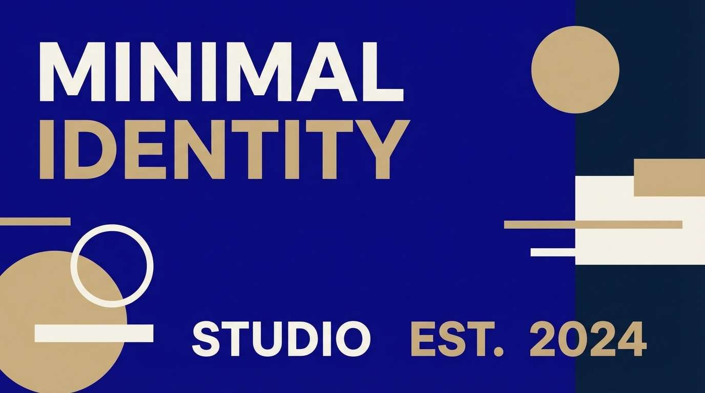
Ultramarine (#120A8F) is a deep, confident blue that instantly adds structure to interfaces, posters, and brand systems. It reads premium and modern while staying versatile across digital and print.
Below are curated ultramarine color palette mixes with HEX codes, mood notes, and practical pairing tips—so you can choose a scheme that fits your message and your layout constraints.
In this article
Why Ultramarine Palettes Work So Well
Ultramarine has natural authority: it’s dark enough to ground layouts, yet saturated enough to feel intentional and energetic. That balance makes it a reliable “anchor color” for systems that need hierarchy.
In UI, ultramarine helps separate navigation, active states, and hero elements without relying on heavy borders. In branding, it signals confidence and trust while still leaving room for warm accents like amber, terracotta, or gold.
Because it pairs well with both cool tints (cyan, seafoam, periwinkle) and warm complements (orange, pink, beige), an ultramarine color scheme can shift mood—from minimal luxury to bold campaign—without losing coherence.
20+ Ultramarine Color Palette Ideas (with HEX Codes)
1) Midnight Sail
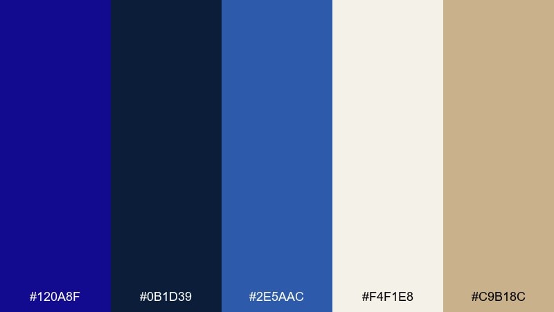
HEX: #120A8F #0B1D39 #2E5AAC #F4F1E8 #C9B18C
Mood: nautical, confident, refined
Best for: brand identity and hero sections
Nautical and confident, it feels like night water under a clean spotlight. This ultramarine color palette works beautifully for premium branding, landing pages, and bold navigation bars. Pair the deep blues with warm sand and creamy whites to keep contrast readable and elegant. Usage tip: reserve the gold-beige for small highlights like icons, badges, and key CTAs.
Image example of midnight sail generated using media.io
Media.io is an online AI studio for creating and editing video, image, and audio in your browser.

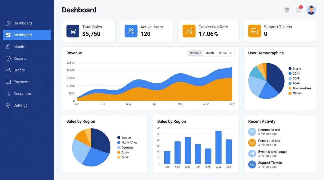
2) Modern Delft
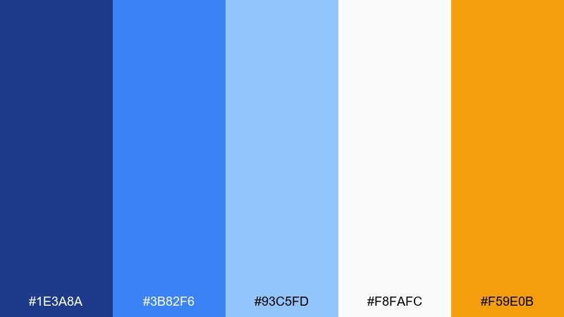
HEX: #1E3A8A #3B82F6 #93C5FD #F8FAFC #F59E0B
Mood: fresh, bright, friendly
Best for: app UI and dashboards
Fresh and upbeat, it evokes glazed ceramic tiles and clear daylight. The layered blues give you a natural hierarchy for UI states, while the warm amber adds instant focus. Use the lightest blue and off-white as surfaces, then bring in the deep ultramarine for headers and active tabs. Tip: keep the orange to one primary action per screen to avoid visual noise.
Image example of modern delft generated using media.io
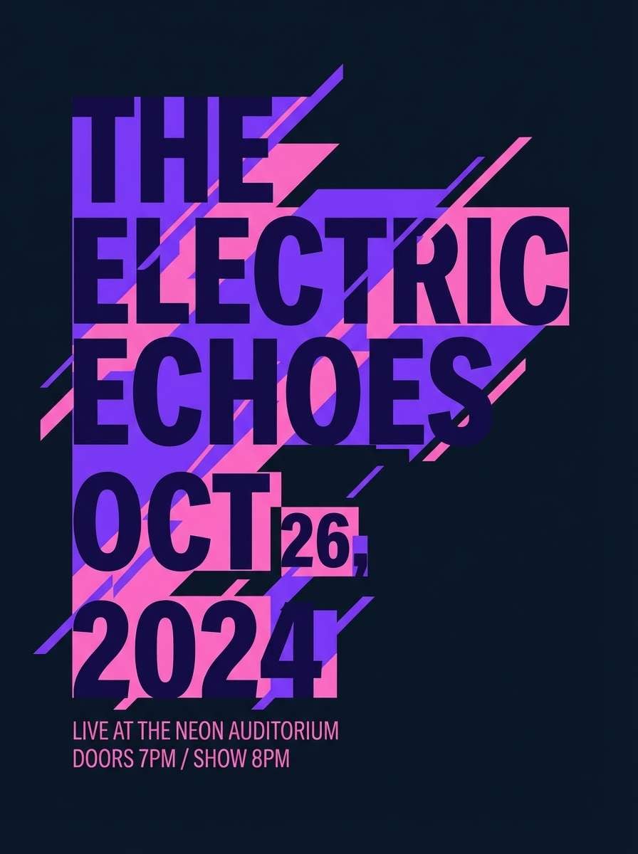
3) Velvet Opera
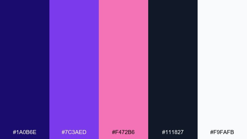
HEX: #1A0B6E #7C3AED #F472B6 #111827 #F9FAFB
Mood: dramatic, luxe, artistic
Best for: event posters and album art
Dramatic and luxe, it feels like velvet curtains and stage lights. Deep indigo and charcoal create a moody base, while violet and pink bring high-impact energy for headlines. Use the pale white for negative space around titles so the bright accents do not overpower. Tip: apply the pink only to key focal elements like dates, icons, or a single gradient stroke.
Image example of velvet opera generated using media.io
4) Coastal Ink
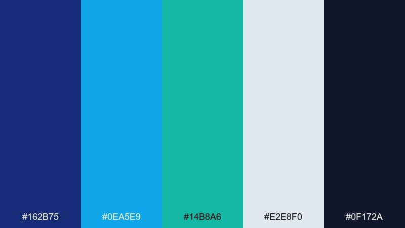
HEX: #162B75 #0EA5E9 #14B8A6 #E2E8F0 #0F172A
Mood: crisp, modern, coastal
Best for: SaaS websites and infographics
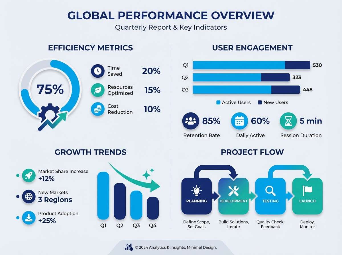
Crisp and coastal, it suggests ink lines, sea glass, and clean air. The bright cyan and teal keep the darker blues from feeling heavy, making it great for SaaS pages and data visuals. Pair the light gray with teal for secondary panels and reserve the near-black for text. Tip: use the cyan sparingly for interactive states like hover and selected indicators.
Image example of coastal ink generated using media.io
5) Gallery Spotlight
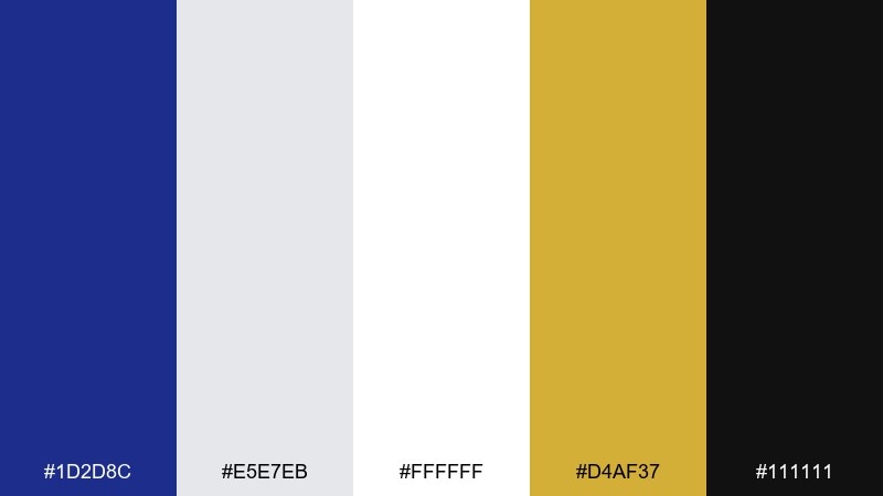
HEX: #1D2D8C #E5E7EB #FFFFFF #D4AF37 #111111
Mood: minimal, premium, high-contrast
Best for: luxury product ads
Minimal and premium, it feels like a quiet gallery with a single spotlight. Ultramarine and black deliver authority, while white and soft gray keep everything sharp and editorial. Add the gold only where you want the eye to land, like a logo mark or price detail. Tip: keep the background clean so the deep blue reads as intentional, not heavy.
Image example of gallery spotlight generated using media.io
6) Astral Citrus
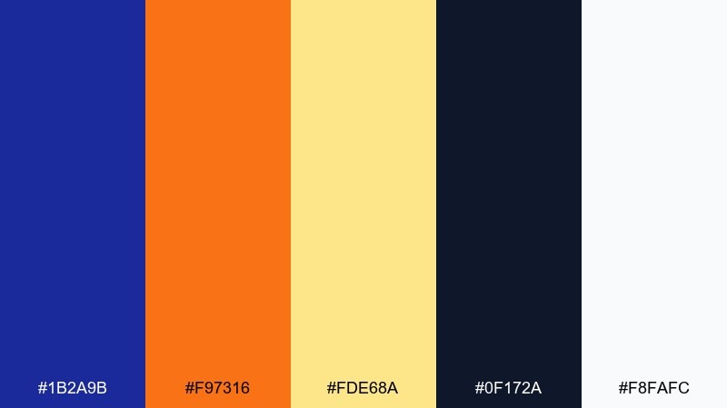
HEX: #1B2A9B #F97316 #FDE68A #0F172A #F8FAFC
Mood: bold, energetic, futuristic
Best for: campaign banners and CTAs
Bold and energetic, it brings to mind a night sky cut with bright citrus light. These ultramarine color combinations are ideal for campaign banners where you need instant contrast and a clear call-to-action. Let the deep blue and charcoal carry the background, then pop orange for buttons and highlights. Tip: use the pale yellow as a soft glow behind headlines rather than as body text.
Image example of astral citrus generated using media.io

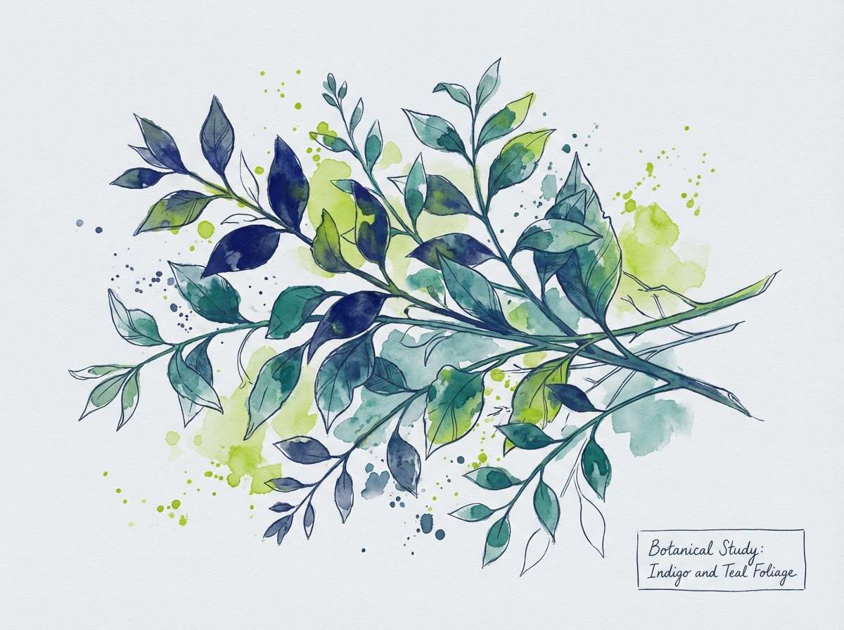
7) Botanical Midnight
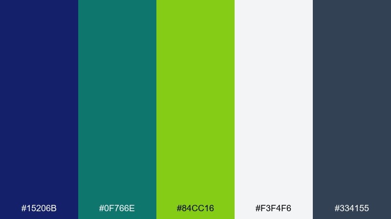
HEX: #15206B #0F766E #84CC16 #F3F4F6 #334155
Mood: earthy, calm, nocturnal
Best for: botanical illustrations and labels
Earthy and calm, it feels like a garden after rain under a deep blue sky. The greens read natural and contemporary against the night-toned base, making it great for plant brands or eco messaging. Use the off-white for label space and keep the slate for typography and linework. Tip: add the bright leaf green only to hero leaves or a single accent stamp.
Image example of botanical midnight generated using media.io
8) Paper Pigment
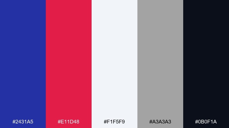
HEX: #2431A5 #E11D48 #F1F5F9 #A3A3A3 #0B0F1A
Mood: editorial, punchy, modern
Best for: magazine covers and social posts
Editorial and punchy, it looks like fresh ink on crisp paper. The hot red creates immediate emphasis, while the ultramarine keeps the layout grounded and modern. Use the light gray as generous whitespace and lean on near-black for readable captions. Tip: keep the red to one or two elements, like a tag label or a single underline, for a clean hierarchy.
Image example of paper pigment generated using media.io
9) Retro Arcade
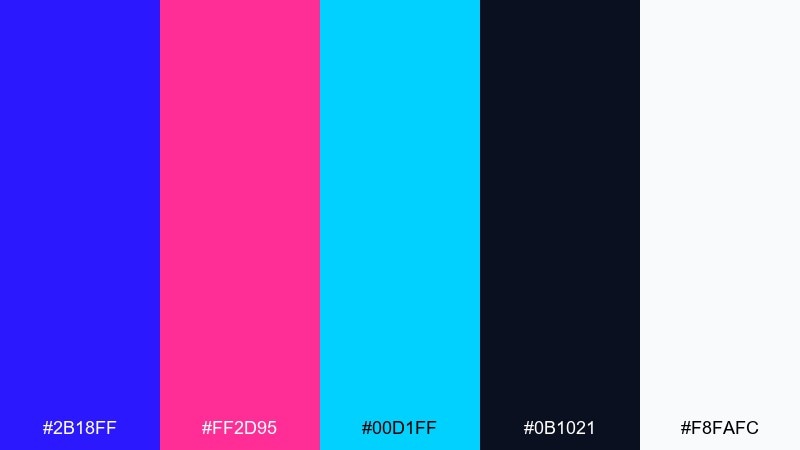
HEX: #2B18FF #FF2D95 #00D1FF #0B1021 #F8FAFC
Mood: playful, neon, high-energy
Best for: stream overlays and promos
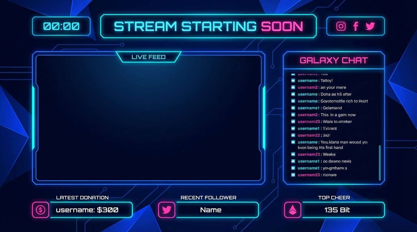
Playful and neon, it feels like arcade lights against a dark room. The electric blue and cyan create a tech-forward vibe, while the hot pink adds fun, youthful punch. Use the near-black for the main canvas so the bright colors stay controlled. Tip: apply the neon tones as strokes and glow highlights rather than full blocks to keep it readable.
Image example of retro arcade generated using media.io
10) Quiet Library
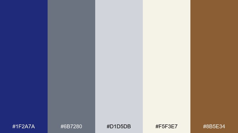
HEX: #1F2A7A #6B7280 #D1D5DB #F5F3E7 #8B5E34
Mood: calm, academic, timeless
Best for: publishing sites and portfolios
Calm and academic, it recalls clothbound books and soft reading lamps. The deep blue anchors the design, while warm cream and brown add a quiet, human touch. Use the grays for secondary UI and long-form layouts where you want minimal distraction. Tip: save the brown for small separators or icons so it stays like a subtle patina, not a competing headline color.
Image example of quiet library generated using media.io
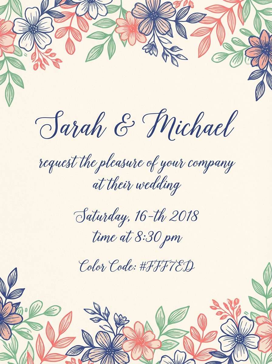
11) Ceramic Bloom
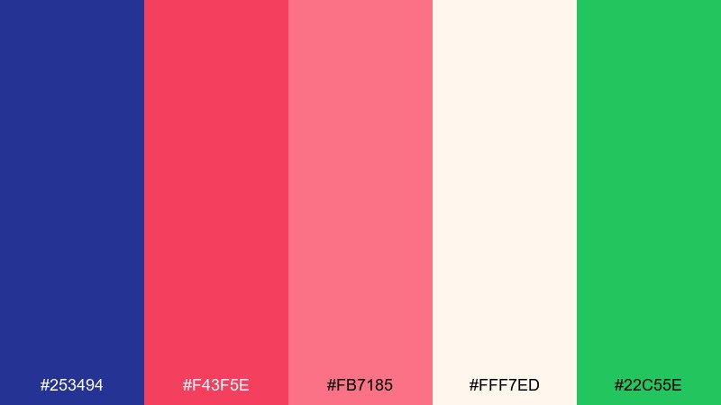
HEX: #253494 #F43F5E #FB7185 #FFF7ED #22C55E
Mood: cheerful, floral, creative
Best for: invitations and stationery
Cheerful and floral, it feels like painted ceramics and spring bouquets. The rich blue holds the composition steady while the rosy tones add warmth and celebration. Use the cream background to keep type legible and let the green act as a tiny botanical accent. Tip: try pink as a ribbon shape behind names, with ultramarine for text and borders.
Image example of ceramic bloom generated using media.io
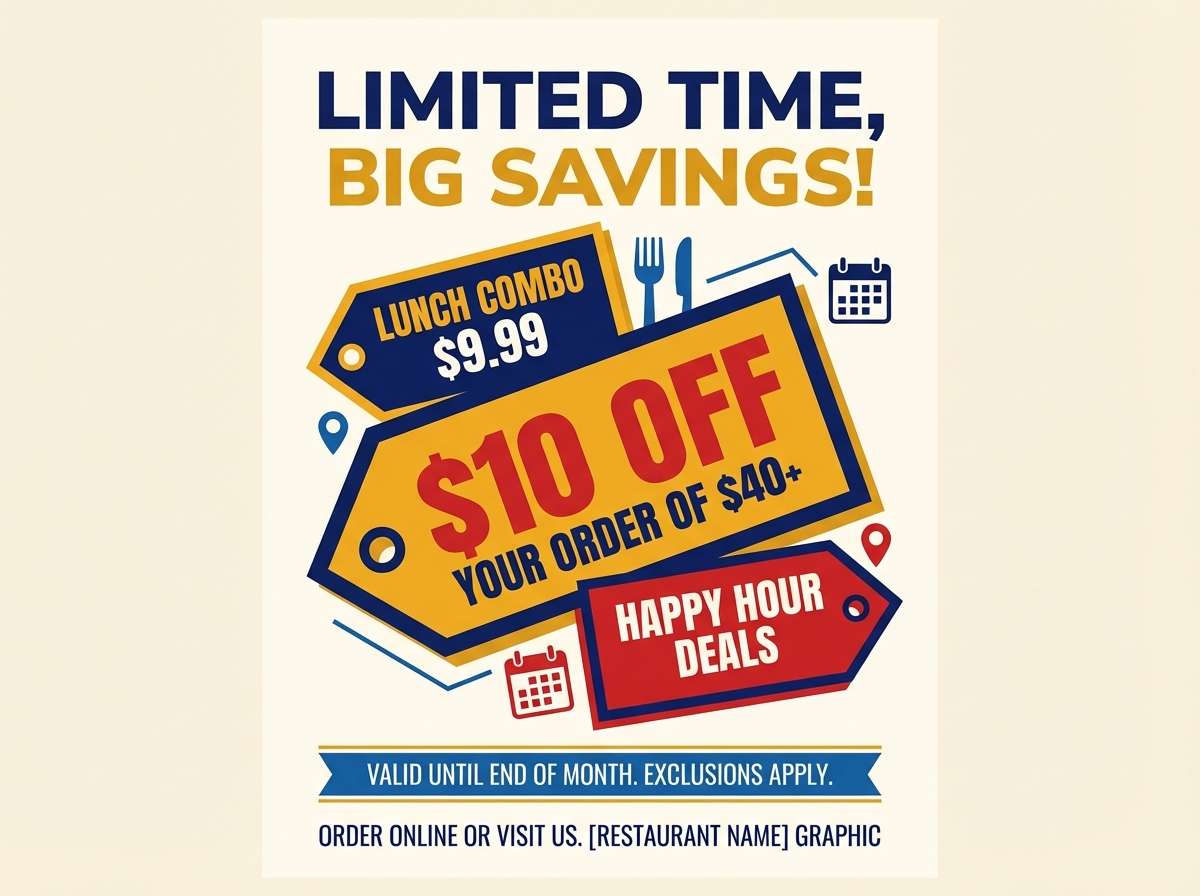
12) Night Market
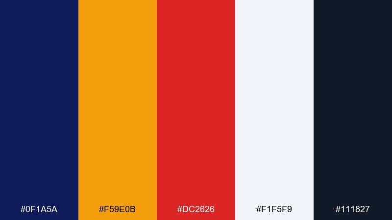
HEX: #0F1A5A #F59E0B #DC2626 #F1F5F9 #111827
Mood: vibrant, urban, appetizing
Best for: food flyers and restaurant promos
Vibrant and urban, it brings to mind lanterns, signage, and late-night stalls. The warm amber and red pop brilliantly against the dark blue, making it perfect for food promos and bold headlines. Use the off-white for menu text blocks and keep the near-black for fine print. Tip: set the amber as the primary highlight color and let red appear only for specials or limited-time tags.
Image example of night market generated using media.io
13) Mountain Shadow
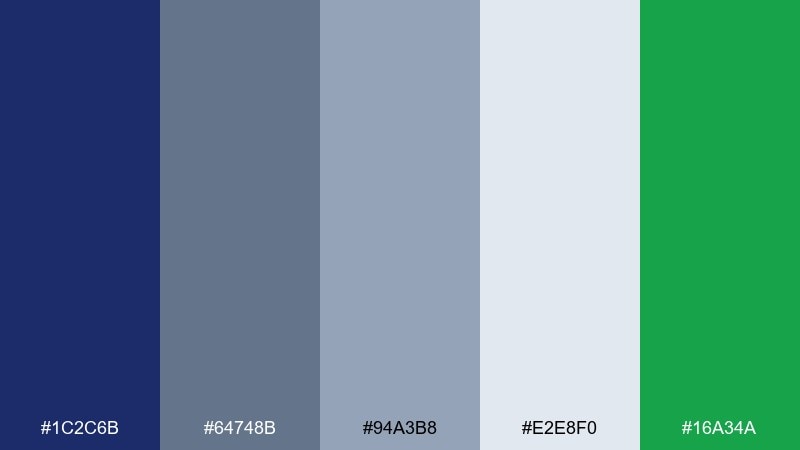
HEX: #1C2C6B #64748B #94A3B8 #E2E8F0 #16A34A
Mood: outdoorsy, steady, cool
Best for: travel blogs and map UI
Outdoorsy and steady, it feels like mountain shade with a hint of pine. The slate blues create dependable structure for maps, navigation, and content-heavy pages. Use the pale gray-blue as your canvas and keep the green for location pins or status markers. Tip: for accessibility, place white text only on the darkest blue and avoid using green for long paragraphs.
Image example of mountain shadow generated using media.io
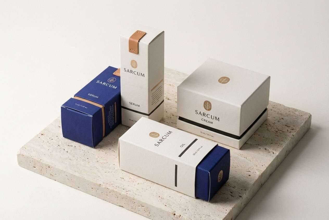
14) Luxe Minimal
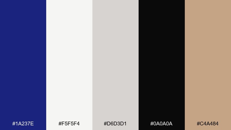
HEX: #1A237E #F5F5F4 #D6D3D1 #0A0A0A #C4A484
Mood: luxury, quiet, architectural
Best for: packaging and premium branding
Luxury and quiet, it evokes marble, ink, and warm brass details. This ultramarine color palette shines on premium packaging where contrast and restraint matter. Pair the deep blue with soft stone neutrals, then use the tan as a metallic-like accent for seals, borders, or tiny icons. Tip: print the ultramarine as a large field and keep the accent to thin lines for a high-end finish.
Image example of luxe minimal generated using media.io
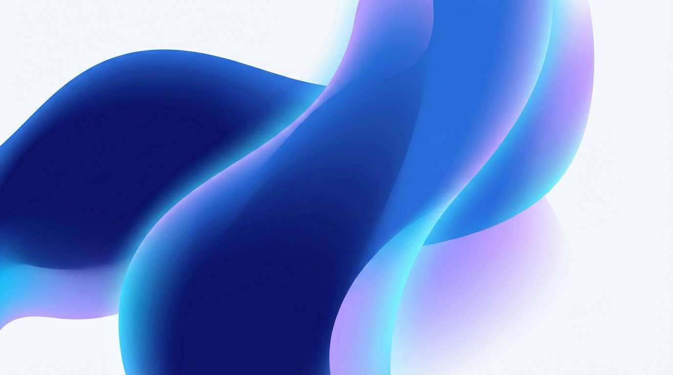
15) Prism Gradient
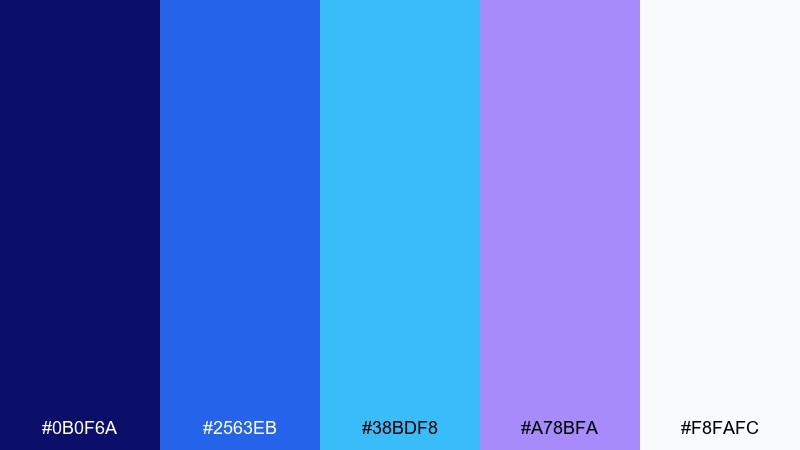
HEX: #0B0F6A #2563EB #38BDF8 #A78BFA #F8FAFC
Mood: clean, digital, optimistic
Best for: tech landing pages and gradients
Clean and optimistic, it looks like light refracting through glass. The step-up blues and soft violet are perfect for modern gradients, charts, and hero illustrations. Use the off-white for breathing room, then blend the mid-blue into cyan for depth without harsh edges. Tip: apply the violet as a secondary gradient stop so it reads as a premium detail, not a distraction.
Image example of prism gradient generated using media.io
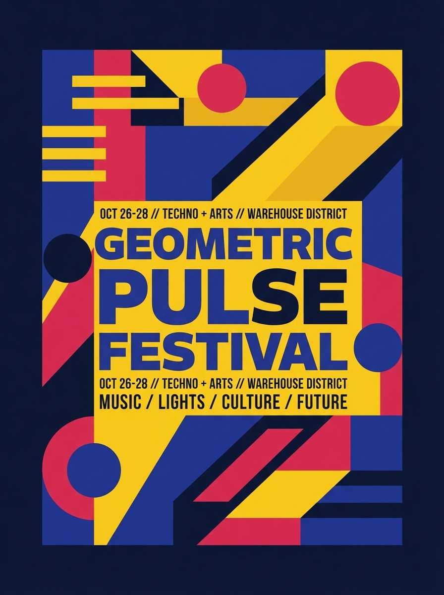
16) Solar Poster
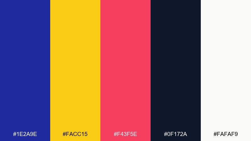
HEX: #1E2A9E #FACC15 #F43F5E #0F172A #FAFAF9
Mood: bold, sunny, graphic
Best for: festival posters and announcements
Bold and sunny, it feels like ultramarine sky with a pop-art sun. These ultramarine color combinations are made for posters that need impact from across the room. Keep the deep tones for big shapes and use yellow for spotlight elements like titles or dates, with pink as a secondary punch. Tip: use the off-white for small text blocks so the brightest colors stay reserved for emphasis.
Image example of solar poster generated using media.io
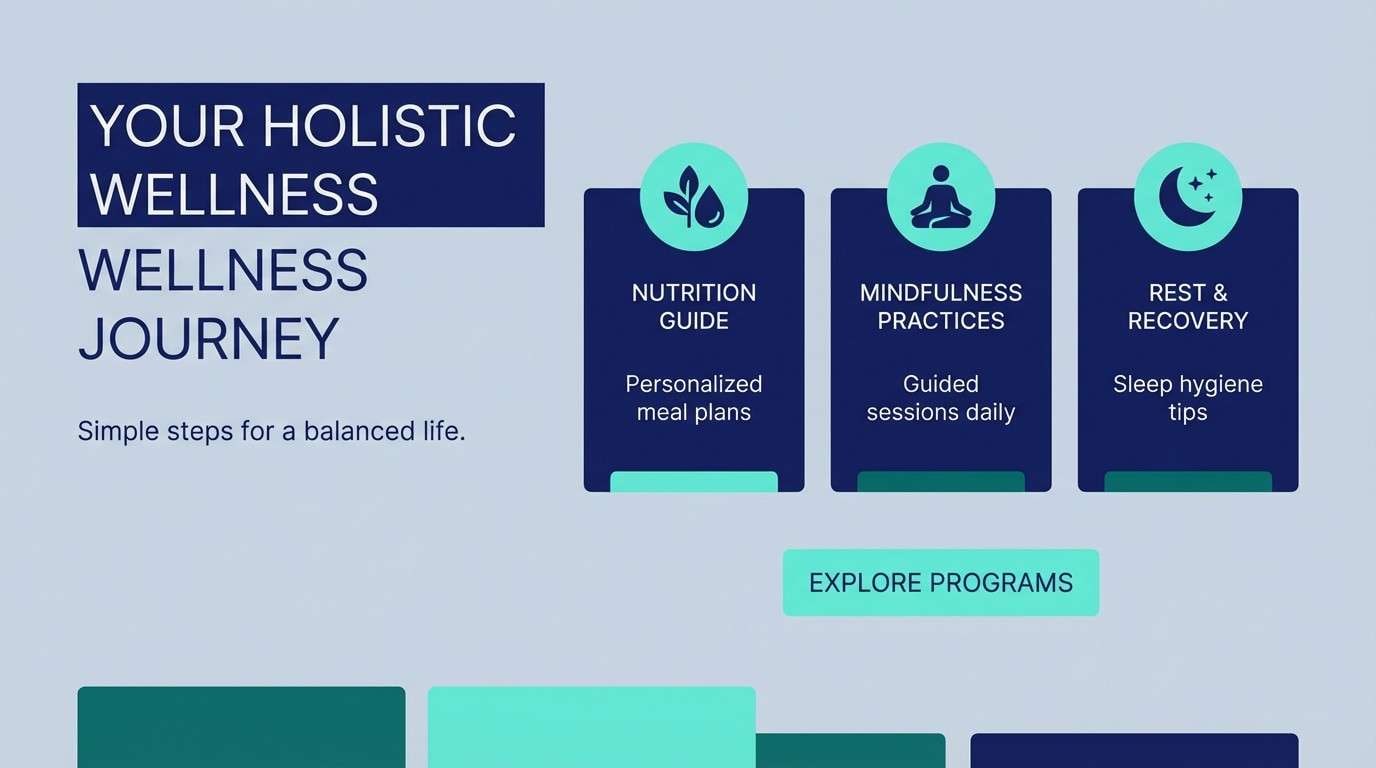
17) Slate Seafoam
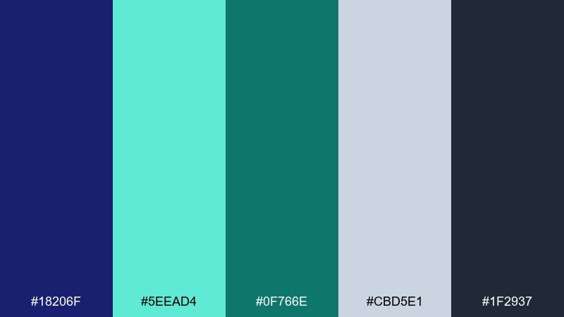
HEX: #18206F #5EEAD4 #0F766E #CBD5E1 #1F2937
Mood: cool, balanced, refreshing
Best for: wellness brands and web sections
Cool and balanced, it brings to mind seafoam against dark rock. The minty teal softens the deep blue, creating a calm, trustworthy feel for wellness and lifestyle pages. Use the light slate as the main background and keep the darkest tones for headings. Tip: set the mint as your hover and active state to add subtle movement without shouting.
Image example of slate seafoam generated using media.io
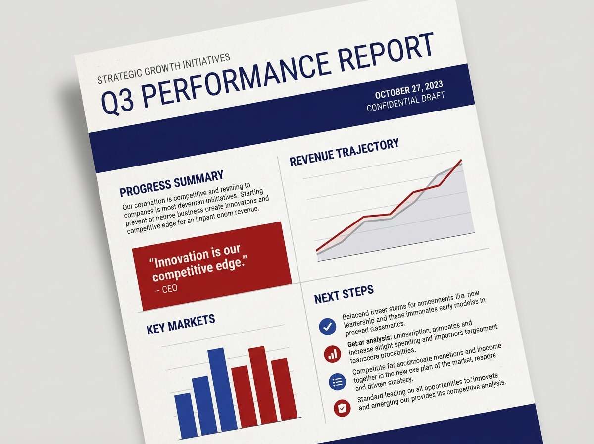
18) Editorial Navy
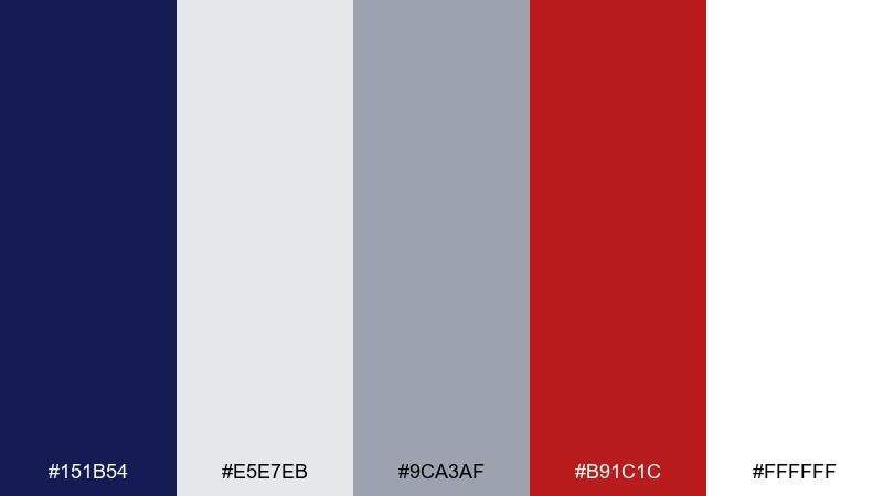
HEX: #151B54 #E5E7EB #9CA3AF #B91C1C #FFFFFF
Mood: serious, newsy, authoritative
Best for: reports and editorial layouts
Serious and authoritative, it feels like a newspaper reimagined for the web. The navy and grays support dense content, while the deep red adds a classic editorial accent for links or callouts. Use white for generous margins and let gray handle dividers and captions. Tip: keep red to a single system role, such as alerts or section tags, for consistent scanning.
Image example of editorial navy generated using media.io
19) Orchid Night
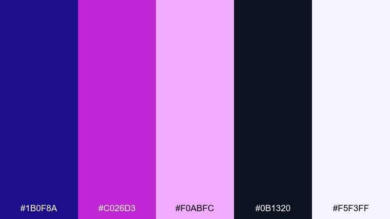
HEX: #1B0F8A #C026D3 #F0ABFC #0B1320 #F5F3FF
Mood: mysterious, dreamy, glamorous
Best for: beauty branding and social ads
Mysterious and dreamy, it evokes orchids glowing in a dark room. The purple-pink range feels glamorous, while the deep blue keeps it grounded and modern. Use the pale lavender as a soft background and push the magenta for highlights like product names or stickers. Tip: add subtle gradients between ultramarine and violet to create depth without adding extra colors.
Image example of orchid night generated using media.io
20) Warm Terracotta
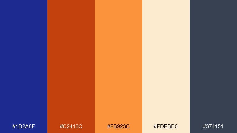
HEX: #1D2A8F #C2410C #FB923C #FDEBD0 #374151
Mood: warm, grounded, handcrafted
Best for: home decor brands and lookbooks
Warm and grounded, it feels like clay, linen, and deep blue glaze. The terracotta tones make the blue look richer and more approachable, ideal for home decor and handcrafted goods. Use the cream as the main page background and keep the charcoal for text and outlines. Tip: let orange lead for small details like buttons and tags, while blue anchors headers and frames.
Image example of warm terracotta generated using media.io
What Colors Go Well with Ultramarine?
Ultramarine pairs beautifully with warm complements—orange, amber, terracotta, and gold—because they create instant contrast and guide attention to CTAs, prices, or key labels.
For calmer, more contemporary mixes, match ultramarine with cool accents like cyan, teal, seafoam, or soft violet. This keeps the palette “digital” and airy while preserving the depth of the base blue.
To stay minimal and premium, combine ultramarine with white, off-white, light gray, and near-black. Add one metallic-like accent (tan/gold) in small doses for a refined finish.
How to Use a Ultramarine Color Palette in Real Designs
Use ultramarine as a structural color: headers, navigation, section dividers, and hero panels. Then place your brightest accent (orange/pink/yellow) on actions and highlights so user attention has a single clear path.
For readability, keep body text on light neutrals and reserve white-on-ultramarine for short elements (buttons, nav labels, badges). If you’re designing charts, assign ultramarine to the “primary series” and use lighter tints for secondary series.
In print (posters, packaging, stationery), ultramarine works best in large fields with restrained accent lines. This helps the blue feel intentional and premium, rather than visually heavy.
Create Ultramarine Palette Visuals with AI
If you already have HEX codes, you can quickly turn them into banner ideas, poster layouts, and UI mockups by describing the composition (layout, typography, shapes) and specifying the palette colors.
For consistent results, mention which colors are dominant, which are background neutrals, and which should be limited to “small highlights.” Adding an aspect ratio (like 16:9 or 3:4) helps the image match your use case.
With Media.io’s text-to-image, you can iterate on the same ultramarine color scheme across multiple formats—social, ads, hero sections—without rebuilding from scratch.
Ultramarine Color Palette FAQs
-
What is the HEX code for ultramarine in this guide?
The core ultramarine referenced here is #120A8F. It’s deep, saturated, and works well as an anchor color for UI and branding. -
Is ultramarine good for website UI backgrounds?
Yes—use it for headers, sidebars, and hero blocks, then keep content surfaces light (off-white or pale gray) for comfortable reading and clean contrast. -
What is the best accent color with ultramarine for CTAs?
Warm accents like orange/amber (for example #F97316 or #F59E0B) are excellent because they contrast strongly and naturally draw attention to buttons. -
How do I keep an ultramarine palette from feeling too dark?
Balance it with generous neutrals (white, off-white, light gray) and add lighter blue tints (sky or periwinkle) for spacing, cards, and secondary surfaces. -
Does ultramarine pair well with pink or purple?
It does—pink and violet accents create a dramatic, modern look (great for posters, beauty branding, and album art). Keep the bright hue limited to focal elements for hierarchy. -
Can I use ultramarine in print branding and packaging?
Yes. Ultramarine prints especially well as a large color field. Pair it with stone neutrals and a restrained gold/tan accent for a premium, architectural feel. -
How can I generate ultramarine palette mockups quickly?
Use an AI text-to-image tool and include your HEX codes, dominant/background guidance, and a target aspect ratio. This makes it easy to produce consistent banners, posters, and UI concepts.


