

Bittersweet is a modern coral-red tone that feels energetic, friendly, and instantly attention-grabbing. It’s a go-to accent color when you want warmth without going overly romantic or neon.
Below are 20 ready-to-use bittersweet color palette ideas with HEX codes, plus practical pairing notes for branding, UI, social posts, and print-friendly layouts.
In this article
- Why Bittersweet Palettes Work So Well
-
- sunlit coral & cream
- clay rooftops
- citrus sorbet
- desert linen
- rosewood evening
- peachy poster pop
- terracotta kitchen
- vintage travel note
- soft bridal blush
- modern saas warmth
- minimal editorial coral
- autumn market
- coastal sunset
- moody studio contrast
- kids candy pack
- rustic cabin firelight
- wellness spa glow
- holiday ribbon
- streetwear heat
- art deco nectar
- What Colors Go Well with Bittersweet?
- How to Use a Bittersweet Color Palette in Real Designs
- Create Bittersweet Palette Visuals with AI
Why Bittersweet Palettes Work So Well
Bittersweet sits in the sweet spot between coral, warm red, and soft orange, so it brings energy without the harshness of pure red. That makes it ideal for modern interfaces, lifestyle branding, and punchy posters where you want attention with a friendly tone.
It also pairs easily with both warm neutrals (cream, tan, cocoa) and cooler anchors (slate, charcoal). With the right dark text color, bittersweet palettes stay readable in UI and print while still feeling expressive.
Design-wise, bittersweet works best as a controlled “hero accent.” When you reserve it for key moments—buttons, headlines, badges, or a single illustration element—the whole palette looks intentional and premium.
20+ Bittersweet Color Palette Ideas (with HEX Codes)
1) Sunlit Coral & Cream
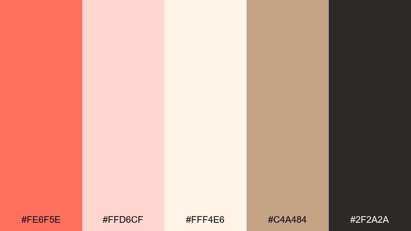
HEX: #FE6F5E #FFD6CF #FFF4E6 #C4A484 #2F2A2A
Mood: airy, friendly, modern
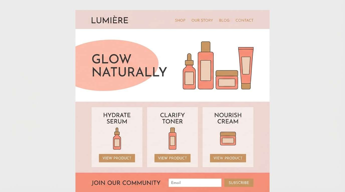
Best for: skincare brand landing page
Airy and optimistic, this mix feels like morning light on soft fabric and sun-warmed stone. Use the coral as your primary accent, then let cream and blush carry large backgrounds for a clean, premium look. Tan adds warmth without turning too orange, while the deep charcoal keeps text crisp. Tip: keep coral to buttons, highlights, and one hero element for a polished hierarchy.
Image example of sunlit coral & cream generated using media.io
Media.io is an online AI studio for creating and editing video, image, and audio in your browser.

2) Clay Rooftops
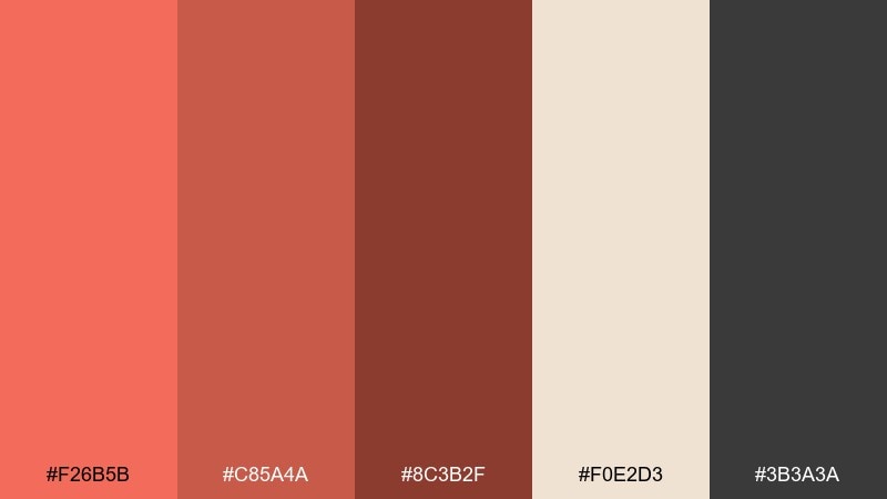
HEX: #F26B5B #C85A4A #8C3B2F #F0E2D3 #3B3A3A
Mood: earthy, urban, grounded
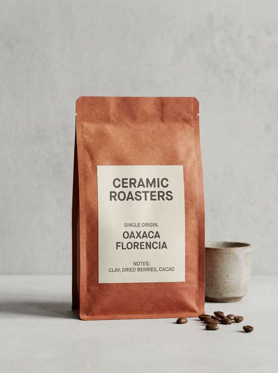
Best for: coffee packaging label
Earthy and grounded, these tones evoke terracotta rooftops, roasted beans, and worn brick. The deeper reds make a strong base for packaging while the creamy neutral keeps the label readable and tactile. Add charcoal for type and small icons to avoid a muddy print result. Tip: use the darkest shade for the brand mark and reserve the mid red for supporting bands and seals.
Image example of clay rooftops generated using media.io
3) Citrus Sorbet
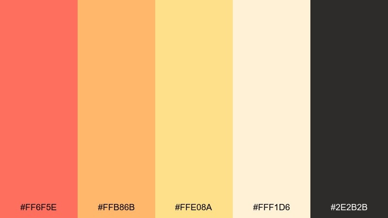
HEX: #FF6F5E #FFB86B #FFE08A #FFF1D6 #2E2B2B
Mood: playful, sunny, energetic
Best for: summer event flyer
Playful and sunny, it reads like citrus sorbet melting on a warm afternoon. For a lively bittersweet color palette, pair the coral headline with tangerine and buttery yellow shapes, then anchor everything with near-black type. Keep the light cream for margins so the layout still breathes. Tip: use large rounded blocks of color instead of gradients to keep prints clean and bold.
Image example of citrus sorbet generated using media.io

4) Desert Linen
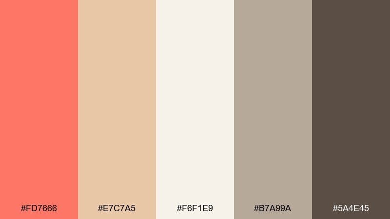
HEX: #FD7666 #E7C7A5 #F6F1E9 #B7A99A #5A4E45
Mood: calm, natural, understated
Best for: interior mood board
Calm and understated, these hues suggest sun-baked sand, linen curtains, and clay pottery. Use the coral tone for small accents like cushions or art, while the pale neutrals handle most of the space. The taupe and warm gray-brown make the palette feel architectural and timeless. Tip: repeat the coral in two or three small touches rather than one big splash to keep it serene.
Image example of desert linen generated using media.io
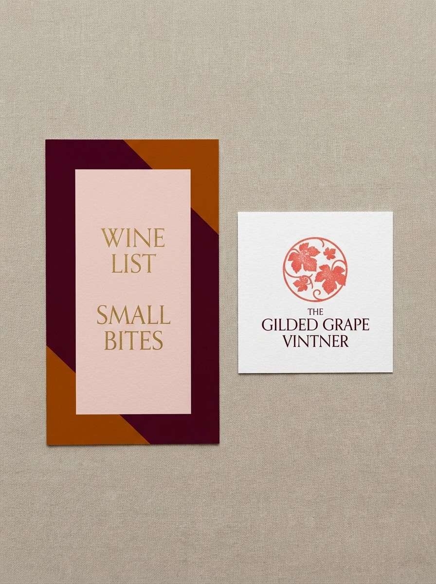
5) Rosewood Evening
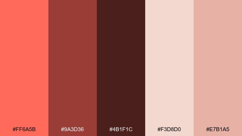
HEX: #FF6A5B #9A3D36 #4B1F1C #F3D8D0 #E7B1A5
Mood: romantic, moody, luxe
Best for: wine bar logo and menu
Romantic and moody, it feels like candlelight hitting rosewood and red leather. Let the deep wine shades dominate menus and wordmarks, then soften the layout with blush and dusty pink for sections and dividers. The brighter coral works best as a small stamp, icon, or callout rather than a background. Tip: foil or spot UV on the darkest color looks especially premium in print.
Image example of rosewood evening generated using media.io
6) Peachy Poster Pop
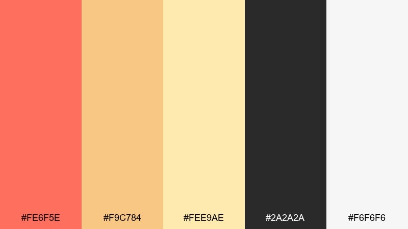
HEX: #FE6F5E #F9C784 #FEE9AE #2A2A2A #F6F6F6
Mood: bold, upbeat, graphic
Best for: product launch poster
Bold and upbeat, the tones read like punchy screen prints and retro candy wrappers. These bittersweet color combinations shine when coral and peach take the lead, with soft yellow for supporting shapes and white space. Use the deep charcoal for strong typography and clean contrast. Tip: keep the poster to two dominant blocks of color, then use the third as a small highlight for dates or pricing.
Image example of peachy poster pop generated using media.io
7) Terracotta Kitchen
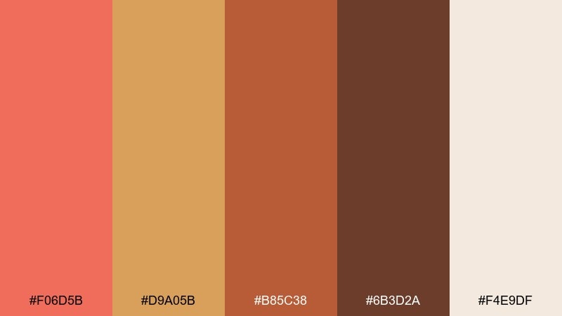
HEX: #F06D5B #D9A05B #B85C38 #6B3D2A #F4E9DF
Mood: cozy, rustic, appetizing
Best for: recipe blog hero image
Cozy and appetizing, this set brings to mind baked stoneware, caramelized edges, and warm spices. Use the creamy off-white for readable text overlays, then layer terracotta and cinnamon tones in props and headings. The darkest brown is perfect for body text or a subtle frame. Tip: avoid pure black here; the warm brown keeps the whole scene inviting.
Image example of terracotta kitchen generated using media.io
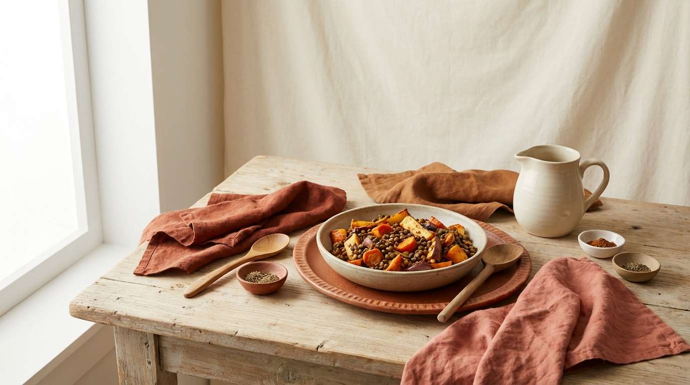
8) Vintage Travel Note
HEX: #FF7262 #F3E3D3 #C9B8A6 #7A6A5B #2C2B2A
Mood: nostalgic, muted, editorial
Best for: travel journal cover
Nostalgic and muted, it feels like a postcard tucked into an old notebook. Let the soft neutrals dominate the cover and use the coral for a title stamp or small illustration. The mid browns keep the look grounded and pair nicely with textured paper or grain. Tip: choose a slightly worn serif typeface to match the vintage mood without looking kitschy.
Image example of vintage travel note generated using media.io

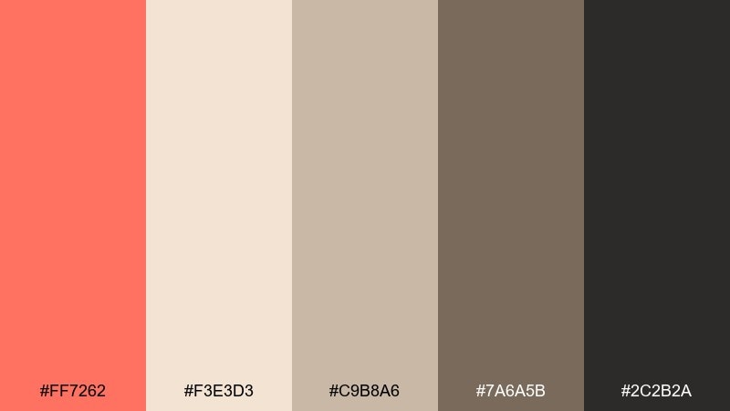
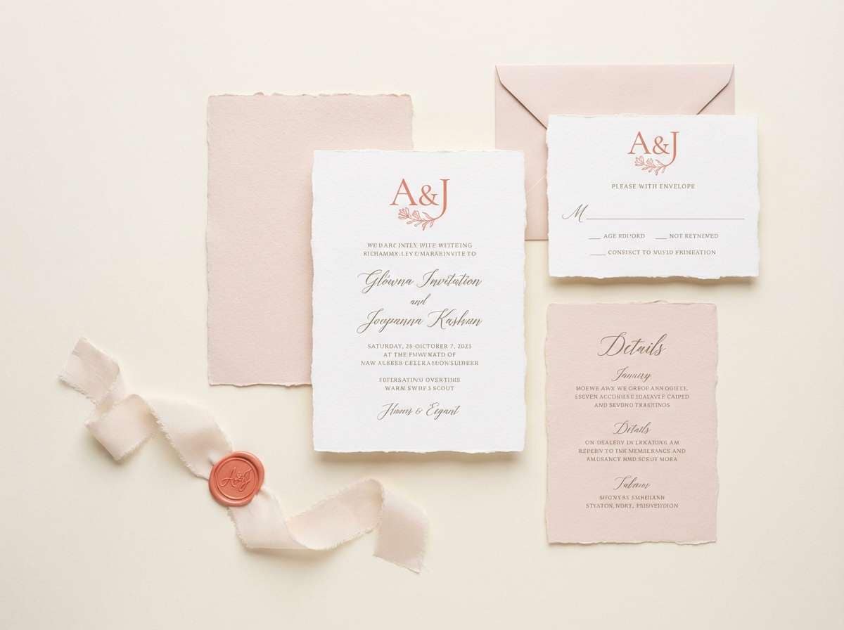
9) Soft Bridal Blush
HEX: #FF7A6C #FFD2CB #FFF7F2 #D6C3B2 #8A7D73
Mood: delicate, romantic, airy
Best for: wedding invitation set
Delicate and romantic, these tones evoke petals, silk ribbons, and soft candle glow. Use the pale blush and warm white as the main stationery base, then reserve coral for monograms or key lines like names and dates. The muted taupe and warm gray help typography feel refined rather than sugary. Tip: letterpress or subtle embossing works beautifully with this gentle contrast.
Image example of soft bridal blush generated using media.io
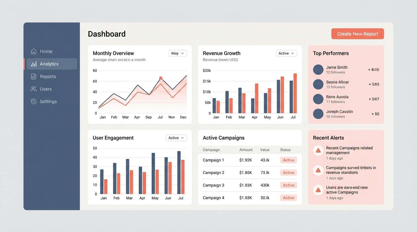
10) Modern SaaS Warmth
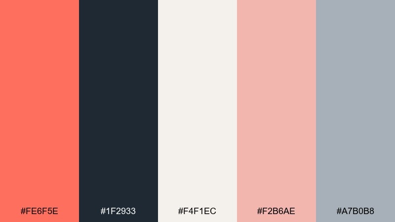
HEX: #FE6F5E #1F2933 #F4F1EC #F2B6AE #A7B0B8
Mood: confident, approachable, tech-forward
Best for: analytics dashboard UI
Confident and approachable, the warm coral feels human against cool slate UI neutrals. This bittersweet color scheme works well when slate handles navigation and charts, while coral highlights key actions and alerts. The off-white keeps screens from feeling sterile, and the soft pink can separate cards without heavy borders. Tip: use coral for one primary button style only, then rely on slate variations for the rest of the system.
Image example of modern saas warmth generated using media.io
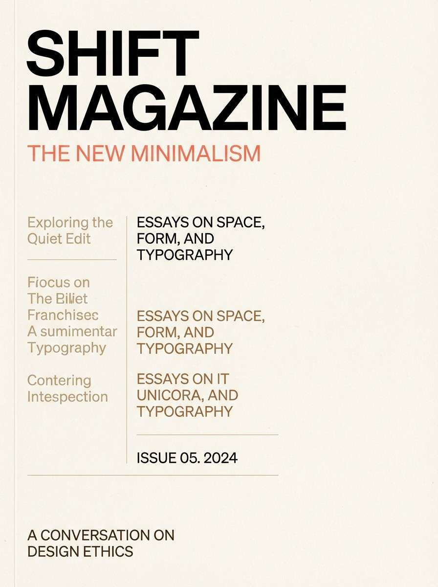
11) Minimal Editorial Coral
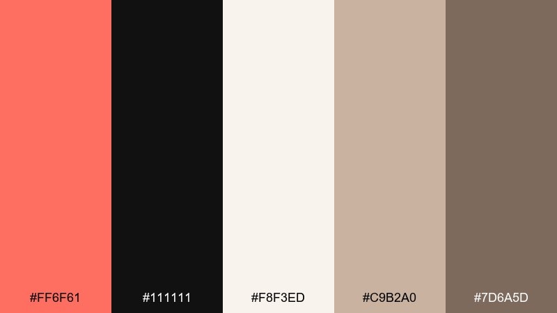
HEX: #FF6F61 #111111 #F8F3ED #C9B2A0 #7D6A5D
Mood: minimal, polished, typography-led
Best for: magazine cover layout
Polished and typography-led, it feels like a high-end editorial spread with one confident pop. Use the near-black for headlines and the warm off-white for generous negative space. Coral should be a single focal element, like a cover line or small graphic mark, while tan and brown support subheads. Tip: keep imagery warm and slightly desaturated so the coral accent stays in control.
Image example of minimal editorial coral generated using media.io
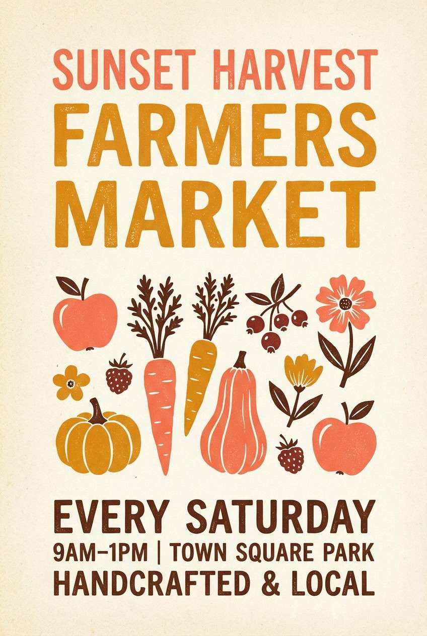
12) Autumn Market
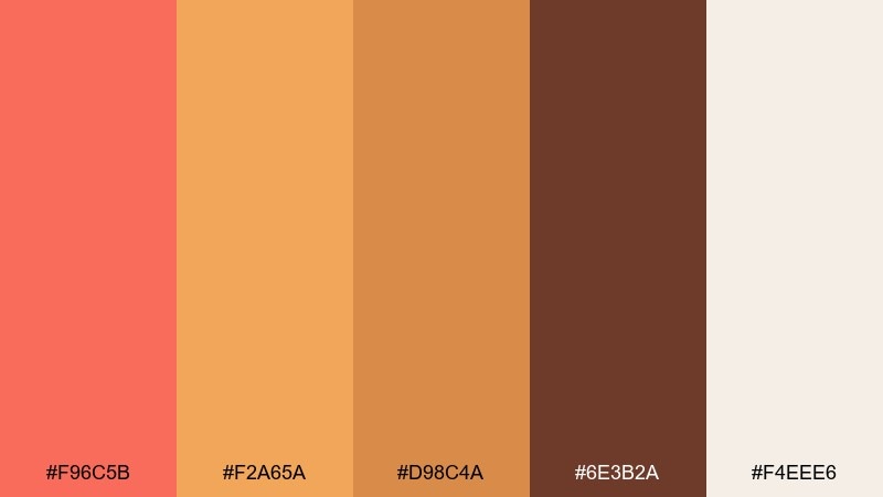
HEX: #F96C5B #F2A65A #D98C4A #6E3B2A #F4EEE6
Mood: seasonal, welcoming, handcrafted
Best for: farmers market poster
Seasonal and welcoming, it brings to mind apples, squash, and hand-lettered signs. Let the warm off-white hold the background, then layer coral and amber for headlines and illustrations. The richer brown adds a handmade feel for typography and small frames. Tip: use a slightly textured paper effect in the design to make the colors feel more artisanal.
Image example of autumn market generated using media.io
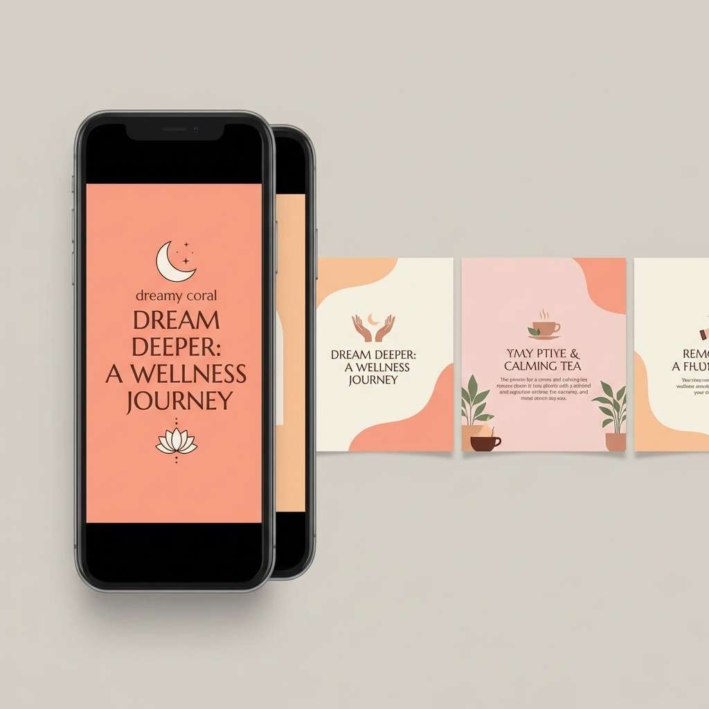
13) Coastal Sunset
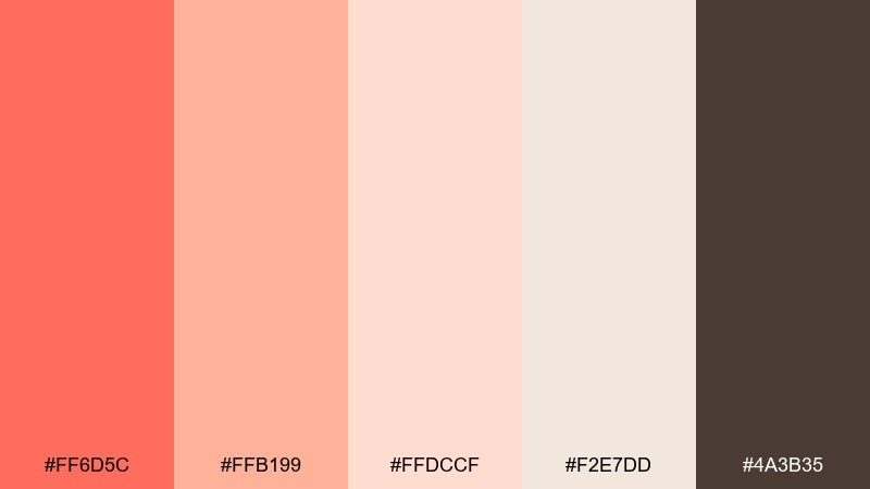
HEX: #FF6D5C #FFB199 #FFDCCF #F2E7DD #4A3B35
Mood: dreamy, soft, coastal
Best for: wellness social media carousel
Dreamy and soft, these shades feel like a sunset fading into salty air. Use coral for one strong headline slide, then lean on peach and blush for calming background panels. The warm cream helps text stay readable without harsh contrast, while deep brown works for captions and small icons. Tip: keep gradients subtle and wide to avoid banding on mobile screens.
Image example of coastal sunset generated using media.io
14) Moody Studio Contrast
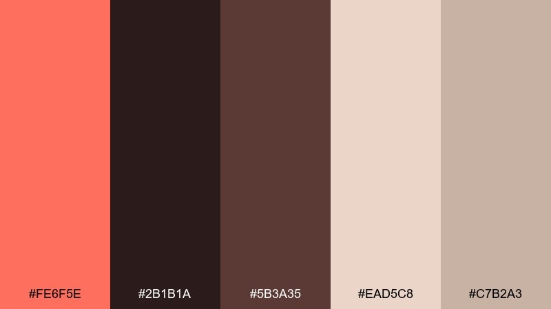
HEX: #FE6F5E #2B1B1A #5B3A35 #EAD5C8 #C7B2A3
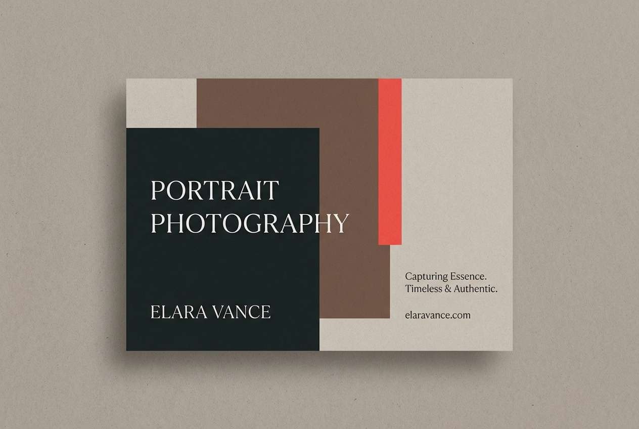
Mood: dramatic, artistic, intimate
Best for: portrait photography promo card
Dramatic and intimate, it reads like studio shadows with a warm gelled light. A bittersweet color palette like this works best when the near-black and deep cocoa set the base, letting coral act as a confident accent. Use the dusty neutrals for borders, captions, and negative space so the design stays elegant. Tip: limit coral to one stripe, stamp, or icon so the contrast feels intentional, not loud.
Image example of moody studio contrast generated using media.io
15) Kids Candy Pack
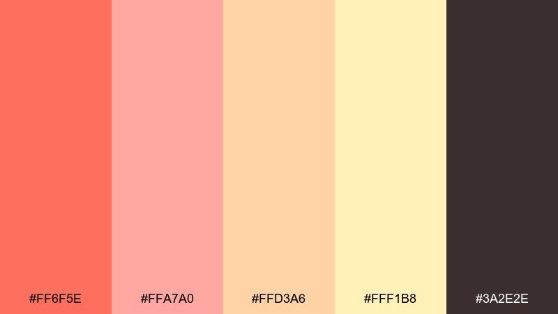
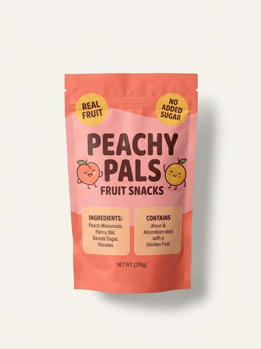
HEX: #FF6F5E #FFA7A0 #FFD3A6 #FFF1B8 #3A2E2E
Mood: cheerful, youthful, sweet
Best for: kids snack packaging
Cheerful and sweet, this set feels like soft gummies and paper confetti. Use coral and pink for the brand mark and main flavor cues, then bring in warm yellow for fun shapes and badges. The dark brown keeps text legible and less harsh than pure black. Tip: build a simple pattern with two colors and keep the rest for icons, so the pack stays playful but not chaotic.
Image example of kids candy pack generated using media.io
16) Rustic Cabin Firelight
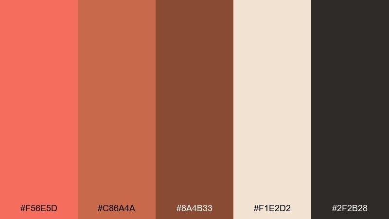
HEX: #F56E5D #C86A4A #8A4B33 #F1E2D2 #2F2B28
Mood: warm, rugged, nostalgic
Best for: outdoor brand poster
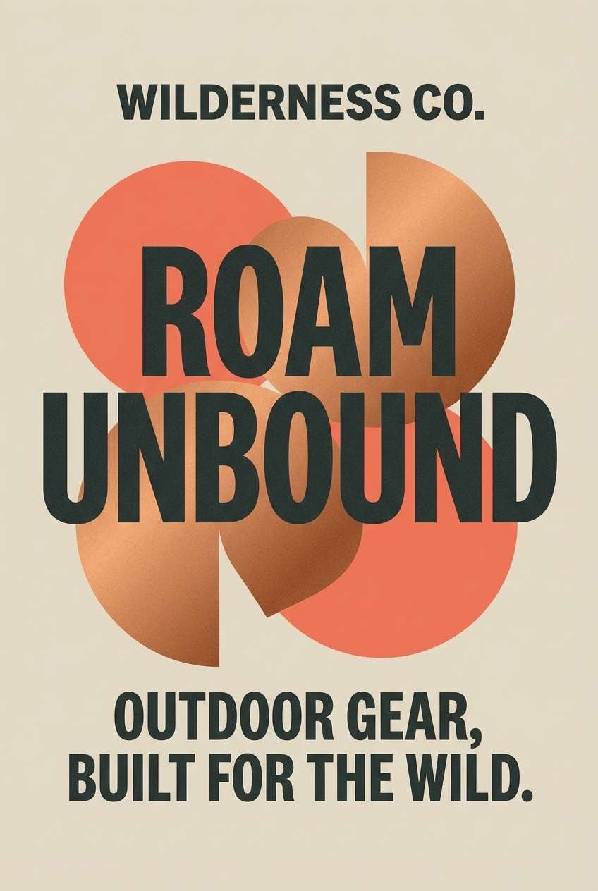
Warm and rugged, it evokes firelight on wood grain and worn leather boots. Use the darker neutral for strong type and silhouettes, then let coral and copper tones carry the main graphic shapes. Creamy beige can soften the overall look and prevent over-saturation. Tip: add subtle grain or halftone texture to make the colors feel more outdoorsy and authentic.
Image example of rustic cabin firelight generated using media.io
17) Wellness Spa Glow
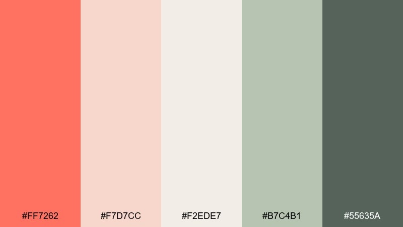
HEX: #FF7262 #F7D7CC #F2EDE7 #B7C4B1 #55635A
Mood: fresh, soothing, restorative
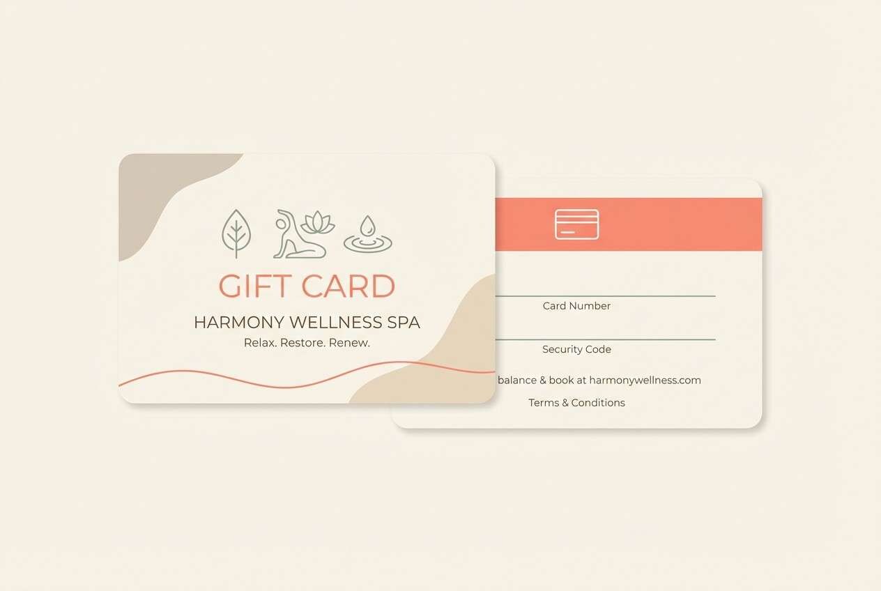
Best for: spa gift card
Fresh and restorative, it suggests warm skin tones paired with calming herbs and eucalyptus steam. Use the soft neutrals for most of the card, then add coral sparingly for a welcoming focal point. The muted green-gray brings balance and keeps the palette from feeling overly sweet. Tip: choose thin line icons and plenty of spacing so the colors read as calm, not busy.
Image example of wellness spa glow generated using media.io
18) Holiday Ribbon
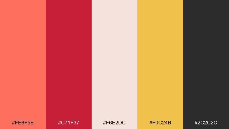
HEX: #FE6F5E #C71F37 #F6E2DC #F0C24B #2C2C2C
Mood: festive, rich, celebratory
Best for: seasonal sale banner
Festive and rich, it feels like satin ribbon, warm lights, and a glossy gift tag. Use the deeper red for urgency and headlines, then let coral soften the message for a friendlier vibe. Pale blush keeps breathing room, while the golden yellow works for small stars, price bursts, or icons. Tip: stick to clean shapes and bold type so the palette looks premium instead of noisy.
Image example of holiday ribbon generated using media.io

19) Streetwear Heat
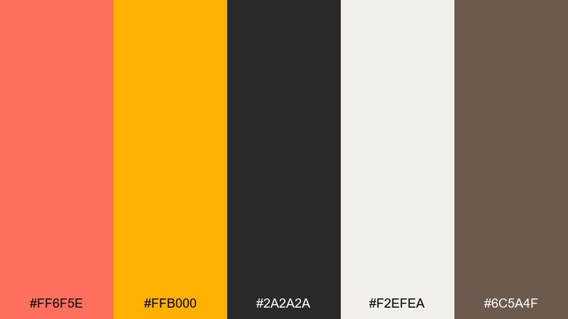
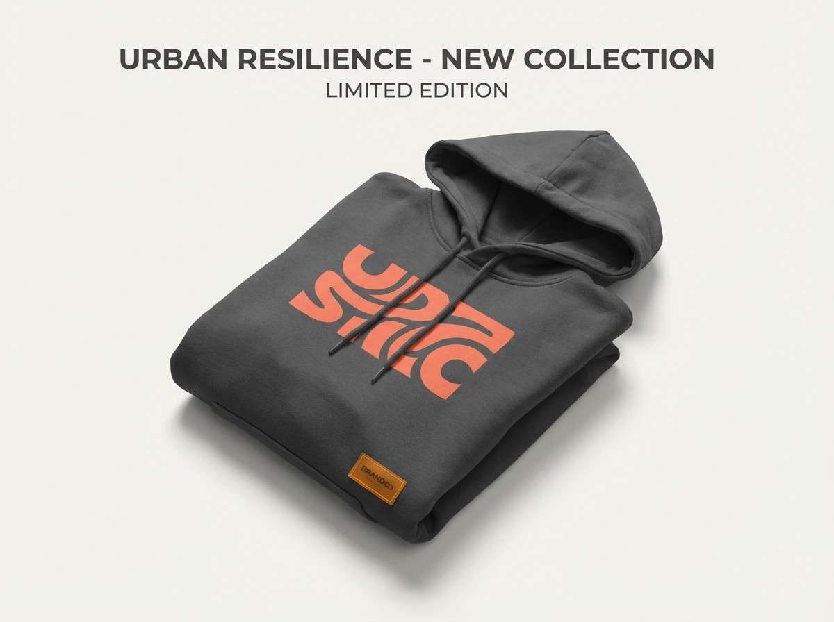
HEX: #FF6F5E #FFB000 #2A2A2A #F2EFEA #6C5A4F
Mood: edgy, high-energy, modern
Best for: streetwear product ad
Edgy and high-energy, these shades hit like heat, asphalt, and a bright pop of amber. The coral and golden accent make strong focal points for logos, stitching callouts, or discount tags, while charcoal and off-white keep the layout clean. These bittersweet color combinations work best with bold sans type and tight spacing. Tip: use the amber only as a secondary highlight so coral stays the hero.
Image example of streetwear heat generated using media.io
20) Art Deco Nectar
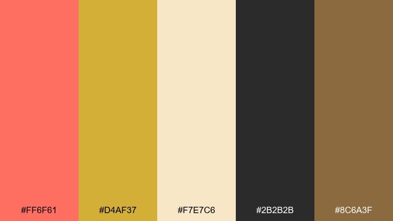
HEX: #FF6F61 #D4AF37 #F7E7C6 #2B2B2B #8C6A3F
Mood: glamorous, geometric, upscale
Best for: cocktail bar invitation
Glamorous and geometric, it recalls Art Deco brass, velvety shadows, and a coral-toned cocktail. Use the dark neutral as the main canvas, then apply coral and gold in sharp lines, frames, and headings. Cream can soften the invitation copy so it stays readable and refined. Tip: keep the gold areas minimal and symmetrical to preserve that Deco discipline.
Image example of art deco nectar generated using media.io

What Colors Go Well with Bittersweet?
Bittersweet pairs beautifully with warm neutrals like cream, ivory, sand, and tan—these keep the coral-red feeling modern and breathable. For typography and structure, charcoal and near-black deliver clean contrast without making the palette feel cold.
For richer, more “grown-up” combinations, add wine, auburn, cocoa, or warm browns to deepen the mood. If you want extra brightness, gold and amber accents can boost energy while still staying on the warm side of the spectrum.
To balance bittersweet in UI, slate, soft blue-gray, or muted sage can cool things down and make the coral pop more strategically. The key is to choose one anchor neutral (dark or light) and let bittersweet act as the controlled highlight.
How to Use a Bittersweet Color Palette in Real Designs
For branding and logos, treat bittersweet as the signature accent and keep your main wordmark in charcoal, deep brown, or near-black for versatility across light and dark backgrounds. In print, pair it with warm off-whites to avoid harsh contrast and keep reds from looking too saturated.
In UI design, use bittersweet for primary actions (one main button style), key states (success/alert variants where appropriate), and high-value highlights like selected tabs or metric callouts. Let neutrals do the heavy lifting for backgrounds, cards, and navigation so screens stay calm.
For social posts and posters, bittersweet works best in big, simple shapes with strong type. Use one supporting warm color (peach, amber, or blush) and one dark anchor; this keeps layouts punchy and readable at a glance.
Create Bittersweet Palette Visuals with AI
If you have HEX codes but need real visuals—mockups, posters, UI screens, or packaging—AI can help you prototype multiple directions quickly. Start with a palette from above, then describe the layout, style (flat, realistic, editorial), and where the coral accent should appear.
With Media.io’s text-to-image tool, you can generate matching examples in consistent aspect ratios for web, print, and social media. This makes it easier to compare moods and lock a final bittersweet color scheme faster.
When you find a look you like, iterate by adjusting just one variable at a time (background neutral, text color, or the secondary accent). That keeps your bittersweet tone feeling consistent across a full design system.
Bittersweet Color Palette FAQs
-
What is a bittersweet color in design?
Bittersweet is typically a warm coral-red (often seen around HEX #FE6F5E to #FF6F61). It feels energetic like red, but softer and more approachable thanks to its orange/coral undertone. -
Is bittersweet closer to coral or red?
It’s closer to coral: a red base warmed with orange. In practice, bittersweet reads as “coral-red,” making it easier to pair with creams, tans, and warm browns than a true primary red. -
What neutral colors pair best with bittersweet?
Warm off-whites, cream, sand, taupe, and charcoal are the easiest matches. These neutrals keep bittersweet modern and help maintain readable contrast for text-heavy layouts. -
Can I use bittersweet for UI buttons and CTAs?
Yes—bittersweet is excellent for CTAs because it’s warm and eye-catching. For best hierarchy, use it for one primary button style and keep secondary actions in slate/gray to avoid a “too many accents” look. -
Does bittersweet print well?
It usually prints well, but very saturated corals can shift depending on paper and ink. Pair with warm neutrals and a dark brown/charcoal text color, and consider proofing if the coral is a core brand color. -
What colors should I avoid mixing with bittersweet?
Avoid pairing it with overly bright neon greens or highly saturated cool blues unless you want intentional clash. If you need contrast, choose muted cool tones (slate, sage) instead of extreme complements. -
How do I keep a bittersweet palette from looking too “sweet”?
Add a strong dark anchor (charcoal, cocoa, wine) and keep backgrounds neutral (cream, off-white). Using bittersweet as a controlled accent—rather than a full background—also makes the palette feel more premium.


