

An ube color palette captures the signature purple of purple yam—creamy, modern, and instantly recognizable. It can feel soft and dessert-like in pastels, or bold and luxe in deep plums and ink purples.
Below are 20 ube palette ideas with HEX codes, plus AI prompts you can use to generate matching visuals for branding, weddings, UI, and content.
In this article
- Why Ube Palettes Work So Well
-
- ube latte
- purple yam sunrise
- silky ube minimal
- velvet plum night
- taro milk tea
- orchid frost
- ube and sage garden
- berry cream pop
- modern ube and gold
- lavender clay neutral
- galaxy ube glow
- ube cocoa comfort
- iris denim contrast
- ube rose wedding
- neon ube arcade
- dusty lilac editorial
- ube matcha bento
- ube citrus zest
- monochrome ube gradient
- ube stone spa
- What Colors Go Well with Ube?
- How to Use a Ube Color Palette in Real Designs
- Create Ube Palette Visuals with AI
Why Ube Palettes Work So Well
Ube sits in a sweet spot between playful and premium. The purple reads creative and distinctive, but it can still feel clean and modern when paired with off-whites, charcoal inks, and soft neutrals.
Because ube has natural “food” associations (taro, purple yam, milk tea), it instantly signals warmth and comfort—great for packaging, lifestyle content, and brand storytelling.
From a design perspective, ube also scales well: pale lilacs create breathable backgrounds, while deep plums deliver contrast for logos, headlines, and UI states without looking harsh.
20+ Ube Color Palette Ideas (with HEX Codes)
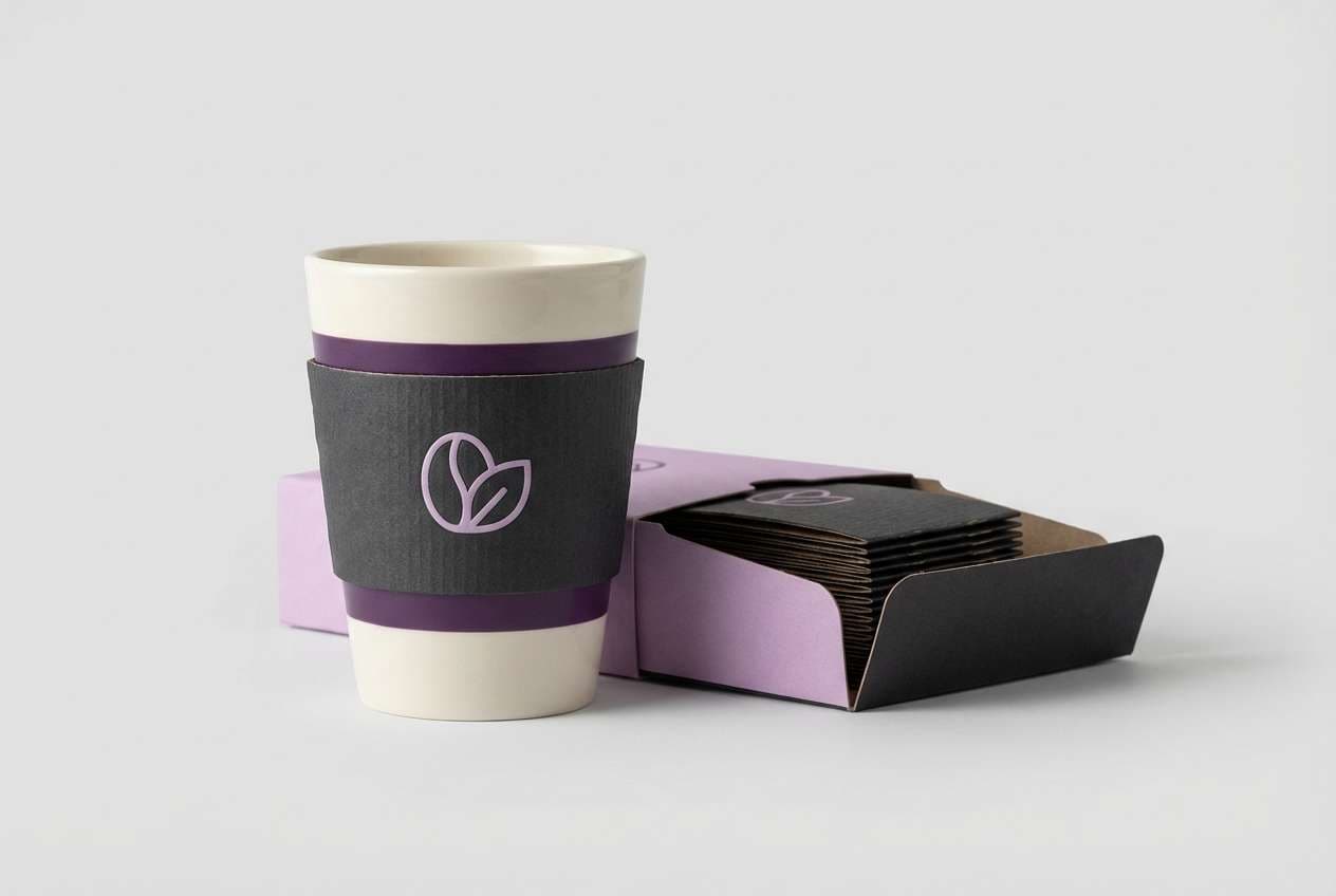
1) Ube Latte
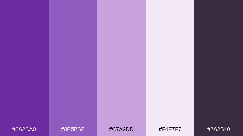
HEX: #6a2ca0 #8e5bbf #c7a2dd #f4e7f7 #3a2b40
Mood: cozy, creamy, and boutique
Best for: coffee shop packaging and cafe branding
Cozy and creamy like a frothy latte with a violet swirl, these tones feel comforting but still polished. Use the deep ube as the anchor, then lean on the soft lilac and cream for whitespace and readability. It works beautifully on labels, cups, and loyalty cards, especially when paired with matte textures and a warm charcoal for type. Tip: keep the darkest color for small text only, and let the mid purple carry large brand blocks.
Image example of ube latte generated using media.io
Media.io is an online AI studio for creating and editing video, image, and audio in your browser.

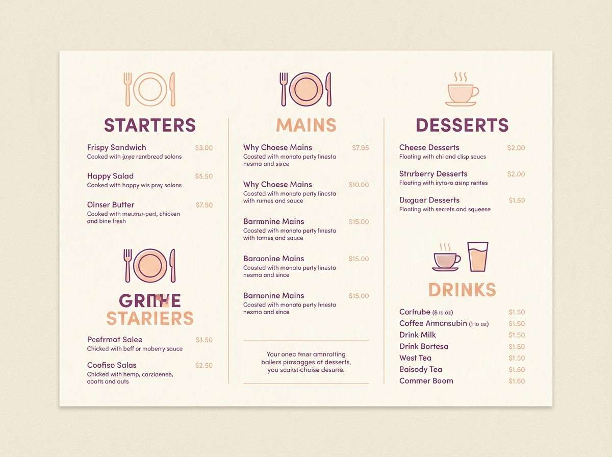
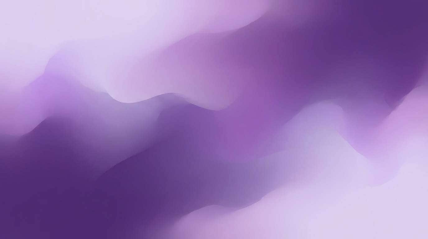
2) Purple Yam Sunrise
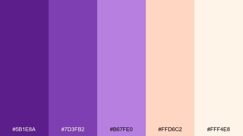
HEX: #5b1e8a #7d3fb2 #b67fe0 #ffd6c2 #fff4e8
Mood: warm, optimistic, and dessert-like
Best for: bakery social posts and menu design
Warm and optimistic like sunrise over a pastel dessert counter, this mix balances sweet purples with peachy light. The peach and cream keep layouts airy, while the two mid purples add personality to headings and stickers. It shines on menus, promo cards, and Instagram templates where you want a friendly, approachable feel. Tip: use the peach as a highlight color for prices or calls to action instead of bright red.
Image example of purple yam sunrise generated using media.io
3) Silky Ube Minimal
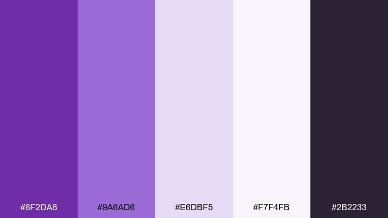
HEX: #6f2da8 #9a6ad6 #e6dbf5 #f7f4fb #2b2233
Mood: clean, calm, and modern
Best for: saas dashboards and settings pages
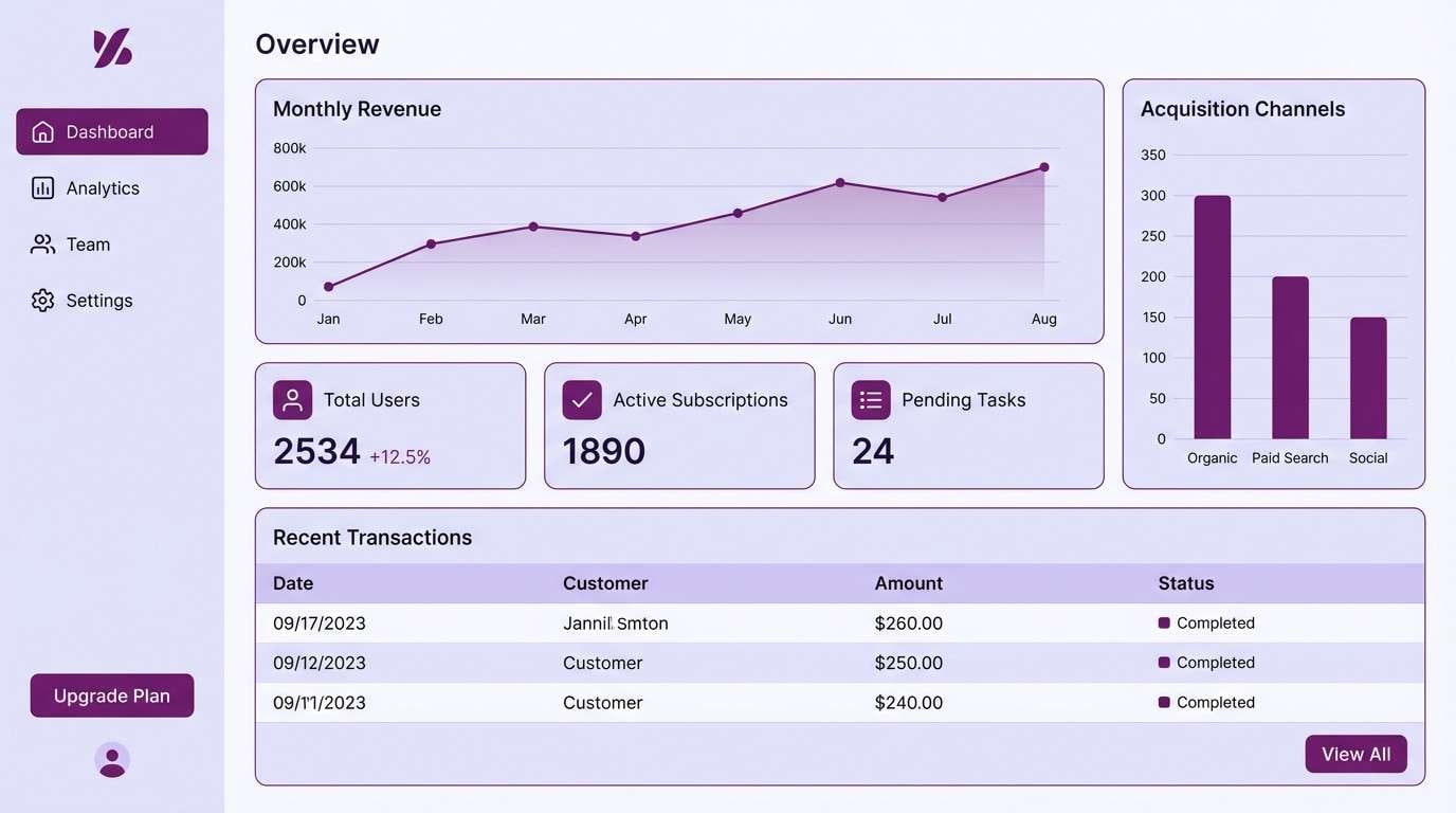
Clean and calm like polished satin, these purples read modern without feeling loud. The near-white and pale lavender build a breathable UI foundation, while the dark ink shade keeps text crisp. As an ube color scheme, it works best with thin borders, subtle shadows, and plenty of spacing. Tip: reserve the most saturated purple for primary buttons and active states to avoid visual fatigue.
Image example of silky ube minimal generated using media.io
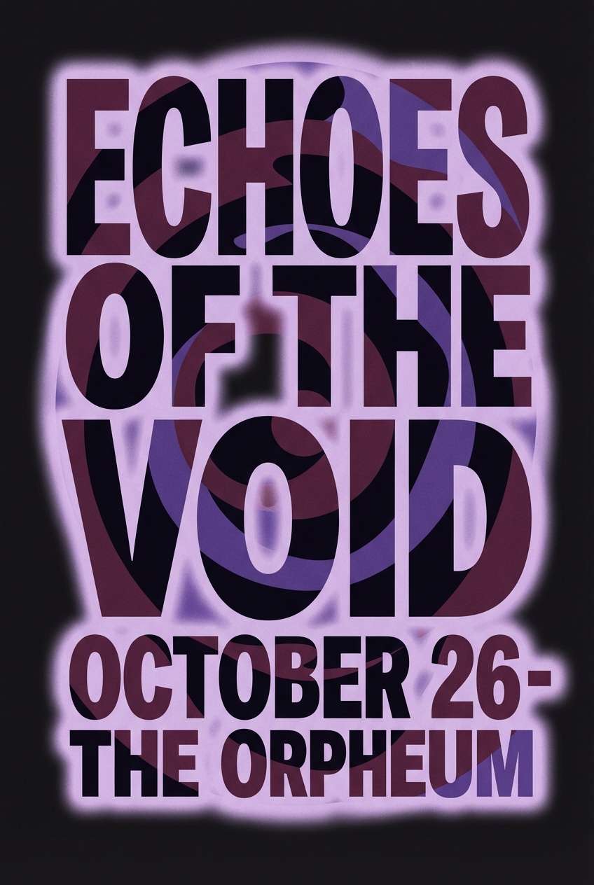
4) Velvet Plum Night
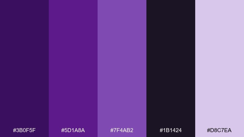
HEX: #3b0f5f #5d1a8a #7f4ab2 #1b1424 #d8c7ea
Mood: dramatic, luxe, and nocturnal
Best for: music posters and album artwork
Dramatic and luxe like velvet curtains in a dim venue, this palette is built for night-time impact. The near-black and deep plum create cinematic contrast, while the pale lavender adds a soft glow for highlights. It suits posters, album covers, and event creatives where you want depth without muddy shadows. Tip: add grain or subtle gradient transitions between the dark tones to keep large areas from feeling flat.
Image example of velvet plum night generated using media.io
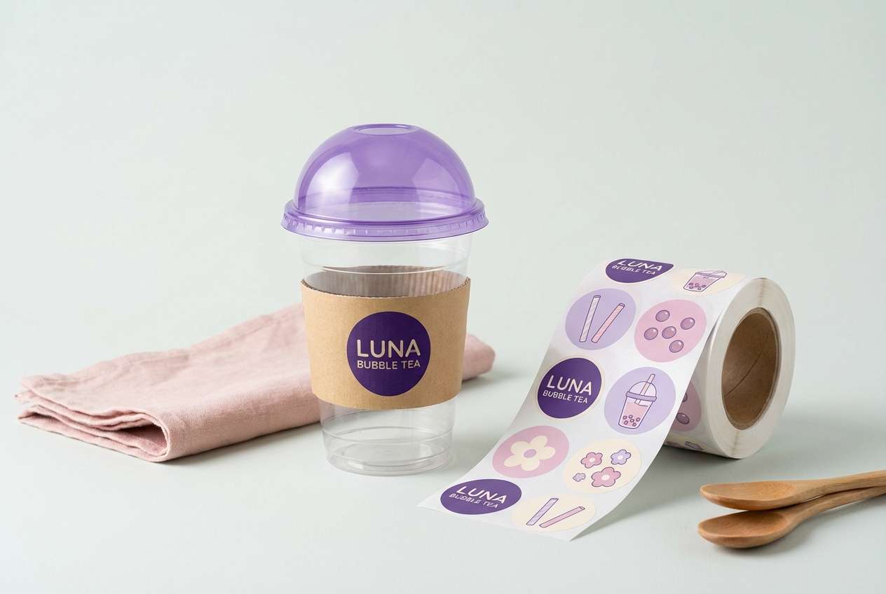
5) Taro Milk Tea
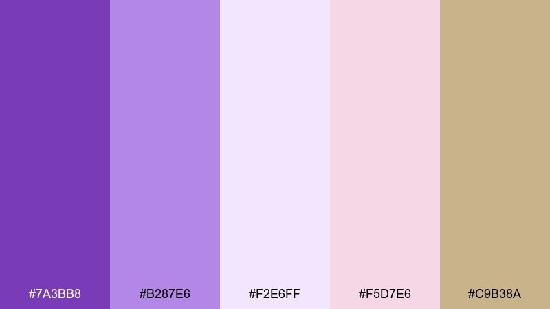
HEX: #7a3bb8 #b287e6 #f2e6ff #f5d7e6 #c9b38a
Mood: sweet, airy, and playful
Best for: bubble tea branding and sticker packs
Sweet and airy like taro milk tea topped with foam, these pastels feel cute without going childish. The blush pink adds a friendly twist, and the sandy beige keeps everything grounded for packaging and print. Use the deepest purple for logos and outlines, then let the lighter tones fill backgrounds and patterns. Tip: pair with rounded typography and simple line icons to keep the vibe light.
Image example of taro milk tea generated using media.io
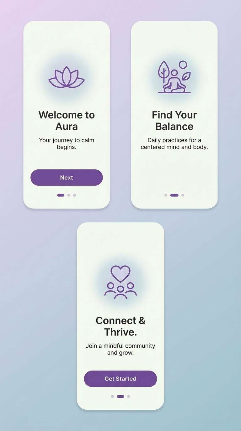
6) Orchid Frost
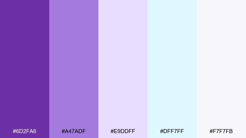
HEX: #6d2fa6 #a47adf #e9ddff #dff7ff #f7f7fb
Mood: fresh, light, and spa-like
Best for: wellness app onboarding screens
Fresh and light like orchid petals with a cool morning mist, these tones feel instantly soothing. The icy blue-tinted highlights keep the purples from skewing too sugary, making the ube color palette ideal for wellness and sleep-focused flows. Use the pale shades for backgrounds and gradients, then bring in the saturated purple only for progress and key actions. Tip: maintain high contrast for body text by leaning on darker purple for headings and labels.
Image example of orchid frost generated using media.io
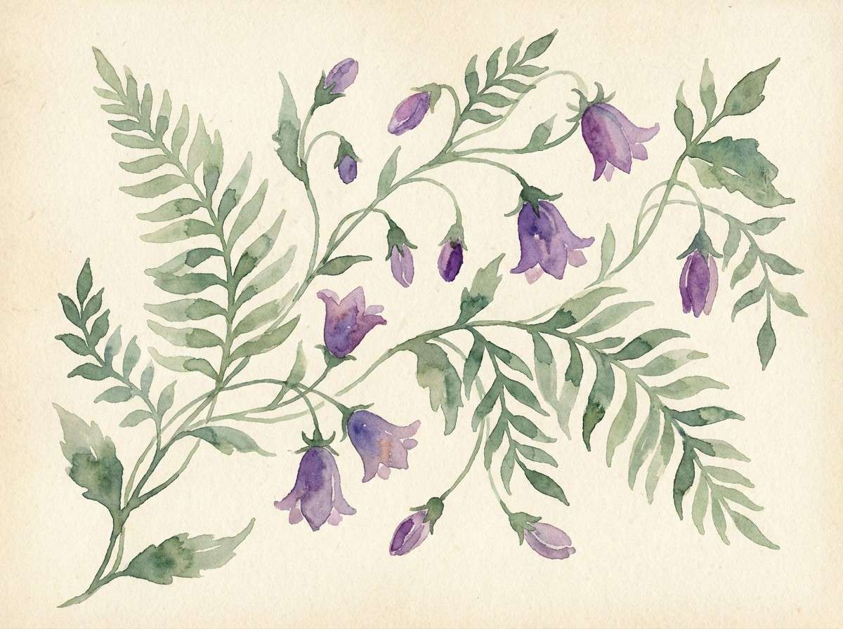
7) Ube and Sage Garden
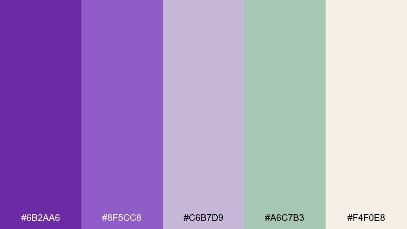
HEX: #6b2aa6 #8f5cc8 #c6b7d9 #a6c7b3 #f4f0e8
Mood: botanical, gentle, and balanced
Best for: watercolor florals and spring illustrations
Botanical and gentle like a shaded garden path, this pairing softens purple with calming sage. The muted neutrals keep it grounded, while the mid ube shades add floral romance without overpowering greens. It works especially well for illustrated stationery, pattern design, and seasonal art prints. Tip: use the cream as paper tone, and keep the strongest purple for small petals and focal details.
Image example of ube and sage garden generated using media.io
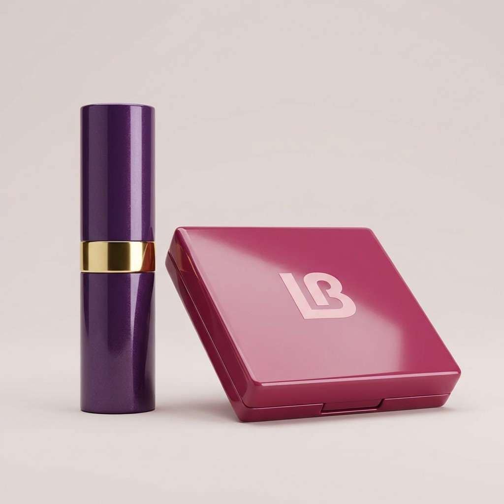
8) Berry Cream Pop
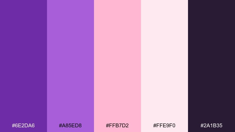
HEX: #6e2da6 #a85ed8 #ffb7d2 #ffe9f0 #2a1b35
Mood: bold, fun, and beauty-forward
Best for: cosmetics ads and product launches
Bold and fun like berry whipped cream, these colors are made to pop on scroll. Hot pink brings instant energy, while the deep ink purple keeps the look premium and legible. Use the light pink as negative space for product names, and let the saturated purple frame hero imagery. Tip: keep the palette to two dominant colors in a layout and use the rest for supporting details like badges and pricing.
Image example of berry cream pop generated using media.io
9) Modern Ube and Gold
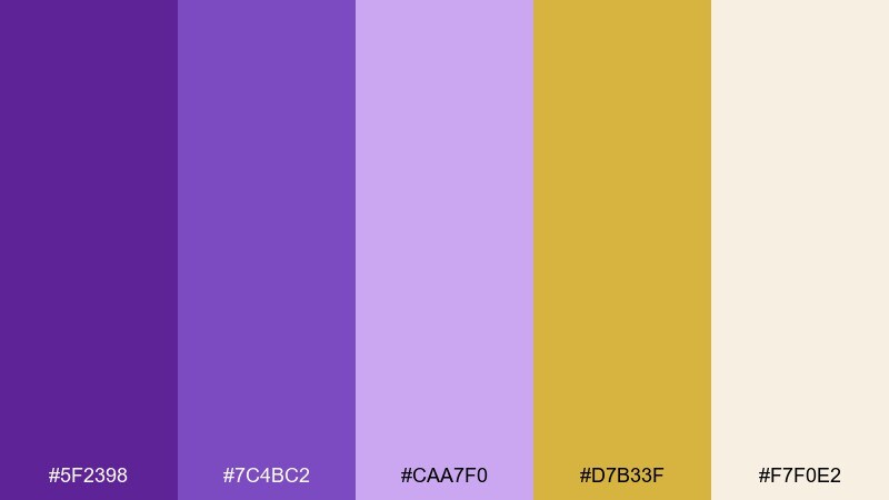
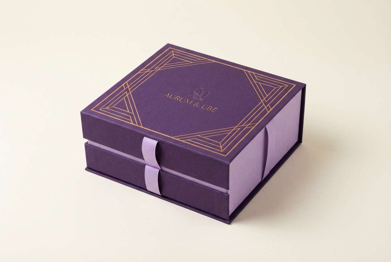
HEX: #5f2398 #7c4bc2 #caa7f0 #d7b33f #f7f0e2
Mood: elegant, upscale, and celebratory
Best for: luxury logos and premium packaging
Elegant and celebratory like a gilded dessert box, this mix turns purple into something premium. The gold accent adds instant hierarchy, making ube color combinations feel intentional and high-end rather than playful. Use the cream as a quiet base, then apply gold sparingly for lines, seals, or foil-stamp moments. Tip: avoid using gold for small text; keep it for accents and let purple handle legibility.
Image example of modern ube and gold generated using media.io
10) Lavender Clay Neutral
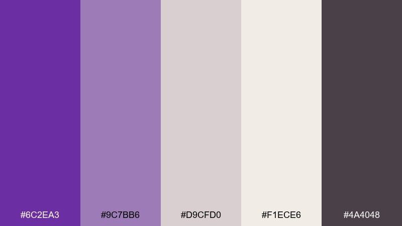
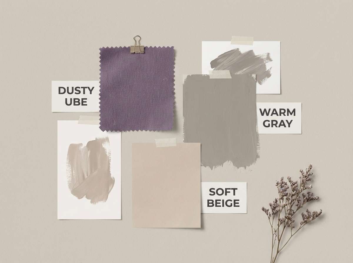
HEX: #6c2ea3 #9c7bb6 #d9cfd0 #f1ece6 #4a4048
Mood: muted, earthy, and contemporary
Best for: interior moodboards and lifestyle brands
Muted and earthy like lavender mixed into clay, these tones feel modern and lived-in. The warm grays and soft beige make purple more versatile for home goods, boutiques, and calm lifestyle content. Use the charcoal as your typography backbone and keep the purple as a signature accent across headers and icons. Tip: for print, choose uncoated paper to enhance the natural, dusty finish.
Image example of lavender clay neutral generated using media.io
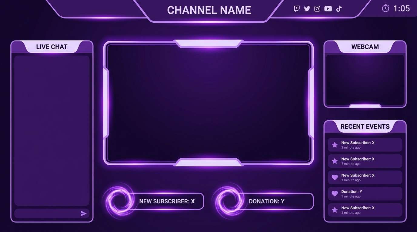
11) Galaxy Ube Glow
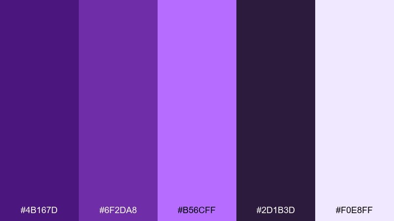
HEX: #4b167d #6f2da8 #b56cff #2d1b3d #f0e8ff
Mood: electric, cosmic, and high-contrast
Best for: stream overlays and gaming branding
Electric and cosmic like neon fog in deep space, this set is built for contrast. The bright violet glow color lifts the darker purples so UI elements feel crisp and reactive. It works for overlays, channel art, and bold landing pages that need a futuristic mood. Tip: use the glow shade for hover states and highlights, and keep the lightest tint for subtle panels only.
Image example of galaxy ube glow generated using media.io
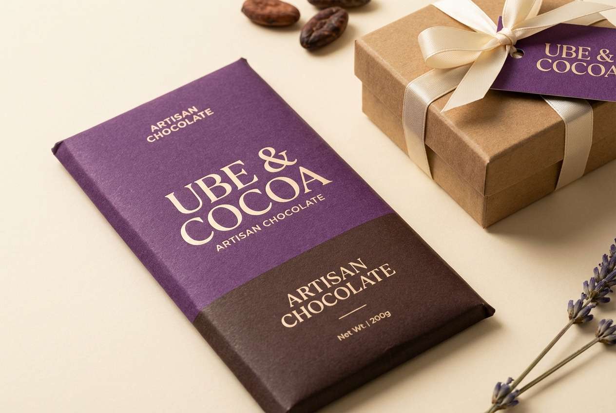
12) Ube Cocoa Comfort
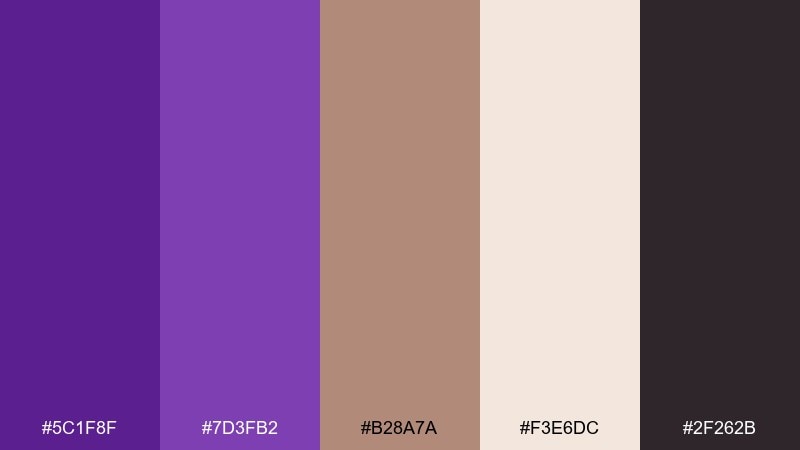
HEX: #5c1f8f #7d3fb2 #b28a7a #f3e6dc #2f262b
Mood: warm, cozy, and artisan
Best for: chocolate packaging and gift sets
Warm and cozy like cocoa stirred into a purple dessert, these tones feel artisan and handmade. The cocoa brown brings richness, while the cream keeps labels readable and clean. As an ube color combination, it pairs beautifully with kraft textures, minimal line illustrations, and serif logotypes. Tip: let the brown handle large background areas and use purple for brand marks and flavor cues.
Image example of ube cocoa comfort generated using media.io
13) Iris Denim Contrast
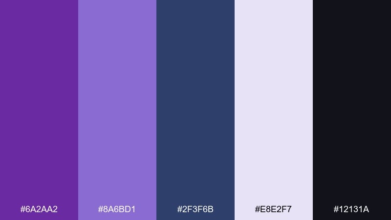
HEX: #6a2aa2 #8a6bd1 #2f3f6b #e8e2f7 #12131a
Mood: cool, editorial, and confident
Best for: fashion lookbooks and brand guides
Cool and confident like iris ink on dark denim, this palette feels sharp and editorial. The navy-blue note adds structure, letting purple read more modern and less sweet. Use the light lavender as a page base, then layer navy for blocks and ube for accents and pull quotes. Tip: keep body text in near-black to preserve readability on the lighter tints.
Image example of iris denim contrast generated using media.io
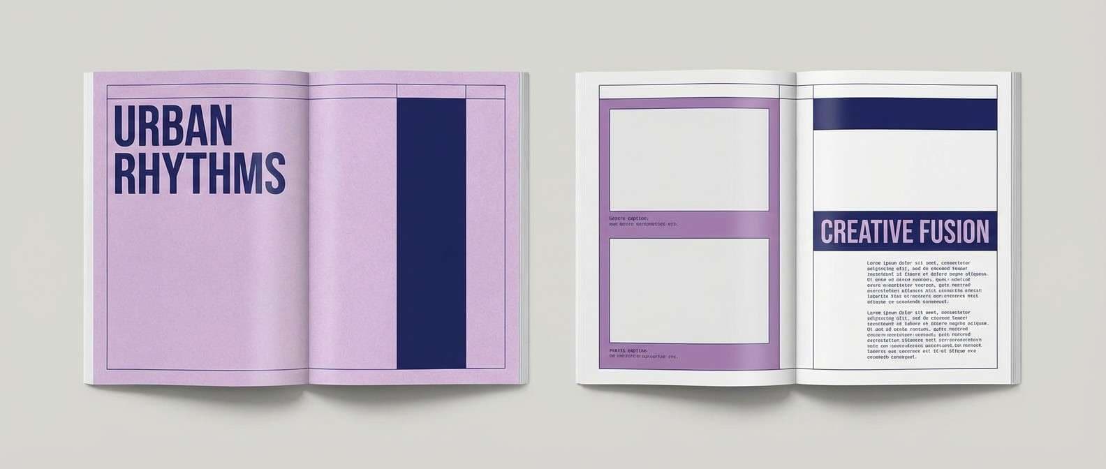
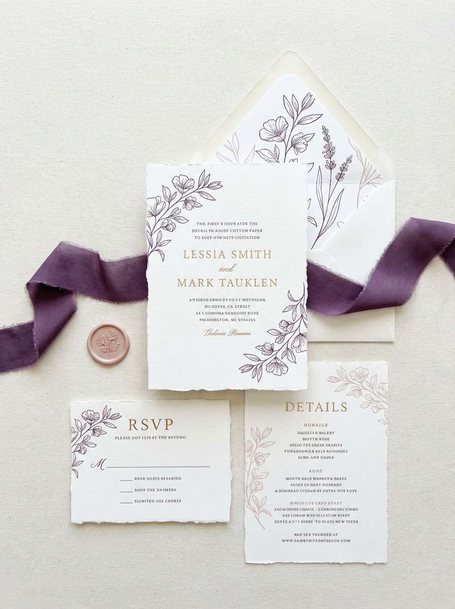
14) Ube Rose Wedding
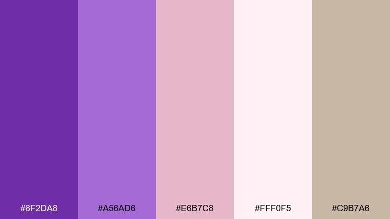
HEX: #6f2da8 #a56ad6 #e6b7c8 #fff0f5 #c9b7a6
Mood: romantic, soft, and dreamy
Best for: wedding invitations and day-of stationery
Romantic and dreamy like pressed flowers in a keepsake book, these tones blend ube with gentle rose. The blush and soft pink-white create airy space, while the purples keep the look distinctive and modern. This ube color palette works especially well for invitations, place cards, and monograms when paired with delicate line florals and warm neutral paper. Tip: print the darkest purple for names and headings, and keep the blush for background panels to avoid low contrast.
Image example of ube rose wedding generated using media.io
15) Neon Ube Arcade
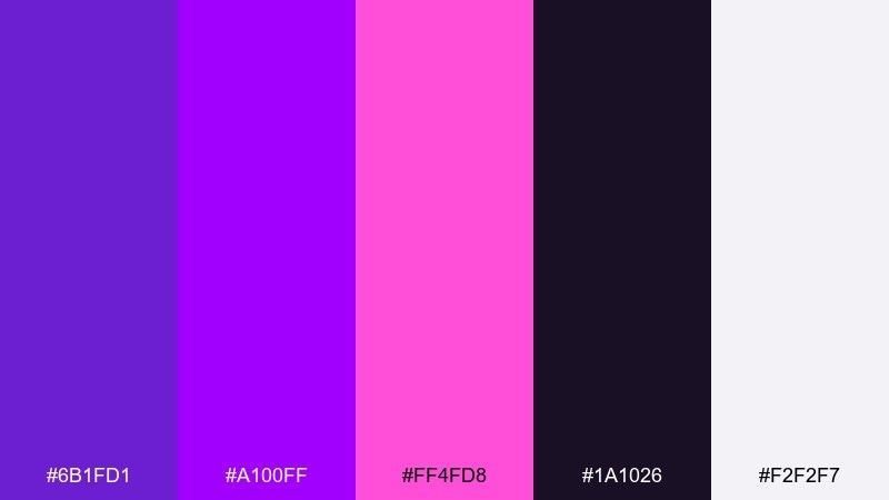
HEX: #6b1fd1 #a100ff #ff4fd8 #1a1026 #f2f2f7
Mood: loud, playful, and nightlife
Best for: party flyers and event promos
Loud and playful like arcade lights at midnight, this set leans into saturated purples and punchy pink. The dark base makes neon accents feel sharper, while the near-white keeps type from getting lost. It is perfect for event promos, club nights, and bold announcements that need instant energy. Tip: use big type, fewer words, and let the neon colors do the work rather than adding extra graphics.
Image example of neon ube arcade generated using media.io

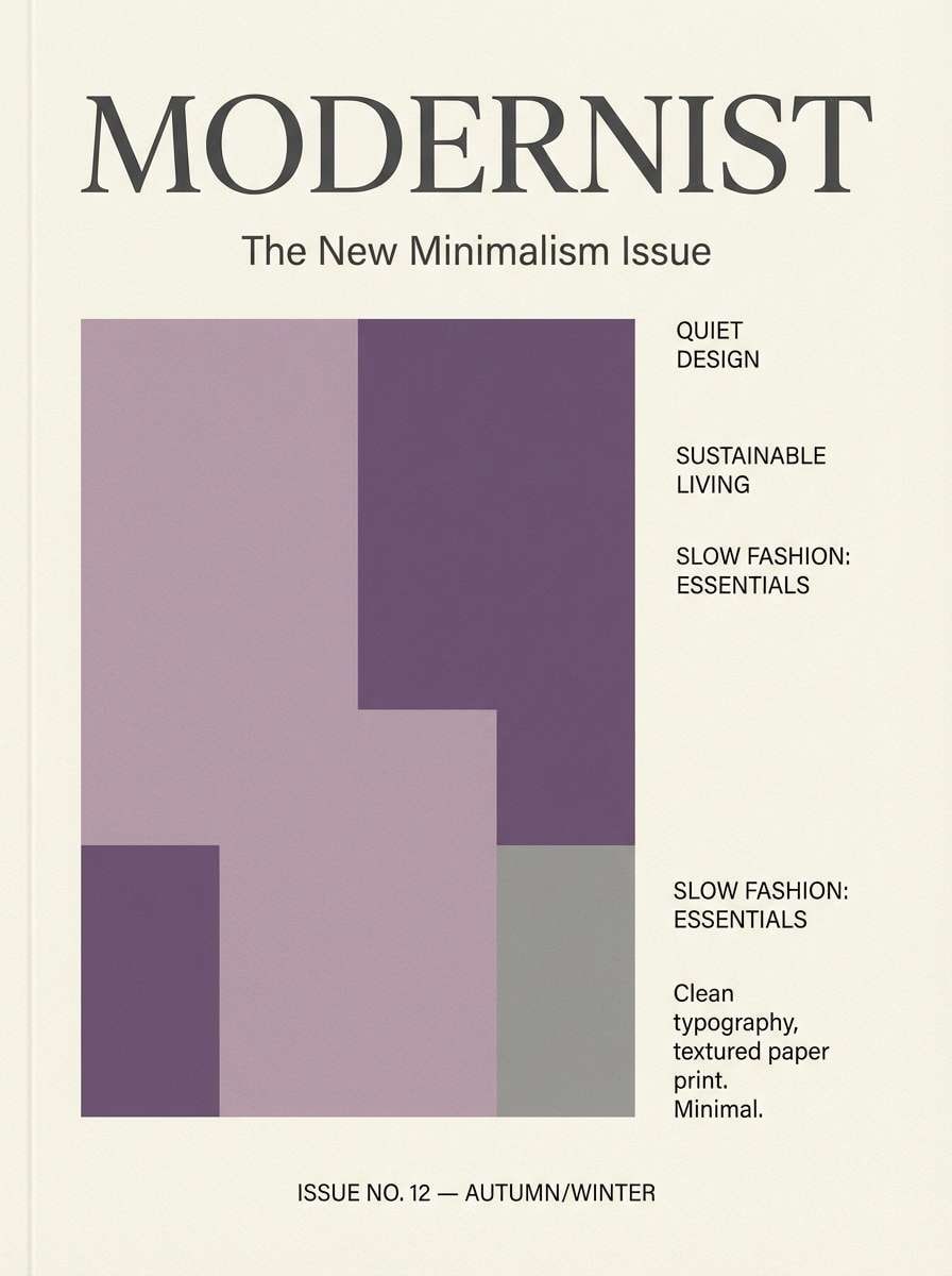
16) Dusty Lilac Editorial
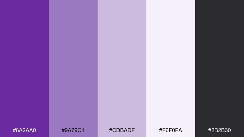
HEX: #6a2aa0 #9a79c1 #cdbadf #f6f0fa #2b2b30
Mood: soft, refined, and print-friendly
Best for: magazines and blog feature headers
Soft and refined like lilac powder on clean paper, these tones are made for typography-led layouts. The dusty mid purples feel sophisticated, while the near-white gives you plenty of breathing room. Use the dark gray for long reads and let purple appear in section labels, dividers, and pull quotes. Tip: keep contrast consistent across components so the design looks intentional in both web and print.
Image example of dusty lilac editorial generated using media.io
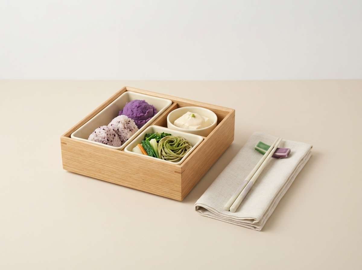
17) Ube Matcha Bento
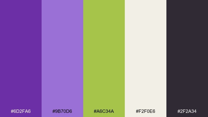
HEX: #6d2fa6 #9b70d6 #a6c34a #f2f0e6 #2f2a34
Mood: fresh, quirky, and foodie
Best for: food blog hero images and recipe cards
Fresh and quirky like a colorful bento lunch, this palette balances purple with a bright matcha green. The contrast feels modern and upbeat, great for recipe cards, food branding, and playful meal-planning content. Use the cream as a plate-like background and keep the green as a small garnish accent so it does not overpower. Tip: pair with simple photography props and avoid extra colors to keep the composition clean.
Image example of ube matcha bento generated using media.io
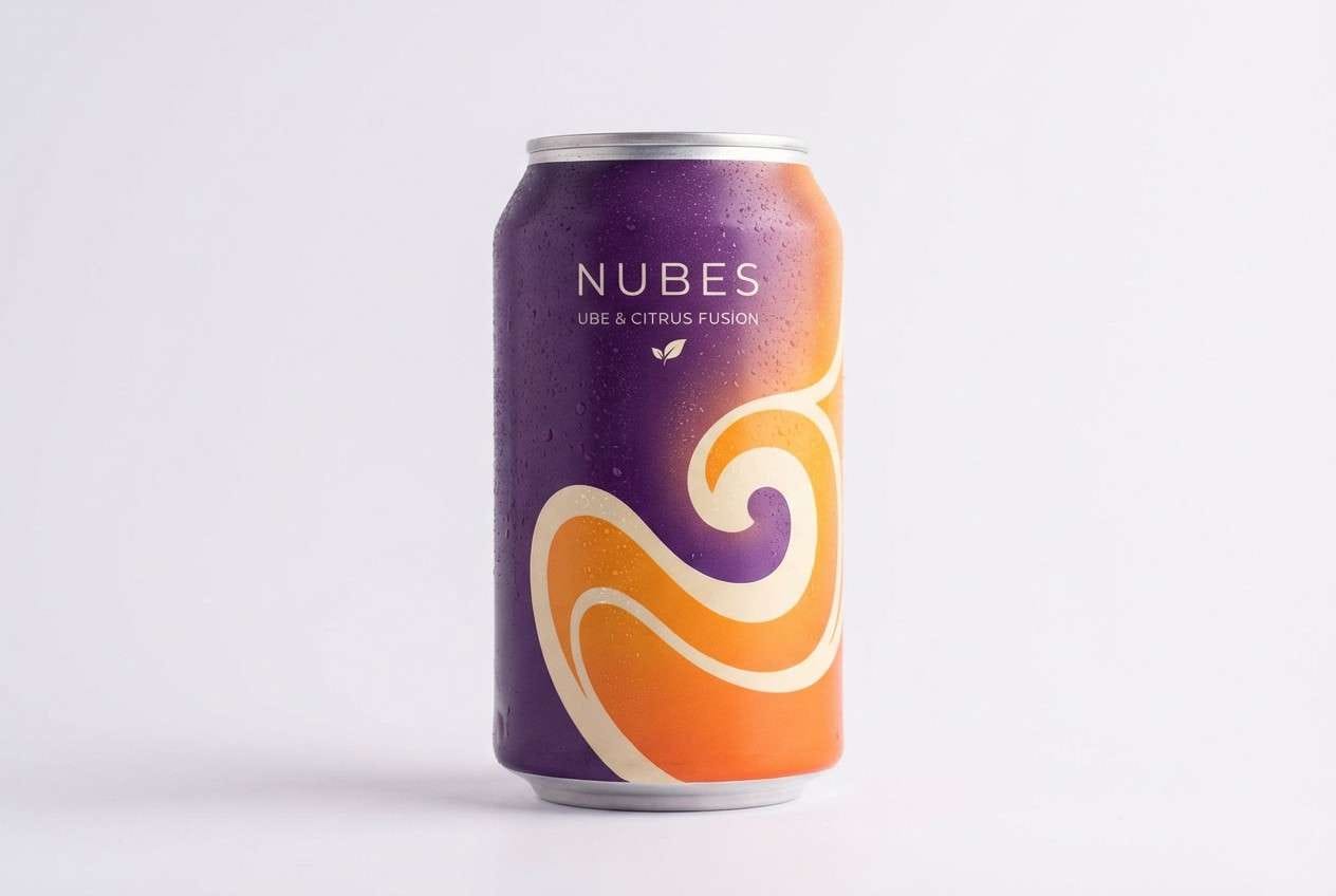
18) Ube Citrus Zest
HEX: #6a2aa2 #9a5bdb #ffb34a #fff1d6 #2a1b35
Mood: energetic, sunny, and modern
Best for: summer beverage can designs and ads
Energetic and sunny like citrus zest over a purple drink, this palette feels modern and bold. The orange brings a bright counterpoint, creating ube color combinations that are attention-grabbing without going neon. Use the pale citrus cream for background space, then let orange carry badges and flavor notes. Tip: keep the deep ink purple for small text and outlines so the warm tones stay clean and readable.
Image example of ube citrus zest generated using media.io
19) Monochrome Ube Gradient
HEX: #3d0f66 #5c1f8f #7a3bb8 #a47adf #e9ddff
Mood: smooth, modern, and immersive
Best for: presentation backgrounds and hero sections
Smooth and immersive like a slow color fade, this gradient-friendly set stays within one family for a sleek look. The steps from deep violet to pale lavender make layouts feel cohesive and easy to systematize. It is ideal for background gradients, section dividers, and bold hero areas where you want depth without extra hues. Tip: add subtle noise or a soft vignette to prevent banding on large gradient surfaces.
Image example of monochrome ube gradient generated using media.io
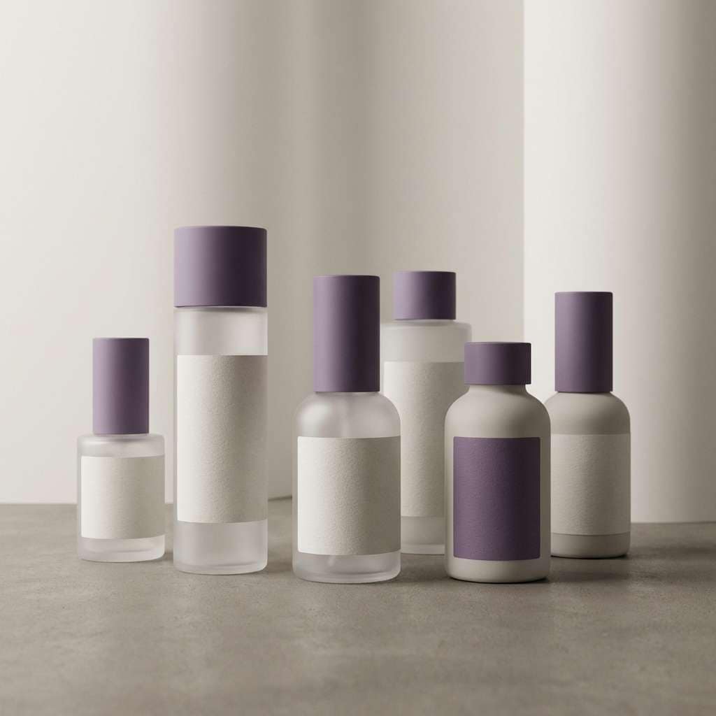
20) Ube Stone Spa
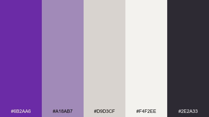
HEX: #6b2aa6 #a18ab7 #d9d3cf #f4f2ee #2e2a33
Mood: quiet, calming, and minimalist
Best for: skincare labels and spa product lines
Quiet and calming like smooth stones in a spa, these tones feel minimal and trustworthy. The warm grays and soft off-white keep the purple understated, making it perfect for clean labels and premium wellness packaging. Use the mid ube shade for brand marks and subtle patterning, while the darker charcoal handles ingredient text. Tip: choose a lot of whitespace and a simple sans-serif to keep the look modern and calm.
Image example of ube stone spa generated using media.io
What Colors Go Well with Ube?
Ube pairs naturally with creamy off-whites, soft blush pinks, and warm beiges—these keep purple feeling sweet, airy, and readable. If you want a grounded look, add charcoal or warm gray for typography and structure.
For contrast, try citrus orange, muted sage, or deep navy. These complementary accents make ube feel more modern and energetic, especially in ads, packaging, and UI highlight states.
For premium styling, gold (used sparingly) or cocoa browns can turn ube into a luxe, giftable palette—perfect for cosmetics, confectionery, and elevated branding.
How to Use a Ube Color Palette in Real Designs
Start by choosing one “hero ube” shade for brand recognition, then build your system with two light tints for backgrounds and spacing. Add one ink/charcoal color for body text so your designs stay accessible.
In print and packaging, ube looks best with matte or uncoated textures, subtle gradients, and minimal linework. In digital UI, keep saturated purples for primary actions and active states, while pale lilacs handle surfaces and cards.
If the palette includes a bold accent (like neon pink, matcha green, or orange), treat it as a controlled highlight—badges, hover states, or small decorative cues—so ube stays the main character.
Create Ube Palette Visuals with AI
If you already have HEX codes, you can generate on-brand mockups by describing the product, layout, and lighting—then specifying ube purple and supporting tones. This helps you preview how a palette feels on real packaging, posters, invitations, or UI screens.
Use the prompts above as templates: swap the subject (menu, skincare bottle, dashboard), keep the color direction, and adjust the aspect ratio to match your platform. You’ll quickly create a consistent set of visuals for campaigns and brand guidelines.
When your results look close, iterate with small changes like “more whitespace,” “matte paper texture,” or “higher contrast typography” to fine-tune the mood while keeping the ube identity.
Ube Color Palette FAQs
-
What color is ube in HEX?
Ube is a purple-yam inspired violet that often sits between lavender and deep purple. Common “ube” anchors in this article include #6f2da8, #6a2aa2, and #6a2ca0, depending on whether you want a brighter or deeper ube. -
Is ube closer to lavender or plum?
Ube can lean either way. Pastel ube palettes push it toward lavender (softer, milkier), while dramatic sets like deep plum night shift it closer to plum/eggplant for a richer, more nocturnal feel. -
What colors pair best with ube purple?
Top pairings include cream/off-white, blush pink, warm beige, charcoal, and gold for elegant looks. For modern contrast, pair ube with sage green, navy, or citrus orange as a controlled accent. -
How do I keep ube palettes readable in UI design?
Use very light lilac/off-white for backgrounds, keep body text in near-black or deep charcoal, and reserve saturated ube for primary buttons and active states. Avoid placing mid-purple text on mid-purple surfaces. -
Are ube palettes good for wedding stationery?
Yes—ube feels romantic but more unique than traditional lavender. Pair it with blush, soft white, and warm neutrals for invitations, menus, place cards, and monograms that feel modern and dreamy. -
What’s a modern accent color for ube besides pink?
Try matcha green (fresh, quirky), sage (botanical and muted), or citrus orange (sunny contrast). These accents help ube feel contemporary and help key elements stand out. -
How can I generate ube-themed images for my brand fast?
Use an AI text-to-image tool and specify the subject (packaging, poster, UI), lighting, and the palette direction (deep ube + lilac + cream, etc.). Start with the prompts in this article and iterate with small tweaks until the visuals match your brand.


