

A beach wedding color palette is all about light, space, and natural contrast—think sun-warmed neutrals, sea-glass greens, ocean blues, and soft sunset accents.
Below are 20+ beach wedding color scheme ideas with HEX codes, plus AI image prompts you can use to visualize invitations, florals, signage, and more.
In this article
- Why Beach Wedding Color Schemes Work So Well
-
- sea glass serenity
- sandy blush
- sunset aperol
- driftwood and linen
- ocean breeze blue
- coral reef pop
- palm shade greens
- nautical minimal
- pearl and champagne
- tropical orchid
- stormy coast
- citrus shore
- lavender tide
- rustic dune
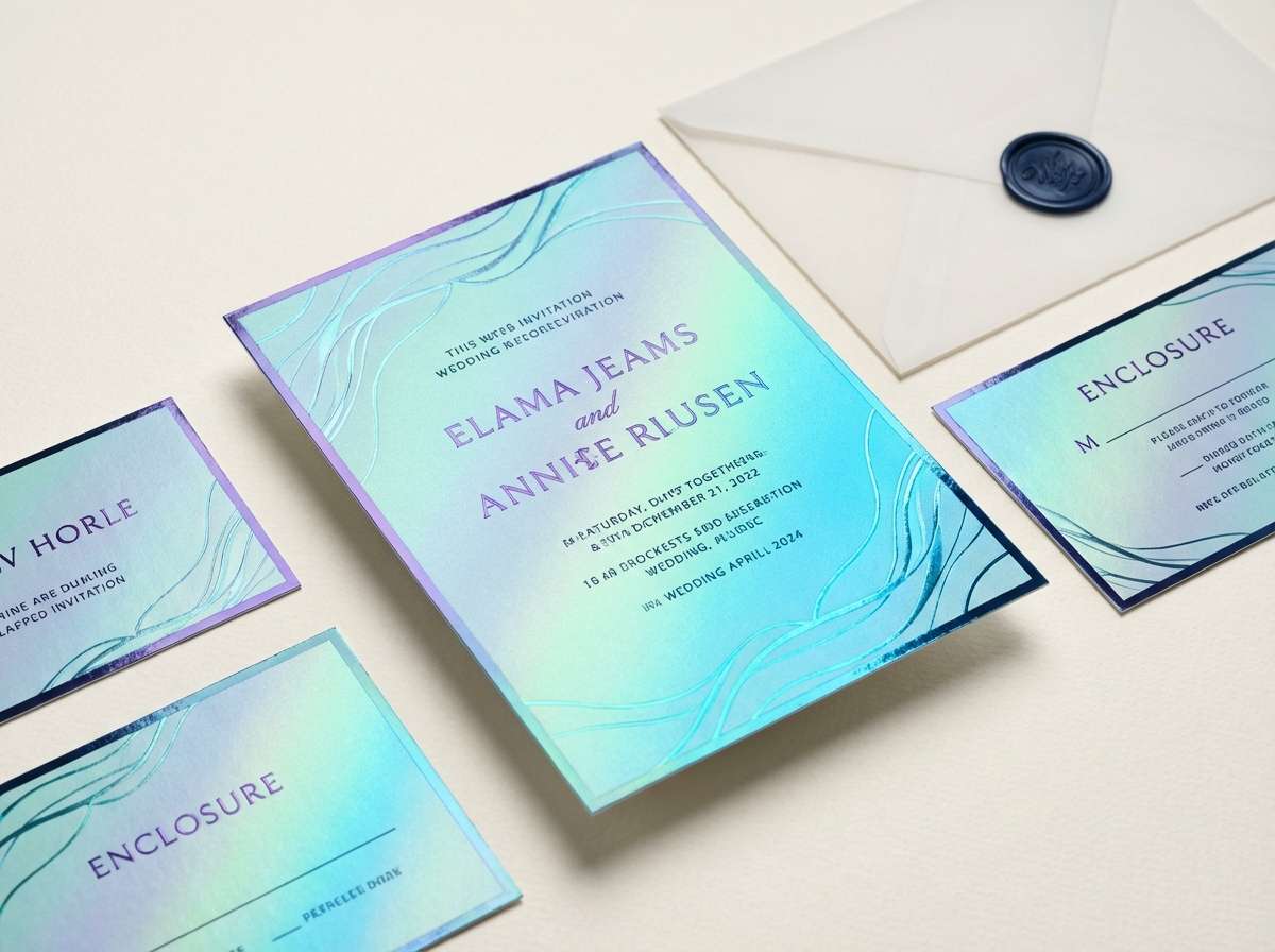
- mermaid metallics
- seaside sage
- flamingo punch
- blue lagoon night
- golden hour neutrals
- saltwater pastels
- ivory surf classic
- coral and navy formal
- What Colors Go Well with Beach Wedding?
- How to Use a Beach Wedding Color Scheme in Real Designs
- Create Beach Wedding Palette Visuals with AI
Why Beach Wedding Color Schemes Work So Well
Beach wedding colors naturally look “right” because they mirror what’s already in the environment: sand, foam, sky, driftwood, and coastal greenery. That built-in harmony makes styling feel effortless.
They also photograph beautifully in strong sunlight. Airy neutrals and oceanic blues prevent over-saturation, while controlled coral or sunset accents add energy without overpowering skin tones.
Most coastal wedding palettes are flexible across materials—from paper and fabric to acrylic signs and florals—so you can keep a cohesive look from invitations to reception details.
20+ Beach Wedding Color Palette Ideas (with HEX Codes)
1) Sea Glass Serenity
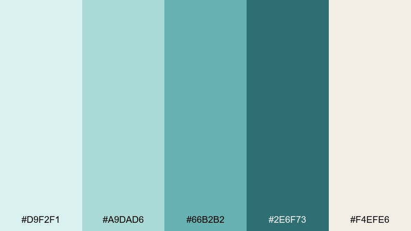
HEX: #D9F2F1 #A9DAD6 #66B2B2 #2E6F73 #F4EFE6
Mood: airy, coastal, calming
Best for: watercolor floral stationery and place cards
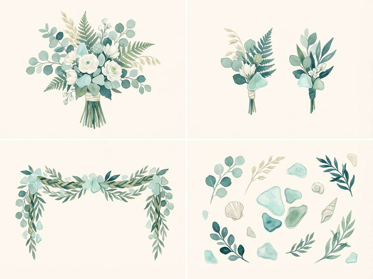
Airy and coastal, these sea-glass tones feel like sunlit shallows and weather-smoothed treasures. Use the pale aqua and cream for roomy negative space, then anchor typography with the deep teal. It works beautifully on invitations, escort cards, and vow booklets where legibility matters. Tip: keep metallics subtle, like soft silver or pearl, so the greens stay serene.
Image example of sea glass serenity generated using media.io
Media.io is an online AI studio for creating and editing video, image, and audio in your browser.

2) Sandy Blush
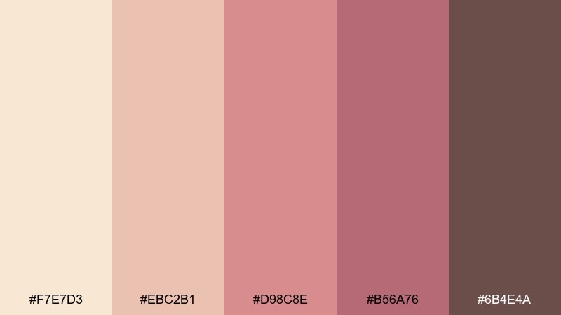
HEX: #F7E7D3 #EBC2B1 #D98C8E #B56A76 #6B4E4A
Mood: romantic, warm, sun-kissed
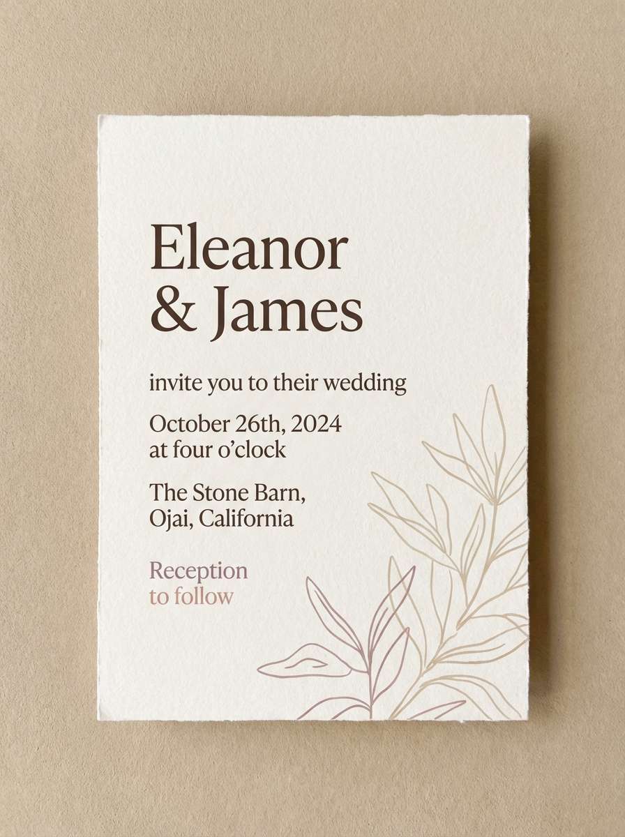
Best for: minimal invitation design on textured paper
Romantic and sun-kissed, this beach wedding mix reads like warm sand, rosy cheeks, and a soft sunset haze. Let the sandy beige carry the background, then use blush and dusty rose for borders, monograms, or wax-seal accents. It pairs well with pampas grass, blush roses, and light wood details. Tip: set body text in the cocoa brown to avoid the washed-out look of mid-pinks.
Image example of sandy blush generated using media.io
3) Sunset Aperol
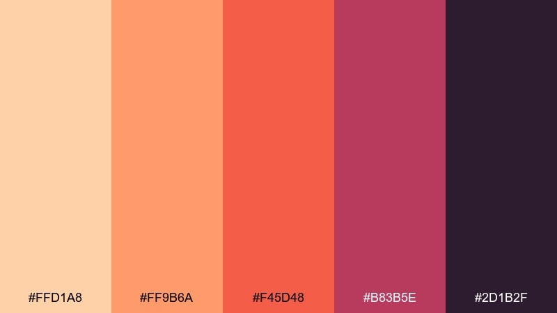
HEX: #FFD1A8 #FF9B6A #F45D48 #B83B5E #2D1B2F
Mood: bold, celebratory, sunset-glow
Best for: welcome sign and ceremony program typography
Bold and celebratory, these sunset tones evoke aperol spritz, coral skies, and twilight drama. The peach and tangerine make friendly backgrounds, while the raspberry and deep plum create high-contrast headlines. For beach wedding color combinations that pop in photos, add matte white and keep props neutral like rattan and clear acrylic. Tip: use the darkest plum for small text so it stays readable outdoors.
Image example of sunset aperol generated using media.io
4) Driftwood and Linen
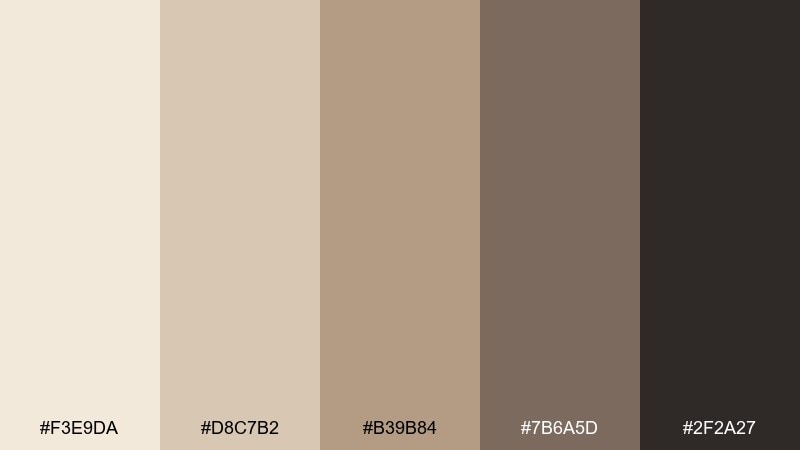
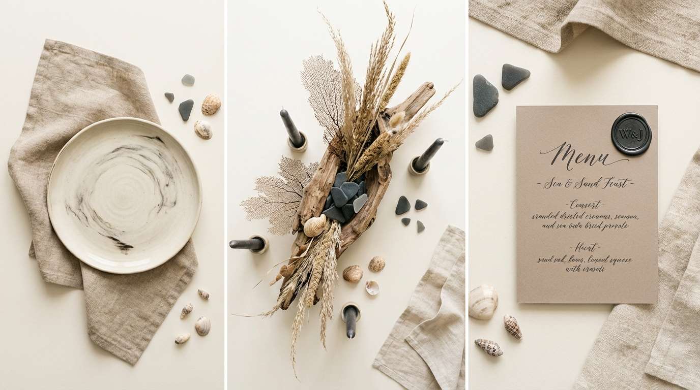
HEX: #F3E9DA #D8C7B2 #B39B84 #7B6A5D #2F2A27
Mood: natural, grounded, effortless
Best for: reception table styling and flat lay photos
Natural and grounded, these neutrals feel like driftwood, linen napkins, and sun-warmed sand. Build the base with the light linen tones, then add depth through warm taupe and charcoal details. It shines in tablescapes with raw ceramics, dried palms, and candlelight. Tip: introduce texture instead of color to keep the look rich without getting heavy.
Image example of driftwood and linen generated using media.io
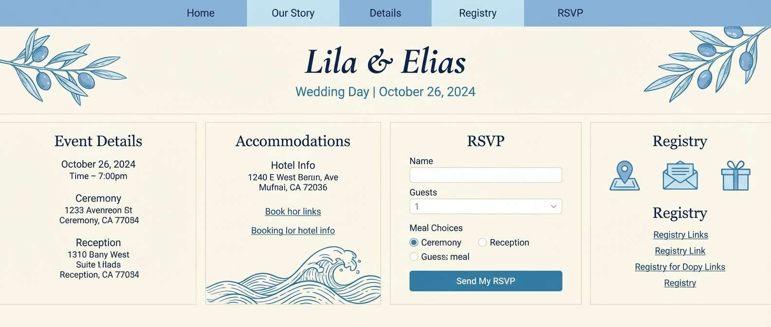
5) Ocean Breeze Blue
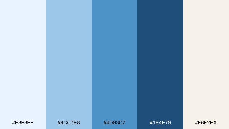
HEX: #E8F3FF #9CC7E8 #4D93C7 #1E4E79 #F6F2EA
Mood: fresh, open, breezy
Best for: wedding website UI and RSVP pages
Fresh and open, these blues feel like clear morning skies over a calm shoreline. Use the pale blue and cream for backgrounds, then rely on the navy for navigation and form labels. The mid blues make perfect hover states, dividers, and icon fills. Tip: keep buttons in the deeper blue for accessibility, and reserve the lightest tint for spacious sections.
Image example of ocean breeze blue generated using media.io
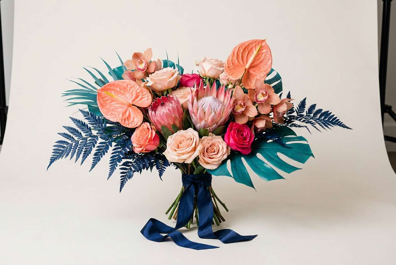
6) Coral Reef Pop
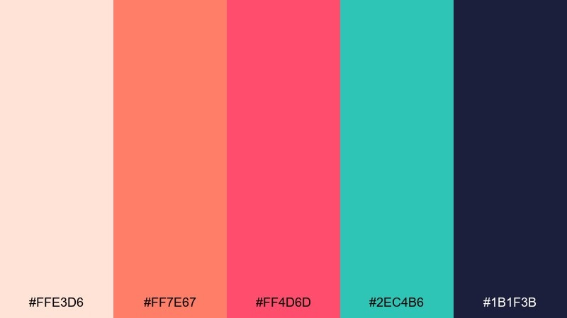
HEX: #FFE3D6 #FF7E67 #FF4D6D #2EC4B6 #1B1F3B
Mood: playful, vibrant, photo-ready
Best for: bouquets, boutonnieres, and floral moodboards
Playful and vibrant, these beach wedding tones bring coral reefs, tropical blooms, and a crisp ocean splash to mind. Let the blush-peach soften the look, then use coral and hot pink as the hero florals against teal greenery. It pairs well with white orchids, anthuriums, and glossy leaves for a modern finish. Tip: repeat the navy in ribbons or printed menus to keep the bright accents feeling intentional.
Image example of coral reef pop generated using media.io
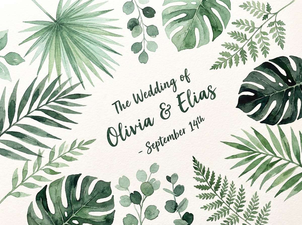
7) Palm Shade Greens
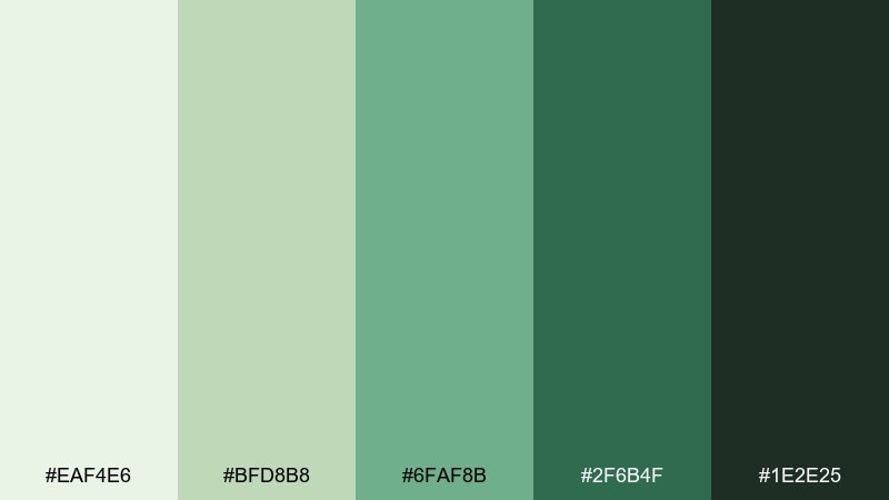
HEX: #EAF4E6 #BFD8B8 #6FAF8B #2F6B4F #1E2E25
Mood: lush, botanical, tranquil
Best for: watercolor foliage illustrations and monograms
Lush and tranquil, these greens evoke palm fronds, shaded pathways, and cool garden air by the coast. Use the soft mint as your paper tone, then layer sage and fern for borders, crests, or envelope liners. This beach wedding color scheme pairs naturally with ivory, cane, and soft gold hardware. Tip: keep the deepest green for monograms and tiny details so the artwork stays crisp.
Image example of palm shade greens generated using media.io
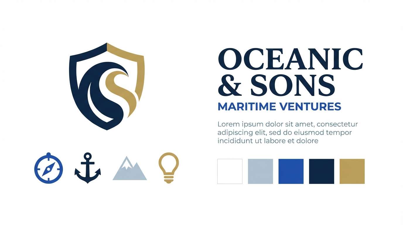
8) Nautical Minimal
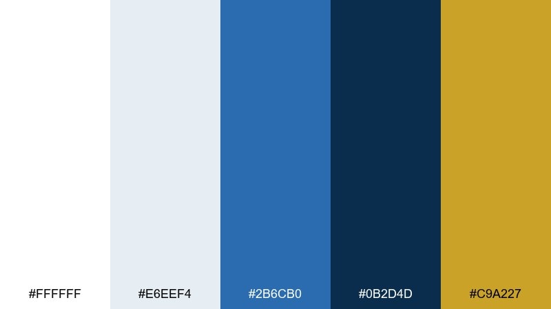
HEX: #FFFFFF #E6EEF4 #2B6CB0 #0B2D4D #C9A227
Mood: clean, classic, tailored
Best for: brand kit, logos, and icon sets
Clean and tailored, this nautical mix feels like crisp sailcloth, deep water, and a glint of brass. Keep the whites and pale blue-gray as your foundation, then bring in the blues for structure and hierarchy. The gold works best as a restrained accent on seals, rules, or small icons. Tip: use the navy for body text to maintain contrast while still feeling coastal.
Image example of nautical minimal generated using media.io
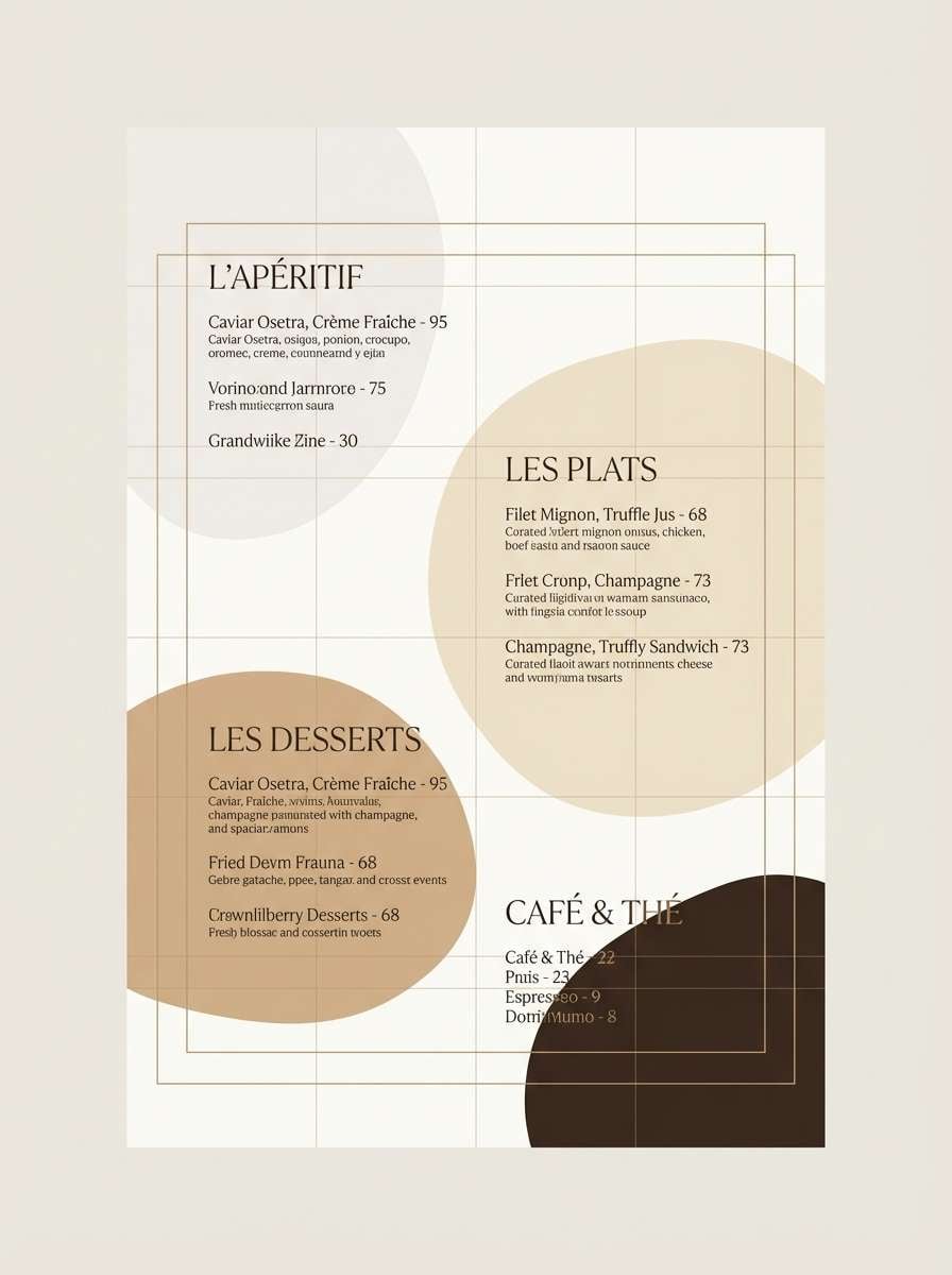
9) Pearl and Champagne
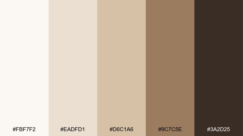
HEX: #FBF7F2 #EADFD1 #D6C1A6 #9C7C5E #3A2D25
Mood: elegant, soft, timeless
Best for: editorial layouts and luxury menus
Elegant and soft, these tones recall pearls, champagne foam, and candlelit dinners by the sea. Use the creamy whites for breathing room, then add warmth through beige and antique gold-brown for headings. This beach wedding color palette looks especially refined on thick paper, blind embossing, and minimal florals. Tip: keep the darkest espresso for fine lines and small type so the palette stays airy.
Image example of pearl and champagne generated using media.io
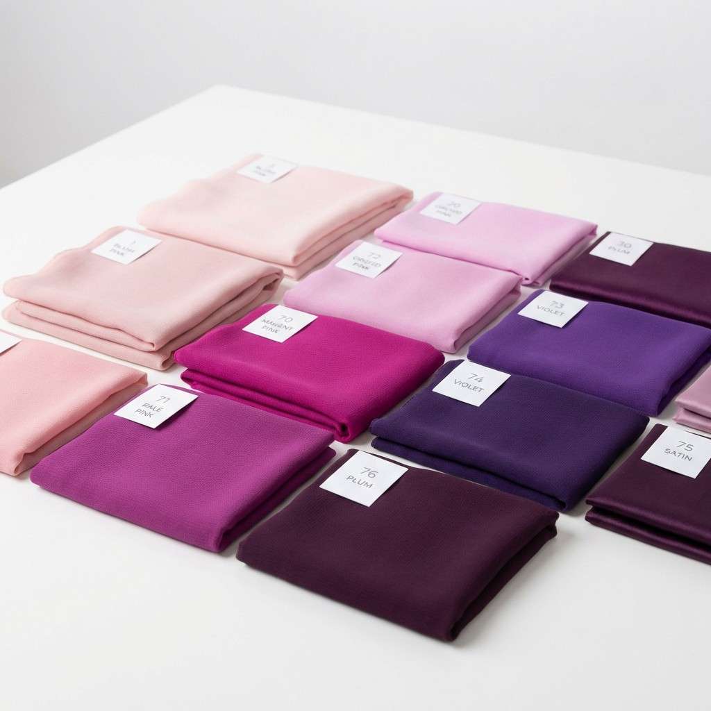
10) Tropical Orchid
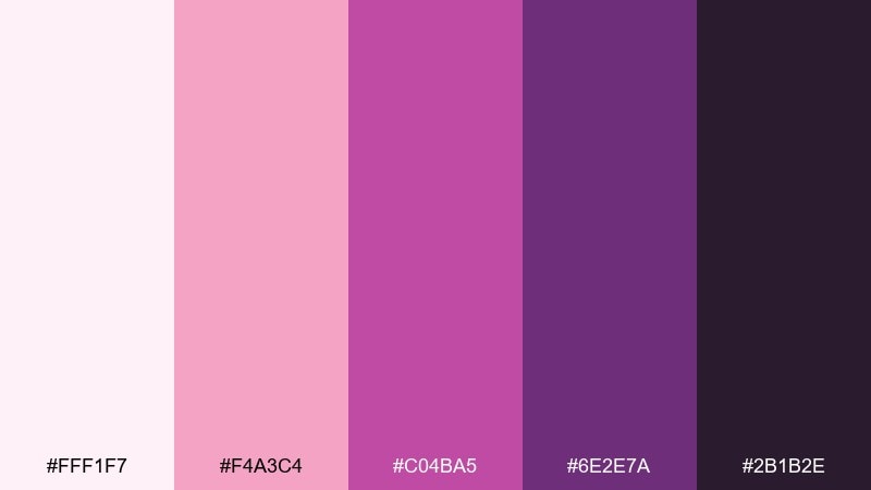
HEX: #FFF1F7 #F4A3C4 #C04BA5 #6E2E7A #2B1B2E
Mood: glam, tropical, romantic
Best for: bridesmaid dress palette and floral accents
Glam and tropical, these orchid purples feel like bougainvillea, silky petals, and a warm evening breeze. Use the blush-pink as a softener, then pick one bold violet as the main statement color for dresses or floral clusters. Deep plum grounds the look in photos, especially at golden hour. Tip: repeat the mid pink in small accessories like ribbons or nails to tie everything together.
Image example of tropical orchid generated using media.io
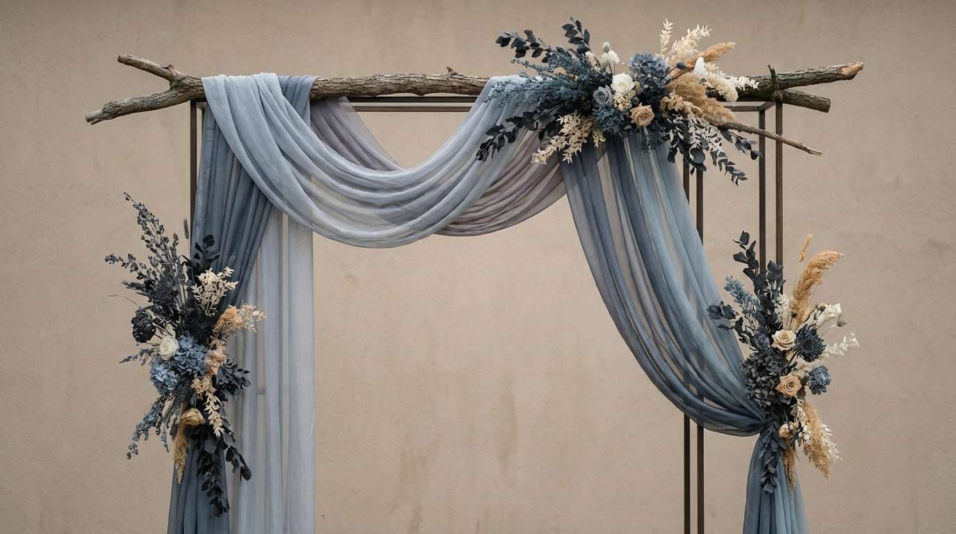
11) Stormy Coast
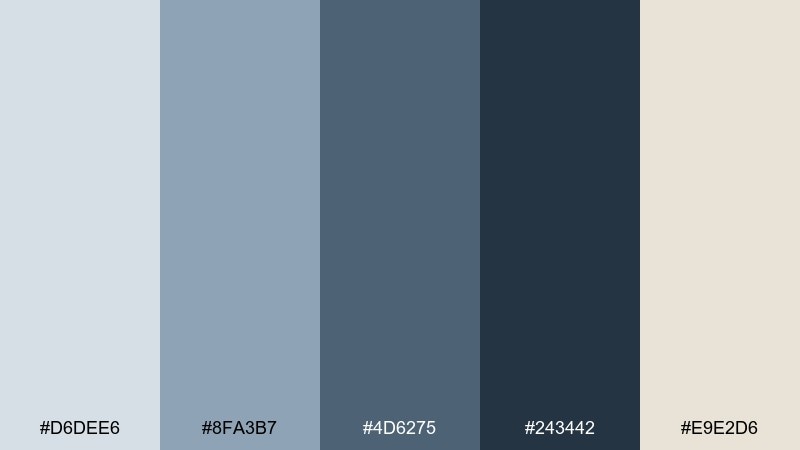
HEX: #D6DEE6 #8FA3B7 #4D6275 #243442 #E9E2D6
Mood: moody, modern, dramatic
Best for: ceremony arch styling and evening signage
Moody and modern, these stormy blues and grays evoke rolling clouds and steel-blue water. Use the foggy light tones for backdrops, then bring in slate and charcoal for structure in signage and fabric. This beach wedding color scheme pairs well with white florals, eucalyptus, and smoky glass vases. Tip: add the warm sand-beige as a gentle highlight to prevent the scheme from feeling too cold.
Image example of stormy coast generated using media.io
12) Citrus Shore
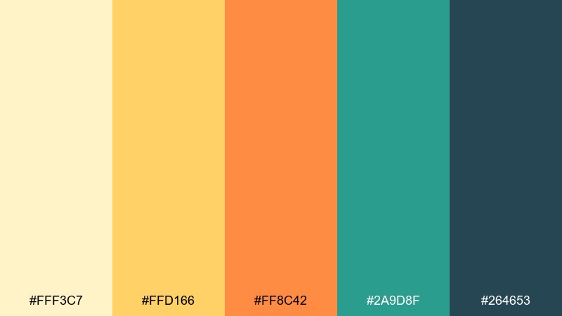
HEX: #FFF3C7 #FFD166 #FF8C42 #2A9D8F #264653
Mood: bright, energetic, sunny
Best for: cocktail menu and bar signage
Bright and sunny, these citrus tones feel like lemon slices, orange zest, and cool sea-glass bottles. Keep the buttery yellow as the backdrop, then use orange for icons and callouts that need instant attention. The teal and deep blue-green add a refreshing counterweight and look sharp on bar menus. Tip: limit typography to teal and navy-green so the warm hues stay clean, not chaotic.
Image example of citrus shore generated using media.io

13) Lavender Tide
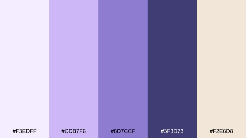
HEX: #F3EDFF #CDB7F6 #8D7CCF #3F3D73 #F2E6D8
Mood: dreamy, soft, coastal-dusk
Best for: detail cards and illustrated maps
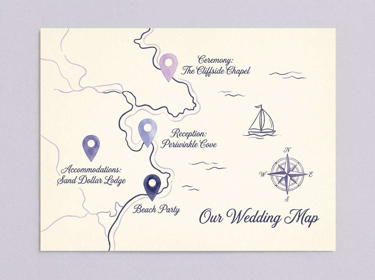
Dreamy and soft, these purples mirror a lavender sky as the tide turns at dusk. Use the pale lilac for backgrounds, then step up to periwinkle for borders and icons. Deep indigo is perfect for map lines and type, keeping everything readable without harsh black. Tip: add the warm sand-cream as a gentle contrast so the purples stay romantic, not icy.
Image example of lavender tide generated using media.io
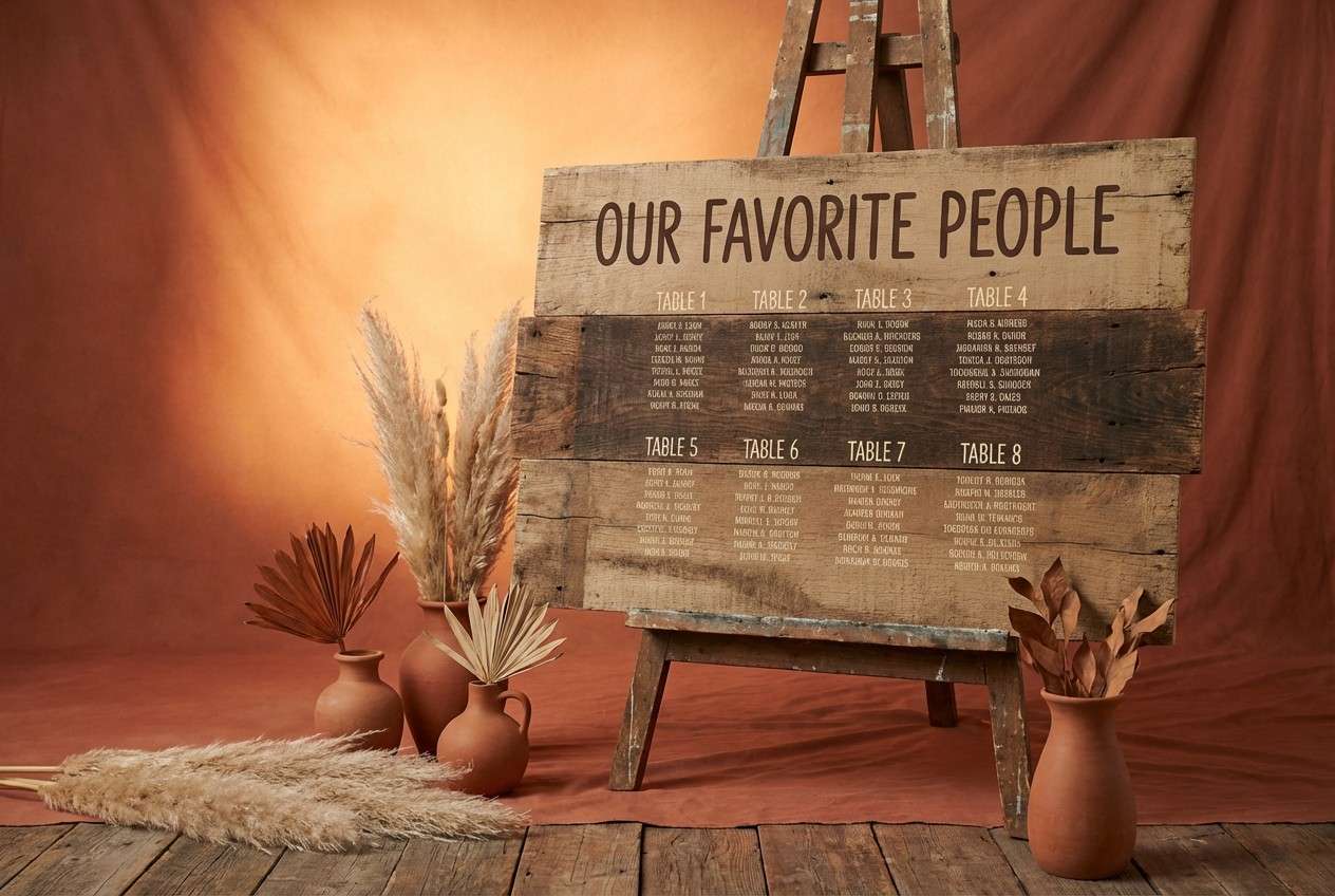
14) Rustic Dune
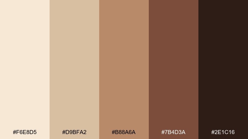
HEX: #F6E8D5 #D9BFA2 #B88A6A #7B4D3A #2E1C16
Mood: rustic, earthy, sunbaked
Best for: wood signage, seating charts, and favors
Earthy and sunbaked, these browns and sands bring to mind dunes, terracotta pots, and toasted coconut. Use the light sand as your base and let the terracotta-brown carry headlines and borders. The beach wedding color palette pairs naturally with jute, rattan, dried grasses, and warm greenery. Tip: keep the darkest chocolate for small text and thin lines so signage reads from a distance.
Image example of rustic dune generated using media.io
15) Mermaid Metallics
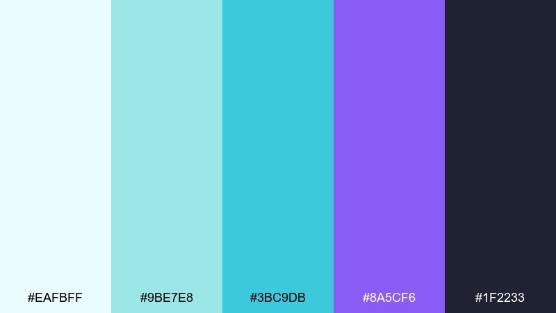
HEX: #EAFBFF #9BE7E8 #3BC9DB #8A5CF6 #1F2233
Mood: iridescent, modern, nightlife
Best for: foil-stamped invites and glossy accents
Iridescent and modern, these beach wedding hues feel like shimmering water, glassy highlights, and a hint of violet magic. Use the icy aqua for open space, then punch up edges with bright cyan and a controlled violet accent. For a beach wedding color palette with a nightlife twist, pair it with chrome foil, clear acrylic, and sleek sans-serif type. Tip: keep the dark ink for all small copy so the brights can stay decorative.
Image example of mermaid metallics generated using media.io
16) Seaside Sage
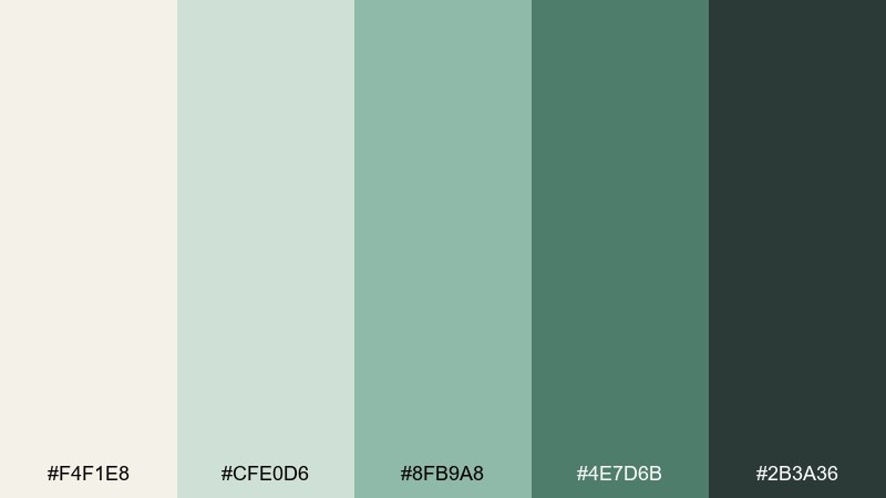
HEX: #F4F1E8 #CFE0D6 #8FB9A8 #4E7D6B #2B3A36
Mood: soft, organic, understated
Best for: linen rentals and ceremony aisle styling
Soft and organic, these sage tones evoke salt air, coastal herbs, and muted greenery. The warm off-white keeps everything bright, while the deeper greens add definition for runners, chairs, and signage. It pairs beautifully with white roses, olive branches, and natural stoneware. Tip: use the darkest green sparingly on type and small details to keep the overall look light.
Image example of seaside sage generated using media.io
17) Flamingo Punch
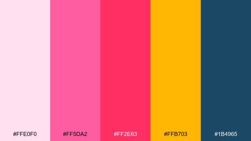
HEX: #FFE0F0 #FF5DA2 #FF2E63 #FFB703 #1B4965
Mood: fun, flirty, party-forward
Best for: afterparty flyer and social templates
Fun and flirty, these beach wedding colors feel like flamingo feathers, tropical punch, and a splash of seaside navy. Keep the blush as breathing room, then let hot pink and red-pink drive the energy in headlines. The sunny yellow works best as a small highlight for times, locations, or icons. Tip: stick to 2 dominant brights at a time so layouts stay bold but readable.
Image example of flamingo punch generated using media.io
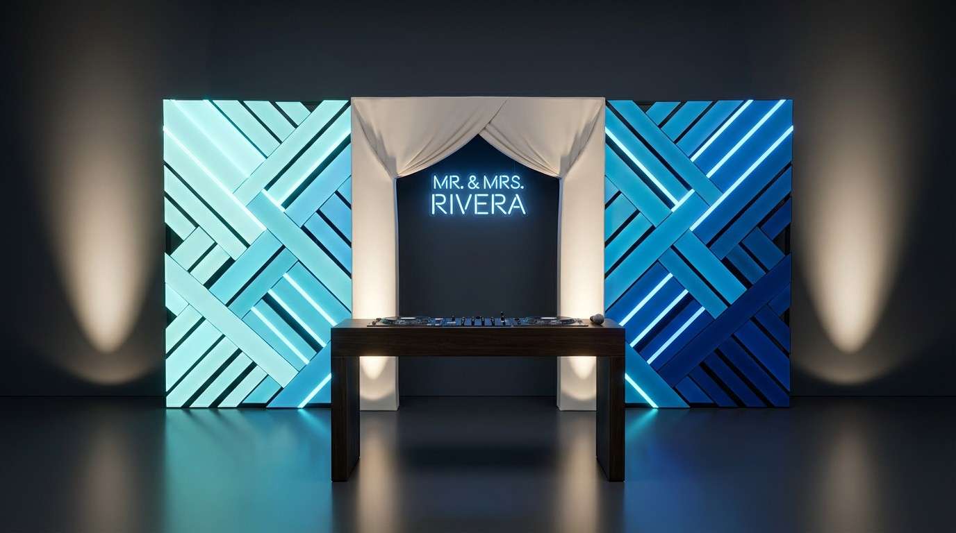
18) Blue Lagoon Night
HEX: #C7F9FF #00B4D8 #0077B6 #03045E #F8EDEB
Mood: cool, electric, nighttime
Best for: evening reception lighting and DJ booth visuals
Cool and electric, these blues capture lagoon water at night with a clean, modern glow. Use the icy tint and cream as soft contrast, while cyan and mid-blue create luminous gradients for lighting cues. The deep navy adds drama and keeps screens and signage feeling premium. Tip: reserve the brightest cyan for focal points like monograms or stage backdrops.
Image example of blue lagoon night generated using media.io
19) Golden Hour Neutrals
HEX: #FFF6E8 #F2D8B3 #D9A66C #A9714B #3D2B22
Mood: glowy, warm, cinematic
Best for: photo moodboards and album design
Glowy and cinematic, these neutrals look like golden hour light hitting sand and sunlit skin tones. Use the creamy white as the page base, then layer caramel and bronze for frames, captions, and dividers. For beach wedding color combinations that flatter photography, pair this mix with warm wood, ivory florals, and soft shadows. Tip: keep the darkest brown for small type and corner details so spreads feel polished.
Image example of golden hour neutrals generated using media.io
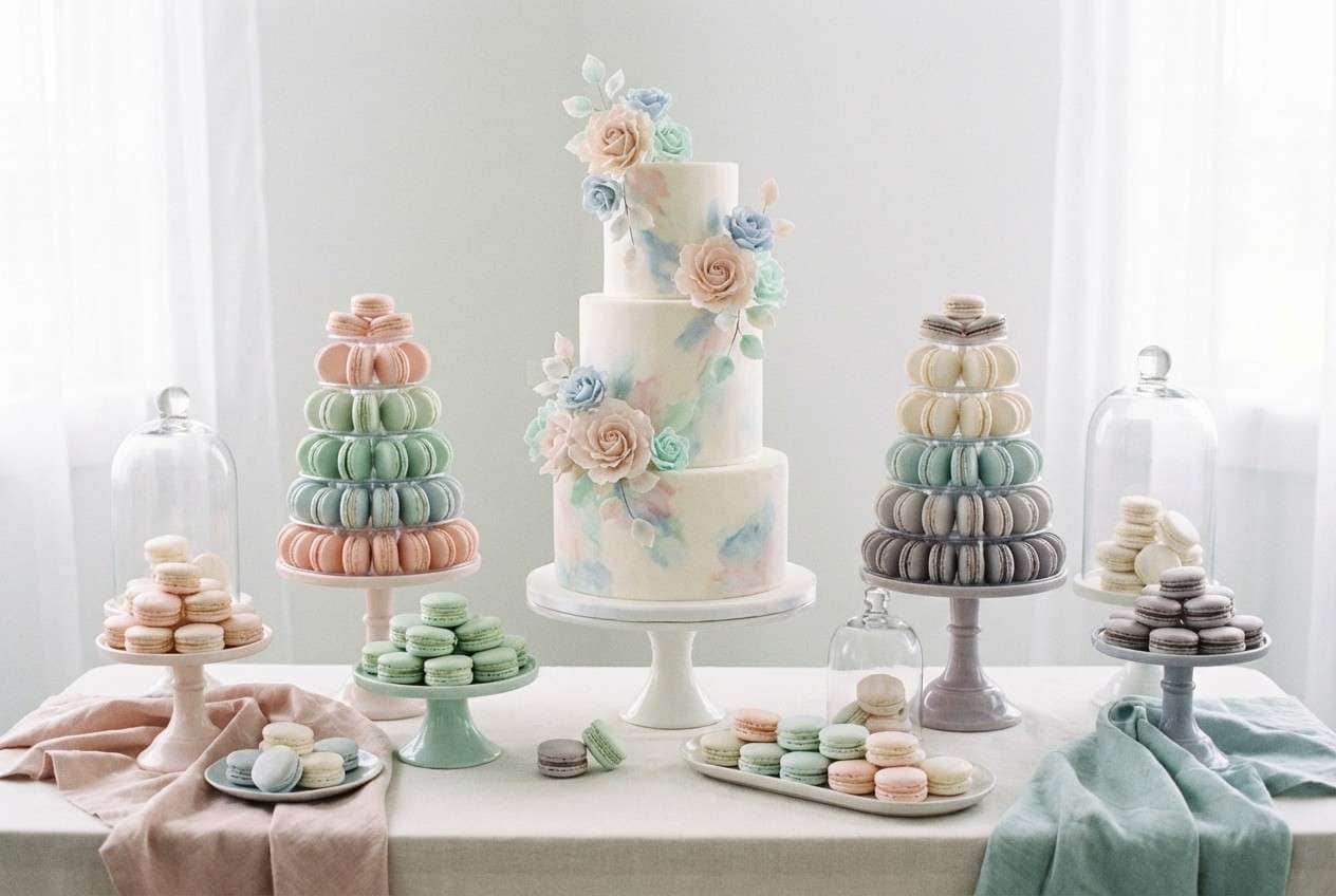
20) Saltwater Pastels
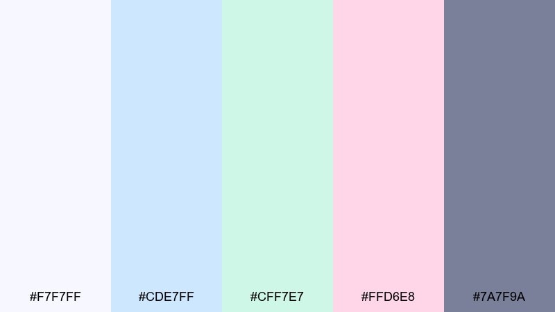
HEX: #F7F7FF #CDE7FF #CFF7E7 #FFD6E8 #7A7F9A
Mood: light, whimsical, airy
Best for: dessert table styling and cake details
Light and whimsical, these pastels feel like sea foam, cotton candy skies, and frosted confections. Use the near-white and soft blue as the base, then sprinkle mint and blush in desserts, florals, and ribbons. The cool gray-violet helps anchor signage and keeps the look from turning too sweet. Tip: repeat one pastel in multiple small places, like macarons, napkins, and menu icons, to make it feel cohesive.
Image example of saltwater pastels generated using media.io
21) Ivory Surf Classic
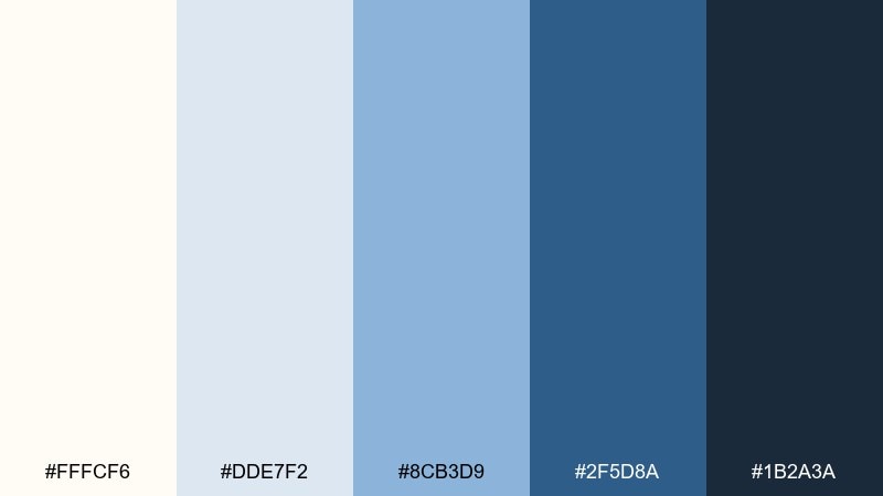
HEX: #FFFCF6 #DDE7F2 #8CB3D9 #2F5D8A #1B2A3A
Mood: classic, crisp, coastal
Best for: ceremony programs and seating cards
Classic and crisp, these tones evoke whitecaps, clean stationery, and polished coastal style. Build pages with ivory and the light surf tint, then use the deeper blues to structure headers and sections. It pairs beautifully with white florals and simple greenery for an effortlessly refined look. Tip: keep icons and small lines in the mid blue so they read clearly without overpowering the page.
Image example of ivory surf classic generated using media.io
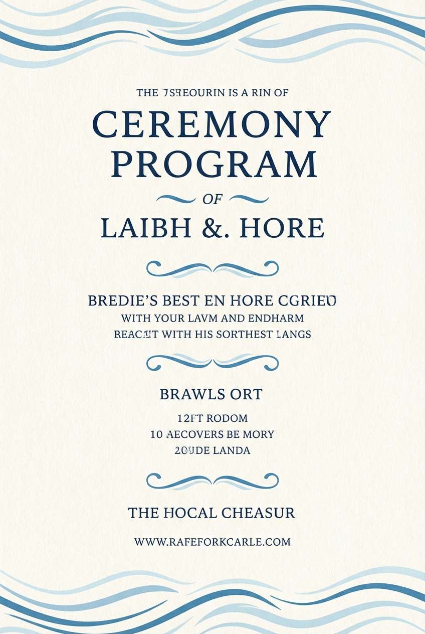
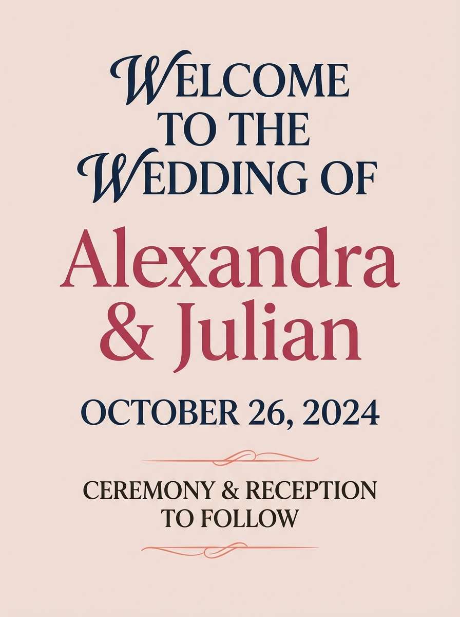
22) Coral and Navy Formal
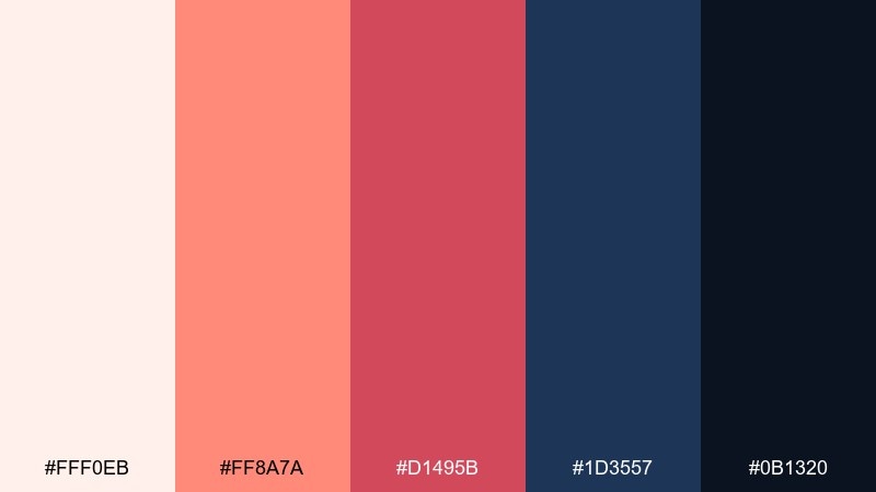
HEX: #FFF0EB #FF8A7A #D1495B #1D3557 #0B1320
Mood: formal, confident, high-contrast
Best for: black-tie beach ceremony branding and signage
Confident and high-contrast, this pairing feels like coral blooms against deep evening water. Use the soft blush as a background to keep everything airy, then let navy carry the typography for a formal finish. For a beach wedding color palette that still reads black-tie, keep coral as the accent and avoid adding extra brights. Tip: apply coral mainly to headings, monograms, or floral callouts so the design stays sharp.
Image example of coral and navy formal generated using media.io
What Colors Go Well with Beach Wedding?
Beach wedding colors pair best when you balance a light base (ivory, warm white, sand, or misty blue) with 1–2 ocean-inspired hues (teal, navy, seafoam, slate) and a small accent (coral, citrus, champagne, or gold).
If your ceremony is in full sun, choose higher-contrast typography colors like deep teal, navy, or espresso so programs and seating cards stay readable. For sunset ceremonies, warmer neutrals and coral tones keep the styling cohesive with the sky.
To avoid a “theme-y” look, keep bright tropical colors to florals and small details, and let neutrals carry large surfaces like linens, signage backgrounds, and paper.
How to Use a Beach Wedding Color Scheme in Real Designs
Start by assigning roles: pick one background color (paper/linen), one primary text color (navy/espresso), two supporting colors (borders/icons), and one accent (wax seal, ribbon, or floral pop). This keeps your coastal wedding palette consistent across every touchpoint.
For stationery, prioritize contrast and negative space—especially outdoors where glare can wash out pale inks. For signage and menus, use thicker strokes and slightly darker shades than you think you need.
For florals and décor, repeat your accent color in at least three places (bouquet, bar menu, and escort display) so it feels intentional rather than random.
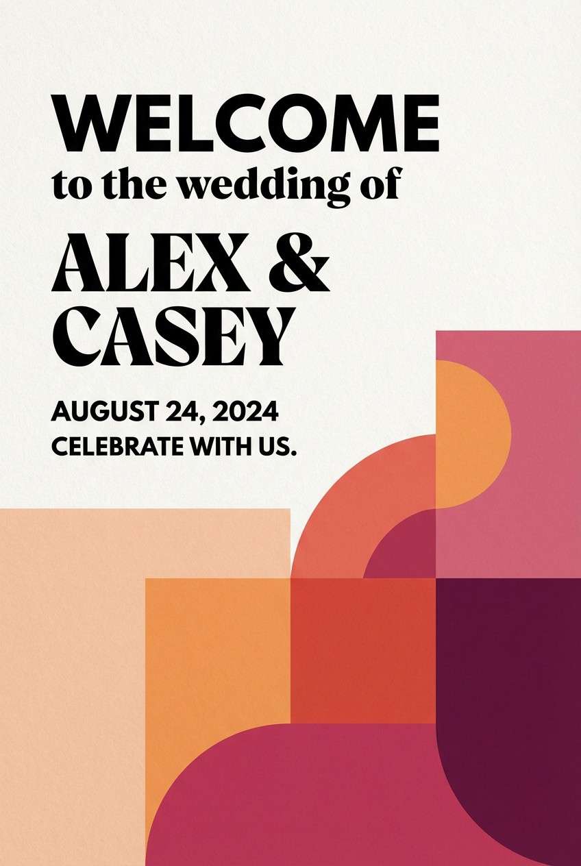
Create Beach Wedding Palette Visuals with AI
If you want to see your beach wedding color scheme before you commit, generate quick mockups for invites, welcome signs, bouquet concepts, or table flat-lays using AI prompts.
With Media.io’s text-to-image tool, you can iterate fast: adjust the vibe (minimal, romantic, bold), lock in your HEX-inspired tones, and export visuals for moodboards or vendor collaboration.
Use the prompts under each palette to recreate a similar look, then swap keywords like “linen,” “acrylic,” or “watercolor” to match your wedding style.
Beach Wedding Color Palette FAQs
-
What are the most popular beach wedding colors?
Popular beach wedding colors include ivory and sand neutrals, seafoam/sea-glass greens, ocean blues (from sky to navy), and small coral or champagne accents for warmth. -
How do I keep beach wedding stationery readable outdoors?
Use a dark anchor color (navy, deep teal, espresso) for body text, keep backgrounds light but not pure white (ivory/cream reduces glare), and avoid mid-tone inks for small type. -
Should I use bright tropical colors for a beach wedding?
You can, but keep them controlled: let neutrals handle large areas (linens, signage backgrounds) and use brights like coral, hot pink, or citrus as accents in florals, ribbons, or small graphic elements. -
What’s a good “elegant” beach wedding palette?
Pearl-and-champagne neutrals, ivory with navy, or blush with deep navy all read refined while still feeling coastal—especially when paired with minimal layouts and high-quality paper. -
How many colors should a beach wedding palette include?
Five is a strong sweet spot: one light base, one dark text/anchor, two supporting mid tones, and one accent. This keeps designs cohesive across invitations, signage, and décor. -
How do I match bridesmaid dresses to a coastal palette?
Choose one hero hue (sage, ocean blue, or orchid) for dresses, then repeat supporting neutrals (ivory/sand) in accessories and florals. Darker tones photograph well at golden hour and in evening receptions. -
Can I generate beach wedding color palette mockups with AI?
Yes. Use Media.io text-to-image prompts to create quick visuals for invitations, bouquets, menus, and table styling—then refine the look by adjusting style words like “watercolor,” “minimal,” or “luxury editorial.”


