

Tyrian purple is a historically luxurious hue that still feels modern when paired with the right neutrals and accents. It can read regal, romantic, edgy, or minimal depending on the supporting colors.
Below are tyrian purple color palette ideas with HEX codes, plus practical guidance for branding, UI, and print so you can apply them with confidence.
In this article
- Why Tyrian Purple Palettes Work So Well
-
- imperial velvet
- orchid noir
- antique royalty
- plum and pearl ui
- garnet rose wedding
- aubergine espresso
- mulberry sunset
- dusty mauve minimal
- fig and sage home
- tyrian teal contrast
- berry ink editorial
- amethyst candlelight
- violet brass deco
- raspberry clay
- lavender smoke
- night bloom botanicals
- wine and winter wool
- royal berry neon
- burgundy blush commerce
- phoenician classic
- What Colors Go Well with Tyrian Purple?
- How to Use a Tyrian Purple Color Palette in Real Designs
- Create Tyrian Purple Palette Visuals with AI
Why Tyrian Purple Palettes Work So Well
Tyrian purple sits in a rare sweet spot: deep enough to feel premium and authoritative, but colorful enough to carry a strong brand personality. It naturally communicates craftsmanship, heritage, and intention.
Because it has both warm and cool undertones depending on the mix, it pairs easily with parchment neutrals, modern off-whites, charcoal text colors, metallic golds, and unexpected accents like teal. That flexibility makes it useful for both bold hero moments and subtle UI details.
In practice, tyrian purple works best when you give it space—letting one dark anchor lead while lighter mauves and blush tones handle backgrounds and readability. The result is contrast without harshness.
20+ Tyrian Purple Color Palette Ideas (with HEX Codes)
1) Imperial Velvet
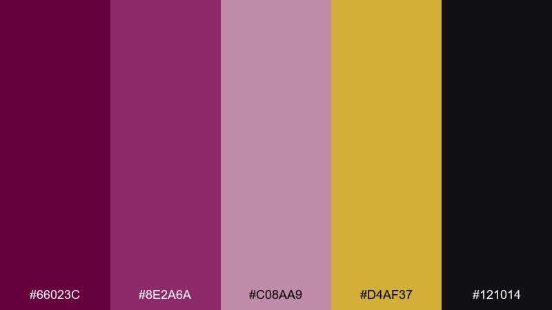
HEX: #66023C #8E2A6A #C08AA9 #D4AF37 #121014
Mood: regal and dramatic
Best for: luxury branding and stationery
Regal and dramatic, it feels like velvet drapery and gilded trim in a candlelit hall. Use the deep purple as your anchor, then let gold act as a premium accent for lines, seals, and small icons. The pale mauve keeps layouts breathable without losing richness. Tip: reserve the metallic tone for 5 to 10 percent of the design so the brand still feels refined, not flashy.
Image example of imperial velvet generated using media.io
Media.io is an online AI studio for creating and editing video, image, and audio in your browser.

2) Orchid Noir
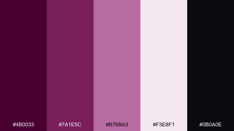
HEX: #4B0033 #7A1E5C #B76BA3 #F3E8F1 #0B0A0E
Mood: mysterious and glamorous
Best for: nighttime event posters
Mysterious and glamorous, it reads like an orchid glow against a black velvet night. Push the near-black background for instant contrast, then highlight headings with the brighter orchid tone. Keep body text on the pale tint for legibility and a modern finish. Tip: add a single oversized gradient shape using the mid purples to create depth without clutter.
Image example of orchid noir generated using media.io
3) Antique Royalty
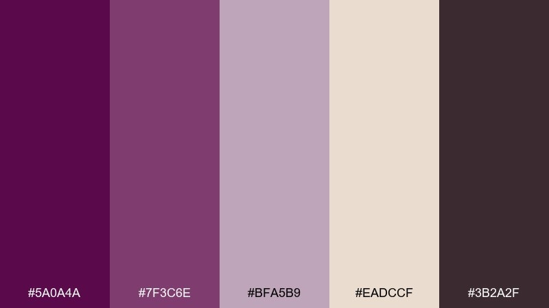
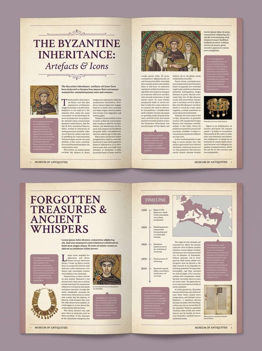
HEX: #5A0A4A #7F3C6E #BFA5B9 #EADCCF #3B2A2F
Mood: vintage and cultured
Best for: museum brochures and exhibits
Vintage and cultured, the tones evoke aged textiles, parchment, and gallery lighting. Pair the deep wine-purple with the parchment neutral to keep copy readable and historically grounded. Use the dusty mauve for sidebars, captions, and subtle dividers. Tip: choose matte paper and avoid high-saturation gradients to preserve the antique feel.
Image example of antique royalty generated using media.io
4) Plum and Pearl UI
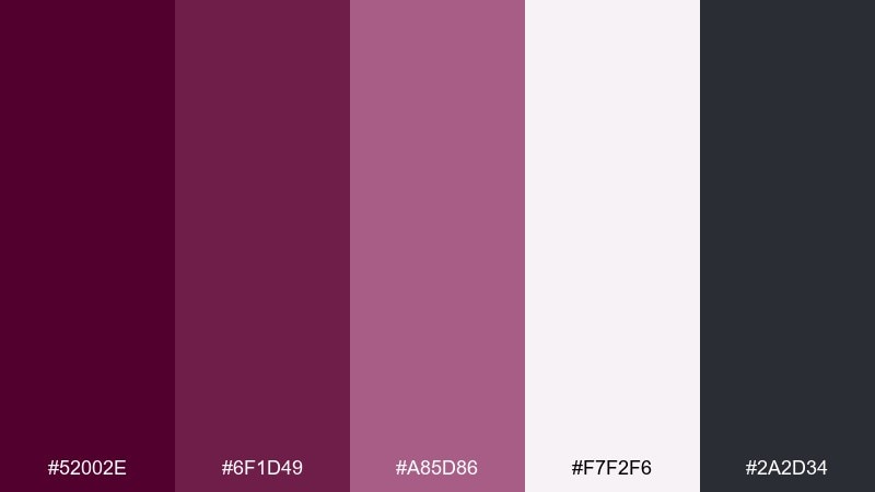
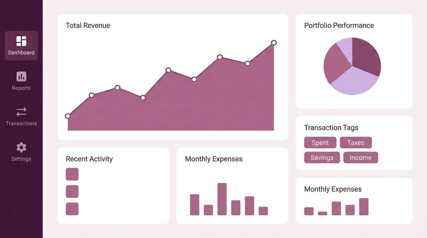
HEX: #52002E #6F1D49 #A85D86 #F7F2F6 #2A2D34
Mood: modern and trustworthy
Best for: fintech dashboard UI mockups
Modern and trustworthy, it feels like polished plum ink on a clean pearl interface. Use the dark plum for navigation and primary buttons, then lift cards and surfaces with the soft off-white. The mid pink-purple works well for charts and status tags without looking childish. Tip: keep the near-black for text only, and let purple carry the brand personality.
Image example of plum and pearl ui generated using media.io
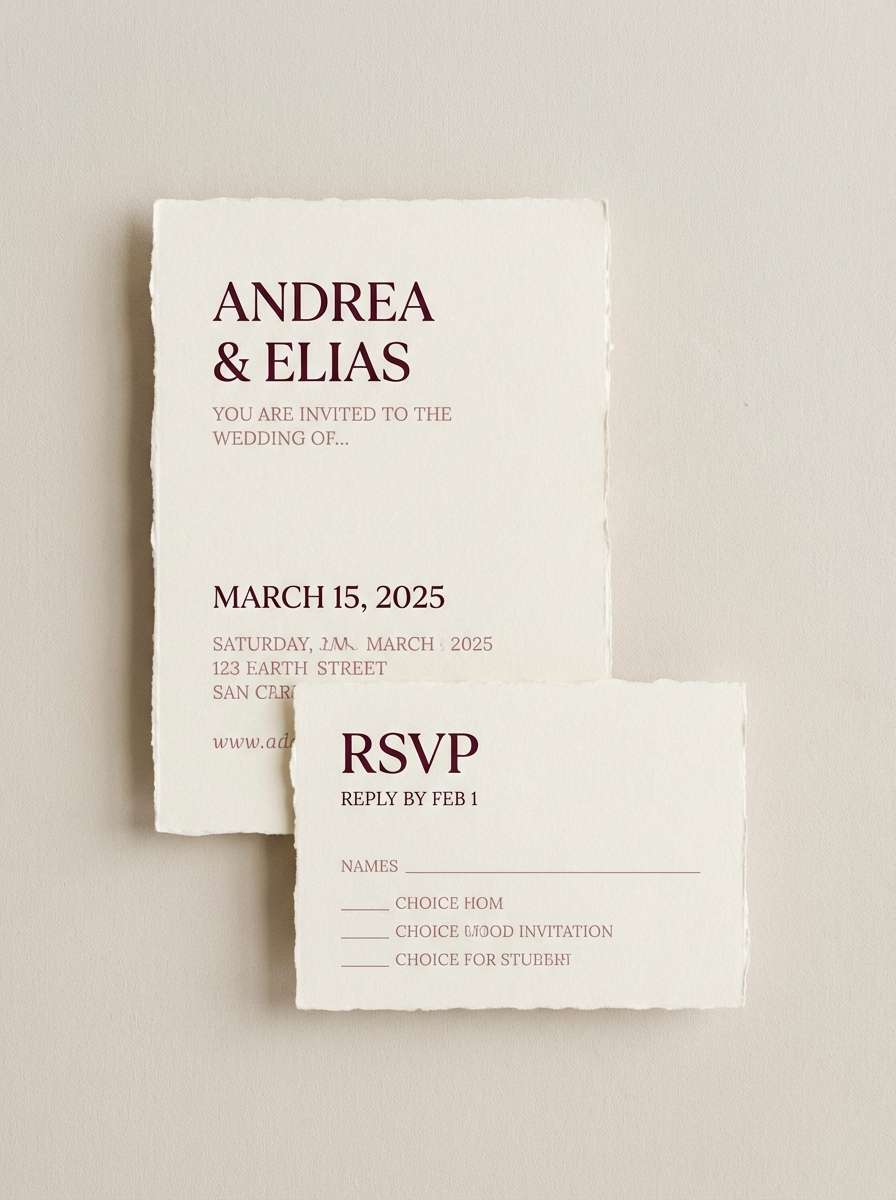
5) Garnet Rose Wedding
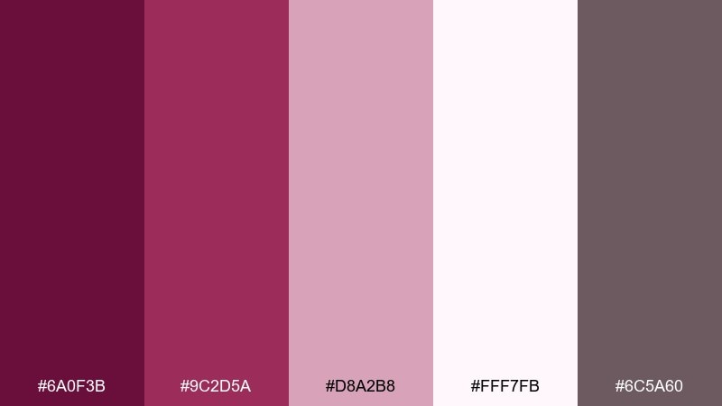
HEX: #6A0F3B #9C2D5A #D8A2B8 #FFF7FB #6C5A60
Mood: romantic and formal
Best for: wedding invitations and RSVP cards
Romantic and formal, it suggests pressed roses, ribbon, and handwritten vows. Let the creamy white lead as the paper tone, then set typography in the garnet for a classic look. Use the dusty rose for borders, monograms, or envelope liners to keep everything cohesive. Tip: emboss a small accent in the deepest shade to add tactile elegance without heavy ink coverage.
Image example of garnet rose wedding generated using media.io
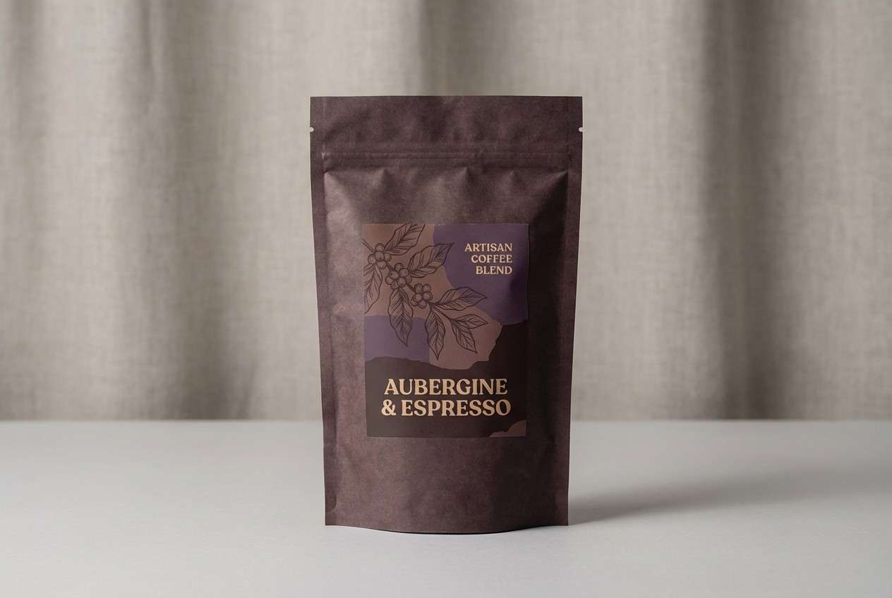
6) Aubergine Espresso
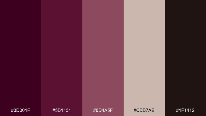
HEX: #3D001F #5B1131 #8D4A5F #CBB7AE #1F1412
Mood: cozy and artisanal
Best for: coffee packaging and labels
Cozy and artisanal, it feels like dark roast aromas and worn leather aprons. Use the aubergine and espresso tones for the main label blocks, then soften the look with the warm beige for background and ingredient callouts. The muted rose-brown is ideal for secondary badges and roast notes. Tip: add subtle grain texture to the lighter neutral to make the package feel handcrafted.
Image example of aubergine espresso generated using media.io
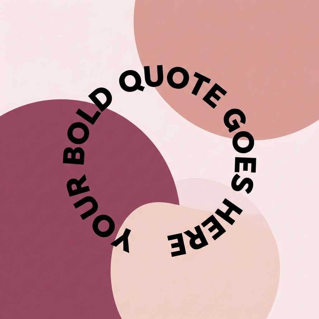
7) Mulberry Sunset
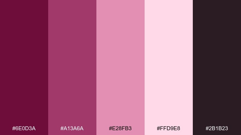
HEX: #6E0D3A #A13A6A #E28FB3 #FFD9E8 #2B1B23
Mood: playful and confident
Best for: social media quote templates
Playful and confident, it reads like a mulberry sky fading into soft blush. Use the bright mid tone for headline shapes and sticker-like highlights, while the dark shade keeps text crisp. The pale pink works beautifully as a background for readable, high-contrast posts. Tip: keep your type to two weights so the color energy stays the hero.
Image example of mulberry sunset generated using media.io
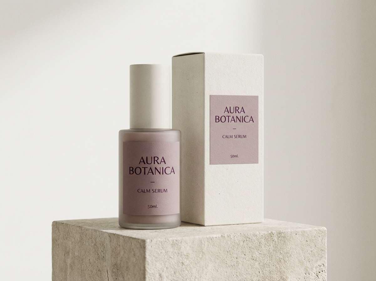
8) Dusty Mauve Minimal
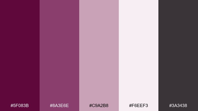
HEX: #5F083B #8A3E6E #C9A2B8 #F6EEF3 #3A3438
Mood: soft and minimalist
Best for: skincare ads and landing pages
Soft and minimalist, it evokes clean linen, gentle scents, and calm routines. Keep the background on the near-white tint, then use the mauve tones for section headers and subtle gradients. The deeper purple makes an elegant CTA button color without shouting. Tip: pair with plenty of whitespace and thin dividers to maintain that spa-like quiet.
Image example of dusty mauve minimal generated using media.io
9) Fig and Sage Home
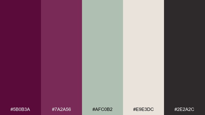
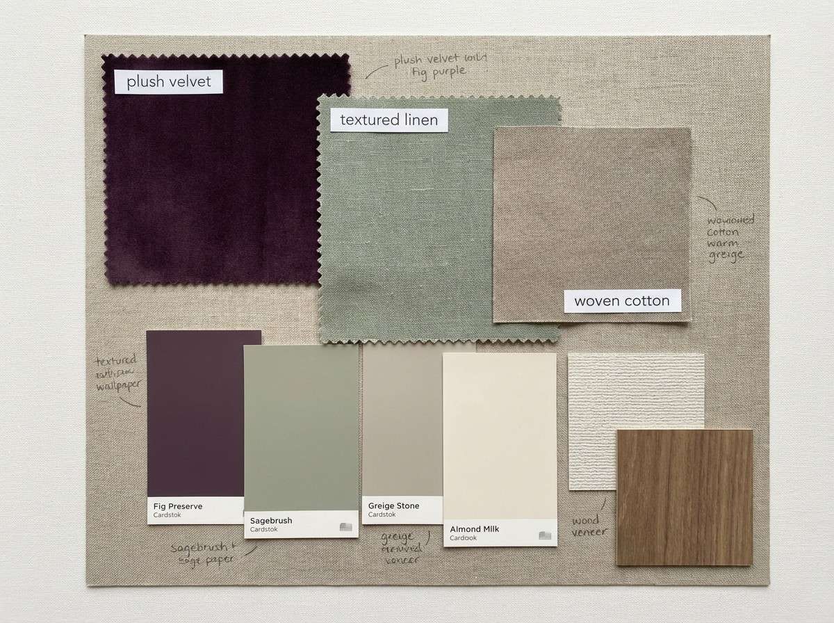
HEX: #5B0B3A #7A2A56 #AFC0B2 #E9E3DC #2E2A2C
Mood: grounded and sophisticated
Best for: interior moodboards and paint pairings
Grounded and sophisticated, it feels like ripe figs next to fresh-cut herbs. The muted sage cools down the purple and makes the whole mix more livable for walls, textiles, and styling. Use the warm greige as your base so the darker tones can appear in smaller, intentional moments. Tip: repeat sage in at least two elements (rug plus cushion, or tile plus plant pot) to unify the space.
Image example of fig and sage home generated using media.io
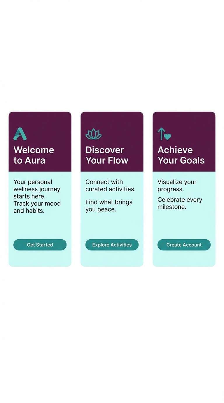
10) Tyrian Teal Contrast
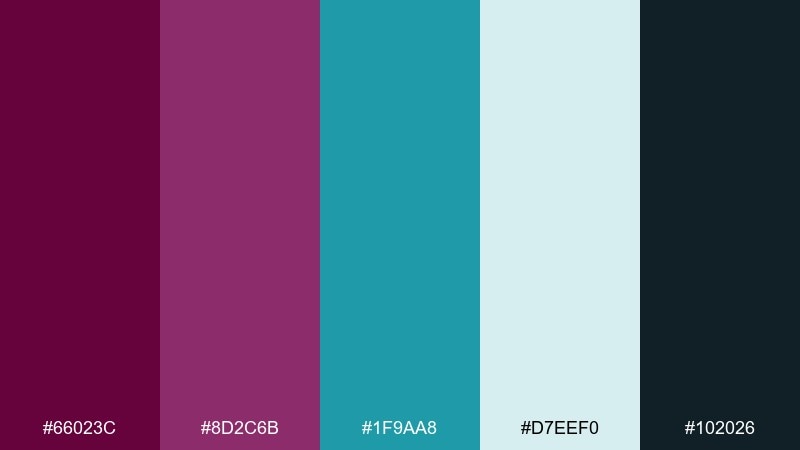
HEX: #66023C #8D2C6B #1F9AA8 #D7EEF0 #102026
Mood: bold and contemporary
Best for: app onboarding screens
Bold and contemporary, it looks like jewel tones lit by crisp ocean air. These tyrian purple color combinations shine when teal is used for highlights, progress states, and micro-interactions. Keep the light aqua as a background wash so the dark tones stay readable on mobile. Tip: pick one accent role for teal (like links only) to prevent the interface from feeling noisy.
Image example of tyrian teal contrast generated using media.io
11) Berry Ink Editorial
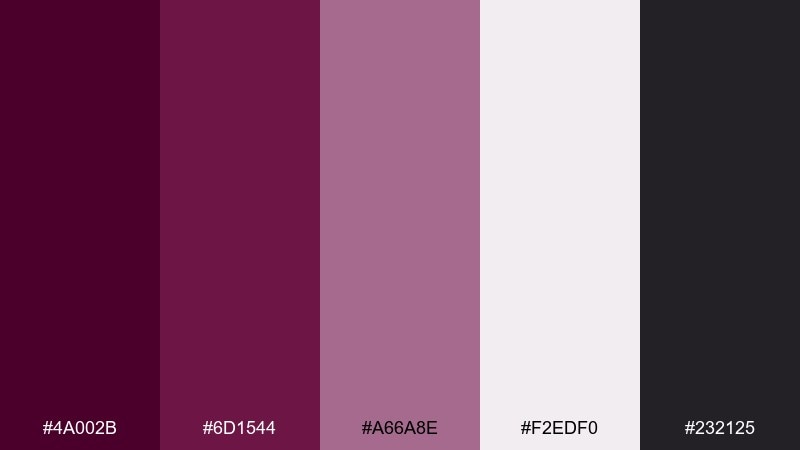
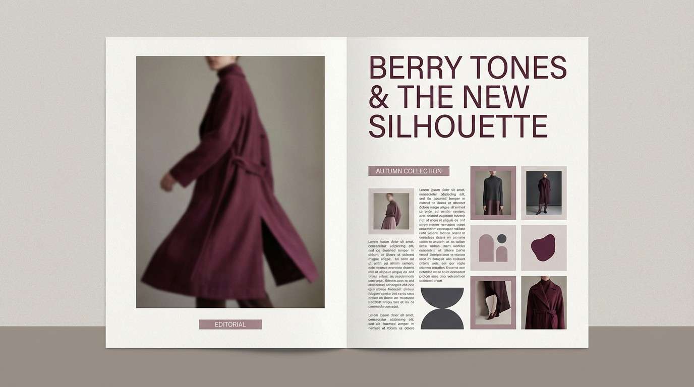
HEX: #4A002B #6D1544 #A66A8E #F2EDF0 #232125
Mood: smart and editorial
Best for: magazine layouts and lookbooks
Smart and editorial, it suggests berry ink on creamy paper with sharp black type. Use the darkest shade for headings and pull quotes, while the muted mid tone can label sections or highlight key stats. The pale neutral keeps photography and copy from feeling heavy. Tip: limit accent blocks to one per spread so the page stays premium and readable.
Image example of berry ink editorial generated using media.io
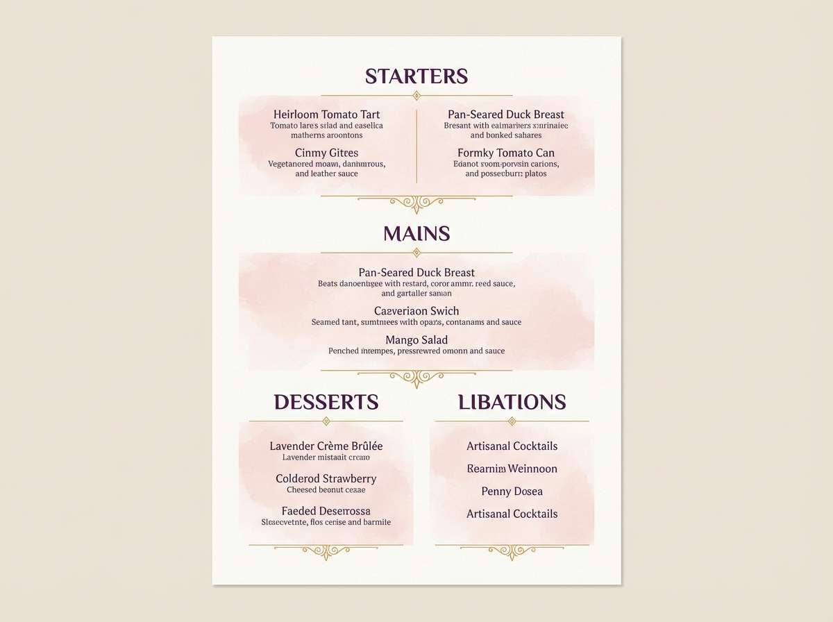
12) Amethyst Candlelight
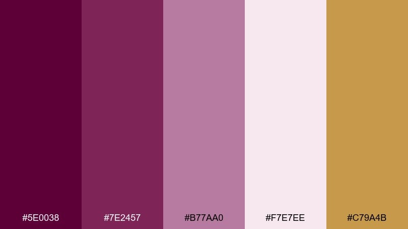
HEX: #5E0038 #7E2457 #B77AA0 #F7E7EE #C79A4B
Mood: warm and intimate
Best for: restaurant menus and wine lists
Warm and intimate, it feels like amethyst glass catching candlelight. The soft blush background keeps long menus approachable, while the deep purple creates strong hierarchy for section titles. Use the amber-gold sparingly for prices, wine badges, or small rules to add glow. Tip: choose a classic serif for headings to match the romantic, evening vibe.
Image example of amethyst candlelight generated using media.io
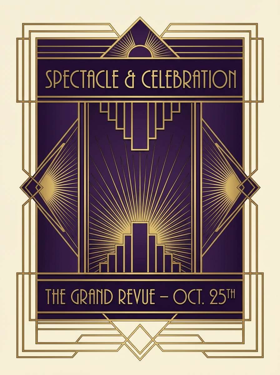
13) Violet Brass Deco
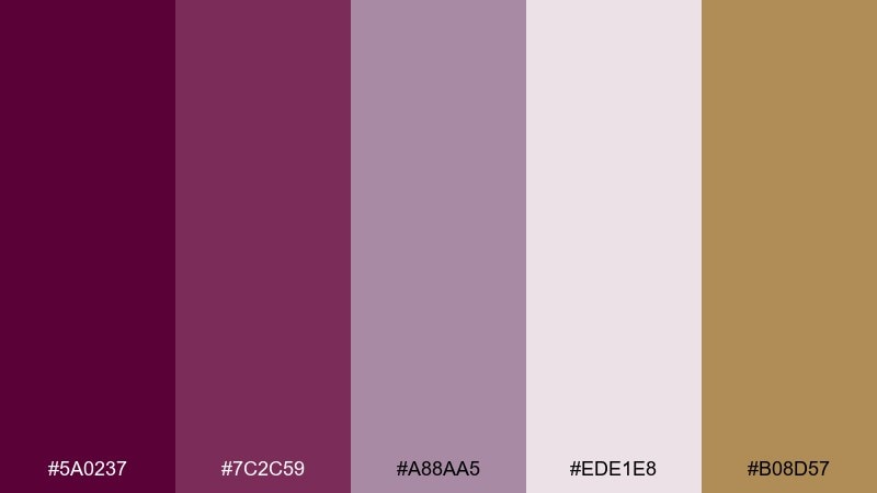
HEX: #5A0237 #7C2C59 #A88AA5 #EDE1E8 #B08D57
Mood: art deco and luxe
Best for: themed posters and invitations
Art deco and luxe, it channels brass fixtures, geometric patterns, and smoky lounges. Pair the deep violet with brass lines to frame content and create that iconic deco symmetry. The pale mauve works well as a backdrop for patterned borders without overpowering the typography. Tip: keep shapes crisp and angular, and avoid overly soft gradients to stay period-true.
Image example of violet brass deco generated using media.io
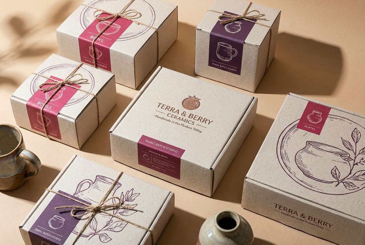
14) Raspberry Clay
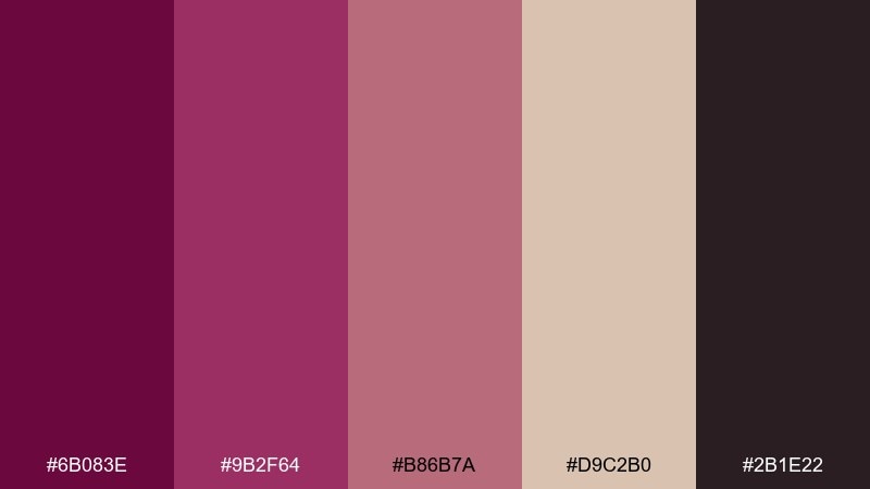
HEX: #6B083E #9B2F64 #B86B7A #D9C2B0 #2B1E22
Mood: earthy and creative
Best for: ceramics packaging and maker labels
Earthy and creative, it feels like raspberry glaze on hand-thrown clay. The warm beige and rose-brown balance the darker purple so labels don't look too formal. Use the near-black for small type and barcodes, and keep the mid raspberry for brand marks or stamps. Tip: print on uncoated stock to enhance the handmade, tactile mood.
Image example of raspberry clay generated using media.io
15) Lavender Smoke
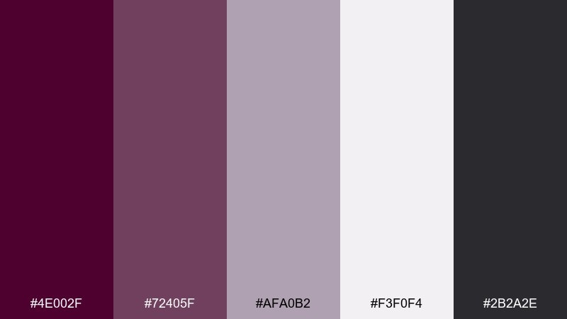
HEX: #4E002F #72405F #AFA0B2 #F3F0F4 #2B2A2E
Mood: calm and professional
Best for: minimal presentation templates
Calm and professional, it resembles lavender mist over charcoal stone. Use the soft gray-lavender as your slide background and reserve the deep purple for titles and key numbers. The smoky mid tone is ideal for charts, dividers, and subtle callouts. Tip: keep imagery desaturated so the palette maintains a quiet, polished rhythm.
Image example of lavender smoke generated using media.io
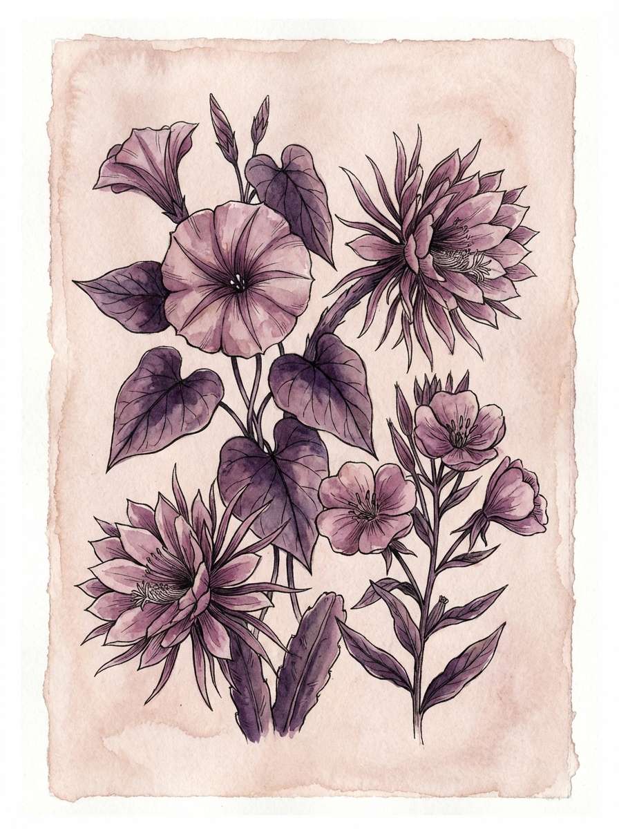
16) Night Bloom Botanicals
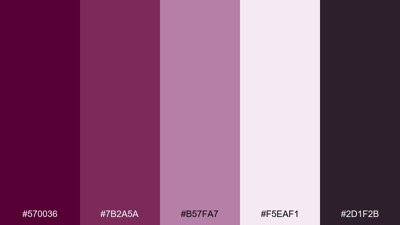
HEX: #570036 #7B2A5A #B57FA7 #F5EAF1 #2D1F2B
Mood: romantic and atmospheric
Best for: watercolor botanical illustrations
Romantic and atmospheric, it feels like flowers opening after dusk. Let the pale blush act as paper, then layer the mid purples into petals for soft depth. The darkest shade makes beautiful stems, shadows, and fine line details without turning harsh. Tip: keep edges loose and transparent so the painting stays airy rather than heavy.
Image example of night bloom botanicals generated using media.io
17) Wine and Winter Wool
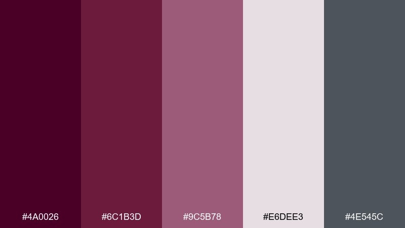
HEX: #4A0026 #6C1B3D #9C5B78 #E6DEE3 #4E545C
Mood: cozy and upscale
Best for: fashion lookbook covers
Cozy and upscale, it evokes wool coats, wine bars, and overcast city streets. Use the wine shade for a strong masthead and let the cool gray support secondary type and minimal lines. The soft neutral works well for negative space around product shots. Tip: add one monochrome photo treatment so the palette stays the focal point.
Image example of wine and winter wool generated using media.io
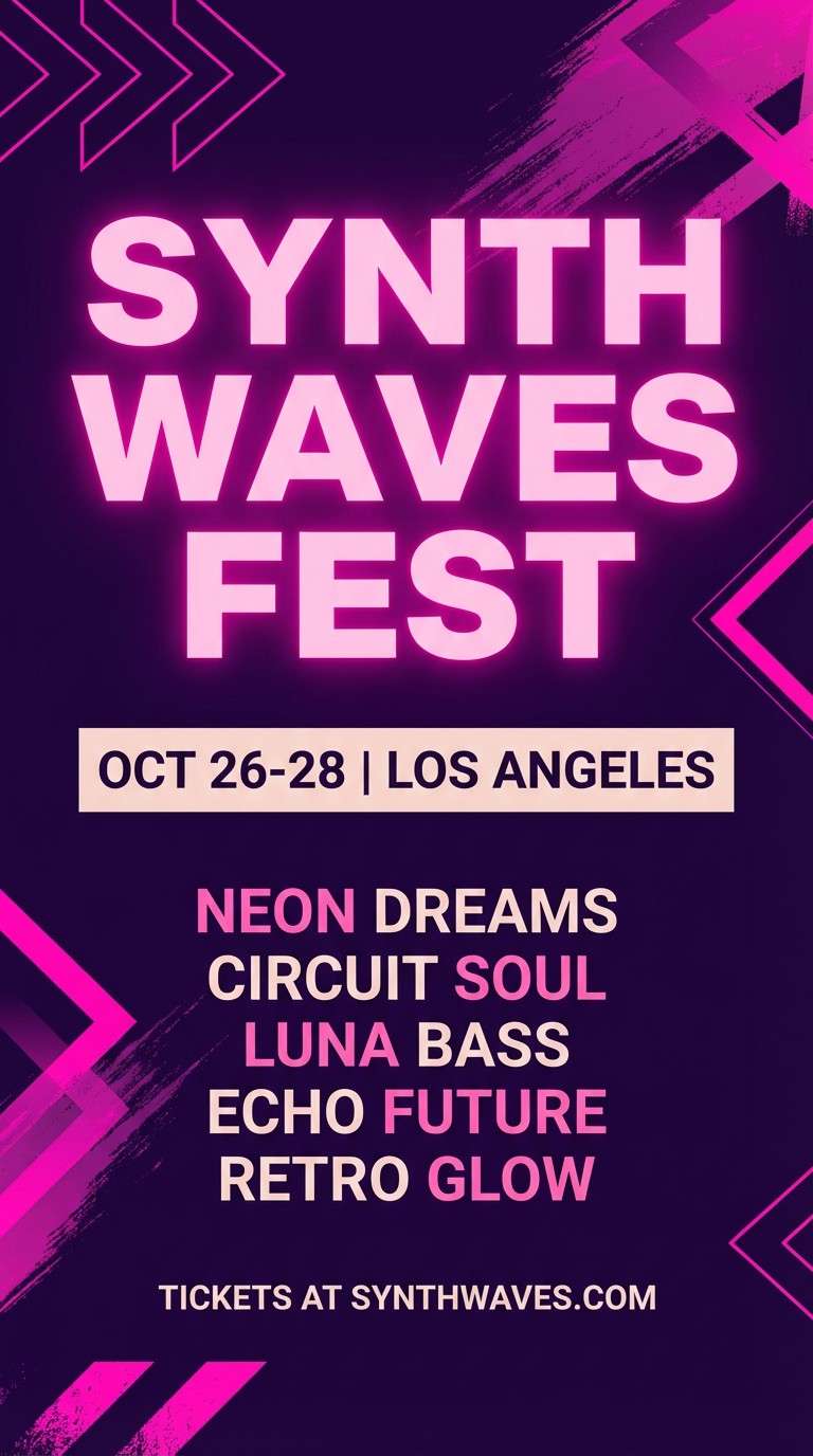
18) Royal Berry Neon

HEX: #5C0034 #8A1D63 #FF4FB3 #F5E6F0 #160A12
Mood: electric and youthful
Best for: music festival flyers
Electric and youthful, it feels like neon signage bouncing off dark walls. These tyrian purple color combinations work best when the hot pink is treated as a spotlight, not a base. Keep the background deep and clean, then use the pale tint to give text breathing room. Tip: stick to big, simple shapes so the neon accent reads instantly from a distance.
Image example of royal berry neon generated using media.io
19) Burgundy Blush Commerce
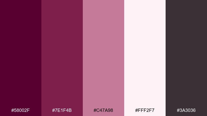
HEX: #58002F #7E1F4B #C47A98 #FFF2F7 #3A3036
Mood: elegant and inviting
Best for: jewelry ecommerce hero banners
Elegant and inviting, it suggests velvet ring boxes and soft boutique lighting. Use the blush-white as your banner background and set the product name in the burgundy for high-end contrast. The rose tone is perfect for badges like free shipping or limited edition. Tip: keep shadows subtle so metal and gemstones remain the center of attention.
Image example of burgundy blush commerce generated using media.io

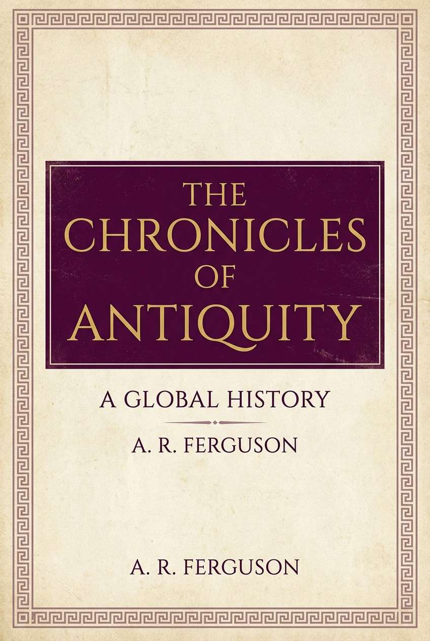
20) Phoenician Classic
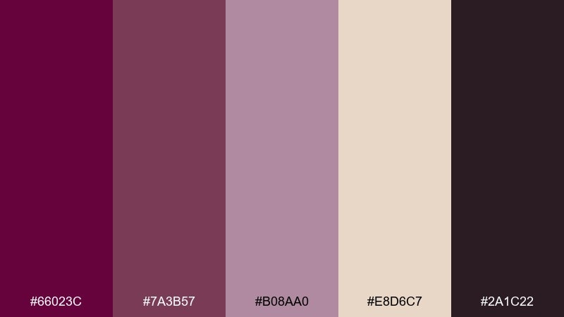
HEX: #66023C #7A3B57 #B08AA0 #E8D6C7 #2A1C22
Mood: historic and authoritative
Best for: history book covers
Historic and authoritative, it echoes dyed textiles, aged stone, and maritime trade routes. The tyrian purple color palette feels especially convincing when paired with parchment neutrals and restrained typography. Use the darkest shade for the title block, then let the warm beige suggest archival paper and credibility. Tip: add a subtle pattern or border inspired by ancient motifs, but keep it low-contrast for a scholarly finish.
Image example of phoenician classic generated using media.io
What Colors Go Well with Tyrian Purple?
Tyrian purple pairs beautifully with warm neutrals (parchment, beige, greige) when you want a heritage or editorial feel. These tones soften the intensity and make long-form text layouts easier to read.
For a modern contrast, combine tyrian purple with cool accents like teal or aqua, plus near-black for typography. This creates crisp hierarchy and a contemporary edge without losing the richness.
If your goal is luxury, add metallic notes (gold, brass, amber) sparingly as trims, rules, icons, or price highlights. Small doses look premium; too much can feel loud.
How to Use a Tyrian Purple Color Palette in Real Designs
Start with roles: choose one deep tyrian purple as the anchor, one light neutral for backgrounds, and one accent for highlights (gold for luxury, teal for modern, blush for romance). This keeps the design consistent across pages and formats.
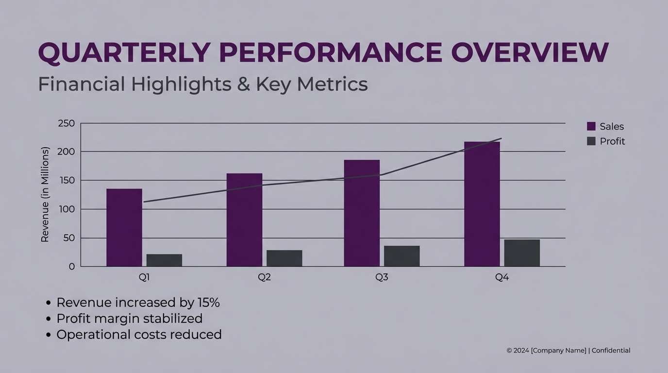
In UI, reserve the darkest purple for navigation, primary buttons, or key headers, and use off-whites for surfaces to maintain contrast. For charts and states, pick one mid-purple and apply it consistently to avoid a “rainbow” dashboard.
In print, tyrian purple looks best when you avoid over-saturated gradients and instead lean into matte textures, subtle patterns, and carefully spaced typography. Let the color do the storytelling while the layout stays calm.
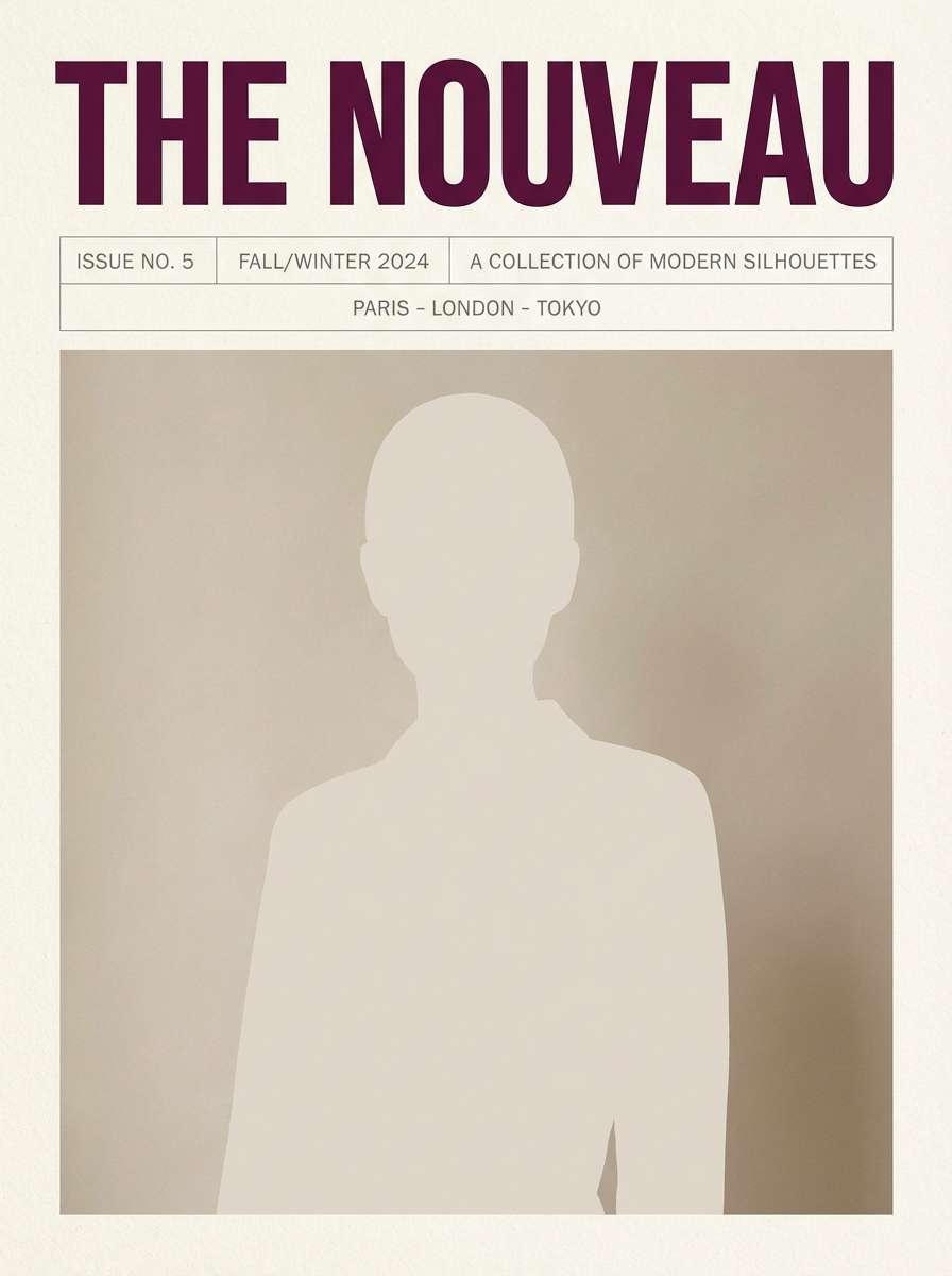
Create Tyrian Purple Palette Visuals with AI
If you already have HEX codes, you can quickly turn a palette into posters, UI mockups, brand boards, and product-style images by describing the layout and lighting you want. The key is to specify where tyrian purple appears (background, headline, accents) so the result matches your design intent.
Try generating a few variations by changing only one element at a time—like swapping gold accents for teal, or switching from a parchment background to a soft off-white. That’s a fast way to explore multiple tyrian purple color combinations without rebuilding from scratch.
When your favorite direction emerges, keep the same prompt structure and update just the subject (menu, invitation, landing page) to maintain a cohesive visual system.
Tyrian Purple Color Palette FAQs
-
What is a tyrian purple color palette?
A tyrian purple color palette is a set of coordinated colors built around tyrian purple (a deep, reddish-purple) plus supporting neutrals and accents for contrast, readability, and brand mood. -
Is tyrian purple warm or cool?
Tyrian purple typically leans warm because it carries red/wine undertones, but it can feel cooler when paired with charcoal, lavender tints, or teal accents. -
What neutral colors work best with tyrian purple?
Parchment, greige, blush-white, and soft off-whites help tyrian purple feel refined and readable. For sharper contrast, pair it with near-black or deep charcoal for type. -
What’s a good accent color for tyrian purple in branding?
Gold/brass is a classic luxury accent, while teal/aqua creates a bold modern contrast. Dusty rose or mauve accents make the palette feel romantic and approachable. -
How do I use tyrian purple in UI without making it too dark?
Use tyrian purple as a navigation or primary button color, then keep most surfaces off-white. Reserve near-black for body text and use a single accent (like teal) for links or highlights. -
Does tyrian purple print well?
Yes, especially on matte stocks and with warm neutrals like parchment. For best results, avoid overly saturated gradients and keep fine details high-contrast so they don’t fill in. -
How can I generate tyrian purple palette images quickly?
Use a text-to-image tool and describe the design type (brand board, poster, UI screen) and where each palette color should appear. Reuse the same prompt structure to generate consistent variations.
Next: Glamorous Color Palette


