

A glamorous color palette is all about polish: rich contrast, intentional highlights, and a finish that feels premium in seconds. Whether you’re designing for beauty, fashion, events, or UI, glamorous palettes help your work look more expensive and more confident.
Below are 20+ glamorous color palette ideas with HEX codes, plus AI image prompts you can use to visualize the vibe quickly for branding, social templates, packaging, and interfaces.
In this article
- Why Glamorous Palettes Work So Well
-
- champagne velvet
- midnight opal
- rose gold noir
- emerald spotlight
- amethyst martini
- sapphire lace
- pearl champagne
- garnet gilded
- smoked topaz
- silver stiletto
- blush satin
- bronze afterparty
- ice diamond
- velvet orchid
- golden hour silk
- teal sequin
- caviar cream
- ruby pearl
- platinum peony
- obsidian cherry
- aurora gold dust
- What Colors Go Well with Glamorous?
- How to Use a Glamorous Color Palette in Real Designs
- Create Glamorous Palette Visuals with AI
Why Glamorous Palettes Work So Well
Glamorous palettes create instant hierarchy: deep bases (black, espresso, navy) make space for highlights (gold, pearl, blush) that naturally pull the eye to logos, CTAs, and key details.
They also communicate quality through restraint. Instead of many competing colors, a glamorous scheme often uses a tight range plus one “jewelry” accent, which feels curated and intentional.
Finally, glamorous color combinations photograph and render beautifully across mediums—print finishes like foil and embossing, and digital effects like glow, gradients, and soft shadows.
20+ Glamorous Color Palette Ideas (with HEX Codes)
1) Champagne Velvet
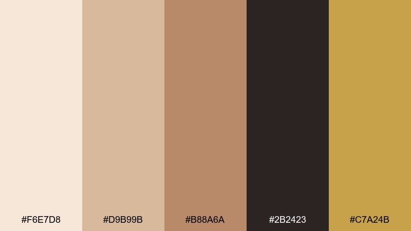
HEX: #F6E7D8 #D9B99B #B88A6A #2B2423 #C7A24B
Mood: warm, luxe, inviting
Best for: beauty product packaging
Warm velvet neutrals and a muted gold accent evoke candlelit dressing rooms and satin textures. This glamorous color palette works beautifully on cosmetic boxes, labels, and premium skincare branding. Pair it with matte black typography and plenty of negative space to keep it upscale. Usage tip: use the gold as a spot-foil highlight for logos or seals only.
Image example of champagne velvet generated using media.io
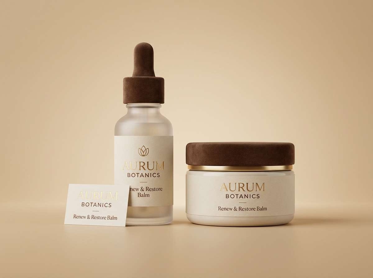
Media.io is an online AI studio for creating and editing video, image, and audio in your browser.

2) Midnight Opal
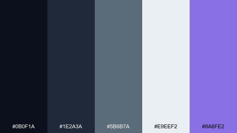
HEX: #0B0F1A #1E2A3A #5B6B7A #E9EEF2 #8A6FE2
Mood: moody, modern, luminous
Best for: saas dashboard ui
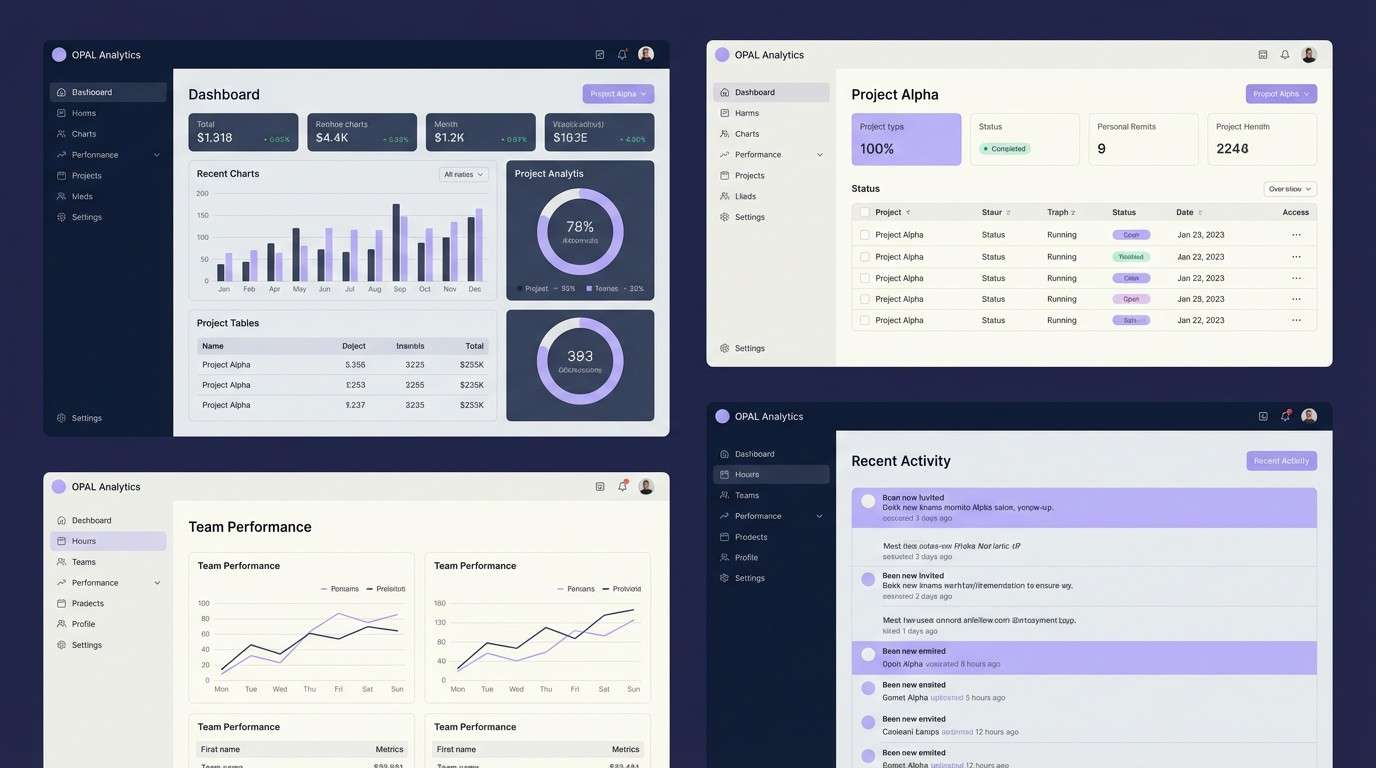
Moody midnight tones with an opal-like lavender glow feel sleek, focused, and slightly futuristic. The contrast supports dense data screens while keeping the interface calm. Pair with thin line icons and soft shadows for depth without clutter. Usage tip: reserve the lavender for primary actions and key status highlights.
Image example of midnight opal generated using media.io
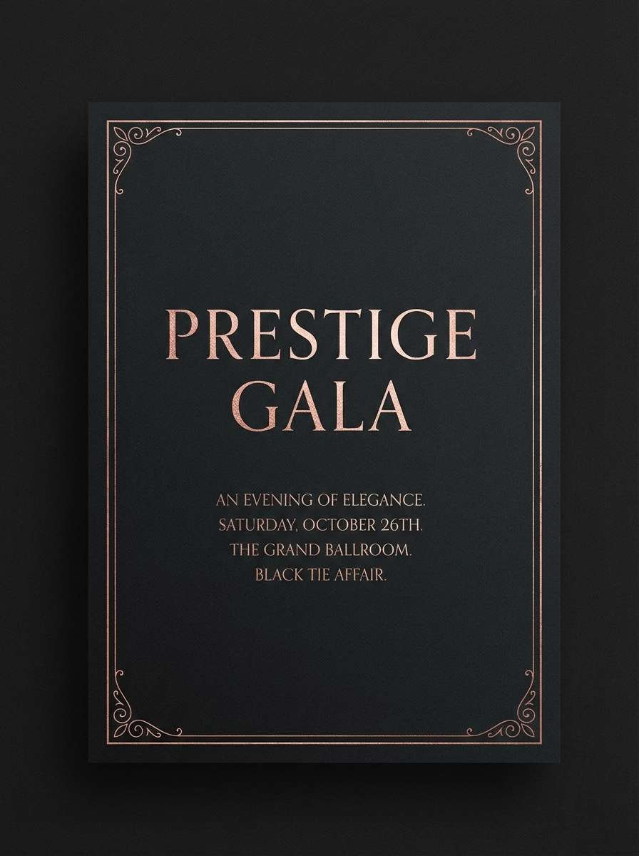
3) Rose Gold Noir
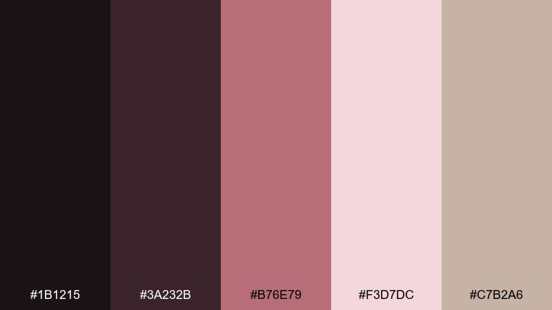
HEX: #1B1215 #3A232B #B76E79 #F3D7DC #C7B2A6
Mood: romantic, dramatic, refined
Best for: evening event invitation
Rose gold blush against inky noir reads like silk roses on a black-tie night. It shines on invitations, menus, and RSVP cards where you want romance without feeling overly sweet. Pair with serif headlines and thin geometric borders for a couture vibe. Usage tip: print the noir background and keep blush for type and linework to avoid muddiness.
Image example of rose gold noir generated using media.io
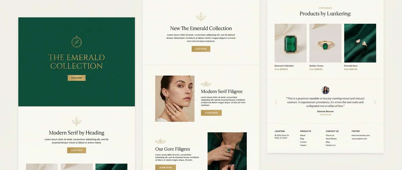
4) Emerald Spotlight
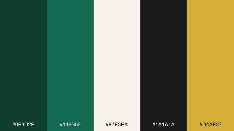
HEX: #0F3D2E #146B52 #F7F3EA #1A1A1A #D4AF37
Mood: confident, cinematic, premium
Best for: luxury brand landing page
Deep emerald and gold accents feel like a velvet curtain opening on a spotlight moment. These glamorous color combinations are ideal for hero sections, product highlights, and premium membership pages. Pair with ivory backgrounds for readability and use black for strong type contrast. Usage tip: keep gold limited to icons and micro-interactions so it stays special.
Image example of emerald spotlight generated using media.io
5) Amethyst Martini
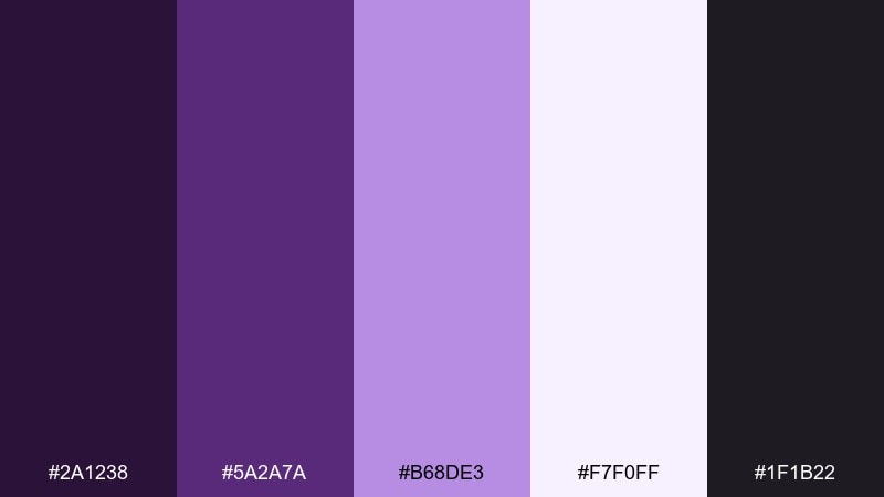
HEX: #2A1238 #5A2A7A #B68DE3 #F7F0FF #1F1B22
Mood: playful, nocturnal, chic
Best for: cocktail bar poster
Amethyst purples with a creamy glow evoke neon reflections in a polished martini glass. It suits nightlife posters, DJ lineups, and seasonal drink promos that need punch without harsh saturation. Pair with bold condensed type and simple geometric shapes. Usage tip: use the light lavender as the background so the dark tones read crisp.
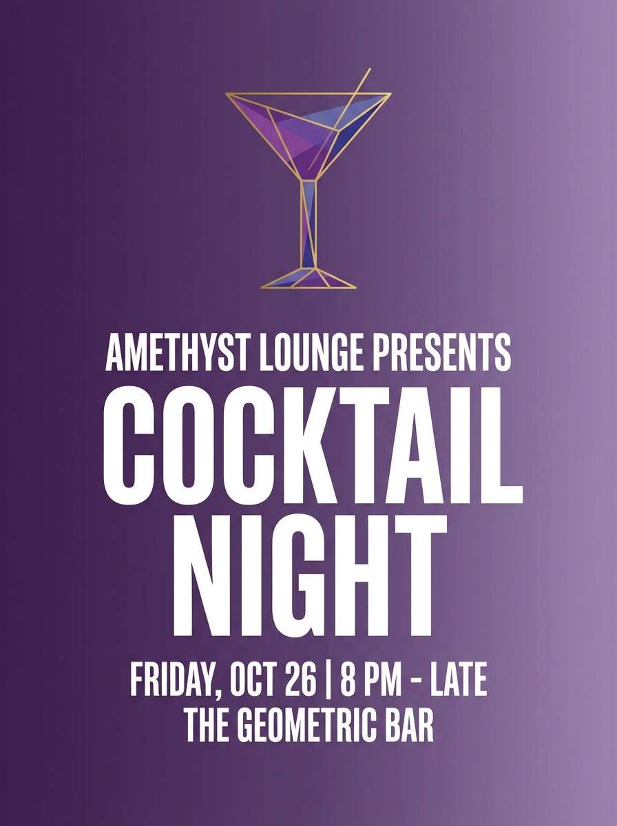
Image example of amethyst martini generated using media.io
6) Sapphire Lace
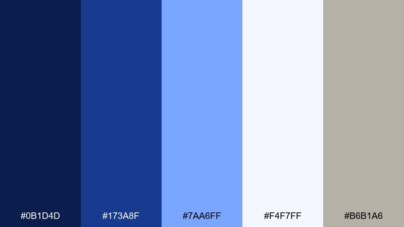
HEX: #0B1D4D #173A8F #7AA6FF #F4F7FF #B6B1A6
Mood: polished, airy, elegant
Best for: wedding website
Crisp sapphire blues and airy whites feel like lace details against a clear evening sky. The palette reads formal yet fresh for wedding sites, registry pages, and save-the-date banners. Pair with warm greige as a soft neutral to avoid an icy look. Usage tip: set body text in the deep navy for accessibility and a refined tone.
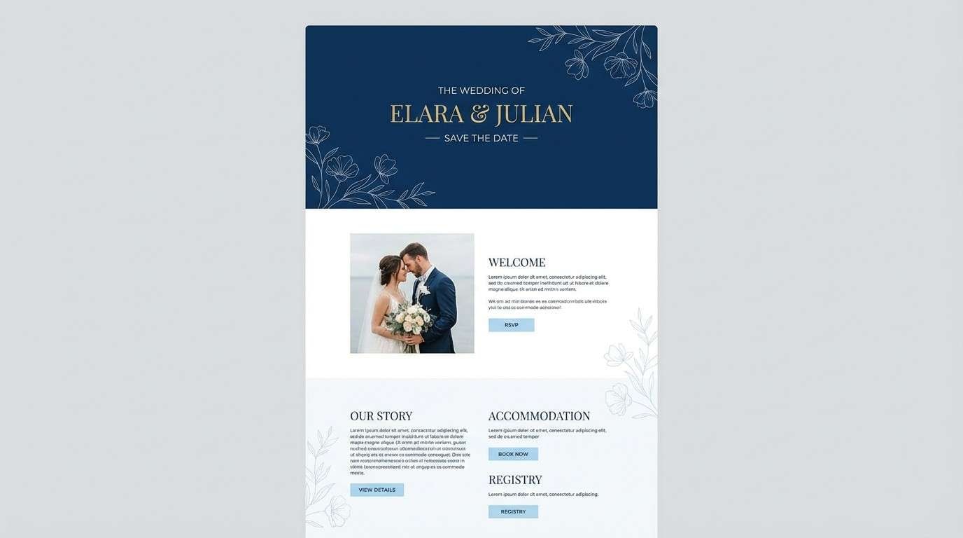
Image example of sapphire lace generated using media.io
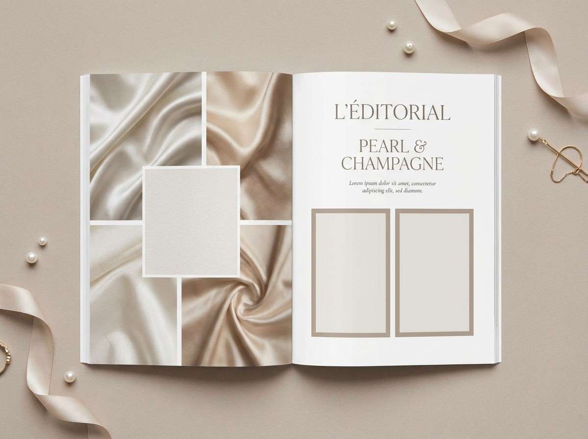
7) Pearl Champagne
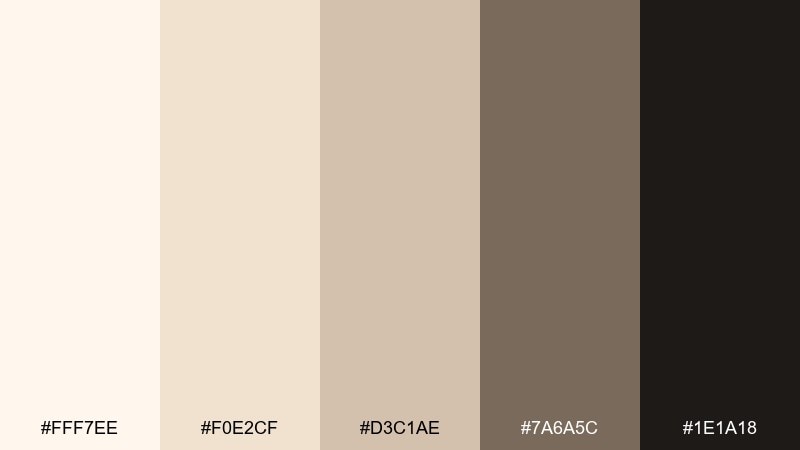
HEX: #FFF7EE #F0E2CF #D3C1AE #7A6A5C #1E1A18
Mood: soft, timeless, elevated
Best for: editorial magazine layout
Pearl and champagne neutrals bring a quiet luxury feel, like silk paper and subtle highlights. They are perfect for editorial spreads, lookbooks, and premium blog templates where photography should lead. Pair with charcoal text and warm taupe dividers for structure. Usage tip: keep headings in the darkest tone and let imagery supply the drama.
Image example of pearl champagne generated using media.io
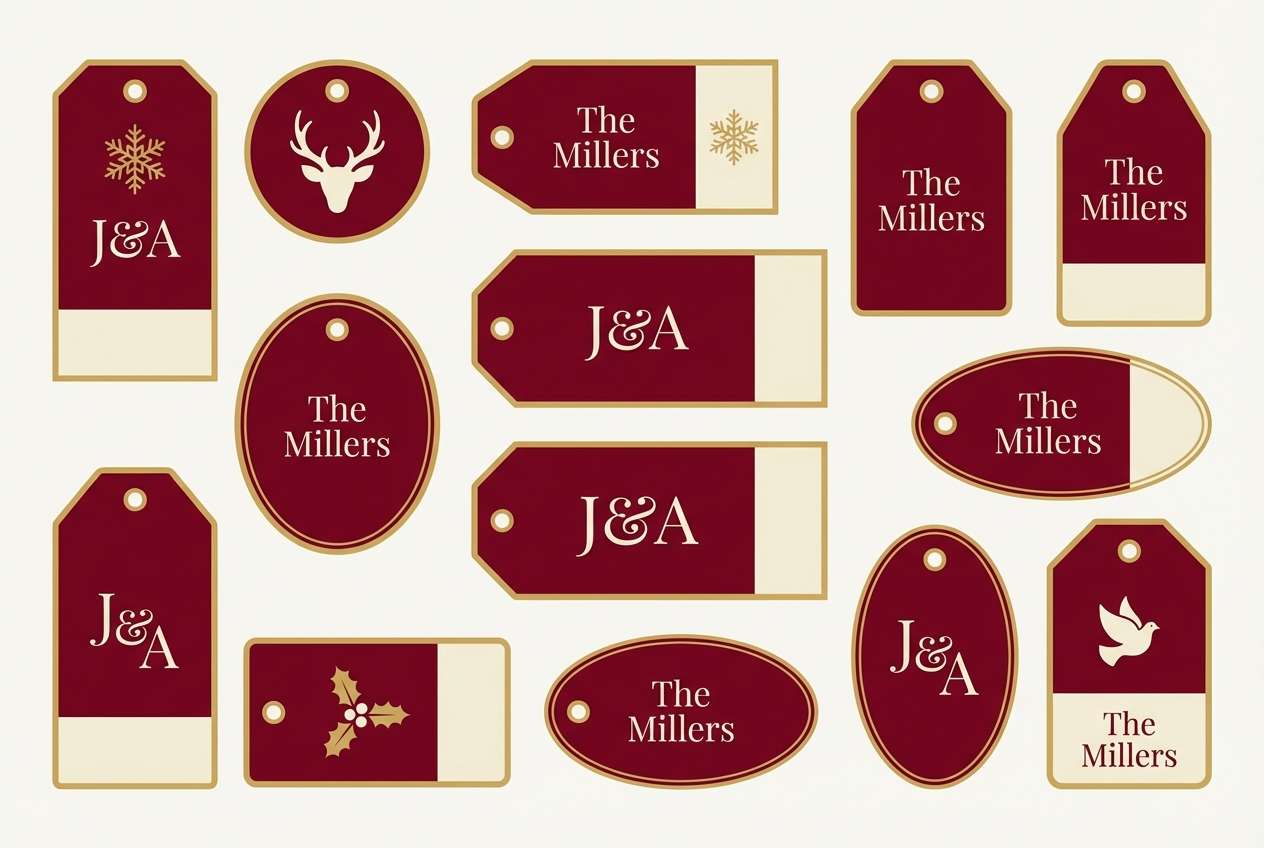
8) Garnet Gilded
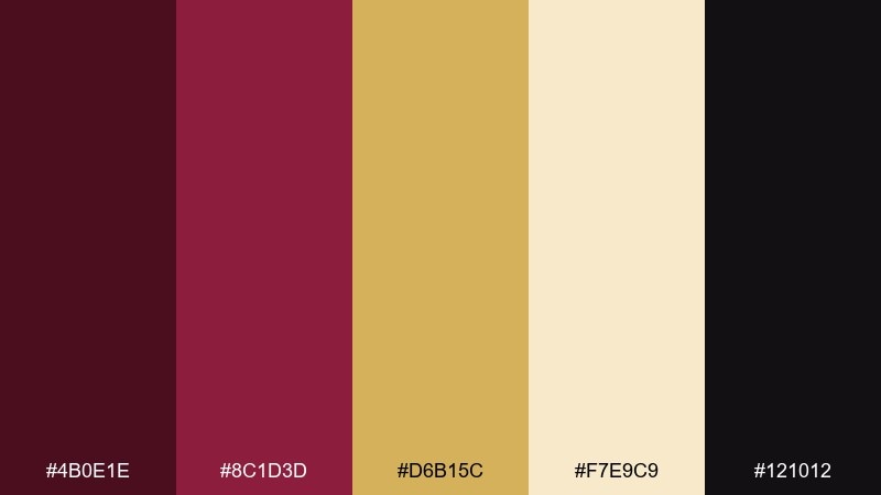
HEX: #4B0E1E #8C1D3D #D6B15C #F7E9C9 #121012
Mood: opulent, bold, celebratory
Best for: holiday gift tag set
Garnet reds and gilded gold feel like vintage ornaments and velvet ribbons. The contrast is strong for small-format designs like gift tags, stickers, and monogram cards. Pair with creamy highlights to keep the red from becoming too heavy. Usage tip: use the gold for borders and tiny icons, and let garnet carry the main fill areas.
Image example of garnet gilded generated using media.io
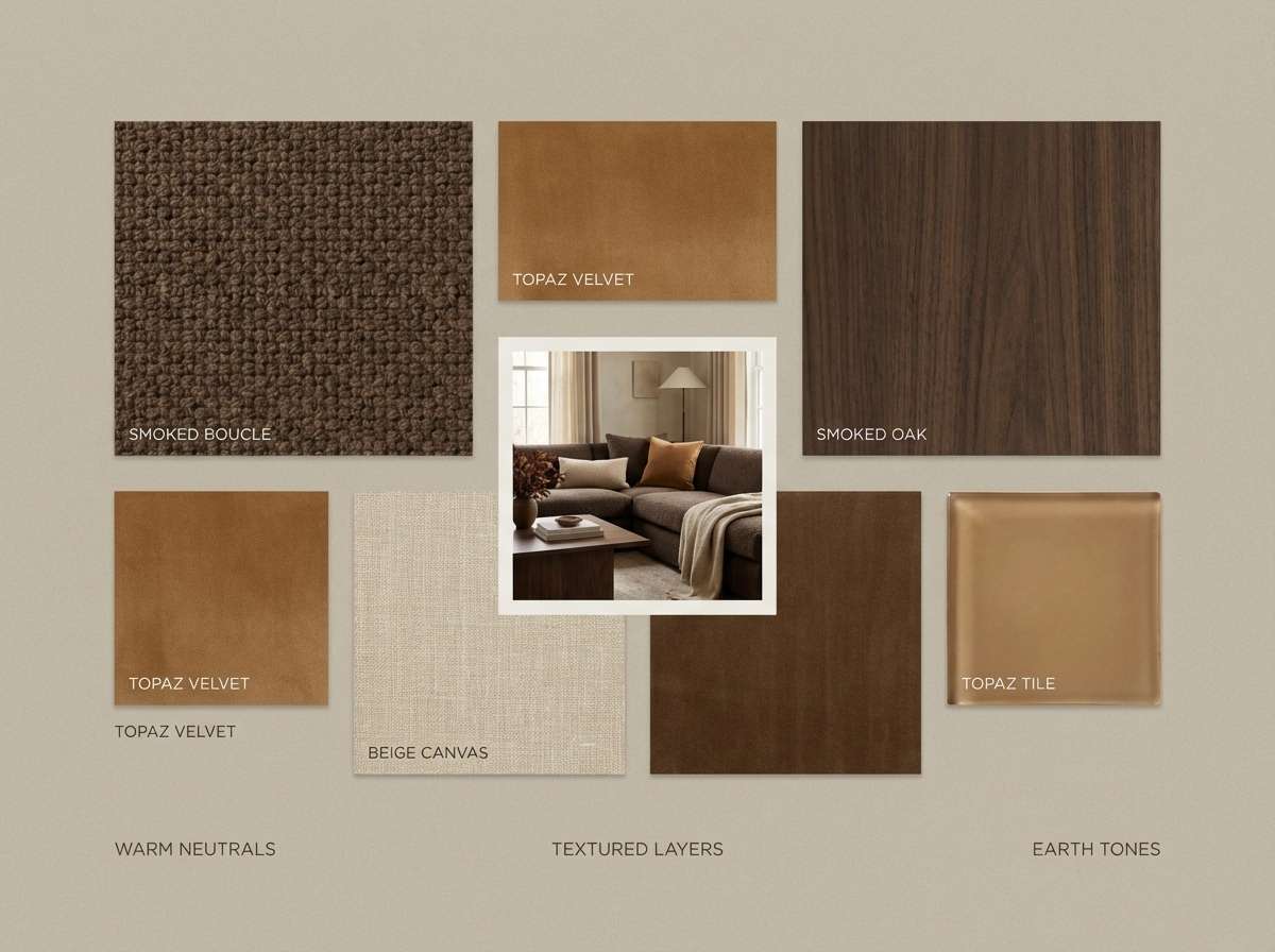
9) Smoked Topaz
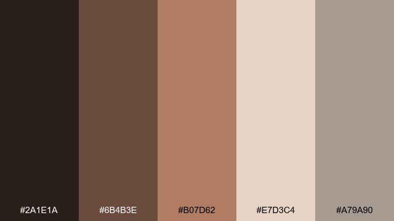
HEX: #2A1E1A #6B4B3E #B07D62 #E7D3C4 #A79A90
Mood: earthy, sensual, understated
Best for: interior design mood board
Smoked browns and topaz warmth evoke leather, woodgrain, and amber glass. It fits interior mood boards, boutique hotel branding, and lifestyle photography overlays. Pair with clean white margins and a single dark type style for a curated look. Usage tip: keep the light blush-beige as the canvas and layer darker tones in small blocks and captions.
Image example of smoked topaz generated using media.io
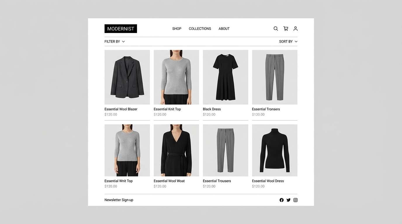
10) Silver Stiletto
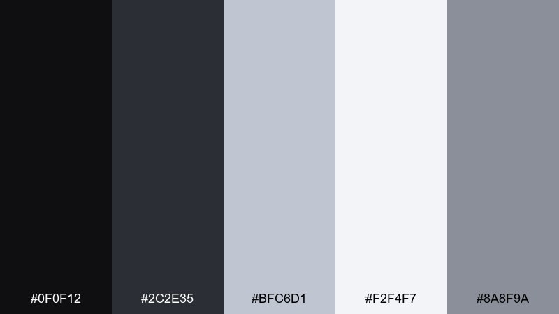
HEX: #0F0F12 #2C2E35 #BFC6D1 #F2F4F7 #8A8F9A
Mood: sleek, sharp, metropolitan
Best for: fashion ecommerce ui
Sharp blacks and silvers feel like chrome details on a runway stiletto. The neutral range keeps product photography front and center while still feeling high-end. Pair with generous whitespace and crisp grid cards for a premium shop experience. Usage tip: use the light gray for backgrounds and reserve true black for prices and key actions.
Image example of silver stiletto generated using media.io
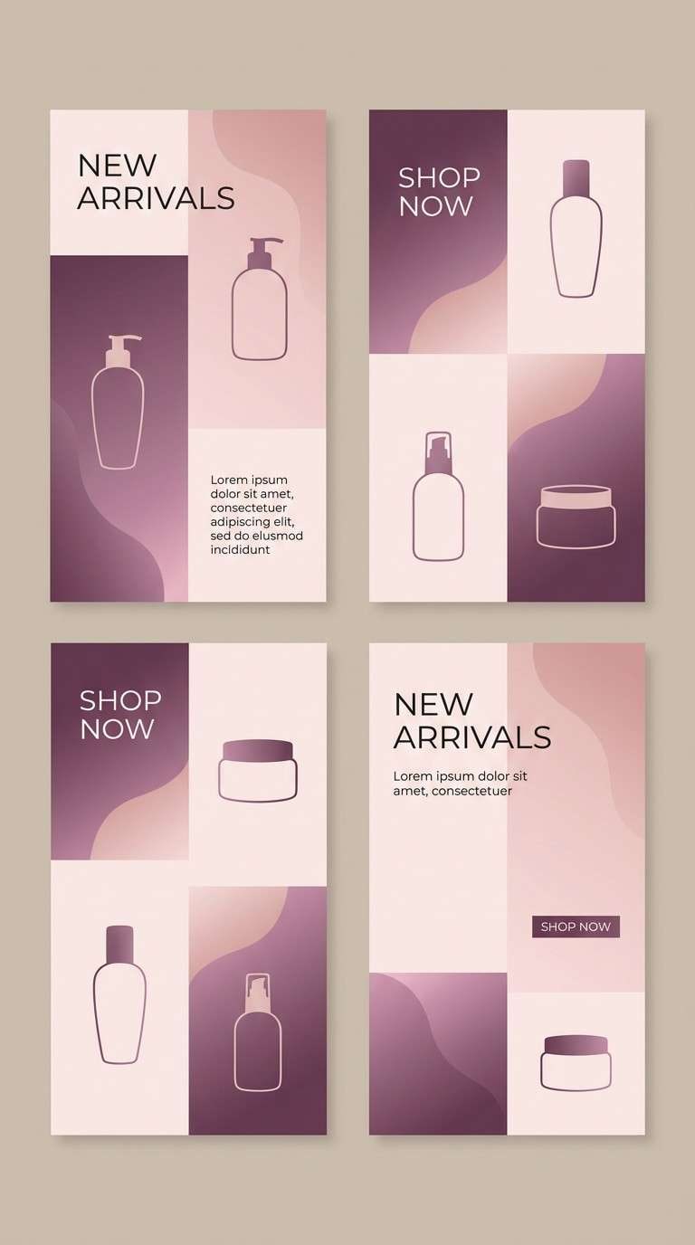
11) Blush Satin
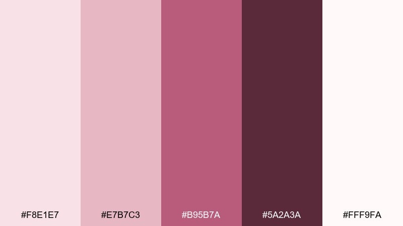
HEX: #F8E1E7 #E7B7C3 #B95B7A #5A2A3A #FFF9FA
Mood: soft, feminine, luminous
Best for: beauty instagram story templates
Blush and satin plum tones evoke soft-focus glow and delicate fabrics. They work well for story templates, promo slides, and creator media kits where you want warmth and polish. Pair with clean sans-serif type and minimal icons so the gradients feel intentional. Usage tip: keep text on the lightest blush panels and use plum only for emphasis.
Image example of blush satin generated using media.io
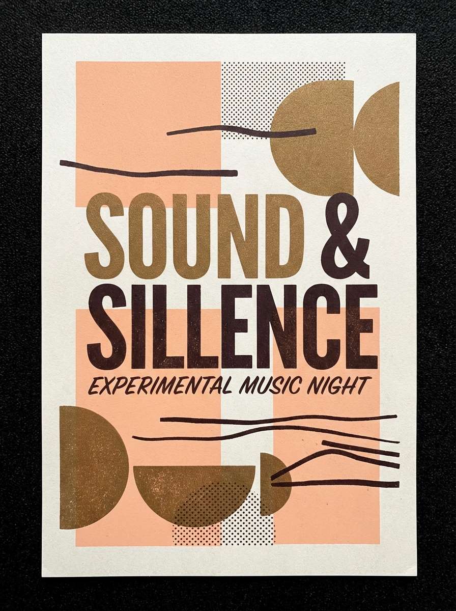
12) Bronze Afterparty
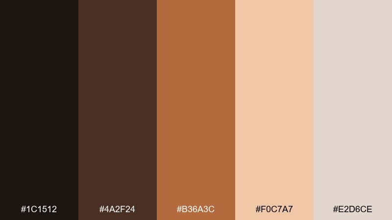
HEX: #1C1512 #4A2F24 #B36A3C #F0C7A7 #E2D6CE
Mood: spicy, nightlife, confident
Best for: music flyer design
Bronze heat and deep espresso shadows feel like dance-floor lights fading into dawn. The tones suit music flyers, club announcements, and bold social banners. Pair with oversized type and strong alignment for a modern edge. Usage tip: keep the peach highlight behind key text so it pops without needing neon.
Image example of bronze afterparty generated using media.io
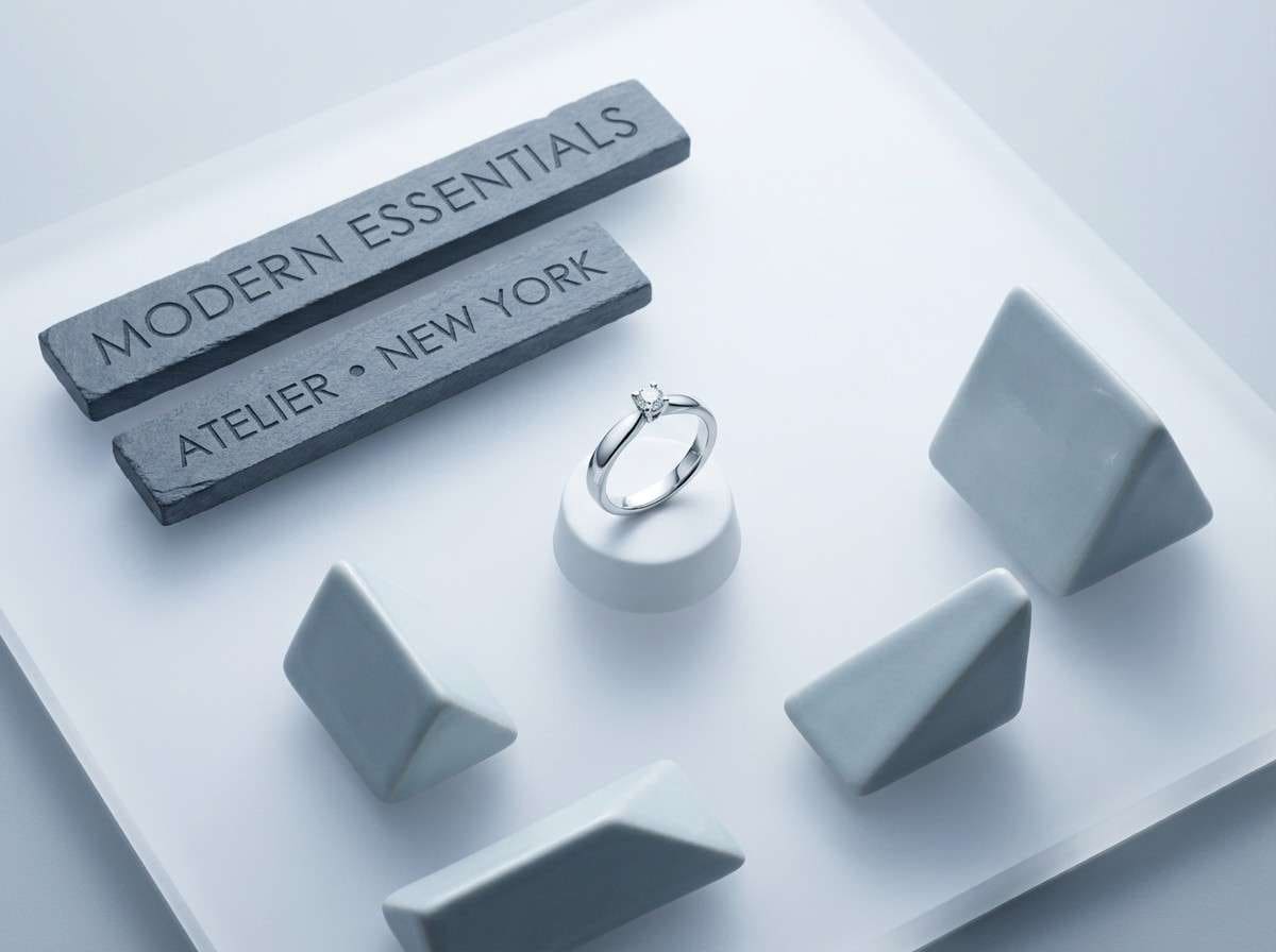
13) Ice Diamond
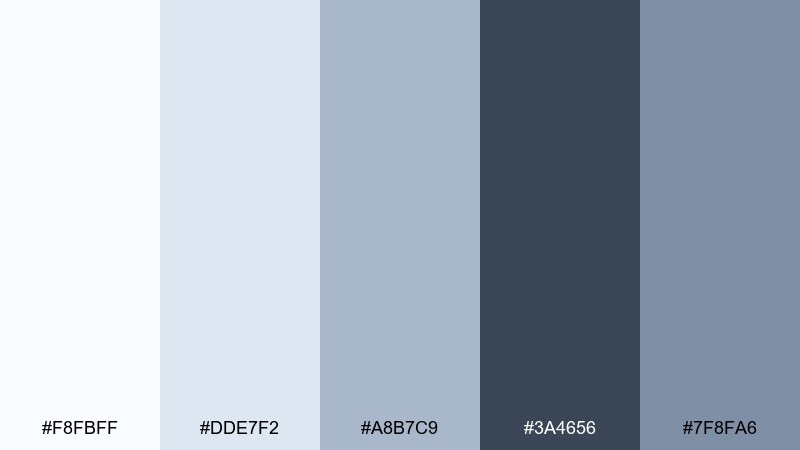
HEX: #F8FBFF #DDE7F2 #A8B7C9 #3A4656 #7F8FA6
Mood: clean, crystalline, upscale
Best for: jewelry product ad
Icy whites and cool slate tones evoke diamond sparkle and polished metal. It works for jewelry ads, minimal product pages, and premium lookbooks where detail matters. Pair with restrained line icons and a single dark headline style. Usage tip: use the slate for copy and let the palest tone act as a bright, gallery-like background.
Image example of ice diamond generated using media.io
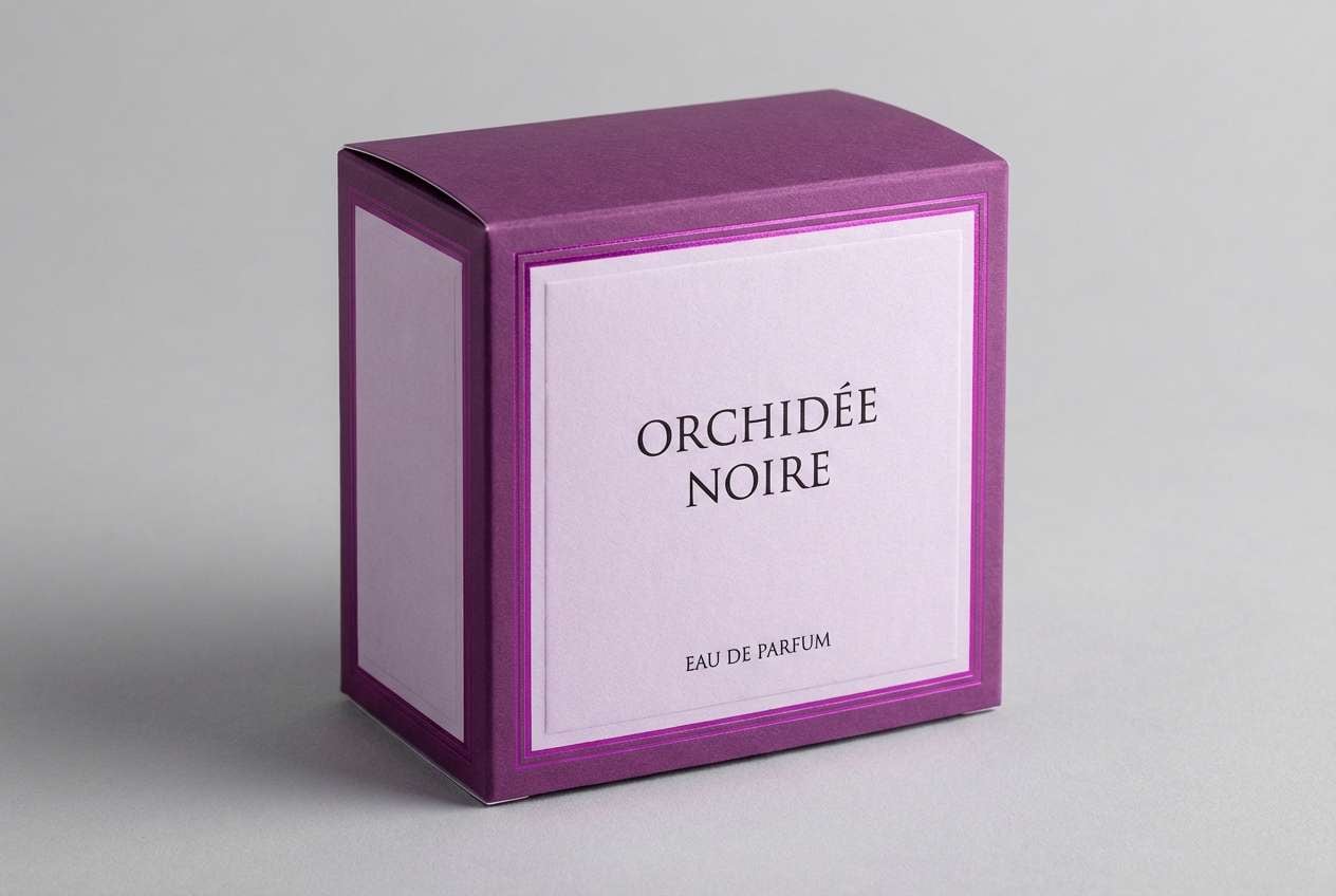
14) Velvet Orchid
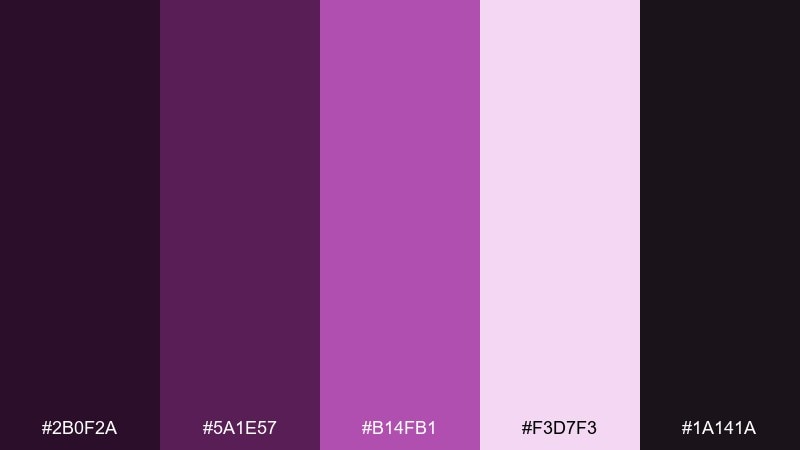
HEX: #2B0F2A #5A1E57 #B14FB1 #F3D7F3 #1A141A
Mood: luxurious, artistic, bold
Best for: perfume box design
Velvet orchid purples create a rich, theatrical mood, like petals under a spotlight. A glamorous color palette like this elevates perfume packaging and limited-edition drops. Pair with minimal black type and a single oversized logo mark for a couture finish. Usage tip: keep the brightest magenta as a small accent panel or foil detail.
Image example of velvet orchid generated using media.io
15) Golden Hour Silk
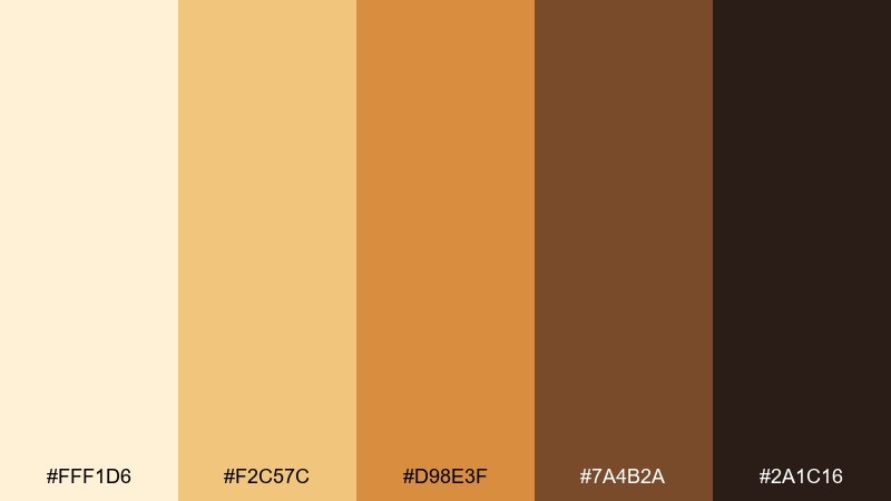
HEX: #FFF1D6 #F2C57C #D98E3F #7A4B2A #2A1C16
Mood: sunlit, cinematic, luxe
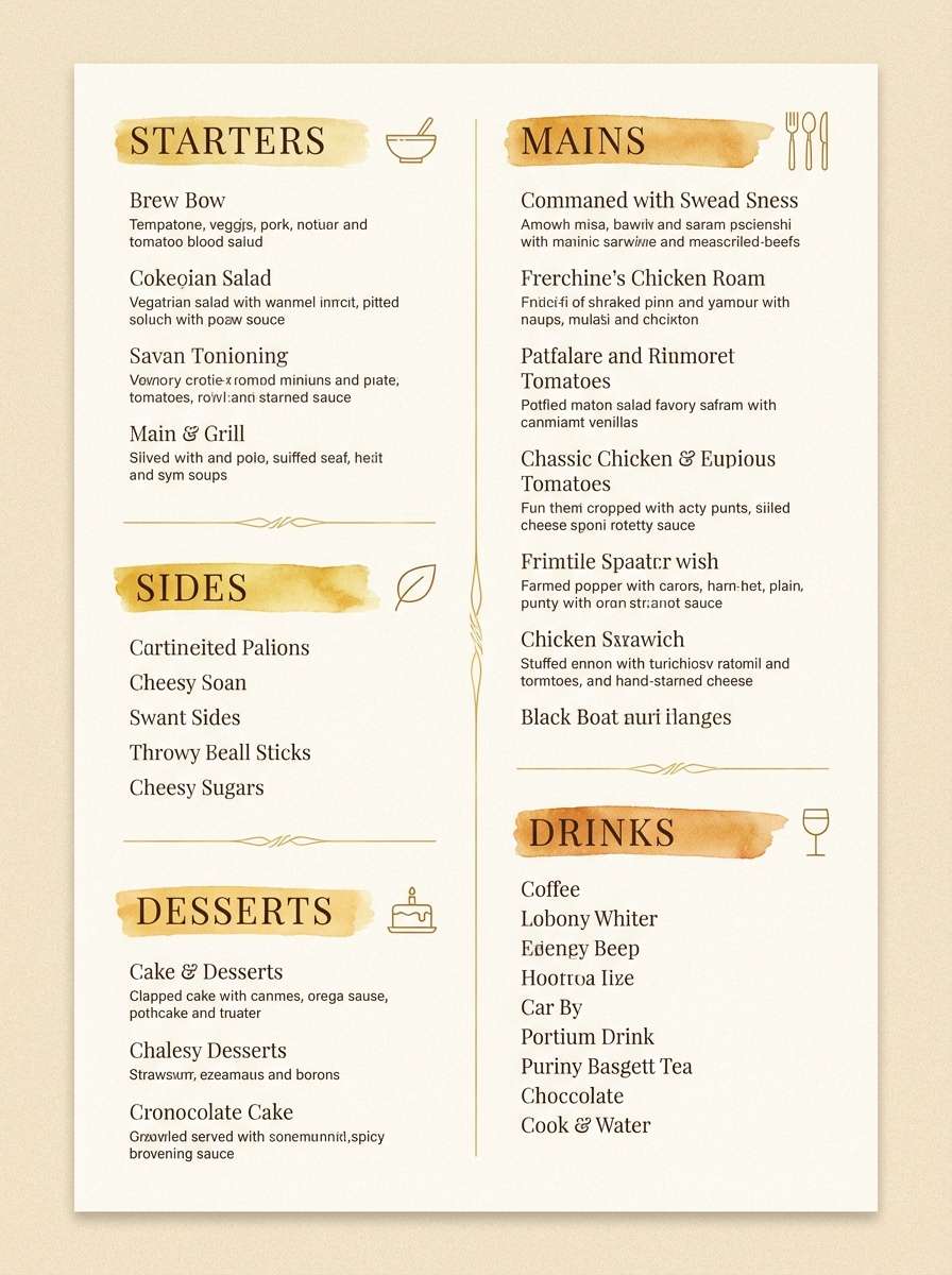
Best for: restaurant menu design
Golden hour warmth feels like silk curtains and amber cocktails at a refined lounge. The tones are great for menus, tasting cards, and restaurant promos that want a premium glow. Pair with dark espresso type for legibility and add thin dividers in the mid-gold. Usage tip: use the light cream as the main paper color to keep everything airy.
Image example of golden hour silk generated using media.io
16) Teal Sequin
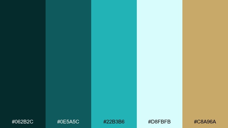
HEX: #062B2C #0E5A5C #22B3B6 #D8FBFB #C8A96A
Mood: sparkling, fresh, upscale
Best for: new year party banner
Teal sparkle with a hint of gold reads like sequins catching light as the countdown starts. These glamorous color combinations fit party banners, digital headers, and festive email hero graphics. Pair with dark backgrounds for drama and keep the aqua for bursts of energy. Usage tip: use the gold only for stars, lines, or tiny confetti shapes so it does not overpower.
Image example of teal sequin generated using media.io

17) Caviar Cream
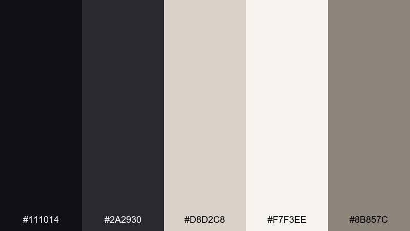
HEX: #111014 #2A2930 #D8D2C8 #F7F3EE #8B857C
Mood: minimal, refined, editorial
Best for: portfolio website
Caviar black and creamy neutrals feel like gallery walls and tailored suiting. The contrast is ideal for portfolios, case study pages, and design studios that want restraint with polish. Pair with thin rules, generous margins, and monochrome photography. Usage tip: keep interactive elements in the mid-gray so they stand out without breaking the calm.
Image example of caviar cream generated using media.io
18) Ruby Pearl
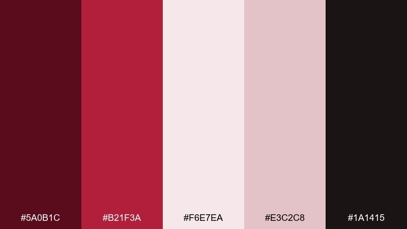
HEX: #5A0B1C #B21F3A #F6E7EA #E3C2C8 #1A1415
Mood: classic, romantic, high-contrast
Best for: valentines day promo
Ruby and pearl tones evoke lipstick, roses, and glossy gift wrap. The pairing is strong for seasonal promos, email headers, and storefront banners where you want instant emotion. Pair with black for bold type and keep the blush tones for soft framing. Usage tip: let ruby carry the main call-to-action and use pearl as breathing room around it.
Image example of ruby pearl generated using media.io

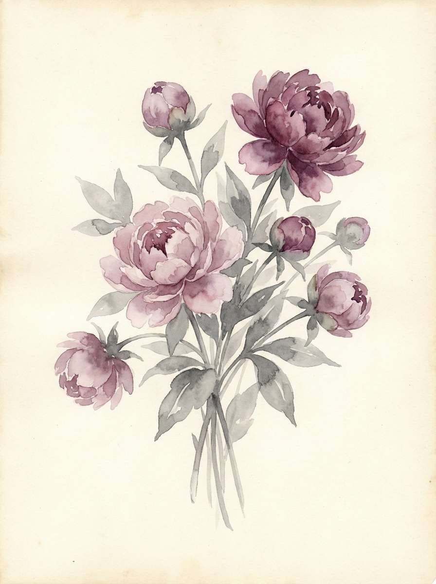
19) Platinum Peony
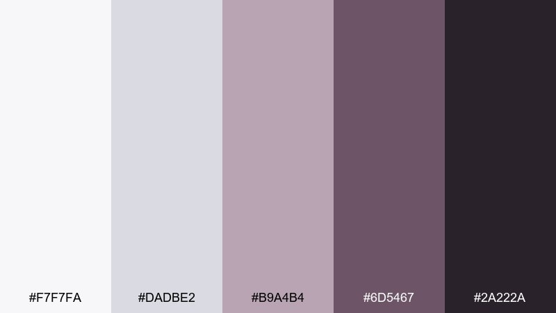
HEX: #F7F7FA #DADBE2 #B9A4B4 #6D5467 #2A222A
Mood: soft, romantic, modern
Best for: bridal bouquet illustration
Platinum neutrals with peony mauves feel airy, delicate, and quietly luxurious. The colors suit watercolor florals, bridal stationery accents, and gentle social graphics. Pair with deep plum for outlines and keep the lightest gray as the paper tone. Usage tip: use the mauve midtone for petals and reserve the darkest shade for focal centers only.
Image example of platinum peony generated using media.io
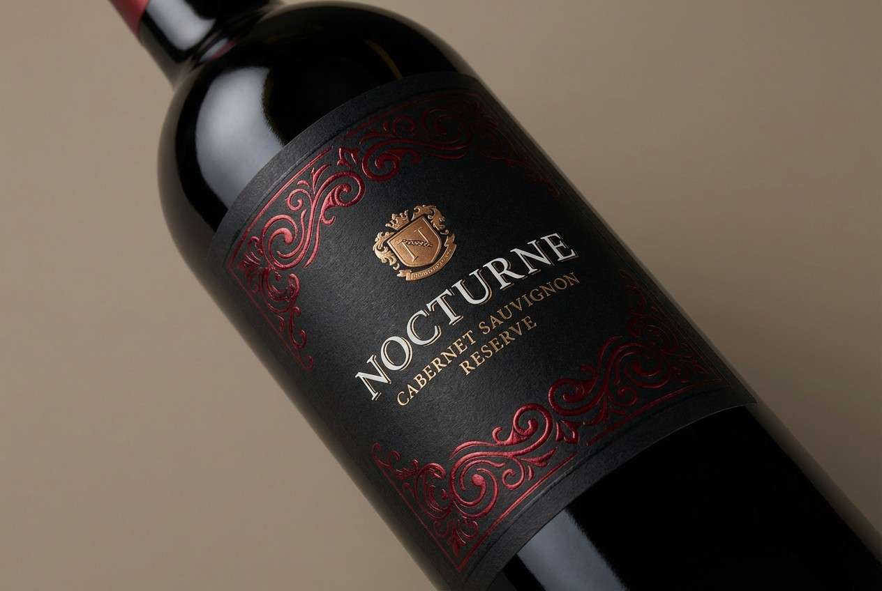
20) Obsidian Cherry
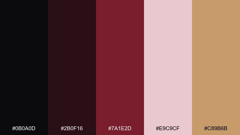
HEX: #0B0A0D #2B0F16 #7A1E2D #E9C9CF #C89B6B
Mood: dark, seductive, premium
Best for: wine label design
Obsidian and cherry tones feel like candlelight reflecting through a glass of red wine. The depth is perfect for labels, bottle neckers, and premium tasting notes. Pair with a warm gold for crests or borders, and keep blush for small highlights. Usage tip: use high contrast type on the dark base to keep fine label details readable.
Image example of obsidian cherry generated using media.io
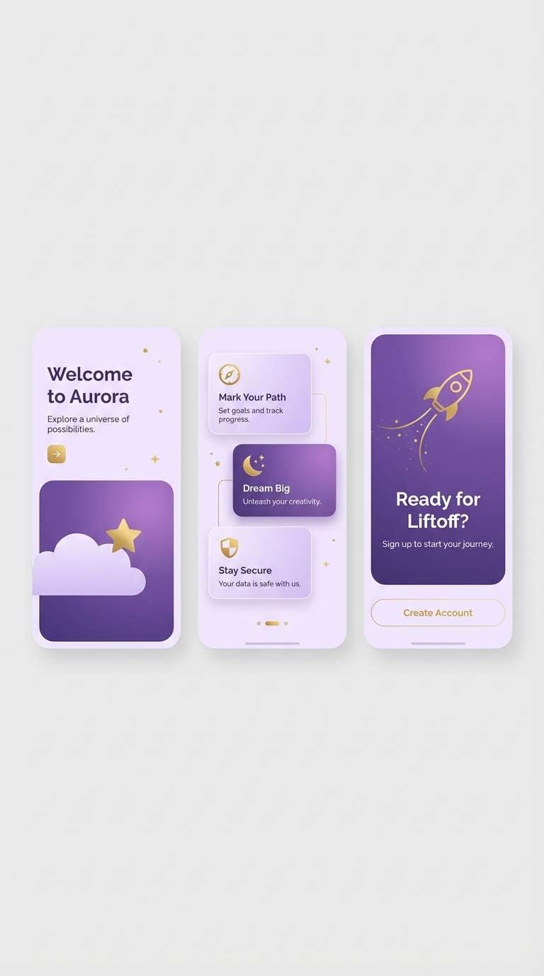
21) Aurora Gold Dust
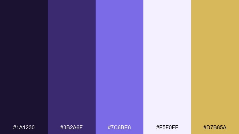
HEX: #1A1230 #3B2A6F #7C6BE6 #F5F0FF #D7B85A
Mood: dreamy, radiant, luxe
Best for: app onboarding screens
Aurora purples with a sprinkle of gold dust feel magical and modern, like a night sky turning luminous. These glamorous color combinations help onboarding screens feel premium while staying friendly. Pair with soft gradients and minimal illustrations to avoid visual noise. Usage tip: keep the gold as a micro-accent on progress dots or small badges.
Image example of aurora gold dust generated using media.io
What Colors Go Well with Glamorous?
Glamorous color palettes pair best with high-contrast anchors like black, charcoal, espresso, and deep navy. These darker tones make metallics and jewel tones look sharper and more intentional.
For highlights, think gold, champagne, pearl, rose gold, and cool silver. In digital design, you can mimic “shine” with soft gradients, glow effects, and gentle drop shadows while keeping the palette tight.
To modernize the look, add a calm neutral (ivory, warm gray, blush-beige) as breathing room. This keeps the overall scheme from feeling heavy or overly ornate.
How to Use a Glamorous Color Palette in Real Designs
Start with a dominant base (60–70%) like ivory, black, or deep navy, then layer secondary tones for sections, cards, or backgrounds. Save your “luxury accent” (gold, lavender glow, ruby) for CTAs, icons, and key highlights.
Typography matters as much as color. Pair a refined serif headline with a clean sans for body copy, or keep it all modern with one strong family and weight contrast. Whitespace and alignment do a lot of the luxury work.
For print, limit metallic inks to small areas (logos, borders, seals) so they feel special. For UI, keep accessibility in mind by using the darkest tone for body text and testing contrast on buttons.
Create Glamorous Palette Visuals with AI
If you already have HEX codes, the fastest way to validate a glamorous scheme is to generate a few realistic mockups—packaging, landing pages, invitations, or ads—and see if the colors feel premium in context.
With Media.io’s text-to-image, you can paste a prompt, specify a clean studio or flat-design style, and iterate quickly until the lighting, materials, and vibe match your brand.
Try generating 2–3 variations per palette (matte vs. glossy, warm vs. cool lighting, minimal vs. decorative) to find the most polished direction before production.
Glamorous Color Palette FAQs
-
What makes a color palette look glamorous?
Glamorous palettes usually combine strong contrast (often a dark base) with refined highlights like gold, pearl, silver, blush, or jewel tones. The “glam” effect comes from restraint, clean spacing, and intentional accents rather than using many bright colors at once. -
Is black and gold always required for a glamorous look?
No. Black and gold is a classic luxury pairing, but you can get a glamorous feel with navy and lavender (like Midnight Opal), emerald and gold (Emerald Spotlight), or even soft champagne neutrals (Pearl Champagne) if the layout is minimal and polished. -
Which glamorous palettes are best for modern UI design?
Try Midnight Opal for dashboards, Caviar Cream for portfolios and case studies, Silver Stiletto for ecommerce, and Aurora Gold Dust for onboarding. These keep the palette controlled while still feeling premium. -
How do I keep glamorous colors from looking too “busy”?
Use one accent color and apply it only to key actions or small details. Let neutrals carry the majority of the layout, and avoid mixing multiple metallic-like accents (gold + silver + rose gold) in the same design. -
What background colors work best with glamorous palettes?
Deep backgrounds (black, espresso, midnight navy) create drama and make highlights pop, while light backgrounds (ivory, pearl, pale gray) create a “quiet luxury” feel. Choose based on whether you want cinematic contrast or airy editorial elegance. -
How can I visualize a glamorous palette before committing to it?
Generate quick mockups (packaging, invitations, landing pages, ads) with AI using consistent prompts and lighting directions. Seeing the colors on realistic materials or clean UI blocks helps you judge whether they feel premium and readable. -
Do glamorous color palettes work for small formats like labels and tags?
Yes—high-contrast glamorous combinations are great for small formats. Keep details bold, reserve metallic accents for borders or crests, and ensure text sits on a solid dark or light panel for legibility.
Next: Sea Color Palette


