

Tuscan red sits in that sweet spot between earthy terracotta and deep wine—warm enough to feel inviting, yet rich enough to look premium in modern layouts.
Below are curated Tuscan red color palette ideas with HEX codes, plus practical pairing tips for branding, interiors, print, and UI.
In this article
- Why Tuscan Red Palettes Work So Well
-
- sunbaked villa
- olive courtyard
- chianti evening
- clay and linen
- rosewood minimal
- antique copper
- terracotta breeze
- dusty merlot ui
- saffron accent
- autumn library
- desert winery
- mocha truffle
- blush stone
- hearth and charcoal
- heritage brickwork
- copper sage kitchen
- garnet nightfall
- vineyard harvest
- neutral gallery
- crimson neighbor
- modern terra ui
- What Colors Go Well with Tuscan Red?
- How to Use a Tuscan Red Color Palette in Real Designs
- Create Tuscan Red Palette Visuals with AI
Why Tuscan Red Palettes Work So Well
Tuscan red is naturally expressive: it can read rustic and sunbaked in warm neutrals, or moody and luxurious when paired with charcoal and near-black. That flexibility makes it a reliable “hero color” across branding, packaging, and digital design.
Because it’s rooted in earthy red tones, it harmonizes easily with creams, tans, wood-browns, olives, and muted blushes—colors that already feel familiar in interiors and lifestyle visuals. The result is a palette that feels cohesive without looking flat.
In UI, Tuscan red also performs well as an accent because it holds presence at low saturation. You can keep interfaces calm and editorial while still giving buttons, tags, and active states a confident warm punch.
20+ Tuscan Red Color Palette Ideas (with HEX Codes)
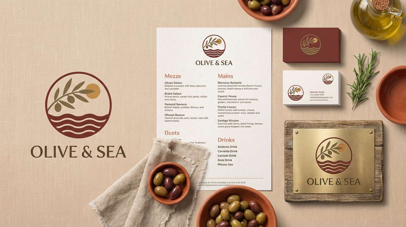
1) Sunbaked Villa
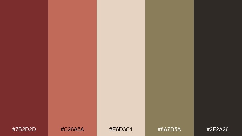
HEX: #7B2D2D #C26A5A #E6D3C1 #8A7D5A #2F2A26
Mood: rustic, welcoming, sun-warmed
Best for: mediterranean restaurant branding
Rustic and welcoming, this mix feels like terracotta walls, linen napkins, and late-afternoon light. Use the deep red as the hero for logos, headers, and signage, then let cream and sand soften large areas. Olive-tan grounds the palette and keeps it from reading too sweet. Tip: print menus on warm off-white stock to make the red look richer without increasing saturation.
Image example of sunbaked villa generated using media.io
Media.io is an online AI studio for creating and editing video, image, and audio in your browser.

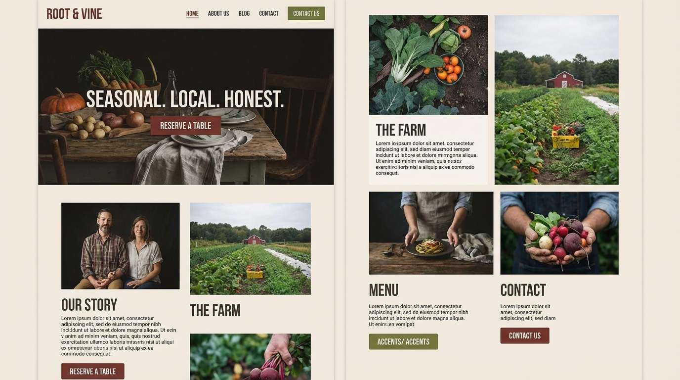
2) Olive Courtyard
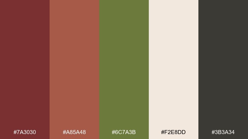
HEX: #7A3030 #A85A48 #6C7A3B #F2E8DD #3B3A34
Mood: earthy, grounded, garden-fresh
Best for: farm-to-table website design
Earthy and grounded, these tones evoke shaded courtyards, herb planters, and stone paths after rain. Pair the red with olive for navigation and buttons, then keep backgrounds airy with warm cream. The charcoal adds contrast for text and helps accessibility. Tip: use olive as the secondary action color so the red can stay reserved for key calls to action.
Image example of olive courtyard generated using media.io
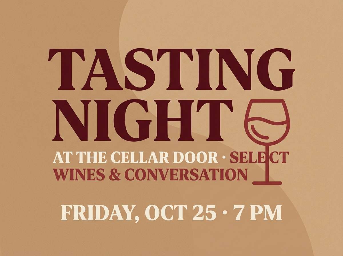
3) Chianti Evening
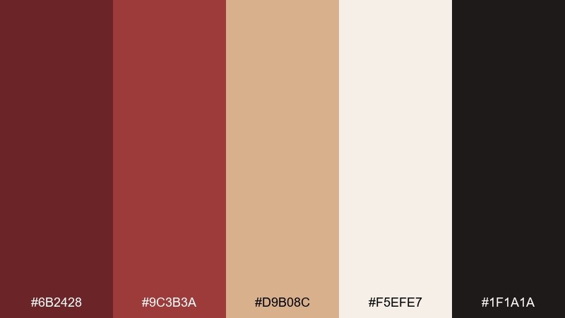
HEX: #6B2428 #9C3B3A #D9B08C #F5EFE7 #1F1A1A
Mood: moody, intimate, elegant
Best for: wine bar menu and poster
Moody and intimate, it reads like candlelight, aged wood, and a glass of red poured slow. The contrast between inky near-black and creamy paper makes typography feel premium and readable. For a tuscan red color palette like this, lean on large cream margins and let the reds appear in headings, seals, and small illustrations. Tip: add subtle grain to backgrounds to keep the warm neutrals from feeling flat on print.
Image example of chianti evening generated using media.io
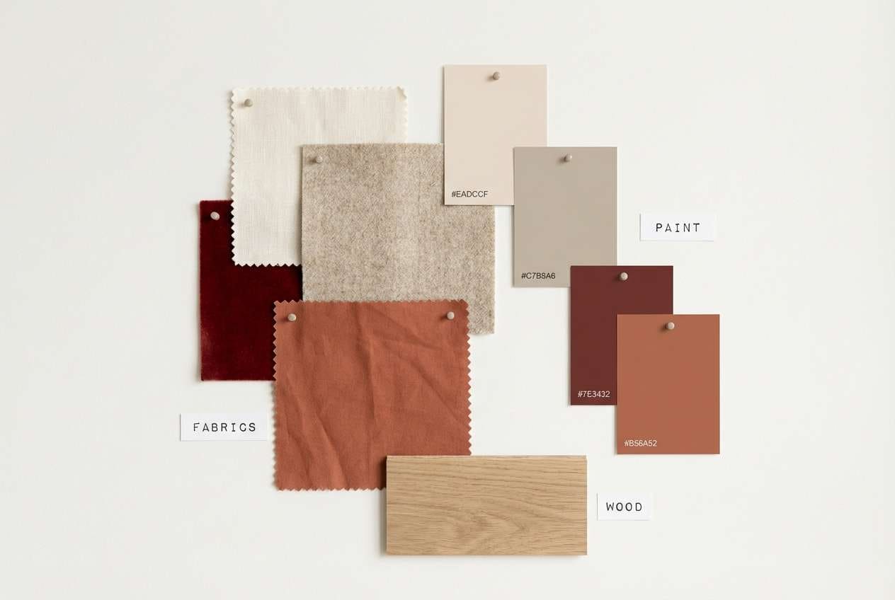
4) Clay and Linen
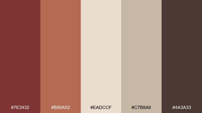
HEX: #7E3432 #B56A52 #EADCCF #C7B8A6 #4A3A33
Mood: soft, natural, tactile
Best for: interior mood board and styling
Soft and tactile, these hues suggest hand-thrown clay, woven linen, and sun-faded plaster. Use the warm neutrals for walls and large surfaces, then add the red on cushions, art, or a single statement chair. The brown anchors wood tones and keeps the room feeling cohesive. Tip: keep metals matte, like brushed bronze, so the palette stays calm.
Image example of clay and linen generated using media.io
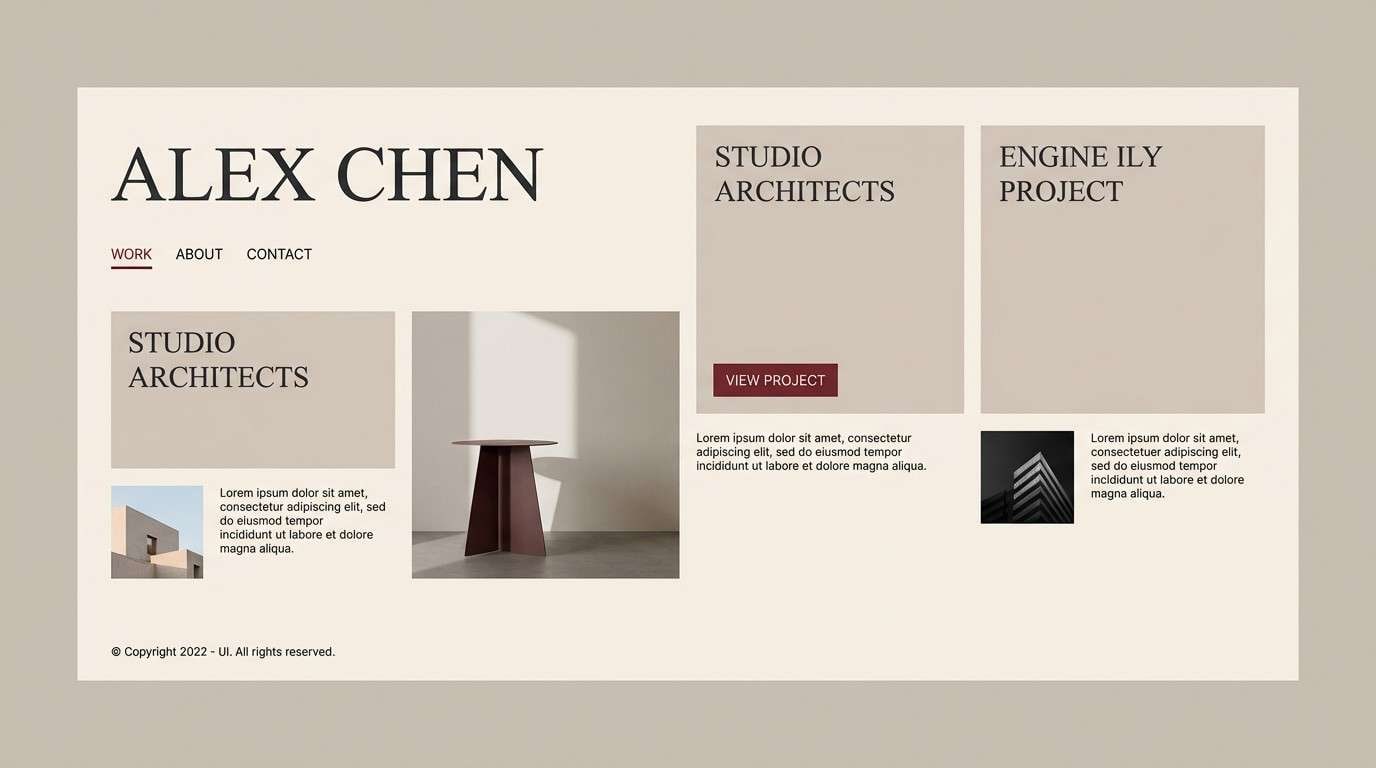
5) Rosewood Minimal
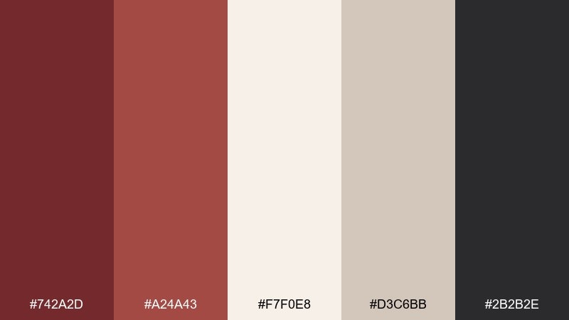
HEX: #742A2D #A24A43 #F7F0E8 #D3C6BB #2B2B2E
Mood: clean, modern, quietly bold
Best for: portfolio website UI
Clean and modern, it feels like a gallery wall with a single rosewood frame stealing attention. Keep layouts spacious with the off-white and warm gray, then use the deep red sparingly for key links and hover states. The near-black is ideal for body text and icons. Tip: set the red as an accent at 10 to 15 percent of the screen to maintain a minimalist rhythm.
Image example of rosewood minimal generated using media.io
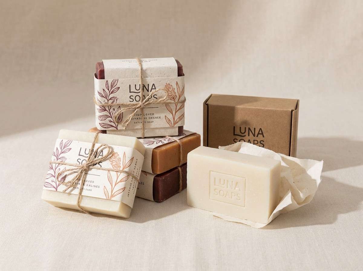
6) Antique Copper
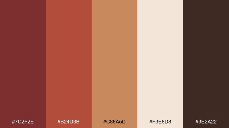
HEX: #7C2F2E #B24D3B #C88A5D #F3E6D8 #3E2A22
Mood: vintage, crafted, warm
Best for: artisan soap packaging
Vintage and crafted, this set resembles copper cookware, spice markets, and hand-stamped labels. Use the cream as the label base, then layer reds and copper tones for seals, borders, and ingredient highlights. The dark brown keeps typography sturdy and legible. Tip: emboss the deepest red on kraft paper for a premium handmade feel.
Image example of antique copper generated using media.io
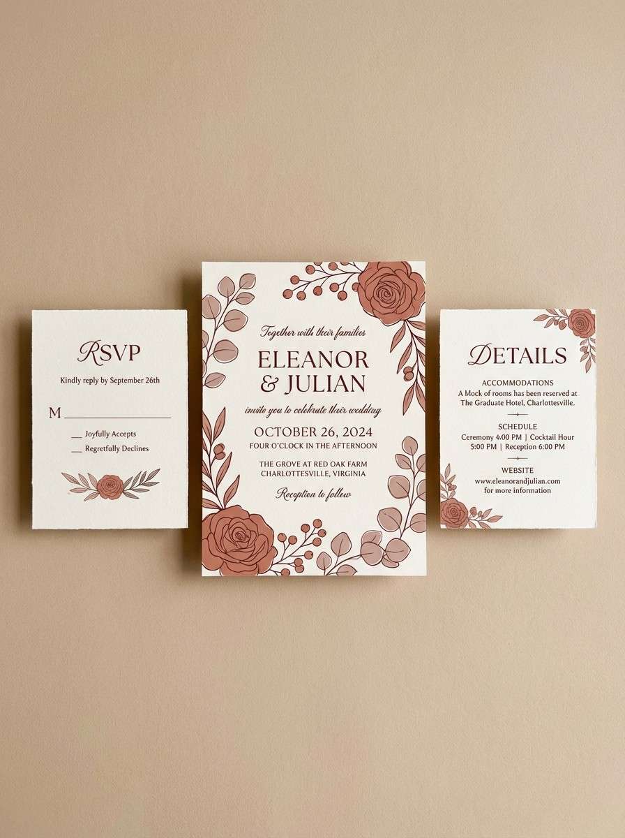
7) Terracotta Breeze
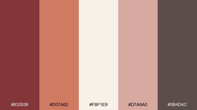
HEX: #833538 #D07A62 #F8F1E9 #D7A9A0 #5B4D4C
Mood: romantic, airy, sunlit
Best for: summer wedding invitation suite
Romantic and sunlit, these shades feel like blush florals against warm terracotta rooftops. Let the ivory lead for paper and negative space, then bring in the reds for monograms, borders, and RSVP accents. The dusty rose keeps transitions soft and photo-friendly. Tip: choose warm gray ink for body copy so the palette stays gentle and refined.
Image example of terracotta breeze generated using media.io
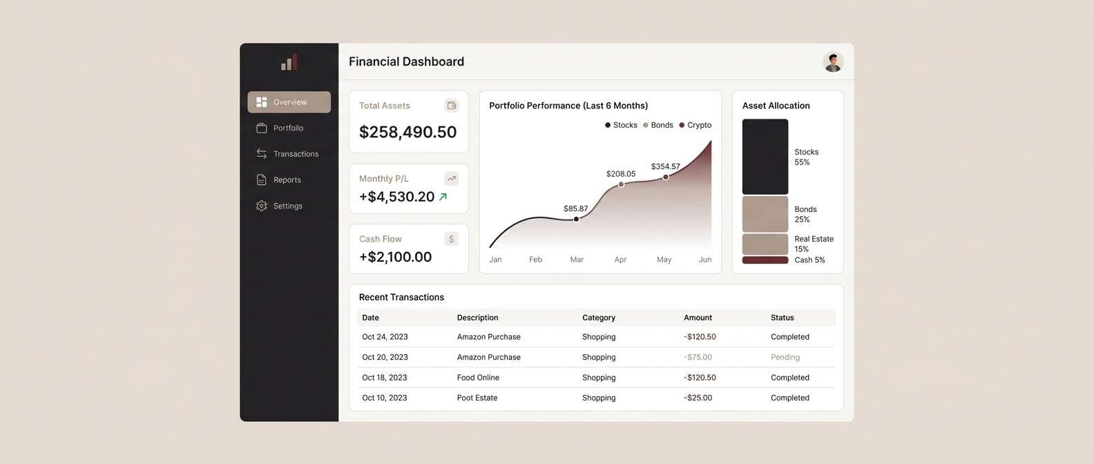
8) Dusty Merlot UI
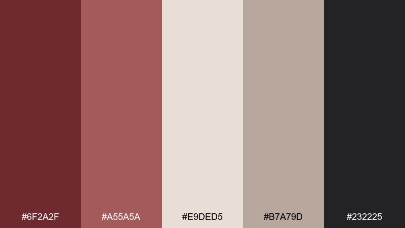
HEX: #6F2A2F #A55A5A #E9DED5 #B7A79D #232225
Mood: calm, mature, user-focused
Best for: finance dashboard UI
Calm and mature, this palette feels like leather journals and quiet confidence. Use the light neutral for panels and charts, then reserve the merlot tones for highlights, selected states, and alerts that should feel serious. The muted taupe supports secondary text without looking washed out. Tip: pair the deep red with thin line icons for a crisp, professional interface.
Image example of dusty merlot ui generated using media.io
9) Saffron Accent
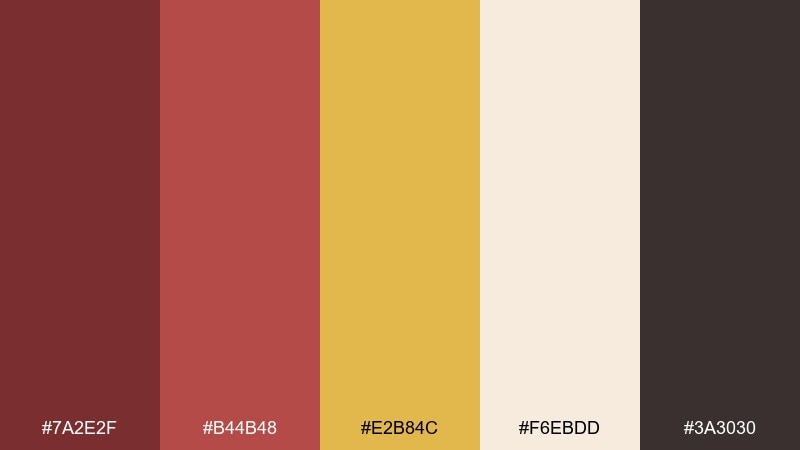
HEX: #7A2E2F #B44B48 #E2B84C #F6EBDD #3A3030
Mood: bold, festive, energetic
Best for: food festival flyer
Bold and festive, it brings to mind spice jars, street banners, and sizzling grills. Use saffron yellow for headlines and icons, with deep red as the grounding base for blocks and dividers. Cream keeps the layout breathable so the warm hues stay appetizing. Tip: limit saffron to one or two elements per section to avoid visual noise.
Image example of saffron accent generated using media.io

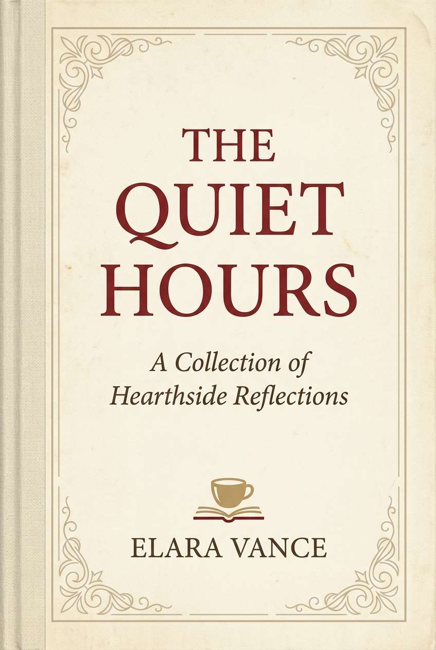
10) Autumn Library
HEX: #72292C #A1483E #C8A27A #EFE4D7 #2A1F1B
Mood: cozy, scholarly, nostalgic
Best for: book cover design
Cozy and nostalgic, these tones feel like worn book spines, caramel paper, and quiet reading corners. The deep red works well for title blocks, while cream and parchment tones keep the cover approachable. Add the warm tan for ornamental borders or subtle texture overlays. Tip: use high-contrast type in the dark brown to keep small text readable on textured backgrounds.
Image example of autumn library generated using media.io
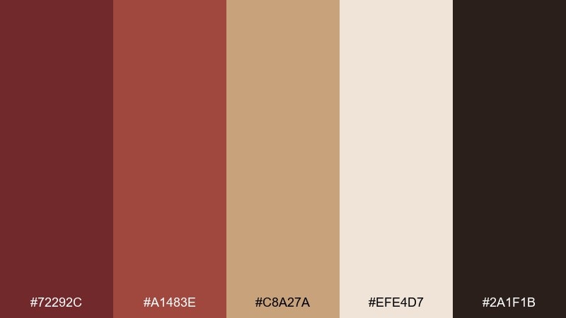
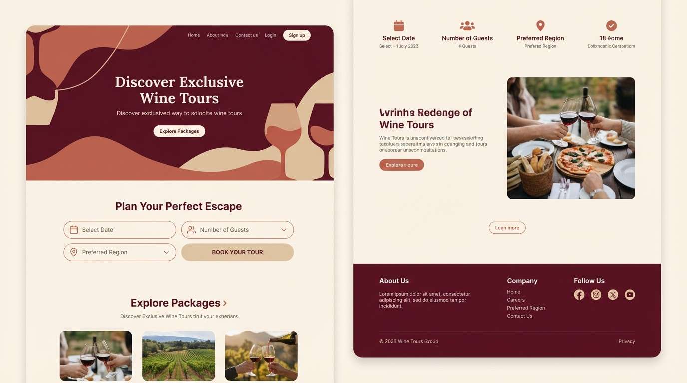
11) Desert Winery
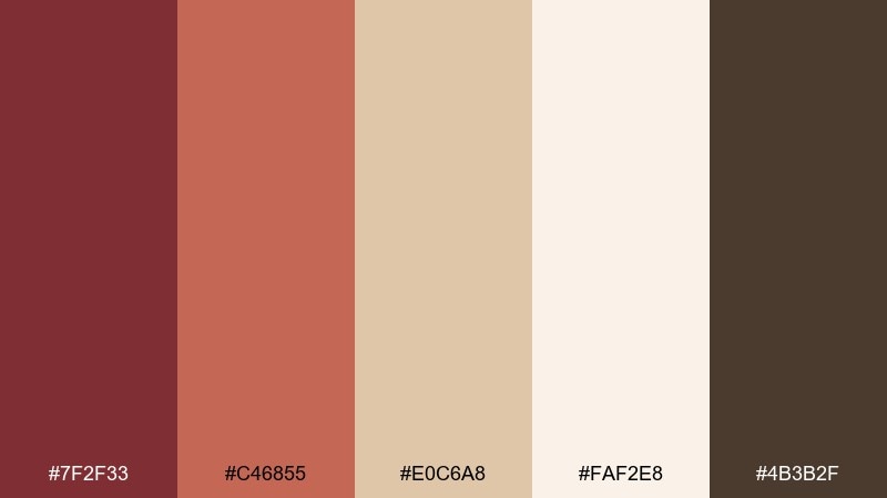
HEX: #7F2F33 #C46855 #E0C6A8 #FAF2E8 #4B3B2F
Mood: warm, expansive, travel-ready
Best for: wine tour landing page
Warm and expansive, it suggests dusty roads, vineyard rows, and sunlit tasting rooms. Keep the page bright with ivory and sand, then use the reds for primary buttons and section headings. The cocoa brown adds depth for footers and fine print. Tip: use the coral tone for badges like limited seats or weekend special to draw attention without shouting.
Image example of desert winery generated using media.io
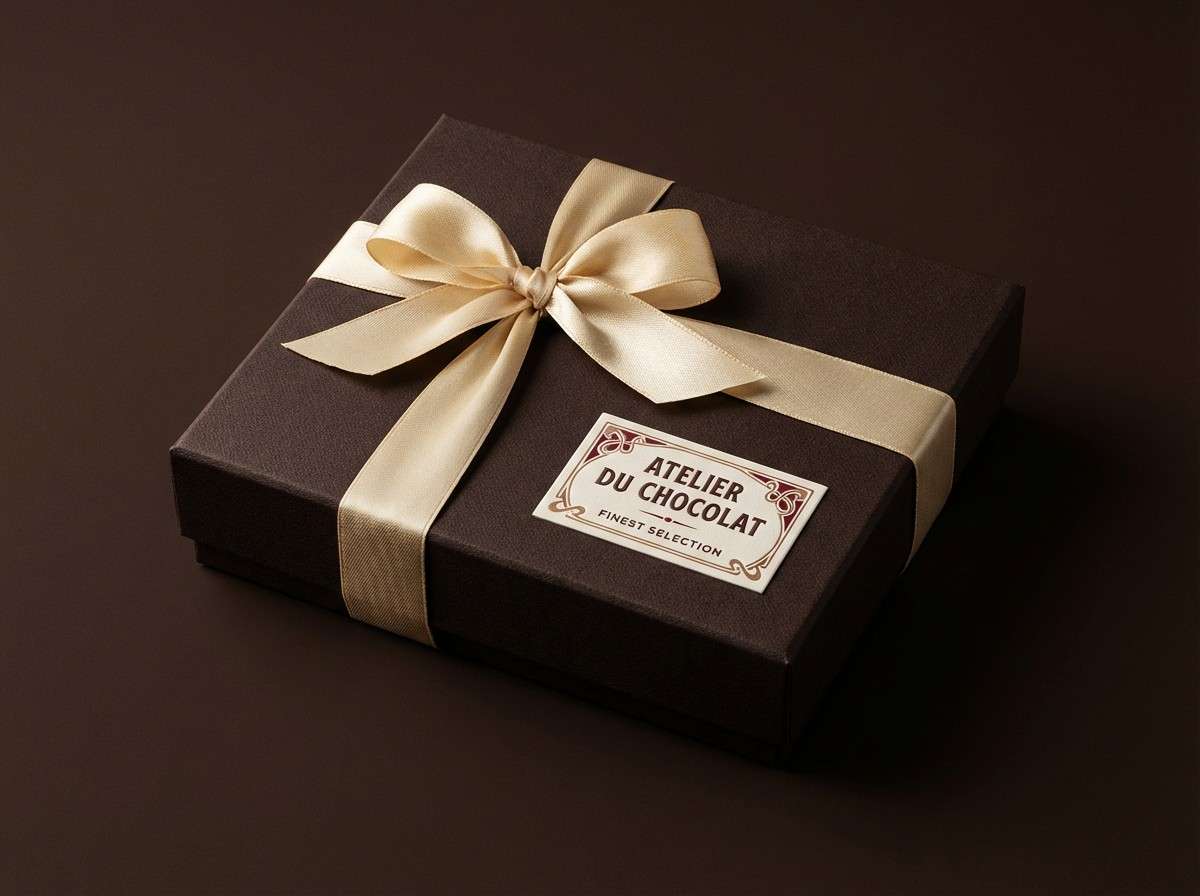
12) Mocha Truffle
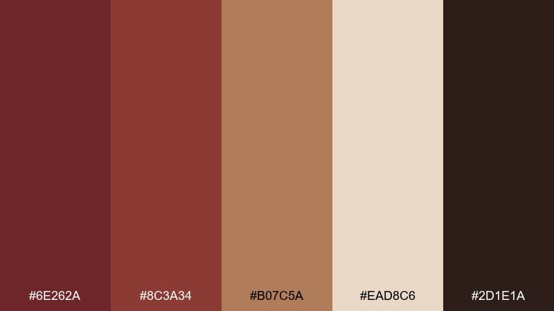
HEX: #6E262A #8C3A34 #B07C5A #EAD8C6 #2D1E1A
Mood: rich, indulgent, intimate
Best for: chocolate product ad
Rich and indulgent, these colors feel like cocoa dust, velvet ribbon, and a dark truffle bite. Use the near-black for background depth and let the warm beige lift product highlights. The reds work best as accents on seals, ribbons, and callouts. Tip: add a soft spotlight gradient behind the product so the deep tones feel luxurious rather than heavy.
Image example of mocha truffle generated using media.io
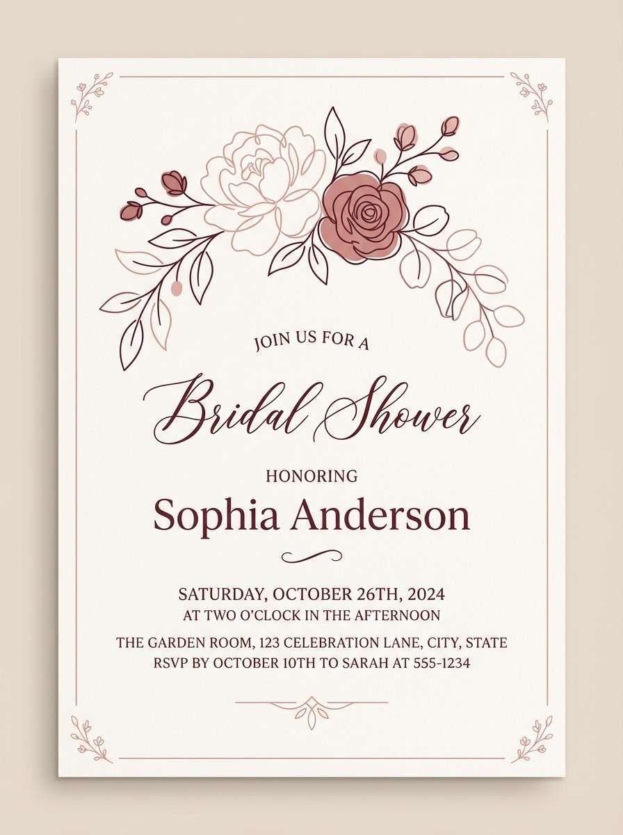
13) Blush Stone
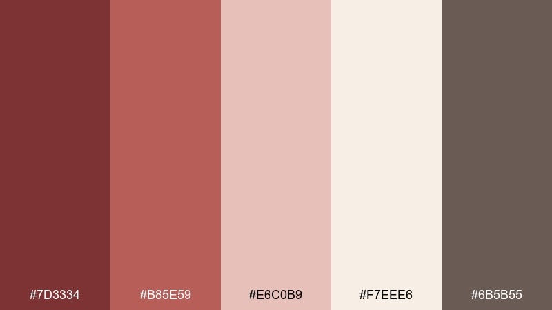
HEX: #7D3334 #B85E59 #E6C0B9 #F7EEE6 #6B5B55
Mood: gentle, romantic, modern classic
Best for: bridal shower invitation
Gentle and romantic, it evokes rose petals on pale stone with a warm glow. These tones make a tuscan red color combination that stays soft when you let ivory dominate and use the reds for initials and small motifs. The muted taupe is great for secondary text and venue details. Tip: add a thin border in the darkest red to frame the layout without overwhelming it.
Image example of blush stone generated using media.io
14) Hearth and Charcoal
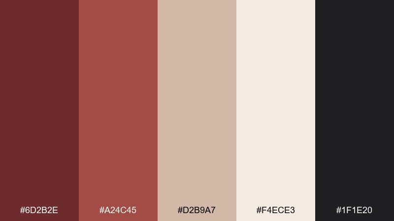
HEX: #6D2B2E #A24C45 #D2B9A7 #F4ECE3 #1F1E20
Mood: balanced, contemporary, confident
Best for: startup brand guidelines
Balanced and confident, it reads like a modern loft with a warm hearth in the corner. Use charcoal for typography and UI scaffolding, then bring in the reds for brand moments like section headers and icons. The beige tones help soften presentations and keep long documents readable. Tip: define a clear hierarchy so the darker red is for primary brand marks and the lighter red is for supporting accents.
Image example of hearth and charcoal generated using media.io
15) Heritage Brickwork
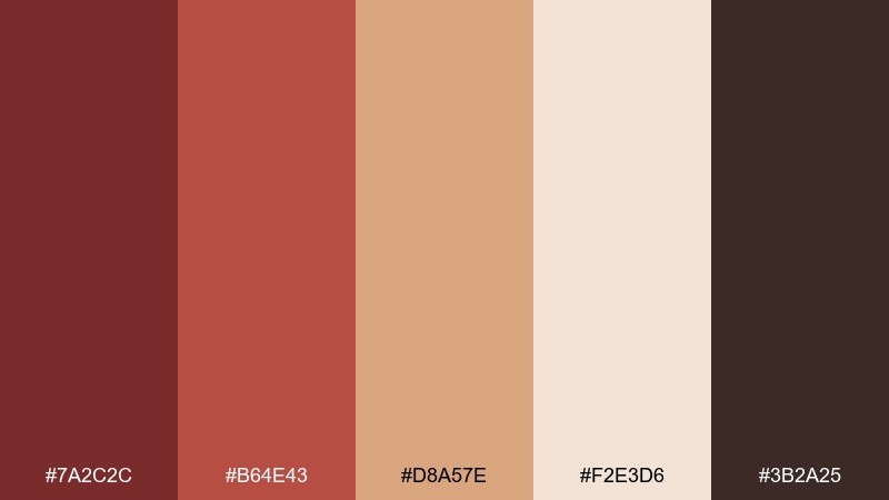
HEX: #7A2C2C #B64E43 #D8A57E #F2E3D6 #3B2A25
Mood: heritage, sturdy, handcrafted
Best for: craft brewery label set
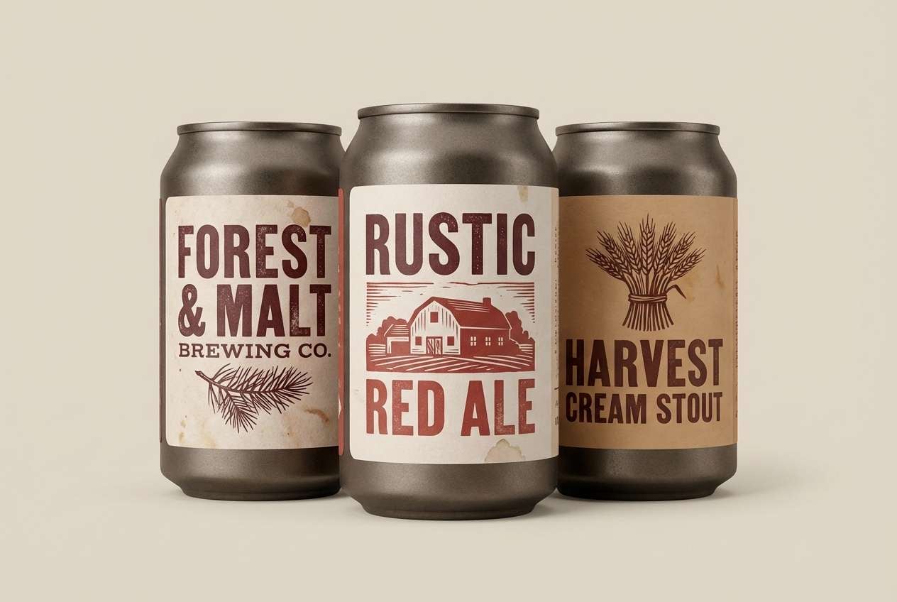
Heritage and sturdy, it brings up brick facades, wood barrels, and hand-painted signs. The warm neutrals keep labels readable while the reds add instant shelf presence. For a tuscan red color palette in packaging, use the darkest tone for the brand badge and the lighter red for flavor differentiation. Tip: print on uncoated paper so the brick tones look authentic and slightly muted.
Image example of heritage brickwork generated using media.io
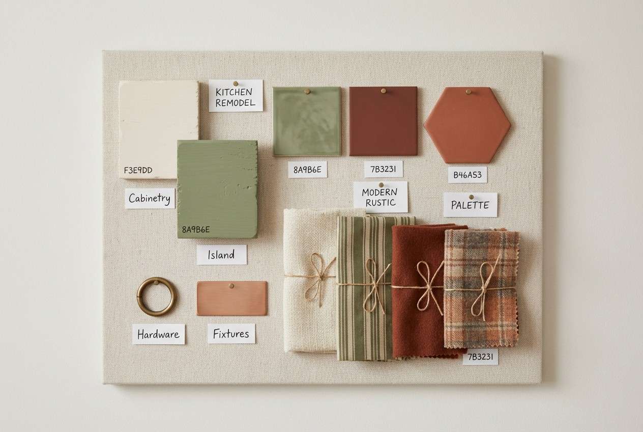
16) Copper Sage Kitchen
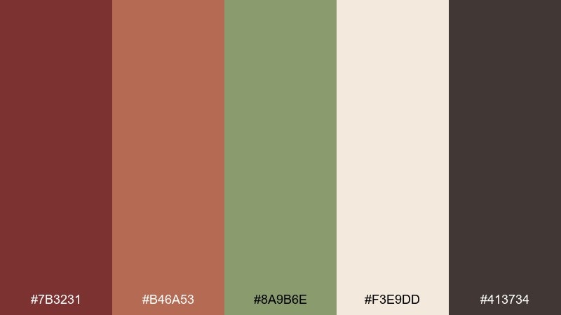
HEX: #7B3231 #B46A53 #8A9B6E #F3E9DD #413734
Mood: homey, fresh, everyday elegant
Best for: kitchen remodel mood board
Homey and fresh, it feels like copper pans against sage cabinetry and creamy backsplash tile. Use the light neutral for surfaces and walls, then bring in the red as a small but confident accent in textiles or art. Sage makes the whole set breathe and adds a natural counterweight to the warmth. Tip: keep hardware in brushed brass or aged bronze to tie the reds and greens together.
Image example of copper sage kitchen generated using media.io
17) Garnet Nightfall
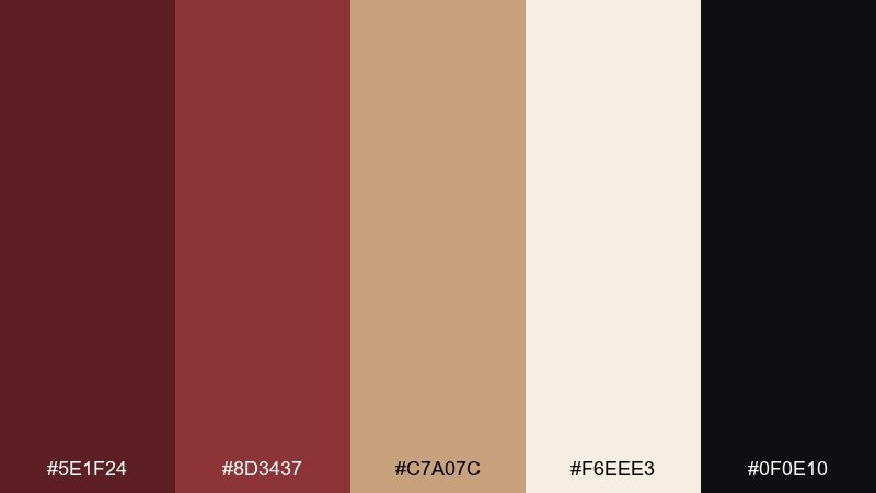
HEX: #5E1F24 #8D3437 #C7A07C #F6EEE3 #0F0E10
Mood: luxurious, dramatic, high-contrast
Best for: luxury fragrance product ad
Luxurious and dramatic, it looks like garnet velvet lit by a single warm spotlight. Let black carry the background, then use cream for negative space in the label to keep the product premium and readable. The gold-beige accent adds a refined gleam without going metallic. Tip: keep the red gradients subtle so the ad feels expensive rather than loud.
Image example of garnet nightfall generated using media.io
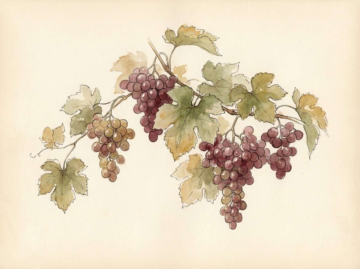
18) Vineyard Harvest
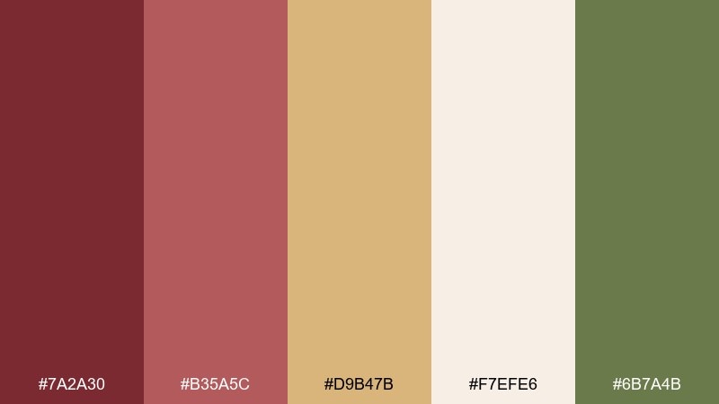
HEX: #7A2A30 #B35A5C #D9B47B #F7EFE6 #6B7A4B
Mood: wholesome, seasonal, artisanal
Best for: watercolor botanical illustration
Wholesome and seasonal, it suggests grape leaves, sun-dried grass, and a blush of ripe fruit. Use the cream as paper tone, then paint reds and mauves in layered washes for natural depth. The olive green keeps the composition grounded and organic. Tip: repeat the golden tan in small details to unify the illustration without overpowering the reds.
Image example of vineyard harvest generated using media.io
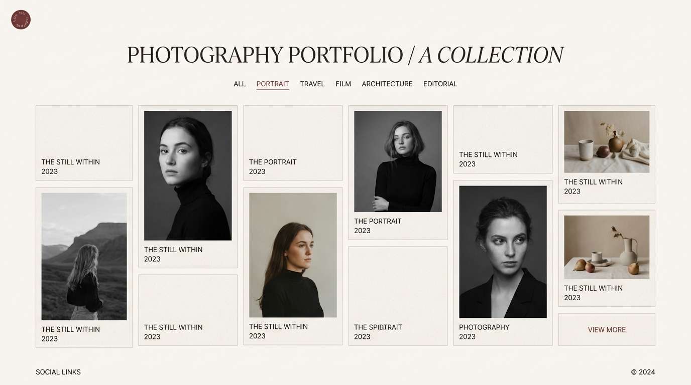
19) Neutral Gallery
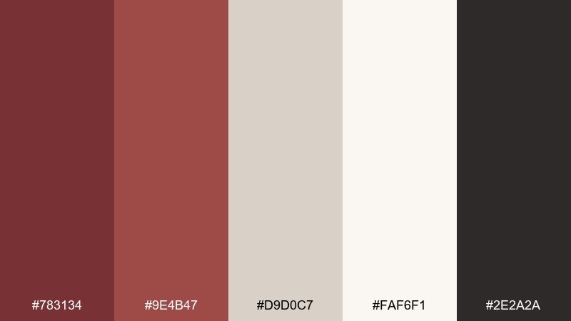
HEX: #783134 #9E4B47 #D9D0C7 #FAF6F1 #2E2A2A
Mood: quiet, curated, design-forward
Best for: photography portfolio layout
Quiet and curated, it feels like a white gallery with a single warm-red piece commanding attention. Use the near-white for full-width image areas and the warm gray for UI rails and captions. The reds are best reserved for subtle highlights like active filters, category tags, or a small logo mark. Tip: keep red accents consistent in size so the interface stays calm and editorial.
Image example of neutral gallery generated using media.io
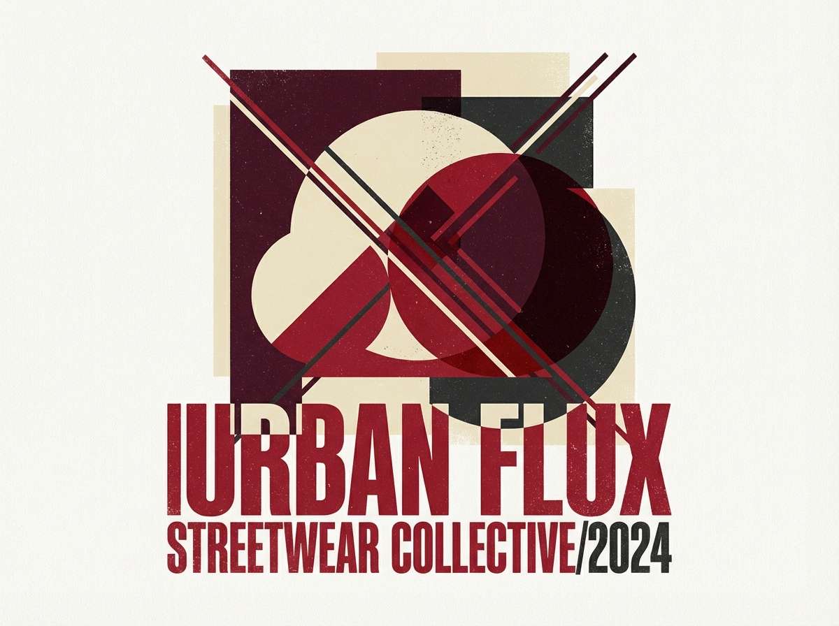
20) Crimson Neighbor
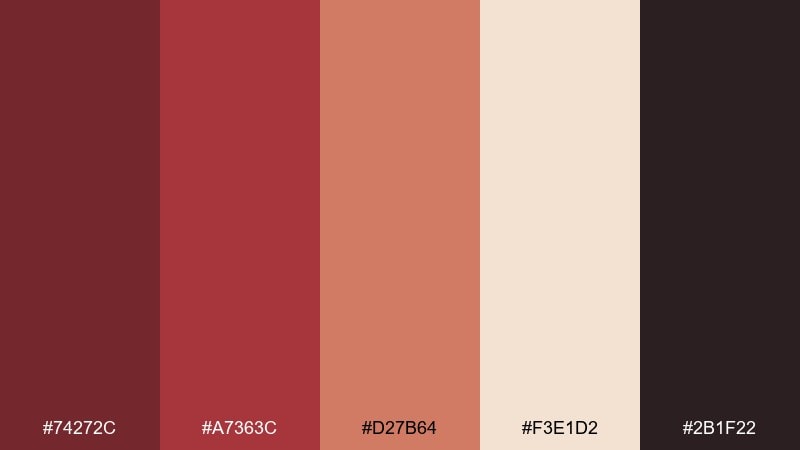
HEX: #74272C #A7363C #D27B64 #F3E1D2 #2B1F22
Mood: bold, modern, slightly playful
Best for: streetwear poster design
Bold and modern, it evokes painted murals, dusk streets, and a confident pop of red. These tuscan red color combinations work best with strong typography and large shapes, letting cream calm the negative space. Use the brighter red for focal text, while the deeper shade anchors blocks and shadows. Tip: keep the palette tight to two dominant reds so the poster reads punchy from a distance.
Image example of crimson neighbor generated using media.io
21) Modern Terra UI
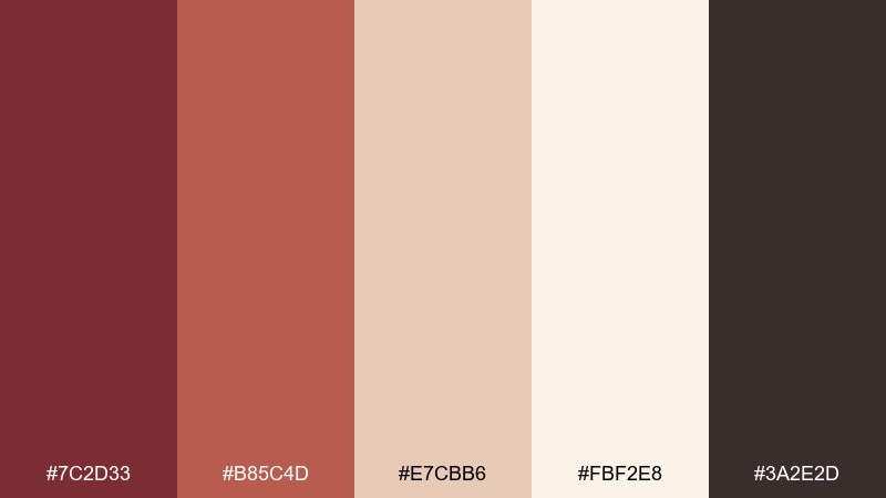
HEX: #7C2D33 #B85C4D #E7CBB6 #FBF2E8 #3A2E2D
Mood: friendly, modern, warm
Best for: wellness app onboarding UI
Friendly and warm, it feels like terracotta pottery paired with soft morning light. Use the light cream for screens and cards, then lean on the red as a consistent primary button color. The peachy tone helps create gentle gradients and progress states without looking sugary. Tip: set the darkest brown for headings only, keeping body text slightly lighter for a softer app feel.
Image example of modern terra ui generated using media.io
What Colors Go Well with Tuscan Red?
Tuscan red pairs naturally with warm neutrals like ivory, cream, sand, and parchment—these lighten the overall look and make the red feel more refined than heavy. Brown and cocoa tones also work well for typography and grounding, especially in print and packaging.
For a more botanical, Mediterranean feel, combine Tuscan red with olive, sage, or muted green. If you want a modern, high-contrast look, introduce charcoal or near-black and keep reds as controlled accents for hierarchy.
Soft blush, dusty rose, and warm tan are great “bridge” colors when you’re mixing multiple reds. They smooth transitions and help the palette stay cohesive across photos, UI components, and brand assets.
How to Use a Tuscan Red Color Palette in Real Designs
Start by deciding the role of Tuscan red: hero, supporting, or accent. In branding, it often shines as the hero color for marks, headers, and packaging badges; in UI, it’s usually strongest as the accent for primary actions and selected states.
Balance warmth with readable contrast. Use cream or off-white for backgrounds, charcoal for body text, and reserve the deepest red for the highest-priority elements so you don’t dilute the palette’s impact.
For interiors and mood boards, keep large surfaces neutral (linen, plaster, warm tile), then bring Tuscan red in through textiles, art, ceramics, or one statement piece. Repeating one warm neutral across the room helps everything feel intentionally tied together.
Create Tuscan Red Palette Visuals with AI
If you want to see how a Tuscan red color scheme behaves in a real layout—poster, packaging, UI, or invitation—generate a few visual directions first. It’s an efficient way to test contrast, mood, and “how much red” feels right.
With Media.io Text-to-Image, you can turn a palette (and a short style prompt) into consistent mockups for brand kits, landing pages, wedding suites, or product ads—then iterate fast by adjusting lighting, texture, and composition.
Use your HEX codes directly in prompts to keep outputs on-brand, and try swapping only one accent (like olive vs. saffron) to quickly explore different vibes without redoing the whole concept.
Tuscan Red Color Palette FAQs
-
What is the HEX code for Tuscan red?
Tuscan red doesn’t have one single universal HEX value, but it typically falls in a deep, warm red range similar to #7B2D2D or #7A2C2C. In practice, “Tuscan red” is best treated as a family of earthy reds that shift slightly toward brick, wine, or terracotta. -
Is Tuscan red closer to terracotta or burgundy?
It can lean either way depending on the shade, but Tuscan red is usually more earthy than burgundy and deeper than classic terracotta. Many Tuscan red palettes combine both directions—pairing a deep wine red with a clay or coral accent. -
What colors go with Tuscan red for a modern look?
For a modern feel, pair Tuscan red with near-white (ivory), warm gray, and charcoal/near-black. Keep Tuscan red as an accent for buttons, tags, and headers so the layout stays clean and editorial. -
What colors go with Tuscan red for a rustic or Mediterranean vibe?
Use warm creams, sand, olive/sage greens, and natural browns. These combinations echo stone, linen, wood, and herbs—making Tuscan red feel sunbaked, welcoming, and authentic. -
How do I keep Tuscan red from feeling too dark?
Increase the amount of light neutral (cream/ivory) and use Tuscan red in smaller, high-impact areas like headings, borders, or seals. Adding a warm tan or dusty rose as a transition color can also soften the overall contrast. -
Can I use Tuscan red in UI design?
Yes—Tuscan red works well as a primary action or highlight color when balanced with accessible neutrals and strong text contrast. Use charcoal for body text, keep backgrounds warm and bright, and reserve the deepest reds for key states (primary CTA, selected, important alerts). -
What’s the easiest way to preview a Tuscan red palette in a real design?
Generate quick mockups (posters, landing pages, packaging, invitations) using an AI image tool and include your HEX codes in the prompt. This helps you validate contrast, mood, and “accent percentage” before committing to final assets.
Next: Crimson Color Palette


