

Crimson sits in that sweet spot between classic red and modern deep tones—rich enough to feel premium, but vivid enough to command attention. It’s why designers use it for everything from luxury labels to high-converting UI buttons.
Below are curated crimson pairing ideas with HEX codes, plus practical guidance for using crimson with neutrals, metallics, warm accents, and contrast-friendly text colors.
In this article
- Why Crimson Palettes Work So Well
-
- velvet rose
- garnet noir
- spice market
- crimson steel ui
- winter berry
- botanical garnet
- museum editorial
- neon nightlife
- heritage tartan
- clay and wine
- tech cherry
- rose gold luxe
- playful berry pop
- coffee and crimson
- athletic bold
- sunset sangria
- minimal blush contrast
- dark academia
- floral romance
- cinematic crimson
- What Colors Go Well with Crimson?
- How to Use a Crimson Color Palette in Real Designs
- Create Crimson Palette Visuals with AI
Why Crimson Palettes Work So Well
Crimson communicates emotion and confidence fast: it’s passionate like red, but deeper and more refined—so it reads as “intentional” rather than loud. That makes it ideal for brand moments where you want impact without looking generic.
It also pairs easily with both warm and cool systems. Put crimson with creams, clays, and golds for cozy editorial warmth; pair it with charcoals, steel grays, and icy whites for modern UI contrast.
Most importantly, crimson gives you a reliable hierarchy tool. Used sparingly, it becomes an instant “primary” signal for headlines, CTAs, labels, and key highlights across print and screens.
20+ Crimson Color Palette Ideas (with HEX Codes)
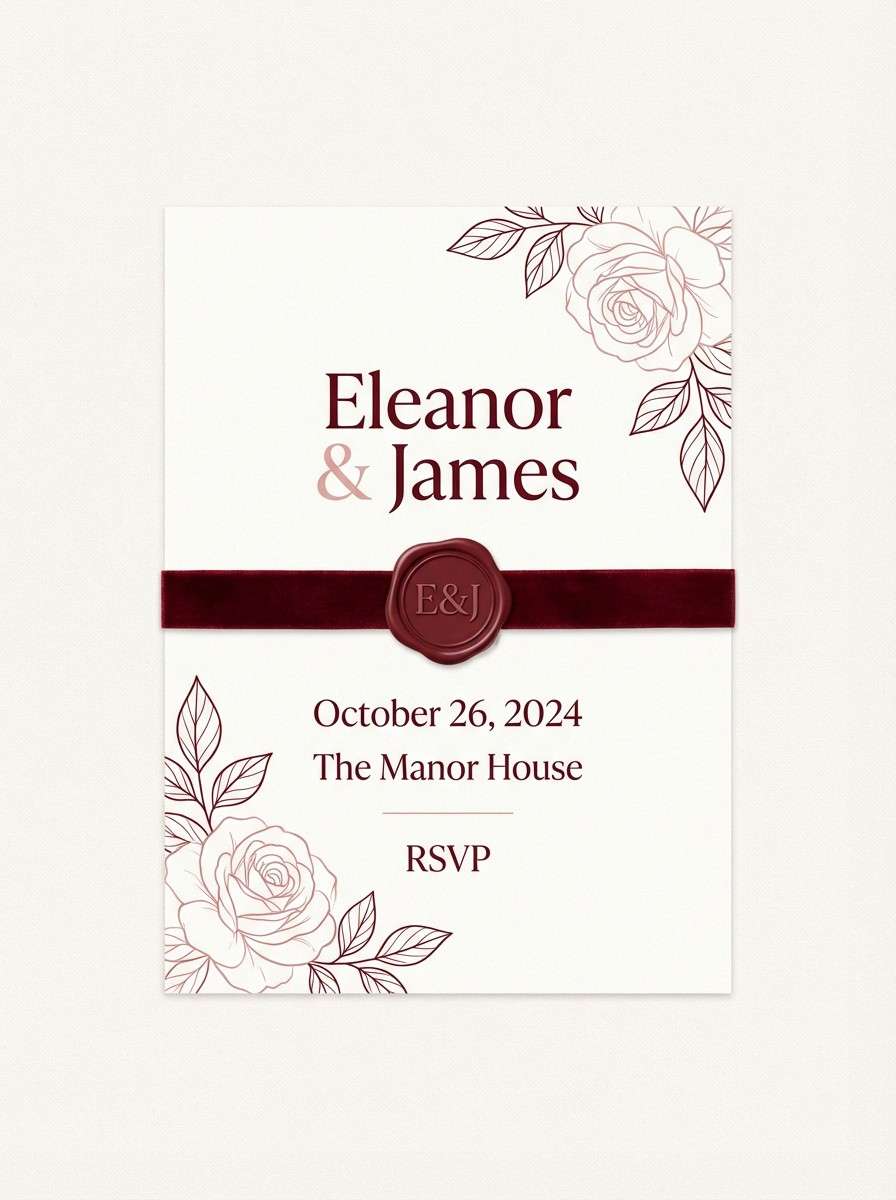
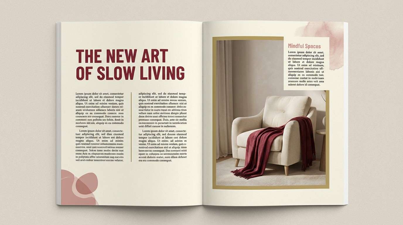
1) Velvet Rose
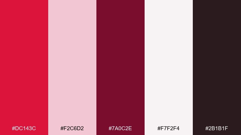
HEX: #dc143c #f2c6d2 #7a0c2e #f7f2f4 #2b1b1f
Mood: romantic and velvety
Best for: wedding invitation design
Romantic and velvety, these tones feel like rose petals and candlelit velvet. Use the deep red as your headline color and let blush and soft white handle the breathing room. Pair with warm gold foil or a subtle embossed texture for a premium finish. Tip: keep body text in the near-black shade to stay readable on light backgrounds.
Image example of velvet rose generated using media.io
Media.io is an online AI studio for creating and editing video, image, and audio in your browser.

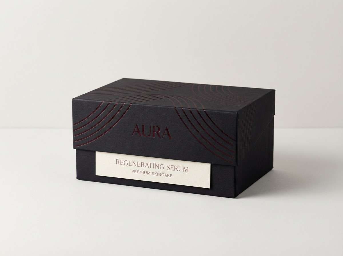
2) Garnet Noir
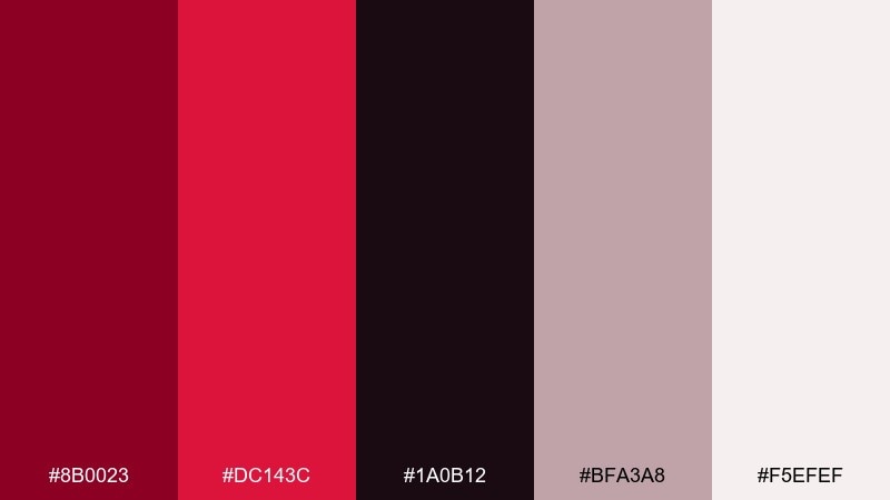
HEX: #8b0023 #dc143c #1a0b12 #bfa3a8 #f5efef
Mood: luxury and dramatic
Best for: beauty packaging and product labels
Luxury and dramatic, the mix reads like garnet gemstones against a black-tie night. Lean on the near-black for background blocks and let the brighter red pop as a brand signature. Soft mauve and porcelain white keep the design from feeling too heavy. Tip: use spot gloss on the red elements to create depth without adding new colors.
Image example of garnet noir generated using media.io
3) Spice Market
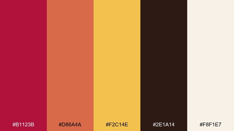
HEX: #b1123b #d86a4a #f2c14e #2e1a14 #f8f1e7
Mood: warm and appetizing
Best for: restaurant menus and food promos
Warm and appetizing, it evokes paprika, roasted citrus, and dark wooden tables. These crimson color combinations work beautifully for menu headers, price highlights, and callouts without feeling harsh. Pair the reds with creamy paper textures and use the golden tone as an accent for specials. Tip: keep large background areas in the pale cream so the spicy hues stay inviting.
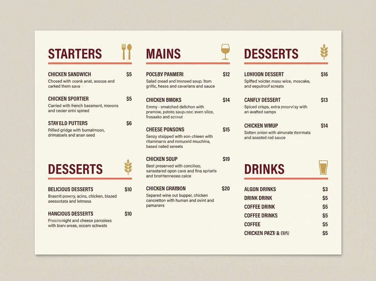
Image example of spice market generated using media.io
4) Crimson Steel UI
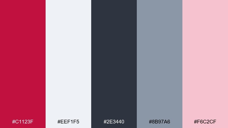
HEX: #c1123f #eef1f5 #2e3440 #8b97a6 #f6c2cf
Mood: modern and confident
Best for: fintech dashboard UI
Modern and confident, it feels like polished steel with a sharp red signal light. Use the cool grays for structure and reserve the red for primary actions, alerts, and key metrics. The soft pink works well for hover states or subtle charts without stealing focus. Tip: limit red to one main button style to keep the interface calm and consistent.
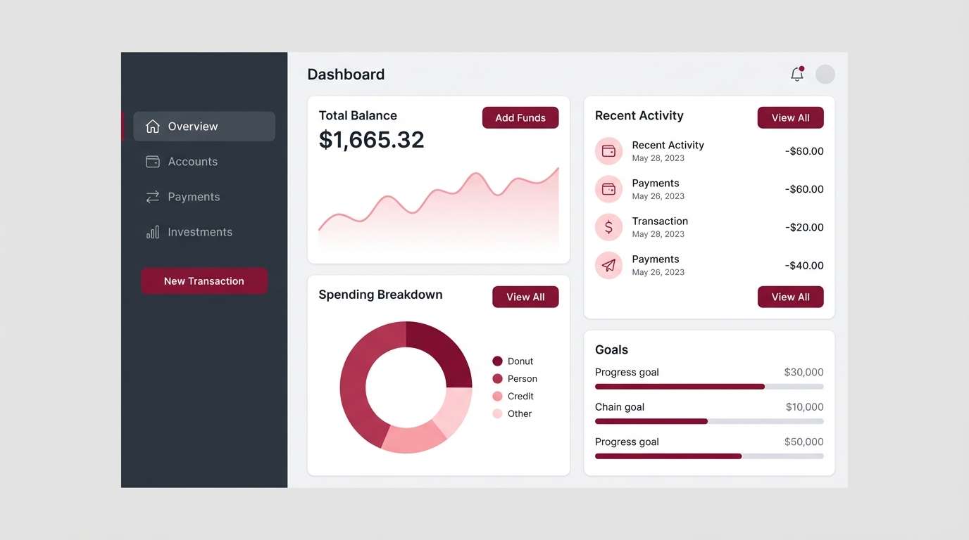
Image example of crimson steel ui generated using media.io
5) Winter Berry
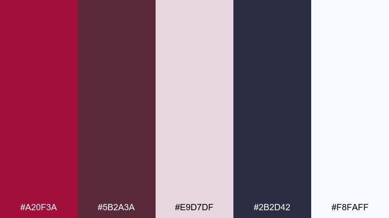
HEX: #a20f3a #5b2a3a #e9d7df #2b2d42 #f8faff
Mood: cozy and seasonal
Best for: holiday social posts
Cozy and seasonal, it suggests berry compote, knit scarves, and snowy dusk. The deep plum-red carries headlines while icy whites and soft mauve make space for content. Pair with simple geometric shapes or subtle grain to keep it modern. Tip: use the navy shade for small text so it stays crisp over pale backgrounds.
Image example of winter berry generated using media.io

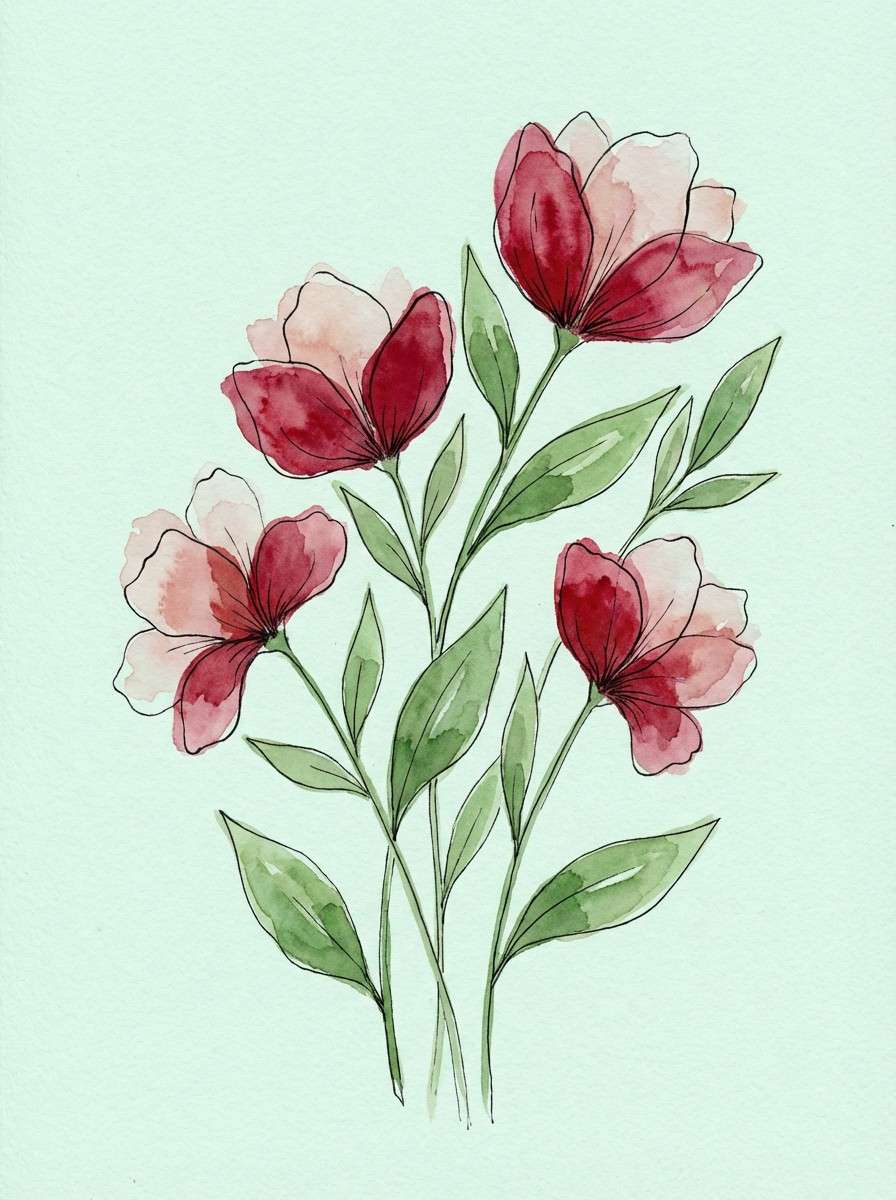
6) Botanical Garnet
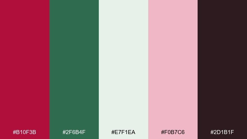
HEX: #b10f3b #2f6b4f #e7f1ea #f0b7c6 #2d1b1f
Mood: fresh and romantic
Best for: watercolor botanical illustrations
Fresh and romantic, the palette recalls garnet blooms against crisp garden greens. Let the green balance the red so florals feel lively rather than heavy. Soft minty off-white keeps highlights airy, while the blush shade adds petal warmth. Tip: paint the darkest shade sparingly for stems and shadows to avoid muddy details.
Image example of botanical garnet generated using media.io
7) Museum Editorial
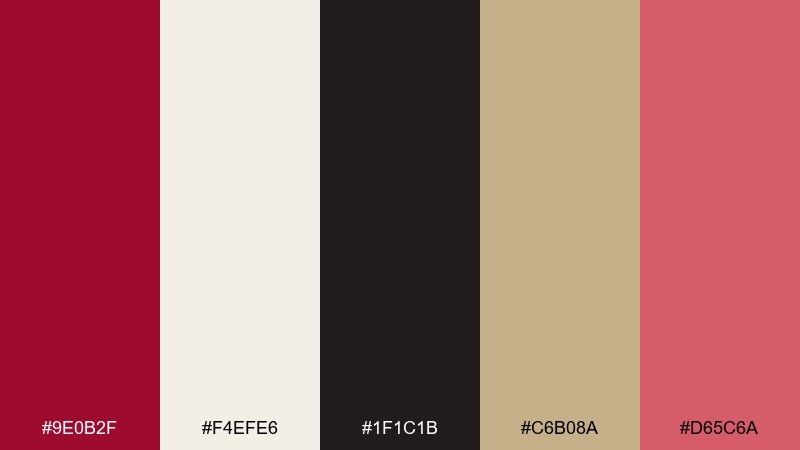
HEX: #9e0b2f #f4efe6 #1f1c1b #c6b08a #d65c6a
Mood: cultured and timeless
Best for: magazine layouts and editorial spreads
Cultured and timeless, it feels like gallery walls, linen paper, and a vintage lipstick mark. This crimson color palette shines in editorials where typography leads and color supports. Use cream as the page base, black for text, and the muted gold for rules, captions, or pull quotes. Tip: keep the dusty pink-red for small highlights so the main red stays special.
Image example of museum editorial generated using media.io
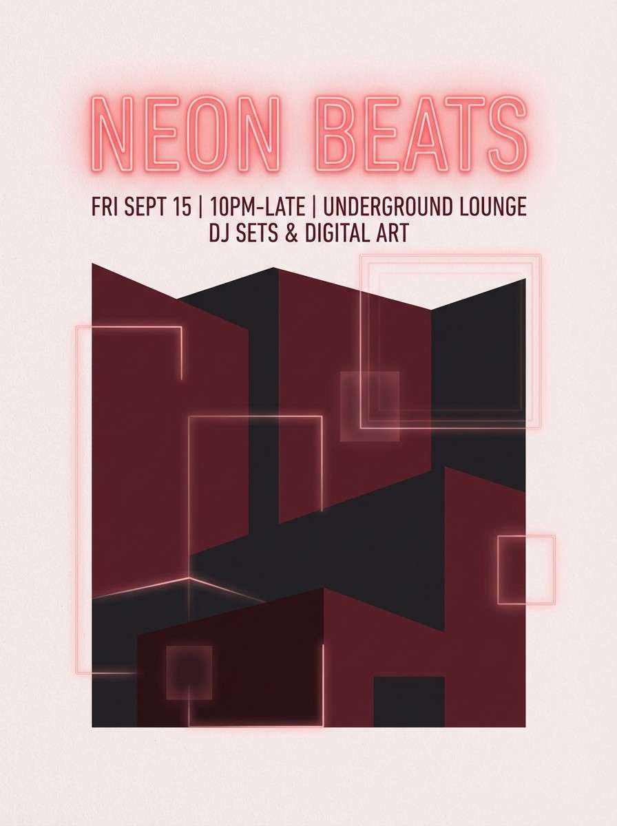
8) Neon Nightlife
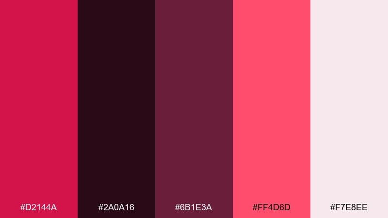
HEX: #d2144a #2a0a16 #6b1e3a #ff4d6d #f7e8ee
Mood: bold and electric
Best for: event posters and club flyers
Bold and electric, it evokes neon signs glowing through a midnight haze. Use the bright pink-red for the main title and anchor the layout with inky shadows. The pale blush works well for secondary text blocks or date panels. Tip: add high-contrast type and simple shapes so the colors feel energetic, not chaotic.
Image example of neon nightlife generated using media.io
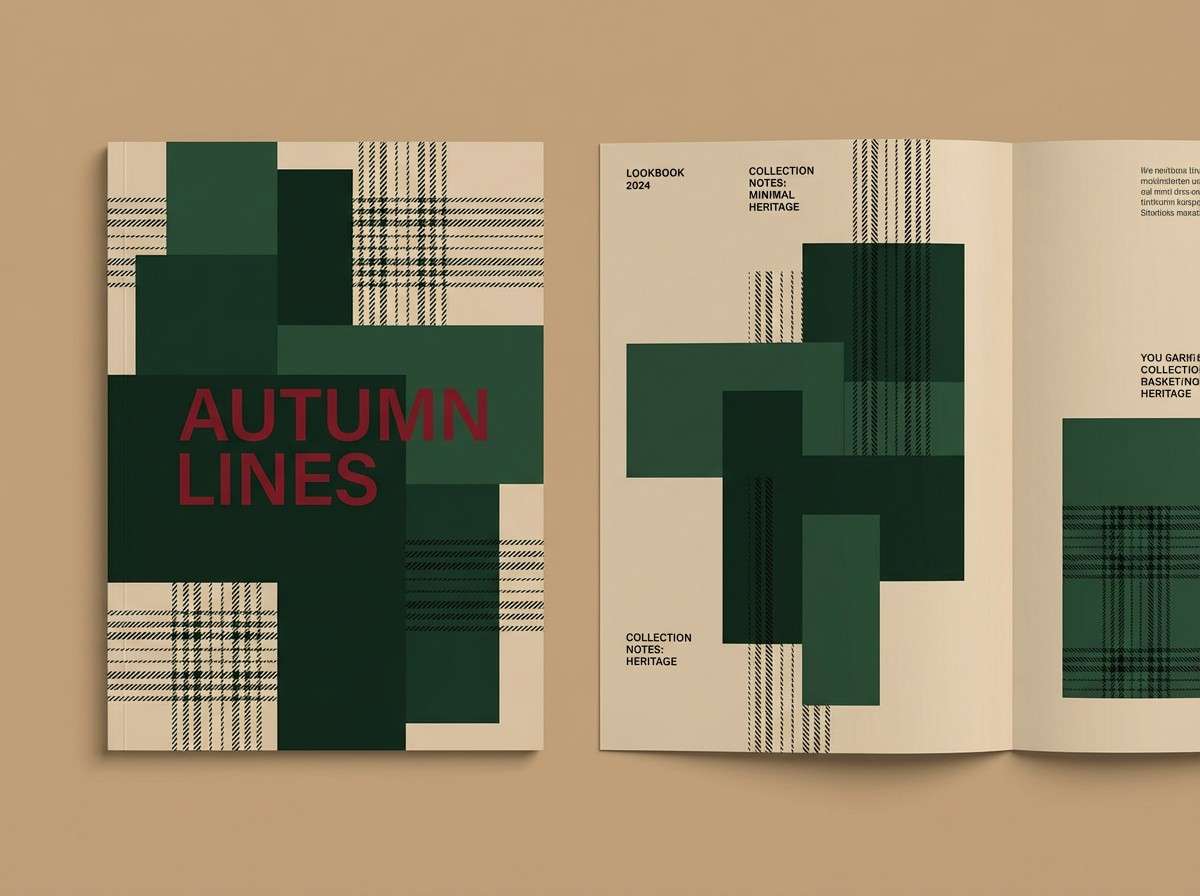
9) Heritage Tartan
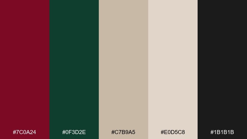
HEX: #7c0a24 #0f3d2e #c7b9a5 #e0d5c8 #1b1b1b
Mood: heritage and grounded
Best for: fall fashion lookbooks
Heritage and grounded, it brings to mind tartan fabric, forest walks, and vintage leather. The deep red and evergreen make a strong duo for section headers and cover typography. Use the warm beige tones for backgrounds that feel like paper or wool. Tip: keep the black for small details like page numbers and thin rules to avoid overpowering the earthy feel.
Image example of heritage tartan generated using media.io
10) Clay and Wine
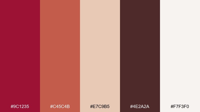
HEX: #9c1235 #c45c4b #e7c9b5 #4e2a2a #f7f3f0
Mood: earthy and warm
Best for: interior design mood boards
Earthy and warm, it feels like terracotta pots, red wine stains, and sunlit plaster. Use the creamy tones as your wall or canvas color, then bring in the reds through textiles and accents. The cocoa shade helps ground layouts with headings or frame lines. Tip: repeat the coral tone in small touches across the board to create a cohesive flow.
Image example of clay and wine generated using media.io
11) Tech Cherry
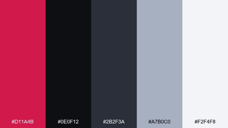
HEX: #d11a4b #0e0f12 #2b2f3a #a7b0c0 #f2f4f8
Mood: sleek and high-contrast
Best for: gaming app UI
Sleek and high-contrast, it reads like a dark interface lit by a cherry-red pulse. Use the near-black as your base and layer cool grays for panels and dividers. Keep the red for primary CTAs, active states, and badges so users always know what matters. Tip: avoid using red for long text and reserve it for short, scannable UI signals.
Image example of tech cherry generated using media.io

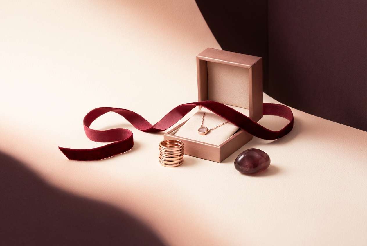
12) Rose Gold Luxe
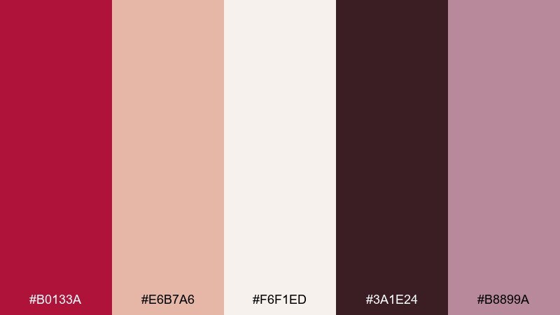
HEX: #b0133a #e6b7a6 #f6f1ed #3a1e24 #b8899a
Mood: soft and upscale
Best for: jewelry ads and luxury promos
Soft and upscale, it suggests rose-gold reflections and a quiet boutique glow. These crimson color combinations work best when the red is an accent, not the whole canvas. Pair the warm blush and cream for backgrounds, then add the deep plum-brown for elegant contrast in type. Tip: use the muted mauve as a gradient step to make metallic-style shadows feel natural.
Image example of rose gold luxe generated using media.io
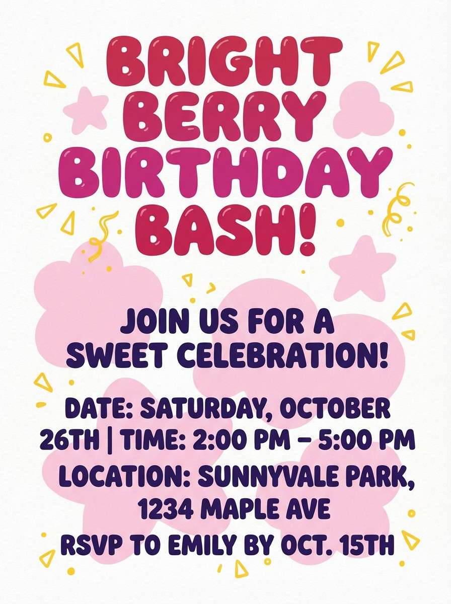
13) Playful Berry Pop
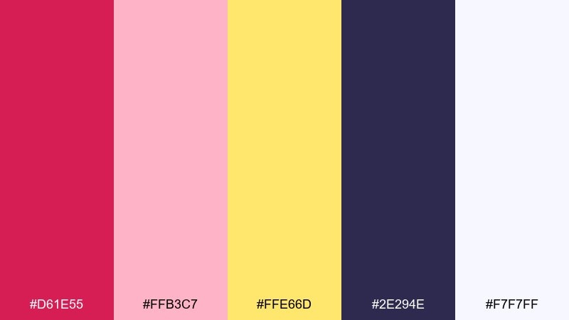
HEX: #d61e55 #ffb3c7 #ffe66d #2e294e #f7f7ff
Mood: fun and youthful
Best for: kids party flyers
Fun and youthful, it looks like berry candy wrappers and sunshine confetti. Use the bright red-pink for the event name and let the buttery yellow highlight times and RSVP details. The deep indigo keeps typography legible and adds a modern edge. Tip: stick to bold shapes and chunky type so the playful contrast feels intentional.
Image example of playful berry pop generated using media.io
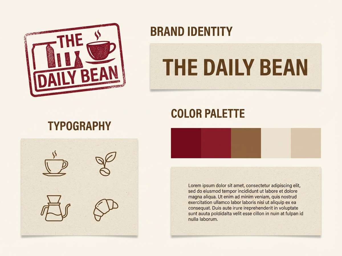
14) Coffee and Crimson
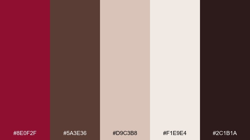
HEX: #8e0f2f #5a3e36 #d9c3b8 #f1e9e4 #2c1b1a
Mood: cozy and artisanal
Best for: cafe branding
Cozy and artisanal, the tones feel like espresso crema with a red jam swirl. Use the warm neutrals for logos, menus, and packaging backgrounds, then add the deep red as a signature stamp or seal. The dark roast shade works nicely for typography and icon outlines. Tip: keep the brand mark simple so the earthy palette does most of the storytelling.
Image example of coffee and crimson generated using media.io
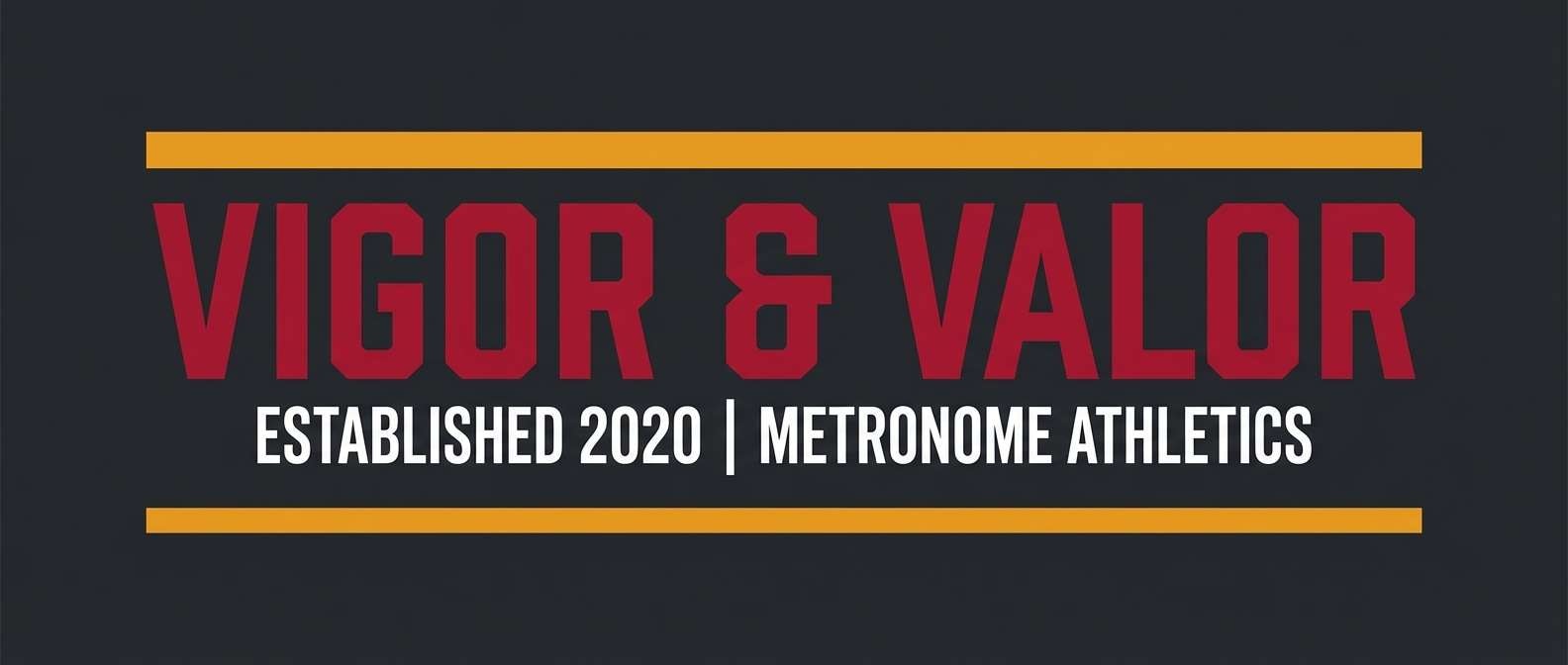
15) Athletic Bold
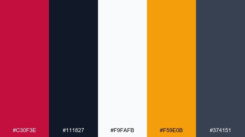
HEX: #c30f3e #111827 #f9fafb #f59e0b #374151
Mood: energetic and competitive
Best for: sports banners and team graphics
Energetic and competitive, it channels stadium lights and crisp team jerseys. Use the deep red for the hero headline and combine it with charcoal for strong contrast. The amber accent is ideal for highlights like scores, dates, or sponsor tags. Tip: keep the background mostly dark so the white and red read sharply from a distance.
Image example of athletic bold generated using media.io
16) Sunset Sangria
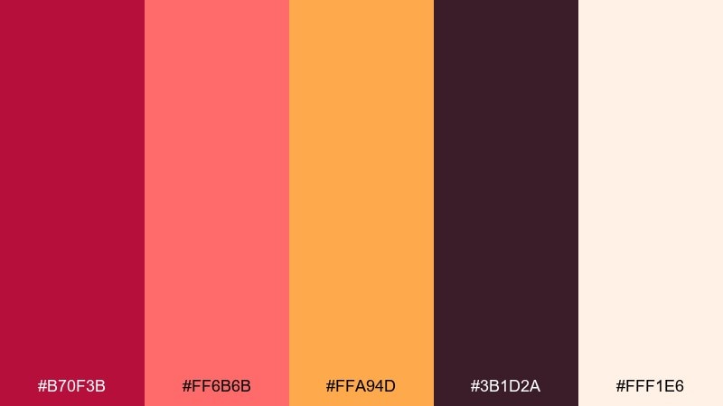
HEX: #b70f3b #ff6b6b #ffa94d #3b1d2a #fff1e6
Mood: summery and vibrant
Best for: cocktail promo posters
Summery and vibrant, it feels like sangria at golden hour with citrus slices on the rim. Use the creamy base to keep the poster bright, then layer the reds for the title and the orange for callouts. The deep plum shade adds contrast for body copy and small icons. Tip: try a simple two-tone gradient from coral to orange for a background that still matches the palette.
Image example of sunset sangria generated using media.io

17) Minimal Blush Contrast
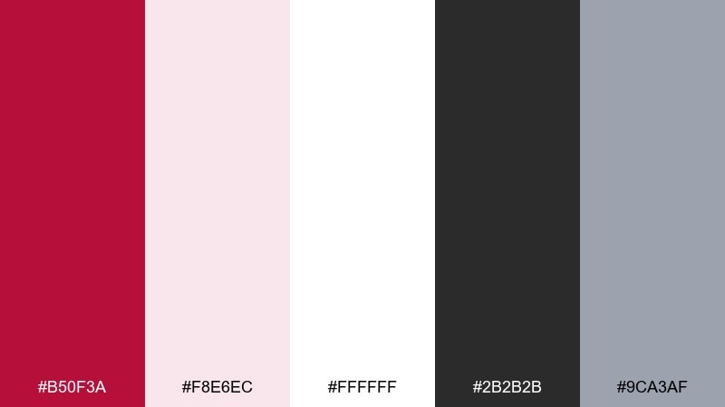
HEX: #b50f3a #f8e6ec #ffffff #2b2b2b #9ca3af
Mood: clean and editorial
Best for: minimal ecommerce landing pages
Clean and editorial, the look is like blush-tinted paper with crisp ink. Use white as the primary canvas, then bring in the deep red for one decisive CTA and key prices. The charcoal and cool gray keep product details readable and refined. Tip: keep spacing generous and let the red appear only once per section for a premium feel.
Image example of minimal blush contrast generated using media.io
18) Dark Academia
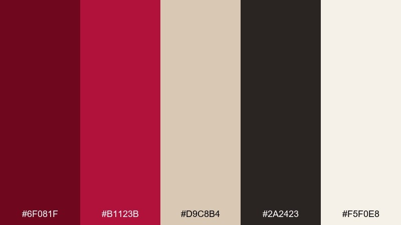
HEX: #6f081f #b1123b #d9c8b4 #2a2423 #f5f0e8
Mood: moody and scholarly
Best for: book covers
Moody and scholarly, it evokes old libraries, leather bindings, and margin notes. Use the parchment tones for the main background and set type in the deep brown-black for a classic feel. The reds work best as a title block, wax-seal motif, or small ornament. Tip: add subtle paper grain and keep the color blocks simple to maintain that academic atmosphere.
Image example of dark academia generated using media.io
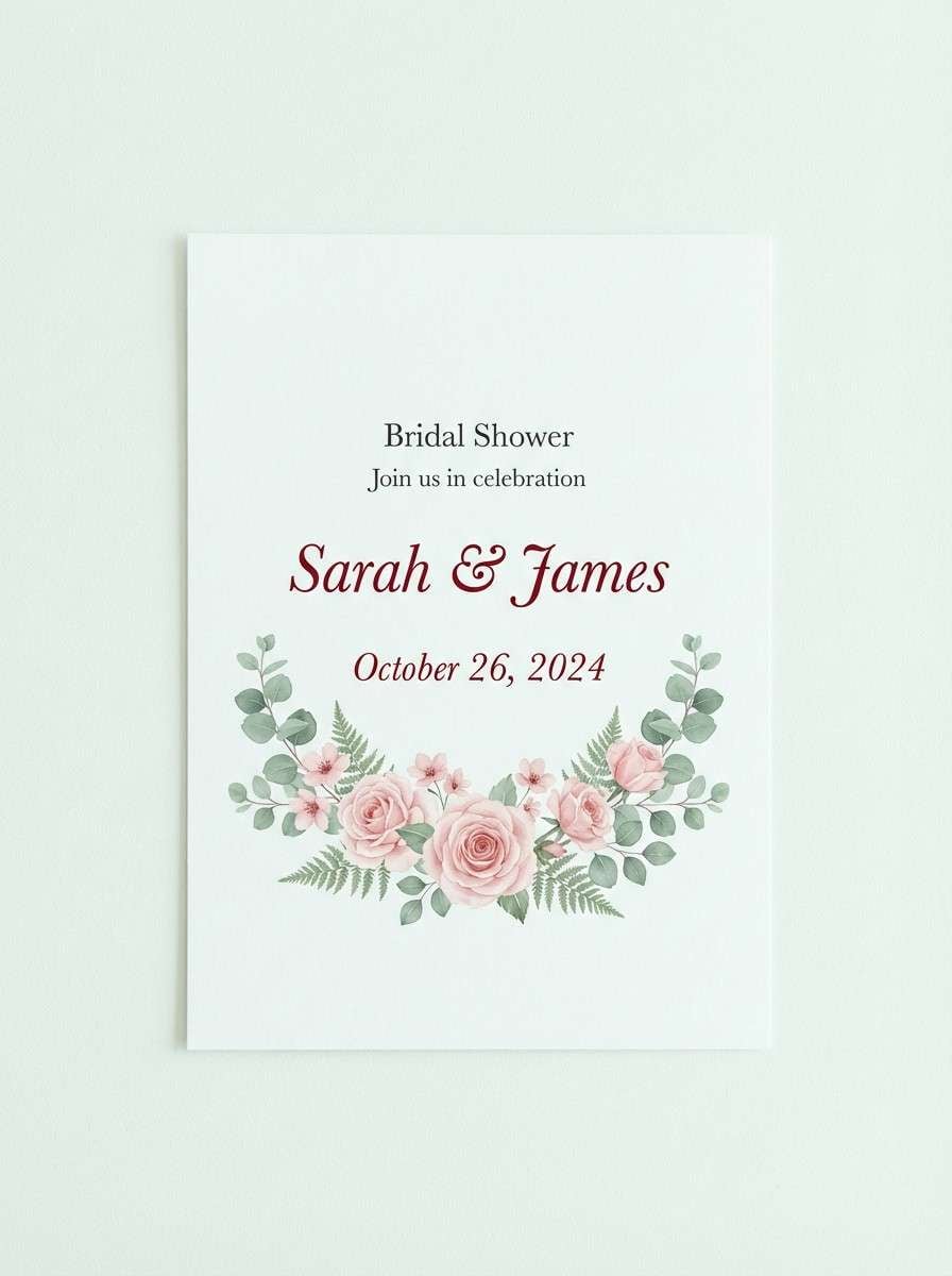
19) Floral Romance
HEX: #c11444 #f7c9d4 #f3f7f5 #6b8f71 #2c1b1f
Mood: garden and graceful
Best for: bridal shower invitations
Garden and graceful, it suggests blush blossoms with leafy green stems. Use the pale minty white for the base and bring in the red for names, dates, and small floral accents. The sage green is perfect for borders, monograms, or a delicate pattern. Tip: keep contrast high by using the dark shade for small text and thin lines.
Image example of floral romance generated using media.io
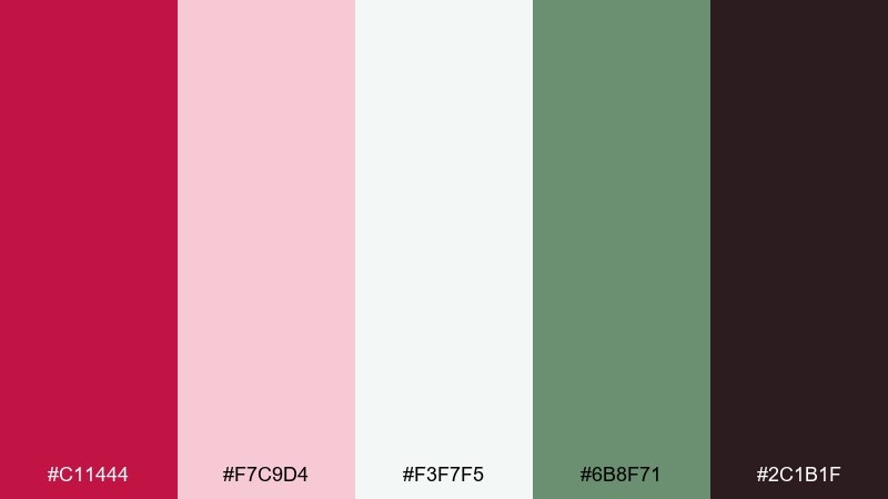
20) Cinematic Crimson
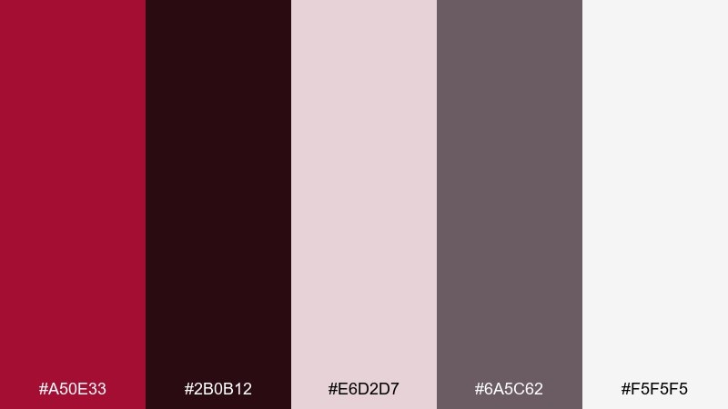
HEX: #a50e33 #2b0b12 #e6d2d7 #6a5c62 #f5f5f5
Mood: dramatic and cinematic
Best for: movie posters and key art
Dramatic and cinematic, it feels like a theater curtain opening into a smoky scene. Use the near-black plum for large background blocks and let the deep red carry the title. Pale grays and soft pinkish neutrals help with billing text and credits without breaking the mood. Tip: add a subtle vignette using the darker tones to guide the eye toward the headline.
Image example of cinematic crimson generated using media.io
What Colors Go Well with Crimson?
Crimson pairs beautifully with clean neutrals like warm white, cream, and soft blush—these keep it elegant and print-friendly. For stronger contrast, charcoal, near-black plum, and deep navy make crimson feel sharper and more modern.
If you want warmth and appetite appeal, add terracotta, coral, amber, and golden accents. For a botanical or romantic balance, sage and natural greens cool down crimson and help it feel fresh rather than heavy.
Metallics also work well: warm gold and rose-gold amplify crimson’s luxe side, while brushed silver can push it toward a sleek, tech-forward aesthetic.
How to Use a Crimson Color Palette in Real Designs
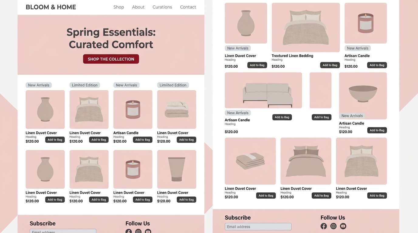
Use crimson as a hierarchy color, not a background default. In UI, reserve it for one main CTA style, active states, and short alerts; let grays and off-whites do most of the layout work so the interface stays calm.
For branding and packaging, treat crimson like a signature stamp: a logo mark, a band, or a label block. Combine it with a tactile neutral (cream, parchment, soft mauve) and one grounding dark for typography.
In print (invitations, editorials, posters), check legibility: crimson looks best as headlines and accents, while body text typically reads cleaner in charcoal/near-black on light stock.
Create Crimson Palette Visuals with AI
If you have HEX codes but need ready-to-use visuals, generate mockups and design examples from text prompts. It’s a fast way to explore different vibes—romantic, dramatic, minimal, or sporty—without rebuilding layouts from scratch.
Start with a simple prompt (format + subject + background + typography style), then iterate: swap paper textures, adjust lighting, or move crimson from “main color” to “accent” to get a more premium result.
When you find a direction you like, keep the palette consistent and only change one variable at a time (layout, type, or background) to avoid chaotic results.
Crimson Color Palette FAQs
-
What is the HEX code for classic crimson?
A widely used “classic crimson” HEX is #dc143c. It’s bold, slightly cool-leaning, and works well as an accent or headline color. -
Does crimson work better with warm or cool neutrals?
Both. Warm neutrals (cream, parchment, blush) make crimson feel romantic and premium, while cool neutrals (steel gray, charcoal, icy white) make it feel modern and UI-friendly. -
What text color is most readable on crimson backgrounds?
For solid crimson backgrounds, light text (off-white/white) usually reads best. For lighter blush/cream backgrounds, use near-black or charcoal for body copy and reserve crimson for short emphasis. -
What metallic looks best with crimson?
Warm gold and rose-gold are the most natural pairings for luxury designs. Silver can also work if your palette includes cool grays and you want a sleek, tech-forward look. -
Can I use crimson in a website UI without it feeling aggressive?
Yes—limit crimson to primary actions and key highlights, and build the rest of the interface with whites and structured grays. Using one consistent crimson button style keeps the system calm. -
What are good accent colors with crimson for seasonal designs?
For winter/holiday: mauve, icy white, and deep navy. For fall: warm beige, forest green, and near-black. For summer: coral and orange accents on a creamy base. -
How do I generate crimson palette images quickly?
Use a text-to-image tool and include both the mood (e.g., “luxury packaging” or “minimal ecommerce UI”) and lighting/background details in your prompt, then iterate with small changes while keeping your HEX palette consistent.
Next: Orchid Color Palette


