

Tundra color palettes balance grounded neutrals with cool, icy accents—perfect when you want modern calm without feeling sterile. Think foggy blue-grays, mossy greens, stone charcoals, and warm paper-browns that still read clean.
Below are 20 tundra palette combos with HEX codes, plus real-world pairing tips for UI, branding, and editorial layouts—so you can keep contrast readable and the mood intentionally understated.
In this article
Why Tundra Palettes Work So Well
Tundra tones sit in that sweet spot between warm earthy neutrals and cool winter grays, which makes them feel natural, modern, and broadly “brand-safe.” They’re subtle enough for minimalist design, but still carry mood through undertones (sage, slate, sand, clay).
Because the hues are typically low-saturation, you can build hierarchy with value (light-to-dark) instead of loud color. That means clean typography, calmer interfaces, and layouts that feel premium rather than promotional.
They also photograph and print well: these muted colors complement paper textures, linen, stone, and matte coatings, so the palette feels intentional across web, packaging, and editorial.
20+ Tundra Color Palette Ideas (with HEX Codes)
1) Frosted Lichen
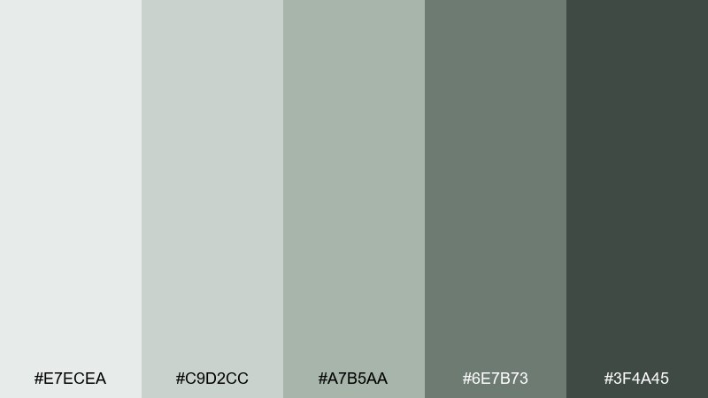
HEX: #E7ECEA #C9D2CC #A7B5AA #6E7B73 #3F4A45
Mood: quiet, fresh, grounded
Best for: minimal skincare packaging
Quiet morning frost over soft lichen and stone comes through in these cool greens and gentle grays. It works beautifully on minimalist packaging where you want clean trust signals without feeling clinical. Pair it with lots of white space and a warm off-black for type to keep it premium. Usage tip: use #A7B5AA as the hero label color and reserve #3F4A45 for small, high-contrast text.
Image example of frosted lichen generated using media.io
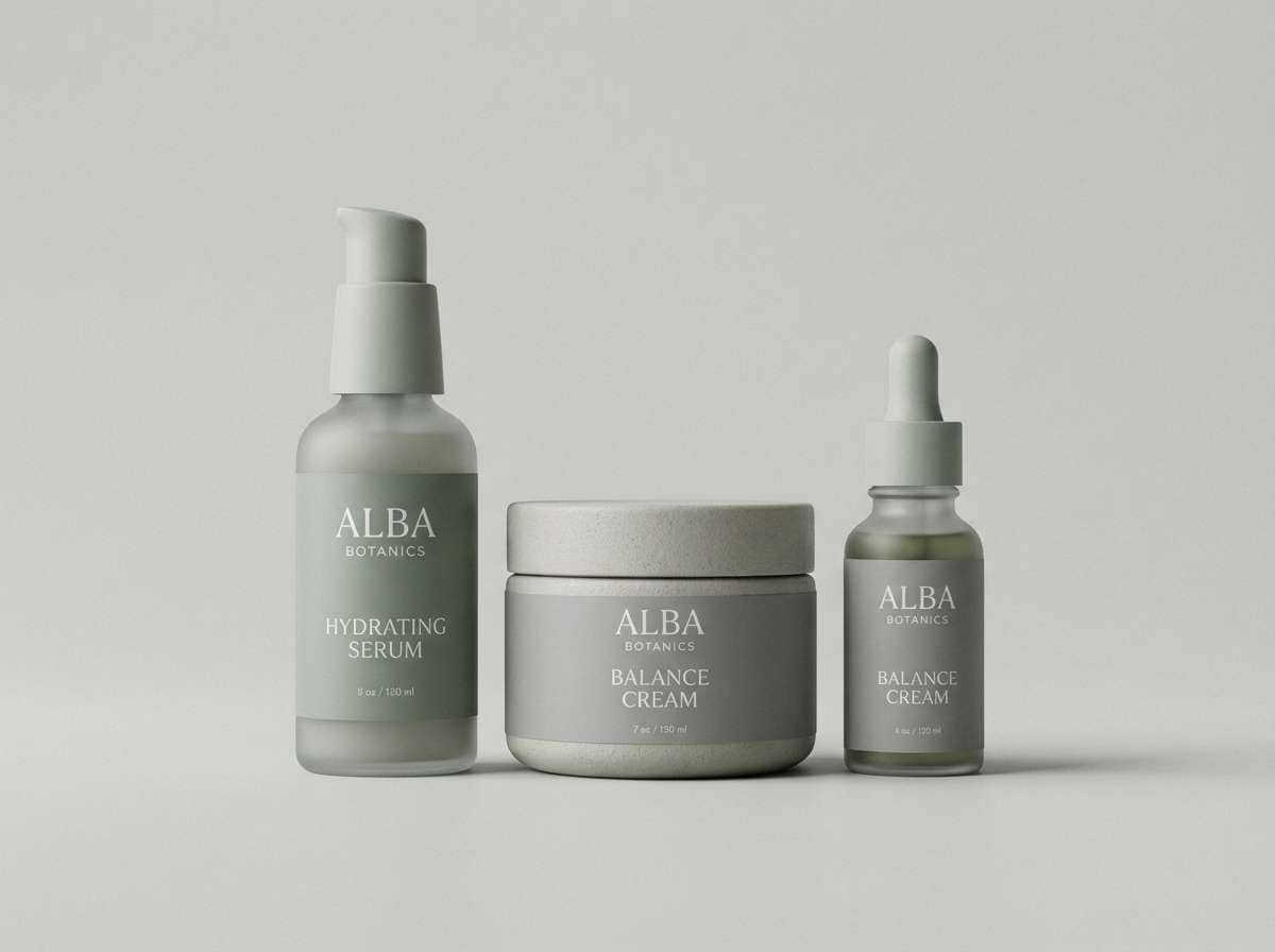
Media.io is an online AI studio for creating and editing video, image, and audio in your browser.

2) Granite Drift
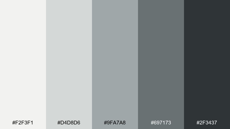
HEX: #F2F3F1 #D4D8D6 #9FA7A8 #697173 #2F3437
Mood: minimal, cool, professional
Best for: analytics dashboard UI
Cool granite haze and overcast light give this set a crisp, no-nonsense feel. It is ideal for data-heavy dashboards where clarity and hierarchy matter more than decoration. Pair #2F3437 with #F2F3F1 for accessible contrast, then use #9FA7A8 for dividers and secondary text. Usage tip: keep charts restrained and highlight only one metric with a single accent tone from the set.
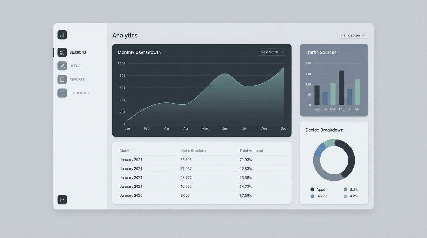
Image example of granite drift generated using media.io
3) Mossy Ridge
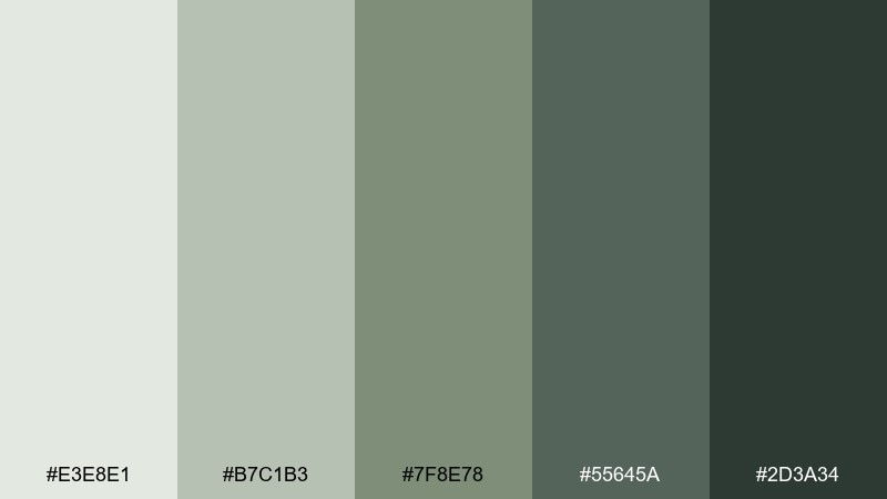
HEX: #E3E8E1 #B7C1B3 #7F8E78 #55645A #2D3A34
Mood: earthy, steady, outdoorsy
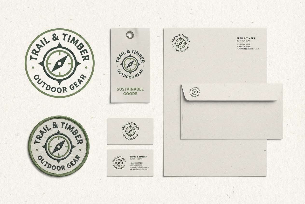
Best for: outdoor gear brand identity
Earthy moss on rocky ridgelines makes this mix feel dependable and trail-ready. These tundra color combinations are a strong fit for outdoor brands that want rugged credibility without loud saturation. Pair the deeper greens with textured paper stock and simple iconography for a heritage look. Usage tip: use #2D3A34 for the wordmark and #7F8E78 for secondary badges and tags.
Image example of mossy ridge generated using media.io
4) Snowfield Sage
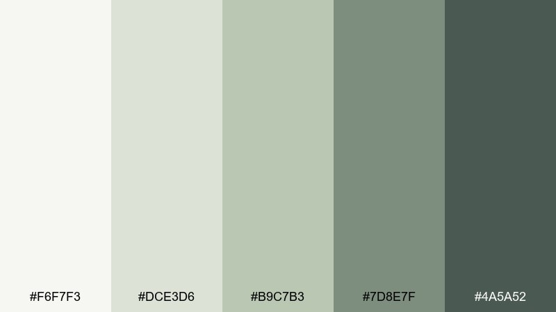
HEX: #F6F7F3 #DCE3D6 #B9C7B3 #7D8E7F #4A5A52
Mood: airy, clean, gentle
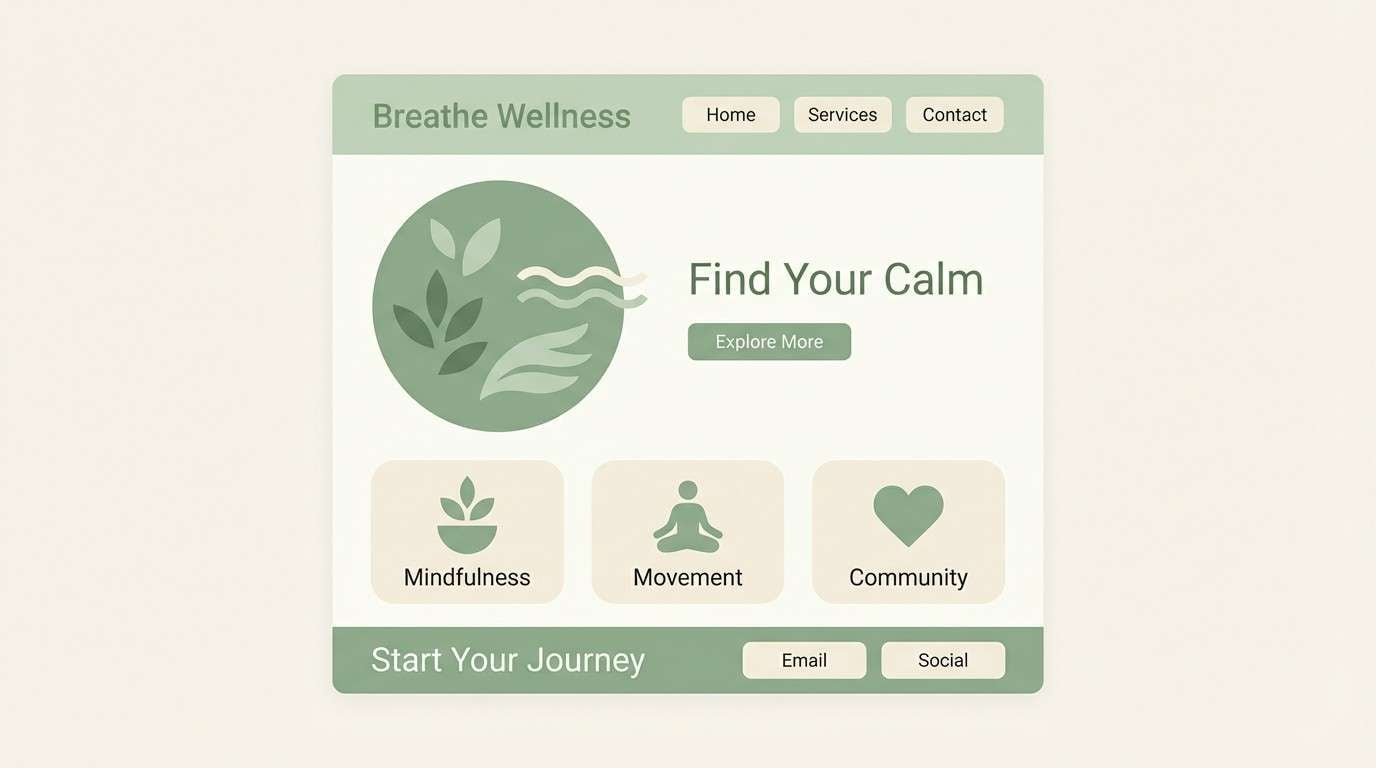
Best for: wellness landing page UI
Airy snowfields and soft sage shadows make the palette feel calm and breathable. It suits wellness and mindfulness pages where you want a bright base with a natural tint. Pair the pale tones with thin-line icons and rounded components for a friendly, modern interface. Usage tip: keep primary buttons in #7D8E7F and reserve #4A5A52 for headings to maintain contrast.
Image example of snowfield sage generated using media.io
5) Glacier Fog
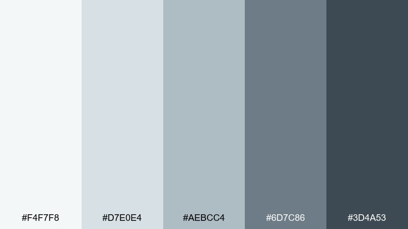
HEX: #F4F7F8 #D7E0E4 #AEBCC4 #6D7C86 #3D4A53
Mood: icy, calm, modern
Best for: SaaS hero banner design
Icy fog rolling off a glacier gives these blue-grays a calm, technical edge. They work well for SaaS hero sections where you want a modern, trustworthy tone without going full corporate navy. Pair the lightest shades with subtle gradients and keep typography dark for readability. Usage tip: limit gradients to two stops, like #F4F7F8 into #D7E0E4, to avoid a washed-out look.
Image example of glacier fog generated using media.io

6) Pebble Creek
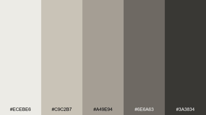
HEX: #ECEBE6 #C9C2B7 #A49E94 #6E6A63 #3A3834
Mood: warm neutral, rustic, balanced
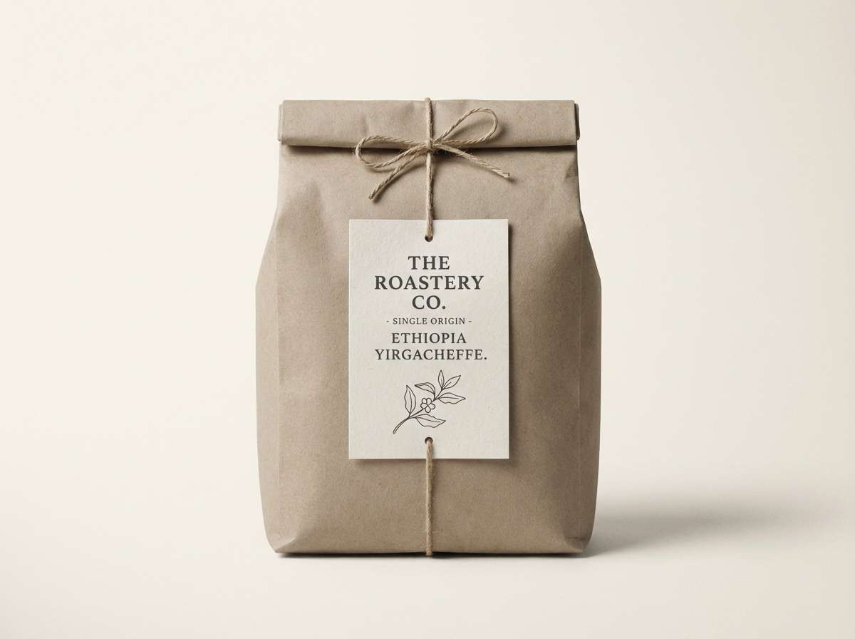
Best for: artisan coffee label design
River pebbles and wet sand bring a grounded warmth to these soft neutrals. The tones fit artisan coffee labels, menus, and small-batch packaging where tactile materials matter. Pair with kraft paper, subtle grain, and a single bold serif to add character. Usage tip: print test #A49E94 early, since mid-neutrals can shift quickly depending on paper stock.
Image example of pebble creek generated using media.io
7) Northern Dune
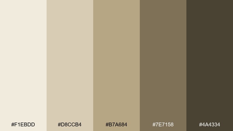
HEX: #F1EBDD #D8CCB4 #B7A684 #7E7158 #4A4334
Mood: sunlit, natural, earthy
Best for: travel magazine cover
Sunlit dunes under a pale winter sky make these sandy neutrals feel calm and inviting. This tundra color palette is a strong choice for travel or lifestyle covers that need warmth without going tropical. Pair it with black-and-white photography or sepia imagery to keep the tone cohesive. Usage tip: set headlines in #4A4334 and use #D8CCB4 as a subtle background panel for cover lines.
Image example of northern dune generated using media.io
8) Pine Ash
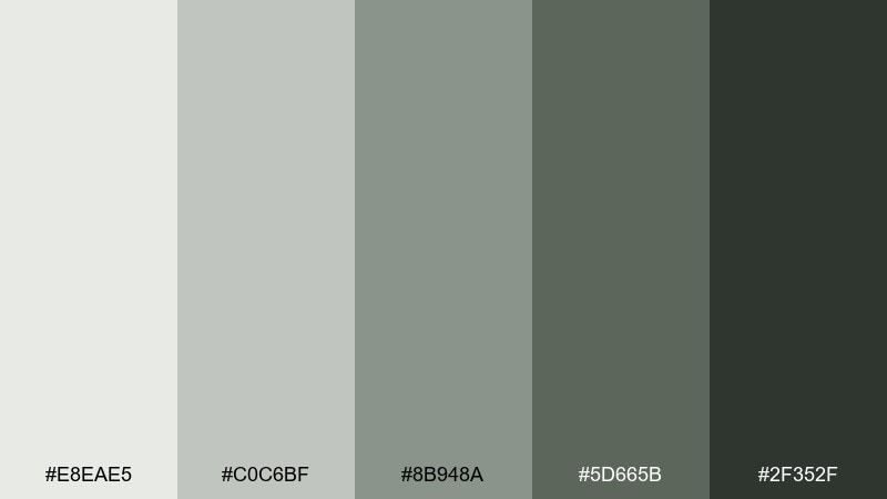
HEX: #E8EAE5 #C0C6BF #8B948A #5D665B #2F352F
Mood: forest calm, understated, modern
Best for: eco-friendly app UI kit
Pine needles dusted with ash create a muted, responsible mood. It fits eco-focused apps that need to feel sustainable and modern without leaning into bright greens. Pair the mid-tones with simple card components and plenty of spacing so the interface stays light. Usage tip: use #2F352F for primary text and keep #8B948A for secondary labels to maintain a gentle hierarchy.
Image example of pine ash generated using media.io
9) Quiet Fjord
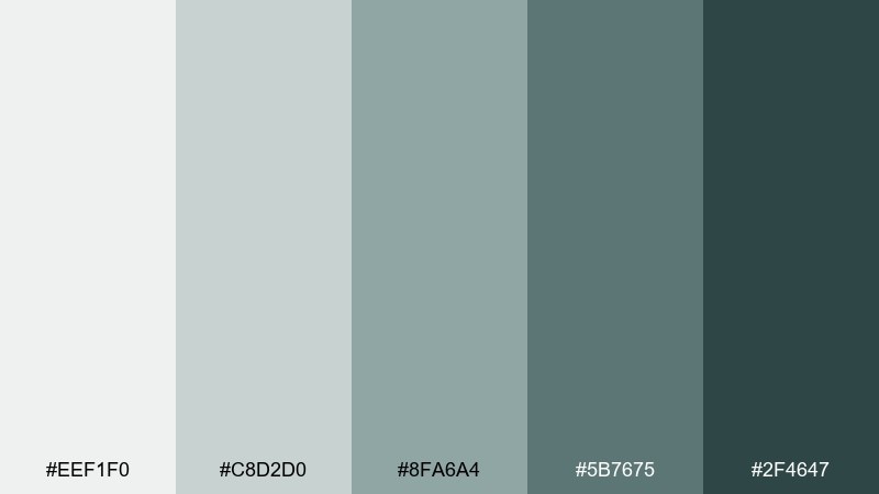
HEX: #EEF1F0 #C8D2D0 #8FA6A4 #5B7675 #2F4647
Mood: cool, serene, coastal
Best for: hotel booking website UI
Still fjord water and misty air give these blue-green grays a serene polish. They suit hospitality sites where you want calm confidence and easy readability. Pair with crisp white sections and a single deep tone for CTAs so the page does not feel flat. Usage tip: keep buttons in #2F4647 and use #C8D2D0 for borders and inactive states.
Image example of quiet fjord generated using media.io
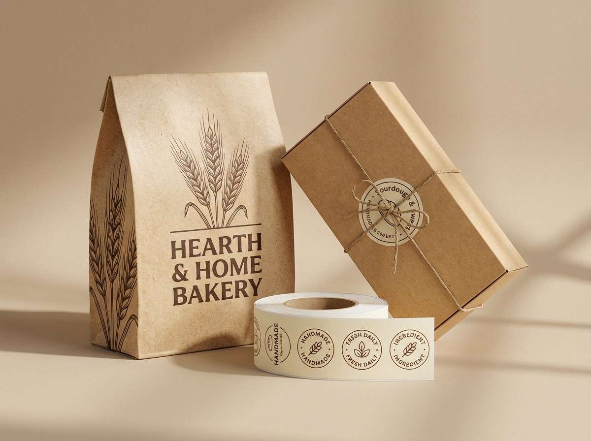
10) Winter Wheat
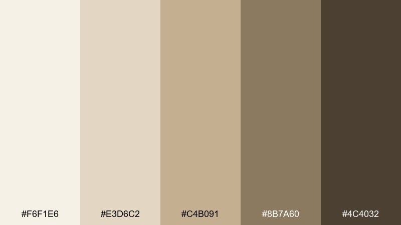
HEX: #F6F1E6 #E3D6C2 #C4B091 #8B7A60 #4C4032
Mood: cozy, earthy, heritage
Best for: bakery brand packaging
Warm wheat fields after first frost make these browns feel cozy and familiar. The palette is perfect for bakery packaging, cafes, and menu boards that need a handcrafted vibe. Pair it with cream backgrounds and classic serif type to amplify the heritage feel. Usage tip: use #8B7A60 for pattern elements and keep #4C4032 for your logo to anchor the design.
Image example of winter wheat generated using media.io
11) Arctic Clay
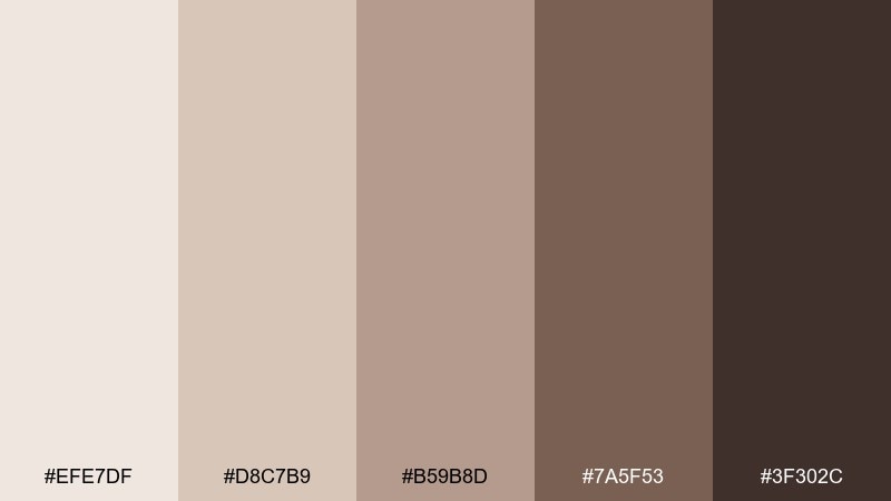
HEX: #EFE7DF #D8C7B9 #B59B8D #7A5F53 #3F302C
Mood: soft, earthy, refined
Best for: ceramics product ad
Soft clay and pale stone create a refined, earthy warmth. These tundra color combinations look great in product ads for ceramics, home goods, or slow-living brands. Pair with minimal props and tactile textures like linen or raw wood so the colors feel intentional. Usage tip: light the scene with gentle side light to bring out the nuance between #D8C7B9 and #B59B8D.
Image example of arctic clay generated using media.io
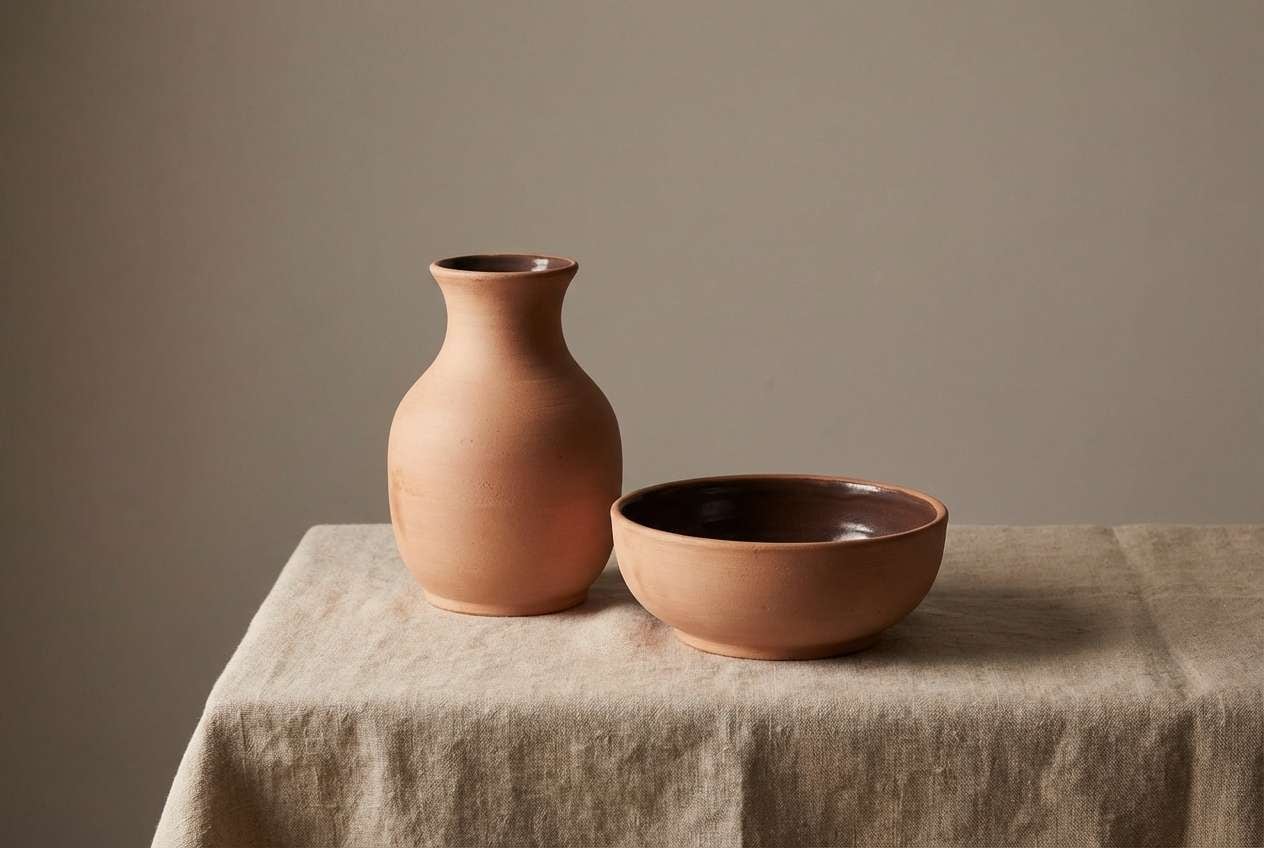
12) Slate Meadow
HEX: #E5E8E9 #C1C8CA #8B969C #5A666D #2E343A
Mood: cool, structured, confident
Best for: B2B pitch deck template
Slate skies over low meadow grass give this palette a structured, confident tone. It fits B2B decks where you want authority while staying modern and readable. Pair the light grays with one deep slate for section headers and keep charts clean and minimal. Usage tip: use #C1C8CA for table fills and save #2E343A for key numbers and headings.
Image example of slate meadow generated using media.io

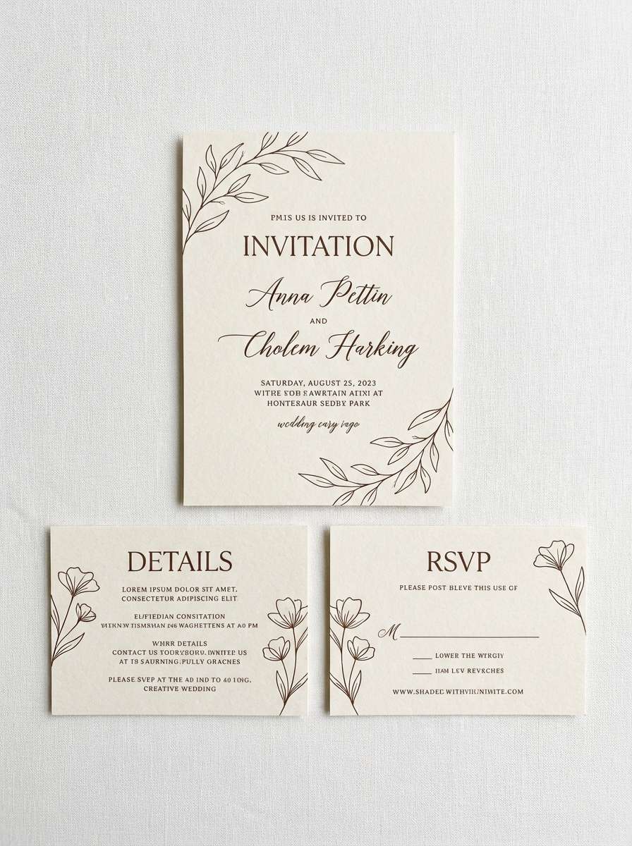
13) Birch Bark
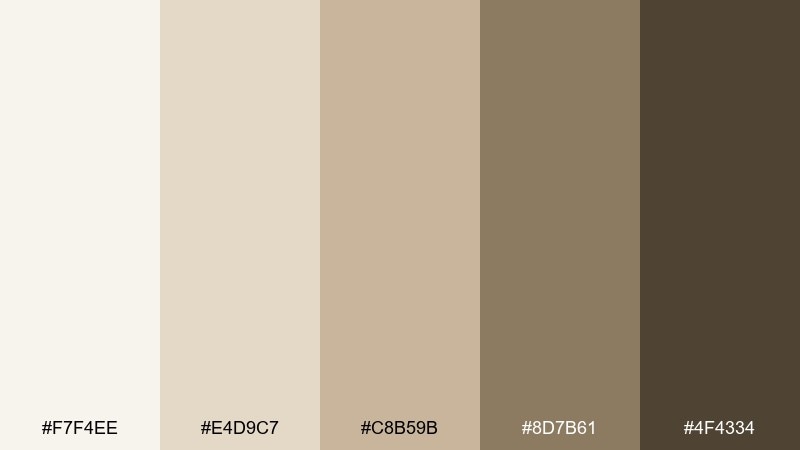
HEX: #F7F4EE #E4D9C7 #C8B59B #8D7B61 #4F4334
Mood: natural, warm, handcrafted
Best for: wedding invitation suite
Birch bark textures and warm paper tones make the set feel intimate and handcrafted. It is lovely for wedding invitations, especially rustic or woodland themes that still want a clean finish. Pair with delicate line art, blind emboss, or soft florals to add detail without clutter. Usage tip: print the main text in #4F4334 and use #E4D9C7 as the paper base for an elevated look.
Image example of birch bark generated using media.io
14) Ironstone Calm
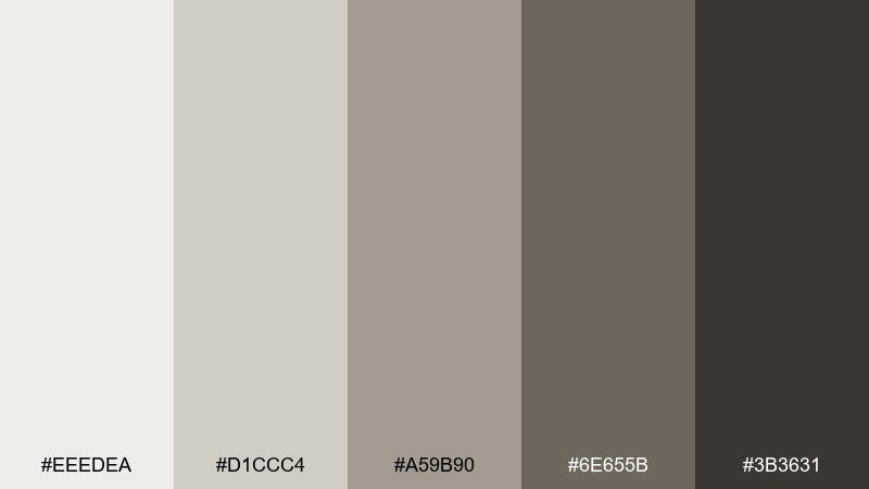
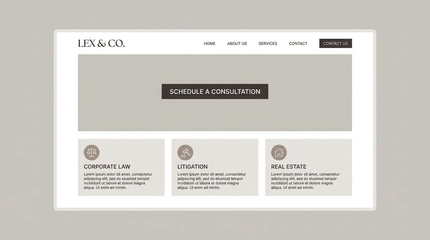
HEX: #EEEDEA #D1CCC4 #A59B90 #6E655B #3B3631
Mood: subtle, mature, timeless
Best for: law firm website redesign
Ironstone and weathered concrete set a mature, timeless mood. It is well suited for professional services that want understated authority without harsh black-and-white. Pair with generous margins, classic typography, and a single accent line to keep pages breathable. Usage tip: use #3B3631 for navigation and #D1CCC4 for section backgrounds to create gentle depth.
Image example of ironstone calm generated using media.io
15) Clouded Spruce
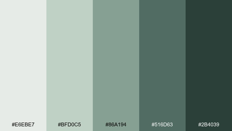
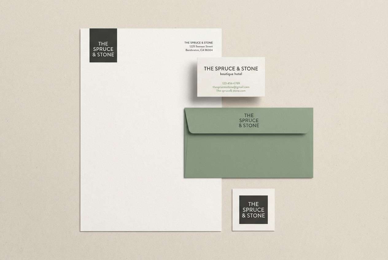
HEX: #E6EBE7 #BFD0C5 #86A194 #516D63 #2B4039
Mood: moody, natural, contemporary
Best for: boutique hotel logo and stationery
Cloud cover over spruce forests gives these greens a moody, contemporary depth. The tones are perfect for boutique hospitality branding that wants nature cues without looking rustic. Pair with a modern serif and minimal monogram marks for an upscale feel. Usage tip: foil-stamp the logo in a dark ink close to #2B4039 and keep #BFD0C5 for supporting stationery fields.
Image example of clouded spruce generated using media.io
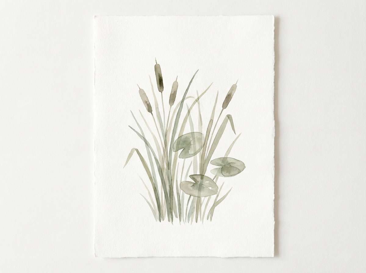
16) Frozen Marsh
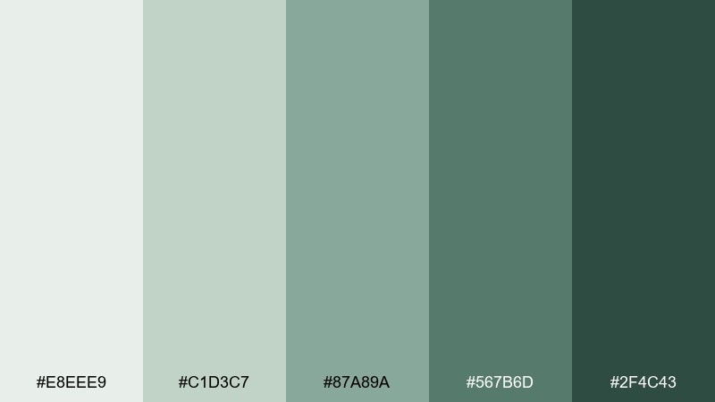
HEX: #E8EEE9 #C1D3C7 #87A89A #567B6D #2F4C43
Mood: fresh, earthy, restorative
Best for: botanical watercolor print
Frozen marsh grasses and crisp air make these greens feel restorative and alive. Use it for botanical illustrations, eco posters, or calming wall art where subtle contrast matters. Pair the mid-greens with light paper texture and plenty of negative space. Usage tip: build shading with #C1D3C7 and keep #2F4C43 for fine outlines and stems.
Image example of frozen marsh generated using media.io
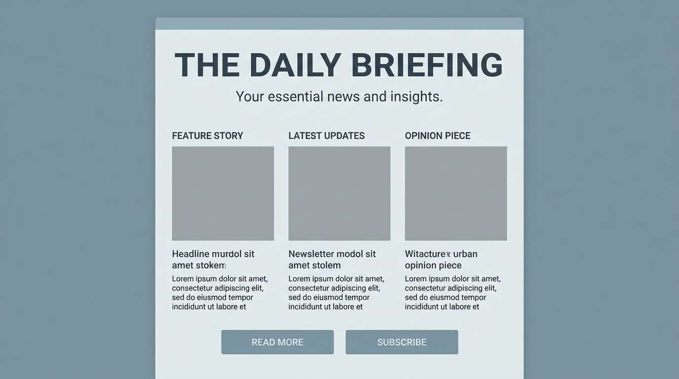
17) Sea Smoke
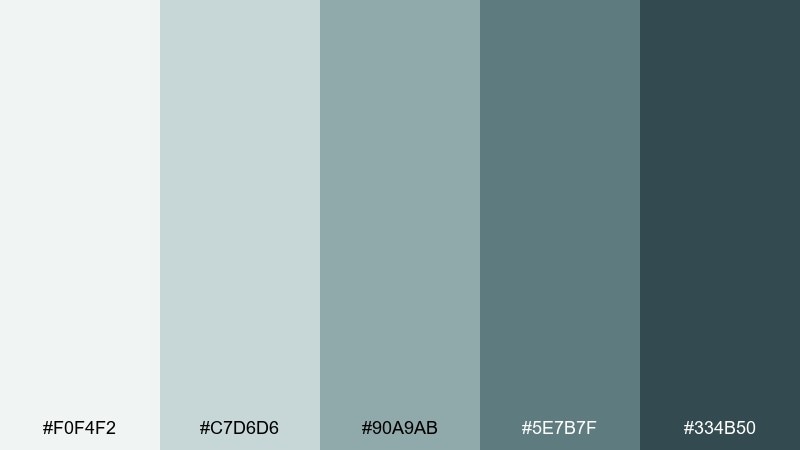
HEX: #F0F4F2 #C7D6D6 #90A9AB #5E7B7F #334B50
Mood: cool, breezy, refined
Best for: editorial newsletter layout
Sea smoke and coastal wind come through as cool, refined blue-grays. It works nicely for editorial newsletters where you want calm readability and a modern grid. Pair the lightest tones with strong typographic hierarchy and simple rules for separation. Usage tip: use #5E7B7F for section labels and keep #334B50 for body text to avoid low-contrast fatigue.
Image example of sea smoke generated using media.io
18) Raven Pebble
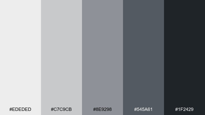
HEX: #EDEDED #C7C9CB #8E9298 #545A61 #1F2429
Mood: sharp, modern, high-contrast
Best for: tech conference poster
Raven feathers against pale pebbles create a sharp, modern contrast. This tundra color palette is great for tech posters when you want drama without bright color. Pair with bold condensed typography and geometric blocks to keep it energetic. Usage tip: set the main title in #1F2429 and use #8E9298 for secondary details like date and venue.
Image example of raven pebble generated using media.io

19) Dried Kelp
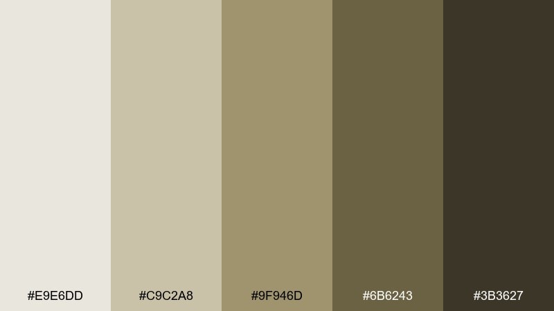
HEX: #E9E6DD #C9C2A8 #9F946D #6B6243 #3B3627
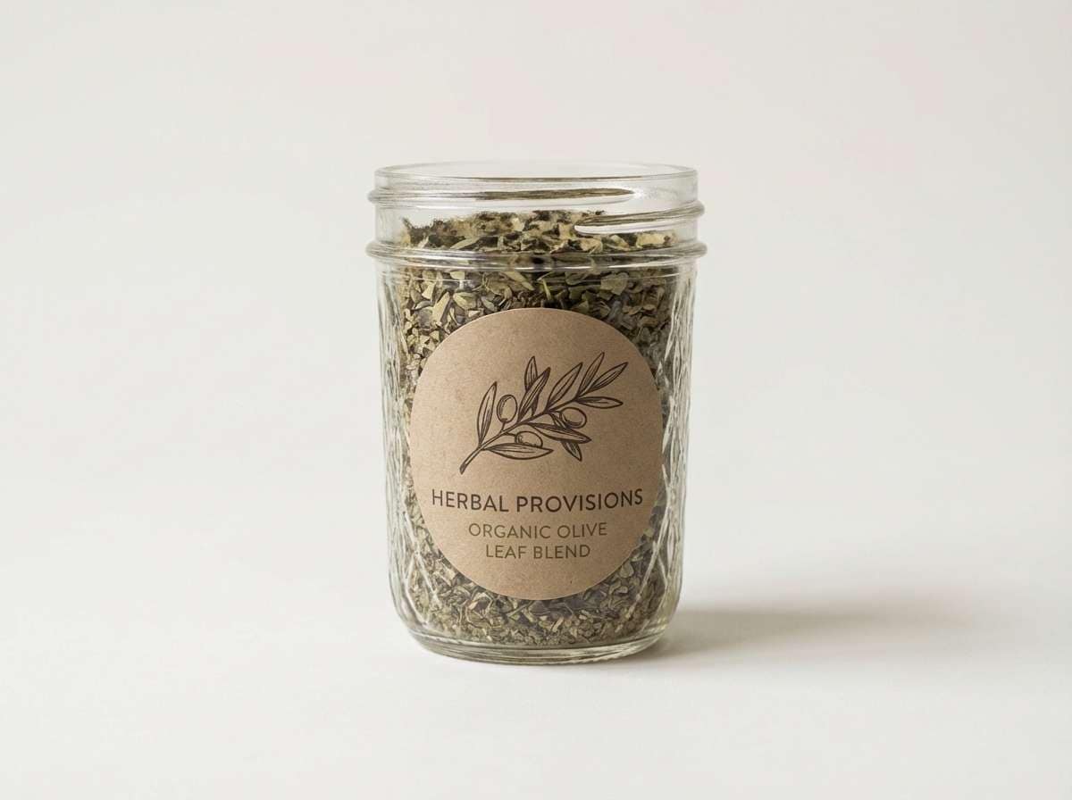
Mood: organic, vintage, earthy
Best for: natural food product label
Dried kelp and coastal sand give these olive-browns an organic, vintage warmth. They are ideal for natural food labels that want an earthy shelf presence without shouting. Pair with hand-drawn illustrations and minimal color blocking to keep it artisanal. Usage tip: use #9F946D as the main label field and keep #3B3627 for ingredient lists and small print.
Image example of dried kelp generated using media.io
20) Aurora Neutral
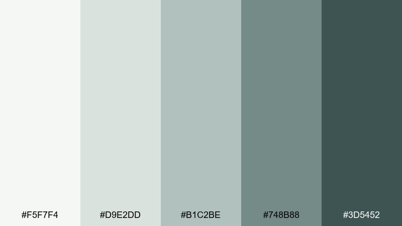
HEX: #F5F7F4 #D9E2DD #B1C2BE #748B88 #3D5452
Mood: soft, modern, quietly optimistic
Best for: brand moodboard presentation
A hint of aurora glow over muted neutrals makes the set feel quietly optimistic. These tundra color combinations are great for moodboards when you need a clean base plus a gentle green-blue lift. Pair with natural textures like stone, linen, and matte metal to keep it contemporary. Usage tip: let #F5F7F4 carry most of the layout and use #748B88 only for key highlights and annotations.
Image example of aurora neutral generated using media.io
What Colors Go Well with Tundra?
Tundra palettes pair naturally with off-whites, warm grays, and charcoal—these keep the overall look quiet while giving you enough contrast for typography and UI states. If your base is cool (glacier or slate), a slightly warm neutral (paper, sand, clay) prevents the design from feeling cold.
For accents, choose one restrained “signal” color and use it sparingly: deep spruce/teal for CTAs, muted sage for highlights, or dark brown-charcoal for premium headers. The goal is controlled emphasis, not rainbow variety.
Materials and finishes also matter: tundra tones love matte surfaces, textured paper, linen, and subtle grain. Those textures add depth without needing high saturation.
How to Use a Tundra Color Palette in Real Designs
Start with a light base (your off-white or pale gray), then define hierarchy with two text tones: a near-black charcoal for body copy and a mid-gray/green-gray for secondary labels. This structure keeps interfaces readable while still feeling soft.
For branding, pick one dark anchor (wordmark, nav, key headings) and one mid-tone field color (labels, cards, backgrounds). Tundra palettes shine when you commit to negative space and let spacing do the “decorating.”
In editorial layouts, use the mid-tones for rules, captions, and callout panels, and keep imagery cohesive by avoiding overly warm filters. A consistent temperature (cool or gently warm) is what makes tundra palettes look intentional.
Create Tundra Palette Visuals with AI
If you want to preview how these HEX combinations feel on packaging, landing pages, or posters, generate quick mock visuals first. It’s the fastest way to test whether your palette reads “premium calm” or “flat and low-contrast.”
With Media.io Text to Image, you can paste a prompt (like the examples above), iterate styles, and quickly find a layout direction before committing to a full design system.
Once you have a few options, compare them side-by-side and keep the version with the cleanest hierarchy and clearest CTA contrast—tundra works best when it stays readable.
Tundra Color Palette FAQs
-
What is a tundra color palette?
A tundra color palette is a muted set of nature-inspired neutrals—often icy off-whites, stone grays, sage greens, slate blues, and deep charcoals—meant to feel calm, grounded, and modern. -
Are tundra tones warm or cool?
Most tundra palettes lean cool (blue-grays, green-grays), but many include warm balancing neutrals (sand, clay, wheat) so designs don’t feel overly cold. -
What accent color works best with tundra neutrals?
Deep spruce/teal, dark slate, or a muted olive are dependable accents. Keep it to one main accent for CTAs or highlights so the palette stays minimal and cohesive. -
Is a tundra color scheme good for UI design?
Yes—tundra palettes are excellent for UI because they support clear hierarchy with light-to-dark values. Just ensure accessible contrast for text and interactive elements (especially on mid-tone backgrounds). -
How do I keep tundra palettes from looking washed out?
Use a dark anchor color for typography (charcoal or deep brown), limit mid-tone text, and reserve the palest shades for backgrounds only. A single deeper CTA color also helps. -
Do tundra palettes print well on packaging?
They usually print very well on matte stocks and textured papers. Run a proof for mid-neutrals (the center HEX values) since they can shift depending on paper warmth and ink coverage. -
Can I generate tundra palette mockups with AI?
Yes—use Media.io’s text-to-image tool to create quick packaging, UI, or editorial mockups, then iterate prompts to test contrast, lighting, and texture before final production.


