

Cyberpunk city palettes are all about contrast: deep night bases, neon highlights, and slick, rain-reflection shine. They instantly signal “future,” “tech,” and “after-dark energy” in posters, UI, and branding.
Below are 20+ ready-to-use cyberpunk city color palette ideas with HEX codes—plus AI image prompts you can copy into Media.io to generate matching visuals fast.
In this article
- Why Cyberpunk City Palettes Work So Well
-
- neon rain avenue
- hologram alley
- taxi light signal
- metro circuit
- night market lanterns
- arcade afterhours
- steel skyline
- neon sushi bar
- signal noise
- subway neon map
- midnight billboard
- chrome streetwear
- vapor mist intersection
- rooftop drone glow
- electric kiosk
- neon noir cinema
- cobalt side street
- rainy neon reflections
- neon temple gate
- synth police lights
- alleyway graffiti glow
- quantum night drive
- neon transit hub
- What Colors Go Well with Cyberpunk City?
- How to Use a Cyberpunk City Color Palette in Real Designs
- Create Cyberpunk City Palette Visuals with AI
Why Cyberpunk City Palettes Work So Well
Cyberpunk city color schemes work because they mimic how real urban nights feel: large dark surfaces (sky, buildings, asphalt) punctuated by concentrated light sources (signage, screens, headlights). That contrast makes designs read instantly, even at small sizes.
They also blend “cold tech” hues (cyan, electric blue, violet) with high-impact warm pops (magenta, amber, neon yellow). The result is a futuristic palette that still feels emotional and cinematic—perfect for brands that want energy, speed, and edge.
Finally, cyberpunk palettes are naturally modular: dark neutrals build structure, while neons can be assigned to states (CTA, alert, highlight, navigation). That makes them especially practical for UI systems and scalable visual identities.
20+ Cyberpunk City Color Palette Ideas (with HEX Codes)
1) Neon Rain Avenue
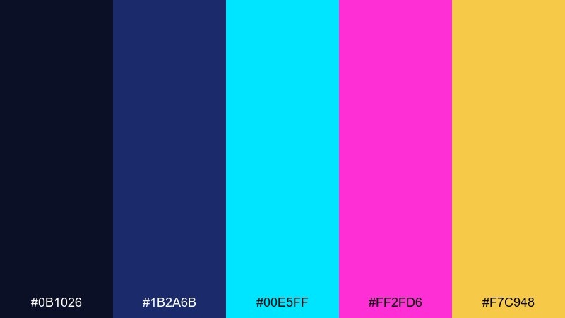
HEX: #0B1026 #1B2A6B #00E5FF #FF2FD6 #F7C948
Mood: electric, cinematic, rain-glossed
Best for: landing page hero with neon typography
Electric neon cutting through wet asphalt, like a midnight boulevard after a downpour. Use the deep navy and indigo as the base, then let cyan and magenta handle headlines, buttons, and glow accents. It works especially well for tech launches, nightlife promos, and streaming banners. Usage tip: keep yellow as a small highlight for CTAs so the page stays sharp, not noisy.
Image example of neon rain avenue generated using media.io
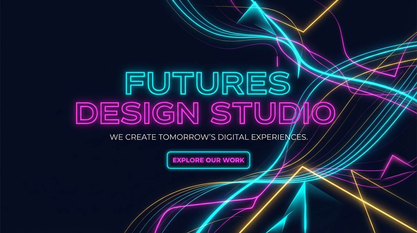
Media.io is an online AI studio for creating and editing video, image, and audio in your browser.

2) Hologram Alley
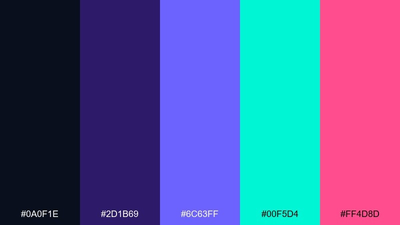
HEX: #0A0F1E #2D1B69 #6C63FF #00F5D4 #FF4D8D
Mood: glitchy, luminous, futuristic
Best for: music event poster on a plain background
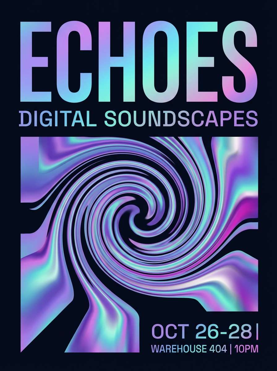
Glitchy holograms and LED billboards flicker between violet and aqua. The near-black base keeps the palette grounded, while periwinkle and teal create that synthetic light effect. Use it for posters, album drops, or club nights where type needs to pop from a distance. Usage tip: add subtle grain or halftone textures so the neon feels printed, not flat.
Image example of hologram alley generated using media.io
3) Taxi Light Signal
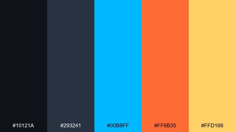
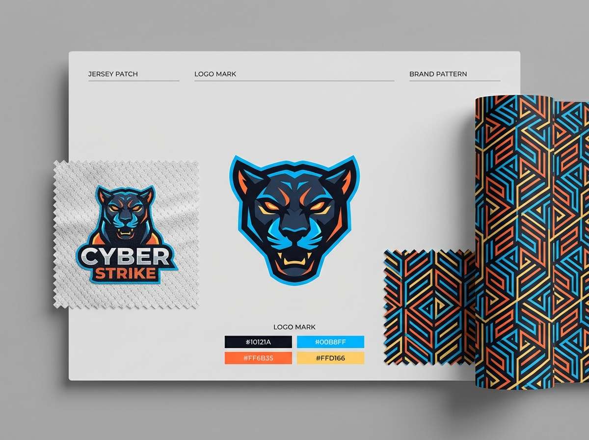
HEX: #10121A #293241 #00B8FF #FF6B35 #FFD166
Mood: urban, energetic, street-lit
Best for: sports team branding kit
Street-lit energy with a punch of warm signal orange, like traffic cutting through fog. These tones make a cyberpunk city color palette that still feels approachable for mainstream branding. Use the charcoal and slate for backgrounds and merch, then reserve the bright blue and amber for logos and highlights. Usage tip: keep the orange-to-yellow elements in the same area of a design to maintain clear hierarchy.
Image example of taxi light signal generated using media.io
4) Metro Circuit
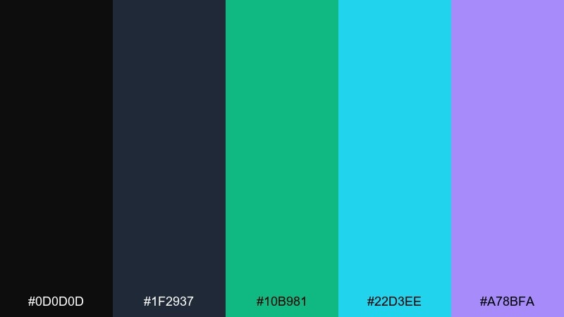
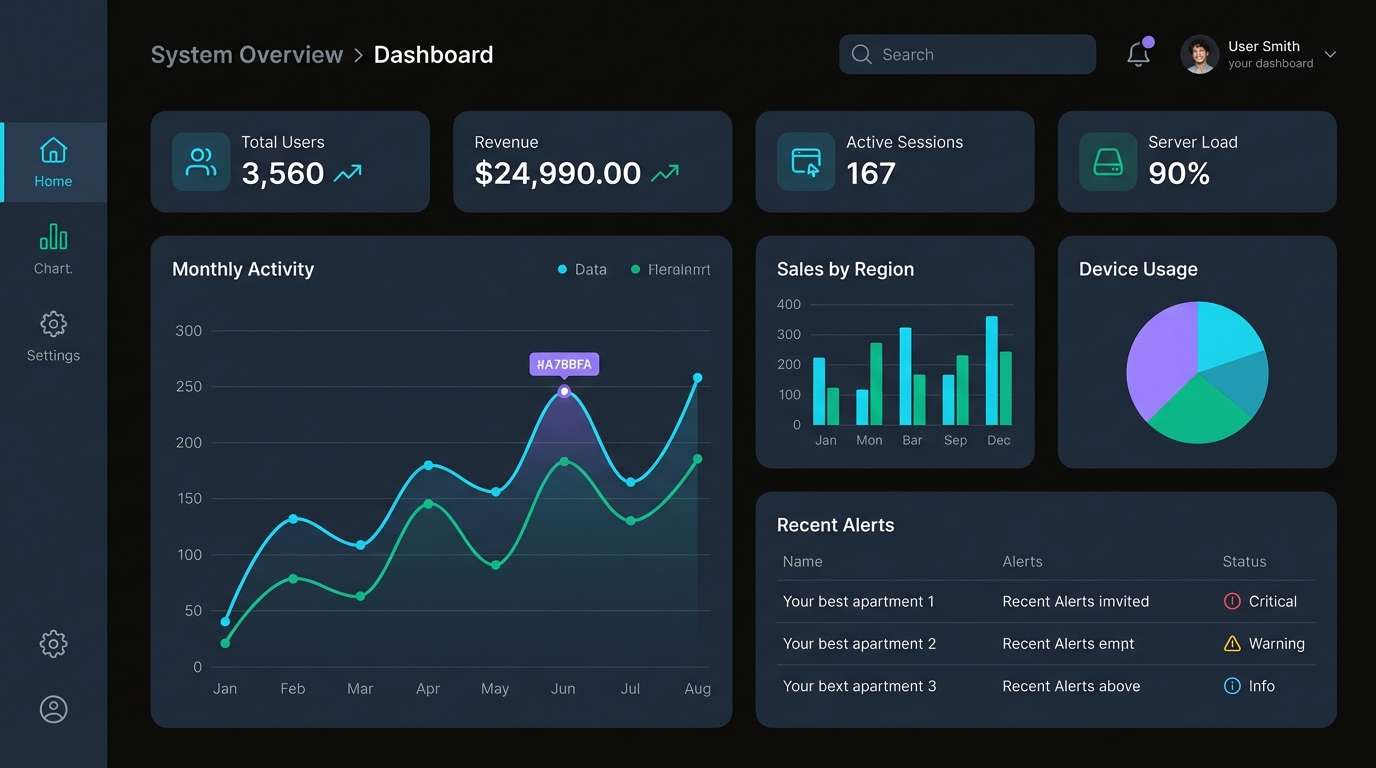
HEX: #0D0D0D #1F2937 #10B981 #22D3EE #A78BFA
Mood: sleek, technical, clean neon
Best for: data dashboard UI mockup (2D only)
Sleek station signage meets circuit-board glow, clean and controlled rather than chaotic. The grays give you a professional UI foundation, while teal and mint create clear status colors and active states. It fits fintech dashboards, developer tools, and product analytics where contrast matters. Usage tip: assign one accent to actions (mint) and another to information (cyan) to avoid mixed signals.
Image example of metro circuit generated using media.io
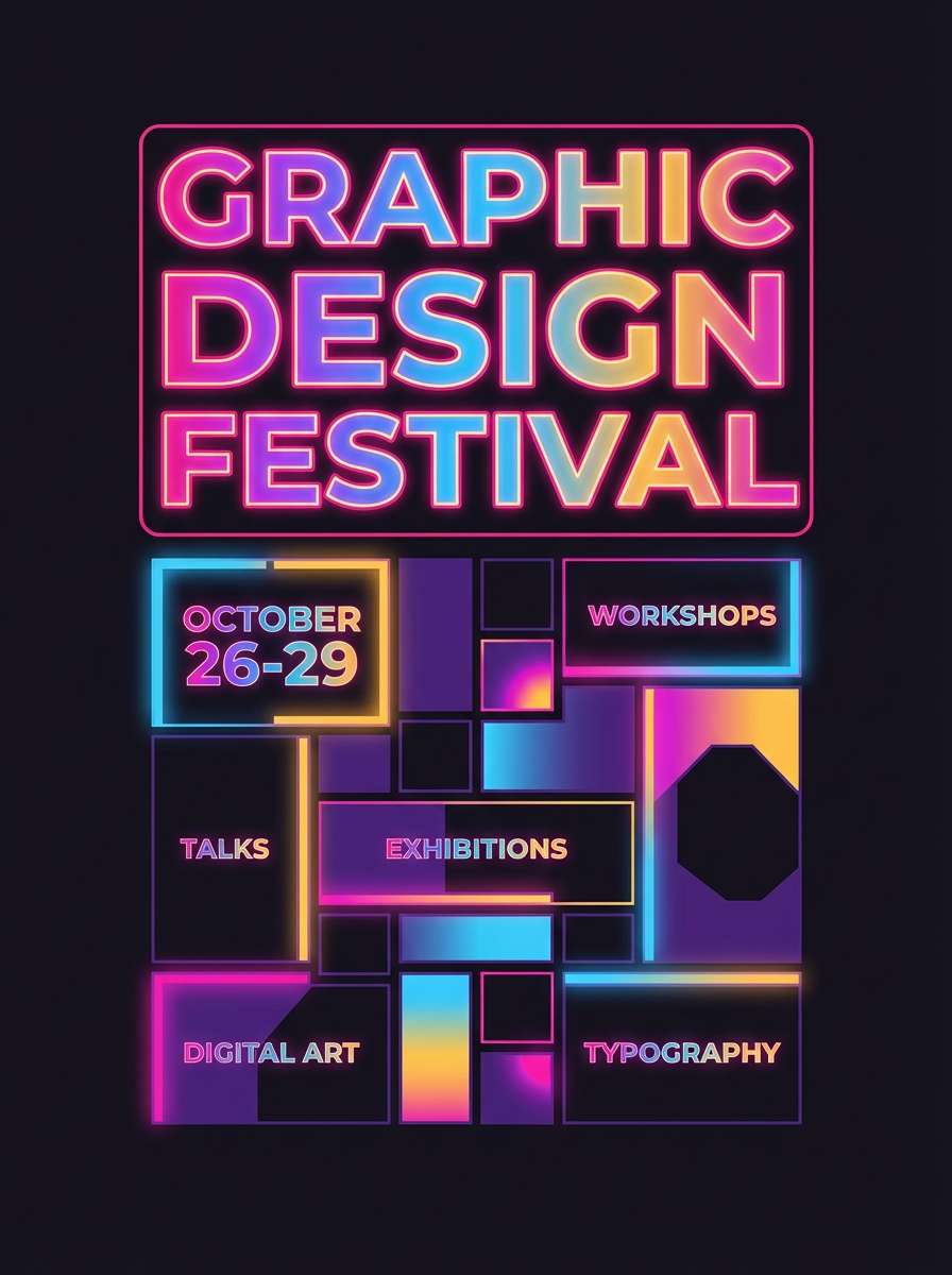
5) Night Market Lanterns
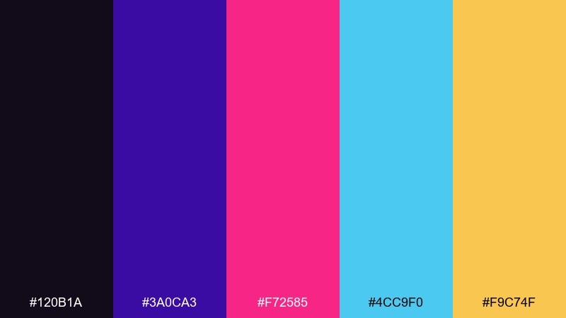
HEX: #120B1A #3A0CA3 #F72585 #4CC9F0 #F9C74F
Mood: festive, neon, lively
Best for: festival flyer on plain background
Festive lantern light and neon stalls, where hot pink and cyan compete for attention. Purple and near-black provide depth so bright elements can glow without washing out the layout. Use it for festival flyers, pop-up markets, or street-food promotions that need instant energy. Usage tip: place yellow behind black type for quick readability in crowded designs.
Image example of night market lanterns generated using media.io
6) Arcade Afterhours
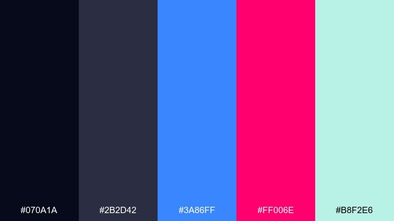
HEX: #070A1A #2B2D42 #3A86FF #FF006E #B8F2E6
Mood: playful, retro-future, punchy
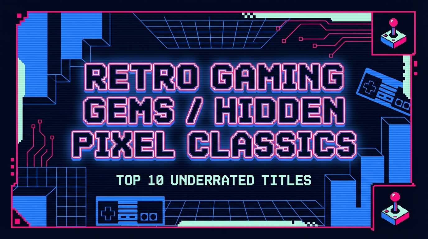
Best for: retro gaming YouTube thumbnail template
Playful arcade glow with a late-night edge, mixing electric blue, hot pink, and a cool mint lift. These cyberpunk city color combinations work great when you want high energy without going fully fluorescent. Use it for thumbnails, social headers, and gaming merch where bold contrast boosts clickability. Usage tip: keep mint for small highlights like icons and outline strokes so it stays crisp.
Image example of arcade afterhours generated using media.io
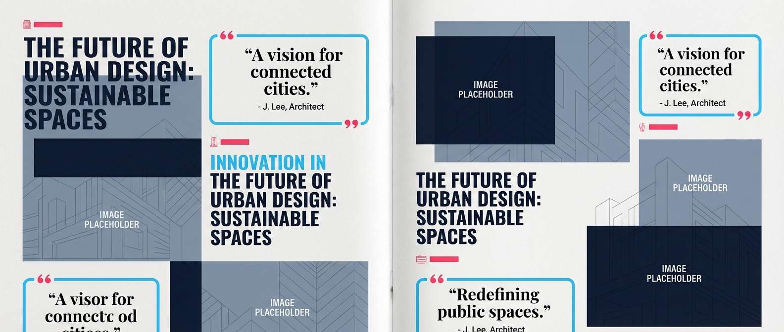
7) Steel Skyline
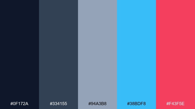
HEX: #0F172A #334155 #94A3B8 #38BDF8 #F43F5E
Mood: cool, architectural, modern
Best for: architecture magazine editorial spread
Cool steel towers against a cold sky, with neon accents peeking through the grid. The slate range makes it ideal for editorial layouts where photos and type need breathing room. Use cyan for pull quotes and navigation elements, and add the rose accent sparingly for calls-outs. Usage tip: pair with condensed typography to emphasize the skyline vibe.
Image example of steel skyline generated using media.io
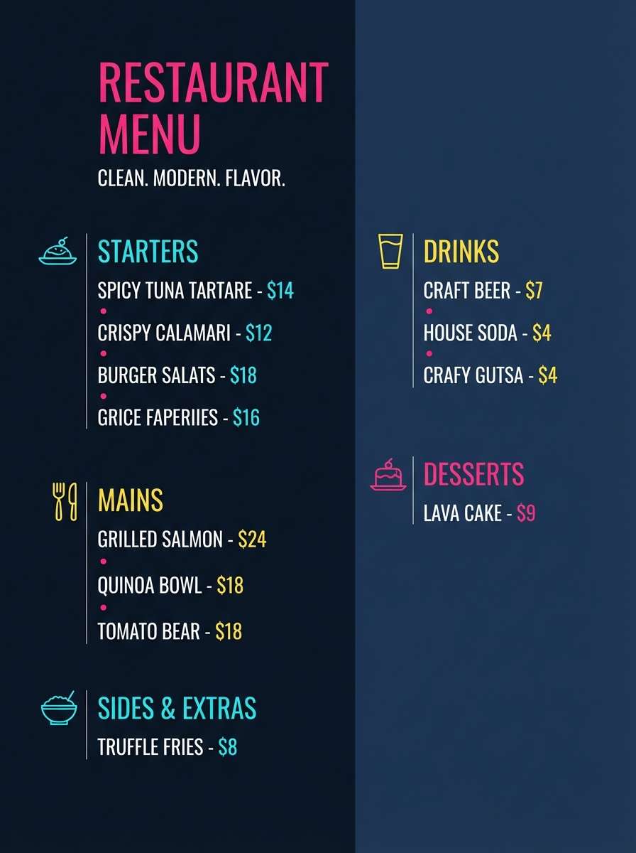
8) Neon Sushi Bar
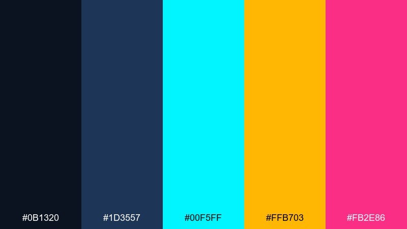
HEX: #0B1320 #1D3557 #00F5FF #FFB703 #FB2E86
Mood: fresh, glossy, nightlife
Best for: restaurant menu design
Glossy bar counters and bright signage, where cyan feels like cold light on glass. Navy and blue keep the menu refined, while amber adds appetite and warmth. Use pink for featured items or chef specials to create a premium, nightlife feel. Usage tip: limit neon cyan to section headers and dividers so the page does not glare.
Image example of neon sushi bar generated using media.io
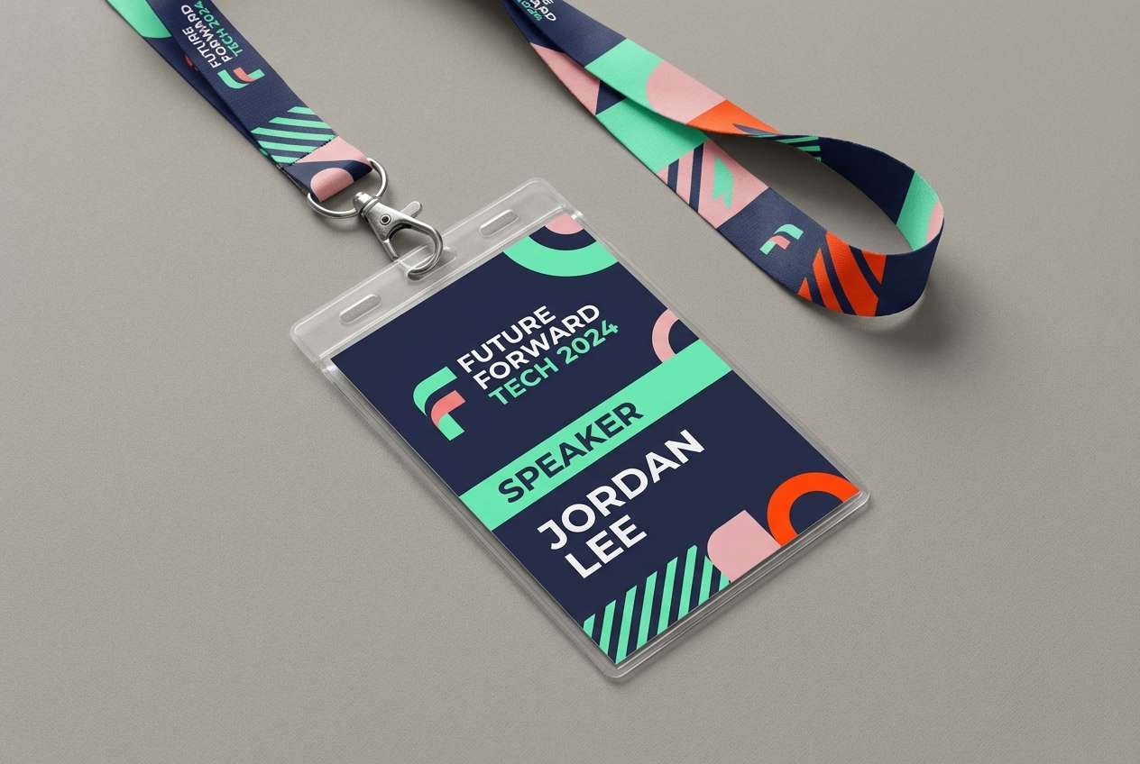
9) Signal Noise
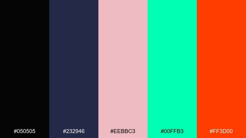
HEX: #050505 #232946 #EEBBC3 #00FFB3 #FF3D00
Mood: edgy, glitch-core, high contrast
Best for: tech conference badge and lanyard
Edgy signal noise with a sharp coral flash, like a warning light in a dark terminal. The muted pink softens the palette just enough to keep it wearable for badges and swag. Use mint for QR codes or access tiers, and save orange-red for urgent labels. Usage tip: test small text on the deep navy to keep accessibility solid.
Image example of signal noise generated using media.io
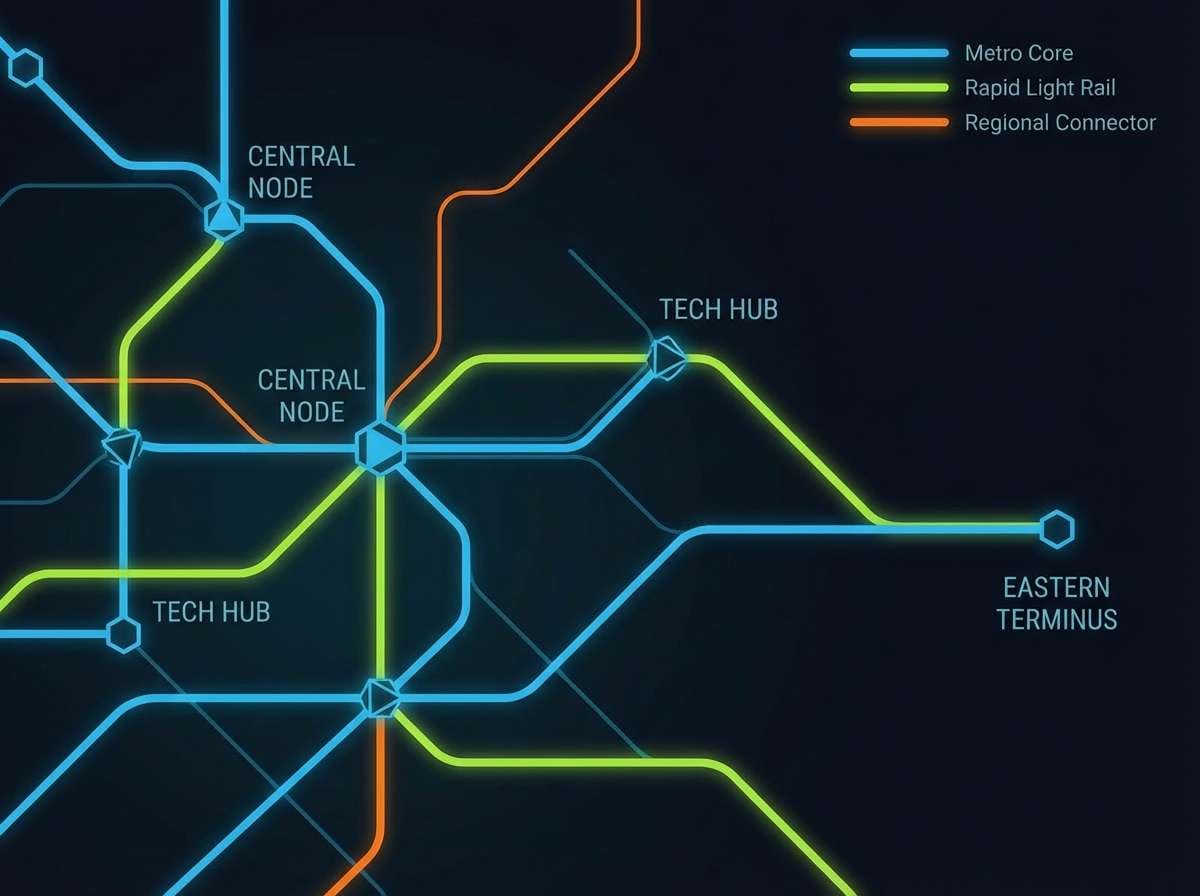
10) Subway Neon Map
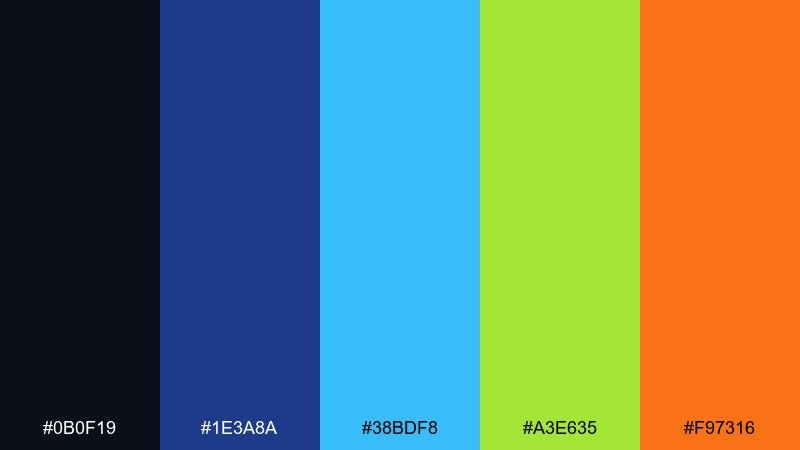
HEX: #0B0F19 #1E3A8A #38BDF8 #A3E635 #F97316
Mood: directional, bold, kinetic
Best for: infographic map poster
Kinetic lines and station dots, like a transit map lit by LEDs. Blue and cyan handle structure and clarity, while lime and orange make perfect route highlights. Use it for infographics, maps, and systems where color coding needs to be immediate. Usage tip: keep lime for primary routes and orange for alerts to preserve meaning at a glance.
Image example of subway neon map generated using media.io
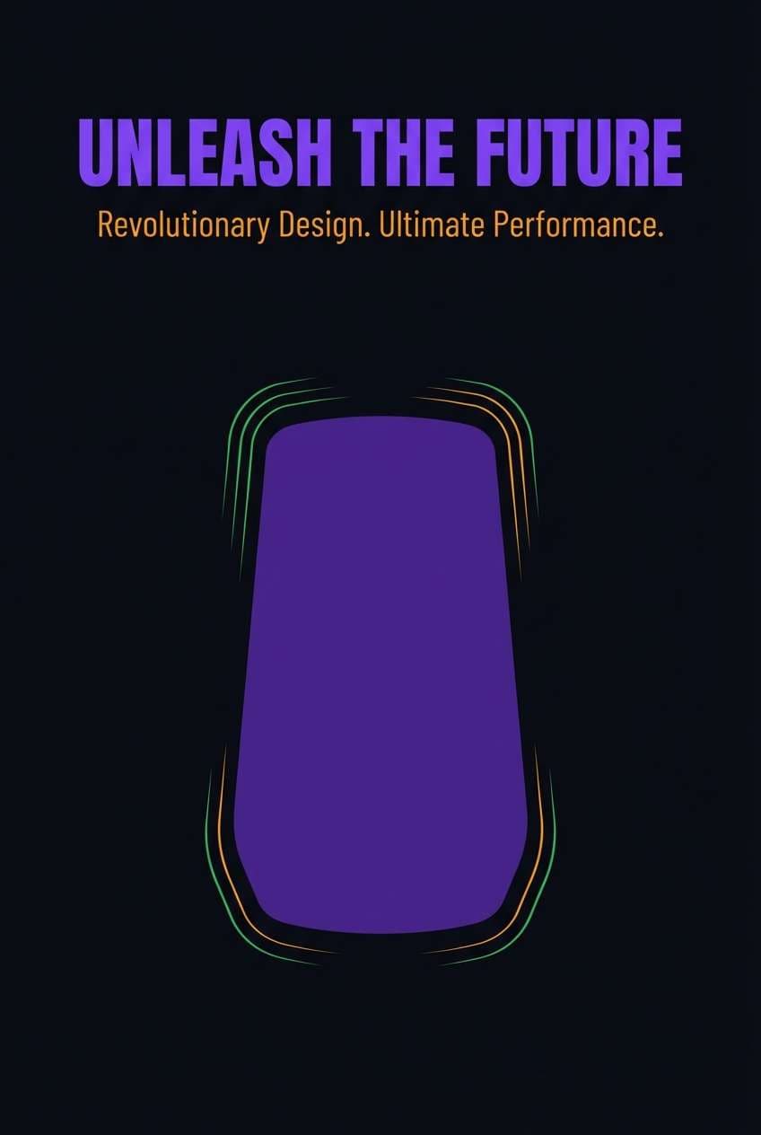
11) Midnight Billboard
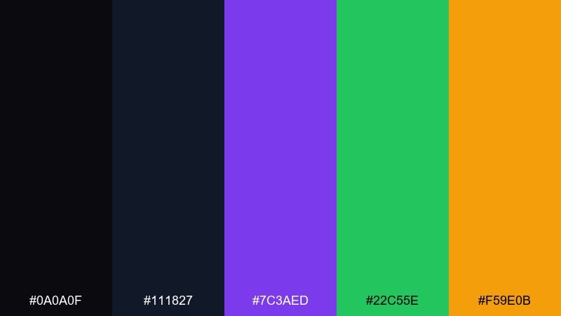
HEX: #0A0A0F #111827 #7C3AED #22C55E #F59E0B
Mood: bold, commercial, neon-lit
Best for: product ad poster on plain background
Bold billboard lighting over a midnight street, with violet and green fighting for attention. The dark neutrals keep the ad premium, while the accents create that high-voltage vibe. Use it for product drops, limited editions, and digital ads where you want instant stop-scroll impact. Usage tip: let one neon be dominant per layout, and use the other only for small cues.
Image example of midnight billboard generated using media.io
12) Chrome Streetwear
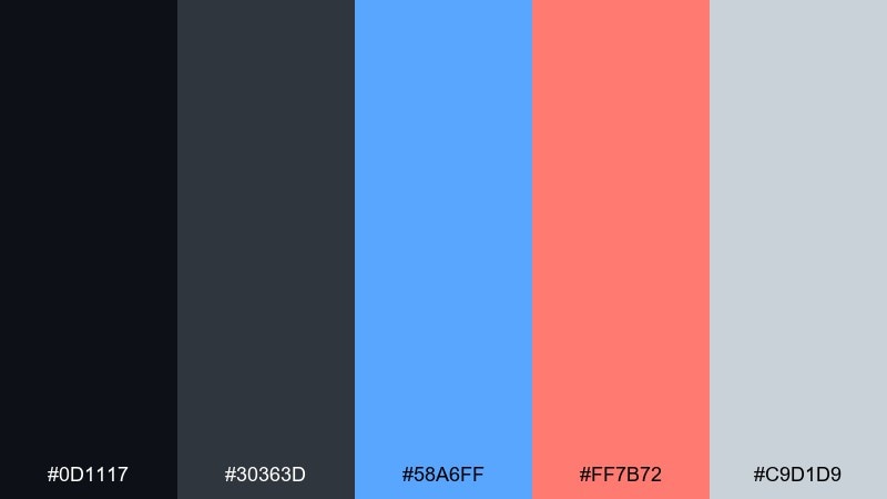
HEX: #0D1117 #30363D #58A6FF #FF7B72 #C9D1D9
Mood: minimal, techwear, polished
Best for: streetwear lookbook layout
Polished chrome and techwear fabrics, clean rather than neon-saturated. The grays and off-white deliver a modern base, while blue and soft coral bring color without losing the premium feel. Use it for lookbooks, ecommerce banners, and brand guidelines that need a restrained future vibe. Usage tip: keep backgrounds mostly dark and use the light gray for spacing and readability.
Image example of chrome streetwear generated using media.io
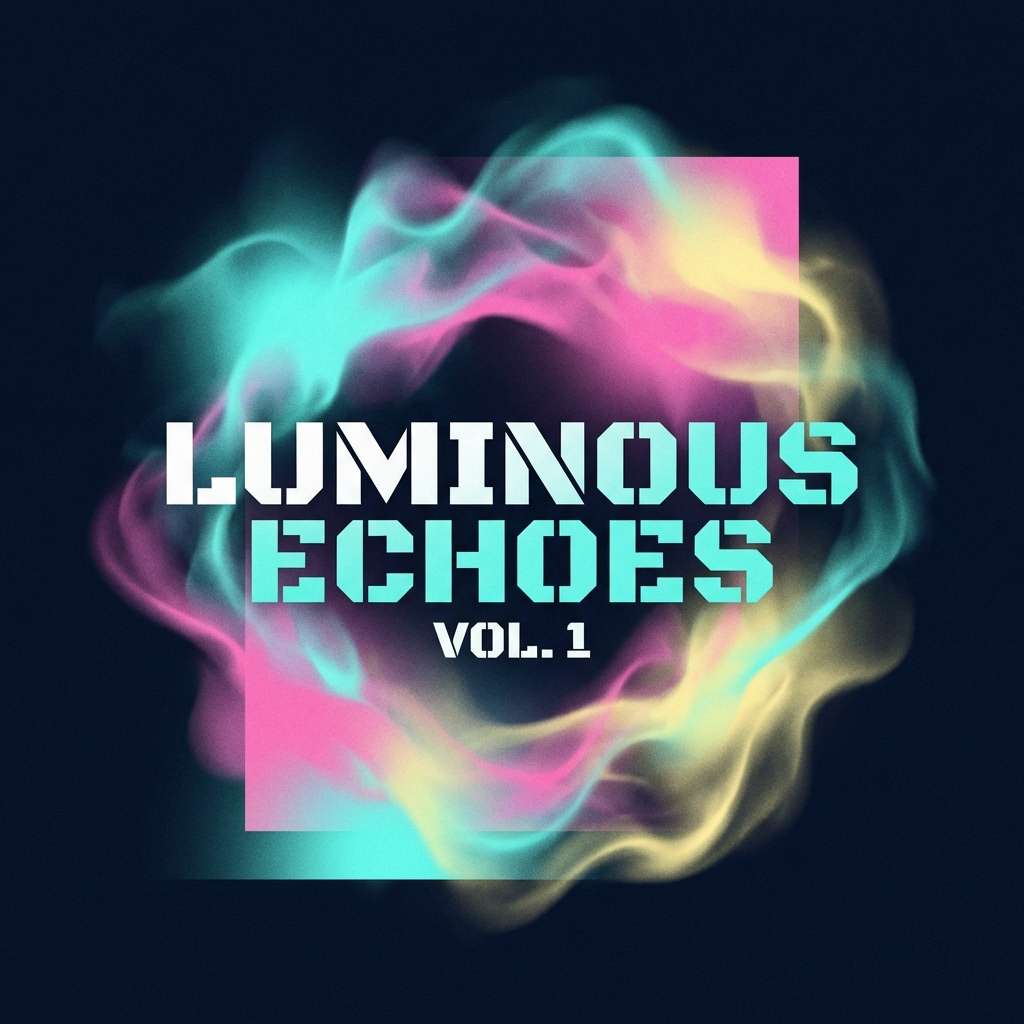
13) Vapor Mist Intersection
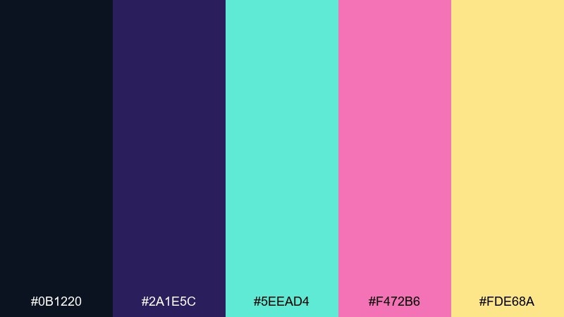
HEX: #0B1220 #2A1E5C #5EEAD4 #F472B6 #FDE68A
Mood: dreamy, misty, neon pastel
Best for: album cover artwork
Dreamy vapor mist drifting through an intersection, soft neon pastels over a deep night base. Teal and pink create a smooth gradient pairing that reads instantly as futuristic pop. Use it for album covers, playlist art, and creator branding that wants glow without harsh contrast. Usage tip: try large color fields with a single sharp typographic element for a modern finish.
Image example of vapor mist intersection generated using media.io
14) Rooftop Drone Glow
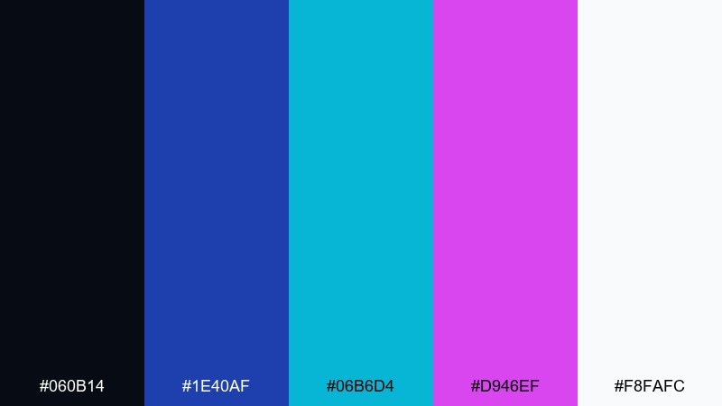
HEX: #060B14 #1E40AF #06B6D4 #D946EF #F8FAFC
Mood: sleek, aerial, high-tech
Best for: SaaS app icon set
High-tech rooftop lighting seen from above, with cool cyan and violet glows cutting through night. The white is a powerful tool here for icon clarity and micro-details. Use it for SaaS icon sets, navigation systems, and modern UI components where small shapes must read fast. Usage tip: keep outlines consistent and use violet only for selected states to avoid visual clutter.
Image example of rooftop drone glow generated using media.io
15) Electric Kiosk
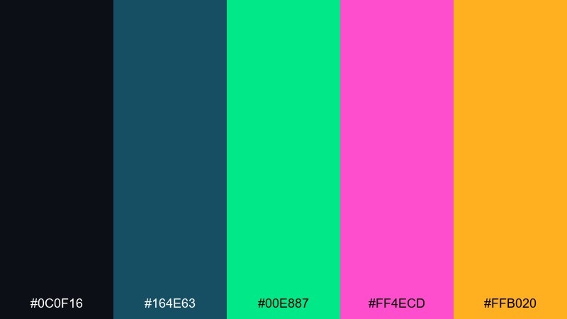
HEX: #0C0F16 #164E63 #00E887 #FF4ECD #FFB020
Mood: bright, friendly neon, street tech
Best for: app onboarding screens (2D only)
Friendly street tech vibes, like a glowing kiosk on a corner with upbeat signage. Teal and emerald make a lively foundation, while pink and amber turn key moments into highlights. It is a great fit for onboarding screens and feature tours where you want a guided, optimistic feel. Usage tip: use amber for progress and confirmation so users feel momentum.
Image example of electric kiosk generated using media.io
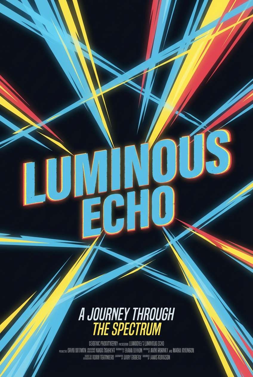
16) Neon Noir Cinema
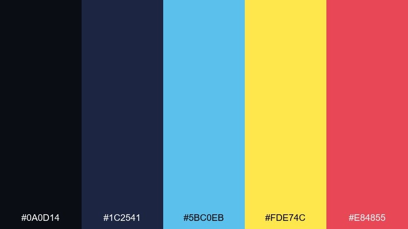
HEX: #0A0D14 #1C2541 #5BC0EB #FDE74C #E84855
Mood: noir, dramatic, poster-ready
Best for: movie poster design on plain background
Noir drama with a crisp cyan beam and a warm marquee glow. The blues build tension and depth, while yellow and red deliver classic poster contrast. Use it for film posters, book covers, and campaign key art where you want instant narrative energy. Usage tip: set your title in yellow and reserve red for the smallest, sharpest emphasis.
Image example of neon noir cinema generated using media.io
17) Cobalt Side Street
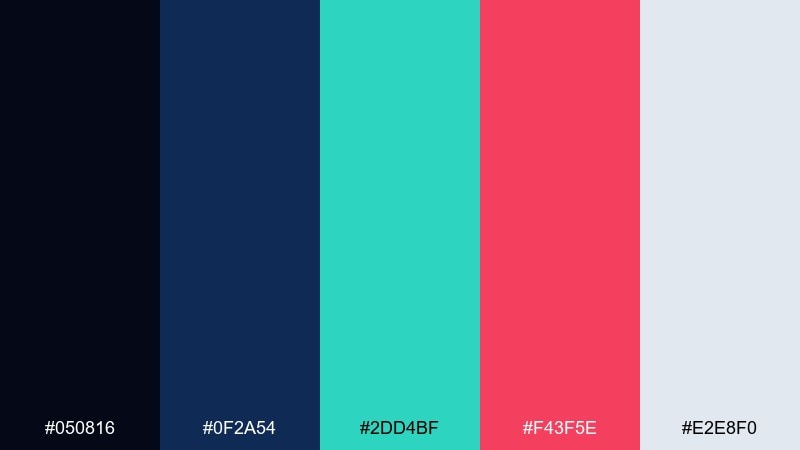
HEX: #050816 #0F2A54 #2DD4BF #F43F5E #E2E8F0
Mood: cool, moody, precise
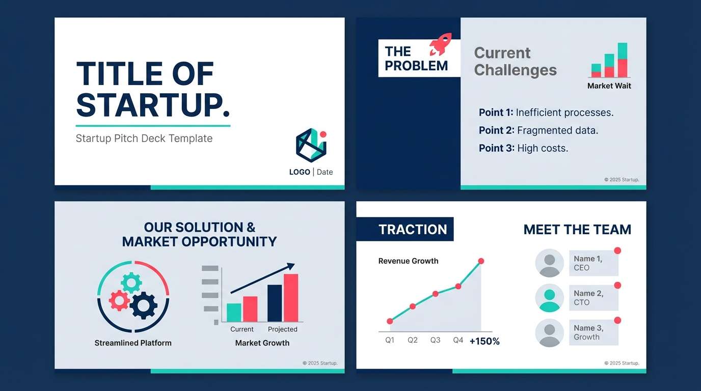
Best for: startup pitch deck template
Moody cobalt shadows on a side street, balanced with clean light gray breathing space. The teal and rose accents create confident contrast for charts, callouts, and section breaks. Use it for pitch decks, case studies, and product storytelling when you want modern and sharp. Usage tip: keep slides mostly cobalt and gray, then use rose for one key metric per page.
Image example of cobalt side street generated using media.io
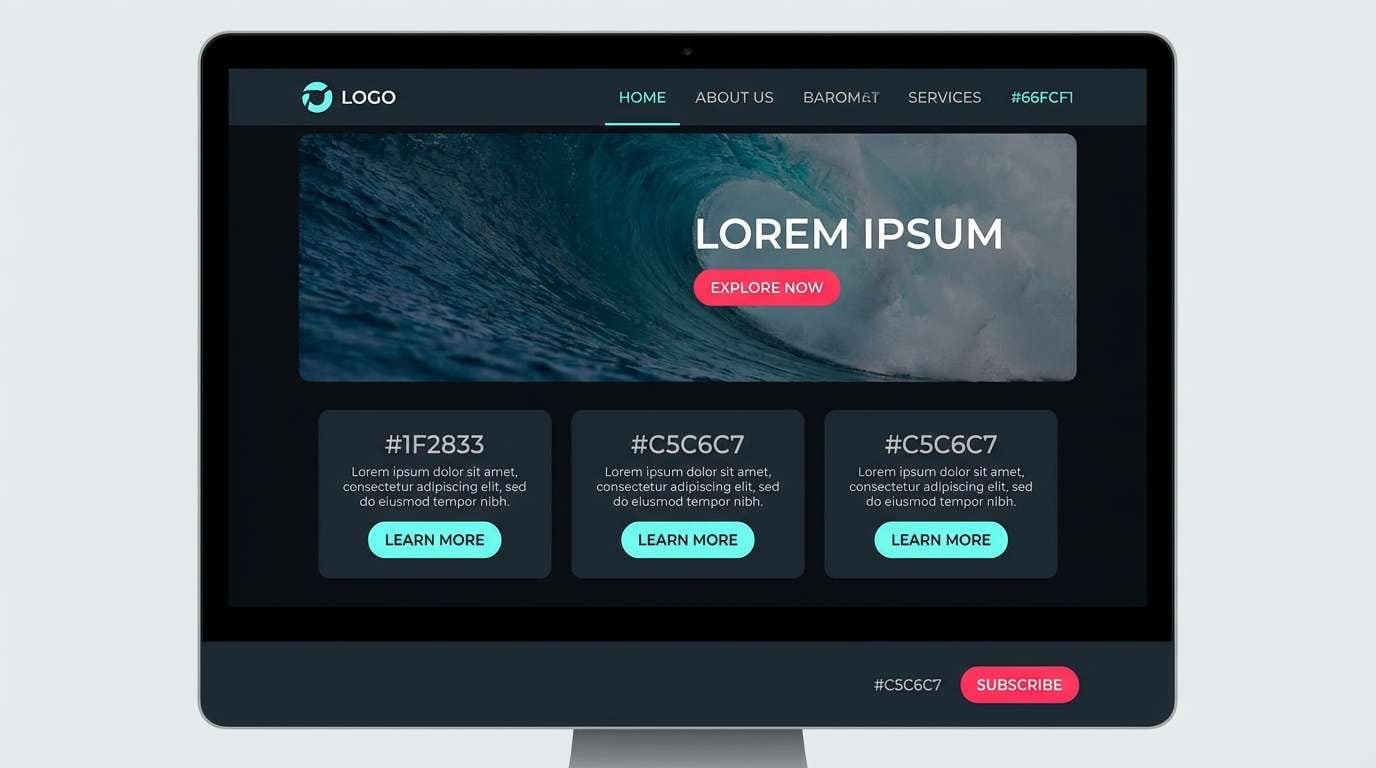
18) Rainy Neon Reflections
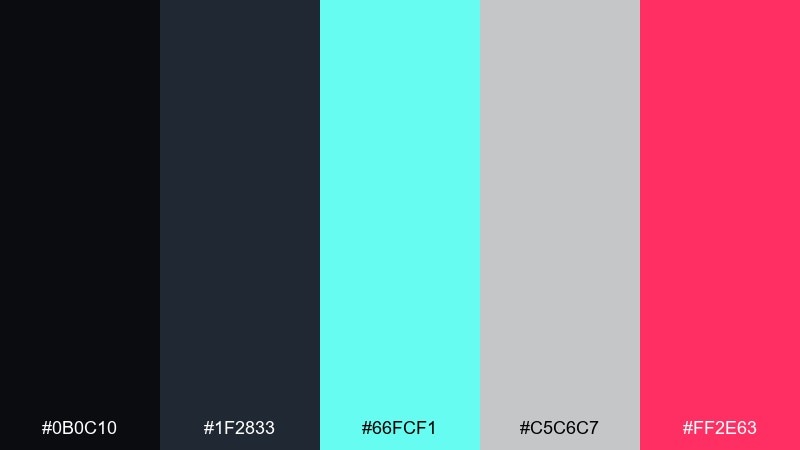
HEX: #0B0C10 #1F2833 #66FCF1 #C5C6C7 #FF2E63
Mood: wet pavement, moody, luminous
Best for: website dark mode theme
Wet pavement reflections with cyan glow and a sharp pink flare, like signage mirrored in puddles. The two charcoals let you build a layered dark UI without losing detail. Use it for dark mode themes, portfolio sites, and tech blogs where readability is critical. Usage tip: keep cyan for interactive states and use pink only for primary actions to avoid competing highlights.
Image example of rainy neon reflections generated using media.io
19) Neon Temple Gate
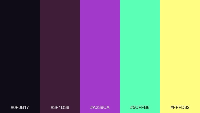
HEX: #0F0B17 #3F1D38 #A239CA #5CFFB6 #FFFD82
Mood: mystic, vibrant, ritual neon
Best for: book cover design
Mystic neon like a temple gate glowing in the dark, equal parts sacred and synthetic. Purple and magenta set an intense tone, while mint and pale yellow add that otherworldly shine. Use it for book covers, game lore PDFs, or creator merch where you want mythic cyber vibes. Usage tip: place pale yellow behind small icons or symbols to create focal points without adding extra colors.
Image example of neon temple gate generated using media.io
20) Synth Police Lights
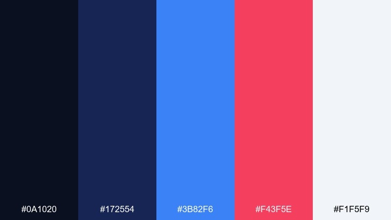
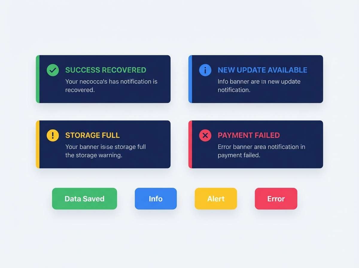
HEX: #0A1020 #172554 #3B82F6 #F43F5E #F1F5F9
Mood: urgent, sharp, high-contrast
Best for: alert banner and notification UI set
Urgent flashes like synth police lights bouncing off glass and metal. Blue handles info states cleanly, while red creates unmistakable urgency without needing extra embellishment. Use this cyberpunk city color palette for alert systems, notification components, and status-heavy interfaces. Usage tip: keep red for error only, and rely on blue shades for everything else to avoid fatigue.
Image example of synth police lights generated using media.io
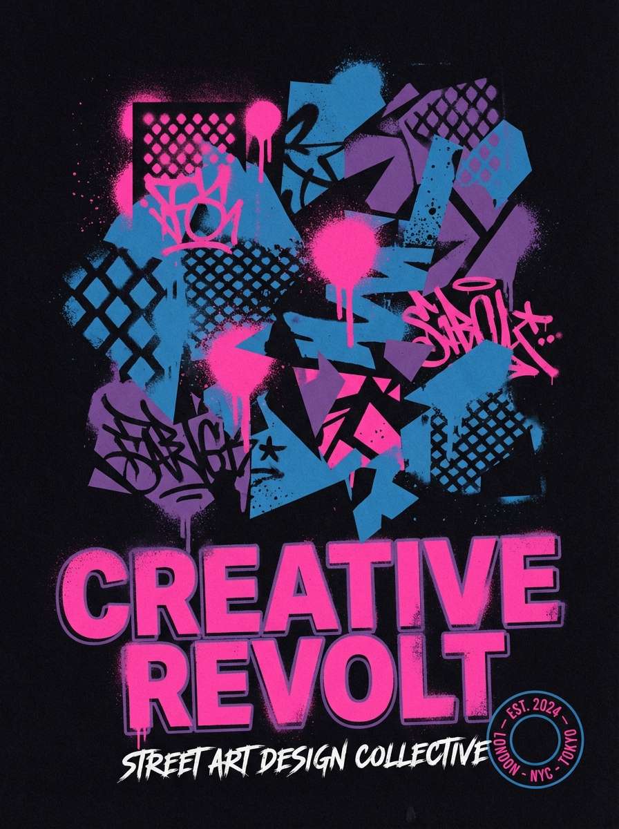
21) Alleyway Graffiti Glow
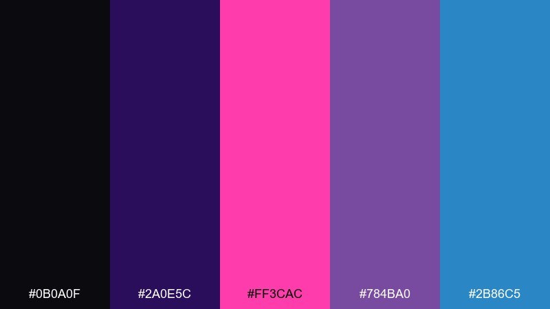
HEX: #0B0A0F #2A0E5C #FF3CAC #784BA0 #2B86C5
Mood: rebellious, artistic, saturated
Best for: street art inspired brand poster
Rebellious graffiti glow with saturated pinks and purples layered over midnight black. The blue brings structure so the palette feels designed, not chaotic. These cyberpunk city color combinations shine in brand posters, merch drops, and social campaigns that lean edgy. Usage tip: use pink for the headline, then keep body text in blue or purple for readable contrast.
Image example of alleyway graffiti glow generated using media.io
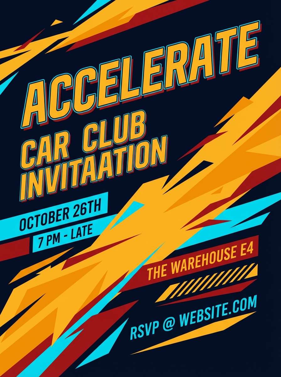
22) Quantum Night Drive
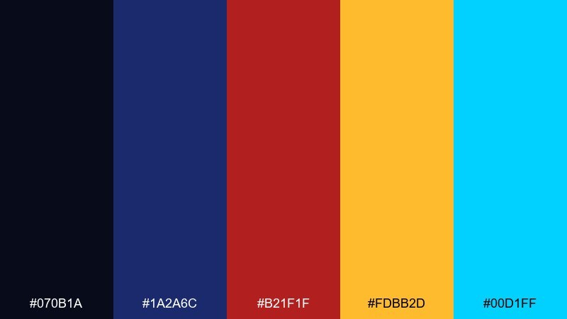
HEX: #070B1A #1A2A6C #B21F1F #FDBB2D #00D1FF
Mood: fast, cinematic, high energy
Best for: car club invitation flyer
Fast night-drive energy with a warm engine glow cutting through cool blues. The red and yellow bring speed and heat, while cyan adds a modern tech edge. Use it for car club invites, racing events, or motion-heavy promos where you want strong visual rhythm. Usage tip: keep cyan as a thin accent line or glow so the warm tones stay dominant.
Image example of quantum night drive generated using media.io
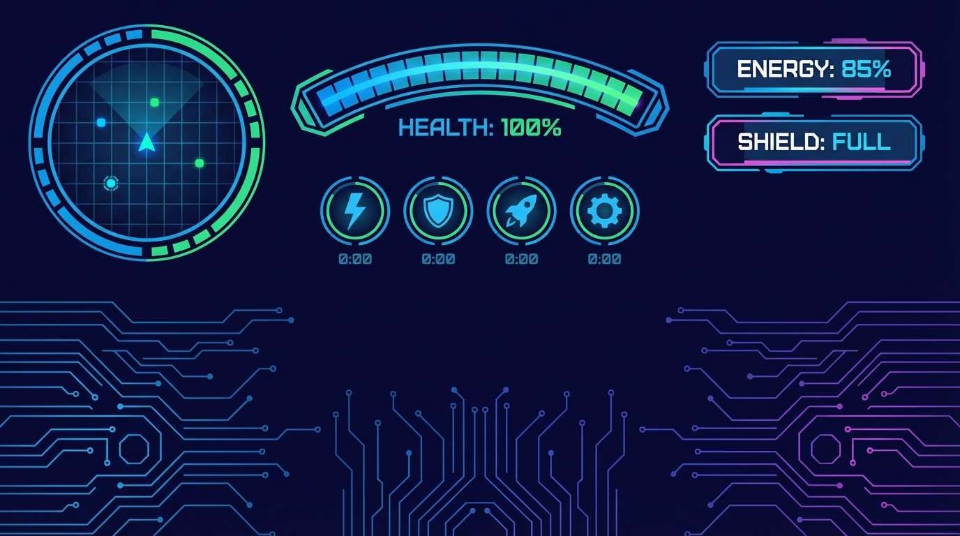
23) Neon Transit Hub
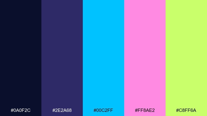
HEX: #0A0F2C #2E2A68 #00C2FF #FF8AE2 #C8FF6A
Mood: busy, modern, luminous
Best for: game HUD overlay design (2D only)
Busy transit-hub lighting with crisp cyan panels and energetic neon accents. These cyberpunk city color combinations are ideal for HUD overlays where you need fast readability and clear hierarchy. Use the dark blues for the frame and panels, then assign one bright accent per system (cyan for navigation, lime for health, pink for specials). Usage tip: reduce glow effects on small text so it stays sharp at a distance.
Image example of neon transit hub generated using media.io
What Colors Go Well with Cyberpunk City?
Cyberpunk city palettes pair best with deep bases like charcoal, near-black, dark navy, and indigo. These colors create “night space” that makes neon accents feel brighter and more cinematic.
For highlights, lean into electric cyan, hot magenta, ultraviolet, and LED green—then add a small amount of warm contrast like amber, neon yellow, or signal orange. This warm-cool tension is what makes neon city colors feel alive.
To keep layouts usable, include one light neutral (off-white or cool gray) for body text, dividers, and spacing. It prevents the design from becoming a wall of glow.
How to Use a Cyberpunk City Color Palette in Real Designs
Start with a strict hierarchy: choose one dark base for backgrounds, one mid-tone for surfaces/cards, and one light neutral for text. Then pick 1–2 neon accents for actions and emphasis—everything else should support those choices.
In UI, assign meaning to accent colors (for example: cyan = interactive, magenta = primary CTA, lime = success). Consistency matters more than having many bright colors on screen at once.
For posters and branding, cyberpunk city color combinations look best with controlled glow: use gradients, soft outer glows, and subtle grain so neon feels atmospheric—not like flat vector fill everywhere.
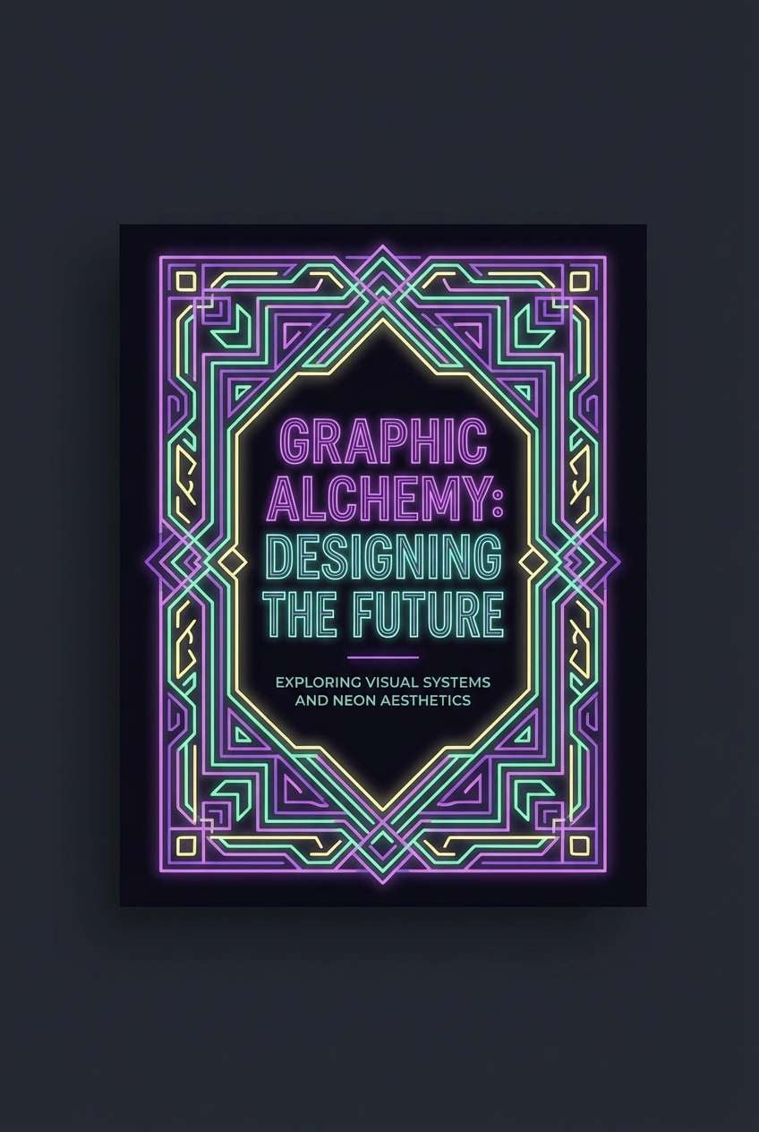
Create Cyberpunk City Palette Visuals with AI
If you want matching visuals for your palette (posters, hero banners, HUD overlays, album covers), an AI generator can keep the style consistent while you iterate fast. The easiest workflow is: pick your HEX set, write a short scene/layout description, and lock your aspect ratio.
With Media.io’s Text to Image tool, you can paste a ready prompt (like the ones above), tweak keywords (glow, holographic, rain, noir), and generate multiple variations for different platforms without rebuilding from scratch.
Once you get a look you like, reuse the same prompt structure across assets so your cyberpunk city scheme stays coherent across UI, socials, and print.
Cyberpunk City Color Palette FAQs
-
What is a cyberpunk city color palette?
A cyberpunk city color palette typically combines very dark bases (black, charcoal, navy) with high-energy neon accents like cyan, magenta, violet, and occasional warm signals (amber/yellow/orange) to mimic night streets, LED signage, and reflective surfaces. -
Which neon colors feel the most “cyberpunk”?
Electric cyan/teal, hot magenta, ultraviolet purple, and neon lime are the most recognizable cyberpunk accents. They read as synthetic light and work well against dark backgrounds. -
How do I keep neon palettes from looking messy?
Limit yourself to 1–2 primary neon accents per layout, use dark neutrals for most surfaces, and reserve warm brights (yellow/orange/red) for tiny highlights like CTAs, warnings, or key labels. -
Are cyberpunk city palettes good for UI design?
Yes—especially for dark mode. Use layered dark grays/navy for structure, a light neutral for readable text, and assign each neon accent a consistent function (interactive, success, alert) to avoid confusion. -
What fonts and effects match cyberpunk city tones?
Condensed sans-serifs, geometric grotesks, and tech-inspired typefaces work well. For effects, try subtle glow, gradient light streaks, scanlines, and light grain so the neon feels atmospheric instead of flat.


