

A tropical wedding color palette is the fastest way to make your celebration feel like a destination: sunlit, coastal, and instantly joyful.
Below are 20 bright-to-earthy tropical wedding colors (with HEX codes) plus practical styling ideas for invites, florals, attire, signage, and modern digital design.
In this article
- Why Tropical Wedding Palettes Work So Well
-
- hibiscus sunset
- lagoon lime
- orchid breeze
- mango mojito
- palm and sand
- seafoam coral kiss
- papaya punch
- azure aloha
- coconut cream neutrals
- pineapple brass
- island peony
- tropical terracotta tide
- reef rose gold
- jungle night glow
- bora bora pastels
- flamingo fizz
- seaside sage
- coral clay and palm
- sunlit turquoise
- monstera and pearl
- What Colors Go Well with Tropical Wedding?
- How to Use a Tropical Wedding Color Palette in Real Designs
- Create Tropical Wedding Palette Visuals with AI
Why Tropical Wedding Palettes Work So Well
Tropical wedding palettes are built for high-impact photos: clear contrasts, sun-friendly saturation, and colors that stay lively from bright beach ceremonies to golden-hour receptions.
They also naturally connect your details (invites, florals, attire, signage) to the setting—ocean blues, palm greens, hibiscus pinks, and sand neutrals feel “right” without extra explanation.
Best of all, tropical wedding colors can be tuned to your style: go bold and celebratory, soft and pastel, or grounded and earthy—while still reading unmistakably coastal.
20+ Tropical Wedding Color Palette Ideas (with HEX Codes)
1) Hibiscus Sunset
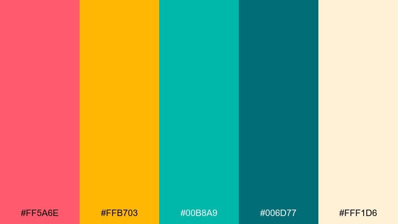
HEX: #FF5A6E #FFB703 #00B8A9 #006D77 #FFF1D6
Mood: bold, sun-kissed, celebratory
Best for: beach ceremony invitation suite
Bold, sun-kissed tones that feel like hibiscus petals against a late-afternoon sky. Coral and marigold pop beautifully on cream, while layered teals keep it coastal rather than candy-bright. Use it for invitation suites, ceremony programs, and welcome signs with clean typography and generous white space. Tip: let the deep teal handle body text for contrast, and reserve the coral for names and key details.
Image example of hibiscus sunset generated using media.io
Media.io is an online AI studio for creating and editing video, image, and audio in your browser.

2) Lagoon Lime
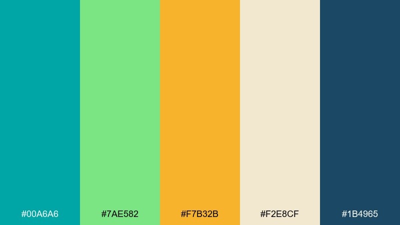
HEX: #00A6A6 #7AE582 #F7B32B #F2E8CF #1B4965
Mood: fresh, playful, breezy
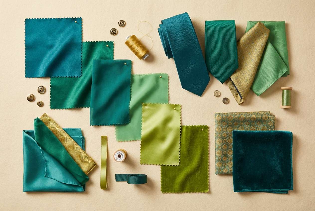
Best for: bridesmaid dress and groomsmen accent styling
Fresh, playful shades that read like lagoon water and lime zest. The teal and navy create a strong base, while the citrus green and warm gold bring the party. It works especially well for dress palettes, ties, pocket squares, and cocktail-hour signage. Tip: keep the lime as a small accent so photos stay elegant and not overly neon.
Image example of lagoon lime generated using media.io
3) Orchid Breeze
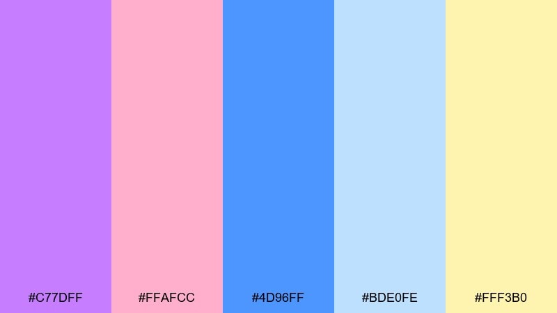
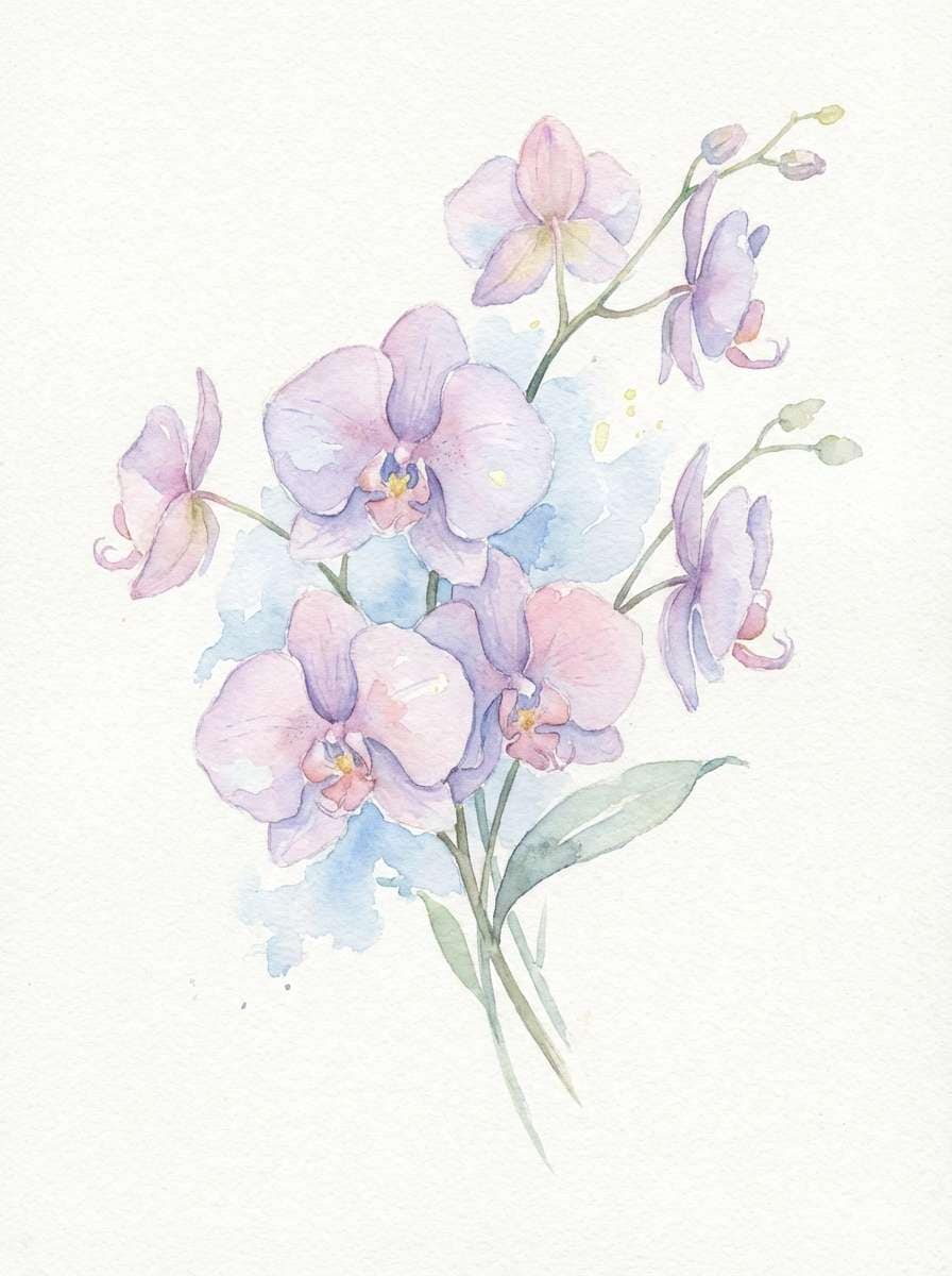
HEX: #C77DFF #FFAFCC #4D96FF #BDE0FE #FFF3B0
Mood: romantic, airy, dreamy
Best for: watercolor floral illustration for stationery
Romantic, airy pastels that evoke orchids, soft sky, and a hint of morning light. The lavender and blush feel delicate, while the gentle blues keep everything cool and modern. Use it for watercolor florals on menus, place cards, or envelope liners where you want a light, floaty look. Tip: add the pale yellow only as a tiny highlight on petals and centers to avoid washing out the design.
Image example of orchid breeze generated using media.io
4) Mango Mojito
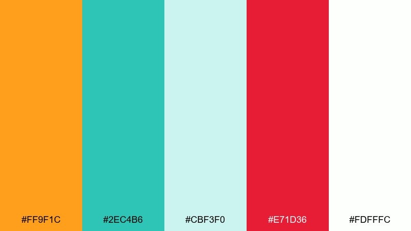
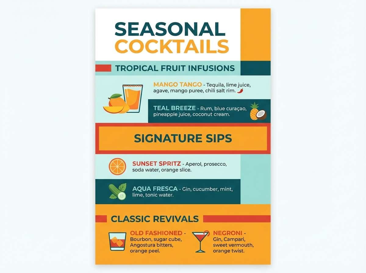
HEX: #FF9F1C #2EC4B6 #CBF3F0 #E71D36 #FDFFFC
Mood: zesty, high-energy, festive
Best for: signature cocktail menu design
Zesty, high-energy hues that feel like mango slices, mint, and a splash of berry. The bright orange and crisp teal are the main stars, with soft aqua and white keeping it clean. It shines on cocktail menus, bar signage, and fun reception details like drink tags. Tip: treat the red as a garnish color for icons or small headlines so it does not overpower the citrus vibe.
Image example of mango mojito generated using media.io
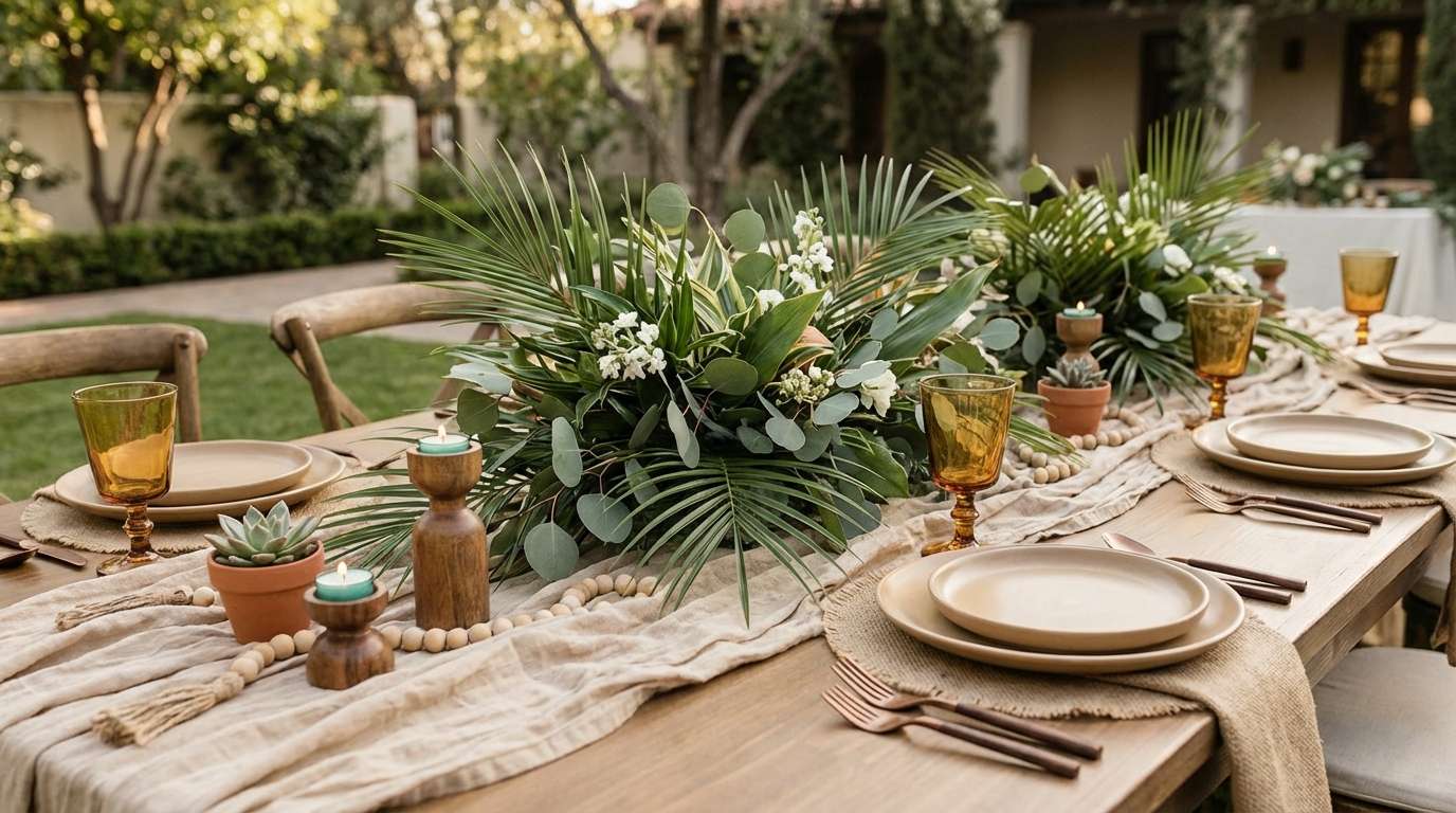
5) Palm and Sand
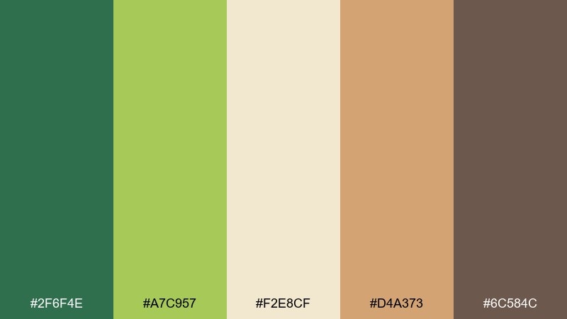
HEX: #2F6F4E #A7C957 #F2E8CF #D4A373 #6C584C
Mood: natural, grounded, sun-warmed
Best for: outdoor reception tablescape styling
Natural, grounded tones that echo palm fronds, sunlit sand, and warm wood. The greens feel organic and calming, while tan and cocoa add texture and depth. Use it for linens, rattan details, place settings, and botanical centerpieces where you want an elevated, earthy look. Tip: choose matte finishes and woven textures so the palette feels tactile rather than flat.
Image example of palm and sand generated using media.io
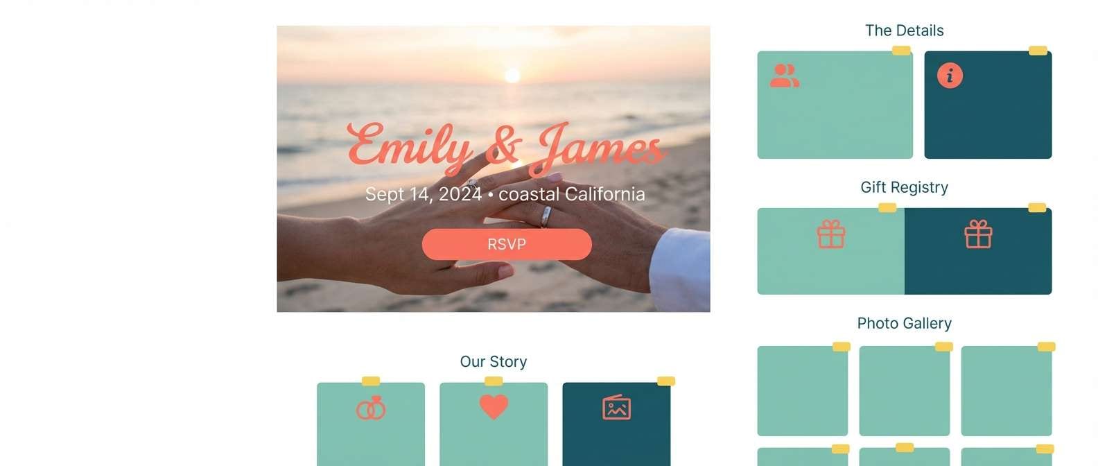
6) Seafoam Coral Kiss
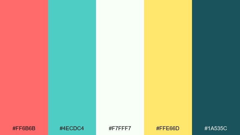
HEX: #FF6B6B #4ECDC4 #F7FFF7 #FFE66D #1A535C
Mood: cheerful, bright, ocean-fresh
Best for: wedding website homepage UI mockup
Cheerful, ocean-fresh colors that suggest seafoam rolling in under a warm coral sky. The mix balances playful energy with strong readability thanks to the deep teal anchor. These tropical wedding color combinations work nicely for a modern wedding website, RSVP flows, and digital save-the-dates. Tip: keep backgrounds near-white and use the yellow only for buttons or micro-highlights so the UI stays crisp.
Image example of seafoam coral kiss generated using media.io
7) Papaya Punch
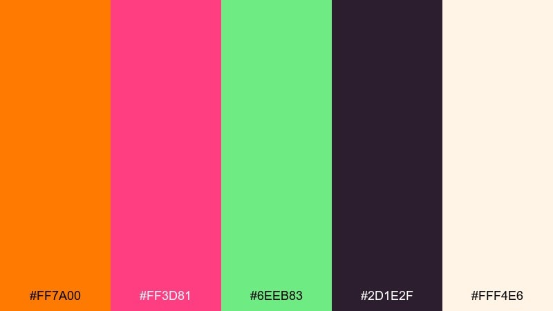
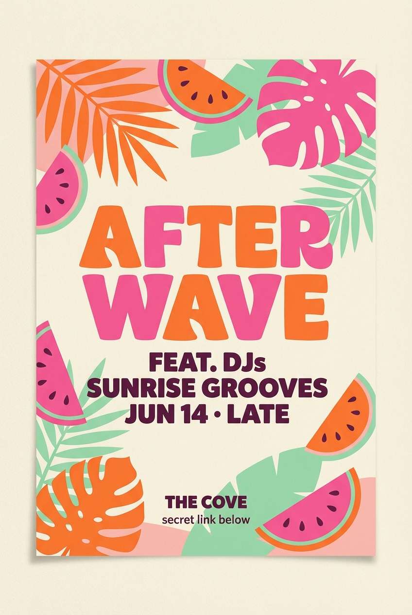
HEX: #FF7A00 #FF3D81 #6EEB83 #2D1E2F #FFF4E6
Mood: fun, punchy, nightlife-ready
Best for: after-party flyer design
Fun, punchy shades that feel like papaya, pink tropical blooms, and a cool mint finish. The dark plum adds a nightlife edge that keeps the brights looking intentional. Use it for after-party flyers, dance-floor signage, or playful neon-inspired details without actually going neon. Tip: set most text in the plum and let the orange or pink handle big headings for impact.
Image example of papaya punch generated using media.io
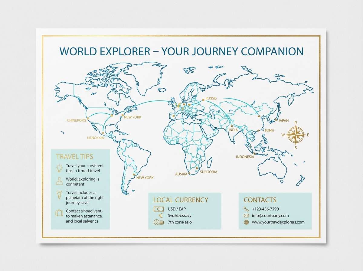
8) Azure Aloha
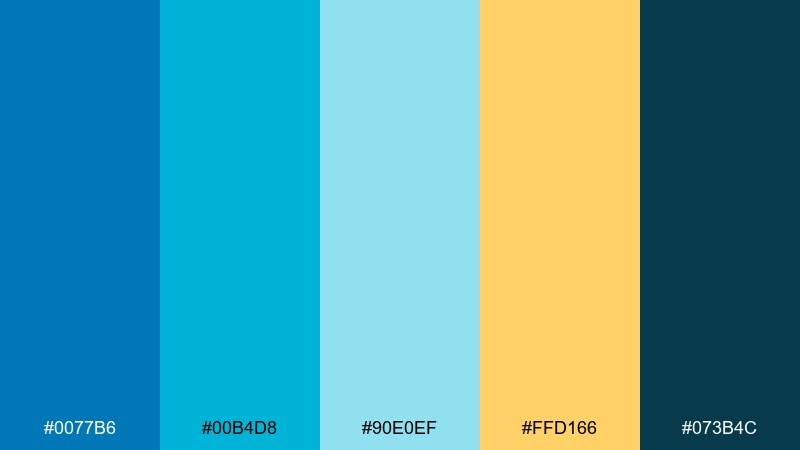
HEX: #0077B6 #00B4D8 #90E0EF #FFD166 #073B4C
Mood: cool, coastal, clean
Best for: destination wedding travel card insert
Cool, coastal blues that read like open water and bright horizon lines. A soft aqua and sky tint keep the palette light, while a warm golden note adds a sunny contrast. It is ideal for travel inserts, itinerary cards, and map-style graphics where clarity matters. Tip: use the navy for icons and outlines so the lighter blues do not blur together when printed.
Image example of azure aloha generated using media.io
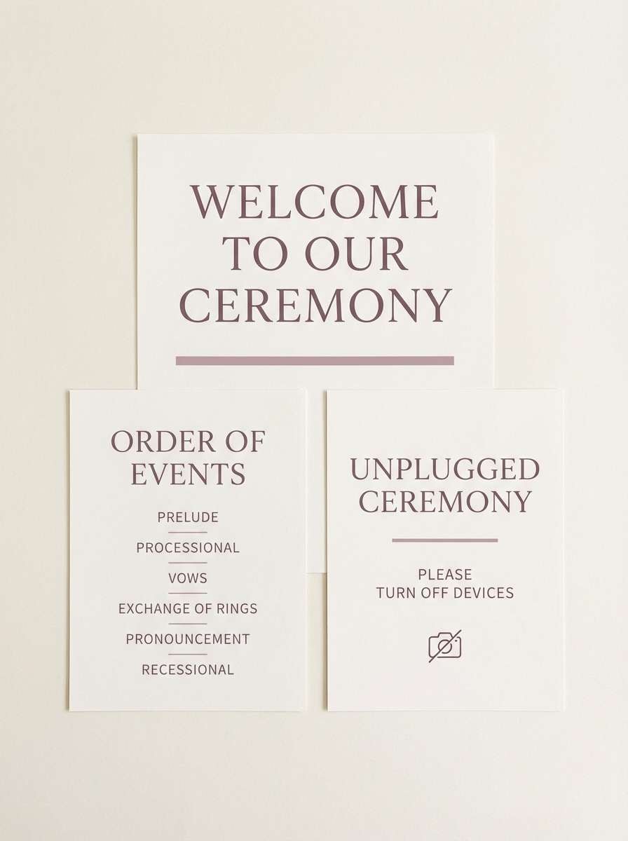
9) Coconut Cream Neutrals
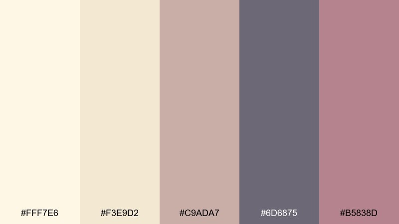
HEX: #FFF7E6 #F3E9D2 #C9ADA7 #6D6875 #B5838D
Mood: soft, elegant, understated
Best for: minimal ceremony signage set
Soft, elegant neutrals that feel like coconut milk, sun-bleached driftwood, and a blush-tinted sunset. Muted mauve and dusty plum provide sophistication without going too formal. Use it for ceremony signage, seating charts, and vow booklets when you want a calm, editorial look. Tip: choose one darker shade for all text and keep the rest as subtle blocks and borders.
Image example of coconut cream neutrals generated using media.io
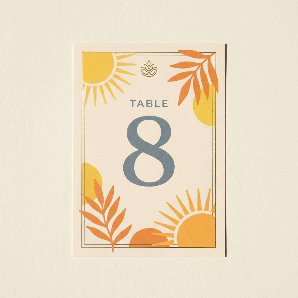
10) Pineapple Brass
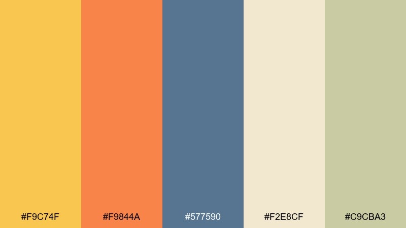
HEX: #F9C74F #F9844A #577590 #F2E8CF #C9CBA3
Mood: warm, vintage, sunlit
Best for: table number cards with brass accents
Warm, vintage-leaning hues that suggest pineapple skin, brass hardware, and golden hour light. The muted blue-gray brings balance, making the warm tones feel more refined. It works for table numbers, escort cards, and detail shots that include metallic candleholders or flatware. Tip: print on textured stock and let the warm yellow be the spotlight while the blue-gray handles supporting elements.
Image example of pineapple brass generated using media.io
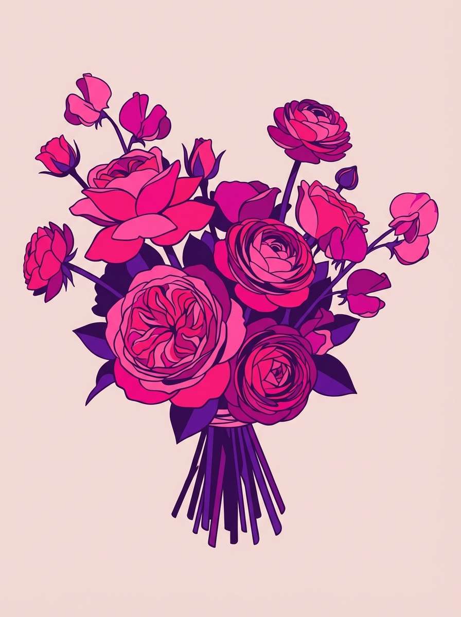
11) Island Peony
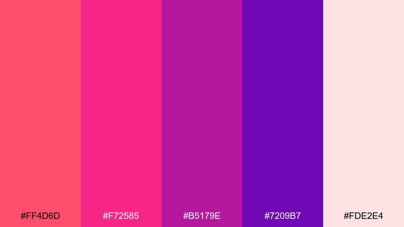
HEX: #FF4D6D #F72585 #B5179E #7209B7 #FDE2E4
Mood: glam, romantic, statement-making
Best for: bridal bouquet inspiration illustration
Glam, romantic pinks and purples that feel like peonies in full bloom at a luxe resort. The saturated magenta and violet create drama, softened by a blushy base that keeps it wedding-friendly. Use it for bouquet concepts, bridesmaid accents, or bold floral installations that need to read clearly in photos. Tip: introduce greenery sparingly so the florals stay the undeniable focal point.
Image example of island peony generated using media.io
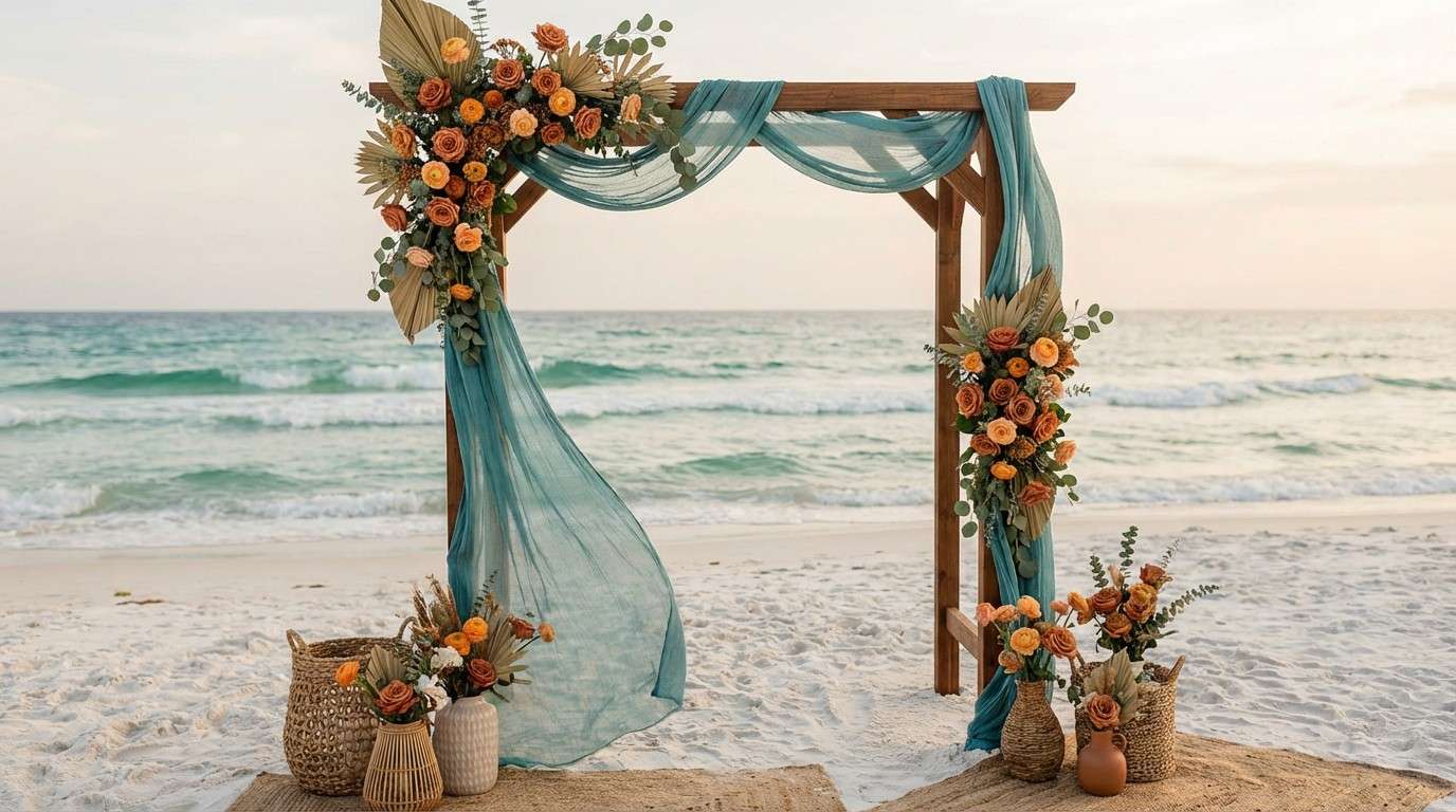
12) Tropical Terracotta Tide
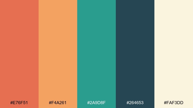
HEX: #E76F51 #F4A261 #2A9D8F #264653 #FAF3DD
Mood: earthy, coastal, modern
Best for: ceremony arch and floral styling
Earthy coastal tones that combine terracotta warmth with tidepool teal. The dark blue-green adds structure, while the creamy neutral keeps everything airy for outdoor light. These tropical wedding color combinations suit ceremony arches, aisle florals, and linen pairings where you want a modern, grounded look. Tip: repeat the teal in small touches like ribbons or napkins to tie the whole scene together.
Image example of tropical terracotta tide generated using media.io
13) Reef Rose Gold
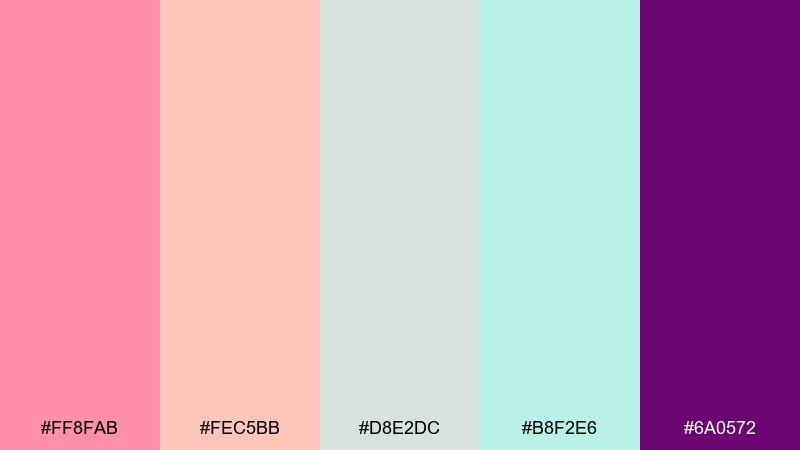
HEX: #FF8FAB #FEC5BB #D8E2DC #B8F2E6 #6A0572
Mood: sweet, polished, airy-luxe
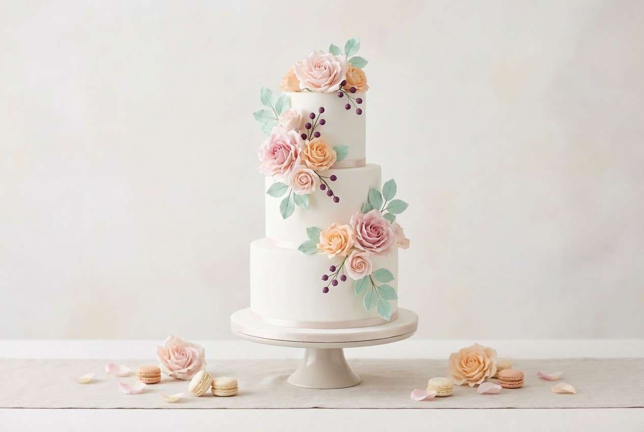
Best for: wedding cake and dessert table styling
Sweet, polished pastels that feel like reef foam with a rose-gold glow. Blush and peach stay front and center, with soft mint and gray-green adding a cool, modern lift. Use it for cake details, dessert labels, and light floral decor around the sweets table. Tip: keep the deep purple for tiny accents like berries, ribbon, or a thin piping line to elevate the whole look.
Image example of reef rose gold generated using media.io
14) Jungle Night Glow
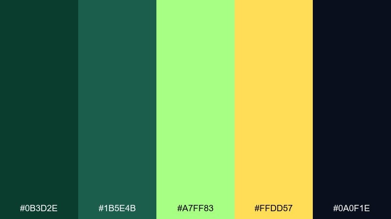
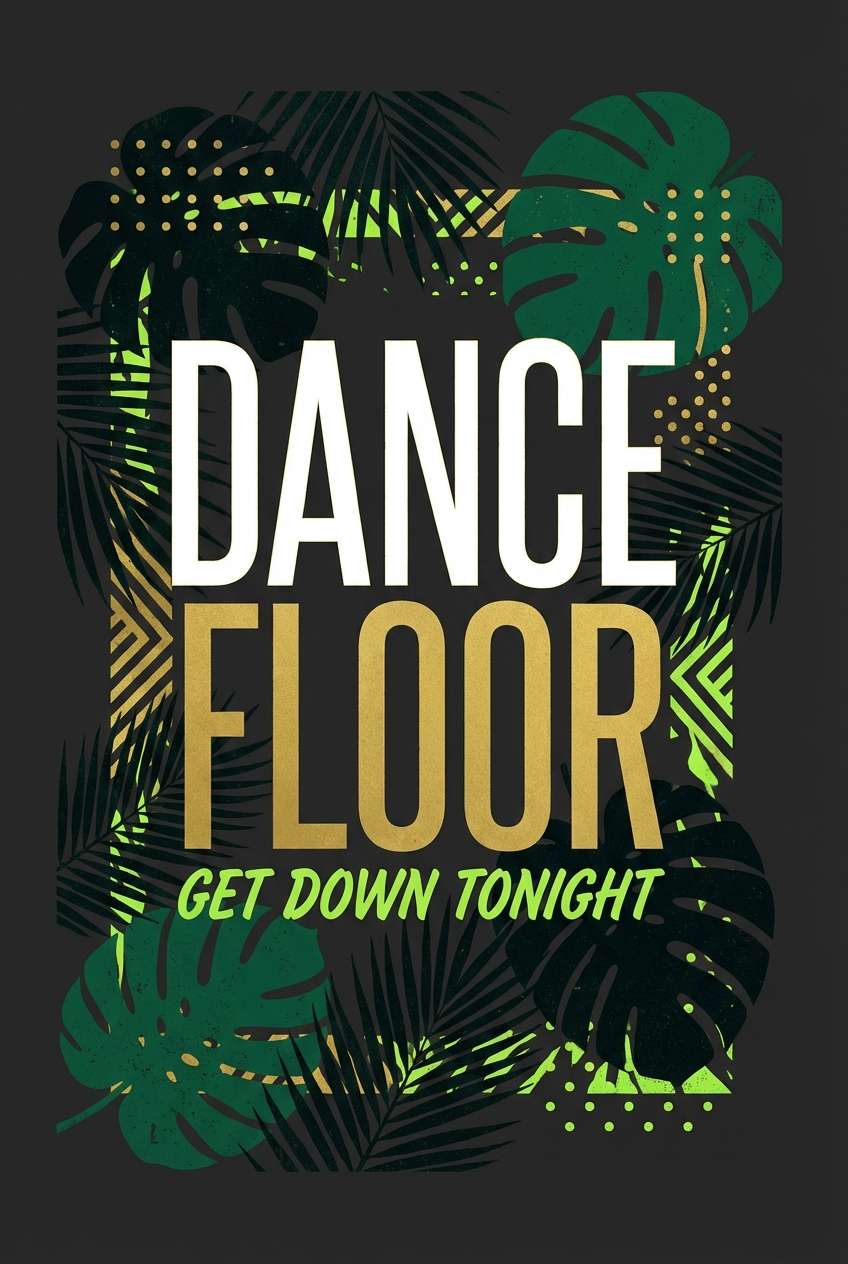
HEX: #0B3D2E #1B5E4B #A7FF83 #FFDD57 #0A0F1E
Mood: dramatic, lush, after-dark
Best for: reception lighting and dance-floor signage
Dramatic, lush greens that feel like a jungle canopy under string lights. The near-black and deep emerald set a moody base, while lime and golden yellow bring that electric glow. It is a strong choice for dance-floor signage, lighting plans, and evening receptions where you want high contrast. Tip: use the bright lime in small bursts so it reads as intentional sparkle rather than overpowering neon.
Image example of jungle night glow generated using media.io
15) Bora Bora Pastels
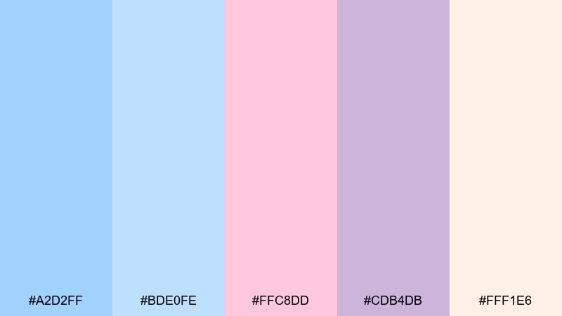
HEX: #A2D2FF #BDE0FE #FFC8DD #CDB4DB #FFF1E6
Mood: soft, serene, romantic
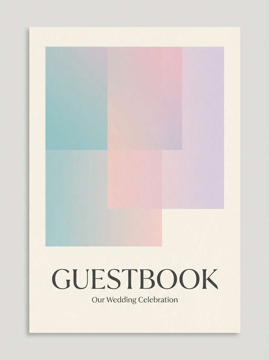
Best for: engagement photo album or guestbook design
Soft, serene pastels that evoke lagoon shallows and airy pink clouds. The gentle blues keep the mood calm, while blush and lilac add sweetness without feeling childish. A tropical wedding color palette like this works beautifully for guestbooks, photo albums, and keepsake stationery with a clean, modern layout. Tip: pair it with a warm white paper and minimalist line icons to preserve the quiet luxury feel.
Image example of bora bora pastels generated using media.io
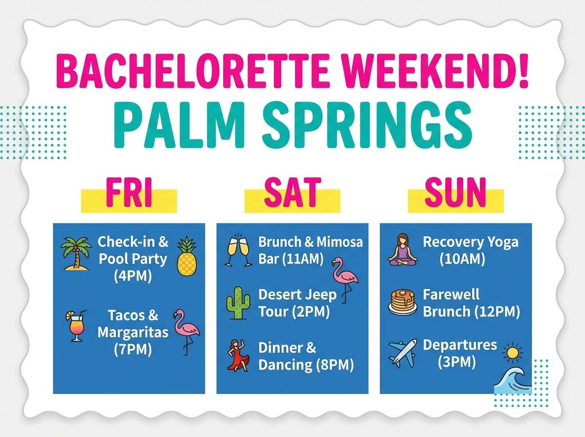
16) Flamingo Fizz
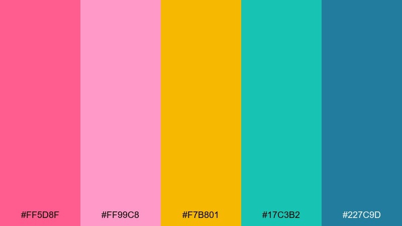
HEX: #FF5D8F #FF99C8 #F7B801 #17C3B2 #227C9D
Mood: bright, bubbly, playful
Best for: bachelorette weekend itinerary card
Bright, bubbly shades that feel like flamingo feathers and sparkling poolside drinks. Hot pink and sunshine yellow bring instant energy, while teal and blue keep it grounded and readable. Use it for weekend itineraries, party favors, and social graphics that need to feel upbeat. Tip: use teal as the main text color and let pink act as headers so everything stays legible.
Image example of flamingo fizz generated using media.io
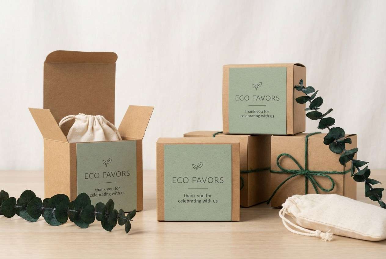
17) Seaside Sage
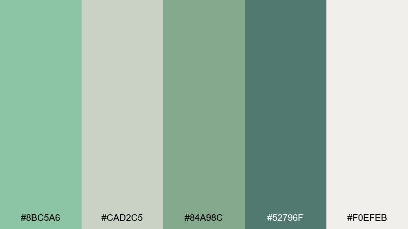
HEX: #8BC5A6 #CAD2C5 #84A98C #52796F #F0EFEB
Mood: calm, organic, minimalist
Best for: eco-friendly favor packaging labels
Calm, organic greens that feel like sea glass and coastal herbs. The layered sages and eucalyptus tones stay subtle, supported by a warm off-white that keeps packaging looking clean. Use it for favor labels, sustainable packaging, and small tags where a quiet palette reads premium. Tip: choose uncoated paper and simple one-color printing in the darker green to keep it eco and elegant.
Image example of seaside sage generated using media.io
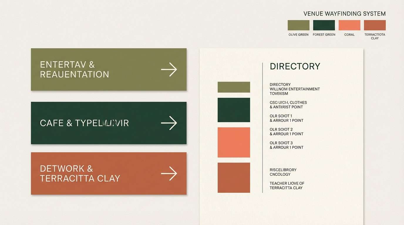
18) Coral Clay and Palm
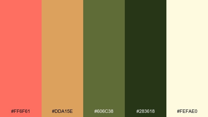
HEX: #FF6F61 #DDA15E #606C38 #283618 #FEFAE0
Mood: warm, earthy, sun-baked
Best for: rustic tropical venue branding and wayfinding
Warm, sun-baked shades that bring coral energy into an earthy, clay-forward pairing. The olive and deep forest tones keep it grounded, perfect for venues with lots of natural wood and greenery. As a tropical wedding color scheme, it supports wayfinding signs, venue maps, and branded details without looking too beachy. Tip: use the cream for negative space and let coral appear only on key callouts like arrows and section titles.
Image example of coral clay and palm generated using media.io
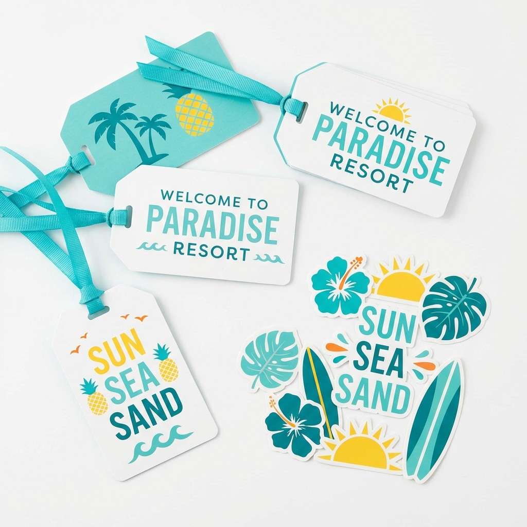
19) Sunlit Turquoise
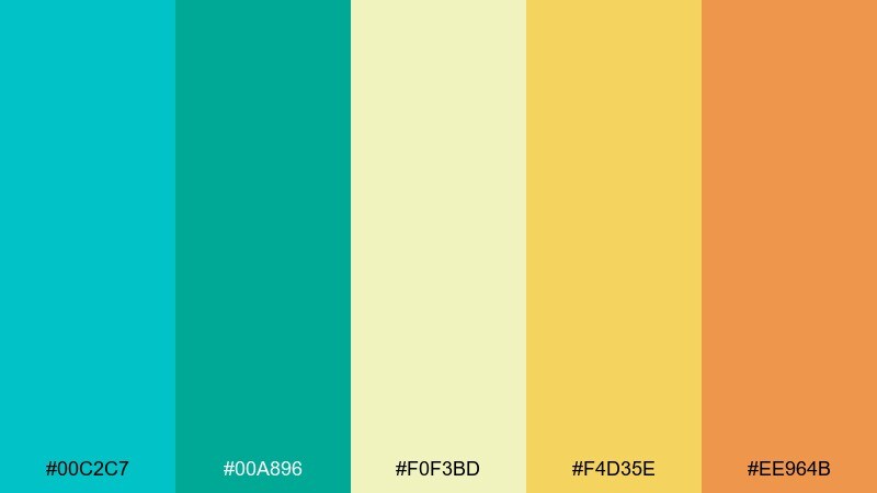
HEX: #00C2C7 #00A896 #F0F3BD #F4D35E #EE964B
Mood: bright, sunny, vacation-ready
Best for: resort welcome bag tag and sticker set
Bright, vacation-ready tones that feel like turquoise water under a golden sun. The warm yellow and orange add cheer, while the pale green-yellow keeps the overall look light and friendly. A tropical wedding color palette in this direction is great for welcome bags, stickers, and playful merch-style details for guests. Tip: keep turquoise as the dominant field color and use orange only for small punches like icons or monograms.
Image example of sunlit turquoise generated using media.io
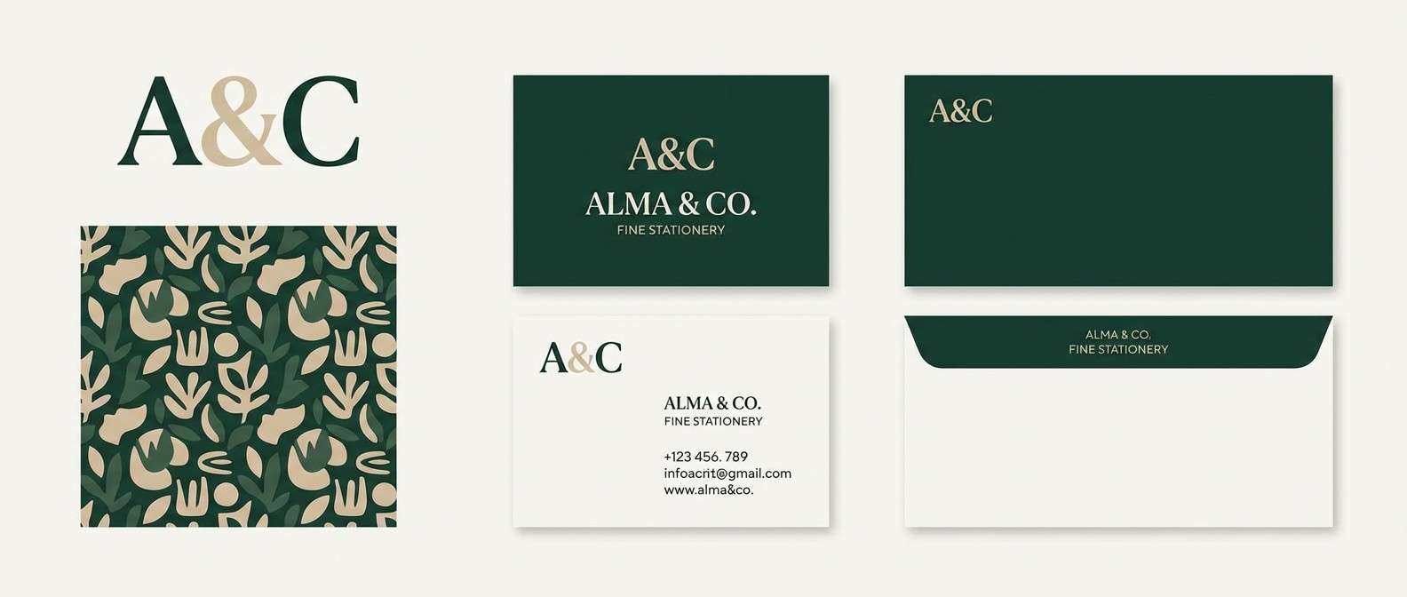
20) Monstera and Pearl
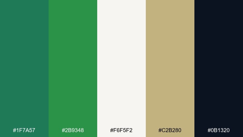
HEX: #1F7A57 #2B9348 #F6F5F2 #C2B280 #0B1320
Mood: classic, botanical, elevated
Best for: monogram logo and brand kit for stationery
Classic botanical greens paired with pearl-like neutrals for a polished, timeless feel. The sandy beige warms the mix, while the near-black creates crisp contrast for monograms and fine lines. Use it for logo marks, wax seal designs, and a cohesive stationery brand kit that still nods tropical. Tip: build the monogram in the near-black, then add green as a secondary ink for patterns and backer cards.
Image example of monstera and pearl generated using media.io
What Colors Go Well with Tropical Wedding?
Tropical wedding colors pair best when you balance a “vacation bright” with an “anchor neutral.” Think coral or hibiscus pink with deep teal, or turquoise with warm sand and a dark navy for contrast.
For a softer look, combine lagoon blues with blush, lilac, or coconut-cream neutrals. These keep the palette airy while still feeling destination-ready.
If your venue has lots of greenery, lean into palm and jungle tones, then add just one sunny accent (marigold, mango, or brass) so the scene looks intentional in photos.
How to Use a Tropical Wedding Color Palette in Real Designs
Start by assigning roles: one main color (largest areas like backdrops or linens), one supporting color (florals or secondary panels), one accent (buttons, bows, icons), plus a light and dark neutral for readability.
For print, keep body text in a deep shade (navy, deep teal, plum, or near-black) and use brights for headings and callouts. This prevents sun glare and maintains contrast on textured stocks.
For digital (wedding websites, e-invites, RSVP), keep backgrounds near-white and reserve the most saturated colors for UI elements like primary buttons, section labels, and small illustrations.
Create Tropical Wedding Palette Visuals with AI
If you already have your tropical wedding color palette picked, the next step is turning it into visuals—invites, signage, cocktail menus, and mood boards you can share with vendors.
With Media.io, you can generate cohesive examples using prompts (like the ones above), then iterate quickly to match your venue, season, and vibe—bold, pastel, or earthy.
Export your favorite results and keep them as a single reference set so your stationery, florals, attire accents, and web design all stay consistent.
Tropical Wedding Color Palette FAQs
-
What are the best tropical wedding colors for a beach ceremony?
Teal, turquoise, coral, and warm sand neutrals are the most reliable for beach light. Add a darker anchor (deep teal or navy) for readable text on invites and signage. -
How do I keep tropical wedding colors from looking too neon?
Use brights as accents (10–20%) and keep most surfaces neutral (cream, pearl, warm white). Choose one deep anchor color for typography and outlines to “calm” the palette. -
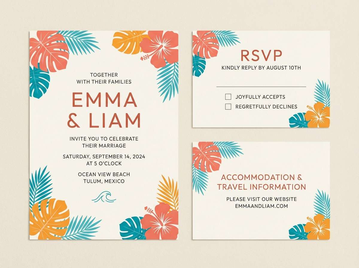
What tropical wedding palette works best for modern invitations?
Palettes with strong contrast and clean neutrals—like Hibiscus Sunset or Monstera and Pearl—work well with modern typography, generous spacing, and minimal floral accents. -
Can I mix tropical colors with earthy tones?
Yes—pair coral or marigold with olive, palm green, terracotta, or warm wood tones for a grounded, elevated look. This is especially good for outdoor resorts and garden-meets-beach venues. -
Which tropical wedding colors look best in photos?
Coral, teal, and deep green photograph beautifully because they separate clearly from skin tones and foliage. Avoid using only pale pastels without a darker shade, or details may look washed out. -
What’s a good color ratio for a tropical wedding color palette?
Try 60% light neutral (backgrounds/linens), 25% main color (large décor), 10% supporting color (florals/panels), and 5% accent (ribbons, icons, small highlights). -
How can I preview a tropical wedding palette before committing?
Generate mockups of your key touchpoints—invitation suite, ceremony sign, menu, and a tablescape—then adjust saturation and contrast until everything looks consistent across print and digital.
Next: Ecommerce Color Palette


