

An ecommerce color palette isn’t just decoration—it’s a conversion tool. The right mix of neutrals, trust-building blues/greens, and purposeful accents can make product pages feel clearer, safer, and easier to buy from.
Below are 20 ecommerce palette ideas with HEX codes, plus practical notes for using them across product grids, promos, and checkout UI.
In this article
- Why Ecommerce Palettes Work So Well
-
- midnight checkout
- blush boutique
- citrus cart
- minimal marble
- ocean trust
- warm warehouse
- neon deal day
- sage support
- copper and cashmere
- solar checkout
- lavender loyalty
- forest market
- clay handmade
- arctic minimal
- rose gold promo
- indigo inventory
- minty fresh
- desert checkout
- ink and apricot
- mossy wishlist
- What Colors Go Well with Ecommerce?
- How to Use a Ecommerce Color Palette in Real Designs
- Create Ecommerce Palette Visuals with AI
Why Ecommerce Palettes Work So Well
Ecommerce design needs clarity under pressure: scanning product grids, comparing prices, and completing checkout quickly. A well-built palette creates hierarchy—what’s clickable, what’s important, and what’s just supporting detail.
Colors also signal trust. Cooler blues and teals often feel secure for payments and confirmations, while warm accents can create urgency for promos without making the UI look “spammy.”
Most importantly, consistent color choices reduce friction across the funnel. When your CTA, states (success/error), and typography contrast are predictable, users move faster and abandon less.
20+ Ecommerce Color Palette Ideas (with HEX Codes)
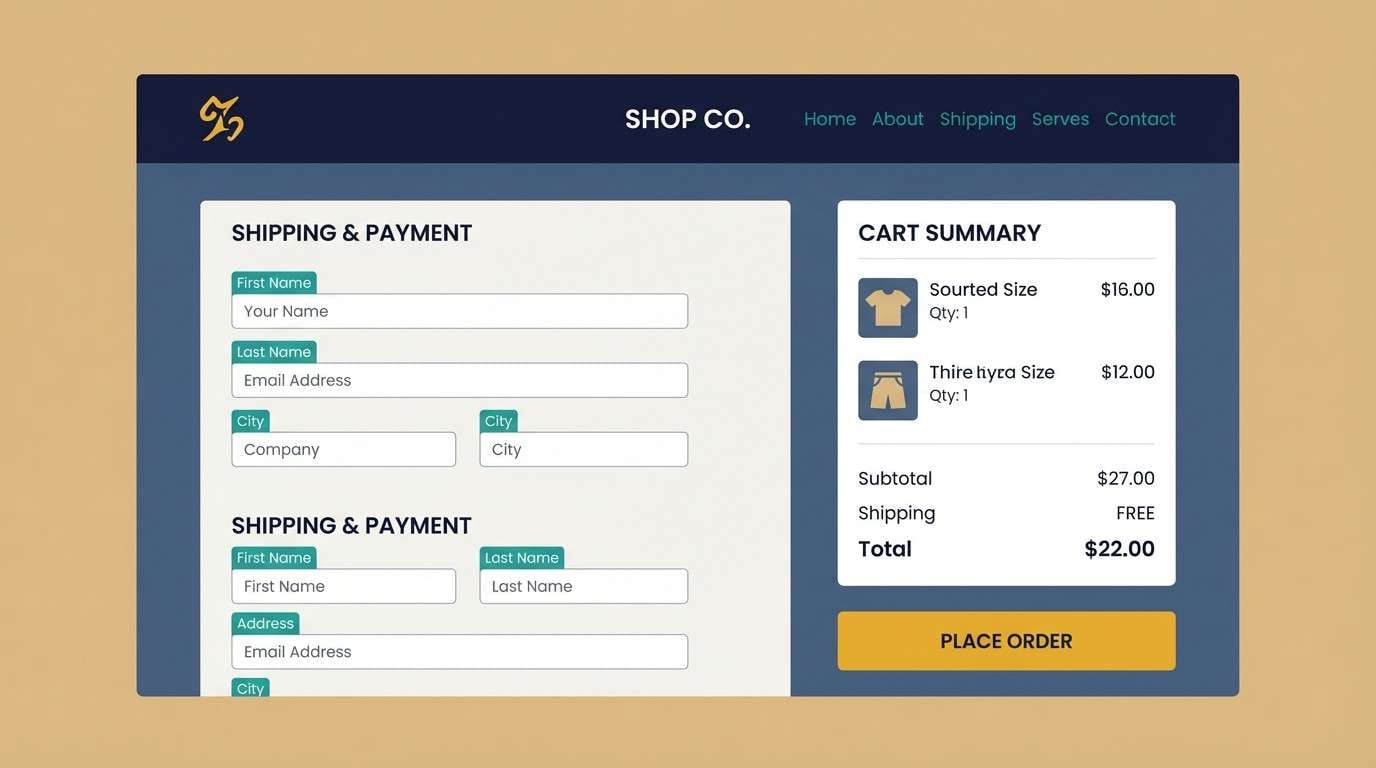
1) Midnight Checkout
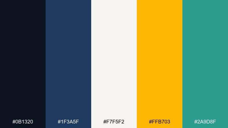
HEX: #0b1320 #1f3a5f #f7f5f2 #ffb703 #2a9d8f
Mood: sleek, secure, high-contrast
Best for: 2d checkout ui mockup for a premium store
Sleek and secure like a late-night storefront, these tones feel confident and streamlined. Use the deep navy for headers and cart panels, then let the golden accent mark primary actions like Pay now. The warm off-white keeps screens readable while teal adds a subtle trust signal for badges and confirmations. Tip: reserve the gold for one main CTA per screen to keep focus tight.
Image example of midnight checkout generated using media.io
Media.io is an online AI studio for creating and editing video, image, and audio in your browser.

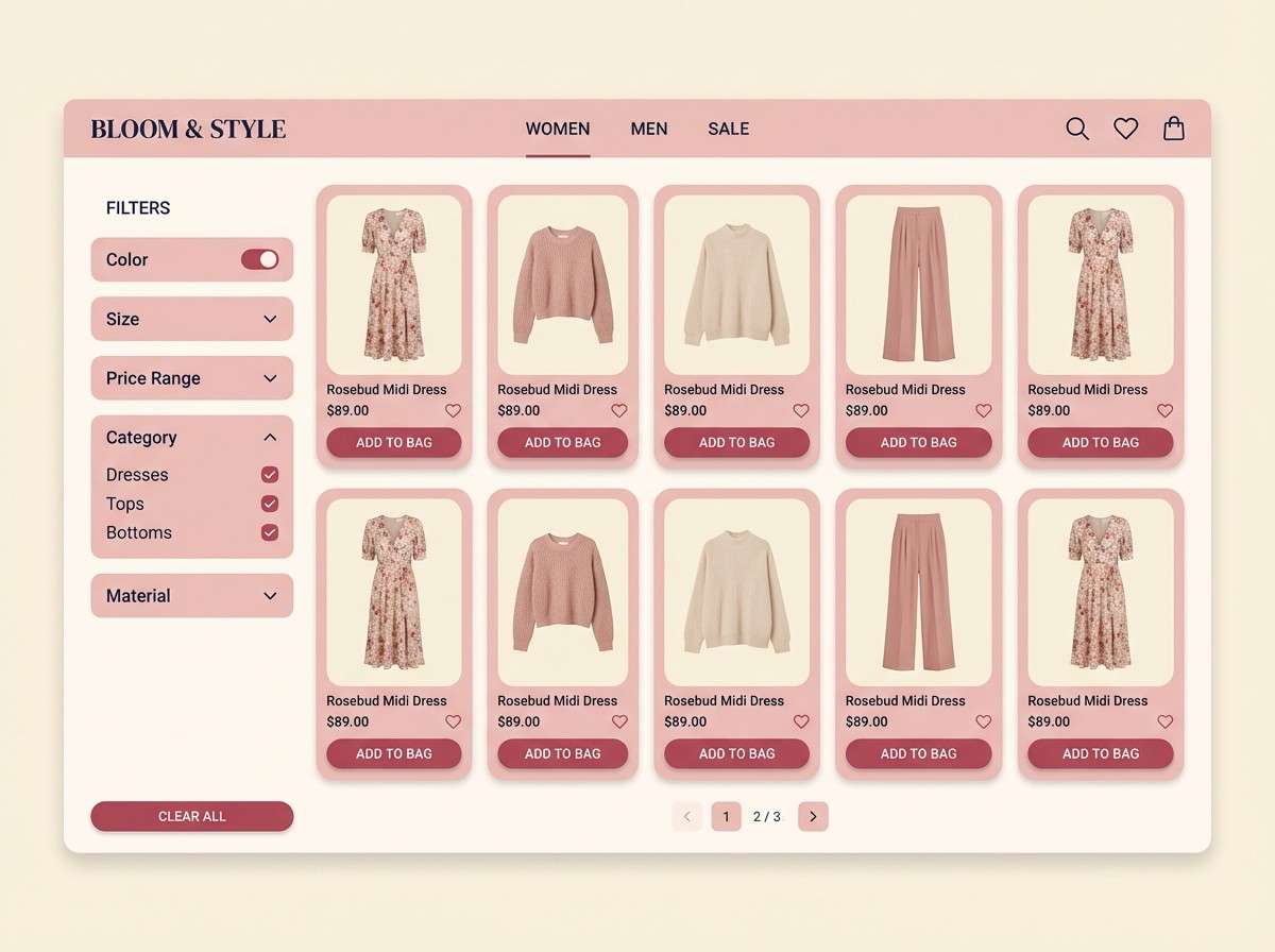
2) Blush Boutique
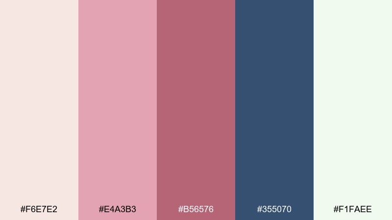
HEX: #f6e7e2 #e4a3b3 #b56576 #355070 #f1faee
Mood: romantic, refined, friendly
Best for: 2d product listing ui for fashion and accessories
Romantic and refined, this mix feels like satin ribbons and boutique display lights. Keep the blush and cream tones for backgrounds and product cards, then use the deeper rose for buttons and price highlights. Navy anchors the layout so the soft tones do not drift into pastel clutter. Tip: pair navy text with blush surfaces for readability without losing the gentle vibe.
Image example of blush boutique generated using media.io
3) Citrus Cart
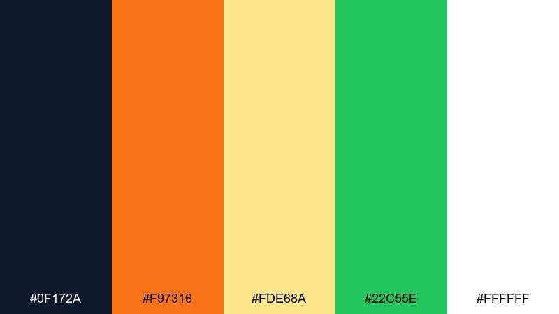
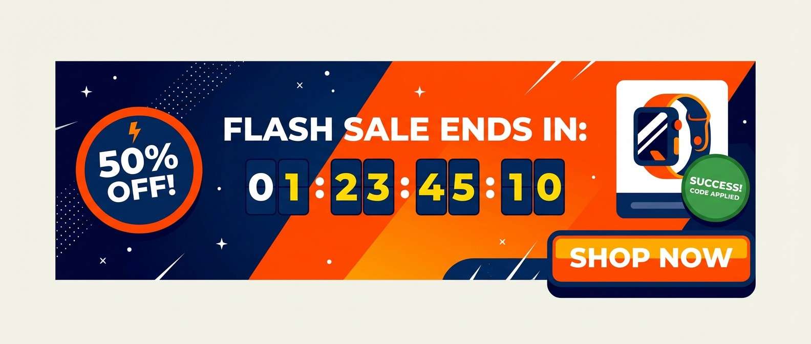
HEX: #0f172a #f97316 #fde68a #22c55e #ffffff
Mood: upbeat, energetic, conversion-focused
Best for: 2d promo banner ui for flash sales
Upbeat and punchy, these tones evoke fresh citrus and a fast-moving deal page. Orange is made for urgency and can spotlight discounts, while sunny yellow supports tags and small highlights. The dark base keeps everything crisp against white sections, and green works well for success states like Added to cart. Tip: use orange only for time-limited offers so it stays persuasive instead of noisy.
Image example of citrus cart generated using media.io
4) Minimal Marble
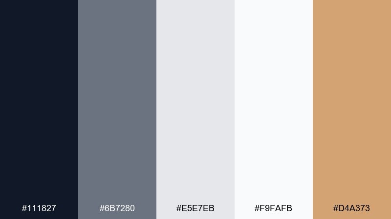
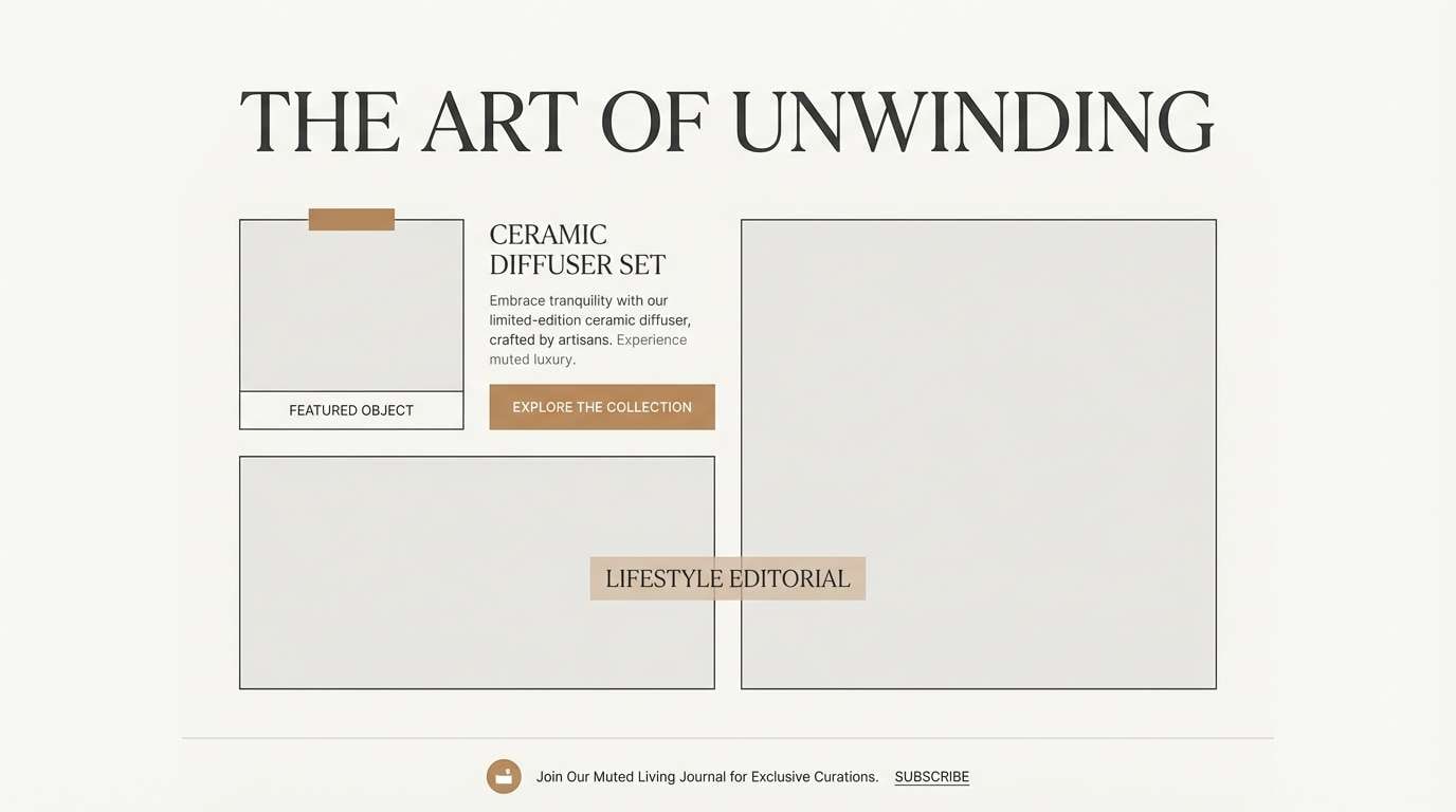
HEX: #111827 #6b7280 #e5e7eb #f9fafb #d4a373
Mood: minimal, editorial, premium
Best for: editorial landing page layout for a lifestyle brand
Minimal and editorial, this set feels like marble counters, linen paper, and quiet luxury. The soft grays build structure for sections and dividers, while near-white keeps the page airy and product-first. A muted caramel accent adds warmth for highlights without turning flashy, making it a strong ecommerce color scheme for premium goods. Tip: use the caramel on micro-elements like underlines, icons, and price chips to keep the look elevated.
Image example of minimal marble generated using media.io
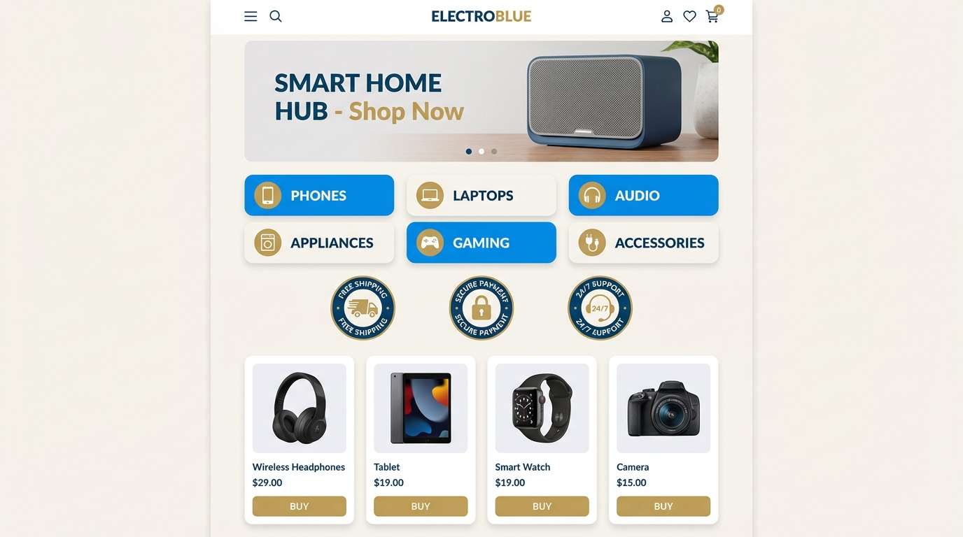
5) Ocean Trust
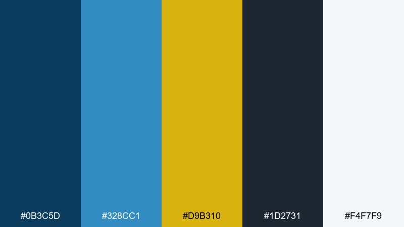
HEX: #0b3c5d #328cc1 #d9b310 #1d2731 #f4f7f9
Mood: trustworthy, crisp, professional
Best for: 2d homepage ui for electronics or services
Trustworthy and crisp, this palette brings to mind clear ocean water and polished steel. Use the dark blue-gray for navigation and footers, then let the brighter blue guide links and interactive states. Gold is best as a sparing accent for key offers or membership tiers, not for body UI. Tip: keep most surfaces in the soft misty white so the blues feel calm, not heavy.
Image example of ocean trust generated using media.io
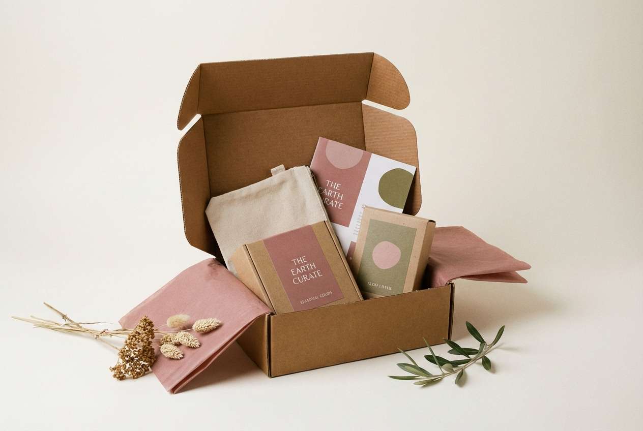
6) Warm Warehouse
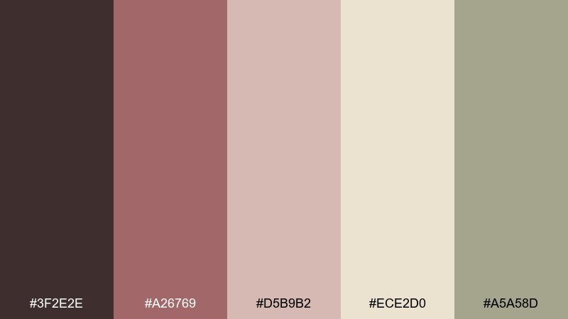
HEX: #3f2e2e #a26769 #d5b9b2 #ece2d0 #a5a58d
Mood: earthy, handmade, cozy
Best for: realistic studio shot for subscription box packaging
Earthy and cozy, these shades feel like kraft paper, warm clay, and soft textiles. The deep brown supports logos and typography, while dusty rose and beige build welcoming midtones for packaging and labels. The olive-neutral works nicely for secondary stamps, ingredient callouts, or eco claims. Tip: print tests matter here, so slightly deepen the rose if it looks washed out on matte stock.
Image example of warm warehouse generated using media.io
7) Neon Deal Day
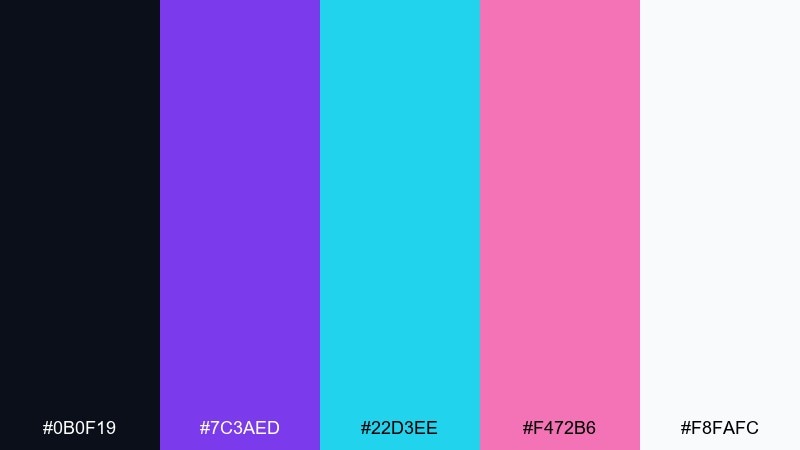
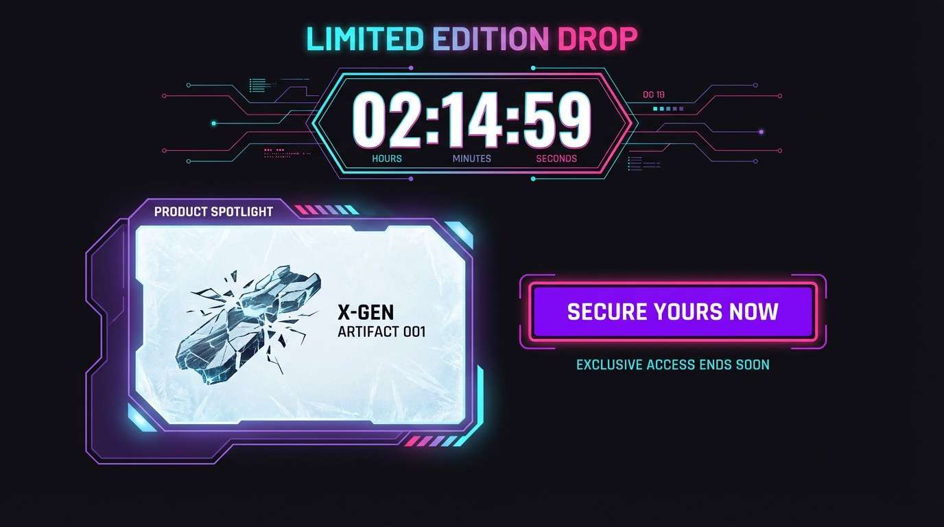
HEX: #0b0f19 #7c3aed #22d3ee #f472b6 #f8fafc
Mood: bold, playful, high-energy
Best for: 2d event landing ui for limited-time drops
Bold and electric, this mix evokes club lights, holographic stickers, and a buzzy countdown. Let the near-black ground the layout, then use violet for primary buttons and section headers. Cyan and hot pink are best as small sparks for badges, progress bars, and hover states, creating ecommerce color combinations that feel modern without chaos. Tip: keep only one neon color dominant per module so the page stays scannable.
Image example of neon deal day generated using media.io
8) Sage Support
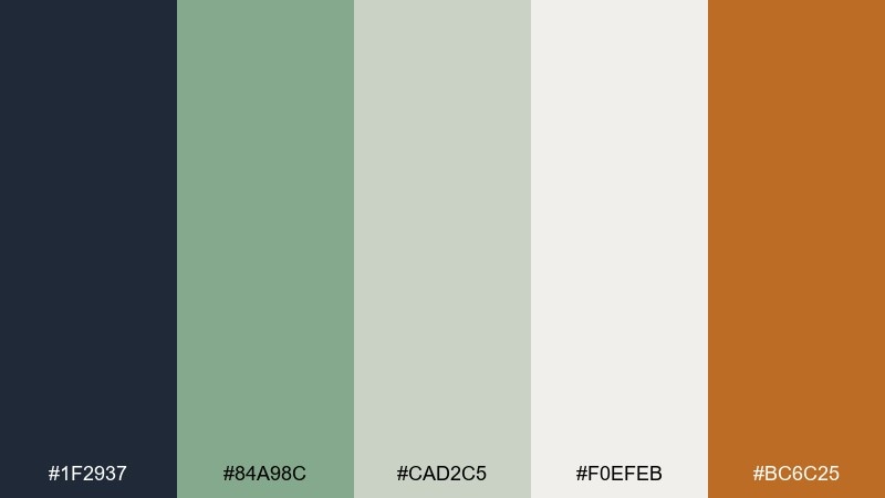
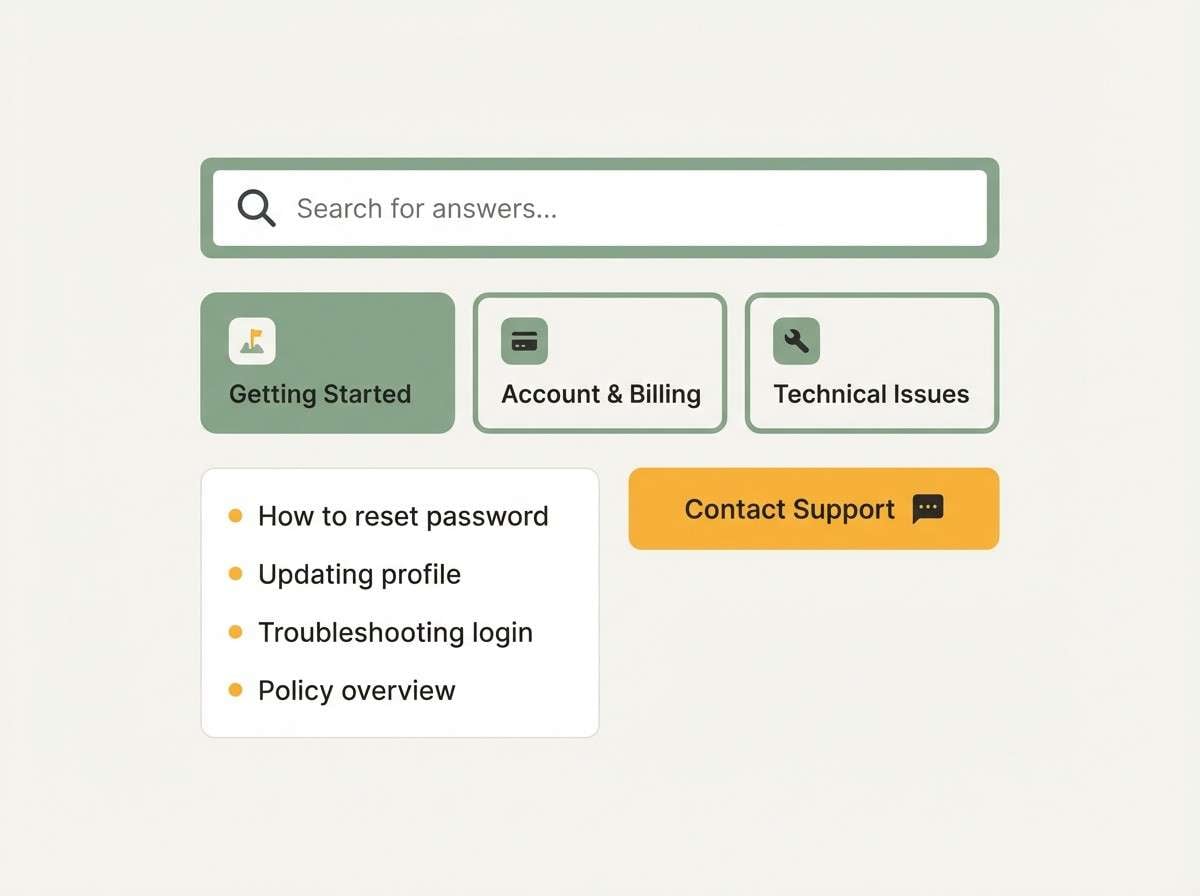
HEX: #1f2937 #84a98c #cad2c5 #f0efeb #bc6c25
Mood: calm, helpful, grounded
Best for: 2d help center ui and faq page
Calm and grounded, these colors suggest quiet reassurance and friendly guidance. Use sage and soft gray-green for panels and navigation so long articles feel less tiring to read. Charcoal keeps text sharp, while a warm amber-brown can highlight important notices or contact options. Tip: reserve the amber for warnings and key links so users instantly know where to click next.
Image example of sage support generated using media.io
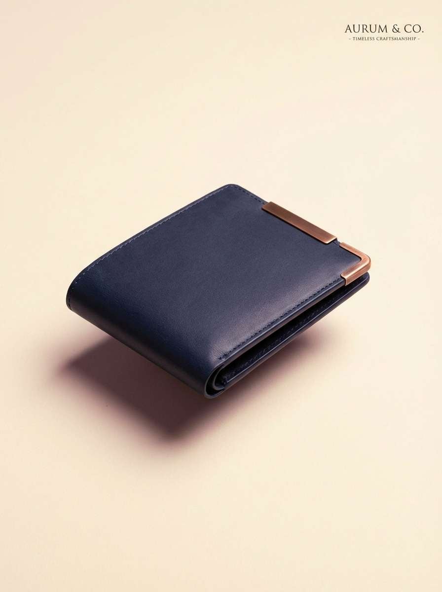
9) Copper and Cashmere
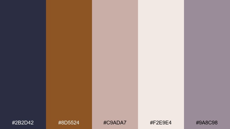
HEX: #2b2d42 #8d5524 #c9ada7 #f2e9e4 #9a8c98
Mood: luxurious, warm, sophisticated
Best for: realistic studio product ad for jewelry or leather goods
Luxurious and warm, this set feels like copper hardware against soft knit cashmere. The deep indigo base adds drama for backgrounds and typography, while blush and cream soften the overall mood. Copper is ideal for logo marks, price accents, or metallic-like buttons when paired with muted mauve. Tip: add subtle texture in cream areas to mimic premium paper without distracting from the product.
Image example of copper and cashmere generated using media.io
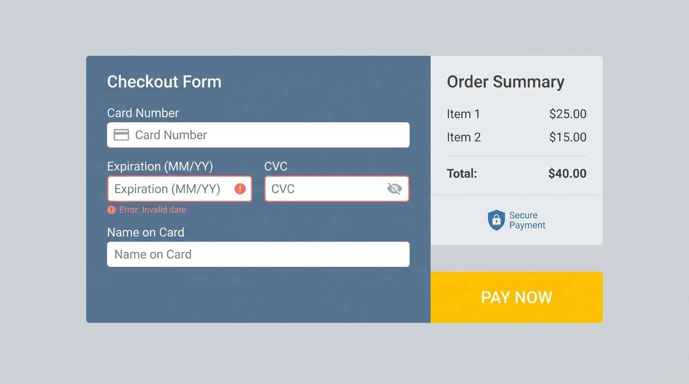
10) Solar Checkout
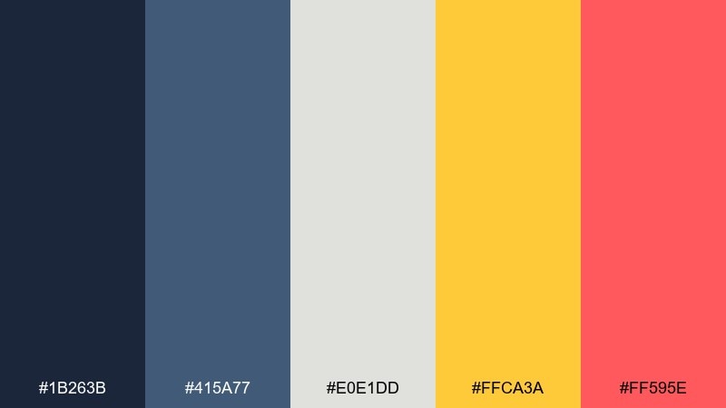
HEX: #1b263b #415a77 #e0e1dd #ffca3a #ff595e
Mood: confident, bright, action-oriented
Best for: 2d payment page ui with clear hierarchy
Confident and bright, these tones evoke sunlight cutting through a crisp, organized dashboard. Blue-grays create a stable frame for forms and summaries, while the pale neutral keeps the content light. Yellow works best for the main action, and the coral-red should be reserved for errors or urgent messages. Tip: in an ecommerce color palette like this, keep red strictly functional so it does not compete with your primary CTA.
Image example of solar checkout generated using media.io
11) Lavender Loyalty
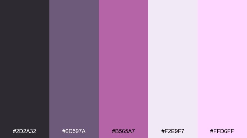
HEX: #2d2a32 #6d597a #b565a7 #f2e9f7 #ffd6ff
Mood: sweet, modern, community-first
Best for: email newsletter design for rewards and referrals
Sweet and modern, these purples feel like a soft glow from a boutique neon sign. Use the pale lavender for the email background and content blocks, then deepen to plum for headings and buttons. Pink-lilac accents are perfect for points badges, referral callouts, and small icons. Tip: keep the darkest tone for text and dividers so the email remains accessible on mobile screens.
Image example of lavender loyalty generated using media.io

12) Forest Market
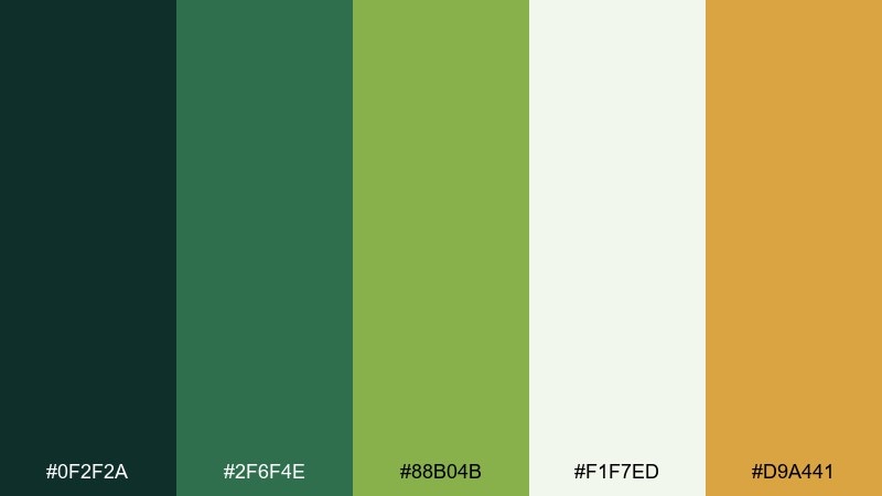
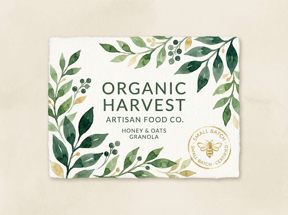
HEX: #0f2f2a #2f6f4e #88b04b #f1f7ed #d9a441
Mood: fresh, organic, outdoorsy
Best for: watercolor label illustration for natural foods
Fresh and organic, these greens and golds feel like a morning farmers market under tree shade. Use the dark evergreen for brand marks and headings, then layer mid-green and leaf tones for supporting blocks and category tags. The pale misty base keeps labels clean, while the warm honey accent adds appetite appeal. Tip: apply the honey sparingly to highlight key benefits like organic or seasonal.
Image example of forest market generated using media.io
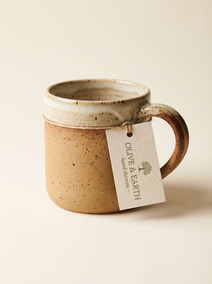
13) Clay Handmade
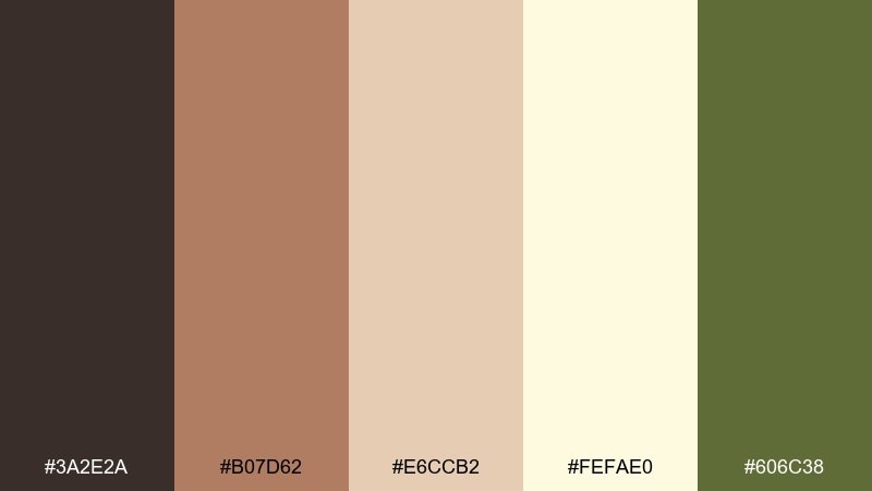
HEX: #3a2e2a #b07d62 #e6ccb2 #fefae0 #606c38
Mood: artisan, rustic, comforting
Best for: realistic studio product shot for handmade ceramics
Artisan and comforting, this palette reads like kiln-fired clay, natural linen, and dried herbs. The cocoa brown adds depth for logos and titles, while tan and cream support soft, tactile backgrounds. Olive brings a grounded accent for eco notes or collections inspired by nature. Tip: keep the product photo warm and consistent so the clay tones do not skew gray under cool lighting.
Image example of clay handmade generated using media.io
14) Arctic Minimal
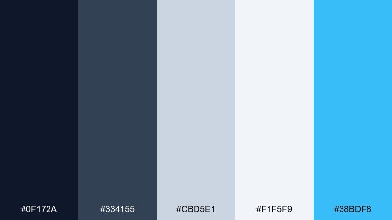
HEX: #0f172a #334155 #cbd5e1 #f1f5f9 #38bdf8
Mood: clean, modern, tech-forward
Best for: 2d ui kit preview for a tech store
Clean and tech-forward, these icy neutrals feel like fresh air and polished glass. Use the dark navy for navigation and bold text, then rely on cool grays for structure and spacing. The sky-cyan accent is ideal for links, toggles, and selected states without overwhelming the page. Tip: keep large surfaces light and let the cyan appear only where interaction happens.
Image example of arctic minimal generated using media.io
15) Rose Gold Promo
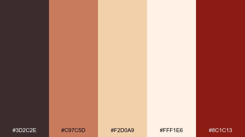
HEX: #3d2c2e #c97c5d #f2d0a9 #fff1e6 #8c1c13
Mood: glam, warm, persuasive
Best for: poster design for a seasonal promotion
Glam and warm, these hues evoke rose-gold foil, espresso, and candlelit displays. Use the creamy blush for the background, then bring in copper for headings and decorative shapes. The deep wine red is a strong accent for discount stickers and limited-time stamps, creating ecommerce color combinations that feel luxe but still urgent. Tip: keep body text in the dark espresso tone so the softer shades remain readable.
Image example of rose gold promo generated using media.io
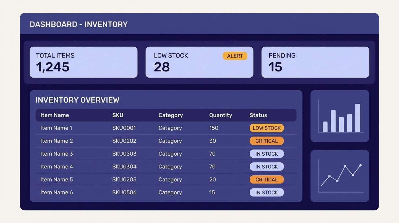
16) Indigo Inventory
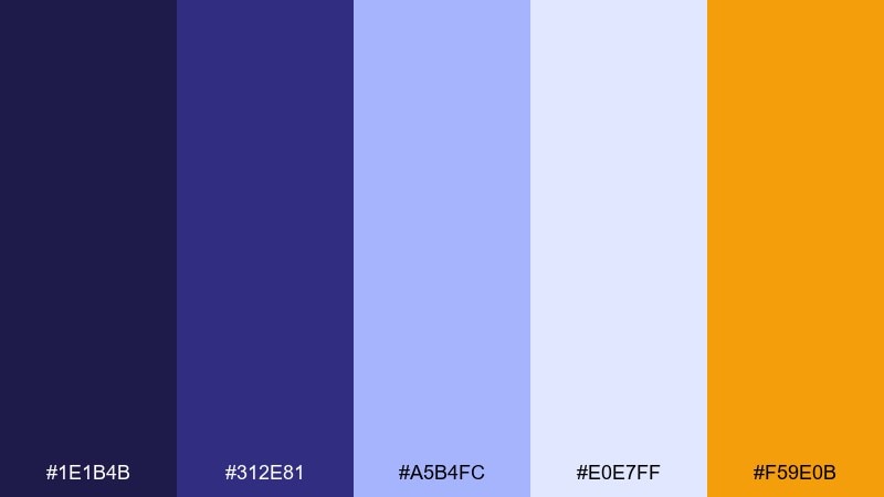
HEX: #1e1b4b #312e81 #a5b4fc #e0e7ff #f59e0b
Mood: focused, organized, confident
Best for: 2d admin dashboard ui for inventory management
Focused and organized, these indigos feel like a well-ordered stockroom with clear labels. Use the darkest tone for side navigation and key numbers, then layer mid-indigo for charts and selected states. Soft periwinkle keeps tables and cards legible, while amber is perfect for warnings or attention flags. Tip: use amber only for exceptions, like low stock, to preserve its meaning.
Image example of indigo inventory generated using media.io
17) Minty Fresh
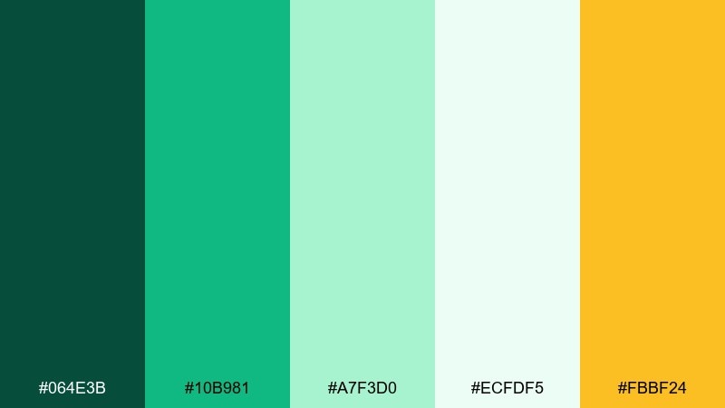
HEX: #064e3b #10b981 #a7f3d0 #ecfdf5 #fbbf24
Mood: refreshing, clean, optimistic
Best for: realistic studio product ad for skincare
Refreshing and clean, this mix feels like mint leaves, spa towels, and a bright morning routine. Use the pale mint as a soft background and let emerald-green carry logos and key type. The golden accent adds warmth for callouts like new or limited edition without breaking the clean look. Tip: keep shadows subtle and green-tinted so the overall photo remains fresh, not muddy.
Image example of minty fresh generated using media.io
18) Desert Checkout
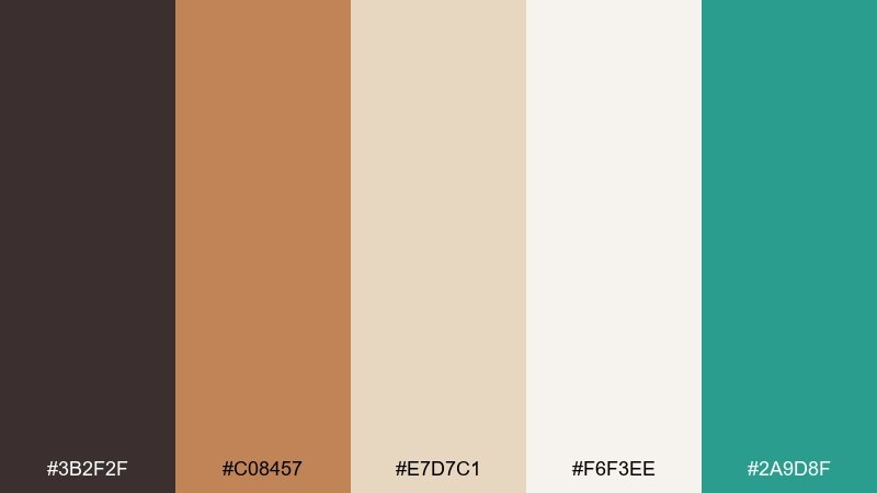
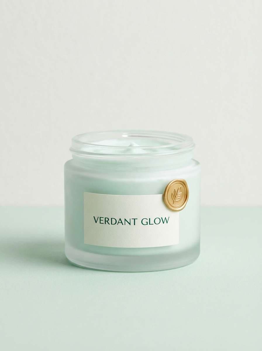
HEX: #3b2f2f #c08457 #e7d7c1 #f6f3ee #2a9d8f
Mood: sunbaked, friendly, grounded
Best for: 2d checkout ui for home goods and decor
Sunbaked and grounded, these tones recall terracotta pottery and sandy fabric. Use warm beige and soft off-white for large surfaces to keep the flow calm and spacious. Terracotta can lead the primary button, while teal is great for trust badges and small confirmations. Tip: keep text in the deep cocoa shade to avoid the low-contrast look that warm palettes sometimes create.
Image example of desert checkout generated using media.io
19) Ink and Apricot
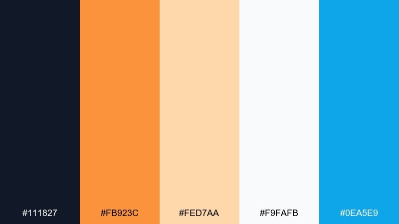
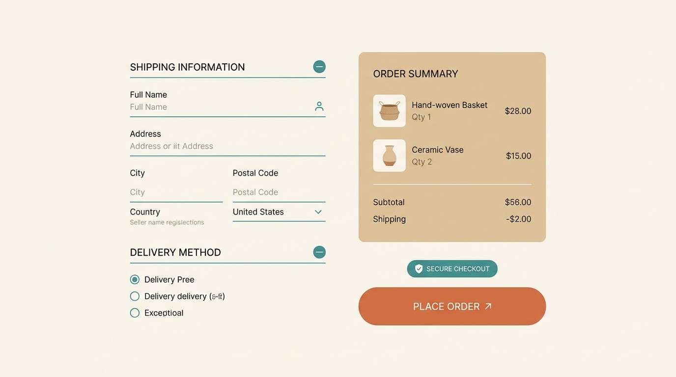
HEX: #111827 #fb923c #fed7aa #f9fafb #0ea5e9
Mood: bold, friendly, modern
Best for: email campaign layout for new arrivals
Bold and friendly, these shades feel like inked headlines with a warm apricot glow. Use the dark ink for strong typography and product names, then add apricot for buttons and promotional chips. Light peach and near-white keep the layout airy, while a small hit of sky blue can differentiate links and secondary actions. Tip: keep the blue minimal so the warm tones stay dominant and cohesive.
Image example of ink and apricot generated using media.io
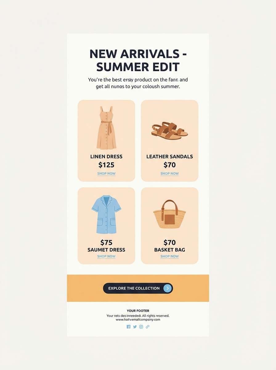
20) Mossy Wishlist
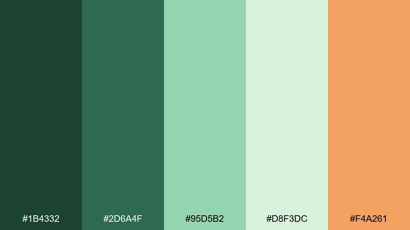
HEX: #1b4332 #2d6a4f #95d5b2 #d8f3dc #f4a261
Mood: lush, calming, nature-led
Best for: watercolor category banner illustration for eco brands
Lush and calming, these greens feel like shaded trails and fresh moss after rain. Use the deep forest tones for titles and navigation, while minty greens can fill banners and category tiles. The soft pale green makes a gentle background, and the apricot accent is perfect for small highlights like limited stock or featured picks. Tip: pair apricot with the darkest green for maximum contrast without losing the natural mood.
Image example of mossy wishlist generated using media.io
What Colors Go Well with Ecommerce?
Neutrals (off-white, light gray, charcoal) pair well with nearly any ecommerce color palette because they keep the spotlight on product photos while maintaining a clean reading experience.
Blues and teals are popular for ecommerce color schemes because they imply reliability—useful for navigation, links, and security cues in checkout. Greens work well for confirmations and positive states like “Added to cart.”
For conversion-driven moments, warm accents like orange, yellow, or coral can highlight discounts and primary CTAs. The key is restraint: one dominant accent per screen usually performs better than competing highlights.
How to Use a Ecommerce Color Palette in Real Designs
Start by assigning roles: background, surface/card, text, primary CTA, and status colors (success/warning/error). This keeps your product pages and checkout UI consistent even as layouts change.
Use high-contrast pairs for readability—especially for price, shipping info, and button labels. If your palette includes soft pastels, anchor them with a darker text color to avoid a “washed out” interface.
Finally, keep promo colors separate from functional colors. If red means “error,” don’t use the same red for “Buy now,” or users may hesitate at critical steps.
Create Ecommerce Palette Visuals with AI
If you want to preview how an ecommerce color palette looks on a homepage, product grid, or checkout flow, generating quick mockups can save hours. Instead of guessing, you can see how contrast, mood, and CTA visibility work together.
With Media.io text-to-image, you can turn a palette + a simple prompt into banner concepts, UI blocks, packaging shots, or email layouts—then iterate until it matches your brand voice.
Use the prompts above as templates and swap in your product category, layout type, and preferred style (flat UI, editorial, studio photo, watercolor) to keep results consistent.
Ecommerce Color Palette FAQs
-
What is a good ecommerce color palette for conversions?
A strong ecommerce palette usually combines clean neutrals for readability, one trustworthy core color (often blue/teal/charcoal), and a single high-contrast accent for the primary CTA. This keeps pages scannable and makes the “Buy” action obvious. -
Which colors build trust on product pages and checkout?
Blues, blue-grays, and teals commonly signal security and professionalism, so they work well for navigation, links, and trust badges. Pair them with light surfaces (off-white or pale gray) so the interface doesn’t feel heavy. -
How many colors should an online store color scheme use?
Most stores work best with 3–5 core colors: background/surface neutrals, a text color, a brand/support color, and one accent for CTAs. Add status colors (success/warning/error) only if they’re clearly distinct. -
What color should “Add to cart” or “Buy now” buttons be?
Pick one accent color with strong contrast against the button background and surrounding UI, then use it consistently for the main CTA. Avoid using the same color for errors or destructive actions to prevent hesitation. -
How do I avoid a palette that looks “too loud” on ecommerce pages?
Limit bright colors to small areas and keep large surfaces neutral. Use one dominant accent per section, and rely on spacing, typography, and subtle dividers (light grays) for structure instead of multiple competing hues. -
What are the best background colors for ecommerce websites?
Near-white and soft gray backgrounds are the most flexible because they keep product photos accurate and improve text readability. If you use a dark theme, reserve it for specific experiences (like premium checkout) and keep contrast high. -
Can I generate ecommerce color palette mockups quickly?
Yes—use an AI image generator to create fast UI or ad concepts from your palette. With Media.io, you can generate variations for product grids, checkout screens, and promo banners to validate contrast and mood before design handoff.


