

Tropical island color palettes bottle up that instant “vacation” feeling: turquoise water, sunlit sand, and bright coral accents that pop.
Below are 20 tropical island color combinations with HEX codes, plus AI image prompts you can reuse for branding, UI, invites, packaging, and more.
In this article
Why Tropical Island Palettes Work So Well
Tropical island colors naturally balance calm and energy: watery blues and teals feel refreshing, while warm sand, mango, and coral tones add friendliness and optimism.
They also create instant visual hierarchy. Cool shades make great backgrounds and large surfaces, and brighter accents guide attention to CTAs, prices, or key labels.
Most importantly, tropical island palettes are versatile: with a small shift in saturation or contrast, they can feel luxurious (spa-like), playful (party-ready), or modern (app-friendly).
20+ Tropical Island Color Palette Ideas (with HEX Codes)
1) Lagoon Breeze
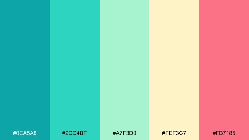
HEX: #0ea5a8 #2dd4bf #a7f3d0 #fef3c7 #fb7185
Mood: fresh, airy, beachy
Best for: travel website hero and blog headers
Fresh sea-spray vibes meet warm sand and a hint of coral sparkle, like stepping off the dock into clear water. Use the teal and aqua as your main surfaces, then reserve coral for buttons or calls to action. It works especially well with clean white space and simple sans-serif type. Tip: keep the coral accents small so the lagoon tones stay calm and premium.
Image example of lagoon breeze generated using media.io
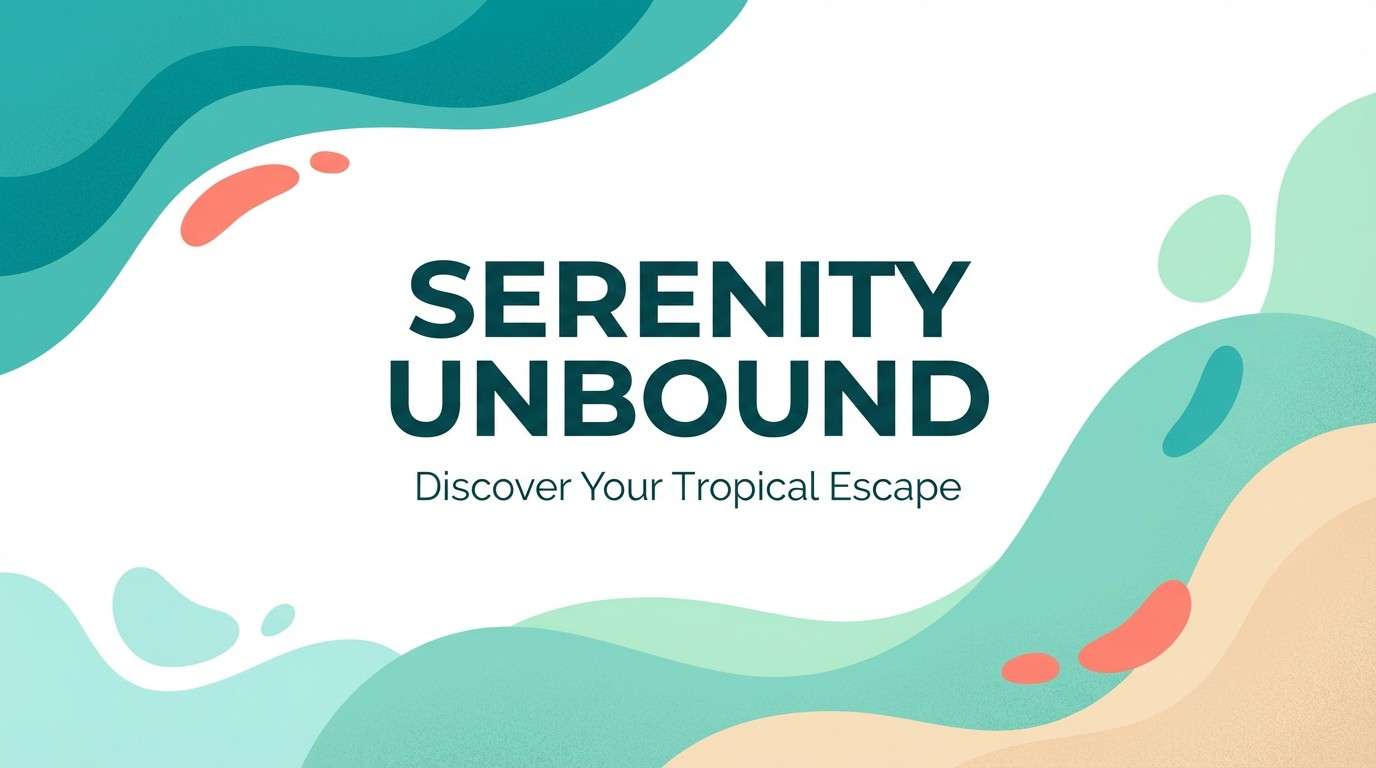
Media.io is an online AI studio for creating and editing video, image, and audio in your browser.

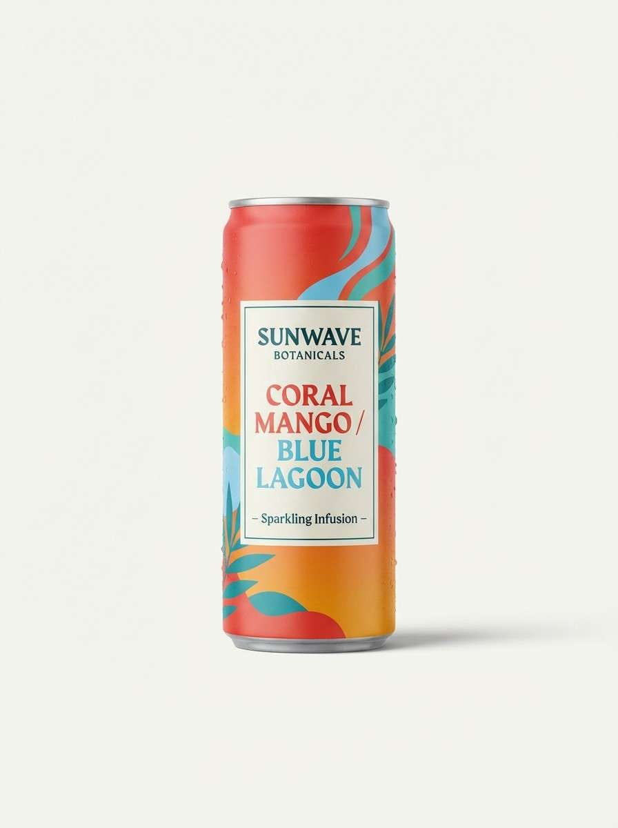
2) Coral Cay
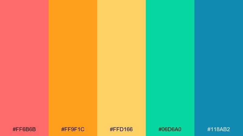
HEX: #ff6b6b #ff9f1c #ffd166 #06d6a0 #118ab2
Mood: playful, sunny, energetic
Best for: sparkling beverage can packaging
Playful and sun-drenched, like a coral reef popping under midday light. Let the coral-red and mango orange lead the label, then balance them with a cool teal-blue for contrast. These tones shine on glossy finishes and bold, chunky typography. Tip: use the pale yellow as breathing room around logos to keep the design from feeling too loud.
Image example of coral cay generated using media.io
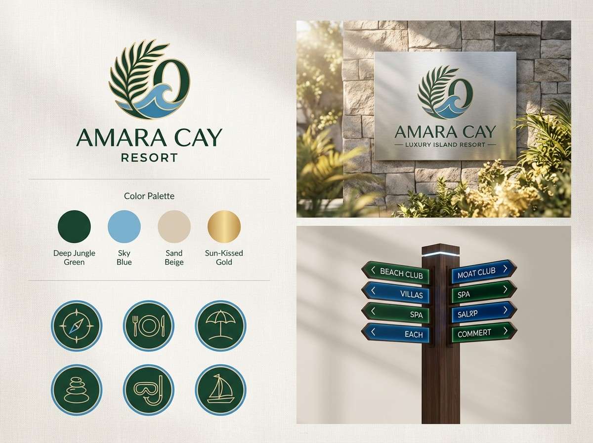
3) Palm Shade
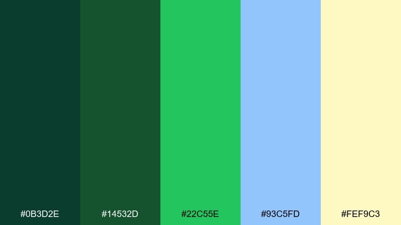
HEX: #0b3d2e #14532d #22c55e #93c5fd #fef9c3
Mood: lush, grounded, breezy
Best for: resort branding and wayfinding signage
Lush palm fronds and dappled light set a grounded, relaxing tone with a breezy coastal lift. For a tropical island color palette that feels upscale, use the deep greens for wordmarks and signage, then add sky blue for secondary panels. The soft yellow works as a friendly highlight without turning neon. Tip: pair with natural textures like linen or rattan in photos to reinforce the shaded, resort feel.
Image example of palm shade generated using media.io
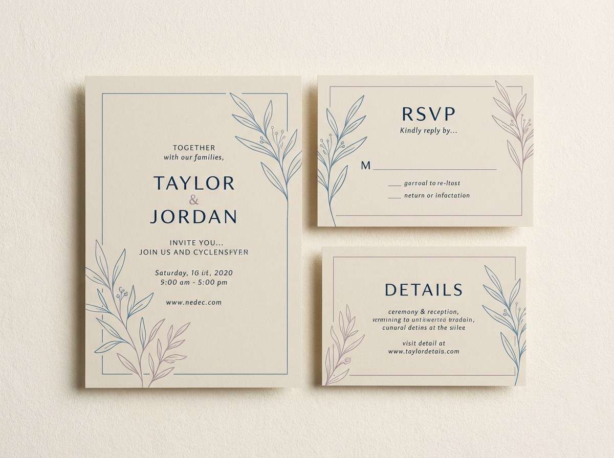
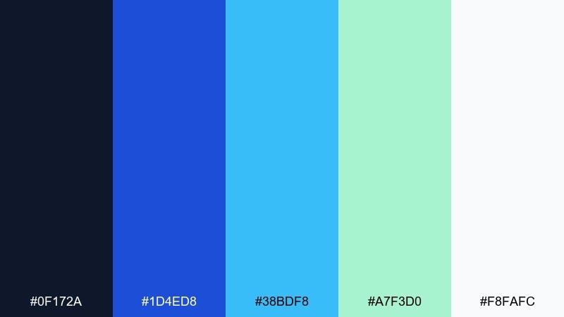
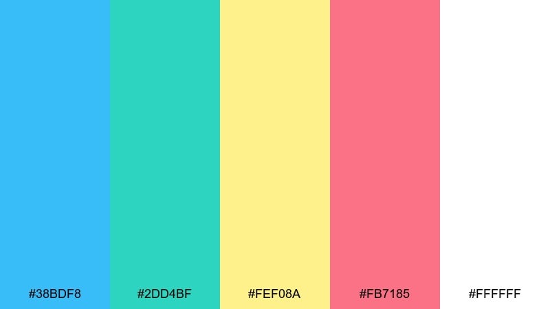
4) Sunlit Sandbar
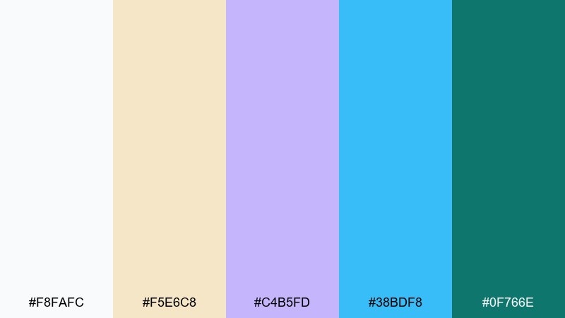
HEX: #f8fafc #f5e6c8 #c4b5fd #38bdf8 #0f766e
Mood: soft, relaxed, modern
Best for: destination wedding invitation suite
Soft sun on a sandbar meets gentle sea tones, with a lilac twist that feels modern and romantic. Use the warm beige as your paper base, then bring in ocean blue for headings and borders. The teal works best as a small anchor color for monograms or RSVP details. Tip: keep fonts elegant and airy so the palette reads calm rather than coastal-cute.
Image example of sunlit sandbar generated using media.io
5) Hibiscus Pop
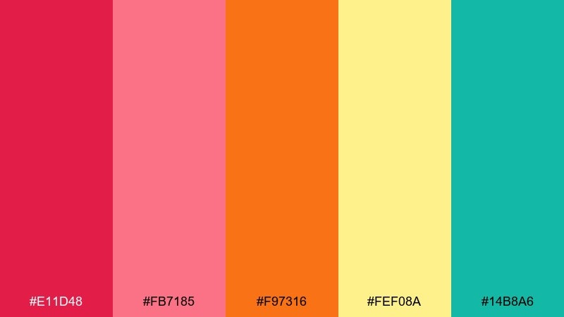
HEX: #e11d48 #fb7185 #f97316 #fef08a #14b8a6
Mood: bold, festive, flirty
Best for: summer party poster and social ads
Bold hibiscus petals and tropical fruit punch bring instant celebration energy. Make hot pink the headline color, then use orange for supporting shapes and dividers. A touch of teal cools the mix and keeps it from feeling too sugary. Tip: set type in strong, simple blocks so the bright hues do the heavy lifting.
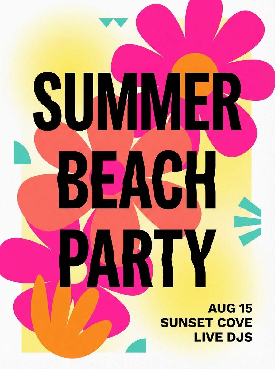
Image example of hibiscus pop generated using media.io
6) Reef Dive
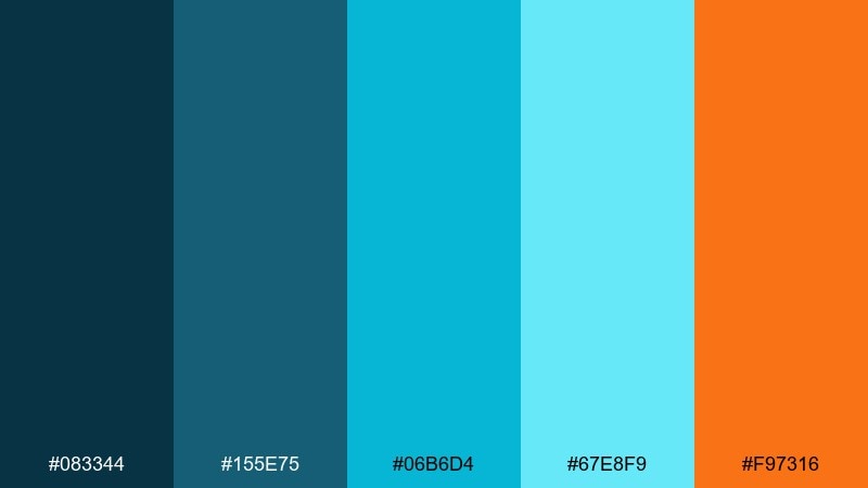
HEX: #083344 #155e75 #06b6d4 #67e8f9 #f97316
Mood: deep, adventurous, sporty
Best for: scuba tour brochure and booking pages
Deep ocean blues with bright water highlights feel like descending into a reef and spotting a flash of orange fish. Use the darker shades for headers and navigation, then bring cyan forward for buttons and info callouts. Orange is perfect for prices, badges, or urgent prompts. Tip: limit the brightest cyan to key actions so the layout stays readable and confident.
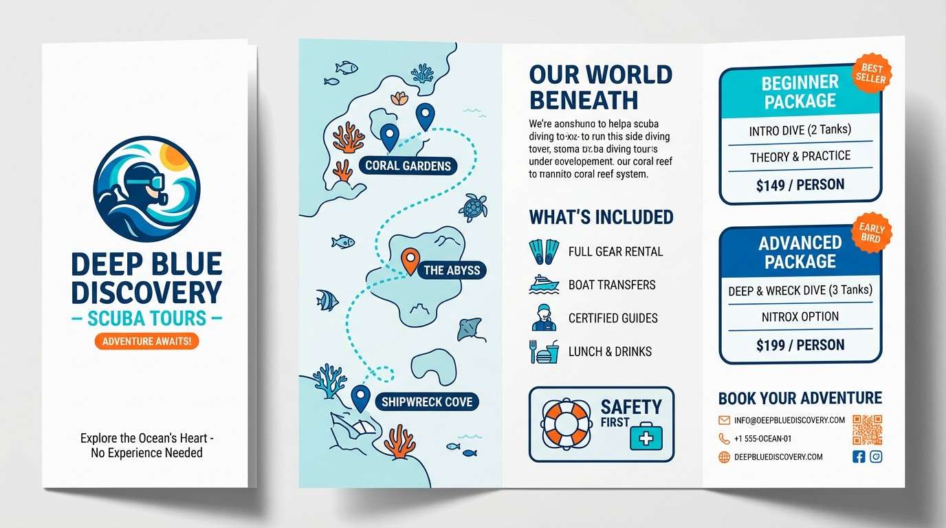
Image example of reef dive generated using media.io
7) Coconut Cream
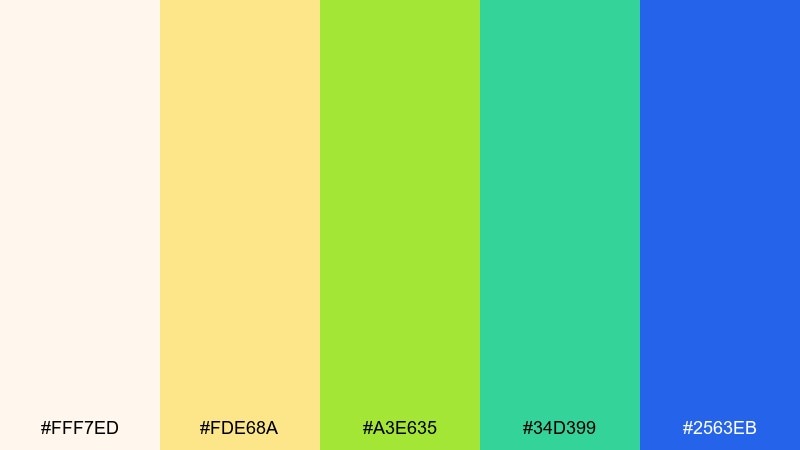
HEX: #fff7ed #fde68a #a3e635 #34d399 #2563eb
Mood: clean, friendly, sun-kissed
Best for: skincare product ad and landing section
Creamy coconut tones with lime-green freshness feel clean, uplifting, and lightly tropical. Let the warm off-white and soft yellow set the background for a bright, skincare-forward look. Use green for benefits and ingredient callouts, then add a small hit of blue for credibility and contrast. Tip: keep shadows soft and highlights bright to maintain a fresh, dewy feel.
Image example of coconut cream generated using media.io
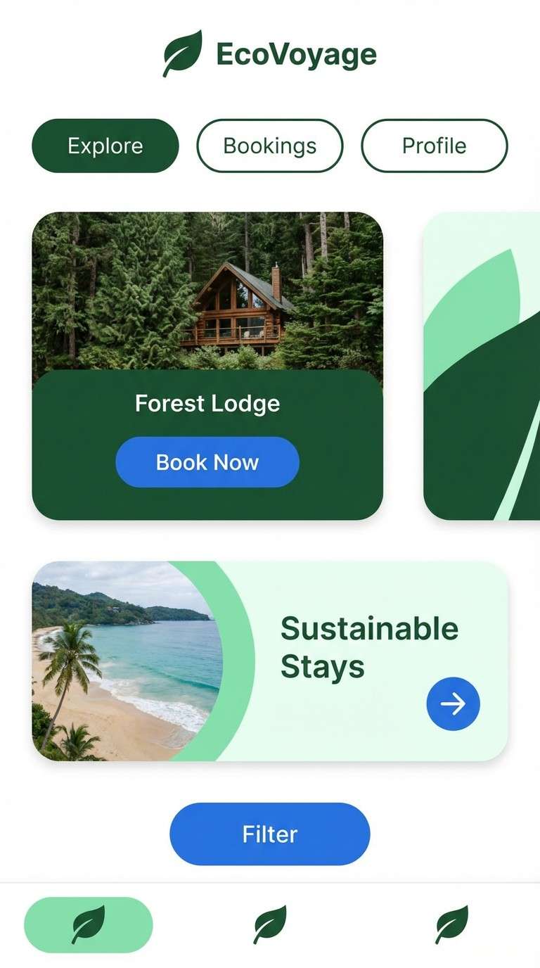
8) Banana Leaf Modern
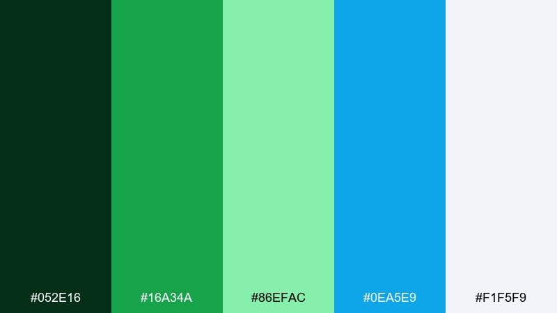
HEX: #052e16 #16a34a #86efac #0ea5e9 #f1f5f9
Mood: crisp, modern, botanical
Best for: mobile app UI for eco travel
Crisp greens and clear blue feel like glossy banana leaves against bright coastal sky. As a tropical island color scheme for UI, use the deep green for headers and navigation, then rely on pale mint and near-white for card backgrounds. The blue works best for primary actions and links. Tip: keep iconography simple and rounded so the palette reads approachable, not harsh.
Image example of banana leaf modern generated using media.io
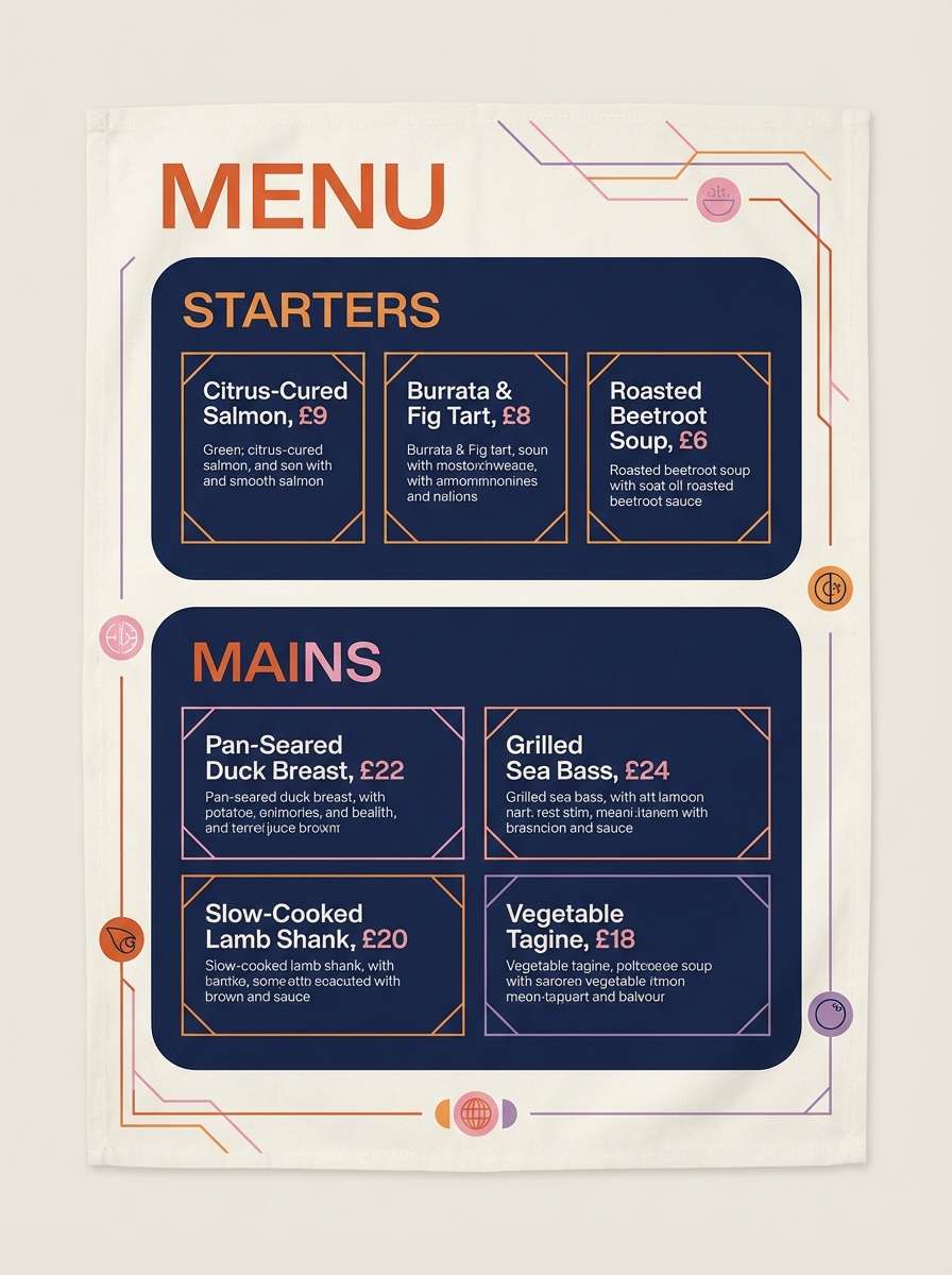
9) Sunset Pier
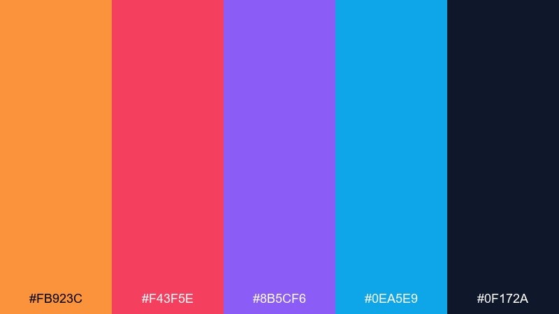
HEX: #fb923c #f43f5e #8b5cf6 #0ea5e9 #0f172a
Mood: romantic, dramatic, lively
Best for: seafood restaurant menu design
Romantic sunset hues blend into twilight navy, like lights turning on along a pier. Use the dark navy as your base so the warm orange and pink feel vibrant and legible. Purple can highlight sections or special dishes without competing with the core warm tones. Tip: add thin dividers and plenty of spacing to keep the menu from feeling crowded.
Image example of sunset pier generated using media.io
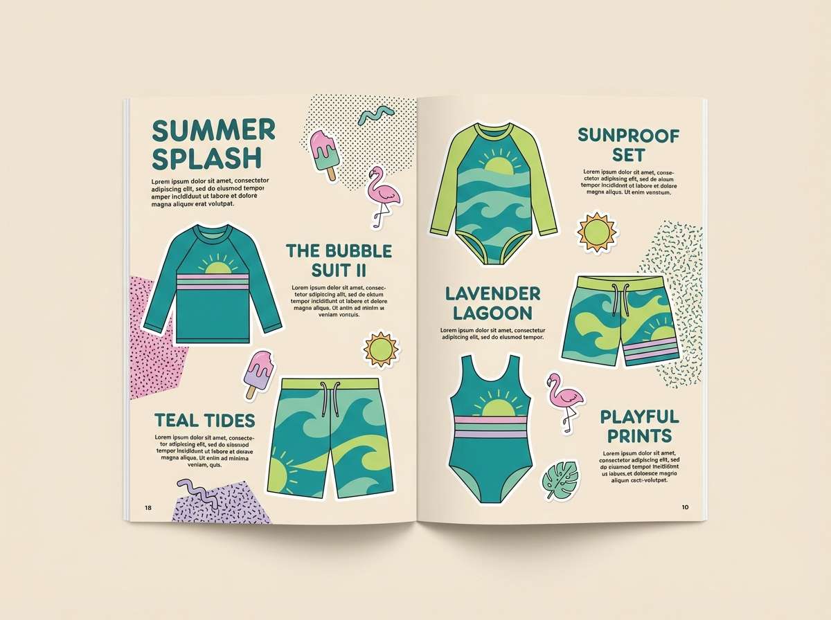
10) Mermaid Market
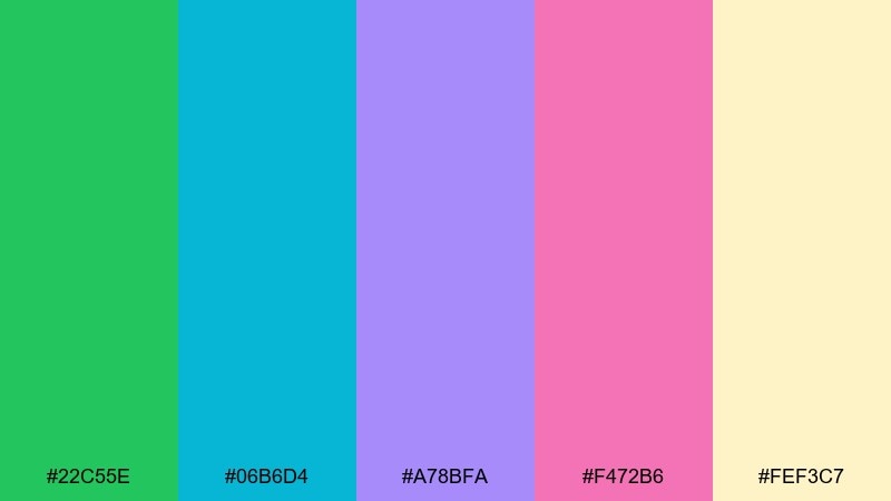
HEX: #22c55e #06b6d4 #a78bfa #f472b6 #fef3c7
Mood: whimsical, bright, youthful
Best for: kids swimwear lookbook spread
Whimsical sea-market vibes mix juicy greens with candy pastels, like shells, fruit, and beach toys all in one stall. Keep the pale sand as the page base, then rotate teal and green blocks behind product names. Pink and lavender work best for stickers, price tags, and playful icons. Tip: use consistent shapes and margins so the colors stay fun, not chaotic.
Image example of mermaid market generated using media.io
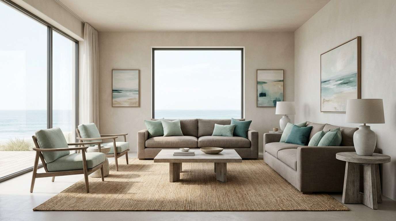
11) Driftwood Seafoam
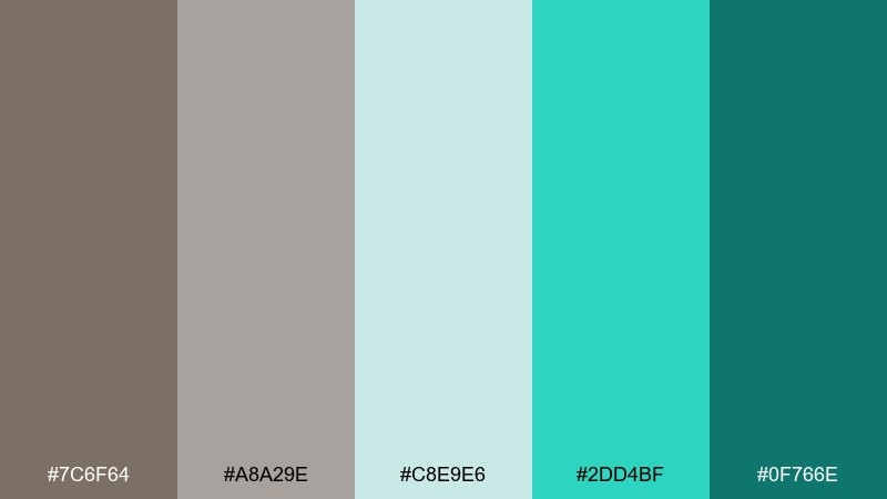
HEX: #7c6f64 #a8a29e #c8e9e6 #2dd4bf #0f766e
Mood: calm, natural, understated
Best for: coastal living room accents and wall art
Calm driftwood neutrals and seafoam greens feel like a quiet shoreline after the tide pulls back. Use taupe and stone for the larger surfaces, then layer seafoam in textiles, ceramics, or artwork. The deeper teal adds structure for frames, shelves, or small decor moments. Tip: mix matte finishes and natural fibers to keep the palette warm and lived-in.
Image example of driftwood seafoam generated using media.io
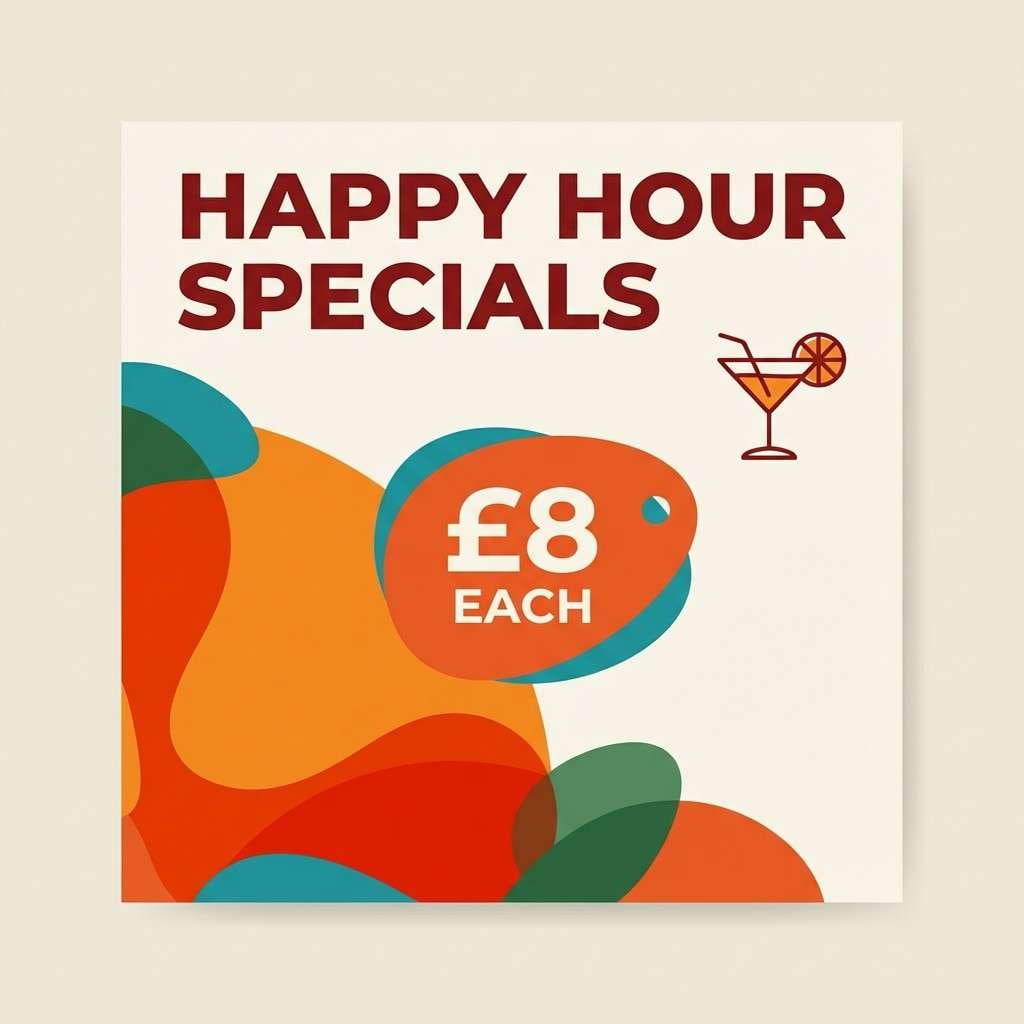
12) Island Punch
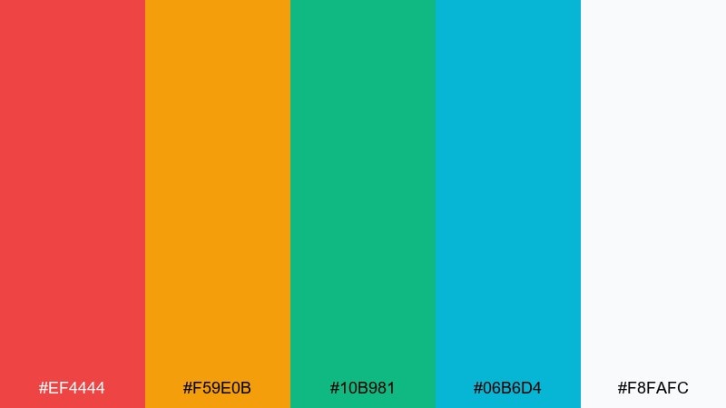
HEX: #ef4444 #f59e0b #10b981 #06b6d4 #f8fafc
Mood: bright, punchy, crowd-pleasing
Best for: cocktail bar Instagram post templates
Bright, juicy tones feel like fruit punch over ice with a splash of sparkling water. For tropical island color combinations that grab attention, use red for the main headline and orange for supporting shapes. Teal and green balance the warmth and keep the post feeling refreshing. Tip: stick to one bold typeface and strong hierarchy so the colors amplify the message instead of competing.
Image example of island punch generated using media.io
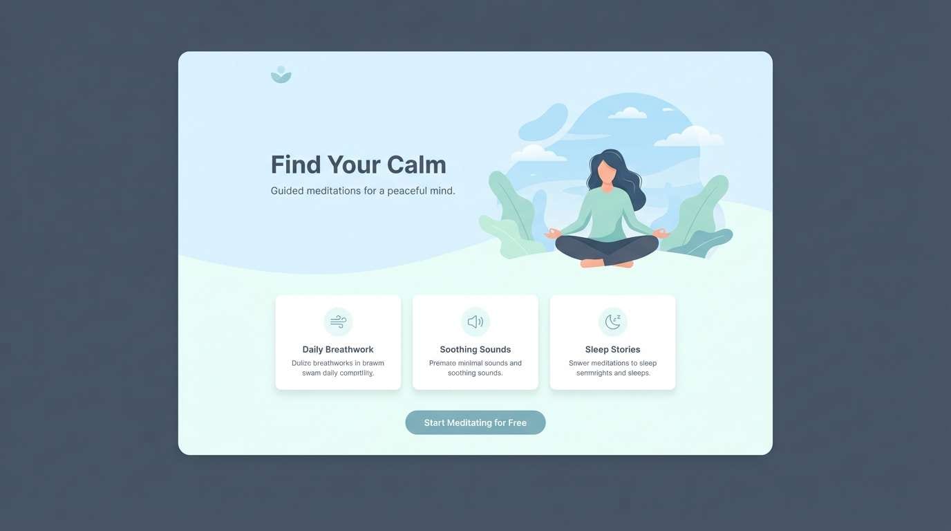
13) Quiet Atoll
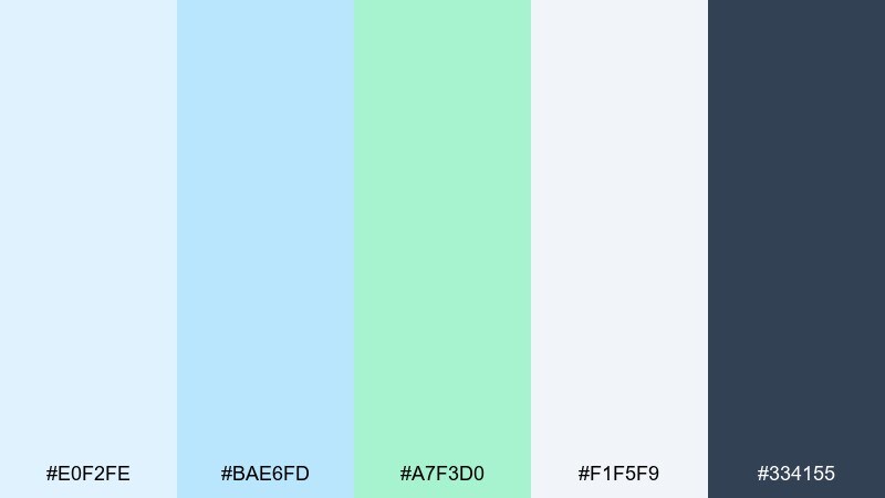
HEX: #e0f2fe #bae6fd #a7f3d0 #f1f5f9 #334155
Mood: serene, minimal, breathable
Best for: meditation app landing page
Serene sky and shallow-water pastels feel like floating in a quiet atoll with nothing but gentle waves. Use the pale blues for sections and gradients, then keep slate for readable headlines and body copy. Mint works well for progress states, toggles, and soft illustrations. Tip: keep contrast accessible by pairing slate text with the lightest backgrounds only.
Image example of quiet atoll generated using media.io
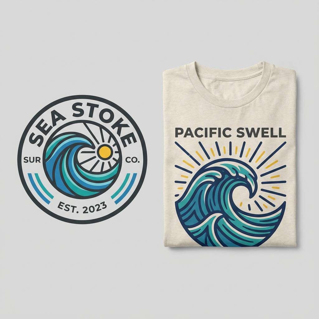
14) Surf Wax
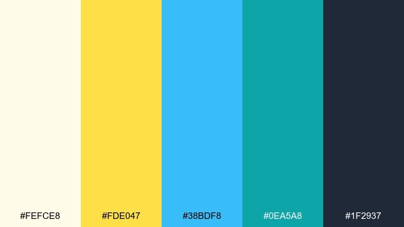
HEX: #fefce8 #fde047 #38bdf8 #0ea5a8 #1f2937
Mood: sporty, sunny, clean
Best for: surf shop logo and t-shirt print
Sunny wax-yellow and ocean blues feel like early surf checks with a board under your arm. Use the soft cream as the shirt base, then let yellow and blue power the graphic marks. The charcoal shade keeps typography crisp and prevents the design from looking too toy-like. Tip: simplify the color count on prints by using one dominant blue plus yellow accents for consistency across merch.
Image example of surf wax generated using media.io
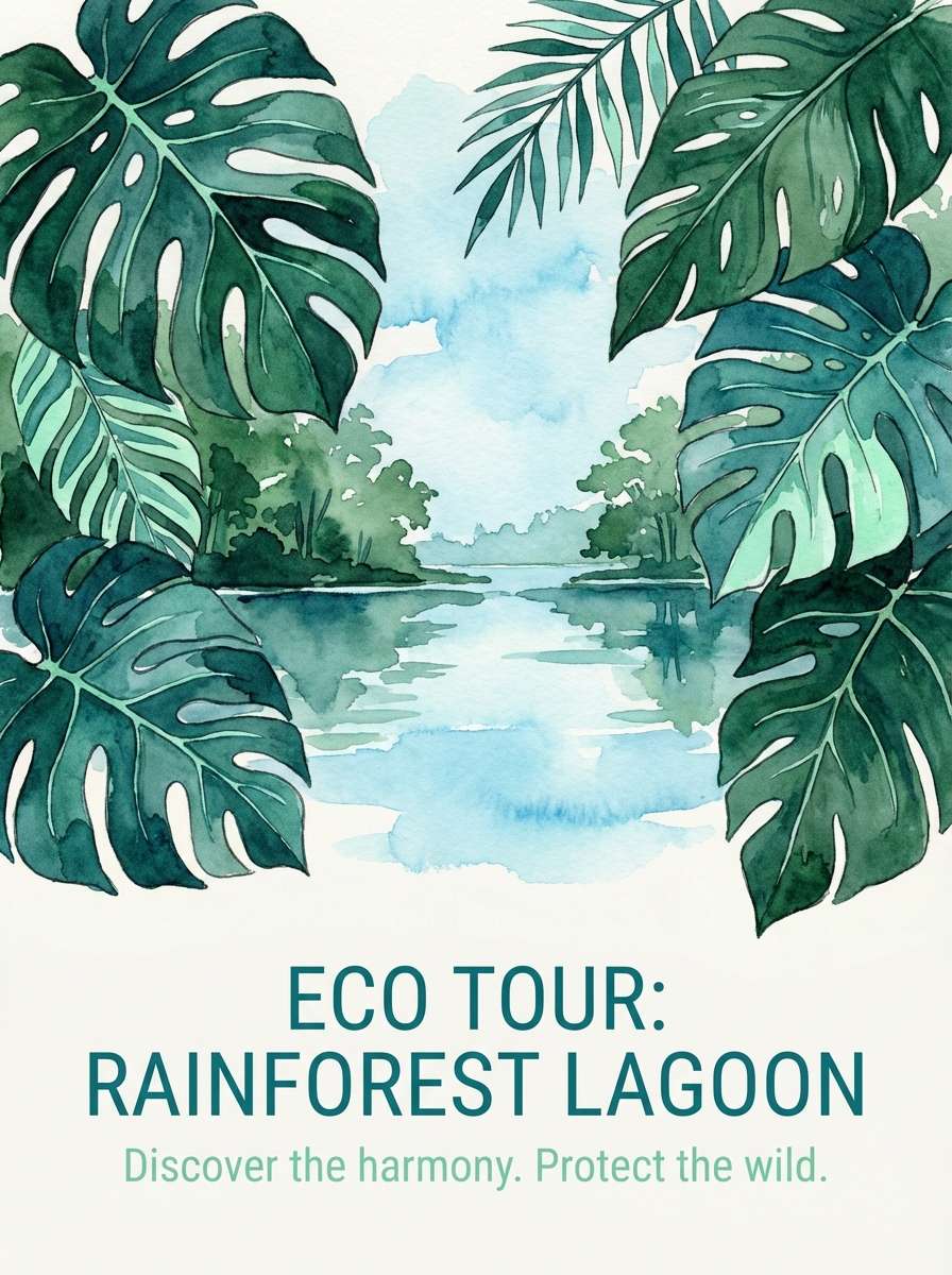
15) Rainforest Lagoon
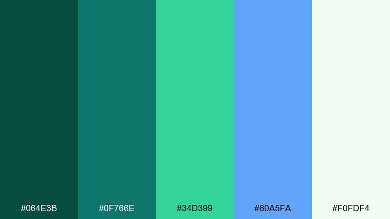
HEX: #064e3b #0f766e #34d399 #60a5fa #f0fdf4
Mood: lush, cool, restorative
Best for: eco-tour poster illustration
Lush rainforest greens with cool lagoon blues feel restorative, like mist rising above a hidden cove. A tropical island color palette like this works great when you want nature-forward credibility without going too earthy. Use deep green for the main illustration shapes, then layer mint and blue for depth and water highlights. Tip: add plenty of negative space so the poster stays readable from a distance.
Image example of rainforest lagoon generated using media.io
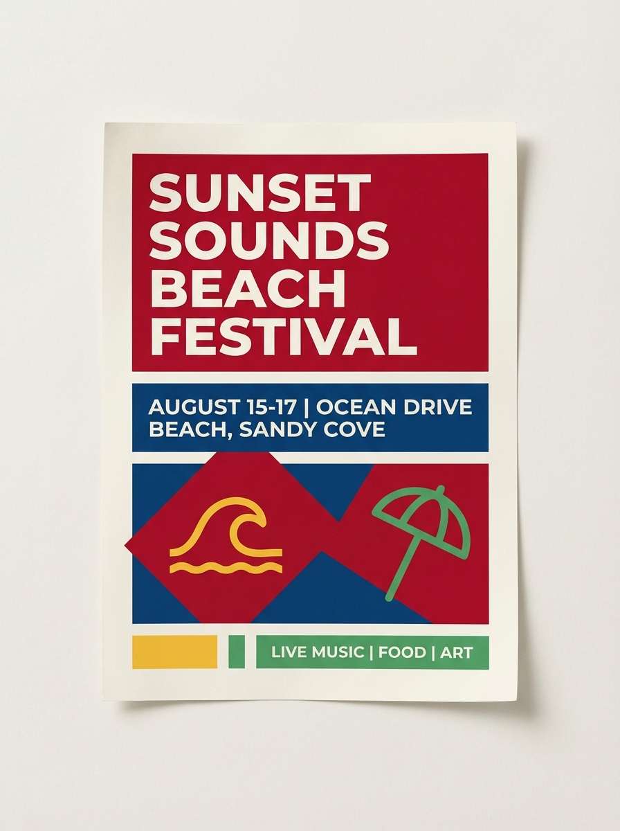
16) Beach Umbrella
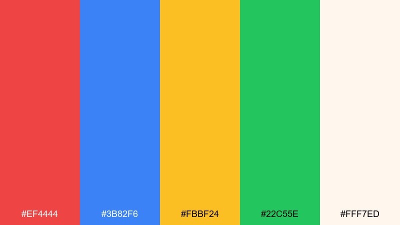
HEX: #ef4444 #3b82f6 #fbbf24 #22c55e #fff7ed
Mood: classic, cheerful, family-friendly
Best for: beach festival flyer
Classic umbrella brights bring a cheerful, family-friendly energy that feels instantly summery. Use the warm off-white as the base, then pick two hero colors like red and blue for the main layout. Yellow and green are ideal for icons, schedule blocks, and small highlights. Tip: keep backgrounds simple so the bold primaries stay crisp and readable from afar.
Image example of beach umbrella generated using media.io
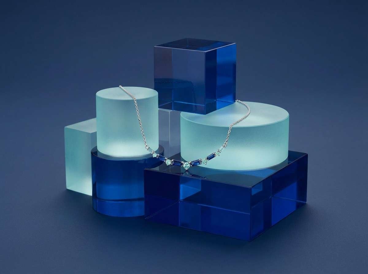
17) Ocean Glass
HEX: #0f172a #1d4ed8 #38bdf8 #a7f3d0 #f8fafc
Mood: polished, cool, contemporary
Best for: jewelry product photography background styling
Polished blues and sea-glass mint feel cool and contemporary, like light refracting through clear water. Let the dark navy anchor the scene, then use bright blue as a premium pop behind the product. Mint is best in small reflections, props, or subtle gradients to keep the shot airy. Tip: use glossy surfaces sparingly so highlights do not overpower the jewelry details.
Image example of ocean glass generated using media.io
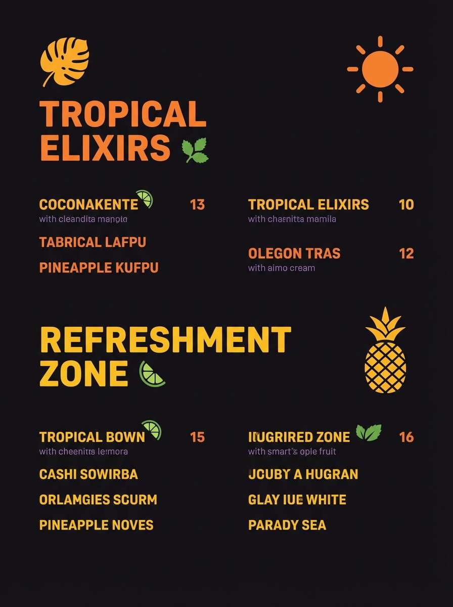
18) Tiki Night
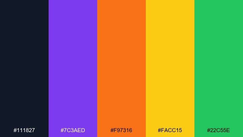
HEX: #111827 #7c3aed #f97316 #facc15 #22c55e
Mood: moody, neon-lit, nightlife
Best for: tiki bar menu and drink cards
Moody nighttime tones with neon pops feel like a tiki bar glowing after dark. Use the near-black as your menu base, then bring orange and yellow forward for drink names and price highlights. Purple adds a fun, retro nightlife twist without stealing contrast. Tip: keep green for tiny garnish icons or section markers so the page stays legible in low light.
Image example of tiki night generated using media.io
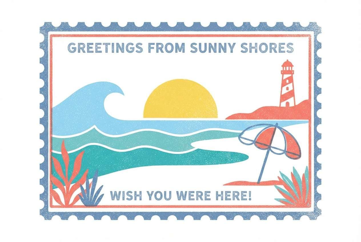
19) Paradise Postcard
HEX: #38bdf8 #2dd4bf #fef08a #fb7185 #ffffff
Mood: nostalgic, sunny, postcard-ready
Best for: illustrated travel postcard design
Nostalgic postcard hues feel sunny and friendly, like a quick hello from the beach. Tropical island color combinations like this are perfect for retro illustrations, stamp shapes, and big blocky headings. Use sky blue and teal for the ocean and shadows, then let yellow and coral highlight sun, umbrellas, and lettering. Tip: add subtle grain or halftone texture to nail the vintage print vibe.
Image example of paradise postcard generated using media.io
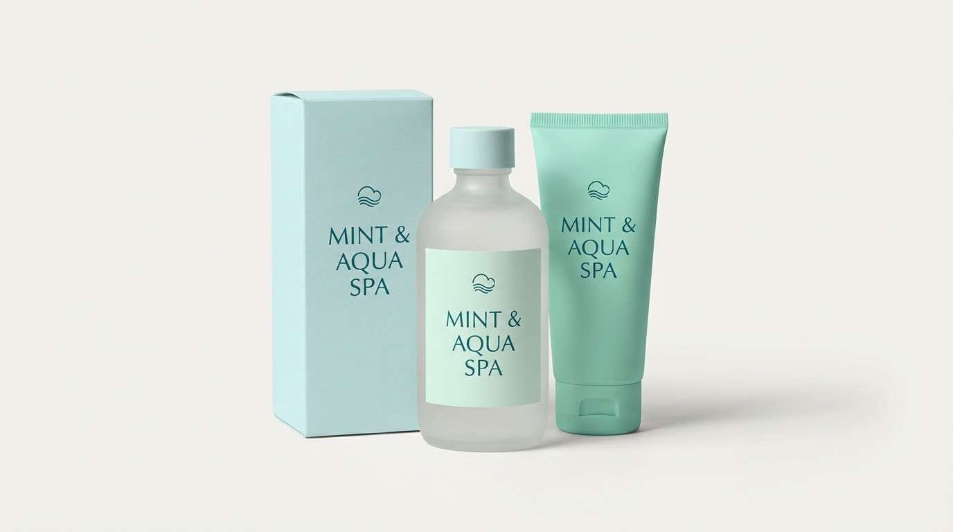
20) Saltwater Spa
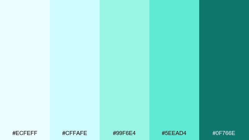
HEX: #ecfeff #cffafe #99f6e4 #5eead4 #0f766e
Mood: clean, soothing, spa-like
Best for: spa brand packaging and website sections
Clean aqua layers feel soothing and spa-like, like cool saltwater on sun-warmed skin. Use the palest tones for packaging backgrounds and web sections to keep the brand airy. The darker teal works best for logos and essential text to maintain contrast. Tip: pair with minimal line icons and lots of whitespace for a calm, premium finish.
Image example of saltwater spa generated using media.io
What Colors Go Well with Tropical Island?
Tropical island palettes pair best with watery blues (aqua, teal, cyan) plus warm neutrals like coconut white and sand beige to keep the look breathable and natural.
For contrast and “pop,” add coral, hibiscus pink, or mango orange in small doses—especially for CTAs, badges, and highlight elements.
If you need a more premium finish, anchor everything with a deep navy or slate for text and navigation while letting the bright island tones do the accent work.
How to Use a Tropical Island Color Palette in Real Designs
Start with one dominant “water” color for large areas (backgrounds, panels, hero shapes), then choose one sandy neutral to prevent the layout from feeling overly saturated.
Use warm brights like coral or yellow as attention tools: buttons, sale stickers, icons, or section headers. Keeping accents consistent makes the design feel intentional rather than noisy.
For readability, set body text in dark slate/navy and reserve the brightest colors for UI states (active, hover, success) or short headline moments.
Create Tropical Island Palette Visuals with AI
If you’re building a brand board, poster, UI mockup, or packaging concept, generating quick visuals helps you validate your tropical island color scheme before production.
Reuse any prompt above, then swap layout words (menu, flyer, app) and keep the “dominant colors” line aligned to your chosen HEX set for consistent results.
Media.io makes it easy to turn a palette into styled images you can iterate on in minutes.
Tropical Island Color Palette FAQs
-
What is a tropical island color palette?
A tropical island color palette typically blends ocean tones (teal, aqua, sky blue) with warm beach neutrals (sand, coconut white) and bright accents (coral, hibiscus, mango) for an energetic, vacation-ready feel. -
Which tropical colors are best for a modern UI?
Use deep green or navy for navigation and text, near-white or pale mint for surfaces, and a single bright blue/teal for primary buttons. Keep coral or yellow for small highlights so the interface stays clean and accessible. -
How do I keep tropical palettes from looking too loud?
Limit brights to accents, and let soft sand or off-white be the main background. Adding a dark anchor (slate or navy) improves contrast and makes the overall design feel more premium. -
What’s a good tropical island palette for wedding invitations?
Look for sand-beige and ocean-blue as the base, with a restrained accent like teal or lilac. Soft, airy typography and thin line details help the colors feel elegant rather than playful. -
What colors should I use for tropical packaging design?
Pair one warm hero color (coral/orange) with one cool contrast (teal/blue), then add a light neutral for breathing room. This keeps labels readable and helps key product claims stand out. -
Can I generate tropical island design mockups with AI?
Yes. Use a text-to-image tool and describe the layout (poster, menu, landing page), the background style (clean, minimal, studio shot), and the dominant colors. Keeping prompts consistent makes it easier to iterate across a full set. -
What is the best “anchor” text color for tropical palettes?
Dark navy or slate works best for body text and UI labels because it stays readable on pale aquas and sand tones while complementing both cool and warm tropical accents.


