

A sea monster color palette leans into deep teals, kelp greens, stormy slates, and eerie highlights that feel like light piercing dark water. It’s a strong direction when you want designs to look modern, cinematic, and slightly mysterious.
Below are 20 sea monster color palette ideas with HEX codes, plus practical use cases for branding, UI, posters, and print.
In this article
Why Sea Monster Palettes Work So Well
Sea monster palettes balance darkness and clarity: near-black ocean bases create drama, while teal and aqua accents keep layouts readable and modern. That contrast makes them especially effective for UI, posters, and branding that needs instant hierarchy.
The color story is flexible too. You can push it toward sleek sci-fi (inky navy + luminous aqua), grounded industrial (slates and barnacle grays), or earthy adventure (kelp greens and sand-toned neutrals) without losing the underwater identity.
Because these colors sit in a naturally “cool” range, they pair well with minimal typography and clean grids. Small warm accents—amber, brass, coral—add focal points without overpowering the mood.
20+ Sea Monster Color Palette Ideas (with HEX Codes)
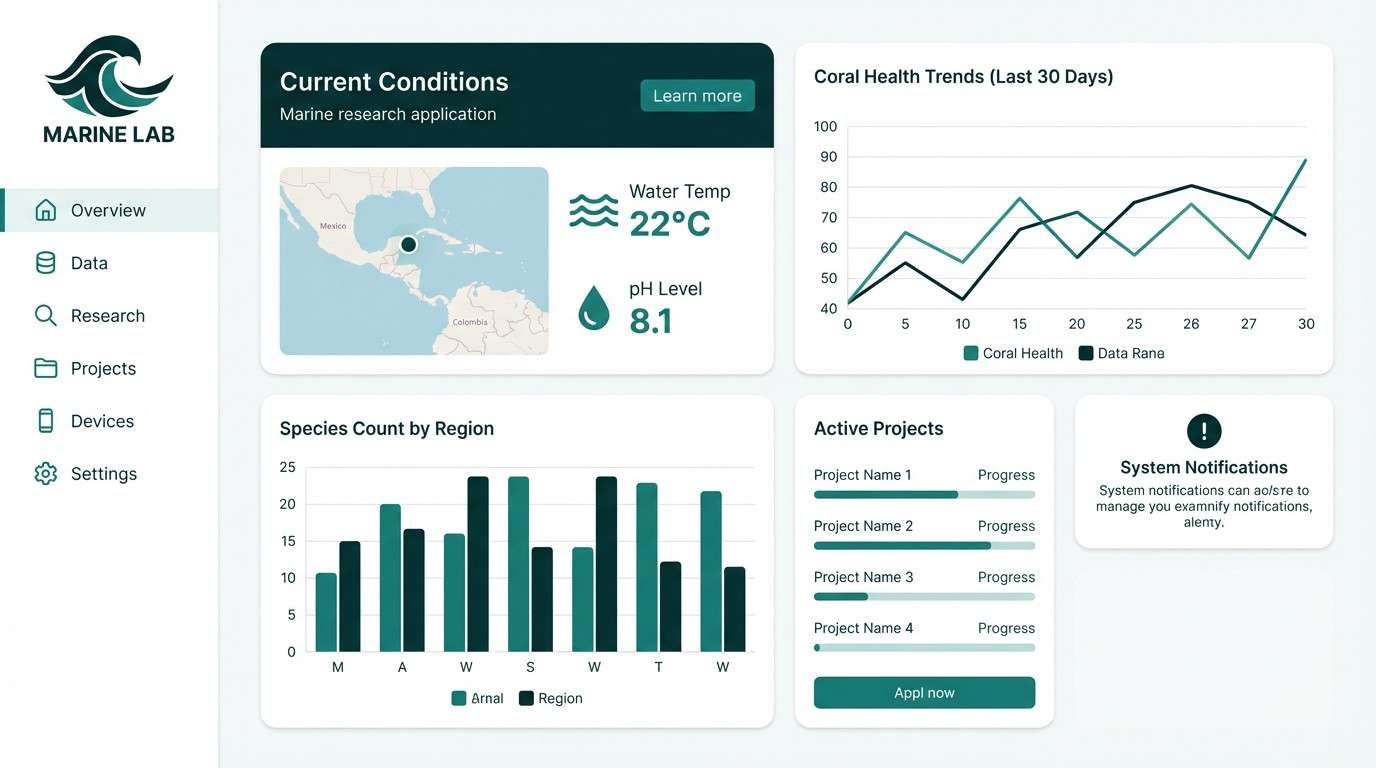
1) Abyssal Teal
HEX: #062A2E #0A4B4E #0F7772 #7AB8A7 #E6F2EF
Mood: moody, sleek, underwater calm
Best for: 2D UI dashboard for a marine research app
Moody and glassy like deep water lit from above, these teals feel controlled and modern. Use the near-black as your base and let the mid teals carry navigation and charts. Pair with clean whites for breathing room and reserve the pale mint for states and highlights. Tip: keep gradients subtle so the palette stays professional instead of fantasy-heavy.
Image example of abyssal teal generated using media.io
Media.io is an online AI studio for creating and editing video, image, and audio in your browser.

2) Kelp Forest
HEX: #0B1F12 #1D4A2A #2F7D3B #A3C96A #F2F6D8
Mood: earthy, alive, adventurous
Best for: outdoor brand logo and label set
Earthy greens and softened yellow-greens evoke kelp fronds swaying in a dim current. These sea monster color combinations work well for rugged eco branding, especially when you lean on the dark green as the anchor. Add the lime-toned accent sparingly for energy on badges, seals, or flavor markers. Tip: print on uncoated stock to keep the greens rich rather than glossy.
Image example of kelp forest generated using media.io

3) Shipwreck Brass
HEX: #132326 #23484A #6D6A4B #B08D3A #E8D9B7
Mood: antique, cinematic, bold
Best for: movie poster typography study
Antique brass against stormy teal feels like treasure pulled from a wreck and polished under lantern light. Use the brass as the headline color and keep the teal-black for depth and drama. The sandy cream lifts smaller copy and keeps the layout readable. Tip: try a distressed texture overlay on the brass to emphasize the aged-metal vibe.
Image example of shipwreck brass generated using media.io
4) Misty Lagoon
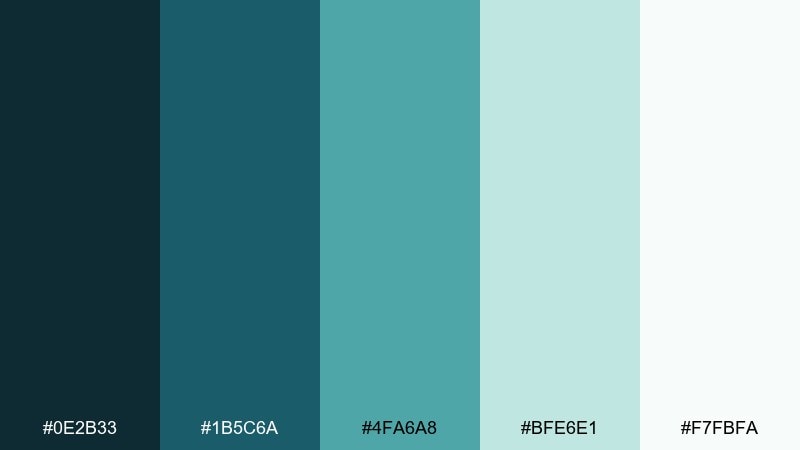
HEX: #0E2B33 #1B5C6A #4FA6A8 #BFE6E1 #F7FBFA
Mood: fresh, airy, coastal
Best for: spa landing page hero section
Fresh aquas and foggy mints suggest a quiet lagoon at sunrise. Let the mid aqua handle buttons and key UI elements while the pale tones keep sections light and spacious. Pair with charcoal body text and plenty of white space to maintain a calm, premium feel. Tip: keep imagery cool-toned so the palette does not drift into tropical neon.
Image example of misty lagoon generated using media.io
5) Barnacle Stone
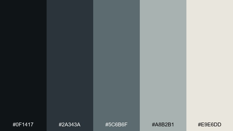
HEX: #0F1417 #2A343A #5C6B6F #A8B2B1 #E9E6DD
Mood: industrial, grounded, minimal
Best for: architectural studio identity system
Cool stones and weathered grays feel like hull plating and barnacles dried by salty wind. This set is strong for minimalist identity work where typography needs to lead. Use the dark charcoal for logos and headers, and rely on the warm off-white to soften presentations. Tip: add a single colored accent elsewhere in your system only when you need clear hierarchy.
Image example of barnacle stone generated using media.io
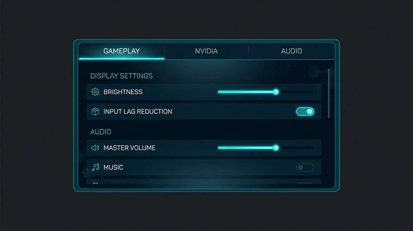
6) Kraken Ink
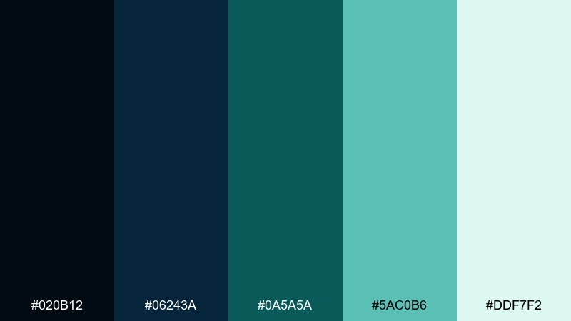
HEX: #020B12 #06243A #0A5A5A #5AC0B6 #DDF7F2
Mood: mysterious, high-contrast, modern
Best for: gaming UI settings screen
Inky navy and electric teal evoke a shadow passing under a spotlighted surface. As a sea monster color palette, it shines in interfaces where contrast and focus states matter. Use the deep tones for panels and overlays, then hit key toggles and sliders with the bright teal for instant readability. Tip: keep glow effects minimal so the UI stays crisp rather than noisy.
Image example of kraken ink generated using media.io
7) Siren Glow
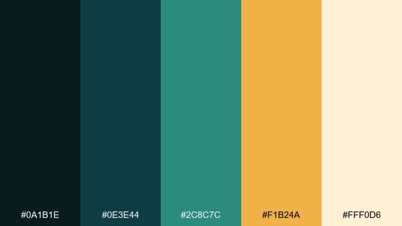
HEX: #0A1B1E #0E3E44 #2C8C7C #F1B24A #FFF0D6
Mood: lure, warmth, dramatic accents
Best for: cocktail bar menu design
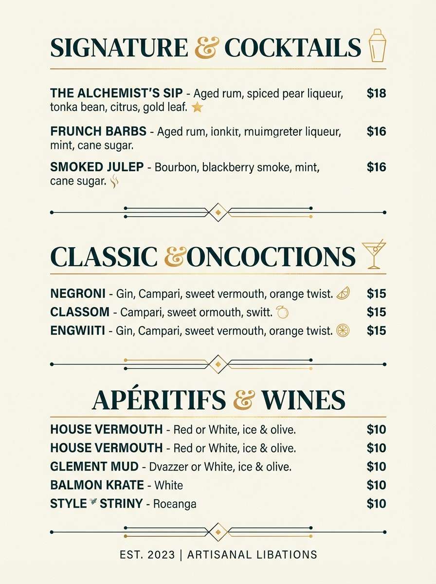
Dark teal with a golden flare feels like a signal lamp cutting through fog. The warm amber creates instant focal points for headings, prices, or signature items. Balance it with creamy negative space so the menu stays readable under low light. Tip: use the amber sparingly to keep the design upscale instead of playful.
Image example of siren glow generated using media.io
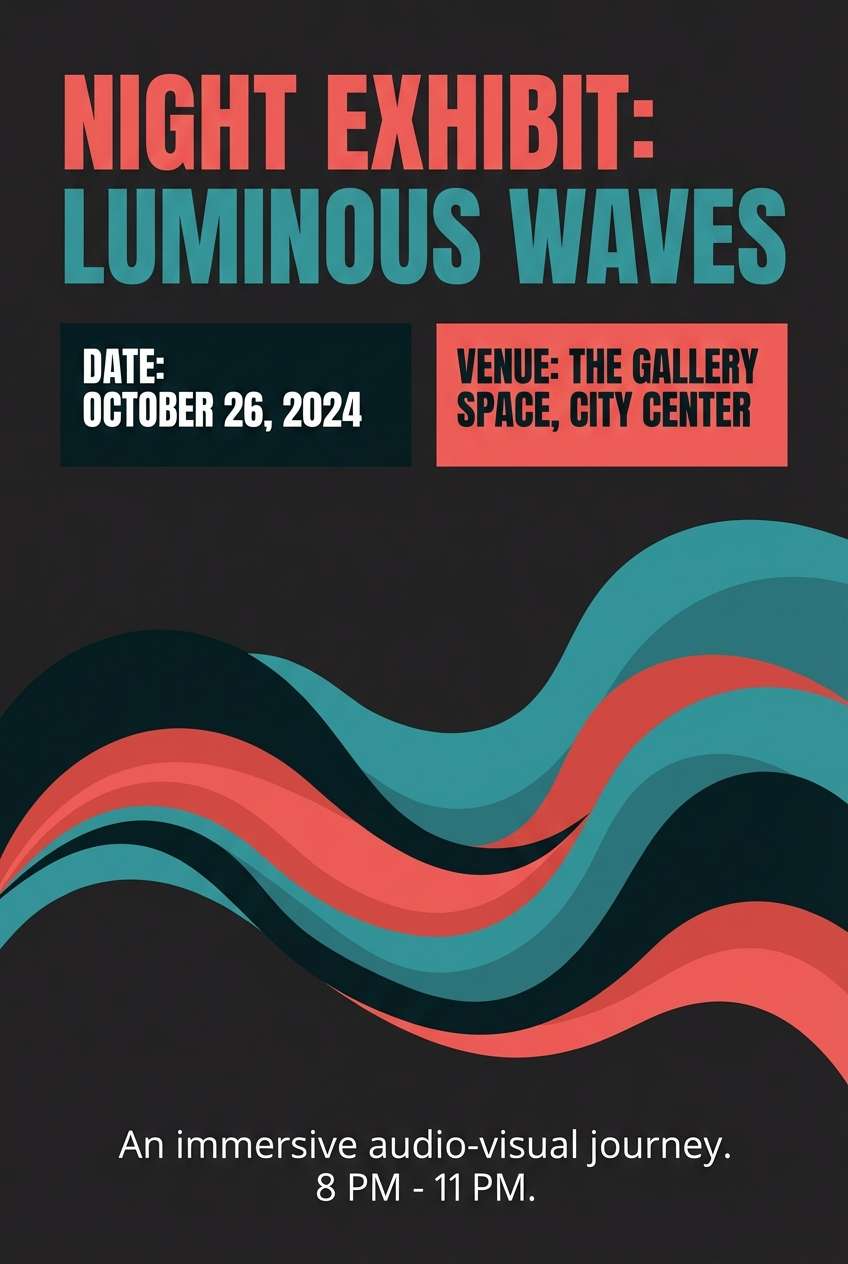
8) Coral Warning
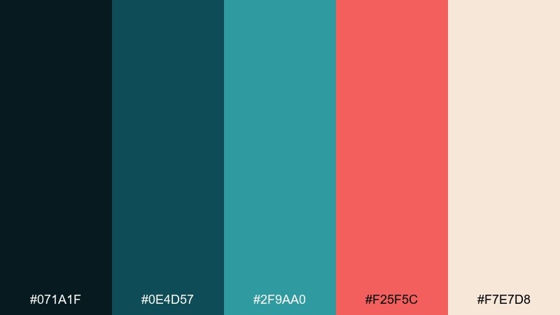
HEX: #071A1F #0E4D57 #2F9AA0 #F25F5C #F7E7D8
Mood: urgent, punchy, modern
Best for: event flyer for a night exhibit
Cold aquas with a coral hit feel like danger lights over dark water. Use the coral for calls to action and key dates, and keep the teal range for backgrounds and secondary blocks. The warm off-white helps long text stay legible without killing the mood. Tip: pair with condensed type to amplify the high-energy feel.
Image example of coral warning generated using media.io
9) Nautilus Pearl
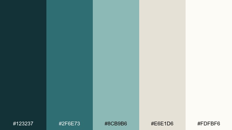
HEX: #123237 #2F6E73 #8CB9B6 #E6E1D6 #FDFBF6
Mood: soft, refined, coastal neutral
Best for: editorial magazine spread
Soft teals and pearly neutrals suggest shell interiors and calm tidal pools. This set is ideal for editorial layouts where photography needs a gentle frame. Use the deep teal for headings and pull quotes, and keep the warm whites for margins and negative space. Tip: add thin rules in the mid teal to guide the eye without adding clutter.
Image example of nautilus pearl generated using media.io
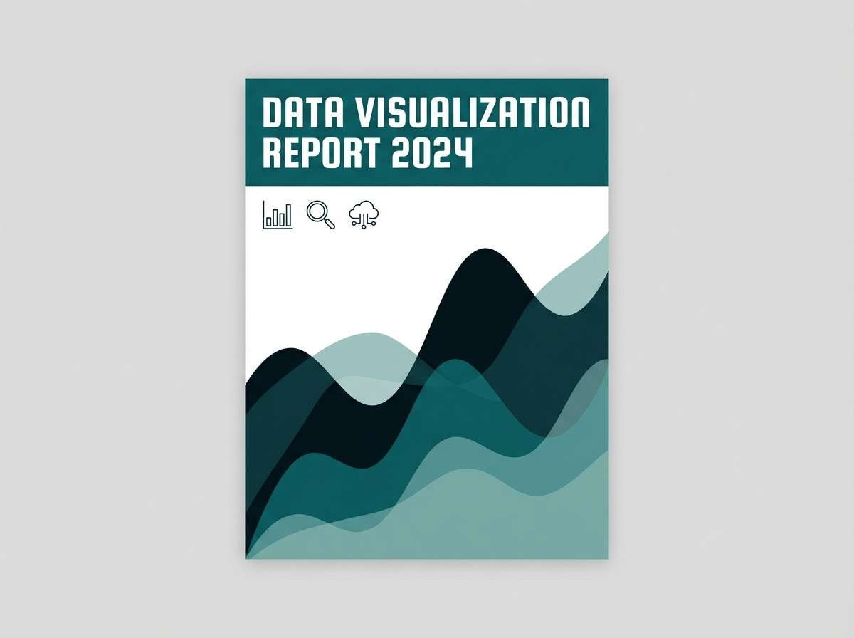
10) Deep Current
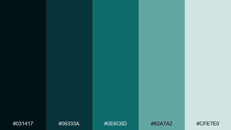
HEX: #031417 #06333A #0E6C6D #62A7A2 #CFE7E0
Mood: focused, technical, cool
Best for: data visualization report cover
Cool depth and steady teal movement feel like a current you can measure. Use the darkest tone for strong title blocks and the mid teal for charts, graphs, and legends. For sea monster color combination work in reports, keep accents limited to one teal shade so the hierarchy reads instantly. Tip: test contrast on small labels to avoid muddy mid-tones in print.
Image example of deep current generated using media.io
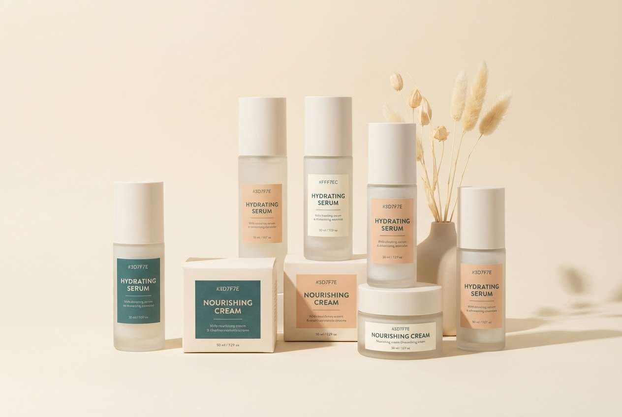
11) Tidepool Pastel
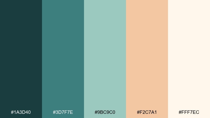
HEX: #1A3D40 #3D7F7E #9BC9C0 #F2C7A1 #FFF7EC
Mood: friendly, gentle, boutique
Best for: skincare product packaging
Gentle teal with a peachy lift feels like sun-warmed stones at the edge of the water. Use teal for brand blocks and ingredient lists, then bring in peach as a soft accent for variants. The creamy white keeps the pack looking clean and premium on shelf. Tip: choose a matte finish so the pastels stay calm and modern.
Image example of tidepool pastel generated using media.io
12) Murky Emerald
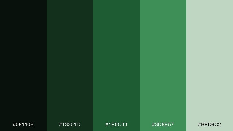
HEX: #08110B #13301D #1E5C33 #3D8E57 #BFD6C2
Mood: wild, shadowy, botanical
Best for: botanical illustration set
Shadowy greens feel like plants growing where light barely reaches. Use the darkest green for outlines and grounding shapes, then build depth with layered mid greens. The pale sage works as paper tone or soft highlights to avoid harsh contrast. Tip: keep saturation modest so the set stays earthy rather than neon.
Image example of murky emerald generated using media.io
13) Storm Surge
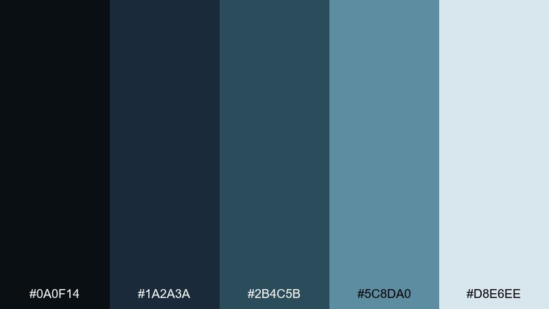
HEX: #0A0F14 #1A2A3A #2B4C5B #5C8DA0 #D8E6EE
Mood: stormy, confident, corporate
Best for: SaaS website header and feature grid
Stormy blues and slate tones capture the moment a wave rises and everything turns steel-colored. Use the near-black for navigation and the slate blue for panels and feature cards. The icy tint makes great background sections that still feel cool and technical. Tip: introduce micro-accents with icons in the mid slate to keep the page cohesive.
Image example of storm surge generated using media.io

14) Seafoam Chalk
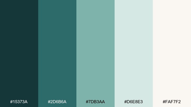
HEX: #15373A #2D6B6A #7DB3AA #D6E8E3 #FAF7F2
Mood: soft, clean, calming
Best for: minimal wedding invitation suite
Chalky seafoam and gentle teals feel airy, like foam dissolving on warm sand. The palette is perfect for simple invitations where paper texture does part of the work. Use deep teal for names and headings, then let seafoam wash the borders or motifs. Tip: emboss a small icon or monogram to add luxury without adding color noise.
Image example of seafoam chalk generated using media.io
15) Midnight Reef
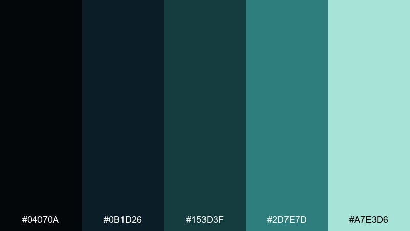
HEX: #04070A #0B1D26 #153D3F #2D7E7D #A7E3D6
Mood: dark, sleek, futuristic
Best for: music album cover design
Midnight tones with a neon-leaning aqua hint at reef life glowing in the dark. Use the darkest shades for a dramatic background and bring in the aqua for the artist name and small graphic marks. Pair with minimal line art to keep the cover sharp and contemporary. Tip: avoid adding extra bright colors so the glow remains the hero.
Image example of midnight reef generated using media.io
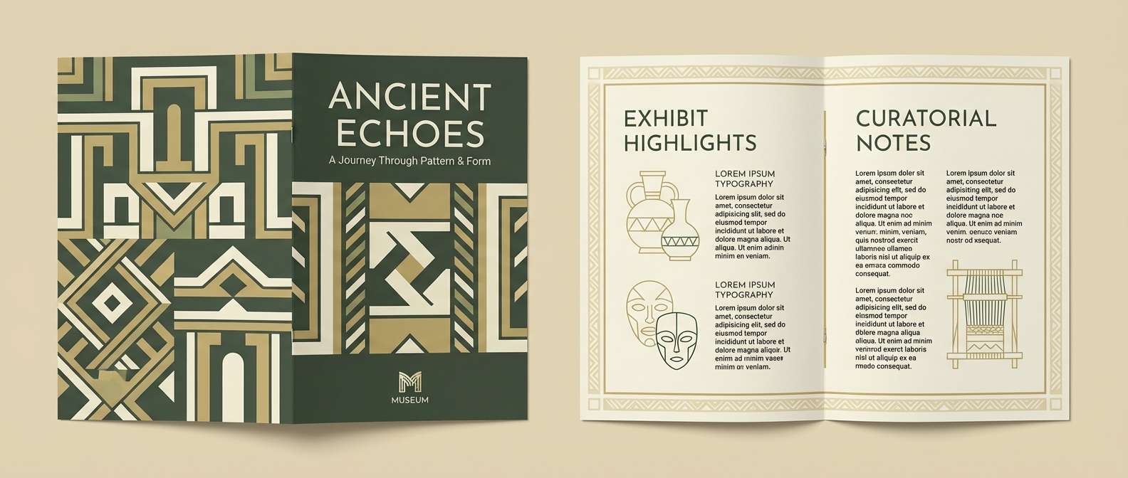
16) Ancient Relic
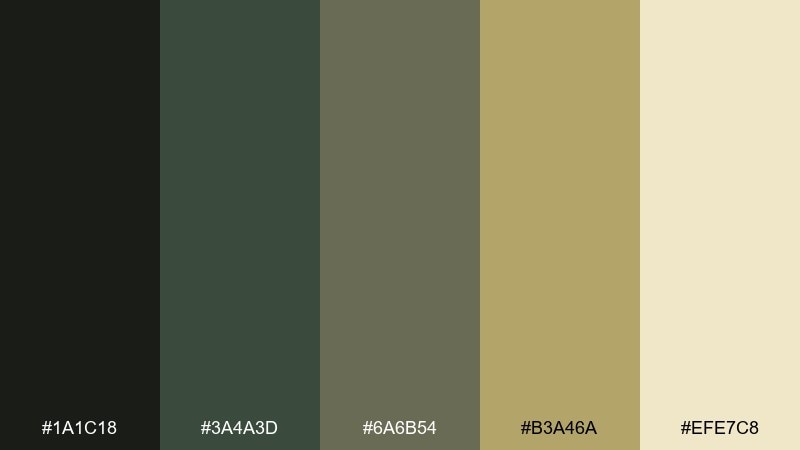
HEX: #1A1C18 #3A4A3D #6A6B54 #B3A46A #EFE7C8
Mood: archaeological, muted, timeless
Best for: museum exhibit brochure
Muted olive and sand tones feel like artifacts laid out on linen under soft lights. Use the dark olive for headings and section dividers, while the parchment tones keep body text welcoming. These sea monster color combinations are especially good when you want a nautical hint without leaning fully blue. Tip: add subtle grain to backgrounds to enhance the historic mood.
Image example of ancient relic generated using media.io
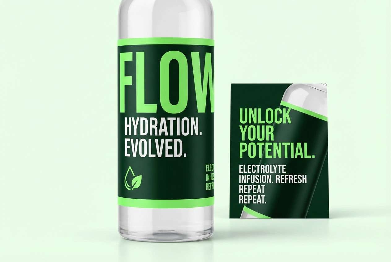
17) Toxic Plankton
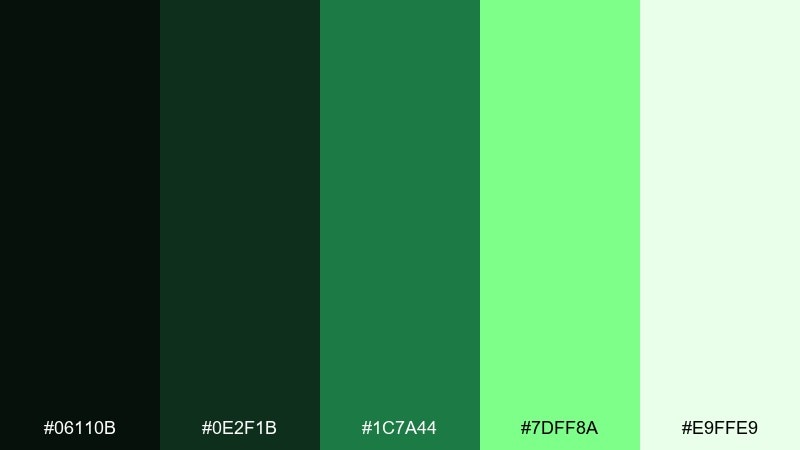
HEX: #06110B #0E2F1B #1C7A44 #7DFF8A #E9FFE9
Mood: energetic, edgy, high-visibility
Best for: sports bottle label and ad
Acid green highlights over deep forest tones feel like bioluminescent plankton in a black sea. Use the neon green for a single high-visibility stripe or callout, and let the darker greens carry the brand. Keep backgrounds clean so the bright accent does not bleed or vibrate. Tip: in print, choose spot color or rich ink to keep the neon effect consistent.
Image example of toxic plankton generated using media.io
18) Harbor Fog
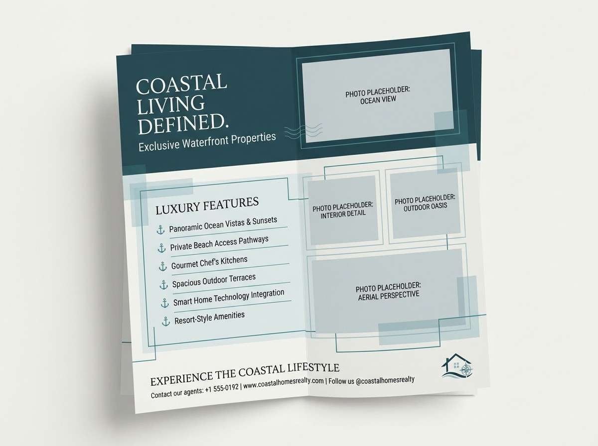
HEX: #0F2226 #2A4C53 #6B8B91 #C8D4D6 #F5F6F2
Mood: quiet, misty, understated
Best for: real estate brochure for coastal homes
Foggy blue-grays feel like a harbor disappearing into mist. Use the deep teal-gray for section headers and the mid gray-blue for callouts and pricing blocks. The pale fog tones make strong whitespace that still feels coastal and branded. Tip: pair with warm photography to prevent the overall design from turning too cold.
Image example of harbor fog generated using media.io
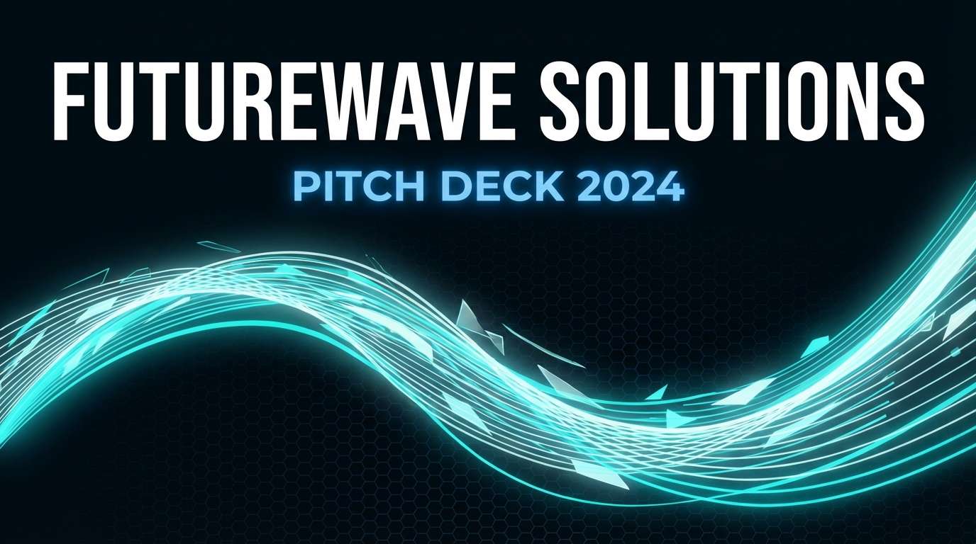
19) Bioluminescent Drift
HEX: #020A10 #082A3A #0B6B6E #38E6D2 #E6FFFA
Mood: sci-fi, luminous, nocturnal
Best for: tech startup pitch deck cover
Luminous aqua on deep navy evokes drifting lights in open water at night. As a sea monster color palette, it fits tech narratives that want mystery plus clarity. Use the bright aqua for a single graphic motif and keep the rest restrained for a premium look. Tip: set titles in bold white and reserve aqua for key metrics only.
Image example of bioluminescent drift generated using media.io
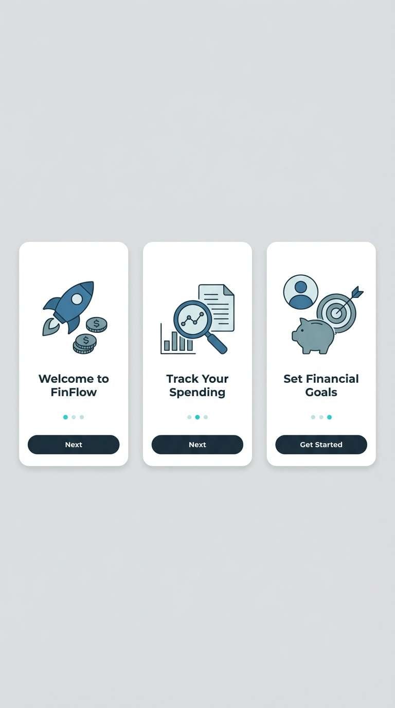
20) Saltwater Slate
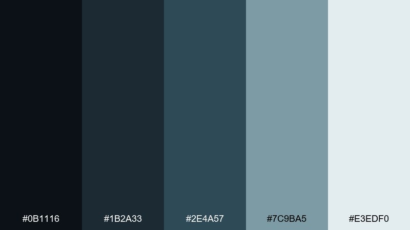
HEX: #0B1116 #1B2A33 #2E4A57 #7C9BA5 #E3EDF0
Mood: professional, cool, dependable
Best for: finance app onboarding screens
Slate blues with a clean ice tint feel steady, like a calm sea under overcast skies. Use the dark slate for type and navigation, and let the lighter blues guide progress indicators and illustrations. This sea monster color combination stays modern when you keep icons simple and spacing generous. Tip: add one warm accent outside the palette only for error states if needed.
Image example of saltwater slate generated using media.io
What Colors Go Well with Sea Monster?
Sea monster palettes pair naturally with cool neutrals like charcoal, slate, and foggy off-white, which help teals and greens look intentional rather than overly saturated. If you want a clean, premium finish, keep backgrounds light and let deep teal handle headings and key UI components.
For stronger contrast, add one warm accent: brass, amber, or coral. Warm highlights work best as a “signal color” for calls to action, labels, prices, or key dates—small areas that should pop against ocean-dark bases.
If your design needs to feel more organic, bring in muted sand, pearl, or parchment tones. These soften the underwater mood and make long-form layouts (reports, brochures, editorial) feel more readable.
How to Use a Sea Monster Color Palette in Real Designs
Start with a clear role system: pick one darkest shade for backgrounds and overlays, one mid teal/green for components, and one light tint for whitespace or section breaks. This prevents the common “everything is teal” problem and improves hierarchy fast.
In UI and product design, test contrast for small text and icons—mid teals can go muddy on dark bases. Reserve the brightest aqua or neon-leaning accent for interactive states (active tabs, toggles, progress) so users immediately understand what’s clickable.
For print (posters, menus, brochures), keep the palette grounded with off-whites and use the warm accent sparingly. A subtle texture (grain, distressed brass, soft paper tone) often sells the sea monster vibe without adding extra colors.
Create Sea Monster Palette Visuals with AI
If you already have HEX codes, you can turn them into on-brand visuals by generating mockups that match your use case—dashboards, packaging, flyers, or album covers. The key is to describe the layout and materials (flat UI, vector brand board, studio product shot) and then anchor the prompt with your dominant colors.
Keep prompts focused: specify 1–2 dominant colors, 1 accent, and the intended style (minimal, cinematic, editorial). This makes outputs look designed rather than random, and it helps your palette stay consistent across multiple images.
Use Media.io to quickly iterate different compositions while staying within the sea monster mood—deep ocean bases, kelp greens, and bioluminescent highlights.
Sea Monster Color Palette FAQs
-
What is a sea monster color palette?
A sea monster color palette is a set of deep ocean-inspired colors—typically dark teal, inky navy, kelp green, slate neutrals, and a bright “signal” accent (like aqua, coral, or amber) for highlights and contrast. -
Which accent colors work best with deep teal and ocean greens?
Warm accents like brass/amber and coral are the most reliable because they pop against cool bases. For a more sci-fi look, use bright aqua or neon mint as the accent and keep everything else muted. -
How do I keep a sea monster palette from looking too dark?
Introduce one or two light tints (foggy off-white, pale mint, pearl) for backgrounds and spacing, and limit the darkest color to nav bars, headers, or poster backdrops. -
Are sea monster color combinations good for branding?
Yes—especially for tech, gaming, marine, outdoor, or cinematic brands. Use a dark base for authority, a mid teal for recognizability, and a single accent color for memorable details like icons, badges, or calls to action. -
What’s the best sea monster palette for UI design?
High-contrast sets like Kraken Ink, Abyssal Teal, or Bioluminescent Drift work well in UI because they provide a strong dark base and a clear bright accent for interactive states. -
How many colors should I use in a real project?
Use 3–5 in the actual system: a dark base, a primary mid tone, a light background tint, and one accent. Keep the remaining shades as optional support colors for charts, dividers, or subtle depth. -
Can I generate sea monster palette images with AI?
Yes. Use a text-to-image tool, describe the design format (poster, UI, packaging), and include the dominant HEX colors plus one accent. Keep the prompt minimal to maintain a cohesive, underwater mood.


