

Teal plum is a striking blend of cool ocean tones and rich purple depth, giving designs a moody elegance without feeling flat.
Below are 20 curated teal plum color palette ideas (with HEX codes) you can use for branding, UI, social graphics, packaging, and interiors.
In this article
Why Teal Plum Palettes Work So Well
Teal brings clarity and freshness, while plum adds depth and sophistication. Together, they create a balanced contrast that feels premium and intentional.
This pairing is versatile across styles: it can read calm and spa-like with airy neutrals, or bold and nightlife-ready with blacks, magentas, and high contrast typography.
Teal plum palettes also play nicely with lighting and texture, which makes them a strong choice for both digital UI (where readability matters) and print (where rich inks and paper stock can shine).
20+ Teal Plum Color Palette Ideas (with HEX Codes)
1) Velvet Lagoon
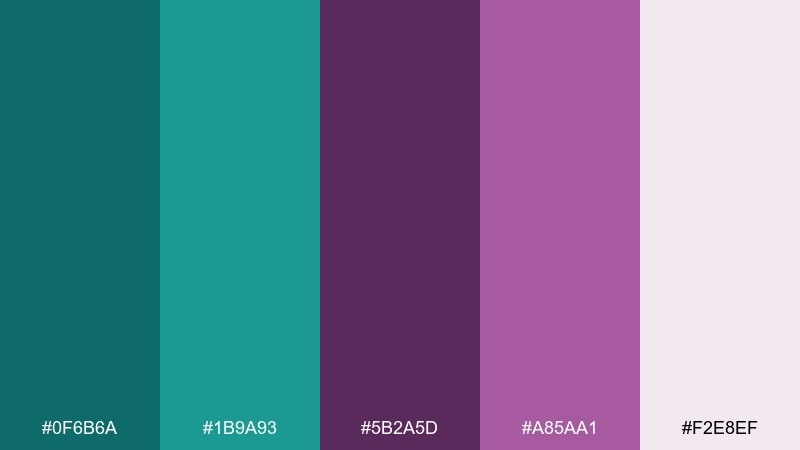
HEX: #0f6b6a #1b9a93 #5b2a5d #a85aa1 #f2e8ef
Mood: lush, modern, calming
Best for: brand identities and premium wellness packaging
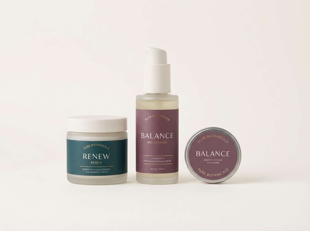
Lush lagoon greens meet velvety orchid tones for a calm-but-confident feel. This teal plum color palette works beautifully on premium labels, skincare, and boutique brand systems. Pair it with warm white space and small gold details to keep it feeling elevated, not heavy. Usage tip: use the darkest teal for type, and reserve the plum accents for seals and highlights.
Image example of velvet lagoon generated using media.io
Media.io is an online AI studio for creating and editing video, image, and audio in your browser.

2) Dusk Peony
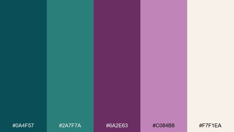
HEX: #0a4f57 #2a7f7a #6a2e63 #c084b8 #f7f1ea
Mood: romantic, twilight, soft
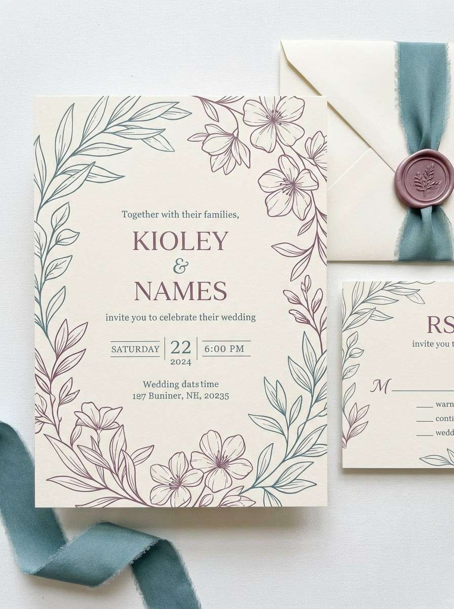
Best for: wedding invitations and event stationery
Twilight teal and peony-like mauves create a romantic, just-after-sunset glow. These tones shine on invitations, menus, and save-the-dates where you want elegance without feeling overly formal. Pair with creamy paper textures and subtle line art for a refined look. Usage tip: keep the pale cream as the main background to protect readability.
Image example of dusk peony generated using media.io
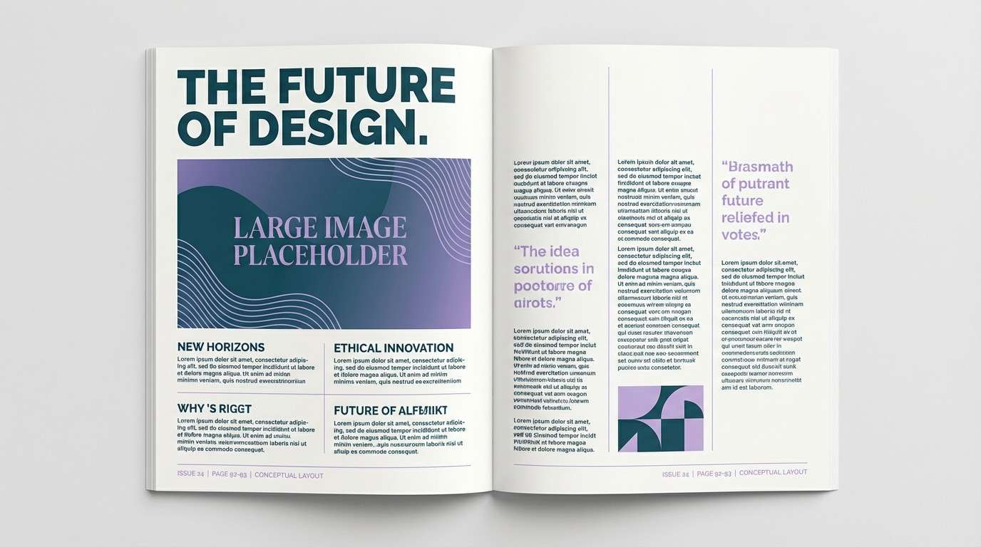
3) Inked Iris
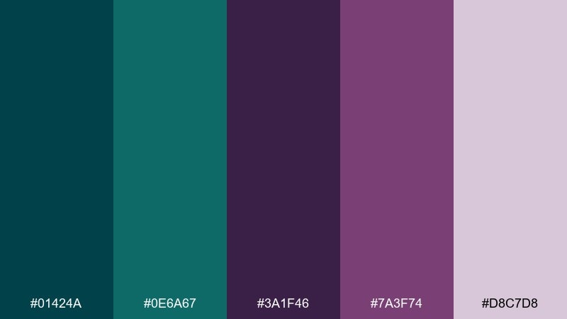
HEX: #01424a #0e6a67 #3a1f46 #7a3f74 #d8c7d8
Mood: editorial, artistic, dramatic
Best for: magazine layouts and album covers
Inky teal and iris purple feel like stained paper, fountain pens, and late-night creativity. The contrast supports bold headlines and moody photography treatments in editorial design. Pair with matte blacks and generous margins to keep it modern. Usage tip: use the lavender tint for pull quotes and section dividers to soften the darkness.
Image example of inked iris generated using media.io
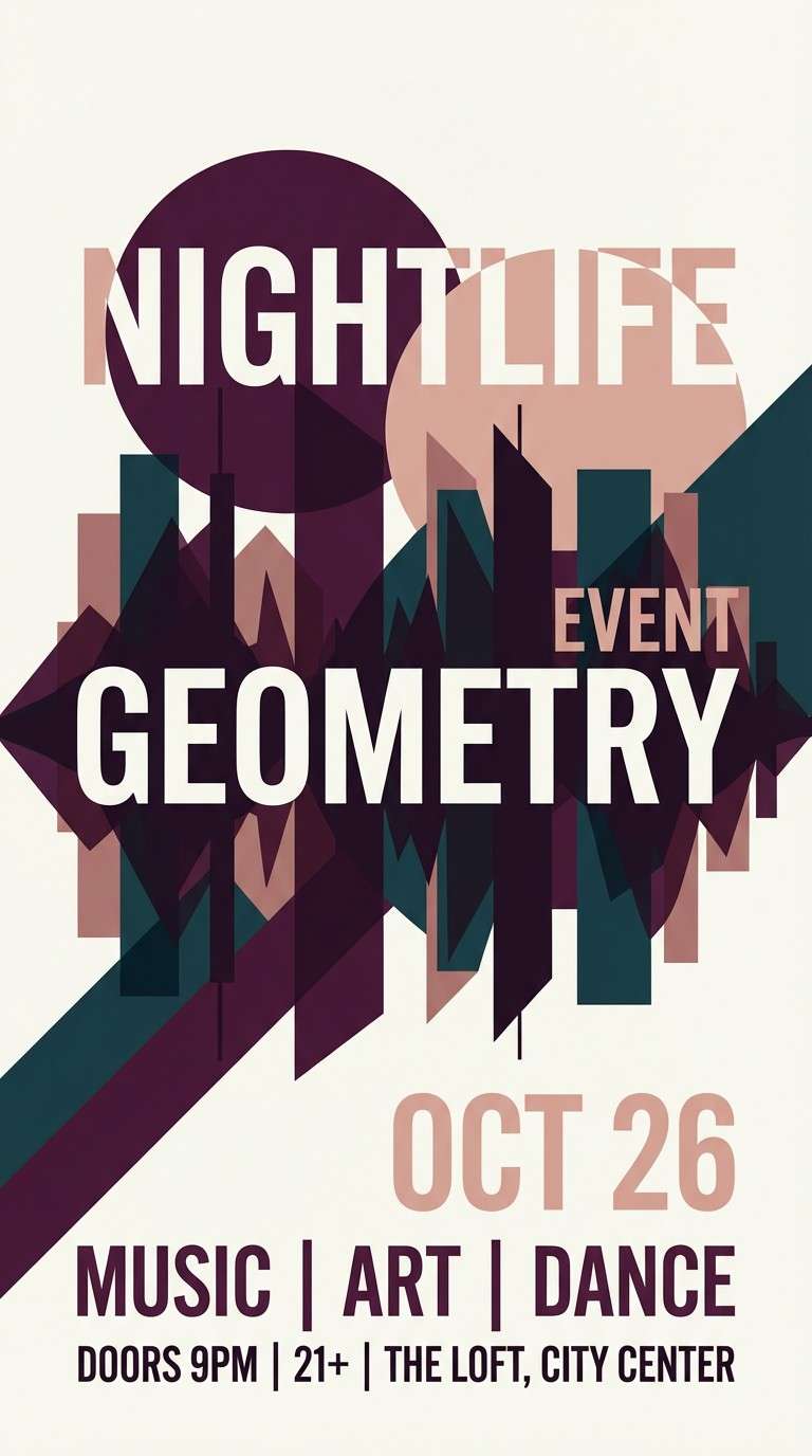
4) Garnet Tide
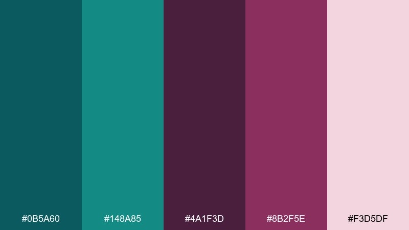
HEX: #0b5a60 #148a85 #4a1f3d #8b2f5e #f3d5df
Mood: bold, glamorous, energetic
Best for: social ads and nightlife posters
A tidal teal base with garnet-plum punches feels electric and glamorous. These teal plum color combinations are made for high-contrast poster work, bold overlays, and striking CTAs. Pair with crisp white type and geometric shapes for an Art Deco edge. Usage tip: keep the bright teal as the attention grabber and let the plum sit in the shadows.
Image example of garnet tide generated using media.io
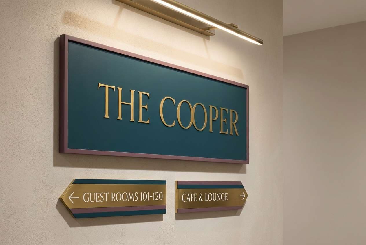
5) Museum Velvet
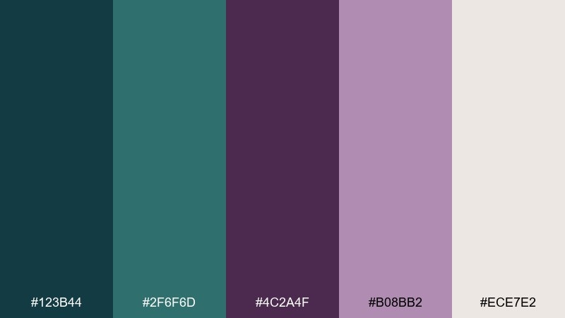
HEX: #123b44 #2f6f6d #4c2a4f #b08bb2 #ece7e2
Mood: curated, vintage, sophisticated
Best for: boutique hotel interiors and signage
Dusty teal and muted plum read like velvet ropes and gallery walls. The mix feels curated and quiet, ideal for wayfinding, plaques, and refined interior accents. Pair with warm neutrals, brushed brass, and soft lighting to keep it welcoming. Usage tip: use the pale greige for background panels to avoid a too-dark hallway look.
Image example of museum velvet generated using media.io
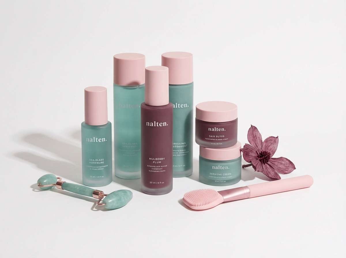
6) Coastal Mulberry
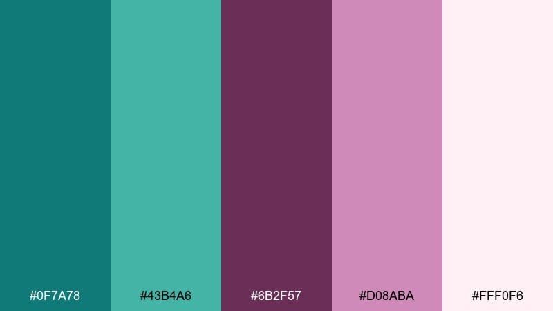
HEX: #0f7a78 #43b4a6 #6b2f57 #d08aba #fff0f6
Mood: fresh, coastal, playful
Best for: beauty branding and summer campaigns
Sea-glass teals with mulberry and cotton-candy pinks feel breezy and upbeat. It works well for beauty drops, seasonal promos, and friendly brand illustrations. Pair with airy white backgrounds and rounded typography to keep it light. Usage tip: let the aqua dominate, then use pink as a small highlight for price tags or buttons.
Image example of coastal mulberry generated using media.io
7) Nocturne Botanical
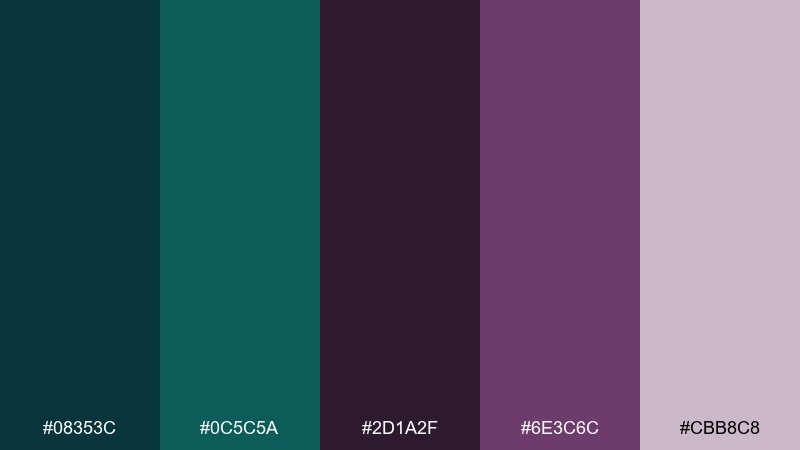
HEX: #08353c #0c5c5a #2d1a2f #6e3c6c #cbb8c8
Mood: mysterious, earthy, moody
Best for: botanical illustrations and book covers
Midnight teal and shadowy plum evoke a moonlit garden with dense leaves and dark petals. The palette supports detailed linework, folio-style covers, and atmospheric storytelling. Pair with textured paper and subtle grain to enhance the organic vibe. Usage tip: reserve the pale lilac for highlights on stems and title lettering.
Image example of nocturne botanical generated using media.io
8) Satin Aubergine
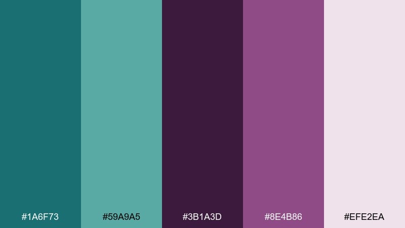
HEX: #1a6f73 #59a9a5 #3b1a3d #8e4b86 #efe2ea
Mood: smooth, feminine, contemporary
Best for: cosmetics packaging and lifestyle posts
Satin teals and aubergine purples feel silky, polished, and slightly romantic. This set is great for cosmetics labels, skincare carousels, and subtle gradients in social graphics. Pair with clean sans-serif fonts and plenty of negative space to keep it contemporary. Usage tip: use the pale blush as the primary canvas and bring in aubergine for contrast.
Image example of satin aubergine generated using media.io
9) Art Deco Jewel
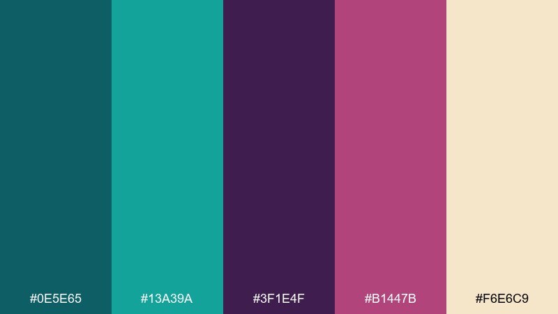
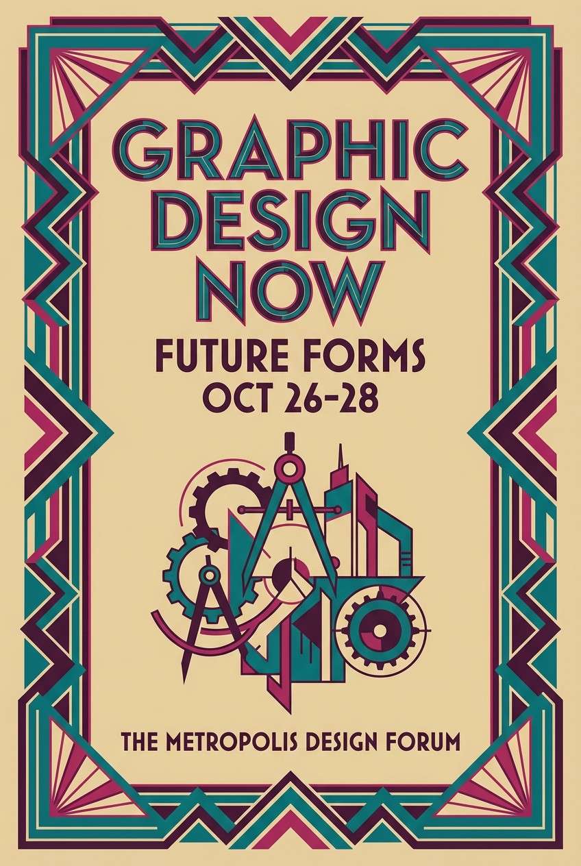
HEX: #0e5e65 #13a39a #3f1e4f #b1447b #f6e6c9
Mood: opulent, geometric, celebratory
Best for: brand launches and luxe event posters
Jewel teals and punchy plum-magenta bring an opulent, cocktail-hour sparkle. These teal plum color combinations fit perfectly with geometric frames, metallic accents, and high-contrast typography. Pair with warm champagne as a background for a more premium feel. Usage tip: keep magenta as a small focal point so it reads intentional, not loud.
Image example of art deco jewel generated using media.io
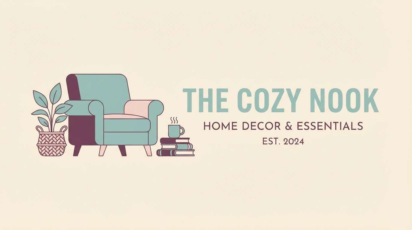
10) Soft Hearth
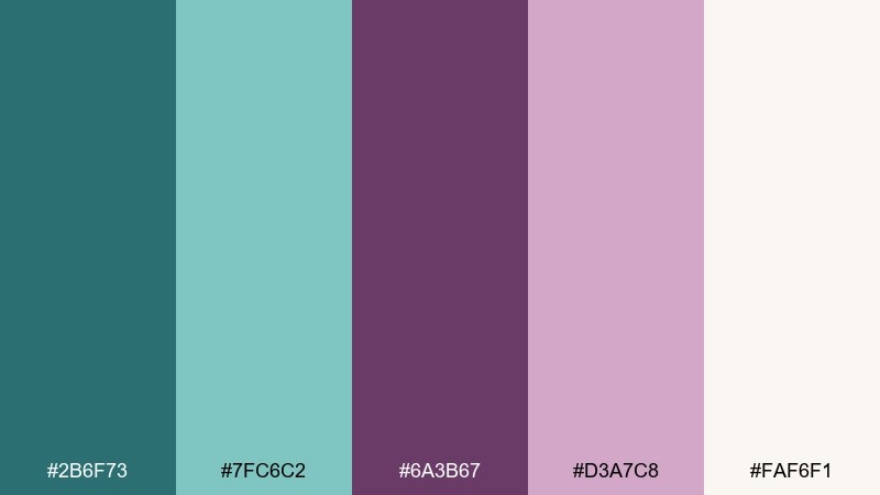
HEX: #2b6f73 #7fc6c2 #6a3b67 #d3a7c8 #faf6f1
Mood: cozy, friendly, relaxed
Best for: home decor shops and lifestyle blogs
Cozy teal and soft plum feel like knitted throws and candlelit evenings. The gentle contrast makes it easy to use for blog headers, lookbooks, and small-shop branding. Pair with creamy whites and warm wood textures for a lived-in vibe. Usage tip: use the lighter teal for large blocks and keep the plum for headings and icons.
Image example of soft hearth generated using media.io
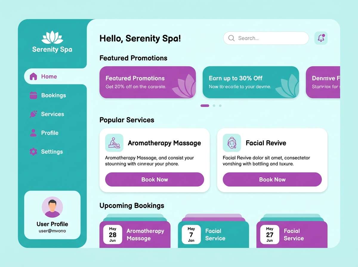
11) Winter Orchid
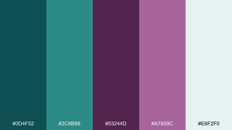
HEX: #0d4f52 #2c8b86 #53244d #a7659c #e6f2f0
Mood: crisp, elegant, serene
Best for: spa websites and calming app screens
Crisp teals and orchid purples feel cool, clean, and quietly luxurious. The tones are ideal for spa web sections, onboarding screens, and gentle gradient backgrounds. Pair with light aqua-tinted whites to keep it airy and reduce visual fatigue. Usage tip: use the deeper plum only for active states and key icons.
Image example of winter orchid generated using media.io
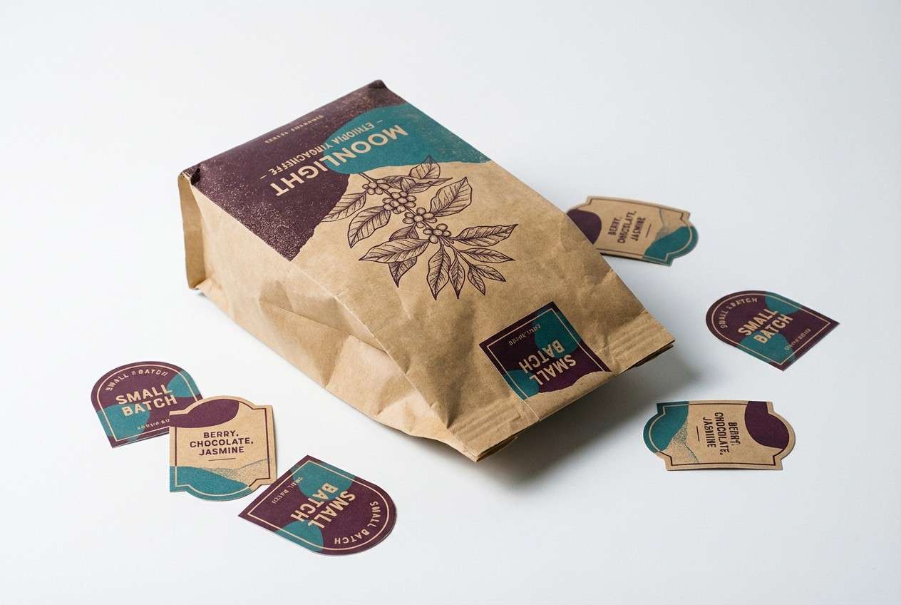
12) Espresso Plum
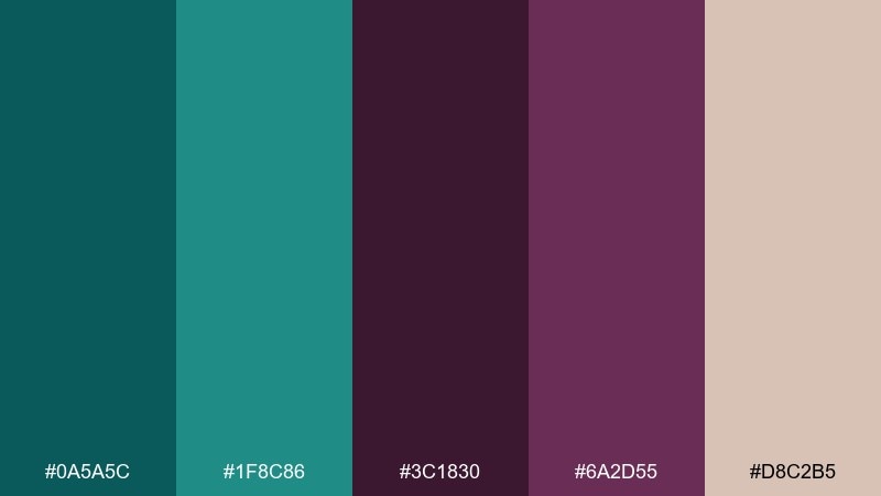
HEX: #0a5a5c #1f8c86 #3c1830 #6a2d55 #d8c2b5
Mood: grounded, moody, refined
Best for: coffee packaging and artisan food labels
Deep plum-brown notes with teal accents feel like espresso crema and glazed ceramics. This teal plum color scheme suits artisan food packaging, cafe menus, and small-batch label systems. Pair with kraft textures and off-black type to emphasize the handcrafted mood. Usage tip: print the teal as a spot color on dark labels for a premium pop.
Image example of espresso plum generated using media.io
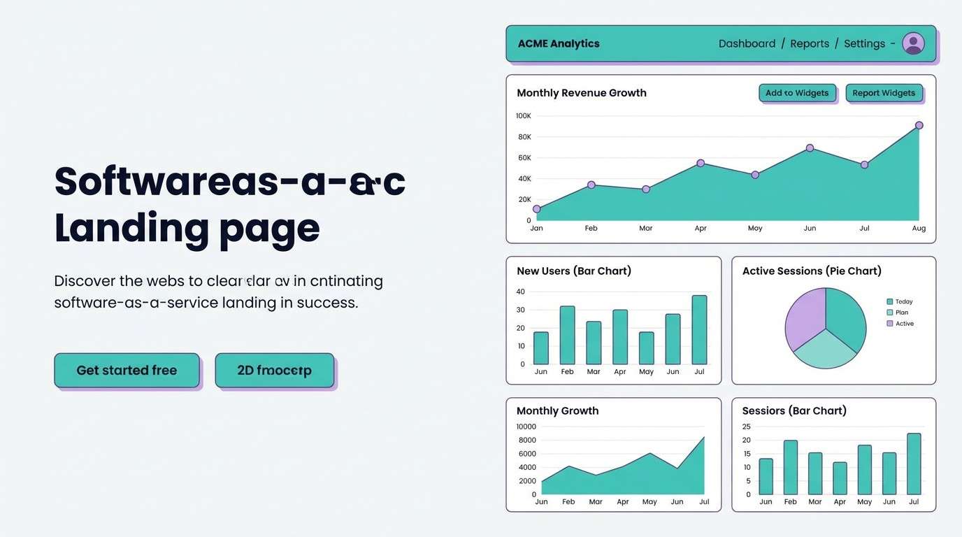
13) City Raincoat
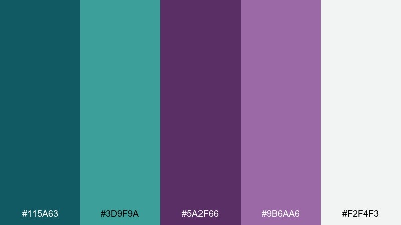
HEX: #115a63 #3d9f9a #5a2f66 #9b6aa6 #f2f4f3
Mood: urban, clean, optimistic
Best for: SaaS landing pages and tech branding
Fresh teal with softened purple feels like neon reflections on a rainy sidewalk, but kept minimalist. It works well for SaaS hero sections, charts, and feature blocks where clarity matters. Pair with cool grays and thin line icons for an urban-tech look. Usage tip: use teal for primary buttons and keep the purple for secondary actions.
Image example of city raincoat generated using media.io
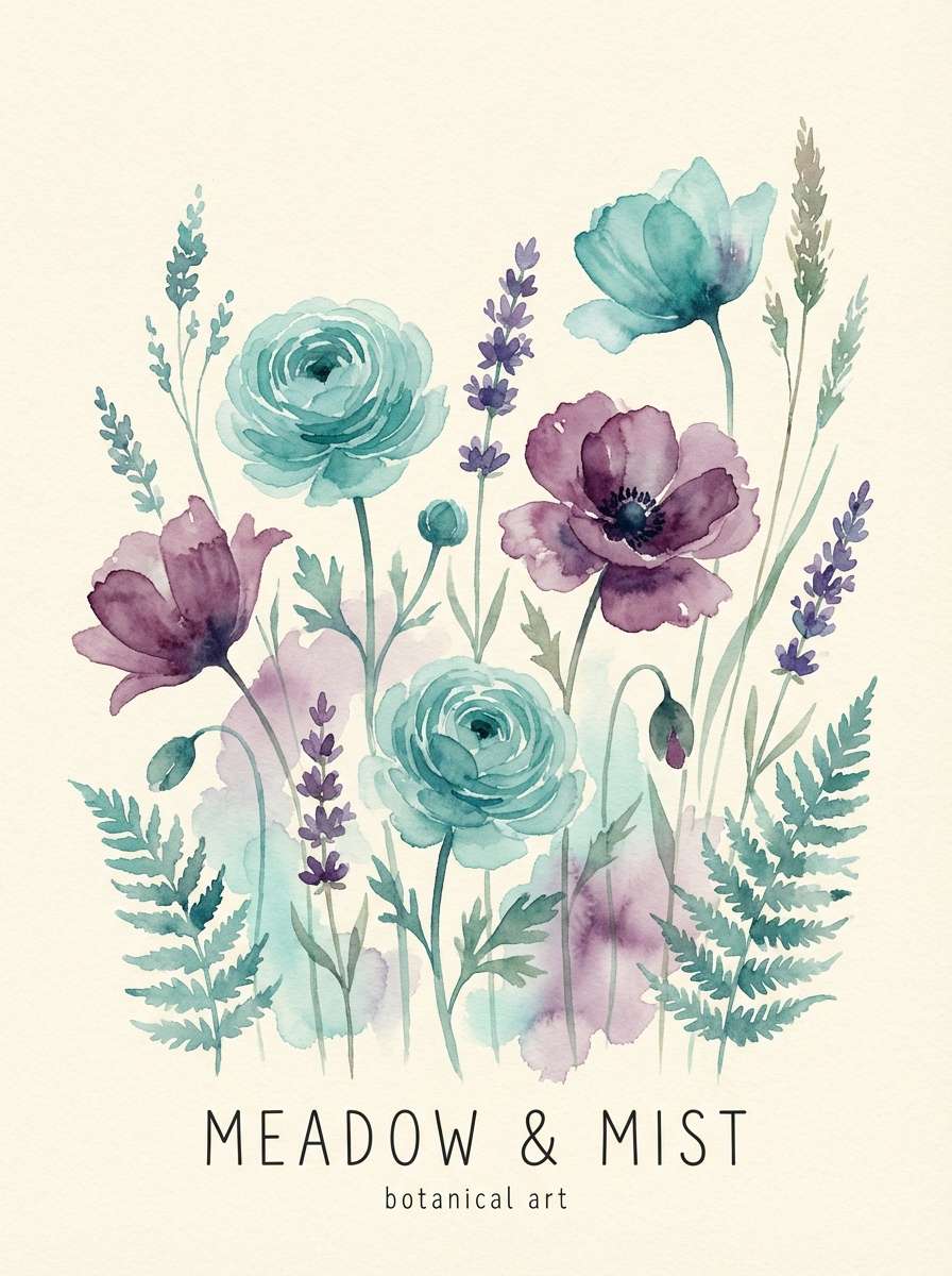
14) Meadow Twilight
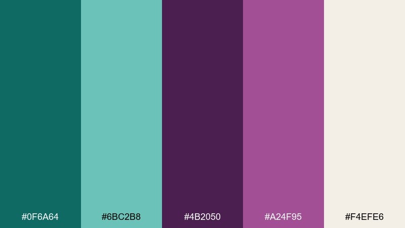
HEX: #0f6a64 #6bc2b8 #4b2050 #a24f95 #f4efe6
Mood: dreamy, airy, romantic
Best for: spring florals and boutique posters
Airy teal and blooming plum evoke a meadow right before dusk, soft light and long shadows. The mix is perfect for boutique posters, floral promotions, and gentle gradient backgrounds. Pair with warm cream and hand-drawn motifs to keep it artisanal. Usage tip: keep the bright teal for large shapes and use the plum mainly for titles.
Image example of meadow twilight generated using media.io
15) Ceramic Bloom
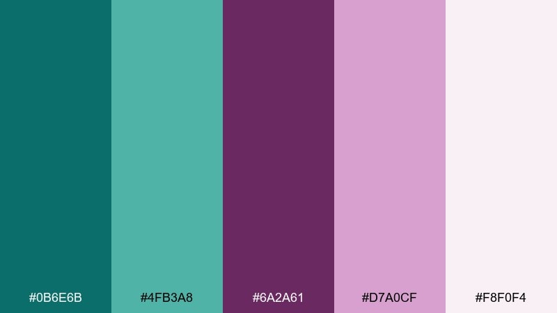
HEX: #0b6e6b #4fb3a8 #6a2a61 #d7a0cf #f8f0f4
Mood: bright, charming, handcrafted
Best for: handmade goods stores and craft fairs
Cheerful teal paired with blooming lilac-plum feels like painted ceramics and artisan markets. It is great for handmade product tags, craft fair flyers, and cheerful ecommerce banners. Pair with textured paper backgrounds and simple iconography for a friendly finish. Usage tip: use the pale pink as breathing room around dense text blocks.
Image example of ceramic bloom generated using media.io

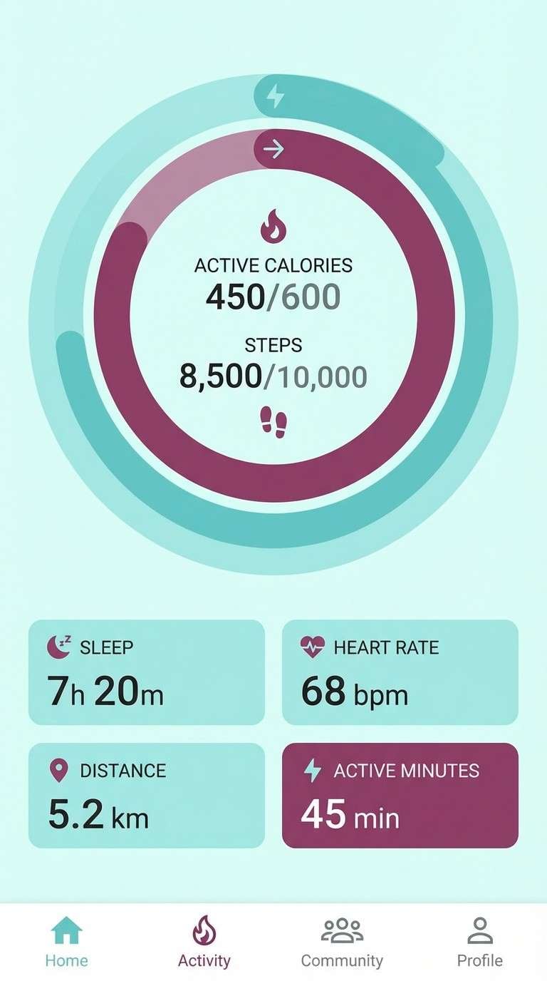
16) Glacier Berry
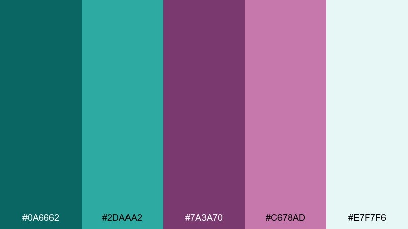
HEX: #0a6662 #2daaa2 #7a3a70 #c678ad #e7f7f6
Mood: icy, vibrant, modern
Best for: fitness apps and energetic UI accents
Icy teal with berry-plum accents feels crisp, fast, and modern. The contrast helps highlight stats, progress rings, and key actions without looking aggressive. Pair with plenty of pale aqua to keep screens bright and readable. Usage tip: use berry for alerts and milestones, not for long text.
Image example of glacier berry generated using media.io
17) Deep Library
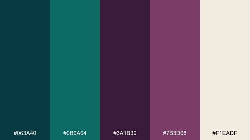
HEX: #063a40 #0b6a64 #3a1b39 #7b3d68 #f1eadf
Mood: scholarly, intimate, timeless
Best for: book covers and academic branding
Deep teal and aged plum feel like leather bindings and quiet stacks. The tones work for book jackets, university program materials, and thoughtful brand marks. Pair with parchment-like neutrals and classic serif type for a timeless finish. Usage tip: keep the darkest teal for titles and use plum as a subtle framing color.
Image example of deep library generated using media.io
18) Tropical Violets
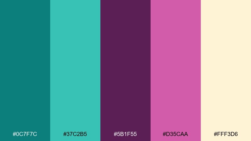
HEX: #0c7f7c #37c2b5 #5b1f55 #d35caa #fff3d6
Mood: playful, bright, vacation-ready
Best for: summer posters and travel promos
Bright teal and tropical violet-plum feel like beach markets and hibiscus petals. It is a strong choice for travel promos, summer posters, and playful brand campaigns. Pair with warm sand backgrounds and bold, condensed headlines for instant energy. Usage tip: use the pink-violet sparingly as a punchy accent to keep balance.
Image example of tropical violets generated using media.io

19) Minimal Luxe
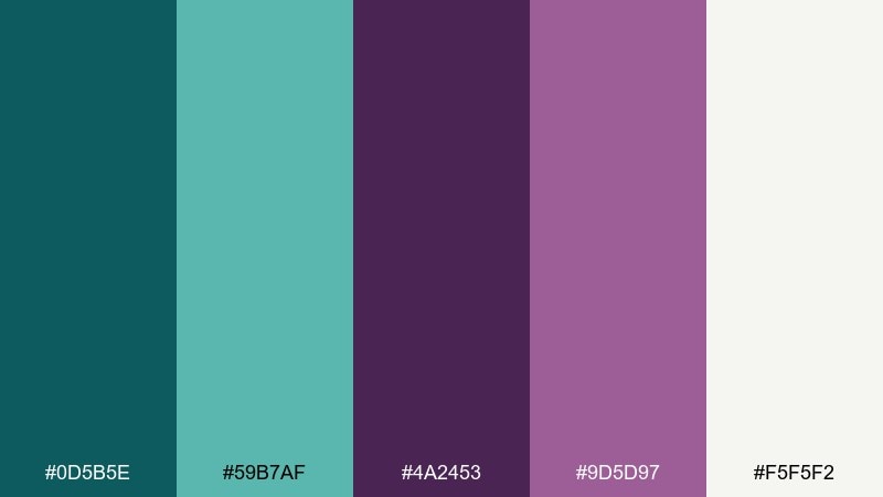
HEX: #0d5b5e #59b7af #4a2453 #9d5d97 #f5f5f2
Mood: minimal, upscale, balanced
Best for: fashion lookbooks and product ads
Clean teal and restrained plum feel quietly expensive, like a minimalist wardrobe with one statement piece. It suits fashion lookbooks, product ads, and premium ecommerce sections. Pair with near-white backgrounds and sharp typography to preserve the luxe simplicity. Usage tip: use the mid teal for large blocks and keep plum to small, deliberate brand marks.
Image example of minimal luxe generated using media.io
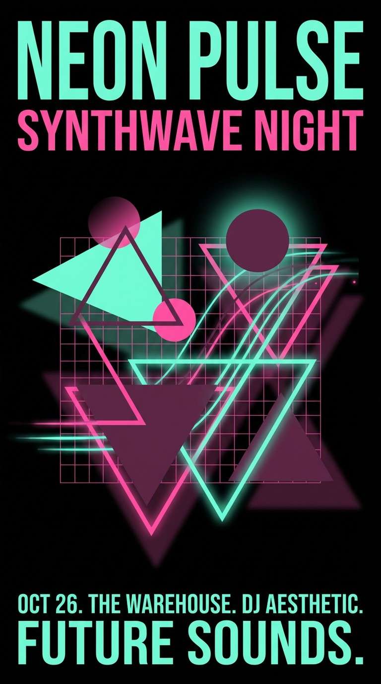
20) Night Swim Neon
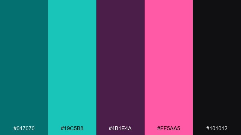
HEX: #047070 #19c5b8 #4b1e4a #ff5aa5 #101012
Mood: neon, nightlife, futuristic
Best for: music promos and bold digital posters
Neon teal with hot pink and dark plum feels like a midnight swim under club lights. The high contrast is perfect for music promos, DJ flyers, and animated digital posters. Pair with black backgrounds and simple sans typography so the glow colors do the work. Usage tip: keep pink to one focal element, like the date or artist name, to avoid visual noise.
Image example of night swim neon generated using media.io
What Colors Go Well with Teal Plum?
Neutrals are the easiest match: warm whites, creams, greige, and parchment tones keep teal and plum readable while preserving the palette’s elegance. For darker layouts, charcoal and near-black backgrounds make the jewel tones feel even richer.
Metallics also pair naturally with teal plum. Brushed gold and champagne accents add a premium finish, while silver or cool chrome pushes the look toward modern tech.
If you want more energy, try accents like blush pink, magenta, or aqua. Use them sparingly for CTAs, tags, and highlights so teal and plum remain the core identity.
How to Use a Teal Plum Color Palette in Real Designs
For branding, treat teal as your foundation color for trust and clarity, then use plum as the signature accent that adds emotion and memorability. This works especially well on logos, seals, and secondary marks.
For UI, keep background surfaces light (cream or pale aqua) and reserve deeper plum for active states, badges, and key icons. Use the darkest teal for text to maintain contrast without looking harsh.
For interiors and print, lean into texture: velvet, matte paper, kraft stock, and brushed metal details help the palette feel intentional and tactile rather than overly saturated.
Create Teal Plum Palette Visuals with AI
If you already have a set of HEX codes, you can generate on-brand visuals by describing the scene (packaging, poster, UI, invitation) and naming teal and plum as the dominant colors.
Start with a clean prompt, then iterate by adjusting lighting (soft studio, neon, warm ambient) and materials (paper texture, satin finish, brushed brass) to match your use case.
With Media.io’s text-to-image tool, it’s easy to create multiple design directions fast—then pick the one that best fits your brand voice.
Teal Plum Color Palette FAQs
-
What is a teal plum color palette?
A teal plum color palette is a curated set of colors that combines teal (blue-green) hues with plum (deep purple) hues, usually supported by a light neutral for balance and readability. -
Is teal and plum a good combination for branding?
Yes. Teal often signals clarity and trust, while plum adds sophistication and emotion—together they feel premium and memorable for modern brands. -
What background color works best with teal plum?
Warm whites, creams, greige, and pale aqua backgrounds work best because they keep the palette airy and improve contrast for text and UI components. -
How do I keep teal plum designs from looking too dark?
Use a light neutral as the main canvas, keep the darkest teal/plum for typography or small blocks, and add spacing/negative space so the colors don’t visually “stack” into a heavy look. -
What accent colors pair well with teal plum?
Gold/champagne for a luxe feel, blush for softness, magenta for energy, and charcoal/black for high-contrast modern layouts all pair well with teal and plum. -
Are teal plum palettes suitable for UI design?
They can be excellent for UI when used with clear contrast rules: teal for primary actions, plum for secondary/active states, and light neutrals for backgrounds to prevent eye strain. -
How can I generate teal plum palette images quickly?
Use an AI text-to-image tool and specify the scene plus “dominant teal and plum” (and your preferred lighting/materials). Generate variations, then refine prompts until the colors and mood match your brand.
Next: Corn Color Palette


