

Corn palettes blend warm golden yellows with creamy neutrals, giving designs instant brightness without feeling harsh. They’re a go-to choice for brands that want to look friendly, wholesome, and confident.
Below are 20 curated corn color palette ideas (with HEX codes), plus pairing tips for UI, print, and modern branding.
In this article
- Why Corn Palettes Work So Well
-
- harvest glow
- creamy kernel
- rustic barnboard
- sunlit meadow
- buttered toast
- desert cornsilk
- retro diner
- autumn festival
- minimal maize
- golden hour linen
- chalk and kernel
- honeyed terracotta
- cornfield dawn
- market fresh
- pale pollination
- toasted spice
- coastal corn
- night cornsilk
- vintage grain sack
- neon popcorn
- What Colors Go Well with Corn?
- How to Use a Corn Color Palette in Real Designs
- Create Corn Palette Visuals with AI
Why Corn Palettes Work So Well
Corn-inspired color schemes sit in a sweet spot: warm enough to feel welcoming, but light enough to stay clean and modern. The golden tones naturally draw attention, which makes them great for highlights, CTAs, and hero areas.
Creamy off-whites and soft beiges help balance the saturation, so layouts don’t look loud or overly “yellow.” This is especially useful in UI design where readability, spacing, and hierarchy matter.
Finally, corn palettes pair beautifully with earthy browns, botanical greens, or deep charcoals—giving you easy contrast options for type, borders, and data visualizations.
20+ Corn Color Palette Ideas (with HEX Codes)
1) Harvest Glow
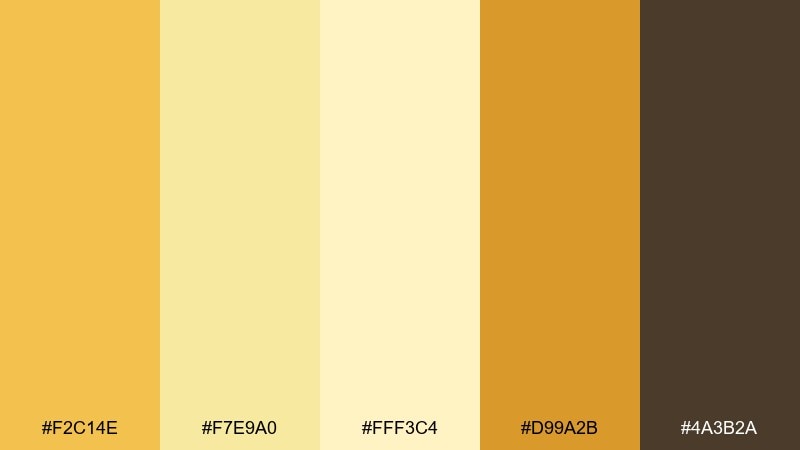
HEX: #F2C14E #F7E9A0 #FFF3C4 #D99A2B #4A3B2A
Mood: warm, confident, sunlit
Best for: brand hero banner and landing pages
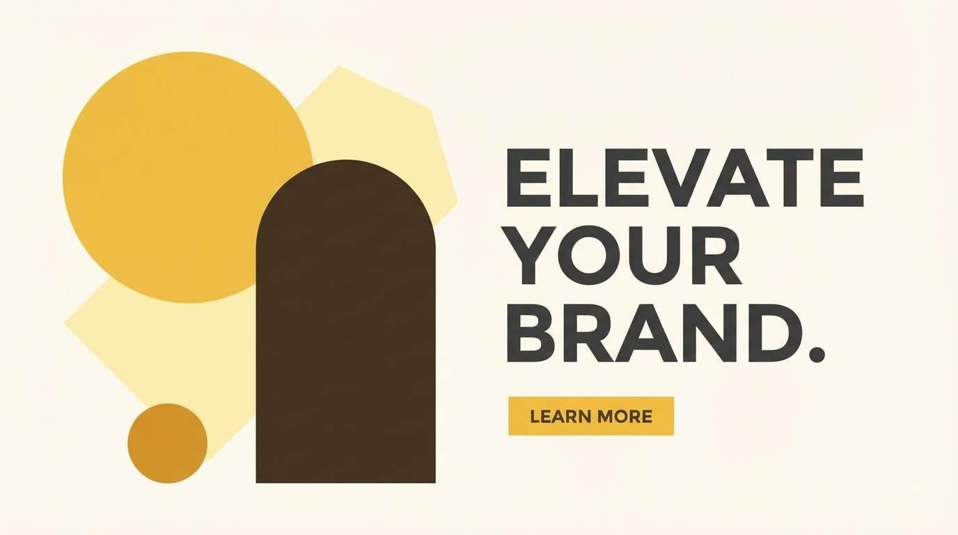
Warm and sunlit like late-afternoon fields, these golden tones feel optimistic and grounded. Use the light cream as breathing room, then build hierarchy with amber and deep brown for headings. It works especially well for food, craft, and lifestyle branding where trust matters. Tip: keep gradients subtle and reserve the darkest brown for small, high-contrast text.
Image example of harvest glow generated using media.io
Media.io is an online AI studio for creating and editing video, image, and audio in your browser.

2) Creamy Kernel
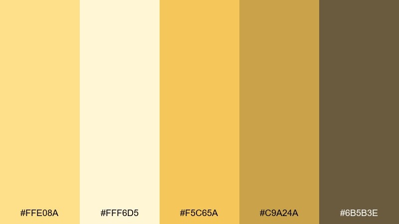
HEX: #FFE08A #FFF6D5 #F5C65A #C9A24A #6B5B3E
Mood: soft, friendly, approachable
Best for: dashboard UI and onboarding screens
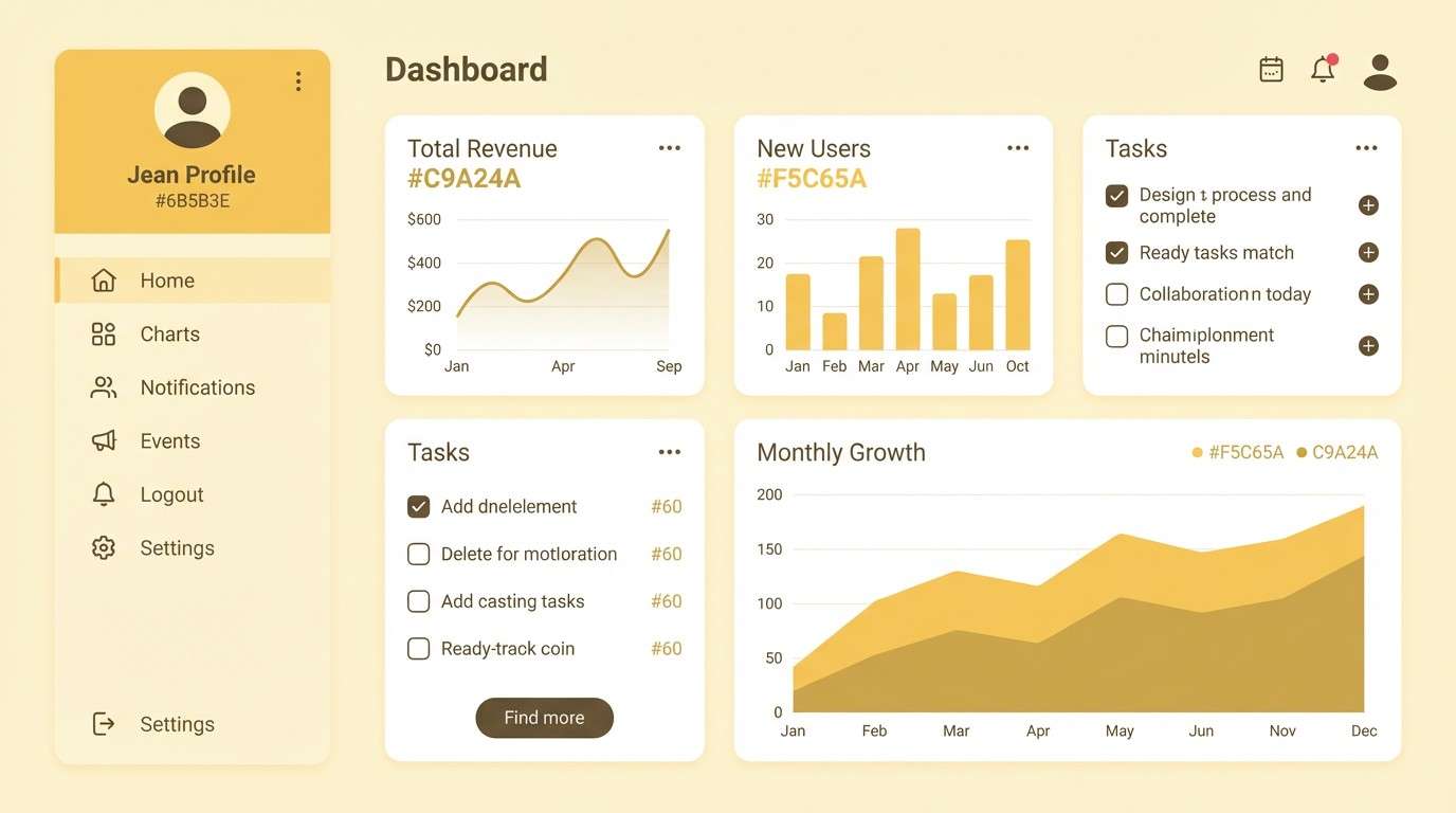
Soft and creamy like whipped butter and warm cereal grains, the palette reads calm without feeling bland. Let the near-white sit behind cards, then use the golden midtone for primary buttons and highlights. Pair it with simple iconography and plenty of spacing for an easy, welcoming interface. Tip: test contrast for accessibility by using the deeper olive-brown for labels and navigation.
Image example of creamy kernel generated using media.io
3) Rustic Barnboard
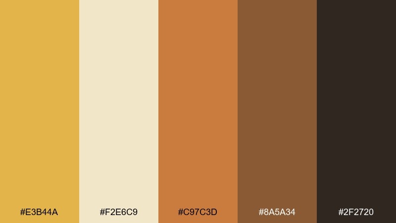
HEX: #E3B44A #F2E6C9 #C97C3D #8A5A34 #2F2720
Mood: rustic, hearty, handcrafted
Best for: food packaging and artisanal labels
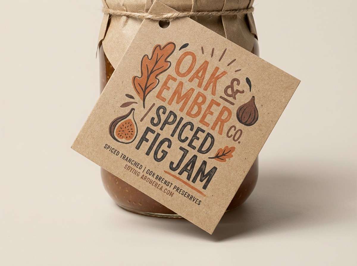
Rustic and hearty, these tones evoke toasted grain, spice, and worn wood. The mix makes a dependable corn color palette for products that want to feel handmade and premium. Use the creamy beige as a label base, then layer in the terracotta and deep espresso for type and borders. Tip: add a subtle paper texture so the darker browns look rich rather than flat.
Image example of rustic barnboard generated using media.io
4) Sunlit Meadow
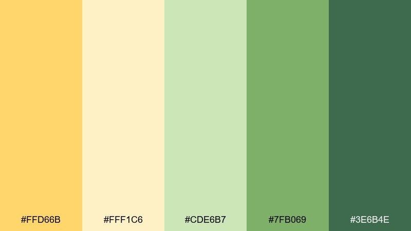
HEX: #FFD66B #FFF1C6 #CDE6B7 #7FB069 #3E6B4E
Mood: fresh, botanical, airy
Best for: spring botanical illustrations and prints
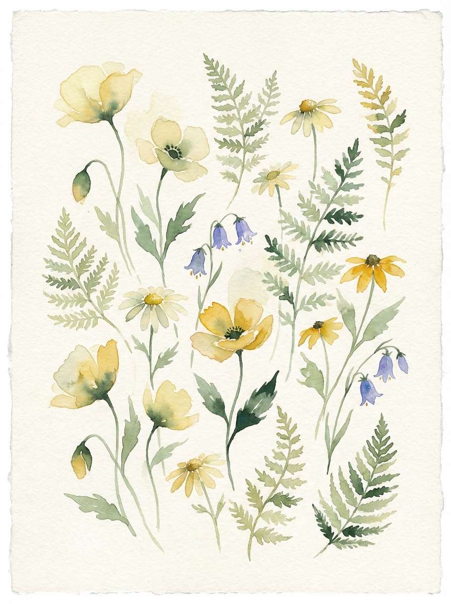
Fresh and airy like a meadow after rain, the yellow feels gentle beside leafy greens. Use the pale cream as paper, then let the mid green carry stems and foliage. It suits garden brands, wellness stationery, and seasonal prints that need calm optimism. Tip: keep outlines in the deep green so the soft yellow stays luminous.
Image example of sunlit meadow generated using media.io
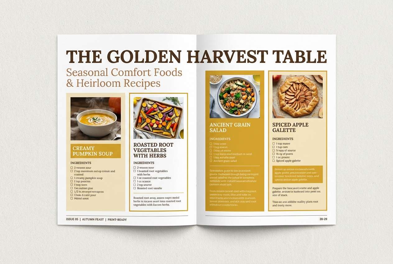
5) Buttered Toast
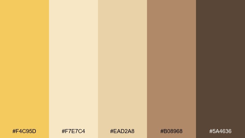
HEX: #F4C95D #F7E7C4 #EAD2A8 #B08968 #5A4636
Mood: cozy, comforting, nostalgic
Best for: magazine editorials and recipe spreads
Cozy and nostalgic, these shades feel like warm toast, linen napkins, and café light. Use the pale cream for margins, then lean on the tan and cocoa for typography and section dividers. It shines in editorial layouts where readability and warmth should coexist. Tip: limit the darkest brown to pull quotes and small UI-like chips to avoid heavy pages.
Image example of buttered toast generated using media.io
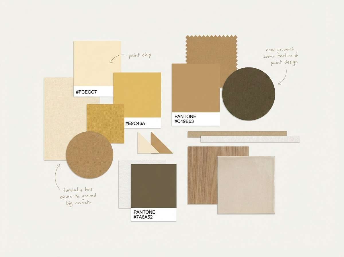
6) Desert Cornsilk
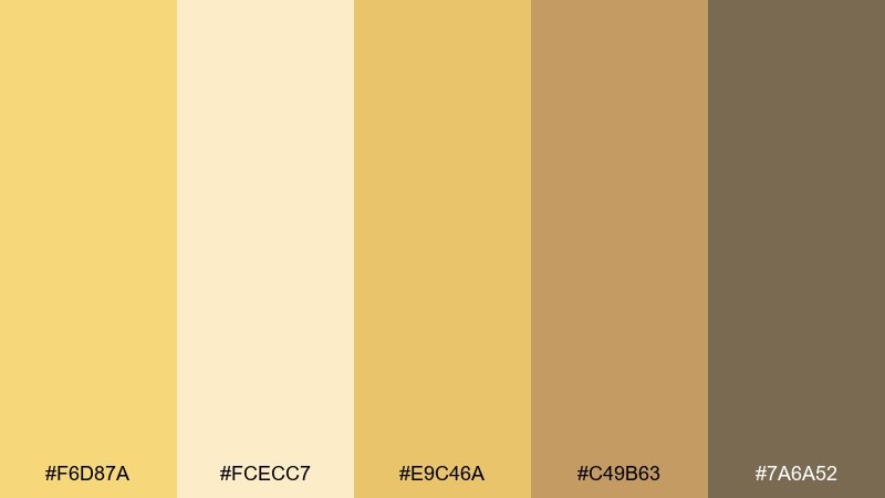
HEX: #F6D87A #FCECC7 #E9C46A #C49B63 #7A6A52
Mood: calm, natural, sun-washed
Best for: interior mood boards and home decor
Calm and sun-washed, these tones recall desert light on clay walls and woven textiles. Use the cornsilk cream as the dominant base, then add the deeper sand and taupe for structure. It fits interior mood boards, home brands, and calm lifestyle visuals. Tip: pair with matte textures and avoid high-gloss effects so the palette stays relaxed.
Image example of desert cornsilk generated using media.io
7) Retro Diner
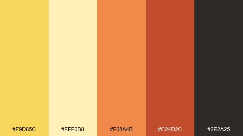
HEX: #F9D65C #FFF0B8 #F08A4B #C24D2C #2E2A25
Mood: playful, vintage, bold
Best for: event posters and retro-themed flyers
Playful and vintage, these colors bring back neon signage and tiled counters without going overboard. The warm yellow and creamy tint set a cheerful base, while orange-reds punch up titles and badges. For corn color combinations that feel energetic, use the dark charcoal as a balancing anchor. Tip: keep body text on the cream and reserve the orange for large display type.
Image example of retro diner generated using media.io
8) Autumn Festival
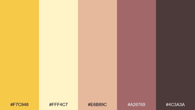
HEX: #F7C948 #FFF4C7 #E6B89C #A26769 #4C3A3A
Mood: festive, welcoming, seasonal
Best for: invitations and seasonal announcements
Festive and welcoming, the mix feels like lantern light, baked treats, and rosy dusk. Use the pale yellow as the invitation background, then set titles in the plum-brown for a classic look. The muted rose adds softness for icons, borders, and small illustrations. Tip: choose one accent color per section so the design stays elegant, not busy.
Image example of autumn festival generated using media.io
9) Minimal Maize
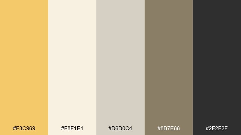
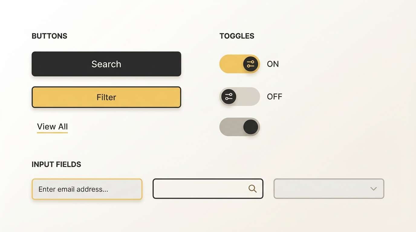
HEX: #F3C969 #F8F1E1 #D6D0C4 #8B7E66 #2F2F2F
Mood: minimal, modern, balanced
Best for: SaaS UI systems and component libraries
Minimal and balanced, these tones feel like clean paper, soft daylight, and a single golden highlight. A restrained corn color scheme works best when the yellow acts as a signal color, not a background wash. Use the off-white and light gray for surfaces, then deploy the deep charcoal for crisp, accessible text. Tip: apply the yellow to focus states and success nudges so it reads purposeful.
Image example of minimal maize generated using media.io
10) Golden Hour Linen
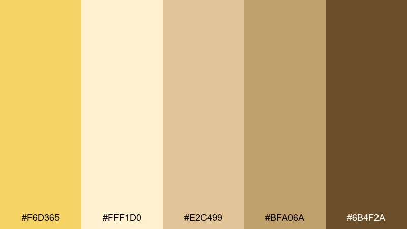
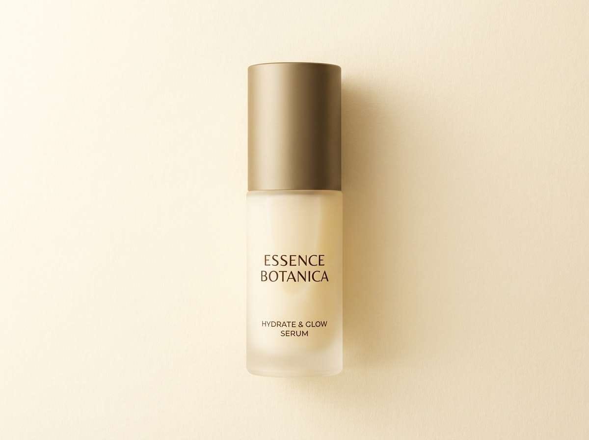
HEX: #F6D365 #FFF1D0 #E2C499 #BFA06A #6B4F2A
Mood: premium, warm, refined
Best for: beauty product ads and lifestyle campaigns
Premium and refined, the colors evoke golden hour on linen fabric and polished wood. Use the pale cream as the studio backdrop, then let the mid gold create a gentle spotlight effect. It pairs beautifully with serif typography and minimal product photography. Tip: keep shadows soft and warm so the brown reads luxurious rather than harsh.
Image example of golden hour linen generated using media.io
11) Chalk And Kernel
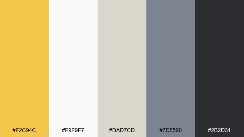
HEX: #F2C94C #F9F9F7 #DAD7CD #7D8590 #2B2D31
Mood: smart, clean, slightly academic
Best for: presentation decks and report templates
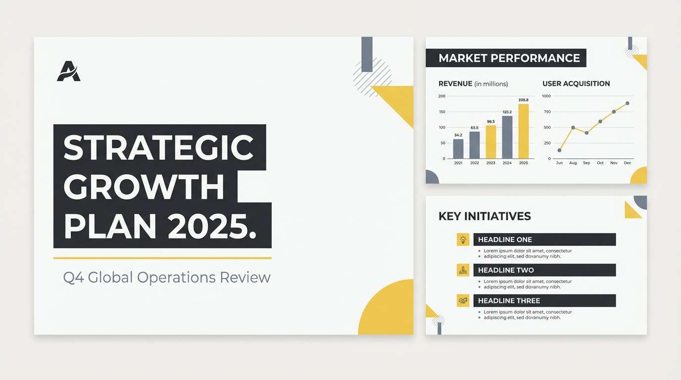
Smart and clean, the palette feels like chalk paper, tidy diagrams, and a hint of sunshine. Use the cool grays for structure, grids, and charts, then highlight key takeaways with the golden accent. It works well for reports that need warmth without losing seriousness. Tip: reserve the yellow for one data series or callouts to keep slides readable.
Image example of chalk and kernel generated using media.io
12) Honeyed Terracotta
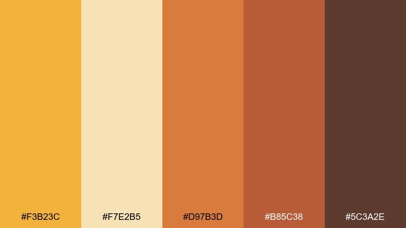
HEX: #F3B23C #F7E2B5 #D97B3D #B85C38 #5C3A2E
Mood: earthy, artisanal, bold
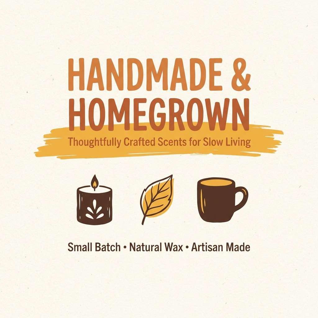
Best for: handmade goods branding and social posts
Earthy and artisanal, these tones feel like honey glaze on clay and sun-baked pottery. The warm cream keeps layouts open, while terracotta brings instant craft-market character. Use the deeper browns for logo marks and strong typographic contrast. Tip: pair with simple line illustrations so the palette stays the hero.
Image example of honeyed terracotta generated using media.io
13) Cornfield Dawn
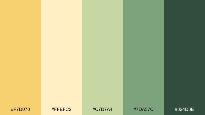
HEX: #F7D070 #FFEFC2 #C7D7A4 #7DA37C #324D3E
Mood: peaceful, pastoral, hopeful
Best for: wide website headers and landscape illustrations
Peaceful and pastoral, the colors suggest early light over fields with dew on leaves. The soft yellow and cream create atmosphere, while greens add depth and natural contrast. Use it for wide headers, eco storytelling, or gentle brand narratives. Tip: keep the darkest green for silhouettes and foreground details to guide the eye.
Image example of cornfield dawn generated using media.io

14) Market Fresh
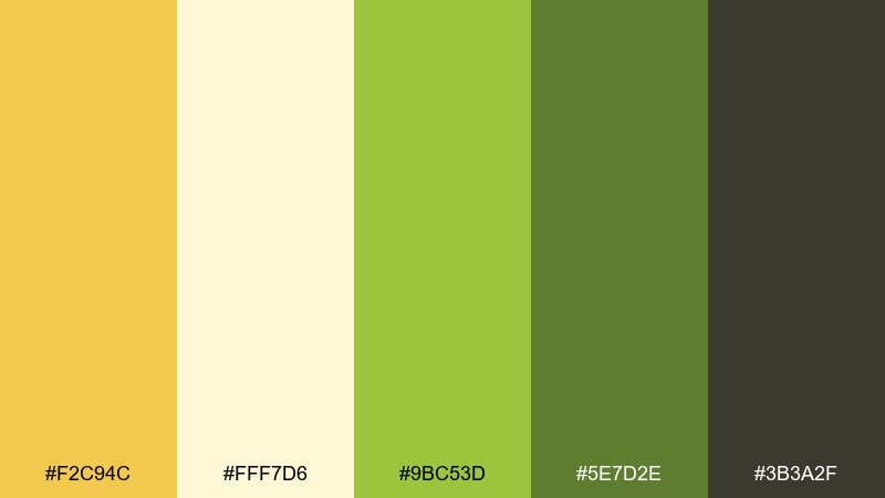
HEX: #F2C94C #FFF7D6 #9BC53D #5E7D2E #3B3A2F
Mood: fresh, energetic, wholesome
Best for: grocery labels and farm-to-table packaging
Fresh and energetic, this mix feels like produce crates, handwritten price tags, and crisp greens. For a corn color combination that also nods to freshness, let yellow lead the logo and keep green for supporting badges. The cream background makes nutrition text easy to read, while the dark neutral anchors barcodes and fine print. Tip: use the brighter green sparingly so the design stays natural, not sporty.
Image example of market fresh generated using media.io
15) Pale Pollination
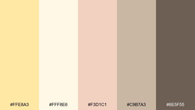
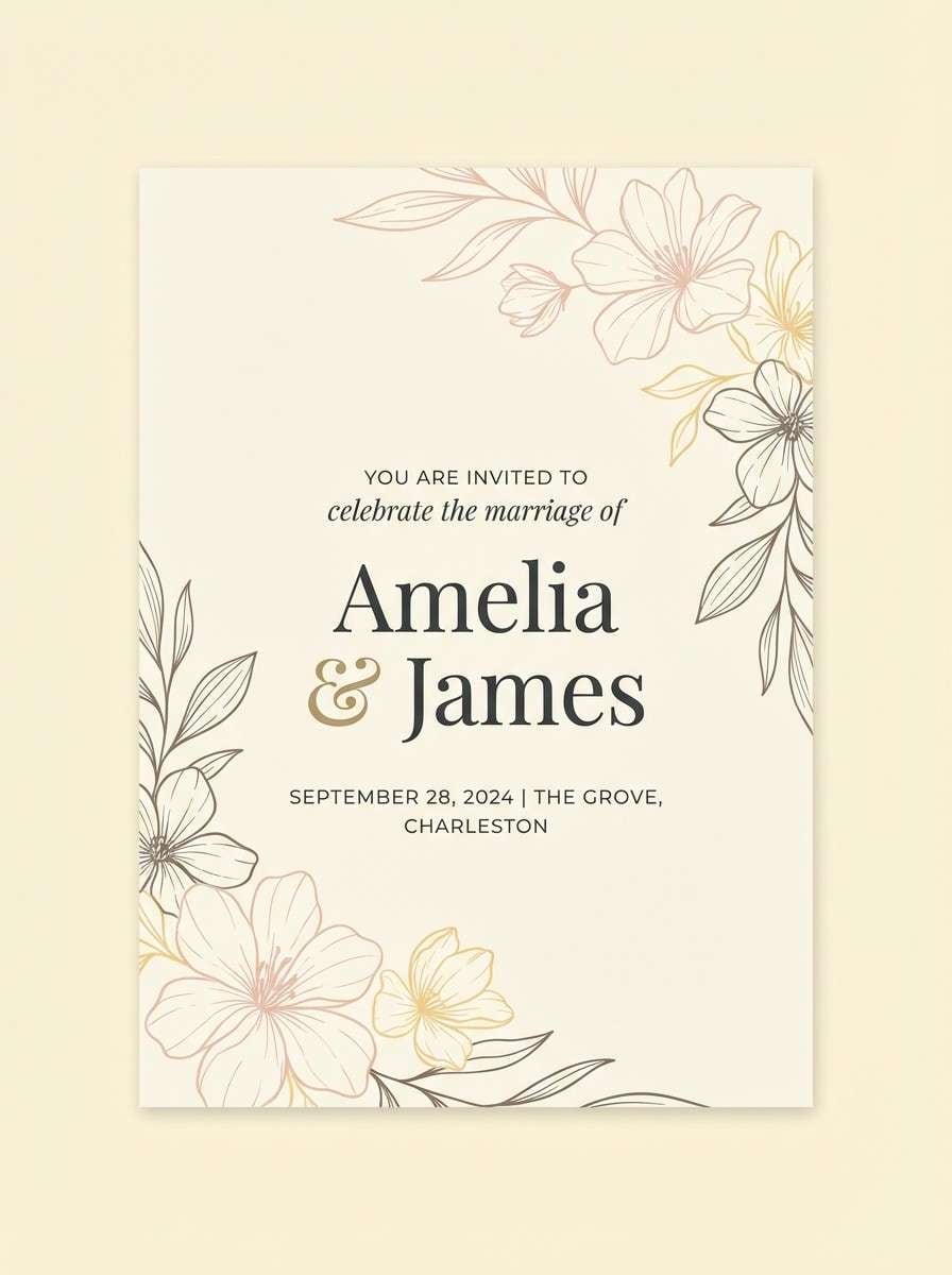
HEX: #FFE8A3 #FFF8E6 #F3D1C1 #C9B7A3 #6E5F55
Mood: romantic, airy, delicate
Best for: wedding stationery and soft brand kits
Romantic and airy, these shades resemble petals, parchment, and gentle morning light. Use the near-white as the main field, then bring in blush for monograms and small flourishes. The warm gray-brown keeps typography legible without turning stark. Tip: choose uncoated paper or grainy backgrounds to enhance the delicate feel.
Image example of pale pollination generated using media.io
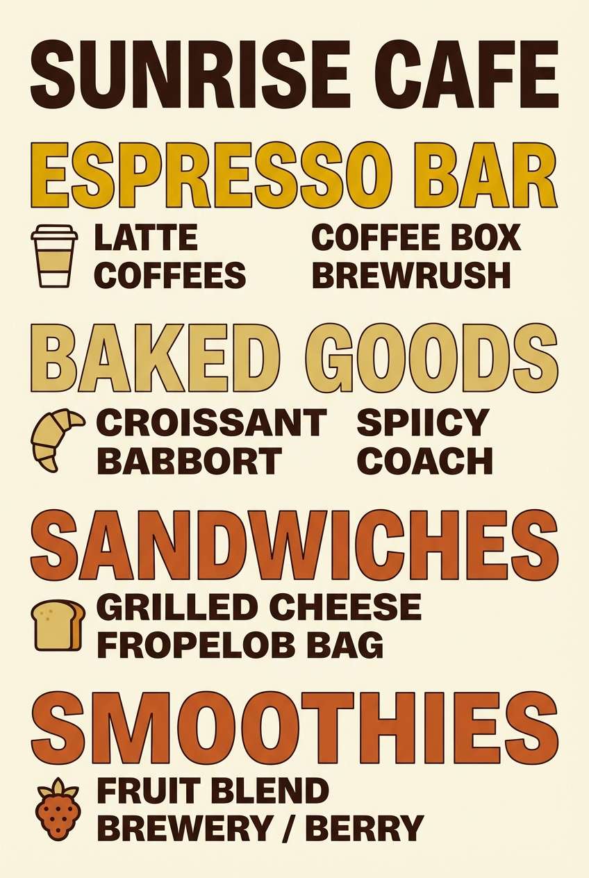
16) Toasted Spice
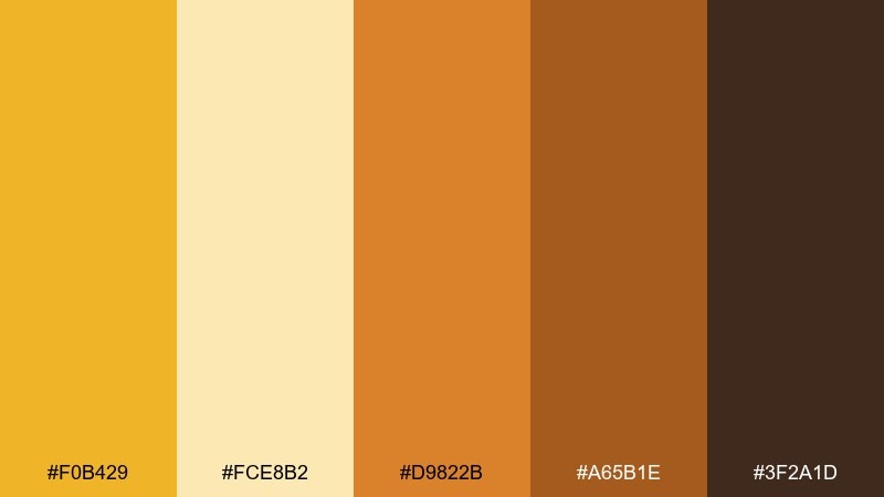
HEX: #F0B429 #FCE8B2 #D9822B #A65B1E #3F2A1D
Mood: bold, appetizing, cozy
Best for: cafe menus and food promos
Bold and appetizing, the colors feel like caramelized edges and spiced syrup. Use the pale yellow for menu sections, then lean on orange and brown for category headers and price highlights. It suits cafés, bakeries, and seasonal promotions where warmth should drive clicks. Tip: keep photography minimal and let color blocks do the heavy lifting.
Image example of toasted spice generated using media.io
17) Coastal Corn
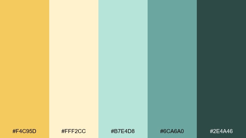
HEX: #F4C95D #FFF2CC #B7E4D8 #6CA6A0 #2E4A46
Mood: light, breezy, modern
Best for: summer lookbooks and lifestyle banners
Light and breezy, the warm yellow pops against sea-glass greens for a modern holiday feel. Use the cream as negative space, then alternate gold and teal blocks for sections or cards. It works well for summer collections, travel promos, and playful lifestyle design. Tip: keep the deep teal for text and navigation so the lighter colors can stay airy.
Image example of coastal corn generated using media.io
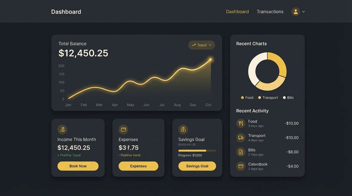
18) Night Cornsilk
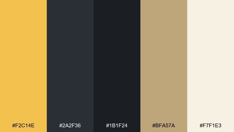
HEX: #F2C14E #2A2F36 #1B1F24 #BFA57A #F7F1E3
Mood: moody, modern, high-contrast
Best for: dark mode UI and fintech apps
Moody and modern, the gold accent glows like streetlight against deep charcoal. Use the darkest shade for main surfaces, then bring in cornsilk as muted text and dividers. The warm metallic midtone helps buttons and badges feel premium without becoming neon. Tip: keep the bright gold to one primary action per screen for clear focus.
Image example of night cornsilk generated using media.io
19) Vintage Grain Sack
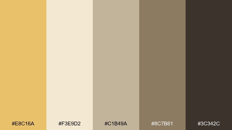
HEX: #E8C16A #F3E9D2 #C1B49A #8C7B61 #3C342C
Mood: vintage, trustworthy, understated
Best for: heritage branding and logo systems
Vintage and trustworthy, these tones recall printed flour sacks, stamped ink, and aged paper. Let the creamy beige act as the background, with taupe and brown building a quiet hierarchy for marks and typography. It suits heritage brands, craft coffee, and rustic packaging that avoids loud colors. Tip: combine with a single serif family and minimal ornament for an authentic feel.
Image example of vintage grain sack generated using media.io
20) Neon Popcorn
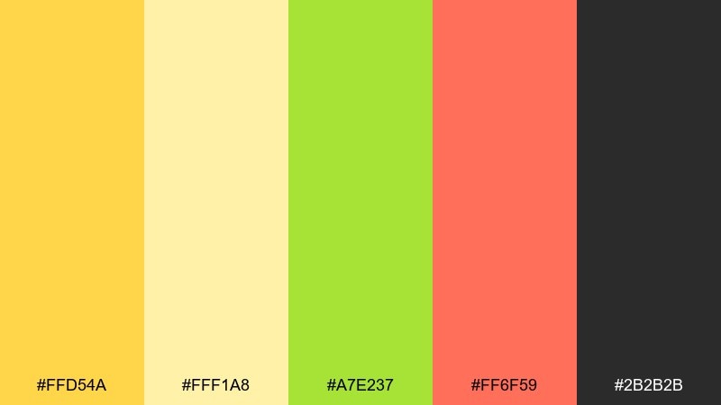
HEX: #FFD54A #FFF1A8 #A7E237 #FF6F59 #2B2B2B
Mood: fun, punchy, modern
Best for: social ads and playful promo graphics
Fun and punchy, this mix feels like bright marquee lights with a modern twist. Use the soft yellow as the base, then let lime and coral handle stickers, bursts, and key promo numbers. For corn color combinations that need extra energy, the charcoal keeps everything sharp and readable. Tip: limit yourself to two loud accents per layout so the message stays clear.
Image example of neon popcorn generated using media.io

What Colors Go Well with Corn?
Corn yellow pairs naturally with warm neutrals like cream, beige, and taupe—these keep the palette soft and “food-friendly,” while preserving a premium, minimal feel.
For contrast, add deep browns, espresso, or charcoal to anchor typography and UI elements. If you want a fresher direction, combine corn tones with botanical greens or sea-glass teals for an airy, seasonal look.
Muted terracotta and clay tones also work well with corn because they share warmth, creating a cohesive earthy system for packaging, editorials, and lifestyle branding.
How to Use a Corn Color Palette in Real Designs
Use corn as an accent first: buttons, badges, highlights, or key illustration details. This keeps your layout readable and prevents large yellow areas from overpowering content.
In UI, put creams and off-whites on backgrounds, then reserve deeper neutrals for text and navigation. In print, test paper and ink behavior—corn tones often look best on uncoated or lightly textured stocks.
When mixing accents (like coral, lime, or teal), cap it at one or two per layout and keep a strong dark anchor color so the hierarchy stays clear.
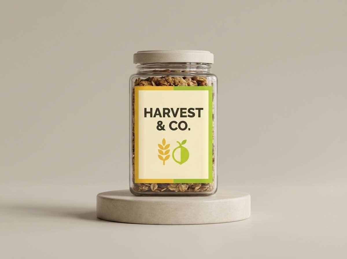
Create Corn Palette Visuals with AI
If you already have HEX codes, you can turn them into real design mockups in minutes—hero banners, packaging labels, UI screens, posters, and mood boards. The fastest workflow is to reuse a consistent prompt and only swap the color values.
To keep outputs on-brand, describe the layout type (e.g., “dashboard mockup” or “invitation card”), set lighting or texture (matte, paper grain, soft shadows), and specify which colors should be dominant vs. accent.
Generate a few variations, then pick the one with the cleanest contrast and spacing—especially if your corn yellow is used for CTAs or key headings.
Corn Color Palette FAQs
-
What is a corn color palette?
A corn color palette is a set of colors inspired by corn kernels and corn silk—typically golden yellows, creamy off-whites, warm tans, and grounding browns or charcoals for contrast. -
Is corn yellow the same as maize yellow?
They’re closely related. “Maize” often implies a slightly deeper, more saturated golden yellow, while “corn” can include a broader range from pale cornsilk to richer amber. -
What neutral colors work best with corn tones?
Cream, ivory, beige, light warm gray, taupe, and espresso brown pair especially well. They soften the yellow while keeping the palette usable for backgrounds and typography. -
How do I make a corn palette look modern (not childish)?
Use corn yellow as an accent rather than a full background, add deep charcoal or dark brown for sharp type, and keep spacing and typography minimal (clean sans-serif or refined serif). -
Are corn palettes good for UI design?
Yes—when you prioritize contrast. Use off-white surfaces, dark text, and apply corn yellow to focus states, primary buttons, and highlights so it reads purposeful and accessible. -
What colors go well with corn for a fresh, natural look?
Leafy greens (sage, olive, meadow green) are the easiest match. Teal or sea-glass tones also work well for a breezy, modern “summer” feeling. -
How can I quickly visualize a corn color scheme?
Use a text-to-image generator and describe the design format (poster, packaging, dashboard, mood board), then include your HEX codes and specify which shades are dominant vs. accent.
Next: Street Art Color Palette


