

Tarot-inspired palettes blend symbolism with contrast: rich reds for willpower, deep blues for intuition, and warm neutrals for age, paper, and ritual.
Below are modern tarot card color combinations with HEX codes you can reuse for deck art, UI, packaging, and branding—plus AI prompts to visualize each look fast.
In this article
- Why Tarot Card Palettes Work So Well
-
- crimson arcana
- moonlit indigo
- antique parchment
- celestial teal
- rose quartz veil
- gilded omen
- velvet nightfall
- sage ritual
- smoky amethyst
- sunlit citrine
- obsidian ink
- coral prophecy
- stormy sapphire
- mystic sepia
- lavender aura
- copper chalice
- seafoam oracle
- scarlet altar
- blue flame sigil
- ivory eclipse
- astral carnival
- dusk rose navy
- What Colors Go Well with Tarot Card?
- How to Use a Tarot Card Color Palette in Real Designs
- Create Tarot Card Palette Visuals with AI
Why Tarot Card Palettes Work So Well
Tarot aesthetics are instantly recognizable because they balance darkness and light: shadowy bases (ink, charcoal, midnight) with luminous highlights (ivory, gold, pale blues). That contrast makes symbols, linework, and typography feel dramatic without becoming messy.
They also borrow from tactile materials—aged paper, velvet, foil, lacquer—so even flat digital designs can feel physical and collectible. A warm neutral can suggest parchment, while one metallic-like accent can imply a premium finish.
Finally, tarot palettes are built around meaning. Reds and wines read as passion and power; blues and indigos feel intuitive and cosmic; greens signal ritual, growth, and grounding. That built-in storytelling makes branding feel intentional.
20+ Tarot Card Color Palette Ideas (with HEX Codes)
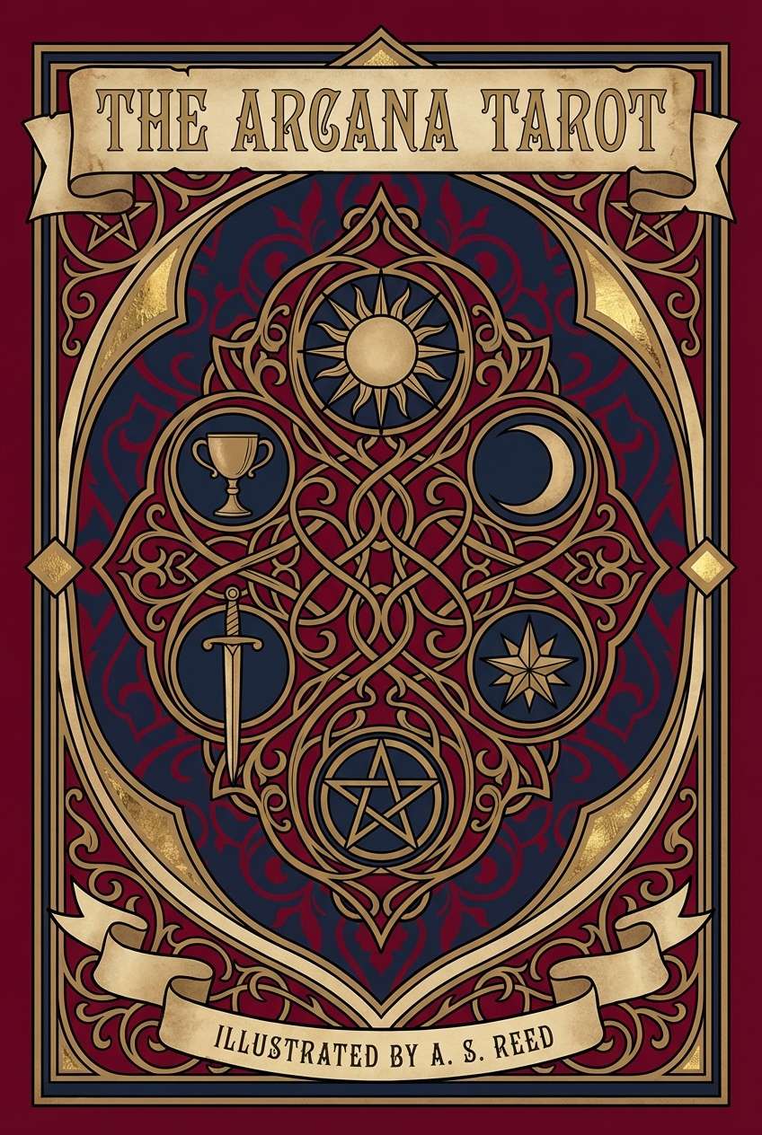
1) Crimson Arcana
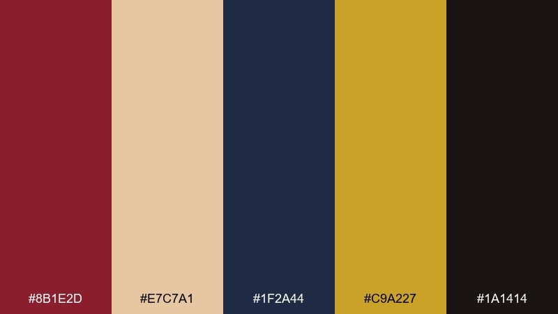
HEX: #8b1e2d #e7c7a1 #1f2a44 #c9a227 #1a1414
Mood: dramatic, regal, mysterious
Best for: tarot deck cover art
Dramatic and regal, it evokes velvet curtains, gilded symbols, and a midnight stage. Use it for tarot deck covers, hero illustrations, or any focal artwork that needs instant gravity. Pair the crimson with deep navy for contrast, then reserve gold for linework and icon accents. Usage tip: keep the black-brown as your shadow tone so the reds stay rich instead of muddy.
Image example of crimson arcana generated using media.io
Media.io is an online AI studio for creating and editing video, image, and audio in your browser.

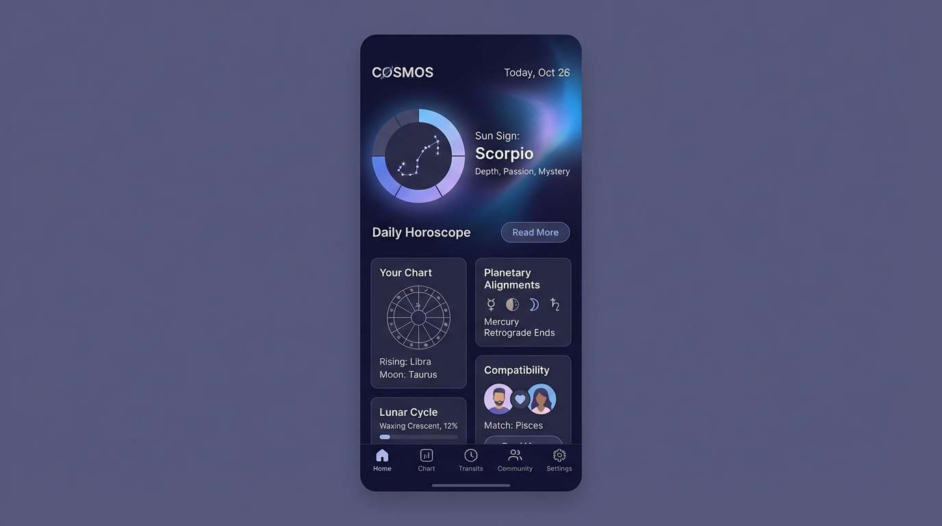
2) Moonlit Indigo
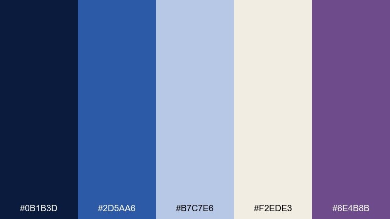
HEX: #0b1b3d #2d5aa6 #b7c7e6 #f2ede3 #6e4b8b
Mood: calm, mystical, celestial
Best for: astrology app UI mockup
Calm and celestial, it feels like moonlight on ink and polished stone. This tarot card color scheme works beautifully for dark-mode UI, horoscope widgets, and gradient charts. Let indigo be the canvas, bring in powder blue for cards and panels, and use violet sparingly for active states. Usage tip: keep body text on the warm off-white to avoid the harshness of pure white.
Image example of moonlit indigo generated using media.io
3) Antique Parchment
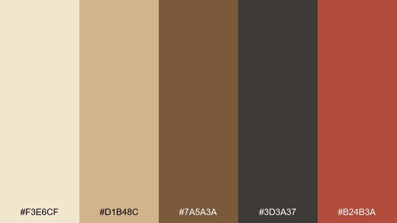
HEX: #f3e6cf #d1b48c #7a5a3a #3d3a37 #b24b3a
Mood: vintage, warm, storybook
Best for: tarot guidebook editorial layout
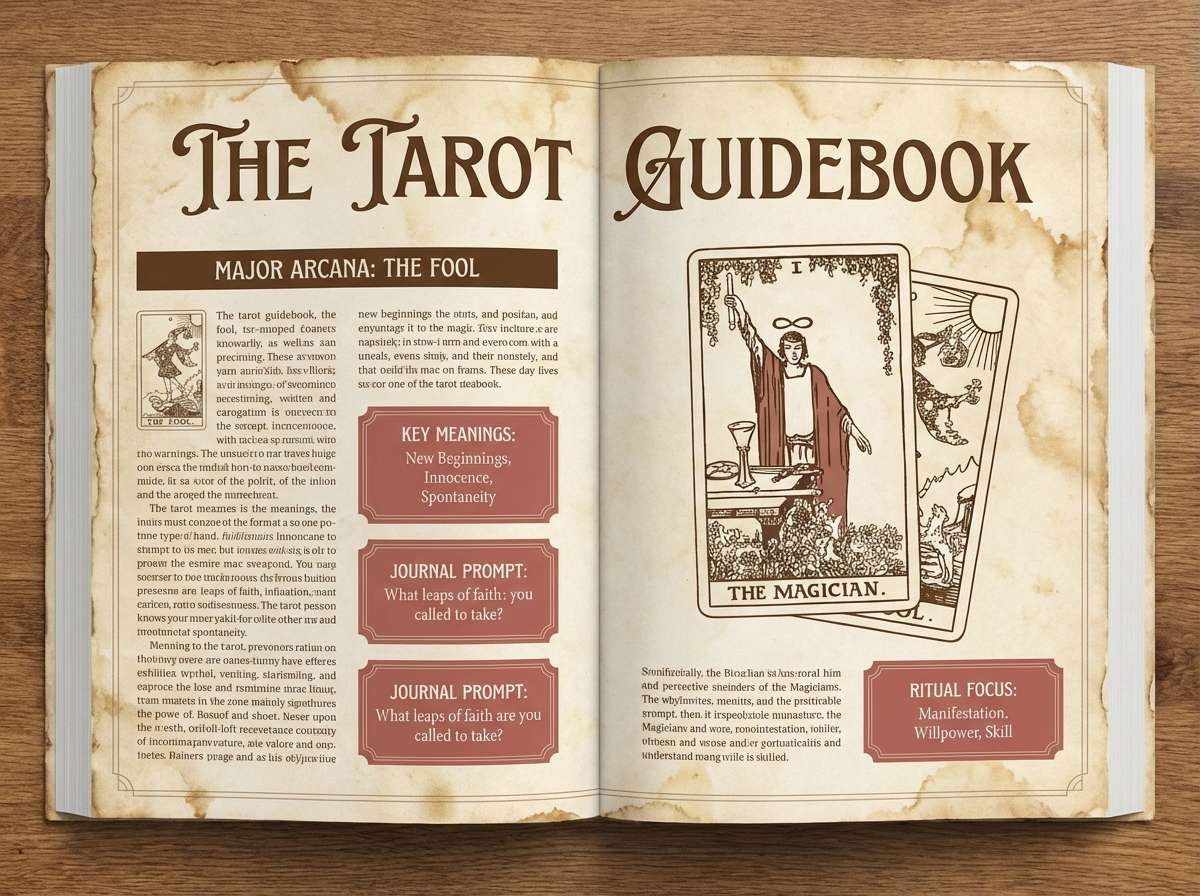
Vintage and bookish, it brings to mind aged paper, leather spines, and handwritten margins. It suits editorial spreads, guidebooks, and long-form tarot notes where readability matters. Use parchment as the base, brown for headings, and the muted red as a callout color for pull quotes or section markers. Usage tip: add plenty of whitespace so the warm neutrals feel intentional, not sepia-heavy.
Image example of antique parchment generated using media.io
4) Celestial Teal
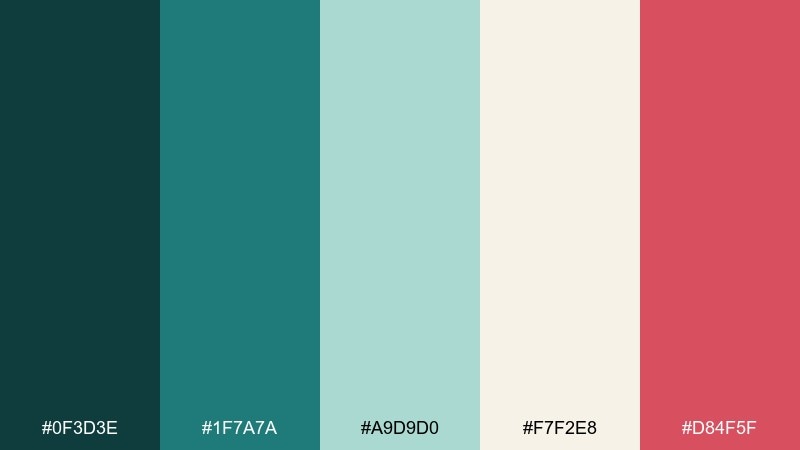
HEX: #0f3d3e #1f7a7a #a9d9d0 #f7f2e8 #d84f5f
Mood: fresh, cosmic, modern
Best for: social posts for a tarot reader
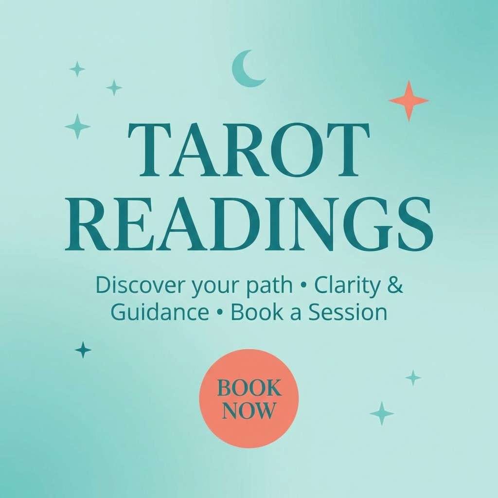
Fresh and cosmic, it feels like sea-glass light cutting through night skies. Teal tones keep layouts modern while the rosy accent adds a spark of fate and drama. Use the pale aqua for text blocks, then highlight key phrases with the coral-red for swipe-stopping contrast. Usage tip: stick to one accent color per post so the feed stays cohesive.
Image example of celestial teal generated using media.io
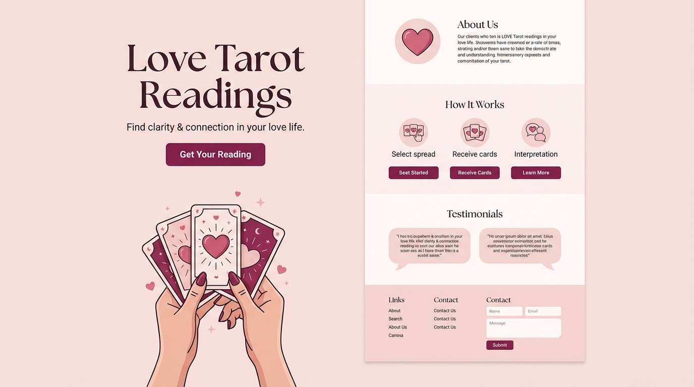
5) Rose Quartz Veil
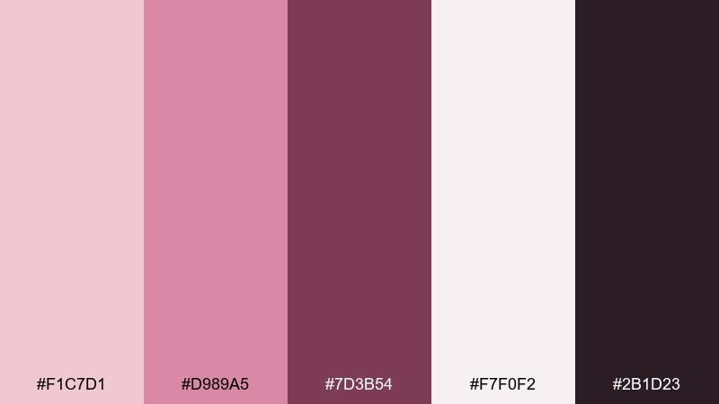
HEX: #f1c7d1 #d989a5 #7d3b54 #f7f0f2 #2b1d23
Mood: romantic, soft, intimate
Best for: love reading landing page
Romantic and intimate, it evokes rose petals, blush candles, and quiet confessions. The soft pinks work well for a love-reading landing page, email headers, or gentle story highlights. Pair the deep berry with near-black for readable buttons and crisp type. Usage tip: keep gradients subtle so the palette stays elegant, not sugary.
Image example of rose quartz veil generated using media.io
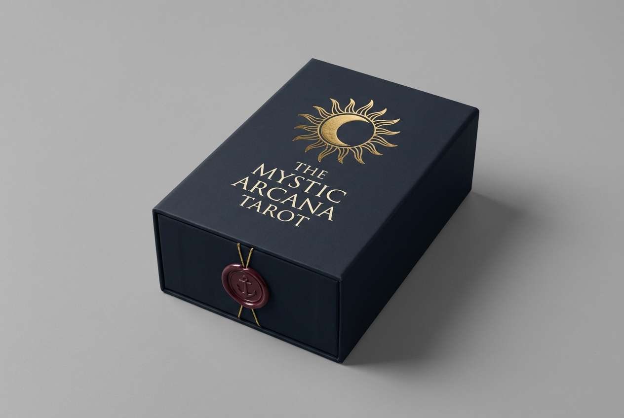
6) Gilded Omen
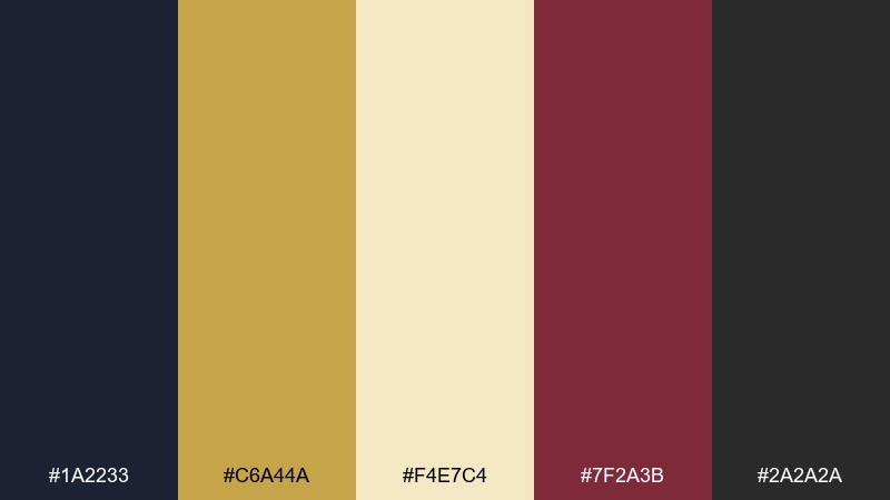
HEX: #1a2233 #c6a44a #f4e7c4 #7f2a3b #2a2a2a
Mood: luxurious, prophetic, bold
Best for: premium tarot deck box packaging
Luxurious and prophetic, it suggests gold foil, lacquered ink, and a dramatic reveal. These tarot card color combinations are made for premium packaging, deck boxes, and branded seals. Use navy or charcoal for the base, then apply the gold and cream for typography and emblem work, saving the wine red for a single focal stamp. Usage tip: simulate foil by keeping gold areas large and clean, not overly detailed.
Image example of gilded omen generated using media.io
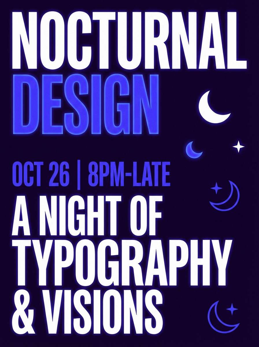
7) Velvet Nightfall
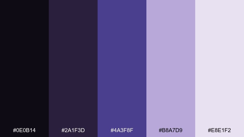
HEX: #0e0b14 #2a1f3d #4a3f8f #b8a7d9 #e8e1f2
Mood: moody, dreamy, nocturnal
Best for: mystic event poster
Moody and nocturnal, it feels like velvet dusk with a violet glow. Use it on posters for readings, moon circles, or late-night livestream schedules where atmosphere sells the message. Pair the near-black with lilac for legible type, and keep the saturated purple for headlines or icons. Usage tip: add subtle grain or a soft gradient to deepen the night-sky effect.
Image example of velvet nightfall generated using media.io
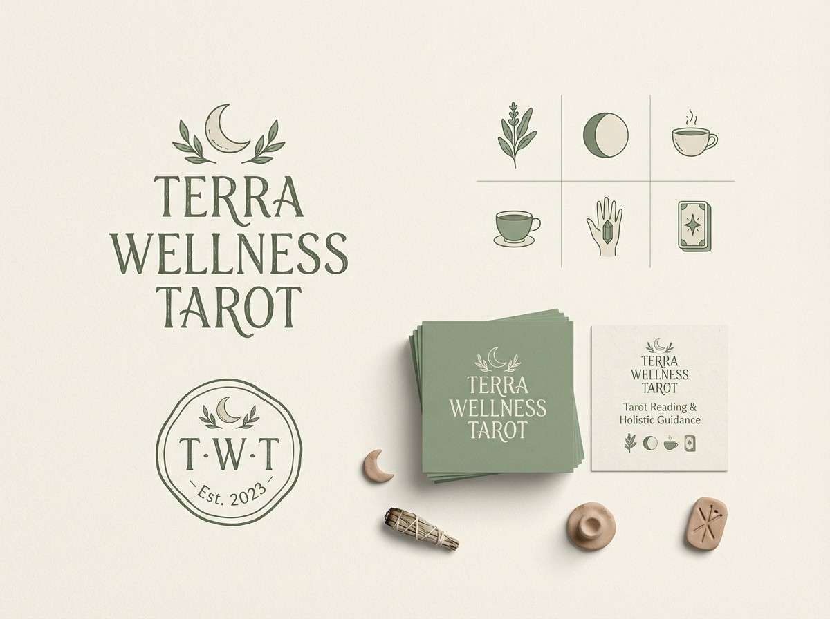
8) Sage Ritual
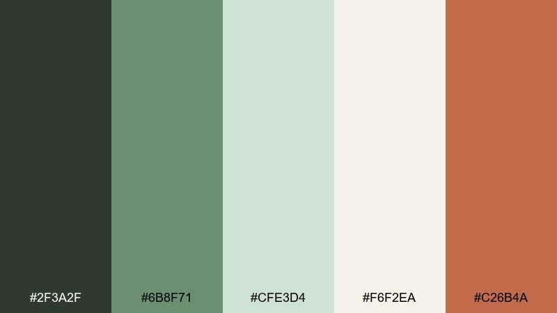
HEX: #2f3a2f #6b8f71 #cfe3d4 #f6f2ea #c26b4a
Mood: grounded, herbal, cleansing
Best for: wellness brand kit for tarot
Grounded and herbal, it brings to mind sage bundles, clean air, and a quiet reset. It fits wellness-forward branding, appointment cards, and earthy product labels. Use the pale mint as the main background, then anchor with forest green and a warm clay accent for buttons or seals. Usage tip: keep the clay tone to small highlights so the greens stay soothing.
Image example of sage ritual generated using media.io
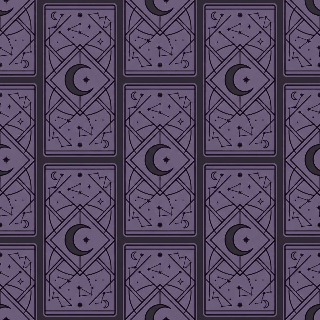
9) Smoky Amethyst
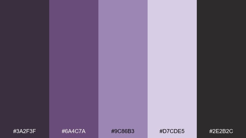
HEX: #3a2f3f #6a4c7a #9c86b3 #d7cde5 #2e2b2c
Mood: enigmatic, soft, shadowy
Best for: card back pattern design
Enigmatic and soft, it feels like incense smoke curling around an amethyst charm. The mid-tone purples are ideal for repeating patterns, card backs, and subtle borders that should not overpower illustrations. Pair the lavender with charcoal for linework and keep the light lilac for micro-details. Usage tip: test the pattern at small scale so it reads clearly when printed.
Image example of smoky amethyst generated using media.io
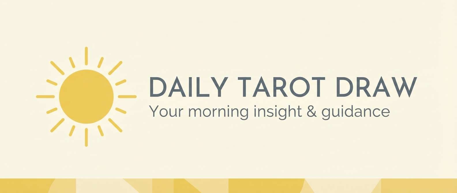
10) Sunlit Citrine
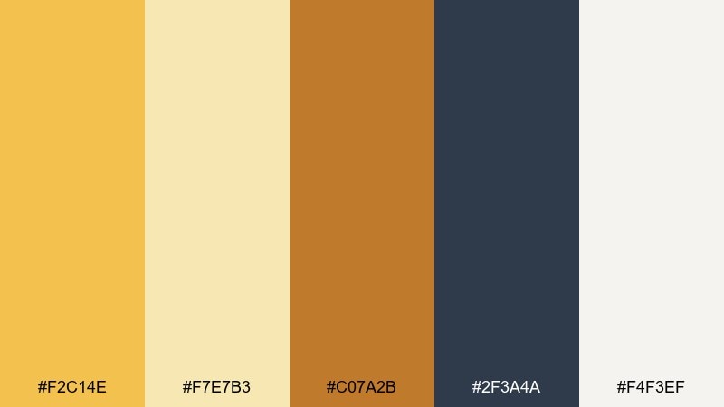
HEX: #f2c14e #f7e7b3 #c07a2b #2f3a4a #f4f3ef
Mood: uplifting, radiant, confident
Best for: daily draw email header
Uplifting and radiant, it evokes citrine crystals and morning light on paper. It works for daily draw email headers, highlight covers, and optimistic call-to-action sections. Use warm yellow for the main banner, then ground it with slate for text and icons. Usage tip: keep the deep tone to thin rules and type so the layout stays bright.
Image example of sunlit citrine generated using media.io
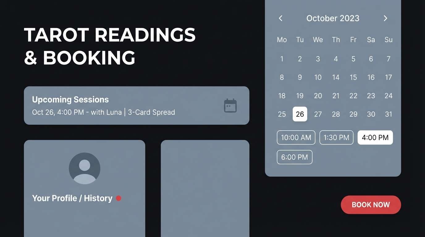
11) Obsidian Ink
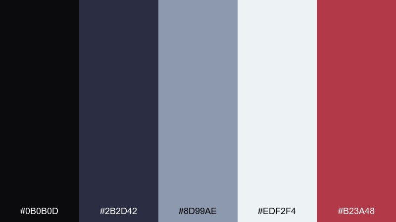
HEX: #0b0b0d #2b2d42 #8d99ae #edf2f4 #b23a48
Mood: sleek, serious, high-contrast
Best for: tarot booking UI
Sleek and serious, it reads like obsidian ink on crisp paper with one sharp red underline. Use it for booking flows, pricing tables, and forms where clarity is non-negotiable. Let the near-black dominate, keep panels in cool gray, and use the red only for primary actions or alerts. Usage tip: ensure contrast meets accessibility standards by avoiding light-gray text on gray panels.
Image example of obsidian ink generated using media.io
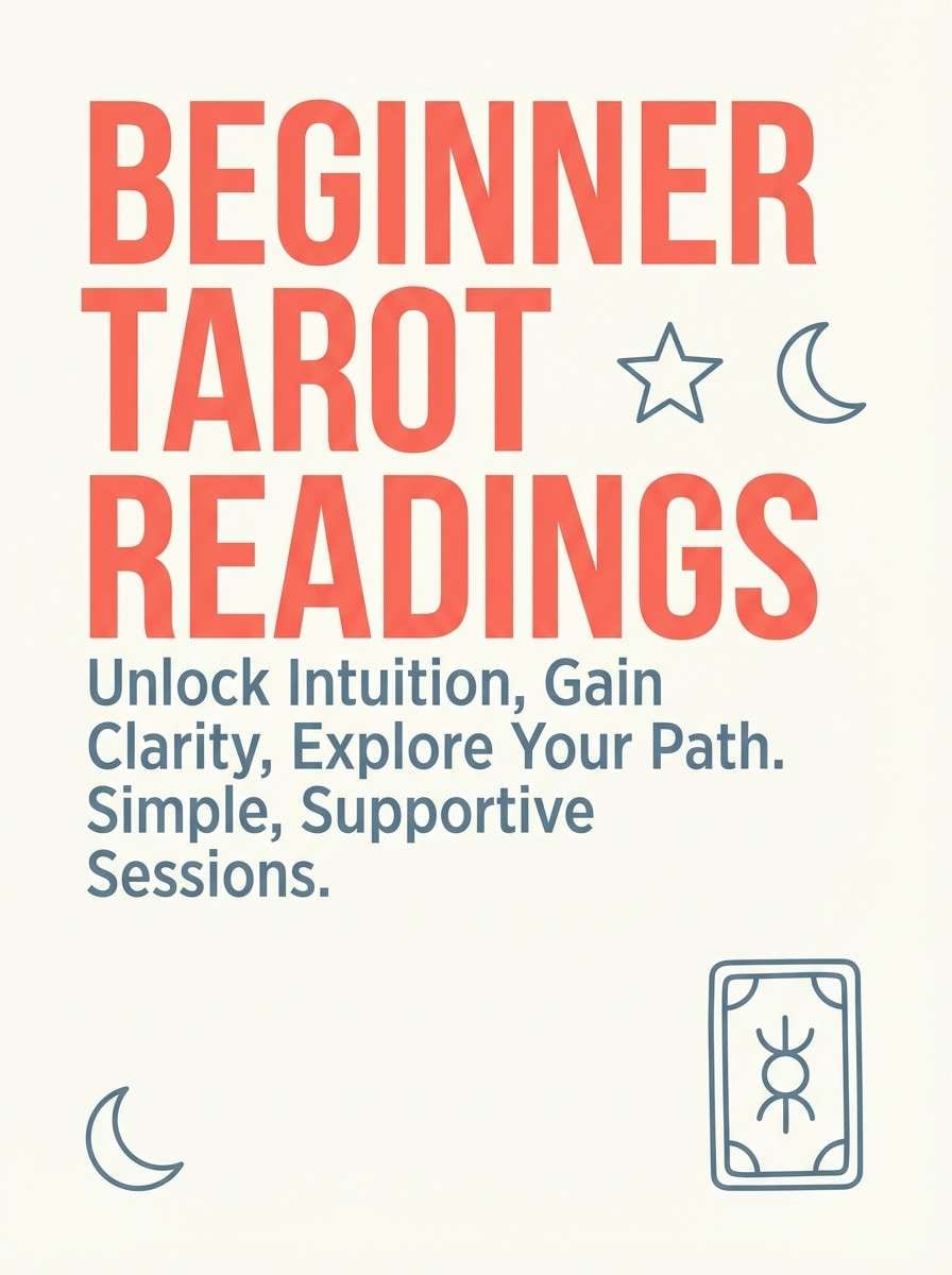
12) Coral Prophecy
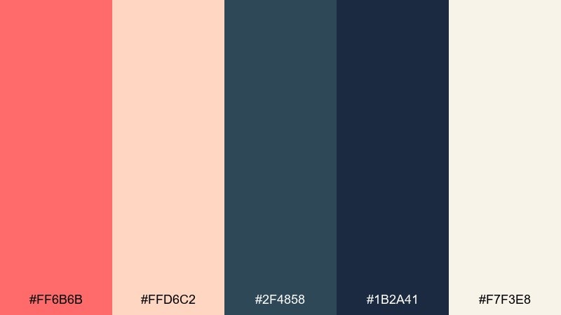
HEX: #ff6b6b #ffd6c2 #2f4858 #1b2a41 #f7f3e8
Mood: playful, modern, inviting
Best for: promo flyer for beginner readings
Playful and inviting, it feels like a modern studio with a warm glow and friendly energy. These tarot card color combinations are great for beginner promos, workshop flyers, and approachable pricing cards. Use coral for headlines, keep the blue-grays for body text, and let the creamy off-white carry the background. Usage tip: stick to two font weights so the palette stays clean and contemporary.
Image example of coral prophecy generated using media.io
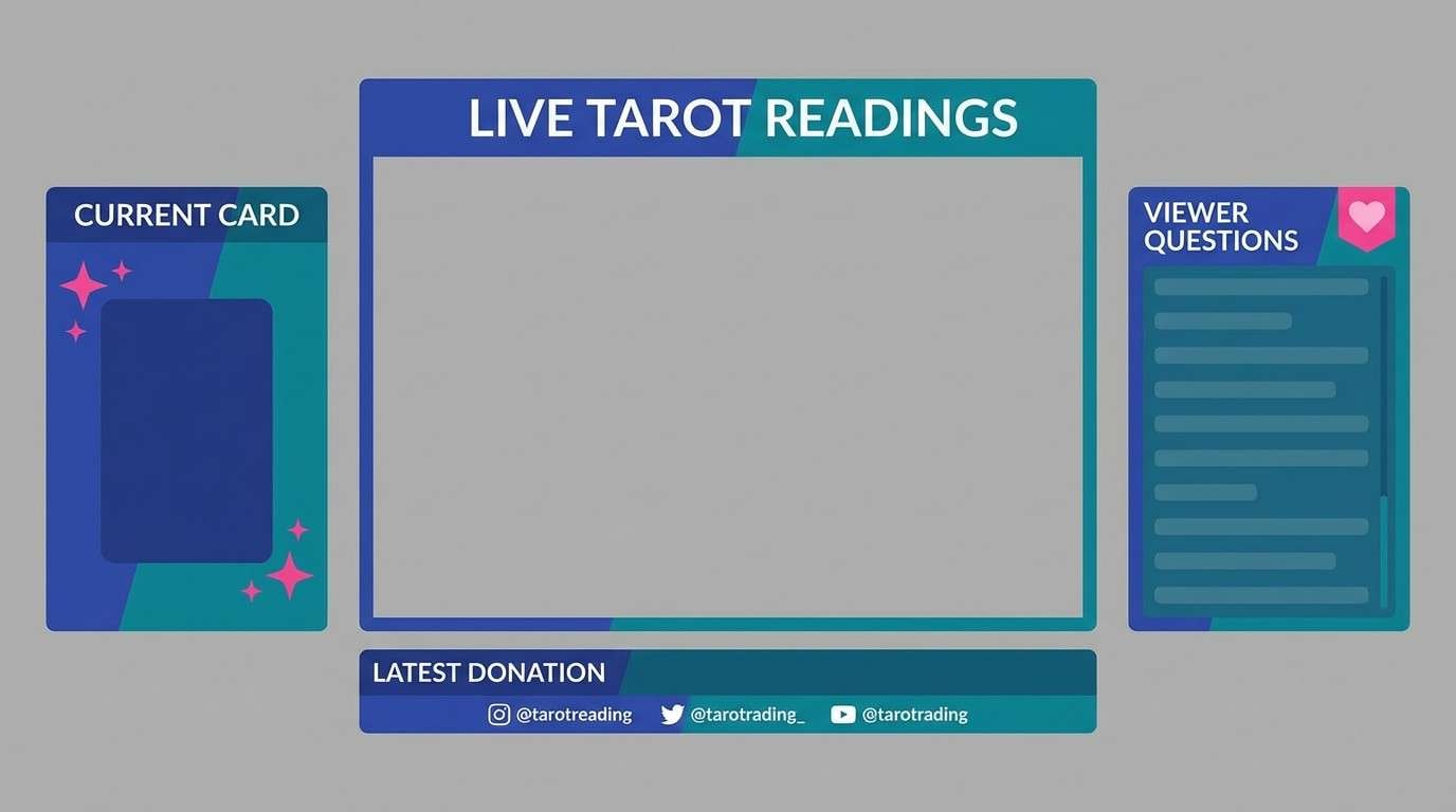
13) Stormy Sapphire
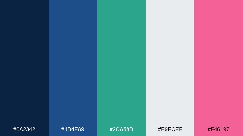
HEX: #0a2342 #1d4e89 #2ca58d #e9ecef #f46197
Mood: electric, bold, adventurous
Best for: stream overlay for live readings
Electric and adventurous, it evokes storm clouds, bright sapphire, and neon sparks of intuition. Use it for stream overlays, lower-thirds, and schedule graphics that need to pop on-screen. Pair sapphire with teal for panels and keep the hot pink only for live indicators or key labels. Usage tip: reserve the light gray for text areas so small type stays readable over dark blues.
Image example of stormy sapphire generated using media.io
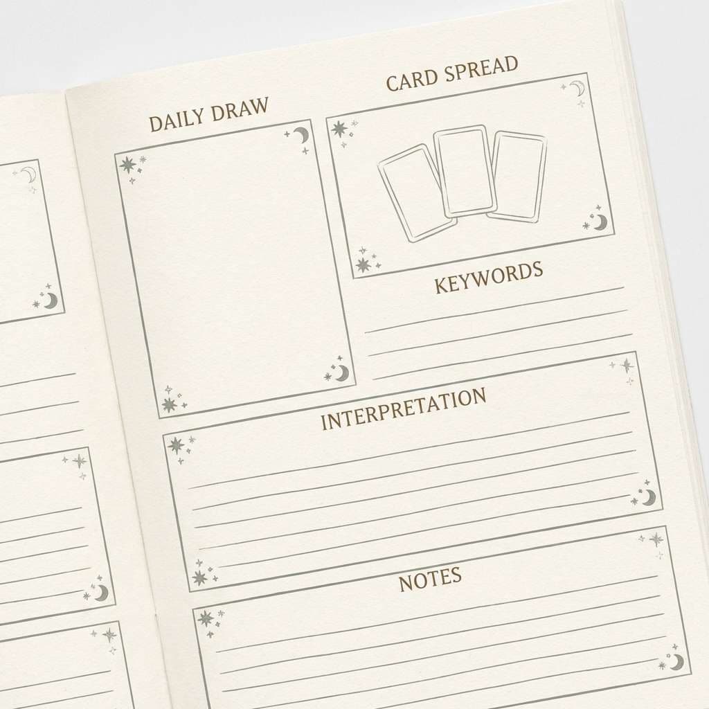
14) Mystic Sepia
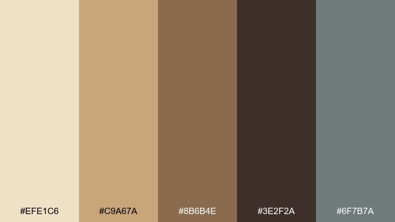
HEX: #efe1c6 #c9a67a #8b6b4e #3e2f2a #6f7b7a
Mood: nostalgic, earthy, scholarly
Best for: tarot journal printable
Nostalgic and scholarly, it feels like an old archive with quiet, earthy restraint. It suits printables for tarot journals, trackers, and spreads where you want structure without harsh contrast. Use the cream as the page, sepia for headings, and the muted gray-green for dividers and checkmarks. Usage tip: keep ink coverage low for home printers by using lighter tints for large blocks.
Image example of mystic sepia generated using media.io
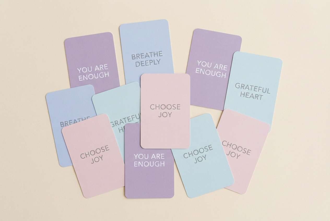
15) Lavender Aura
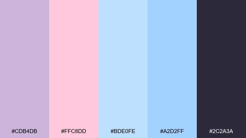
HEX: #cdb4db #ffc8dd #bde0fe #a2d2ff #2c2a3a
Mood: airy, gentle, dreamy
Best for: affirmation card set
Airy and dreamy, it evokes a soft aura glow with pastel light drifting across the page. It works well for affirmation cards, gentle guidance decks, and calming quote graphics. Pair lavender and baby blue as the main blocks, then use the deep charcoal for crisp type. Usage tip: keep backgrounds matte and flat so the pastels print cleanly without banding.
Image example of lavender aura generated using media.io
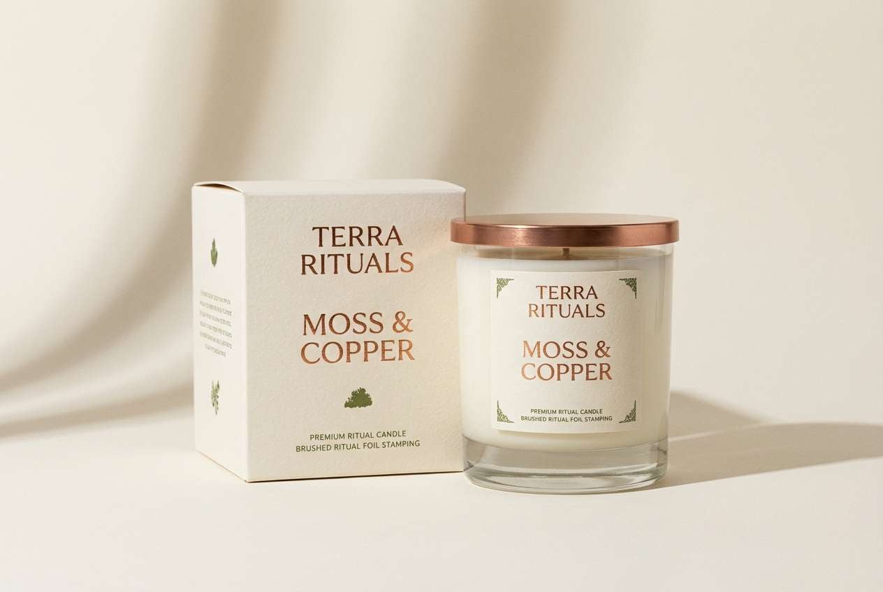
16) Copper Chalice
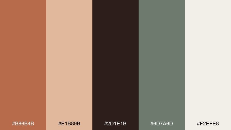
HEX: #b86b4b #e1b89b #2d1e1b #6d7a6d #f2efe8
Mood: artisan, grounded, cozy
Best for: candle label for ritual kits
Artisan and cozy, it suggests hammered copper, warm wax, and an herbal apothecary shelf. It is ideal for candle labels, ritual kits, and earthy product storytelling. Use copper as the hero tone, keep cream for the label base, and bring in mossy green for scent notes or ingredient badges. Usage tip: avoid pure black and use the deep brown instead for a softer, handcrafted feel.
Image example of copper chalice generated using media.io
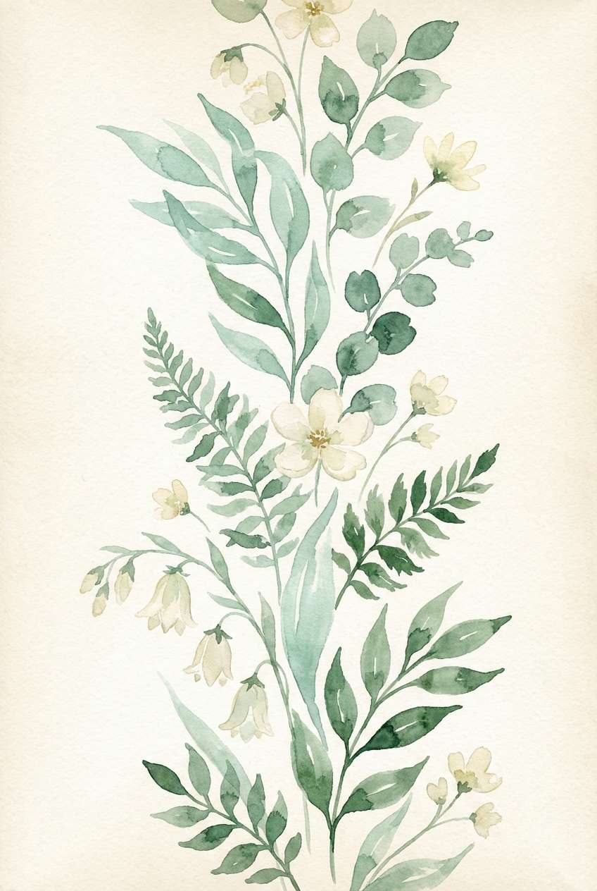
17) Seafoam Oracle
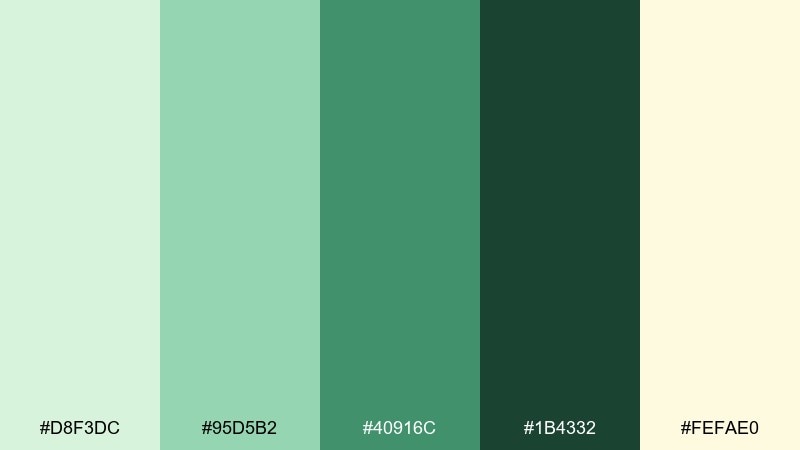
HEX: #d8f3dc #95d5b2 #40916c #1b4332 #fefae0
Mood: fresh, natural, optimistic
Best for: watercolor botanical tarot illustration
Fresh and natural, it feels like seafoam mist and new leaves after rain. The greens are perfect for botanical tarot motifs, nature-based decks, and spring-themed illustrations. Use the pale mint for washes, deepen with forest green for stems and shadows, and keep the creamy yellow as a light source. Usage tip: limit hard outlines so the watercolor look stays airy.
Image example of seafoam oracle generated using media.io
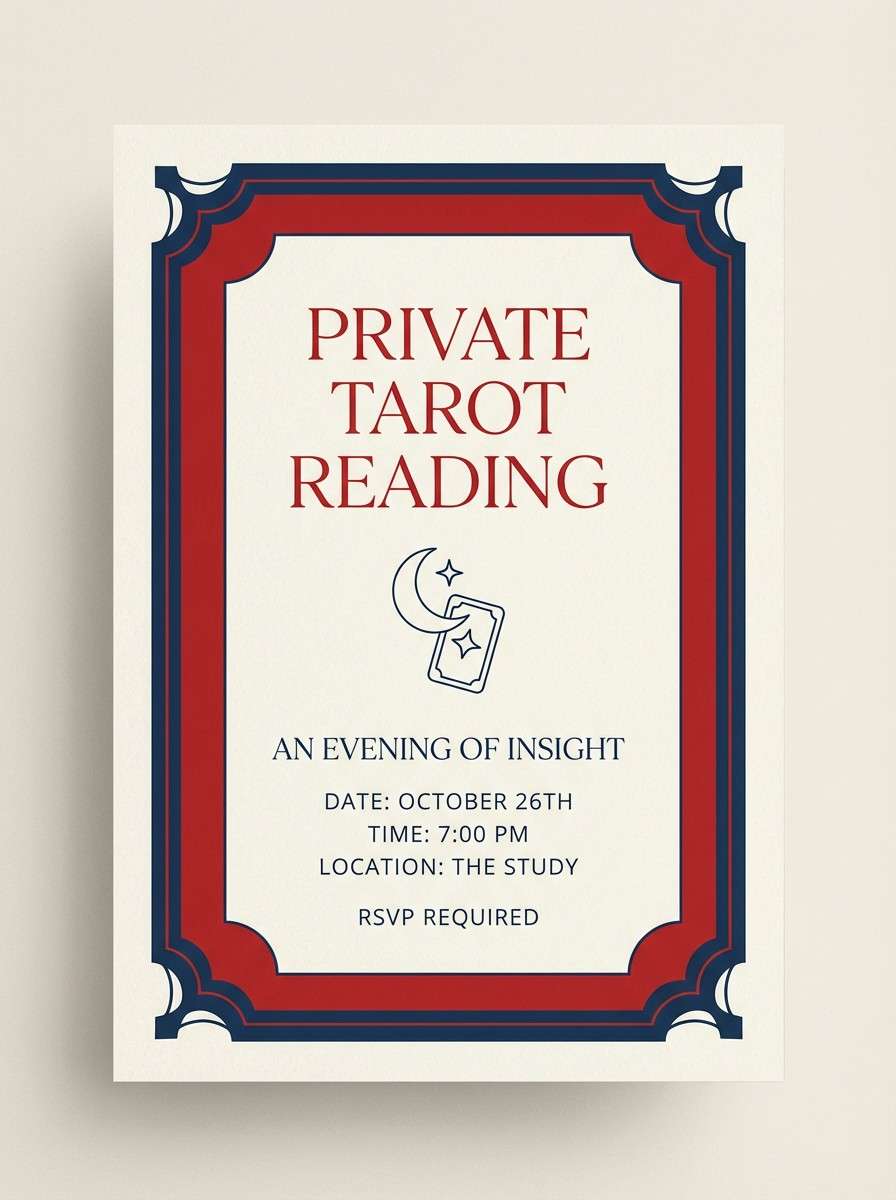
18) Scarlet Altar
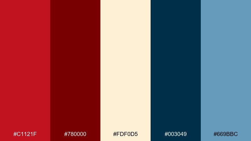
HEX: #c1121f #780000 #fdf0d5 #003049 #669bbc
Mood: intense, ceremonial, cinematic
Best for: tarot reading invitation
Intense and ceremonial, it evokes a candlelit altar with a crisp, nautical-blue counterpoint. The contrast makes it strong for invitations, private-session cards, and bold headlines. Use scarlet for the focal message, set details on the warm cream, and bring in the blue tones for borders and secondary panels. Usage tip: keep the darkest red for small elements so it does not overpower the layout.
Image example of scarlet altar generated using media.io
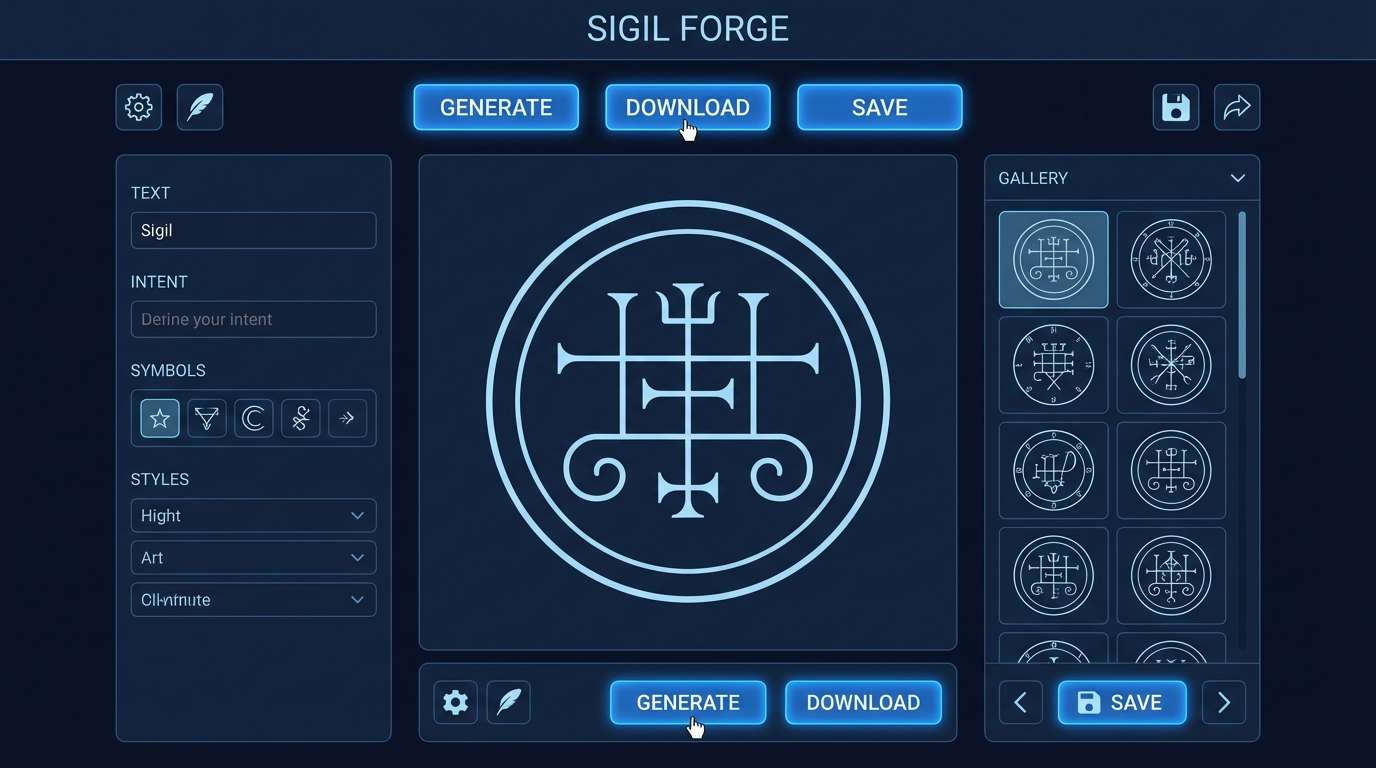
19) Blue Flame Sigil
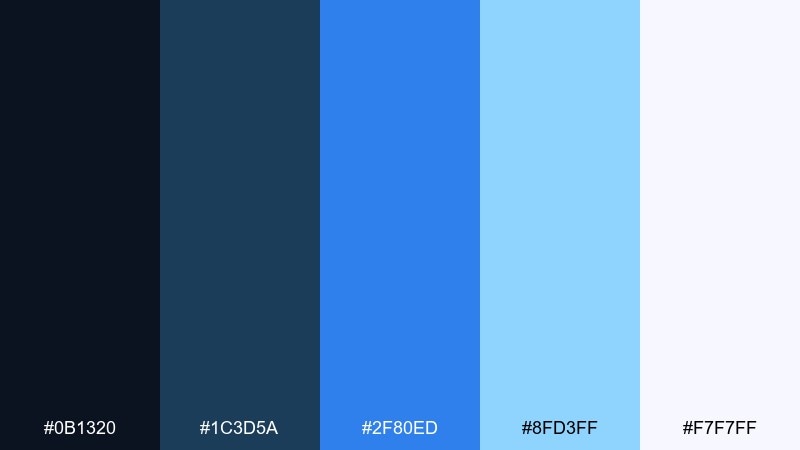
HEX: #0b1320 #1c3d5a #2f80ed #8fd3ff #f7f7ff
Mood: focused, mystical, tech-forward
Best for: sigil generator web app UI
Focused and tech-forward, it feels like blue flame tracing a sigil across dark glass. It fits a web app UI, tool dashboards, and interactive generators where you want mystical vibes without clutter. Use the deep midnight as the base, make electric blue the primary action color, and keep the pale sky tone for sliders and highlights. Usage tip: apply the brightest blue to only one action per screen to guide attention.
Image example of blue flame sigil generated using media.io
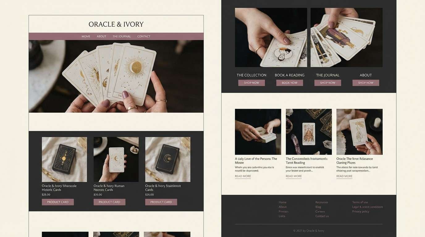
20) Ivory Eclipse
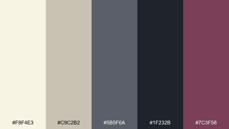
HEX: #f8f4e3 #c9c2b2 #5b5f6a #1f232b #7c3f58
Mood: minimal, elegant, enigmatic
Best for: luxury tarot brand homepage
Minimal and enigmatic, it evokes an eclipse edge: soft ivory light fading into graphite shadow. For a luxury site, this tarot card color palette keeps typography refined while still feeling mystical. Use ivory for the canvas, charcoal for navigation and footer depth, and the mauve tone for subtle links or micro-accents. Usage tip: choose one serif display font and one clean sans to keep the mood elevated and readable.
Image example of ivory eclipse generated using media.io
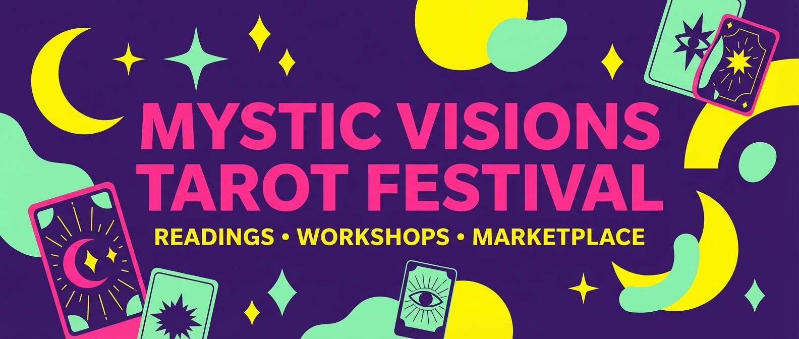
21) Astral Carnival
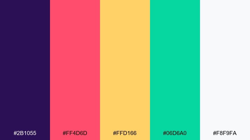
HEX: #2b1055 #ff4d6d #ffd166 #06d6a0 #f8f9fa
Mood: whimsical, vibrant, celebratory
Best for: festival booth banner for readings
Whimsical and celebratory, it feels like a cosmic carnival sign glowing at dusk. The vibrant mix is great for booth banners, pop-up signage, and bold promo graphics that must be seen from a distance. Use purple as the base, let pink carry the headline, and keep yellow and mint as secondary accents for icons and stickers. Usage tip: avoid tiny details and use thick shapes so the colors stay clear when printed large.
Image example of astral carnival generated using media.io
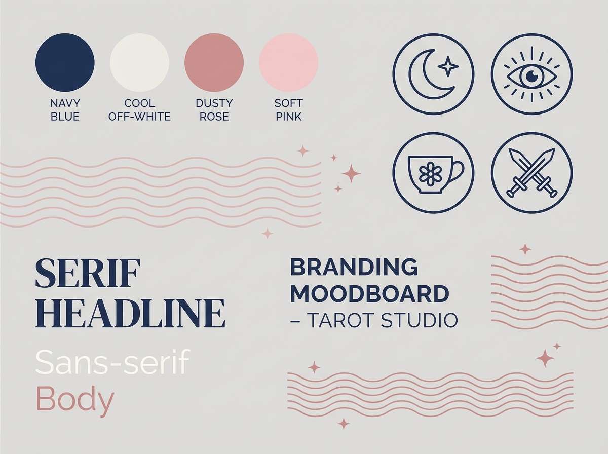
22) Dusk Rose Navy
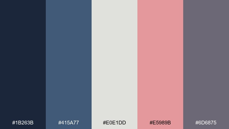
HEX: #1b263b #415a77 #e0e1dd #e5989b #6d6875
Mood: romantic, refined, balanced
Best for: brand moodboard for tarot studio
Refined and balanced, it evokes dusk skies with a rose blush drifting across the horizon. Use it for a moodboard, brand guidelines, or a cohesive identity system that feels modern yet soft. Pair navy with the cool gray-white for structure, then use the rose as an accent on stamps, highlights, or social templates. Usage tip: keep rose to about ten percent of the layout for an understated, premium finish.
Image example of dusk rose navy generated using media.io
What Colors Go Well with Tarot Card?
Tarot visuals usually look best with a high-contrast foundation: a dark “night” base (near-black, indigo, navy) plus a light “paper” tone (ivory, parchment, warm off-white). This keeps symbols and linework readable and instantly mystical.
For accents, metallic-like golds and warm reds are classic because they echo foil stamping, candles, and ritual. If you want a modern twist, try teal, coral, or electric blue—just keep them to small highlights so the palette still feels intentional.
Neutrals are the glue. Soft grays, browns, and muted greens help balance saturated colors, especially when you’re designing guides, journals, or UIs that need long-term readability.
How to Use a Tarot Card Color Palette in Real Designs
Start by assigning roles: one background color, one surface/panel color, one text color, and one accent. Tarot palettes shine when the hierarchy is clear—your symbols and headlines should “appear” like a reading reveal.
In print, simulate tactile materials with restraint: use gold as linework or emblem shapes, keep large dark areas clean, and let warm neutrals act like paper. In digital, test contrast on small text and buttons so the mystical mood doesn’t sacrifice usability.
Finally, keep your imagery consistent. If your palette is moody (indigo, charcoal, violet), use soft gradients or grain; if it’s bright (citrine, coral, carnival tones), use bold flat shapes and thicker icons.
Create Tarot Card Palette Visuals with AI
If you already have HEX codes, you can turn them into tarot-style mockups quickly by describing the layout (cover art, UI, poster, packaging) and the dominant colors. The key is to specify the vibe (mystical, vintage, luxe) plus the composition (centered emblem, clean grid, minimal icons).
Media.io makes it easy to generate consistent visuals for a whole series—swap only one accent color per concept, reuse the same prompt structure, and iterate until the set feels like a cohesive deck or brand system.
Tarot Card Color Palette FAQs
-
What is a tarot card color palette?
A tarot card color palette is a curated set of colors (often 4–6 tones) designed to evoke mystical, symbolic, and ritual-like aesthetics—commonly pairing dark bases with parchment lights and a bold accent for iconography. -
Which tarot colors feel the most “classic”?
Deep reds/wines, midnight blues/indigos, parchment ivories, and gold accents are the most classic because they resemble candlelit scenes, aged paper, and foil stamping used in traditional decks. -
How do I choose the right palette for my tarot brand?
Pick a base that matches your tone (dark for mysterious, light for minimal), then add one signature accent (gold, coral, teal, or rose). Build consistency by using the accent on buttons, seals, and key highlights across every asset. -
Are tarot palettes good for UI design and apps?
Yes—especially dark-mode UIs. Use one deep background, one lighter surface color for cards/panels, and one high-contrast text color. Keep bright accents limited to primary actions to maintain a premium, mystical feel. -
How can I make a tarot palette look luxurious?
Use a dark base (navy/charcoal), a creamy off-white for typography, and a gold-like tone for emblems and borders. Keep details large and clean to mimic foil, and avoid too many competing accents. -
What’s the best way to keep tarot designs readable?
Prioritize contrast: dark text on light parchment or light text on deep indigo. Avoid low-contrast gray-on-gray combinations, and test small type on both mobile and print proofs. -
Can I generate tarot palette mockups with AI?
Yes. Use prompts that specify the design type (deck cover, poster, UI, packaging), the dominant tones, and constraints like “flat graphic illustration” or “clean grid,” then iterate by swapping only one color at a time.
Next: Red Blue Color Palette


