

Red and blue is one of the most reliable pairings in modern design: bold enough to grab attention, but structured enough to feel trustworthy.
Below you’ll find red blue color palette ideas with HEX codes for UI, branding, posters, and more—plus practical tips for contrast, accents, and readable type.
In this article
- Why Red Blue Palettes Work So Well
-
- crimson navy
- cherry ice
- retro athletics
- harbor lights
- velvet flag
- winter sunrise
- neon arcade
- rose denim
- marinara bay
- rocket pop
- canyon dusk
- studio contrast
- botanical tide
- opera house
- signal system
- picnic nautical
- night shift
- coral blueprint
- glacier cherry
- minimal patriot
- festival badge
- ceramic coast
- code and cherry
- airshow poster
- library lantern
- What Colors Go Well with Red Blue?
- How to Use a Red Blue Color Palette in Real Designs
- Create Red Blue Palette Visuals with AI
Why Red Blue Palettes Work So Well
Red and blue naturally create strong visual hierarchy: blue tends to feel stable and “structural,” while red is attention-grabbing and action-oriented. Together, they make it easy to guide users from layout to headline to call-to-action.
As a red blue color scheme, the pair also spans temperature and emotion. Blue cools and calms, while red energizes—so you can tune the mood from professional to playful by shifting saturation, darkness, and how much neutral space you leave.
From an accessibility standpoint, many red/blue combinations can achieve high contrast—especially when supported by near-black, off-white, and grays. That makes red and blue tones practical for UI, signage, and poster typography when used with intent.
20+ Red Blue Color Palette Ideas (with HEX Codes)
1) Crimson Navy
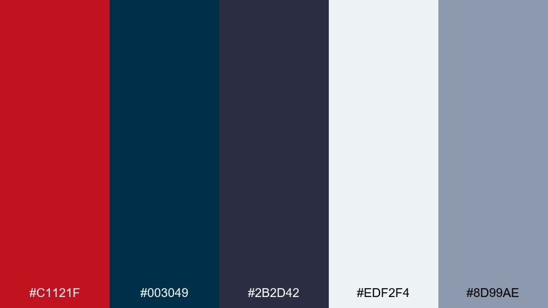
HEX: #C1121F #003049 #2B2D42 #EDF2F4 #8D99AE
Mood: bold, classic, confident
Best for: corporate branding and website headers
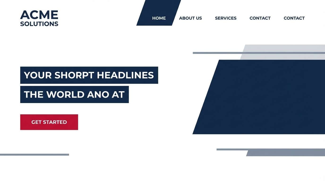
Bold and classic like a tailored blazer against a night sky, these tones feel confident and authoritative. Use the deep navy for backgrounds and the crimson for calls to action so contrast stays crisp. Pair with cool grays and plenty of white space to keep it premium rather than loud. Usage tip: reserve the brightest red for one action per screen to avoid visual fatigue.
Image example of crimson navy generated using media.io
Media.io is an online AI studio for creating and editing video, image, and audio in your browser.

2) Cherry Ice
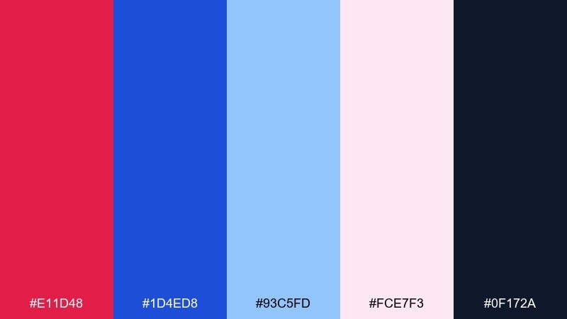
HEX: #E11D48 #1D4ED8 #93C5FD #FCE7F3 #0F172A
Mood: fresh, playful, high-contrast
Best for: social media templates and creator thumbnails
Fresh and playful like cherry sorbet over crushed ice, this mix pops without turning neon. Let the bright blue carry large shapes while the cherry red punctuates badges, prices, or key words. Soft pink and light blue act as safe background fills that still feel on-theme. Usage tip: add a thin dark outline for text placed on the pastel tints to keep readability.
Image example of cherry ice generated using media.io
3) Retro Athletics
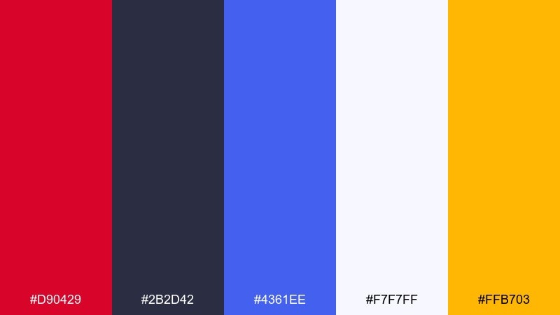
HEX: #D90429 #2B2D42 #4361EE #F7F7FF #FFB703
Mood: energetic, sporty, vintage
Best for: sports posters and team merch graphics
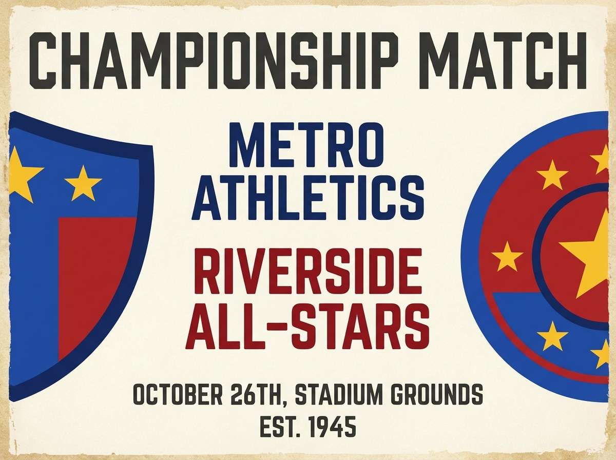
Energetic and sporty with a vintage scoreboard vibe, the colors feel ready for kickoff. Use the inky charcoal for big type and keep the red and royal blue as competing accent blocks for impact. A warm yellow works best as a tiny highlight for numbers, icons, or stitch details. Usage tip: keep gradients out and lean on hard edges to preserve the retro athletic look.
Image example of retro athletics generated using media.io
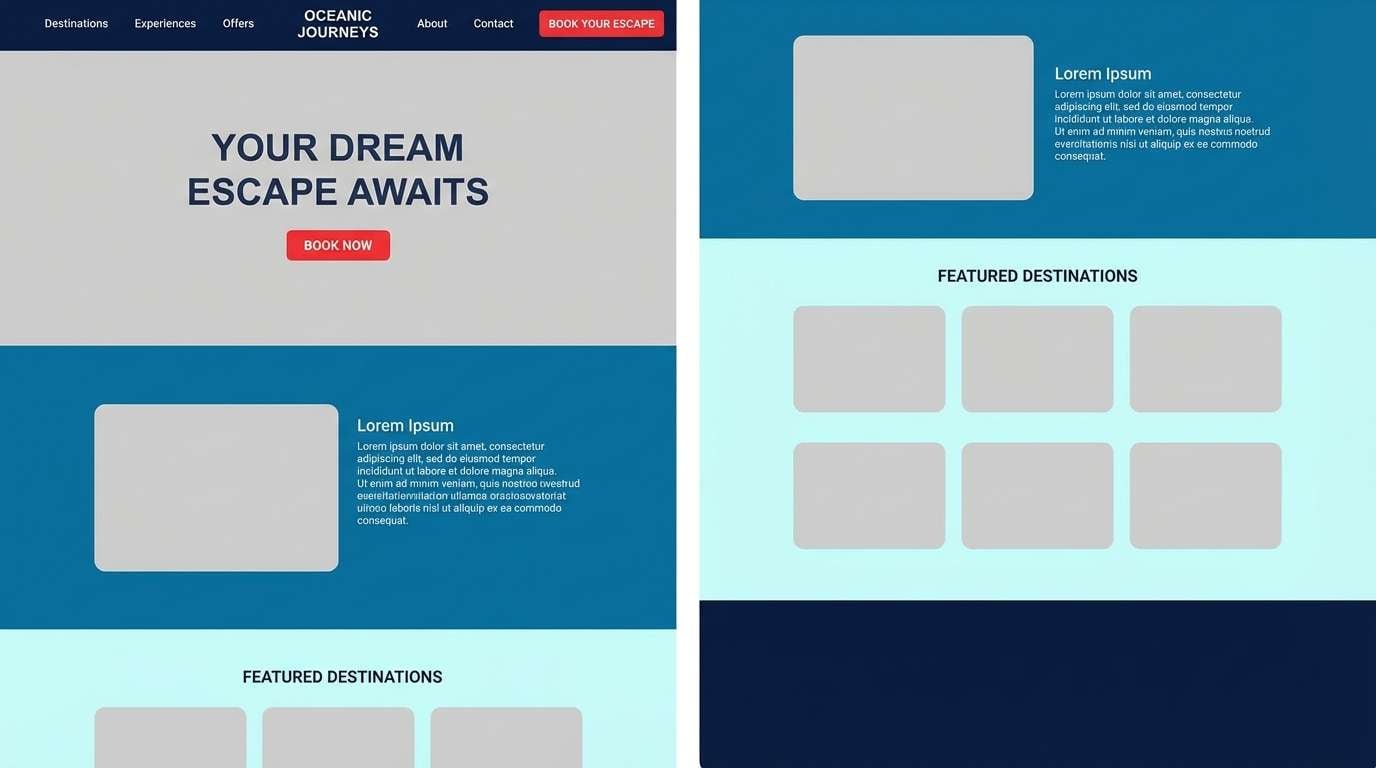
4) Harbor Lights
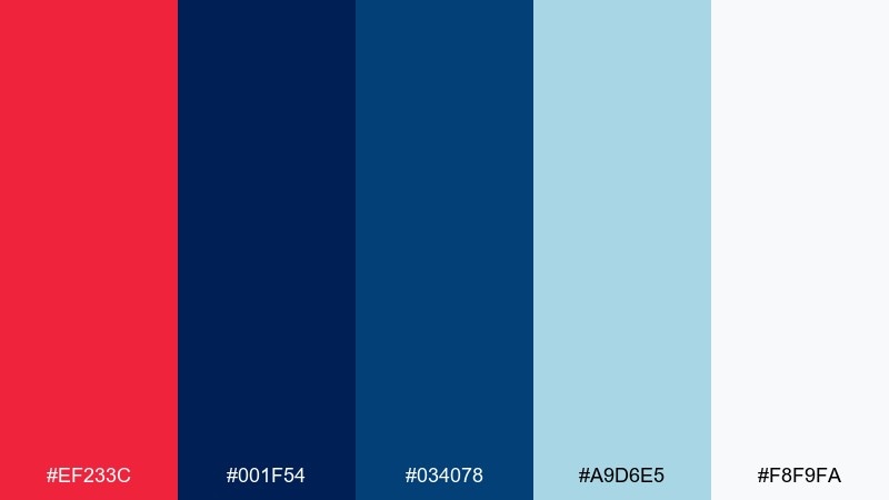
HEX: #EF233C #001F54 #034078 #A9D6E5 #F8F9FA
Mood: nautical, crisp, modern
Best for: travel landing pages and hotel branding
Crisp and nautical like harbor lights reflected on dark water, this pairing feels clean and modern. Use the deep blues for wide sections and navigation, then drop in red as a small, confident accent for booking buttons. The pale aqua supports airy imagery and keeps the page feeling coastal rather than heavy. Usage tip: pick one blue for primary surfaces and keep the other for hover states or secondary panels.
Image example of harbor lights generated using media.io
5) Velvet Flag
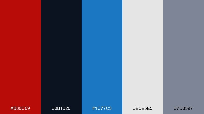
HEX: #B80C09 #0B1320 #1C77C3 #E5E5E5 #7D8597
Mood: moody, refined, dramatic
Best for: editorial layouts and book covers
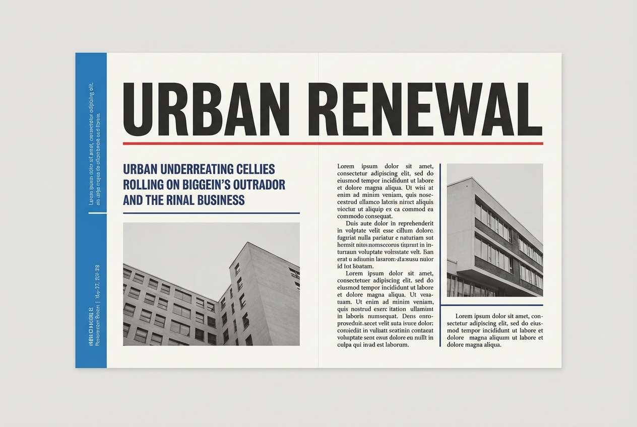
Moody and refined like velvet drapes under stage light, these tones add drama without losing legibility. Anchor the layout with near-black and use blue for structured elements like rules, captions, and pull quotes. The red works best as a spotlight on titles or a single illustration detail. Usage tip: keep body text on light gray instead of pure white to reduce glare in long reads.
Image example of velvet flag generated using media.io
6) Winter Sunrise
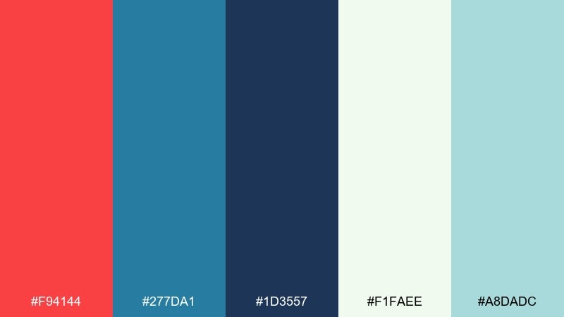
HEX: #F94144 #277DA1 #1D3557 #F1FAEE #A8DADC
Mood: optimistic, airy, calming
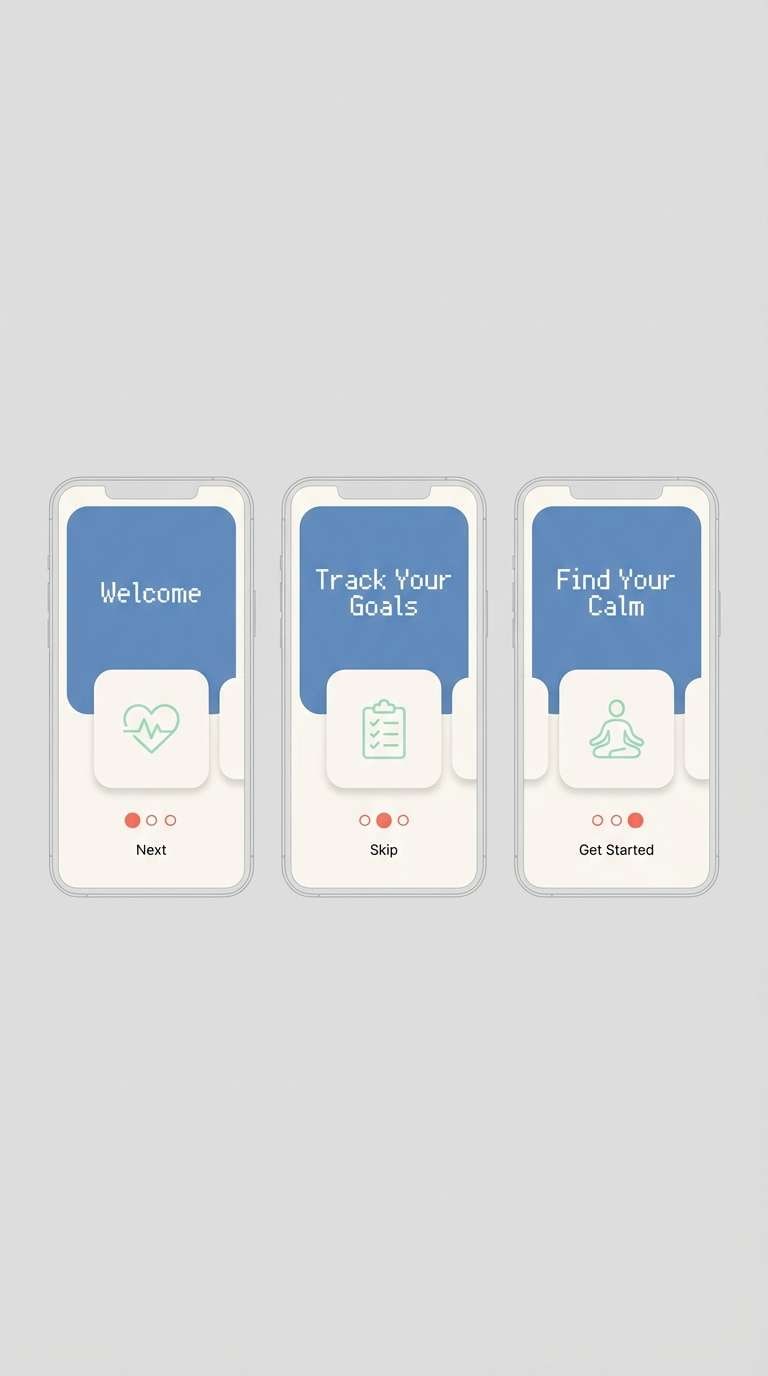
Best for: wellness apps and onboarding screens
Optimistic and airy like a winter sunrise over a frozen lake, the mix feels calm yet motivating. Use the cool blues for primary UI surfaces and bring the warm red in for progress, confirmations, or small badges. Minty aqua and soft off-white help onboarding screens feel friendly and breathable. Usage tip: for accessibility, pair red text only on the off-white and avoid placing it on aqua.
Image example of winter sunrise generated using media.io
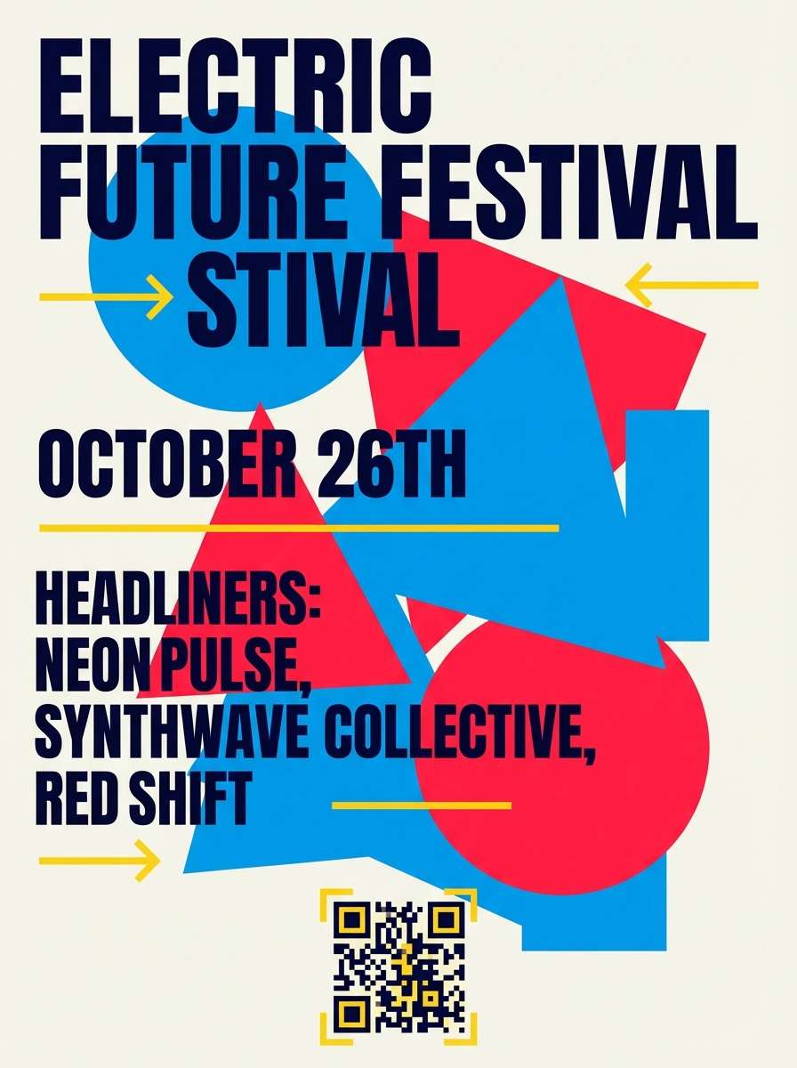
7) Neon Arcade
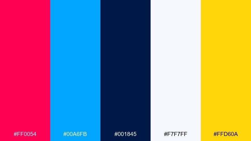
HEX: #FF0054 #00A6FB #001845 #F7F7FF #FFD60A
Mood: electric, youthful, high-energy
Best for: event flyers and music posters
Electric and youthful like an arcade sign buzzing at midnight, the colors demand attention fast. Let the bright blue take the largest background shapes and use hot red for the headline or date. A small hit of yellow adds that ticket-stub sparkle when used on icons or separators. Usage tip: keep text blocks on the near-navy so the brights stay punchy without vibrating.
Image example of neon arcade generated using media.io
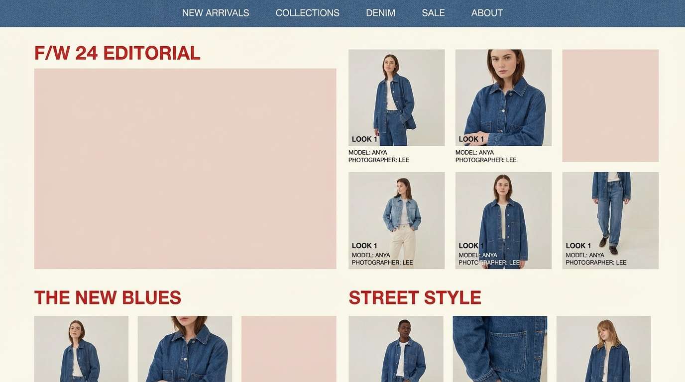
8) Rose Denim
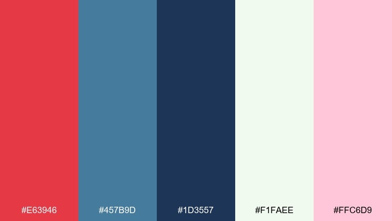
HEX: #E63946 #457B9D #1D3557 #F1FAEE #FFC6D9
Mood: soft, stylish, approachable
Best for: fashion lookbooks and lifestyle blogs
Soft and stylish like a rose-tinted scarf paired with worn denim, this set feels approachable and modern. Use the denim blue for navigation and sidebars, then let red headline accents guide the eye through sections. The blush tint works well behind product grids or quote cards without overpowering photography. Usage tip: keep saturation moderate on images so the palette stays the hero.
Image example of rose denim generated using media.io
9) Marinara Bay
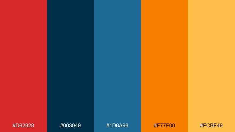
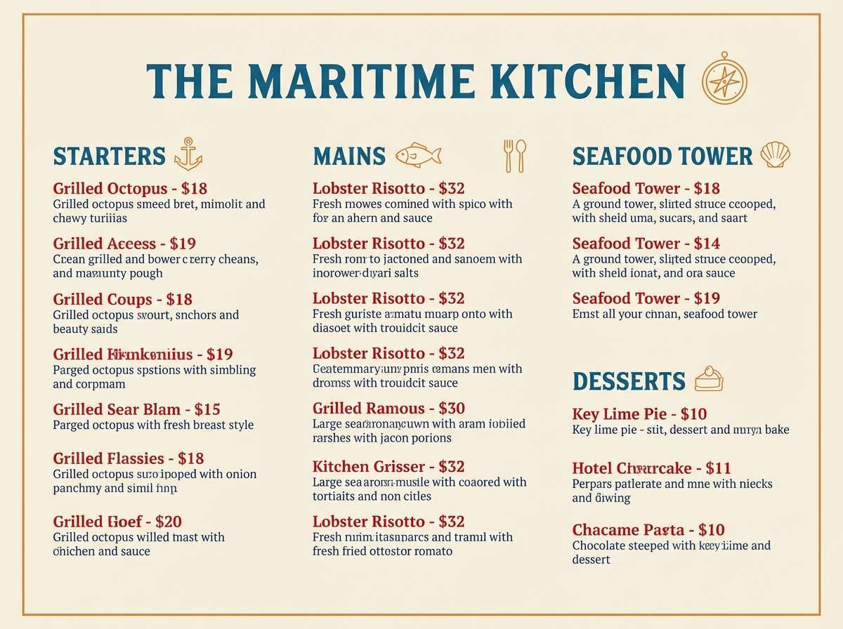
HEX: #D62828 #003049 #1D6A96 #F77F00 #FCBF49
Mood: warm, appetizing, lively
Best for: food packaging and restaurant menus
Warm and appetizing like marinara simmering beside a cool seaside breeze, the colors feel lively and bold. Use navy and ocean blue for structure on menus while red highlights featured dishes and prices. The oranges can act as secondary accents for spice levels, callouts, or category tabs. Usage tip: print tests matter here, so adjust the red slightly darker if it bleeds on uncoated paper.
Image example of marinara bay generated using media.io
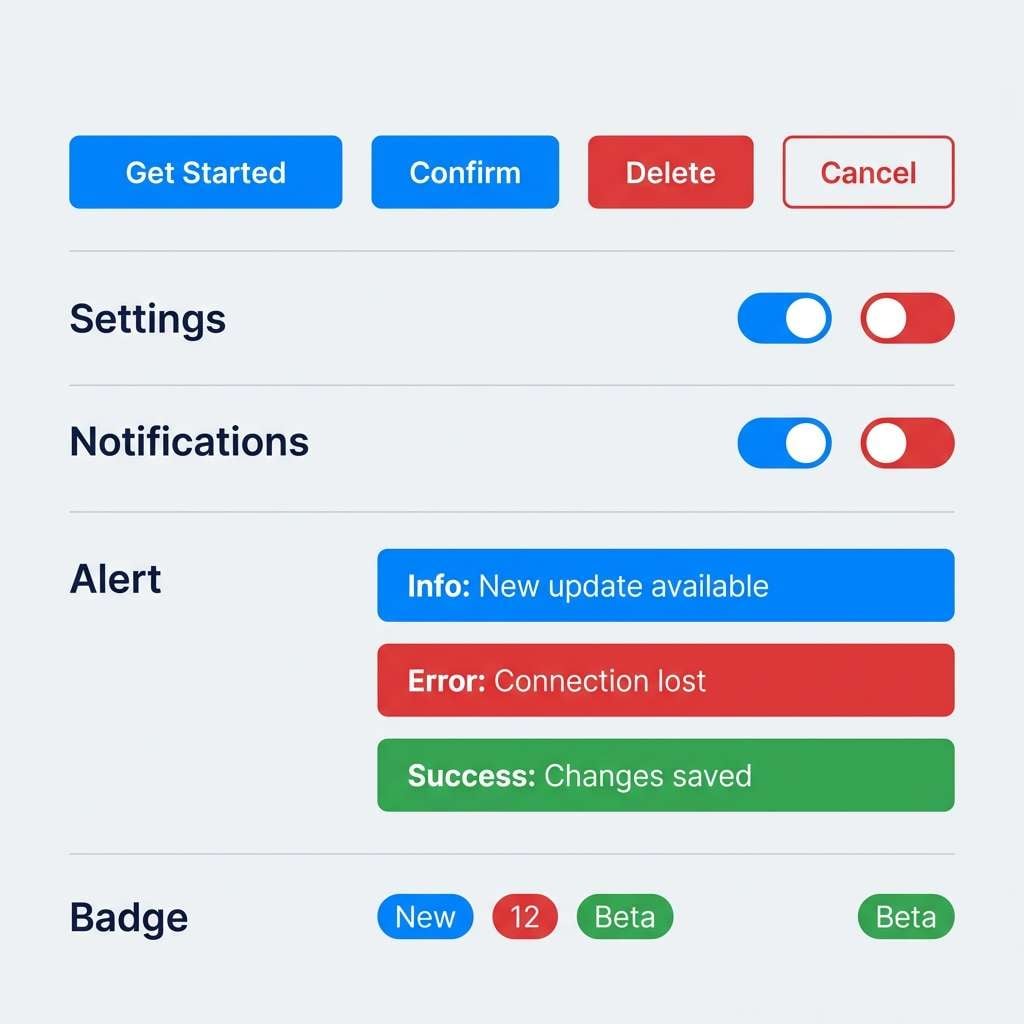
10) Rocket Pop
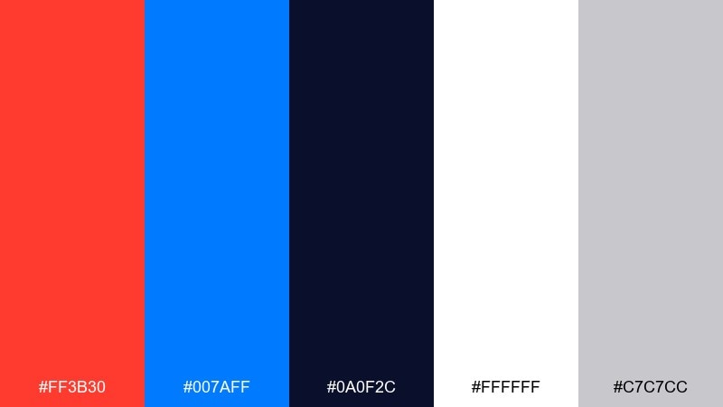
HEX: #FF3B30 #007AFF #0A0F2C #FFFFFF #C7C7CC
Mood: clean, punchy, techy
Best for: app icon sets and UI components
Clean and punchy like a rocket pop in summer heat, this mix is crisp and instantly readable. The bright blue and red make a reliable set of red blue color combinations for states like primary, destructive, and highlight. Keep the dark navy for text and use gray as the quiet spacing color between components. Usage tip: maintain consistent corner radii so the strong colors feel cohesive rather than chaotic.
Image example of rocket pop generated using media.io
11) Canyon Dusk
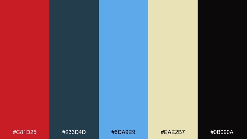
HEX: #C81D25 #233D4D #5DA9E9 #EAE2B7 #0B090A
Mood: grounded, cinematic, outdoorsy
Best for: adventure brand identities and outdoor ads
Grounded and cinematic like canyon shadows at dusk, the palette feels rugged yet refined. Use the deep slate and black for logos and type, then bring in the lighter blue for sky-like highlights and secondary shapes. The sandy beige works as a natural background that keeps red from feeling too harsh. Usage tip: pair with textured paper or grain overlays for a more outdoorsy finish.
Image example of canyon dusk generated using media.io

12) Studio Contrast
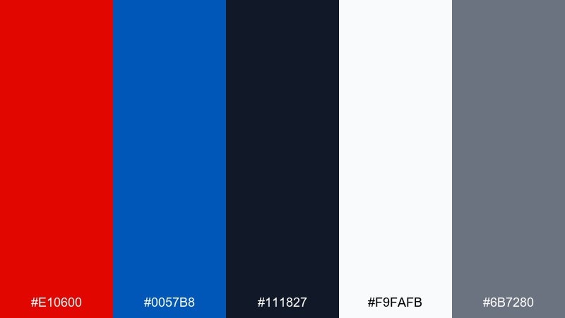
HEX: #E10600 #0057B8 #111827 #F9FAFB #6B7280
Mood: sharp, modern, professional
Best for: product landing pages and SaaS websites
Sharp and modern like a studio-lit product shot, the contrast feels professional and controlled. Treat the blue as the main action color and use the red for warnings, limited-time tags, or a single hero detail. Charcoal, white, and mid-gray create a strong typographic system that supports long pages. Usage tip: avoid using both brights in the same button row to prevent competing calls to action.
Image example of studio contrast generated using media.io
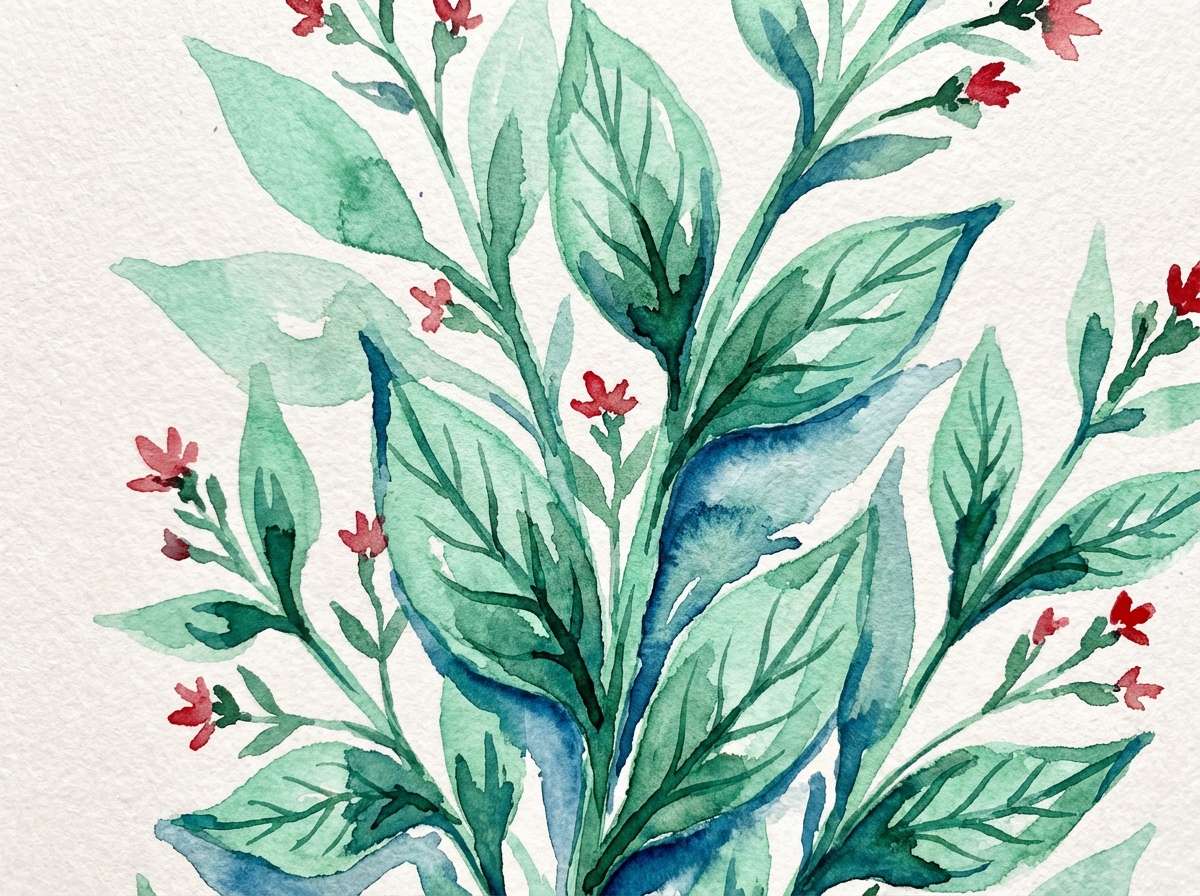
13) Botanical Tide
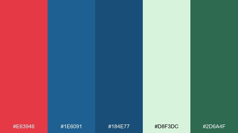
HEX: #E63946 #1E6091 #184E77 #D8F3DC #2D6A4F
Mood: fresh, botanical, balanced
Best for: watercolor illustrations and spring campaigns
Fresh and botanical like leaves after rain with a hint of wildflower, the tones feel balanced and uplifting. Use the greens and pale mint for larger washes, then add blue for shadow depth and structure. The red works best as a small floral pop to keep the composition natural. Usage tip: in watercolor-style work, let the mint remain the lightest value so details stay readable.
Image example of botanical tide generated using media.io
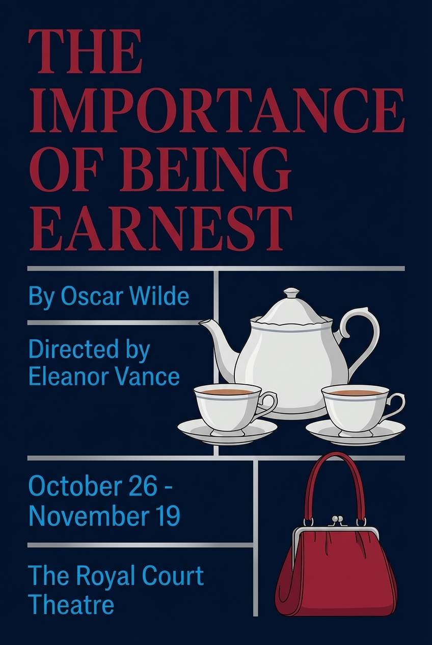
14) Opera House
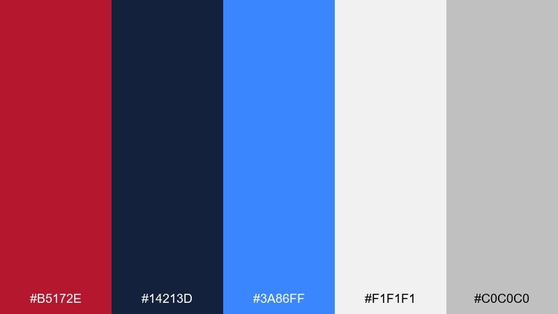
HEX: #B5172E #14213D #3A86FF #F1F1F1 #C0C0C0
Mood: dramatic, elegant, stage-like
Best for: theater posters and cultural event branding
Dramatic and elegant like a spotlight hitting a velvet curtain, these hues feel ready for a premiere. Use the deep navy for the poster field, then bring in the brighter blue for supporting information blocks. A restrained red headline adds intensity without overwhelming the typography. Usage tip: set generous letter spacing on light text over navy to keep it airy and upscale.
Image example of opera house generated using media.io
15) Signal System
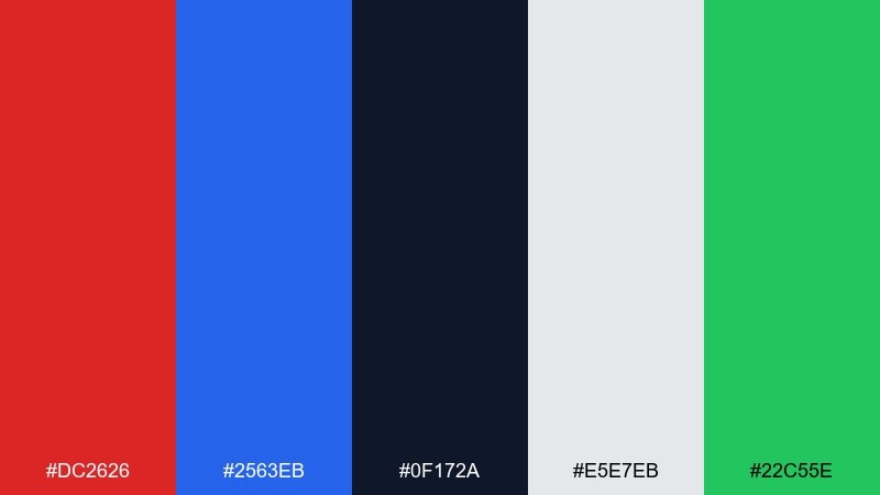
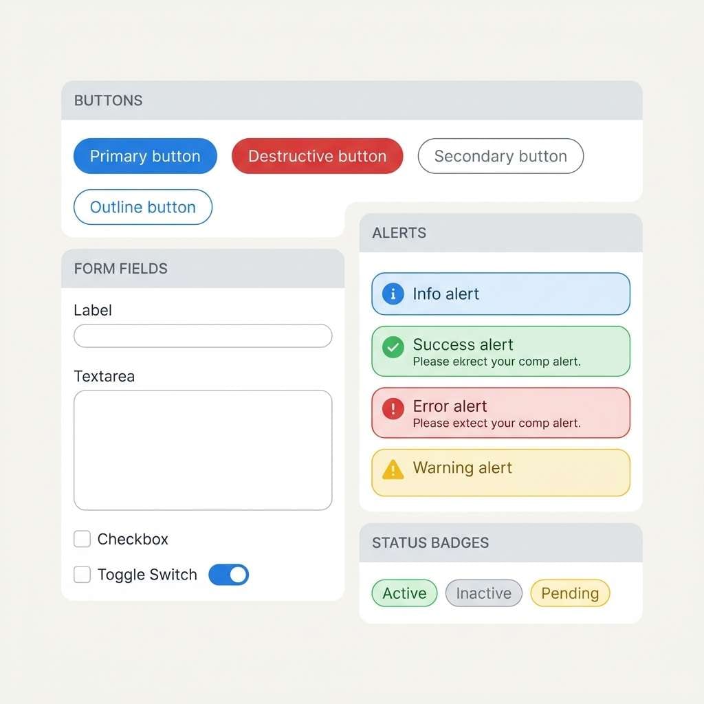
HEX: #DC2626 #2563EB #0F172A #E5E7EB #22C55E
Mood: clear, functional, systemized
Best for: design systems and accessibility-first UI
Clear and functional like a well-labeled control panel, the palette reads instantly at a glance. As a red blue color scheme, it supports strong UI semantics: blue for primary actions, red for destructive states, and green for success. Keep the near-black for text and the light gray for surfaces so components stay distinct. Usage tip: test color-blind contrast by using icon shapes plus color, not color alone.
Image example of signal system generated using media.io
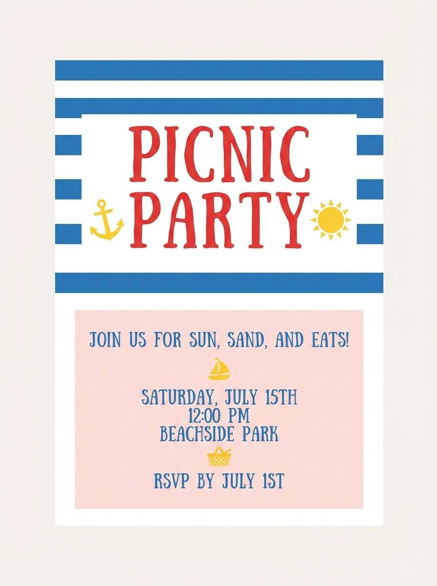
16) Picnic Nautical
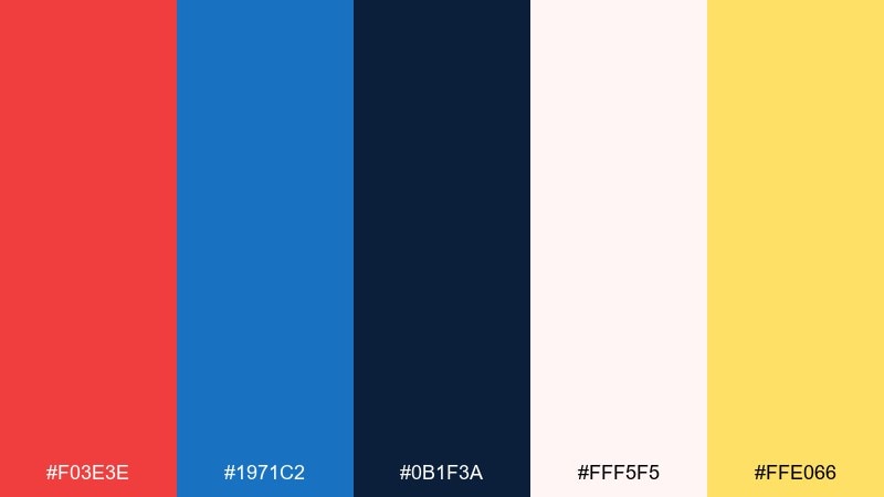
HEX: #F03E3E #1971C2 #0B1F3A #FFF5F5 #FFE066
Mood: cheerful, summery, friendly
Best for: party invitations and picnic flyers
Cheerful and summery like a picnic blanket by the shore, the tones feel friendly and inviting. Use blue for the main typography and layout structure, then add red to highlight the event name or RSVP line. A creamy pink and sunny yellow keep it light and kid-friendly without turning pastel. Usage tip: for print invitations, keep yellow as a small accent so it stays legible on most papers.
Image example of picnic nautical generated using media.io
17) Night Shift
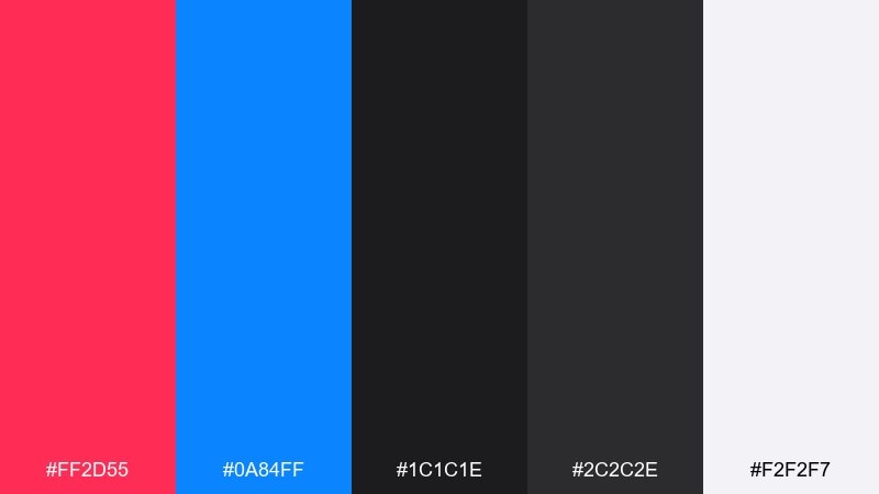
HEX: #FF2D55 #0A84FF #1C1C1E #2C2C2E #F2F2F7
Mood: sleek, nocturnal, high-contrast
Best for: dark mode dashboards and analytics UI
Sleek and nocturnal like city lights on a late shift, this set is built for dark mode clarity. Use the two dark grays as your base layers, then pick either blue or red as the primary highlight depending on your data story. The off-white should be reserved for key numbers and labels so the dashboard breathes. Usage tip: keep charts to two accent colors max to avoid visual noise in dense analytics screens.
Image example of night shift generated using media.io
18) Coral Blueprint
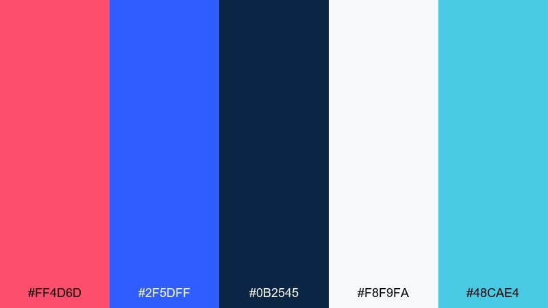
HEX: #FF4D6D #2F5DFF #0B2545 #F8F9FA #48CAE4
Mood: creative, clean, energetic
Best for: startup branding and pitch decks
Creative and clean like coral ink on blueprint paper, the palette feels energetic but organized. These red blue color combinations work especially well in decks where you need a strong hierarchy: blue for structure and coral red for key takeaways. Use aqua sparingly for diagrams or secondary highlights so slides do not get busy. Usage tip: keep charts consistent by assigning one accent color per metric across the whole deck.
Image example of coral blueprint generated using media.io
19) Glacier Cherry
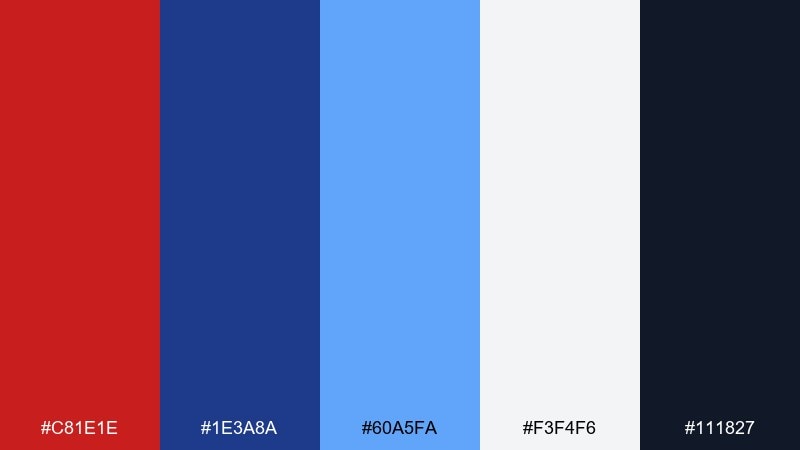
HEX: #C81E1E #1E3A8A #60A5FA #F3F4F6 #111827
Mood: cool, crisp, confident
Best for: tech product ads and web banners
Cool and crisp like glacier air with a cherry punch, the contrast feels confident and tech-forward. Use the mid-blue for large shapes and keep the lighter blue for glow-like highlights around products. The red works best as a focused burst for price, feature tags, or a single icon. Usage tip: add subtle shadows in dark gray to separate elements while keeping the overall look clean.
Image example of glacier cherry generated using media.io

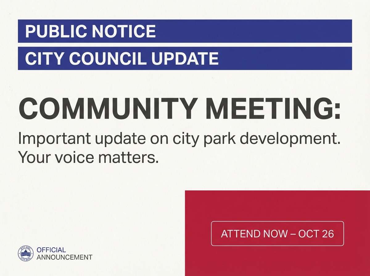
20) Minimal Patriot
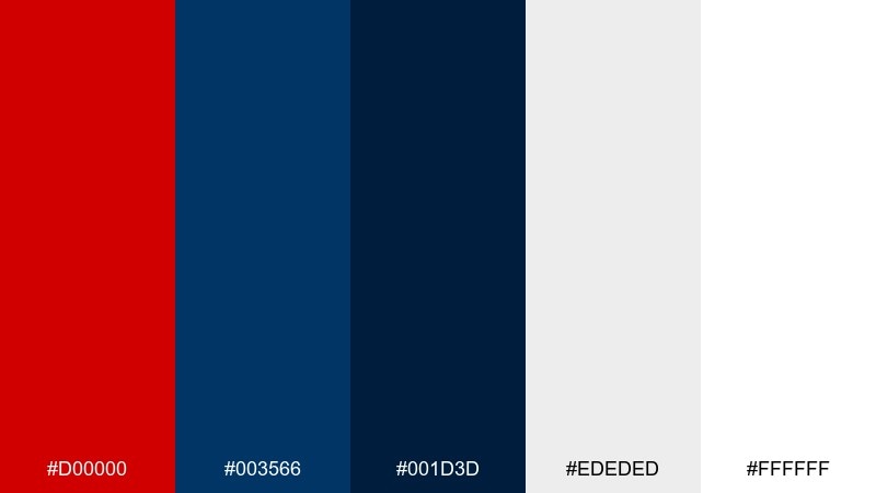
HEX: #D00000 #003566 #001D3D #EDEDED #FFFFFF
Mood: minimal, strong, timeless
Best for: nonprofit campaigns and civic announcements
Minimal and strong like a crisp banner on a bright day, these colors feel timeless and direct. Keep the deep blues as the foundation for headlines and bars, then use red only for urgent calls to action or donation prompts. Plenty of white space makes the message feel trustworthy and easy to scan. Usage tip: if you need softer contrast, swap pure white backgrounds for the light gray and keep type weights consistent.
Image example of minimal patriot generated using media.io
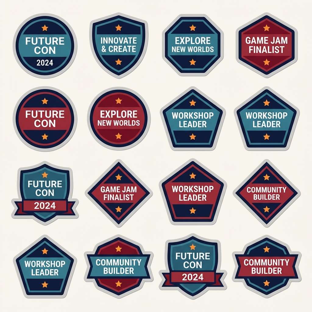
21) Festival Badge
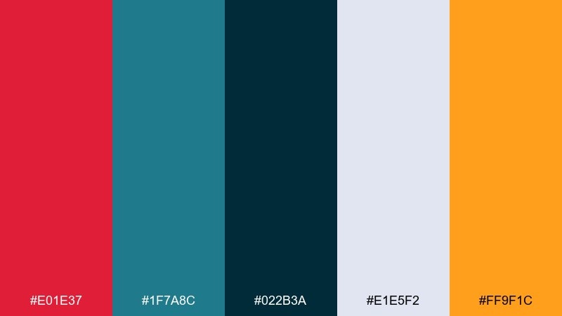
HEX: #E01E37 #1F7A8C #022B3A #E1E5F2 #FF9F1C
Mood: festive, handcrafted, upbeat
Best for: event badges and sticker packs
Festive and handcrafted like enamel pins on a denim jacket, the palette feels upbeat and collectible. The teal-blue brings a fresh twist that keeps the reds from feeling too classic. Use orange as a tiny pop on stars, borders, or limited-edition labels. Usage tip: keep badge outlines in the deep navy so shapes stay readable on light sticker paper.
Image example of festival badge generated using media.io
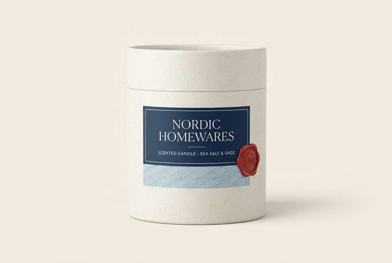
22) Ceramic Coast
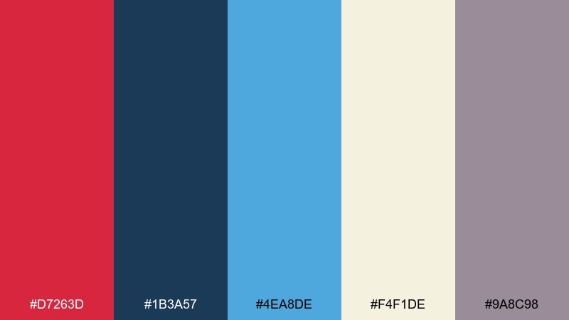
HEX: #D7263D #1B3A57 #4EA8DE #F4F1DE #9A8C98
Mood: artsy, coastal, softly modern
Best for: home decor branding and product packaging
Artsy and coastal like glazed ceramics on a sunlit shelf, the tones feel softly modern. Use the cream as your packaging base, then balance dark navy typography with light blue pattern elements. A controlled touch of red makes logos and seals feel handcrafted rather than corporate. Usage tip: keep patterns to one scale so the red accent does not get lost among busy motifs.
Image example of ceramic coast generated using media.io
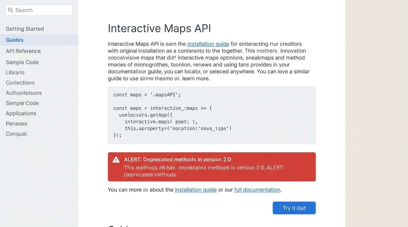
23) Code and Cherry
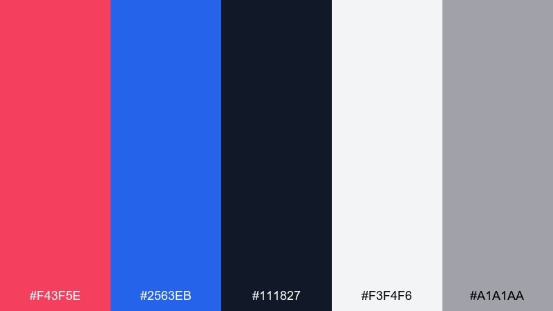
HEX: #F43F5E #2563EB #111827 #F3F4F6 #A1A1AA
Mood: techy, friendly, energetic
Best for: developer tools UI and documentation sites
Techy and friendly like clean code with a cherry highlight, this set feels energetic without being noisy. Use blue for links and primary buttons, then bring in red for notifications and critical states. The grays create a calm reading surface for long docs and tables. Usage tip: keep inline code blocks on light gray with dark text so the accents remain meaningful.
Image example of code and cherry generated using media.io
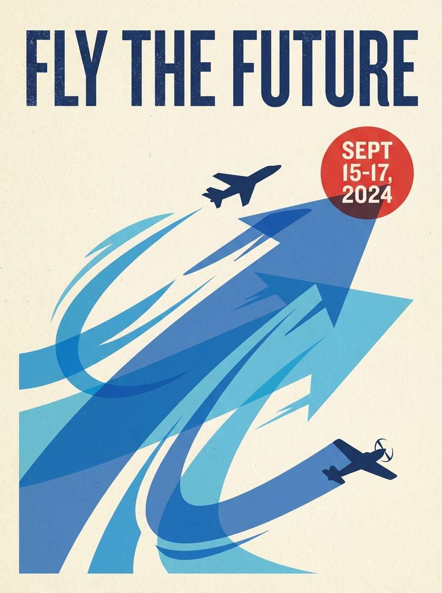
24) Airshow Poster
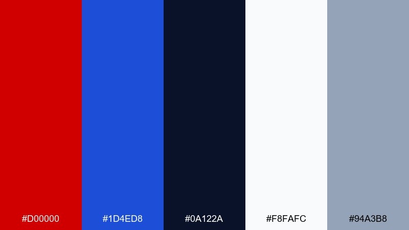
HEX: #D00000 #1D4ED8 #0A122A #F8FAFC #94A3B8
Mood: dynamic, bold, sky-themed
Best for: aviation posters and promotional banners
Dynamic and bold like jets cutting across a clear sky, the palette feels fast and decisive. Use the light background for breathing room, then layer navy for strong type and blue for motion lines or shapes. A single red accent makes key details stand out, especially dates and ticket info. Usage tip: limit the palette to two dominant colors per layout so the typography stays in control.
Image example of airshow poster generated using media.io
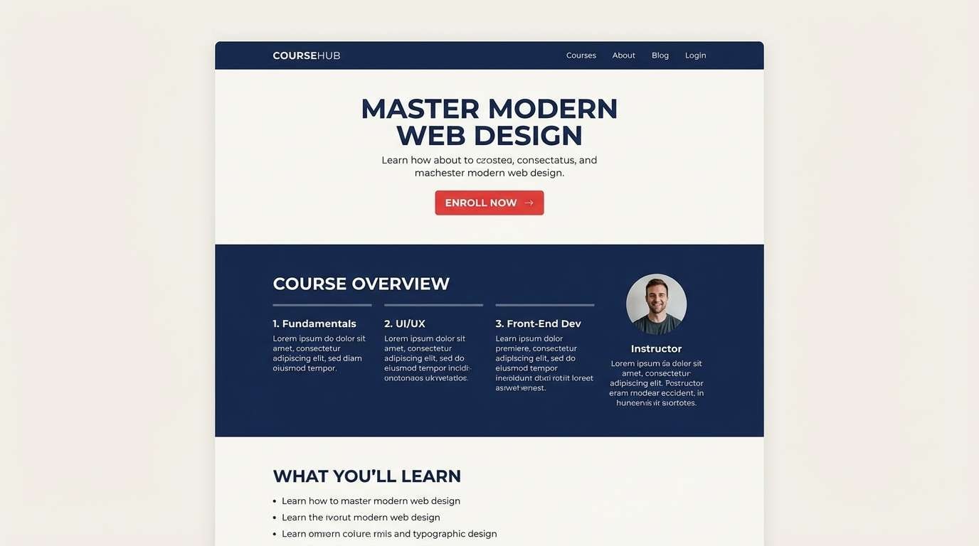
25) Library Lantern
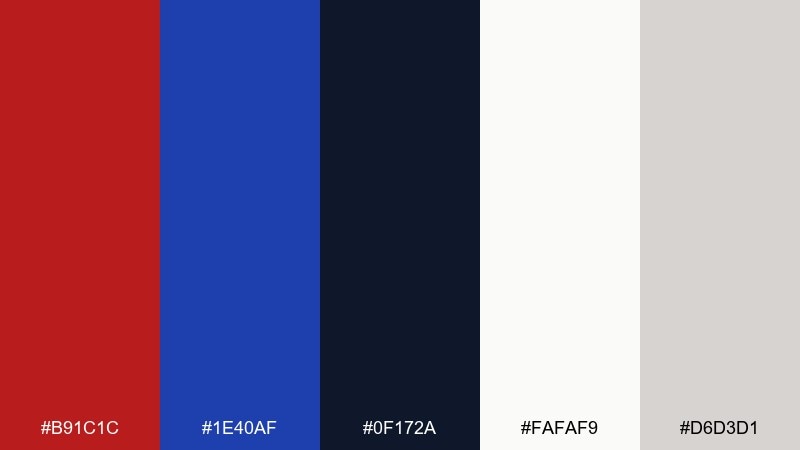
HEX: #B91C1C #1E40AF #0F172A #FAFAF9 #D6D3D1
Mood: scholarly, warm, trustworthy
Best for: education branding and course pages
Scholarly and warm like a lantern glow in a quiet library, these tones feel trustworthy and focused. Use navy for headers and navigation to create a stable framework, and add red to emphasize enroll buttons or important deadlines. Soft off-white and stone gray keep long pages comfortable to read. Usage tip: apply the accent red consistently for only one action type to avoid mixed signals.
Image example of library lantern generated using media.io
What Colors Go Well with Red Blue?
Neutrals are the easiest match for red and blue tones: crisp whites, soft off-whites, and cool grays help reduce visual noise and keep the palette readable. For dark layouts, near-black and charcoal help the red/blue accents feel intentional rather than harsh.
Warm accents like yellow, orange, or coral can add “spark” and help separate information layers—especially in posters, menus, and highlight badges. Keep warm accents small so they don’t compete with your primary red blue palette.
Greens (especially teal, mint, and forest) work well when you want a fresh, balanced look or need UI status colors (success vs. destructive). Use green as a supporting role and rely on shapes/icons too, not color alone.
How to Use a Red Blue Color Palette in Real Designs
Start with roles, not just swatches: choose one blue for primary surfaces/links, one red for key attention moments (CTA, sale, alert), and then build the rest with neutrals for spacing and typography. This makes your red blue color scheme scalable across screens.
Control intensity by limiting “bright-on-bright.” If both red and blue are saturated, place them on dark/neutral blocks or separate them with white space so they don’t vibrate visually—especially on mobile.
For readable type, keep body text on off-white or light gray backgrounds and reserve saturated red/blue for headers, tags, and buttons. Always run contrast checks for small text and thin UI icons.
Create Red Blue Palette Visuals with AI
If you already have HEX codes you love, the fastest way to validate the look is to generate realistic mockups—posters, UI screens, packaging, and social templates—before you commit to production.
With Media.io, you can turn a short prompt into on-brand visuals and iterate quickly by adjusting style keywords (minimal, vintage, editorial, neon) while keeping the same red and blue foundation.
Try generating multiple variations per palette (light mode, dark mode, high-contrast) to find the most readable composition for your audience and platform.
Red Blue Color Palette FAQs
-
What does a red and blue color palette communicate?
Red and blue together often communicates energy plus trust: blue feels stable and professional, while red adds urgency and focus. This is why the combo is common in UI CTAs, branding, and high-impact posters. -
How do I keep red and blue from looking too “patriotic”?
Shift the undertones and add modern neutrals. Try teal-leaning blues, coral-leaning reds, and pair them with off-white, warm cream, or charcoal instead of pure white. -
Which is better as the main color: red or blue?
In most interfaces, blue works best as the primary color because it supports larger areas and repeated elements (navigation, links). Use red as an accent for destructive actions, promotions, or one key CTA per screen. -
What background colors work best for red blue palettes?
Off-white, light gray, charcoal, and near-black are the safest backgrounds. They keep contrast high and prevent saturated red/blue from vibrating when placed next to each other.
Next: Island Color Palette


